
Virtual gallery

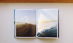
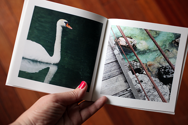
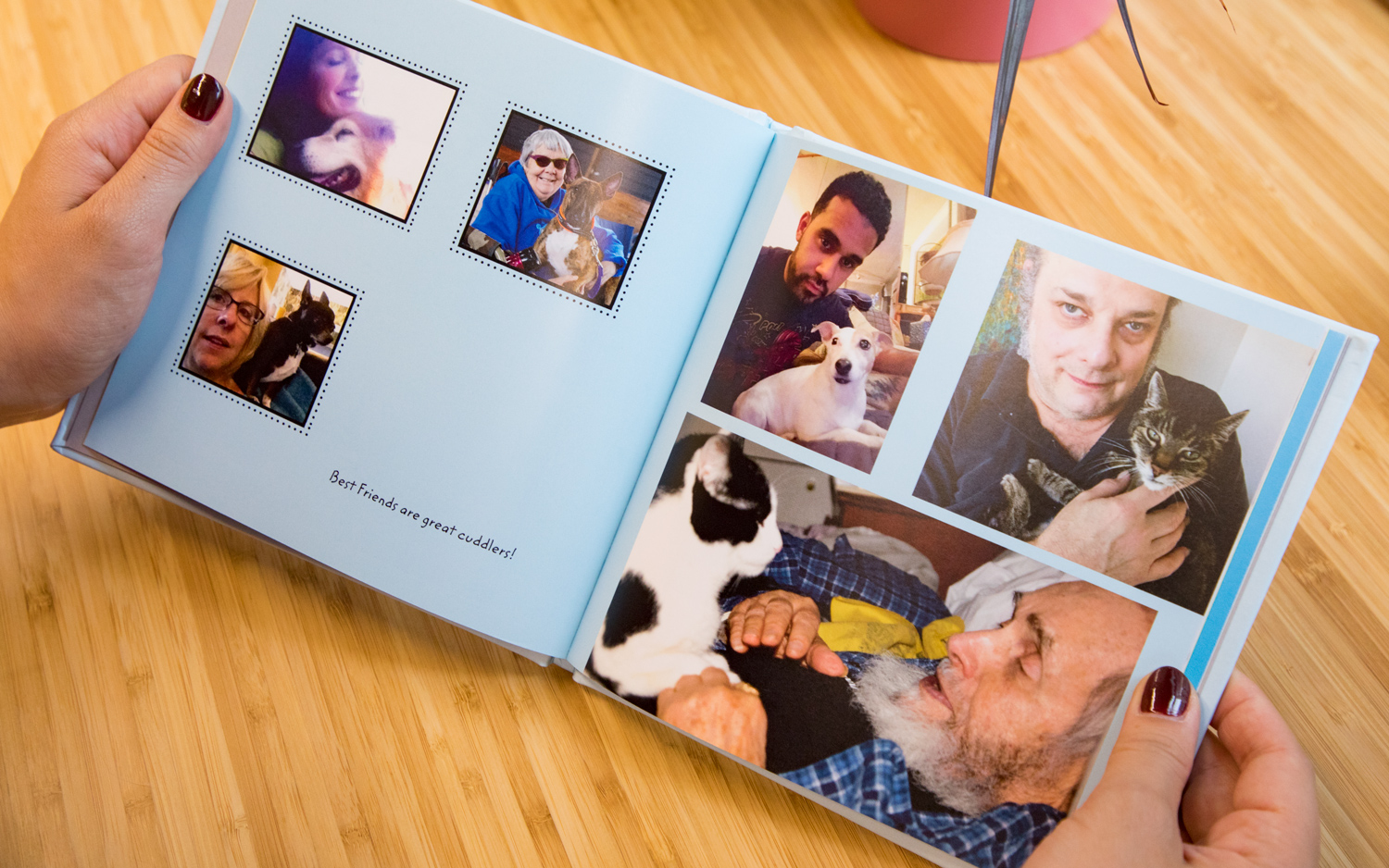
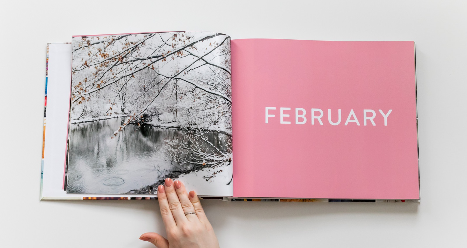
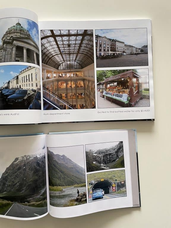
My online photobook: https://www.blurb.co.uk/bookstore/invited/10551639/9effd457a602a0ec97cc56155316cb6cb1c6ecd7
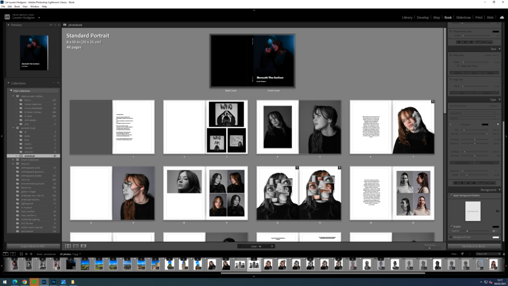
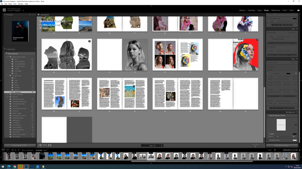
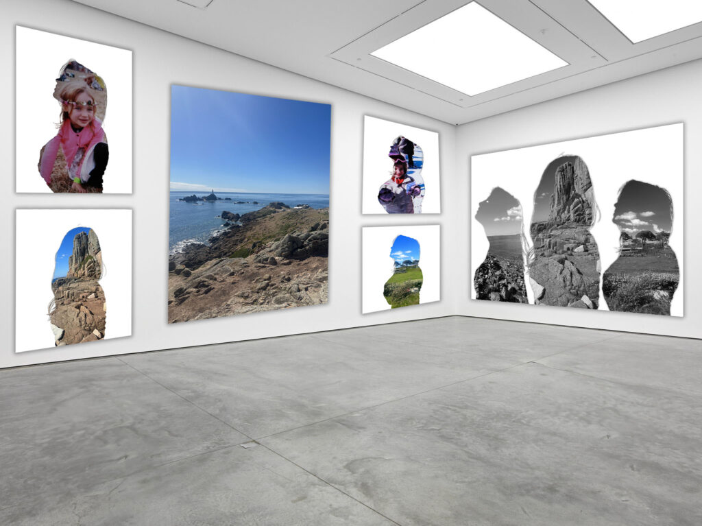
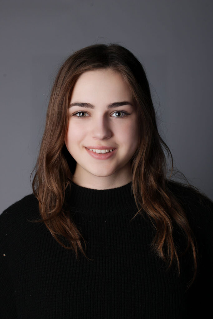
To make my photobook, I commenced by adding all of the photographs I wanted to use into a folder on Lightroom. I then selected the book option at the top which then put them all into a book format. I decided to not put an image on the first page of my book and add a poem about identity instead. I did this to set the tone for the book and enable the viewer to understand what the concept behind my book is. I then chose to add my images from the photoshoot ‘who am I?’ at the start as I think it was a good reflection of what I wanted the beginning message of my story to be (someone struggling with their identity). Upon reflection, I decided to make these images black and white instead of in colour to symbolise a loss of identity.
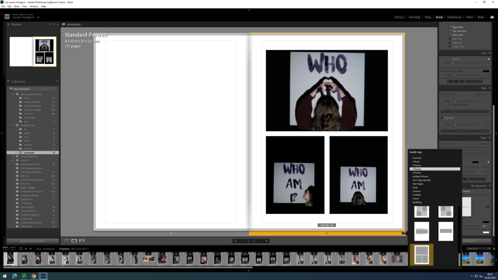
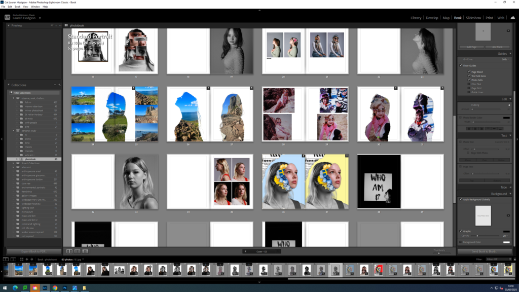
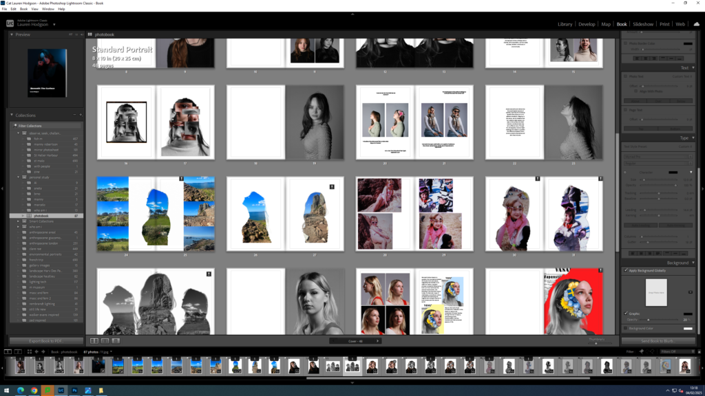
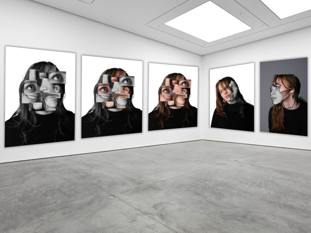
Next, I incorporated my images inspired by Manny Robertson whom creates masks on top of people’s face, showing how everyone hides who they really are in order to avoid being judged. To follow up, I added my Brno Del Zou/ David Hockney inspired images. I slowly began to include colour into my book here as I included two versions of the image: the first all in black and white and the second with some boxes of colour. I then added images from my smaller project I did alongside this about AI. I thought this would fit into my book as I wanted to explore how these AI technologies we have enable people to create completely false versions of themselves online (essentially disguise their true selves).

For my last pages, I used my photographs from my Aneta Ivanova photoshoot and Marcelo Monreal photoshoot. I chose to use these as in my replication of Ivanova’s work, I added pictures of places and people who had a personal connection to the model inside of her, which is ultimately a part of her identity. This was the beginning to her slowly embracing her identity. Lastly, I used the Marcelo Monreal images last as the flowers blooming from inside her shows how freeing and beautiful it is to finally accept and embrace yourself for how you are. As I looked over my photobook again, I decided to add some pages which included a singular full sized image of a model to create some more variety in my work and make it flow smoother between my different artist inspired work. To finalise my book, I added an image of a girl with her head in her hands on the cover page and added the title ‘Beneath The Surface’. I then kept the back cover empty with a black background.
Overall, I like how my photobook regarding the theme of identity turned out. Throughout my project, I got to explore the different ways in which identity is expressed in different artist’s work. The wide range of perspectives surrounding the topic sparked my curiosity and was what ultimately inspired me to create my book around the idea of the journey of identity, which is often complex and chaotic. My photobook commenced with photographs inspired by the artist David Hockney, whom highlights the concept of identity being fragmented and often difficult to understand in his series called the ‘joiners’. In response to his work, I decided to take my own studio portraits of one of my peers from multiple viewpoints. I then collated these images together to create a distorted yet cohesive image, reflecting the state of her mind which is evidently a mess as she is unsure of who she really is. I decided to finish my photobook with images inspired by Marcelo Monreal, who delves into the idea of embracing identity and yourself for who you are. I think my photobook successfully conveyed the concept of the journey of identity as it begins by exploring identity from a negative perspective and then leads into a more positive viewpoint. Additionally, I like how I made the images at the start of my book black and white then slowly introduced more colour into my images as the book continued. I did this to symbolise the idea that the models are slowly regaining their sense of identity. However, one improvement I would make to my photobook is adding a few more pages of just singular, full page images as a lot of my photobook is filled with multiple images put together and writing, which makes it slightly cluttered.
1. Write a book specification and describe in detail what your book will be about in terms of narrative, concept and design with reference to the same elements of bookmaking as above.
Narrative: What is your story?
Describe in:
Design: Consider the following
2. Produce a mood-board of design ideas for inspiration. Look at BLURB online book making website, photo books from photographers or see previous books produced by Hautlieu students on the table in class.

In what way is identity explored in the work of David Hockney and Marcelo Monreal?
Introduction:
“People don’t often show who they really are. Instead, they keep parts of their real selves hidden.” [1]
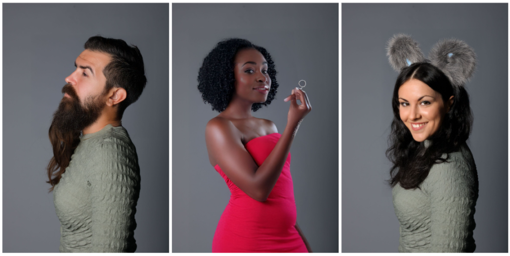
This quote by Marcelo Monreal closely links to my personal study where I want to delve into the topic of identity; more specifically the complex and confusing relationship people often have regarding it. This topic especially stood out to me as I believe identity is very prominent thing people struggle with in my age group. Whether that be teenagers trying to conceal their true identity in order to fit societal expectations or just trying to discover who they really are, identity is something that makes us unique but also makes us vulnerable, therefore leading to people to put up a facade to hide who they truly are to the world. For example, teenagers tend to hide their emotions or alter their physical appearance (eg by wearing makeup) as a way to protect themselves from people’s judgements and rejections that they feel they will receive if they are their whole, natural self. I found this idea of concealment and the desire to conform very interesting and so I have decided to explore it further in my project. An artist whose art I believe links to exploring identity is David Hockney’s body of work called ‘joiners’ which is a combination of images taken of a singular person from different angles to create a collage. In this project, his work typically explores the theme from a perspective that focuses on people’s tendency to conceal their innermost emotions and identity. He does this through distressing and distorting classical portraiture through the idealistic, creating fragmented images of people which represents their sense of self being not whole and how identity is something fluid; it is constantly adapting and changing to fit one’s environment. In contrast, I also want to look at identity from a different, more positive perspective. I will do this by illustrating the beauty and strength of embracing your identity despite the potential risk of being rejected or judged towards the end of my project. I have chosen to do this as I want to portray the journey of self discovery, which often consists of a lot of obstacles that need to be overcome and will hopefully inspire and reassure people that they can take off these facades that hide them from the world and be unapologetically themselves as it’s liberating knowing those around you love you for you and not for the fake version of yourself you have created in order to please them. I think Marcelo Monreal depicts this message clearly in his ‘Flower Face’ series as he covers themes of personal growth and acceptance through combining flowers with human faces to create beautiful, empowering images. Flowers are known to grow, wither and regenerate. This conveys to me the idea of our identity being similar to a flower; constantly changing and blossoming as we grow and transform. His work puts an emphasis on the importance of identity and embracing who we are as like the flowers seen in his images, they are all different in some way, just like we are and it is that which makes us unique and special. I hope to explore these opposing outlooks on identity further throughout my project by taking inspiration from both David Hockney and Marcelo Monreal’s work where I will compare, analyse and explore the artists differing ways of expressing what identity means to them through their art.
Historical context
The origin of photomontage began with early collage experiments by Pablo Picasso in the early 20th century. At that time Picasso was developing a new painting style coined Cubism. His experimental work in this style of art had a profound influence on what is now known as photomontage. Cubism and photomontage are closely linked to each other as they both challenge traditional ways of representing reality by fragmenting and reassembling images in an abstract form. David Hockney described cubism as a ‘different way of looking, and it’s about reality and perception’. [2] Picasso’s work surrounding cubism involved him deconstructing his subjects into abstract, geometric shapes taken from multiple perspectives then merging them together to create a completely new, alternative image and meaning. Many artists like Picasso used the cubist technique as a way to depict a new, alternative reality and to try and push the limits of artistic expression. They wanted to move beyond the representational way of displaying art and to explore it in a more unique and different way. This can be seen when Picasso said ‘it’s not what the eye sees, it’s what the mind sees’. [3] This refers to the idea that art should be used as a way to show how the mind tries to process and interpret the world instead of just photographing the world as it is; which is a core concept of cubism. The key theme of the cubism is centred around not representing an object from a single, fixed angle but showing an object’s essence by breaking it into multiple parts then displaying the different angles together into a final, cohesive but unique piece of art. This is very similar to photomontage which is an art form where multiple photographs are cut, rearranged, and reassembled to create new meanings and perspectives. Both art styles focus on embracing fragmentation and abstraction to create new perspectives instead of simply capturing what everyone already see’s normally.
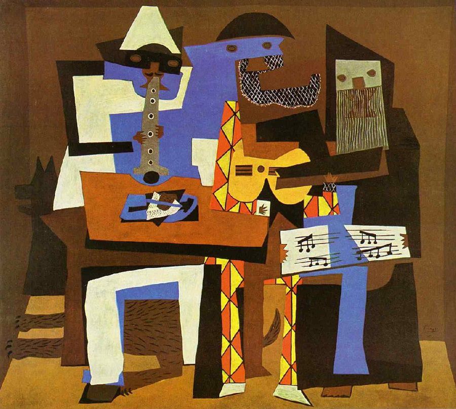
This image by Pablo Picasso clearly demonstrates some of the key themes seen in cubism as he fragments the three musicians into different geometric shapes. Whilst they are still recognisable, they are not depicted in a conventional or realistic way as parts of their bodies and instruments are cut, rearranged and overlapped with one another to create a fragmented image (as seen in David Hockney’s work too).
The Dadaism movement followed shortly after Cubism. Cubism emerged around 1907-1914 and Dadaism emerged around 1916 after the outbreak of World War I. It was created as a reaction against the war, societal values, and traditional art forms at the time. The main concept of cubism was to break away from the traditional forms of perspective and realism by fragmenting objects and having multiple viewpoints present in one image in order to depict the complexity of reality whereas Dadaism was used as a way to reject all pre established norms of art and to embrace absurdity/randomness. Dadaists often mixed unrelated images/ objects to create new, nonsensical narratives. Dadaism made people question the meaning of art itself. Dadaism involved using techniques that broke away from conventional photographic norms, for example: photomontage, collage, manipulation, and absurd subject matter. Photographers would intentionally distort and fragment images to create confusing juxtapositions and used photography as a tool to challenge society’s expectations of art and beauty. One of the most influential figures in Dada photography was Hannah Höch who was a German Dada artist. Her photomontages critiqued societal norms, gender roles, and the politics of her time. She desired to challenge the traditional representations of women at the time (clearly seen when she stated that she wished to ‘blur the firm boundaries which we self-certain people tend to delineate around all we can achieve.’) [4] and the patriarchal structures that influenced art and society. She often described her work as ‘a way to confront the contradictions and absurdities of the world’. [5] Hannah Höch popularised the photomontage technique as she cut and joined photographs from magazines, newspapers and other printed materials to create surreal and provocative images.
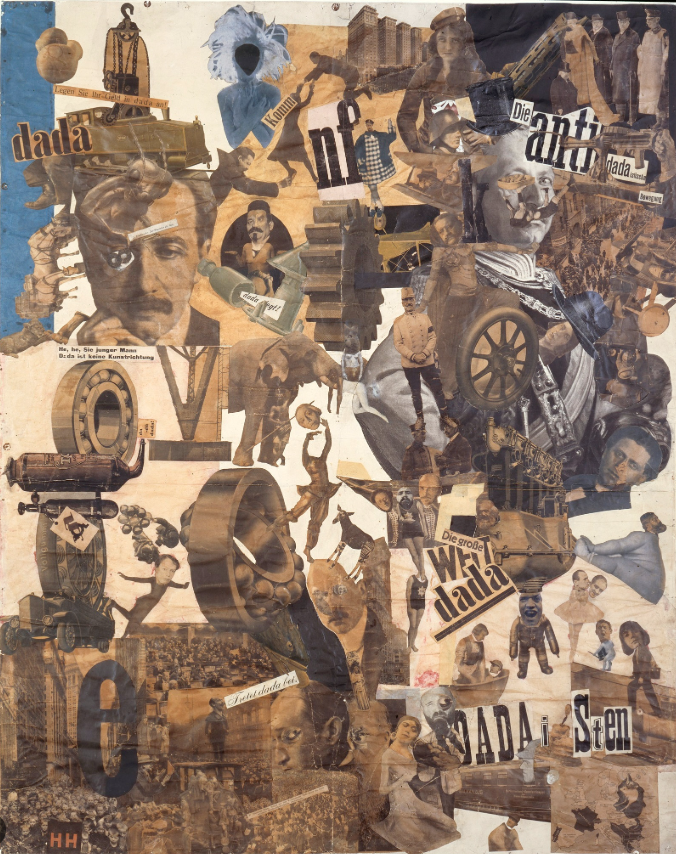
One of her most famous works is Cut with the Dada Kitchen Knife Through the Last Weimar Beer-Belly Cultural Epoch in Germany (1919). This was a political piece that was used to critique and mock the political chaos of post war Germany and the objectification of women. She used her work to try change the traditional representations of femininity. She did this by dissembling images of women with images of political and military figures in a way that challenges the previously male dominated area of politics (which was known for excluding women). This successfully conveyed the message that we should question these traditional gender roles that are so normalised in society. This links to Dadaism as she managed to create a chaotic, fragmented vision of post war Germany through her distorting and assembling of different genders. Overall, Cubism and Dadaism were crucial elements in the development of photomontage which was began to take shape in the 1920s, as they both rejected traditional ideologies, embraced absurdity, and broke the boundaries between art and reality (which are similar concepts present in photomontage). For example, collages that were produced as a part of Dadaism expanded to the use of photographs and directly lead to the development of photomontage. The photomontage technique continues to grow and evolve as time progresses.
David Hockney
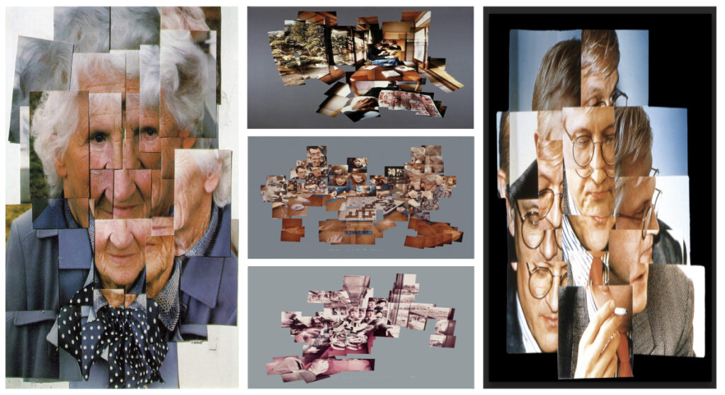
David Hockney explores identity and its complexity throughout his series of ‘joiner’ photographs. These images incorporate a technique by which he cuts up, rearranges and assembles a variety of different photographs to create a single, composite image. The message being conveyed in these images is to encourage the people who are viewing his work to embrace these fragmented representations of people and find comfort in the chaotic, non linear journey of understanding identity. Hockney actively engages with the idea that identity is not a static, singular image but a dynamic, multifaceted process. His fragmented approach to exploring identity in his work mirrors the way identity can be shaped and changed by a variety of factors. For example: your personal experiences, interactions with others, memories, and relationship with time all impact who you are as a person now and who you will be in the future. This evidently demonstrates that identity is a long, ever changing concept that one may never be able to grasp fully. Additionally, not only do our perceptions of ourselves change but of others too. By David Hockney breaking his subjects into smaller, disjointed parts, he illustrates the idea that identity cannot be captured in a single snapshot. This disorder in his work reflects how our own images of ourselves are constantly constructed and reconstructed, depending on our context and perspective. The joiners and often require the viewer to piece together the different perspectives in the image in order to begin to understand that person’s identity. David Hockney said he’d ‘love to make a true representation of space, as we know it, since it’s impossible to photograph it’, [6] showing that even with these different viewpoints being compiled into one image, our understanding of who that person is may still be incomplete and ever changing. This highlights how truly versatile and unpredictable identity is.
His joiners series also explores identity through the use of time. David Hockney was very interested in the concept of time in images as seen in an interview where he said ‘When is the present? When did the past end and the present occur, and when does the future start? Ordinary photography has one way of seeing only, which is fixed, as if there is kind of an objective reality, which simply cannot be.’ [7] In many of his pieces, he combines a variety of photographs, all of which were taken over a period of days, weeks, or even months. This allows him to explore the idea of time passing in his images and show the evolution of his subjects within that time period. This can specifically be seen in his photocollages of landscapes in which there’s often a shift in light, weather and perspective which he then joins together creating a single composite image. This conveys to me the idea that identity isn’t about simply seeing a person for what they are at a specific moment in time but how that person is constantly changing as time progresses alongside with their identity, interests and personality. This concept of time passing in his images makes people reflect and consider how people’s surroundings and experiences alter over time which ultimately shapes that person’s identity simultaneously. David Hockney often described photography as ‘a way of visualising time’. [8].
During the time of his joiner series being created, photography was undergoing a rapid transformation as more technologies became accessible to people eg Polaroid cameras. He stated ‘I think we are moving into a more electronic age, there’s no doubt about it. In a way, storing information digitally is storing abstractions’. [9] He then incorporated this new sense of modernism into his work by joining multiple Polaroid pictures taken from different viewpoints together to create a new, abstract image. David Hockney’s work was influenced by his own life, experiences and relationships. He would often use self portraits and photographs of his loved ones in his joiner images. By doing this, I believe he was trying to reflect the fragmented and layered ways in which he experiences his own identity. As he presents himself from several different perspectives in the same image, he is trying to prevent a single narrative/ fixed representation of himself from being formed. His work actively engages with the idea that identity is fluid and shaped by many external factors. His work highlights the importance of different viewpoints to be able to understand people. He was also inspired by Cubism and the works of Picasso and Braque (as seen when he said ‘I’m interested in all the great traditions, and I admire Salvador Dali and Picasso hugely’) [10]. His joiners series took an innovative approach on their work (which involved them breaking up their subject matter into different fragmented perspective’s) by capturing and merging multiple angles and viewpoints in order to depict the subject in a more holistic manner. Overall, David Hockney’s work has inspired me to take a variety images of people from different perspectives then join them together to create a distorted individual, highlighting the idea of the complexities surrounding identity as seen in his work.
Marcelo Monreal
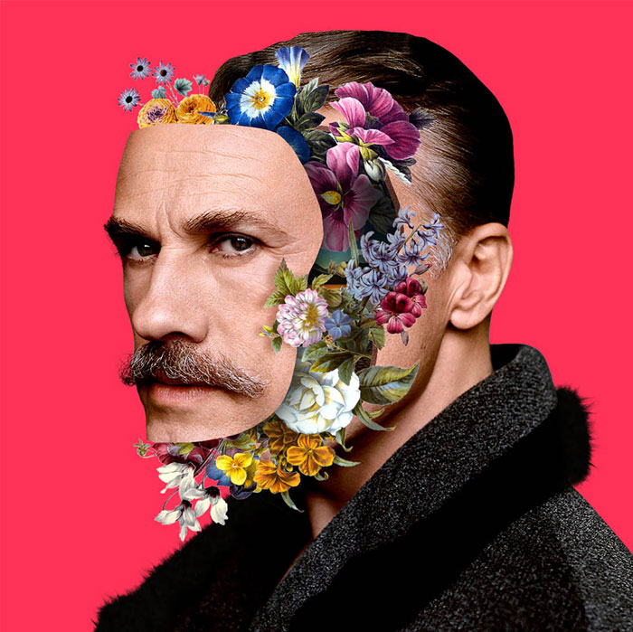
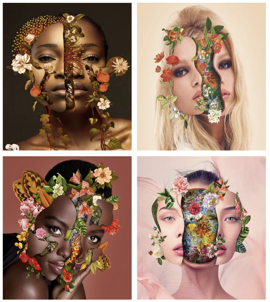
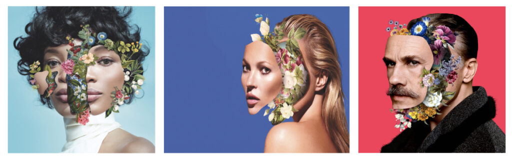
In contrast, Marcelo Monreal explores the theme of identity from an alternative, more positive perspective throughout his body of work called ‘Inside outside’. These images consist of him manipulating the faces of famous celebrities, actresses, actors and models by creating cracks and holes into their face then filling them up with a variety of botanical flower images in order to create surreal portraits. These surreal images aim to explore the duality of human identity and highlight the idea that identity isn’t just about appearance, but also about deeper, often unseen layers. Marcelo Monreal believed that “to create is to uncover a new part of oneself, hidden in the layers of perception.” [11] This is reflected in his work as he delves into the internal factors of people as a way to understand what makes them who they are. I interpret his work as being a commentary on the complexity of how we perceive ourselves and how we are perceived by others. The contrast displayed between the interior (for example: internal thoughts, emotions and psychological states) and exterior (for example: physical appearance and societal roles) reflects the multifaceted nature of identity. His approach often challenges those who look at his work to question the surface level layers of identity and instead prompts them to consider the deeper, more hidden factors that shape who we are. Marcelo Monreal’s work focuses more on embracing identity in its fullest complexity as he doesn’t depict identity in a fixed/singular way but rather as something that has many layers, fluid and is ever changing. Monreal engages with the idea that embracing one’s identity often involves acknowledging and integrating all aspects of oneself. This includes both the visible and the hidden, the natural and the constructed. His work encourages people to look beyond the surface of appearances and open their eyes to see what lies beneath each person which accumulates to form who they are. For example, people’s own history, emotions and potential inner struggles is what ultimately makes them unique. I think Marcelo Monreal’s work encourages people to accept all the hidden, complex parts of themselves and to not be ashamed of those internal differences they may have to other people as by embracing your differences you begin to flourish. Marcelo Monreal often felt like people don’t tell us who they really are, saying: ‘They keep all of their real selves hidden from view’ in an interview. [12] This is what inspired him to start the project where he would be able to reveal the rare moments in which we see the beauty that’s behind these celebrities appearances. Additionally, the bright colours present in the flowers juxtapose with the soft, natural colours of the human facial features, showing how valuable and extraordinary you become as you begin to not worry about what other people think of you and accept yourself for who you are.
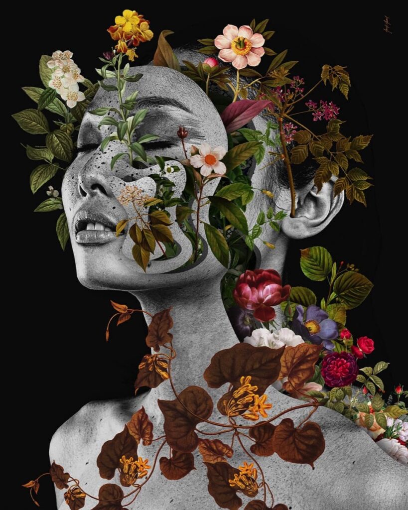
Marcelo Monreal’s mum’s death had a major influence on his project and was what ultimately started it. This concept of adding flowers to people’s face began after he went to his mothers funeral to which he then went to his childhood home in Sāo Paulo and noticed that his mother’s once flourishing, vibrant garden was non existent. This caused him to recall all the positive memories he had in that garden with his brothers. One day, he asked his mother what people are made of to which she responded “flowers, son!”. This memory sparked a passion in him to try to recreate and express that fond memory he had of his mother through art as a way to remember her. Overall, this series of images has inspired me in my own project on identity. I believe this positive outlook regarding the idea of embracing identity is a perfect way to sum up my project which previously focused on identifying and highlighting how people try to conceal themselves from the world, leading to them losing a part of themselves as they conform to societal norms. My images which will closely replicate the work of Marcelo Monreal. They will emphasise the notion of the beauty one radiates when they appreciate and value all the internal factors that make them who they are.
Conclusion
In conclusion, David Hockney and Marcelo Monreal explore identity in similar but conflicting ways through their series called ‘joiners’ and ‘inside outside’. While their approaches may differ in technique, they both use their work to dissect and convey the fluid nature of identity and invite their viewers to reflect on the complexity and layers that make up a person’s sense of self. David Hockney used photo collages in order to convey the fragmentation associated around identity. He used multiple photographs of a subject (taken from various angles and times) then joined the images together to create a fragmented but still cohesive final image. Hockney’s unique use of collage highlights the way identity is not fixed but is made up of many layers, perspectives, and moments which come together to form who that person is. Hockney said he ‘wanted to show the world as we see it, not as we know it should be. I want to suggest a different kind of space, a space that includes time, and also gives you a feeling of the movement of the human eye.’ [13] showing that he believes identity isn’t a singular snapshot but a continuous process, formed through multiple views and experiences. Hockney suggests that identity isn’t a static portrait but a dynamic and evolving construct which is influenced by various viewpoints and experiences. On the other hand, Marcelo Monreal uses digital manipulation to merge human faces with flowers. This creates a surreal blend of the inner and outer worlds. His work highlights a deep connection between an individual’s internal world (for example: their thoughts and emotions) and the external world (for example: society, nature, and environment). He clearly illustrates how our identities are shaped by our inner experiences and external influences. Monreal stated ‘What we have inside us is much more powerful than what we show outside. The inside is connected to nature, to everything around us. The outside is just a mask. It’s only the surface.’ [14] This quote sums up the key theme behind his work as he delves into the idea that identity is far more than what is immediately visible and by embracing these internal and external factors simultaneously, something beautiful can be formed. He believes the external self (the mask we show to the world) isn’t a full representation of who we truly are but by intertwining the inner self with nature (as seen in his work), he demonstrates how rare and potentially beautiful it is when one fully embraces every part of themselves even the parts you may deem as weird or cause you to be judged by society. In contrast to Hockney’s fragmented approach, Monreal’s work merges together two completely opposite worlds seamlessly, creating a visual harmony that reflects the integrated nature of identity.
One similarity between the artists’ way of exploring identity is they both look at identity as something that’s multifaceted and ever changing. Hockney’s fragmented compositions and Monreal’s hybrid imagery both convey the idea that identity cant be understood by a singular, fixed concept. It is crucial that we understand identity is shaped by a variety of internal and external factors that interact with each other. Additionally, they both explore the concept of time and change in relation to identity. Hockney’s work captures the passage of time through his use of multiple perspectives within a single image whereas Monreal’s combination of human forms with flowers suggests there’s a deeper, cyclical connection between humans and the world around them. Both artists imply that identity isn’t linear but a fluid thing that is constantly changing due to the different experiences one may undergo. However, David Hockney and Marcelo Monreal differ slightly regarding the methods and mediums they use. For example, Hockney’s approach is rooted in traditional photography in which it involving him using physical photographs, cutting them and then reassembling them to create a new meaning and image. His work emphasises the process of constructing an image. In contrast, Monreal’s work is digital (instead of the more physical approach Hockney’s joiners take) as he seamlessly blends a variety of flowers with a human face. His use of digital manipulations allow him to create ethereal images. This majorly contrasts with Hockney’s work which is more grounded. Furthermore, Hockney’s joiners series focuses on capturing multiple perspectives of a singular subject whereas Monreal’s work emphasises the merging of inner and outer worlds. Hockney often deconstructs and dissects identity throughout his work, but in Monreal’s work, he seeks to integrate the various aspects of self, suggesting a more harmonious, interconnected view of identity.
Both artists have had an influence on project and how I wanted to approach the concept of exploring identity through photography. I have taken inspiration from Hockney’s use of fragmented images and the idea of conveying multiple perspectives into one image. His work has inspired me to think about identity in terms of its complexity and fluidity which often leaves people feeling lost and alone as they struggle with embracing or even knowing who they truly are. Hockney’s joiners where he uses a multitude of images from different perspectives to create a distorted yet cohesive image, inspired me to highlight the idea that identity is a complex journey one must go through in my work. By distorting peoples faces using multiple images of them, I hope to emphasise the message that you are not alone and others also feel the chaos portrayed in the images. Similarly, Monreal’s work has inspired me to explore how our identities are shaped by not only our internal thoughts and feelings but also by our environment and society. Towards the end of my project, I want to look into the different external influences (eg culture, history, and nature) that play a role in shaping who we are and show how these differences make us unique and valuable. This will hopefully inspire those who look at my work to not conceal certain parts of themselves in order to conform to societal expectations. Ultimately, both Hockney and Monreal’s work have shown me that identity is not a singular or fixed concept, it is continually changing and shaped by both internal and external factors. Their work has encouraged me to explore different, alternative ways of representing identity. For example, through fragmentation, layering, and the blending of different perspectives as seen in Hockneys work, to digital manipulation in Monreal’s work that enhances the beauty of people that’s typically hidden inside.
Bibliography:
[1]= Interview with Marcelo Monreal (no date) PHOTOGRAPHIZE. Available at: https://www.photographize.co/interviews/marcelomonreal/ (Accessed: 09 January 2025).
[2]= Hockney, D. and Joyce, P. (2008). Hockney on art : conversations with Paul Joyce. London: Little, Brown.
[3]= Goodreads.com. (2019). Pablo Picasso Quotes (Author of The Burial of the Count of Orgaz and Other Poems). [online] Available at: https://www.goodreads.com/author/quotes/3253.Pablo_Picasso.
[4]= The Art Story. (n.d.). Hannah Höch Photomontages, Bio, Ideas. [online] Available at: https://www.theartstory.org/amp/artist/hoch-hannah/.
[5]= Palmer, L. (2015). Words of Wisdom from Dada Genius Hannah Höch on her Birthday. [online] artnet News. Available at: https://news.artnet.com/art-world/words-wisdom-dada-genius-hannah-hc3ch-birthday-350867.
[6]= Bookey.app. (2023). 30 Best David Hockney Quotes With Image | Bookey. [online] Available at: https://www.bookey.app/quote-author/david-hockney [Accessed 1 Feb. 2025].
[7]= photoquotes.com. (n.d.). Quotes by David Hockney | PhotoQuotes.com. [online] Available at: https://photoquotes.com/author/david-hockney.
[8]= Bookey.app. (2023). 30 Best David Hockney Quotes With Image | Bookey. [online] Available at: https://www.bookey.app/quote-author/david-hockney [Accessed 1 Feb. 2025].
[9]= photoquotes.com. (n.d.). Quotes by David Hockney | PhotoQuotes.com. [online] Available at: https://photoquotes.com/author/david-hockney.
[10]= Bookey.app. (2023). 30 Best David Hockney Quotes With Image | Bookey. [online] Available at: https://www.bookey.app/quote-author/david-hockney [Accessed 1 Feb. 2025].
[11]= OpenAI (2022). ChatGPT. [online] ChatGPT. Available at: https://chatgpt.com/.
[12]= ellieclaireartblog, A. (2016). Inside Outside – Artist Research – Marcelo Monreal. [online] Ellie Claire Fine Art Blog. Available at: https://ellieclaireartblog.wordpress.com/2016/12/08/inside-outside-artist-research-marcelo-monreal/.)
[13]= OpenAI (2022). ChatGPT. [online] ChatGPT. Available at: https://chatgpt.com/.
[14]= OpenAI (2022). ChatGPT. [online] ChatGPT. Available at: https://chatgpt.com/.
History of photomontage information from:
David Hockney information from:
King, E. (2024). David Hockney Art for Sale: Prints & Originals. [online] MyArtBroker. Available at: https://www.myartbroker.com/artist-david-hockney/articles/exploring-david-hockney.
Marcelo Monreal information from:
Ideas & Processes. (2018). Marcelo Monreal. [online] Available at: https://nickyb513882.wordpress.com/marcelo-monreal/.
ellieclaireartblog, A. (2016). Inside Outside – Artist Research – Marcelo Monreal. [online] Ellie Claire Fine Art Blog. Available at: https://ellieclaireartblog.wordpress.com/2016/12/08/inside-outside-artist-research-marcelo-monreal/.
PHOTOGRAPHIZE. (2019). INTERVIEW WITH MARCELO MONREAL. [online] Available at: https://www.photographize.co/interviews/marcelomonreal/.
Burnthouse Lane- Michelle Sank

1. Research a photo-book and describe the story it is communicating with reference to subject-matter, genre and approach to image-making.
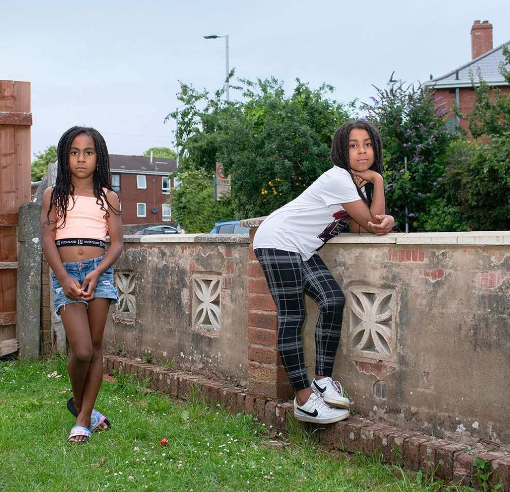
Michelle Sank’s photo book Burnthouse Lane explores themes of working-class life, youth culture, and the socio-economic landscape of a specific community in England. The book focuses on the lives of teenagers growing up in a town characterised by a sense of isolation and stagnation. Through her portraits and intimate images, she aims to convey the complexity of identity, youth experience, and the struggles faced by young people in areas marked by limited opportunities and social disillusionment. The subjects seen in her images are portrayed in intimate, unguarded settings, providing a raw and authentic look into their lives.
The title Burnthouse Lane refers to a specific street in the area, and the book takes the viewer through various aspects of daily life, including the personal challenges and moments of vulnerability that these young people experience. It’s both a documentation of a community and a poignant commentary on the broader socio-political issues affecting that group. Ultimately, Sank’s work tells a story of resilience and the search for meaning in difficult circumstances, emphasising the human side of life in a place often overlooked by mainstream narratives.
Her approach to creating Burnthouse Lane was deeply immersive and observational, with a focus on building trust and establishing a personal connection with her subjects. She spent significant time in the community, getting to know the teenagers she photographed, which allowed her to capture intimate, candid moments. Her approach was not merely about documenting the external world but also about delving into the internal worlds of the individuals she photographed.
2. Who is the photographer? Why did he/she make it? (intentions/ reasons) Who is it for? (audience) How was it received? (any press, reviews, awards, legacy etc.)
Michelle Sank decided to create Burnthouse Lane in order to explore and shed light on the often overlooked lives of young people growing up in working-class, economically disadvantaged areas. Her motivation stemmed from a desire to understand and portray the nuanced experiences of adolescents in communities that may be stereotyped or misunderstood in mainstream narratives. She was particularly interested in the intersection of personal identity, socio-economic challenges, and youth culture, and how these factors shape the lives of young people. She wanted to go beyond surface-level representations of these teenagers and to counteract the negative stereotypes often associated with working-class youth, offering a more empathetic and complex portrayal.
She received positive feedback from the public for her book’s sensitive, empathetic portrayal of young people living in a working-class community. Critics and viewers praised the book for its raw honesty and the emotional depth with which it depicted the lives of its teenage subjects. Sank’s intimate, humanising approach to photography was particularly noted for capturing the vulnerability, strength, and complexity of adolescence in a way that felt authentic and not exploitative.
3. Deconstruct the narrative, concept and design of the book and apply theory above when considering:
The pages have a smooth, thick, slightly matte texture, which enhances the richness of the images without being overly glossy or commercial. Burnthouse Lane primarily features colour images. The colour in this book serves to highlight the emotional depth of the portraits, with the vibrant hues of the teenagers’ clothes, the environment, and their facial expressions contributing to the overall narrative. The colour captures the gritty, lived-in quality of the community and the personal vibrancy of the youth she portrays. The book also feels quite heavy due to hardback cover, giving the book a more premium feeling.
Michelle Sank’s burnthouse lane book is a landscape, rectangular book, with pages slightly wider than A4 piece of paper but the length is smaller than that of an A4 piece of paper. This allows for an immersive experience from the viewer as their attention is solely directed towards the images.
This book has a case bound binding. This is useful as it helps to maintain the integrity of the pages over time, especially since the book contains large, full-bleed photographs that deserve to be preserved in the best possible condition. The binding allows the pages to lay flat when opened, which is essential for a seamless viewing experience, especially for double-page spreads. The hard cover also provides protection to the pages, ensuring that the book can withstand handling and wear over time.
Burnthouse Lane has a linen cover with an image of a girl on it. This material gives the book a tactile, premium feel, making it both visually appealing and durable.
The title Burnthouse Lane is more poetic than literal, though it does have a literal reference to a specific place. Burnthouse Lane is the name of a street in a working-class area in the UK, and the title clearly grounds the book in a real location. However, the way Michelle Sank uses the title is more metaphorical, reflecting the broader themes of the book—identity, isolation, and the environment in which these young people live.
Burnthouse Lane portrays the lives of teenagers in an isolated, economically disadvantaged area. Sank is interested in how these young people navigate their daily lives, deal with the limitations of their environment, and form their identities. The teenagers are not depicted as victims of their circumstances but as individuals with dreams, conflicts, and complex emotions. The images reflect moments of vulnerability, camaraderie, defiance, and introspection. She tells this story primarily through her photography, using a mix of portraits and candid shots that emphasise the rawness and authenticity of her subjects.
Rather than using text to directly explain the story, Sank’s photographs convey the emotions and experiences of the teenagers. The book does not rely on captions or heavy narration. Instead, the images themselves serve as the storytelling medium.
The book is structured in a series of photographic sequences, rather than a strict linear or chronological format. It moves through various moments in the lives of the teenagers, often focusing on small, intimate details that capture the essence of their experiences. The absence of text or captions means that each image stands on its own, yet they are all interconnected, building a complex portrayal of youth, identity, and the impact of socio-economic conditions. The specific, thought out pacing of the images allows the viewer to linger on individual portraits or group shots, giving the photographs time to evoke emotional responses. The book switches between portraits and photographs of the environment.
Many of the images are presented as full-page shots, which allows the viewer to focus deeply on individual subjects and moments. These single-page images often create a powerful, intimate connection with the viewer. The sequencing of images in the book is done in a way that builds a visual narrative. While the book does not follow a strictly linear or chronological order, the flow from one image to the next creates a sense of progression. There’s a careful balance of emotional highs and lows—some moments of stillness or reflection followed by more active, expressive shots. This sequencing guides the viewer through different aspects of the teenagers’ lives, gradually revealing the complexity of their experiences. Sometimes the left page is left completely blank this is because as viewers, our attention normally goes straight to right page. So, Michelle Sank may have wanted the viewer to focus on specific images and so put them on a page alone.
There’s lots of juxtaposition of photographs seen throughout her book; specifically on doubles pages. For example, on one double page there was an image of a house with toy unicorns outside and then the image on the other side had a toy dinosaur in it (these are typically opposite interests seen in children, with girls liking unicorns and boys like dinosaurs). On next page, there’s picture of a man with a watering can and then on the other side of the page there’s a lady with a hose (both doing gardening and so she put them on the same page). I also noticed that when a page has an object on the floor, the person in the image next to it is typically sitting down. She does this to link them together by having them at similar heights. It is evident that Michelle Sank carefully looked at ways her images match/ juxtapose one another and designed the layout of the book in a way to accommodate those different images.
Michelle Sank’s decision to exclude text from Burnthouse Lane is a deliberate artistic choice that serves multiple purposes. By not using captions, narratives, or explanatory text, Sank allows the photographs to speak for themselves, encouraging a deeper, more personal engagement with the images. It also makes the book more universal as the images, free from specific context or explanation, invite viewers from diverse backgrounds to connect with the emotions and experiences of the subjects.
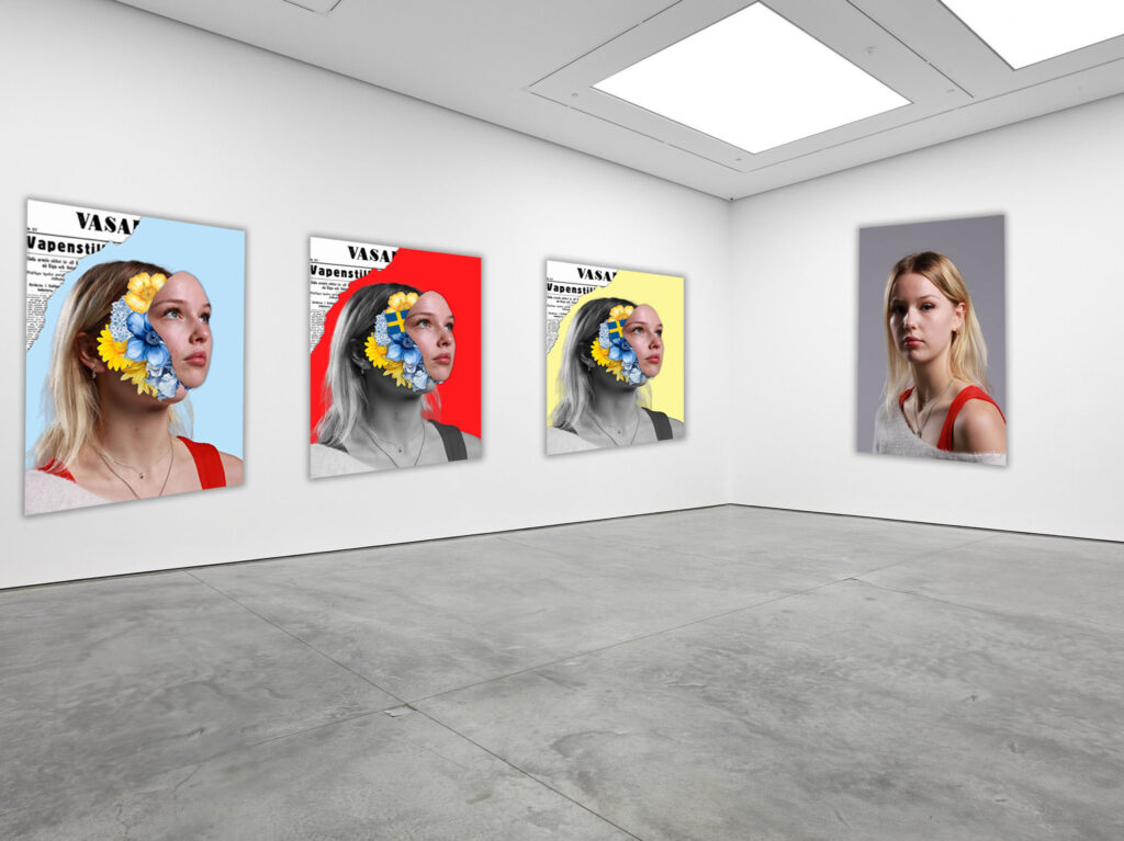
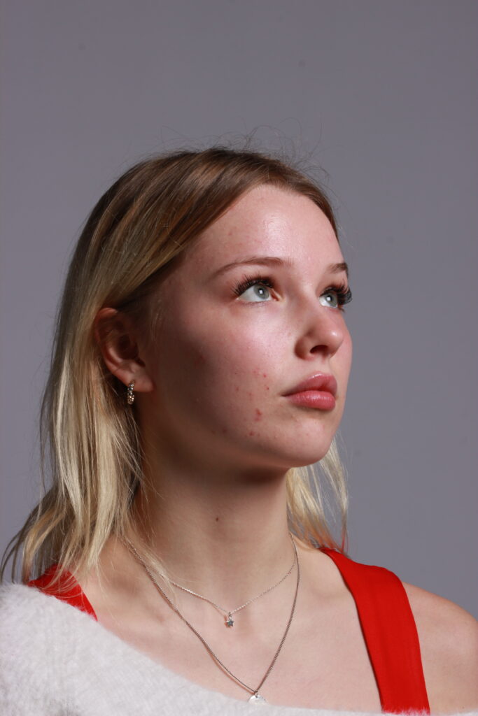
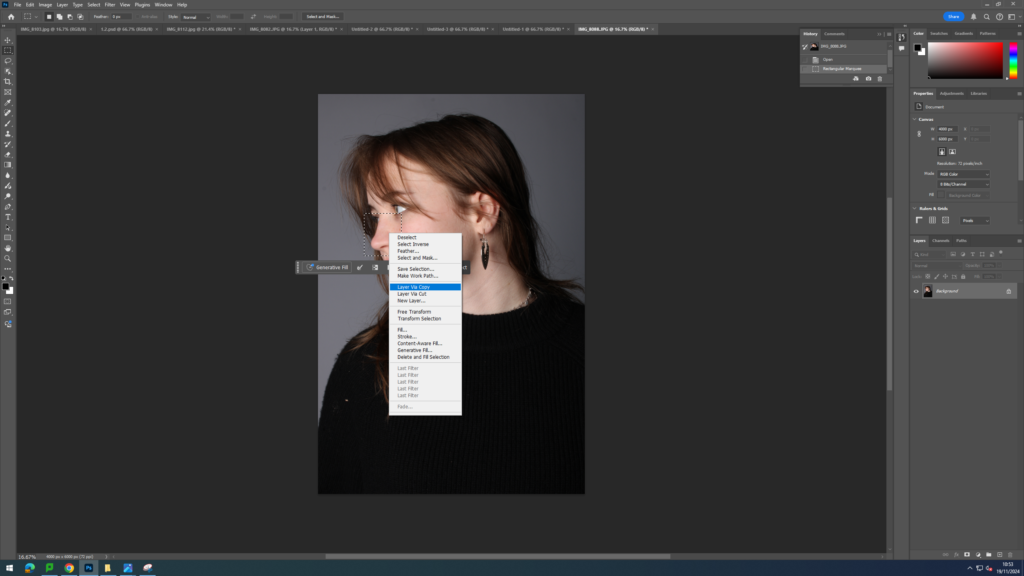
For this photoshoot, I was inspired by Marcelo Monreal. I began the editing process by first selecting an image of my model where she was slightly on her side (which would allow me to bring her face out to the side later). I then used the object selection tool to create an outline around the model then pressed layer via copy. I then dragged this cut out onto a blank white piece of A4 paper.
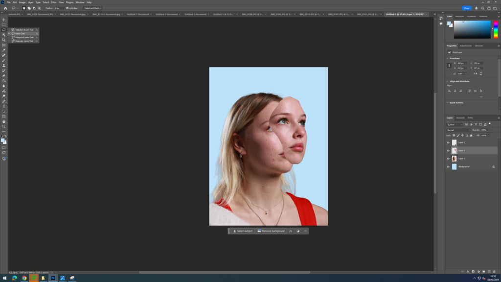
Next I used the lasso tool to make a shape on her face and then dragged out that shape to the side to give the illusion of a mask coming off of her face, revealing her true self. I then went onto google and searched up yellow and blue botanical flower prints. I chose these colours as the model is from Sweden and the colours seen on their flag is blue and yellow. This made my idea more personal and about identity as I incorporated her heritage into the image, which is a part of her identity.
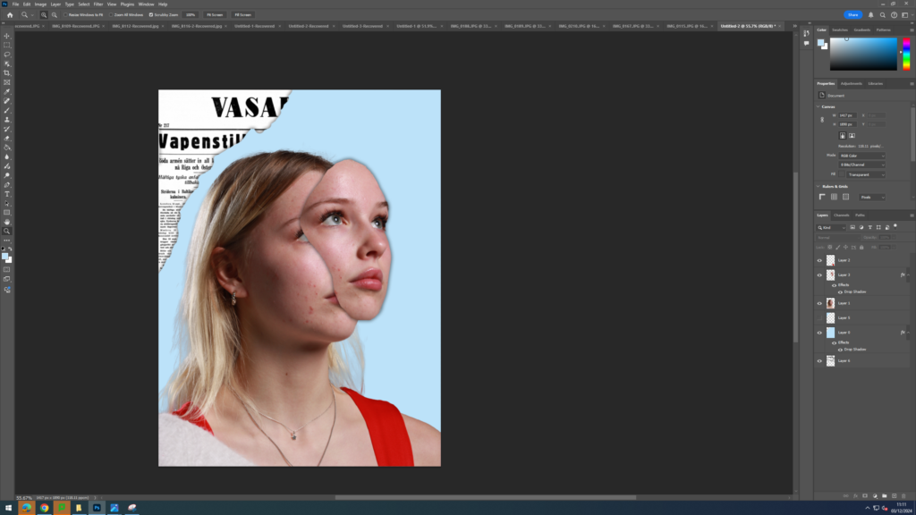
Once I had selected a flower, I used the object select tool to make a cut-out of the flower and dragged it onto the model. Then, I had to bring the flower layer below the face cut out so that the flowers were behind the model. I repeated this step many times until I had the desired amount of flowers. I also experimented with adding a Swedish flag amongst the flowers. Finally, I experimented with different background colours and layouts. Ultimately, I decided to add an image of a Swedish newspaper in the corner in order to emphasise the point of the image being about showing her identity. I then tried different colours for the background eg red, blue and yellow. I think the red background made the model pop the most due to the extreme contrast between the black and white model and the red in the background.
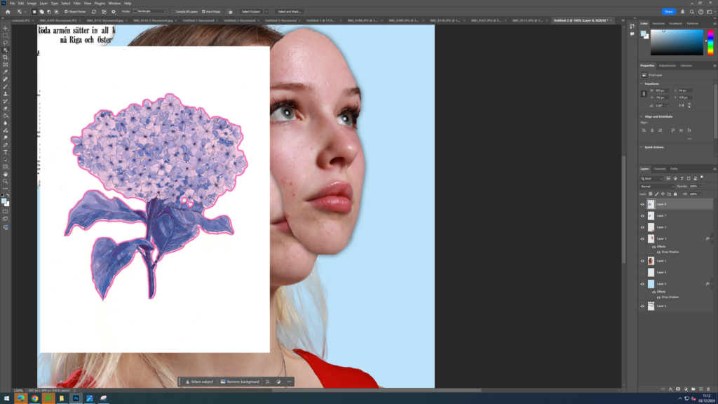
This is the photograph of the model I decided to use and the kinds of flowers I wanted to incorporate in my design.
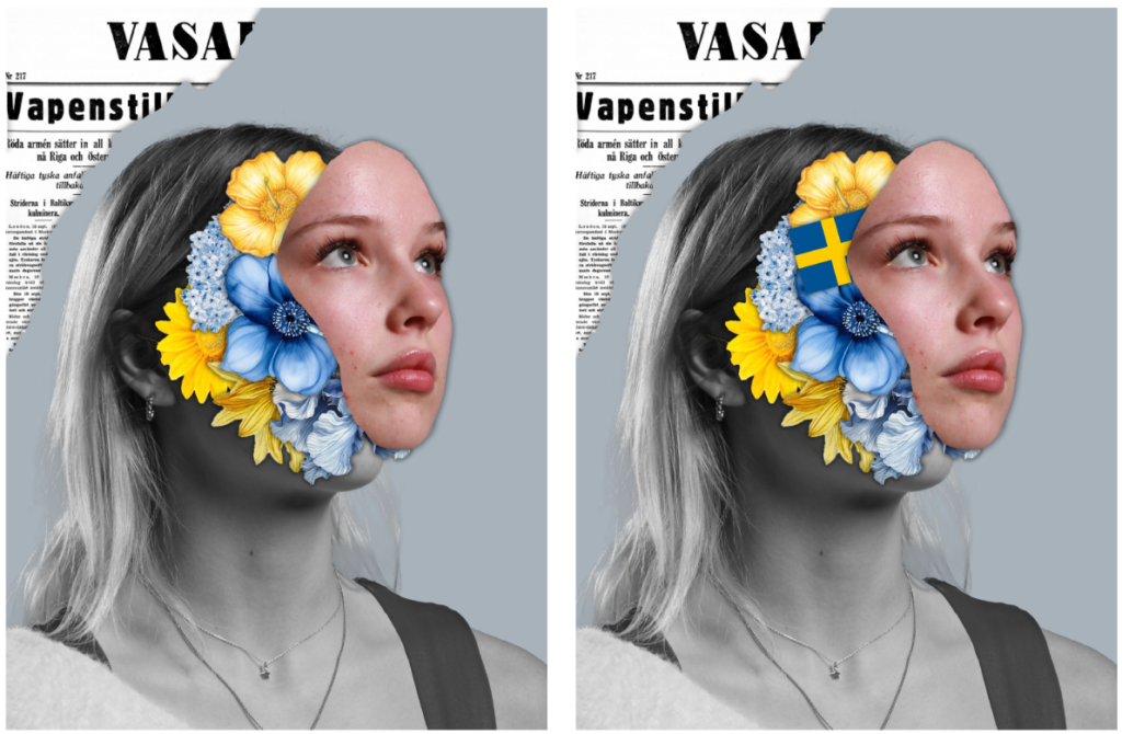
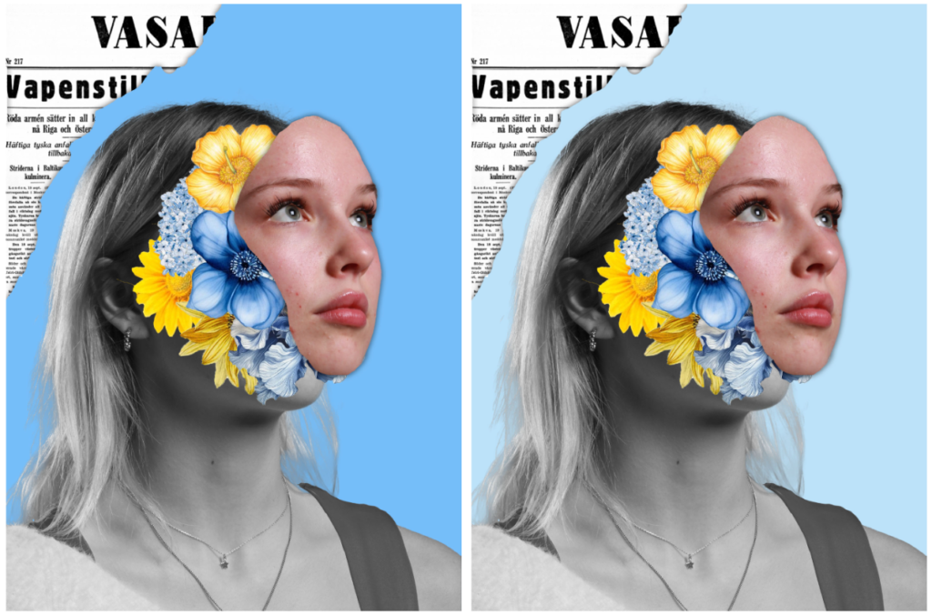
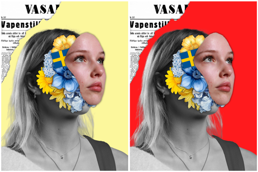
Overall, I like how this idea came out as I managed to successfully resemble the work of Marcelo Monreal but was still able to add my own personal take on it by making the flowers inside of the models head be about her identity by showing the colours of the Sweden flag (which is where she is from). I also liked the idea of adding a rip into the background and adding an extract from a Swedish newspaper to emphasise the point of image being about her identity in the form of her heritage/ upbringing. Next time I would like to experiment with people from other cultures and instead of flowers, add objects that are associated with that place so it makes it clearer what I’m trying to convey.
Marcelo Monreal is a Brazilian visual artist and photographer known for his unique approach to digital art and photography. He combines elements of portrait photography with surreal and sometimes abstract digital manipulation. Monreal often incorporates nature, architecture, and surrealist imagery, blending human faces with intricate designs, textures, and natural elements like plants or animals, creating visually striking and thought-provoking compositions. His work tends to challenge traditional boundaries in portrait photography, making him a distinctive figure in contemporary visual art.
Marcelo Monreal’s floral portraits are a captivating series where he merges human faces with vibrant, intricate floral elements, creating surreal and symbolic images. The portraits typically feature human subjects with portions of their faces or features replaced or integrated with flowers, leaves, and other organic elements.
Marcelo Monreal’s floral portraits deeply explore the theme of identity by merging human faces with organic elements like flowers, leaves, and plants. This fusion reflects the fluid and multifaceted nature of identity, suggesting that it is not fixed or singular but rather something that evolves, grows, and changes—much like nature itself.
In summary, Marcelo Monreal’s floral portraits use nature as a metaphor for the evolving, interconnected, and multifaceted nature of identity. By blending the human form with organic, ever-changing elements, Monreal captures the complexity and fluidity of what it means to be human.
Marcelo Monreal has shared insights into his floral portraits project, expressing that it is an exploration of the relationship between the human being and nature. In interviews and statements, he has emphasized how these portraits reflect his fascination with the fluidity of identity and the interconnectedness of humanity with the natural world. He views the human face as a symbol of identity, and by incorporating elements like flowers and plants, he aims to redefine traditional portraiture by highlighting the organic and evolving nature of who we are. He sees flowers as metaphors for human emotions, growth, and the cycles of life, and uses them to convey how identity can be shaped by both internal and external forces.
Through this project, Monreal invites viewers to question the boundaries between the human form and nature, suggesting that identity is not static but rather a dynamic process, constantly influenced by both our inner world and the external environment. The blending of the face with nature is also, for Monreal, a way of challenging conventional notions of beauty and exploring the fragility and strength inherent in both humans and the natural world. Overall, Monreal’s floral portraits are a reflection of his desire to capture the complexity of human identity through the lens of nature, symbolizing growth, transformation, and the transient yet interconnected aspects of life.

For this part in my project, I decided to experiment with AI which is something I hadn’t explored yet. I came across this idea accidentally when I was trying to change the facial expressions on my models face and noticed that every time it would alter her complete face, making her into a different person essentially instead of just changing a specific facial feature. The AI generation tool made 3 completely different, unique faces from the same model.
I decided to do this idea of experimenting with AI as I felt it linked with my project on identity. Through using the AI generation tool on photoshop, I was able to create completely different people just by adding simple sentences such “make it so that the model is smiling” to which it then completely changed the face as well. This highlighted to me the idea that people can easily hide behind a façade these days as they have access to these easy to use tools that drastically change one’s appearance. Additionally, it emphasised to me the fact that you can’t trust what people really look like online as there are so many filters/ edits people use in order to make themselves come off in a different way: whether that be making themselves look more attractive or wealthier, we are constantly exposed to fake versions of people which then causes unrealistic expectations to be formed about how people should look. I think this shows how easily identity is doctored in the present day and how people often lose their own sense of identity due to the tools that distort who they really are. I like how this idea came out as I think it highlights how social media is often filled with fake versions of people who alter themselves in order to fit in with societal expectations.
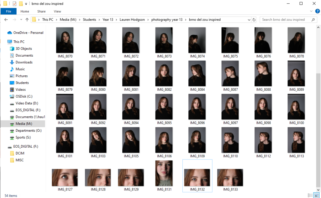
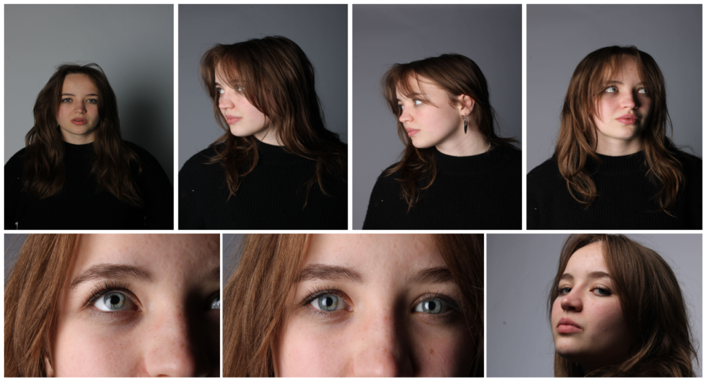
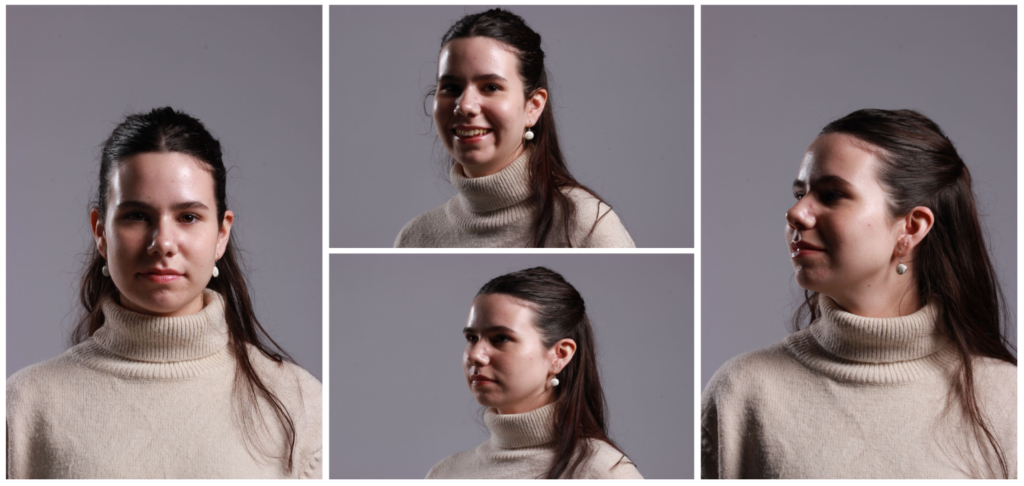
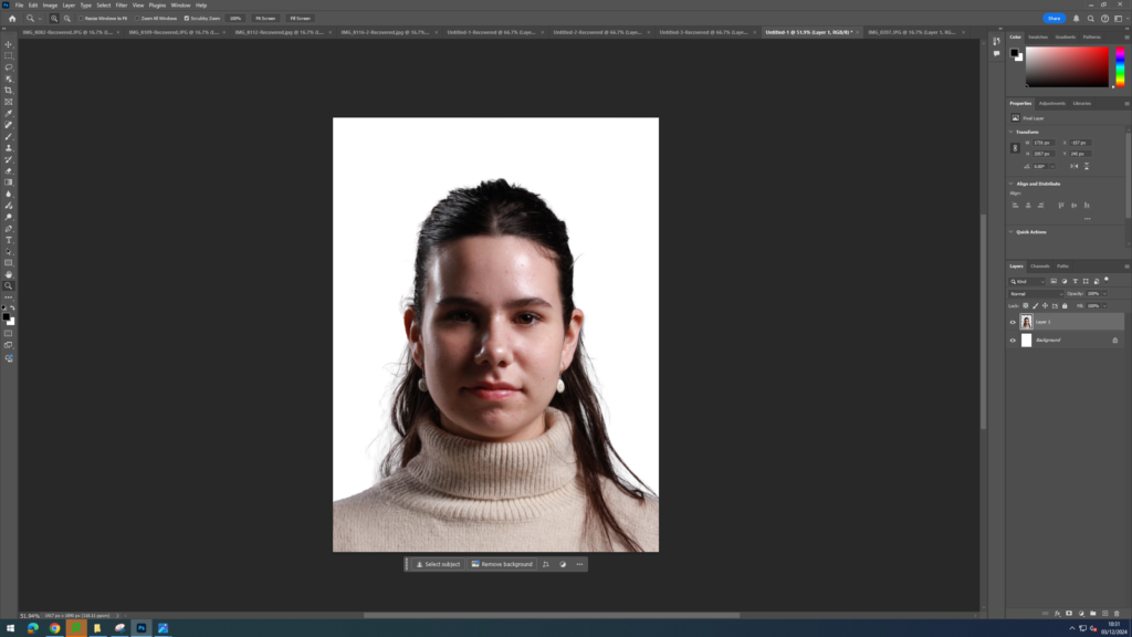
For this photoshoot, I went into the studio and took some close up headshots of a girl. I made sure to capture her from a variety of different angels by getting her to face different directions. I also placed a light source directly in front of her face to make sure the images would be well lit and the camera would pick up every detail on her face. Once I had finished taking my pictures, I imported them into Lightroom and began the narrowing it down process. This involved me giving each image either a white flag or black flag then giving a rating out of 5 to all the images I had previously given a white flag to. I then adjusted the exposure, contrast, blacks, whites and shadows of the images. Then I exported them into a folder which I could then open up in photoshop.
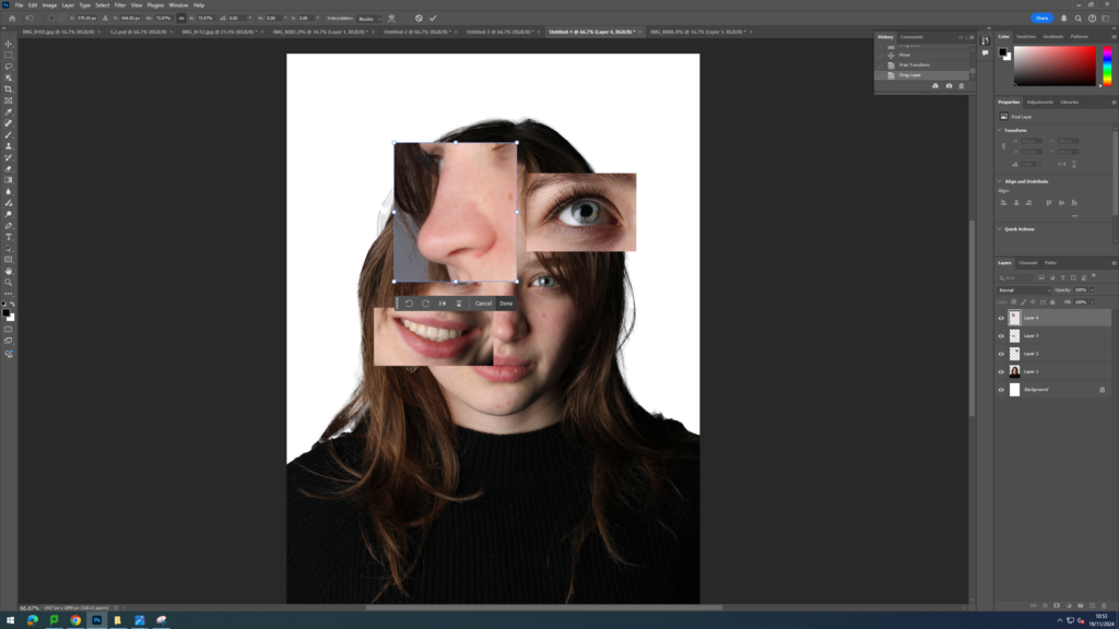
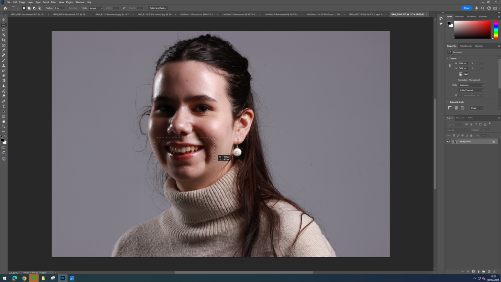
To begin my editing process, I first chose the image I wanted to have in the background as my vague guide to where I should place the cut outs which would make a different, distorted face. I then cut out only the model from the image using the object selection tool and placed her on a blank piece of white paper as Brno Del Zou’s images are typically on white backgrounds but my background before was grey.
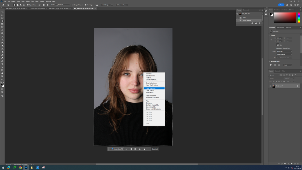
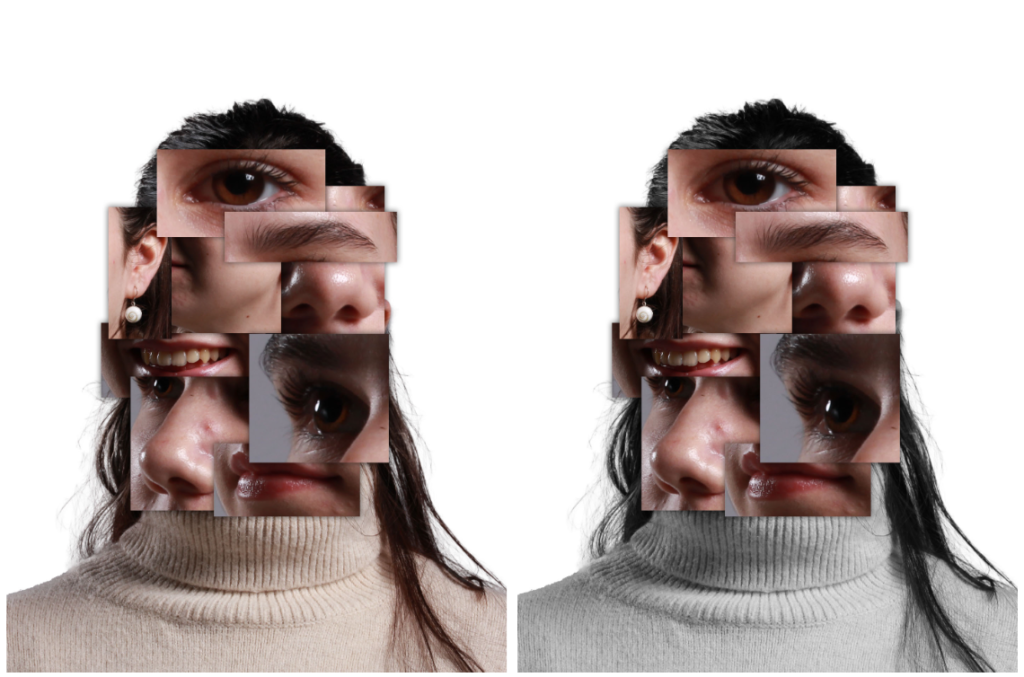
I then selected 7 other images that I wanted to use to get different parts of her face from different directions. I opened one of these images and used the rectangular marquee tool to create a box over the facial feature I wanted to use eg lips. I then dragged this cut out onto the full face image and adjusted it using ctrl t. Once I was happy with its placement I opened up a different image and repeated the process once again but with a different facial feature. When taking the images in the studio, I zoomed the camera into the model more in certain photographs so I could really capture a specific part of her face. This allowed for the random enlarged features seen in Brno’s work to be replicated in mine. Once I had completely reconstructed her face, I then decided to add a drop shadow to all of the cut outs to give my images some more depth and emphasise the idea that it was a face many out of lots of different images.
Finally, I experimented with the use of black and white. I created some images where the whole image was black and white as seen in Brno Del Zou’s work, but also created some where only certain boxes were black and white whilst the others remained in colour.
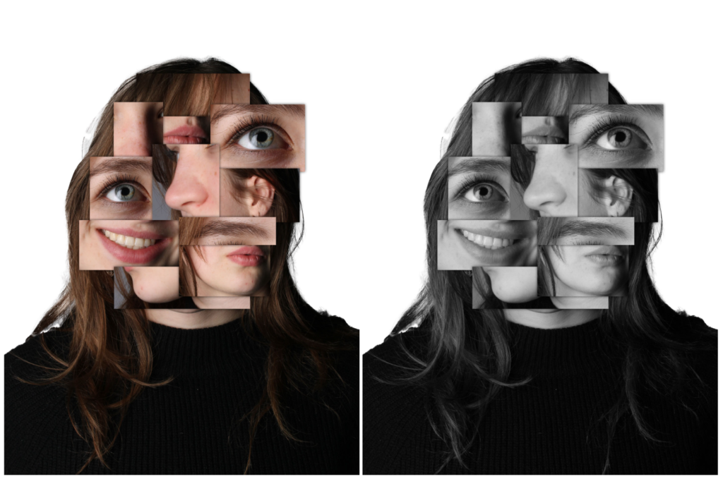
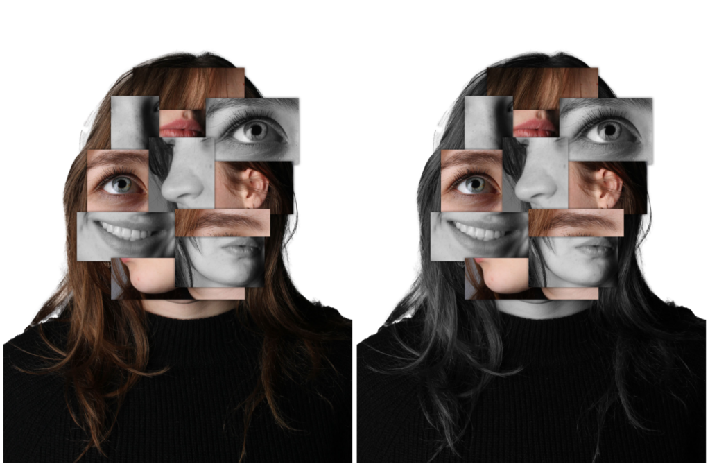
Overall, I like how this idea came out as I managed to closely resemble the work of Brno Del Zou whilst also adding my own twist on his idea. However, I may attempt to do this idea again but with a different model as I have used the same one quite a lot and I want to expand on the idea of identity in young people not just one person.
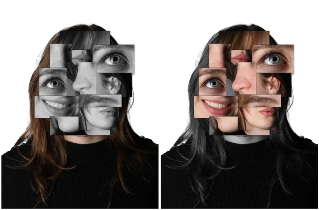
For this second photoshoot, I used photographs of another model I had previously taken in order to get different people in my project and therefore different identities as before it only consisted of one person. I completed the same process as described above to create my final image.
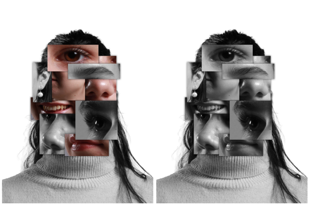
I like how these pieces came out as I also used images where she was smiling and then looking sad in order to portray the many emotions one may feel when trying to discover who they are and discuss the complexity of being human simultaneously. However, I would like to further this idea even more by using multiple people to make one face as I think this would portray how there’s such a vast amount of people in the world, each with their own unique identities.
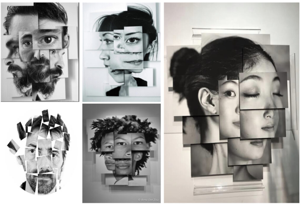
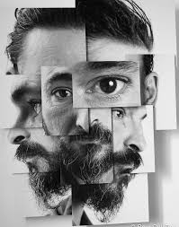
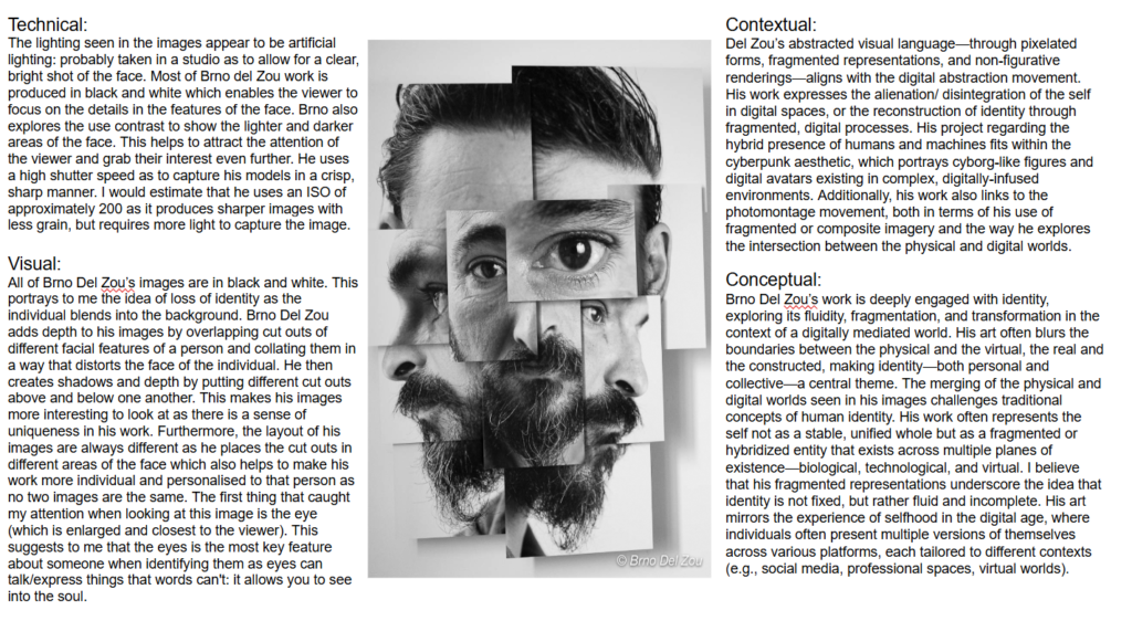
Brno Del Zou is a musician, photographer, sculptor, videographer, software designer, creator of video / sound / interactive installations. After a doctorate in theoretical mechanics, a teaching and research position in information and communication at the University of Poitiers, the creation and management of a university research laboratory on mediated learning, Brno Del Zou now devotes himself exclusively to his artistic productions. His portraits and bodies, in “Photo-sculptures” or video animations, have toured the planet and inspired many artists. Brno del Zou is a French artist/photographer born in 1963. In his “photo sculptures” series, Brno del Zou uses the fragmentation of the body in order to better understand it. Brno del Zou layers various cropped photographs of the face taken from various angles to create a distorted overall portrait. Most of Brno del Zou work is produced in black and white which enables the viewer to focus on the details in the features of the face. Brno also explores the use contrast to show the lighter and darker areas of the face. This helps to attract the attention of the viewer and grab their interest even further.
How he links to identity
Brno Del Zou’s work often plays with themes of identity, transformation, and concealment. His photography typically explores the tension between the surface appearance and deeper identity, blurring the lines between reality and illusion. This can manifest in several ways such as using lighting, shadows, and abstract compositions to create a sense of visual ambiguity, where the viewer is uncertain about what they are seeing. This suggests that nothing is as it seems, and the true essence of a person or concept is obscured—echoing the idea of disguise as a means of hiding or transforming one’s true nature. In this way, Del Zou’s photography invites a dialogue about identity, self-presentation, and the masks we wear, whether consciously or unconsciously. His approach links closely to the theme of disguise, offering a nuanced exploration of how we conceal, reveal, and alter ourselves in the context of society and personal expression. He often expresses that “photography can act as both a mirror and a mask, revealing and concealing aspects of the subject”. I think his images clearly link to the theme of seek observe and challenge as he is not only looking at the person he’s photographing but also seeking understanding by capturing them from all angles which is more vulnerable than a straight on single shot then encompassing all those separate images to create one whole, real image of that person where they cannot hide any part of themselves. Therefore challenging their natural instinct to hide their true selves.
•“Fragmenting the body doesn’t mean cutting it up in order to dissolve it, it means trying to recompose it in the hope to achieve and create unity, an identity, perhaps the fundamental one, the one that supports all the differences, all the variations, all the points of view, which is saved despite everything, despite the light variations and the positions in the space, resisting any immediate apprehension, multiplying as it wishes, without ever losing this unity without which the body itself could not exist.” I believe here he is trying to convey the idea of capturing someone from many different viewpoints and variations in order to try and get the most real, whole sense of that person, despite the image looking fragmented these individual pieces allow us to see the person in every angle which could be seen as vulnerable and which you couldn’t get with just one photograph straight on.
•“In the manner of the first cubists, a body, a face, or even a landscape, can be represented from different points of view both on the same plane space. For my part, I add a “thick” compared to the canvas of painters. But the process is the same, I am as faithful, perhaps even more, to the subject photographed by representing it from different angles, different scales, than by using the unique point of view of classical photography.”
(https://www.kooness.com/artists/brno-del-zou)
David Hockney is a renowned British artist known for his contributions to painting, drawing, printmaking, and photography. In the context of photography, Hockney is particularly famous for his innovative exploration of photo-collage and multi-image compositions.
One of his most significant photographic works is the joiners series, which he began in the 1980s. In these works, Hockney took multiple Polaroid photographs or 35mm snapshots of a single subject from various perspectives and then arranged them into a grid-like collage. The resulting images present a fragmented, yet cohesive, view of a scene, emphasizing the passage of time, movement, and the subjective experience of vision. This technique reflected Hockney’s interest in how the mind perceives and processes visual information, challenging traditional notions of perspective and photographic representation.
Hockney’s approach to photography is often seen as a bridge between the worlds of painting and photography, pushing the boundaries of both media. His work in this area was part of a broader exploration of how visual art can represent time, space, and multiple viewpoints simultaneously.
David Hockney’s work is often linked to Cubism due to his exploration of multiple perspectives and the fragmentation of visual space, similar to what was pioneered by artists like Pablo Picasso and Georges Braque in the early 20th century. While Hockney is not a Cubist in the traditional sense, his use of collage, the reordering of visual elements, and the representation of time and space in non-linear ways bear a clear influence from Cubism.
Key ways Hockney connects to Cubism:
Multiple Perspectives: One of the core ideas of Cubism was showing an object from multiple angles simultaneously. Hockney adopted this idea in his photography and painting. For example, in his famous joiners series, he used multiple photographs of the same subject taken from different angles and arranged them to depict a scene in a fragmented, Cubist-inspired way. The result is a multi-dimensional view of a moment, much like how Cubist artists would depict a subject from various viewpoints in a single work.
Collage and Assemblage: Like Picasso’s collage techniques, Hockney also employed collage in his photography, combining many images to form a larger composition. This aligns with the Cubist tendency to deconstruct and reassemble reality in a fragmented form.
Time and Space: Cubism challenged traditional perspectives of space by representing subjects from different angles simultaneously, allowing for a more complex, layered depiction. Hockney’s photo collages achieve a similar effect by showing the passage of time within a single image. In his joiners, the viewer can see different moments and viewpoints of the same subject, which echoes the Cubist interest in representing time and space as fluid and interconnected, rather than fixed and linear.
Flatness and Abstraction: Hockney also experimented with the flattening of space, a characteristic of Cubism. His works often defy traditional perspective, with figures and objects appearing fragmented and disjointed, emphasizing flatness and abstraction, much like Cubist paintings.
In sum, while Hockney’s style is not strictly Cubist, his work draws on many of the techniques and ideas that defined the movement, particularly in terms of reimagining how we perceive and represent space, time, and perspective in art.
In his joiners series (photographic collages), Hockney deconstructs the traditional idea of a singular, static identity by fragmenting the image and presenting it from multiple perspectives. This approach suggests that identity is not a fixed or singular thing but is instead constructed from many different viewpoints, experiences, and moments. Just as the collages break down and reassemble a subject, identity itself is presented as something dynamic, evolving, and open to reinterpretation.
Overall, Hockney’s work suggests that identity is not a static or singular thing, but rather a continuous process of change and reinvention. Through his experimentation with different media and his constant revisiting of themes such as self-portraiture, portraiture, and the relationship between people and their environments, Hockney offers a nuanced and multifaceted view of identity as an evolving, dynamic experience. David Hockney’s exploration of identity is multi-layered, examining not only personal and sexual identity but also how identity is shaped by memory, time, environment, and perception. Through his diverse body of work, Hockney provides a complex and ever-evolving portrait of the self and others.
David Hockney is known for his use of multiple perspectives, particularly in his photographic joiners series, where he assembled photographs from various angles to create a fragmented but cohesive image. This approach challenges traditional perspectives and encourages a more dynamic understanding of time and space.
Brno Del Zou similarly plays with perspectives in his photographic work, often manipulating the viewer’s perception by presenting scenes from unusual angles, fragmented viewpoints, or by employing collage techniques. Both artists use the concept of perspective to challenge conventional ways of seeing and depict a more complex, multidimensional world.
2. Collage and Fragmentation:
Hockney’s joiners (photo collages) are famous for combining multiple photographs of the same scene into one large composition, fragmenting the image into parts while maintaining a cohesive whole. This approach reflects his fascination with the process of perception and time.
Brno Del Zou also uses collage techniques and fragmented imagery in his work, creating complex and layered compositions. Both artists embrace fragmentation not as a disintegration of the subject but as a means to deepen the viewer’s engagement with the image and explore new ways of experiencing a scene or subject.
3. Portraiture and Identity:
Hockney’s portraiture, whether in painting or photography, is deeply concerned with identity—how it can be represented through the interaction of people, environments, and emotional depth.
Brno Del Zou often incorporates identity exploration into his photographic work, using layering, light manipulation, and distortion to suggest different facets of a person’s identity. Both artists treat the subject of portraiture as an exploration of more than just the visual appearance, delving into psychological and emotional dimensions.
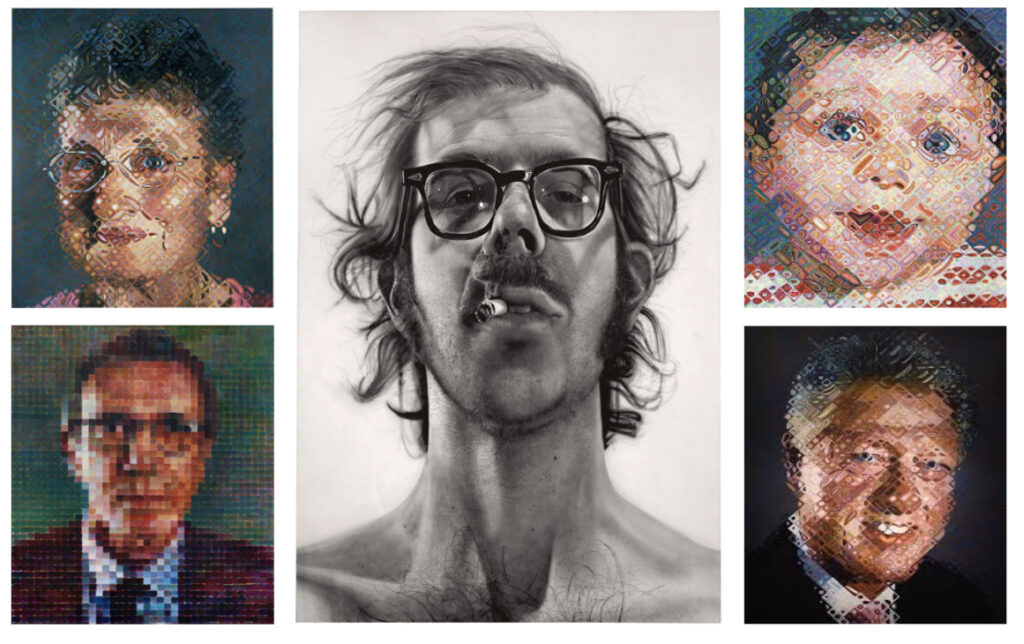
Chuck Close was an American artist renowned for his large-scale portraiture, which bridged the worlds of painting, photography, and printmaking. In the context of photography, Close is best known for his innovative work in photo-based portraiture, where he applied photographic techniques and processes to create highly detailed, often monumental portraits of his subjects. His approach to photography significantly influenced contemporary art, especially in the realm of hyperrealism and photo-realism.
One of the defining aspects of Close’s work was his use of the grid method, which he applied both in painting and photography. He would divide a photograph into a grid of small sections and replicate each section on a larger scale. This method allowed him to focus on minute details, leading to the high level of precision and realism that his works are known for. This process, while rooted in photography, also aligns with artistic traditions in painting.
Close’s work in portraiture explores identity and individuality. His large, close-up portraits often focus on the face, allowing for an intense scrutiny of the human condition. These works highlight the uniqueness of each subject while also drawing attention to the texture, form, and subtleties of human features, often rendered with a photographic precision.
Chuck Close’s work stands as a pivotal example of how photography can intersect with painting, particularly in the realm of portraiture. His use of photography to capture and render the human face with extreme attention to detail reshaped the way that both mediums were perceived. Close’s work has had a lasting influence on both the fine art world and contemporary photography, particularly in terms of how we think about identity, representation, and the artistic process.