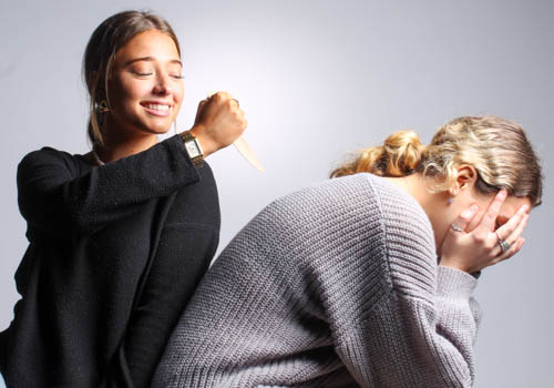
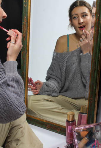
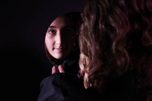
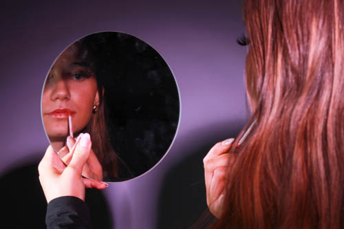
All posts by Katie Robbins

Filters

Author:
Category:

Inspirations for my photoshoot

In my headshots I am going to use a range of photographers to inspire my work so that I can make my images more exciting and mysterious.

Thomas Ruff:

I would like to use inspiration from Thomas Ruff’s work as his images resemble a passport photo using the deadpan aesthetic. This would be the criteria for his subjects.

  • eyes must be open and clearly visible, with no flash reflections and no ‘red eye’
  • facial expression must be neutral (neither frowning nor smiling), with the mouth closed
  • photos must show both edges of the face clearly
  • photos must show a full front view of face and shoulders, squared to the camera 
  • the face and shoulder image must be centred in the photo; the subject must not be looking over one shoulder (portrait style), or tilting their head to one side or backwards or forwards
  • there must be no hair across the eyes
  • hats or head coverings are not permitted except when worn for religious reasons and only if the full facial features are clearly visible
  • photos with shadows on the face are unacceptable
  • photos must reflect/represent natural skin tone

I really like this form because the photographs produced are clean cut and look extremely formal.

The Deadpan Aesthetic:

The word “Deadpan”  can be traced to 1927 when Vanity Fair Magazine compounded the words dead and pan, a slang word for a face, and used it as a noun. In 1928 the New York Times used it as adjective to describe the work of Buster Keaton, however Thomas Ruff familiarised himself with this aesthetic i his work too.

Deadpan photography shows people in their natural state, emotionless and detached. These subjects are not posed, are not dressed up for the occasion, and seem completely honest. I really like this aspect because it gives a tone of authenticity to the work and broadcasts people in the real world truthfully.

This style originated in Germany and is descended from Neue Sachlichkeit, New Objectivity, a German art movement of the 1920s that influenced the photographer August Sander who systematically documented the people of the Weimar Republic.

Deadpan portraits are typically shot in a straightforward, uncontrived manner. The photographer does not use any special angles, lighting, or props to create an emotional or dramatic effect. Instead, the subject is simply captured as they are, in their natural environment.

In my work, I could use coloured gels to add more life and saturation into the image as my subjects will be emotionless.

Bruce Gilden:

Bruce Gilden is one of the most iconic street photographers known for his confrontational and graphic images of a close-up subject. His work is around this due to being fascinated by the life on the streets and the complicated and captivating motion it involves in his childhood. His work has a high degree of intimacy and directness which have become signature in his work called FACE. Typically, people used are not the average person and have blemishes or look uncomfortable/awkward. Many people may say he is the most aggressive street photographer due to the rawness and realness of his images.

I like this aspect of his work because once again it documents the reality of life on the streets of places such as  America, Great Britain, and Colombia during 2012-14

Man Ray:

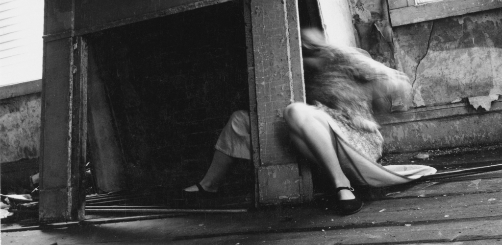
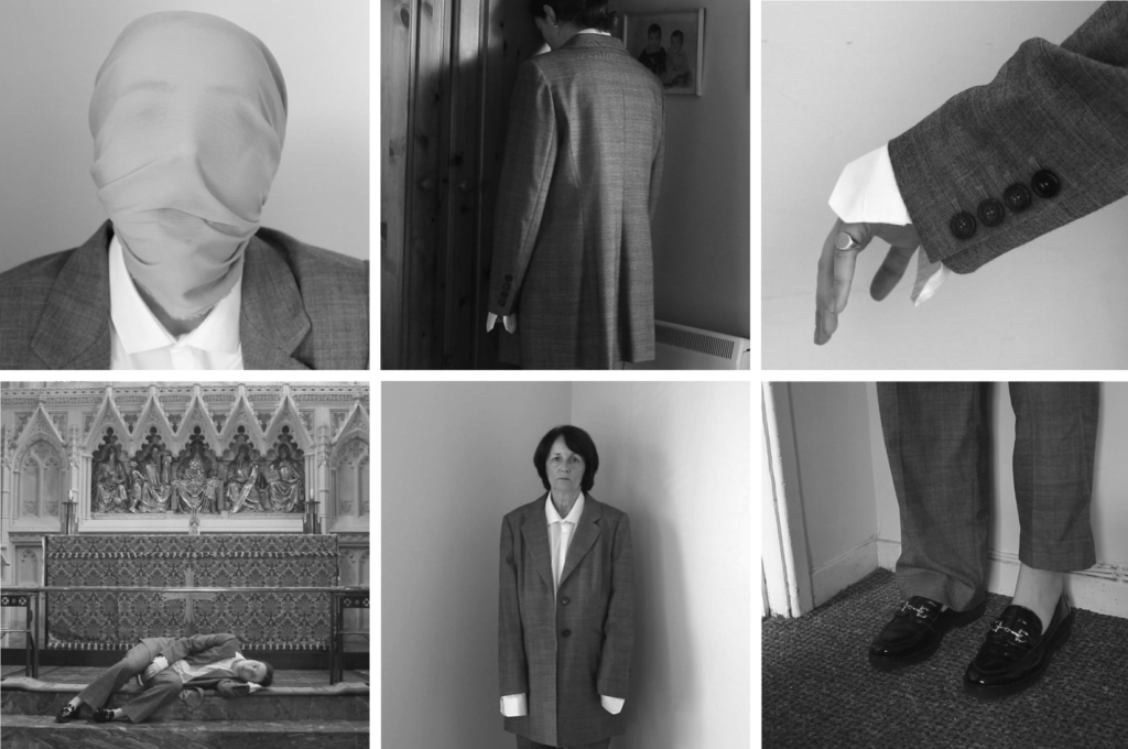
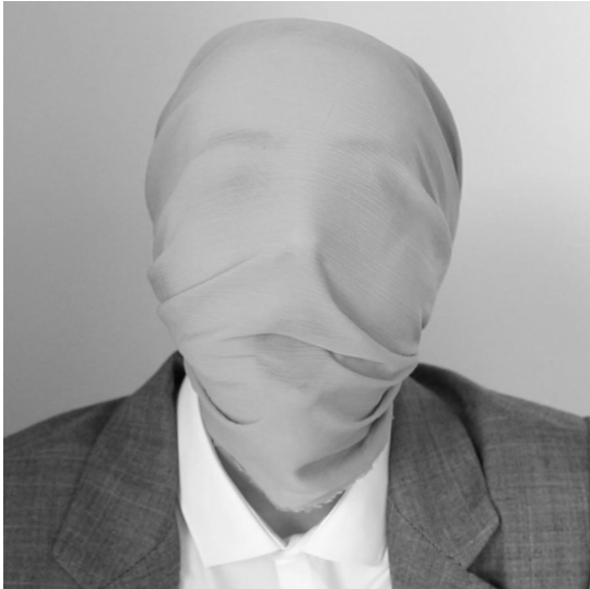
Man Ray took multi exposure photographs which is something that greatly intrigues me in my work as they provide a great sense of mystery to the viewer. I also personally feel that the images this technique creates can resemble identity depending on how the subject is represented, such as this:

Man Ray made his “rayographs” without a camera by placing objects-such as the thumbtacks, coil of wire, and other circular forms used here-directly on a sheet of photosensitized paper and exposing it to light.

Usually, to take multi-exposure photographs you:

  1. Take your first photo. The camera shutter opens to expose the film to one image, then closes.
  2. Rewind the film and take your second photo.
  3. Develop both images in one photo

Examples of his work:

Surrealism:

Man ray was a surrealist photographer, which is what multi-exposure photography stems from. Artist have used these techniques to explore Surrealist Ideas and evoke dream-like imagery, or imagery that explores time / time lapse.

Surrealism aims to revolutionise human experience. It balances a rational vision of life with one that asserts the power of the unconscious and dreams. The movement’s artists find magic and strange beauty in the unexpected and the uncanny forms of the human face, the disregarded and the unconventional.

This art form was developed in Europe in the aftermath of World War I. The art produced depicted unnerving, illogical scenes and developed techniques to allow the unconscious mind to express itself. 

It can be described as : “psychic automatism in its pure state, by which one proposes to express – verbally, by means of the written word, or in any other manner – the actual functioning of thought.” – André Breton said this which can be more simply defined as an artists way of seeing past reason and rationality, thinking outside the box into something that makes the viewer question the image. This can be described as a dream-like art form.

Technical – Headshots

Definition: a type of portrait photography typically used for websites, press releases, publications, and social-media profiles.

The term “headshot” or “head shot” just means that the portrait photo is cropped somewhere in the middle torso – so that the focus is on your face. The subject’s face should be the main focus, and the framing should be done in a way that draws attention to the eyes and facial expressions.

In headshots it’s important to consider:

  • Lighting: soft, hard
  • Framing: Headshots
  • Focusing: focus on the eyes
  • Expression: Explore different moods and emotions.
  • Pose: Manner and attitude. Use hands too…

Soft and hard lighting:

Soft lighting has a few hard shadows that’s bright yet balanced. The transition between light and shadow is a gradient instead of being bold and separate from one another.

Hard lighting does not only emphasize facial features, it also create the dark and broody mood you want with a tone of mystery. Chiaroscuro and Rembrandt are good techniques to achieve this as they cast harsh shadows and draw attention to a specific part of a photo. In hard lighting, the transition between the light and the shadows is very harsh and defined.

Framing:

Rule of thirds is a good technique in framing the face in headshots so that the face is equally distributed across the image. For example, you should aim to align your eyes with upper-third line of the grid when cropping tight, and if you’re cropping wider, be sure that your head is positioned within the top third of the image. However if you are looking to be more creative you can alter this technique. The subject should look relaxed and confident by keeping their chin up and making eye contact.

Focusing on the eyes:

By placing your camera directly in front of your subject it allows fine-tune and focuses on the eyes, making them sharp. This way the colour and pattern in the eyes can be seen more as they are the most distinct part of a persons face. This makes the image more engaging for the viewer where they can look around the image more. Reflectors can help this.

Expressions and emotions:

Exploring different expressions is important as it highly reflects the mood and tone of the image especially if paired with the appropriate lighting. You want to project confidence and competence to make others feel at ease. The face is the centre of attention so it is important to have a compelling expression, yet not to over-do it entirely as this may make the image unappealing.

Posing:

The pose performed in the image also sets the tone and mood for the image. This can act as a cue for an emotion out of the viewer too so that it makes them feel something. The hands are very useful in this as they can also conceal certain areas of the face and add to the emotion of the subject. For example, the Power Pose is a classic stance that exudes confidence and strength. Stand with your feet shoulder-width apart, place your hands on your hips, and tilt your chin slightly up. This pose will make you look assertive and in control – perfect for professional headshots.

The camera settings I am going to use:

Camera settings (flash lighting)
Tripod: optional
Use transmitter on hotshoe
White balance: daylight (5000K)
ISO: 100
Exposure: Manual 1/125 shutter-speed > f/16 aperture
– check settings before shooting
Focal lenght: 105mm portrait lens

Camera settings (continuous lighting)
Tripod: recommended to avoid camera shake
Manual exposure mode
White balance: tungsten light (3200K)
ISO: 400-1600 – depending on how many light sources
Exposure: Manual 1/60-1/125 shutter-speed > f/4-f/8 aperture
– check settings before shooting
Focal lenght: 50mm portrait lens

Headshots: Experimentation

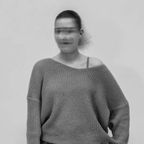
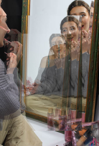
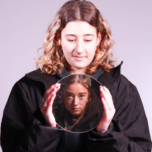
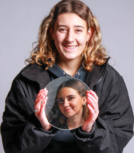
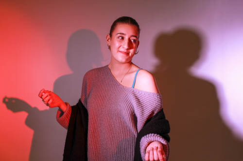
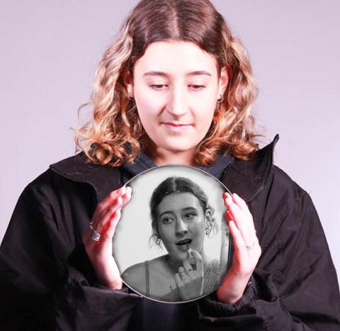
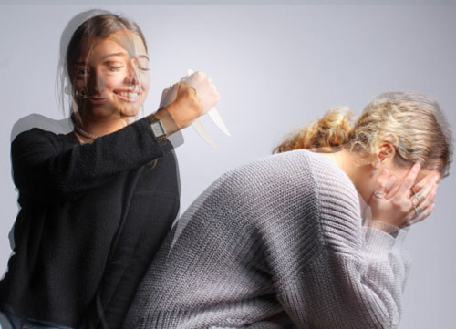
I used photoshop to create these multi-exposure images using the photos from my headshots photoshoot. I did this by layering the images over one another and using blending options to change the opacity of the second image so that they would both be visible to give that mysterious look that I was trying to achieve. I think this has worked very well especially due to the coloured gels I used for my lighting as this made it more interesting to look at.

I especially like the last image as one image was a warm toned lighting however the other was cool toned which are polar opposites. I wanted to merge these together as they were separate sides of her side profile and I think its made the image look very mysterious. I like the way she’s smiling on the warm side however it’s unable to see her expression on the blue side, giving the impression it represents sadness.

Headshots photoshoot plan

In my photoshoots, I want to experiment to demonstrate more creativity than I did in my portraits to make them more exciting for the viewer.

First experimentation:

For my first plan I am going to use a Diamond Cameo. This is where four small oval portraits (1″ x 3/4“) were placed on a carte de visite in the shape of a diamond, each portrait being of the same person photographed in a different position. To do this in my photoshoot I am going to have my subject sit straight on, side profiles of the left and right, then looking slightly off to the side of the camera. Then I will arrange it into the correct format shape – the diamond.

Second experimentation:

I am going to use double/multi exposure for my second experiment. This is photographs in which two or more images are superimposed in a single frame which gives off a very mysterious look due to the illusion it gives. I really want to use this experimentation idea because it makes the image become really interesting and adds motion to the image. This can be achieved in the camera settings, or on Adobe Photoshop by creating layers and then using blending options and opacity control.

Third experimentation:

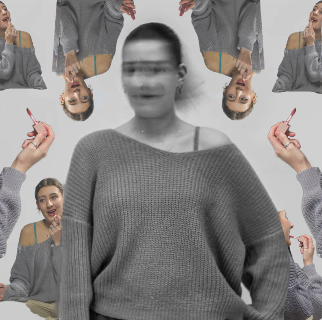
For this I am going to use photomontage as I have used this method before during my art gcse and I took a big liking to it as it was really effective. This method consists of making a composite photograph by cutting, gluing, rearranging and overlapping two or more photographs into a new image. I really like this as you take a regular boring image and create an interesting piece out of it by taking it entirely apart and joining it back together in a completely new way. It adds a new perspective on the image which is something I want to put into my own work.

Henry Mullins

Henry Mullins is one of the most prolific photographers represented in the Societe Jersiase Photo-Archive, producing in the 19th century. He captured 9,000 portraits of islanders from 1852 to 1873 at a time when the population was around 55,000, proceeding to place them in an order of levels of social class in albums. He began his career by working at 230 Regent Street in London in the 1840s, then moving to Jersey in July 1848, setting up a studio known as the Royal Saloon, at 7 Royal Square. Initially he engaged in a partnership with a Mr Millward yet very little is known about him. By the following year he was working alone and he continued to work out of the same studio for another 26 years.

Henry Mullins’ work of 19th century Jersey is highly politicised, taking images of Jersey political elite (E.g. The Bailiff, Lt Governor, Jurats, Deputies etc), mercantile families– involved in trade (Robin, Janvrin, Hemery, Nicolle etc.), military officers and professional classes such as doctors, bankers and advocates. He organised these images from the most powerful roles, to the lesser powerful.

Mood board of his work:

These images are only a small portion of the large amount of images he took, these images would then be placed into an album, presented as Cartes de visite:

Cartes de visite:

Defined as : ‘visiting card’ or a close-trimmed portrait photograph approximately 2¹/₄×3³/₄ in. intended as a substitute for a visiting card.

Mullins specialised in Cartes de visite, in which the photographic archive of La Société contains a large amount of these (online archive being 9600 images). The Cartes de visite small albumen print. This is described as the first commercial photographic print produced using egg whites to bind the photographic chemicals to the paper which is quite interesting as this is would be very rare to see now. Because the image emerges as a direct result of exposure to light, without the aid of a developing solution, an albumen print may be said to be a printed rather than a developed photograph. Usually, this consisted of a small thin photograph mounted onto a thicker piece of card, however Mullins placed is work into an album.

Many of these images contained the island’s most affluent and influential people, alongside officers of the Royal Militia Island of Jersey, for whom it was very popular to have portraits taken, as well as of their wives and children. The images of the officers document the change in generations as they do not look like the general person today, showing the fashion for long hair, whiskers and beards in the mid-1800s. Their appearance makes it difficult for the viewer to differentiate who is who as they were styled almost identically during this time.

Diamond Cameo:

This layout of final images is called a Diamond cameo due to the diamond-like shape produced by the placement of oval images. I do like this form of layout as it makes it more interesting rather than a regular image alone, or a regular layout of images side by side. It lets the viewer investigate the images more which is more engaging, also making it more aesthetically pleasing to the eye.

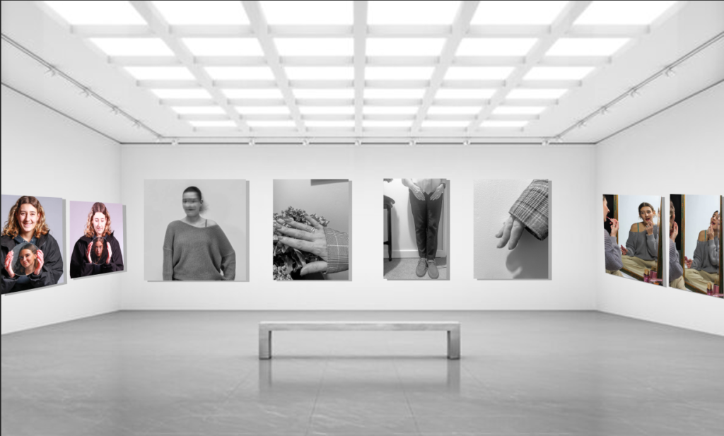
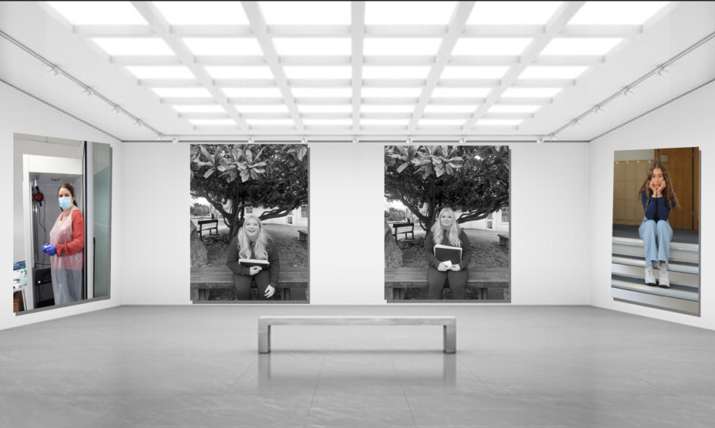
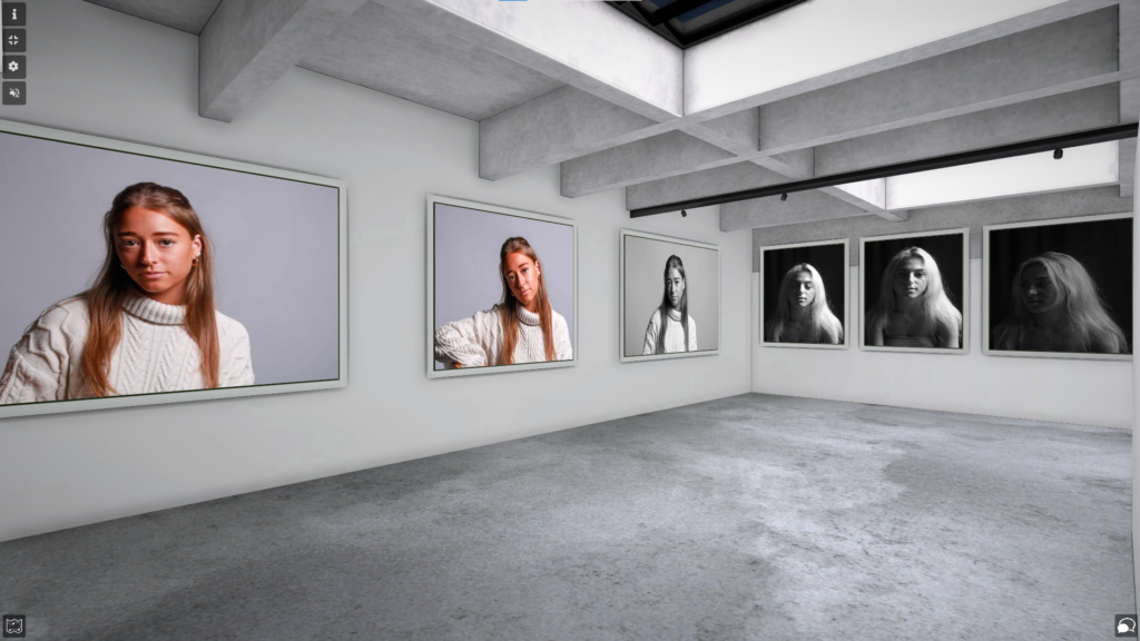
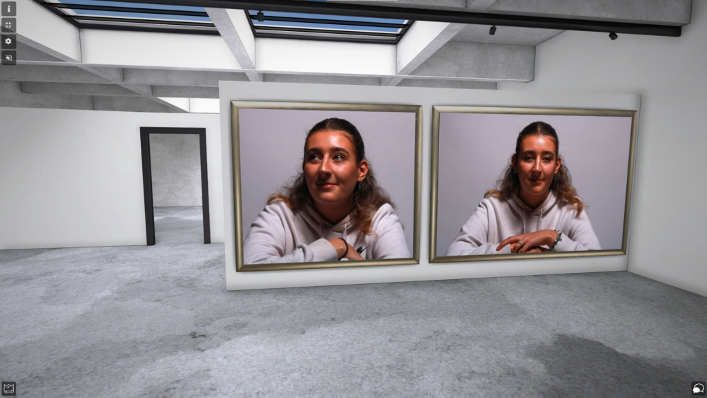
Portraits- virtual gallery

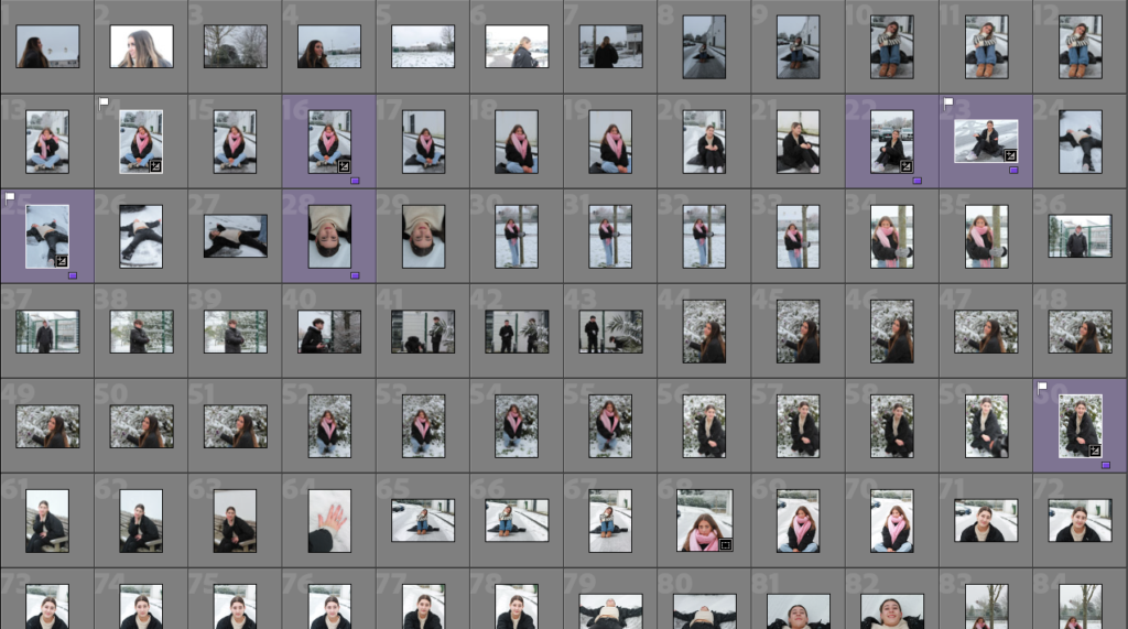
I made a virtual gallery to showcase my final and best images. I placed them on the basis of which lighting was used so it made more sense and were with images similar to it. I did this by exporting my edited images from Lightroom into my documents, then importing them in Artsteps where I was able to add frames and place them on the wall.

I exported them from Lightroom by placing them into a best images folder within my portraits folder for easy access.

I dragged and dropped my images into the exhibition in this way to import them.

Edited Chiaroscuro photoshoot

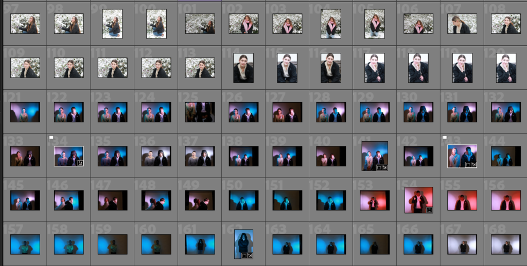
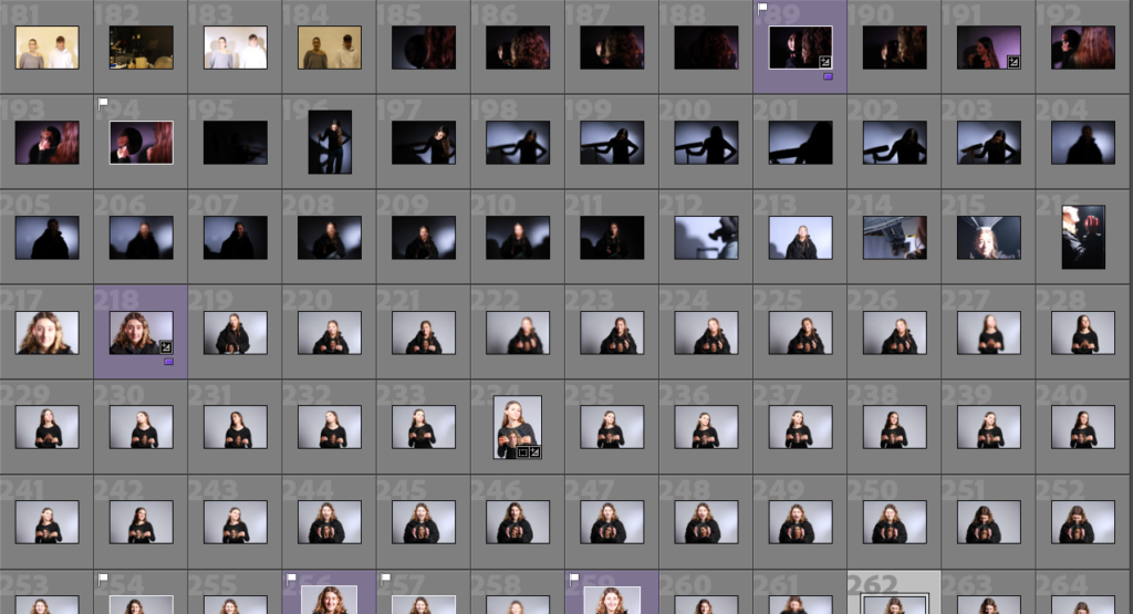
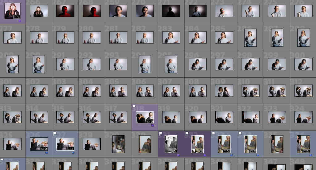
I organised all of my Chiaroscuro images into one colour so I could easily see them all and figure out which ones had the best lighting.

MY FAVOURITE IMAGES:

I thought these 3 images were the best out of all the others. Although they are similar in the way that they are the same position and person, however I liked the way they went together. In the first image, as she is blonde this has reflected well off of the light and only lights up part of her face as she is turned away. In the second, the lighting has been completely split down either side of the subject’s face which I really liked. In the last image, I got her to close her eyes as this made the darker part of her face almost disappear which I thought was effective. They didn’t need much editing as the placement of the lighting along with the black curtain behind worked well together.

The original images:

These two images didn’t require any editing.

Edited butterfly photoshoot

I colour-coded all my images so I could see which ones I preferred over the ones that were the worst and could easily see them.

MY FAVORITE IMAGES:

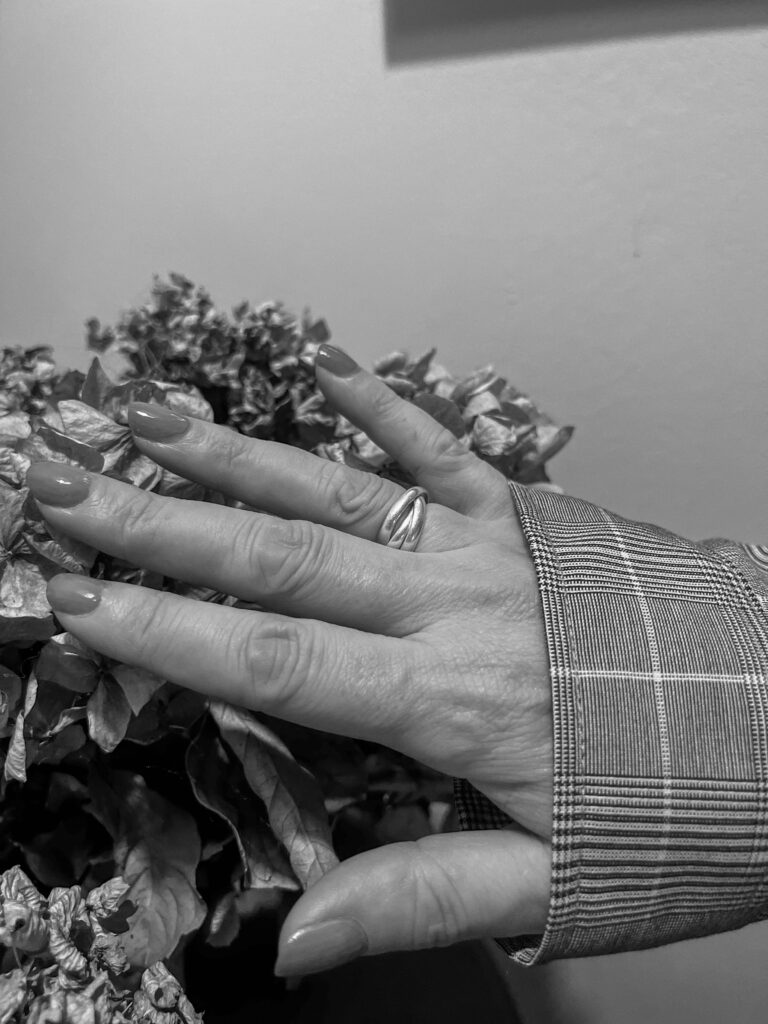
I like the way her hands are included in the image in a relaxed way as I feel it adds more to the image and fills up what would’ve been empty space. I like the way they are curved on top of each other and you can see her jewellery as I feel like this brings more life to her character. She has a very relaxed and neutral expression and is central. I cropped the background so that she was the main focal point of the image. The position she is sat in is quite powerful as she is straight on from the camera looking right into it which I really liked.

Original image:

MY SECOND IMAGE:

I really like the way she is looking to the left of the camera because a lot of my other images are looking directly forward and the light is bouncing off her face more. Her cheekbones have been darkened alongside the butterfly shape under the nose so I know this technique has been successful. I cropped the background so she would be more central to the image. Instead of a neutral expression she has a slight smile which I also really like as it is more natural instead of being neutral and lifeless.

The final images:

Edited Rembrandt photoshoot

I colour-coded all my Rembrandt photos into one colour so they were clear to point out and to easily assess which ones were the best compared to the worst.

REMBRANDT EDITED IMAGES:

I created a virtual copy of the original image so that I could create a black & white version too. I cropped the background as there was a lot empty space surrounding the subject and I didn’t want this to make the viewer’s eyes wonder to the background. I really like the way the light has created a warm tone on one side of her face and given me that ideal triangle underneath the eye. I used a gold reflector to do this which I think has worked quite effectively.

Original image:

MY SECOND IMAGE:

I really like this pose as she looks very relaxed and calm leaning on her chair. I had similar photos to this but I found that this one was better because I liked the way her head was positioned more. The light has given her a warm tone and this lighting has worked very well. I also like the way she is not entirely central and more to the side as this makes it different from a standard image. There is a lot of light brought into her eyes as I got someone to hold a reflector for me to bounce the light onto her face.

Original image:

MY THIRD IMAGE:

I really like this image as I didn’t have to do much editing, I really like the expression and where her hand is placed as I feel it makes her more connected to the viewer. I chose to put it in black and white because I felt that it just looked better. I also really liked the way she is looking up into the camera as its a more powerful way to use the eyes.
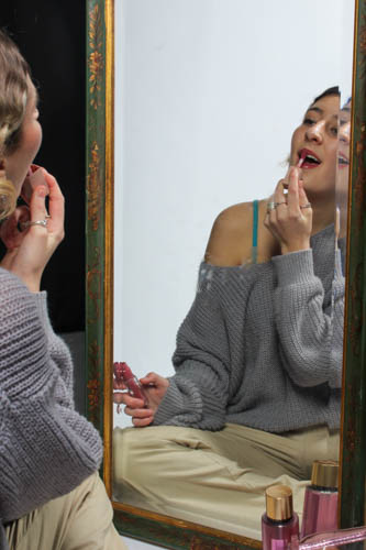
Original image:

MY FOURTH IMAGE:

I really liked this image because it has an element of Chiaroscuro lighting in it alongside Rembrandt due to the split lighting however there’s a clear triangle of light below the eye which I think has worked effectively. To improve this, I could use a reflector when taking the image to bring more light into her eyes as it is quite dark. The position she is in looks very relaxed and natural as she is resting on her hand.
Original image:

The final images: