For my photoshoot in response to documentary and tableaux photography, I think it would be really beneficial for me to research many different artists, both images with windows and mirrors, in order to get a broad spectrum to choose from that I feel most drawn to and also ensure that I completely understand the concepts and motives behind the images I am going to shoot.
Mood Board:
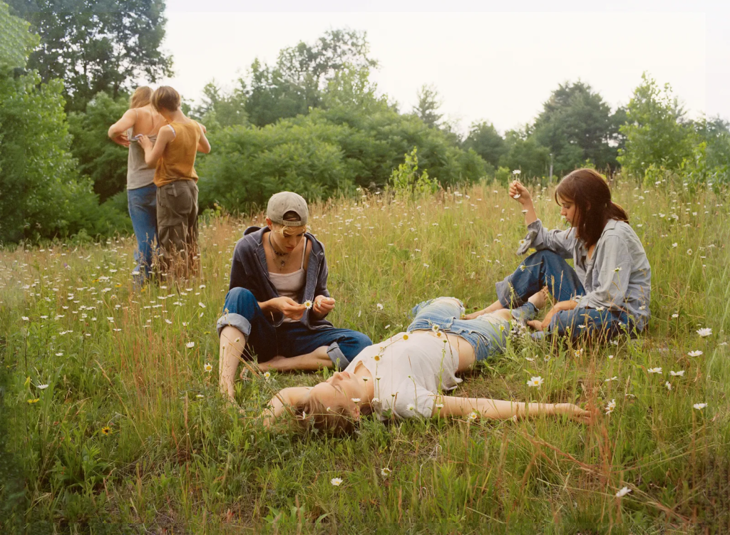
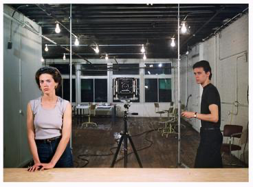
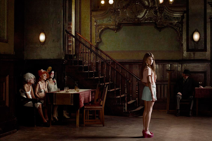
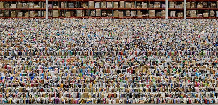
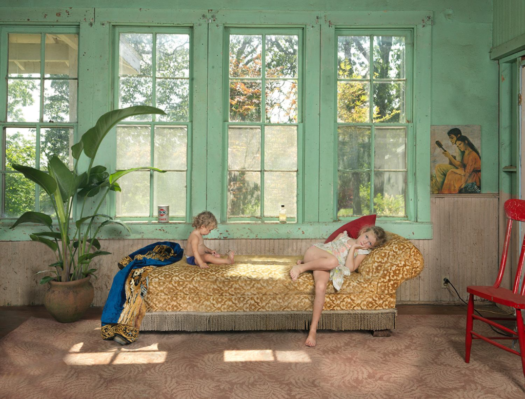
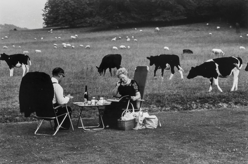
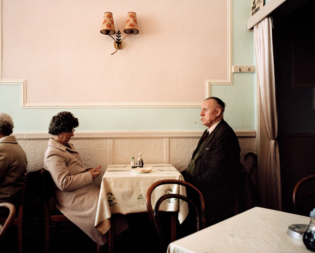
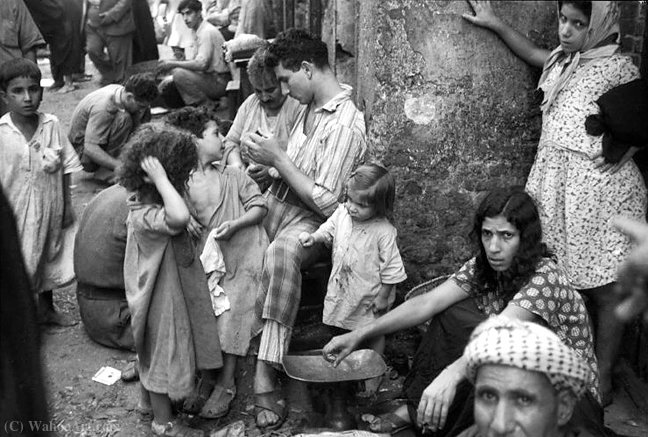
Nan Goldin – Amanda in the mirrorJustine Kurland – Girl PicturesSarah JonesGregory Crewdson – UntitledJeff Wall – Picture for WomenErwin OlafAndreas GurksyJulie BlackmonEdgar Martins – Sometimes the right stuff is in fact the wrong stuffTony Ray-Jones – GlynedebourneMatt Black – Farmworker CampMartin Parr – A couple in a cafeDoug Aitken – New opposition
Many of these photographers have really deep intentional meaning behind them whilst others explore the world in both abstract and documentary ways. If I do decide to use a photographer with images that have controversial or deep personal meaning behind them, I need to ensure that I carry out my own photoshoots in a respectful and considerate way in order to be aware of the concepts, purposes and symbolisation behind what the photographer intended with their own images.
With Photography originating through the use of the camera obscura, a tool believed to have been used since 400BC, this brought about this instantaneous form of ‘drawing with light’. As this optical phenomenon filled rooms of light with images, many pioneers of photography attempted to find more practical ways to invent processes that could fix the image on a surface.
One of these pioneers was Louis Daguerre in 1839, creating the visual experience now known as the Daguerreotype, creating ‘people on the edge of being present’. This would be done initially by polishing a metal plate and laying silver grains upon the surface of it due to them being light-sensitive. Then, this would be placed inside a large format camera and exposed to light from hours to days in order for the light to be reflected back through. After this, the plate would be heated, then cooled with water with extreme caution. This was because if the daguerreotype was touched in the slightest, the image would melt away and be destroyed, wasting the many tools that had to be used. These had high monetary value too, meaning that if the Daguerreotype had been melted away, the artist would have missed out greatly. Due to the fragile element of this photographic process, these would typically be placed into special housing such as wooden boxes, an open model or a folding case which included red velvet too for protection and luxury.
Then came the salted paper and Calotype production of Henry William Fox-Talbot. Talbot first began by applying “silver salts” onto salted paper, creating silver nitrate reactions from the light-sensitivity. This was then exposed to light for many days and then darkened producing negative images. These appeared like shoebox sized cameras and were named mousetraps and were very difficult to use because if it was disturbed it may just get darker and darker so that its only experienced momentarily. Overall, calotypes were better than Daguerreotypes due to it being easily distributed, reproduced and were much cheaper. Whilst they both used light sensitive silver salts, the Daguerreotypes required a lot more tools and metal plates which would have been extremely difficult to find and afford back in the 19th century.
In my opinion, I believe that Daguerreotypes should be categorised as mirrors, due to the fact that they are fictional and staged, with the subjects within the image sat posed in a tableaux-style. I feel that from a certain perspective, however, this can be perceived as a window due to it looking objectively and as if it is documenting someone of importance, yet I think that the loss of candidness makes the Daguerreotypes more of a mirror. I also think that the formal tone of these images pushes the Daguerreotypes to be categorised as a mirror because they can be interpreted in a subjective way, for example the people in the images pretending to be someone of importance and wealth when that’s not what actually defines them.
On the other hand, Calotypes can be majorly categorised as windows, due to these paper negatives documenting the landscape, for example, in an objective and truthful manner. These images identify with realism because their entire concept is external to the photographer with no personality behind it.
In accordance to John Szarkowski’s thesis, he states that ‘The distance between them is to be measured not in terms of the relative force or originality of their work, but in terms of their conceptions of what a photograph is.‘, which stood out to me as it looks at what photography actually is from a different perspective, being that photography isn’t defined by how original your images are or what is within the image, but focuses on the different perceptions of photography and the different associations made. I think this quote is really important because it shifts the narrative of photography from being technical and critical, and instead towards a more conceptual, intentional and meaningful form of expression.
Mirrors
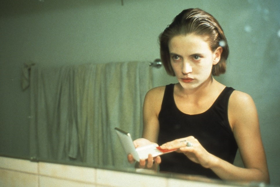
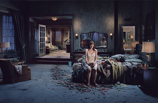
For my example of photographs as mirrors, I chose this image by Gregory Crewdson named ‘Untitled’. Crewdson’s image of a girl in a unclean room followed by a trail of scattered, picked apart roses portrays themes of suburban anxiety, disorientation, fear, loss, and longing. Using a wide-shot angle, Crewdson paints this storyline of vulnerability and abnormality, with the image looking slightly disorientated. A woman sitting in her nightgown on the edge of the bed, emulating a child with her slumped demeanour, followed by piles of roses and thorns. This image is a mirror due to his use of teams of riggers, grips, lighting specialists, and actors in order to create a scene that looks like a film still or a tableaux vivant. The subjectivity in the image is immense making it open to interpretation, for example the roses and thorns being a symbol for the hard journeys that Crewdson has had to go through in his life to get to where he is now. The ambient lighting placed strategically around the room gives the walls a tone of grey and navy in order to emphasize the woman’s distress and lonesome, however this is also tactical in making the viewer feel the same emotion as her. With the final story of this woman remaining elusive and concealed, this image has its roots in Romanticism because of the fairy-tale like aesthetic it has and how it becomes affiliated with the classic horror aesthetic; something terrible has happened, is happening, and will likely happen again. The use of artificial lighting makes it evident that this is shot in a studio, with the lighting being dramatically centred around her like a spotlight, drawing the viewers eyes to her initially.
Szarkowski idealises that his thesis is not a rigid pattern, but a ‘continuous axis, the two poles of which might be described by the terms proposed above’ whilst on the other hand, Pearl’s review criticises this, arguing that ‘its very nature, presupposes a “generous and inclusive acceptance of fact, objective structure,” and that the selection among these facts is the romantic, personal opposite built into any photograph of merit.’. To an overall extent, I agree with Szarkowski’s viewpoint of mirrors and windows being a continual categorisation method because not all photographs can be defined by subjectivity or objectivity, and may sometimes be both. This is because some images can vary, being personal and idealising a romantic expression of the photographs own perspective on the world whilst still being documentary.
Windows
Henri-Cartier Bresson’s photojournalism is a key example of realism photographs, especially this one entitled ‘Baghdad1950’. This image stems from how, in 1950, Iraq was undergoing significant changes, transitioning from a monarchy to a more modern state. The emotional resonance that this image gives the viewer through documenting the great poverty among the people of Baghdad at the time evokes nostalgia, curiosity and contemplation on the privilege that we hold within our own lives in comparison to the overpopulation that this image reveals. Bresson’s success in showing the exterior world that goes unbeknowst to us is incredibly moving because it captures a truthful story in a raw and real way. The monochromatic palette that Bresson has included has emphasised the contrast and texture, the dry and cracked walls from the hundreds to thousands of people passing by everyday, in order to draw attention to the subject matter and the emotions of the people.
The importance of photographs categorised as windows is evident here, forcing their viewers to resonate with themes of community, connection and existence of these underfunded places. Additionally, this enables us as the viewers to learn visually about the cultures, architectures, attires and customs in places that would go unseen otherwise, embodying a tension between modernisation and tradition to show a distinct civilisation. This realist viewpoint archives a pivotal moment in a city’s history that would have been missed or forgotten without this reflection of unique culture and universal aspects of human life. Without images such as these, activism and awareness would not exist, whereas with window photographs, we can get rich insights into the reality of others lives. Through Szarkowski’s thesis of ‘a window, through which one might better know the world?’ and Jed Pearl’s review stating ‘It is the realist view that the world exists independent of human attention’, I feel that these both can define not only Bresson’s image above, but define the meaning being the category of windows on a whole. They outline how the form of photography within windows can spread messages of crisis, hardship and difficulty better than words can describe, and provide evidence to richly detail this.
Conclusion
To conclude, photographs construed as windows, such as Cartier-Bresson’s objective approach into the lives of the people of Baghdad in 1950, reveals the innermost complexities of the varying cultures around the world and ensures that the opportunities of activism are given. Without images such as these, the world would be unaware of not only the difficulties other face in order to appreciate their own, but also enables people with less to gain higher opportunities and gives them the chance for their stories to be told through a lens. Alternatively, these images classified as mirrors allow photographs to envision a story and produce it in order to share private things in their lives of which they may have not been able to find the words to explain. Additionally, due to the subjective nature of these images, viewers can interpret the photographs into their own lives and apply it in realistic situations as a form of comfort. Along the lines of fictional storytelling, this allows exploration of intimate and personal experience and allows us to connect with one another through fictional stories that may resonate with our own personal beliefs and matters.
These opposing concepts of photography; the subjective and objective; the public and private; the fact and the fiction; realism and romanticism, provide alternative perspectives of not only what a photograph is but concurrently reflect the personal experiences that we all uniquely inhabit within our lives and contextualise the wider social issues and conditions. Crewdson’s image resonates with Szarkowski’s explanations of mirrors being that they ‘largely reflected the subjectivity of the artist’ and Pearl’s review of ‘Romantic is used here … as a term that suggests the central and indispensable presence in the picture of its maker, whose sensibility is the photograph’s ultimate subject, and the standard against which its success is measured.’. Additionally, Crewdson’s representation of fictional tableau in a personal format can also be defined by Szarkowski’s thesis of ‘work largely sought to seek outside themselves’ and Pearl’s review disclosing ‘ a generous and inclusive acceptance of fact, objective structure, and the process of logic and system.’ because they highlight the dynamic and potentially controversial aspects of externally documenting the alternating experiences of everyday life. By establishing the connection between photographs and the views of windows and mirrors, this allows people around the world to connect and enhance understandings of different realities.
Szarkowski, J. (1978), Mirrors and Windows: American Photography Since 1960. Museum of Modern Art: New York
Read two texts above (John Szarkowski’s introduction and review by Jed Pearl) and select 3 quotes form each that is relevant to your essay.
Select two images, one that represent a mirror and another that represents a window as examples to use in your essay.
Use some of the key words that you listed above to describe what the mirrors and windows suggest.
My three quotes from Jed Pearl’s review:
‘A photograph provides, to use Szarkowski’s word, an “autobiographical” response to a realist situation.’
‘Much of the work included in the show is meant to strike us with its surprising imagery – a private vision so riveting as to leave a permanent imprint on the mind.’
‘that use of the medium, by its very nature, presupposes a “generous and inclusive acceptance of fact, objective structure,” and that the selection among these facts is the romantic, personal opposite’
My three quotes from John Szarkowski’s introduction:
“The distance between them is to be measured not in terms of the relative force or originality of their work, but in terms of their conceptions of what a photograph is.”
“is it a mirror, reflecting a portrait of the artist who made it, or a window, through which one might better know the world?”
“a mirror – a romantic expression of the photographers sensibility as it projects itself on the things and sights f this world; or as a window – through which the exterior world is explored in all its presence and reality.’
Essay plan Introduction (250 words): Reflect on the origin of photography and describe in your own words the difference between the two photographic processes, Daguerreotype and Calotype. Consider how they could be viewed as either a mirror or a window of the world according to John Szarkowski’s thesis. Choose one quote from Szarkowski’s text and comment if you agree or disagree.
Paragraph 1 (250 words): Choose an image that in your view is a mirror and analyse how it is a subjective expression and staged approach to image-making. Choose one quote from Szarkowski’s thesis and another from Jed Pearl’s review which either supports of opposes Szarkowski’s original point of view. Make sure you comment to advance argumentation in providing a critical perspective.
Paragraph 2 (250 words): Choose an image that in your view is a window and analyse how it is an objective expression rooted in the notion of realism. Choose one quote from Szarkowski’s thesis and another from Jed Pearl’s review and follow similar procedure as above ie. two opposing points of view and commentary to provide a critical perspective.
Conclusion (250 words): Refer back to the essay question and write a conclusion where you summarise Szarkowski’s theory and Pearl’s review of his thesis. Describe differences and similarities between the two images above and their opposing concepts of objectivity and subjectivity, realism and romanticism, factual and fiction, public and private.
What are the differences between photographs that are WINDOWS and MIRRORS?
Photographs that are windows and those that are mirrors are binary opposites to each other, being metaphorical in order to categorise them. Binary opposites are words or concepts which are opposed in meaning, being set off by one another and mutually exclusive terms. Images that are categorised as windows are those that take an objective stance and have a perspective that is documentary-style. This allows the exterior world to be explored in all its presence and reality, getting to know the world around us better. On the other hand, mirrors are images which are personal to the photographer and have an element of privacy. These images are curated in order to be reflective of the photographer to create a subjective viewpoint instead. This paints a romantic picture of the photographer’s sensibility, making them open to personal interpretation. This raises the question of whether an image is external of the photographer or an internal reflection.
John Szarkowski:
Szarkowski curated this exhibition of American photography at the Museum of Modern Art, New York (MoMa) in July of 1978 in an attempt to categorise the work which largely reflected the subjectivity of the artist in comparison with those whose work largely sought to see outside themselves. Szarkowski wrote a catalogue essay to accompany the exhibition:
“The distance between them is to be measured not in terms of the relative force or originality of their work, but in terms of their conceptions of what a photograph is.”
The quote above by Szarkowski stood out to me because it is looking at photography from a different perspective, being that photography isn’t defined by how original your images are or what is within the image, but focuses on the different perceptions of photography and the different associations made. I think this quote is really important because it shifts the narrative of photography from being technical and critical, and instead more conceptual,intentional and meaningful.
“is it a mirror, reflecting a portrait of the artist who made it, or a window, through which one might better know the world?”
SYNONYMS OF WINDOWS & MIRRORS:
Images that are mirrors are associated with the word tableaux – this is known as a static scene in acting containing actors or models silently, typically with scenery or props and posed in a cautious way. This word is applicable to images categorised as mirrors because they are manipulated scenes of fiction that are staged. The topic of romanticism is also associated with these reflective images due to its subjective nature, emphasizing imagination and emotion.
One the other hand, the topic of windows is associated with realism due to its straightforward, truth-telling tone. These images are also associated with words such as optical and candid because they are documenting external matters.
Cindy Sherman
This self-portrait image above of Cindy Sherman comes from her ‘Untitled Film Stills’, in which she depicts stereotypical roles of women, gaining inspiration from films of the 1950s and 1960s. I see this image as a mirror due to it being staged, representing a fictional character in a manipulated environment. Additionally, this may be an internal reflection of Sherman’s emotion, feeling stereotyped and prejudiced due to her gender, hinting that she may have a distorted perception of herself alone. This reveals a private side to herself, letting the viewer know of her inner thoughts and feelings. The setting of this image may have been taken in a studio with props set up however, Sherman may have also taken this in her home for example as that is a domestic area and would be able to convey the message well. This would also have helped make the image a mirror as her home is a personal area that she is sharing with the viewer. I think that her expression of looking over her shoulder surrounded by this large empty space on her left suggests that she may feel as if she is forced to fit into these traditional roles against her will, for example representing women in the 50s and 60s as a female photographer when in these times, this would have been frowned upon and unheard of. Because she has turned to look over her shoulder, large diagonal shadows have been created behind her which may connote her hidden rage or distress, representing how these stereotypical viewpoints can be damaging and hurtful. The black and white tones of this image also help portray her emotions well as this is a more dynamic approaching, perhaps draining all the colour from the image to show the seriousness of the message she is sending, making the concept behind it more solemn.
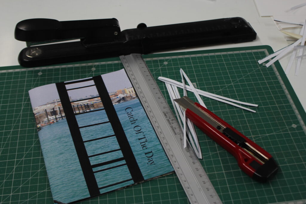
I printed out my images from Adobe InDesign and created my zine:
To do this, I had to ensure that all the pages matched up, specifically the images that I had put onto a double-page spread so that the full picture was together. Then, I had to make sure that both edges of the sheet were aligned, then use a tool called a paper bone:
This enabled me to get a smooth and precise fold in the centre of the paper. By doing this, all my images would line up perfectly in the middle so that I could staple them easily, but it also meant that either side would be even so that my zine wouldn’t look wonky. One I had folded all the pages, I stapled them down the spine.
Then, I used a knife to slice off the white edges to get a clean and even edge so that it would look more professional and smooth.
After I created my zine, I created a virtual gallery to showcase my images using Artsteps so I could show my work in two mediums – physically and digitally.
EVALUATIONAND CRITIQUE:
Overall, I am quite pleased with the outcomes I have produced within the topic of Jersey’s maritime history. Initially when we were researching the islands maritime history, I didn’t really enjoy it as I found it fairly tedious and dull, however when we began doing photoshoots I began to gain a little bit of motivation. In the first photoshoot we took down at Société Jersiaise Photographic Archive and St Helier Harbour, my expectations were that I was going to try and highlight Jersey’s fishing culture and history. Whilst some of my images were very successful (for example capturing a seagull flying), I don’t feel that I could be entirely creative with this as I didn’t particularly notice any specific details that I thought would be beneficial to my work and didn’t explore the area entirely. Due to this, many of my images were similar. However, my second photoshoot was where I think I was able to really get engrossed in my work and seek out unnoticed aspects of the harbour, leading to me having a vast selection of images to select from. Here, I was able to make the topic my own by exploring the harbour in detail instead of just taking images of the parts that were the most visible or just shooting pictures of the boats at the harbour in an unstructured way like I had in the majority of my images during the first photoshoot. As well as this, I made colour and texture the foundation of my images so that when I did go to create my zine, this would make it easier for me to form a narrative behind my images. As this shoot was taken down at the Maritime Museum, The Fresh Fish Company and around the Marina, this let me know that I had many options to choose from when deciding what I wanted my zine to be about. Despite that, while the images I took at the Maritime Museum provided a high amount of historical value and contextual importance into my work, I didn’t want to use any of them within my work or experiment with them any further because it didn’t fit in with my intentions behind this topic and were not as effective as the other photos I took, yet I am still glad that I did include them in my blogpost because this ensured I had that awareness behind what I was creating instead of doing it blindly. As a result of my images being successful, I ended up planning to create two zines with two separate After this, I began to prepare to create my zine by researching about narratives and sequencing, trying to spark a story by describing both my zines intentions with 3 words, a sentence and then a paragraph. I think this activity was really beneficial to me because it made me sit and think properly about what I wanted to produce and how I wanted to use the topic of Jersey’s maritime history, a topic that didn’t excite me at all, to create an artistic zine. Once I had figured this out, I found it quite a straightforward process in beginning to choose what images I was going to put in my zine. What helped me decide further was physically creating final selections by printing out various images in both black and white and colour. I think this activity was also really valuable because it meant I had to be critical about my work as I used process of elimination and be realistic about what images worked with each other and which ones didn’t. Once I started using InDesign, everything came together smoothly and I found it easy to show the storyline I had intended. I am really happy with how my zines came out, however if I did this again I would have liked to have made a black and white version and layout my images in a different way, with images overlapping the page or multiple on one page, or using text. I didn’t do this in my zines because I wanted each image to speak for itself, however it would’ve been good to do this because then I would have more variety in my work.
I created two virtual galleries to display the final images I used within my two zines using ArtSteps. My second gallery however shows a smaller amount of images as some of my images were shared between the two zines:
First, I opened a document using these measurements:
Then, I used the square boxing tool to create the sizing of the image I wanted.
I used the placing tool to select the image to fill the box.
After I selected the image, I could choose the appropriate fitting. I selected ‘Fit Frame Proportionally’ so that the image would size up into the box and be laid out properly. This way, my page wouldn’t look strange and would sit neatly.
The result:
Throughout my work, I could go into display mode so that the resolution would be good and I could see how my work would look physically:
To create my two zines, I added them to the same document by duplicating the spread. This made it easier to manage and also I could compare both of my zines to one another to make sure that they were different and contrasted well so I could represent the harbour from two different perspectives.
In this image, I am duplicating the spread to see which image should go on the left and which image should go on the right. This ensures I can make the page look the best as possible and that the two compositions match up properly.
Overview:
Experimentation:
I experimented with different fonts, sized and text-designs, repositioning them into different angles to see which were best suited to my first page. I did this to ensure that my title was representative of what my zine’s story was about and the narrative I wanted to tell as well as where I actually placed the title so that this wouldn’t look strange on the image.
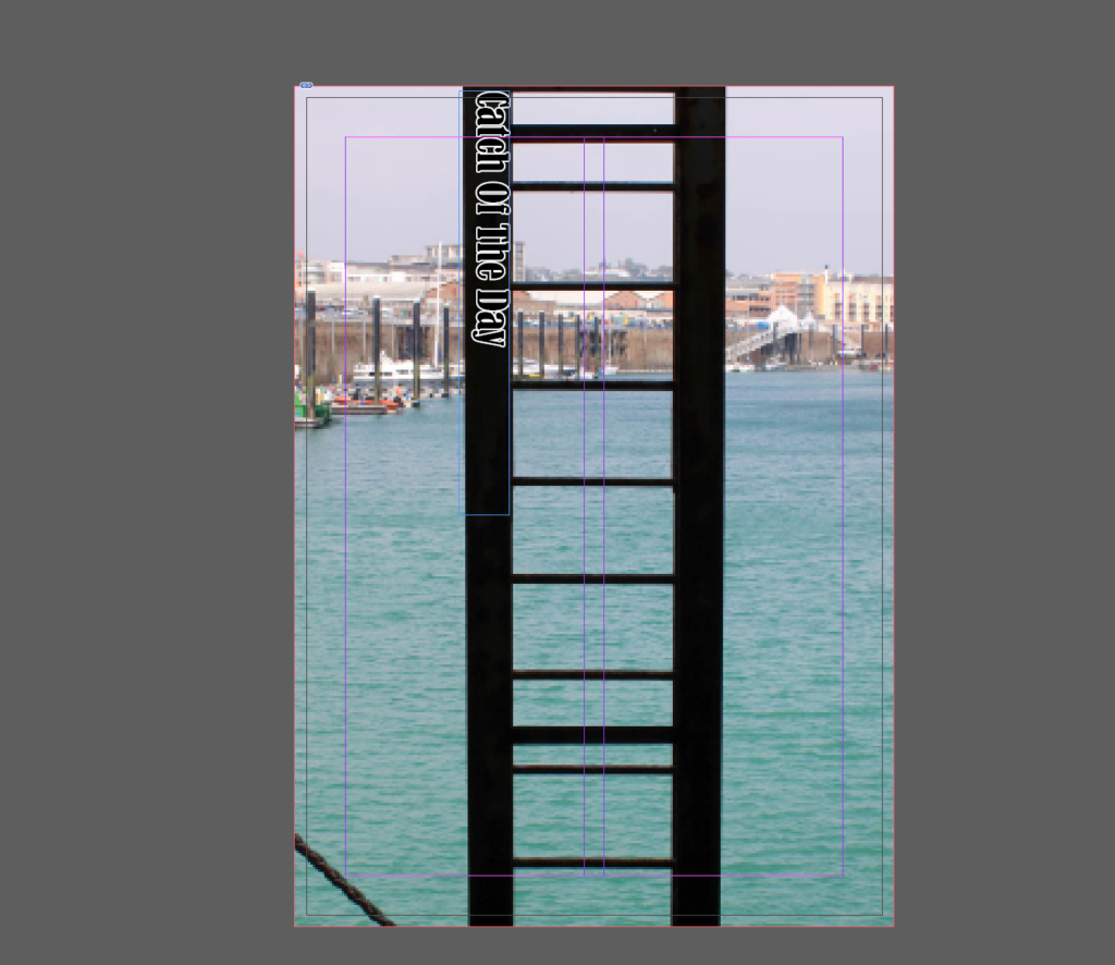
I ended up choosing this font for my title as it is bold and dark to match the silhouette of the ladder as this is a more modern image.
I chose this font for my second zine as I think that the black outline with the white lettering matches the colour palette of the image really well, and the way that the writing curves matches the structure in the image too.
A zine is short for magazine, being a self-published piece of work of original or appropriated text and/or images. This is typically used as a form of developing identity by expressing artistic vision about a certain topic. This is non-commercial print-work that is usually produced in small, limited batches.
I will be creating a zine to showcase my best images from my two photoshoots from the harbour and the marina.
In the zine that I produce, it’s important to select the right images and sequence them so that they link with each other and spark a narrative. To create a narrative I will need to convey relationships between the images in my zine but also creating an ideal design through InDesign. I will be experimenting with different layouts and references to the different aspects that surround the harbour, possibly resulting in producing more than one zine.
Once you have considered the points made between the differences in narrative and story and thought about what story you want to tell about St Helier Harbour and the images that that you have made in response, consider the following:
STORY: What is your story?
As I will be making two zines, I need to create a story for each as they represent two different things:
Zine 1:
3 words: The fishing culture.
A sentence: The lifestyles exhibited through the fishing culture.
A paragraph: The fishing industry is one that is unlike the rest, a culture that is unmatched to any other. The culture of Jersey’s fishing companies entails many different liabilities – the catch, the preparation, the retailing. Whilst this is something that is typically hidden away from the people, pushed to surround the sea, the fishing industry is something that is a crucial part of Jersey’s heritage and history which may go unappreciated if it isn’t revealed.
Zine 2:
3 words: Identity of a rower.
A sentence: The Jersey Rowing Club’s way of life.
A paragraph: The Jersey Rowing Club is something that isn’t acknowledged very much, being that it is tucked away over one side of the marina, passed by everyday by hundreds of cars. A rowers life consists of strong dedication and willpower that takes years of experience to achieve.
NARRATIVE:How will you tell your story?
Within both of my zines, a big factor I want to convey is the aspect of form because this means I can hone in on particular details of the harbour and marina, not just the simplest and most obvious sections of it. To do this, I am going to use strong directional lines because I feel that this will make my work become more bold and it will add a sense of sharpness to it. As well as this, I feel that using the same colour palette throughout my zines is important because it enables me to link each image to one another, telling the story in a more smooth way. However, I still want to have a sense of ambiguity in my work as this means that the viewer can interpret my work in their own way subjectively. Through my zine, I am not going to use text very much aside from the title because I want the images to speak for themselves instead of being an informative piece so that I can keep this subjectivity in my work, however I will be experimenting with different fonts-types, designs, colours and sizes so that I still involve some graphics too.
Because my first zine is about the fishing industry, this is going to be concerned with the colour blue predominantly as I feel that this is the colour most commonly associated with fishing, therefore this will be most effective as it correlates the most. As well as this, I am going to use more orange and brown tones as accent colours as whilst these are the colours that surround the animals that fishermen actually catch, these tones are often associated with age, for example rust, meaning that this can denote how long these companies have been running at the marina. As my second zine is concerned with the Jersey Rowing club, typically there are not colours associated with the club however I am going to use my images of the equipment, tools and location to create dynamic shapes in my work because I think that this will tell a story about the club in an implicit way, instead of just shooting these objects alone. I want to create a balance of bold block colours alongside pastels to make my work be contrasted against itself, however still continuously running smooth. Alongside this, I want to ensure that my work contains fine details instead of displays of the harbour, for example, because I want to point out the parts of the harbour that people do not typically see of associate with the marina as I think this will be really effective in representing it how it actually is. This will be completed through using depth of field tactics, making the main focal points of my images sharp and precise with the background being blurred, for example with the harbour in the background just out of focus. I think this will work really well in my zine because it ensures the viewer is aware of what my zine is actually about and where it is located, however this means I am not explicitly showing that. I will also be using different structures too to create leading lines in my work as well as shape, whether this may be squares up to ambiguous patterns.
FINAL SELECTIONS:
Initially, I printed out my best and final images and laid them out on the editing table in the photography classroom so that I could envision how my zine would physically look and then, I could piece together my images and see if the compositions would link together smoothly. By doing this, I could use process of elimination to make critical decisions of which images suited my themes and which ones were outliers.
Photography originated back in 1822 as an instantaneous form of revealing secrets beyond the world in a nonchalant form, giving nothing away at the same time. Due to the etymology of photography being ‘drawing with light’ this art form if to turn the ordinary into the extraordinary, evoking a variety of emotions and thoughts, creating wonder about what lies beyond the frame of the image.
THE CHRONOLOGICAL HISTORY OF PHOTOGRAPHY:
Camera Obscuras and Pinhole photography:
In his Book of Optics written in Cairo between 1012 and 1021, Alhazen (or Ibn al-Haytham), is said to have created the camera obscura alongside the pinhole camera in order to ‘fix the shadows’. However, it is said that a camera obscura was a tool used since 400BC. A camera obscura consisted of a large box with a hole in it which projected an image of its surroundings onto the wall inside. This allowed the outside world to pour in and act as an optical phenomenon, with the time taken for this alternating from several minutes to several hours depending on the desired image that was being projected. The environment projected would be presented upside-down and ‘twice as natural’, used for artists to sit inside the box and create paintings or drawings of this area, using darkness to see light. This was called pinhole photography.
Now, in more modern times, the camera obscura has been made into an electronic chip.
Example of the camera obscura
Below is an example of the camera obscura in use more recently. This was done by Abelado Morell of the Santa Maria Della sauté in Venice:
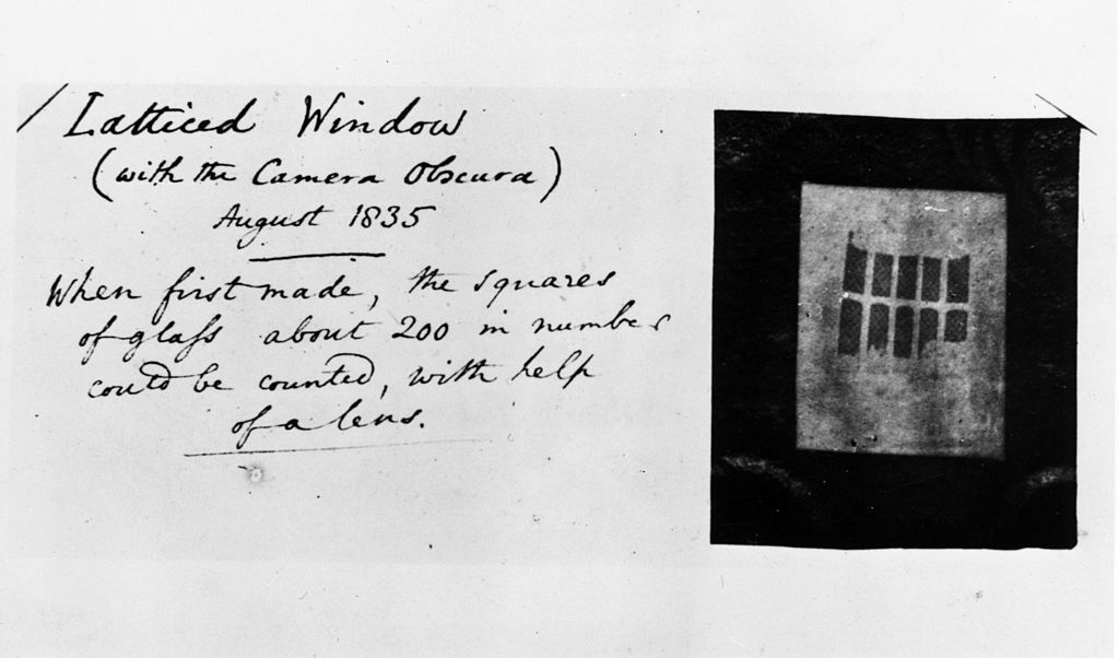
Latticed Window (with the Camera Obscura)August 1835
JosephNicephore Niepce and Heliography:
Joseph Nicéphore Niépce, was a French inventor who is recognised widely as one of the earliest pioneers of photography through his development of heliography, creating arguably the oldest surviving image made with a camera:
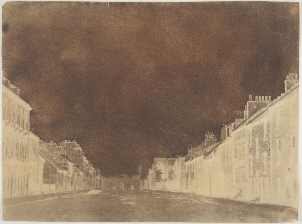
View from the Window at Le Gras by Nicéphore Niépce in 1826 or 1827
Heliography is a process where Bitumen of Judea (a natural tar from ancient times acting as a light-sensitive material) was coated in a thin layer on a pewter plate and was exposed to areas surrounding his estate such as buildings or the countryside. He experimented with this using zinc, glass, copper and limestone (lithography) too, creating different etches using acid. This image was exposed for 8 hours and it provides no information of the weather, time or season.
Louis Daguerre and Daguerreotypes:
In 1824, Louis Daguerre created the visual experience known as a Daguerreotype, described as ‘a mirror with a memory’ and created ‘people on the edge of being present’. This would be done initially by polishing a metal plate and laying silver grains upon the surface of it due to them being light-sensitive. Then, this would be placed inside a large format camera and exposed to light from hours to days in order for the light to be reflected back through. After this, the plate would be heated, then cooled with water with extreme caution. This was because if the daguerreotype was touched in the slightest, the image would melt away and be destroyed, wasting the many tools that had to be used. These had high monetary value too, meaning that if the Daguerreotype had been melted away, the artist would have missed out greatly.
As the daguerreotypes were so fragile, they would be specifically placed into different kinds of housing such as an open model, a folding case or in jewellery boxes: wooden ornate boxes dressed in red velvet.
Henry Fox Talbot and Calotypes:
Henry William Fox-Talbot was an English member of parliament, scientist, inventor and a pioneer of photography for his salted paper and calotype processes. Talbot first began by applying “silver salts” onto salted paper, creating silver nitrate reactions from the light-sensitivity. This was then exposed to light for many days and then darkened producing negative images. These appeared like shoebox sized cameras and were named mousetraps and were very difficult to use because if it was disturbed it may just get darker and darker so that its only experienced momentarily.
Overall, calotypes were extremely better than Daguerreotypes due to it being easily distributed, reproduced and were much cheaper. Whilst they both used light sensitive silver salts, the Daguerreotypes required a lot more tools and metal plates which had high monetary value.
Henry Fox Talbot – Latticed Window, 1835 The first photograph to produce a negative image, a paper negative taken with a camera obscura by William Henry Fox Talbot, of a latticed window in Lacock Abbey, Wiltshire. This early process was known as calotype and the original negative, labelled with the photographer’s own handwriting is preserved in London’s Science Museum. This image has still survived to this day. (Photo by William Henry Fox Talbot/Getty Images)
Robert Cornelius and self-portraiture:
Robert Cornelius became a pioneer in photography through his daguerreotype self-portrait in 1839:
The back of the image read ‘The first light picture ever taken’, becoming the first known photographic portrait in America.
Julia Margaret Cameron and Pictorialism:
Julia Margaret Cameron was an English photographer considered to be one of the best portraitists in the 19th century. She is not only known for her soft-focus close-ups of famous Victorians but also her illustrative images which depicted characters of Christianity, mythology and literature.
However, she was often criticised by the photographic establishment for her poor technique – some images are out of focus, her plates are sometimes cracked and her fingerprints are often visible.
A stapling example is a photograph taken 1867 of Sir John F. W. Herschel; a scientist, mathematician and photographic experimenter. Emerging from the shadows with tousled hair and deep facial lines, it tells a story of a man devoted to the intellectual life.
Sir John F. W. Herschel
Around 1863, Cameron received a sliding-box camera for Christmas from her son-in-law and daughter, sparking her immense interest in photography. This led her to turn her coal-house into a dark room, converting the chicken coop into a studio to work in.
“I began with no knowledge of the art… I did not know where to place my dark box, how to focus my sitter, and my first picture I effaced to my consternation by rubbing my hand over the filmy side of the glass“
Whilst Cameron took up photography as an amateur, she considered herself to be an artist and took the matter very professionally, copyrighting and publishing her work. In 1865, she became a member of the Photographic Society of Scotland and arranged to have her prints sold through the London dealers P. & D. Colnaghi, with her series of prints named Fruits of the Spirits being exhibited solo at the British Museum in November 1865. Overall in her 12 year career, she produced over 900 photographs.
PICTORIALISM:‘an approach to photography that emphasizes beauty of subject matter, tonality, and composition rather than the documentation of reality‘
This was a movement which dominated photography during the late 19th and early 20th centuries. This depicted common and regular images in a more psychological and spiritual way, focusing on the compression of space and blurring detail, as well as patterning light across the image. Pictorialists also involved soft focus and the use of additions of the lens or filters in the dark room. This reinforced the idea of photography being an art alongside painting and drawing. To create this dreamy visual effect, a chiaroscuro technique was often implemented to reveal these ideals of beauty, truth and the picturesque. However, pictorialism was often criticized for being too emotionally shallow because the main point behind these images was the focus on formal qualities such as the texture, tone and composition, disregarding the content or meaning behind the actual image.
Henry Mullins and Carte-de-Visit:
Henry Mullins is one of the most prolific photographers represented in the Societe Jersiase Photo-Archive, producing in the 19th century. He captured 9,000 portraits of islanders within Jersey from 1852 to 1873 at a time when the population was around 55,000, proceeding to place them in an order of levels of social class in albums. He began his career by working at 230 Regent Street in London in the 1840s, then moving to Jersey in July 1848, setting up a studio known as the Royal Saloon, at 7 Royal Square. Initially he engaged in a partnership with someone named Mr Millward, yet very little is known about him. By the following year he was working alone and he continued to work out of the same studio for another 26 years.
Henry Mullins’ work of 19th century Jersey is highly politicised, taking images of Jersey political elite (E.g. The Bailiff, Lt Governor, Jurats, Deputies etc), mercantile families- involved in trade (Robin, Janvrin, Hemery, Nicolle etc.), military officers and professional classes such as doctors, bankers and advocates. He organised these images from the most powerful roles, to the lesser powerful.
CARTES DE VISITE:‘visiting card’ or a close-trimmed portrait photograph approximately 2¹/₄×3³/₄ in. intended as a substitute for a visiting card.
Mullins specialised in Cartes de visite, in which the photographic archive of La Société contains a large amount of these (online archive being 9600 images). The Cartes de visite small albumen print. This is described as the first commercial photographic print produced using egg whites to bind the photographic chemicals to the paper which is quite interesting as this is would be very rare to see now. Because the image emerges as a direct result of exposure to light, without the aid of a developing solution, an albumen print may be said to be a printed rather than a developed photograph. Usually, this consisted of a small thin photograph mounted onto a thicker piece of card, however Mullins placed his work into an album.
Albumen Print
Many of these images contained the island’s most affluent and influential people, alongside officers of the Royal Militia Island of Jersey, for whom it was very popular to have portraits taken, as well as of their wives and children. The images of the officers document the change in generations as they do not look like the general person today, showing the fashion for long hair, whiskers and beards in the mid-1800s. Their appearance makes it difficult for the viewer to differentiate who is who as they were styled almost identically during this time.
He then arranged this compilation of images into a diamond cameo:
Its name is derived from the diamond-like shape that the images are laid out into. These diamond cameos consisted of 4 images of the same person looking in different directions and at different angles. This is a really effective way to produce a final set of images as they are consistent and act in a poised manner of taking headshots. Also, it centers around the person and makes the image become a question of who the person is and why they have been presented at this status, depending on the kind of clothes and hairstyles they presented.
WHO IS FRANCIS FOOT?
Francis Foot was born in Jersey in 1885 to mother and father, Louisa Hunt and Francois Foot. His father was a china and glass dealer along Dumaresq Street which was one of the most affluent areas in St Helier at the time. Francis Foot began his working life as a gas fitter, however shortly after this began he started to become fascinated by photography, the early phonographs and gramophone records. Through this, he realised that he could earn a living using this. Taking on a second shop on Pitt Street, Francis worked as a photographer however remaining on Dumaresq Street, his mother and father sold records, gramophones and other wares until his father passed away. After this, Francis remained working in Pitt Street.
Francis Foot outside his shop
Some of Foots images were published as postcards even though many of his images featured portraits of his family. Alongside this, he also took 16mm black and white cine films regarding many different types of events such as:
Aircraft landing on the beach at West Park,
A visit by HMS Sheffield,
Cattle shows,
The Battle of Flowers at Springfield,
The Liberation,
The visit of King George VI and Queen Elizabeth,
WW1 troops departing
Eventually the gramophone and record department of his work became increasingly more important and had to take over the larger shop on Pitt Street in which Francis sold vinyl records during the 1950s and 60s.
In 1996, La Société Jersiaise received a collection of glass plates and other photographic material, leading them to now behold 322 images of a diverse array of Jersey such as:
The Battle of Flowers,
St Helier Harbour,
Shipwrecks,
Fetes,
Coastal and country views,
The family prospered through holding the HMV franchise for Jersey, with this being painted in 1899 by Francis Barraud where it remains still intact to this day.
This photoshoot took place at the Maritime Museum, The Fresh Fish Company and around the Marina. In these areas alone, I took over 900 images in order to capture a wide variety of examples of what goes on down in these areas and what a working environment like this entails.
It was important for me to take images of nearly everything going on down here so that not only would my images be able to link with one another and tell an active story, but represent the way of life when working down on the Marina itself. As well as this, it meant that I could show comparisons and the advancements from when the transatlantic trade began for cod-fisheries, showing the more modernised and efficient industry.
BEST IMAGES:
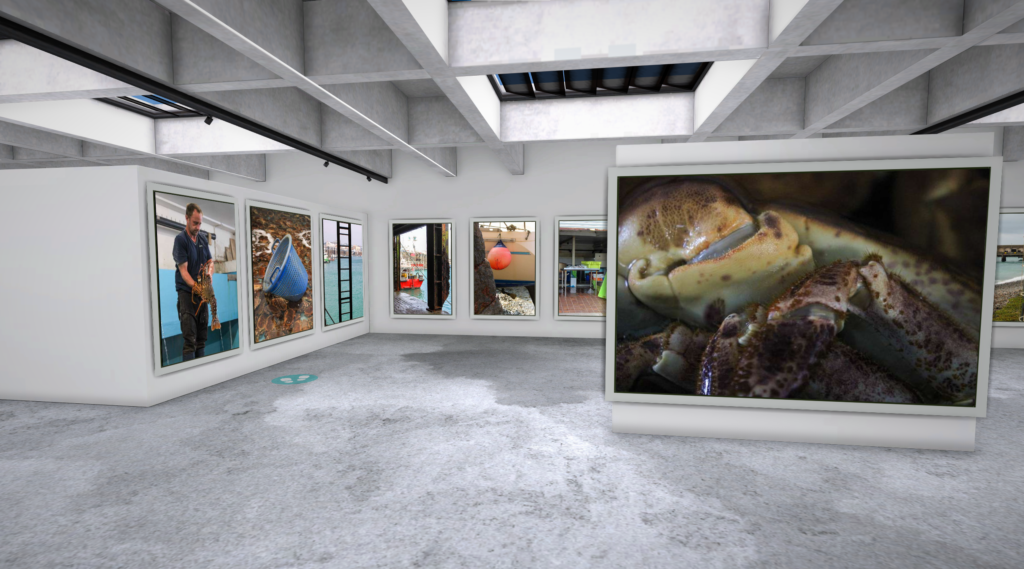
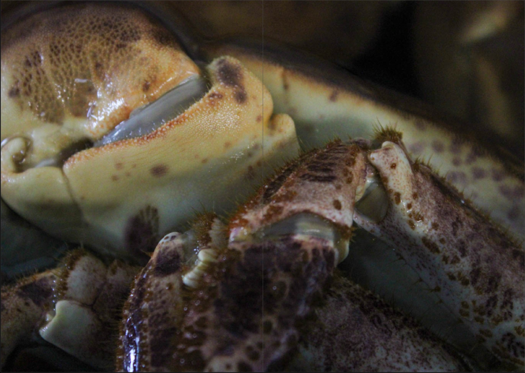
One of my favourite images I took was of one of the hundreds of crabs that had been caught within The Fresh Fish company. These crabs were piled up onto one another and created an indistinguishable blanket of crabs, struggling to move around within these confined bodies of water. From here, these crabs would be exported to places overseas in Southern Europe. I think this image is really successful because there is so much detailed captured within the image, with the crab being partially submerged this creates an ominous tone due to the change in texture as the crab declines into the water, giving an almost glowing effect around its shell. I also think that this was really effective as in the foreground, the crab has high definition but as the background is entered, it goes out of focus, showing the compact space of crabs toppling over one another.
The image on the left is of one of the many fishermen working in this industry holding a crayfish. These creatures are exported to places such as Venice to become served in restaurants and are sold at £150 per kilogram. This environmental portrait depicts really well the type of ‘hands-on’ approach that fishermen take within their jobs, with the possibility of injury, in order to export these goods to be enjoyed.
Fishing wadersOne of the many shipping containersLobster pots
This image was taken from inside the Jersey Sailing Club, hanging their life jackets in the air on a metal rod. I really like this image, not just because of the high vibrancy throughout the image which makes it eye-catching, but also the way the first life jacket is the main focal point of the image, making everything else in the background blurred.
This image was taken of a commercial boat, however I similarly do like the way that the yellow buoy is the focal point of the image, with the row of boats in the background flowing behind and adding to the composition. I think that this has worked very well also due to blue in the background, contrasting the brighter yellow within the foreground. As well as this, the light has reflected off of the metal and bounced off at a good angle due to this being taken at midday, leading to a more iridescent and shiny look, outlining it and making it stand out.
This image was really appealing to me because of the rich and bold yellow on the boat in the foreground as its very eye-catching and hard to miss. Not only do the shadows within this image provide dynamic shapes to slide across, but it also includes a vast amount of various dinghy boats and heavy machinery in the background, giving a rich insight into the types of activities that take place down at the marina.
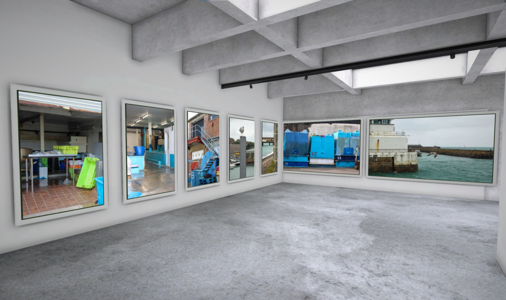
These images are of cargo boats onloading and offloading for imports and exports to places like France for example. I wanted to capture these as not only are they really vibrant and appealing, but there are so many intricate details, textures and parts which I thought would be beneficial to my work as it shows how technical and intricate this work is.
Dinghy boatsDinghy boats
I liked these images because the boats bring in bright block colours which juxtaposes all of the dull sand and left-over sea water in the boats as the tide has gone out.
These two images above are of the retailing part of the fishing process. The lobster and crab has been prepared during the production stage and now is ready to be bought and eaten.
A fishing boat
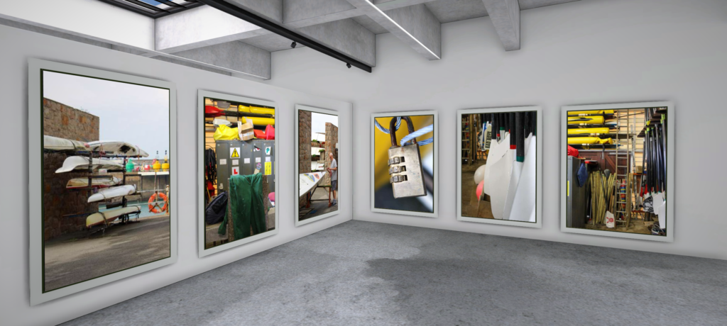
On the left is a photo of one of the many stacks of rowing boats at the Jersey Rowing Club. I feel that this image is really effective because the points of the boats go down in a vertical line as if its splitting the image into two halves. As well as this, this adds some depth to my image too.
The image on the right is taken of one of the many ladders used to get down onto the boats to fish. I really liked this image because there is a large contrast within it, the ladder has become extremely dark and allows the marina to be revealed behind it.
I liked this image because it resembles the sublime due to the way the sail boats are much bigger in comparison to the worker, creating an intimidating feel in the image. As well as this, this image has used a wide-pan approach meaning that you can see how large the harbour actually is.
Not only did I really like the saturated tone in this image but the way the two sailing boats created parallel lines, due to their masts, making the viewers eyes flow through the centres of the images. As well as this, the foreground of the thick sludge revealed from the tide going out has been imprinted with seaweed, rope and chains making an intricate pattern and an uneven texture from puddles of water left behind.
Maritime Museum:
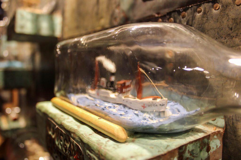
Glass bottles of models of ships used within Jersey’s maritime history:
This photoshoot taken from Jersey’s Maritime Museum was very insightful and provided a high amount of historical value and contextual importance into my work, however I didn’t choose to use many of the images I took here as I don’t feel that these would be useful any further as it doesn’t fit in with what I am intending to explore in this topic. Although this information will help me when creating my zine as it means I will be more aware of what I am creating and help me create a narrative, I have other images which are more successful.
Black and White:
I put my images into black and white too to create a more composed perspective: