I created two virtual galleries to display the final images I used within my two zines using ArtSteps. My second gallery however shows a smaller amount of images as some of my images were shared between the two zines:
Zine 1:
Zine 2:
I created two virtual galleries to display the final images I used within my two zines using ArtSteps. My second gallery however shows a smaller amount of images as some of my images were shared between the two zines:
Zine 1:
Zine 2:
First, I opened a document using these measurements:
Then, I used the square boxing tool to create the sizing of the image I wanted.
After I selected the image, I could choose the appropriate fitting. I selected ‘Fit Frame Proportionally’ so that the image would size up into the box and be laid out properly. This way, my page wouldn’t look strange and would sit neatly.
The result:
Throughout my work, I could go into display mode so that the resolution would be good and I could see how my work would look physically:
To create my two zines, I added them to the same document by duplicating the spread. This made it easier to manage and also I could compare both of my zines to one another to make sure that they were different and contrasted well so I could represent the harbour from two different perspectives.
In this image, I am duplicating the spread to see which image should go on the left and which image should go on the right. This ensures I can make the page look the best as possible and that the two compositions match up properly.
Overview:
Experimentation:
I experimented with different fonts, sized and text-designs, repositioning them into different angles to see which were best suited to my first page. I did this to ensure that my title was representative of what my zine’s story was about and the narrative I wanted to tell as well as where I actually placed the title so that this wouldn’t look strange on the image.
I ended up choosing this font for my title as it is bold and dark to match the silhouette of the ladder as this is a more modern image.
I chose this font for my second zine as I think that the black outline with the white lettering matches the colour palette of the image really well, and the way that the writing curves matches the structure in the image too.
My Zines layout:
Zine 1:
Zine 2:
ZINE: What is a zine?
A zine is short for magazine, being a self-published piece of work of original or appropriated text and/or images. This is typically used as a form of developing identity by expressing artistic vision about a certain topic. This is non-commercial print-work that is usually produced in small, limited batches.
I will be creating a zine to showcase my best images from my two photoshoots from the harbour and the marina.
In the zine that I produce, it’s important to select the right images and sequence them so that they link with each other and spark a narrative. To create a narrative I will need to convey relationships between the images in my zine but also creating an ideal design through InDesign. I will be experimenting with different layouts and references to the different aspects that surround the harbour, possibly resulting in producing more than one zine.
Once you have considered the points made between the differences in narrative and story and thought about what story you want to tell about St Helier Harbour and the images that that you have made in response, consider the following:
STORY: What is your story?
As I will be making two zines, I need to create a story for each as they represent two different things:
Zine 1:
Zine 2:
NARRATIVE: How will you tell your story?
Within both of my zines, a big factor I want to convey is the aspect of form because this means I can hone in on particular details of the harbour and marina, not just the simplest and most obvious sections of it. To do this, I am going to use strong directional lines because I feel that this will make my work become more bold and it will add a sense of sharpness to it. As well as this, I feel that using the same colour palette throughout my zines is important because it enables me to link each image to one another, telling the story in a more smooth way. However, I still want to have a sense of ambiguity in my work as this means that the viewer can interpret my work in their own way subjectively. Through my zine, I am not going to use text very much aside from the title because I want the images to speak for themselves instead of being an informative piece so that I can keep this subjectivity in my work, however I will be experimenting with different fonts-types, designs, colours and sizes so that I still involve some graphics too.
Because my first zine is about the fishing industry, this is going to be concerned with the colour blue predominantly as I feel that this is the colour most commonly associated with fishing, therefore this will be most effective as it correlates the most. As well as this, I am going to use more orange and brown tones as accent colours as whilst these are the colours that surround the animals that fishermen actually catch, these tones are often associated with age, for example rust, meaning that this can denote how long these companies have been running at the marina. As my second zine is concerned with the Jersey Rowing club, typically there are not colours associated with the club however I am going to use my images of the equipment, tools and location to create dynamic shapes in my work because I think that this will tell a story about the club in an implicit way, instead of just shooting these objects alone. I want to create a balance of bold block colours alongside pastels to make my work be contrasted against itself, however still continuously running smooth. Alongside this, I want to ensure that my work contains fine details instead of displays of the harbour, for example, because I want to point out the parts of the harbour that people do not typically see of associate with the marina as I think this will be really effective in representing it how it actually is. This will be completed through using depth of field tactics, making the main focal points of my images sharp and precise with the background being blurred, for example with the harbour in the background just out of focus. I think this will work really well in my zine because it ensures the viewer is aware of what my zine is actually about and where it is located, however this means I am not explicitly showing that. I will also be using different structures too to create leading lines in my work as well as shape, whether this may be squares up to ambiguous patterns.
FINAL SELECTIONS:
Initially, I printed out my best and final images and laid them out on the editing table in the photography classroom so that I could envision how my zine would physically look and then, I could piece together my images and see if the compositions would link together smoothly. By doing this, I could use process of elimination to make critical decisions of which images suited my themes and which ones were outliers.
Zine 1 mood board:
Zine 2 mood board:
Photography originated back in 1822 as an instantaneous form of revealing secrets beyond the world in a nonchalant form, giving nothing away at the same time. Due to the etymology of photography being ‘drawing with light’ this art form if to turn the ordinary into the extraordinary, evoking a variety of emotions and thoughts, creating wonder about what lies beyond the frame of the image.
THE CHRONOLOGICAL HISTORY OF PHOTOGRAPHY:
Camera Obscuras and Pinhole photography:
In his Book of Optics written in Cairo between 1012 and 1021, Alhazen (or Ibn al-Haytham), is said to have created the camera obscura alongside the pinhole camera in order to ‘fix the shadows’. However, it is said that a camera obscura was a tool used since 400BC. A camera obscura consisted of a large box with a hole in it which projected an image of its surroundings onto the wall inside. This allowed the outside world to pour in and act as an optical phenomenon, with the time taken for this alternating from several minutes to several hours depending on the desired image that was being projected. The environment projected would be presented upside-down and ‘twice as natural’, used for artists to sit inside the box and create paintings or drawings of this area, using darkness to see light. This was called pinhole photography.
Now, in more modern times, the camera obscura has been made into an electronic chip.
Below is an example of the camera obscura in use more recently. This was done by Abelado Morell of the Santa Maria Della sauté in Venice:
Joseph Nicephore Niepce and Heliography:
Joseph Nicéphore Niépce, was a French inventor who is recognised widely as one of the earliest pioneers of photography through his development of heliography, creating arguably the oldest surviving image made with a camera:
Heliography is a process where Bitumen of Judea (a natural tar from ancient times acting as a light-sensitive material) was coated in a thin layer on a pewter plate and was exposed to areas surrounding his estate such as buildings or the countryside. He experimented with this using zinc, glass, copper and limestone (lithography) too, creating different etches using acid. This image was exposed for 8 hours and it provides no information of the weather, time or season.
Louis Daguerre and Daguerreotypes:
In 1824, Louis Daguerre created the visual experience known as a Daguerreotype, described as ‘a mirror with a memory’ and created ‘people on the edge of being present’. This would be done initially by polishing a metal plate and laying silver grains upon the surface of it due to them being light-sensitive. Then, this would be placed inside a large format camera and exposed to light from hours to days in order for the light to be reflected back through. After this, the plate would be heated, then cooled with water with extreme caution. This was because if the daguerreotype was touched in the slightest, the image would melt away and be destroyed, wasting the many tools that had to be used. These had high monetary value too, meaning that if the Daguerreotype had been melted away, the artist would have missed out greatly.
As the daguerreotypes were so fragile, they would be specifically placed into different kinds of housing such as an open model, a folding case or in jewellery boxes: wooden ornate boxes dressed in red velvet.
Henry Fox Talbot and Calotypes:
Henry William Fox-Talbot was an English member of parliament, scientist, inventor and a pioneer of photography for his salted paper and calotype processes. Talbot first began by applying “silver salts” onto salted paper, creating silver nitrate reactions from the light-sensitivity. This was then exposed to light for many days and then darkened producing negative images. These appeared like shoebox sized cameras and were named mousetraps and were very difficult to use because if it was disturbed it may just get darker and darker so that its only experienced momentarily.
Overall, calotypes were extremely better than Daguerreotypes due to it being easily distributed, reproduced and were much cheaper. Whilst they both used light sensitive silver salts, the Daguerreotypes required a lot more tools and metal plates which had high monetary value.
Robert Cornelius and self-portraiture:
Robert Cornelius became a pioneer in photography through his daguerreotype self-portrait in 1839:
The back of the image read ‘The first light picture ever taken’, becoming the first known photographic portrait in America.
Julia Margaret Cameron and Pictorialism:
Julia Margaret Cameron was an English photographer considered to be one of the best portraitists in the 19th century. She is not only known for her soft-focus close-ups of famous Victorians but also her illustrative images which depicted characters of Christianity, mythology and literature.
However, she was often criticised by the photographic establishment for her poor technique – some images are out of focus, her plates are sometimes cracked and her fingerprints are often visible.
A stapling example is a photograph taken 1867 of Sir John F. W. Herschel; a scientist, mathematician and photographic experimenter. Emerging from the shadows with tousled hair and deep facial lines, it tells a story of a man devoted to the intellectual life.
Around 1863, Cameron received a sliding-box camera for Christmas from her son-in-law and daughter, sparking her immense interest in photography. This led her to turn her coal-house into a dark room, converting the chicken coop into a studio to work in.
“I began with no knowledge of the art… I did not know where to place my dark box, how to focus my sitter, and my first picture I effaced to my consternation by rubbing my hand over the filmy side of the glass“
Whilst Cameron took up photography as an amateur, she considered herself to be an artist and took the matter very professionally, copyrighting and publishing her work. In 1865, she became a member of the Photographic Society of Scotland and arranged to have her prints sold through the London dealers P. & D. Colnaghi, with her series of prints named Fruits of the Spirits being exhibited solo at the British Museum in November 1865. Overall in her 12 year career, she produced over 900 photographs.
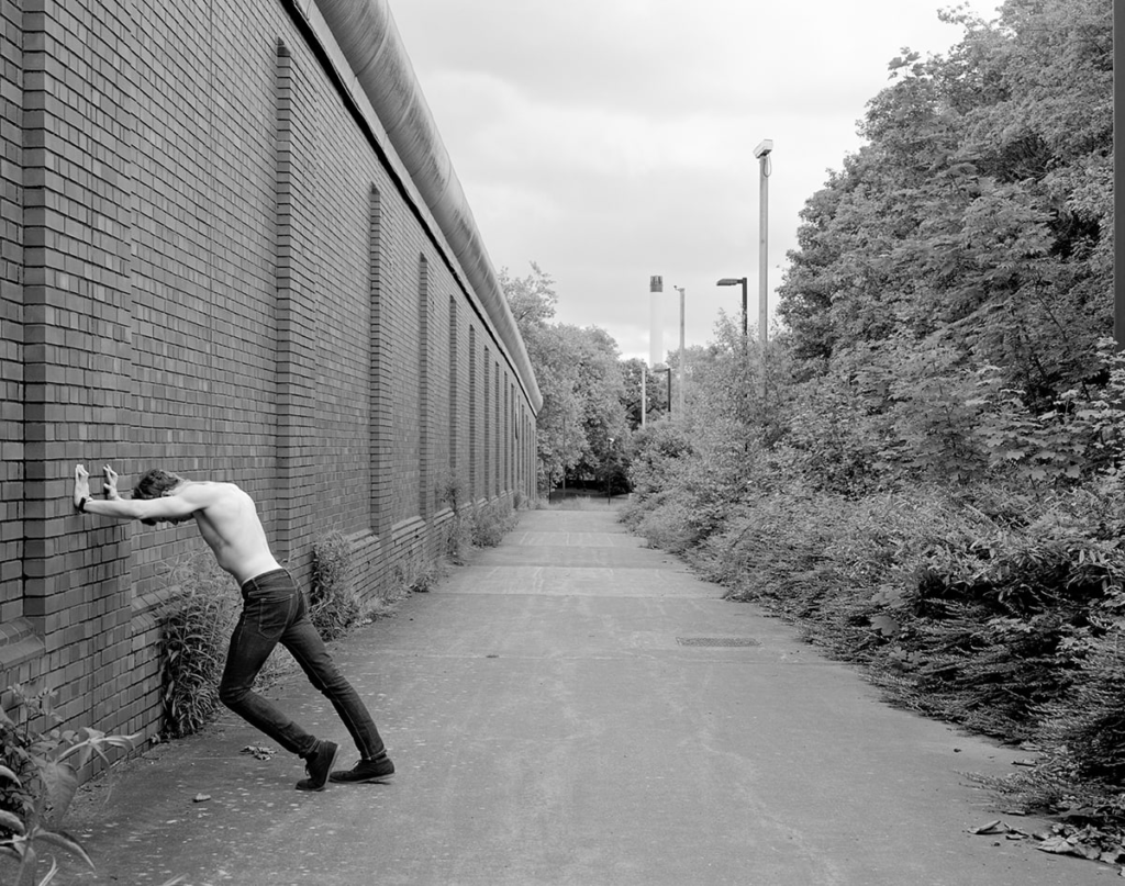
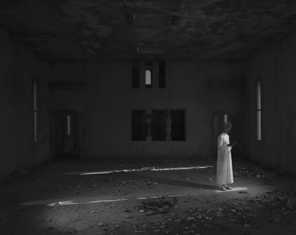
PICTORIALISM: ‘an approach to photography that emphasizes beauty of subject matter, tonality, and composition rather than the documentation of reality‘
This was a movement which dominated photography during the late 19th and early 20th centuries. This depicted common and regular images in a more psychological and spiritual way, focusing on the compression of space and blurring detail, as well as patterning light across the image. Pictorialists also involved soft focus and the use of additions of the lens or filters in the dark room. This reinforced the idea of photography being an art alongside painting and drawing. To create this dreamy visual effect, a chiaroscuro technique was often implemented to reveal these ideals of beauty, truth and the picturesque. However, pictorialism was often criticized for being too emotionally shallow because the main point behind these images was the focus on formal qualities such as the texture, tone and composition, disregarding the content or meaning behind the actual image.
Henry Mullins and Carte-de-Visit:
Henry Mullins is one of the most prolific photographers represented in the Societe Jersiase Photo-Archive, producing in the 19th century. He captured 9,000 portraits of islanders within Jersey from 1852 to 1873 at a time when the population was around 55,000, proceeding to place them in an order of levels of social class in albums. He began his career by working at 230 Regent Street in London in the 1840s, then moving to Jersey in July 1848, setting up a studio known as the Royal Saloon, at 7 Royal Square. Initially he engaged in a partnership with someone named Mr Millward, yet very little is known about him. By the following year he was working alone and he continued to work out of the same studio for another 26 years.
Henry Mullins’ work of 19th century Jersey is highly politicised, taking images of Jersey political elite (E.g. The Bailiff, Lt Governor, Jurats, Deputies etc), mercantile families- involved in trade (Robin, Janvrin, Hemery, Nicolle etc.), military officers and professional classes such as doctors, bankers and advocates. He organised these images from the most powerful roles, to the lesser powerful.
CARTES DE VISITE: ‘visiting card’ or a close-trimmed portrait photograph approximately 2¹/₄×3³/â‚„ in. intended as a substitute for a visiting card.
Mullins specialised in Cartes de visite, in which the photographic archive of La Société contains a large amount of these (online archive being 9600 images). The Cartes de visite small albumen print. This is described as the first commercial photographic print produced using egg whites to bind the photographic chemicals to the paper which is quite interesting as this is would be very rare to see now. Because the image emerges as a direct result of exposure to light, without the aid of a developing solution, an albumen print may be said to be a printed rather than a developed photograph. Usually, this consisted of a small thin photograph mounted onto a thicker piece of card, however Mullins placed his work into an album.
Many of these images contained the island’s most affluent and influential people, alongside officers of the Royal Militia Island of Jersey, for whom it was very popular to have portraits taken, as well as of their wives and children. The images of the officers document the change in generations as they do not look like the general person today, showing the fashion for long hair, whiskers and beards in the mid-1800s. Their appearance makes it difficult for the viewer to differentiate who is who as they were styled almost identically during this time.
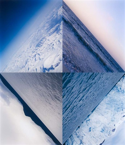
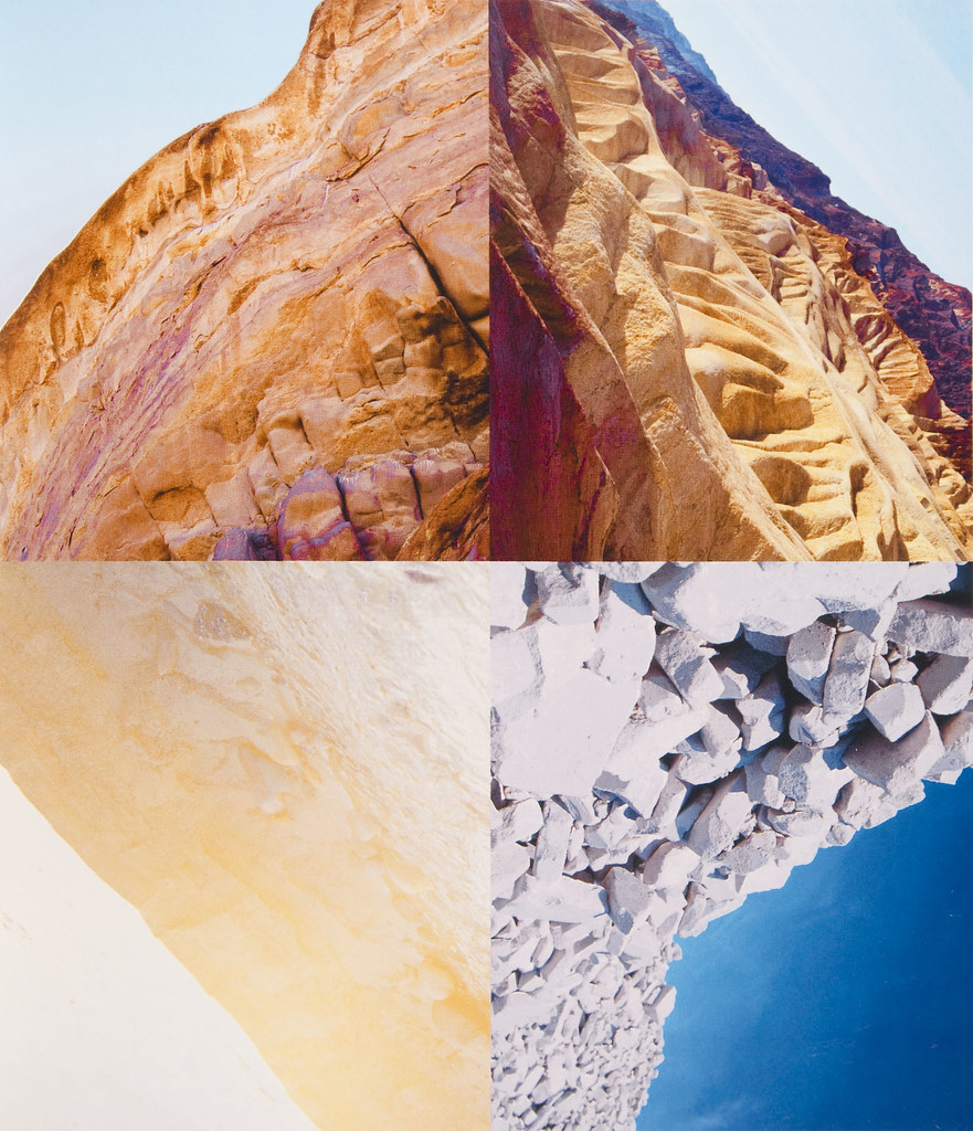
He then arranged this compilation of images into a diamond cameo:
Its name is derived from the diamond-like shape that the images are laid out into. These diamond cameos consisted of 4 images of the same person looking in different directions and at different angles. This is a really effective way to produce a final set of images as they are consistent and act in a poised manner of taking headshots. Also, it centers around the person and makes the image become a question of who the person is and why they have been presented at this status, depending on the kind of clothes and hairstyles they presented.
WHO IS FRANCIS FOOT?
Francis Foot was born in Jersey in 1885 to mother and father, Louisa Hunt and Francois Foot. His father was a china and glass dealer along Dumaresq Street which was one of the most affluent areas in St Helier at the time. Francis Foot began his working life as a gas fitter, however shortly after this began he started to become fascinated by photography, the early phonographs and gramophone records. Through this, he realised that he could earn a living using this. Taking on a second shop on Pitt Street, Francis worked as a photographer however remaining on Dumaresq Street, his mother and father sold records, gramophones and other wares until his father passed away. After this, Francis remained working in Pitt Street.
Some of Foots images were published as postcards even though many of his images featured portraits of his family. Alongside this, he also took 16mm black and white cine films regarding many different types of events such as:
Eventually the gramophone and record department of his work became increasingly more important and had to take over the larger shop on Pitt Street in which Francis sold vinyl records during the 1950s and 60s.
In 1996, La Société Jersiaise received a collection of glass plates and other photographic material, leading them to now behold 322 images of a diverse array of Jersey such as:
This photoshoot took place at the Maritime Museum, The Fresh Fish Company and around the Marina. In these areas alone, I took over 900 images in order to capture a wide variety of examples of what goes on down in these areas and what a working environment like this entails.
It was important for me to take images of nearly everything going on down here so that not only would my images be able to link with one another and tell an active story, but represent the way of life when working down on the Marina itself. As well as this, it meant that I could show comparisons and the advancements from when the transatlantic trade began for cod-fisheries, showing the more modernised and efficient industry.
BEST IMAGES:
One of my favourite images I took was of one of the hundreds of crabs that had been caught within The Fresh Fish company. These crabs were piled up onto one another and created an indistinguishable blanket of crabs, struggling to move around within these confined bodies of water. From here, these crabs would be exported to places overseas in Southern Europe. I think this image is really successful because there is so much detailed captured within the image, with the crab being partially submerged this creates an ominous tone due to the change in texture as the crab declines into the water, giving an almost glowing effect around its shell. I also think that this was really effective as in the foreground, the crab has high definition but as the background is entered, it goes out of focus, showing the compact space of crabs toppling over one another.
The image on the left is of one of the many fishermen working in this industry holding a crayfish. These creatures are exported to places such as Venice to become served in restaurants and are sold at £150 per kilogram. This environmental portrait depicts really well the type of ‘hands-on’ approach that fishermen take within their jobs, with the possibility of injury, in order to export these goods to be enjoyed.
This image was taken from inside the Jersey Sailing Club, hanging their life jackets in the air on a metal rod. I really like this image, not just because of the high vibrancy throughout the image which makes it eye-catching, but also the way the first life jacket is the main focal point of the image, making everything else in the background blurred.
This image was taken of a commercial boat, however I similarly do like the way that the yellow buoy is the focal point of the image, with the row of boats in the background flowing behind and adding to the composition. I think that this has worked very well also due to blue in the background, contrasting the brighter yellow within the foreground. As well as this, the light has reflected off of the metal and bounced off at a good angle due to this being taken at midday, leading to a more iridescent and shiny look, outlining it and making it stand out.
This image was really appealing to me because of the rich and bold yellow on the boat in the foreground as its very eye-catching and hard to miss. Not only do the shadows within this image provide dynamic shapes to slide across, but it also includes a vast amount of various dinghy boats and heavy machinery in the background, giving a rich insight into the types of activities that take place down at the marina.
These images are of cargo boats onloading and offloading for imports and exports to places like France for example. I wanted to capture these as not only are they really vibrant and appealing, but there are so many intricate details, textures and parts which I thought would be beneficial to my work as it shows how technical and intricate this work is.
I liked these images because the boats bring in bright block colours which juxtaposes all of the dull sand and left-over sea water in the boats as the tide has gone out.
These two images above are of the retailing part of the fishing process. The lobster and crab has been prepared during the production stage and now is ready to be bought and eaten.
On the left is a photo of one of the many stacks of rowing boats at the Jersey Rowing Club. I feel that this image is really effective because the points of the boats go down in a vertical line as if its splitting the image into two halves. As well as this, this adds some depth to my image too.
The image on the right is taken of one of the many ladders used to get down onto the boats to fish. I really liked this image because there is a large contrast within it, the ladder has become extremely dark and allows the marina to be revealed behind it.
I liked this image because it resembles the sublime due to the way the sail boats are much bigger in comparison to the worker, creating an intimidating feel in the image. As well as this, this image has used a wide-pan approach meaning that you can see how large the harbour actually is.
Not only did I really like the saturated tone in this image but the way the two sailing boats created parallel lines, due to their masts, making the viewers eyes flow through the centres of the images. As well as this, the foreground of the thick sludge revealed from the tide going out has been imprinted with seaweed, rope and chains making an intricate pattern and an uneven texture from puddles of water left behind.
Maritime Museum:
Glass bottles of models of ships used within Jersey’s maritime history:
This photoshoot taken from Jersey’s Maritime Museum was very insightful and provided a high amount of historical value and contextual importance into my work, however I didn’t choose to use many of the images I took here as I don’t feel that these would be useful any further as it doesn’t fit in with what I am intending to explore in this topic. Although this information will help me when creating my zine as it means I will be more aware of what I am creating and help me create a narrative, I have other images which are more successful.
Black and White:
I put my images into black and white too to create a more composed perspective:
My photoshoot took place down at Société Jersiaise Photographic Archive and St Helier Harbour in order to show the history and development of Jersey’s maritime culture and how the fishing industry substantially benefits Jersey’s survival.
CONTACT SHEETS:
Due to the weather conditions being poor, I took multiple images of the same thing in order to ensure the wind and rain didn’t make the camera go out of focus or blur. This meant that I could go through each selection in sections and choose which images had the best composition.
MY EDITS:
I think these two images are really successful as I have been able to make the seagulls, birds which are very common to Jersey as we have hundreds surrounding the island (alongside them being native to the sea), the main focal point of my image by making my background of the harbour become blurred. I feel that this has worked very well because, although I am still taking images of the harbour, this makes the image more interesting and tell a better story as its a quiet nod to the type of environment these people are working in every day, with the gloomy weather contributing to that.
For this, I used a horizontal cropping technique after completely zooming out my camera lens in order to not only capture the vastness of ships loading and unloading, but also make this appear as a panoramic as this meant that the harbour was the sole focus of the image and not taken up by negative space – a large amount of the sky or sea.
I selected this image because not only did I think the vertical angle makes the focal point of the boat look extremely large in comparison to the men working on the boat, but I feel that this juxtaposes images of teams of fishermen in the past working on large ships with little equipment at all towards this image of two men on a modernised sailing boat using high level technology to manoeuvre it.
Similarly, I feel that this boat suggests the same idea.
I liked this image because of the way the diagonal angle makes this image look more dramatic and mysterious, as if someone is slyly moving through the harbour trying to remain unnoticed. As well as this, it means there are many ambiguous lines moving and pointing in all directions, creating a cross-hatched type of pattern scattering across the screen and making the viewers eyes be signalled all over the screen.
I selected this image as I felt it tells the story on how these cargo ships and loaded or unloaded, as well as showing a contrast from how fishermen used to have to manually perform these acts at great difficulty in comparison to this industry becoming more modernised and using heavy machinery through Ports of Jersey in order to complete jobs and tasks with more efficiency.
I took these images of the Ariadne steam clock because, not only is it the largest in the world, it is a full-scale replica of the centre section of a paddleboat. I thought it would be useful to incorporate this into my work because it resembles a ships funnel and reflects Jersey’s long association with the sea.
This image here is a memorial dedicated to the RNLI, a crew of dedicated volunteers and staff concerned with the dangers of commercial fishing and keeping fishermen safe whilst at work. I wanted to photograph this as I felt it was really important due to this company being one of the main helpers in times of danger, for example if a fisherman is experiencing trouble at sea during rogue weathers, possibly in a storm.
These images are of an abstract structure of three block coloured anchors spiralling up into the air.
These two images depict a ships anchor, put into both monochrome and colour as whilst in the colour it has rich shades of red, I also liked the way the black and white version looked more modest.
I took this image of the roof of the maritime museum, crowded by a statue of a woman which would have been seen on the bow of an old ship, accompanied by a weather vane. I felt these two factors were relevant here because not only does it note the history of the structure of ships and shows the modernised change in the way they are manufactured, but also a weather vane which would’ve been important for fisherman to use in order to see the strength and direction of the wind before setting off to sea. As well as this, I feel that this is very important to show because the fact that a woman was placed on the bow of these ships shows the way traditional roles and social norms were – the men working doing these dangerous jobs whilst the wife sits at home looking after the children.
In this image, I really liked the way the buoy in the foreground, used in emergency situations when someone is in the water, and puts the harbour behind it out of focus. As well as this, I feel that this shows the extensive length of the harbour and makes it look bold.
I took this image facing down the stairs into the harbours waters, where many sailing boats and dinghy boats used to sail out to them, because this would be the perspective of a fisherman when going down into the boat to set sail.
In this image, I took it at a diagonal angle in order to capture the red buoy with the long stretch of harbour following behing it. I think that this worked really well because of the way the smaller boats are piling on top of eachother in the foreground, however as the camera pans back the boats are in a more relaxed state.
Typologies:
During my photoshoot, I took some images of structures created for and around the sea, in use and not, which are used for communications of fisherman at sea and with the island. I took them in this style because I felt as I feel that the anonymity this style provides makes the image more powerful as it is the focal point in the image and placed in the centre, showing significance and importance. As well as this, I feel that its a minimalistic way to show how, as a society, we find ways to update and advance technology, being applicable here through the way Jersey’s maritime history has gone from voyages at sea for months on end with no practical way to communicate back to the island, to a consistently developing fishing culture.
History:
This image is of one of many plaques placed on a benches, stating the name, weight and date of which one of the many sailing boats were in use within the harbour. I wanted to include this within my work as I feel that this acts like a memoir to the past, showing the kind of language these fishermen used and the old fashioned manor of which these boats were spoken about. I also think that the use of a harsh font portrays a viewpoint of strength and power, announcing that these boats were of high status at the time and extremely significant to the advancements made.
I selected this image of a reconstructed cannon because I liked the way I took it from a low angle, following upwards through the spine of the cannon. This is because I feel that this shows the depth and length of this weapon, and gives a powerful and bold feel to the images, specifically in black and white.
Down on the side of the lighthouse within my other images, a plaque dedicated to a person during concentration times and tells a story about this. This is important because it’s informative of Jersey’s history and stands as a idolisation of someone, fighting for their country.
This mural on the wall of the car park overlooking the harbour depicts a story of World War cargo ships and fisherman working to import and export cod in a black and white tone, contrasted against bright solid colours of red, cyan and yellow showing our society now and the simpler way these jobs are carried out now.
Saint Helier harbour is the main harbour of Jersey through its occupation of most of St Helier down the south coast. This harbour is operated by Ports of Jersey, the operative government company. Here, there are 3 marinas for private yachts on pontoons and drying harbours for commercial shipping, with facilities including a dock for lift-on/lift-off cargo ships, roll-on/roll-off ferry berths and a tanker berth.
Definition: a berth is a designated area where a vessel may be moored, typically for unloading and loading, assigned by an authority – in this example, Ports of Jersey.
The harbour gains its name from the 6th-century ascetic hermit from Belgium, Helier (Helierius).
The Old Harbour:
This area got its name as the Old Harbour, also known as the English and French harbour, with berths for over 500 motorboats and sailing yachts used for leisurely purposes, resulting in them being able to dry out on the mud below during low tide. Down here is where South pier and, the abandoned pub, La Folie Inn, are and have become an area in which marine engineers are working for South Pier Marina and St Helier Yacht club.
Back in 1790, this was only a small jetty at the side of the island where ships coming into the island could go.
Construction:
The 19th century is when the harbour was properly constructed. This only occurred after the Chamber of Commerce was denied by the States Assembly to build a new harbour, therefore they took it into their own hands to upgrade it in 1790. This consisted of a new breakwater of which its purpose was to shelter the jetty’s and harbour.
This led onto the merchants constructing the roads now known as Commercial Buildings and Le Quai des Marchands in 1814 in order to connect the harbours to the island to make them more accessible. After this, construction was concluded on the Esplanade and its sea wall:
An extensive expansion of shipping around 1837 led the States of Jersey to order the construction of two new piers named Victoria pier and Albert pier.
The Main Harbour:
This harbour is home to the deep water berths necessary for commercial vessels along Victoria Quay, where fish wholesalers of Fresh fish Company and Aquamarine fisheries is, and New North Quay.
Elizabeth Harbour:
Here is where high-speed craft and traditional ferries to Poole, Guernsey and Saint-Malo alongside foot passenger ferries to Granville, Barneville-Carteret and Sark use the implemented ferry terminal, two roll-on/roll-off berths and trailer park for shipping containers.
Involved within this are three marinas known as:
Out of all of these, The La Collette Yacht Basin is the only one which provides non-tidal, 24-hour access to the sea, leading it to be home to Jersey’s commercial fishing community.
Development of the harbour:
By the beginning of the 16th-century Basque fishermen were travelling near Canada to fish. Basques were fishermen and sailors which had greater expertise and a specialised group within whaling and fishing, controlling the fishery along la haute main (northeast coast) for over a century. By 1580, around 10,000 European fishermen were making the transatlantic voyage to the area each year in order to fish for cod.
This methodology of sea travel in order to fish for food intrigued the Jersey people alongside the Channel Islands, for example Guernsey, to get involved greatly as lucrative trade routes were and still are, crucial to Jersey’s survival. This pioneered the development of fishing tactics for Jersey fisherman alongside finding ways to ease the imports of food Jersey receives. Because of this, Jersey’s food production economy has shrunk over coming years, resulting in potatoes being near enough the only food source grown and sold – 98% of food sources being imported on vessels from the UK and Europe.
The sea has become a large factor within Jerseys culture, identity, geography, history and economy and has intrinsically helped shaped these.
During the Middle Ages, a large sum of piracy/raiding took place by Vikings, causing jersey to employ many Viking words within the old Norman-French language of Jèrriais to do with fishing, farming, ships and the sea. These include:
Piracy in the Channel Islands concluded when Sark became colonised in 1563 by Hellier de Carteret, leaving some pirates hiding out in isolated French and English bays, some sailing up from places such as Turkey too in order to ransom valuable captives or keep them as slave workers.
INVOLVEMENT OF JERSEY MARINERS:
The fishermen of the Channel Islands, many from Jersey, had set up lucrative trade routes between Canada, Europe and America by the 1750s, establishing bases on the Gaspé Coast where they could salt and prepare the cod. The Gaspé Coast is an area which follows along the St. Lawrence River extending from the Matapedia Valley in Quebec, Canada, into the Gulf of St. Lawrence. This area provided great ease when fishing in the open sea, available at any time of year however fishing closer to the coast was a more difficult task, allowing the Jersey fishermen to obtain great catches.
One of the biggest companies on the Gaspé coast was operated by Charles Robin, a Jersey merchant, who set up a fishing post at Paspebiac in 1767 after Canada passed to the English. After the American Revolution had died down, he took advantage of the lack of competition to set up a fishing monopoly in 1783 to reap the benefits of the cod trade.
Within Gaspé, despite the fact they were a minority, the Jersey community settled it nicely, speaking Jèrriais in their businesses and day to day lives, almost transforming the Gaspé coast between these years into a Jersey colony. The Jersey people became the economic giants of Quebec. Alongside this, islanders would receive concessions from the people of Newfoundland or the Gaspé coast such as the dried cod produced as well as cloth, wine, wool, leather and household goods.Â
However, this would all come to an abrupt ending when problems concerning finance and the disappearance of the cod trade appeared, causing a dwindling of this renowned Jersey fishing company. In the 1870s and 1880s they suffered a credit crunch, as the Jersey banks crashed leaving many companies in huge debt. For example, the Jersey Banking Company crash in 1883, came about due to the bank manager, Philip Gosset, gambling with the funds – a bank of which many Canadian-Jersey companies had borrowed heavily from.
When the banks crashed, vast sums that had been made during the fishing monopoly years were wiped out. The credit system, where fishermen would receive all they needed from the company insured against future catches, also left many workers heavily in debt to their employers. This meant the end of these monopoly trading years.
Which ports did Jersey ships sail to and trade with?
The effort towards building harbours didn’t become a concern until the late 17th century, with work beginning on the islet of St Aubins building a pier. It was the 18th century when St Aubins harbour was finally constructed, followed by the development of building a port in St Helier too, however this only began to develop as a port properly towards the 19th century due to the need to raise capital. This then sent forth the movement to developing stone piers at La Rocque, Bouley Bay, Rozel, to accommodate the oyster boats, alongside Gorey which took passenger traffic from Normandy.
What type of goods did Jersey merchants exchange for cod-fish?
The Jersey merchants exported their findings of cod to places like the West Indies, the Caribbean and other British Colonies to trade for plantation goods. This consisted of sugar, molasses (a thick syrup that people use as a sweetener), rum, tobacco and cotton alongside oils, skins and several types of fur.
In order to export the cod, the fish were dried, salted and dispatched in various wooden tubs weighing about 112lbs. This procedure was done as it meant that the fish would be preserved longer and wouldn’t arrive in an unacceptable state.
Has the island of Jersey benefitted from its constitutional relationship with Britain and the legacies of colonialism based on a slave plantation economy during the first Industrial Revolution (1760-1840)?
During these times, many Jersey merchants either owned or traded using mahogany, tending to have mahogany plantations in British Honduras – a crown colony south of Mexico renamed to Belize in 1973. The mahogany industry was built through enslaved peoples harvesting, dragging and rolling felled mahogany trunks to riverfronts, then floating the logs, which were chained together, to ships waiting in bays full of sharks and coral reefs.
For example, Sir George Carteret – founder of New Jersey, was a founder of the Company of Royal Adventurers into Africa where he would trade in enslaved people, ivory and gold. As well as this, Aaron de St Croix and brothers, James and Clement Henry and Co, George Mauger, Francis Valpy, Francis Alexandre Bradley and George Le Geyt were identified as being part of the mahogany industry.
This trade connection was provided through boats and ships, one being the Speedwell. For example, leaving London in 1663, the Speedwell initially picked up 302 enslaved people at Offer, Benin, followed by the selling of 155 men, 105 women and 22 boys to plantations in Barbados by March 1664. This was only just the start of the hundreds of trades of enslaved people which would take place.
The Rohingya experience was a photography exhibition showcased around St Helier, Jersey from the 1st until the 14th of July. This consisted of photography boards strategically placed throughout the high street and most popular areas of town, with 26 images each taken by an extremely talented Rohingya refugee through a partnership named Rohingyatographer – a unique magazine showcasing images from the worlds largest refugee camp. Accommodating these images were QR codes which invited members of the public to scan and listen to the compelling story behind the photograph. The ideology behind this project was to reveal the truth behind one of the worlds most tormented and stateless populations, and indicate the tremendous resilience these people inhabit in their lives just to get through the day.
What is the Rohingya crisis?
For decades, the Rohingya people, a Muslim ethnic minority in Myanmar (specifically the Rakine State) which is a predominantly Buddhist country, have faced a horrifying amount of institutionalised discrimination such as being denied citizenship. These policies have been created by Myanmar’s government since the 1970s, compelling over a million of these people to flee their homes for the sake of refuge and peace. Due to this exiling, the Rohingya people have shown to be the worlds largest stateless population, with an estimated 3.5 million people dispersed worldwide due to this brutal discrimination. Even though the roots and history of the Rohingya people is present in Myanmar dating back centuries, their existence is not recognised by the government.
Already being depersonalised by the ignorance of the Myanmar government, the hardships continue for the Rohingya people. Various restrictions have been put into place on topics such as marriage, family planning, employment, education, religion and freedom of moment – for example Rohingya couples in the northern towns of Maungdaw and Buthidaung are restricted to only having two children.
The most significant exodus (migration) took place in August 2017 when large clashes broke out in the Rakine State, with the military mounting a brutal campaign which destroyed the homes of hundreds of Rohingya people in their villages and resulting in nearly 700,000 people having to evacuate this persecution to Bangladesh. Now, Cox’s Baza in Bangladesh is home to the worlds largest refugee camp, with 1.35 million people living there. This escape from unwarranted military persecution was the result of an attempted ethnic cleansing, one that consisted of widespread violence, attacks and the stripping of basic human rights. This genocide of the Rohingya people has resulted in the deaths of thousands, consisting of brutal forms of abuse and violence that is unimaginable.
Why?
This exhibition is one that is monumental and moving, having great importance in order to give visibility to this crisis. The intention behind this showcase is to provide a plaintive platform for the Rohingya people, from adults to children, to document the truth about their lives, in a raw and authentic way. This is extremely key in shifting the narrative from one of victimhood to a story of strength and tenacity through self-representation and advocacy. Photography has acted in a transformative way to illuminate the difficult experiences these people have gone through and emphasises their suffering and dignity. By doing things like this, charities such as the Jersey Overseas Aid have the ability to ease the unprecedented pain these people experience in their day to day lives by performing activities to positively impact health, hygiene, sanitation, nutrition and protection, both community-based and legally. I think it is really important that this exhibition has taken place in the busiest area on the island because it sparks a conversation about the need for change in Cox’s Baza and for these pressing issues to be addressed immediately, shedding light on the undergoing hope of the Rohingya people who has persevered for decades whilst living through this immense amount of violence. The way that photography can reveal the harsh realities that the Rohingya people are experiencing in this current moment is monumental because it spreads awareness about this crisis and can encourage advocacy and activism for this minority group who are struggling. Alongside this, it is eye-opening to the people of Jersey to realise the privileges that not only do we experience as an island, but the luckiness that economies such as the UK or USA experience and how much this is taken for granted. The visual element behind this experience is key because it means that members of the public get to actually see what these conditions are like instead of reading a piece of information to draw their own conclusions from, providing a more objective approach. Finally, the way that this exhibition has come from the Rohingya people’s own images makes the entire experience more compelling, captivating and moving because not only does it show Cox’s Baza from their own perspective but this would give them a sense of hope because this means that they are able to try to get away from this stressful situation and try to take their minds off of it through creative and artistic ways, giving them the opportunity to express themselves and try to find joy in a specific project.
I thought it would be really significant to involve this in my work through a blog post because not only does it provide more contextual elements into my work but it is something occurring in the world at the moment and is important to be aware of to try and help in any way.
Using InDesign, I created my picture stories to depict St Malo. I used these pre-sets:
This meant that my pages would be an A3 size with borders at the side. This made it easy for me to ensure my images worked well together and fit suitably on the page. As well as this, I could make sure that the small gaps between each image would be identical so that the picture story would look formal and structured. I began with 3 pages however I could add more by simply just using the pages button and creating more on he document to experiment.
To create my picture stories, I used the rectangle frame tool to create the size of the image I wanted to add:
Then I used the place button in the file section and selected an image:
Once I selected my image, I used the fitting button to make sure that the image fit proportionally inside of the frame, then afterwards I could move around the image to my liking. By doing this, it made sure the entire frame was filled and that as much detail was in it as possible.
After I had filled the page with the all the images that I wanted to include within that picture story, I could then use the rectangular framing tool once again and fill it with text depending on the context of the picture story and images in order to provide more information and detail on what it was about and the contents of the images featured.
MY PICTURE STORIES:
I created 7 different experimental picture stories, some in colour, black and white and with graphic design behind them. These are the picture stories before the writing within the captions in changed from placeholder text to mine. Once I was happy with the layout of each one, I either kept the placeholder text there or wrote some information about my images. In my picture story on ‘The Life Of St Malo’, I used google translate to add in some French words as I felt that it seemed more realistic.
I used my initial picture story as a template to build off of to create these two slightly different images. For the one below, I used the same rectangle frame tool as I did for my photos, however I laid it over the text I had written and filled it with a solid grey, then lowering the opacity to make my writing stand out bolder.
And for this one:
I used the polygon frame tool to create two hexagon shapes and right clicked each to send it behind my work and settled on a monotone colour scheme to make my work look more interesting as everything had been rectangular.
For the background on this one, I used an ombre effect to lighten the title and make it stand out in a bold way, whilst creating a gradient diagonally across the page.
For this background, I used a pastel yellow as yellow and orange tones were frequently shown in practically all of the images, however I didn’t want to make it too saturated as this would have been too bold and could have possibly distracted the viewer from the actual story taking place through the photographs.
For this picture story, I used the rectangle frame tool to create an opaque background of one of the small lanes I found in St Malo. Then, I used the polygon frame tool to depict a story of the heavy rain there was during my time in St Malo by using different images of people in the rain, structures and umbrellas. I chose not to add text onto this one as I felt that the images were able to carry and tell the story itself as well as the title.
Finally, in this picture story I used the same traditional layout for my images and text however, I used the same framing tool to create a red and blue rectangle in order to show the flag of France so my picture story was more cultural to France. Also, this meant that to those who are unaware of what/where St Malo is, this provides a more muted and simplistic explanation.