All posts by Kate Mullins

Filters

Author:
Category:

Headshots – Photoshoots and edits

For this photoshoot, I took simple, portrait photographs, which I will be using to show multi-exposure through editing.

Photoshoot 1 –

I gathered a variety of different types of lighting in every few photos, such as ; Chiaruscuro, Rembrandt and butterfly lighting. This is to have different area of light to play around with and explore my editing and colour handling.

Photoshoot 2 –

With this second photoshoot, the use of different lighting, would give even more variety of the types of lighting that I had to manipulate.

Edits –

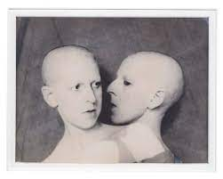
For this edit I was playing around with layers and opacity on my photos. I dragged this photo onto photoshop and duplicated the layers 3 times. Changing the opacity on the original photo to 50%. I slowly enhanced the opacity on each layer from 50% – 60% until I had a mirrored looking edit.

Edit 2 –

I used these two photos to edit together. I wanted to show a contrast between emotions as well as colours and I thought that could be quite powerful.

I edited both photos different ends of the colour wheel to show contrast, this I did in Lightroom-classic. Blue to the sad photo, and red to the angry photo. This is the emphasis the stereotypical emotions and the colours that are subdued to them.

I brought both edited photos from Lightroom Classic and put them in photoshop. I played around with the saturation and vibrancy of both photos getting them to the exact colour that I wanted.
Then placing them on top of each other, I controlled the opacity of the photo on the top bringing it down to 50% so the background went transparent while keeping some of the blue hue on top.
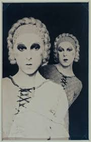
Edit 3 –

For this edit I wanted to do something similar to the first one but making it slightly more difficult, adding more layers and different ideas.

I dragged the first photo into photoshop and flipped it upside down first of all. Then using the eyedrop tool to match the colour, I coloured the background the same grey hue as the photo. After that was done, I dragged the same photo in again, keeping it the correct way up but moving it across so each subject was in opposite thirds of the photo keeping an inch of space between.

I then cut the background from one of the layers to help not show original background on the photo. When the photo looked smooth, I dragged in the second photo on top keeping it the correct way up, then changing the opacity to 50% to show background of the other photo.

Studio Portraits – Edits

These are the photos I want to use for the Studio Portrait topic. They show a variety of different lighting techniques, like Rembrandt lighting, Chiaroscuro and butterfly technique and I think they portray my skill well overall.

Rembrandt lighting –

Rembrandt lighting is where there is a little triangle of light on the cheek ( under the eye ) of the model in the photo. This appears when the features of the model in the photo block a certain amount of light from reaching the side of the face where the light is not facing which created the triangle patch of light on the face.

Chiaroscuro lighting –

Chiaroscuro lighting is when there is only a slight patch of light that hits the face of the model in the photo. This happens when the light that hits the face comes from an angle which doesn’t disrupt the shadow on the rest of the face. This causes an orb like light hitting the face darkening everything else around it.

Butterfly lighting –

Butterfly lighting is where the light hitting the face causes there to be a butterfly shaped shadow below the tip of the nose. This happens because the light that hits the faces comes from above the models head causing the little shadow below the nose.

Editing ( photo 1 ) –

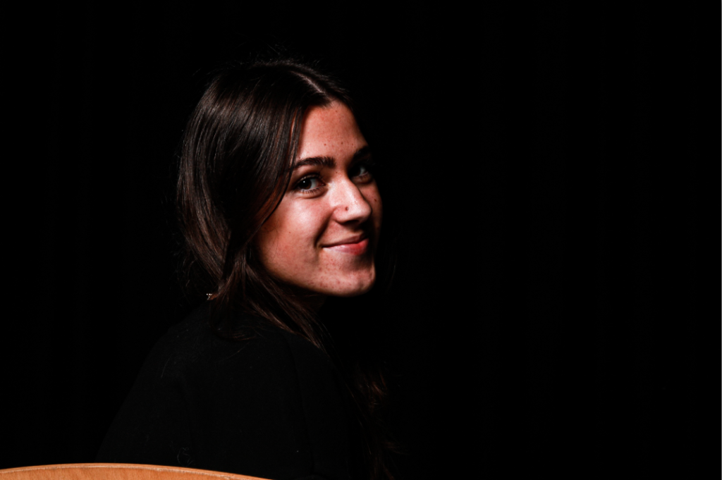
The end result I want to see in this edit is a brighter contrast between the shadows and the highlights. The lighting technique used in this photo is Rembrandt lighting as you can see the triangle of light on the far side of the face caused by the shadow of her nose.

In this edit, I obviously enhanced the highlights in this photo and changed the shadow as needs be to create a better contrast between the two. The clarity has also been brought up to show enhancements in the detail, especially in the hair.

Editing ( photo 2 ) –

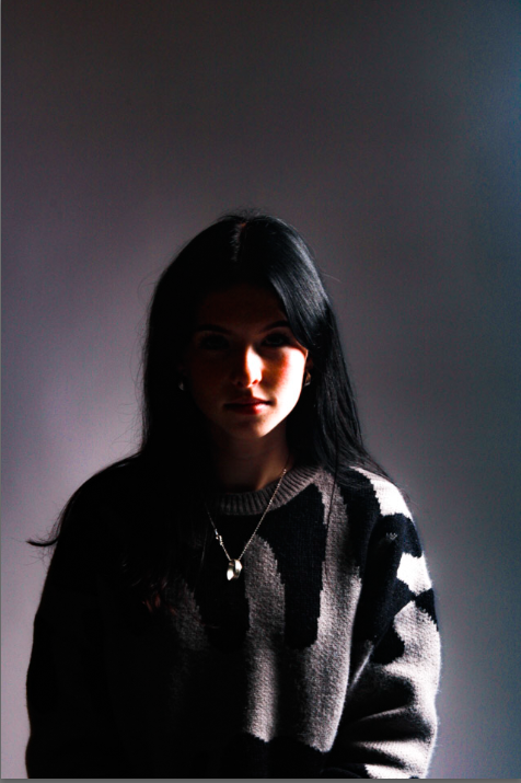
For this photo, the main thing I want to do is add some light into the photo to give some contrast because currently, the photo is very dark and not well lit at all.

In this edit, I increased the saturation in the photo which is where the coloured ‘aura’ cam from surrounding the outline of me. While I did the saturation, I made sure to keep the vibrancy down to avoid having neon colours lurking in the photo. I enhanced the shadows while controlling the highlights to give a smoother transition from light to dark in certain places in the photo.

The Lighting technique used in this photo is chiaroscuro as there is only light on one side of my face instead of seeping onto the other side.

Editing ( photo 3 ) –

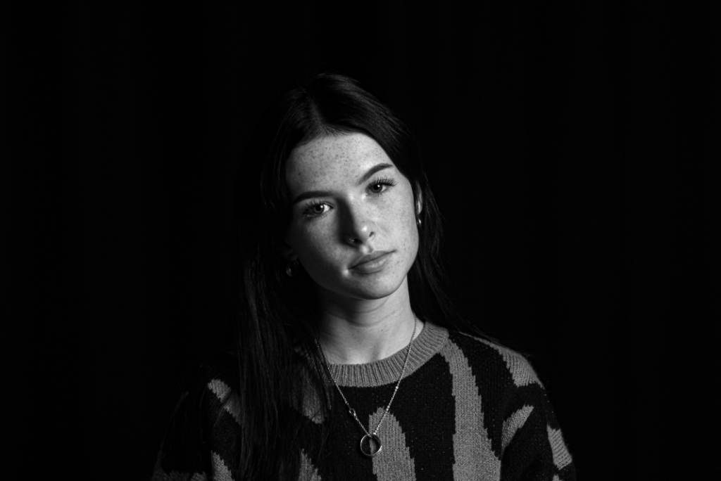
There is not a lot of editing I want to do to this photo but I am going to shadow my face slightly just to give more definition and dimension. Also, I am going to add a black and white hue to the photo too enhance the definition even more.

The lighting technique used in this photo is Rembrandt lighting as you can see the triangle shape patch of light on the left cheek.

In this edit, I did focus on shadows and enhancing the light for highlights. But I also enhanced the clarity, because for me, in the wrong lighting, my freckles blur and are not as defined and I want to include those in the self portraits of me.

Editing ( photo 4 ) –

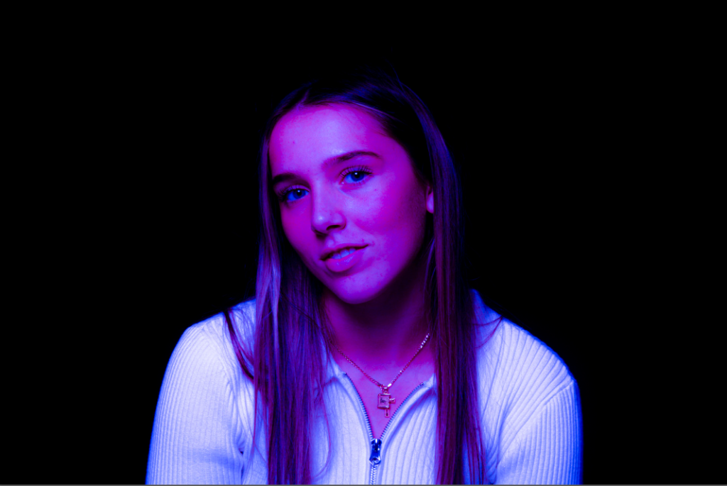
For this photo, I want to give it some depth so that it looks more like a headshot photo. With that, I will have to focus on highlights and texture as well to make sure the photo keeps its detail.

With this edit, I was highly inspired by the iconic Marilyn Monroe photos that are highly saturated and very dimensioned. I added highlights on points where the natural light hit the skin and shadows where the saturation had taken away the natural ones.

Evaluation –

If I was to re do these edits, what I would do differently would be that I would focus more on how the edits may effect the photo as a whole and not just doing them quickly and without too much thought. This would improve the edits all together and boost my confidence editing and changing the original photos.

Studio Lighting introduction-

There are three main types of studio lighting that is commonly used, Rembrandt lighting, Butterfly lighting and Chiaroscuro lighting.

Rembrandt lighting –

Rembrandt lighting is a technique that was taken from a famous painter from the 1600s Rembrandt Harmenszoon van Rijn. The technique is a way of lighting the face so that a small upside-down triangle of light appears on the cheek, just under the eye of the model in the photo.

This technique is most commonly known for the impact it had on Hollywood photos throughout the years, used in promotional photographs to show them in a dramatic and eye-catching way.

Using Rembrandt lighting you instantly create shadows and contrast in your photos. it also adds an element of drama and psychological depth to the model in the photo. It draws the viewers attention to the eye of the person in the photo since it acts like a photographic device. This is helpful because in portraiture the eyes are usually the main focal point and subject of the photo.

Lighting setup :

Light: Lighting styles are determined by the positioning of your light source.  Rembrandt lighting is created by the single light source being at a 40 to 45-degree angle and higher than the subject. Use cans use both flashlights and continuous lights.

Lens: Use a 35mm or 50mm if space is at a premium – or if you’re looking at including more of the subject than just the head and shoulders. A 50mm works really nicely for portraits and will give a nice depth of field if you’re shooting at a shallow aperture. But a 35mm will give you a wider point of view and is great to fit more of the body in of your subject.

Butterfly Lighting –

Butterfly lighting is a type of lighting technique primarily used in a studio setting. Its named ‘ butterfly ‘ because of the butterfly-shaped shadow that it creates just under the models nose. This happens because the lighting used in the shot, comes from above the face of the model. It can also commonly be called ‘paramount lighting’ or ‘glamour lighting’.

Butterfly lighting is used mostly for portraits, its a pattern that flatters everybody that its used on which makes it one of the most common lighting setups.

Lighting setup :

Lighting: Butterfly lighting requires a key light that can be a flash unit or continuous. If continuous, it can be artificial or natural. In other words, you can use strobes, speed lights, LEDs or even the sun.

A butterfly lighting effect refers to the setup and not to the quality of light – it can be soft or hard light depending on the effect you want.

Chiaroscuro –

Chiaroscuro is Italian for ( light/dark ) which is obvious for the photos it produces. There is a very obvious contrast of lighting in these photos, the shadows are very harsh and dark while the highlights are very bright and illuminating. This shows the bold contrast.

It first appeared in a 15th century painting in Italy and Flanders, but true Chiaroscuro was developed during the 16th century, in Mannerism and in Baroque art – dark subjects were dramatically lighted by a shaft of light from a single constricted and often unseen source. It was a compositional device seen of old ‘masters’ from that time.

Chiaroscuro is also often seen in Hollywood now too, usually in crime or thriller dramas to enhance the theme of unsettlement throughout the film.

Lighting Setup :

Chiaroscuro using one key light and a variation using a reflector that reflects light from the key light back onto the sitter, which gives the illusion of the light and dark contrast.

Environmental portraits – Edits

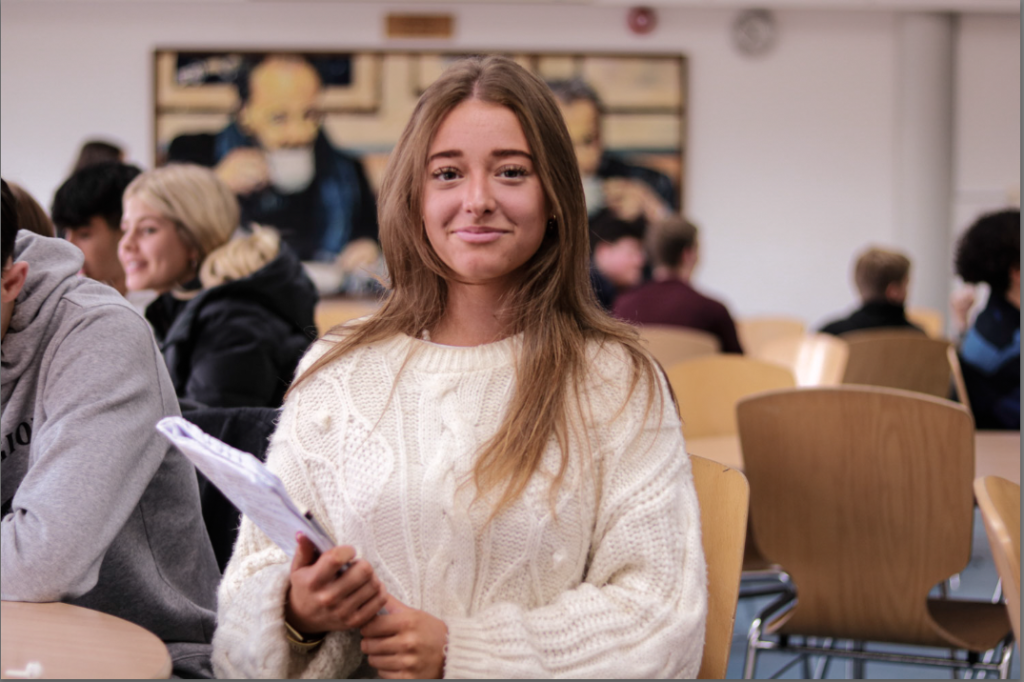
These are the photos I am going to edit for Environmental Portraits because I believe that they are the best photos to show natural environment, especially in a school that provides a wide variety of opportunities for students.

Editing ( photo 1 ) –

For this photo, I want to show the reality of work for students, the rawness of students learning and growing, through my photo. I am going to raise the clarity on this photo to make it more clear to show details and smaller aspects the viewer might have missed. Still focusing on highlights, I am going to experiment with the shadows that could be brought into this photo.

The edits for this photo went really well. I was able to bring the saturation and vibrancy back into the photo while still keeping the shadows and contrast high enough. The realism is also prominent in the photo as you can see the details and small increments you may have missed before.

If I was to do anything different, I would have controlled the shadows a little bit more so that the photo did not have such a dark area to it around the bottom right corner .

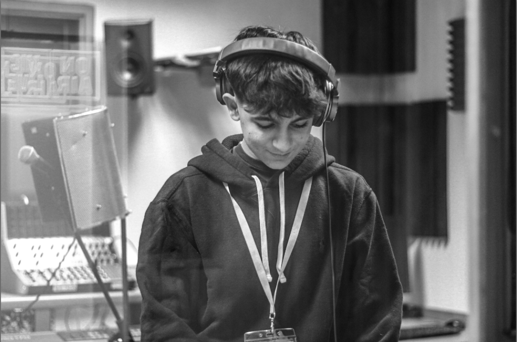
For my last edit I wanted to try out the black and white idea again. I feel like its given the photo an almost vintage feeling to it, which I think fits the photo quite well considering the man is a DJ which reminds me of older generations quite a lot.

If I was to re do this edit, I would change the fact that the colour has no impact on the photo. I personally feel that colour brings a lot to a photo and the lack of it makes the photo look slightly dull.

Editing ( photo 2 ) –

For this photo, I’m leaning towards a 50s vibe for the editing style. I want to enhance the clarity but dampen the colour of the photo to give it some originality from some of my other photos.

In this edit, I decided to change the lighting a little bit, making it a warmer looking light instead of a colder light to give the photo a bit more life. I gave the photo more clarity just to enhance details in the photo and so the the model in the photo was more flattered.

If I were to re do this edit, I would defiantly do something a bit more drastic with the colour, something with increasing the vibrancy significantly to give the photo an original spin.

Artist analysis –  Michelle Sank.

The artist I have decided to focus on is Michelle Sank.

She is a South African photographer who was born in Cape Town. She lived there till 1978 and she moved to England in 1987.

Her images reflect a preoccupation with the human condition and too this end can be viewed as social documentary. Her work encompasses issues around social and cultural diversity.

Some examples of her work include:

In this photo she decided to photograph an elderly woman in what seems like her home. Sank depicted the woman to look comfortable. She managed to make the woman seem very wise and almost powerful in the photo.

My emotional response to this photo definitely varies depending on what aspect I focus on. Overall the photo makes me feel comforted and almost safe because of the stereotypical thought of older people, that they are sweet loving people. And because of the angle the photo was taken, it almost gives the illusion that the viewer is looking up. This is because the woman is sat down making the eye view of this photo the hight of whoever Sank wanted the viewer to imagine was looking at this woman. To me it makes me think of a child and a child would definitely be looking up to this woman, almost as a roll model.

This photo was what seems like taken in natural light. And the backdrop seems to be the comfort of the woman’s home making the photo seem more comfortable and somewhat safe. The shadows and the dimensions don’t seem forced and look natural due to the natural light used to take the photo.

The leading lines in this photo seem to be vertical, you can see that on the couch, the frame of the glass shelf behind the model, the curtains and the radiator. If I were to over analyse this information, I would say that the use of this linework would back up my thoughts about looking up to the woman in the photo because of how the lines travel up through the photo.

Another example of Michelle Sank’s work would be ;

In this photo Michelle decided to photograph a young woman in what seems like her bedroom. Sank decided to make this woman stare straight into the camera maybe to give a more intimidated feel to the photo. In this photo Michelle definitely showed the difference between cultural differences and stereotypes, in the first photo before, the woman was shown to be of some kind of wealth based on the clothing she wore and the sophistication of the photo in general, while in this photo the woman seemed to be in more generic clothing and is you can see, the wall in her bedroom seemed to be broken or a layer of paint has worn away or been broken off. This could show social standing differences through little details in both photographs.

The emotional feeling this photo gives me in particular is more intimidation while still giving a feeling of comfort and relaxation. The intimidation comes from the glare the model is giving the camera and also the observation that her hands are in her pockets. However the comfort and relaxation feeling comes from the fact that the woman gives a slight smile in the photo almost making her inviting and kind looking. Also, the idea that the woman is in her own bedroom gives the feeling of comfort because she is in her own home and is safe where she is.

Environmental portraits –

What are Environmental portraits?

An Environmental photo is a photo taken of a person, usually head on, of them in their ‘natural environment’ ( place of work etc.. )

The first Environmental portrait was first created by a man named Arnold Newman ( 1918 – 2006 ). He was known for pioneering and popularising the environmental portrait.

He placed his ‘models’ in their normal work environment when he took the photo so he could represent their professions, aiming to capture the essence of an individuals life and work.

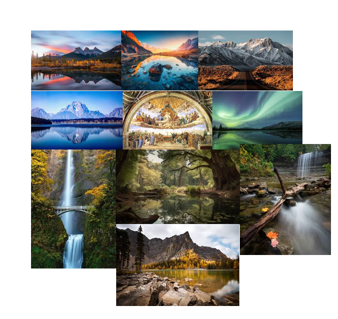
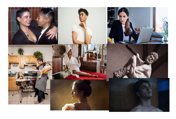
Environmental portrait mood board –

To me, these photos represent a lot more then just people at their work, they represent peoples lives and how they live and what they do. It gives a picture of the personal part of someone’s life, and almost gives us a window to understand people in a different way then just what is on the surface and what we can see first hand.

Typology

Typology is basically a fancy word for a group of photos or a certain ‘photoshoot’ that are all themed together that give the same ‘feel’ or ‘idea’.

Some environmental portraits are also typologies, taken in a similar way. The photos all have similarities even though they are completely different and show different people and lives in completely different ways.

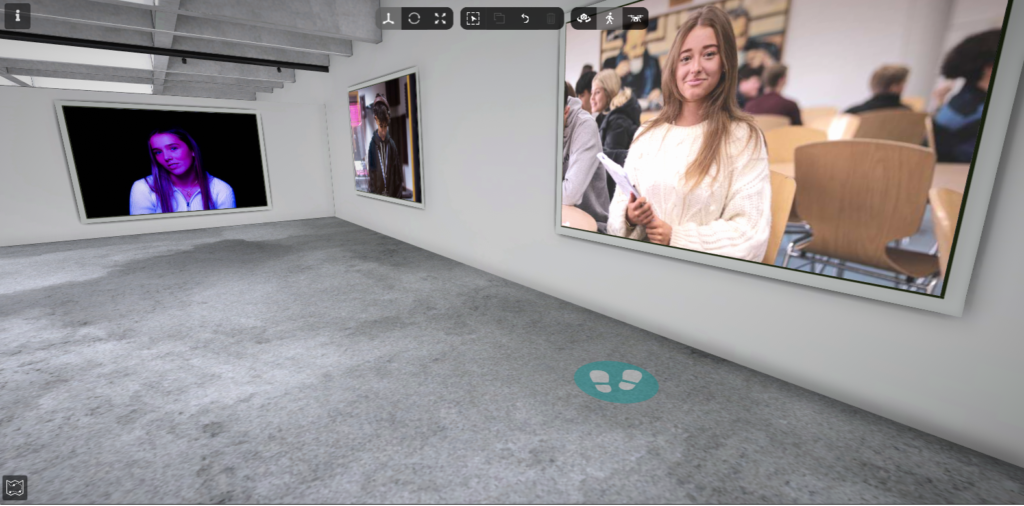
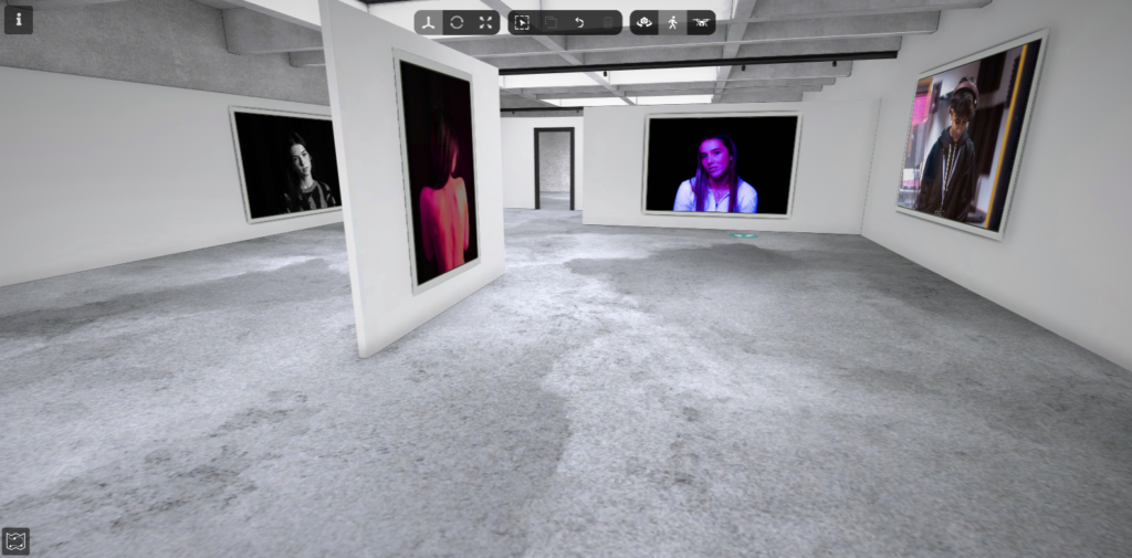
Virtual Gallery –

The photos I used :

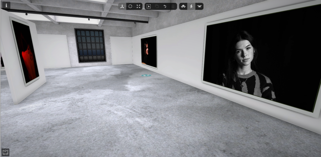
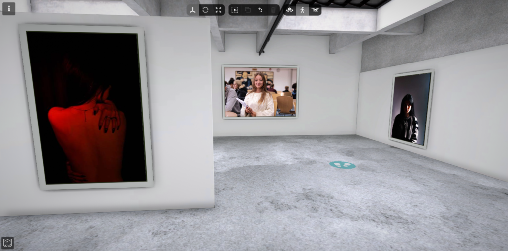
I found a backdrop on google first and pasted that into photoshop.

I picked my three favourite photos I’ve taken over the start of the year and pasted them into the backdrop. I changed the perspective and the size of each photo to fit the wall I wanted to put them on.

Then I decided to give each photo a small border just to give a bit of depth to each photo. Then finally, I added a small shadow to give the thought of realism to the photo as if it was really on the wall of a gallery.

This was the finished Walk through Gallery :

Photoshop edits –

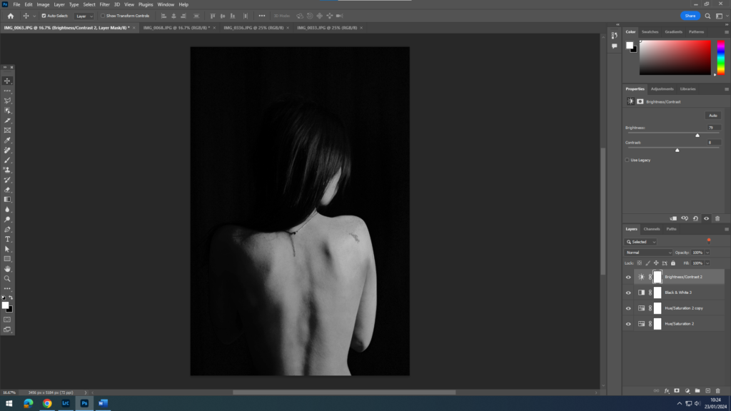
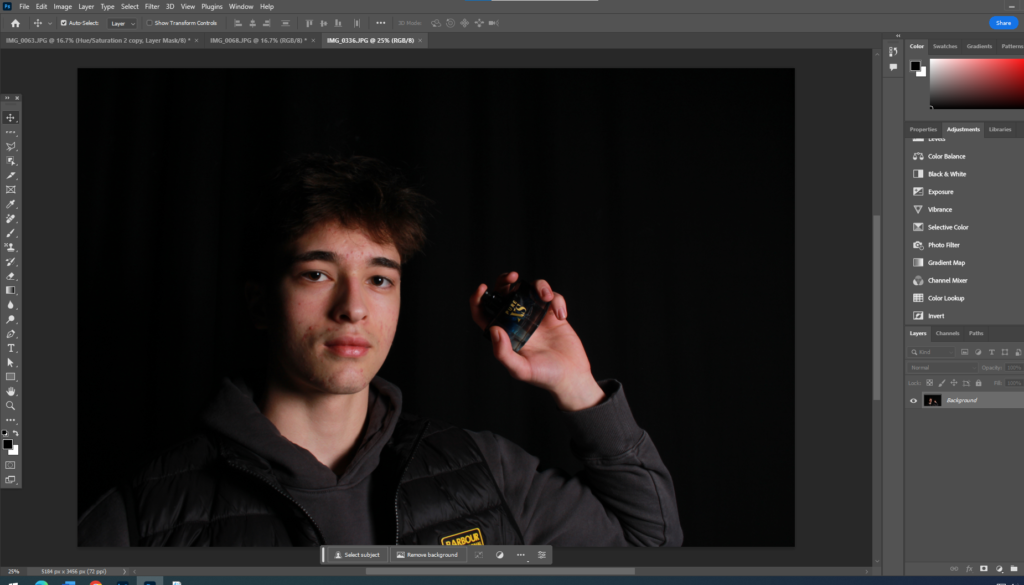
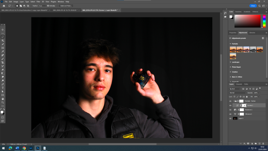
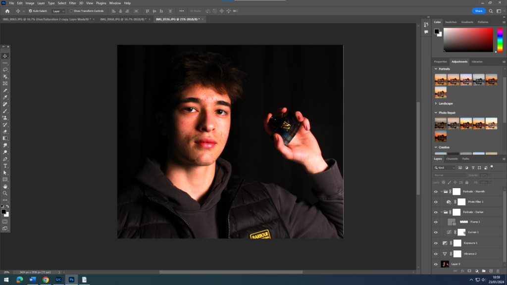
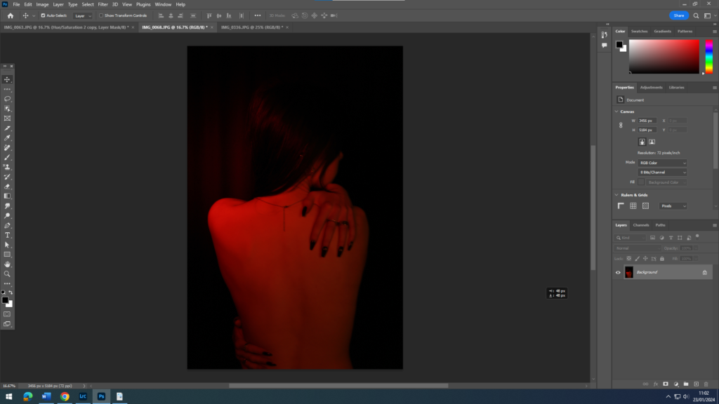
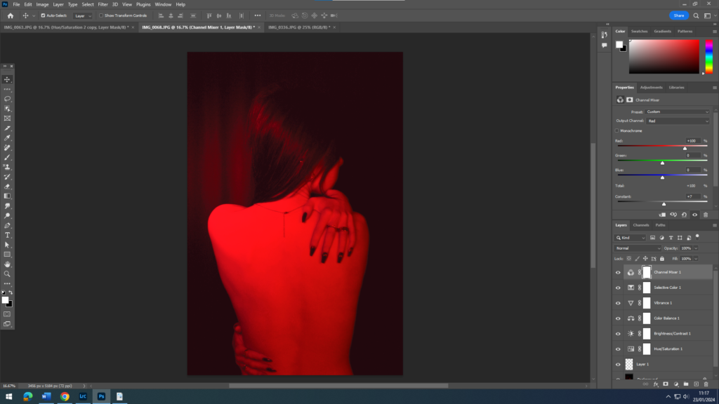
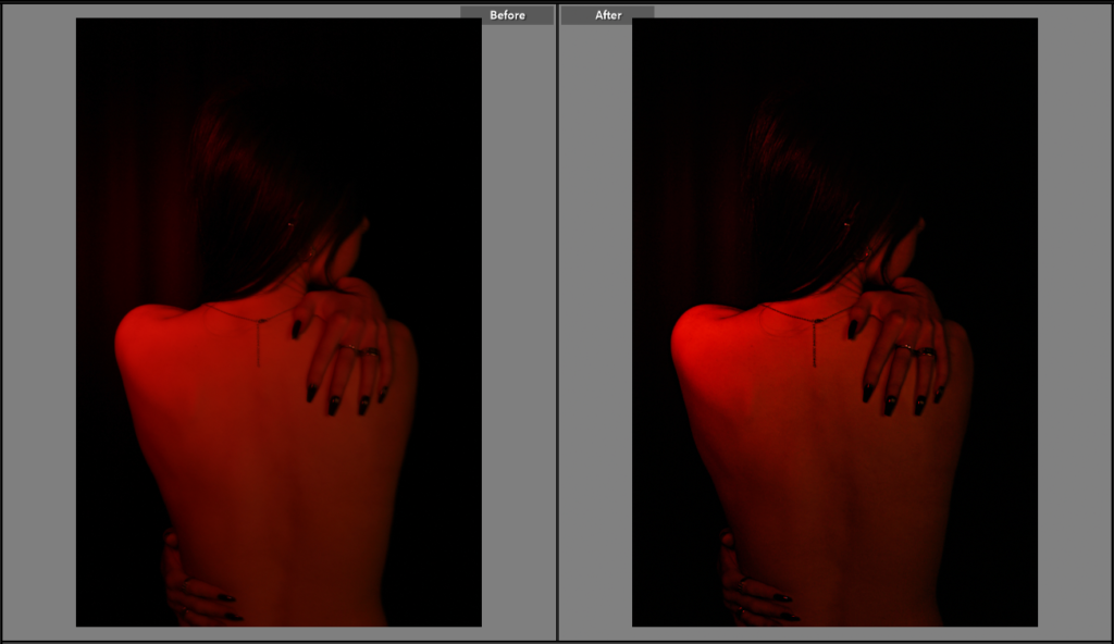
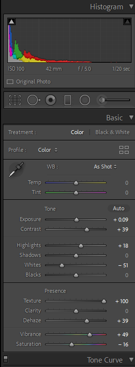
I wanted to try and change up how I was editing my photos by using a different platform to edit so I decided to use photoshop to change my style a little and to give variety to my editing skills.

Still Life photos –

Before editing :

After editing :

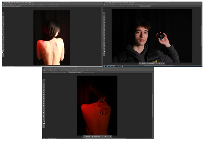
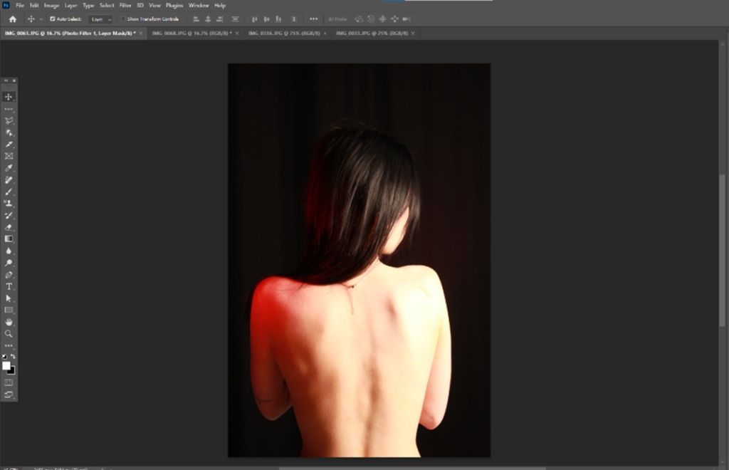
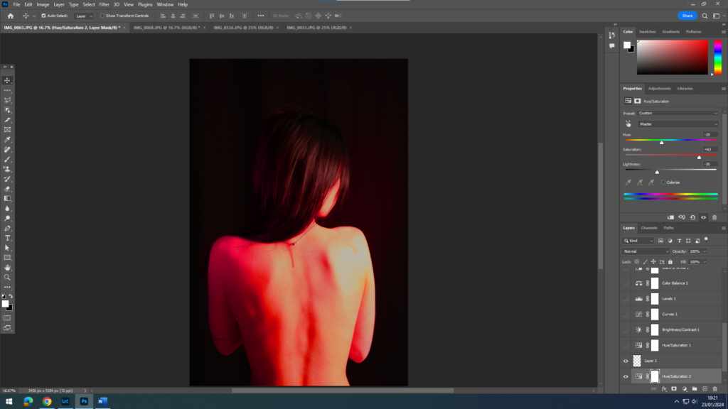
As you can see, I decided to add a red hue to the lighting through photoshop, making the lighting more of a focus point in the photo.

This was the first edit I have done on photoshop but for the next one I want to try and create something more exciting.

formalism –

before editing :

after editing :

For this photo I decided to change the hue of the background to more of a colder orangey brown to almost give it a vintage look trying to stay on the theme of nostalgia.

I wanted to also bring clarity to the photo, to help show finer details that may have been unclear in the first initial shot. This also brought more dimension to the paint brushes in the photo which in affect enhanced the shadows created in the photo.

single object photos :

before editing :

after editing :

I wanted to take a different approach with this photo changing the colours to black and white.

I did this to enhance the highlights that are shown on the object ( fork ). The exposure was also changed to make sure that the photo didn’t look gloomy or too dark, I wanted it to be as clear as possible but still keeping the black and white effect.

On this photo, the clarity was also heightened to help the viewer see the smaller details of the object in the photo. With the clarity being heightened it made the darkness of the shadows creep back but that was sorted with slight gamma control on the exposure.

Black and white photo interpretations –

I wanted to give some variety to the photos I have already edited by using inspiration from Walker Evans to show the black and white effects he used in his work.

still life –

The objects I used for this image definitely gave me the feeling of nostalgia and age, so I wanted to accentuate that by giving it a black and white feeling to it. I lowered the contrast and reduced the vibrancy by changing the shadows and highlights to give the black and white effect.

I also put a mask over the photo to make the black and white feel more retro and older. I wanted to change the warm lighting used in the original photo without using one of my cool lighted photos, so I did this by adding this mask over the photo.

For this photo, I did somewhat the same thing as the Still Life photo but instead of heightening and lowering the shadows and highlights, I found a more prominent black and white mask to go over the photo.

I did however change the clarity of the photo making it slightly higher to give the photo some definition. After adding the mask, I was playing around with the highlights and lowlights again and decided to heighten the highlights slightly just to make the photo a little bit lighter.