All posts by Kate Mullins

Filters

Author:
Category:

Narrative story – The Zine

“What is your story?”

Described in 3 words –

Time, Life, Sea

Described in a sentence –

The lives and history’s of those who worked among the Jersey fisheries.
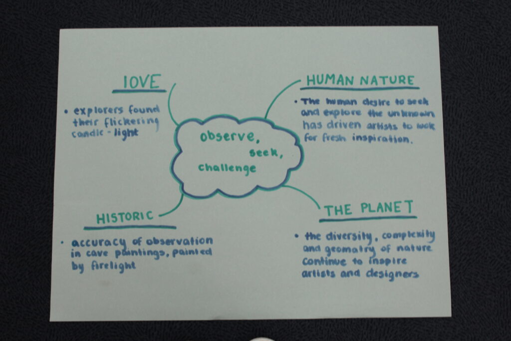
Described in a paragraph –

My Zine will portray a story through pictures, that depict the history and lives of great people, who worked among the fisheries and shores of Jersey. It will show the hard work and dedication that many generations of people and families have lived to get Jersey and its harbours to the incredible place it sits now.

Narrative –

“How will you tell your story?”

My story will be shown through photos that I have taken and meticulously selected to show the story of Jersey’s harbours. My title will help open and grasp the overall idea of my Zine and with small statements to help paint a picture of my story. With careful selection of font and wordplay throughout the zine will help bring everything together and show the viewers of my zine exactly what I want them to see. I have taken inspiration from countless archived photos or zines themself to help guide me on the best possible outcomes for my zines as well.

Sequencing –

I began with thinking about what kind of story I wanted to depict. I wanted to find a focused photo for me to use for my front cover. The photo used on the front and back of the zine helps start and end this beautiful story I wanted to show.

I found establishing shots that I gathered, that I though, even on their own, could show such a powerful story. So, with that idea, if I found a group of establishing shots, how great would my story be if each photo individually, could show their own mini story.

I wanted on each open page for the photo’s I’ve chosen to have a visual relationship, whether that was due to colours or just the nature of each photo. Carefully choosing each photo was a main focus for me during the creation of my zine. I believe that individually photos tell a story but together they can show a life.

The images I’ve chosen gradually depict a story that not only has history but almost shows a life as it unfolds. From photos from a museum to live photos of that life today.

Smaller detailed shots are added throughout the zine to show things in these photos that may usually be overlooked. However to closely look at them is like looking into a hidden window of the past which helps wind my story all together.

St Helier Harbour –

The Harbour development –

Over the years, the harbour did develop a lot. From the 19th century to the 21st century, the size, technicality and involvement has changed dramatically as the roads and land grew near the harbour.

In the 19th Century the Old Harbour was constructed. The Chamber of Commerce urged the States Assembly to build a new harbour, but they refused, so the Chamber took it into their own hands and paid to upgrade the harbour in 1790. To shelter the jetty and harbour a new breakwater was constructed and in 1814 the merchants constructed the roads now known as Commercial Buildings and Le Quai des Marchand’s. They did this to connect the harbours to the town and in 1832 construction was finished on the Esplanade and its sea wall. In 1837, a rapid expansion in shipping led the States of Jersey to order the construction of two new piers: the Victoria and Albert Piers

Harbour trip –

St Helier Harbour is the main Harbour in Jersey. This harbour is used to dock Jersey citizens boats, as well as how Jersey citizens travel to and from the Island on the Condon Ferry. There are 3 marinas in St Helier Harbour, which are used for private yachts on pontoons and drying harbours for commercial shipping, with facilities including a dock for lift-on/lift-off cargo ships, roll-on/roll-off ferry berths and a tanker berth. This harbour is operated by Ports of Jersey, the operative government company.

Today, Ports of Jersey operates all entry and exit points to the island, including harbours and airport. They have plans to re-develop St Helier Harbour into a modern commercial maritime hub.

Currently this harbour is used for citizens to dock their boats and for cargo ships to leave and return with goods from other places around the world

Photoshoot 1 –

Photoshoot 2 –

Final photos chosen before editing –

Evaluation of chosen photos –

I chose to pick these photos because they all have very distinct colouring of either yellow and red. Due to some of the photos being taken around the harbour, yellow and red are the most prominent colours I saw so I thought that it would be nice for that to be the focal point of my photoshoot.

The photos used from the maritime museum I wanted to help dictate the history of the harbour so I thought that the two would work really well with each other to almost show a story of the harbour and the boats that reside in it now, and societies ago.

I thought that due to the fact that I haven’t really included colour in my previous shoots, I can make this one colour based.

Edits analysation –

For my edits, I want to group some photos together, the photos with prominent red colouring in them will be together, prominent yellow will stay together too and the photos with both red and yellow will be sperate from all others.

I want to mute all colours from photos that aren’t the prominent red or yellow colouring by making the back of the colour black and white.

Edit 1 –

To achieve this edit, I used the HUE dials, and muted all insufficient colours in the photo and with the red colour I wanted to keep, I saturated the colour to 100% making it a lot more prominent . I wanted to enhance the red in this photo due to the almost dominant power this boat clock holds. It is the focal point of St Helier harbour and is the first thing you see as you come through the tunnel on the way into town.

Edit 2 –

For this edit I did the exact same thing as edit 1, changed the hue and saturations and heightened any saturation I needed more prominent. The importance of the red in this photo is to show the danger and things that the island had to earn to have what it does. Since the harbour played a fair part in the occupation, and boating life of jersey, the red shows the hurt and the history of the harbour and the areas surrounding it making it a focal part of the liberation area and the surrounding harbours.

Edit 3 –

In this edit, I initially muted all colours apart from yellow to emphasize it, however I started to play around with the luminance of the colour and thought that if I enhance it, the colour will make the photo more eye-catching and intriguing for people who view it.

Edit 4 –

With this photo, I wanted to focus on the colour. Instead of muting them, I wanted to enhance them, the pictures in this photo show a history to out island and what was not only worked for but important to the society who live here. The colour brings the photo to life and helps show a story through them, even with minimal information to grasp.

Edit 5 –

For this edit, The colour editing proved quite difficult due to the orange and yellow hues on the floor and the boeys. I stuck with keeping the yellow hues in even through the floor seemed to interrupt the black and white overall vibe of the photo so more editing may be needed on this one. The boeys seem to be a very big part of seaman life throughout the years so I thought keeping them as the main colour could emphasize their importance.

Edit 6 –

This edit initially had a lot of yellow, green and red, but due to the hues in the background I decided to focus on the red and the view of the harbour. The view included some yellow, blue and green hues, which would have made it substantially more difficult to cancel out from the background. So, I stuck to red. Also increasing the clarity and texture, and tone of the picture.

Edit 7 –

This photo almost gave me eerie feel to it due to the well shown rule of thirds so I thought while still keeping the red colour in the photo, I made the texture and shadows quite prominent to keep the eerie feeling about it.

Edit 8 –

This photo, like the other, it has a scary eerie kind of feeling to it. I wanted the shadows to really be dramatic as well as the colour red to pop out a lot. The use of muting all the colours apart from red really helps to do this because that alone enhances the shadows and whites in the photo making the red really pop.

Edit 9 –

With this edit, I wanted to include some of the wildlife that you find in the harbour and around the fisheries that we saw. I wanted to still stick to the idea of muting all colours apart from one in particular, but with this one it seemed quite difficult. Because the colours in the original photo aren’t man made, like paint it was difficult to segregate the different hues of orange and red and yellow. I played around with each colour and decided to stick with red and see how it played out.

I also did focus on the shadows and brightness and leant towards having this photo more bright. I levelled out the shadows and highlights as much as I could, while still keeping the natural lights as well as natural shadows.

Edit 10 –

I loved the use of the border light in this photo and thought that enhancing that would make a really great focal point. I also muted all other colours apart from yellow due to the border light being a yellowy tinge. The colour yellow also depicts an aging feel to the photo and due to this photo showing a ancient boat which resided in the harbour years ago.

I enhanced shadows and highlights in this photo, and due to this photo being taken not at a front facing angle I decided to crop and move the photo slightly to give more of a face forward look.

Edit 11 –

These photos from the museum really all show the history of the boats and harbours but due to the ominous and spooky feeling of this photo, I decided to really focus on the shadows and the darkness of the photo, while still looking at segregating the colour yellow to give the photo a focal point. This could also show that the history of the harbour is not all good and positive, there were dark times and things that weren’t good that circled the harbour too.

I made the photo more clear and enhanced the texture to give the photo more of a realistic feel rather then a photo as well, this is to show that the history of the harbour did happen and should be taught and spoken about due to the importance it has on Jersey and it’s society.

Edit 12 –

This photo really looked at the spooky side too, the segregated red really shows a lot and the use of the enhanced shadows and almost deathly mood this photo sets, shows the amount of deaths that surrounds the fishing and boating society even up to this day and age, its a way of remembering and understanding.

Edit 13 –

This photo has the same editing idea of edit 10. The use of using yellow as the depicted colour works so well due to the gold/yellow tinge that the lights let off. I thought the use of shadows and highlights being extenuated worked so well for the eerie ominous feel this photo lets off.

Jersey Maritime history –

What was the involvement of Jersey mariners in the Canadian cod-fisheries and the Transatlantic carrying trade?

It has been more then 400 years since the first islanders crossed the the Atlantic in search of grassland. They went to plunder the cod-rich seas of the American and Canadian coast.

By the beginning of the 16th century, Basque Fishermen were travelling to the region to fish, and by 1580, around 10,000 European Fishermen were making the transatlantic voyage to the area each year, to fish for cod. Channel Island Fishermen were among these and by the 1750’s they had set up lucrative trade routes between Canada, Europe and America, establishing bases on the Gaspe Coast where they could salt and prepare the cod.

Which ports did Jersey ships sail to and trade with?

During the roman period, there was an established trade route between Alet (St Servan) and Hengistbury Head in Dorset. Guernsey was a favoured stop off point, because the natural deep water harbour at St Peter Port, although these boats undoubtedly called into Jersey too.

What type of goods did Jersey merchants exchange for cod-fish?

Jersey cod-merchants exported cod-fish to British colonies in the West Indies and later Brazil too in exchange for plantation goods, such as sugar, molasses, rum, cotton, coffee and tobacco, which it brought to markets in America, Europe and the UK (including Jersey).

To what extend, has the island of Jersey benefitted from its constitutional relationship with Britain and the legacies of colonialism based on a slave plantation economy during the first Industrial Revolution (1760-1840)?

By the 1770’s there may have been up to 70 Jersey ships and 2000 Jersey men engaged in the cod trade. By the 1840’s it is estimated that the industry directly employed 4000 people. Also, many others were engaged in manufacturing goods to be exported to the Canadian settlements.

However, Jersey was not without internal trouble not withstanding increased prosperity. Both war and poor harvests led to increases in corn prices of such magnitudes that the poor were unable to feed themselves. Matters reached a head in 1769 when wealthy mill owners tried selling the little corn there was at very high prices to France, causing some local people to riot. The rioters went on to demand changes to the island Government which resulted in the code of 1771, giving more power to the States Assembly

In design page spreads –

Text draft –

France in general is famous for its incredible artists and its world known art. Saint Malo is surrounded by it’s enormous brick walls encasing its small city within it, including its architecture and people. It was built in the 12th century to protect the the city and its people from invaders. To this day, the walls still stand and are a beaming attraction to tourists.
The city is appreciated for much more then just its walls, the beautiful views and delicious sea food ( especially oysters ) which are harvested from the local bay, make Saint Malo a very popular destination.
For all History geeks, Saint Malo is rich in it, with roots dating back to the Roman Empire. St Malo played an important part in the development of trade in the region, The port helping develop this too during the middle ages.
St Malo is a busy city with many restaurants serving delicious local food and is also home to many museums and galleries that portray the most beautiful art pieces. The city also has a thriving music scene and water sport scene too, including surfing, sailing and windsurfing too, so it really is a city for everyone.
The architecture in Saint Malo is incredible really, the beautiful buildings and streets really show the diverse cultural individuals who have walked there over the years and the work that the community has put in place to make sure this ancient city stays it its former glory for hundreds of years to come.

Page spread 1 –

Page spread 2 –

Page spread 3 –

I felt like overall, these 3 topics really stood out and captured my St Malo trip really well, grabbing some of the most important things that I feel St Malo has to offer. I not only included the people and the atmosphere, but the architecture too. This overall making my picture stories effective in presenting St Malo as a whole.

InDesign terminology –

workflow – 0 for the purpose of this course, I refer to workflow as the order in which you work in a program as you’re designing a project (a very watered down example: first you setup a new document, then you create a background, then you add text, etc.)

margins – the negative space around the inside of a page, a safe zone for all content / text / images

bleed – used for print only, extra space in addition to your page size that’s cut off when artwork “bleeds” to the edge of the page, so you don’t have any white border

slug – extra space on the outside of your document, different from bleed, used to show markings or notes for the printer (commonly used for printed magazines or newspapers)

grids / guides – the thin colored lines on your IND document that do not appear on your final document, but are just used for aligning objects on your page or showing where the margins are placed

facing pages – two pages shown side-by-side, also known as a spread – used for documents that will be printed and bound

parent pages (formerly called master pages) – mini templates you can create and use throughout your document for pages that have repeated content on them, like a page number or footer (they’re not part of your page count)

character / paragraph styles – a pre-set of settings and formatting that can be applied to a word, a line of text, or an entire paragraph in one click

frame – the invisible box that an object, link or text is contained within (also called container)

flow / reflow – how your lines of text continue from one frame / text box to the next, from one page to the next, and around other objects in your layout

overflow – when the amount of text in your text box is more than the size of your frame and overflows into a second text box

widows / orphans – a single word left by itself on a line of text at the end of a paragraph, or a single line of a paragraph left on a page by itself at the beginning or end of the paragraph

page break – when a section of text is cut off and the remainder is bumped (or reflowed) to the next page

line break – when a paragraph is cut off and the remainder is bumped (or reflowed) to the next line

frame break – when any part of a text box is cut off and the remainder is bumped (or reflowed) to the next text box / frame

keep – regulations for where line breaks can occur, so you can avoid widows / orphans and keep a certain number of lines in a paragraph together at all times

endnote – a group of notes shown at the end of an entire document that each refers to a reference number made in the text

footnote – a note shown at the bottom of a page that refers to a reference number made on that same page in the text

drop cap – a decorative feature at the start of the first paragraph of a section or page; usually an enlarged first letter in the paragraph or the first few words in the paragraph

small caps – when you use all caps for a word or phrase, this makes the letters a little smaller than a typical capital letter to make it easier to read and not so “loud” (as sometimes all caps can appear)

glyph – every character in a typeface, (e.g.: G, $, ?, 7), is represented by a glyph; this includes all capital and lowercase letters, numbers, and symbols

Picture stories – Research and Analysis

A picture – story is a layout of photos and text that can produce information and stories on a specific topic. They are usually seen in magazines or newspaper, even online blogs or gossip columns.

mood board –

For my mood board, I just used old students work for this topic, that has been saved into a folder for students and staff to access.

Analysis –

This picture-story shows the positive and happy ‘blissful’ lives that are lived behind the walls of Saint Malo ( seen in the title ‘Bliss behind the walls’.)

I think that the pictures that include happier colours or happy people are more establishing shots. The use of constantly including the colour yellow in the shots, show a childlike sense of joy, enhancing the idea of the ‘blissful lives’ that people in Saint Malo live.

The candid photos that are used are very powerful because of the idea of capturing naturalistic photos, show the unfiltered lives that people live. The ease and naturality of the photos show the un-stressful and simple lives these people might be living.

Plan for my picture-story –

Photos I am using –

I want to include these photos because I feel like they represent the art that I saw while we were in Saint Malo very well and I also wanted to include the photo of the buildings because the artistic value of the architecture is also a very big deal in France. ( these photos may change depending on the evolution of my work and my ideas.)

Headline/title ideas –

Because of the use of me wanting to talk about the art and culture of Saint Malo, I thought something to do with that could work quite well, here are some ideas ;

  • ‘ the art among the walls ‘
  • ‘ the hidden art beneath the walls ‘
  • ‘ Saint Malo ‘

Introduction draft –

France in general is famous for its incredible artists and its world known art. Saint Malo is surrounded by it’s enormous brick walls encasing its small city within it, including its architecture, people, and art. It was built in the 12th century to protect the the city and its people from invaders. To this day, the walls still stand and are a beaming attraction to tourists.

The city is appreciated for much more then just its walls, the beautiful views and delicious sea food ( especially oysters ) which are harvested from the local bay, make Saint Malo a very popular destination.

For all History geeks, Saint Malo is rich in it, with roots dating back to the Roman Empire. St Malo played an important part in the development of trade in the region, The port helping develop this too during the middle ages.

St Malo is a busy city with many restaurants serving delicious local food and is also home to many museums and galleries that portray the most beautiful art pieces. The city also has a thriving music scene and water sport scene too, including surfing, sailing and windsurfing too, so it really is a city for everyone.

The architecture in Saint Malo is incredible really, the beautiful buildings and streets really show the diverse cultural individuals who have walked there over the years and the work that the community has put in place to make sure this ancient city stays it its former glory for hundreds of years to come.

Street Photography – different editing styles

Cropping –

I wanted to play around with the cropping of my final photos to see if I could give a different feel to each.

First cropping –

For the first photo, I wanted to play around with circular cropping almost to show the main focus in my photo.

I went onto photoshop and figured out the cropping tool playing around with the circular and square crops. I ended up just using the circular shaped crop for this photo.

Second cropping –

For this photo, I wanted to show the rule of thirds through this photograph. The dog isn’t centred in the photo and I thought cropping would work really well to centre the focus.

Third cropping –

In this photo there is a lot of negative space and whilst that can be very powerful in some images I want the couple to be the main focus in this one, so I decided to crop the landscape.

Colour hue edits –

We are practicing changing colour and focusing on separate colours for these edits. This is done on light-room through the hue section.

Photo 1 –

I want to focus on the red in this photo so I will be muting the other colours to focus on the red in the word ‘ APOCALIPS’.

Photo 2 –

In this photo, I want to focus on the registration plates since they are blue because the photo was taken in France (St Malo).

Photo 3 –

I want to just focus on the sales on the boats in to Emphasize the neon yellow stripe on each sale.

St Malo trip –

To expand on out work with Henri Cartier -Bresson, as a year, all photography A-level students took a short day trip to St Malo to gather photos. We spent a few hours looking, waiting and being patient waiting for perfect moments to capture.

Photoshoot –

I took a very wide variety of photos ; people, animals, landmarks, culture buildings and whatever else caught my eye. I wanted to capture ‘moments in time’ to show the inspiration that I’ve got from Henri Cartier – Bresson’s late photography work. I gathered a total of 250 photos and decided it would be best to narrow down my photos to help my editing and production.

Best photos –

With these 26 photos, keeping in the theme of Henri Cartier – Bresson, I want to edit them with black and white to show the nostalgia and sneak peaks of his work through mine.

Edit 1 –

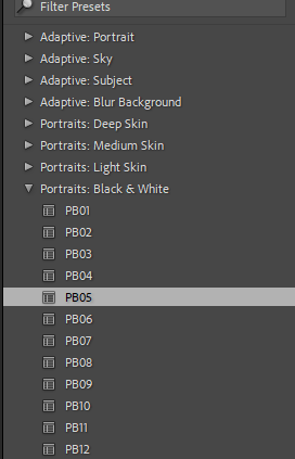
Using the filters on light-room, I used a black and white one to show the inspiration I have gathered from Henri Cartier – Bresson and his vintage black and white photos, and adapt that to my own work.

The filter obviously changed the photo, but I wanted to adjust the highlights and lowlights of the photo to show more of a grunge vintage look, almost to make it seem like it was taken years prior.

Final edit ( photo 1 ) –

Edit 2 –

This photo I understand is not like the ‘captured moment’ style like Cartier – Bresson but I felt like the incorporation of street art can be a very powerful, moving thing to witness and in a way can be a small moment captured in time through art.

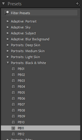
Using the filter to add a black and white tinge to the photo, I just thought it would be more simple then doing it manually.

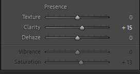
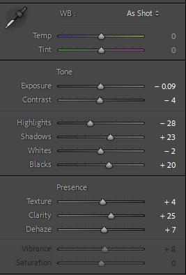
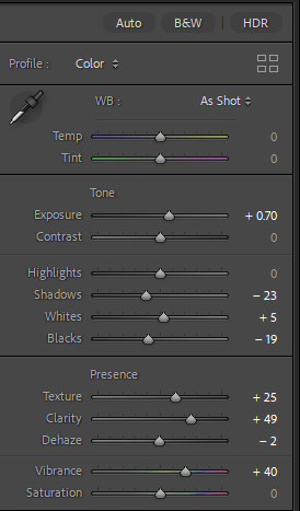
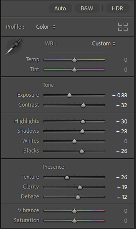
Adjusting the highlights and shadows simply to make the black and white hues balance well and not look more uneven. I love how my photos look when I enhance the texture, clarity and the dehaze, it makes them very clear and clean to show a modern enhancement.

Final edit ( photo 2 ) –

Edit 3 –

I thought about photographing this car in particular because cars can have a lot of feeling connected to them and with this Vintage 1989 Renault. I thought it could signify a particularly great idea of ‘moment in time’ and a captured a nostalgic view.

Just the filter added again…

With this photo, I enhanced the shadows and white hues in the photo because of the fact that its a vintage car. I thought that making the car almost look pristine can show a beauty through it especially with the worn brick wall behind it.

Final edit ( photo 3 ) –

Edit 4 –

For this photo, yes I used the exact same filter as I have been using already, however I feel that for this photo, it can really extenuate the feeling of love shown through the people in this photo. It reminds me of the stereotypical ‘love’ from eras like the 50’s and 60’s and the black and white tinge really helps show that.

Just using the tools on Lightroom, I balanced out the hues and tones to make the photo more equal.

Final edit ( photo 4 ) –

Edit 5 –

This photo is slightly different again from Cartier – Bresson’s usual photo style but I thought that capturing a dog, that with a family, could be capturing not just a dog but a very important part of someone’s moment due to the importance that this dog may have on someone.

Yet again, sticking with a black and white filter, however not the same one, one that has almost a warmer hue to it which I thought could capture the moment with the feelings within it.

Just adjusted the hues and tones again to balance the photo also enhancing the clarity and texture to show the realism in the photo and yet again the modernisation.

Final edit ( photo 5 ) –

Final photo edits gallery –

Henri Cartier Bresson –

Background –

Henri Cartier Bresson was a humanist photographer, who lived from 1908 – 2004 in France with a loving wealthy family. He always had a passion for the arts since being introduced from a young age and began with drawing and painting as a child. When he was introduced to photography he began taking his camera everywhere with him almost like an extra limb as it helped him interact with the world. Photography inspired him to travel the world to explore the cultures of other countries and ended up travelling Africa and Europe. He believed that photography was not just about photos but the essence of existence throughout the world.

Cartier – Bresson photographed candid society with a blind understanding that ordinary people have ordinary lives wanting to capture that through photos. His camera was like an extension of his eye and he used the analogy of ‘its like hunting but we don’t kill’ to explain the idea that this was his physical pleasure. This analogy shows that through the idea of hunting he was patient and precise with everything that led up to his photos due to the technology not being advanced, and the specific moments needed. Bresson was also present at a lot of historical events through his lifetime and also wanted to capture the realism and naturalistic aspect that these events may have.

The reason for the philosophy behind his photo ‘ Gare Saint-Lazare’ was the idea that ” there is never not a decisive moment “. Therefore any moment could be a photo, and he made this shown with every piece of work he produced.

The photo of ‘Gare Saint- Lazare’ was taken in Paris in the 1930’s at the station of St Lazare. In this photo shapes and shadows are extremely important to show all kinds of composition.

leading lines usually start off the frame and usually guides the eye to follow the main focus which in this case is the Jumping man. The leading lines in this photo is the fence and the reflection which give a set of parallel lines that help follow this jumping man.

For photos like this, there needs to be a lot of balance in the photo to almost level it out and the was that this was done in this particular photo was the view of the large clock tower in the background which balances with the reflection of the jumping man in the water. This shows almost a feel of Ying and Yang as the difference of the reality of the clock tower and the intriguing thought of the reflection being almost an alternate place clash so well together.

There is a lot of negative space in this photo too, like the white sky space above the landscape and the empty ground space seen underneath the reflection of the jumping man. This helps the main focus of the photo ( the jumping man ) to stay in focus all throughout.

The symbolism of the man jumping in the photo is also a really nice touch to this photo because again it almost feels like an alternative world through something like a looking glass foreshadowing the photo within itself almost giving a unnatural feeling throughout.

His use of rule of thirds is very effective as the use of having the main focus of the man being in the middle right third almost helps the eyes of viewers follow through his moment in the photo, almost helping us imagine the movement that would be happening.

Examples of his work –

As you can see, all his photos show the natural world without filter and the candid society that people live in. The photos have been taken at almost the perfect time showing the naturality of everyone in shot and I think that that that is a very powerful idea.

The camera and lens –

Henri Cartier – Bresson was known for using a Leica rangefinder with a 50mm lens. These cameras were compact, reliable and their design was quite small and discreet, making it very inconspicuous. This allowed him to use a quick and unobtrusive shooting style, which is essential for street photography.

He loved how stealthy the camera was, the shutter was quiet, making capturing moments easy to do without attracting attention to himself and therefor allowing moments to unfold naturally before him. This silent lens was crucial for someone who believed in capturing authentic unstaged moments.

He preferred the 50mm lens because it offers a field of view close to the human eye, ensuring he captured images that felt natural and immersive to the viewer.

Anthropocene – virtual gallery and evaluation

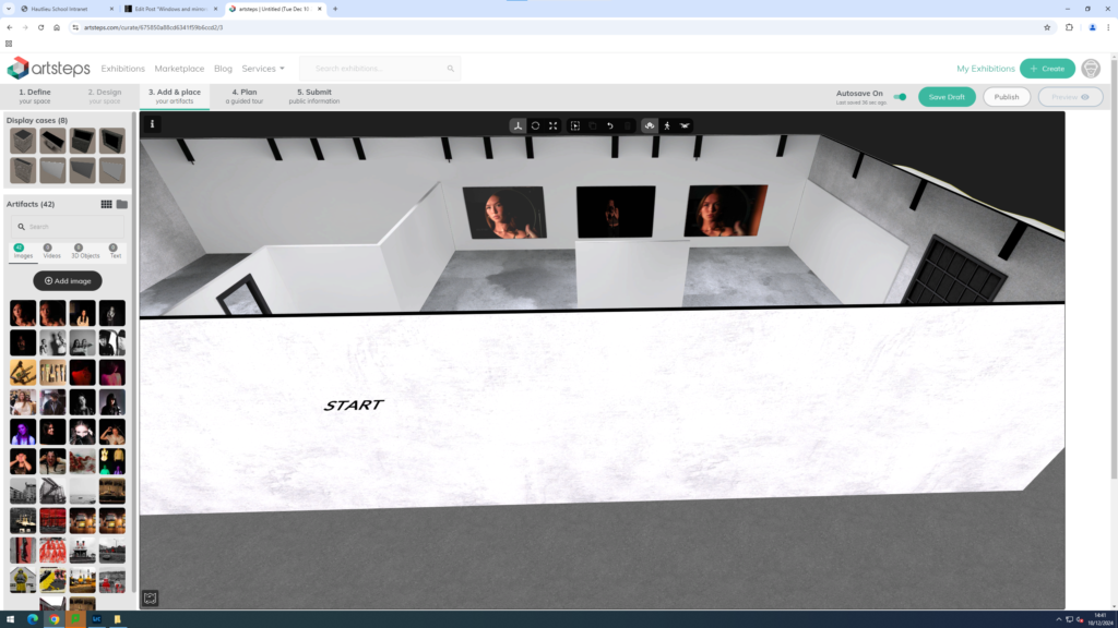
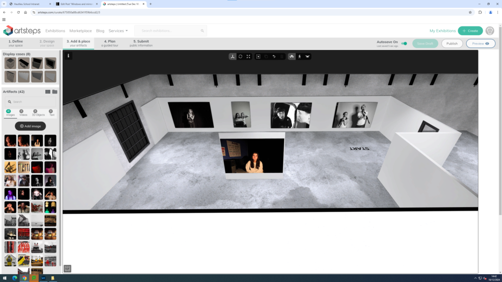
Virtual gallery –

Evaluation –

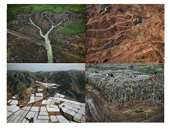
For my final photos, I think that they have all worked very well. My work shows the issues around the world, that Anthropocene focus’ on. My photoshoots and edits were done to the best of my ability and came out better then what I had envisioned.

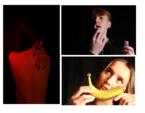
I was only disappointed with one of my photos and that would be the one that was inspired by the Marilyn Monroe collage. I feel that those photos could have had more effort put into them as well as the editing that followed. That photo was definitely rushed and if I spend more time and allowed myself to put a little bit more effort into it it would have came out exactly how id like it too.

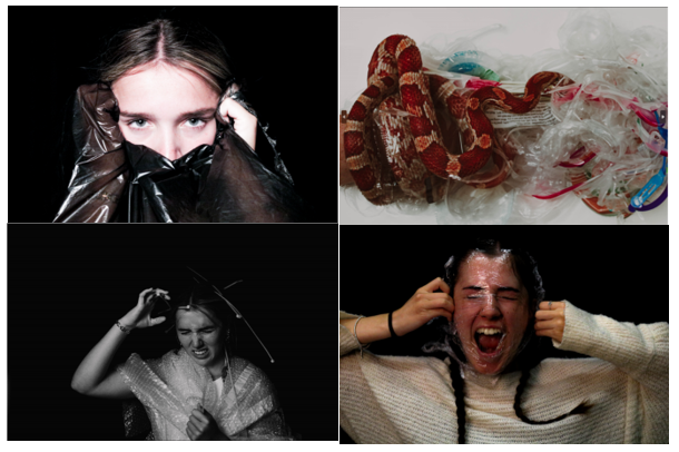
My pollution photos, with the rubbish and the plastic bags, I felt really portrayed not only the theme of Anthropocene, but the emotions and issues that are caused by the poor actions we make as the human race. The planning that went into the portrait photos was very in-depth and that really worked to my advantage for this photoshoot.

The photos including the animals worked incredibly too, I felt that it would be good to include animals because sometimes people forget that the issues that are caused by us don’t only effect us but it effects every living thing that is around us as well. So including the animal ( snake ), really helps shed light and share that information so that people could understand, and I could spread awareness on that separate issue that we have caused.