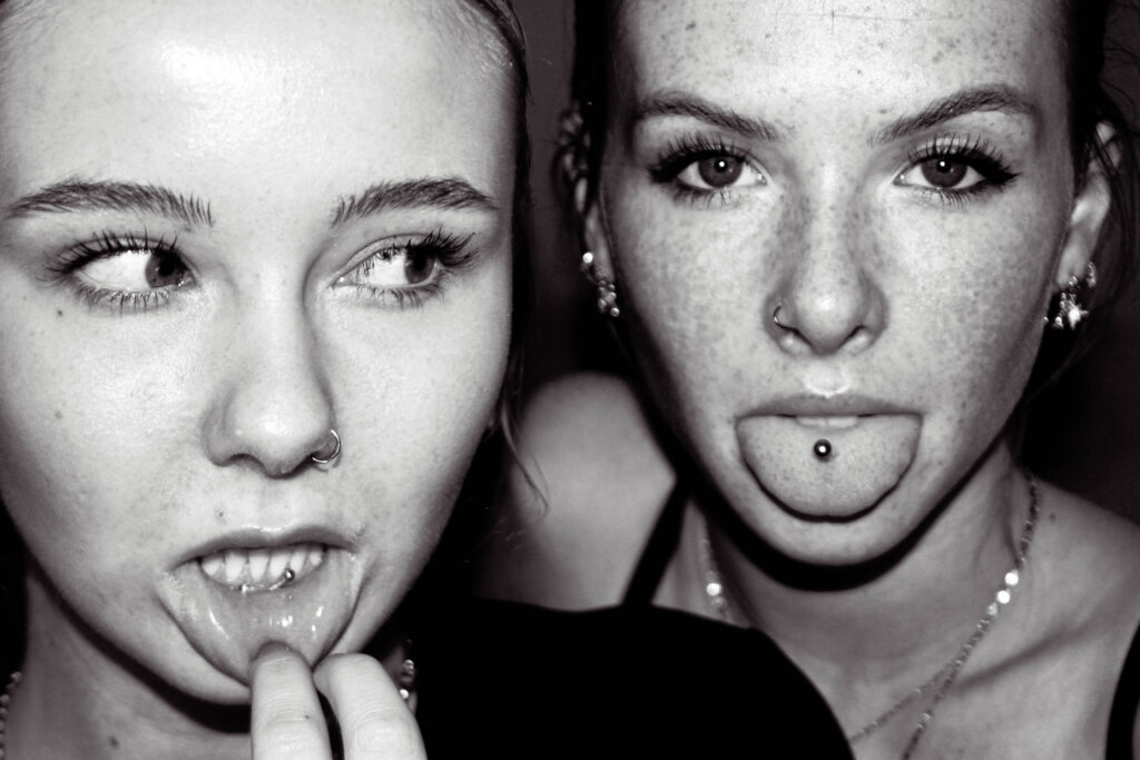
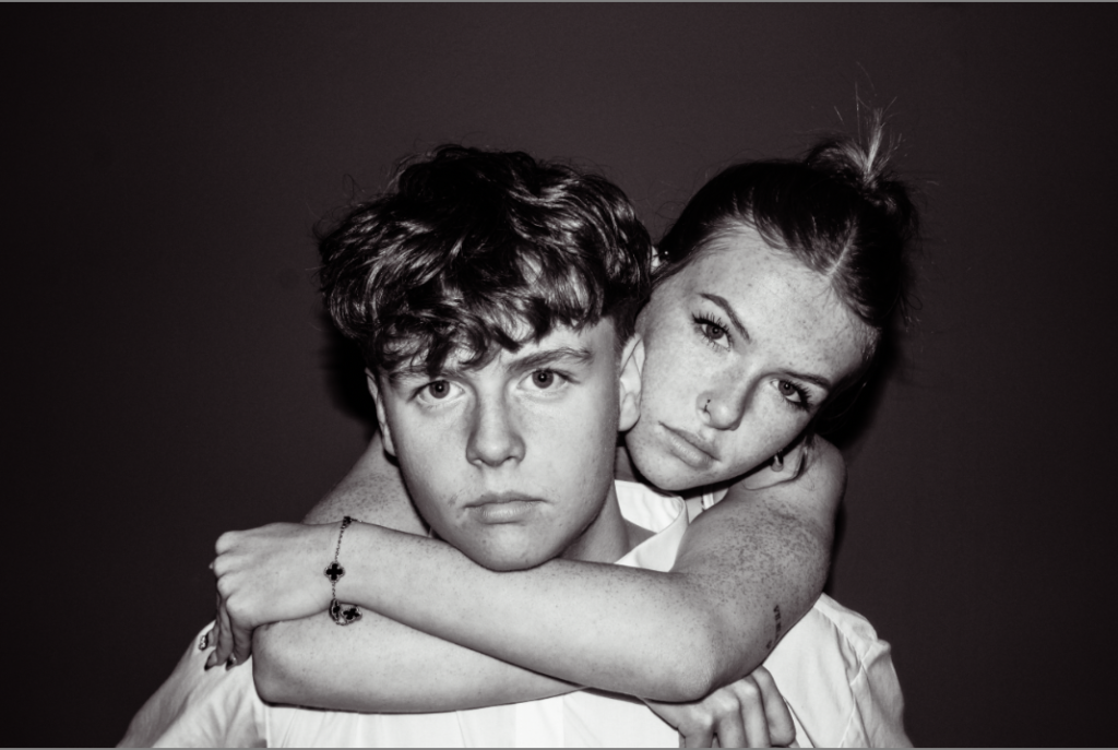
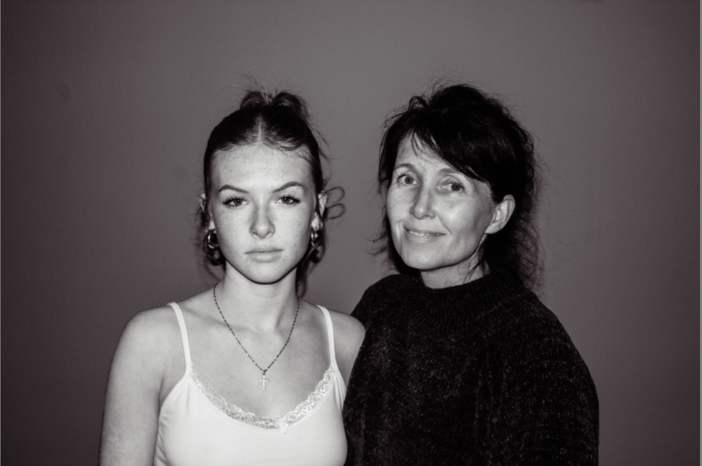
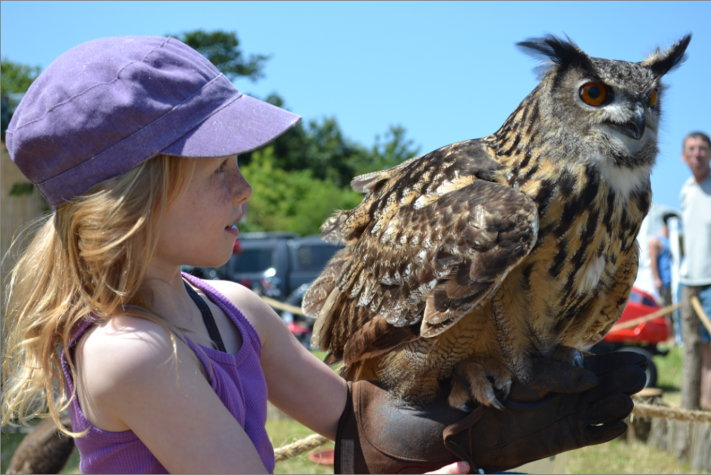
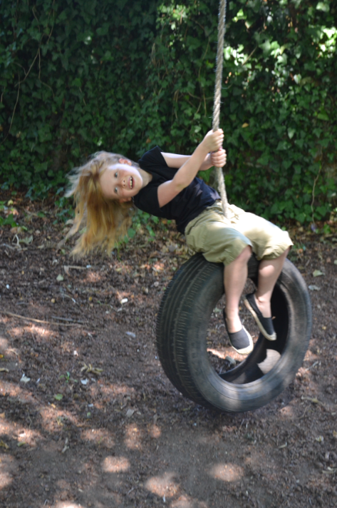
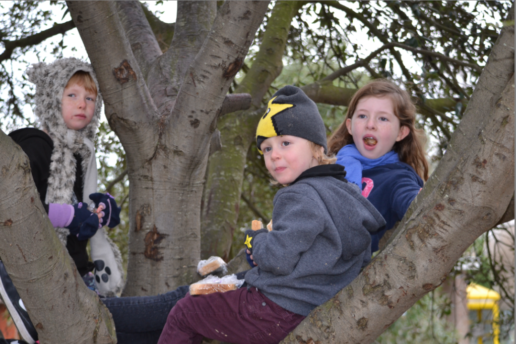
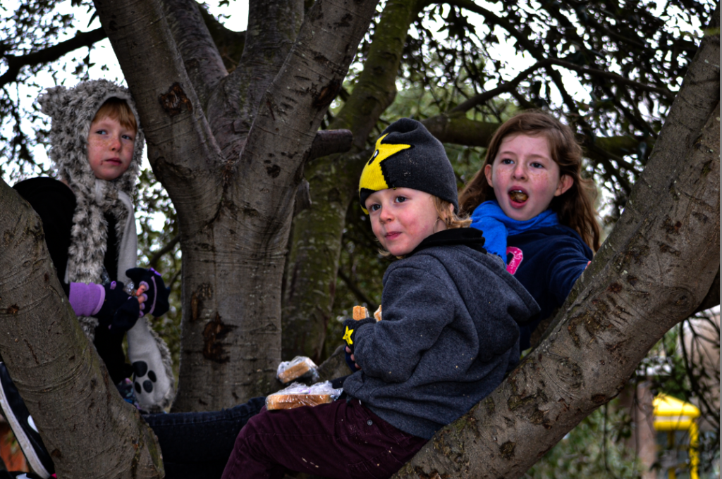
1. Research a photo-book and describe the story it is communicating with reference to subject-matter, genre and approach to image-making.
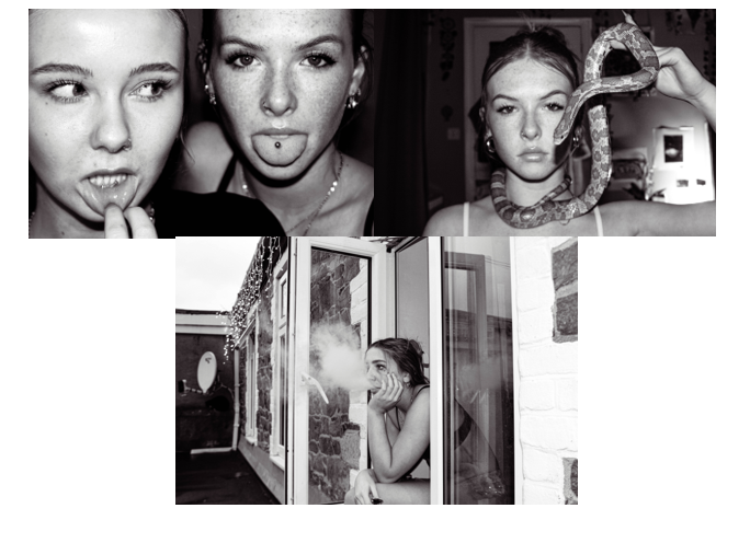
The photobook I’ve chosen is called ‘FEMALE’. This photobook is made with individual portraits. Each photograph being completely different, a different person, place and style. If I were to assume that the topic of the photobook was ‘females’ then the artist has produced that perfectly. All models included in this project were women, and seem completely different, woman of all walks of life were included in this project.
2. Who is the photographer? Why did he/she make it? (intentions/ reasons) Who is it for? (audience) How was it received? (any press, reviews, awards, legacy etc.)
The photographer is a woman called Jitka Hanzlova. A German based Czech artist. Jitka wanted her work to bring a sense of home to her viewers, she moved from Czech to Germany young, with her environments being uncertain, new people place language and surroundings. She didn’t feel like she had a place, so her work helps give herself and others a form of security and home.
3. Deconstruct the narrative, concept and design of the book and apply theory above when considering:
For this Photobook, there doesn’t seem to be a story, but pages and pages of individual stories. Each and every separate woman included in this piece has their own individual story, and I believe that is more powerful then a singular story. It brings variety and experience from loads of different perspectives.
- Book in hand: how does it feel? Smell, sniff the paper.
The book is a hard cover book, thick paper with a papery smell. Thick paper for ease of printing the photo, and hardcover used for formality.
- Paper and ink: use of different paper/ textures/ colour or B&W or both.
The paper type stays the same throughout the whole book, I don’t know if that is because of the theme of neutrality throughout the photobook but it is very impactful. The first and last page is in sugar paper/cardboard too.
- Format, size and orientation: portraiture/ landscape/ square/ A5, A4, A3 / number of pages.
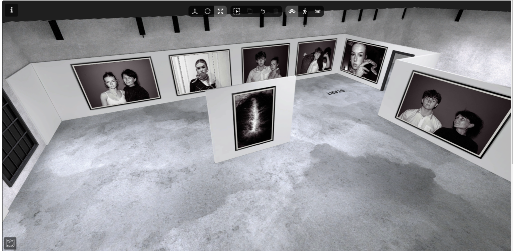
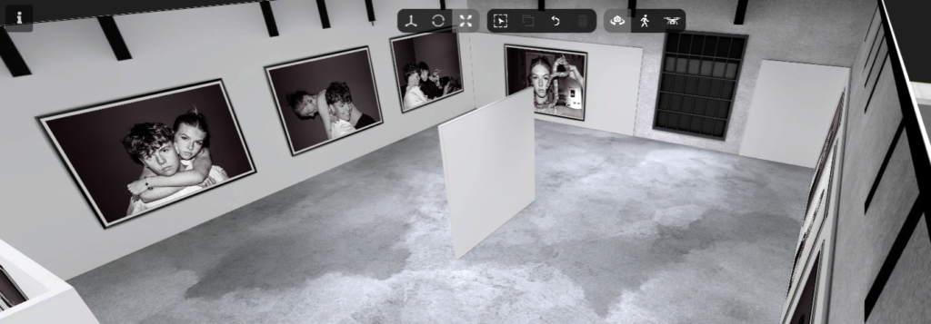
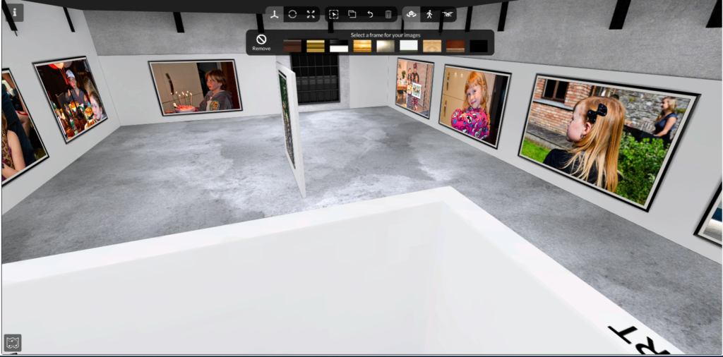
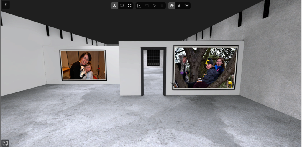
Each photo is printed onto the A4 in landscape. The photos were taken with the technique of portraiture, almost mug shots. Simple quick photos of women. There are 128 pages (not including first and last page) in this photobook, which may be significant to Jitka Hanzlova in some sentimental way but from what I can see, there is no straight up reason for it.
- Binding, soft/hard cover. image wrap/dust jacket. saddle stitch/swiss binding/ Japanese stab-binding/ leperello
This photo is a hard cover book, with a plastically film surrounding it. Probably for ‘wear and tear’ reasons. To keep it safe.
- Cover: linen/ card. graphic/ printed image. embossed/ debossed. letterpress/ silkscreen/hot-stamping.
The front page has a large printed photo on the cover. The photo from page 39. This photo must have some significance to Jitka for it to be used twice.
- Title: literal or poetic / relevant or intriguing.
The title ‘FEMALE’ is very intriguing, it leaves a lot open for interpretation. It is also very relevant for this specific photobook too, since every person photographed is a female/woman.
- Narrative: what is the story/ subject-matter. How is it told?
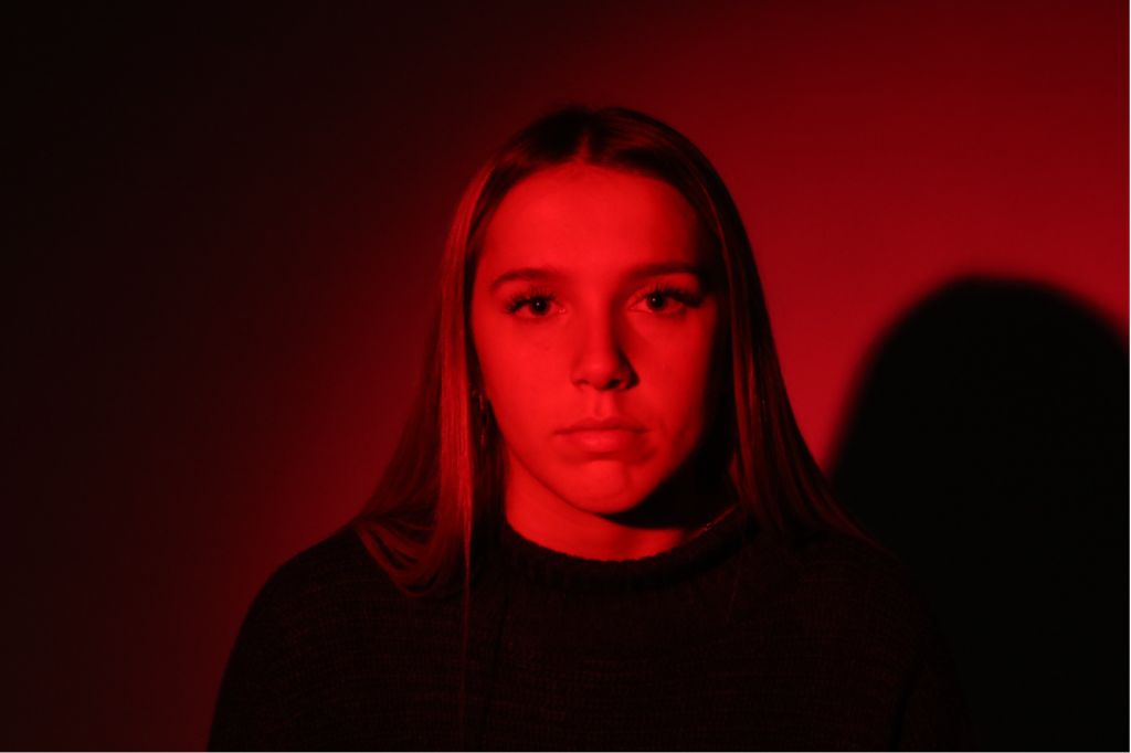
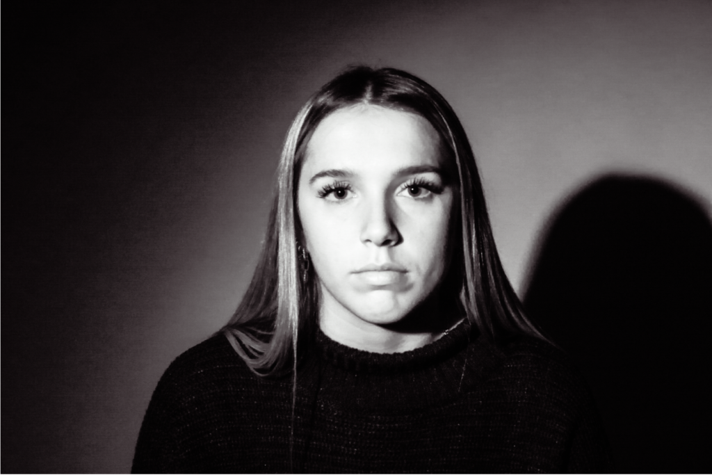
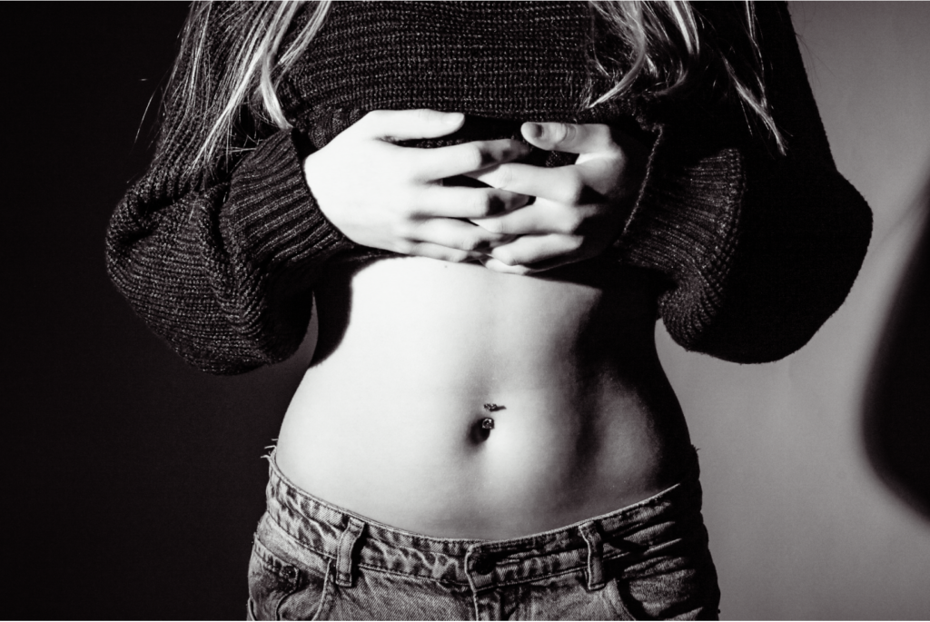
From what I can gather, each page has its own story, each specific person on each page has a life and a story of their own. Their stories are told through not just facial expressions but body language too. The poise and structure of their stance, illuminates it all.
- Structure and architecture: how design/ repeating motifs/ or specific features develops a concept or construct a narrative.
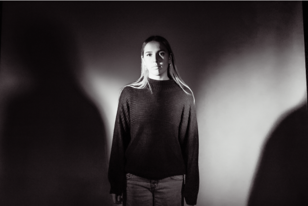
The repeating technique of portraiture, shows a distinct similarity between each photograph, a woman in her own world, with no bothers in the moment the photo was taken.
- Design and layout: image size on pages/ single page, double-spread/ images/ grid, fold- outs/ inserts.
Each individual photo has its own 2 pages, while only sitting on one, is the photo. There is no fold outs or double spreads but only a couple pages with writing.
- Editing and sequencing: selection of images/ juxtaposition of photographs/ editing process.
The editing of these photos are difficult to point out, they seem like raw, untouched candid portraits. However the portraits show juxtaposition through the repetitiveness of the photographing style.
- Images and text: are they linked? Introduction/ essay/ statement by artists or others. Use of captions (if any.)
This photobook contained an essay, however it was in Czech, so was not understandable.