All posts by Joseph Raffio-Curd

Filters

Author:
Category:

Headshots artist analysis

BRUCE GLIDEN – FACE

Bruce Gilden’s project, Faces 2012–14, is an extended series of confronting and compelling photographic portraits. He went very up and close to the subjects faces, capturing and amplifying all the imperfections lack of symmetry of people, making each person very different to each other as we are all individuals.

“My style evolved because I liked being among the common man,” he once said. “I like characters. I always have. When I was five, I liked the ugliest wrestler, so it was easy for me to pick what I wanted to photograph.”

Gilden is not without critics who view the photographs as potentially exploiting his subjects. He would often take photos of unsuspecting people along the street. The artist describes the series as a reflection on his childhood in Brooklyn and the result of a lifelong fascination with ‘characters’ he encounters in pursuit of his subjects.

Gilden, like many photographers, often shies away from explaining the meaning in his photographs. “When people look at my pictures I don’t want to tell them what’s in the pictures. I want them to look at the picture and make up their own story.” So now I’m going to analyse some of his photos in my own way.

Both these photos have a few things in common. They leave very little space in the frame for the background, and making sure the whole face is including in the photo. This allows the viewers to see every imperfection in the face, making the individuals look ugly. There’s almost a since of humour to these photos as well as the subjects didn’t get a change to pose properly and it looks like mug shots.

Here, the blemishes, bad teeth, the stubble and the scrapes – as well as the pimples, wounds, wrinkles, and bulbous veined noses – are rendered even more extreme by the closeness of the camera and the unremitting light of the flash.

Headshots – info

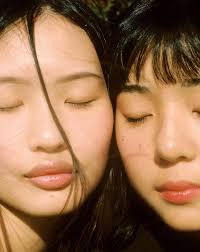
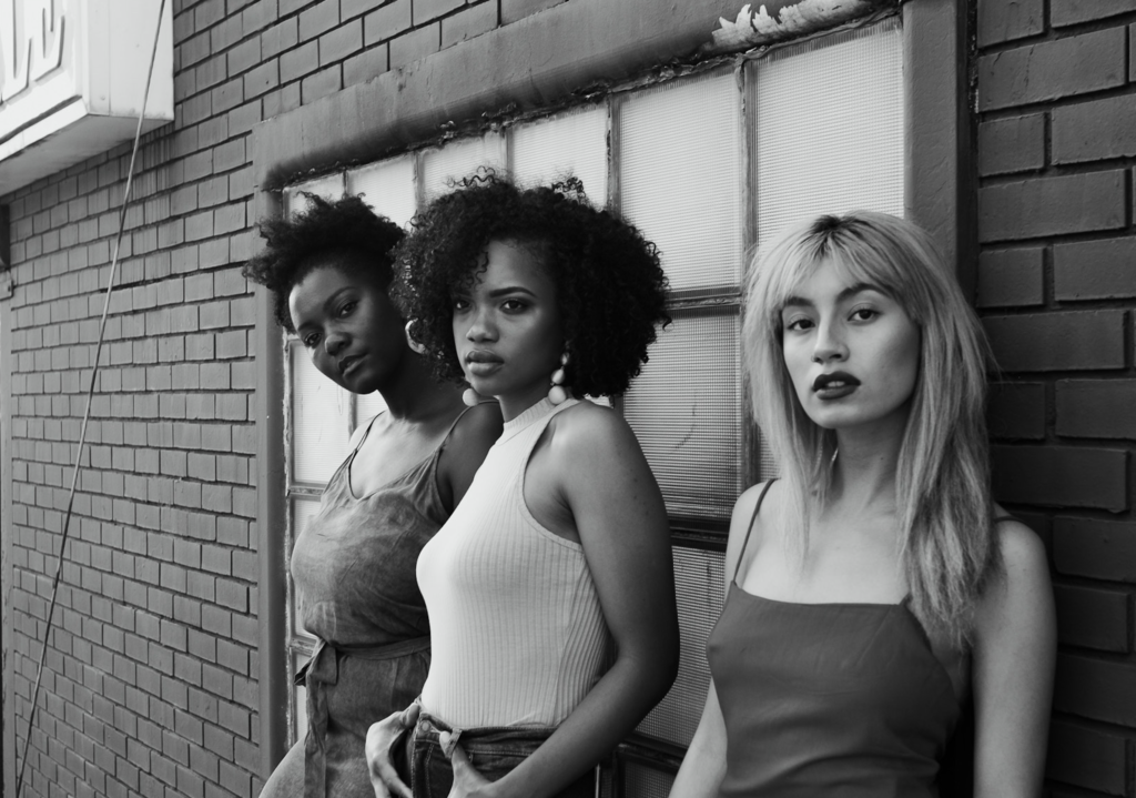
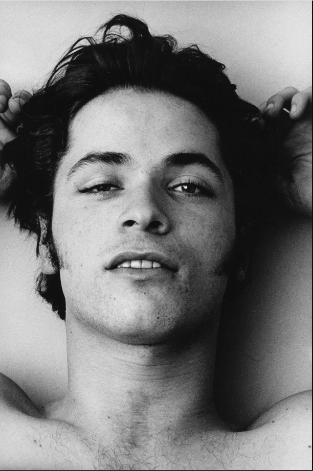
type of portrait photography typically used for websites, press releases, publications, and social-media profiles. The term “headshot” or “head shot” just means that the portrait photo is cropped somewhere in the middle torso – so that the focus is on your face. The subject would usually look directly into the camera so the viewer feels more engaged.

Famous headshot photographers:

There are many famous headshot photographers like Peter Hurley, Jordan Matters, Joel Grimes and many more. They are all famous for capturing interesting models, famous actors and singers, ext.

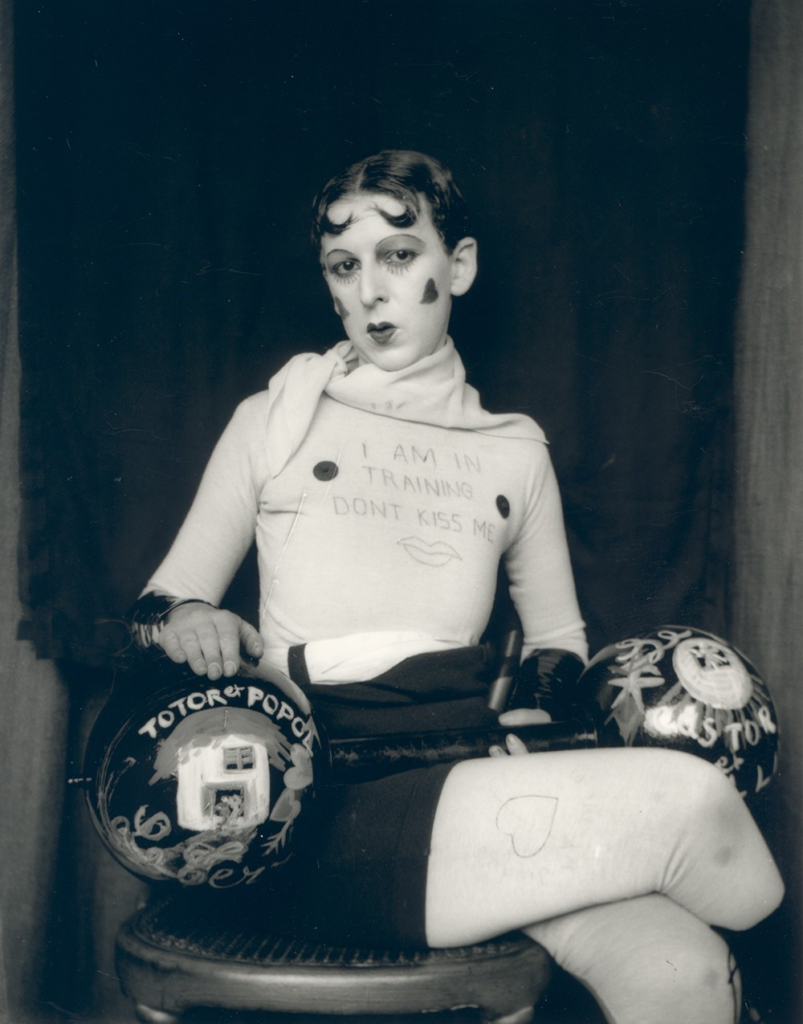
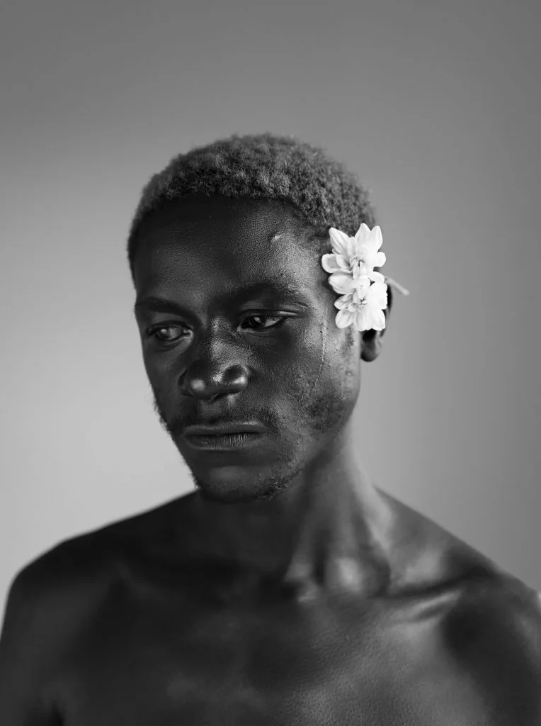
Examples of Headshots (famous people):

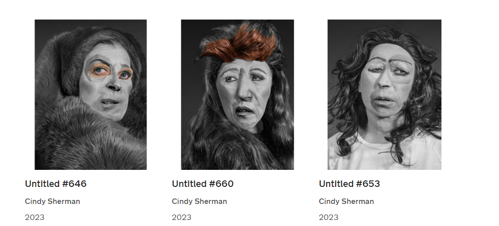
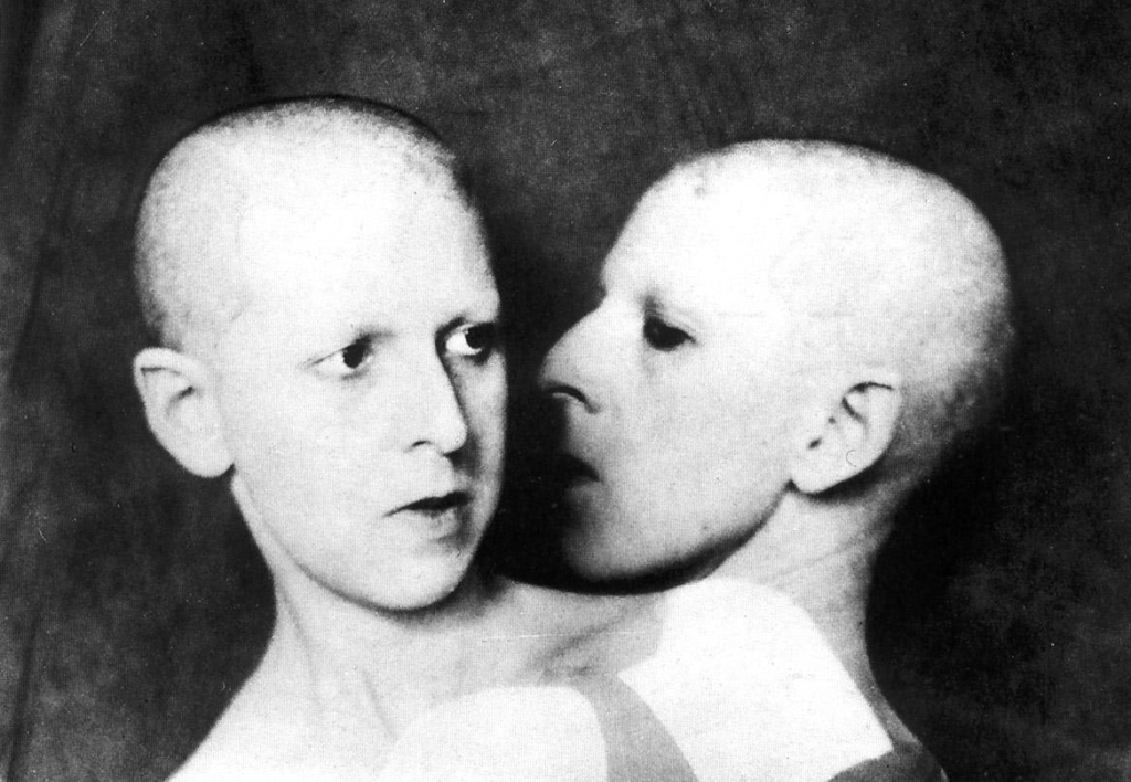
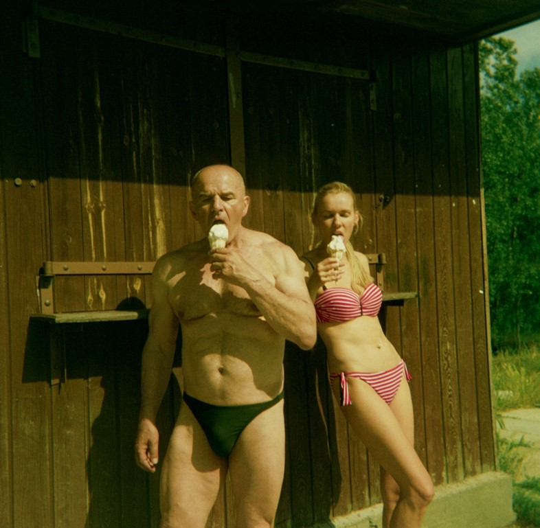
The are many different techniques to create interesting headshots, like DIAMOND CAMEO, DOUBLE/ MULTIPLE EXPOSURE, JUXTAPOSITION, SEQUENCE/ GRID AND MONTAGE. You can make them into a typology of many photos of a similar look.

My interpretation on studio lighting

We took a total of 172 photos trying out different lighting methods, and setups. Here is the setup of the studio and our best photos

setup:

This was the basic setup we used for all the different lighting methods (chiaruscuro, rembrant, butterfly), we just changed the direction of light(s), camera angle and how the subject poses.

Chiaruscuro

Selection of best images:

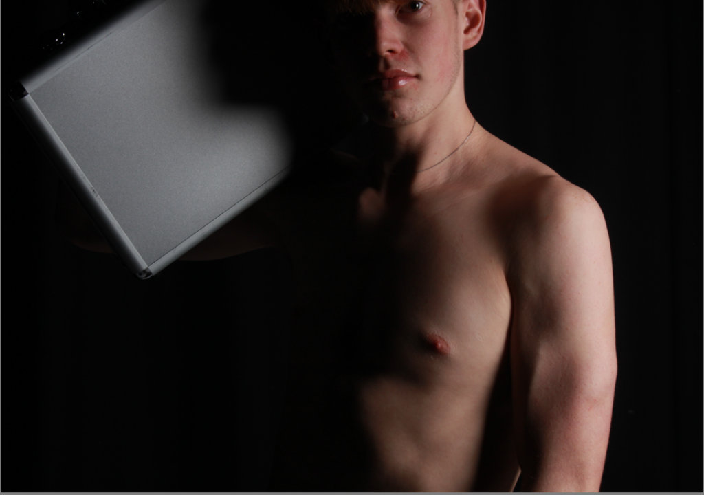
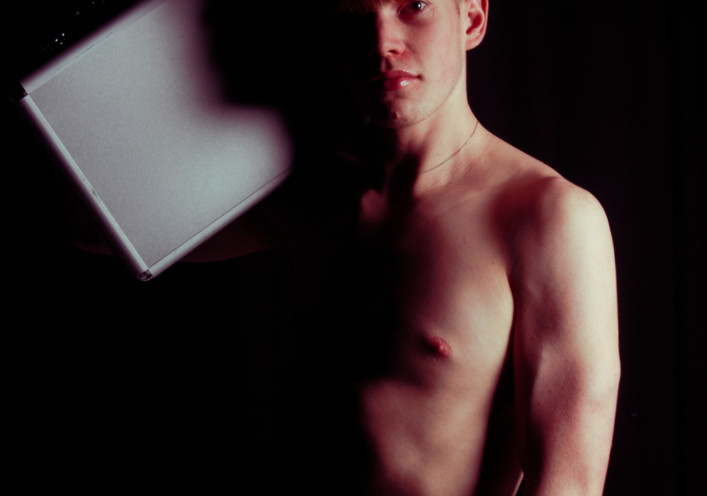
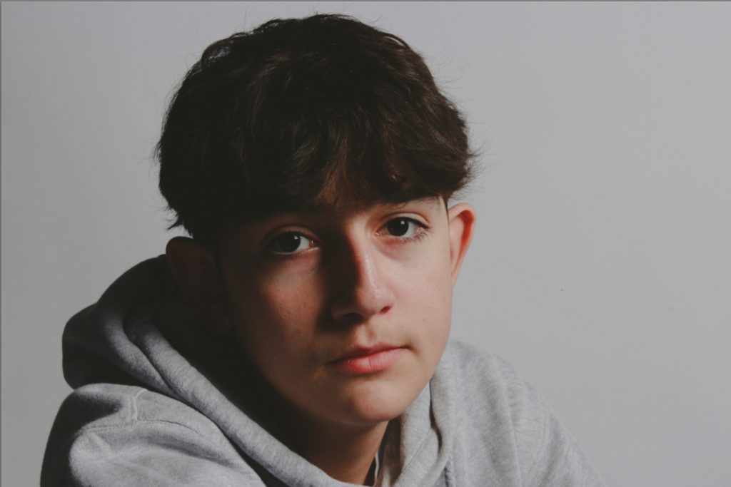
This is a photo i took of Jonny. Its got a white backdrop, with a flash light and diffuser 45 degrees from the subjects face, while still being close to create a dramatic effect between light and dark (chiaruscuro). I make the highlights very dramatic and almost glow like with editing to replicate how old cameras took photos. Many famous movies implemented Chiaruscuro to create a more dramatic scene, so I used the same effect here. I made my subject look into the distance, not at the camera to increase emotional effect.

Here, I heavily relied on editing to create more emotion. With the editing you cannot see the subjects right eye, changing his smirk look, into a more sympathetic one. I used the black and white filter to make the contrast more dramatic as colour will not distract the image.

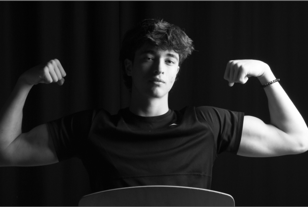
For this picture, I used the black curtains, a lightbox and flash light, and a secondary light that hits the back of his head. There is a clear line between dark and light here, going across the nose, lips, ext. The eyes have little life as we put the reflector further away from his face, giving him a sense of lifelessness.

Rembrandt

Selection of best images:

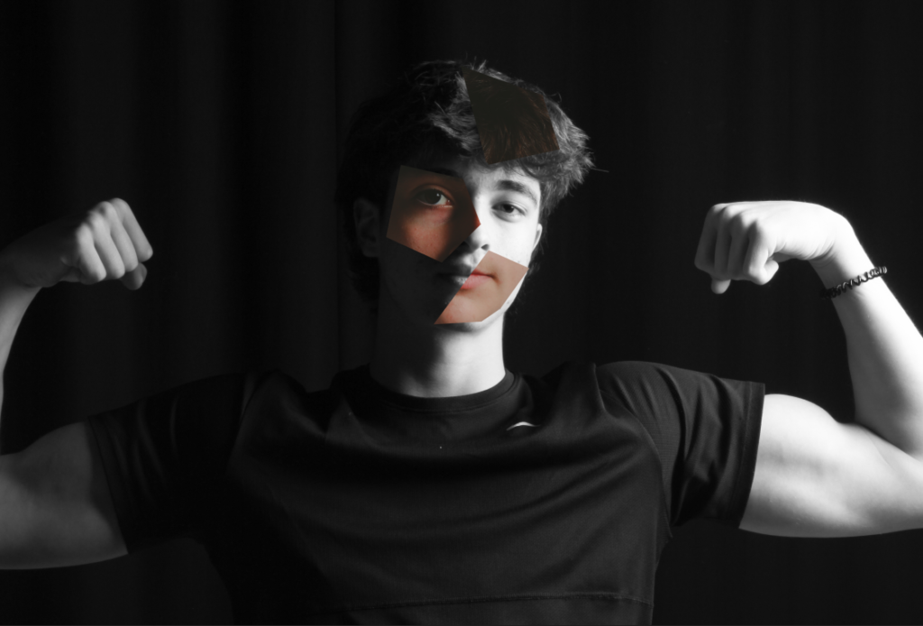
(left one is edited). The triangle is bellow the right side of their face. I edited it with bright and colourful settings and slightly more contrast (keeping the rule of thirds by placing his eyes along one of them.) I did this to oppose the dramatic effect created by a Rembrandt lighting method .

I did a similar thing as the above image for this one, just with a new subject.

happy dude.

Butterfly

Selection of best images:

young handsome man

studio lighting

studio lighting consists of 2 main types, continuous and flash, with other types like natural lighting . We can uses these 2 different lights to create different lighting techniques like the a butterfly for example.

The technical side of lighting

Continuous lighting (or tungsten light) produces a constant amount of light which is often a warmer temperature, meaning you need to adjust your white balance accordingly.

Flashlight lights have umbrellas, or a soft box can be attached to diffuse the light (not to say continuous lights cant have this). They create a flash of light which is very bright and used to make hard lighting.

Other objects can be used like a reflector to direct light in multiple directions often leading to more soft lighting. To create an interesting studio portrait you need to different directions of light, temperature, key lighting (e.g. 3 point lighting), use of reflectors and diffusers, camera settings (ISO, camera lenses, shutter speed and aperture), backdrop and infinity curves, and of course an interesting subject. So what different techniques are there?

Hard light refers to light that offers very sharp transitions from light to shadow. Soft light is the complete opposite of hard light: It offers gradual transitions between light and shadow.
High Key (left) is shadowless, over exposed, soft lighting, and low contrast. Where as Low key (right) is the complete opposite of that.

Rembrandt lighting

This technique (named after a Dutch painter, Rembrandt Harmenszoon van Rijn) is where the lighting creates a upside down triangle under the eye. Rembrandt lighting is a technique utilizing one light and one reflector or two separate lights. It’s a popular technique because it creates images that look both dramatic, full of drama, yet staying natural. Its also used as a way to draw the views eyes towards the eyes of the subject in the photo (usually the main focal point of a portrait image). This is because it will create emphasis of that part of the face, drawing the view in. Other ways of moving where the viewer is looking is by using negative space, leading lines and depth of field.

Rembrandt self-portrait using paint, with a noticeable triangle under the right eye

As you can see, kewano weafs and all the other photos have very hard lighting, creating a large amount of contrast within the face. This allows the triangle to appear, drawing the attention towards the eyes. Eyes can be used to show many different emotions so its important to have it as a main focal point.

Rembrandt lighting setup ^

Butterfly lighting

butterfly lighting is achieved by moving the main light above the camera, and directly centred with the models face. This creates a shadow under the nose and cheek bone that resembles a butterfly It’s also known as ‘Paramount lighting,’ named for classic Hollywood glamour photography. It creates a thinner looking face by making shadows under the cheek bones and neck.

As you can see, the butterfly effect can create a warm and happy image or a scarier, darker one. This is because the butterfly lighting effects the setup of lighting and not the quality of lights, so you can still have soft or hard lighting and still have butterfly lighting.

The reflector can soften the shadows under the check bone and neck if you don’t want the butterfly lighting to be so noticeable. To create hard lighting you can just remove the modifier (e.g. a soft box).

Chiaruscuro

Chiaruscuro (Italian for light dark) is a dramatic contrast between light and dark in the image. It appeared in the 15th century paintings:

It’s has a dark, contrast look, with dense shadows – though, for the most part, not completely black. The use of shadows in the background gives the painting an impression of depth and three-dimensionality. The subjects, meanwhile, are lit carefully, almost sculpted, by the light and shadow that falls on them.

Chiaroscuro in photography is made using one key light and a variation using a reflector that reflects light from the key light back onto the sitter.

To create a Chiaruscuro effect, use a flash – with triggers and a light stand and set the shutter very high, to remove any ambient light.

This way the only light recorded is created by the flash. If you zoom flash too, it will intensify the light on the subject and leave the background dark. Its best to just use a dark wall as a backdrop.

You don’t even need any artificial lighting to create this effect, as long as the lighting is strong.

environmental portrait photoshoot – town

For this photoshoot, me and my colleague both walked around St.Helier and took photos of a variety of different people, with different jobs and environments. For example, some was of local shops like IKeys, others were builders in their building site. We also took a few of people playing sports like basketball and of some random people going about their day.

This is one of my favourites from this photo shoot. Its of 2 guys who we asked to take some photos of. We captured them from many different angles and this ones my favourite because they are acting as if the camera was not even there presenting them in reality. There body and faces match the rule of thirds, making the picture not feel awkward, with things seeming in place. I think cigarettes always add character and the fella suggested it so we went with it.

For this portrait, after a basketball game I took photos of my mate under a hoop, staring into the camera, while i was standing on the viewing platform at the top. Its quite intimidating but the hoop in the way keeps a distance between him and the viewer. I got him to hold to basketballs to connect him to his environment more.

Arnold Newman – Image Analysis

1963, environmental portrait of Alfred Krupp

Emotional

The effect of this image makes me feel quite intimidated and devious 😈 . Its very rough and serious as there’s no natural objects in the scene, except for the subject. Also seen as gloomy, dark, uncomfortable, cold and more. He’s almost blocking the viewer away from the picture.
Visual

Cold blue colours, lots of industrial objects in background (a train factory). The subject sits in the bottom centre of the image sitting almost like he has authority over the factory. He’s giving an intimidating look, especially with the harsh shadows on his wrinkly face.

Technical

symmetry and balance. The 2 pillars add to this symmetry, and leads the eyes towards the subject. harsh lighting – not very conventional giving similar lighting to churches or cathedrals (very intimidating). perspective goes to end of factory, with the focus on the subject.

Conceptual

The idea behind the image was to show his views on people who helped the Nazis win the war. He presented this image in a dark and sinister way, perfectly portraying the man in the image.

Contextual

Alfred Krupp was a German industrialist who ran the Krupp empire, a major arms manufacturer during World War II. Convicted as a war criminal for his company’s use of slave labor, he was later pardoned. Despite his pardon, Krupp remained a controversial figure, and his reputation as a ruthless businessman and war profiteer followed him.

Newman, a renowned portrait photographer, initially refused to photograph Krupp due to his own Jewish heritage and Krupp’s dark past. However, he later changed his mind, deciding to use the portrait as a way to express his personal feelings toward Krupp. he later said after taking the photo that ‘shivers when down my spine’

Arnold Newman – 1918-2006

Arnold Newman, one of the most accomplished portrait photographers of the twentieth century. Arnold Newman has been credited with popularising the ‘environmental portrait,’ which places the sitter in surroundings that suit their profession or skill. Newman said of his sitters, “it is what they are, not who they are, that fascinates me,” and he made his reputation photographing a wide range of highly influential cultural and political figures of the twentieth century, often in their most telling environments, be it home or work. He became known for his ability to thoughtfully capture the personalities of his subjects through their expressions and surroundings. While commonplace today, this technique was not widely used in the 1930s when Newman was learning his craft, pathing the new era of portrait photography.

Newman spent a lot of time refining the background and the subject to work together well and to present stories and emotion. He would designing floor plans, equipment, schedules, and possible poses before the actual shoot even took place. This highlights how important he considered his work to be.

He managed to take photos of many influential figures like:

John F. Kennedy by Arnold Newman

Explaining the portraits of famous people

In The Picasso portrait, Picasso looks directly at the camera with a hand resting on his forehead, looking more serious than in many other photographs of him. He tried to highlight his facial expressions and face blemishes, hardly focusing on the background.

In the john F. Kennedy environmental portrait, Arnold Newman focused heavily on the background (the white house) with the 35th presidents youthful and elegant appearance making him seem very powerful, looking over the country.

The Marilyn Monroe portrait (one of the most celebrated actresses of all time), has a deep impact on the views. The photograph is notable for its composition, showing an intimate glance between the two subjects. The piece also shows the contrast between Monroe’s glamorous public persona and Sandburg’s more serious and scholarly image.

Other works

Environmental portraits

An environmental portrait is a portrait executed in the subject’s usual environment, such as in their home or workplace, and typically illuminates the subject’s life and surroundings.

The surroundings or background is a key element in environmental portraiture, and is used to convey further information about the person being photographed.

While it is often true that the background may dominate the subject, this need not necessarily be so. In fact, the details that convey the message from the surroundings can often be quite small and still be significant. It can be used as a way to tell a story.

Mood board

All these images are very unique and tell very different stories. Some portray sadness while others are more lively and happy. Some images are linked to there workplace and others are to do with there current situation. They are some similarities (topology’s are similar photos) like how they all have there subject in the centre, most look into the camera, and they all have lots of contrast.

The bottom right has the basketball net as the main focus of the image. However, this does not exclude the person from the image, its almost used as a way to lead the eyes to the neutral face of the guy.

The top left is quite different as the main focus is clearly the guy sitting there seriously. It looks very planned out allowing cool details in the background to happen like the sparks.

Virtual gallery – evaluation

https://visit.virtualartgallery.com/2c643fc9-fe3a-4d9e-bd60-fdb08f0d6fb5/

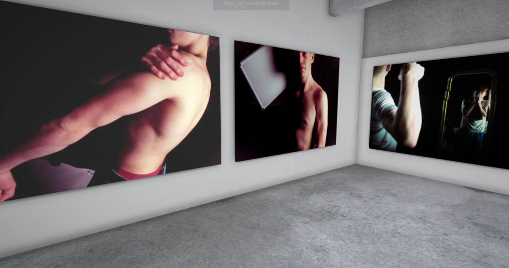
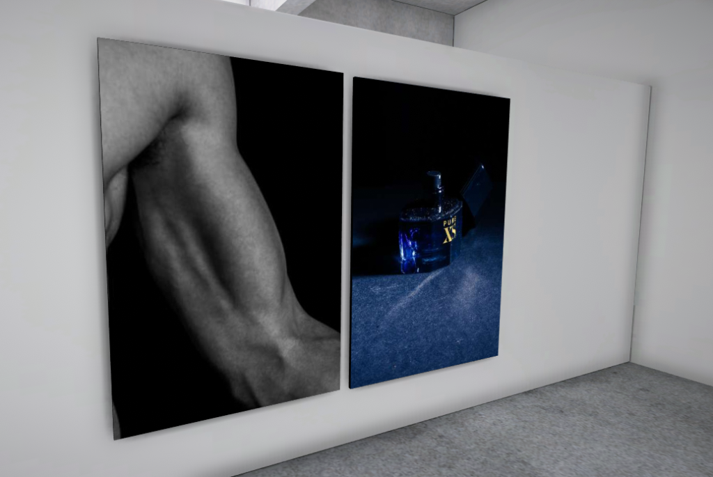
Here I created a virtual gallery to view some of my edited photos. The first section contains the single object and common tools images. The second room is all the still life photos.

I used virtual art gallery and added my photos to a plain room. I added a frame to each image to make them pop out more. Some images where larger than others as they have more detail in them.
Evaluation

Selection of Final still life images

Here are my 3 final images:

I chose these three as they are all very unique yet still have a nostalgic effect due to the old, worn objects :). I also think they will look good next to each other.

Then, I decided to Make them all B/W as the theme is nostalgia, and B/W images brings out a nostalgic feel for many people including me. B/W also removes any distraction of colour and helps the viewer focus on other aspects of the photo, such as the subject, the textures, shapes and patterns, and the composition. Contrast is also more noticeable with B/W photographs, which can bring out more emotion. For example, the middle photo of the book has a powerful and dark shadow due to the continuous, directional light used. This makes the book more noticeable, increasing the emotion from the image.
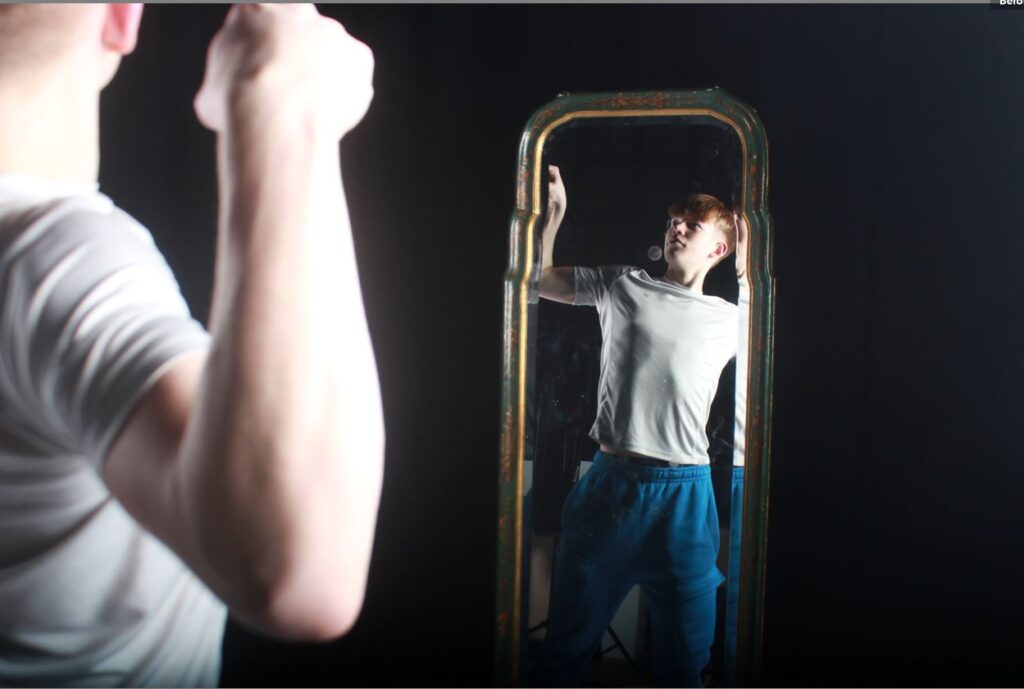
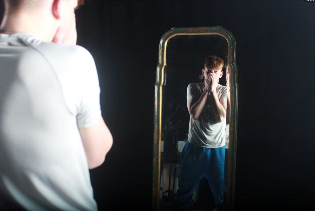
Here, I split up one of my final images using the triptych method. I think I makes it look very clean and professional.