All posts by Joseph Raffio-Curd

Filters

Author:
Category:

Virtual Gallery – St Helier Harbour and further Evaluation

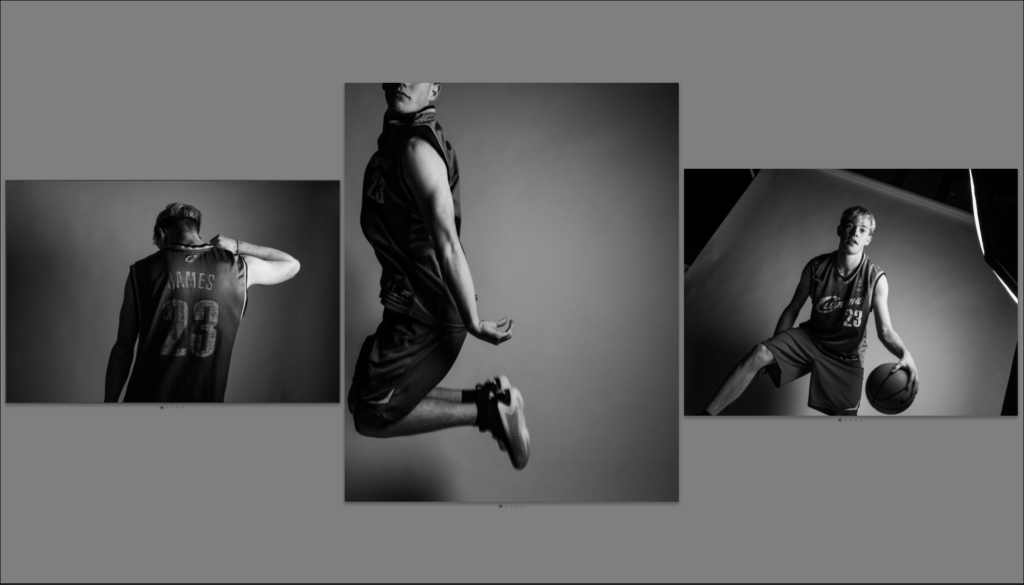
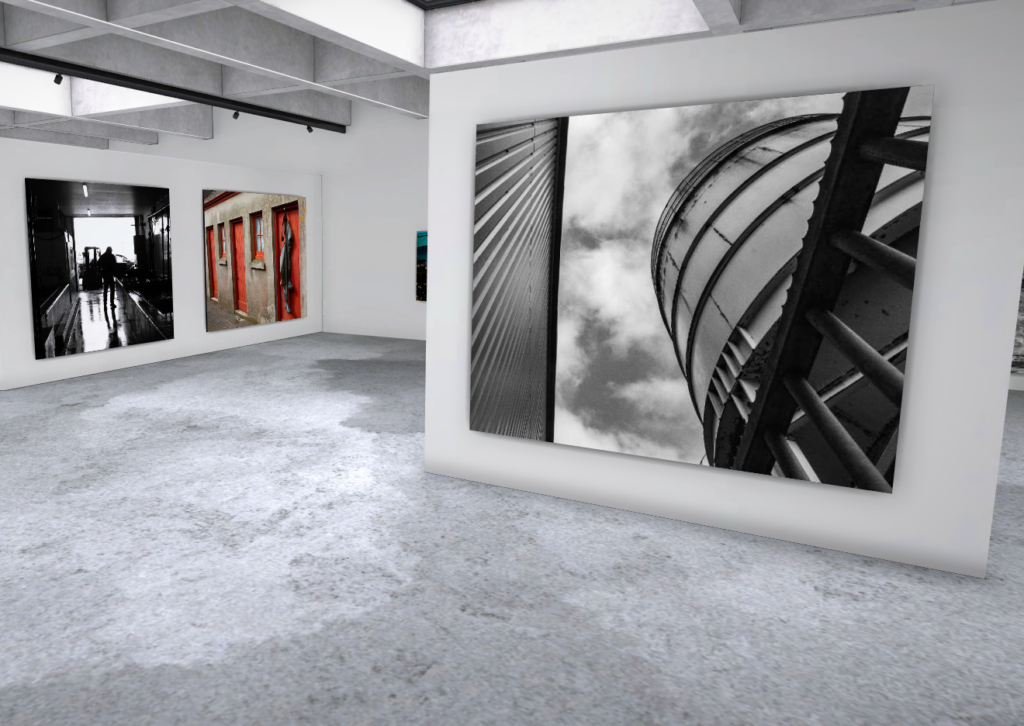
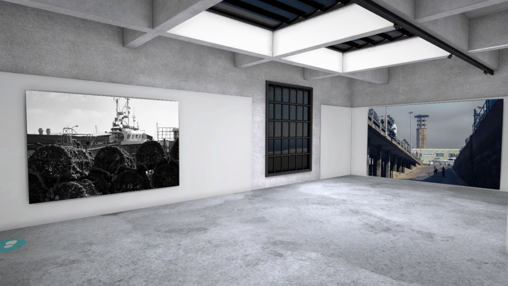
Below are some screenshots of the gallery presenting my photos from the photoshoots taken in the St Helier harbour. I laded them out in controlled order with photos containing wide open spaces having a larger frame than close up photos. I also grouped similar images together to make the viewing less confusing.

Evaluation of the whole topic:

the topic of Jerseys marine life was initially quite interesting to me as I have now lived on this island for over 7 years and I’m always interested in learning new things about the island. The Jersey marines was particularly interesting because it my dad has always been into fishing and I often join him, so learning about the interesting and often overlooked history of jersey cod trading was fun to learn about. Using the Jersey Archives as a research tool helped me massively to find out what was going on from over 300 years ago to now in Jersey. It helped me answer many questions about Jerseys history, like sources of income, common jobs, ext.

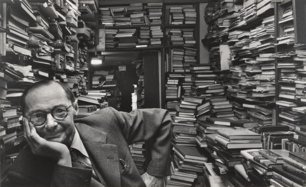
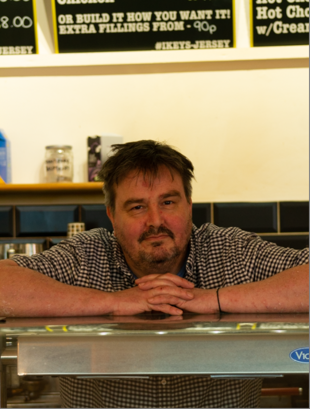
For the first photoshoot we went around the the St Helier harbour with 2 tour guides, one being the old captain of the marine which one of my final images has him as the subject:

I like this image as Its almost a capsule into the past, with no new items in the frame. It also has a lot of context to it, with him being the old captain of the harbour. The geometric background also complements the subject nicely, as well as drawing the eye towards the captain. His happy expression passes onto the viewer, making this a very enjoyable photos, while also making the past seem fun and exciting as well.

I have a few other photos that I like from the first photoshoot which I explain in previous blog posts.

For the second photoshoot, our school gave us a tour around the maritime museum which was a very interesting experience, as all my research was now viewable, with old boats, paddles, fishing requirement and so much more, all used to help create the rich history of Jerseys marine industries. Here is a photo from the museum:

As you can see it was packed with history, making it a valuable place for my research and understanding of the Jersey marine history. For example did you know that in the 19th century Jersey was one of the largest producer’s of boats in the British Isles. This was partly due to its very cheap tax rates and its large labour work force.

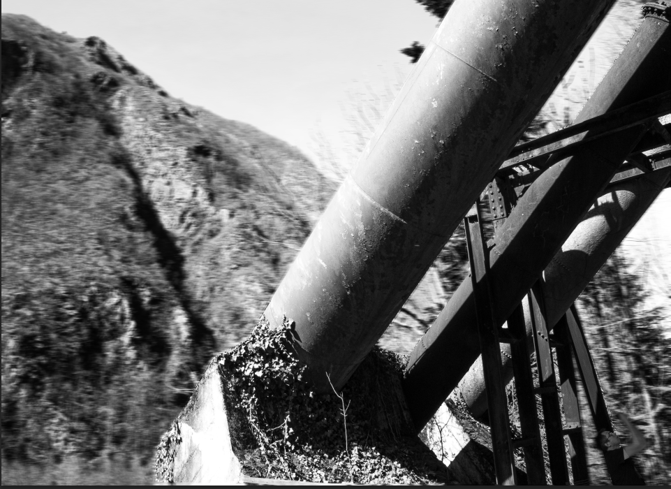
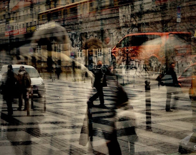
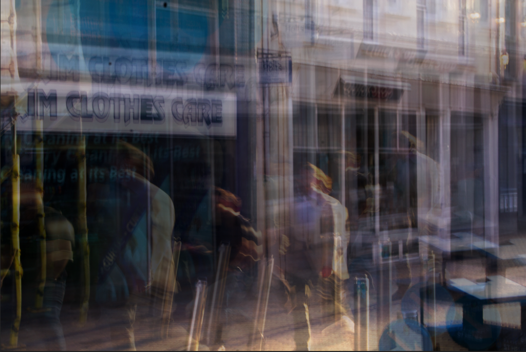
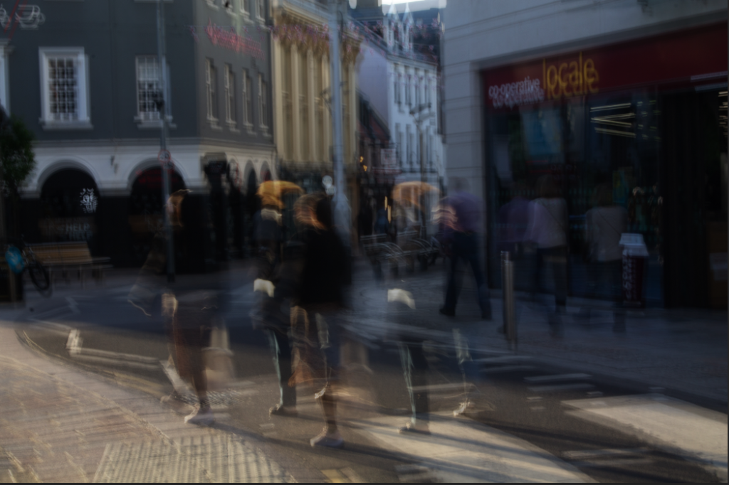
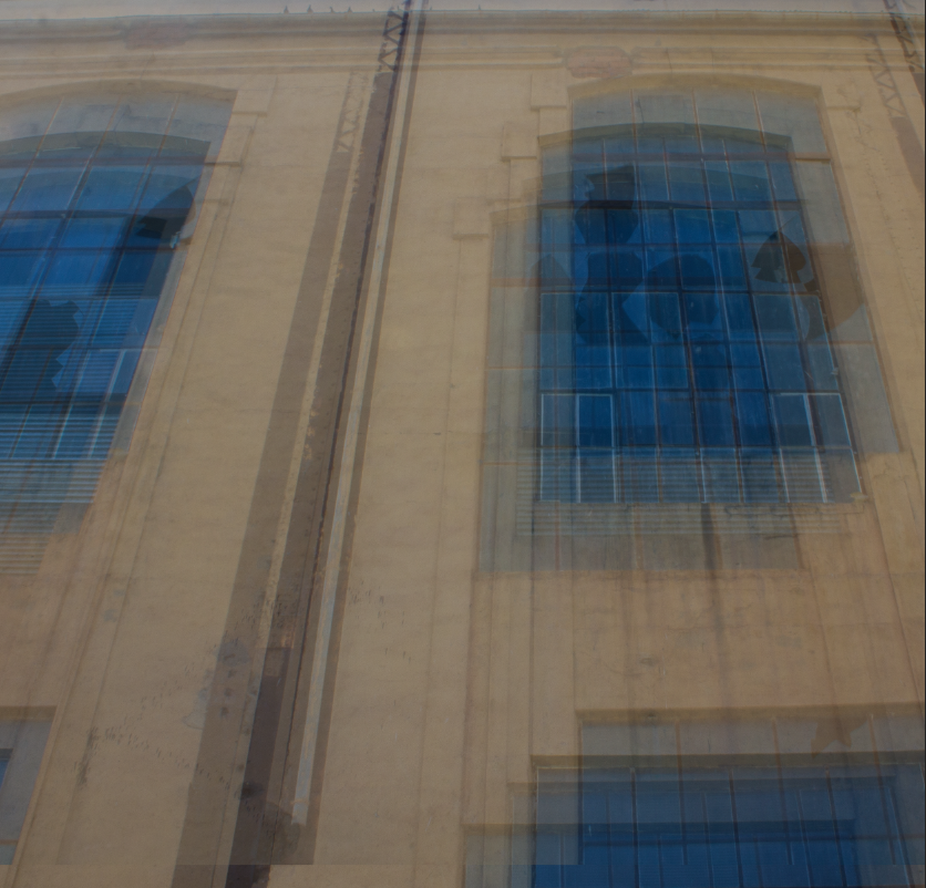
We also took more photos of the harbour after the museum, which I am very pleased about, as I tried many photography techniques like taking photos at unexpected angles, using various camera settings like a long exposure time to create a blurred effect, and more.

After the two photoshoots I am very pleased with my final images, each being very unique and having a lot of context to them.

zine: InDesign for designing and layout

Here is my first mock up of my zine design, using inspiration from my printed pictures:

I then tried adding some text to or next to images to add more context to them, making them more interesting for people looking at the zine. I also rearranged some photos here:

I didn’t want to add to much information otherwise it would be become more of a tourist booklet instead of a zine. These images are all the same so it makes sense to put them together. Its also the first page in the zine so it shouldn’t be too overwhelming.
I put these images together as they are different in almost every way, reducing repetition through the zine.
I put 2 pages together as I think there was too many close to empty pages I kept the people photos in the left and the others on the right. The top left and bottom right of the zine where images from the same location so to reduce confusion when looking I placed them diagonally.
I’ve kept this image as a full page because I want to further enhance the vastness of this image, since originally it seemed quite compact. This makes the subject look more isolated, creating a more dramatic image.
I added a grey border to this photo since most of the image is grey, it would reduce distraction. This photo is another very isolating feeling image since the buildings completely overwhelm the subjects. The final image of a zine is normally impacts the viewer the most so putting this image of the back further increases this impact.

I also tried making the margins from 12.7mm to 7mm so the photos fill up more of the page. I think it looks more clean and better now:

All these images work well together so I put them together to act as almost a separate part of the zine, keeping it interesting when the viewer flicks through it.

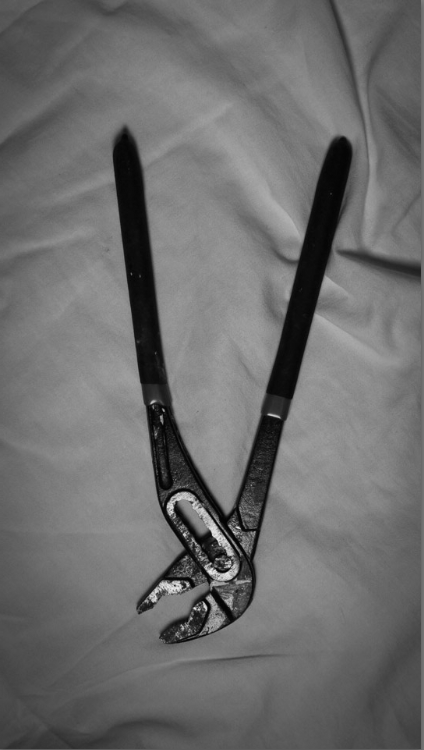
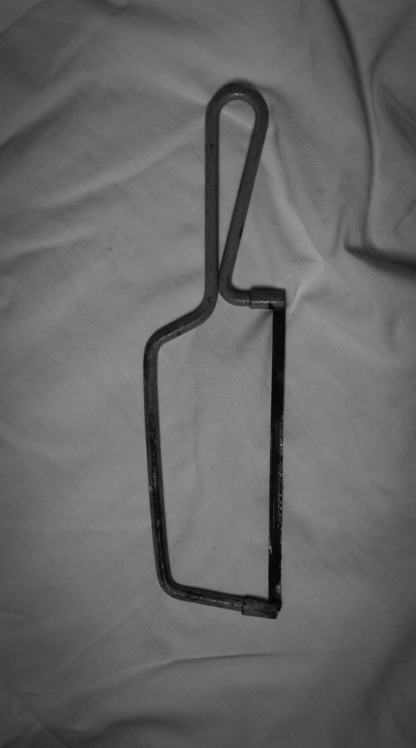
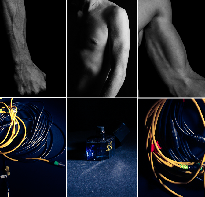
Now I have a free page that needs filling. To do this I’m going to find some photos that will complement well with the current images in the zine:

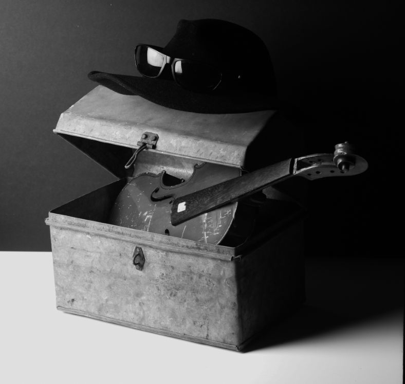
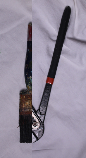
Here I wanted to add some contrast to the images, with one being organic and one being very robust. This will keep the zine interesting.

I also changed the name to:

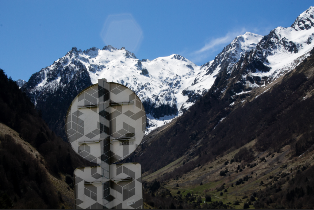
I tried a funky design in photoshop to use for my title but I think it looks better to just use ordinary text:

The print:

After printing, using booklet settings, I collected the pages and folded them neatly using a bone folder and put them together in order. The I stapled the spine of the zine and trimmed the edges. Here is are some images from the final product:

Evaluation

Overall I am very happy with the final zine. It has many photos in without looking too busy as I has some pages with less images. The photos I chose also brings the viewer through a little story as they explore the harbour with my zine, without missing much as most of the harbour is included. However I do think I could add more ‘story’ elements instead of headers on some of my pages. It turned out very similarly to my mock up designs which I am pleased about, with the improvements further enhancing the zine. The zine also helped my present my best images in the order and format (e.g. the size) that I want, which would naturally improve the images.

Selecting Images for the zine

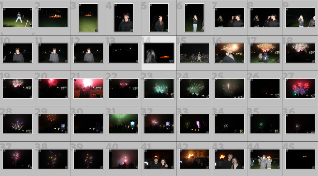
To select Images. I looked through the Images I have already rated on lightroom:

Then chose 16 unique Images that I can use to tell a story. I tried to include some busy Images which have wide and detailed shots. As well as including some simpler images to complement them and to add a negative space effect to the little magazine. I also wanted to include a lot of images with human subjects as they are usually the most interesting.

Here are the Images I decided to chose:

I might decide later to swap out the 4th image so I can put these to images next to each other as I think they contrast each other nicely:

I then printed out the 16 images I decided I want to use, cut them up and laded them out so I can decide which order they are placed and how they are placed in the zine:

I used other zines that you can see above my images to give me inspiration for the layout. I think for the steam clock I might add a few more photos to that page to create a topology of the steam clock.

I Then stuck the images inside a mock up zine with tape to see how it would look like. The size of the images will change later on as I will re-design them inside InDesign:

St Helier harbour photoshoot 2

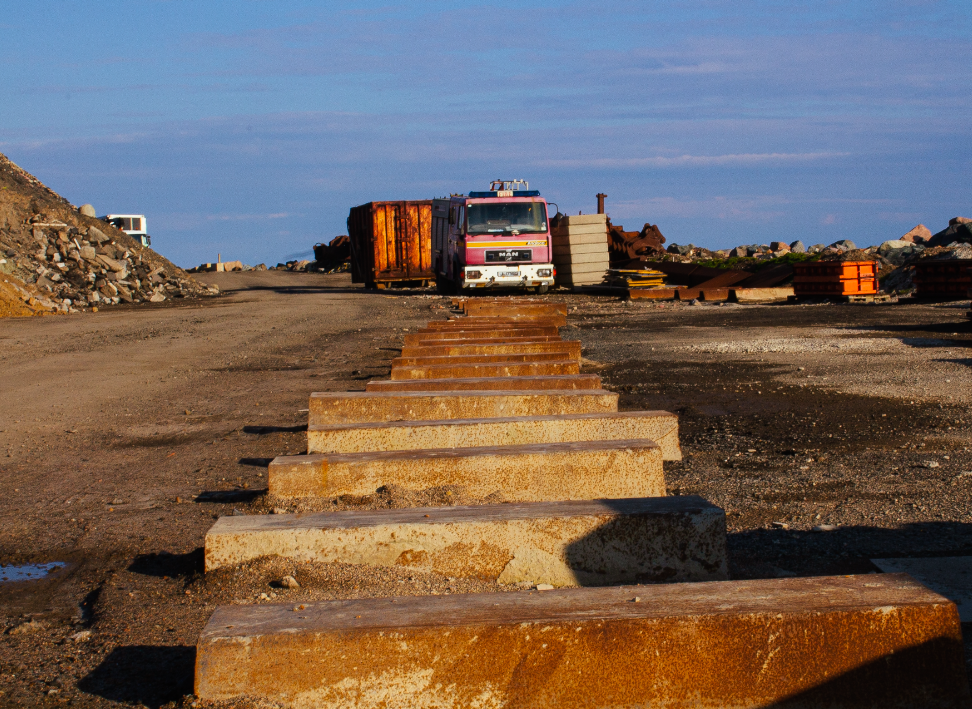
I took these photos a week after I took the first ones, on the 18th of September. This time the sea was a lower tide, As well as being more sunny. We went around the maritime museum for the first 1-2 hours of our trip. Then after lunch we went around the harbour, but to different areas of the piers around. I focused more on portrait photography this time since I already have many photos of the piers, as photos with people normally tell more of a story.

here are some local fishermen who I asked for some photos. I would like to of positioned my camera more to the right so the man on the left wont be cut off by the pole. However I do think the composition is nice as there is not much negative space (as most areas have a face in), and the pole can be a leading line towards the right person. The right person also has a lot of character in his face so it helps add more story to the photo. To edit I added a black and white filter, and changed the contrast slightly. I also cropped it a little bit.

I like this photo because the bad boys paddle contrasts the subject on the left who seems a bit nervous.

This photo was taken inside a shell fish area, It was very dark and had containers with different shell fish in each.

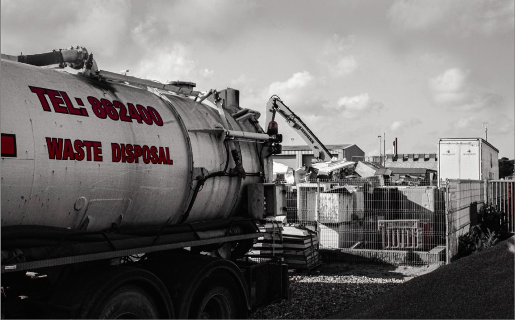
Here is a montage of 3 images (plus 1 large image), each of buildings around the harbour. I chose these photos to be next to each other since each building is very large, showing the scale of the harbour in jersey. For editing I bumped up the saturation and contrast slightly, while adjusting the blacks and whites to make each image a similar style.

here are some photos from the maritime museum. Unfortunately a lot of my photos came out full of noise because I needed to increase the ISO to above 2000 since it was very dark.

Here is some photos of a worker changing the chains along the sea floor. I edited it so the neon green safety jacket would be the only object with saturation. This method of selective saturation can reduce the busyness of an image and allow the subject to be more obvious.

I tried again but with this dock workers shoes and it looks a bit naff. I will increase the workers exposure so he doesn’t blend into the background more, I will also try cropping the image to reduce background noise and to make the subject larger.

This looks a bit better in my opinion but still not the best.

Here is are 4 images that I edited with these settings:

These are all quite similar images In my opinion. They all don’t has an obvious main subject, meaning the eyes don’t have an obvious place to rest, making it more chaotic. They are also different in some ways as well, the first image and second image have a foreground and background where as the third and forth image is mostly all background.

Here is a one off image I took through a little gap in curb. It has good composition and reminds me of picture cards that you get while on holiday.

St Helier harbour photoshoot 1

Our school did a trip around the St Helier harbours. A tour guide that explained some of the things I talked about in previous blog posts in more detail, which I added later on to those blog posts. My goal for this photoshoot was to capture the present harbours and compare them to what the harbours use to look like. We got handed photos on our tour at certain locations, showing how the area use to look like which was very interesting. I also learned about this photographer from France who takes photos of boat textures, which looks like abstract art on a canvas.

Here is some edited photos from my photoshoot:

For the first image I increased the saturation and contrast slightly, and aligned the subject to the middle. For the second Image I cropped towards his face more since it looks very sailor like, as well as creating a B&W image that I like.

For this photo I noticed that the background noise distracts from the subjects, so to combat this I used a radial filter around the subjects on Lightroom, then decreased the sharpening around the filter, as well as decreasing the exposure.

Here I just increased the saturation and changed some of the highlight settings, I cropped it so the boat is on the rule of thirds, so the eyes naturally go towards the people in the boat.

The left is my photo, and the right is a comparison from the mid 20th century, after the pier was built. As you can see nothing much has changed. One thing I did notice was how there are just less people around, this may be because we where doing shots while people where at work, however this contrast of people to no people does make our current time seem less exciting.

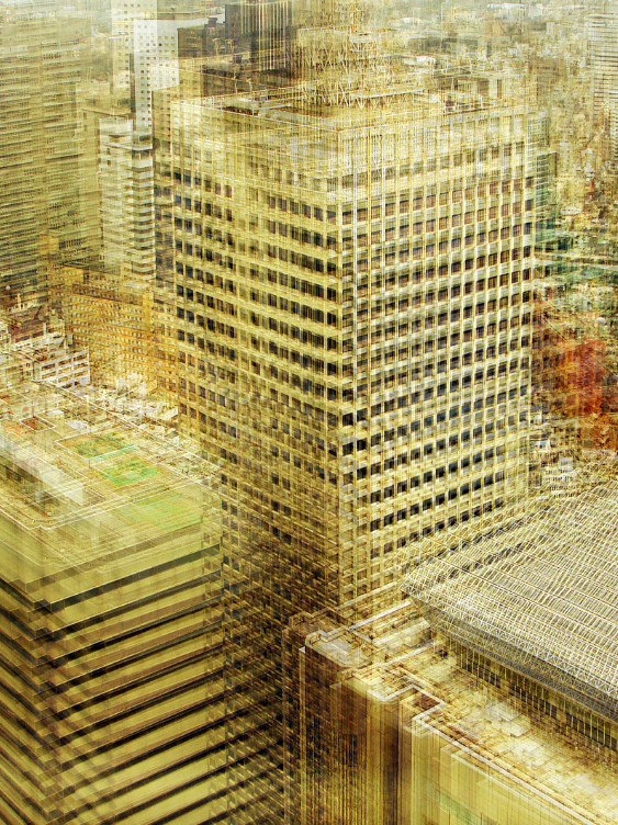
Above is a some more abstract photos towards the end of the pier.

Above I took a photo of the steam clock around new north quarry. I took 8 photos each at different angles giving this topology.

Origin of Photography

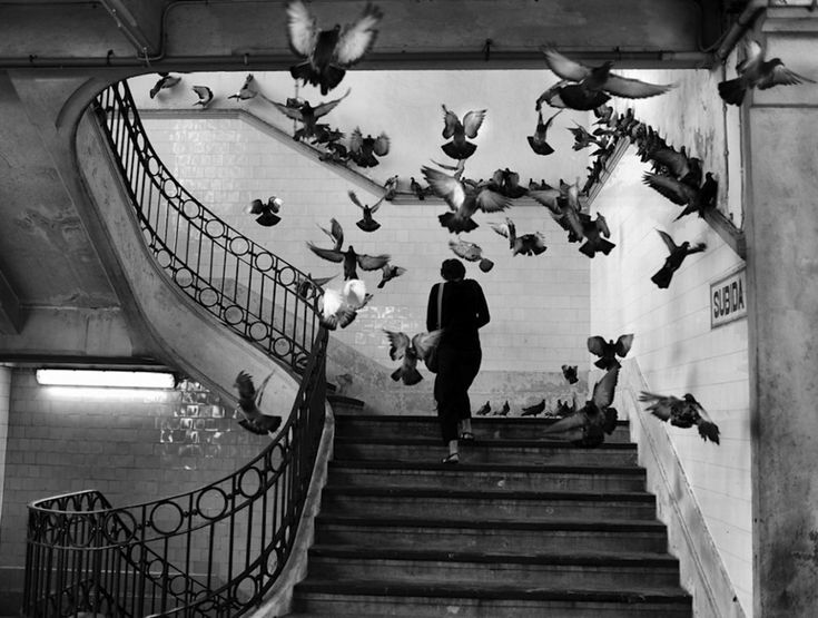
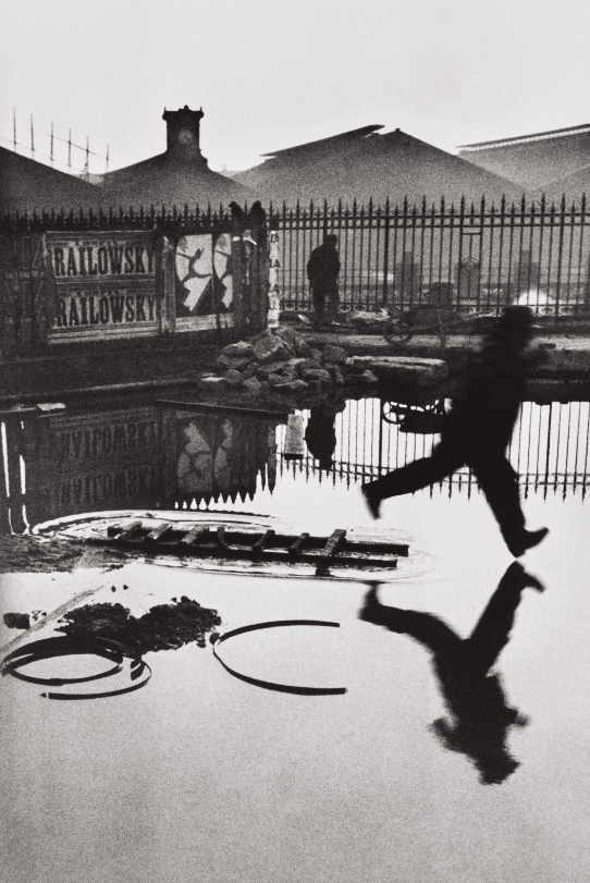
“Photography can turn something ordinary into the extraordinary”. Meudon, a famous photographer from the early 20th centry, has some very good examples to explain this quote. He would find a place witha nice composition (the ordinary), then wait for a story to be performed, so he can capture that moment (the decisive moment). By waiting for an interesting moment to be captured, he has turned the ordinary to the extraordinary. Below is an example:

The beginning – camera obscura

Photography in a certain sense has been around for almost 1000 years through a process called camera obscura (simply means dark room). It is the natural phenomenon in which the rays of light passing through a small hole (also known as the aperture) into a dark space form an image where they strike a surface, resulting in an inverted (upside down) and reversed (left to right) projection of the view outside.

It was often used as a drawing aid, used by the likes of leonardo davinci for example.

it allowed tracing the projected image to produce a highly accurate representation, and was especially appreciated as an easy way to achieve proper graphical perspective.

capturing the light

In the early 18th century, scientists found a certain silver salt that becomes darker from light exposure. However, they could not keep it from turning all black after they took it out the camera obscura.

The first ever photo was taken in the 1820s using a discovery made by Joseph Nicephore Niepce using asphalt and different solvents. Its a simple view from a window:

Nyep’s experiments further was an advanced version of Nicephore experiments and his camera design was used to create the first ever camera. This kick started the photography and allowed it to become what it is today.

first ever camera

Talbot further advanced the camera. He was not very good artist but needed to be for many of his hobbies. he switched photo drawing process from silver chloride to silver iodide. He then experimented with different solutions allowing him to create a photographic negative. With this photographic negative photo the same photo can now be produced many times after some exposure to light with the negative image underneath. This is called the positive negative process. This is what a negative image looks like:

Photography shaped the way we remember things, making it a very important cultural change. Early photography showed the truth in photos.

history of the development of St Helier harbour

St Aubin was the main harbour for Jersey merchants before St Helier became the central maritime hub. St Helier harbours were proving too small for the larger ships and increasing tonnages, with both drying out at low tide.

So it was to St Aubin that the States turned when the demand for a harbour could no longer be ignored, and during the 17th century this certainly became the island’s principal port, where vessels headed to and from the cod fisheries on the Canadian coast would moor, alongside cargo vessels and privateers and their captures.

St helier harbour 1901

There have been a number of 20th century developments. The tanker berth was built to allow tankers to offload fuel and oil supplies near to the fuel farm. It is also the outermost part (at the southern edge) of the harbour. Further north, La Collette Yacht Basin backs onto the Victoria Pier, and provides a deep-water harbour for leisure craft. Nearby is the area for the fishing fleet.
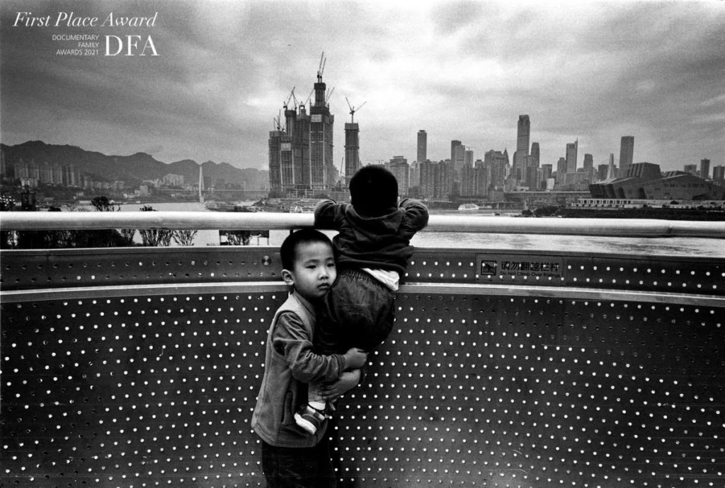
In the 1970s, Jersey had plans to create the now called la Collette. This is where more land was added to the existing harbour for more space, ext.
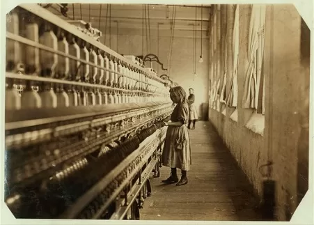
Today, the company, Ports of Jersey operates all entry and exit points to the island, including harbours and airport. They have plans to re-develop St Helier Harbour into a modern commercial maritime hub – see their Harbour Masterplan here.

Above is a map view of the pier, from late 1700s to mid 1900s. in the 1970s they added a lot to albert pier, here is a google maps view:

All the stuff on the left is all new land created, called Elizabeth pier.

Mood board

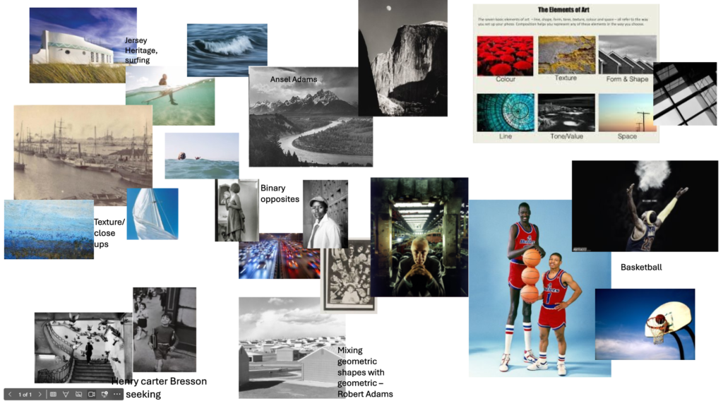
For my next photoshoot I want to take similar photos to the ones already on the jersey archive. As well as try to be creative with some new photos.

Jersey’s maritime history and development

Jersey is the largest of the channel islands, which is off the coast of France. The islands were separated from mainland Europe with rising sea levels in the Neolithic period; thereafter maritime activity commenced. Jersey is packed full of history, making it a popular tourist destination for holiday makers. One of the most important parts of history is its maritime. Jersey was an important part of the boat building industry and the fishing industry.

This is a fish my dad caught

What was the involvement of Jersey mariners in the Canadian cod-fisheries and the Transatlantic carrying trade?

Cod was valuable and from 1763 when Quebec (in Canada) was ceded to the British, colonies were founded by both Jersey and Guernsey in Newfoundland. The people in each colony undertook the fishing and drying, waiting for the company ship to arrive with trade goods they could exchange for the fish.

Up to 2000 quintals a year (weighing up to 50kg) where shipped to the Caribbean and Europe. The American war of independence saw the Guernsey fishing colony fade away as more profitable opportunities opened up, privateering.


Which ports did Jersey ships sail to and trade with?

St Aubin was the main harbour for Jersey merchants before St Helier became the central maritime hub. St Helier harbours were proving too small for the larger ships and increasing tonnages, with both drying out at low tide. Jersey added a few piers to its harbour, such as Victoria and Albert Piers.

What type of goods did Jersey merchants exchange for cod-fish?

dried cod from Newfoundland and Gaspe coast, cloth, wine, wool, leather and household goods.

To what extend, has the island of Jersey benefitted from its constitutional relationship with Britain and the legacies of colonialism based on a slave plantation economy during the first Industrial Revolution (1760-1840)?

Jersey’s constitutional relationship with Britain has been highly beneficial in terms of maintaining autonomy while reaping the benefits of British defense and trade networks. During the Industrial Revolution, Jersey’s economy thrived on agriculture, maritime trade, and colonial connections. Although it did not develop a major industrial base, it profited from the global expansion of trade driven by industrial growth.

The island also benefitted indirectly from the slave plantation economy, through its involvement in maritime trade, shipping, and investments in slave-based colonial industries. While this role was not as prominent as in major British ports, it nevertheless left a legacy that contributed to Jersey’s wealth accumulation and modern financial prowess. it used the triangular slave trade to cure the fish and send it to countries around the world, as well as importing goods back to Jersey.

Page Spread – InDesign

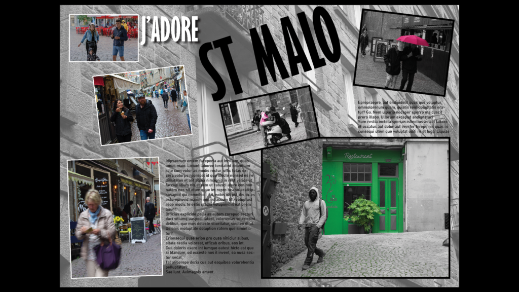
Here Is my first Attempt at InDesign, I used the rectangle frame tool to design where I wanted the pictures to go, then I inserted pictures that I thought went well in those areas. I wanted this slide to be entirely building and motor vehicles so that my next slide can be full of pictures showing the decisive moment. I saw a few picture magazines having text duplicated going across the screen so I replicated that here with the St Malo title.
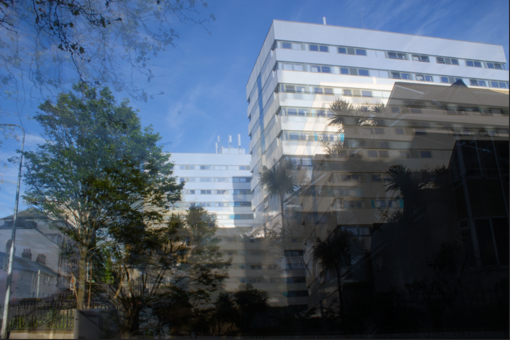
Here Is my second attempt, I reogranised some of the photos but It doesnt look as good as the first so I thought I could add some colour to the image.

I reorganised the photos again and changed the title to a normal title, I think this is my best one so far.

Using New Photos:

I’m now using photos of people to present the decisive moment, I used a quirky font for the title, however I don’t think it looks French enough so I will add some next.

Here I added the French flag with a slight angle at the back of the image. The ‘st’ in the title was hard to see so I changed it to from black to white, to contrast the dark blue behind it. Next I feel like I could improve the title, and maybe experiment more with the background:

I used a picture of a wall in st malo that I took for the background Image, also decreasing the transparency. I also changed the title to something French. Next Im going to try reducing the noise in the centre by shrinking some images and removing some text:

I also added a drop shadow to some of the title and tilted some of the image a little bit but not too much where it looks wrong.

Above is my final iteration, I changed the photos and added different borders to images. I also decreased the transparency for the background image.

Picture stories: research and Analysis

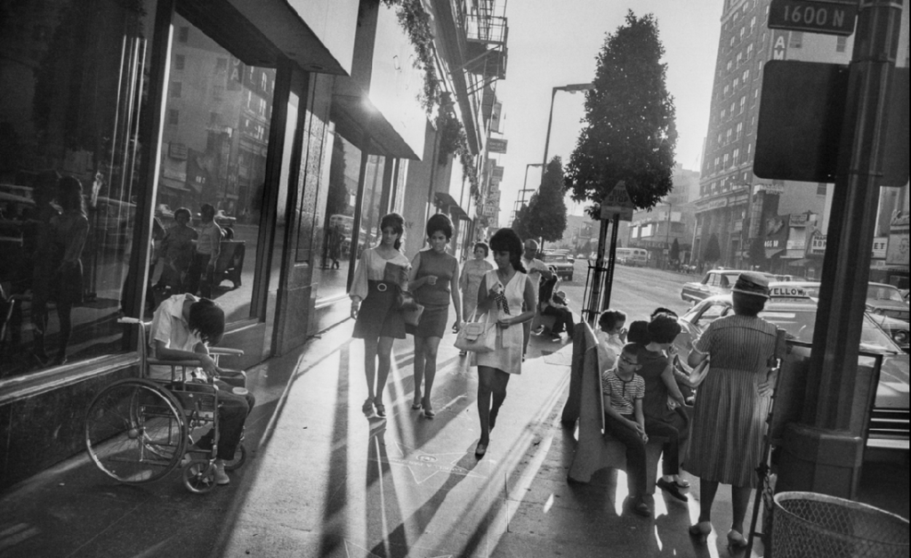
Above is a little mood board of various magazine and picture stories I have found online. I will be using my photos from the St. Malo trip to create a picture story of the walled town.

Analysis:

This page is apart of the ‘Nurse Midwife’ by W Eugene Smith. It talks about stories of Midwifes and the difficulties of being a midwife. I like how one side is just a single picture, as well as being the most dramatic picture. I think this was done to allow the viewer to spend time looking at the image instead of glancing at it and turning to the next page. On the left side, the photos dominate the text, likely because its easier to show emotion faster thought images than text. The font used for the title ‘Maude’s 16-hour day’ is bold, larger and different to others, making it stand out more.