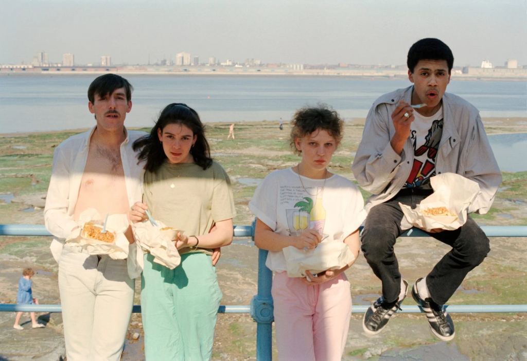

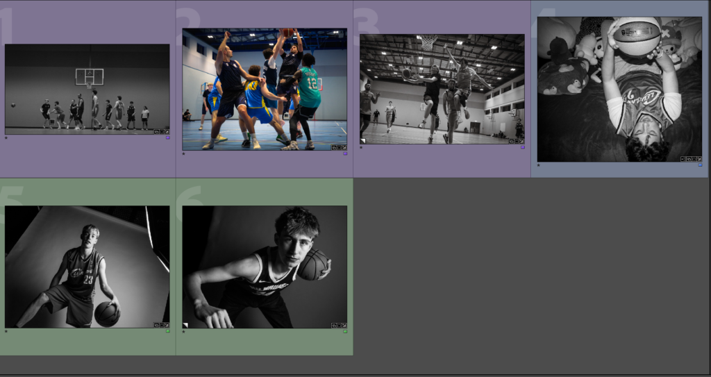
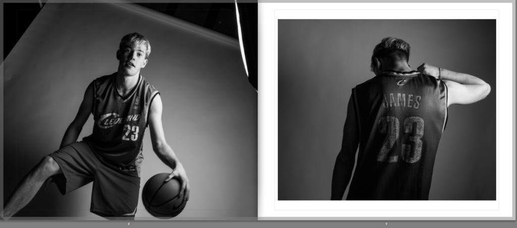
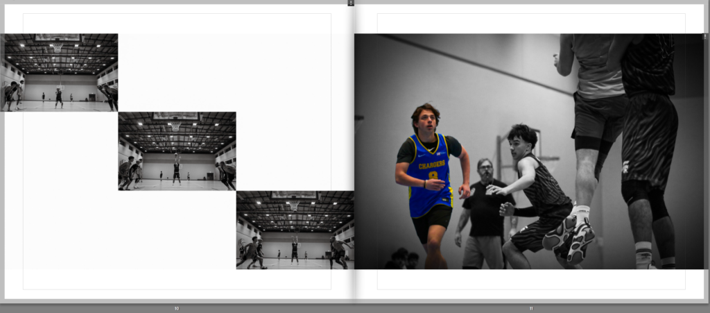
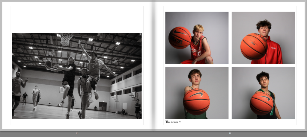
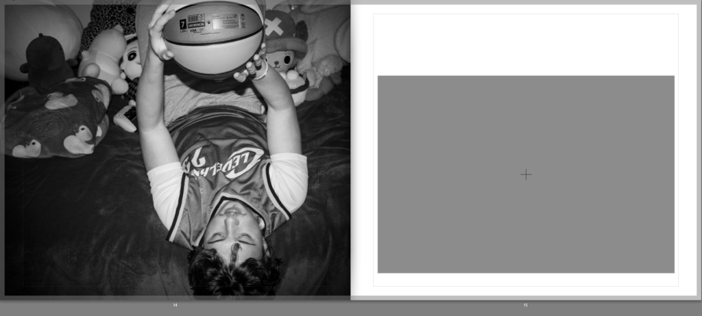
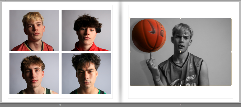
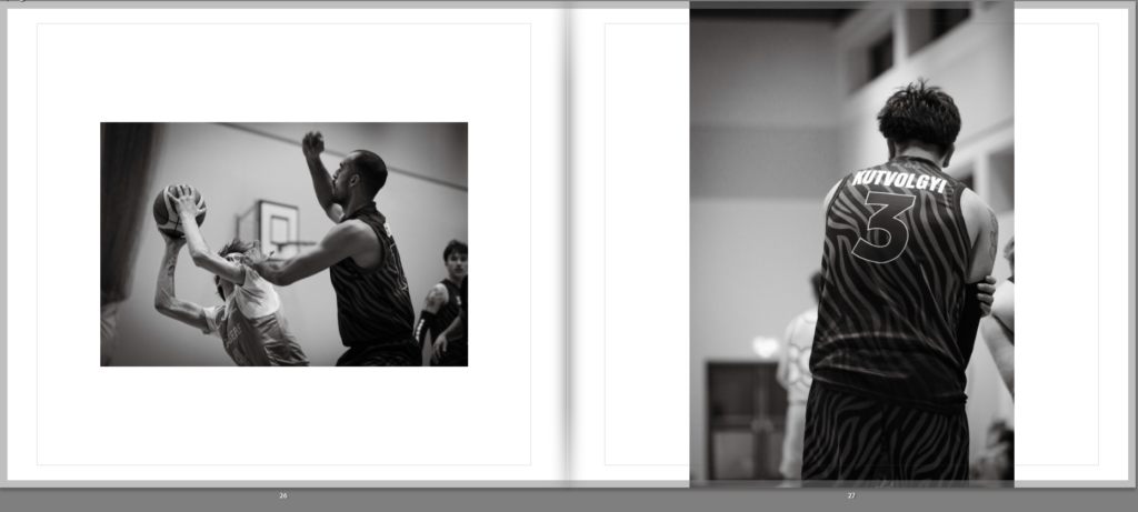
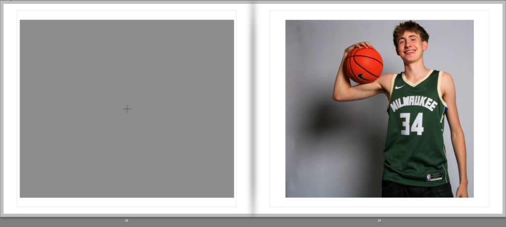
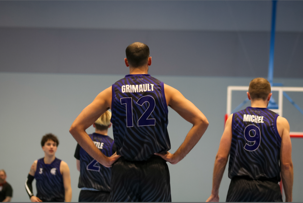
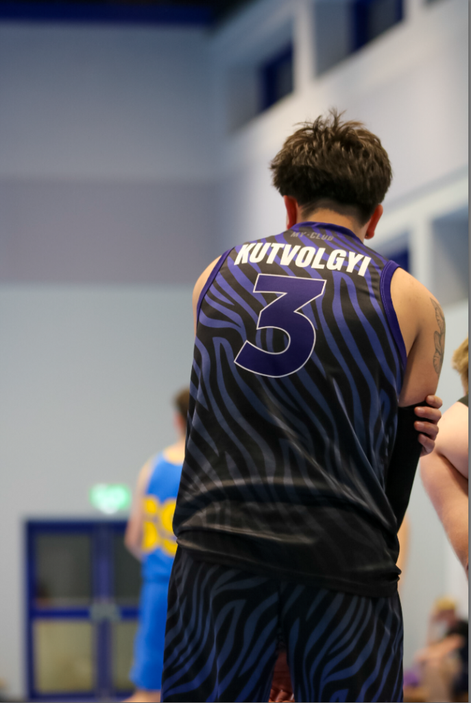
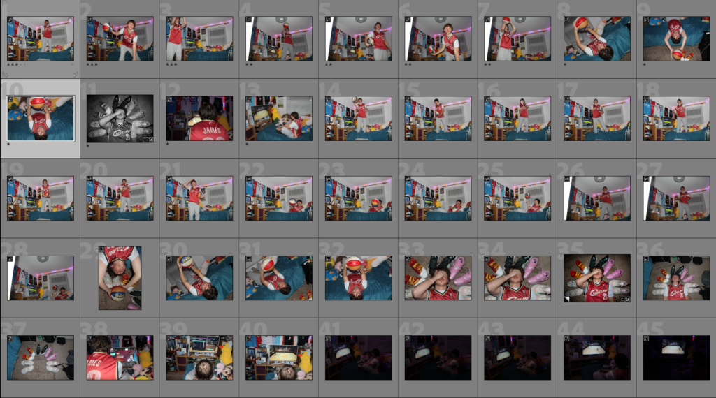
Here are my final images that I will be printing and placing on a board to present my Images. I chose these images as I think they are some of my strongest and there is a lot of variety. I will be printing the black and white studio photos in A3 and the rest in A5.
Overall, I believe that my personal study on the difficulties of being an athlete was successful. I was able to use my knowledge of different portrait lighting from past areas of study , especially with Rembrandt lighting, to create many interesting shots in the studio. Manipulating light also bring attention to detail in areas of the photograph that I would like, further enhancing the final images from the studio. Outside of the studio, I believe my photoshoots with Tony helped add a story to my personal study, creating a deeper meaning to it all. It also helped me form a photo book that wasn’t bland and had some story to it. However, I only had a limited number of photos to use with tony in it so next time I will improve by taking more photoshoots, as well as having more of a variety of images to chose from, making it easier to create a meaningful photobook. My documentary photos on the court where my some of my strongest, as I wasn’t afraid to get close to the side court. But ,unfortunately, my photos where saving as a compressed format in the camera, making a lot of them unusable for the photobook. Edited photos was also slightly lacking in my personal study since It was difficult to find artist reference for a lot of my documentary photos on the court. I also believe I could of done more photoshoots, especially with some relating to Tom Wood, an artist i rigorously analysis and didn’t use as much as I originally planned.
Despite these setbacks, my in-depth research of a wide variety of photographers, as well as photographic methods helped me create a good starting base to create a well formulated personal study.

Here are the images I will be using for my photobook. I chose my best images as well as images that included the main subject, tony. I colour coded them to help me organise the layout in the photobook. Purple means its documentary photos of a basketball game. blue are photos of tony in his room. Green are photos of the team mates. yellow are only portrait photos of the team mates faces. and red are photos that don’t fit the rest of the images. The star rating is not important here.
Below is my first try at laying out these images:

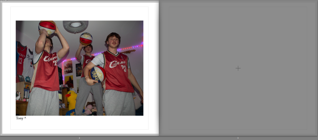

Here I have another montage right after the page with Tony in it. This increases the isolation that tony has as pages before and after it are full of people. I also added Tommy on the right and I think It complements the headshots on the left quite well, almost like a ‘zoom in’ into Tommy’s headshot.
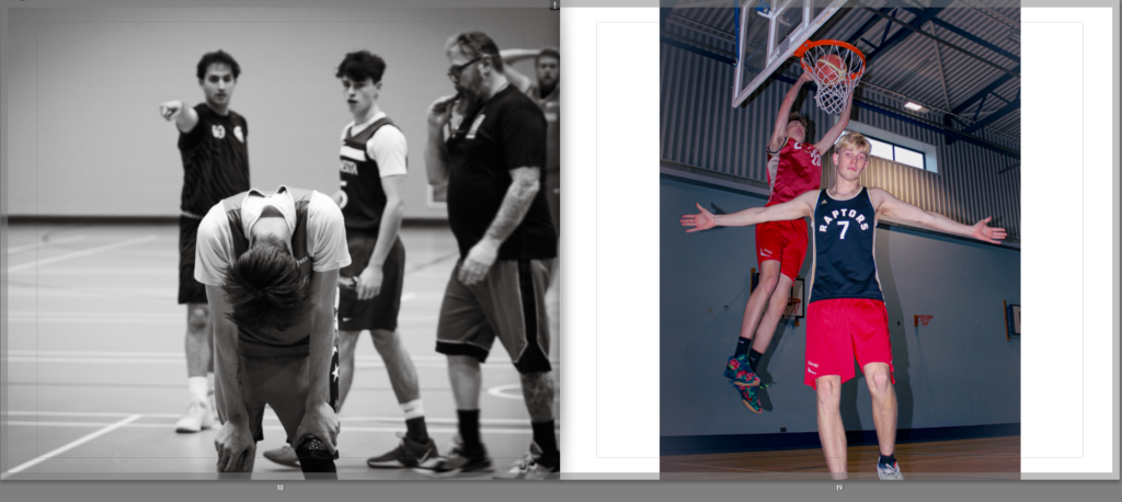
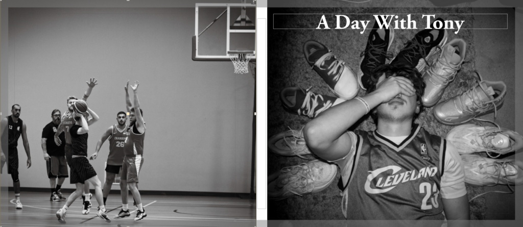
I think these two images contrast each other nicely, one is almost sad with the subjects face looking down, likely tired. The other image seems exciting with its vibrant colours, as well as a nice slam dunk in the background.

Here I added to Images that contrast each other again, to add more to this book, making it more interesting. From this part of the book you stop seeing tony, showing that his obsession to be the best has stopped him completely from having fun playing the sport that he loves.
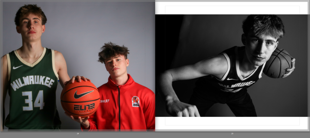
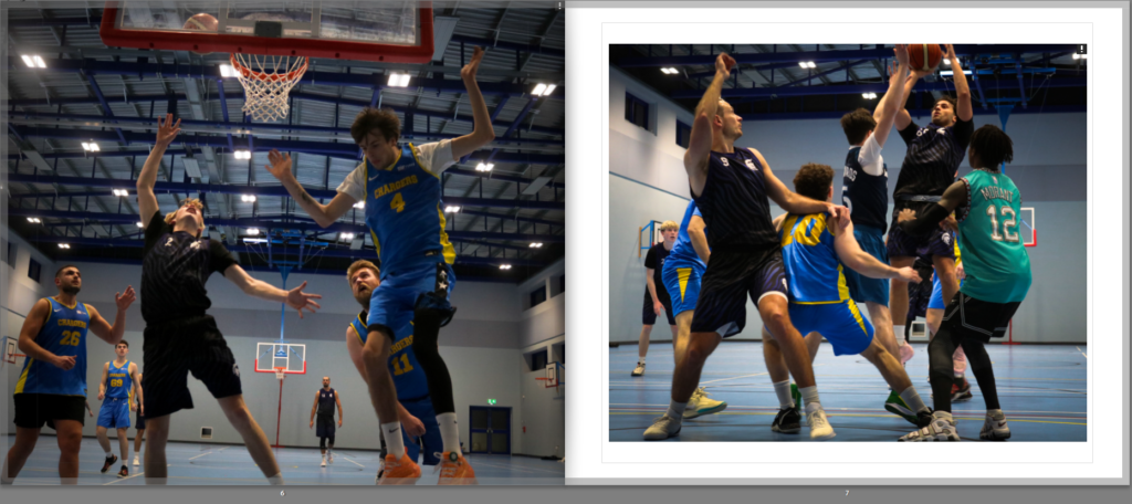
These two images are nicely contrast, with the left image replicating the famous photo of the largest and shortest players, Gheorghe Muresan and Muggsy Bogues:

Here I added more documentary photos of the basketball game, once again not including tony to show his participation in the team is dwindling.
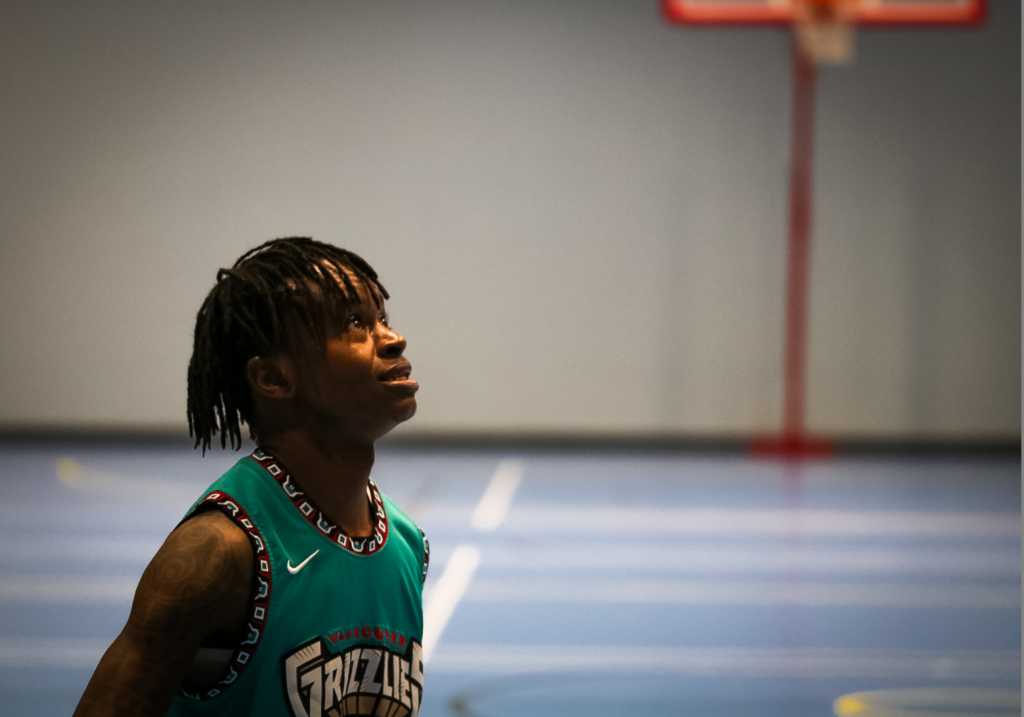
For the final image I decided to use this image of Jesper looking very excited to be there, showing a lot of positive emotion. I think this image finishes of this book quite nicely since it shows that sport is meant to be played for fun, and trying to hard where you stop finding the sport fun is not worth it. I also used this image of Jesper specifically since he is shown a lot more towards the end of the book, making him the centre of attention. The book is divided into 2 parts I think, Tommy’s section at the start and Jespers section at the end, as well as having Tony presented thought the book. This allows me to show 3 different story’s at once, with each subject showing how different there personality is.
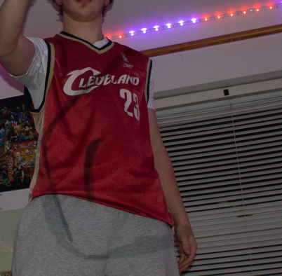
I decided to change the front cover to:
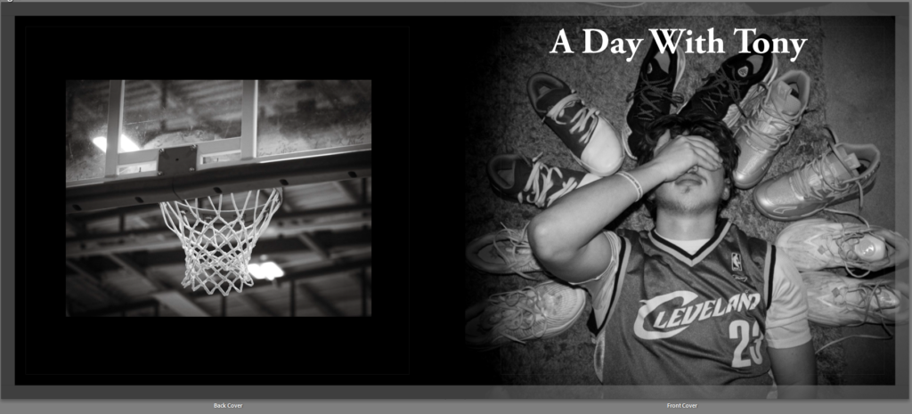
This is because I took my documentary photos using a very compressed format so when I scale up my images they become very blurry, so I changed it to a basketball hoop photo too keep with the theme and stop pixilated images from being an issue.
I then added the essay about tableaux vs documentary to the photo book:

As you can see I added the title to its own page spread to lead the reader into the essay.
I think I did a good job at creating a story of a player using photos from 3 different photoshoots. The things I did well in was having a variety of different types of images (including documentary and tableaux, portrait and landscape). I also made use of Juxtaposition with the images, paring coloured and B&W images in an aesthetic way. I used Adobe Garamond Pro for the font, keeping it consistent throughout the book. I also like the minimalist text I added below some of the images to give context to the viewer.
However, I think I didn’t add enough text to the photobook overall, making it less exciting to read. I also think I lacked in the amount of photos I took, especially with the main figure in this book, tony. The image quality was also a problem meaning I cant scale up a lot of my images, making it difficult to lay out the photos in the way I want. I also think the editing is too inconsistent, with some images being slightly darker, some being too colourful, ext.
1. Write a book specification and describe in detail what your book will be about in terms of narrative, concept and design with reference to the same elements of bookmaking as above.
Narrative: What is your story?
Describe in:
Athlete, Difficulties, Passion
It will be about a passionate basketball player who strives to be the best.
This story is about a player called tony who is a passionate basketball player. His room is filled with basketball items, and he’s always trying to be better than his teammates. He doesn’t participate in activities with his teammates as he’s worried he wont live up to them.
Design: Consider the following
WHAT IS THE IMPACT OF DOCUMENTARY VERSUS TABLEAUX PHOTOGRAPHY IN TELLING A STORY?
‘To photograph is to appropriate the thing photographed.’ (Sontag S. 1977)
The meaning of this quote is to explain the difference between the real thing itself and an image of the real thing. The photograph of the real thing is only an appropriation, or rather a representation of that thing which the camera recorded, or the photographer chose to frame in a picture. However, the photograph itself as a print, is a real object that exists in the world.
This essay explores two aspects of photography; documentary and tableaux, in their unique ability to entice and seduce the viewer to comprehend the story that is being told. Both photographic methods attempt to convey a story in a historical timeframe; documentary photography is often used in reportage (Tate.org) by comparison a photograph that uses tableaux can feel pre-planned and hence staged. Although, the two approaches maintain a common purpose in communicating a narrative, the method behind how each photograph has been produced is completely different.
The origin of tableaux photography emerges from Pictorialism in the late 19th century. The word documentary was first coined by British filmmaker John Grierson in 1930s. The line between a tableaux photograph being staged and posed and a documentary photograph showing ‘reality’ isn’t as black and white as the definitions say. For example, some photographers such as Tyler Mitchell and Justine Kurland fuse together both the real with the imaginary. (Gelder 2010). This means that to keep this essay on track, I will be explicitly focusing on obvious documentary or tableaux style photography.
This essay primarily analyses one historical and two contemporary image-makers; Dorethea Lange’s Migrant Mother, Paul M Smith’s tableaux photography focusing on masculinity and recreating scenes of war, and Neil Leifer’s documentary photos of sports. These artists were previously explored as part of my personal study, including them in this essay permits me to take a deeper dive into their images and make comparisons between tableaux and documentary styles.
Storytelling in photography is of particular personal interest, because my previous studies explored creating visual narratives of St Malo and St Helier Harbour, producing two different outcomes, magazine double spread and a photo-zine. My approach taken in both cases were documentary based. A similar approach will be taken to my current project, however this time the subject being explored will be basketball and the commitment and determination that a sports person needs.
Documentary photography is the recording of people, events and places to create an accurate record or story. Documentaries are traditionally supposed to show ‘reality’ as well as highlighting issues and for promoting change (Tate.org). However, it can also be used as an art form. It is similar to, though not the same as reportage photography.
In its infancy photography was originally used for scientific purposes. This meant that a camera was only used for documentary purposes; nothing more than a simple record of reality. “This is one of the founding arguments about photography right from the moment of its original invention, that is, its capacity to store and reproduce other objects as a visual image” (Bate 2010).
Photographs only started moving towards a true art form in the late 19th century, gaining a similar artistic status to paintings and sculptures. This is known as the pictorialism movement, starting in the late 19th century and continued growing after. This meant photography can be a ‘naked’ and unaltered image that shows truth, or an artistic image, that the photographer planned to make it unique and impossible to replicate. This is where photographs start drifting away from a true depiction of history and to a depiction of the thoughts that a photographer has. The idea of a ‘Naked Image’ when referring to documentary photography is used represent history to fact and reality, as its often accepted to not tolerate any other form of presentation when it comes to a documentary photo. However, it’s impossible to take a photograph without aesthetics being added. And often, the most basic and obvious examples of a ‘document’ in a photograph end up being a formation of art photography.

Above Dorothea Lange ‘Migrant Mother’ – example of documentary photograph taken during the Great Depression in USA during the 1930s.
The composition draws your eye to her face, which is tired and shows she is worn out, and hopeless. The image was used to raise awareness to the many Americans, especially farmers, that faced this kind of poverty (Eschner 2017). According to Lange, she approached the woman – as if drawn by a magnet – and snapped five pictures. Lange didn’t ask her name, but did hear of how the woman had sold the tires of her car just to buy food. Years after the photograph was published the subject of the photograph came forward to given her account. She said that she had not been paid and was told that the photograph would not be published. There are another five photographs of the same scene taken by Lange. In each photograph the furniture and the children are in different locations (Davis 2020). This has led to accusations that the final, iconic, picture was posed, staged. If this was the case does this take away the value of the image? As Bate (2010) said “in terms of history and memory, photographs demand analysis rather than hypnotic reverie” (Bate 2010).
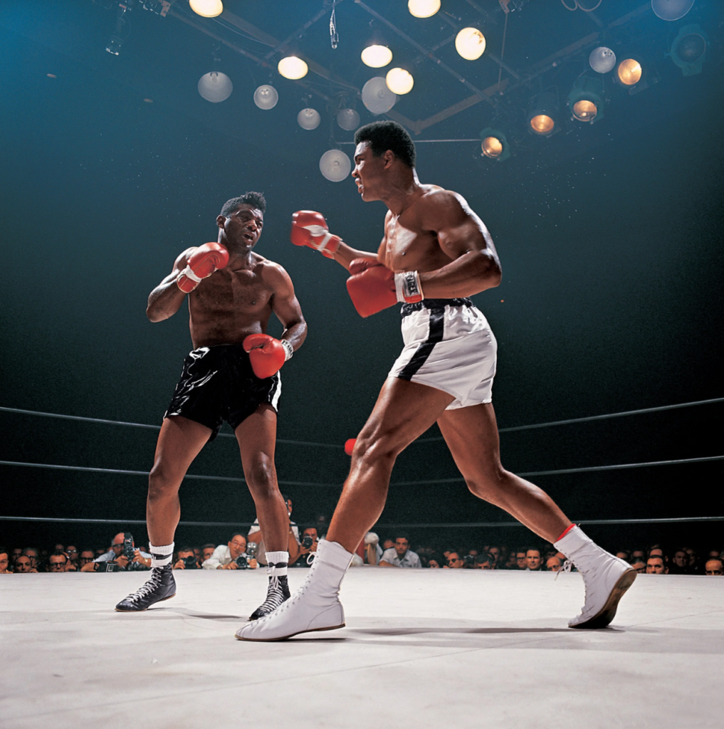
A more recent photographer, and someone who is an inspiration for my own personal studies, is Neil Leifer. Leifer has been documenting key sporting events in America for 60 years and is responsible for many classic sporting images (nielleifer.com). His style is primarily documentary and portraiture. He has taken many posed photographs of famous sports personalities however it is his documentary photographs that this essay will focus on.
Neil Leifer puts his success down to luck and being in the right place at the right time, however he also emphases the need to recognise that a great shot is there and grab it, even when it may be fleeting: “what separates the top photographers from the run-of-the-mill photographers is that when you get lucky a good photographer doesn’t miss.” (NPR 2016).
One of Leifer’s successes has been getting the camera in the right spot. He says this takes time and planning. For his famous shot of Ali v Williams boxing match at the Houston Astrodome in November 1966 he arrived four days before the match to set up and test his remote camera mounted in the rafters. He then took the film to the developers and waited for it to be processed “most photographers don’t hang around the magazine’s photo labs, but I would go to make sure they didn’t mess up my film” (Jonze, 2020). So, for sports documentary, it is important to be think ahead and plan and to control what you can, however it is equally important to be constantly on the lookout for ‘the shot’ and ensure you do not miss it.

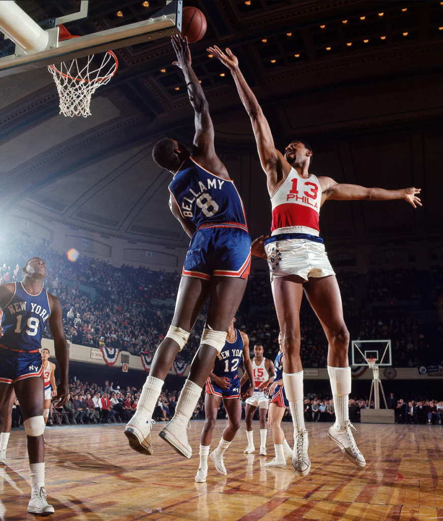
Above Philadelphia 76ers center Wilt Chamberlain shoots over Walt Bellamy of the New York Knicks during a game at Convention Hall. Philadelphia, Pennsylvania. March 1966 (neilleifer.com)
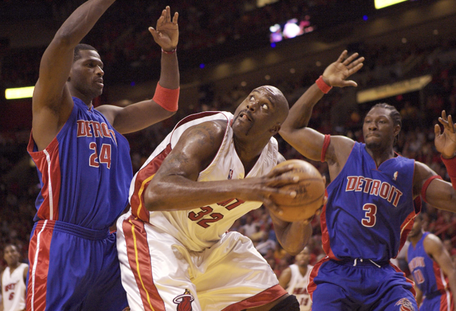
Above Miami Heat center Shaquille O’Neal goes up against Antonio McDyess and Ben Wallace of the Detroit Pistons during Game 5 of the 2005 NBA Eastern Conference Finals at American Airlines Arena. Miami, Florida. June 2, 2005. (neilleifer.com)
Above are some of my favourite basketball photographs taken by Leifer many years apart. With the first image, you can see a bright light shining on the players from the left, casting long and ominous shadows. Both players reaching for the ball are fully in the frame, making these players seem even larger than they are, this and the dynamism of the players is exaggerated by the wide angle lens and by having the camera low to the ground. This image is a good documentation of what basketball looked like back in the sixties, especially when compared to the second image with Shaquille O’Neal forty years later. You can see how the clothing has changed to being baggier, as well as the players being larger on average. The photograph captures the split-second pause as O’Neil eyes onto the basket before he shoots. O’Niel, in white, is framed on both sides by McDyess and Wallace, in blue. McDyess’s and Wallace’s eyes are both on O’Neil, drawing the viewer to the central figure. O’Neil’s eye’s are focused hard on the basket, which being out of shot sends the viewers gaze off to the top left of the image. This is a perfect example of what Leifer means when he says that good photographers do not miss the shot.
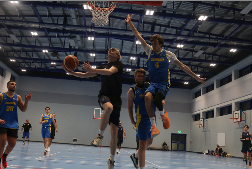
Above is one example from my photoshoot that I took during a D1 game in Jersey. I tried to replicate Neil Leifer’s Images by sitting close to the basketball hoop as well as using a wide-angle Lense to capture a wider field of view.
Tableaux photography is staged and often posed. The people in the photographs may be wearing costumes and props may be used along with artificial lighting to create a scene. Tableaux photography is an evolution from art, for example Renaissance paintings depicting scenes from the bible or mythology. People in tableaux photographs are staged such that they appear to be absorbed in their actions or surroundings and unaware of the photographer. (Tate and Pilgrim 2023). Tableaux photography operates in the space between reality and fiction, drawing the viewer into a scene that feels both familiar and uncanny. (David Bate). This tension between reality and fiction allows tableaux photography to be so powerful when it comes to telling a story.
Below is a modern (amateur) example of a tableaux photograph below The Last Supper by Renaissance artist Leonardo da Vinci. The image, clearly posed by medical staff trying to have some light relief during the Covid Pandemic, is an example of a classic tableaux photograph, depicting a scene from the bible. (Smith 2020).

Above – The Last Supper painting by Leonardo da Vinci and tableaux by doctors at a hospital in Paris during the Covid pandemic (Smith 2020).
I’ve already talked a little bit about pictorialism in this essay, however, almost all tableaux photographs contain ideas from pictorialism and adds an aesthetic that’s pleasing to the viewer. Many contemporary photographers didn’t agree with this new movement at the time saying it marks a shift from an emphasis on ‘truthful’ representation to a recognition of its constructed nature. However, photographers that followed pictorialism believed it allowed viewers to pause and analyse them, allowing them to find there own meaning and symbolism. This can increase a story’s impact on the viewer as they are able to relate the photo to other moments in their own life, instead of taking the photo at face value which is often the case for documentary photography.
At first sight the images of Paul M Smith would not appear to be part of the tableaux genre. Smith is a British photographer who has produced several sets of images on the theme of masculinity. While his photographs appear to have the theme of documentary they are actually posed, and a large amount of effort has gone into capturing and editing the images in which, he, is often the only person in the photographs. These photographs do not record real events and are completely staged, they are tableaux.
In ‘Artist Rifles’ Paul M Smith takes self portraits of himself dressed as different soldiers and uses photomontage to create fictional military scenes (some of which are relatively graphic, such as execution and burials).

Above Paul M Smith photograph taken as part of his Artist Rifles series. In this photograph each of the soldiers is posed by Paul M Smith himself and the image put together as a photomontage. While having the appearance of a documentary image, it is entirely posed and fictional.
This image and the rest of the ‘Artist Rifle’ series contradicts the ideal view of courageous and well-known superheroes against that of a soldier, since he previously produced a series called ‘Action’ which mocks the masculine ideas of a superhero. Solders are unfortunately often seen as faces among the masses. This makes them heroes, not through their individuality or charisma, and instead by the difficulties of being a soldier. The use of tableaux allows Smith to recreate images with a high level of emotion, as he can control every aspect of the image, including the subjects himself since he is the subjects. When he took these photos back in the 1990s, it was much harder to replicate himself without the current technology, making these images more visually striking to the viewer. The multiple self-portraits also emphasise the idea of ‘brothers in arms’ in war, where they all work as one unit. This image above is particularly realistic as well, not just with the subjects’ actions, clothing and placement, but the baren and war-like background, allowing a strong effect on the viewer. The cigarette in the left soldier’s mouth and the rifle in the right soldier’s arms is almost over exaggerating the stereotypes of masculinity since the viewer knows its staged, giving an amusing effect allowing the viewer to participate in the fantasy. Looking past the depiction of masculinity, the details in this image that Smith planned makes it seem like a real event.
Above is my attempt at replicating photomontage in the style of Paul M Smith. I used photoshop to replicate the subject multiple times performing different things that are ‘basketball’ related.
It is clear from the examples given that both documentary and tableaux have the ability to tell a story.
Lange has potentially manipulated her image by having the mother and her children pose for the final and most famous image. Does this detract from Lange’s purpose of documenting the impact of the Great Depression and spreading the news of the suffering to the rest of America and the world? Does it remove the title ‘documentary’ from the image? Is it ‘fake? The truth is that the mother in the photograph was homeless and the children were starving. Perhaps all Lange is guilty of is using her skill as a photographer to marginally manipulate the story to make a greater impact on the reader, and by doing so raise the plight of the mother and others in her difficult situation?
It is interesting to compare the images of Lange with the sports photographs of Leifer. Both are well known documentary photographers, working at different times with very different subjects. However while the documentary images of Lange have a shadow of doubt over their ‘authenticity’ it is clear that the images taken during sports events by Leifer are true representations of what actually happened, the story of the match. It is very unlikely that these would be staged in anyway, and instead they are the product of a photographer who has the ability to foresee and capture a great image in the instant it happens during a fast-paced sports event.
The purpose of tableaux photography is to tell a story, whether that be the bible story of the last supper, the trials of working in a hospital during the Covid Pandemic, or the modern representation of masculinity and warfare.
Smith’s photographs are deliberately fabricated to mimic documentary wartime photographs. Only by looking closely is it apparent that all the people are posed by Smith himself. This creates a contrast between documentary photos and tableaux photos. Does a documentary photo carry more emotion because there are no lies? Or a tableaux photo, which can be endlessly modified to maximise the emotion the photographer is trying to create? It is my view that impact is not from whether the photograph fits the ‘tableaux’ or ‘documentary’ genre. Rather it more the ability of the photographer to convey the message they wish to tell. A documentary photographer who asks (implicitly or explicitly) the subject to change their pose, position etc, and in doing so is able to make a more powerful image while the most important elements of the truth remain is equally valid as the obviously posed tableaux that examines the meaning of its subject.
Bate, D. (2010) ‘The Memory of Photography’, photographies, 3(2), pp. 243–257. doi: 10.1080/17540763.2010.499609.
Davis L. J. (2020) ‘Migrant Mother: Dorothea Lange and the Truth of Photography’ https://lareviewofbooks.org/article/migrant-mother-dorothea-lange-truth-photography/
David_Bate ‘The Art Of The Document’
David_Bate ‘The_Pictorial_Turn’
Gelder, H. V. (2008), ‘Photography Today: Between Tableau and Document’, Photographie Volume 28, numéro 1-2, URL : https://id.erudit.org/iderudit/044589ar
Pilgrim, F. (2023) ‘Dreaming in Real Time’: How staged tableaux disrupt notions of authenticity in documentary photography’ https://www.felixpilgrim.com/blog-1/staged-tableaux-and-documentary-photography
Eschner (K), (2017) ‘Meet 10 Depression-Era Photographers Who Captured the Struggle of Rural America’, Smithsonian Magazine. https://www.smithsonianmag.com/smart-news/meet-photographers-charged-documenting-depression-era-america-farm-security-administration-180964123/
Smith W. S. (2020) ‘Tableaux Vivants Are Giving Us Life During the Pandemic’ Art News https://www.artnews.com/art-in-america/columns/ableaux-vivants-replicate-art-masterpieces-during-covid-19-quarantine-1202686492/
Jonze, T. (2020) ‘Muhammad Ali flattens Cleveland Williams: Neil Leifer’s best photograph’ The Guardian. https://www.theguardian.com/artanddesign/2020/dec/02/muhammad-ali-cleveland-williams-neil-leifers-best-photograph
NPR (2016), ‘A ‘Relentless’ Sports Photographer Explains How He Got His Shots’ NPR. https://www.npr.org/2016/05/06/476893044/a-relentless-sports-photographer-explains-how-he-got-his-shots
Sontag S. (1977) ‘On Photography’ Farrar, Straus and Giroux
Both contemporary aspects of photography; documentary and tableaux, are paramount for encapsulating a specific scene which conveys a particular time frame in history. Although, the two photographic techniques maintain a common purpose, the method behind using one is a completely different prospect
Essay plan
Introduction (250-500 words)
This essay discusses and compares two aspects of photography; documentary and tableaux, in their unique ability to entice and seduce the viewer to comprehend the story that is being told. Both photographic methods attempt to convey a story in a historical timeframe; documentary photography is often used in reportage (Tate Gallery) in comparison a photograph that uses tableaux can feel pre-planned and hence reproduced. Although, the two techniques maintain a common purpose, the method behind each one is completely different. More recently it has been argued that some photographers such as Tyler Mitchell and Justine Kurland fuse together both the real with the imaginary.
Essay introduction: convert draft introduction to final version.
Below is link to a blog post which will provide you with helpful guidelines if you are struggling to structure your essay or writing paragraphs.
ESSAY WRITING | 2024 Photography Blog (hautlieucreative.co.uk)
What is documentary photography? Photographing people, events, places etc to create an accurate record or story. Traditionally for highlighting issues and for promoting change (Tate reference). However it can also be used as an art form. It is similar to, though not the same as reportage photography.
What is Tableaux photography? Tableaux photography is staged, often posed, people in the photographs may be wearing costumes, props may be used along with artificial lighting to create a scene. Tableaux photography is an evolution from art, for example Renaissance paintings depicting scenes from the bible or mythology. People in tableaux photographs are staged such that they appear to be absorbed in their actions or surroundings and unaware of the photographer. (Tate and felix pilgrim).
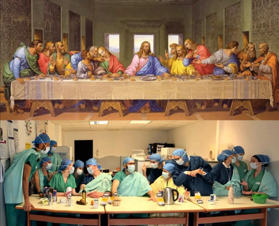
Above – Last Supper painting by Leonardo da Vinci and tableaux by doctors at a hospital in Paris during the Covid pandemic (artnews.com)
How are they similar/dissimilar?
Documentary supposed to show ‘reality’, whereas tableaux is artificial and posed
Documentary used to record events and can be used to try to influence (for example depression era photographers such as Dorothea Lange (smythsianmag.com)) whereas tableaux is often for artistic purposes, but may also be used for social or political purposes.
Subjects in documentary may or may not be aware that the photograph is being taken, however if they are aware there is a possibility their expression and stance may be influenced by the photographers presence (niemanreports.org). Subjects in tableaux are, by definition, aware they are being photographed, and may be instructed by the photographer to pose in a particular way.
Paragraph 1 Structure (500 words) : Use subheading. This paragraph covers the first thing you said in your introduction that you would address. The first sentence introduces the main idea of the paragraph. Other sentences develop the subject of the paragraph.
Content: you could look at the following…exemplify your hypothesis within a historical and theoretical context. Write about how your area of study and own work is linked to a specific art movement/ ism. Research and read key text and articles from critics, historians and artists associated with the movement/ism. Use quotes from sources to make a point, back it up with evidence or an example (a photograph), explain how the image supports the point made or how your interpretation of the work may disapprove. How does the photograph compare or contrast with others made by the same photographer, or to other images made in the same period or of the same genre by other artists. How does the photograph relate to visual representation in general, and in particularly to the history and theory of photography, arts and culture.
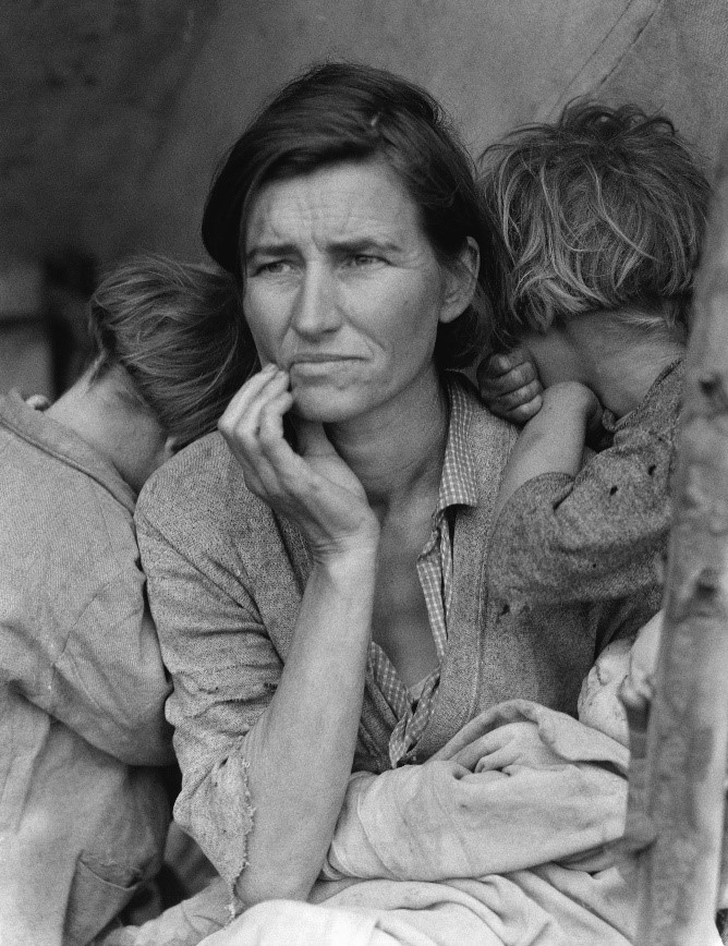
Above Dorothea Lange ‘Migrant Mother’ – example of documentary photograph taken during the Great Depression in USA during the 1930s. The composition draws your eye to her face, which is tired and shows she is worn out.
Paragraph 1 structure (use subheadings) (historical and theoretical context- how is your area of study links to the specific art movement- read key texts from critics, historians and artists, us quotes, evidence back up if can with photo. Explain how image supports the point made, how does the photo compare/contrast .
First photographer (put one of two or own pictures too)
Tom WoODS
Tom Woods became known as the ‘Photie Man’ as he was often seen around Liverpool and Merseyside in the 80s and 90s taking photographs of the people and events he observed around him. studiointernational.com. Tom Wood’s approach was to document everyday life, normally through candid, street, photography, although in some of his photographs his subjects were aware he was photographing them. Interestingly he says that he is not a documentary photographer, although this is what he has undeniably done: ‘I’m not trying to document anything ….. I’m only interested in good pictures, if it’s a document then it’s a bonus’.


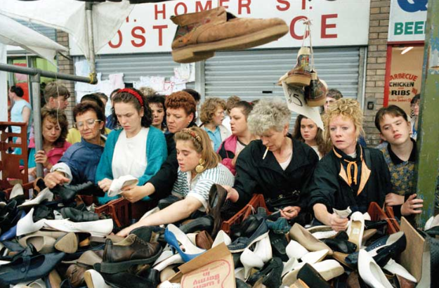
Above – Tom Woods ‘Finding a Pair’ – photograph of women at a second hand shoe stall. use of classic ‘rule of thirds’ composition
Second photographer (put one of two or own pictures too)
paul M smith
Paul M Smith is a British photographer who has produced several sets of images on the theme of masculinity. While his photographs appear to have the theme of documentary they are actually posed, and a large amount of effort has gone into capturing and editing the images in which, he, is often the only person in the photographs. Thus making these tableaux photographs.
It is interesting to juxtaposition images from his ‘Artist Rifles’ series alongside Robert Capa’s iages from taken during the Spanish civil war. In Artist Rifles Paul M Smith takes self portraits of himself dressed as different soldiers and uses digital photomontage to create fictional military scenes (some of which are relatively graphic, such as execution and burials).
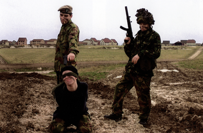
Above Paul M Smith photograph taken as part of his Artist Rifle series. In this photograph each of the soldiers is posed by Paul M Smith himself and the image put together as a photomontage. While having the appearance of a documentary image, it is entirely posed and fictional.
Robert Capa was a war photographer who documented the Spanish Civil War and the Second World War, was an acclaimed documentary photographer. One of his most famous images depicts the shooting of a soldier in 1936. A number of claims have been made that Capa’s description of the location where false and the photograph is likely to have been faked. Nytimes.com.
Between the posed images by Paul M Smith and the documentary footage (perhaps posed?) by Robert Capa, the clear definition between documentary and tableaux is blurred. “Art is always manipulation, from the moment you point a camera in one direction and not another,” (Spain’s culture minister, the film director and screenwriter Ángeles González-Sinde) (nytimes.com)
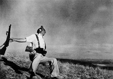
Above Robert Capa’s The Falling Solider, an image taken during the Spanish Civil war in 1936. Supposedly taken exactly at the time the soldier was shot, however there has been controversy over the accuracy of this picture.
neil leifer- sports documentary
Neil Leifer has been documenting key sporting events in America for 60 years and is responsible for many classic sporting images (nielleifer.com). His style is primarily documentary and portraiture. He has taken many posed photographs of famous sports personalities however it is his documentary photographs that this essay will focus on.
Neil Leifer puts his success down to luck and being in the right place at the right time, however he also emphases the need to recognise that a great shot is there and grab it, even when it may be fleeting: “what separates the top photographers from the run-of-the-mill photographers is that when you get lucky a good photographer doesn’t miss.” (npr.org).
One of Neil Leifer’s successes has been getting the camera in the right spot. He says this takes time and planning. For his famous shot of Ali v Williams boxing match at the Houston Astrodome in November 1966 he arrived four days before the match to set up and test his remote camera mounted in the rafters. He then took the film to the developers and waited for it to be processed “most photographers don’t hang around the magazine’s photo labs, but I would go to make sure they didn’t mess up my film”. (theguardian.com/artanddesign)
So for sports documentary it is important to be think ahead and plan and to control what you can, however it is equally important to be constantly on the lookout for ‘the shot’ and ensure you do not miss it.
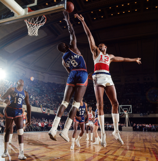
Philadelphia 76ers center Wilt Chamberlain shoots over Walt Bellamy of the New York Knicks during a game at Convention Hall. Philadelphia, Pennsylvania. March 1966 (neilleifer.com)
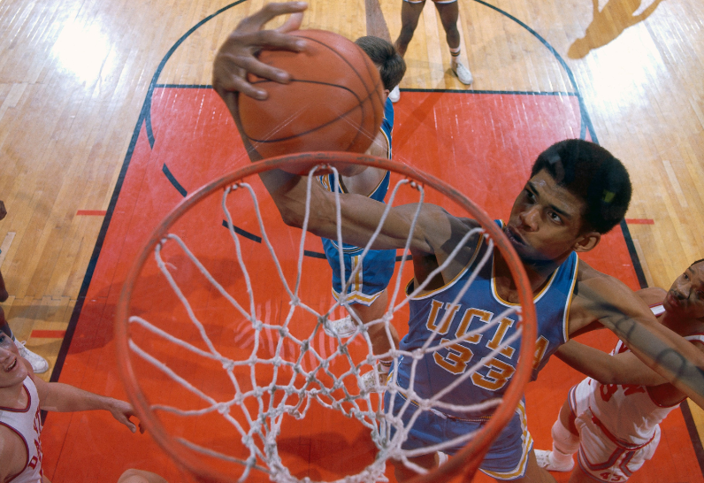
Aerial of UCLA center Lew Alcindor (later known as Kareem Abdul-Jabbar ) rebounding during the 1967 NCAA National Championship game against Dayton at Freedom Hall.Louisville, Kentucky. March 25, 1967. (neilleifer.com)
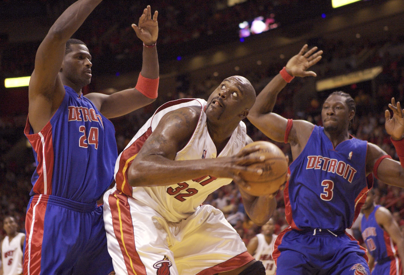
Miami Heat center Shaquille O’Neal goes up against Antonio McDyess and Ben Wallace of the Detroit Pistons during Game 5 of the 2005 NBA Eastern Conference Finals at American Airlines Arena. Miami, Florida. June 2, 2005. (neilleifer.com)
George McGinnis of the Philadelphia 76ers drives to the lane versus Paul Silas of the Denver Nuggets at The Spectrum. Philadelphia, Pennsylvania. March 9, 1977. (neilleifer.com)
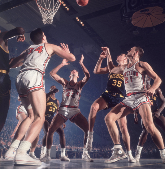
Bill Bradley of Princeton University waits for a rebound during a 1964 ECAC Holiday Festival game versus Michigan at Madison Square Garden. New York, New York. December 30, 1964. (neilleifer.com)
Conclusion
COMPARING THE IMPACT OF DOCUMENTARY VERSUS TABLEAUX PHOTOGRAPHY IN TELLING A STORY
Things to add:
Bibliography
David_Bate_The_Pictorial_Turn.pdf
David_Bate_The_Art_of_the_Document.pdf
Photography Today: Between Tableau and Document Hilde Van Gelder- Photographie Volume 28, numéro 1-2, 2008 URI : https://id.erudit.org/iderudit/044589ar
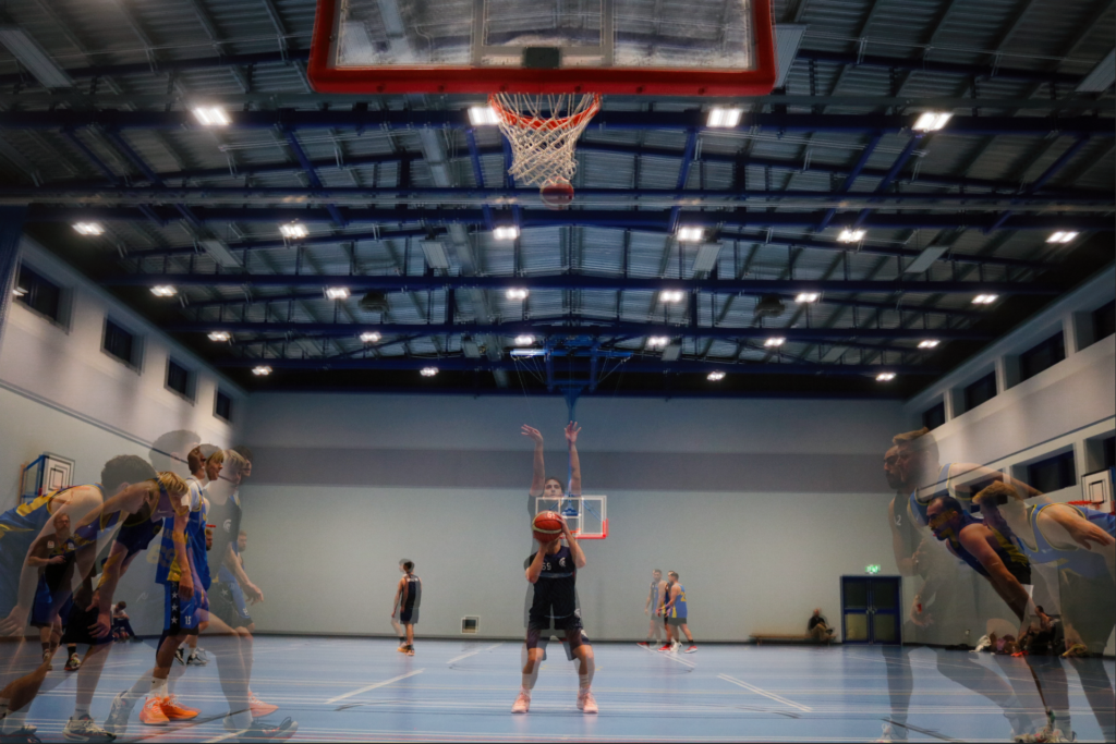
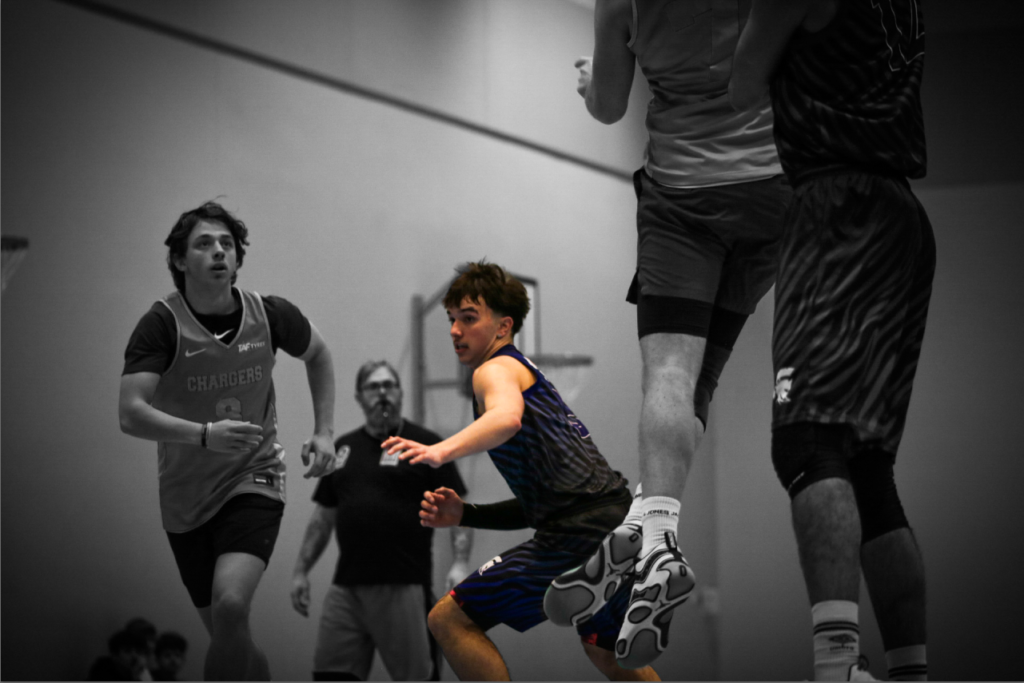
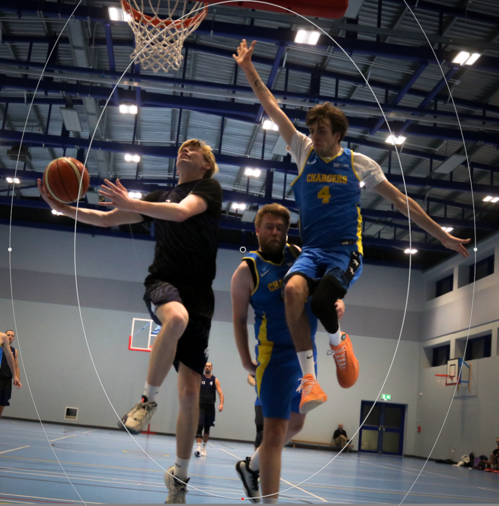
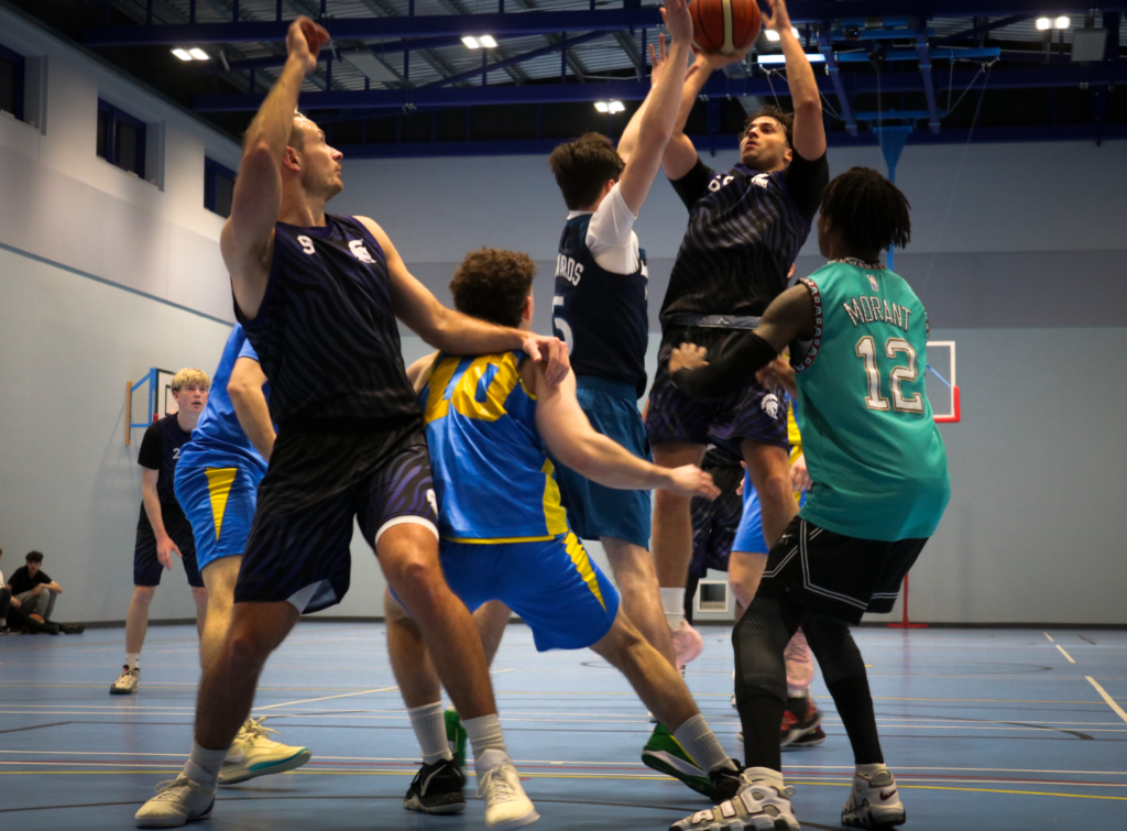
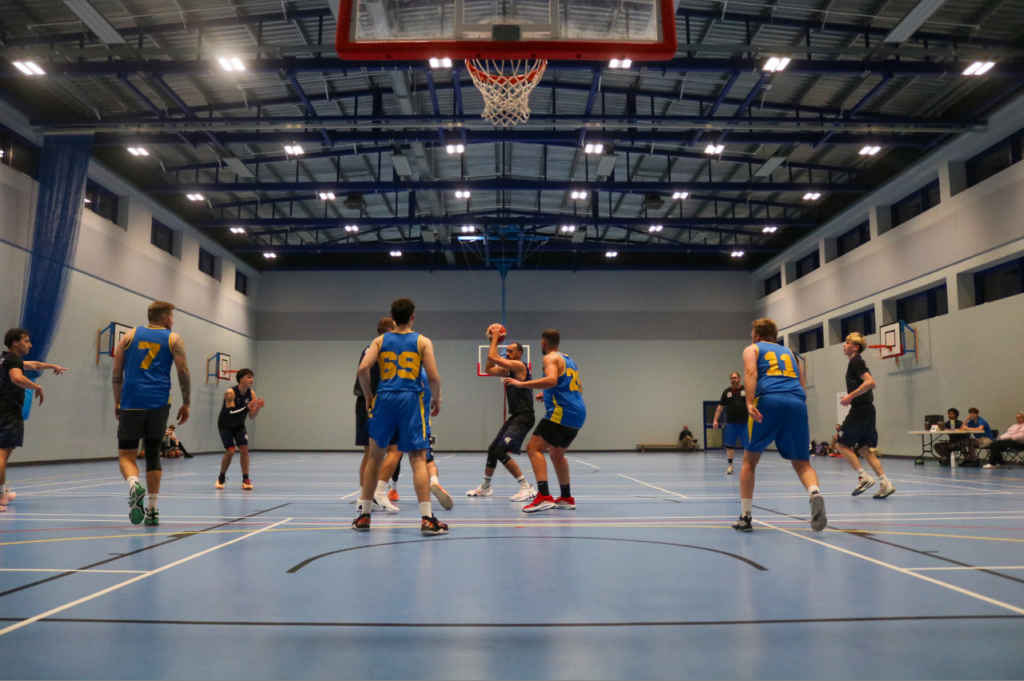
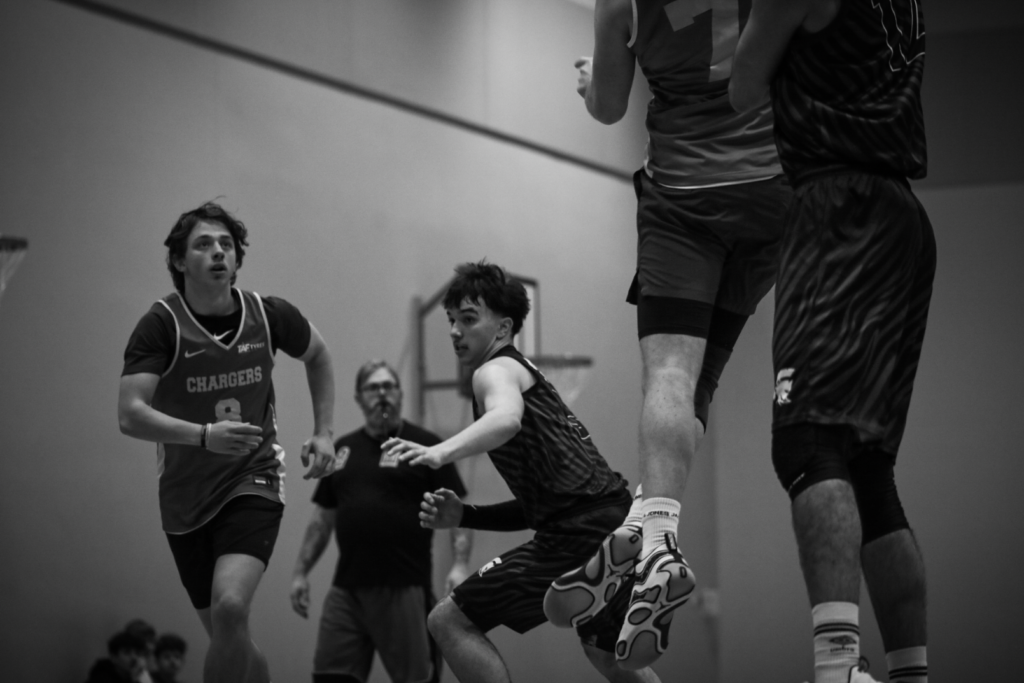
Here I tried takings some pictures of a D1 Jersey game using a long focal length (100mm), as well as switching to a shorter focal length to get a wide variety of different shots. For the first half of the game I used aperture priority with an F-stop of 2.8 to 5.6. However, I didn’t turn the ISO up enough, as well as decreasing the overall exposure causing a lot of the images to be blurry since its a fast paced game with lots of movement. So after half time I increased the ISO to 1600 and decreased the exposure to -1, giving me a shutter speed of around 1/1000, allowing me to capture better images in the game. Also at half time, I looked at some Neil Leafer images for inspiration and realised he often had a shorter focal length to capture more action instead of a single player. He also seems to wait for something interesting to happen before he would take the photo.
I changed the camera angle a lot, getting some shots from higher up and lower down. Shots coming from a lower angle are more traditional for sports photography in basketball since the photographers are usually sitting on the floor around court side to take the photos. I thinks shots from lower down created a much more dynamic image and add drama, since the legs of the athletes become the main focus, and it distorts the player in a way to make them look powerful and big and creates a perspective of grandeur. I often kept the rule of thirds in my mind to make sure the composition was on point, but sometimes I tried out different compositions to and more variety in this photoshoot. It seemed that taking photos when the players where running towards the camera leads to much better photos as the subjects faces are in frame, allowing viewers to make more of there own judgement on the image based on the players faces. It also adds more emotion when the players face is in frame.
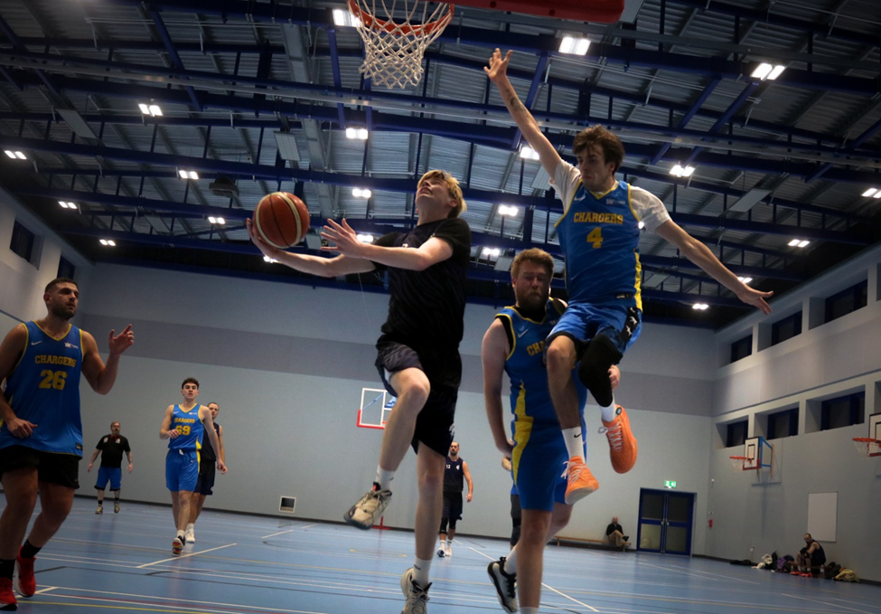
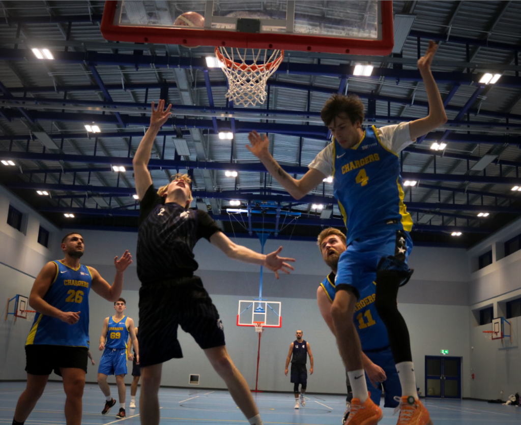
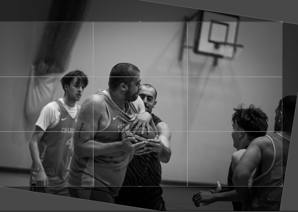
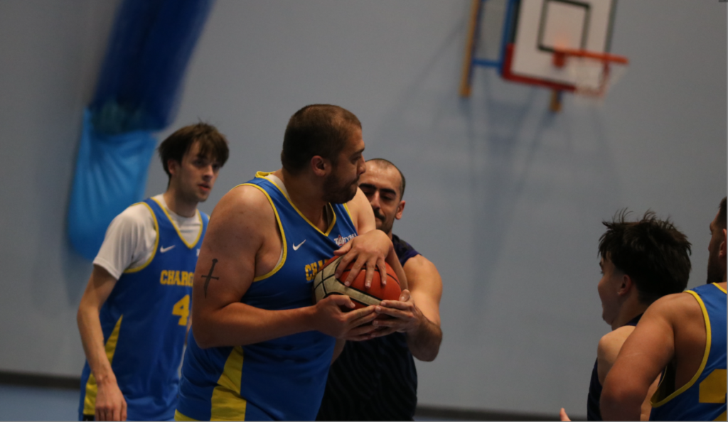
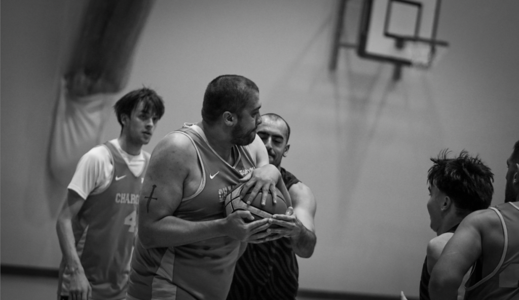
This was below was taken in the 2nd quarter just as tommy (the one in the dark navy) was going up for a layup. Unfortunate, since the photos where shot with a compressed file, it was hard to edit without the image becoming grainy. However, I still managed to add a vignette and rotated the image to make the subjects level and to make the image even more dynamic. I also added a layer mask to the subjects in the centre to draw the eyes towards it. Number 4 looks likes he’s being picked up by number 2, which makes this image more interesting a more amusing.

Below are some more photos edited in the same way:
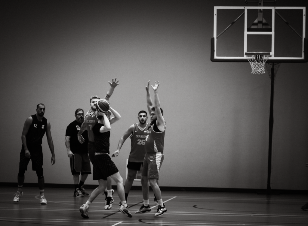
I thought this Image would look good in B&W
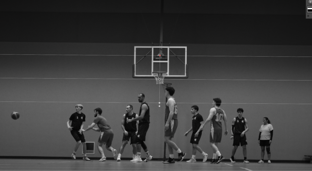
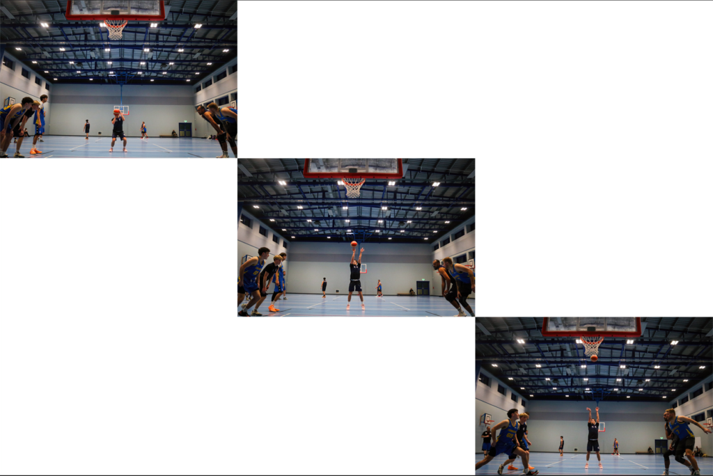
Below I tried a montage of 3 photos of a free throw. This was the second free throw so other players started running in to get the rebound. I used the wider angle lens to capture more action in the shot. I created three images to show the create a montage of players running towards the centre. Below you can see how I edited the image.
I like this image as the subject with the ball is in the centre, with other subjects evenly spread out around the image, giving it good composition.
For this image below I changed the angle to match the alignment of the face of the person holding the ball. It also makes the image look more dynamic which is what I want for a sporting image.
Below I montaged 3 images together that have a similar pattern (looking away from camera and focused on one player).

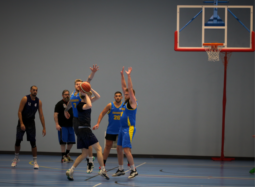
This image below was taken during a free throw shot that would tie the two teams. This obviously isn’t good for the team other team which is no longer ahead who this player was on. You can see the hope in his face that the free throw does not go in.
Since this is my first time doing sports photography, I made few mistakes, firstly when using the long focal length It was difficult for me to take photos of the action since it was so zoomed it, meaning I should of taken more photos from the other side of the court. Another issue was that a lot of my photos are fairly uninteresting, so I might try going closer to the court next time with a wide angle lens to capture action close up (which is how Neil leafer did it). Finally I think I could decrease the exposure even more and shoot with raw files allowing me to increase the shutter speed making the photos less blurry. I can increase the exposure in post production.
1. Research a photo-book and describe the story it is communicating with reference to subject-matter, genre and approach to image-making.
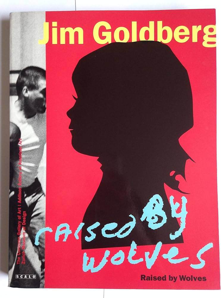
Jim Goldberg – raised by wolves
This book is about shedding light on kids without giving them labels like ” victims of abuse” or “drug addicts”, by people trying to classify them into neat groups. This book follows two “main” figures, Echo and Tweedy Dave, where there story is told without being “edited” or “manipulated” to fit with what the readers want. It contains mostly archives of Goldberg’s polaroid’s, and a few pages with interviews by the figures in the books, as well as notes and comments from Goldberg.
“when I thought of youth, I thought of my own teenagehood and childhood, and other people I knew who were often scapegoated, not appreciated, or not given a chance. The end result was trouble for them. I wanted to look at those people who were outsiders, like I felt I was.”
The photos are taken around the California streets, from Hollywood up to San Francisco and back. Many of the figures in the books start out fairly well, but as the book progresses, they slowly determinate and fall into bad habits. There is a lot of drugs and prostitution making it a very emotional book as it shows the difficulties of youth homelessness.
For the image making, he often took a abstract approach, with blurred and B&W images, or close ups of certain people, places or object that help add emotion or explain the story.
2. Who is the photographer? Why did he/she make it? (intentions/ reasons) Who is it for? (audience) How was it received? (any press, reviews, awards, legacy etc.)
Jim Goldberg’s reasons for creating this was to tell a story of kids in various Californian areas over a 11 year period of interviews and photos. It’s also partial, rearranged, taken out of context, romanticized, subjective, and, therefore is as much about Goldberg’s making of the project as it is about the kids. I think the main audience is for other photographers and people who have the money to spend on a book like this.
ZHodl and the other subjects of “Raised by Wolves” are deep in their subcultural world, and Goldberg is, too. Indeed, he’s a most original photo documentarian. He immersed himself in a work of teenage runaways, getting them to write in there own hand writing, and gets up and personal to the subject.
It has a 4.71/5 star rating on good reads, and has been received very positively by the press
3. Deconstruct the narrative, concept and design of the book and apply theory above when considering:
The book has a heavy weight to it, as well as feeling flimsy and a need to be looked after.
The whole book is the same texture, but printed like its a personal diary, with fake texture added to the pages. There’s also a lot of colour and and B&W areas creating a contrast through the book.
The format is portrait, size 23 x 30 cm and 314 pages. So it is quite a big book, which makes since considering how much is in it, and how much is needed to tell stories of lots of youths.
The title ‘raised by wolves’ suggests that they are growing up in there own way and that they don’t fit what’s expected upon them by society. People often use the term ‘you’ve been raised by a wolf’ to suggest they are acting in a wild and uncivilised manner with a lack of basic manners or social norms.
Its structured with mostly Images, some interviews with fake textures added, and the real handwriting of the people inside the book.
This can vary a lot, including almost every kind of design and layout. I think this was done to make it seem handcrafted like a diary.
The editing seems limited, but the way the images are shot can be very abstract. I saw a few Juxtaposition of Images as well.
The images and texts are linked very closely. The Images are usually there to explain some text or add more detail that can be difficult to explain through text, e.g. showing a subject, where they like to go, ext.

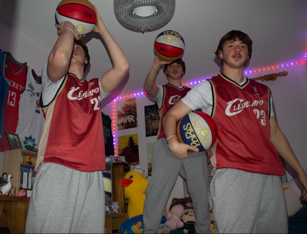
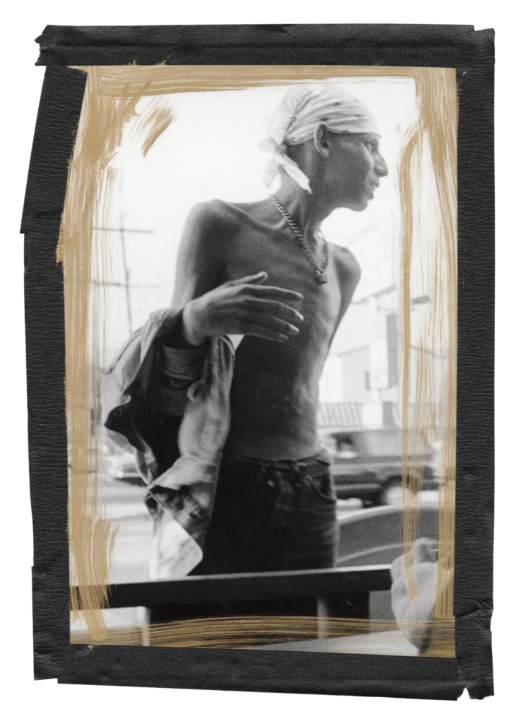
I only had 20 minutes to take some photos with tony (the model in these photos), so I only managed to take a few of my ideas. His room is full of colour which really adds to the basketball theme, as well as his endless shoes and basketball Jerseys. The brown carpet does ruin the colour sometimes, so I might edit the photos showing carpet in black and white. I asked him to look annoyed and sad, to show more emotion in my photos. I played around with the angle of the shot multiple times since basketball is a very dynamic sport, and an easy way to add this dynamic effect is to take photos with weird and unusual camera angles. For the camera settings, most of the photos where set to auto, with flash since I didn’t have enough time to mess around with the settings. However, I think this made it look more home made and real, as if a family member was taking photos of him.
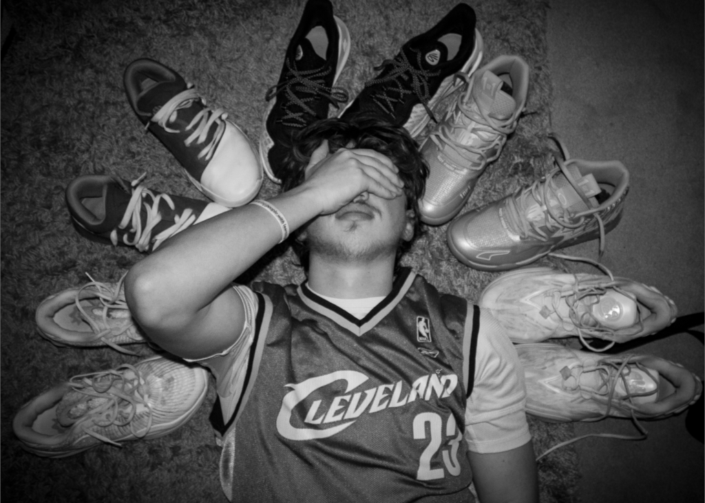
Here I asked tony to get a few of his basketball shoes out and place them around his head, where he then places his arm on his face, looking disappointed and annoyed. He chose his favourite shoes which ended up being the most colourful which make the image more vibrant and exciting, contrasting his facial expressions. This adds to the story of him being an over obsessed basketball player, as the colourful image adds to the basketball theme, and the disappointed facial expressions adds to his obsession with basketball, never being satisfied with himself.
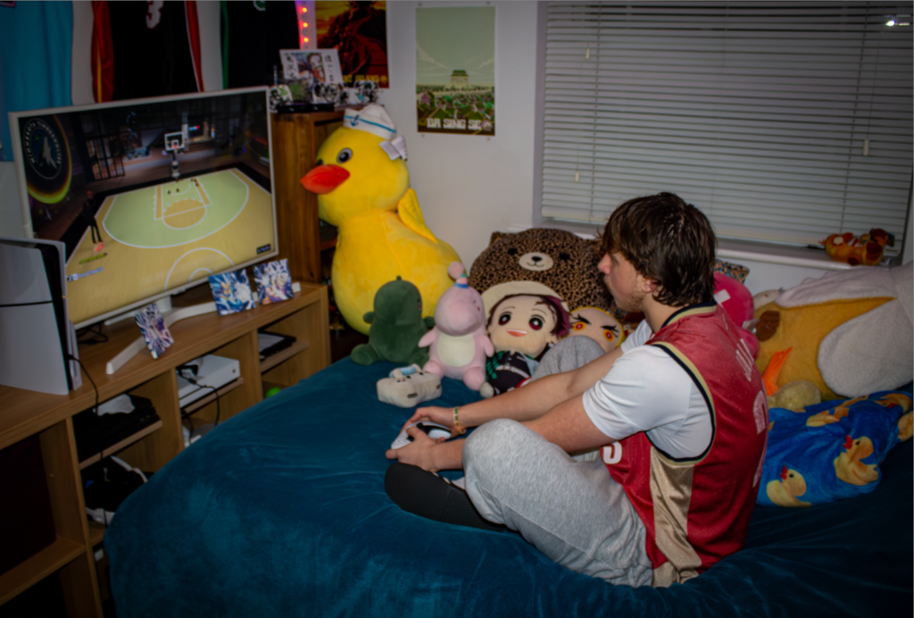
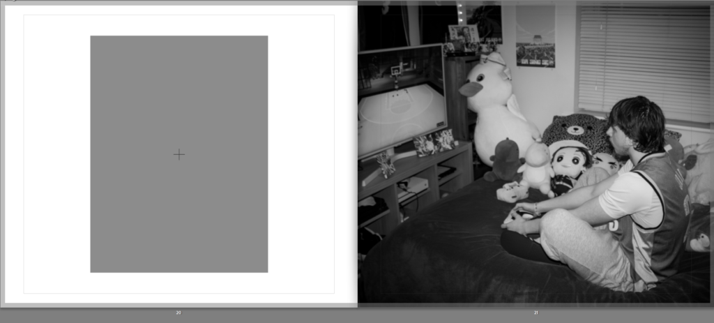
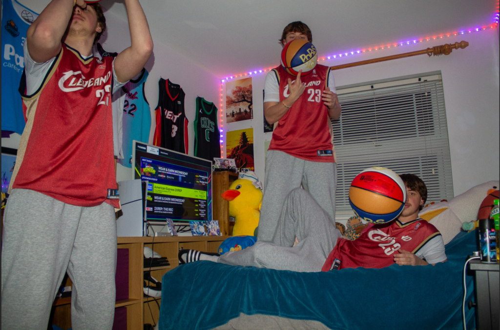
Here I asked my friend to get some of his old plushies out for the photoshoot. I asked him to look a bit insecure when playing NBA 2K (a basketball game which is the most popular in the basketball community). You normally need to play the game with other players but if you look closely he is playing by himself, adding to his isolation from his basketball team mates. The plushies next to him could also add to this loneliness and isolation, especially since its taking up most of the bed, leaving him scrunched up towards the left side of the bed.
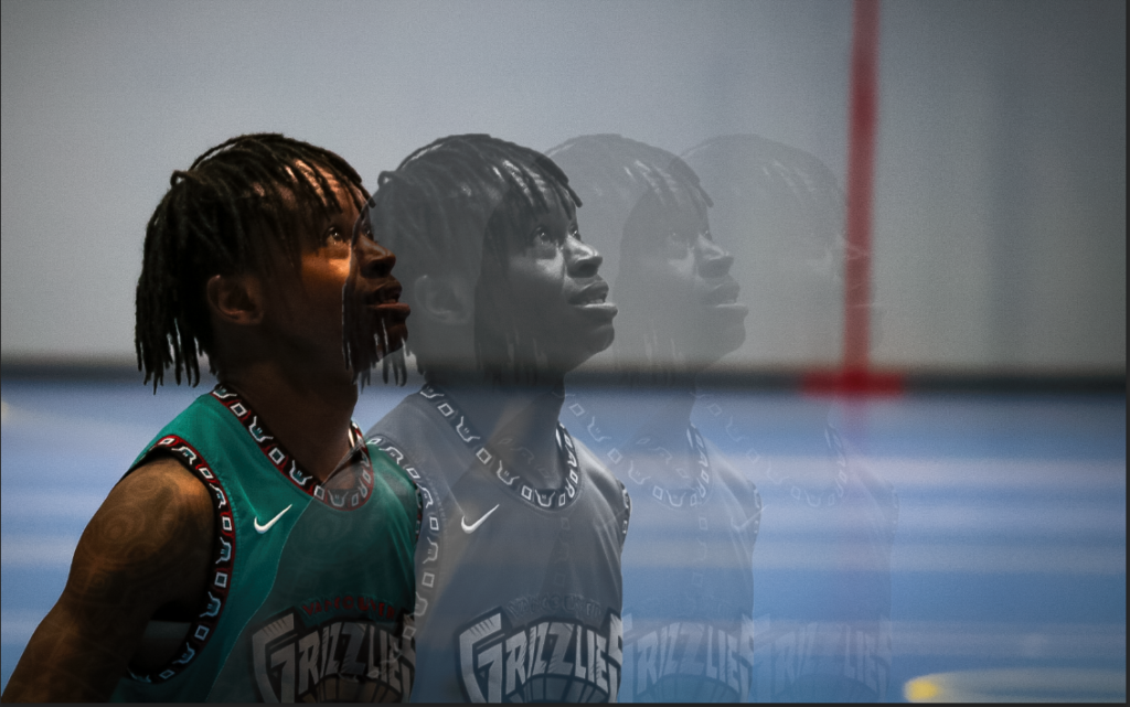
Here is my first attempted edit of a Paul M Smith style photograph, using photoshop to add layers onto one photo. I had to manually add some shadows as well using the brush tool which don’t look too realistic in my opinion. I also blurred the layers that are further away and adjusted the lighting similarly to this. Before I imported the photos into photoshop, I made sure they are similarly edited (by copying one edit and adjusting the exposure to match). I think editing like this adds more effect as the whole composition is filled by the same subject, bringing more attention to what he is actually doing. It also adds the time dimension into my photos as you can see him changing what he is doing over time in one photo. It fits in with the whole story of this project as well since he is shown to be working on himself, by himself which portrays a sense of loneliness.
Here’s my second attempt with a different set of photos, I tried adding shadows on the tony behind the tony: