- Read two texts above (John Szarkowski’s introduction and review by Jed Pearl) and select 3 quotes form each that is relevant to your essay.
- Select two images, one that represent a mirror and another that represents a window as examples to use in your essay.
- Use some of the key words that you listed above to describe what the mirrors and windows suggest.
Essay plan
Introduction (250 words): Reflect on the origin of photography and describe in your own words the difference between the two photographic processes, Daguerreotype and Calotype. Consider how they could be viewed as either a mirror or a window of the world according to John Szarkowski’s thesis. Choose one quote from Szarkowski’s text and comment if you agree or disagree.
Paragraph 1 (250 words): Choose an image that in your view is a mirror and analyse how it is a subjective expression and staged approach to image-making. Choose one quote from Szarkowski’s thesis and another from Jed Pearl’s review which either supports of opposes Szarkowski’s original point of view. Make sure you comment to advance argumentation in providing a critical perspective.
Paragraph 2 (250 words): Choose an image that in your view is a window and analyse how it is an objective expression rooted in the notion of realism. Choose one quote from Szarkowski’s thesis and another from Jed Pearl’s review and follow similar procedure as above ie. two opposing points of view and commentary to provide a critical perspective.
Conclusion (250 words): Refer back to the essay question and write a conclusion where you summarise Szarkowski’s theory and Pearl’s review of his thesis. Describe differences and similarities between the two images above and their opposing concepts of objectivity and subjectivity, realism and romanticism, factual and fiction, public and private.
My Essay
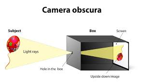
The origin of photography started back in 1822, when Nicephore Niepce created the Niece Heliograph, which is the earliest photograph produced with the aid of the camera obscura. In 1829 Niepce partnered up with Louis Daguerre, who continued to experiment and improve the heliograph after Niepce’s death in 1833 and he went on to create the Daguerreotype. To create a daguerreotype image a daguerreotypist polished a sheet of silver-plated copper to a mirror finish, then he would use an air gun, so that there was no dust on this plate, that would ruin the photograph. Then it is exposed in a camera for as long as was judged to be necessary, which could be as little as a few seconds for brightly sunlit subjects or much longer with less intense lighting. Next, he torches it, with mercury vapour, so that the image is visible. Then, he removed its sensitivity to light by liquid chemical treatment, which was rinsing it with cool water to cool the hot metal plate down and dried it and then sealed the easily marred result behind glass in a protective enclosure.
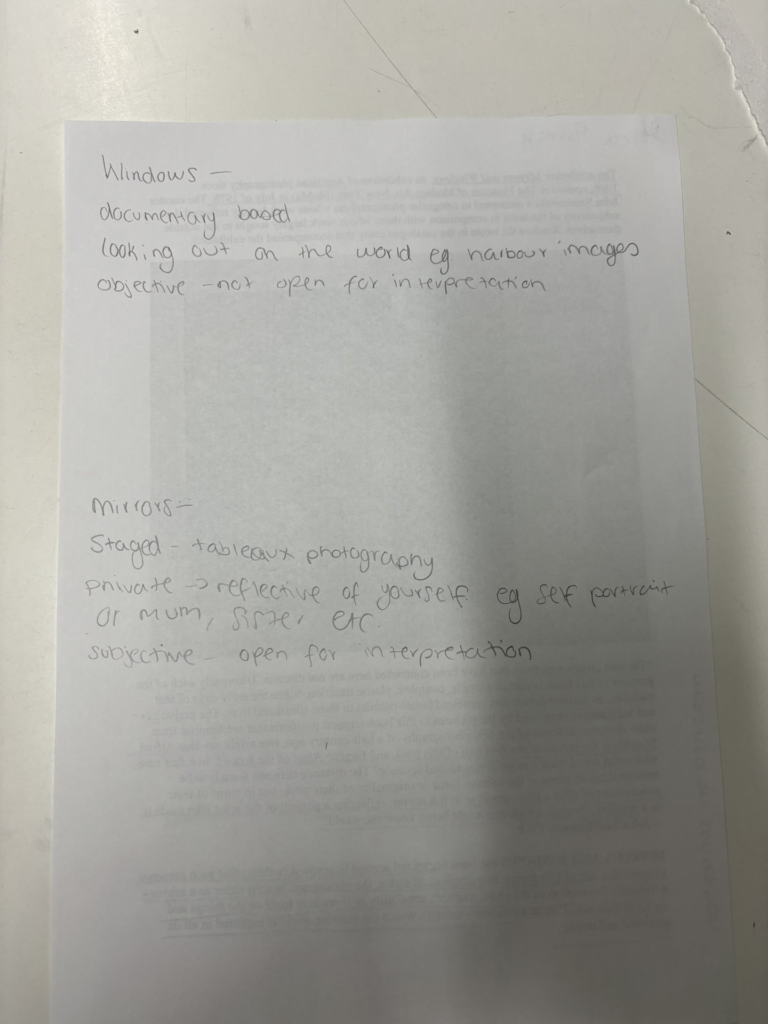
The images produced by a daguerreotype tend to represent a mirror in photography, because the image is on a mirror-like silver surface, so light was reflected back through the image. The image was also on the edge of being present, as it was on the surface of the metal mirror, instead of like paper, where the image sinks into it. This meant that the metal one could be wiped away with a finger. These images were also described as, ‘a mirror with a memory.’ This images were often also portraits of people, which has a very personal element to them. They were also often tableaux images that were taken, as the image was staged and manipulated, instead of a candid shot. The daguerreotype also took a lot of time and effort to use to create the images, so the images taken by it also are also very personal to the photographer, because of the time taken and the effort they put in to produce these images. This makes it represent a mirror also, because of how personal the images now become to the photographer due to the daguerreotype.
In 1841, Henry Fox Talbot created another photographic process, which was called the calotype. Talbot first began with a piece of high-quality writing paper, which was first washed with a solution of sodium chloride (table salt), left to dry, then evenly coated in the dark with a solution of silver nitrate, and left to dry once more. When objects such as lace or ferns were placed on the sensitized side of the paper and exposed to sunlight, a negative silhouette would be created. Exposure times were fairly long, and areas not protected from the sun gradually darkened. Since the silver deposits on the paper reacted and changed tones during exposure, this was called a “printing-out” process. The print would then be washed in another solution of sodium chloride, which stabilized the image and reduced its sensitivity to light. Overall, calotypes were extremely better than Daguerreotypes due to it being easily distributed, reproduced and were much cheaper. Whilst they both used light sensitive silver salts, the Daguerreotypes required a lot more tools and metal plates which had high monetary value.
The images produced by a calotype tend to represent a window, because they were most commonly used for taking pictures of the external world. These images were documentary images, because they were candid images and not staged, but instead truthful. These images have a level of realism to them, as they are objective. Henry Fox Talbot also tended to take images of the external world, such as ferns and trees etc. which are window images, as the lens is like the window that you are looking through onto the world. Compared to the daguerreotype these images could be produced quicker and many positive images could be produced from the negative image, whereas with the daguerreotype this wasn’t the case. This meant that it didn’t take as much time and effort for the photographers to create the photos, so this also takes away that deep personal element of the images, because they didn’t have to work as hard or put as much time into creating these images. This represents a window even more so now, because there is even less of a personal element to the images now.
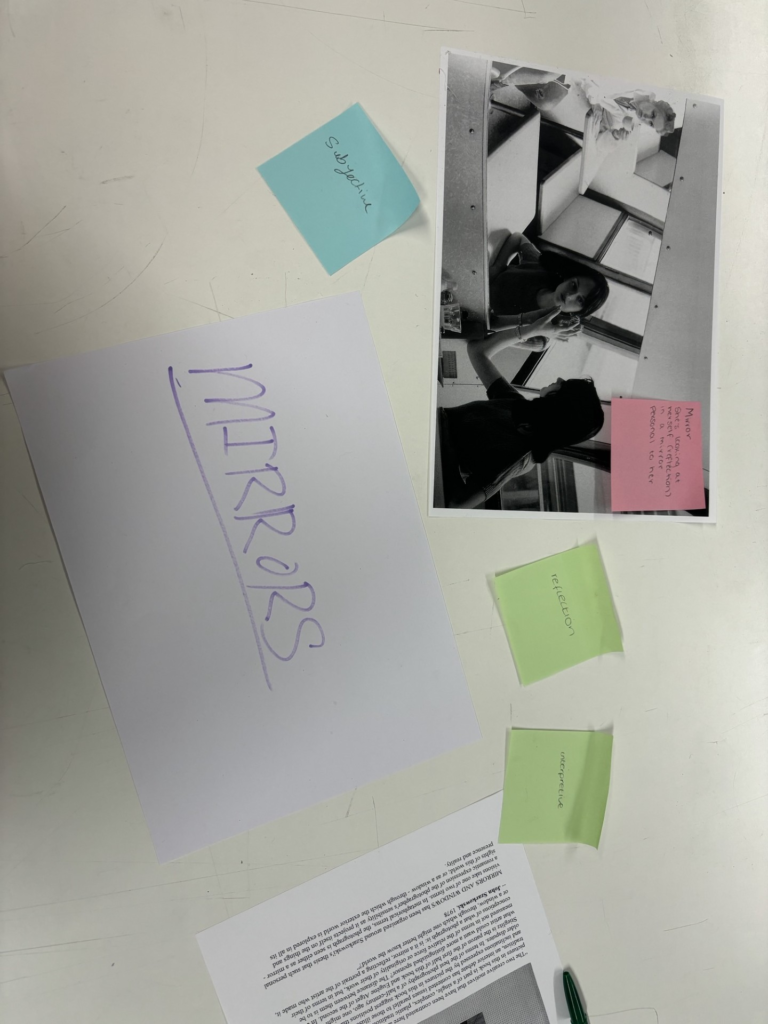
Mirrors
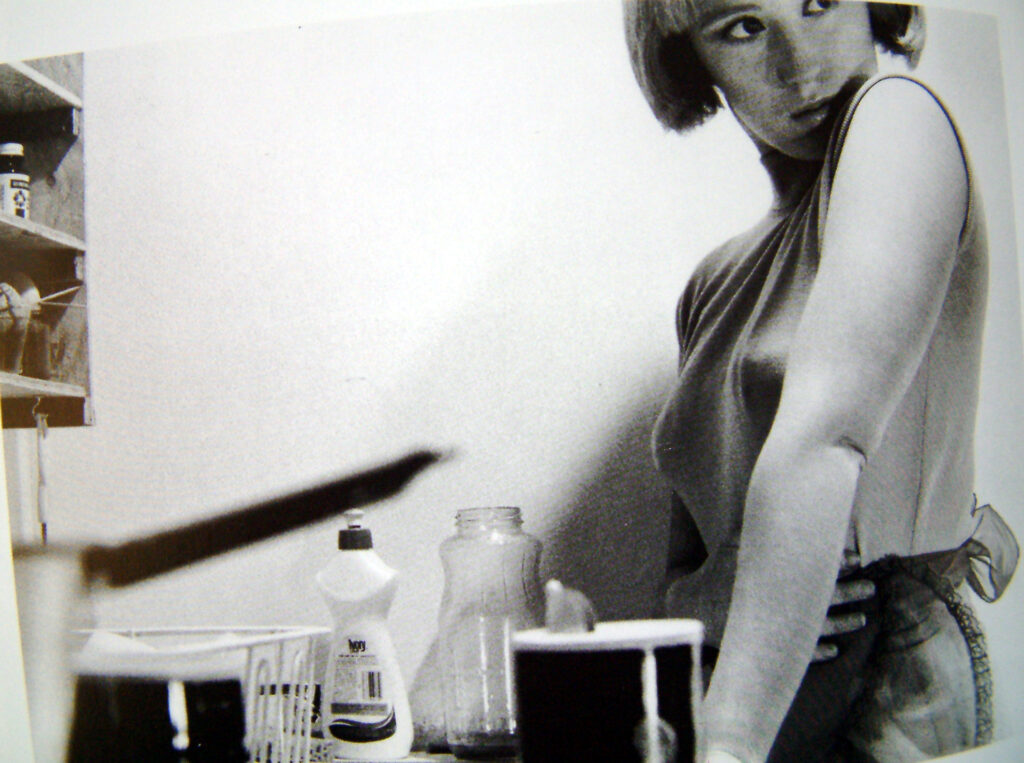
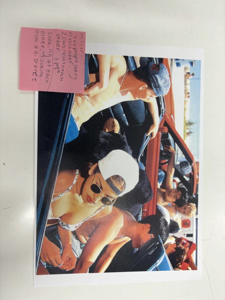
For my example of photographs as mirrors, I have used an image by Cindy Sherman. Cindy Sherman is a female photographer, who took images of herself dressed up as many different female stereotypes. In this image the stereotype that she is presenting is a generic housewife, who is in the kitchen. This image is a powerful image, because back in 1970-1980, which is when this image was taken, the ‘norm’ for women and the social standard for women was to be very domestic and stay at home to cook, clean and look after the children, while the men went out to work.
This image is a mirror, because it is a reflection of herself as a women and a reflection of her identity, because this is the stereotype she had to live through and this is what was considered to be socially acceptable of her and all other women in this time. This is also very personal and internal to her, as she is the one who has lived her life this way and being told she must live her life this way. She has also manipulated this image and staged the image, by using kitchen props in a kitchen setting. She has manipulated and positioned the props in the way she thought was best. She is also dressed up wearing an apron to really portray the housewife stereotype. She is also posing in this image, which makes it not a candid shot, but instead a tableaux image. This image is also very subjective and can interpreted in many different ways by the viewer, because it is such a simple, yet powerful image of her stood in the kitchen, with an apron on. This image is also a mirror, because it is a self-portrait of herself, that she had taken on a timer for her camera.
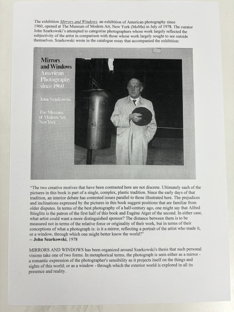
Szarkowski idealises that ‘a mirror, reflecting a portrait of the artist who made it,’1 however, Jed Pearl suggests that ‘Szarkowski thesis gives little value to photography’s a priori status as a realist activity. The very technology of photography contains an admission that the “world exists independent of the human attention”- a photograph is, after all, a record of nature, of the world’s light and shadows. A photograph provides, to use Szarkowski’s word, an “autobiographical” response to a realist situation.’2
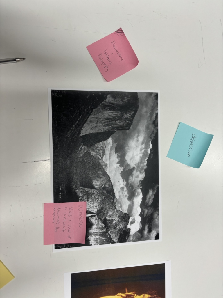
Windows
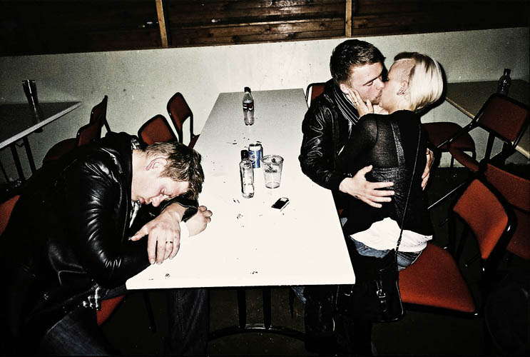
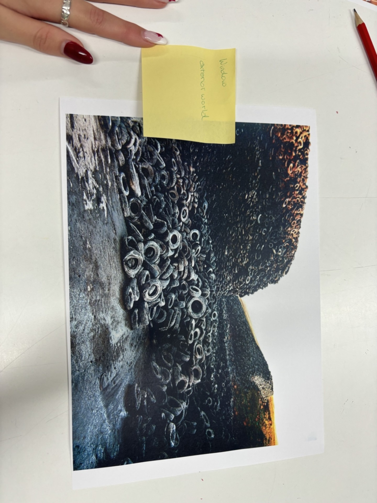
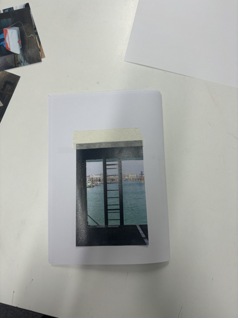
For my example of photographs as windows I have used an image by Rafal Milach. He took this image during a road trip across Iceland. He travelled across Iceland stopping at certain point to take images. This was a image he took in either a bar/ diner of a couple and their friend.
This image is a window, because he travelled across Iceland taking documentary candid images of whatever he saw that interested him, and in this image it was these three people. This image is very external to him, because he does not know these people, and most likely never saw them again, but he spotted a decisive moment and acted. He is looking out onto these people for this image, instead of looking at his reflection, or onto himself. There is also an element of realism and truthfulness in this image, which is what makes it a window, because it is a documentary image, instead of a candid image, which is staged or fictional.
Szarkowski’s thesis of ‘a window, through which one might better know the world?’3 and Jed Pearl’s review stating ‘It is the realist view that the world exists independent of human attention,’4 support this image as a window, because this image is a ‘realist view,’ because this image was not staged, but instead a documentary image, instead of a candid shot.
To conclude, photographs can be both windows and mirrors of the world, because windows, such as Rafal Milach’s image above, are realist documentary images, which present the truest form of the exterior world. Window images are candid images, so they present the world in it’s truest form. These images present to the viewer our exterior world. The importance of these images is that they are objective, they are used to present to the viewer the exterior world, and this can be really important for specific issues, such as war etc. These window images present issues of the world, as well as just landscape images. These images are metaphorically known as window images, because it is like you are looking out of a window (the camera lens) onto the exterior world. However, mirror images, such as Cindy Sherman’s image above, are tableaux images that are subjective to the viewer, so the viewer can interpret the image in any which way. This is important, because the viewer can interpret this intimate image, and may be able to relate to it and apply it to their own lives, as well as the photographers. These images are metaphorically called mirrors, because they are a reflection of the artist who made it, so this can be really important for photographers, so that they can display a sense of themselves through their work. They can also be used to display issues that are important and relate to the viewer, similarly how window images can be used to spread awareness.
The opposing concepts of photography: objectivity, subjectivity; documentary, tableaux; interior, exterior etc. provide alternative perspective of what photography is. However, these opposing concepts can overlap and cause ‘blurred lines.’ For example, these opposing concepts can overlap when the photographer takes documentary images that also reflect themselves etc. Therefore, photography may not be as split as Szarkowski and Jed Pearl state. The function and purpose of the photographs can and will change depending on who wields the camera and what they point their camera at, and how these images are presented.
- Szarkowski John. (1978). Mirrors and windows. New York; Museum of Modern Art ↩︎
- Jed Pearl. Review published in the photography magazine, Aperture in spring 1978. ↩︎
- Szarkowski John. (1978). Mirrors and windows. New York; Museum of Modern Art ↩︎
- Jed Pearl. Review published in the photography magazine, Aperture in spring 1978. ↩︎