All posts by Jessica-Mary Patrick

Filters

Author:
Category:

Page spread: InDesign

Firstly, I selected my page spread size and layout, I could have an A3 spread. I used the measurements and layouts below.

Experimentation

Next, I selected the area of where I wanted my image and went to file and place and selected which images I wanted to use. Once they are on my page spread I right clicked selected fitting and selected fill frame proportionately.

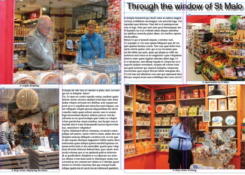
Next, I added a title, captions and some placeholder text for now.

Next, I experimented with different images and coloured images and repeated the same steps. I also experimented with creating a drop shadow for my title.

I also wanted to experiment with the colours of the French flag (red, white and blue) for one of my page spreads. I selected an area and then filled the area with a colour. Then, I went to file, arrange and then send to back, so that the colour was behind my writing and images, instead of on top. Finally, I adjusted the size and angle of my coloured blocks.

Next, I experimented with making the writing white, so I could see if it would be more visible than the black.

Finally, I started to replace to placeholder text with my own text.

Images I have used

I used these images in my book, so that I could present St Malo, so it is clear in my book where these images have been taken and where all the other images have been set.

I used these relationship shots in my book to display the different relationships (lovers, friendship, colleges etc.) all through St Malo that I witnessed.

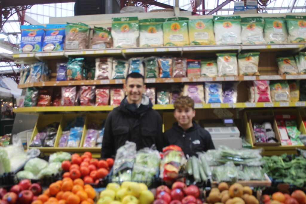
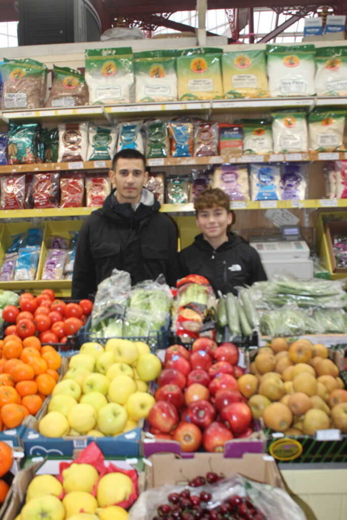
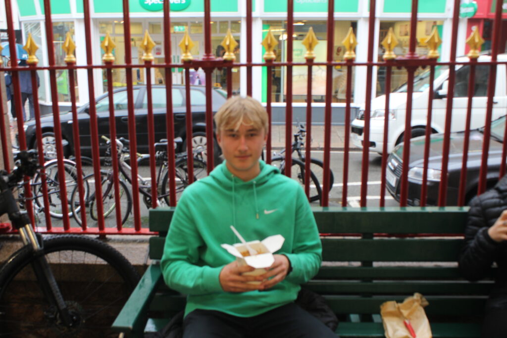
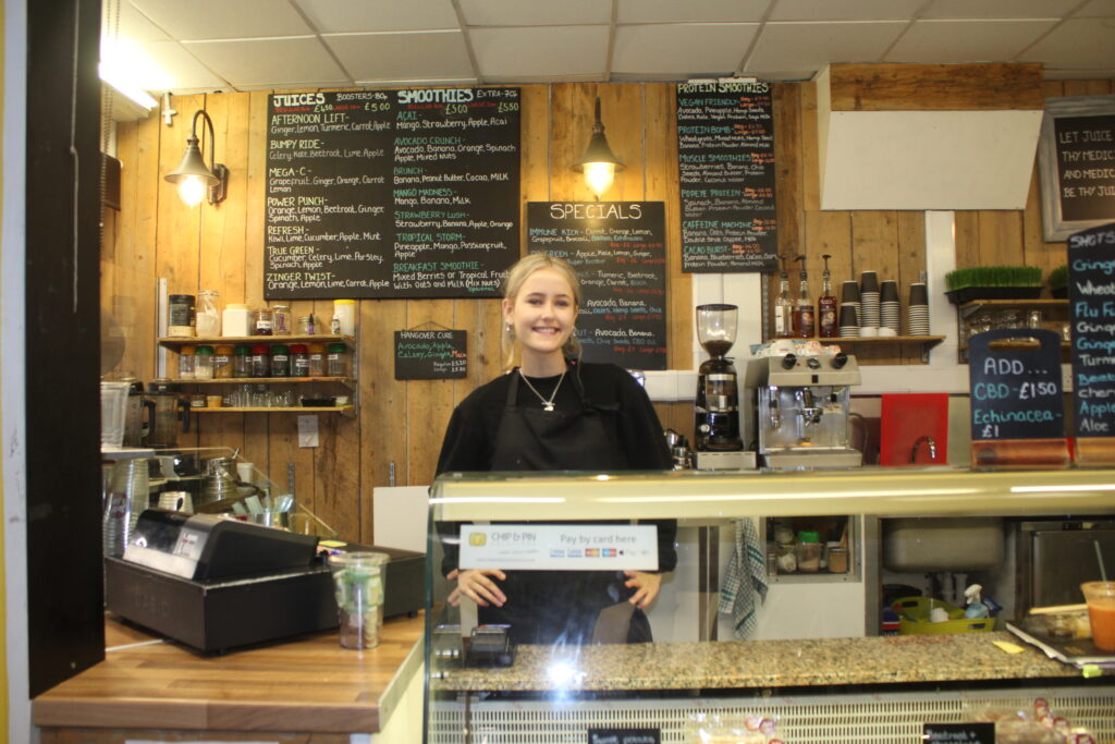
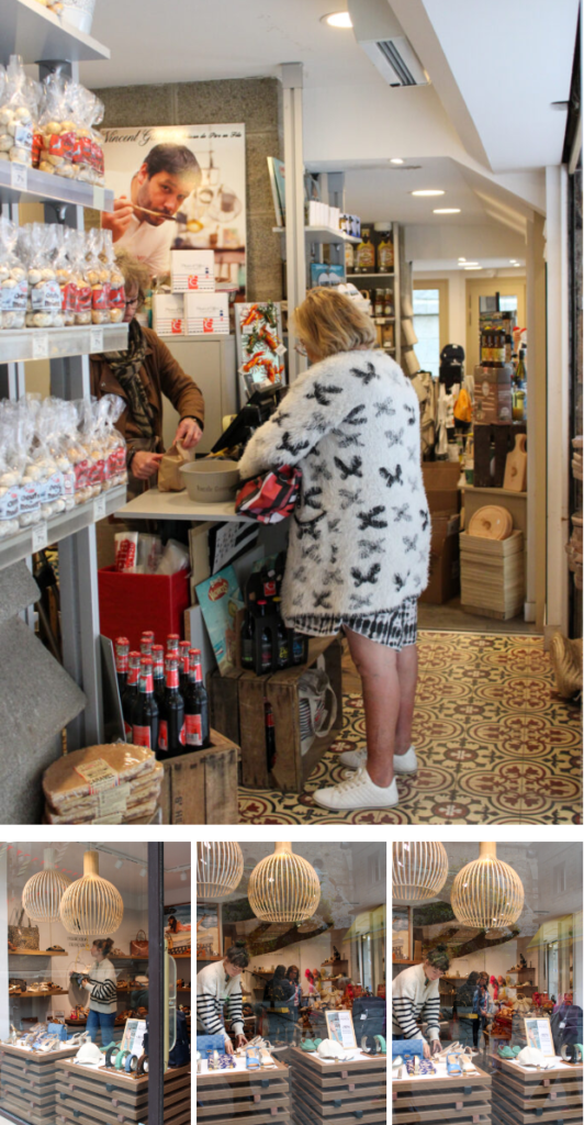
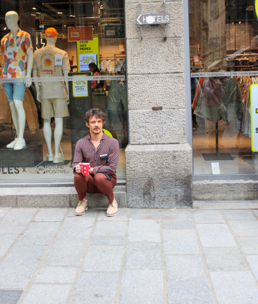
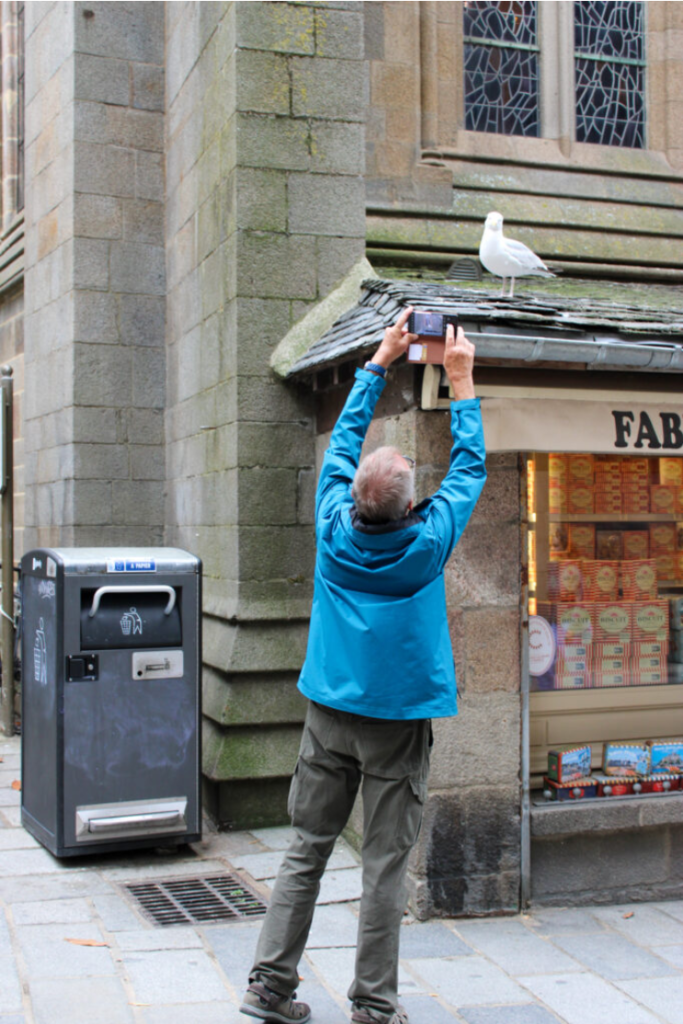
I took these images of people at work, so I could explore the different shops and places in town, so I could display the uniqueness of all the small businesses in St Malo.

My Book

Once, I had finished experimenting, I decided that the front page of my book would be through the window of St Malo, and that would be my title.

For my double page spread, I decided to use the colours of the France flag on both pages, because I liked the look of the colours, so I wanted both pages to match and work well together.

Evaluation:

In conclusion, I like my book, because I enjoy the exploration in it and in my images. I like how I explored with the colours of the French flag on my double page spread. I also like the concept of my book of ‘looking through the window of St Malo,’ but I would of liked to explore this concept more with my images. I should of used images of more shops and used my images experimenting with window reflections more, but I felt like they were not my stronger images, and the ones I did use were. I also like how I have explored with coloured and black and white images, but next time I think I will keep the images either all coloured or all black and white, as I think they go together better. I also like how I have used different types of images (establishing shot, relationship shot, person at work, etc.) because I feel like it displays St Malo as a whole very well.

Picture Stories: Research and Analysis

Types of Images Typically used in Picture Stories

  • Establishing shot
  • Person at work
  • Relationship shot
  • Detail shot
  • Environmental Portrait
  • Formal Portrait
  • Observed portrait

These types of images are typically used in picture stories, because they help display the whole story with enough detail and show lots of different elements to the story.

Establishing Shot

An establishing shot is a photo that provides an overview of the setting, like where the image is taken and what the weather is like etc.

Person at Work

A person at work image shows a person at work doing their job. A person at work photo should include 4 things:

Relationship Shot

A relationship shot shows the relationship between two or more people. It can show many different relationships, such as friends, family, lovers etc.

Detail Shot

A detail shot is a close-up photograph or artwork that focuses on a specific part or element of the subject, highlighting its intricate details and textures.

Environmental Portrait

An environmental portrait is a photo of an individual in their usually or natural environment, such as their home or work place etc. It typically gives us some insight into the individuals life.

Formal Portrait

A formal portrait is a photo of an individual’s face, that is not candid, but is posed in effective lighting conditions.

Observed Portrait

An observed portrait is a candid image of a person, who is does not know they are being photographed, so they are not posed.

Mood Board

Analysis and Deconstruction

Photoshop

Experimenting with AI

I wanted to use AI to make the streets of St Malo more busy, so I selected where I wanted my people and used different prompts to achieve what I wanted.

Experimenting with cropping

For cropping I chose images that I wanted to zoom in on, or images which I wanted to crop something out of the image.

These are the different cropping formats I tried.

  • Portrait Format
  • Landscape format
  • square crop
  • circle crop
  • multi circle / porthole crop
  •  polygon crop
  • panoramic crop

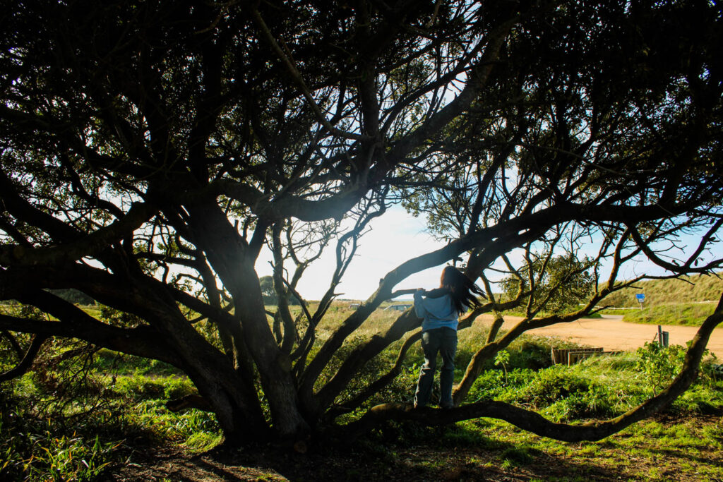
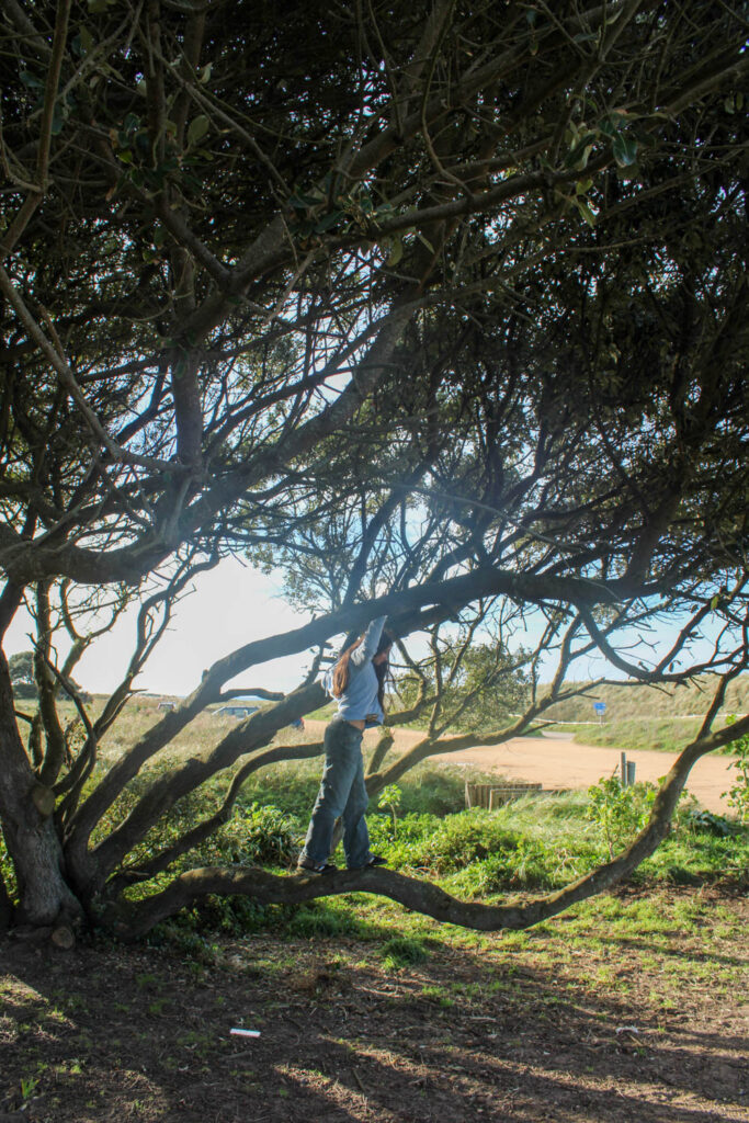
I chose to use a portrait crop for this image, because I wanted to zoom in on the girl in this image more, so that I could remove some of the negative space all around her, so that she was more visible and the main viewpoint.

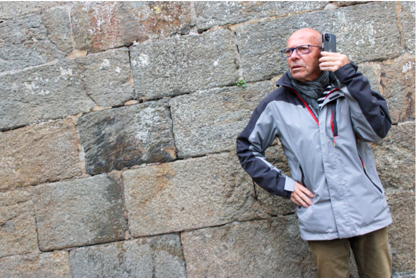
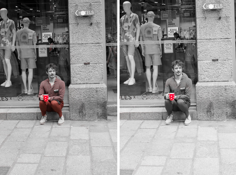
For this image I also wanted to close in on the man in this image more, by removing some of the negative space around him.

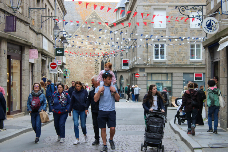
For this image I wanted to remove some of the negative space on the right hand side of this family, so that I could close in on the family more, and so they would be more centre in the image.

For this image, I wanted to remove the people on the right hand side and zoom in on the man looking into the window more, so that he is the main focus of the image.

I didn’t take any panorama for this photoshoot, but I experimented with the panoramic crop in my Anthropocene work.

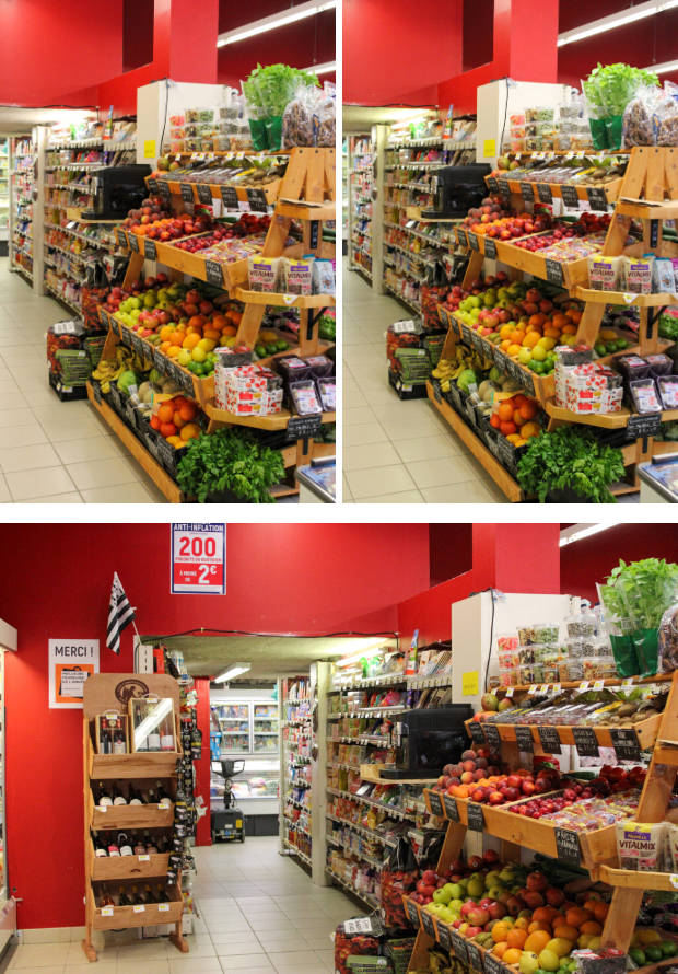
I have chosen to square crop this image, so that I could zoom in on the fruit, to create more of a detailed shot.

I removed all the negative space around the fruit and zoomed in on them quite a lot, to create this nice detail shot, that an be displayed nicely with a few of my other images.

I decided to circle crop this lady in this image, and crop out all the negative space around her.

First, I selected the elliptical marker tool and made a circle around her. Then, I went to inverse and deleted my background. Finally, I dragged her onto a white background.

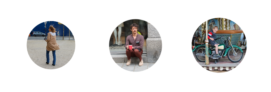
I chose these three images to create a multi circle crop.

I c hose this image to create my polygon crop.

First, I selected the polygon tool and created my triangle shape. Next, I went to select and inverse and deleted the background. Finally, I dragged my polygon onto a white background.

Finally, I wanted to look at the colour wheel/ colour theory for when I am cropping, so that I can try and include complimentary colours in my images instead of cropping them out.

This image contained both red and green, which are complimentary colours, so they compliment each other and look good together in this image, so I wanted to make the green stand out a bit more, so I tinted the image slightly green.

This image contains both blue and orange, which compliment each other well, so they make this image look better.

Complimentary colours create a harmony in the image, so they look good next to each other in the viewers eyes, so the image is more visually pleasing.

Experimenting with colour selection

I tried two different methods when creating my colour selection images.

  1. Open my chosen image in photoshop
  2. Duplicate my background
  3. Go on original background and make it black and white

4. Next I went onto my background copy and selected what I wanted to be coloured

5. Next, I went to select and then clicked inverse, so I am selecting what I do not want to be colour.

6. Finally, I deleted the background.

  1. Open my chosen image in Lightroom develop.
  2. Go to HSL/ colour and put the colours you do not want in the image down to 0 on the saturation.

3. Then, go to the adjustment brush and lower the saturation and exposure to 0.

4. Finally, brush over all the colours on the image, which are not wanted.

Final Colour Selecting Images

With this image I experimented with which parts I wanted coloured and which parts I didn’t.

Then, I decided to experiment with making multiple different things and colours pop against the black and white.

Experimenting with Motion Blur

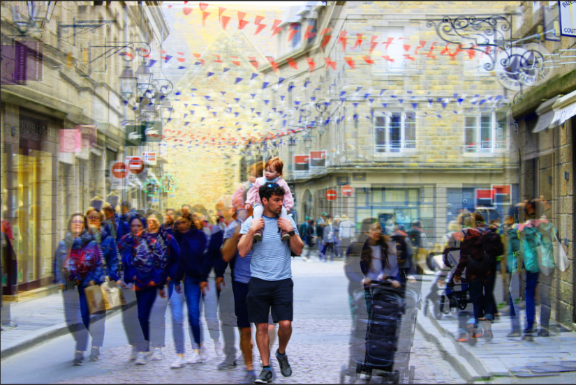
I wanted to play around with this image, because it is a busy image with lots of people, so I felt like I could do a lot with it.

  • Firstly, I duplicated the background and selected the man and his baby. Then, I selected inverse and deleted the background.
  • Next, I selected filter and motion blur and blurred the background.
  • Finally, I duplicated the background again and played around with the hue and saturation.

Next, I wanted the experiment with a single person image, and wanted to blur the person, rather than the background. I wanted wanted to experiment with different levels of blur.

This is the image I decided to edit.

  • Firstly, I duplicated my background layer and selected my person. Then, I went to select and inverse and deleted the background.
  • Then, I duplicated the background again and turned it black and white, so that the background was black and white, but my person was in colour.
  • Finally, I went to filter and motion blur and selected the strength of the blur and the angle.
  • First, I experimented with a weak blur.
  • Next, I experimented with a stronger blur.

Finally, I wanted to experiment with making a Tryptic out of these three images.

Final Images with Motion Blur

Final Images

Eye Level Camera

Analysis

I like these images, because they show the day to day lives of the local St Malo. I captured all different people in St Malo and they were all doing different things. I took candid shots of all these people. I also like the composition of these images, as well as the lighting and editing.

How these images relate to Henri Cartier Bresson

These images relate to Henri, because I observed people going through their day to day lives and waited for the decisive moment to take the shot. I took these candid images of people. I tried to take these photos in secret as well, which relates to Henri as he tried to do the same with his small discrete camera (Leica camera). Henri took candid images of people going about their day to day lives and also waited for the decisive moment, so he can take the shot.

I also tired to experiment with taking images that are similar to Henri Cartier-Bresson:

I also made my images black and white, so that they resembled Henri’s work even more.

Hip Shots

Analysis

I placed the camera down by my hip when taking these images, so that I was able to capture people living their day to day lives in a candid shot. I had the camera down by my hip, so that the people were unsuspected of my photos, so they did not pose or change their actions or what they were doing. I think this made my photos come out well, because I was able to secretly capture the decisive moment.

The composition was also good in some of these images, however, some of these images didn’t have the best composition, because of how low down the camera was. The editing on these images were also done quite well, and the lighting was good.

How do these images relate to Henri Cartier Bresson?

These images relate to Henri Cartier-Bresson, because he too observed people going about their every day lives and waiting for the decisive moment, so he could capture it. Henri also wanted to capture these images secretly, so that they were true candid shots and people didn’t change their actions when they saw the camera. However, he did this in a different way. He used a small quiet camera (Leica rangefinder). This camera was small and quiet, so he was able to secretly capture his candid shots.

I also tried to take images that are similar to Henri Cartier-Bresson’s work:

I also made my images black and white, so that they resembled Henri’s work even more.

Experimenting with Windows and Reflections

Analysis

These images capture people’s day to day lives while shopping. I also tried to experiment with windows and window reflections while taking these images. The composition of these images were also good, as well as the lighting and editing. If I were to do this again, I would try to experiment with window reflections more.

How do these images relate to Henri Cartier Bresson?

These images relate to Henri Cartier-Bresson, because he also observed and sought out the decisive moment, so he could capture it in his candid shots. He observed people’s day to day lives during his street photography, just like I did in St Malo, so I could capture the life of St Malo in my street photography.

Henri however didn’t photograph people shopping as such, but I wanted to include these images, so I could dive deeper into the life of St Malo.

Blurry Images

Analysis

Some of these blurry images came out well, as it captured the motion of life and of St Malo. I also experimented with different shutter speeds to get different levels of blurriness, but if I was to do it again I would experiment with this more. I would want to experiment with slightly faster shutter speeds as well, so the images are not so blurry, like Henri Cartier-Bresson’s work. I would also experiment with different compositions and try experiment with different moving objects, like more cars for example.

How do these images relate to Henri Cartier Bresson?

These images relate to Henri Cartier Bresson, because he also experimented with different shutter speeds, so he could capture the decisive moment, but with motion. However, he did not do this in a lot of his images and he usually used a faster shutter speed, so his images were less blurry.

As you can see in this image the children’s feet are slightly blurry, so the shutter speed was slightly too slow to capture the moment still.

In the future, I would want to speed up my shutter speed, so my images are not as blurry and they look more similar to Henri Cartier-Bresson’s. However, I did find one picture of Henri Cartier-Bresson, which is much more similar to my images, as he has used a really slow shutter speed here, just like I did, so the image was much more blurry.

Then, I wanted to experiment with making my image black and white, so it resembles Henri’s work even more.

These images also relate to Henri’s work, because I have observed the people of St Malo’s day to day lives and captured candid images of them, just like Henri did in his street photography.

Black and White Images

Analysis

I really like these black and white images, because not only do I think most images always look better in black and white, but I also think it makes these images much more dramatic and they resemble Henri Cartier-Bresson’s work more. I also like the editing of these images, because they have very high contrast between the whites and blacks and grey tones.

How do these images relate to Henri Cartier Bresson?

These images relate to Henri Cartier- Bresson, because they not only capture the decisive moment in these people’s day to day lives, but they are also in black and white, which all of Henri’s images were too.

Through the Window of St Malo

Final Images

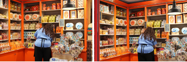
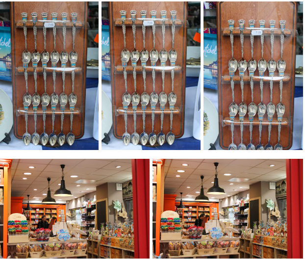
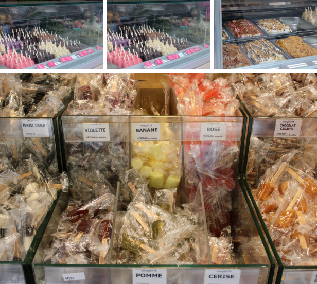
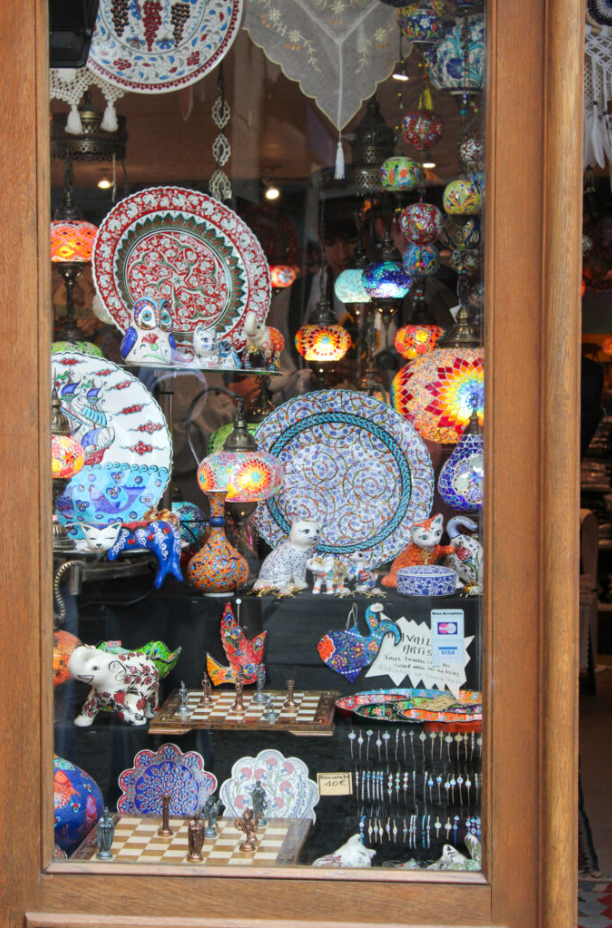
While in St Malo I wanted to experiment with taking photos of shops, items inside the shops and using the reflection in the shop window etc. I wanted to do this, because the shops in St Malo were very different to the shops that we have in Jersey, so this really interested me. St Malo was full of small own business shops and there was very little high end designer or branded shops. This intrigued me, because all of the shops were quite unique.

Items

Analysis

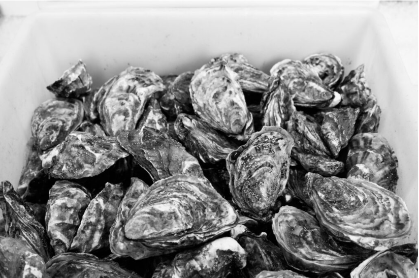
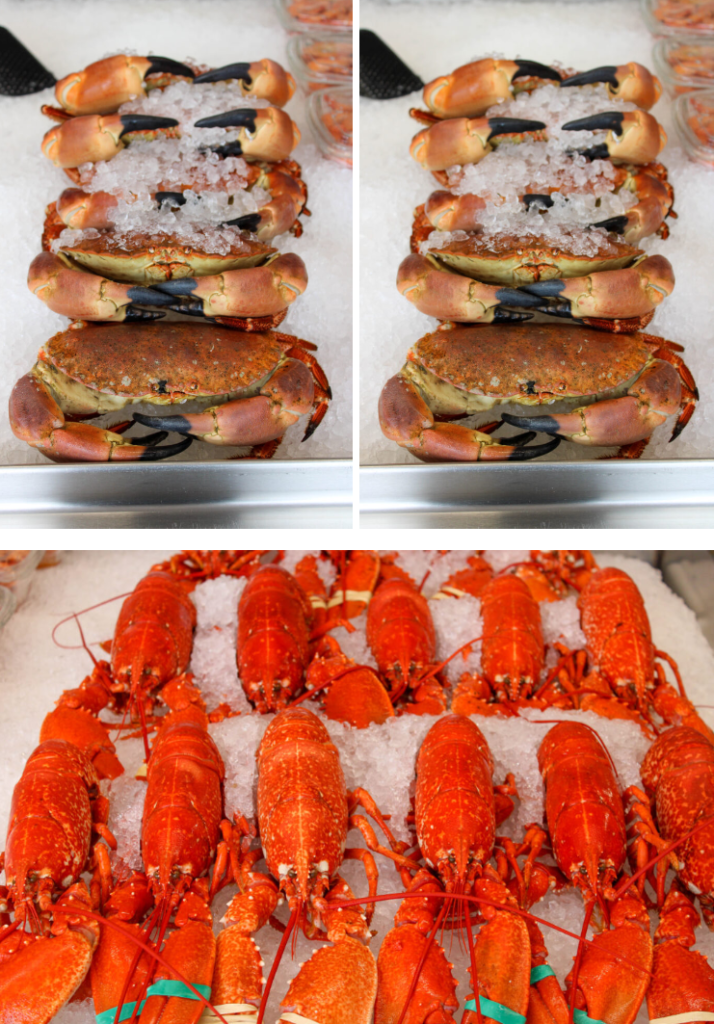
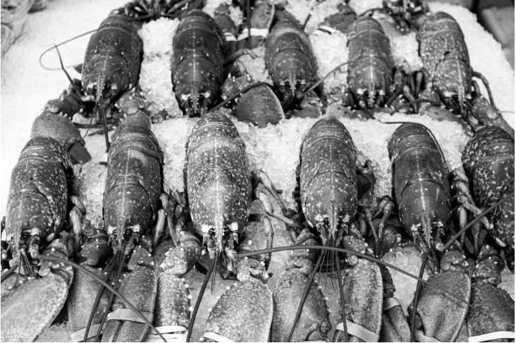
I think these images came out well, because they display how the shops offer different items and things to Jersey shops, as well as each other, as they all offer different things. These photos also display how even the food is different in St Malo compared to Jersey.

These images also have good composition and lighting and have been edited well in my opinion.

How do these images relate to Henri Cartier-Bresson?

These images don’t necessarily relate Henri, but they do show the lives of the people living in St Malo and how their lives differ from ours back at Jersey.

People

Analysis

These images display the lives of the locals in St Malo, as I have snapped images of them living their day to day lives (candid photos). These images also display all different types of people, eg: young, old, male, female. I have also tried to use shop windows to my advantage, by capturing people through the windows without them seeing me and using the window reflection to my advantage.

The composition of these photos are also good, even though they all have different compositions. The lighting and editing are also good in these images.

How do these images relate to Henri Cartier-Bresson?

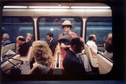
These images relate to Henri Cartier-Bresson, because I was observing the peoples day to day lives in these images (mostly without them knowing) and waiting for the decisive moment, which is what Henri did. I took candid shots of these people, which is what Henri did, while he walked the streets observing the people.

Ferris-wheel

Analysis

I like these images, even though they are a different style. I like these photos, because they produce different angles of St Malo and the people from St Malo. I was able to achieve higher up angles for my photos and did capture a few landscape shots. I was also able to capture other people on the Ferris-wheel with us. I also had fun on the Ferris-wheel and I don’t think anyone else really went on it.

How do these images relate to Henri Cartier-Bresson?

These images don’t necessarily relate to Henri, but I had fun taking them. They also do show life in St Malo from other angles and the lives of people from other angles.

Bringing the People of St Malo to life

I wanted to experiment with bringing the people, who are still in these images to life. I wanted to do this by using motion blurring.

  • First, I duplicated my background and selected my person. Then, I selected inverse and deleted the background.
  • Next, I went to filter and motion blur and selected how blurry I wanted it and what angle I want the blur to be.
  • If my person got too transparent I would also duplicate the layer with only my person, before I motion blur it, so there is always an opaque copy.

I wanted to also experiment creating different scenes in St Malo, so I used AI to do this. I also used AI to create more shop windows and reflections, so I could experiment with that even more.

  • First, I selected an image I wanted to use and selected where I wanted the AI to go. Then, I selected generative fill and typed in the prompts that I wanted and finally selected which one I thought looked best.

Edits- Observe, Seek, Challenge

St Malo

St Malo is mainly a tourist destination, so it was ‘normal’ for the locals to see us taking pictures with our cameras. We also saw many other tourists who were not with us taking photos with either their phones or cameras. There were many different shops and food stalls in St Malo, which attracted many tourists. There was also the Ferris-wheel.

Contact Sheet

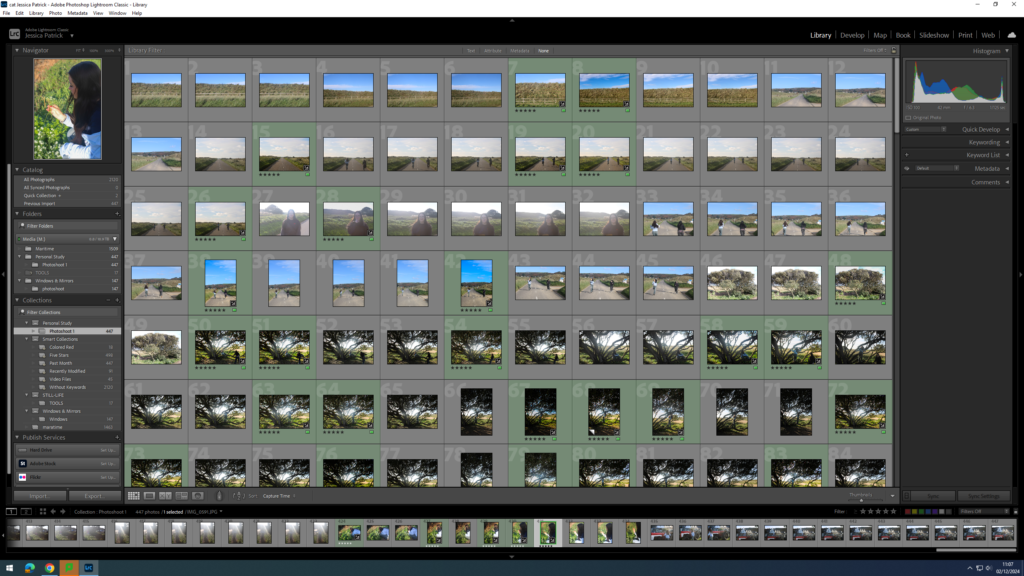
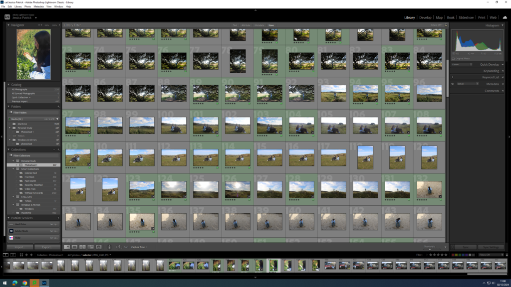
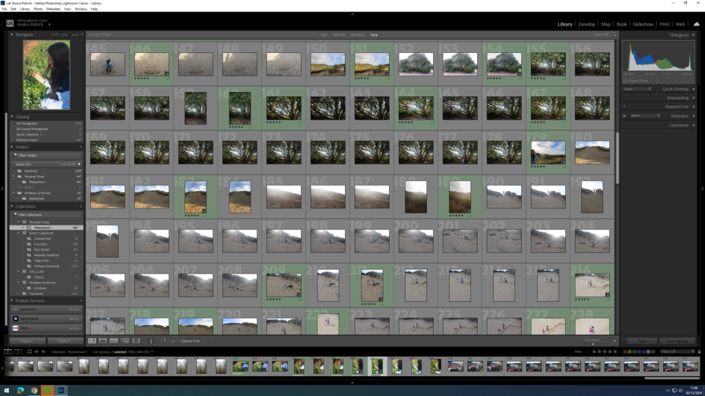
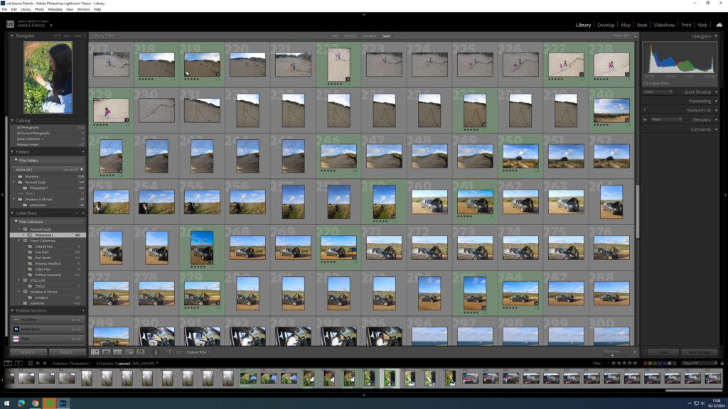
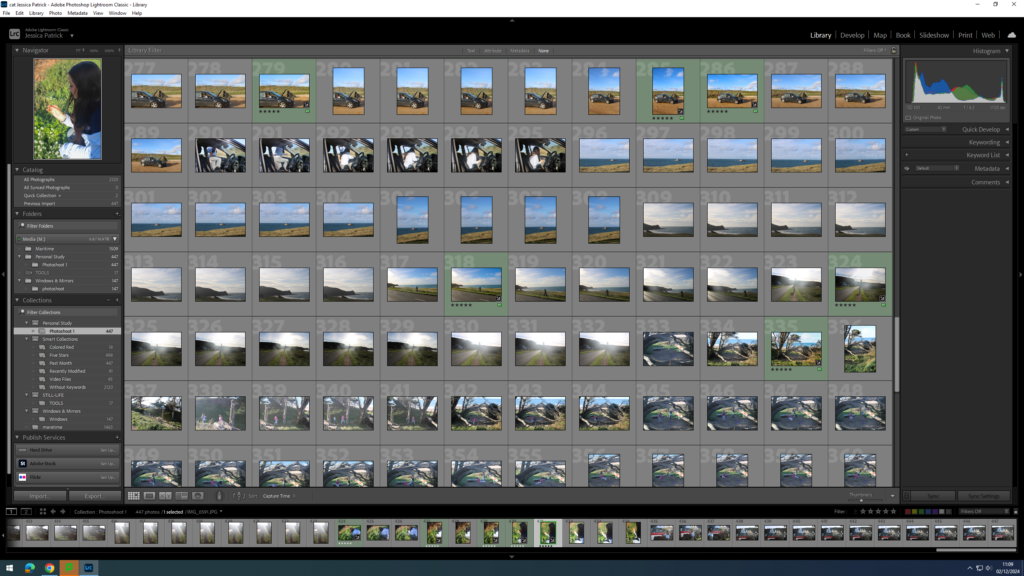
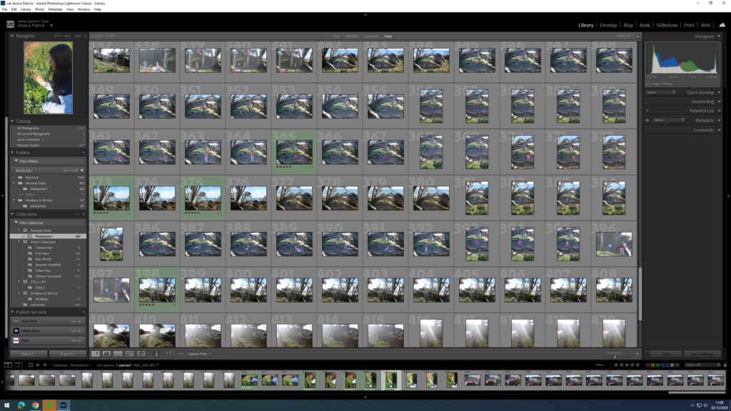
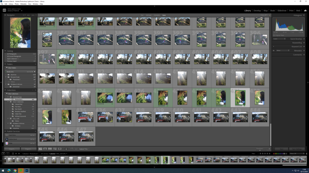
The images that are highlighted green are my best images and the images I have decided to edit, because they show people’s every day lives the best, while have the best composition. They are also the different types of images I have experimented with.

Edits

These images are images I have taken with the camera at eye level, so people knew I was taking photos in these.

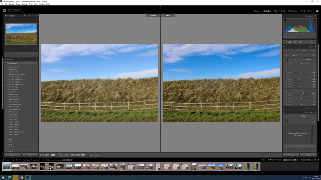
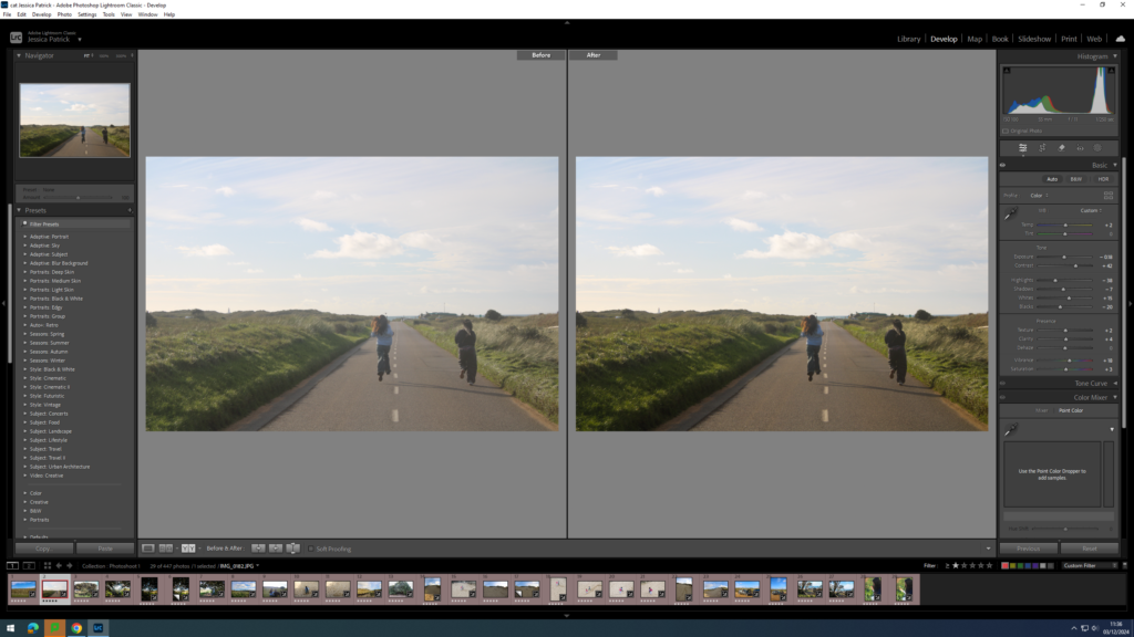
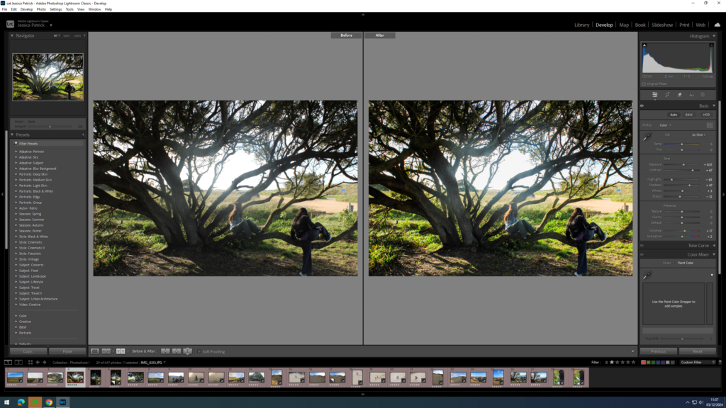
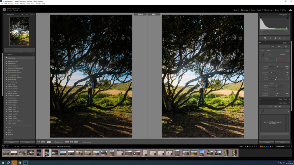
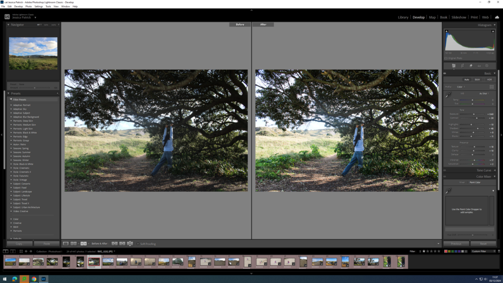
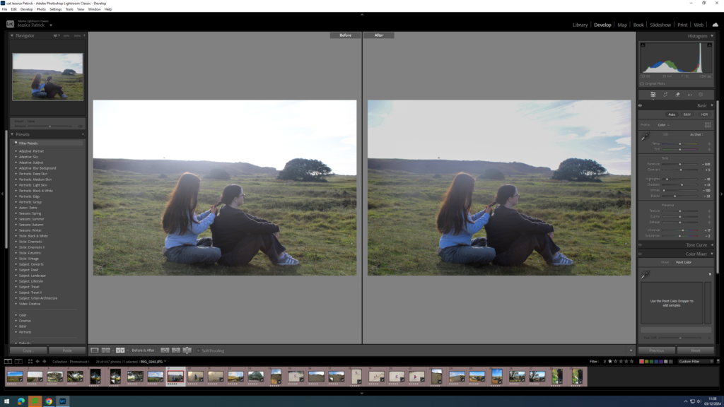
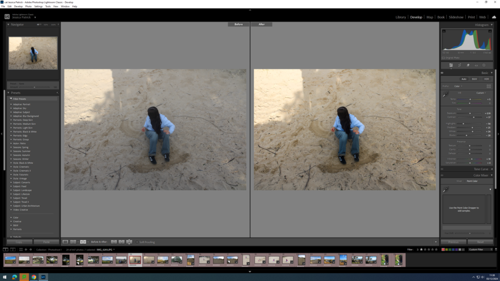
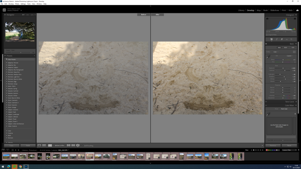
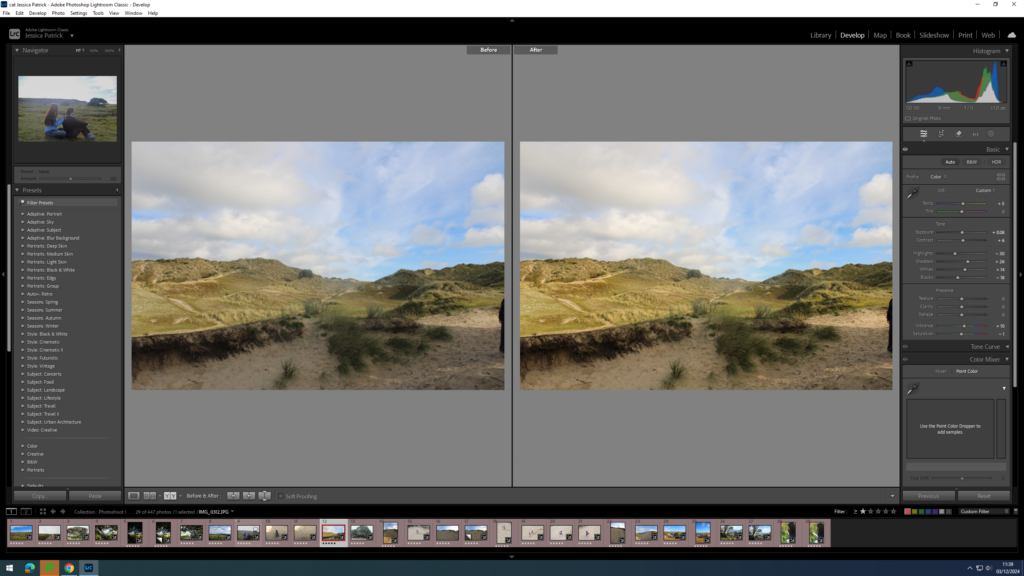
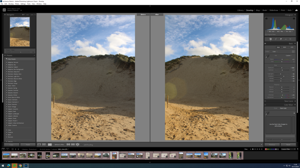
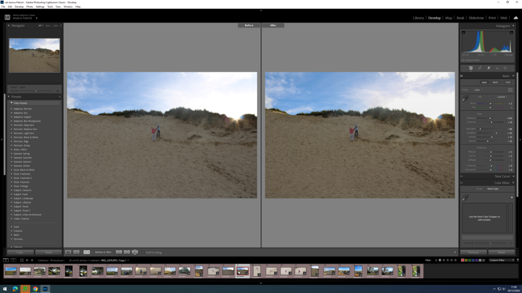
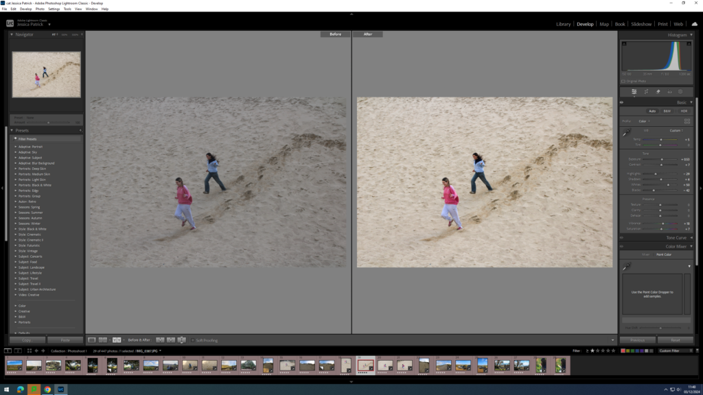
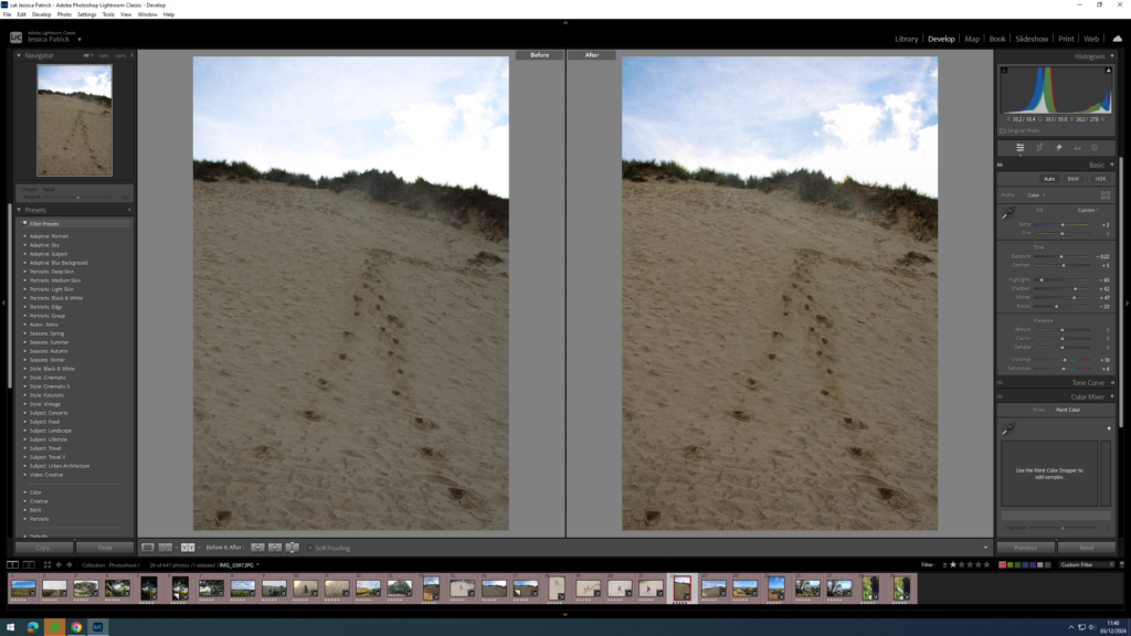
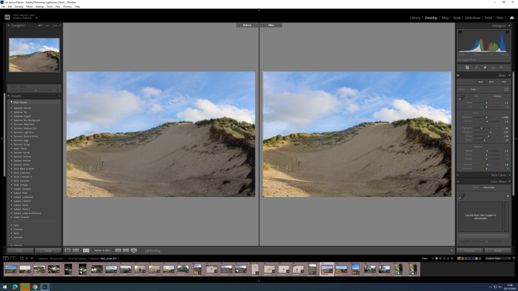
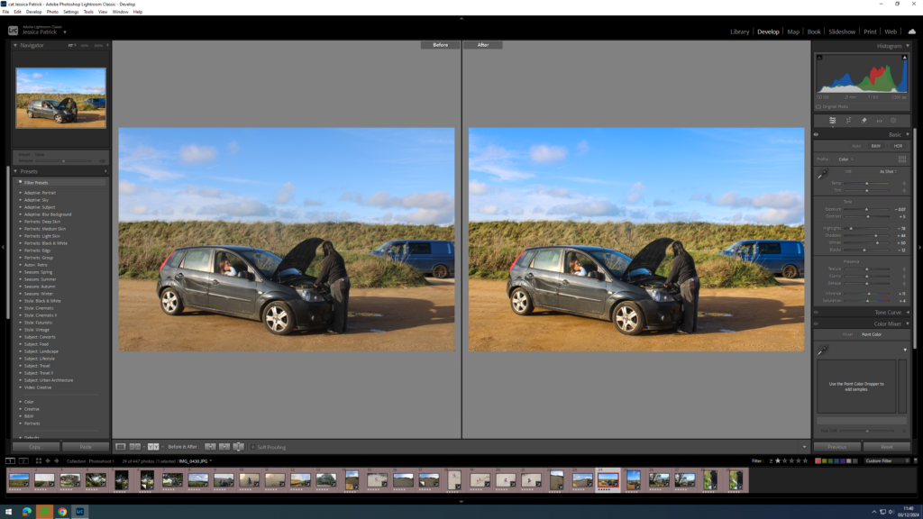
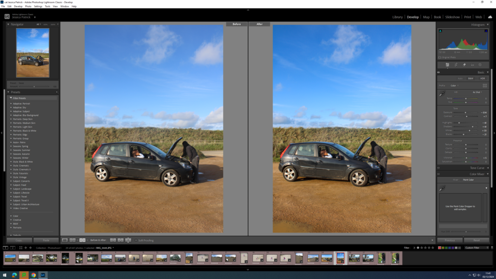
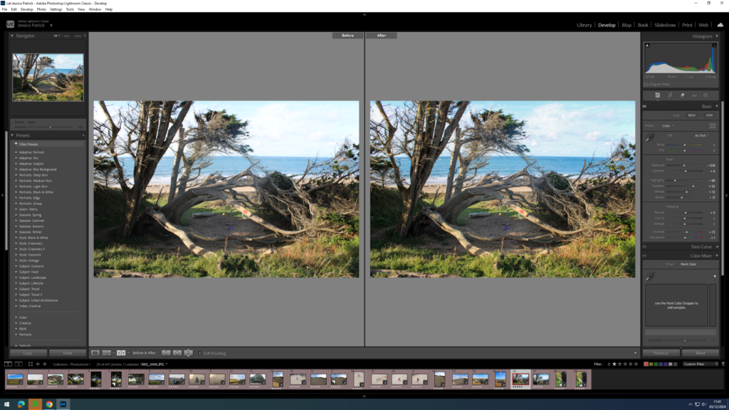
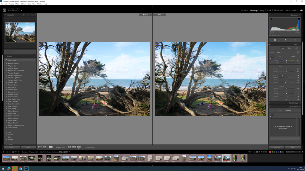
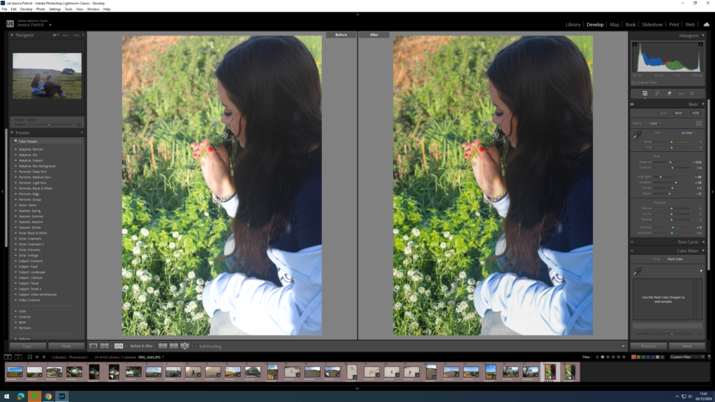
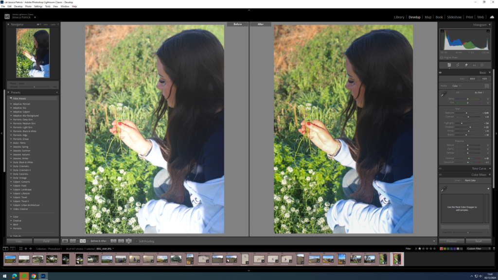
I edited this image by increasing the contrast, shadows, whites, vibrancy and saturation, while decreasing the exposure, highlights and blacks. I did this, so that the image would have better lighting and be more vibrant.

I edited this image by increasing the contrast, shadows, whites, vibrancy and saturation, while decreasing the exposure, highlights and blacks. I did this, so that the image would have better lighting and be more vibrant.

I edited this image by increasing the contrast, shadows, vibrancy and saturation, while decreasing the exposure, highlights, whites and blacks. I did this, so that the image would have better lighting and so the background of the sea and boats would be more visible and eye capturing.

I edited this image by increasing the contrast, shadows, whites, vibrancy and saturation, while decreasing the exposure, highlights and blacks. I did this, so that the image would have better lighting and be more vibrant.

I edited this image by increasing the contrast, shadows, whites, vibrancy and saturation, while decreasing the exposure, highlights and blacks. I did this, so that the image would have better lighting and be more vibrant.

I edited this image by increasing the contrast, shadows, whites, vibrancy and saturation, while decreasing the exposure, highlights and blacks. I did this, so that the image would have better lighting and be more vibrant.

I edited this image by increasing the contrast, shadows, whites, vibrancy and saturation, while decreasing the exposure, highlights and blacks. I did this, so that the image would have better lighting and be more vibrant.

I edited this image by increasing the contrast, shadows, whites, vibrancy and saturation, while decreasing the exposure, highlights and blacks. I did this, so that the image would have better lighting and be more eye capturing.

I edited this image by increasing the contrast, shadows, whites, vibrancy and saturation, while decreasing the exposure, highlights and blacks. I did this, so that the image would have better lighting and be more vibrant.

I edited these images by increasing the exposure, contrast, shadows, whites, vibrancy and saturation, while decreasing the highlights and blacks. I did this, so that the images would be more vibrant and eye capturing.

I edited this image by increasing the contrast, shadows, whites, vibrancy and saturation, while decreasing the exposure, highlights and blacks. I did this, so that the image would have be brighter.

I edited this image by increasing the contrast, shadows, whites, vibrancy and saturation, while decreasing the exposure, highlights and blacks. I did this, so that the person in this image would stand out more.

I edited this image by increasing the contrast, shadows, whites, vibrancy and saturation, while decreasing the exposure, highlights and blacks. I did this, so that the image would have better lighting.

I edited these images by increasing the contrast, shadows, whites, vibrancy and saturation, while decreasing the exposure, highlights and blacks. I did this, so that the image would have better lighting and be more eye capturing. Also so the people would stand out more.

I edited this image by increasing the contrast, shadows, whites, vibrancy and saturation, while decreasing the exposure, highlights and blacks. I did this, so that the image would have better lighting and be more vibrant.

I edited this image by increasing the contrast, shadows, whites, vibrancy and saturation, while decreasing the exposure, highlights and blacks. I did this, so that the image would have better lighting and be more vibrant.

I edited this image by increasing the contrast, shadows, whites, vibrancy and saturation, while decreasing the exposure, highlights and blacks. I did this, so that the image would be brighter.

I edited this image by increasing the contrast, shadows, whites, vibrancy and saturation, while decreasing the exposure, highlights and blacks. I did this, so that the image would be brighter.

I edited this image by increasing the contrast, shadows, whites, vibrancy and saturation, while decreasing the exposure, highlights and blacks. I did this, so that the image would have be more vibrant and all the colours on the caracal would pop more.

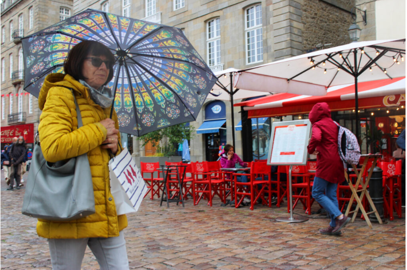
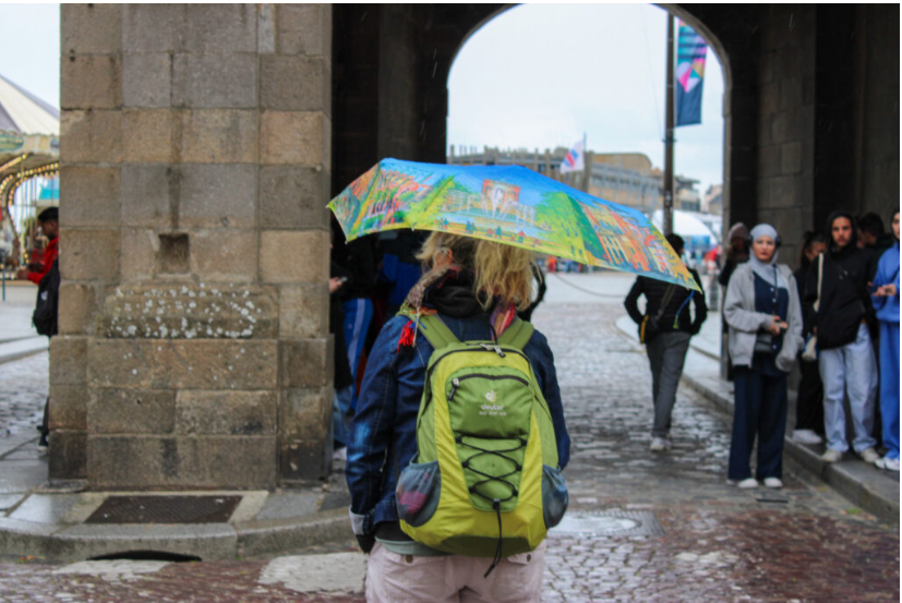
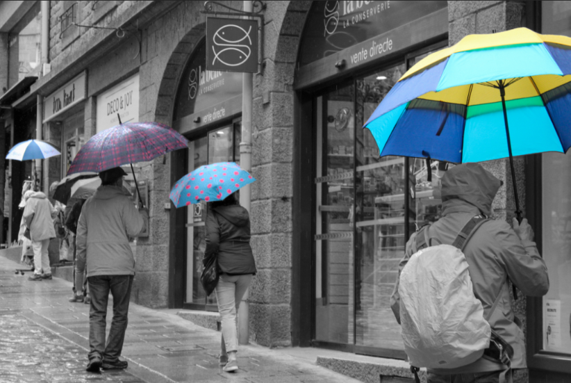
I edited this image by increasing the contrast, shadows, whites, vibrancy and saturation, while decreasing the exposure, highlights and blacks. I did this, so that the lady’s bag and umbrella would pop more and be the main focus.

I edited this image by increasing the contrast, shadows, whites, vibrancy and saturation, while decreasing the exposure, highlights and blacks. I did this, so that the image would have better lighting.

I edited this image by increasing the contrast, shadows, whites, vibrancy and saturation, while decreasing the exposure, highlights and blacks. I did this, so that the coloured umbrella and backpack would pop more and be more eye capturing.

I edited this image by increasing the contrast, shadows, whites, vibrancy and saturation, while decreasing the exposure, highlights and blacks. I did this, so that the image would have better lighting.

I edited this image by increasing the contrast, shadows, whites, vibrancy and saturation, while decreasing the exposure, highlights and blacks. I did this, so that the image would have better lighting.

I edited this image by increasing the contrast, shadows, whites, vibrancy and saturation, while decreasing the exposure, highlights and blacks. I did this, so that the image would have better lighting and be more vibrant.

Hip Shots

These are images I have taken with the camera at hip level, so it is less visible that I am taking photos, so that people will not change their expressions or actions when I am taking the photos.

I edited this image by increasing the contrast, shadows, whites, vibrancy and saturation, while decreasing the exposure, highlights and blacks. I did this so the image was more vibrant and had better lighting.

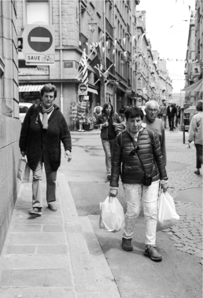
I edited this image by increasing the exposure, contrast, shadows, whites, vibrancy and saturation, while decreasing the highlights and blacks. I did this so the colours in the image would pop more and be more vibrant, such as the flags and coloured clothing.

I edited this image by increasing the contrast, shadows, whites, vibrancy and saturation, while decreasing the exposure, highlights and blacks. I did this so the coloured clothing and flags in this image would pop more, and so the image was slightly brighter.

I edited this image by increasing the contrast, shadows, whites, vibrancy and saturation, while decreasing the exposure, highlights and blacks. I did this so the image was more vibrant and had better lighting. Also, so the ladies coat was more vibrant and stood out more.

I edited this image by increasing the contrast, shadows, whites, vibrancy and saturation, while decreasing the exposure, highlights and blacks. I did this so the image was more vibrant and had better lighting.

I edited this image by increasing the contrast, shadows, whites, vibrancy and saturation, while decreasing the exposure, highlights and blacks. I did this so the image was more vibrant and had better lighting.

I edited these images by increasing the contrast, shadows, whites, vibrancy and saturation, while decreasing the exposure, highlights and blacks. I did this so the images were brighter.

I edited this image by increasing the exposure, contrast, shadows, whites, vibrancy and saturation, while decreasing the highlights and blacks. I did this so the image was brighter and had better lighting.

I edited this image by increasing the exposure, contrast, shadows, whites, vibrancy and saturation, while decreasing the highlights and blacks. I did this so the image was brighter and had better lighting.

I edited this image by increasing the contrast, shadows, whites, vibrancy and saturation, while decreasing the exposure, highlights and blacks. I did this so the image was brighter and had better lighting, and so the green bench was slightly more vibrant.

I edited these images by increasing the contrast, shadows, whites, vibrancy and saturation, while decreasing the exposure, highlights and blacks. I did this so red furniture would pop more and be more vibrant, so that it was eye capturing. I also wanted the lighting to be better.

I edited this image by increasing the exposure, contrast, shadows, whites, vibrancy and saturation, while decreasing the highlights and blacks. I did this so all the different colours in this image, such as the red furniture and her coloured umbrella would pop more and be more vibrant, so that the image was more eye capturing. I also wanted the image to be slightly brighter, so that the lighting was better.

Blurry Images

For these images I experimented with the shutter speed by slowing it down, so that anyone or thing that is moving will be slightly or very blurry, while I am stood still taking the images.

I edited this image by increasing the contrast, shadows, whites, vibrancy and saturation, while decreasing the exposure, highlights and blacks. I did this so the colours in this photo would be more vibrant and the lighting would be better.

I edited this image by increasing the exposure, contrast, shadows, whites, vibrancy and saturation, while decreasing the highlights and blacks. I did this so the different colours in this image would be much more vibrant.

I edited this image by increasing the exposure, contrast, shadows, whites, vibrancy and saturation, while decreasing the highlights and blacks. I did this so the image was brighter and had better lighting.

I edited these images by increasing the contrast, shadows, whites, vibrancy and saturation, while decreasing the exposure, highlights and blacks. I did this so the image had better lighting.

Shop windows/ Reflections

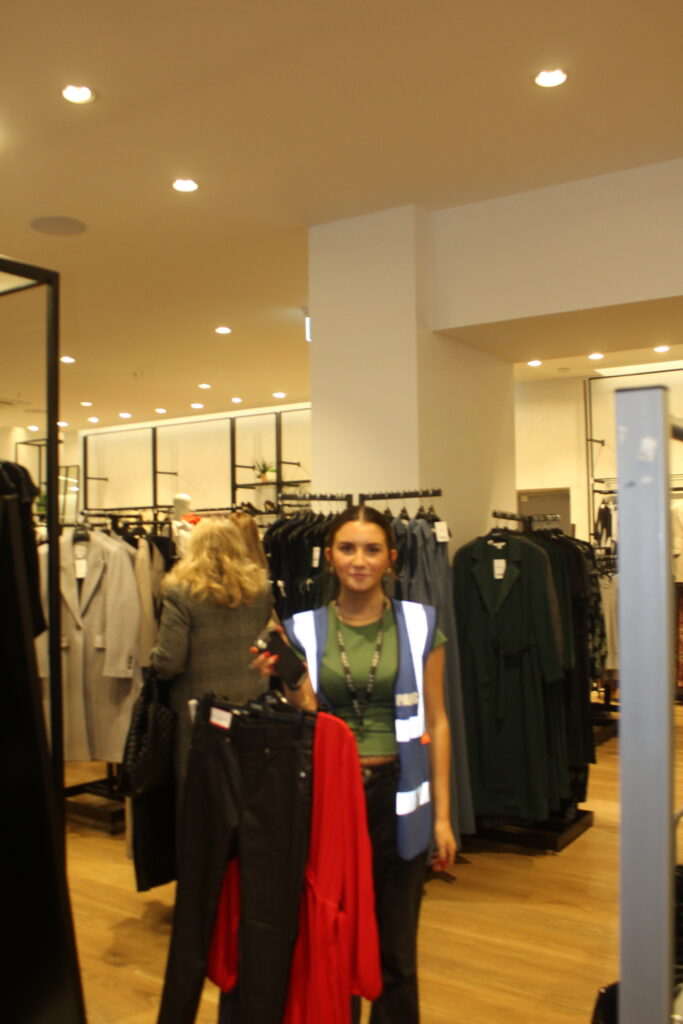
For these images I experimented with using shop windows/ reflections, so I took pictures of people inside the stores from outside the window. I also just took images of people shopping and browsing.

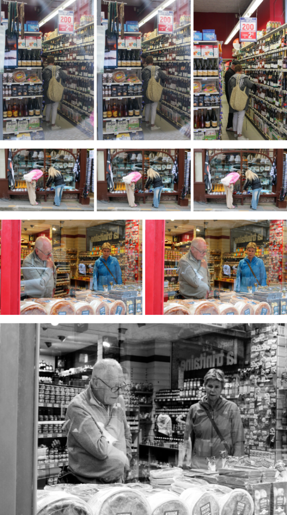
I edited this image by increasing the contrast, shadows, whites and vibrancy, while decreasing the exposure, highlights and blacks. I did this so that the lighting would be better and their brightly coloured coats more vibrant.

I edited this image by increasing the exposure, contrast, shadows, whites and vibrancy, while decreasing the highlights and blacks. I did this so that the lighting would be better and all the brightly coloured clothing would be more vibrant.

I edited this image by increasing the exposure, contrast, shadows, whites and vibrancy, while decreasing the highlights and blacks. I did this so that the lighting would be better and the colours in the image would pop more.

I edited this image by increasing the exposure, contrast, shadows, whites, saturation and vibrancy, while decreasing the highlights and blacks. I did this so that the lighting was better.

I edited this image by increasing the exposure, contrast, shadows, whites and vibrancy, while decreasing the highlights saturation and blacks. I did this so that the image was brighter and the people could be seen better.

I edited this image by increasing the exposure, contrast, shadows, whites and vibrancy, while decreasing the highlights, saturation and blacks. I did this so that the lighting was better and all the colours were more vibrant.

I edited this image by increasing the exposure, contrast, shadows, whites, saturation and vibrancy, while decreasing the highlights and blacks. I did this so that the image had better lighting.

I edited this image by increasing the contrast, shadows, whites and saturation, while decreasing the exposure, vibrancy, highlights and blacks. I did this so that the colours would pop more.

I edited this image by increasing the exposure, contrast, shadows, whites, saturation and vibrancy, while decreasing the highlights and blacks. I did this so that the lighting was better.

I edited this image by increasing the exposure, contrast, shadows, whites, saturation and vibrancy, while decreasing the highlights and blacks. I did this so that the lighting was better and the person could be seen more clearly through the window.

I edited this image by increasing the exposure, contrast, shadows, whites, vibrancy and saturation, while decreasing the highlights and blacks. I did this, so the image is brighter and her neon coat more vibrant.

I edited this image by increasing the contrast, shadows, whites, vibrancy and saturation, while decreasing the exposure, highlights and blacks. I did this so the lighting was better in these images.

Experimenting with Black and White Images

I made all these images by making a virtual copy of the final edited images. Then, I edited them more so after they’ve been made black and white if need so.

I edited this image even more after turning it black and white, by increasing the contrast and whites more, while decreasing the highlights, shadows and blacks more. I did this so there was lots of contrast.

I edited this image even more, by increasing the contrast, shadows and whites more, while decreasing the highlights and blacks more. I did this so the image would have more contrast.

I edited this image by increasing the contrast, shadows and whites more and decreasing the blacks and highlights more. I did this so there was more contrast and the reflection in the window was more apparent.

I edited this image more by increasing the contrast, shadows, highlights and whites more, while decreasing the blacks more. I did this so there is more contrast.

I edited this image by increasing the contrast, shadows and whites, while decreasing the highlights and blacks more. I did this to create more contrast.

I edited this image by increasing the contrast, shadows and whites, while decreasing the highlights and blacks more. I did this to create more contrast.

I edited this image by increasing the contrast, shadows and whites, while decreasing the highlights and blacks more. I did this to create more contrast.

I edited this image by increasing the contrast, shadows and whites, while decreasing the highlights and blacks more. I did this to create more contrast.

Artist Research

Henri Cartier Bresson

Henry Cartier captures the movements of people through the world. He is a humanist photographer, who is considered a master of candid photography. He waits for the decisive moment, by looking with his heart, looking at things that connect to humanity and waiting and watching for the decisive moment. The decisive moment is a second when all elements of reality align perfectly and the goal is to notice and capture that moment. He often compared this waiting and watching to hunting, as it was similar to predator waiting and watching their prey, also trying to capture it. A good example of Henri Cartier capturing the decisive moment is this image:

This captures the decisive moment, as he captures a man, who is passing by leaping of the puddle and captures his action in this image.

About him?

Henri grew up in a wealthy family in France, and was introduced to the arts early. He was initially drawn to painting, but his passion was sparked when he discovered photography, which he saw as an extension of drawing and an extension of his eye. With a camera, Henri found a tool he could use to interact with the world. In his early years, he travelled extensively, from Europe to Africa, and absorbed varied cultures. These experiences helped to shape his outlook on life and hone his philosophy.

This philosophy matured into what we call “The decisive moment”.

Inspired in the 17th centaury Cardinal de Retz’s quote,

Henri internalised this notion, making it the cornerstone of his work. It wasn’t just about pushing the shutter at the right moment. It was about intuition, anticipation, and connection with the subject and environment.

The Camera and Lens

Henri Cartier Bresson was known for using a Leica rangefinder with a 50mm lens. The Leica rangefinder were a revolutionary piece of equipment in the world of photography, especially during Henri Cartier Bresson’s time. These cameras were compact, reliable, and their design was more discreet than the large and conspicuous cameras of the era. This allowed him to use a quick and unobtrusive shooting style, which is essential for street photography.

Another main reason Cartier-Bresson favoured the Leica rangefinder was its stealthy nature. Its quiet shutter let him capture moments without drawing attention to himself, letting life unfold naturally before his lens. The silent operation was crucial for someone who believed in capturing authentic, unstaged moments.

Henri also preferred the 50mm lens, because it offers a field of view close to the human eye, ensuring he captured images that felt natural and immersive to the viewer.

Behind the Saint-Lazare

Henri Cartier-Bresson’s most famous and well known image was taken in Paris in 1930. The image was taken behind the Saint-Lazare train station, an ordinary scene was about to unfold. An unsuspecting man, perhaps in a rush, decided to leap over a puddle. Henri, always observant, saw this not just as a jump, but as a symphony of shapes, shadows ad reflections.

He captured it, turning a mundane act into a timeless masterpiece. I wasn’t just a photo; it was a testament of his philosophy. The leaping man, frozen in time, epitomized the essence of ‘The Decisive Moment.’ A split second earlier or later, the magic would have been lost.
Analysis

The composition of this image is a man jumping over a puddle at first glance, but the message this photo displays is that there is always thing waiting to be seen and captured.

This image has leading lines, which direct the viewers eyes to the heart of the action, which in this case is the man jumping over the puddle. These leading lines also help frame the subject, so the viewers eyes are drawn to the subject even more.
The reflection in this image also helps to create a balance in the image. There is also lots of negative space at the sky and the reflection. However, the reflection eats into that negative space, as well as the chimney, so both these create a balance in the image. They are almost symmetrical, as they are opposite end of the image, but they are different items.
The image also has outer and inner frames. The outer frames have negative space, so the inner frame is more apparent, so the eyes are drawn to the inner frames more, which is the man etc.

This image also contains the rules of thirds, as there is negative space at the top and the bottom of the image. The man also isn’t in the middle of the image, but it is in the middle right third, so the man is at the end of his leap, we have followed his journey in this image.

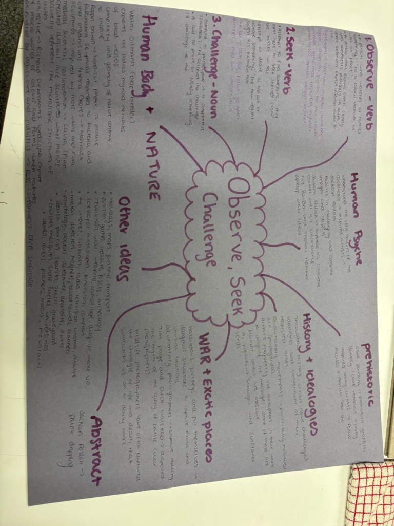
Observe, Seek, Challenge

Definition

The aim for this theme is to observe people going about their every day life, while trying to capture the decisive moment.

Mood Board

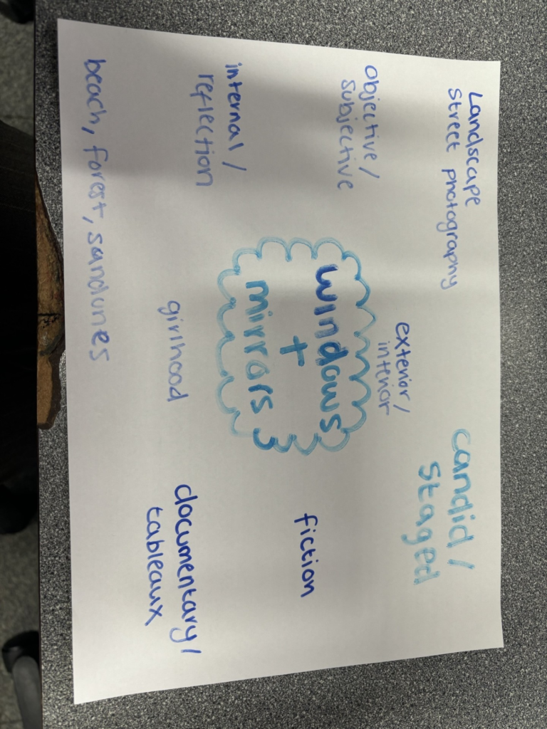
Mind Map

Anthropocene Final Images

Analysis

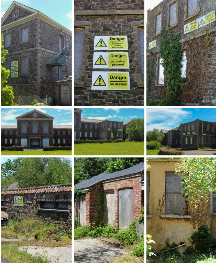
I think my final images came out well and they have been edited well. However, I prefer the St saviours hospital photos more, because they have better lighting. Next time, I would visit Bouley Bay again, but when its lighter, so that the images come out less dark. However, I did edit the images well, to increase the exposure. This was the lighting in the images before the editing:

I also like have I have sets of images that go together with both the St Saviour’s hospital and Bouley Bay.

Analysis

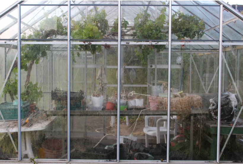
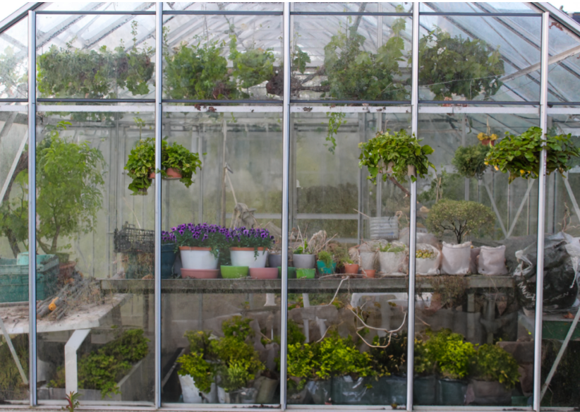
I love the images of the smaller greenhouse, because it presents what’s inside the greenhouse very well and has a good composition. It also has good contrast between the green of the grass and the dull dirt on the greenhouse walls and the colour of the greenhouse.

The image at Trinity is a good photo, but it was quite dark when the photos were taken, so if I were to do this again I would visit Trinity again, but when it is lighter, so the lighting is better. However, I edited the image well, so it had more exposure.

The images of the larger greenhouse are very vibrant and there is lots of green colours, which pop and make the image much more eye appealing. These images also have good lighting and composition.

If I were to ever photograph greenhouses again, I would love to experiment with flash lights and different coloured gels more, when the sun is starting to set, because I think the images would turn out very good, but when I tried it this time it was very difficult to make it work, so I will have to be more prepared with a plan and bigger, more powerful flashlight.

Analysis

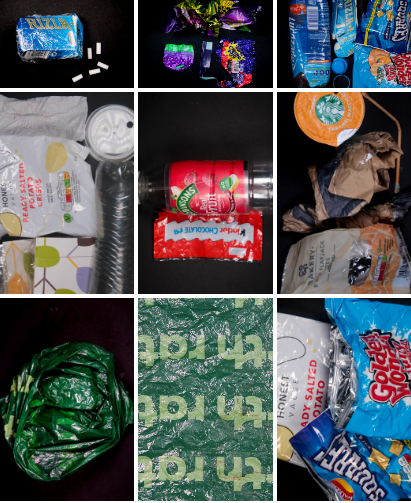
I liked the discarded plastic photoshoot and thought the rubbish looked good against the black background and really stood out. However, if I were to do this again I’d want to collect more rubbish and place the camera further away so I can make larger patterns with my colour coordinated litter.

The single item images came out well, as it made them stand out lots and be more eye appealing, especially against the black background.

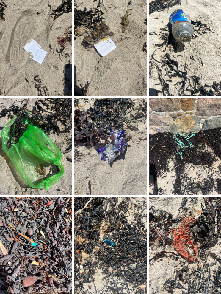
I liked the photoshoot of litter found on the beach, because it really presented how much litter there is in these natural environments, which habitat animals. However, if I were to do this next time I would remember to put a card in my camera, so that the images had better quality. I would also experiment more, so there were no shadows of my phone or camera.

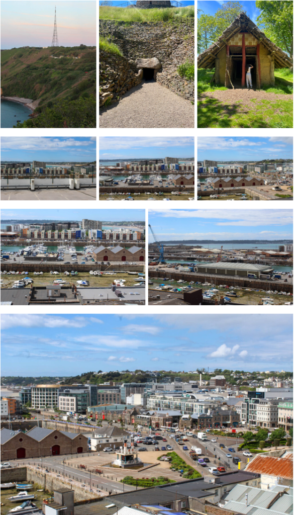
I really liked this industrialisation photoshoot, because it allowed me to explore different places, and it allowed me to explore how industrialisation has changed and developed over time. It also showed me how many built up places there are in Jersey, never mind the rest of the world. It also gave me an idea of how the world is developing and what it is going to be like in the future.

Analysis

My images showed fly tipping very well, as there were lots of furniture items that were just discarded. I also enjoyed this photoshoot, because I didn’t think that fly tipping happened that often in Jersey, but this photoshoot really opened my eyes.

Analysis

I really enjoyed this photoshoot, because these images show how there are smaller pieces of litter, such as cigarettes, which do effect the earth, because there are so many of them, but people do not really notice this, or worry about it, when it does actually have a huge impact and I think this photoshoot presents this. If I were to do this photoshoot again, I would use a camera instead of my phone, so that the quality is better.

Photoshop

Experimenting with AI

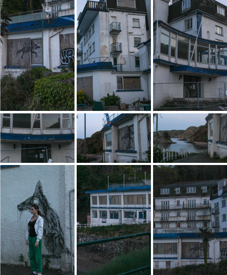
I used AI in photoshop to edit images of the abandoned hotel at Bouley Bay, so that I could give it a more rustic look, so that it looks much older and more destroyed. I did this by selecting the image I wanted to use and dragging it to photoshop. The image I used was;

I used this photo, because it captured both the abandoned building, as well as the natural environment surrounding it. It also captured the graffiti, which is often left on abandoned buildings.

Next, I went to filter and selected neutral filters. Then, I downloaded the landscape tab and selected a colour theme that would be suitable. Lastly, I adjusted the strength and saved the image.

Then, I experimented with some different colour themes.

I used AI to experiment with my greenhouse images, because I wanted to display how greenhouses should be used, and how they used to be used very often. I did this by using AI to add more greenery, bushes, flowers etc. to my greenhouse. The prompts I have used are below.

The original picture is a sad greenhouse, which has nearly no green in it, because it was rarely used. It also has quite a few dead plants.

The image with AI shows how greenhouses used to look and how they should look today.

I used AI to go into the past here, by adding more greenery, more alive plants and bushes.

For Industrialisation, I decided to go into the future, to see what our town would look like in a few years. I used AI in the same way to do this, by adding different prompts:

These are examples of the prompts I have used to edit this image.

This is the original image of a popular recognisable place in St Helier.

I wanted to edit the picture to show what this place will look like eventually, if things do not change and people continue to damage the earth.

There are many more buildings, because of industrialisation, as well as over population, which is also why there is more cars. There is smoke to represent air pollution, as well as the water in the bottom left harbour to represent rising tides and how much they will rise due to global warming and ice bergs melting. The changes are very subtle, but they present of huge message.

Cropping

Cropping images can be important for many different reasons. You may want to crop something or someone out of an image, or you may want to zoom in closer on the main view point of the image. Cropping also allows us to explore the negative space in an image, by cropping it out.

There are also many different ways you can crop images;

  • Portrait Format
  • Landscape Format
  • panoramic crop (vertical or horizontal)
  • square crop
  • circle crop
  • polygon crop
  • etc

Firstly, I am going to experiment with portrait format. I am going to be using Lightroom to crop these images.

This is the image I have decided to crop, so that I can crop out the negative space around the greenhouse, so that I zoom in on the greenhouse more, which is my main viewpoint.

This is how my final image came out after that first crop.

Next, I decided to crop out the negative space at the grass a bit more, so that I could zoom in on the greenhouse even more so.

I also experimented using a portrait format for a few other images.

This is the next image I used.

I used the cropping tool on Lightroom to do this.

I wanted to crop the image in this way, so that I could really zoom in on the abandoned building, so all the damage was more visible.

I cropped the negative space on the left out of this image, so that I could zoom in on the damaged section of the green house more, as that is my main viewpoint for this topic.

Next, I wanted to try and experiment with a person in one of my images.

I cropped out the negative space either side of the main viewpoint and also a little bit of negative space below the viewpoint, so that is was more in balance with the negative space above the viewpoint.

I think portrait format images work best for when you want to remove negative space from either the right or the left of the main viewpoint, as it allows the image to zoom in more on the main view point. I think the portrait format worked well on my images, but I do think it worked best on the image with a person, so I do think it could be better used for people.

Landscape cropping will be useful for cropping out negative space that is either above or below the main focus of the image. I also think landscape format cropping will work better for my images as they are landscape images.

This is the image I have chosen to crop in Lightroom in landscape format, because it is a beautiful landscape shot and I think this format would work best for it.

I wanted to zoom in on the tower more, as that is the main viewpoint and the main part of my topic. I also wanted to crop out some of the negative space below and around the tower, so that there was less distractions.

Next, I experimented with other images.

Next, I experimented with a more busy landscape image.

I wanted to zoom in on the 5 building in a line, as they were the main view point of the image.

Next, I wanted to experiment with complimentary colours, while cropping.

These green and red colours compliment each other, as they are opposite sides of the colour wheel, I wanted to zoom in on the colours so I could get a closer up.

I think the landscape format images worked well for my landscape images as it allowed me to crop out the negative space and zoom in on my main view point. Using complimentary colours ad cropping to zoom in on them worked very well, as they complimented each other and created some harmony in the image.

I think square cropping will be useful to crop out all the negative space in an image, so it is only the main viewpoint that is in the image. It will also be useful to create an equal amount of negative space all around the main view point, so that it is centre.

I used this same Image for my square crop, because I wanted to zoom in on the greenhouse even more, and present how one image can look entirely different, just by the way it is being cropped.

I used the cropping tool on Lightroom to do this.

I used the square cropping tool to zoom in on my main view point.

The square cropping worked well for removing all negative space from my images, so I could create close up images.

I cut the jagged edges off this image previously and now I have cropped out the negative space, so I can zoom in on the tower.

I cropped off the jagged edges to this previously and now I have decided to really zoom in on the busiest section on this panorama.

These cropping work well, but I do not see the full point of them after making a panorama from a series of images, which will look like the ones I am cropping.

Black and White Images

I edited these images:

I did this by creating virtual copies of each image and making them black and white in Lightroom. Then, I experimented with contrast, whites, blacks, highlights etc. until I was happy with the images.

I think making these images black and white worked very well, especially with the abandoned building images, because it gave it almost an eerie vibe. I also prefer black and white images to ones with colour, so I prefer these images.

Virtual Gallery

I used ArtSteps to create my virtual gallery. I first chose the gallery I wanted and then imported all the images I wanted to use into the gallery. Then, I positioned them where I wanted the images and then finally added the dark brown frames to them.

I used ArtSteps to create this virtual gallery and added black frames, because I thought they went with the images the best.

I used ArtSteps to create this virtual Gallery and added a dark brown colour, similar to a tree trunk, because I thought it fit with the theme well.

I used ArtSteps to make this virtual gallery and I added black frames, because I thought they looked best with the black background.

I used ArtSteps to create my virtual gallery and I added dark brown frames to each image, because I thought it was the most aesthetically pleasing.

I used ArtSteps to create this virtual gallery and I used white frames, because I thought it looked better with the sand colour and made the colour of the litter pop more against it, as it didn’t take any attention way from the litter.

I used ArtSteps to create this virtual gallery. I added black frames to the darker images and white frames to the sand images, because they blended in more and looked better. They also didn’t take the focus off the image, even though the items in the images were smaller and less noticeable.