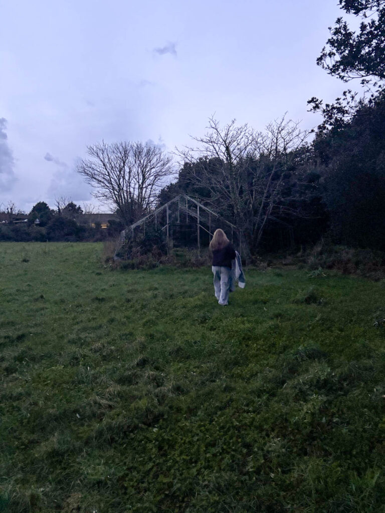
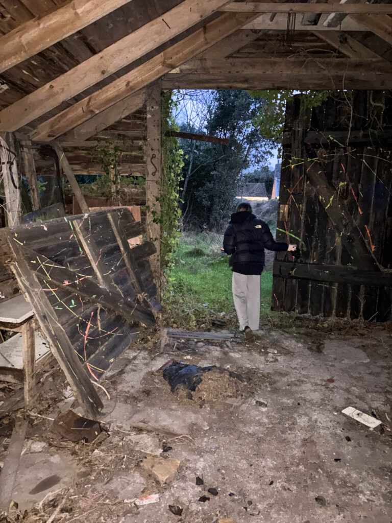
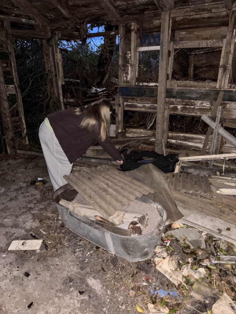
For this photoshoot I focused on borrowing ideas, concepts and compositions from my chosen historical paintings, as well as photographs that Jeff Wall and Justine Kurland have taken. I have also experimented with different compositional features, such as the rule of thirds, foreground, middle ground and background, as well as experimenting with visual elements, such as tone, texture, line etc.
My Inspiration
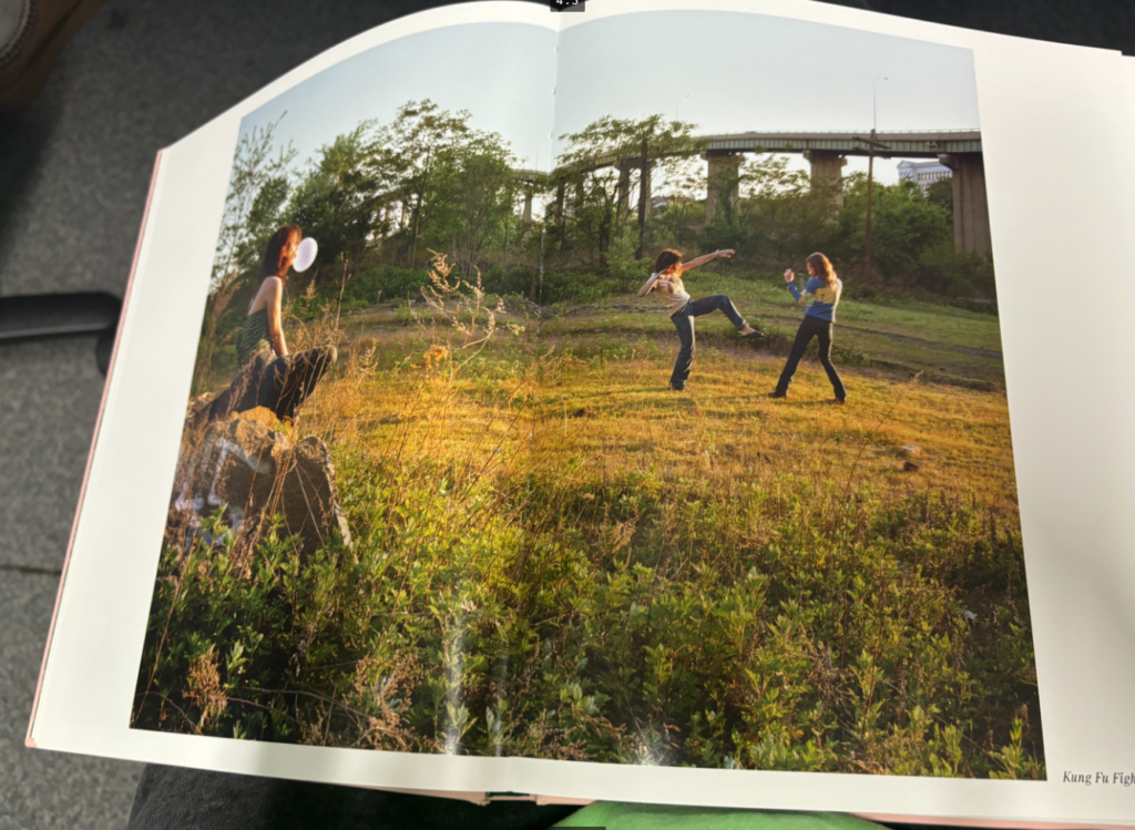
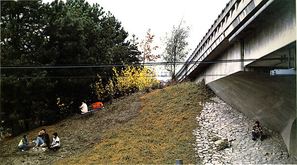
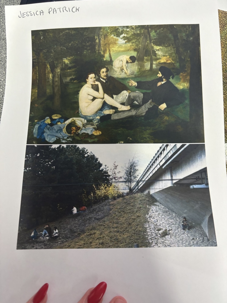
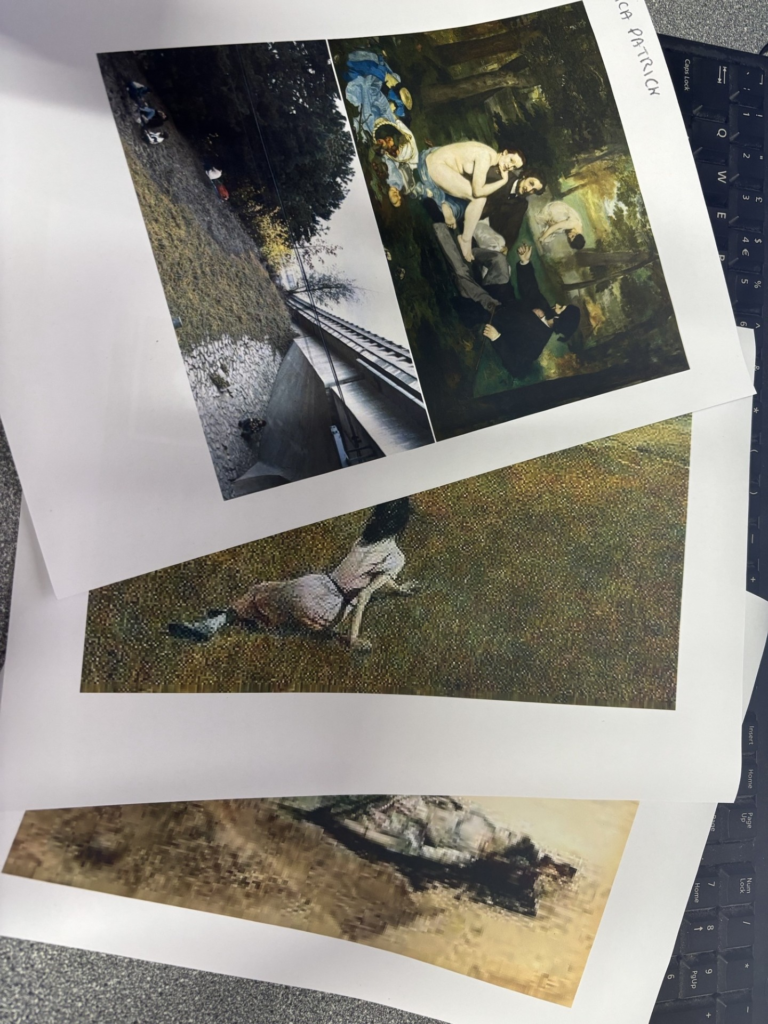
The images below are the historical paintings that I have decided to borrow ideas, concepts and compositions from, because they either have a really good composition, or tell a story.

I have printed off each of these paintings on an A4 piece of paper and I took these prints out with me, while I was doing my photoshoot, so that I could see the images, while I was manipulating my models, composition, layout etc, so that I could see them side by side and compare them.
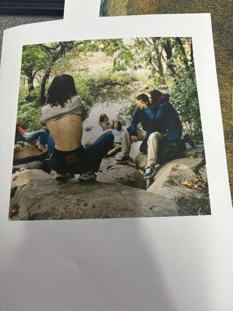
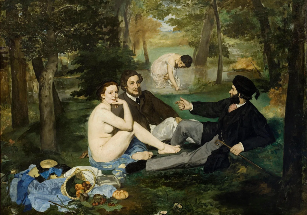
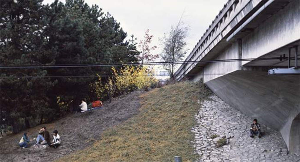
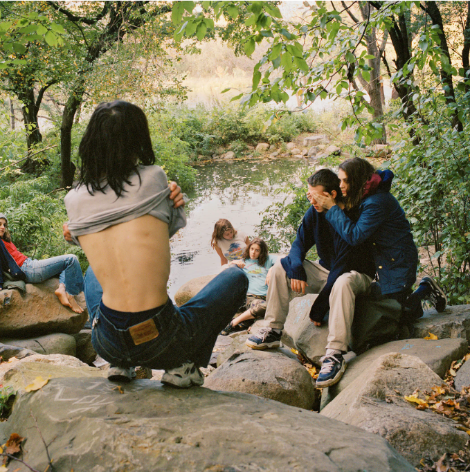
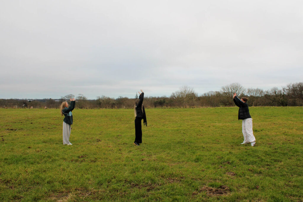
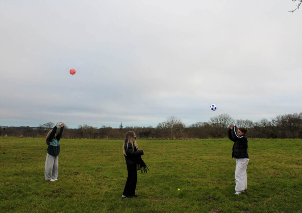
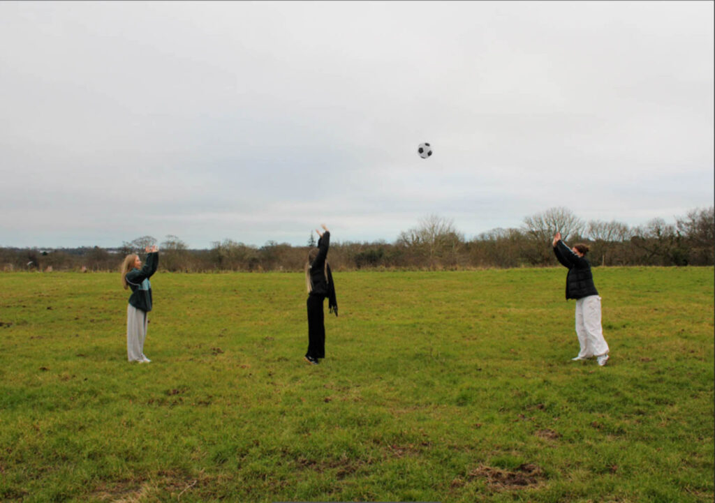
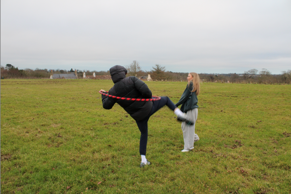
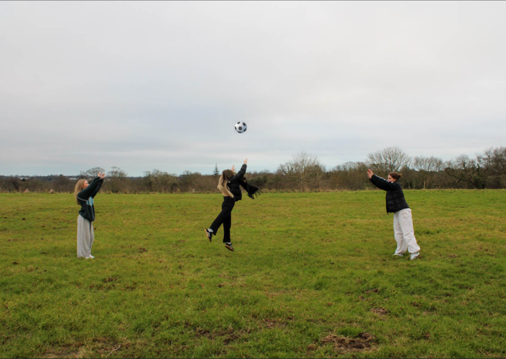
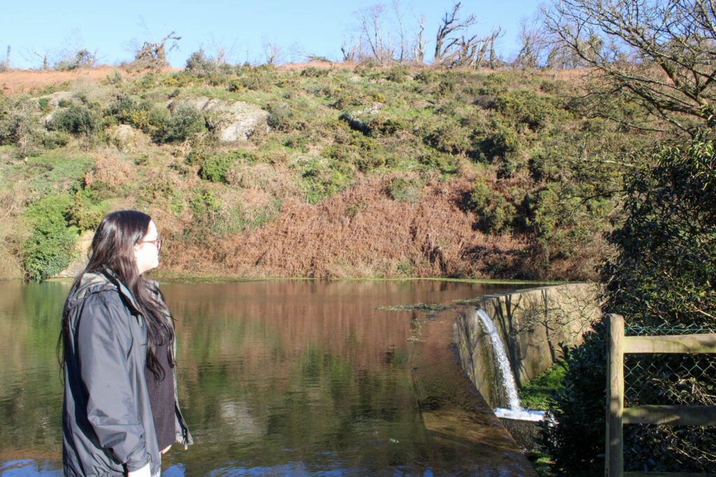
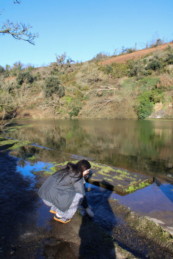
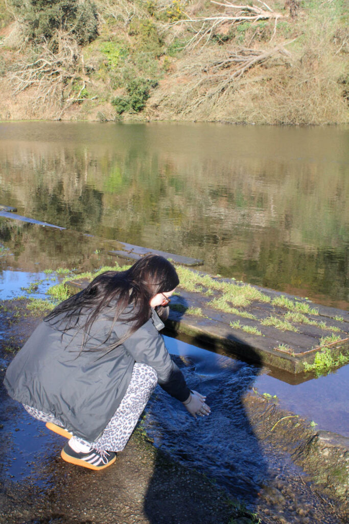
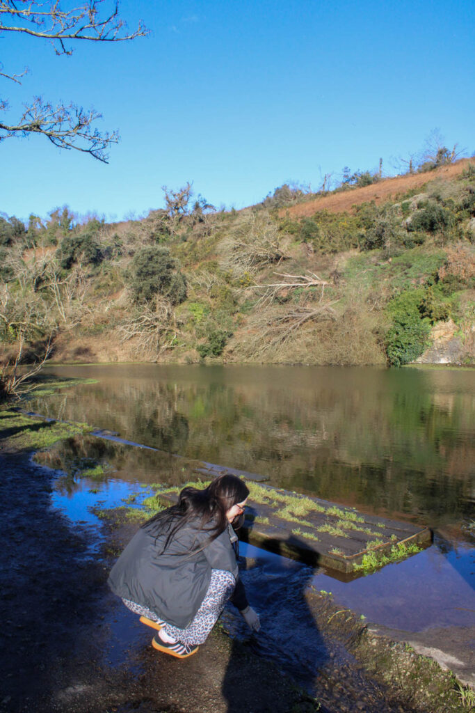
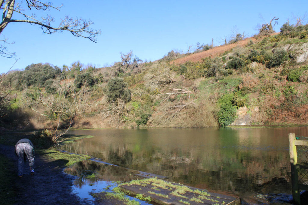
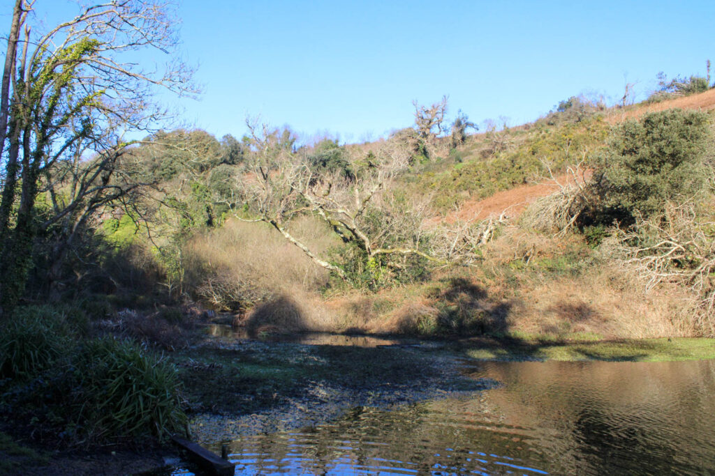
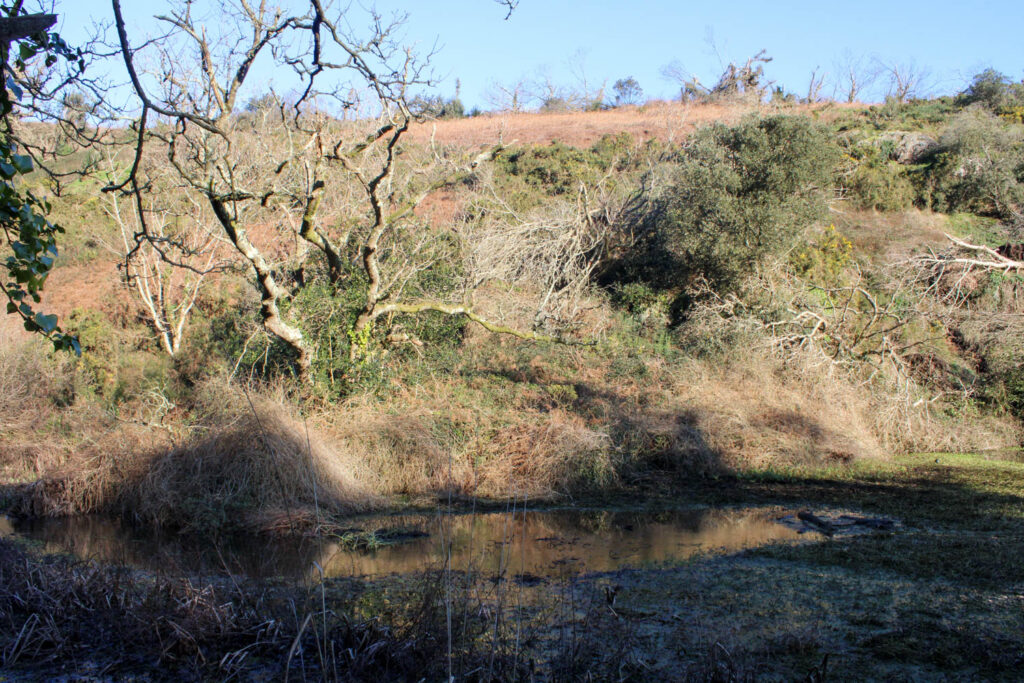
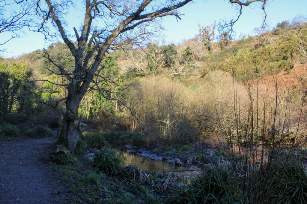
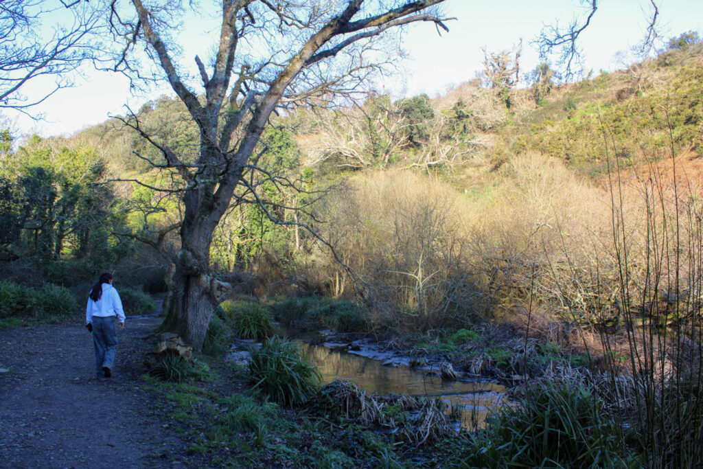
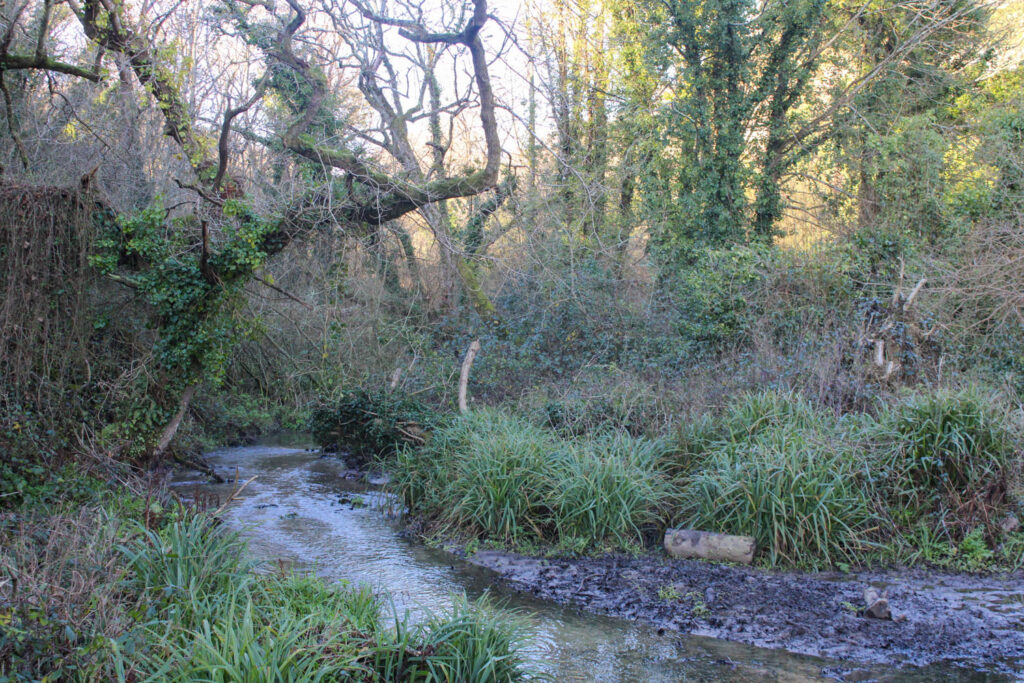
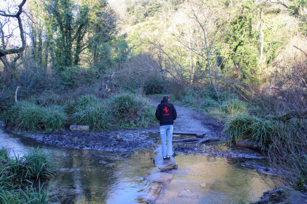
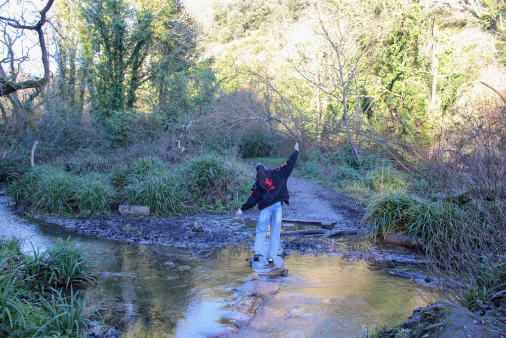
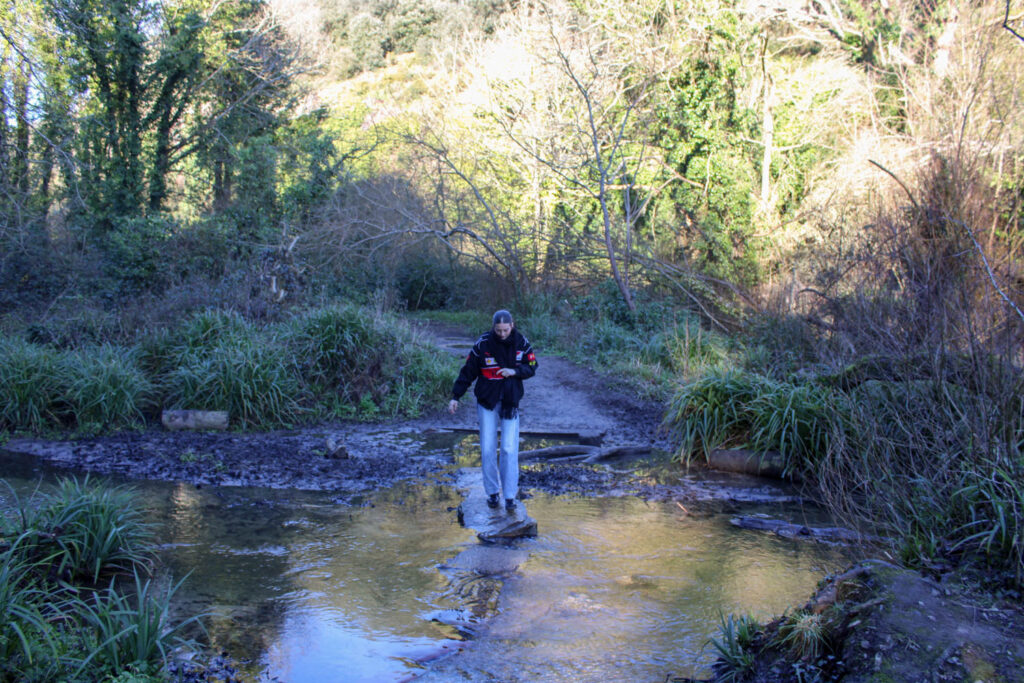
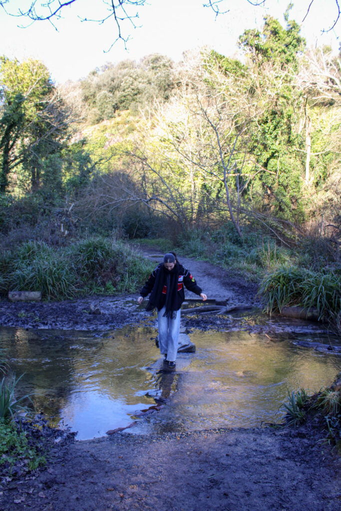
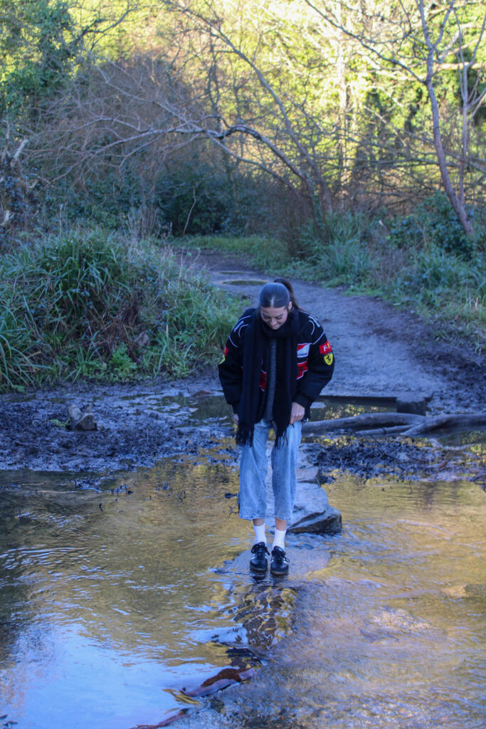
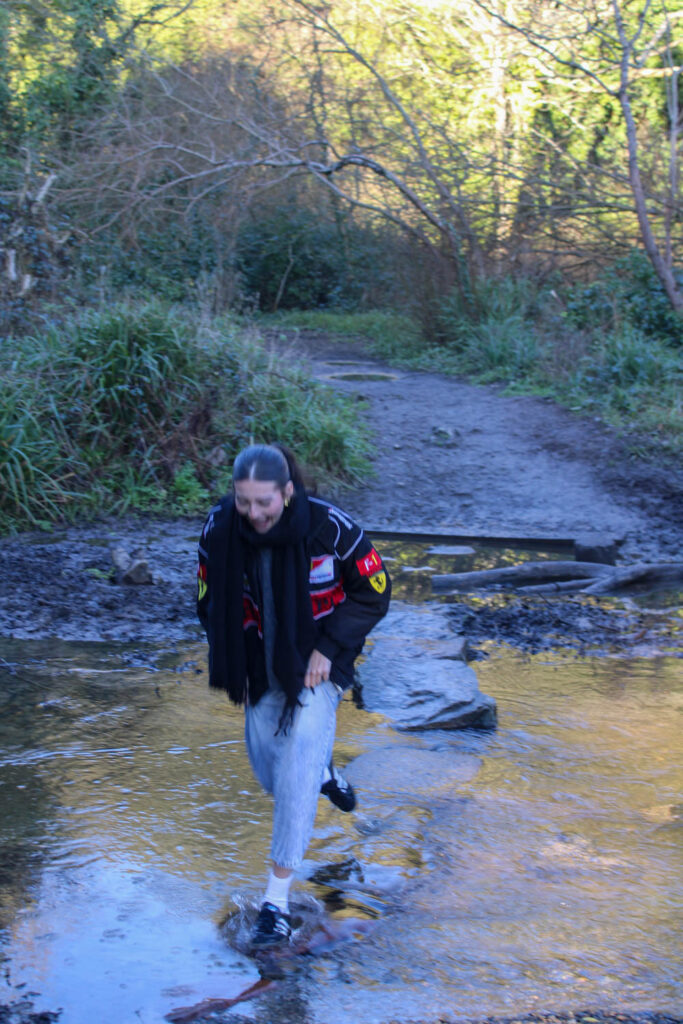
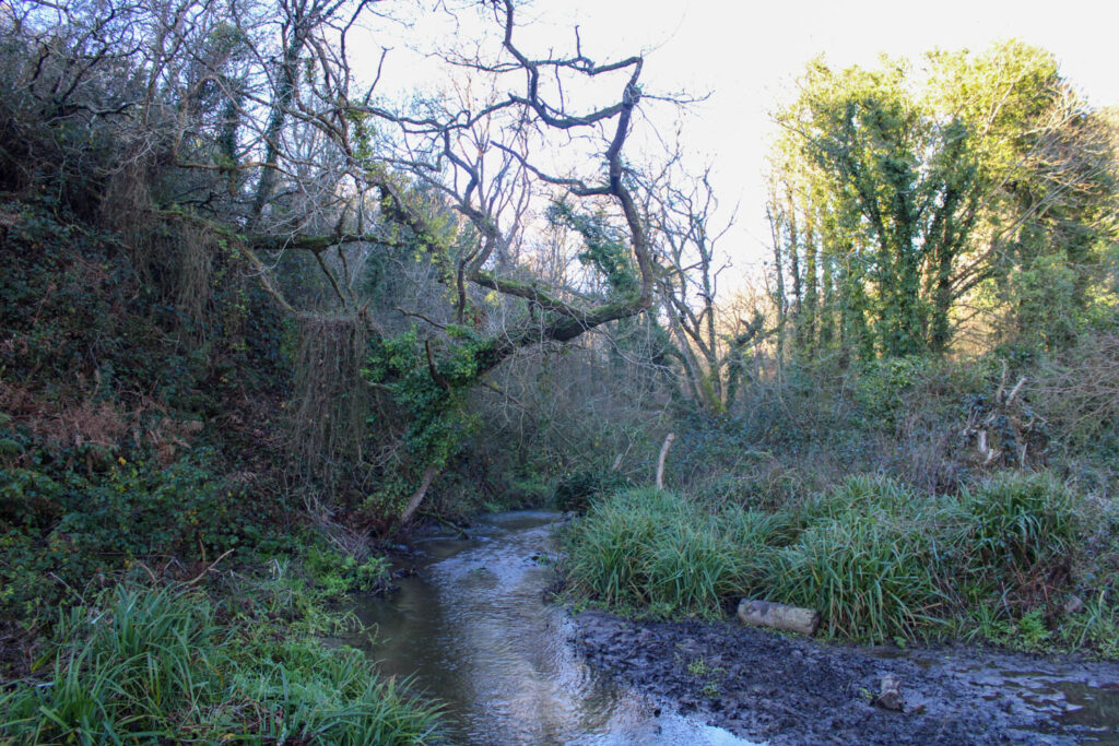
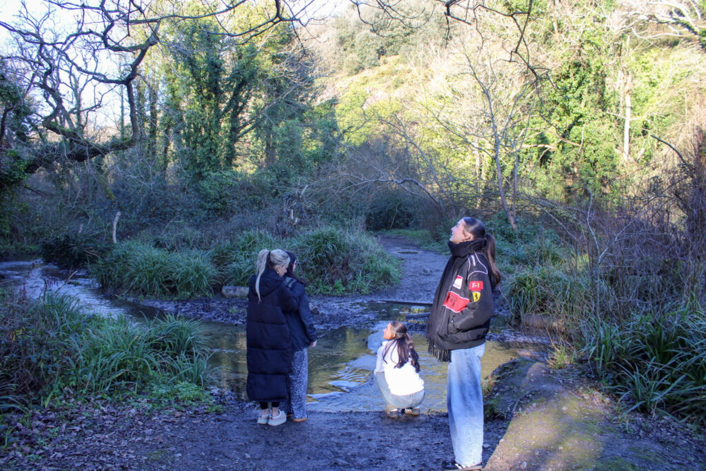
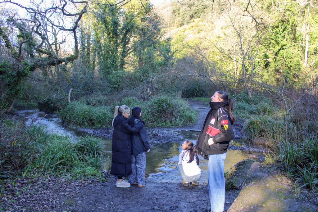
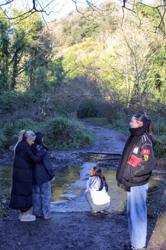
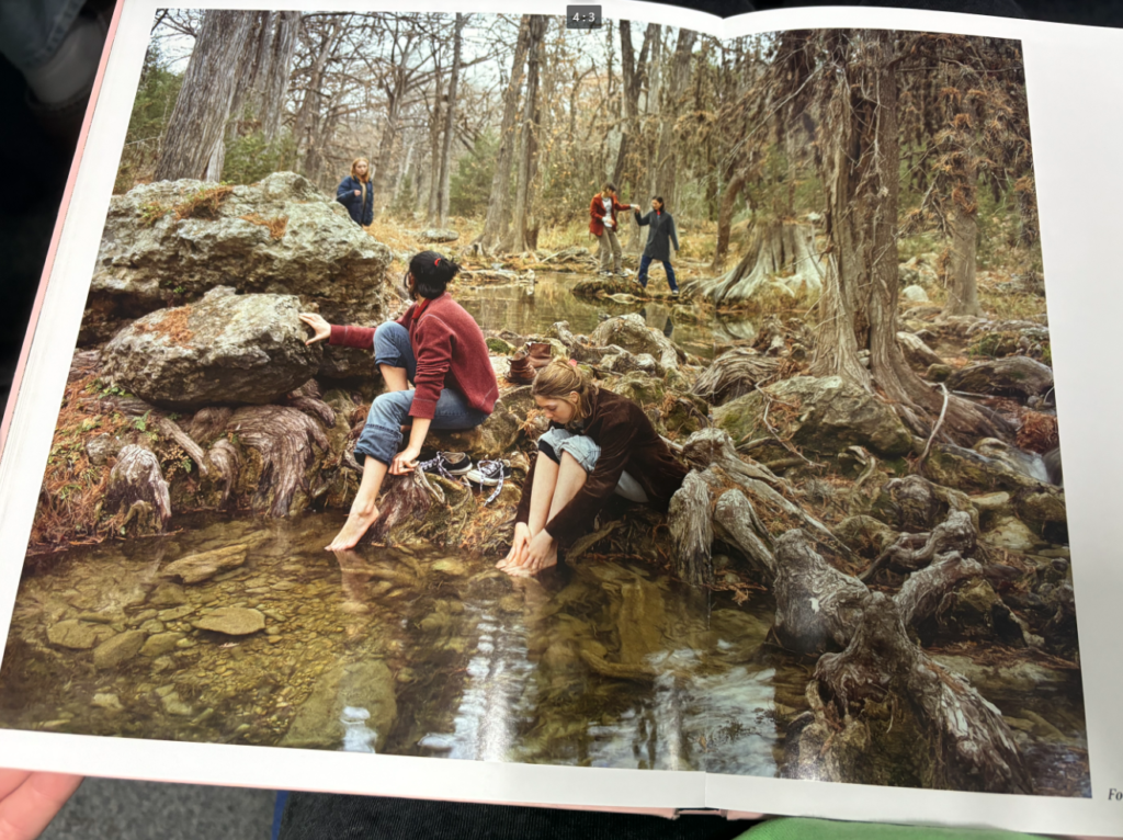
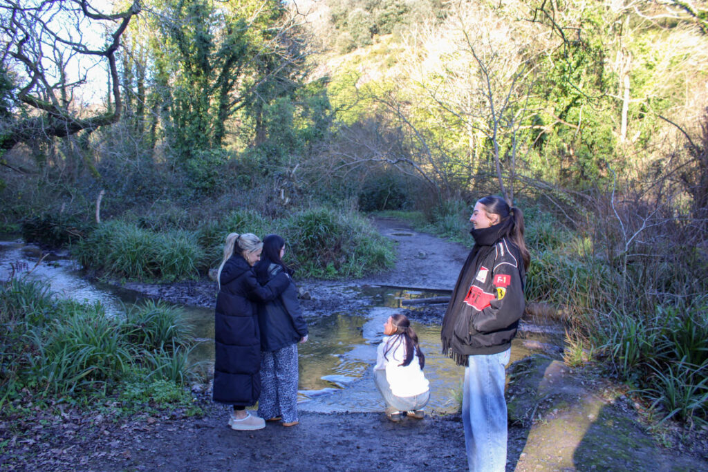
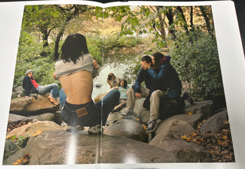
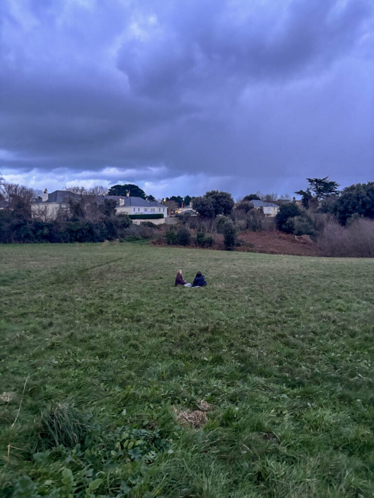
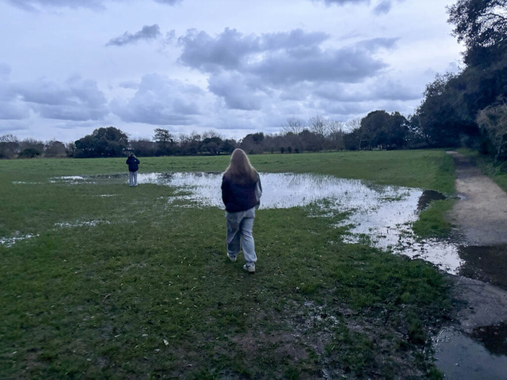
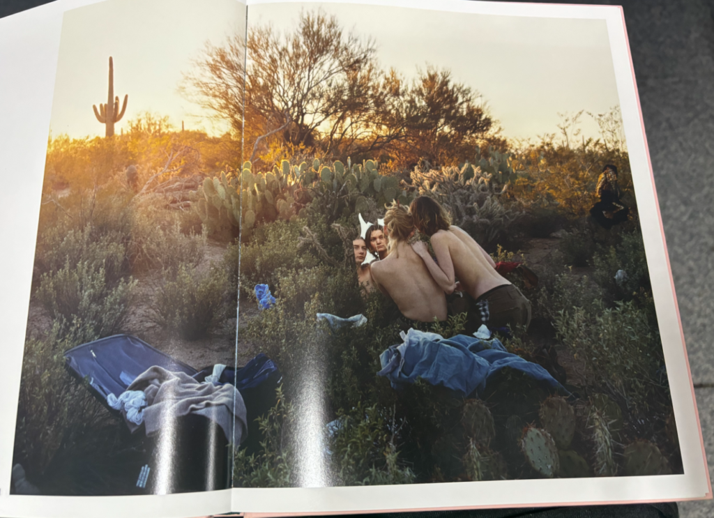
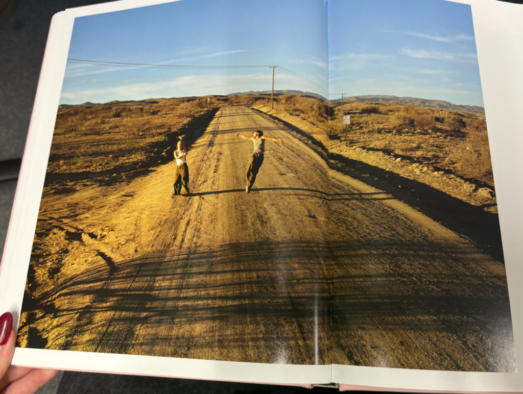
For these three images, I will take a more similar approach to Justine Kurland’s image, as I will use my female models to create the foreground, middle ground and background composition. I will also have a similar setting to Manet’s painting and Justine Kurland’s image, with the trees and the lake.
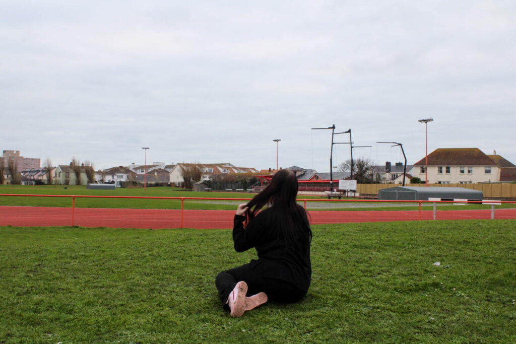
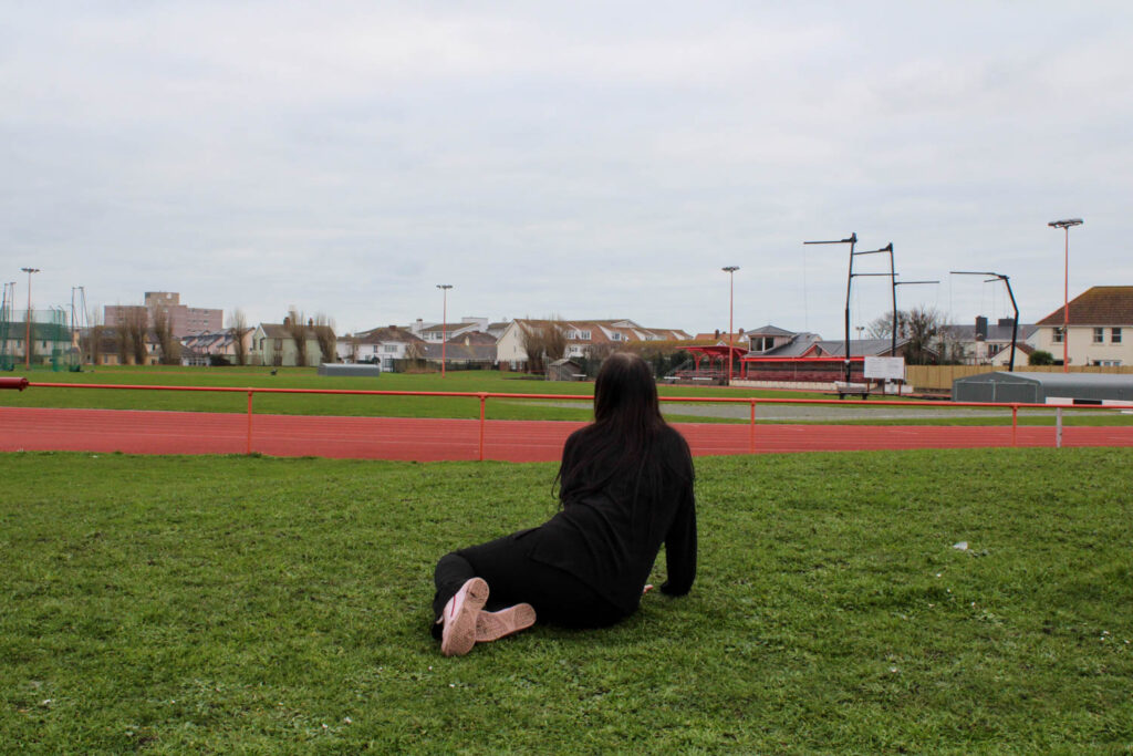
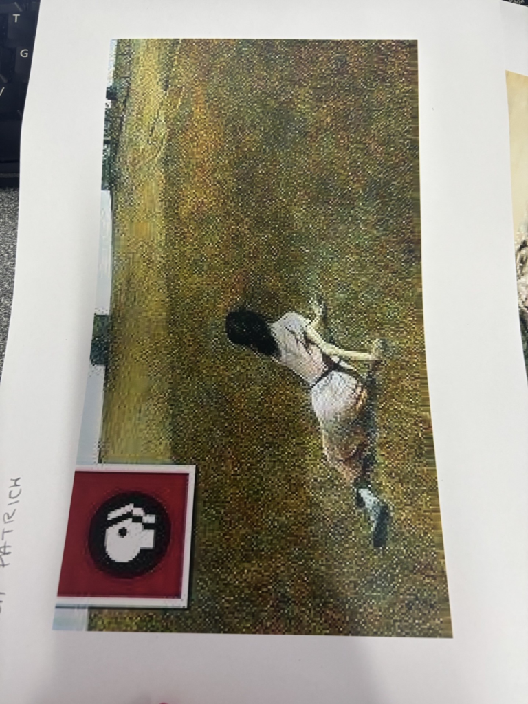
When making my photograph using this painting as my inspiration I have used one model sitting in a field in the same way. However, the narrative of my photograph is different to the narrative of the painting. In my photograph the model is sat in the field making daisy chains, compared to in the painting, where the women is dragging herself along a field, because she has polio and can no longer walk. I have altered this narrative, so that it fits the theme of youth, because this is an activity I used to do in my youth.

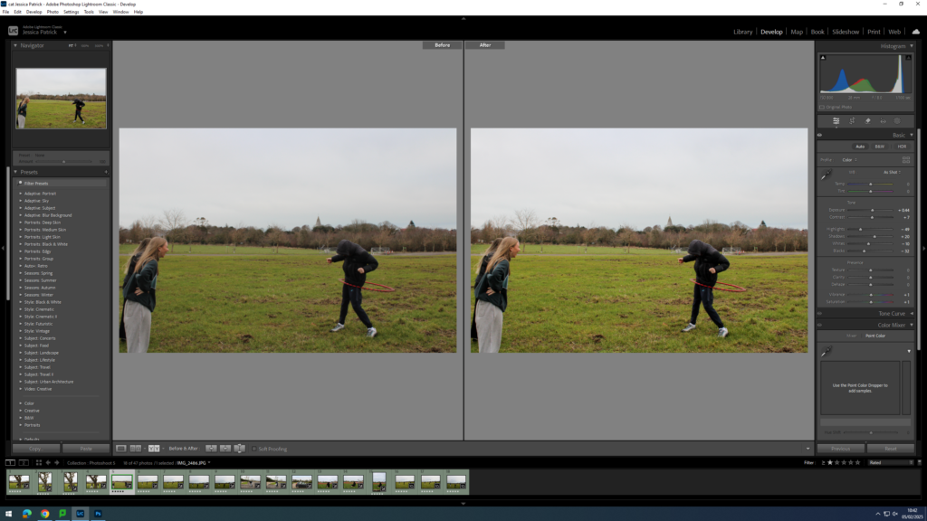
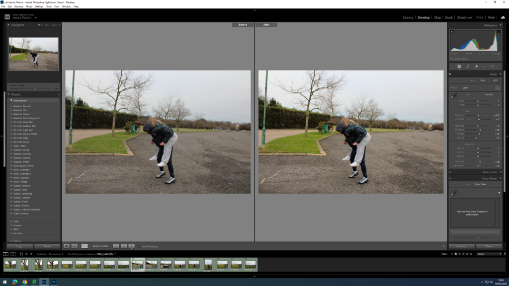
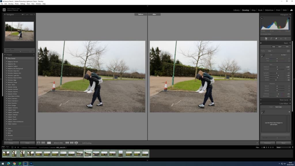
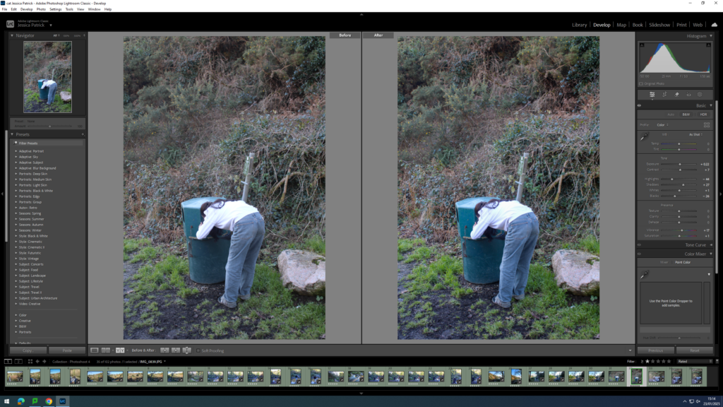
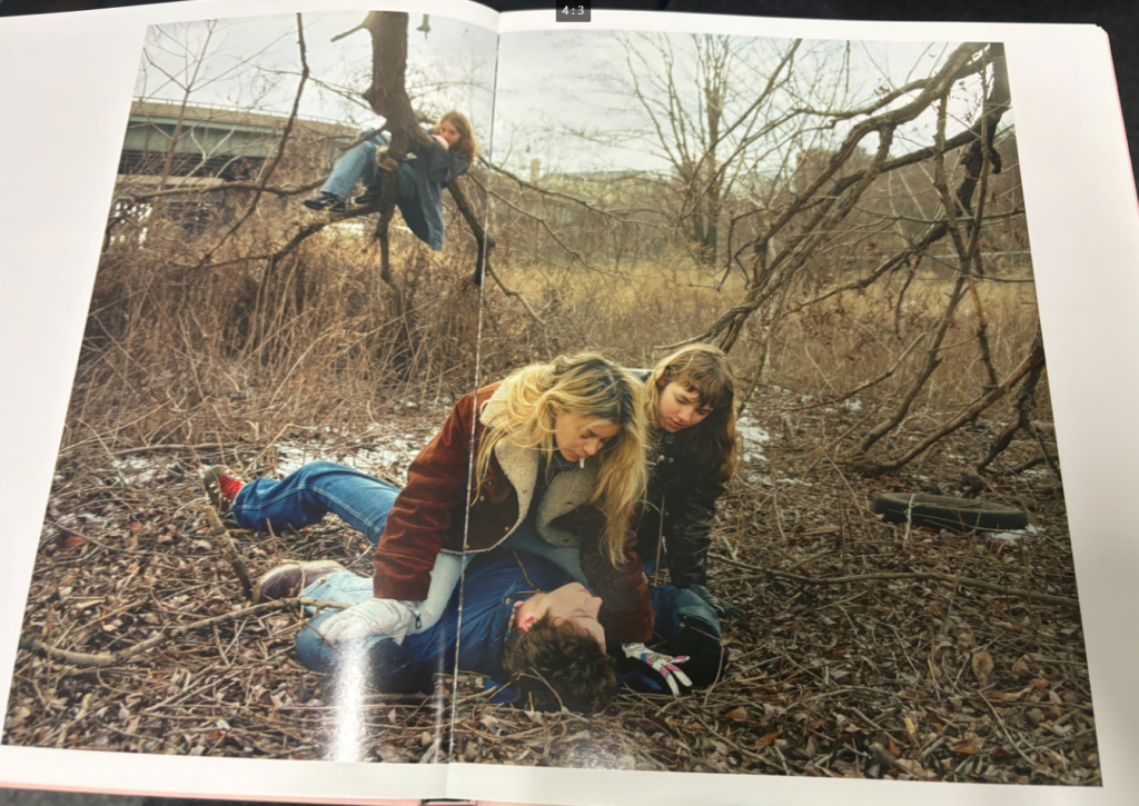
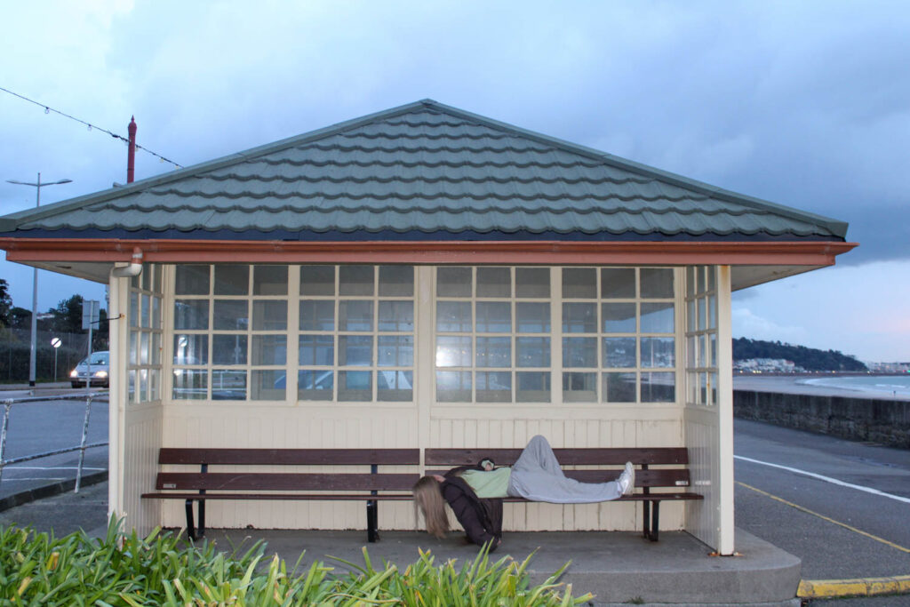
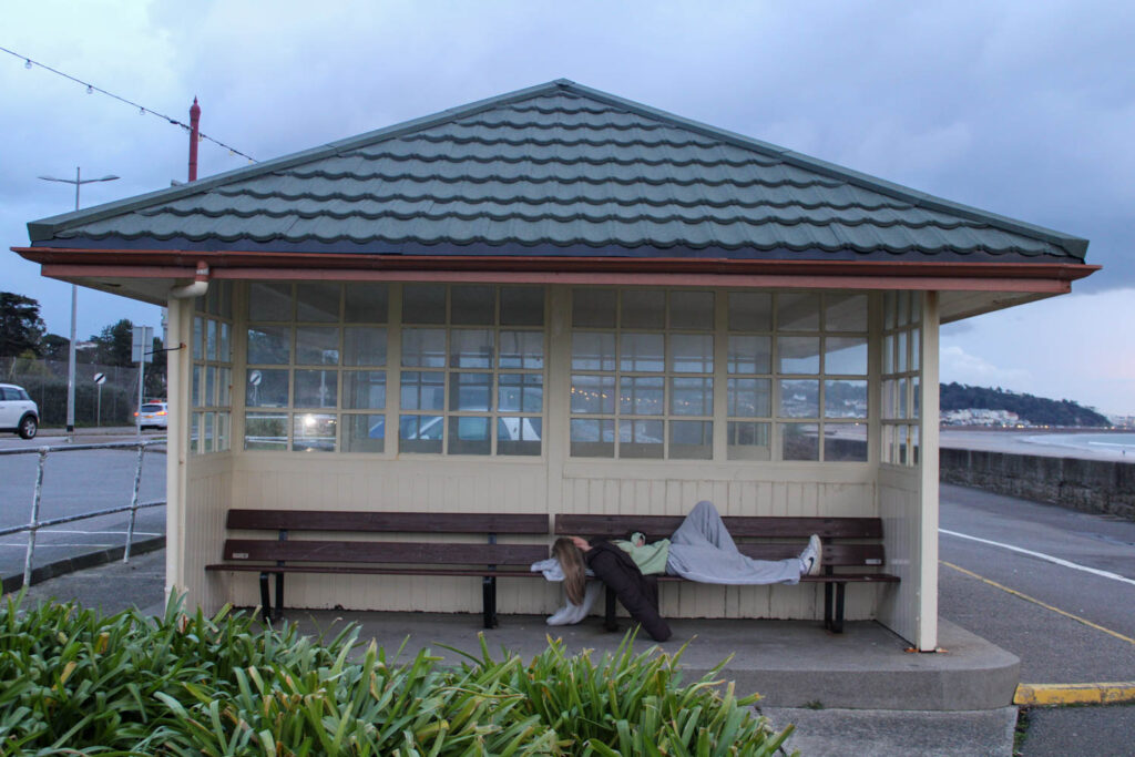
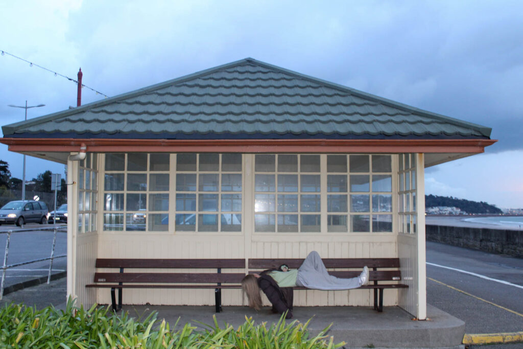
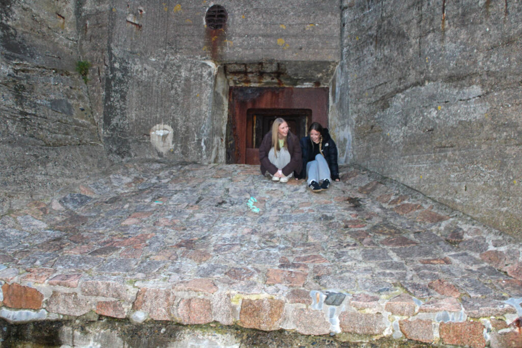
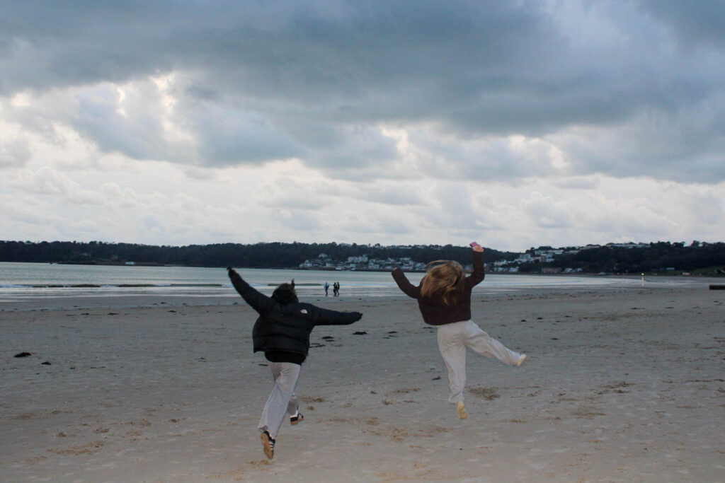
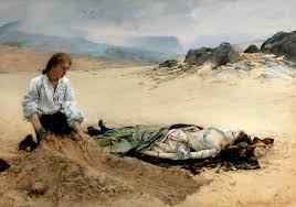
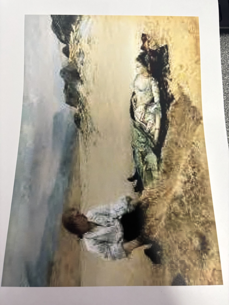
When making my photograph using this paintings as inspiration, I have borrowed the composition and idea from this painting. I had my model lie where the women is on the floor and I had another model on there knees beside them. However, instead of the narrative of my image being a dead woman and a man burying her at the beach, I have altered the narrative to fit my theme of youth. Instead, the narrative of my photograph is two younger children playing at the beach and having one bury the other in the sand in a fun, instead of upsetting way. I have altered the narrative of the painting in this way, because this was an activity I used to do in my youth with my friends, when we would play at the beach on a hot summers day.
Edits
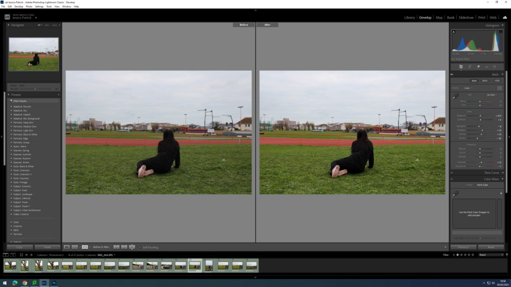
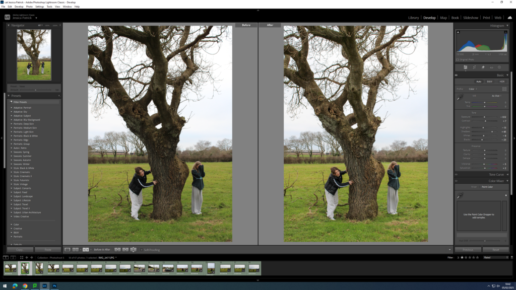
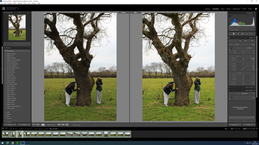
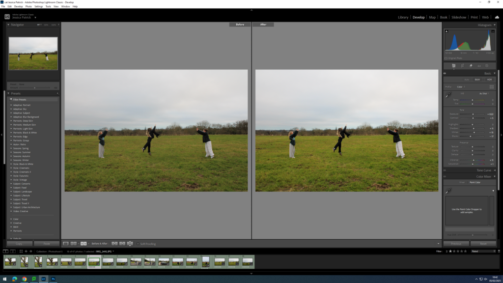
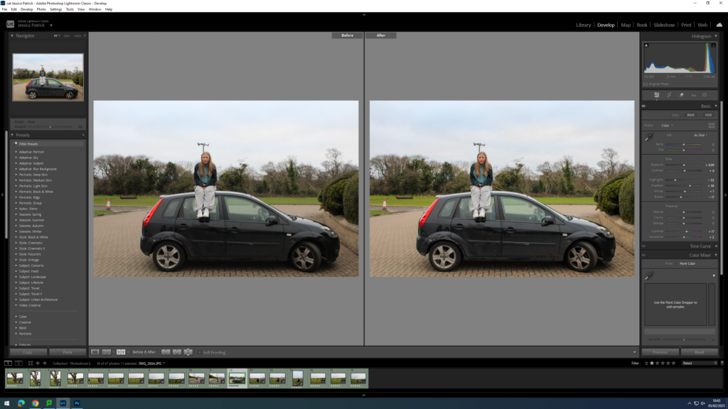
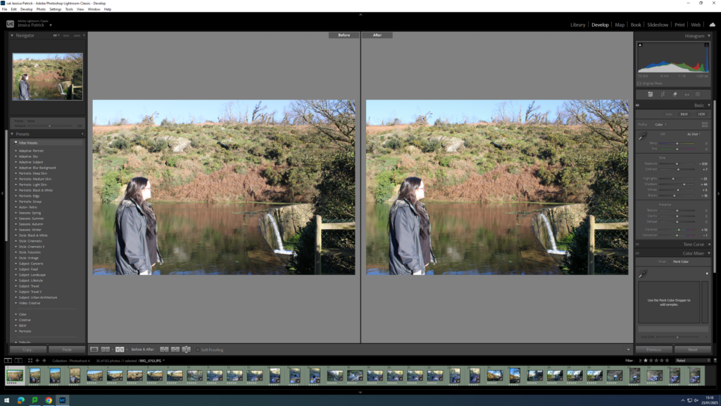
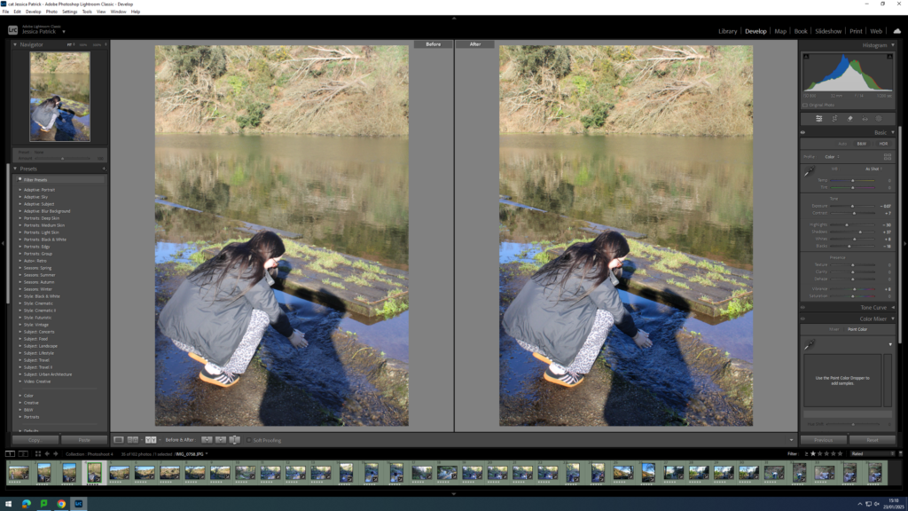
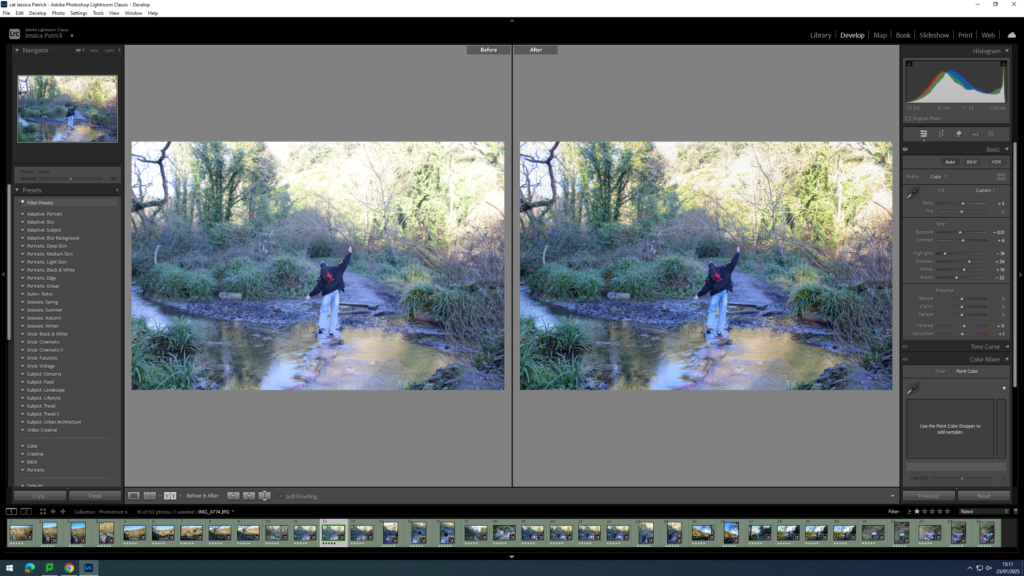
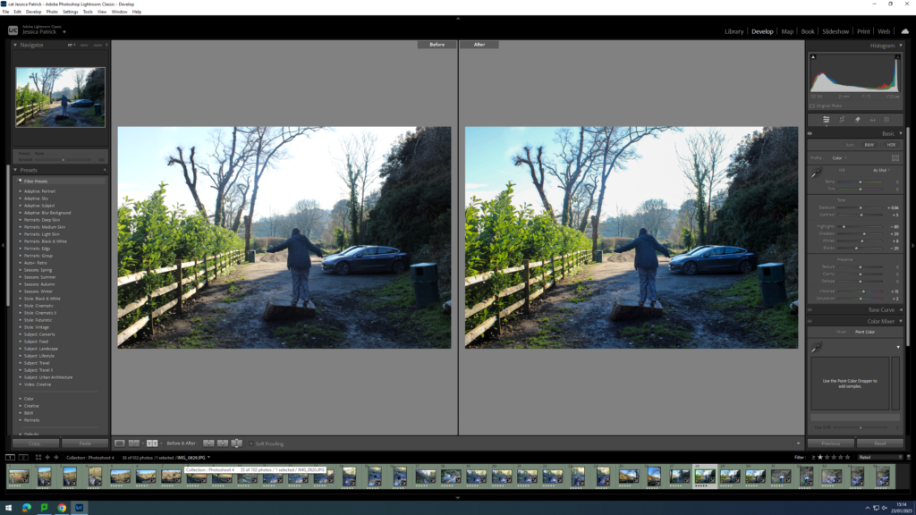
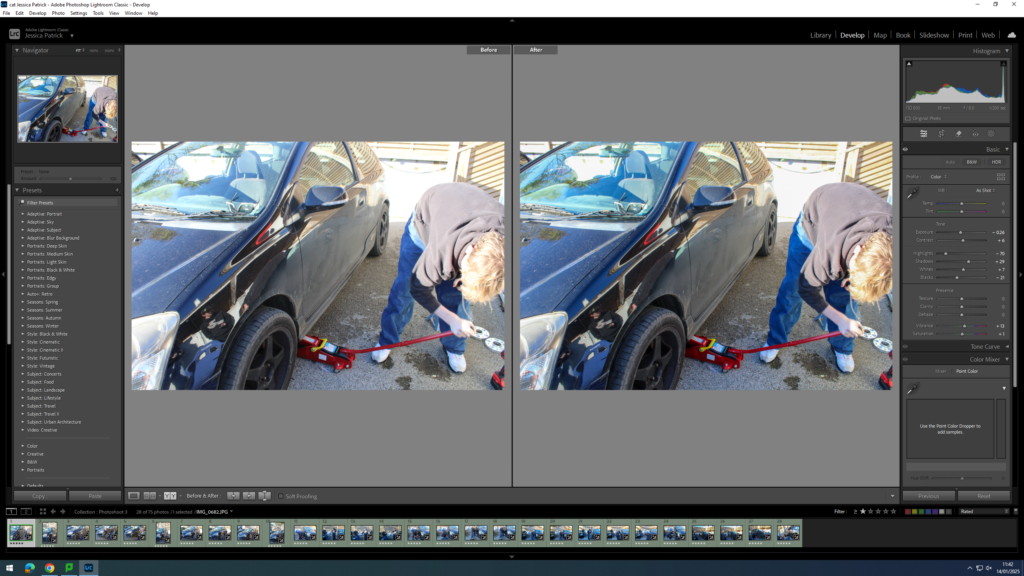
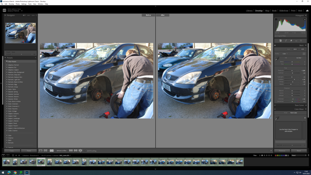
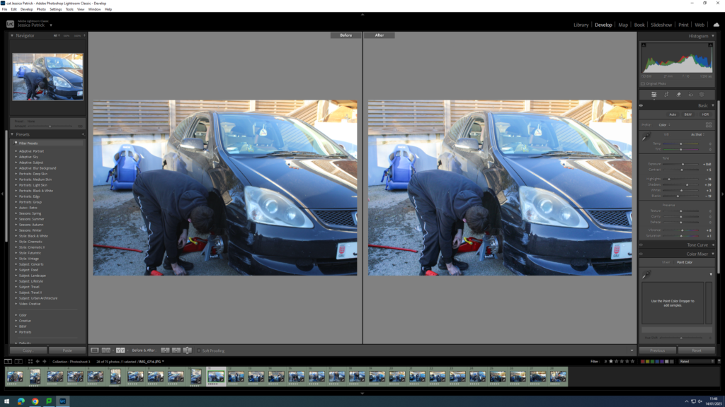
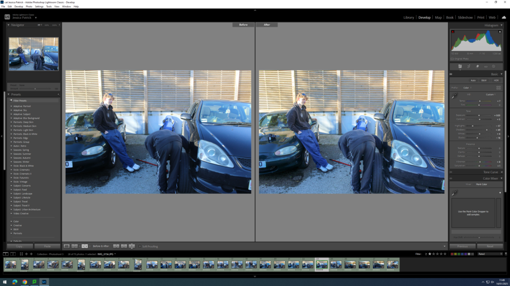
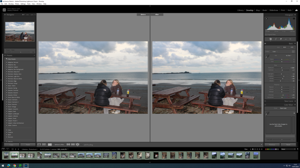
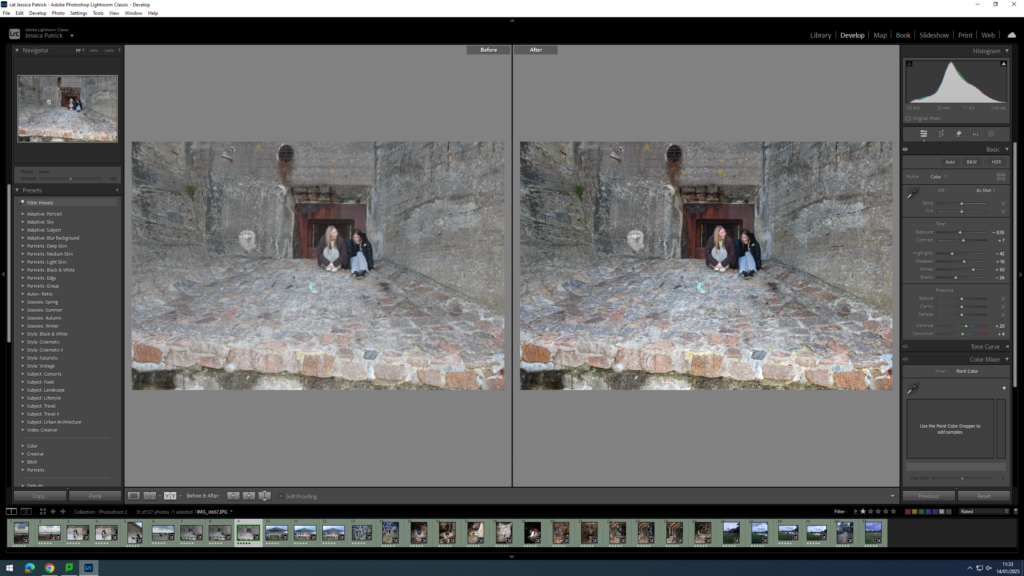
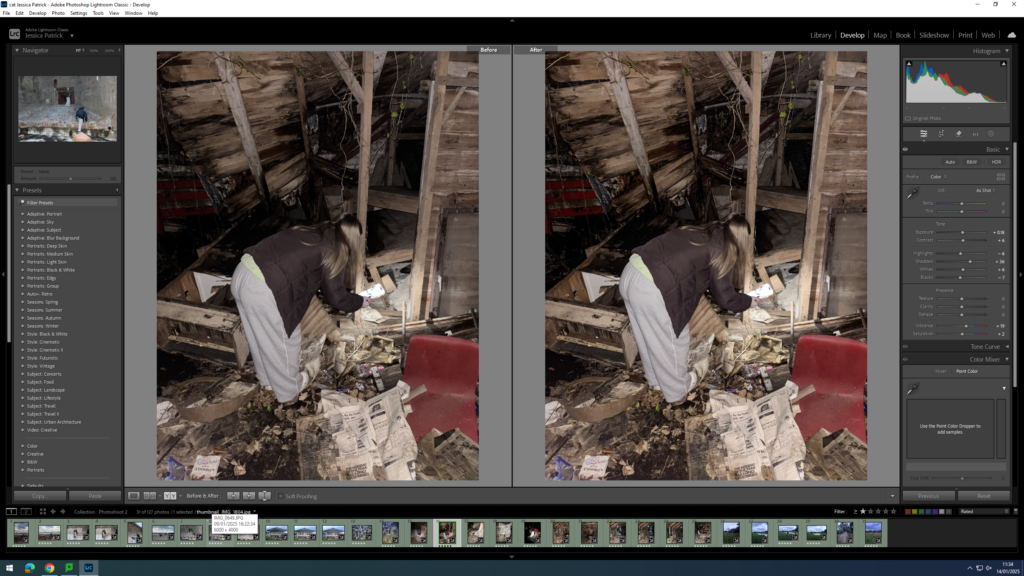
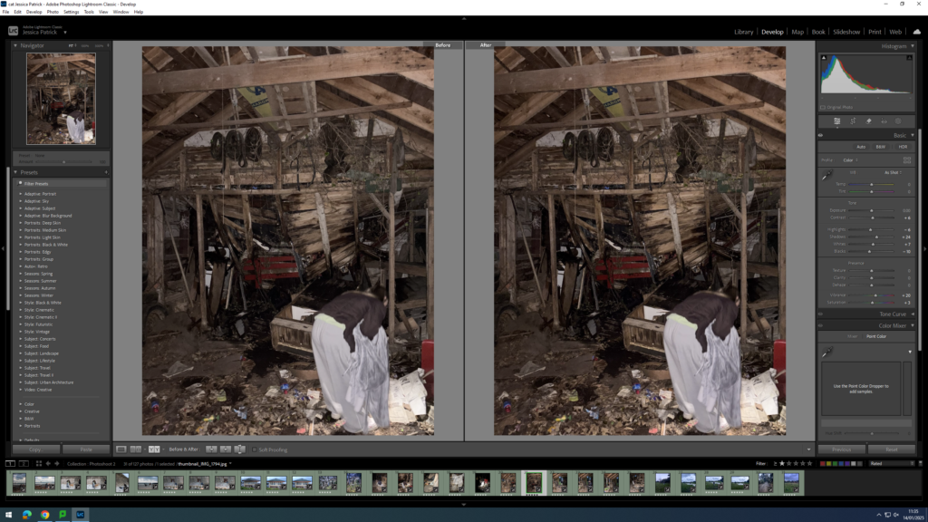
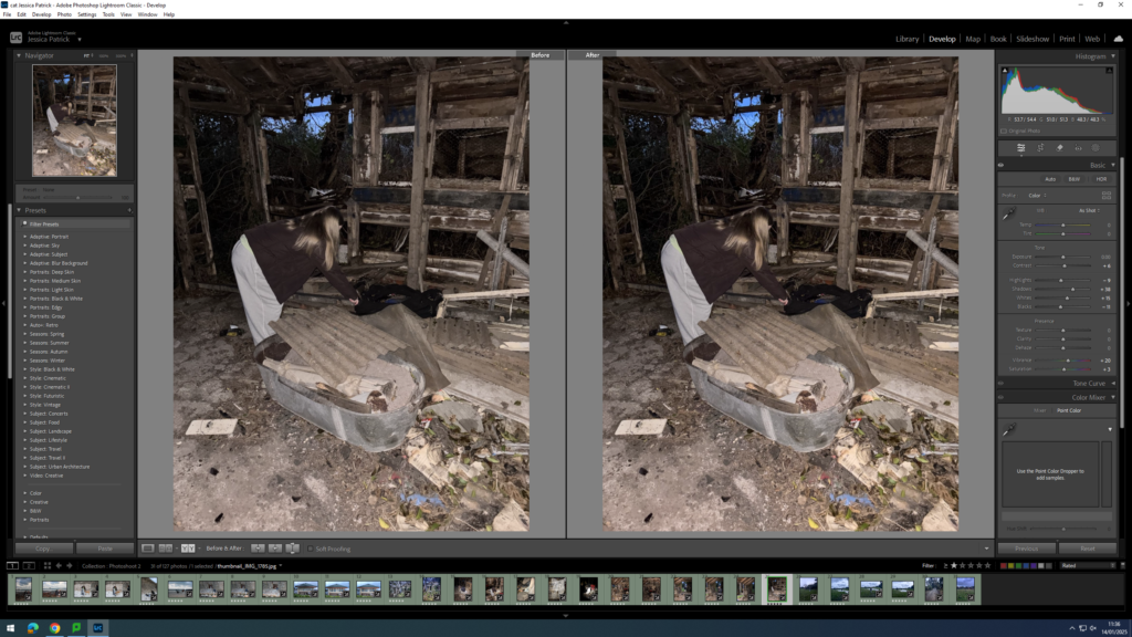
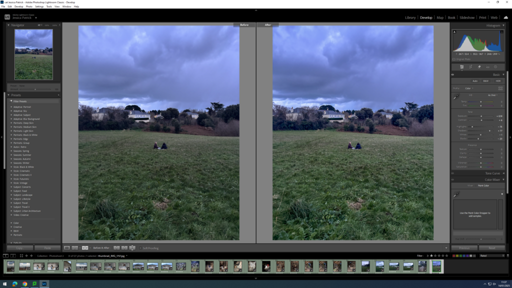
I edited this image by increasing the contrast, shadows, whites and vibrancy, while decreasing the exposure, highlights, blacks and saturation. I did this, so that the image would have better lighting, by being slightly brighter.

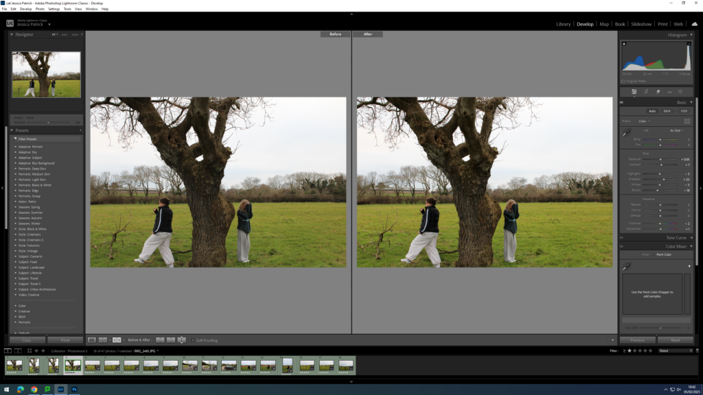
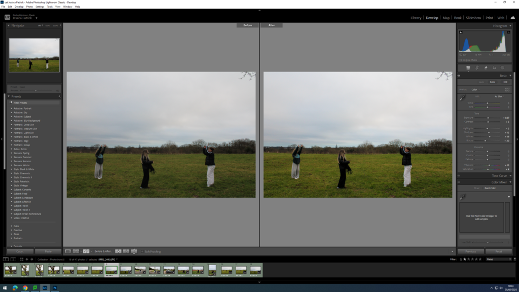
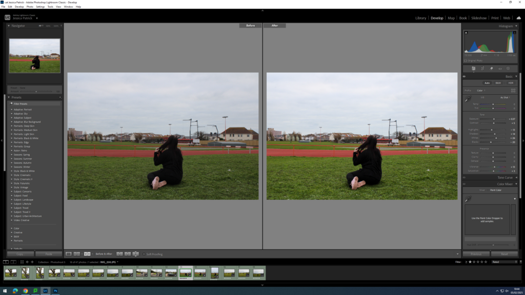
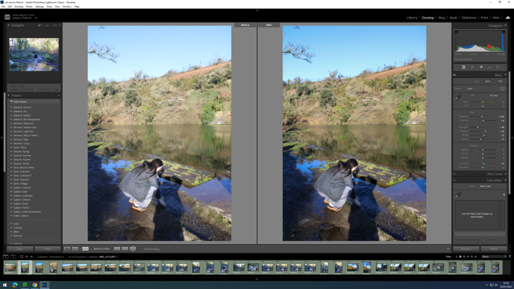
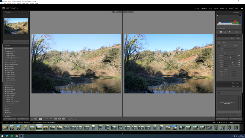
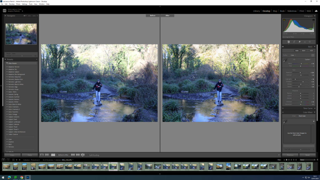
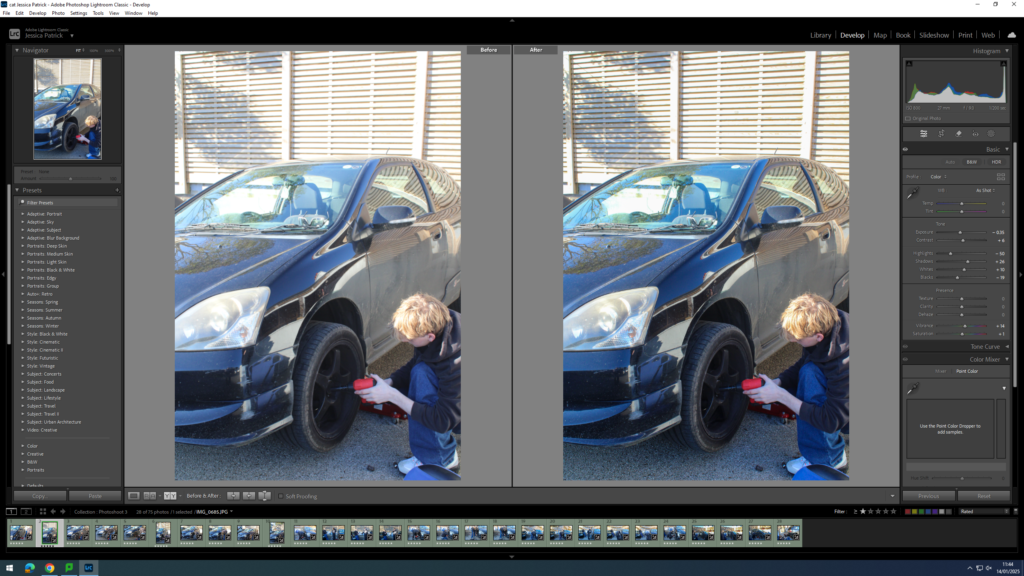
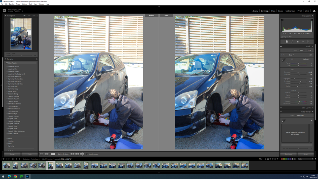
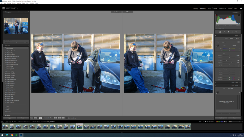
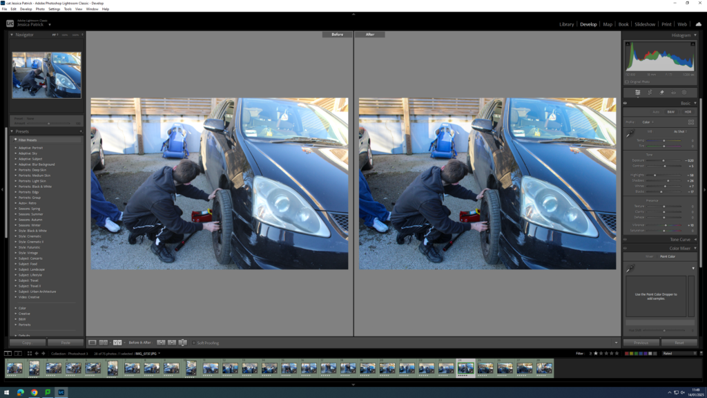
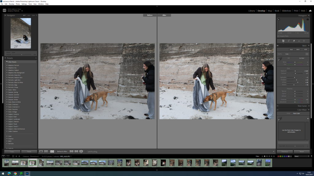
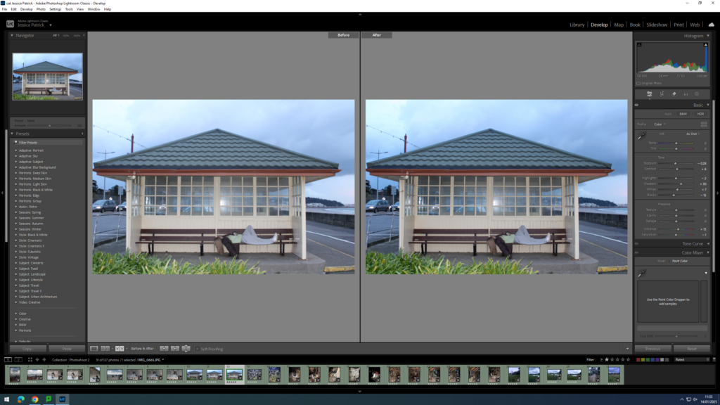
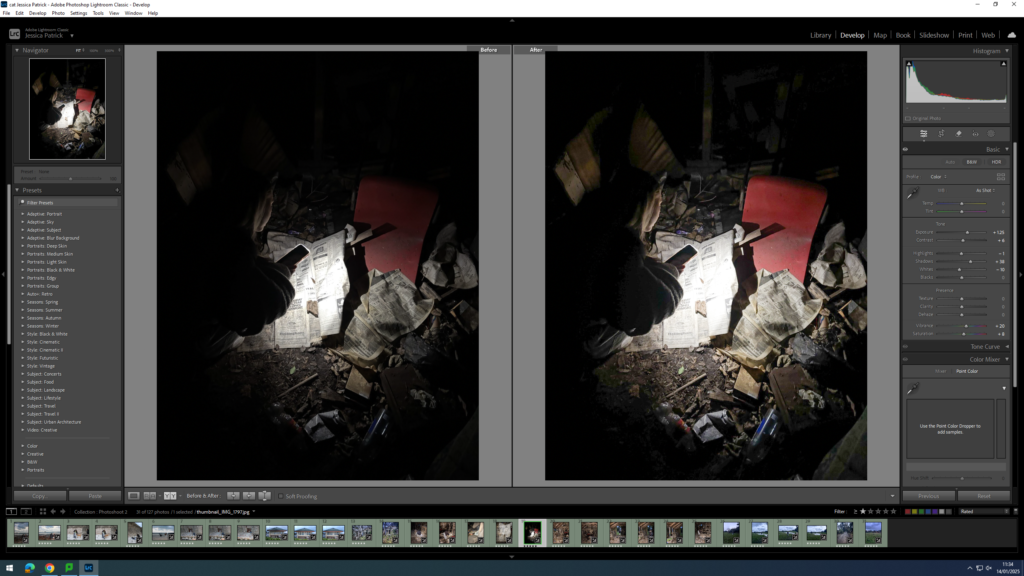
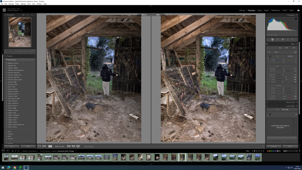
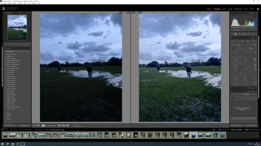
I edited this image by increasing the exposure, shadows, whites, vibrancy and saturation, while decreasing the highlights and blacks. I did this, so that my image would be more vibrant and less dull.
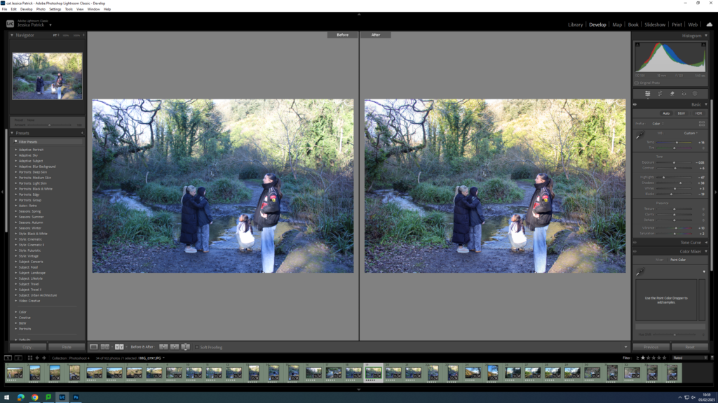
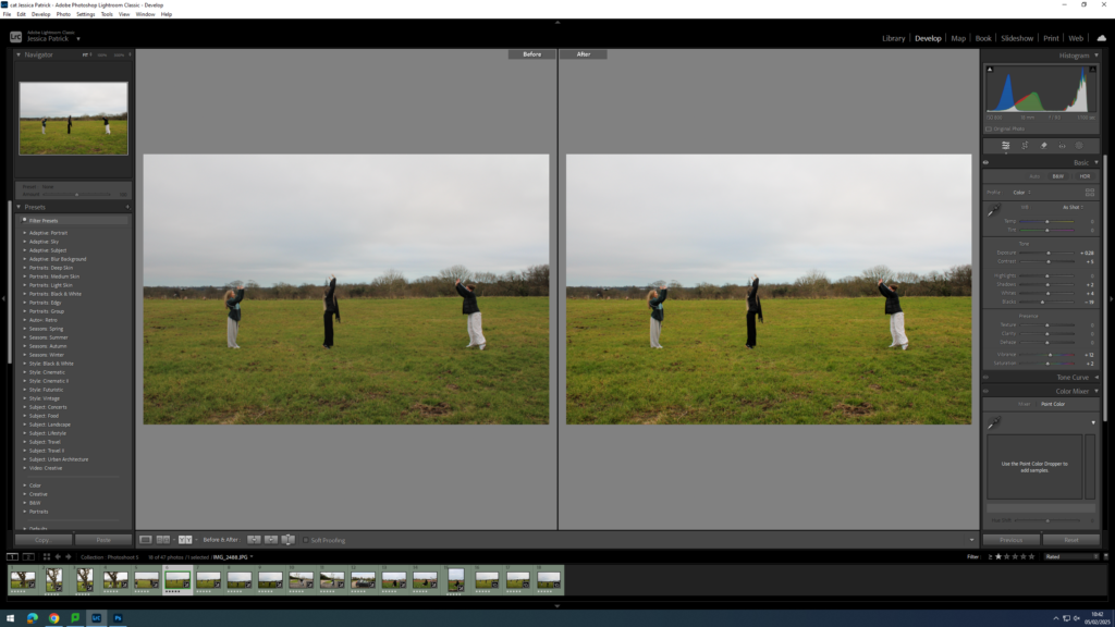
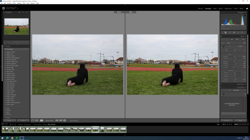
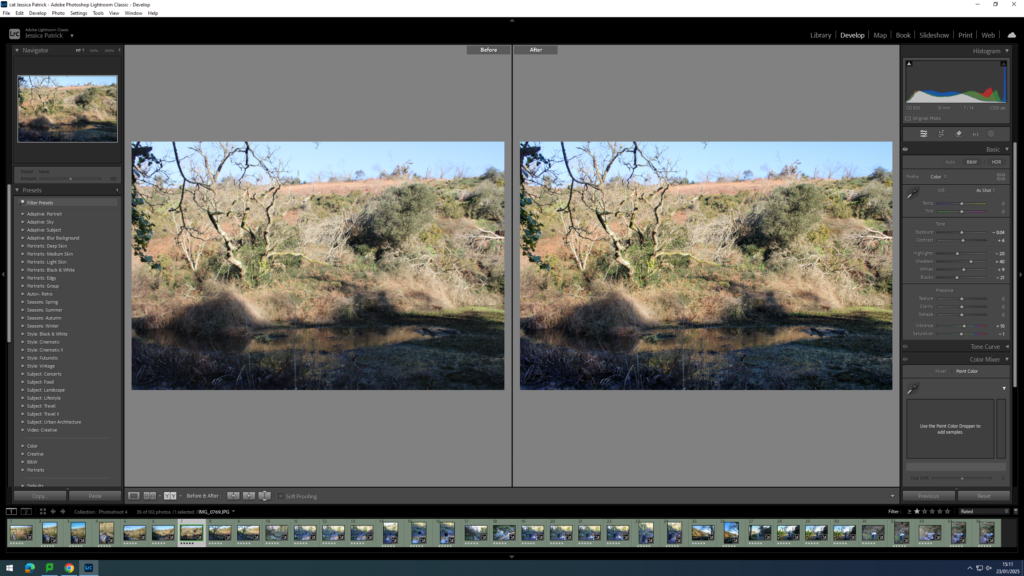
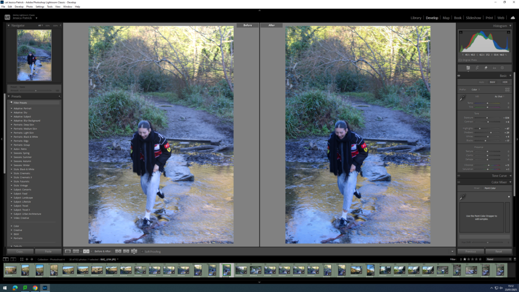
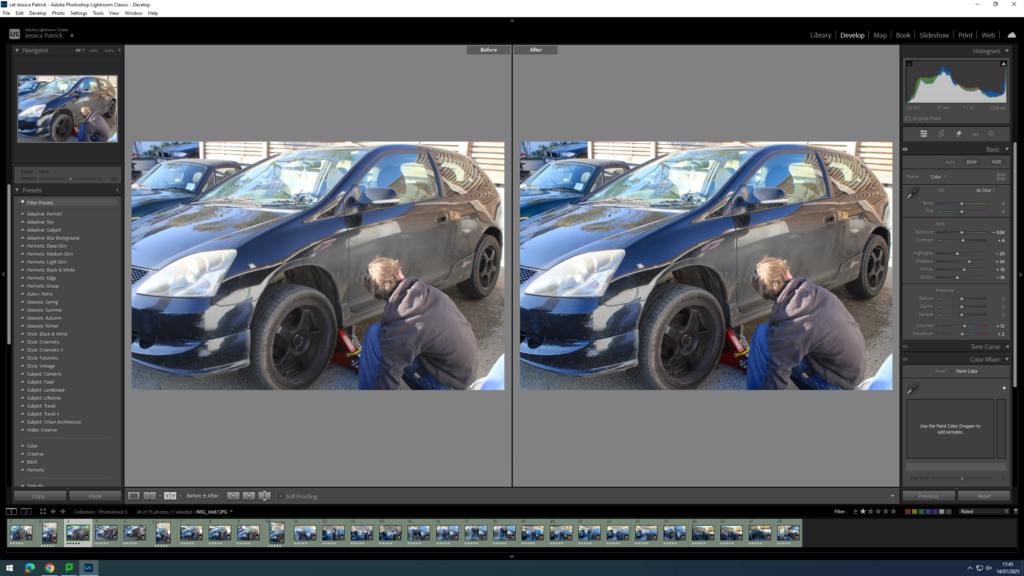
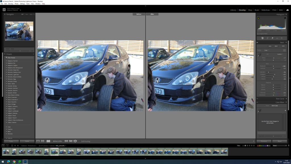
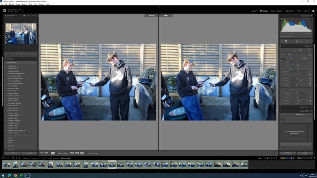
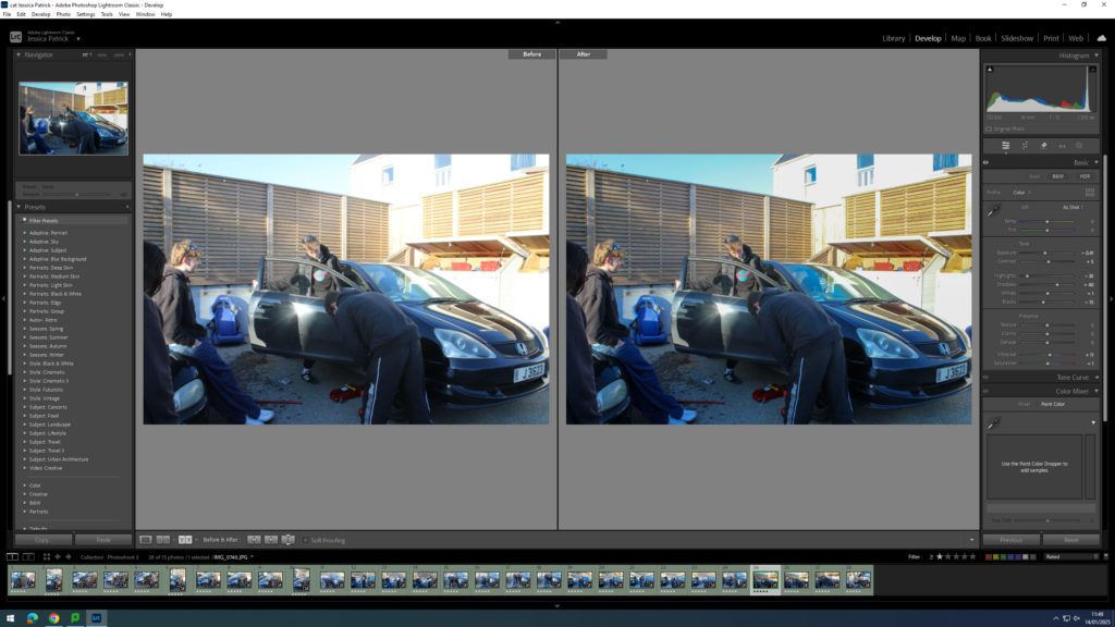
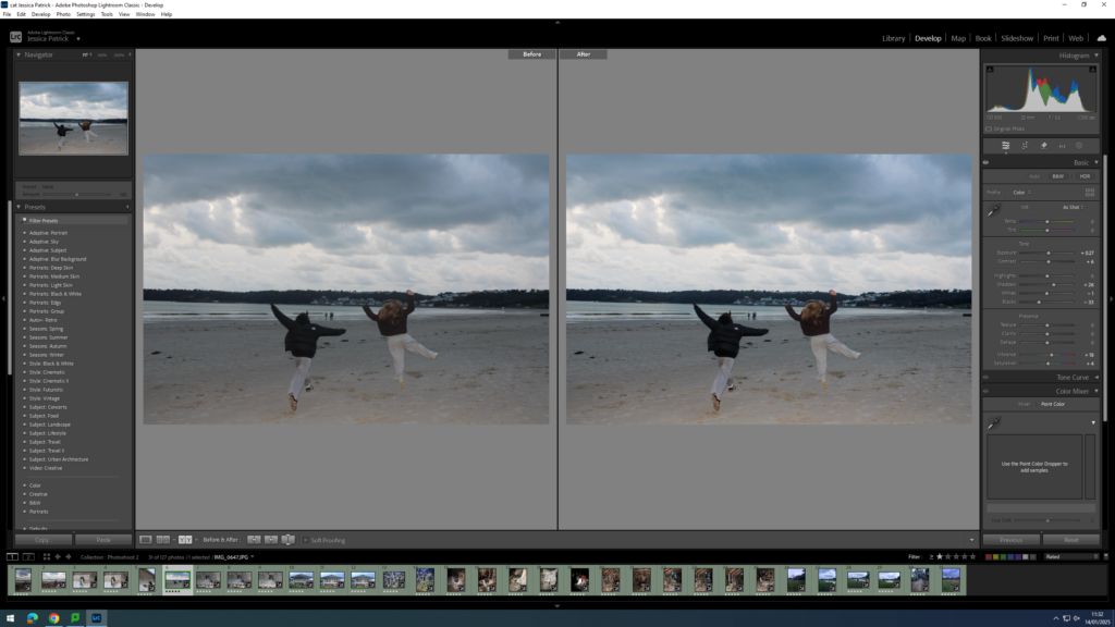
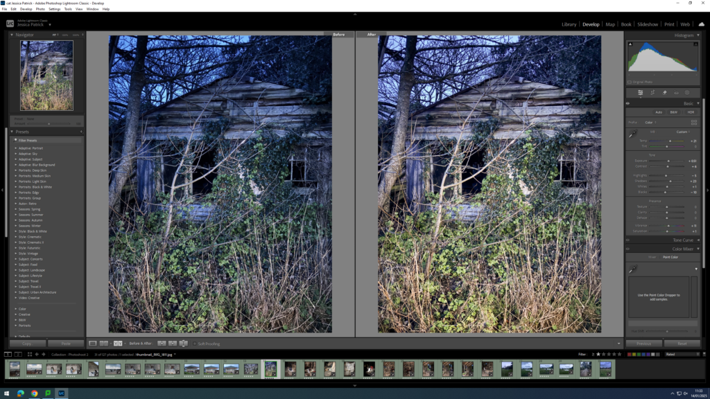
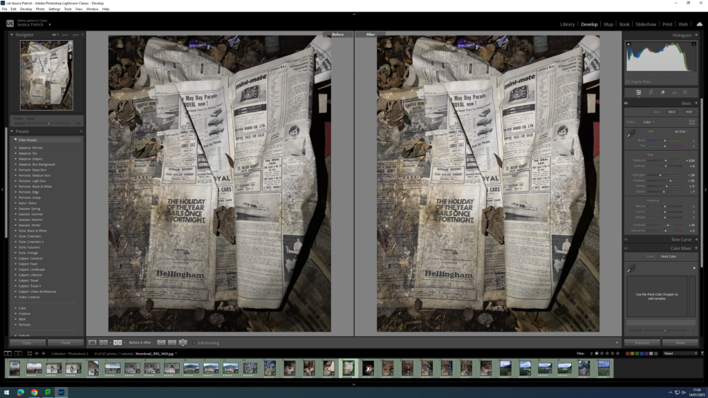
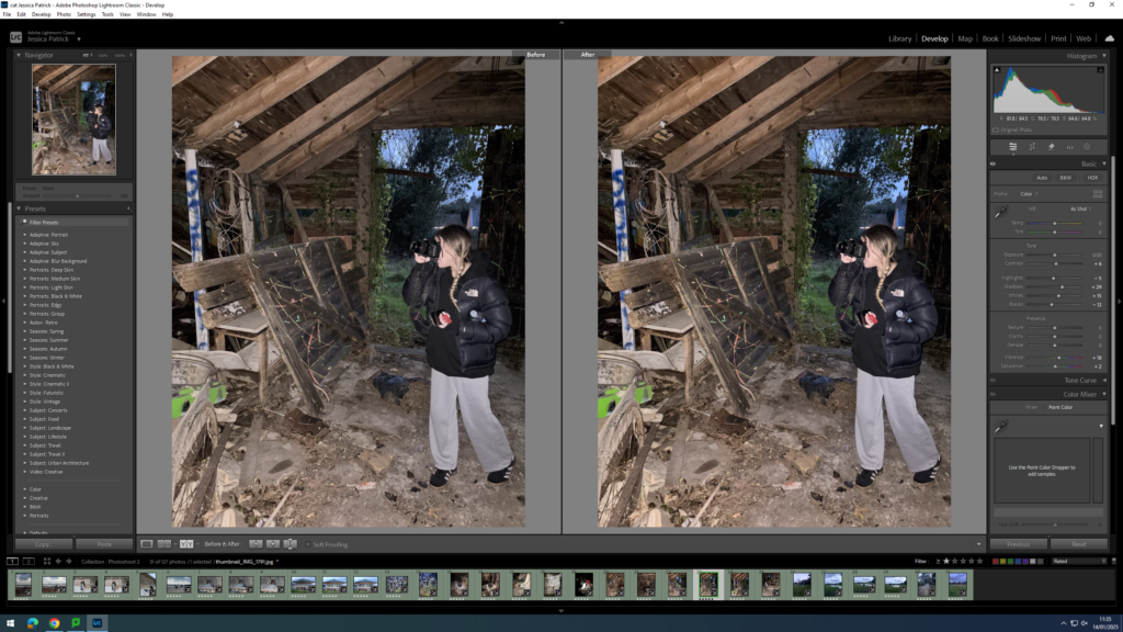
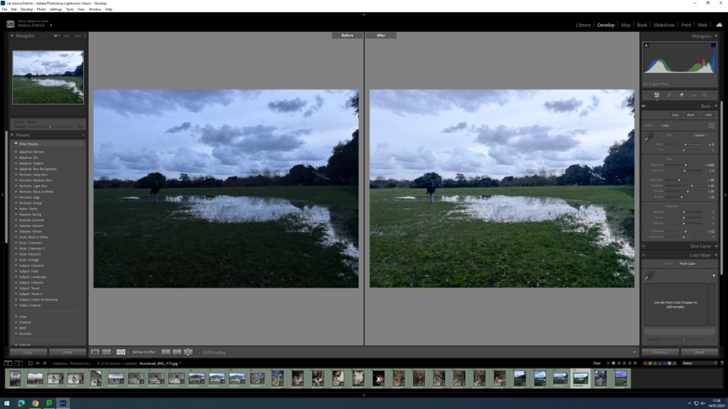
I have edited this image by increasing the contrast, shadows, whites, vibrancy and saturation, while decreasing the exposure, highlights and blacks. I did this, so that the image has better lighting. I also added a yellow tint to the image, because the image originally had quite a blue tint, so I wanted to cancel that out.
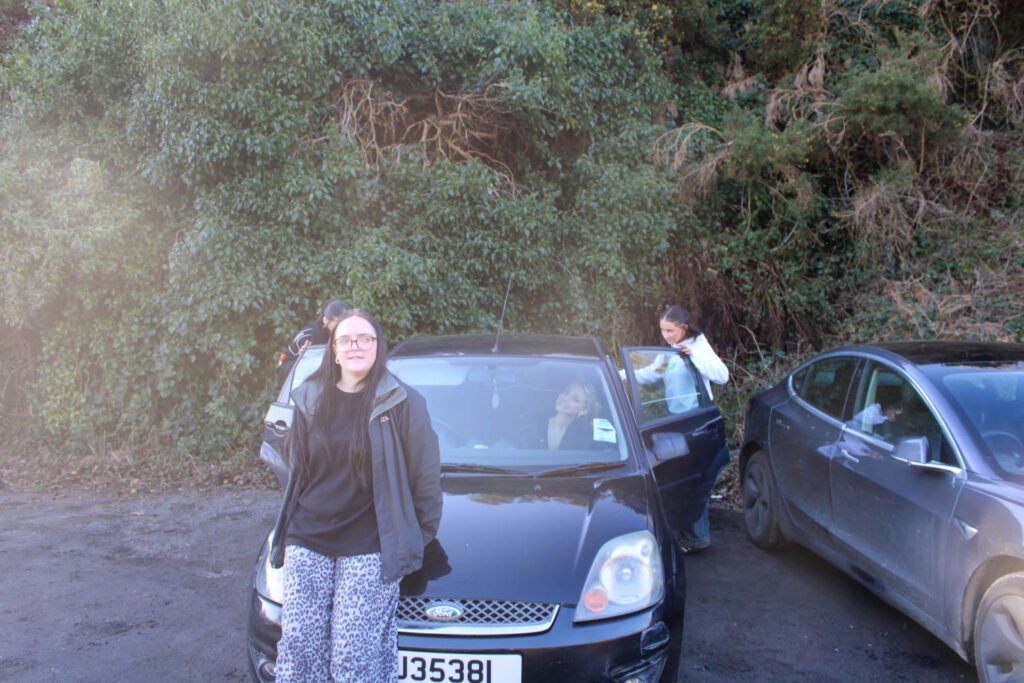
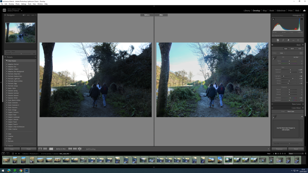
Experimenting with the Fore, Middle and Background
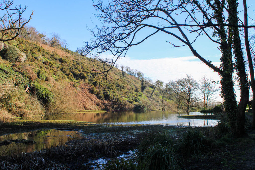
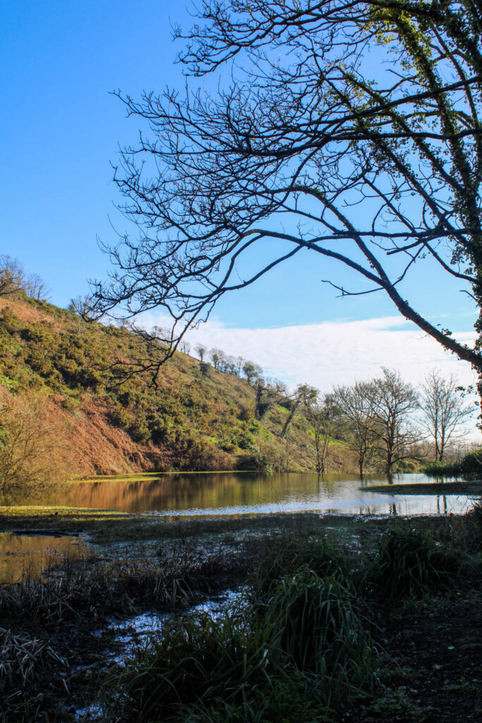
In Manet’s painting, as well as Justine Kurland and Jeff Walls photographs that they have taken inspiration from the painting. They all use the foreground, middle ground and background compositional element. I have also experimented with this and other visual elements in my work.
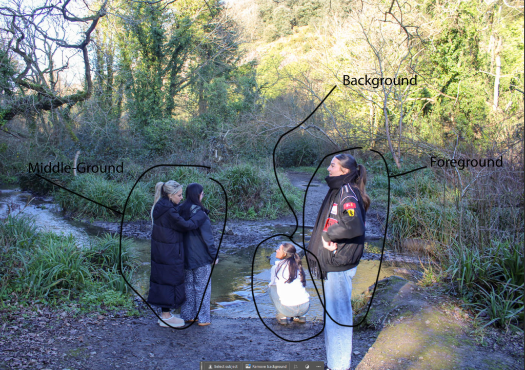
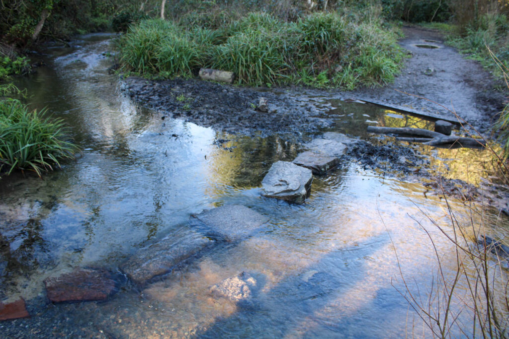
I have also used similar visual elements to Manet’s painting, such as the texture and the setting with the trees and lake in the background.
Experimenting with Selection Cropping
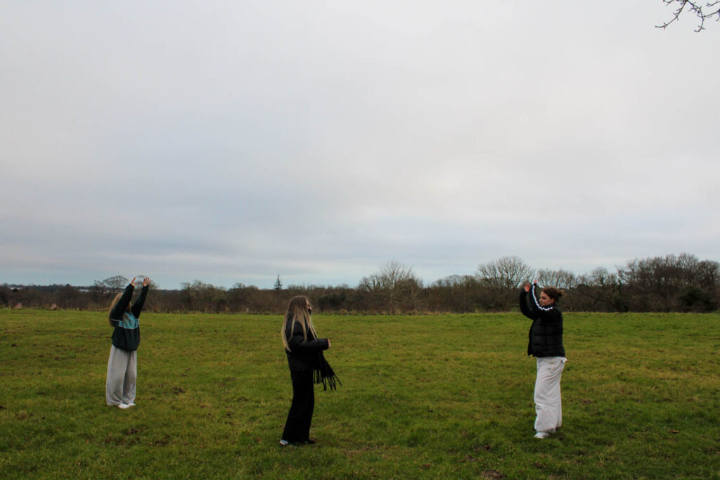
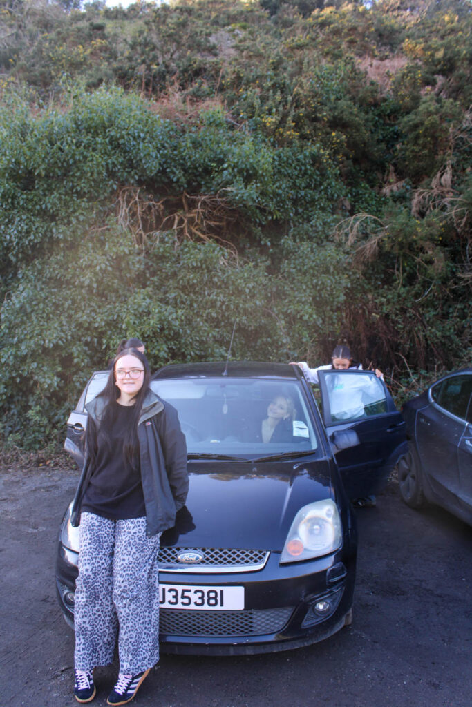
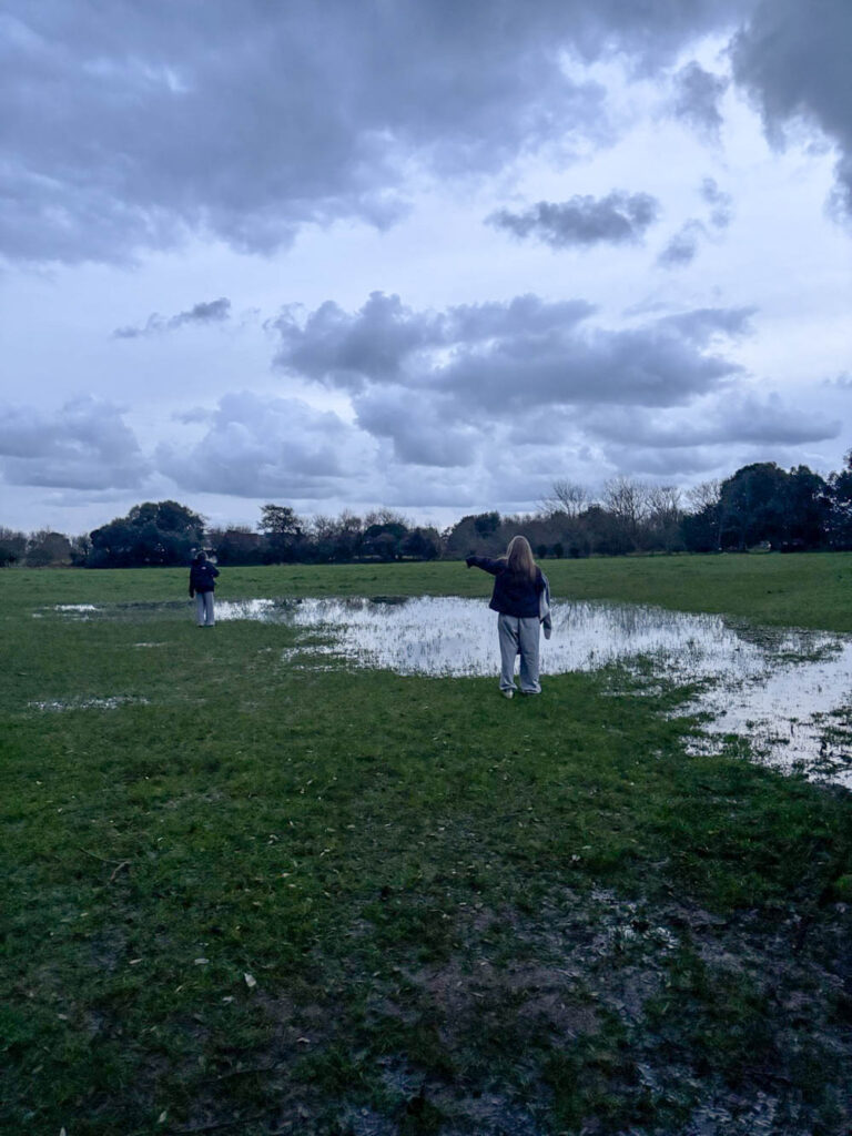
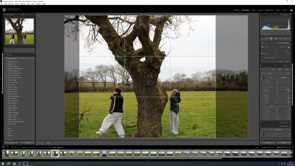
During this photoshoot, I experimented with rule of thirds. In the raw photos I was unable to get the exact thirds correct, so I experimented with selection cropping, so that the images would fit the rule of thirds criteria better.
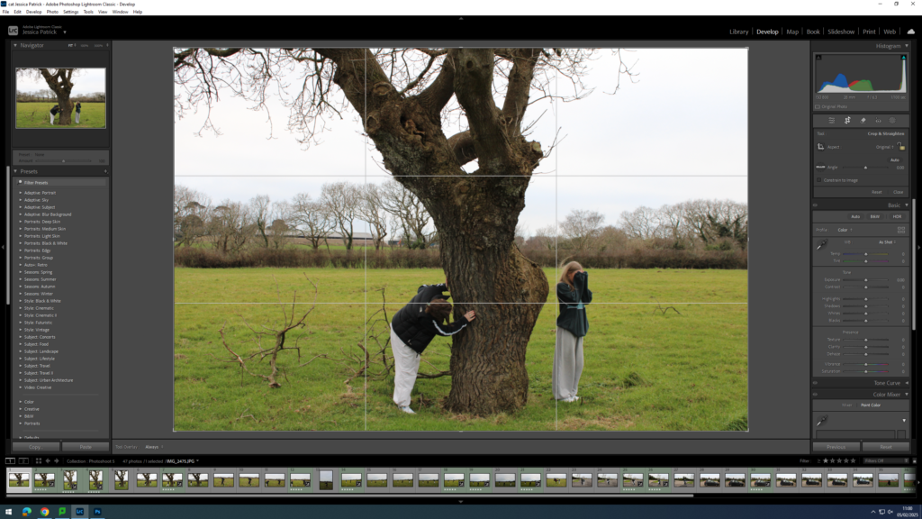
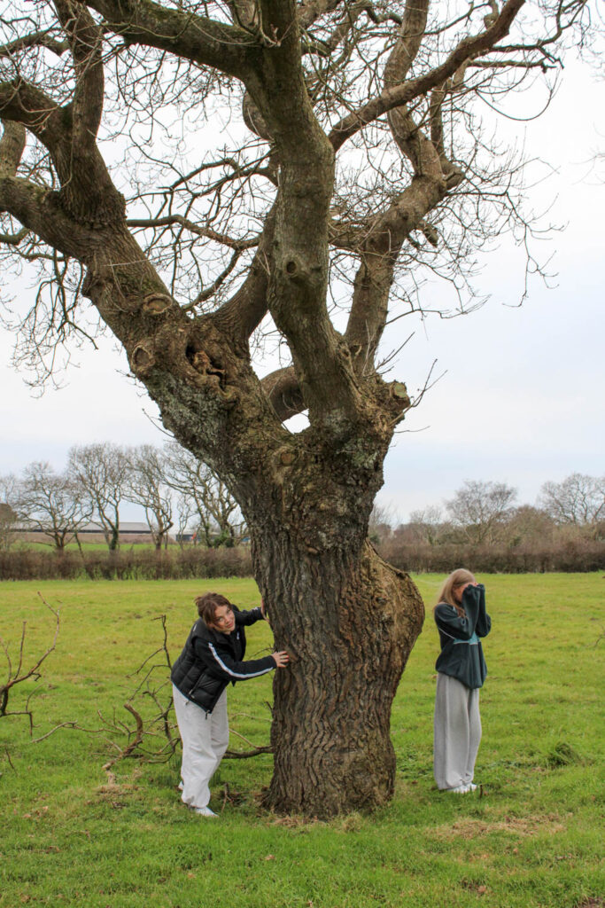
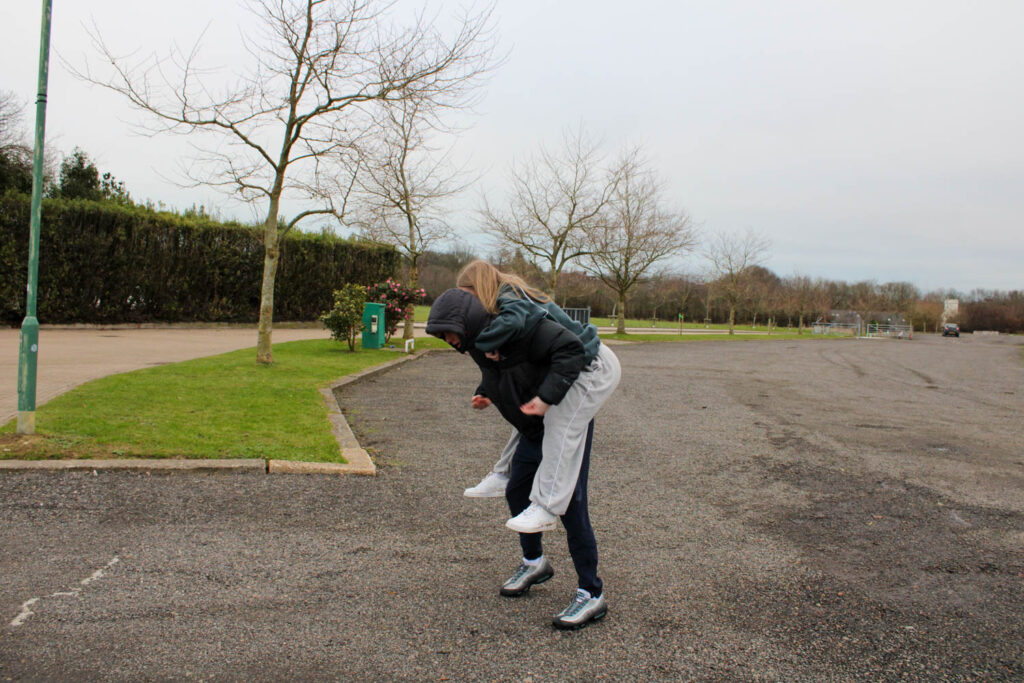
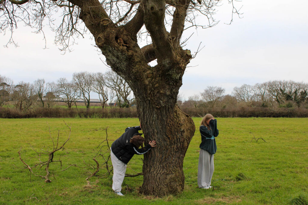
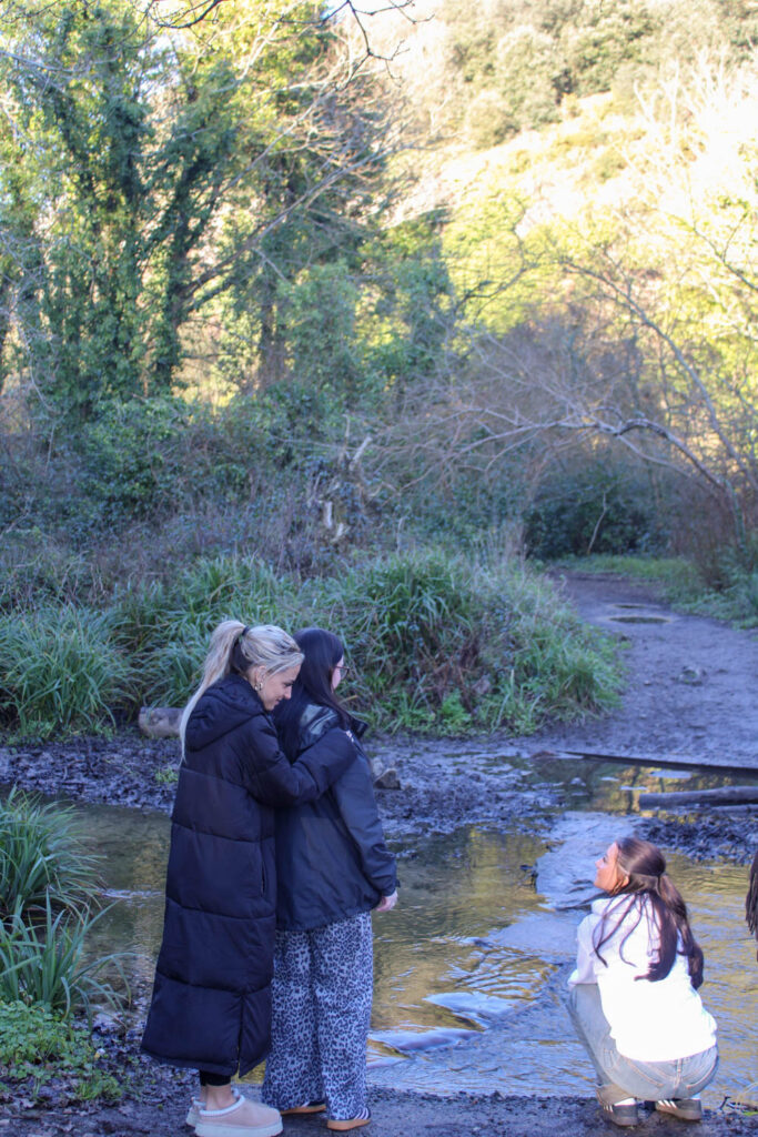
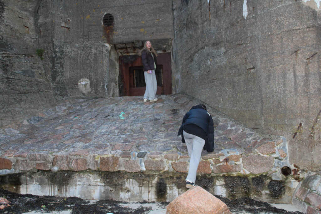
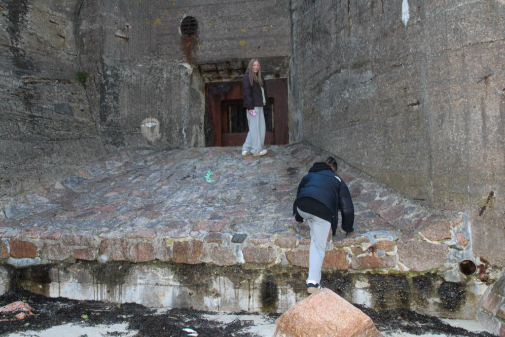
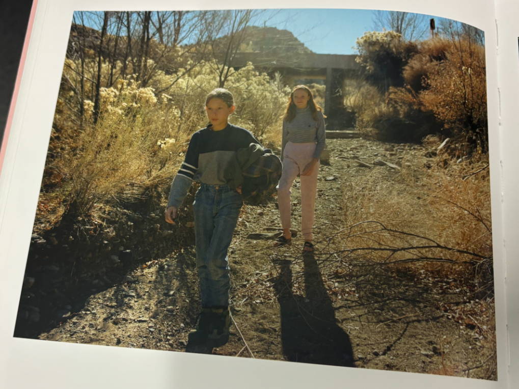
As seen in this image, the subject on the left is in the middle third with the tree and the subject on the right is in the right hand third. In order to have the subject on the left in the left hand third, the negative space on the left and right hand side needs to be cropped out.

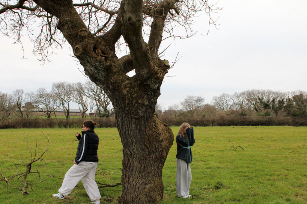
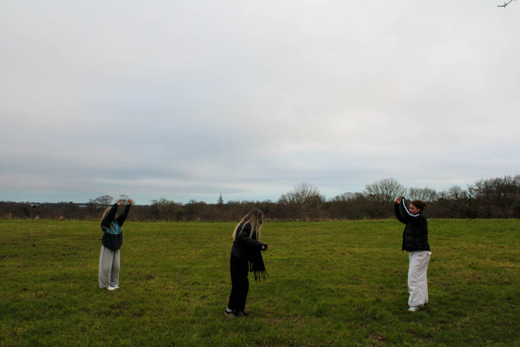
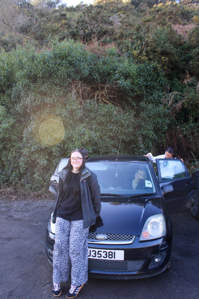
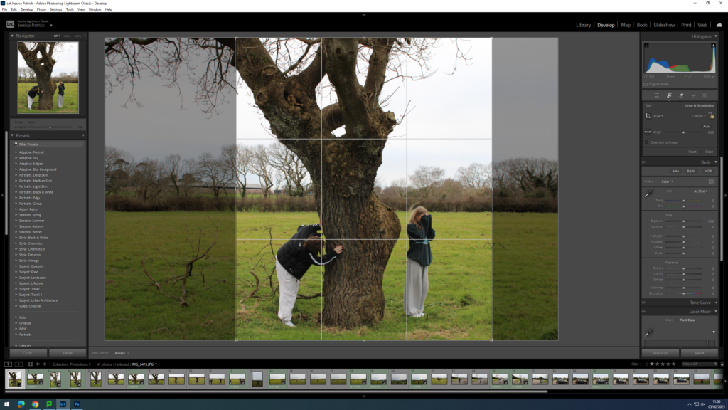
Now, the two subjects and the tree have their own thirds.
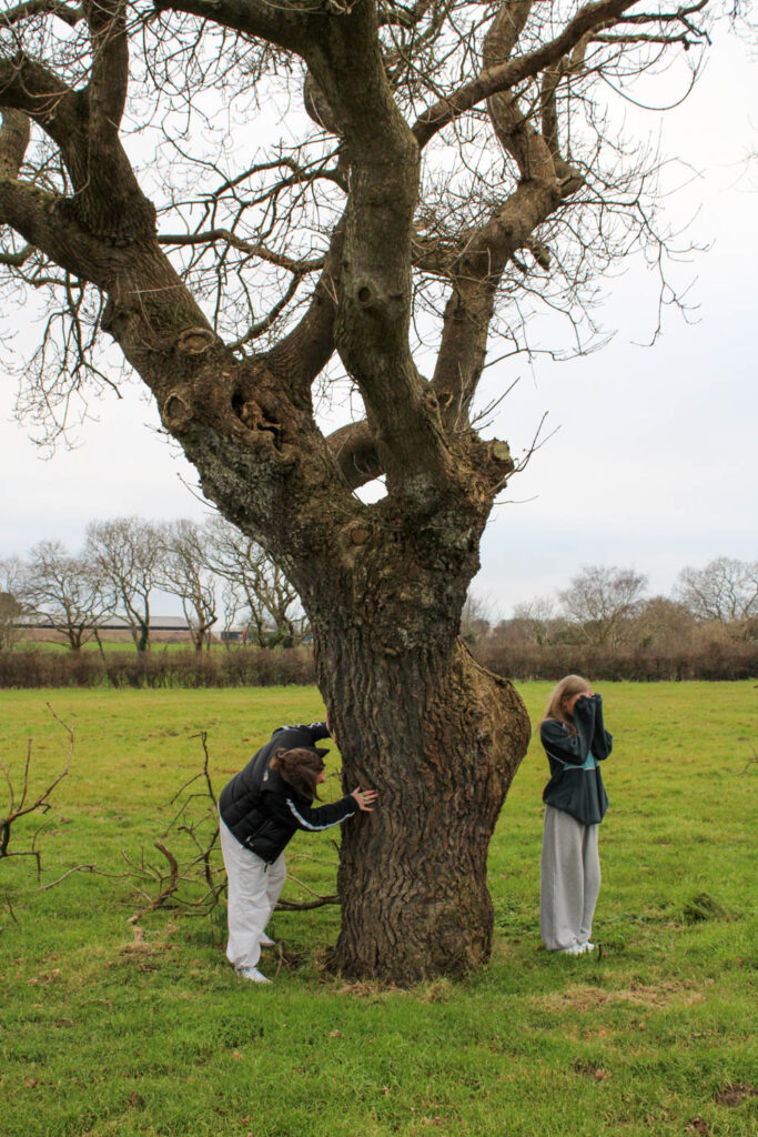
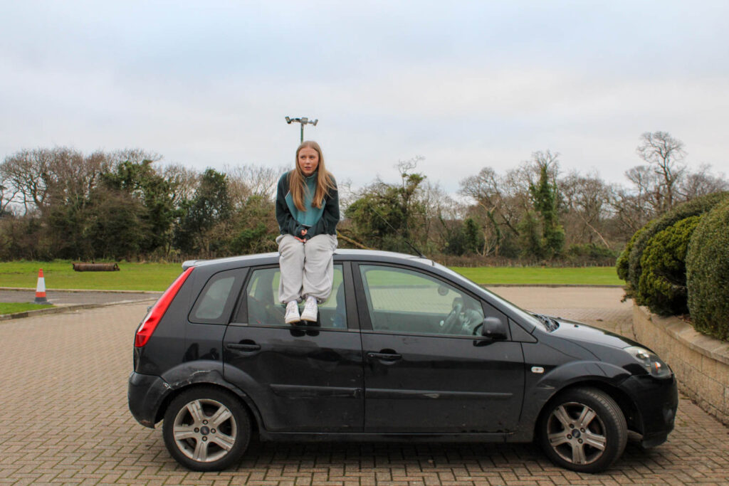
The process was then repeated for this image.
Experimenting with Rule of Thirds
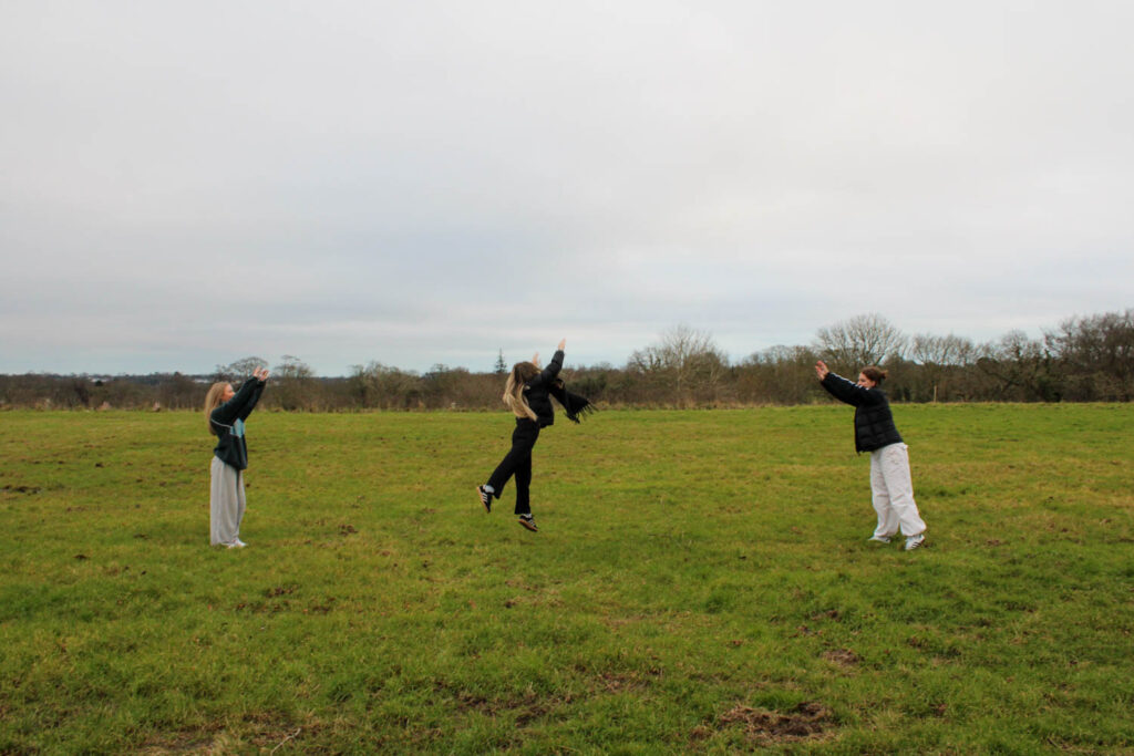
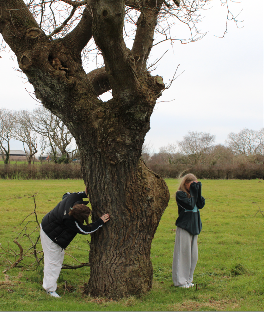
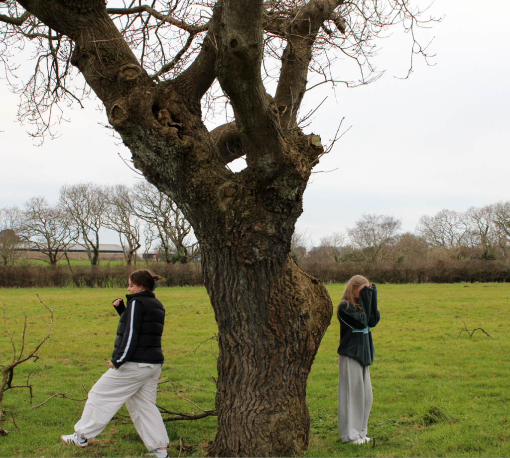
After selection cropping here are the final images, that meet the rule of thirds criteria.
Final Images


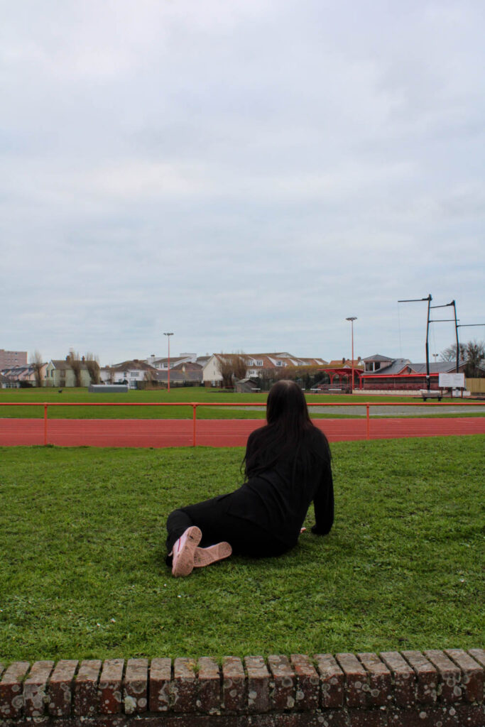
I have used the same composition in my images, that was used in the painting. However, the narrative of the painting is a girl with polio dragging herself along the floor and in my image the narrative is my subject relaxing on the grass. I wanted the narrative of those photograph to be my subject making daisy chains, as this was something I did a lot during my youth, but there are not a lot of daisy’s this time of year, as it is Winter.
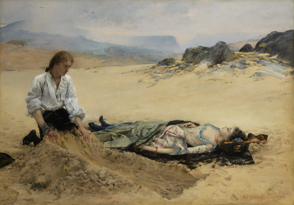
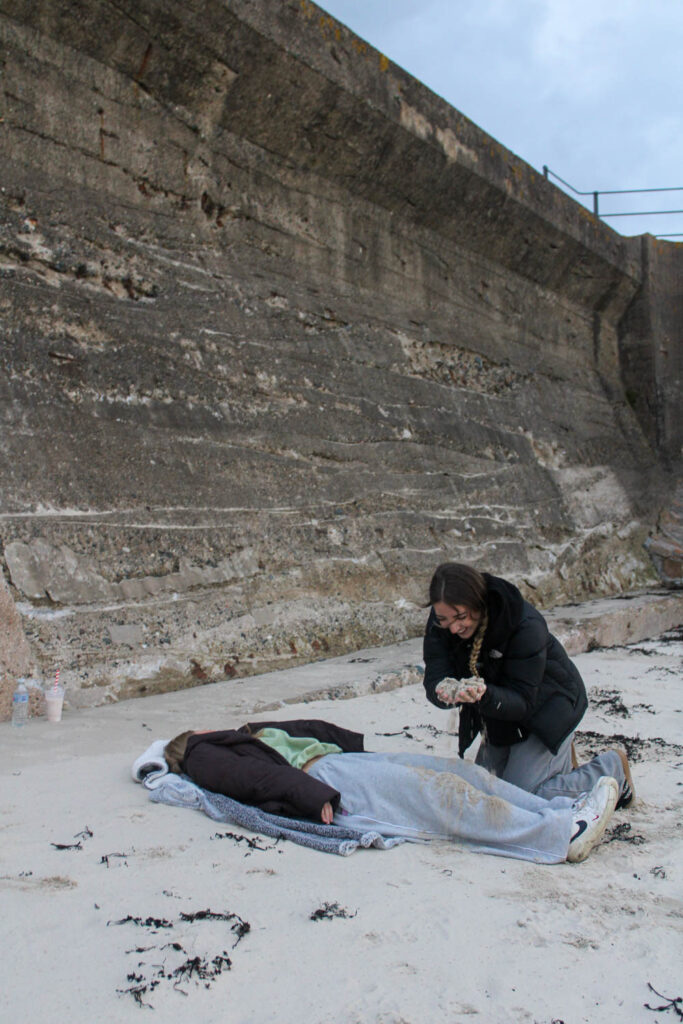
For my photograph I have borrowed the concept of the painting, which is a man burying a women in the sand, but the narrative is different. In the painting the man is burying the women, as she is dead, but in my photograph my subject is burying the other subject, as they are playing and having fun at the beach, which is something I did a lot during my youth. I have also used a similar composition, but the subjects are the other way around.


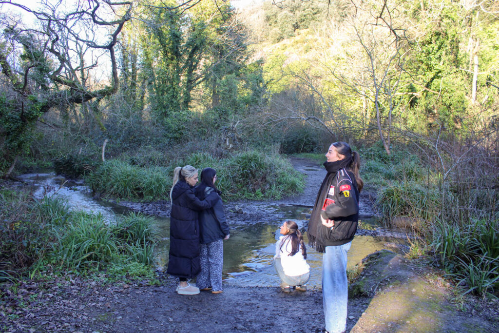

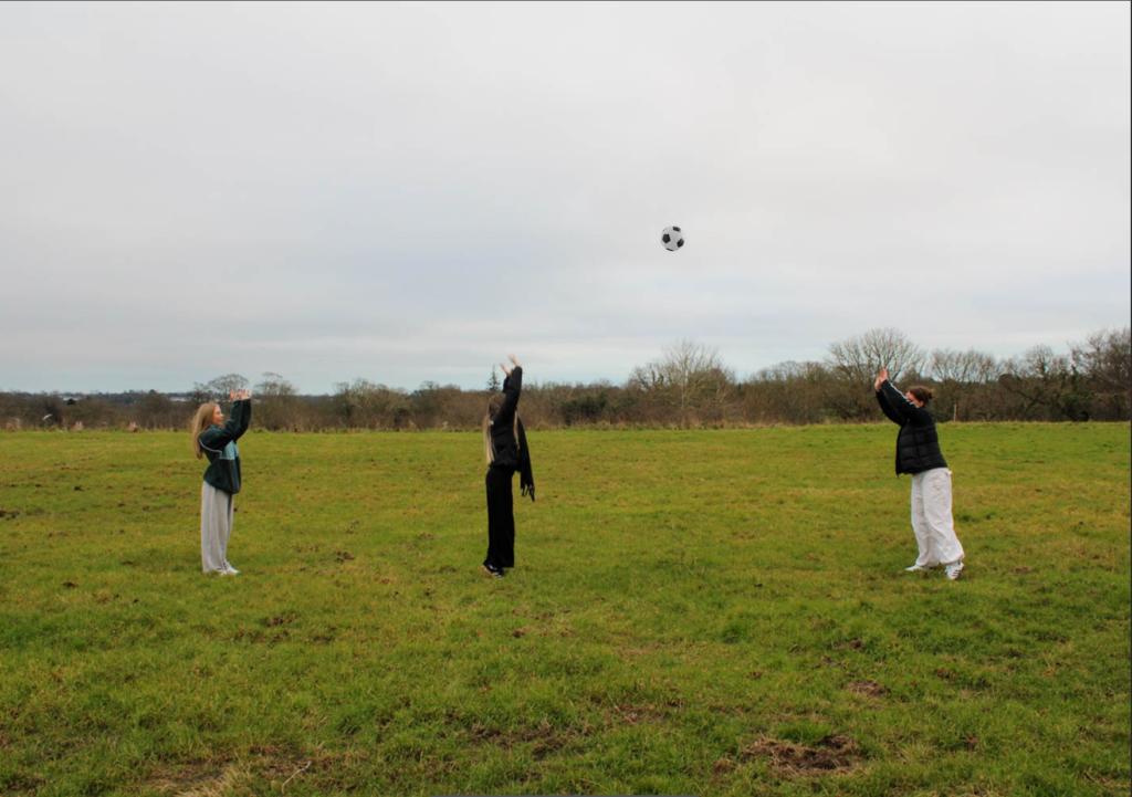
My images use the same compositional layout as the three images above, which is the foreground, middle ground and background layout of my subjects. I have also used similar visual elements, such as the texture and colour in all these images. I have also used a similar setting with the trees and the lake in the background.