All posts by Jemma Mullins

Filters

Author:
Category:

The New Topographics Features + moodboard

Features

The photographs, stark and documentary, are often devoid of human presence. Jenkins described the images as “neutral” in style, “reduced to an essentially topographic state, conveying substantial amounts of visual information but eschewing entirely the aspects of beauty, emotion, and opinion”.

On the one hand, New Topographics represented a radical shift by redefining the subject of landscape photography as the built (as opposed to the natural) environment. To comprehend the significance of this, it helps to consider the type of imagery that previously dominated the genre in the United States.

Photographers involved

 The New Topographics photographers were Robert Adams, Bernd and Hilla Becher, Lewis Baltz, Joe Deal, Frank Gohlke, Nicholas Nixon, John Schott, Stephen Shore, and Henry Wessel Jr.

The new Topographics

Robert Adams Mobile Homes, Jefferson County, Colorado, 1973

What is the meaning to new Topographics?

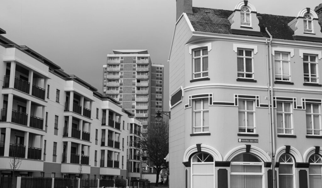
New Topographics was a term coined by William Jenkins in 1975 to describe a group of American photographers (such as Robert Adams and Lewis Baltz) whose pictures had a similar banal aesthetic, in that they were formal, mostly black and white prints of the urban landscape.

What was the New Topographics in relation to?

The stark, beautifully printed images of the mundane but oddly fascinating topography was both a reflection of the increasingly suburbanised world around them, and a reaction to the tyranny of idealised landscape photography that elevated the natural and the elemental.

What was it inspired by?

Many of the photographers associated with new Topographics including Robert Adams, Lewis Baltz, Nicholas Nixon and Bernd and Hiller Becher, were inspired by the man-made, selecting subject matter that was matter-of-fact. Parking lots, suburban housing and warehouses were all depicted with a beautiful stark austerity, almost in the way early photographers documented the natural landscape. 

How have photographers responded to mans impact on land?

Photography has also been instrumental in shaping public opinion, as it can evoke emotions and influence how people see and understand the world. Photographs can sway public opinion and impact the course of events, whether through photojournalism, advertising, or propaganda. Landscape photographers often capture the effects of human activity on the environment. These images serve as a powerful reminder of the consequences of irresponsible actions, such as deforestation, pollution, and climate change.

how have photographers found a sense of beauty in the ugliness of functional land use?

Landscape photography is an immersive journey that allows us to connect with the awe-inspiring beauty of our planet. Through composition, perspective, and the mastery of light, we can capture and unveil Earth’s wonders. Some landscape photographers highly value what they show in their photos as “real”; that there is correlation between what they saw with their own eyes at the moment they got the photo and the final print. It, of course, comes with some problems. Defining what “real” is, is actually rather hard.

Stephen Shore, 2nd Street East and South Main Street, Kalispell, Montana, August 22, 1974

Artist Reference – Ansel Adams

Ansel Adams was an American landscape photographer and environmentalist known for his black and white images of the American West. He is also perhaps the most widely known and beloved photographer in the history of the United States; the popularity of his work has only increased since his death. Adams’s most important work was devoted to what was or appeared to be the country’s remaining fragments of untouched wilderness, especially in national parks and other protected areas of the American West. He was also a vigorous and outspoken leader of the conservation movement.

The Zone System

The 11 zones in Ansel Adams’ system were defined to represent the gradation of all the different tonal values you would see in a black and white print, with zone 5 being middle grey, zone 0 being pure black, with no detail, and zone 10 being pure white, with no detail.

Visualisation

 Ansel Adams describes it as the ability to see the scene you photograph and recreate in your mind the print you will produce. Meaning see your developed image, relying on the information you receive from the scene and on your developing intentions.

Landscape photography

Landscape photography is the practice of capturing a natural or outdoors scene in an artful or compelling way to engage the viewer’s eye and attention. Landscape photography is one of the most appreciated genres of photography. While landscape photography is commonly joined with nature photography, a cityscape can also be considered a landscape in many circumstances.
History of Landscape photography

According to records, the earliest known evidence of a landscape photograph was taken between the years of 1826 and 1827. It was an urban landscape photo taken by a French inventor by the name of Nicephore Niepce.

Then in 1935 the English scientist Henry Fox Talbot came into play with various photography innovations.

Methods and Techniques of landscape

The ideal cameras you can use for shooting landscapes are DSLR and mirrorless cameras. While today’s most developed smartphone cameras are able to produce pretty nice landscape shots, they have yet to catch up to the quality of professional cameras.

Landscape shooters typically head out during golden hour (right after sunrise and before sunset) to get beautiful mixes of blue and orange in the sky. Pay attention to your image composition. The same basic image can change drastically when photographed from slightly different vantage points.
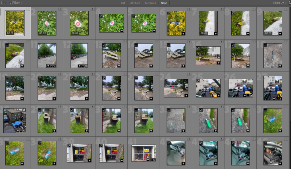
One problem with many landscape shots is that the subject is far away and there’s nothing to look at in the foreground. That gives landscape images a flat sameness that we want to avoid. As you look at some stunning vistas, pay attention to nearby rocks, plants, or even puddles of water that can add interest to your image and also create a stronger sense of the third dimension.

Introduction to rural landscape photography

Rural landscape refers to an area of land that is predominantly used by farmers, ranchers, and other agricultural activities. It is typically characterized by low human population, open fields, wooded areas, and small communities. Rural landscapes provide both ecological and economic benefits to the region.

Rural landscapes include a variety of geographical features such as croplands, forests, deserts, grasslands, swamps, rivers and lakes. They provide natural resources, wildlife habitats and inspiration.

Rural landscapes are different to urban landscapes as urban areas are places with high populations and density. They are characterised by their man-made structures and expanded by them. Rural areas are the complete opposite where they have low population and density, and their lack of man-made structures.

Moodboard

Romanticism

Romanticism emphasised the individual, the subjective, the irrational, the imaginative, the personal, the spontaneous, the emotional, the visionary, and the transcendental.

For the western world it was it its peak from approximately 1800-1850. Romanticism was characterised by its emphasis on emotion and individualism as well as glorification of the past and nature, preferring the medieval over the classical

Romantics celebrated the spontaneity, imagination, and the purity of nature. Along with these elements it also incorporated a deep feeling of emotion as an authentic source of experience which put new emphasis on emotions such as apprehension, horror and terror, and awe.

Romanticism is marked by a focus on individualism, an emphasis on nature, emotion over reason, freedom of form, and an exploration of the Gothic and unknown.

The birth of the classical landscape

Landscape with a Calm, Nicolas Poussin, 1650–1651

In the 17th century the classical landscape was born. These landscapes were influenced by classical antiquity and sought to illustrate an ideal landscape recalling Arcadia, a legendary place in ancient Greece known for its quiet pastoral beauty. In a classical landscape the positioning of objects was placed strategically, every tree, rock, or animal was carefully placed to present a harmonious, balanced, and timeless mood.

The Modern Landscape

Irises, Vincent van Gogh, 1889

The 19th century held many milestones for the history of landscape art. As the Industrial Revolution altered the traditions of rural life, the old hierarchy of subjects crumbled. Barbizon painters such as Théodore Rousseau and Charles Daubigny became less concerned with idealized, classical landscapes and focused more on painting out-of-doors directly from nature—a practice known as plein air painting. The influence of Courbet’s distinct use of paint and the way he structured his landscape views extended well beyond impressionism, deeply impacting the work of Cézanne and Van Gogh, as well as painters in the 20th century.

Sublime

Sublime is a theory developed by Edmund Burke in the mid 18th century, where he defined sublime art as art that refers to a greatness beyond all possibility of calculation, measurement or imitation. In aesthetics the sublime is the quality of greatness, weather physical, moral, intellectual, aesthetic, spiritual or artistic An example of the sublime is looking up at a steep mountain or the stormy sea and feeling a sense of awe due to the vastness of the scene.

The sublime has been long understood to mean a quality of greatness that inspires awe and wonder. the concept and emotions it inspires have been a source of inspiration for artists and writers, particularly in relation to the natural landscape.

Moodboard

Virtual Gallery – femininity

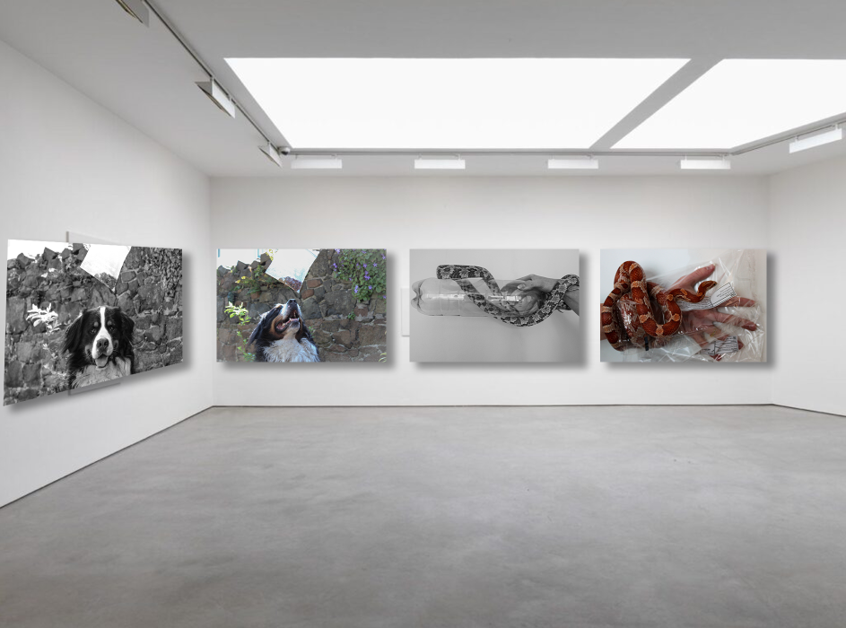
This is my virtual gallery and I put my favourite images in it. I chose these specific images because they are the ones I experimented most with and I love how they turned out. They are all unique and different but they all match the theme of femininity and Marilyn Monroe which I’m really proud of.

The image in the centre is the one that stands out the most and it immediately catches your eye as it is vibrant and colourful. I ended up putting two landscape images next to it as they are a bit longer than the others so they wouldn’t have fit along the outside walls. I like how the images are even moving out from the centre image it makes it look more professional but also pleasing to the eye. The images on the outer sides of the gallery are both of the back of the head. One is in colour and the other is in black and white this contrasts to the photos next to them where the photo on the far left is in colour while the image next to it is in black and white, and it is the same on the other side but it reverse. I liked how this looked because it didn’t look too even yet it looked good.

Evaluation – Femininity

This is my favourite image I created for this whole photoshoot as I think its really creative and different. I chose to add the inspiration, Marilyn Monroe to my edit because I love the way she matches my image. I love the way I have presented my own image with a lot of other images of Marilyn Monroe, the inspiration of my whole femininity theme.

Comparing my final images to artist – Feminism

Cindy Sherman referance

I chose this image to relate to Cindy Sherman’s images about femininity. Things in my photo that are similar to Cindy Sherman’s photo is the way both models show the back of their heads in the camera while their reflections of their face in the mirror. I like the way both images have similar story’s in the images, for example in Cindy Sherman’s it looks like the model is fresh out the shower and in a towel, meanwhile in my photo the model is getting ready and putting on makeup. It can show the stages of being a stereotypical ‘woman’ and being stereotypically feminine. The differences between these two images are that in my photo the model is holding a prop to her face instead of just her hand like in Cindy Sherman’s.

Claude Cahun reference

I chose this image as it relates to Claude Cahun. Even though my image is more feminine they have similar styles like the model in my photo is looking towards the camera while the reflection is looking away and this is the same as Claude Cahun’s photos. I like the way that my photo contrasts to Claude Cahun’s, mine is feminine while Claude Cahun’s is more masculine, by the way she is looking at the camera. They pose and look very different but you can see the similarities within the different photos. A difference is that the model in my photo isn’t making any eye contact with the camera giving it a ‘silly’ or less serious look. Meanwhile in Cahun’s photo she is making full eye contact with the camera making it a serious and moody photo.