All posts by Jemma Mullins

Filters

Author:
Category:

Photoshoot 2 – Plastic + Animals

Firstly flagged my favourite images and narrowed it down from 73 to 15 images.

I then went through my flagged images and edited my favourite ones from that selection.

In this image it is of a snake covering plastic. The snake represents nature and wildlife while the plastic and hand represent humans doing damage to the world due to plastic pollution. For this image I turned highlights and whites and turned down shadows and blacks as the original picture looked dull with no vibrancy and colour, (which could have worked well for the topic) but I decided to make it lighter and more vibrant. I also turned up the texture and clarity slightly so you could see the shapes and patterns properly and more clearly. this also contributed to the pop of colour in the image.

This image is of a snake wrapped around a plastic bottle. I think this image shows Anthropocene and typography as it represents life (the snake) and how it is wrapped around a plastic bottle which shows how plastic is polluting the world and the human hand to symbolise its humans doing it. I chose to put the image in black and white as I didn’t originally like the colour contrast of the snake, hand and bottle all mixed together and I preferred the way it looked in black and white. I turned the contrast and clarity up to get sharper point in the photo and really define all the features in this image.

This image is of a dog looking at treats through a plastic bag. I took this image of the dog looking into the treat bag to show that humans look after these animals and they rely on humans for food and care. I think this relates to the Anthropocene topic indirectly because it shows the care for animals instead of if they had improper care, were stray, being hunted or if their environment was destroyed. For this image I added an effect where the outside of the image is highlighted and glowing. I also turned the highlights down a lot and turned the black tone up to make the image darker so the effect stands out more.

This image goes with the other dog image where this time the dog isn’t looking at the plastic bag and is looking into the camera. I made this image black and white because I like the way the dog is smiling into the camera, the black and white contrasts with this and I like how it came out.

Photoshoot 1 – Vehicles and Fuels

I chose my first photoshoot to be of vehicles and fuels. I chose this theme as I was inspired by Edward Burtynsky’s photos of cars.

This image is of old broken cars that are used for parts. I thought this related to the topic as I think that cars are a big part of pollution and their fuels and emissions. I also chose to take pictures of cars from an angle looking down as I was inspired by Edward Burtynsky’s work on images of cars. I decided to keep the picture in colour as I think that it looked boring in black and white, whereas in colour it you can see all the details of the cars that aren’t being used and are broken. I also think the colours made it look messy which I liked because it makes you have to look properly into the image which is quite scruffy when you first glance at it but when you look into the details it gives you more of a story behind the image that the cars are being used for scraps which you may not see when you originally look at the image.

I decided to take this picture as it was also inspired by Edward Burtynsky’s car images but instead I chose to take pictures of a lot of PED bikes and motorbikes, instead of a large amount of cars. This image is different to the car image as the cars where being used for scraps but instead these bikes work. I started off edited this image by cropping it as there was lots of the road in the image and it looked bad. I made the image darker but made all the colour stand out more which matched the colours of the first picture of cars in the scrap so they look nice together.

This is another image of scraps and cars being used for scraps. I chose to edit this image because it goes along well with my theme for this photoshoot. this image is different to the other so far because it isn’t based particularly on cars there are other things in this image like cones, tyres and a big container box. I chose to also edit this image differently from the other two vibrant images and went for a duller less vibrant picture. I achieved this by minimally editing the tone just turning the highlights up slightly and the whites and blacks both down slightly.

This image is of a motorbike exhaust. I chose this image because it is a more detailed picture of one specific thing instead of taking a picture where there is a lot going on like in the other pictures. For this image I turned vibrancy up all the way, I liked how this turned out because it made the image really stand out and shows every detail of the bike.

Anthropocene

What is Anthropocene?

Anthropocene is used to simply describe the time during which humans have had a substantial impact on our planet. Whether or not we are in a new geological age, we are part of a complex, global system and the evidence of our impact on it has become clear. The current geological age, viewed as the period during which human activity has been the dominant influence on climate and the environment.

Consequences of the Anthropocene

These human actions cause, among other consequences, changes in the water cycle, imbalances and destructions in the marine and terrestrial ecosystems, the increase of extreme meteorological phenomena, the acidification of the oceans or the disappearance of the forests.

When did Anthropocene begin?

It began in 1950. The resulting radioactive particles were detected in soil samples globally. In 2016, the Anthropocene Working Group agreed that the Anthropocene is different from the Holocene, and began in the year 1950 when the Great Acceleration, a dramatic increase in human activity affecting the planet, took off.

The Anthropocene Project

The Anthropocene Project is a multidisciplinary body of work combining fine art photography, film, virtual reality, augmented reality, and scientific research to investigate human influence on the state, dynamic, and future of the Earth.

“UNLIKE PAST MASS EXTINCTIONS, CAUSED BY EVENTS LIKE ASTEROID STRIKES, VOLCANIC ERUPTIONS AND NATURAL CLIMATE SHIFTS, THE CURRENT CRISIS IS ALMOST ENTIRELY CAUSED BY US — HUMANS.”

An armed soldier stands guard as the 105 tons of ivory are burned in a game reserve outside the capital city of Nairobi, a stockpile that would have been worth more than £100million to smugglers.

AI

What is AI?

Artificial intelligence is the science of making machines that can think like humans. It can do things that are considered “smart.” AI technology can process large amounts of data in ways, unlike humans. The goal for AI is to be able to do things such as recognize patterns, make decisions, and judge like humans

How does AI work to create images? 

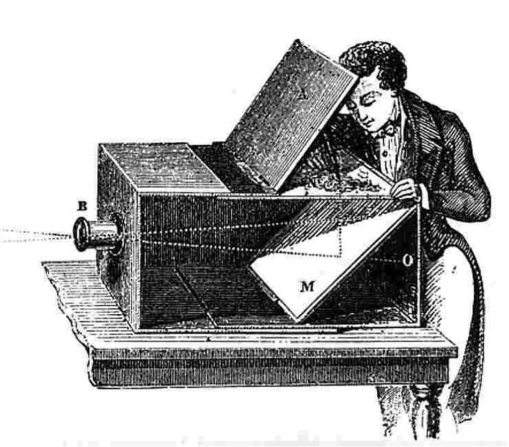
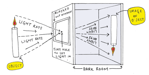
Artificial neural networks mimic the brain’s process to recognize patterns. Convolutional neural networks specialize in the ability to identify objects and patterns in data. The neurons are a specialized form that works in a similar manner as the human eye.

Mood Board

HDP Photo walk

Contact Sheet:

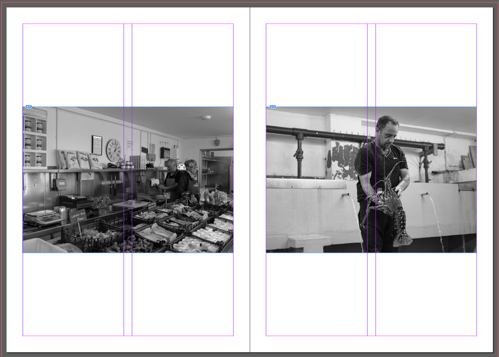
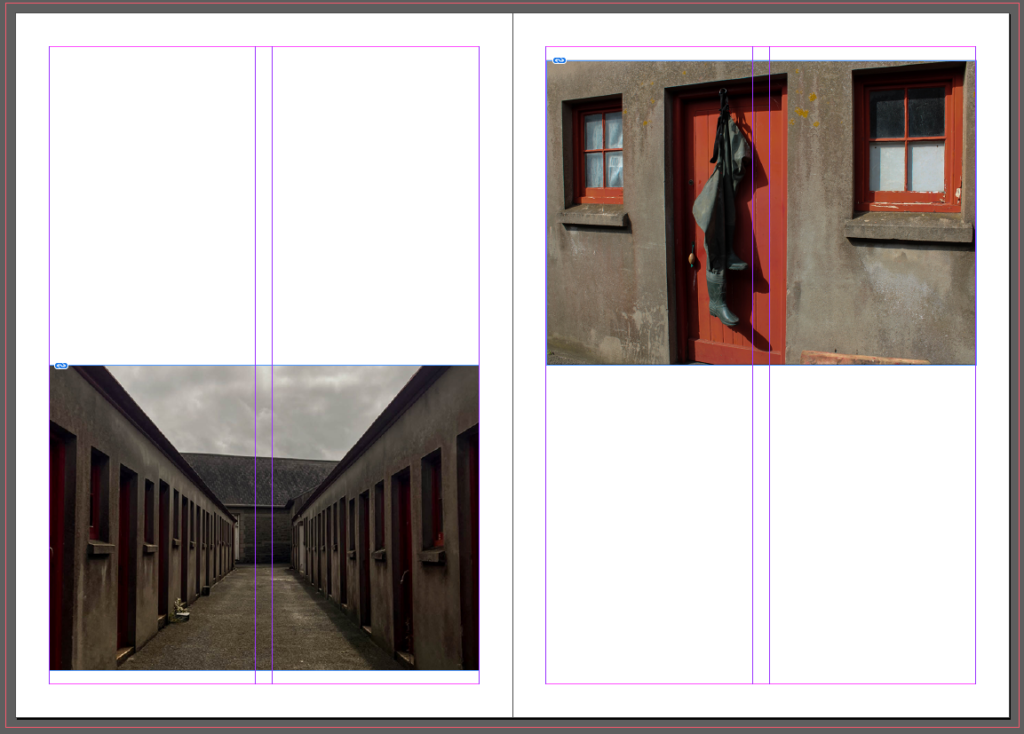
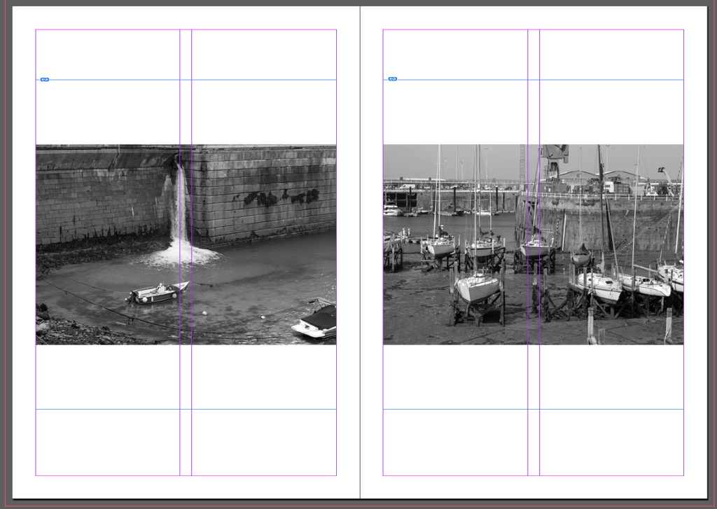
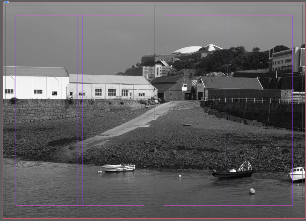
I chose my favourite images that I took at Harve Des Par flagged them and then highlighted green the ones I wanted to edit.

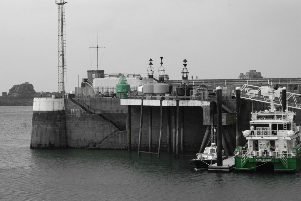
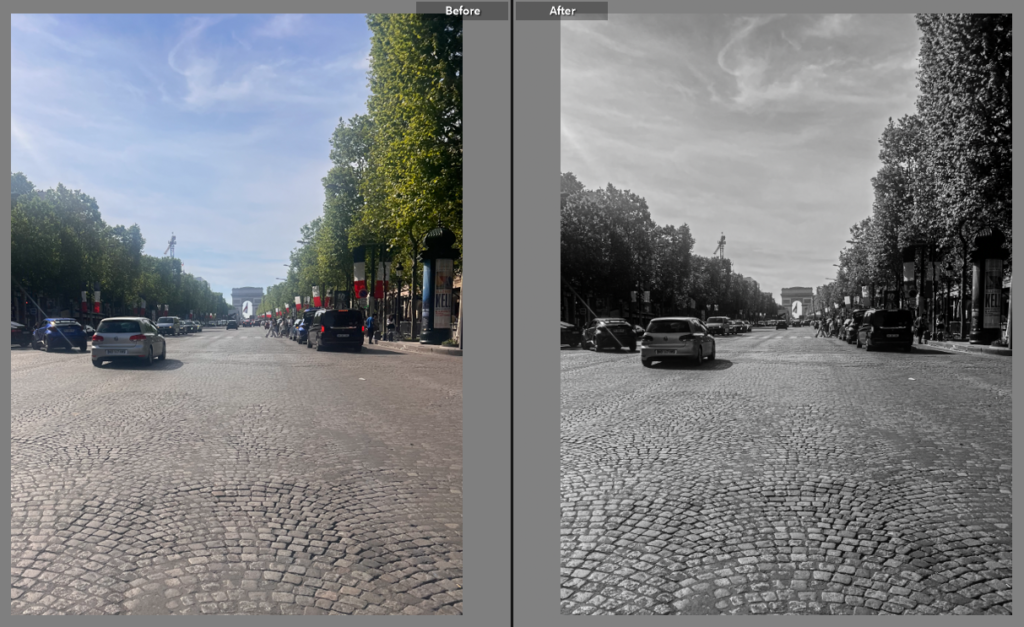
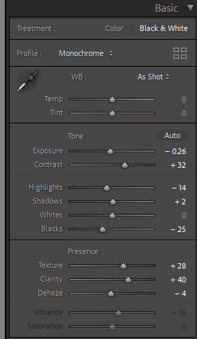
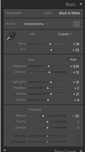
This image is of Harve Des Par is a lamp post with the pool in the background. This image was originally in colour but I changed it to black and white. It was a cloudy day when this photo was taken so the lighting was adjusted using the camera settings. The lamp post looks misplaced in the image as the settings around doesn’t match it making it look outlandish and singular. I turned up the texture, clarity and dehaze for detail and depth in the image

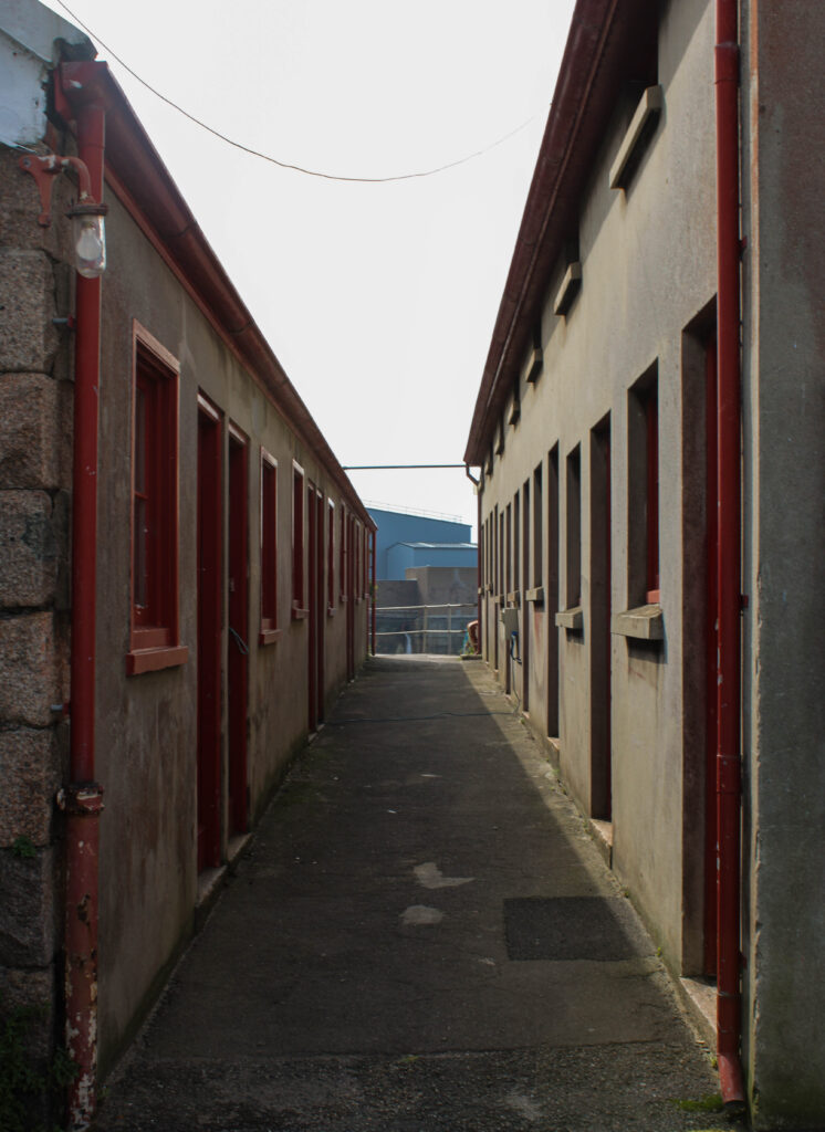
This image is of the flats and houses at La Colette. For this picture I angled the camera towards the flats with some more flats and houses towards the front half of the image. On the houses there is a Harve Des Par sign. I like this in the image as it shows the location where the image was taken and adds detail to the image. I changed the original image to black and white and turned down the temperature and tint for a colder image. I turned the exposure and contrast up for more dimension and turned up texture and clarity for more detail in the buildings.

Landscape – Final Outcomes

Photoshoot 1

Contact sheet:

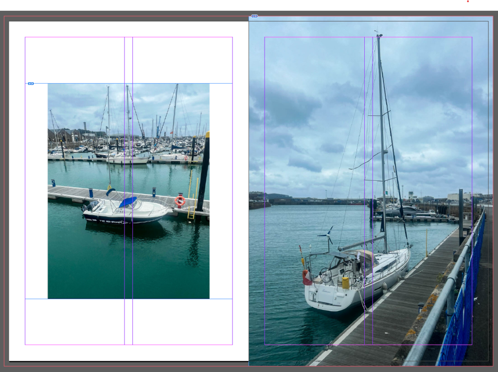
I started off with 113 photos of different places around Jersey these places were: Gorey, St Catherines, Archirondel.

Flagged photos:

I then flagged the images I thought looked best and there were 49 remaining.

After I flagged the photos I went through them and chose my favourite of each setting and scenery. Lots of the Landscape photos I chose looked similar so I went through each one and chose my favourite.

Landscape 1:

For this image I turned the vibrance up and the temp a bit to make the colours brighter. I turned up the texture and dehaze as the original looked a bit unclear and this made sure the nature in this image was clearly visible.

Landscape 2:

For this image I didn’t like the original way it looked as I thought it looked dull. To change this is turned up the vibrance and made the colours in the image really bold and stand out.

Landscape 3:

For this image I changed it to black and white because I think it looks good with the dark hills and the foliage. I turned up the texture and clarity to show all the rocks and patterns in the waves.

Landscape 4:

For this photo I turned up the vibrancy to make the sky bright blue as I think it looks really pretty with the brightness of the sea. The castle looks really nice with the natural scenery which is opposite to the theme of the new Typographics

Landscape 5:

This image of St Catherines Pier was originally in colour I turned it to black and white. The lampposts was a main part of my reason to turn it to black and white as they gave off this vintage, olden day look which is why I think it suits the black and white. I turned up the contrast, texture, clarity and dehaze to make everything look more clear and less mixed together. Another thing I like about this image is the clouds, they look like they are being pulled away making this photo look very dark.

For this image it is much darker than any of the other ones. I added blue mid-tones to the image to make it look a lot moodier. I love how this turned out because you can see the darkness is the clouds and the see, this made the image look a lot more dramatic and it gives off a scary vibe which I think looks really good with the theme. The original looked very grey and less vibrant which to me looked boring and dull, by turning up the contrast, highlights and whites this made it more bright, then by turning the mid-tones a dark blue gave this photo a lot more contrast to the final image.

This image is much more vibrant where the yellow and blue tones of the path and the sea are really bright, I turned up the contrast to make this look better. I also turned up the vibrance and saturation to make the image look brighter and stand out.

Photoshoot 2

For my second landscape photoshoot I chose to take pictures around town.

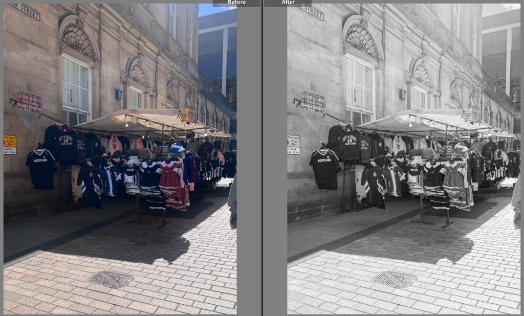
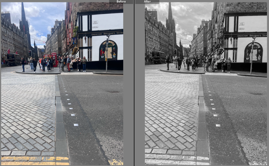
For this image I went to the top of highlands hill and took a picture of the view from there. I changed the image to black and white as I think it suited the image better than from when it was in colour. For the overall tone I turned everything down as I like the dark look at the front and as the buildings go further back it gets lighter.

For this imagine I also took it on highlands hill. In the image you can see lots of buildings with foliage on the right side of the picture. The thing that stands out in this image is a person. I gave the image a blue tint as I think the blue makes the picture look cold which I like and I think it matches the vibe well. I turned the texture up for more detail. I turned down the exposure as the lighting looked weird with the blue tint.

This image was taken near Harve Des Par. I gave the picture a yellow tint to give the image a yellowish retro look. I think the features in the image suit this look because of its suburban look. I turned up the exposure, contrast and highlights so yellow tint didn’t make the image look too dark.

Edward Burtynsky – Artist Referance

Edward Burtynsky, born February 22, 1955 is a Canadian photographer and artist known for his large format photographs of industrial landscapes. His works depict locations from around the world that represent the increasing development of industrialisation and its impacts on nature and the human existence. It is most often connected to the philosophical concept of the sublime, a trait established by the grand scale of the work he creates, though they are equally disturbing in the way they reveal the context of rapid industrialisation.

Burtynsky is an advocate for environmental conservationism and his work is deeply entwined in his advocacy. His work comments on the scars left by industrial capitalism while establishing an aesthetic for environmental devastation, the sublime-horrors discussed in a number of essays on the topic of his work.

This image is of a big car park. It shows how many cars there are in one singular car park. I chose to analyse this image because I find it very interesting that Burtynsky chose cars to represent Typography and Anthropocene a lot of the time. This image to me shows pollution and the damage cars and other vehicles are doing to the world. This image is taken from a height and looking down onto a field or grass car park of some sort this gives us a view of how many cars are in this car park.

This is an image is of a lot of cars that are going to be destroyed as they are all damaged, crashed and being used for scraps. I think this image symbolises typography and Anthropocene as cars play a major part in polluting the world. I think Burtynsky captured this image perfectly to show and represent the significant damage that cars do to the earth.

Artist Reference – Robert Adams

Robert Adams

Robert Adams (born May 8, 1937) is an American photographer who has focused on the changing landscape of the American West. His work first came to prominence in the mid-1970s through his book The New West (1974) and his participation in the exhibition New Topographics of a Man-Altered Landscape in 1975. 

Adams grew up in the suburbs of Colorado and in 1956, he shifted to South California to study English literature at University of Redlands. In 1965, he did his Ph.D., from University of Southern California, in the same subject.

Adams has worked on American West landscapes for more than 38 years, covering Oregon, Colorado and California. He uses his camera to express his love for landscapes. Also, to understand how industrial and urban growth has transformed it.

 Adams bought a 35mm camera and began to take pictures mostly of nature and architecture. He soon read complete sets of camera work and aperture at the Colorado springs fine arts centre. He learned photographic technique from Myron Wood, a professional photographer who lived in Colorado. While finishing his dissertation, he began to photograph in 1964. In 1966, he began to teach only part-time to have more time to photograph. He met John Szarkowski, the curator of photography at the Museum of Modern Art, on a trip to New York City in 1969. The museum later bought four of his prints. In 1970, he began working as a full-time photographer.

The New West

In a seminal series of images representing the suburban southwest, Adams shows the brutal squalor of suburban architecture and its effect on the landscape, as well as the hopeful aspects of nature that are beyond our impact.

Image Analysis

In this image there are man made buildings and structures with the natural scenery of mountains in the background. The man made structure and the natural scenery blend in together seamlessly, as there isn’t much change in tones of black and white, the mountain and the top of the buildings wouldn’t have much between them on the zone system while the sign that is lit up is much lighter and standing out more than the structures (man made and natural) in this image. The beauty of this picture is the fact that the petrol station is something that would be seen as ‘basic’ and it is something you see in everyday life. Their is a clear retro vibe in Adams images which is what I really like and find unique within these images, for example the lighting and electrical wires wouldn’t typically be the same in todays modern world, they are something you wouldn’t typically take pictures of but the idea of making something ugly and neglected and transforming it into a pleasant and interesting image is something Adams was clearly very good at.

This image is different to the first one. You can see a clear change in scenery from the top to bottom as there is a mountain in the top background and buildings at the bottom front. In this image it is easy to say there is signs of poverty and a suburban lifestyle. This is because Robert Adams liked to take these kinds of pictures where there is a ‘poor quality’ life with a beautiful, natural environment contrasting behind it. The homes look like they would not be secure and it looks like an indecent place to live, this conflicts to the mountain and hills behind where the mountain looks strong and bold unlike the homes that look poor quality and strategically placed whereas the mountains natural curves and soft corners don’t match with the man-made structures.