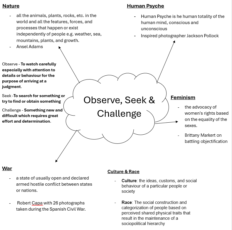
For my photoshoot I will be taking inspiration from Wolfgang Tillmans and Vinca Petersen. I want to create a photo book where there is a mixture of club and party images with some images of me and my friends hanging out. I have taken Wolfgang Tillmans nightclub photos and inspiration from Vinca Petersen’s ‘No system’ book where she takes pictures of her friends hanging out and relaxing before going on another night out.
My aims
My aim is to create a book where it shows the youth and fun within clubs and nightlife where there is also looks of regret throughout the book. The first filler image I want to use will be one of us hanging out a car window, this is to symbolise the fun at the start of the partying. After the first fun filler image I want the rest of the filler images to be used to symbolise the regret and unpleasant experience after the night out. Then finally the last image to be my friend hungover. This is because I want to show the cycle of going out every weekend and the result after it happened showing it to be fun at first but then eventually gets tiring and repetitive. I also aim to show the different type of people that I go out with and all my friends in one book. showing the different personalities and identities in the people throughout the book
Photoshoots
I will be taking 1 actual photoshoot of set up images where I will get my friends to be acting drunk and then hungover. We will also be getting a photoshoot of us in a car hanging out the windows and having fun and laughing, which will be filler images. I will then be taking photo of different nights in town or parties then present them in a photobook, I want the first image to start off with us out at a party or in town and then the final image to be one of my friend being hungover in the morning after all the partying throughout the photobook.
Wolfgang Tillmans is an influential contemporary German photographer. He began his career photographing nightclubs roughly three decades ago. Known since the early 1990s for his photographs of young people in their social environment – clubs, gay pride parades, warehouse parties.
Tillmans was initially known for his seemingly casual, sometimes snapshot-like portraits of friends and other youth in his immediate surroundings and scene. Tillmans was considered the “documentarian of his generation, especially that of the London club and gay scenes. Half of his work is staged, with the artist choosing the clothes and the location, as well as setting his models up in their positions.
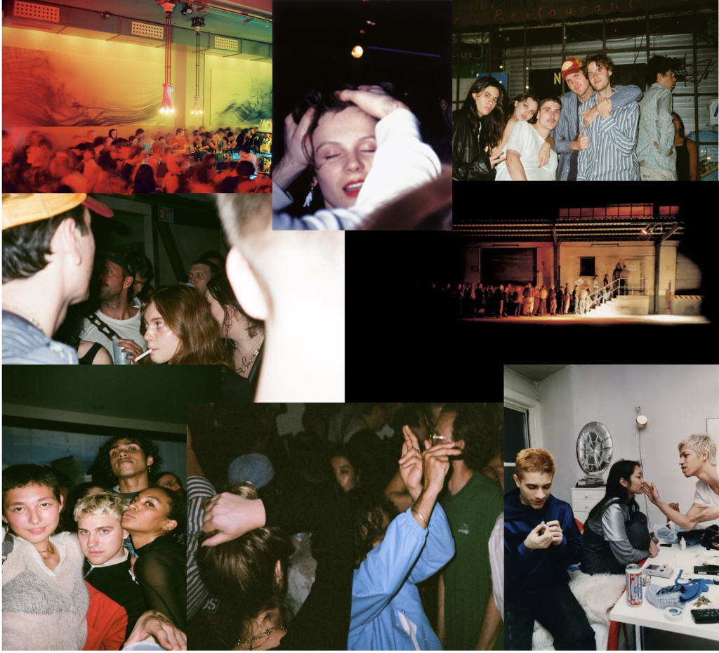
Mood board
This mood board of Wolfgang Tillmans club images are the types of images that I would like to take in my own photoshoots.
Image Analysis
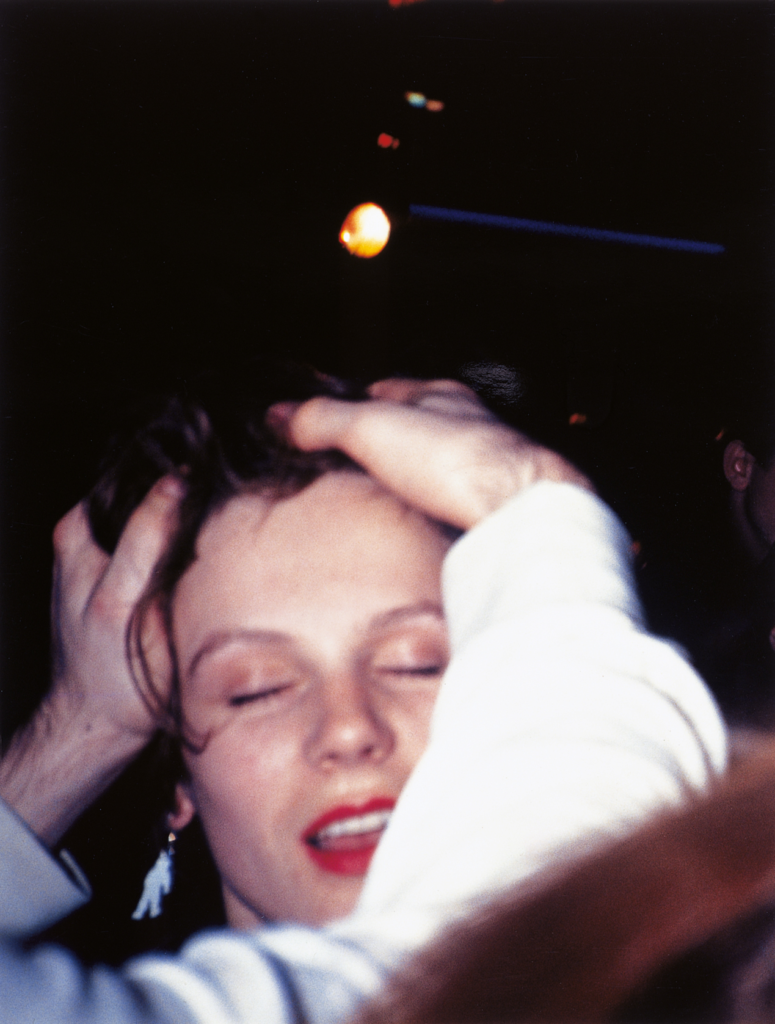
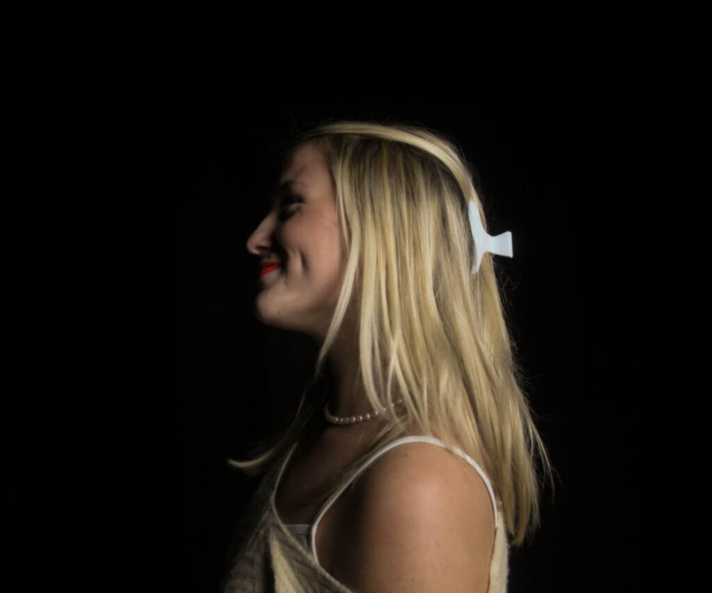
I have chosen this image to analyse this image of a woman with a mans hands in her hair. This image stood out to me because it was a lot closer up to someone and more focussed on one person instead of a group of people like lots of his other images. The main focus of the image is the woman and the hands in her hair, the arm is the brightest thing in the image making it catch your eye then the background is very dark. The image was taken in a club, which could be a tense upbeat place, but the woman looks like she is calm, the hands in her hair could be adding to the relaxing feeling. This is the most interesting factor of the image as it makes you wonder why she looks calm, it could be that the man is someone she trusts or loves or she could be drunk/on drugs.
Swindells started taking photographs while at university in Sheffield, inspired by a 1982 exhibition of Derek Ridgers’s nightclub portraits at the Photographers’ Gallery in London. After graduating, he moved to London and got a bar job in a club which he later got fired from for taking pictures. In 1985, he started taking club portraits. Since the early 80’s Dave Swindells has been documenting London’s most influential club, rave scenes and nightlife. As Time Out Clubs Editor from 1986 – 2009 he had exclusive access to nightlife and its shifts in youth culture, styles and attitudes. Dave Swindells captured on film what it meant to be raving during the late 80s and 90s. Starting off by taking sly photos on the dancefloor instead of working behind the bar, he quickly moved up in the world of nightlife press. Swindells remained Time Out’s Nightlife editor for over two decades, getting not only an insight into capital rave scenes over time but experiencing first-hand the birth of acid house.
In the case of acid house, overwhelming numbers of clubgoers defying the police to dance all night at huge, illegal parties eventually led after new laws failed to contain them to a gradual loosening of the draconian restrictions on both club opening hours and the sale and consumption of alcohol in the UK. These characteristics have also made the nightlife scene hard to record. There are technical issues for photographers in clubs, but also issues of trust. Swindells has been able to take candid pictures in clubs like Shoom because he made himself part of the culture by turning up night after night, year after year, bearing witness without ever being intrusive.
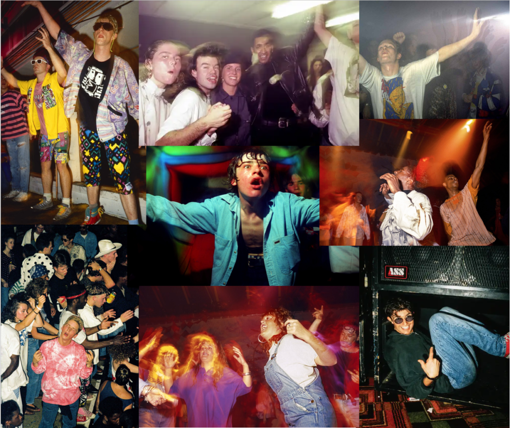
Mood Board
This is a mood board of my favourite Dave Swindells images. I have chosen these images because I like how there is a mixed variation of images, for example there are people who are posing and looking at the camera but there are also people that haven’t acknowledged it. These images show nightlife through the 80s and 90s and to me show a large difference is culture, fashion and styles from then compared to now, for example the hairstyles, outfits and behaviours. These are things you wouldn’t see in the youth culture now in clubs therefore I want to contrast this and show my own version of the youth culture nightlife in my photoshoot projects.
Image Analysis
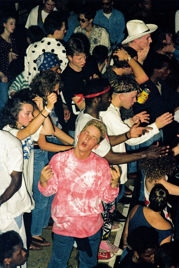
I have chosen to analyse this image of a man in a crowd of people who stands out from the other people. He is in the centre of the image making him the focus, also the bright pink jumper he is wearing makes him stand out compared to the crowd of everyone else wearing white and black. Another thing that stands out in this image is that everyone in this image is wearing denim jeans, this shows a large amount of the fashion at the time. To me this image represents the youth culture and fun during the 80s and 90s nightlife scene.
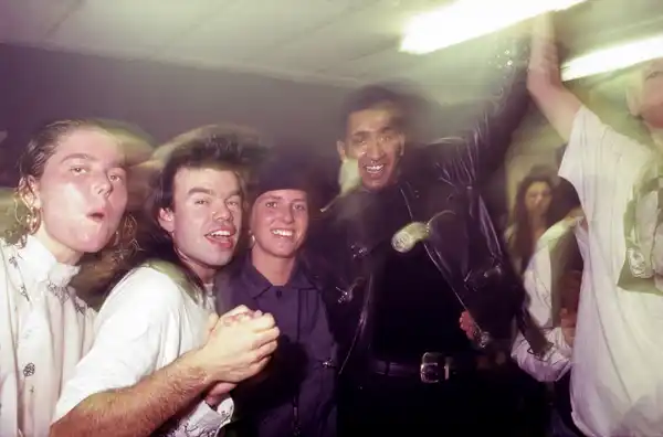
This image is of a group of people who are raving and partying in a nightclub. this image is different from the other one as the people have acknowledged the camera and are smiling at it. I liked this difference from some of the other images because it shows the reality of what would happen if people saw someone taking a picture of them, it shows that they are having fun and wanted to have their picture taken which is a realistic factor of going out with a camera and pointing it around when drunk people see it being positioned their way, they will probably smile.
Vinca Petersen is a British photographer and artist. Her photography book No System documents her life in the 1990s travelling around Europe with sound systems, putting on free parties. Her pictures began as a visual diary, documenting her leaving home at seventeen, moving into a London squat and becoming involved in the free party scene that grew across Europe in the 1990s. In the UK, free parties grew out of the rave explosion of 1989 when crowds of up to twenty-five thousand people would gather in the English countryside for illegal all-night events fuelled by MDMA and techno music. Petersen had become involved in this scene while still in her teens in London. They wandered through France, Spain, Portugal, Italy, the Netherlands and Germany, banding together with other sound systems to put on huge parties in remote countryside locations in the summer, then separating to seek out smaller, more urban venues, such as empty warehouses, when the weather got colder. The resulting pictures are intimate and warm, celebrating the travellers without romanticizing them. Petersen shows the damage as well as the highs of drug use, the litter and destruction the travellers left, as well as the euphoria of their parties.
Mood board
These pictures from her book ‘No System’ document a lot of information from her travels around Europe, for example their party habits and waking up the next morning feeling rough and repeating it everyday for years. The journal entries provide information on how she was feeling and documenting what has happened that night or day which I find intriguing because it is a completely different life as they don’t have any rules where they are and completely free, compared to the party and rave scene now where you don’t hear much about illegal parties and raves in the countryside.
In an article written by Sheryl Garratshe says “The travellers played what Petersen describes as a constant game of cat and mouse with the police. As a result, they were wary of outsiders, especially those taking pictures.” This shows Vinca Petersen’s passion for photography as she was willing to get in trouble from her fellow travellers for taking images of their lives and parties. The article also states how Petersen’s images “have been taken by an insider. Working with small, inconspicuous cameras, she sometimes didn’t even look through the viewfinder before clicking the shutter; other times she’d leave a camera on a bar overnight and retrieve it in the morning to see what had been recorded.”
Image Analysis
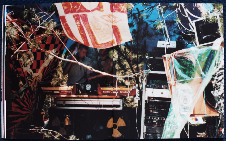
I chose to analyse this image of two men at a DJ stand because it shows the life they were living while they were travelling. The DJ stand being covered by different materials shows the little/no money that they had within their travelling lifestyle as they had little money to afford proper shelter and they probably moved to a different location after this day. This image was taken during the day because it has natural lighting and no artificial lighting as she is a documentary photographer and it was taken in somewhere like a forest or countryside as they only went to remote locations, otherwise they could easily get caught by the police. This image doesn’t romanticize the travelling and party lifestyle as it doesn’t make it look appealing, the image looks dirty and rough but also free. The main feeling that is presented in Vinca Petersen’s book ‘No System’ is freedom, it is shown all throughout the book and I can see it a lot in this image with the countryside background and knowing the backstory and facts about the book it makes me see it even more.
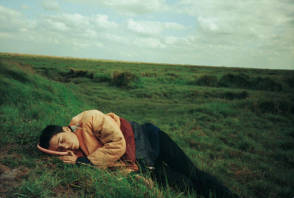
I have chosen to analyse this image of a person asleep in a countryside field because it represents the freedom and euphoria that they experienced while they were travelling around Europe with their sound systems drinking alcohol and taking drugs. This could either be an aftermath of a night that they had or just someone relaxing in a field of tranquillity. The image shows little about what has happened to lead up to it, but knowing that the book is set on them travelling and partying around Europe you can add up what the story of this image is.
Still Life was the first time I went to the studio and used a camera to take pictures of objects displayed on tables and stands. It was boring but a good introduction to my first time using a camera properly and taking pictures.
Environmental Portraits
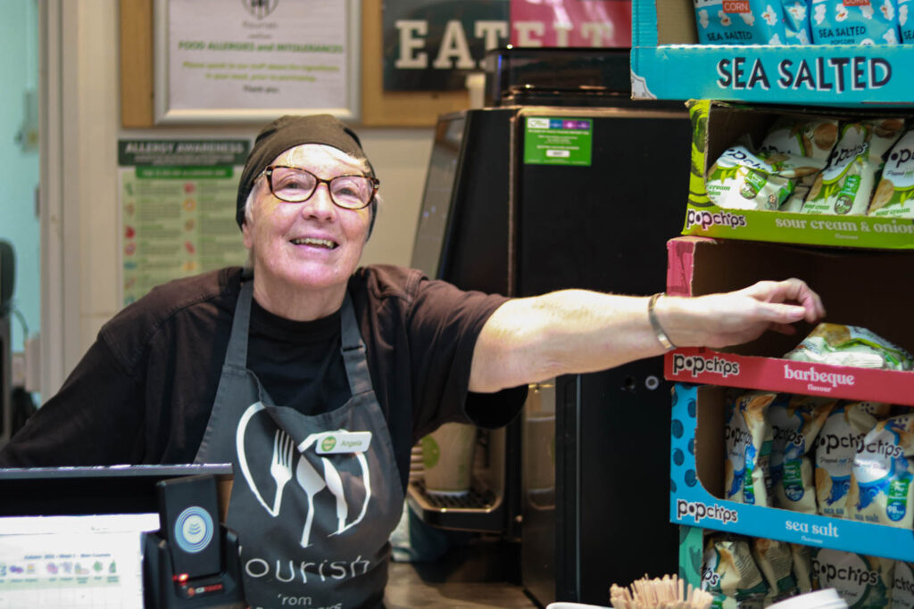
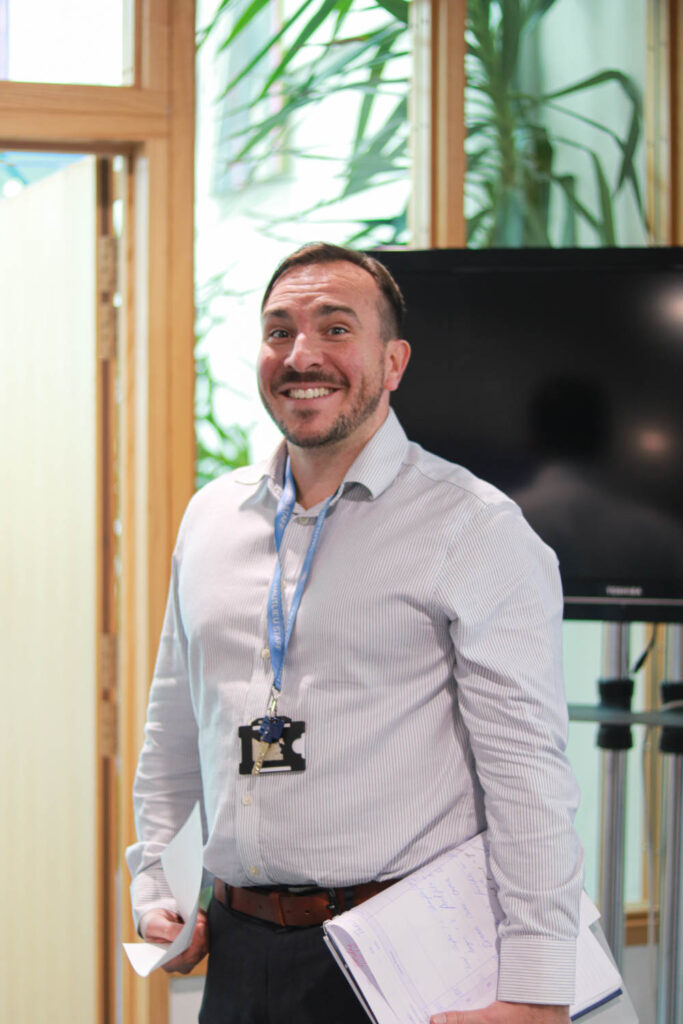
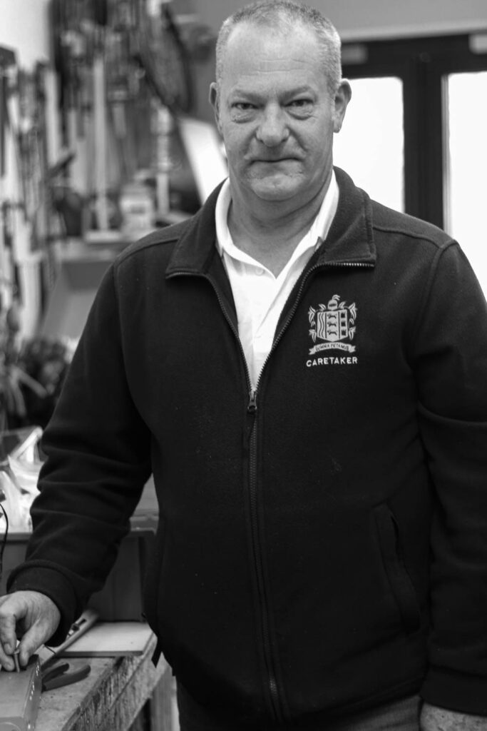
An Environmental Portrait is where you take a picture of someone in their natural or working environment and capture them doing their job, hobbies or whatever they are doing. For this, I went around the school and took pictures of teachers and other people that work in and around the school and took pictures of them doing their jobs. This was a good introduction to taking pictures of people and getting used to different environments.
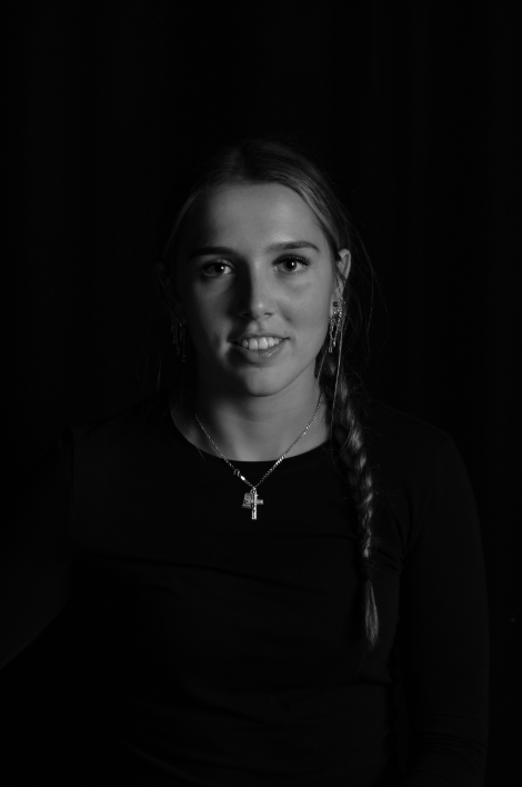
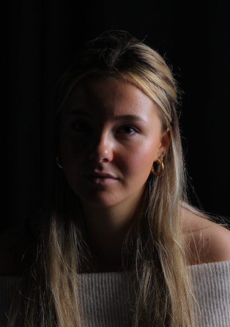
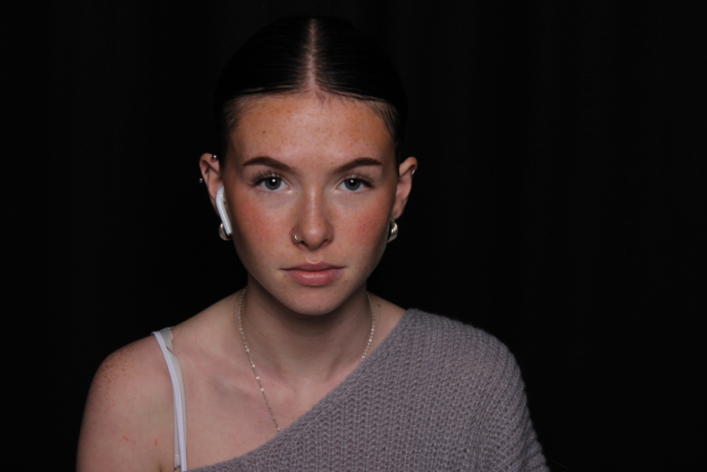
Lighting Portraits
Lighting portraits was another one of my favourite topics that we did because I was able to experiment with and include the different techniques I learnt in the studio which where, Rembrandt, Chiaroscuro and Butterfly.
Rembrandt Lighting
Rembrandt lighting was where you would angle the light on one side of the person so one side is lighter and then reflect a screen that the light reflects off and brightens up the other half but darker
Chiaroscuro Lighting
Chiaroscuro lighting was a strong contrast between light and dark where there would be bold colour differences throughout the image where it isn’t a smooth transition and more of a harsh one.
Butterfly Lighting
Butterfly lighting is where the light is angled above the persons face creating shadows underneath the nose creating a butterfly shape and more shadows on the cheekbones and ja
Femininity and Masculinity
Femininity and Masculinity was one of my favourite projects that we did. For this project we decided to go with the femininity theme take inspiration from Marilyn Monroe in the 1950s and recreated some of her images from what they would be like if she was in this generation. I enjoyed learning about the different stereotypes between men and women from a long time ago like during the war and the stereotypes now and comparing the different styles and aesthetics between different decades. I also learnt how different stereotypes can affect people and their emotions and try and live up to these stereotypes of the ‘typical’ man or woman and how they can be recreated in a photoshoot, like we did. I also enjoyed coming up with an idea for the blog and making it come to life in the studio.
Anthropocene & Typography
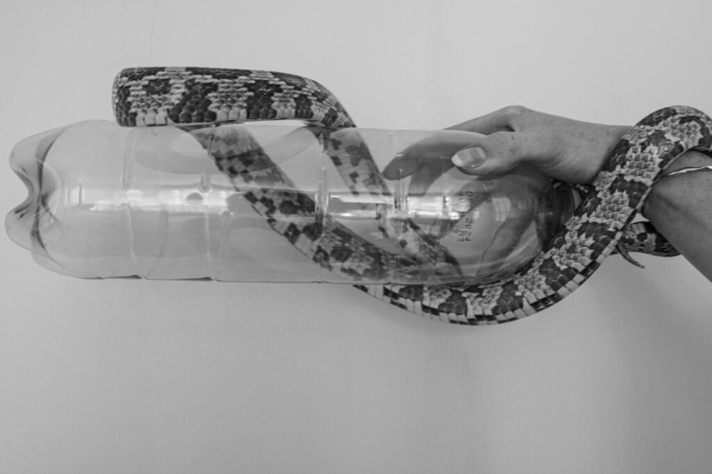
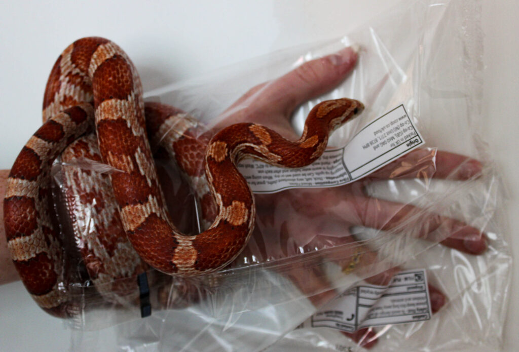
Anthropocene is used to simply describe the time during which humans have had a substantial impact on our planet. I liked the Anthropocene topic because I was able to learn about the impacts of the planet while also being able to use my imagination to create my own version of what the main issues in the world are from humans for example, climate change and what can add to the issues of it and also animals dying due to plastic and other human causes, I used my friends snake and some rubbish to create re-create this.
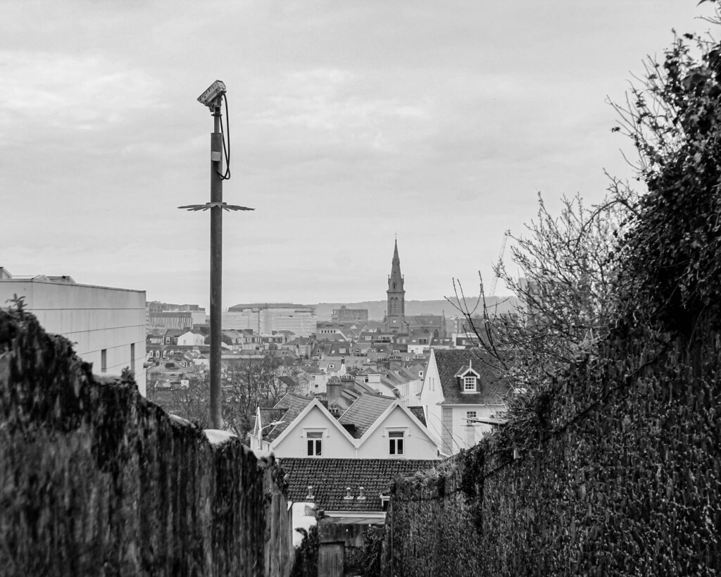
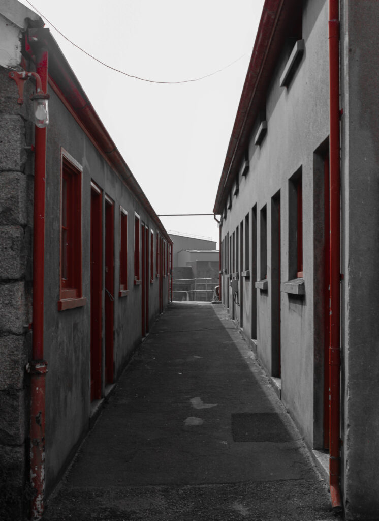
Typography is the photographs of odd looking structures that would be classified as ugly but to make them look aesthetic in images. For typography I used Harve des par and took pictures of building around and the pier, I also went to St. Catherines and took pictures of the pier and St. Helier and took pictures of it from on top of a hill over looking town. I mainly enjoyed typography because I liked taking pictures of the buildings and structures and editing them in a way where they look aesthetic and then print them out to put them into a window frame.
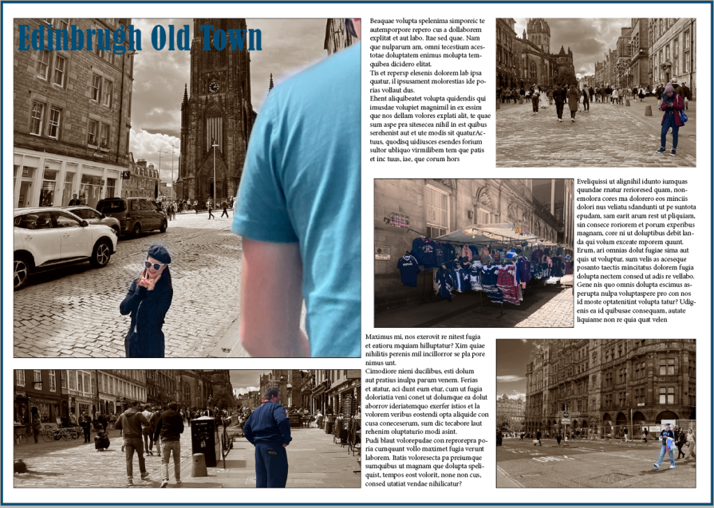
Street Photography
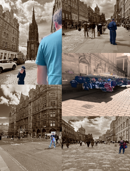
Street photography was where I would take photos of people and places to create a final photo story in InDesign. I enjoyed street photography as I was able to go out and take pictures of people and things that I found interesting and thought would look good together as a final piece. For my street photography I took pictures in Edinburgh and Paris, which are two places that I think have good architecture and looks to create the vintage looking aesthetic that I wanted for my street photography images.
Photo Story
Maritime & Harbour
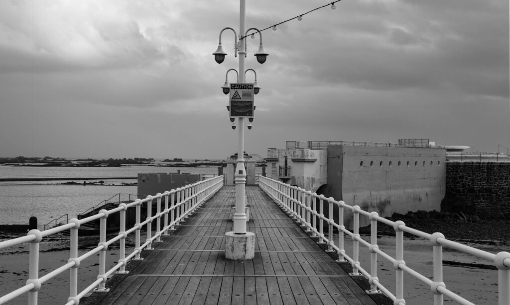
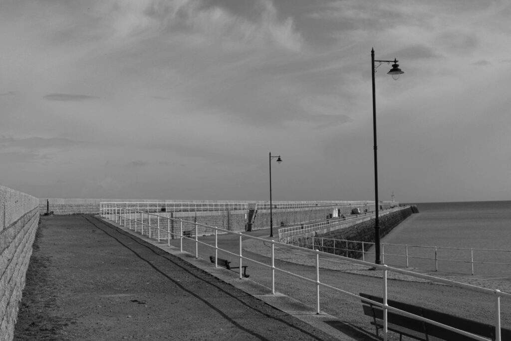
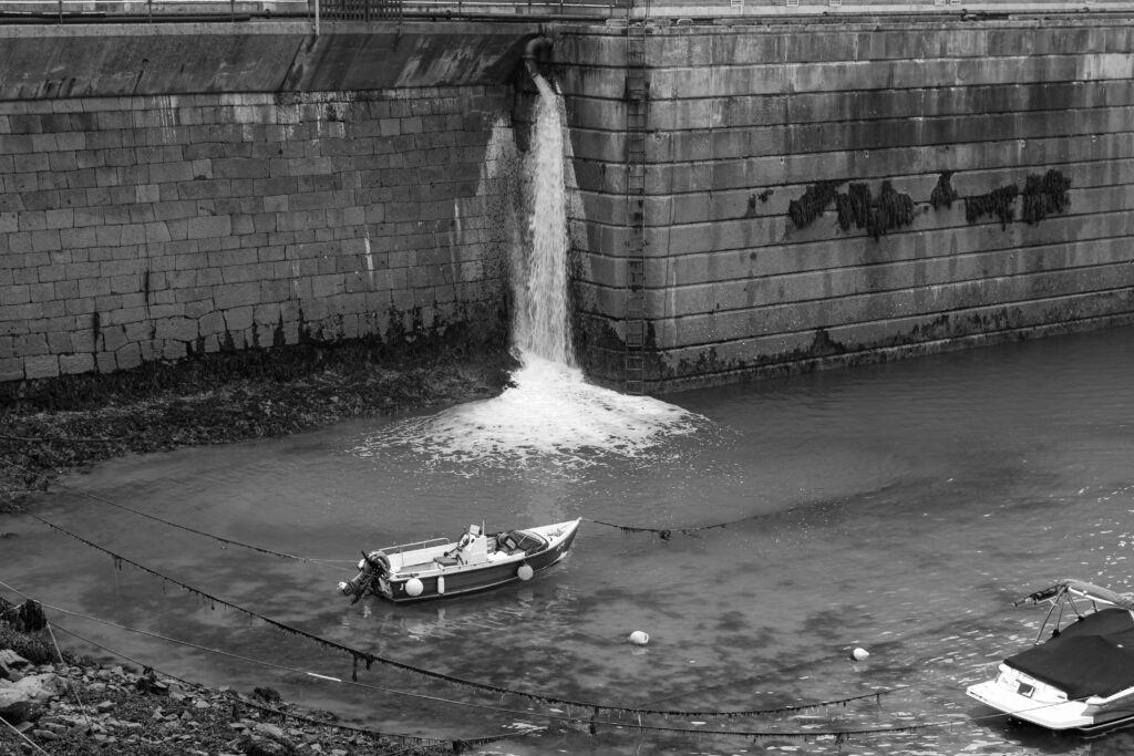
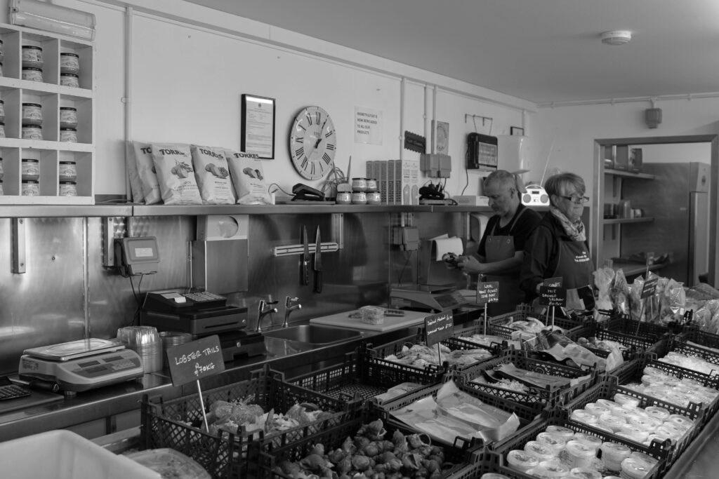
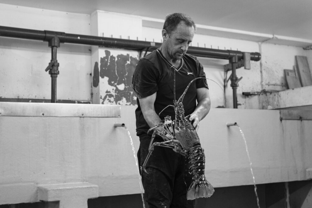
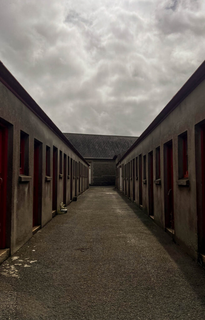
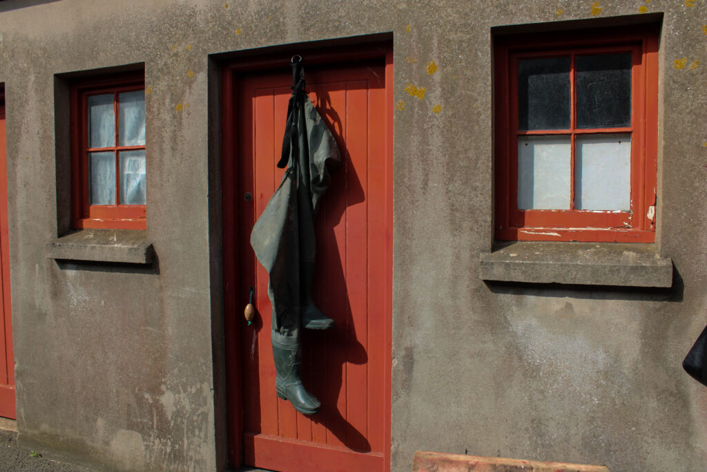
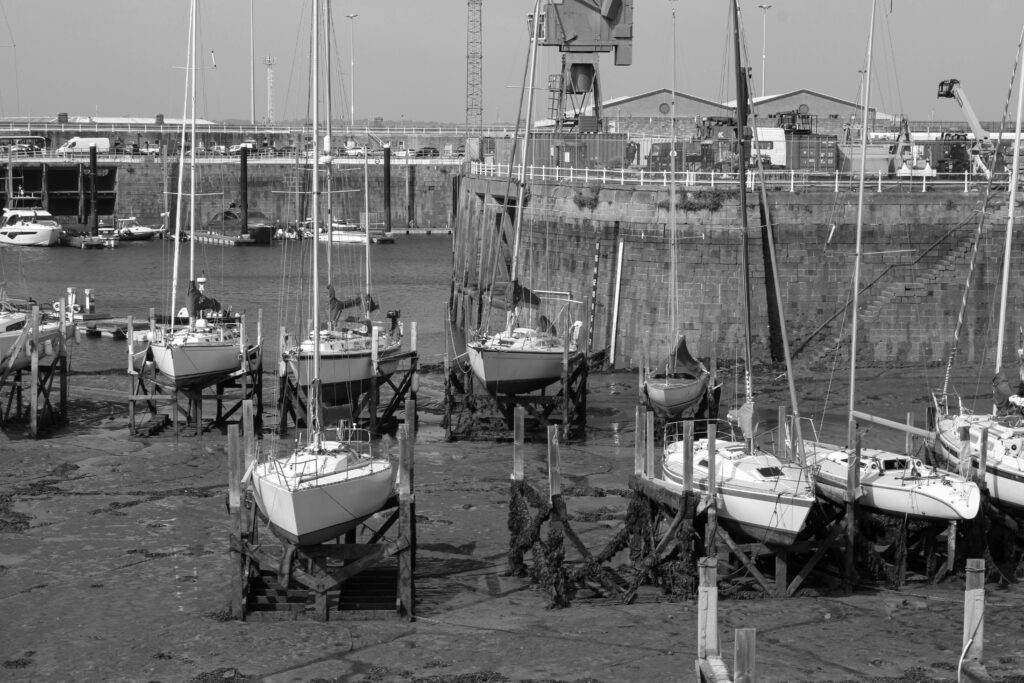
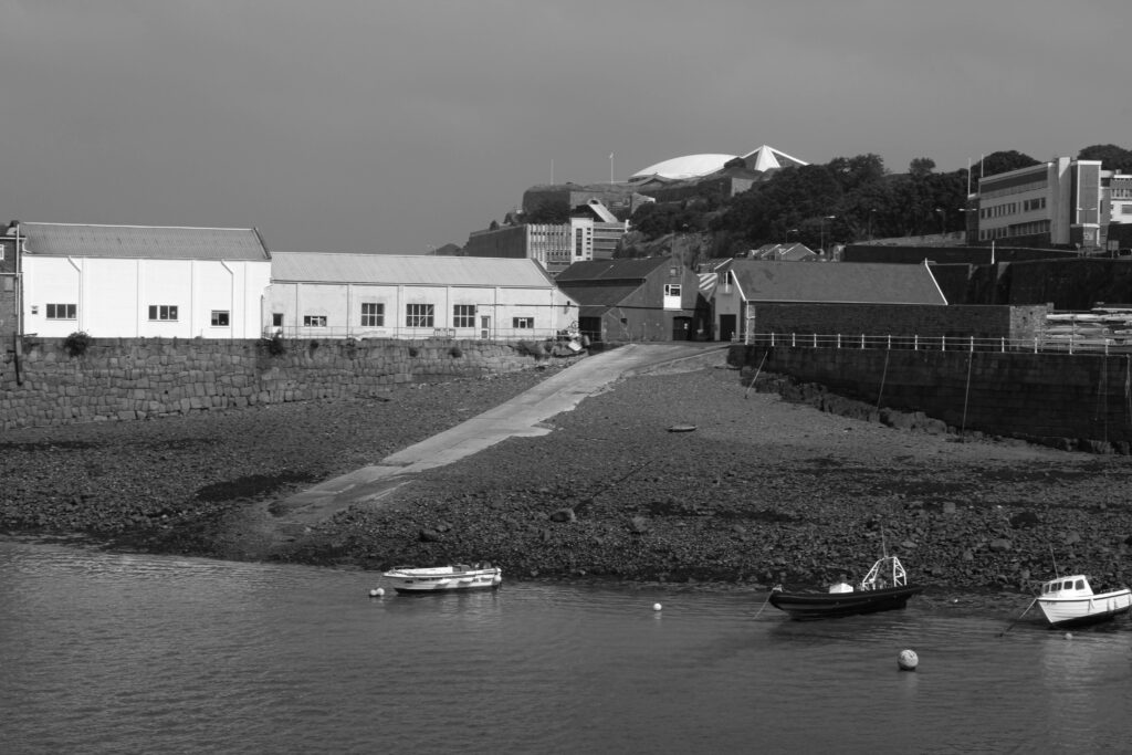
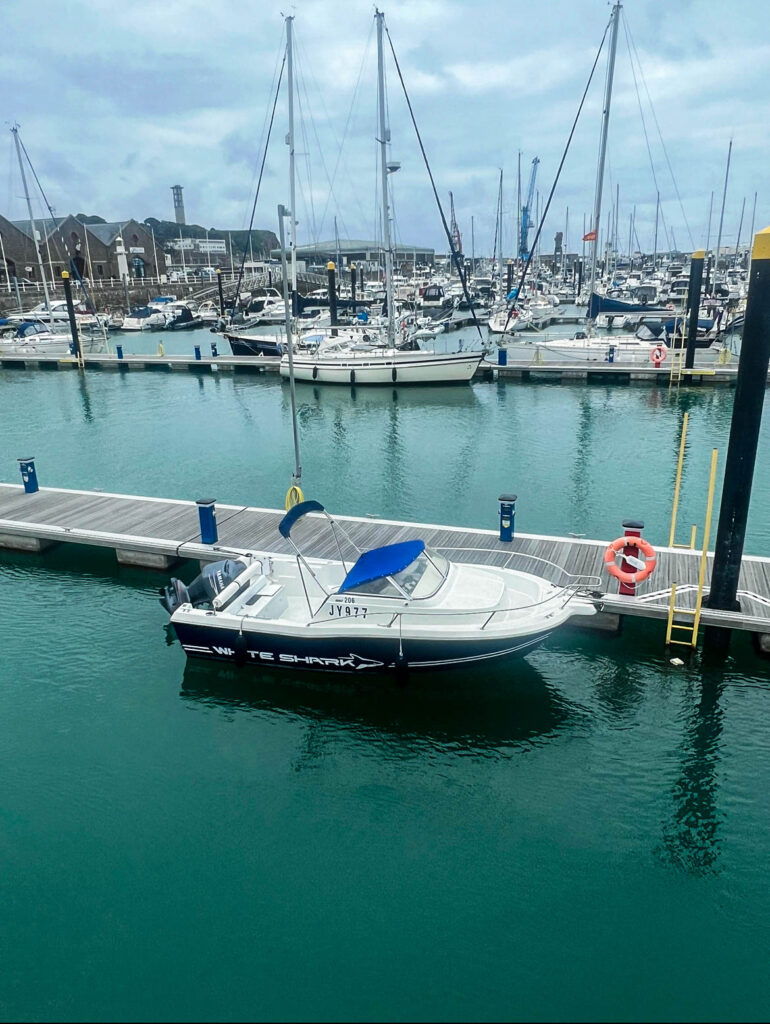
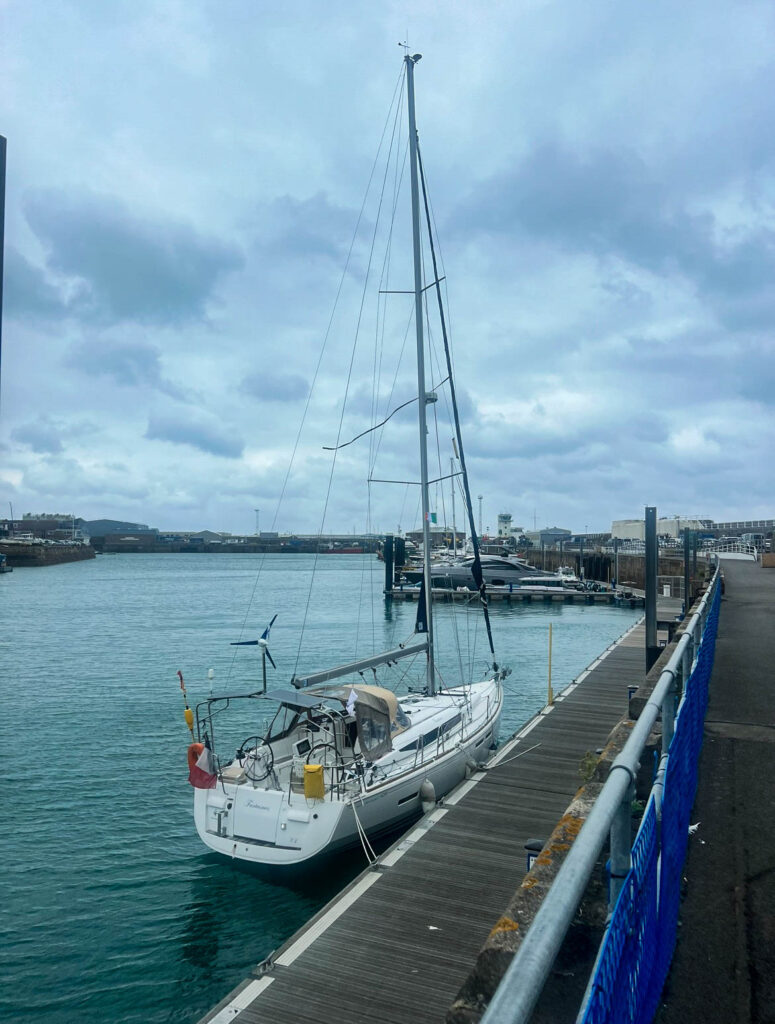
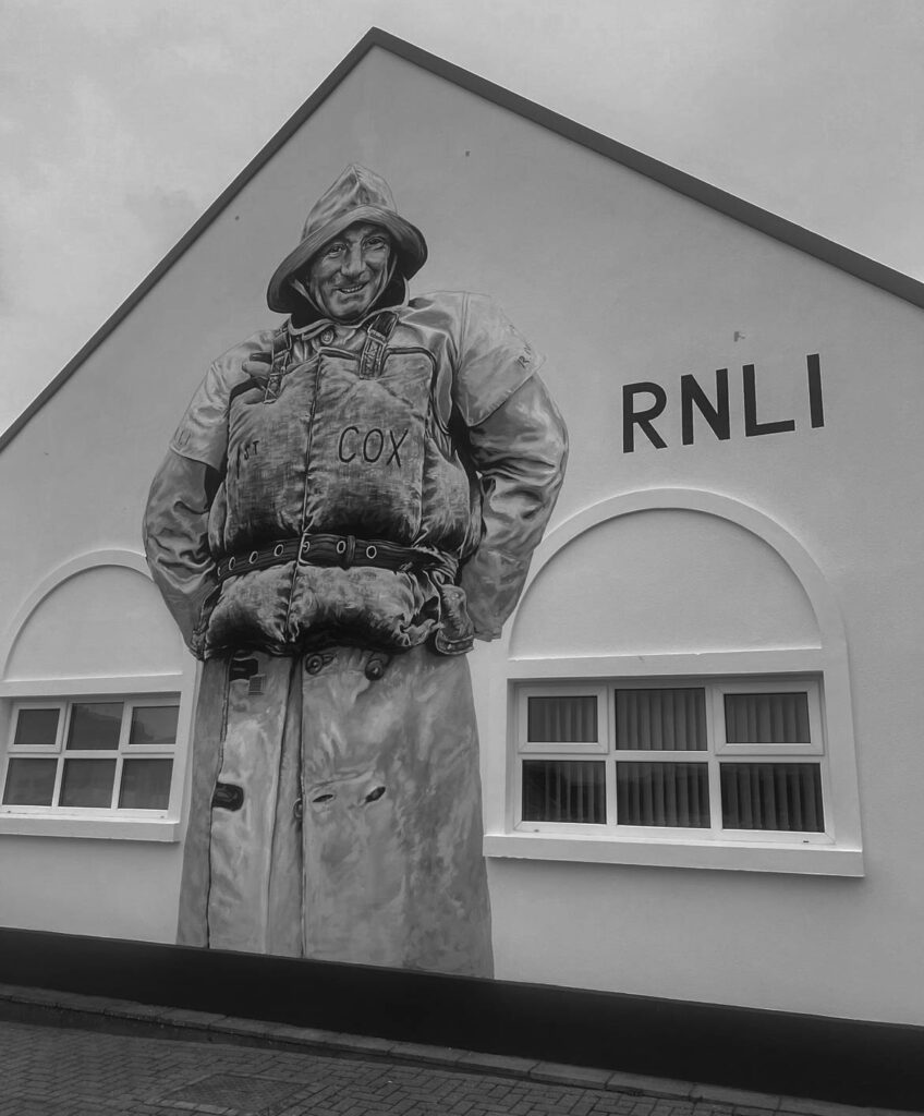
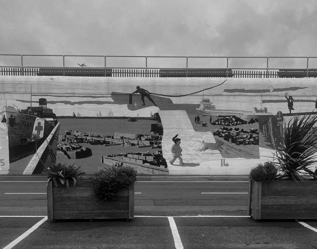
Taking pictures of the harbour was another one of my favourite topics. I enjoyed taking pictures of the harbour and structures around it while also taking pictures of the people that worked there. This topic brought in other skills that I had learnt throughout my year at Hautlieu like environmental portraits, landscapes and typography. Learning about the maritime and harbour history at the maritime museum and the harbour master was also another interesting and unique thing to learn about as not many locals that live here would do that and get that opportunity.
Zine
For my zine I used my pictures that I took around the harbour throughout my two days there and created a zine with them. A zine is a small book with minimal or no writing that tells a story through its images. To create this I used InDesign and put a zine with my favourite and best images that corresponded together nicely to create my zine which I wanted to tell a story about the harbour and its history. I chose a minimal design for my zine where there was no writing apart from the front cover which has the title and my name.
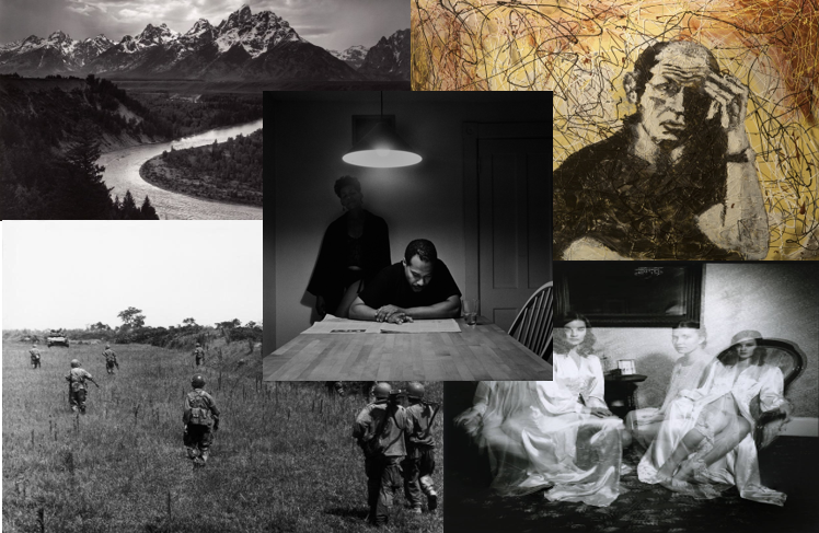
As photography began with the Camera Obscura dated back to 4th century BC and known as an ancient building block for photography where an image is reflected into a dark room upside down using only natural light, which is still used by photographers to this day. It was then developed by French photographer Nicephor Niépce in 1822 who is named the father of photography, his first photograph was a view from his window in Burgundy, France. He used a sheet of pewter coated with bitumen, which required at least 8 hours of exposure time. Painter Louis Daguerre heard about this achievement and he decided to partner with Niépce. Daguerre continued to develop with the process by using silver-plated copper sheets and mercury vapor. As he continued to develop this process, Daguerre was able to reduce the exposure time.
After the death of Niépce in 1833, Daguerre concentrated his attention on the light-sensitive properties of silver salts. For the process which was eventually named the daguerreotype, he exposed a thin silver-plated copper sheet to the vapour given off by iodine crystals, producing a coating of light-sensitive silver iodide on the surface. The plate was then exposed in the camera. Initially, this process also required a very long exposure to produce a distinct image, but Daguerre made the crucial discovery that an invisibly faint “latent” image created by a much shorter exposure could be chemically “developed” into a visible image. The Daguerreotypes, introduced in Paris in 1839, process made it possible to capture the image seen inside a camera obscura and preserve it as an object, they were usually portrait and the rarer, landscape ones were more expensive. Typically Daguerreotypes would be used forrecording many other images such as documentary subjects, antiquities, still lives and remarkable events.
In the same year of 1839 William Henry Fox Talbot invented the calotype process. Calotype is an early photographic process, using paper coated with silver iodide. Paper texture effects in calotype photography limit the ability of this early process to record low contrast details and textures. Despite their flexibility and the ease with which they could be made, calotypes did not replace the daguerreotype. The calotype produced a less clear image than the daguerreotype. The texture of the paper was visible in prints made from it, making an image that was grainy or blurry compared to daguerreotypes, which were usually clear.
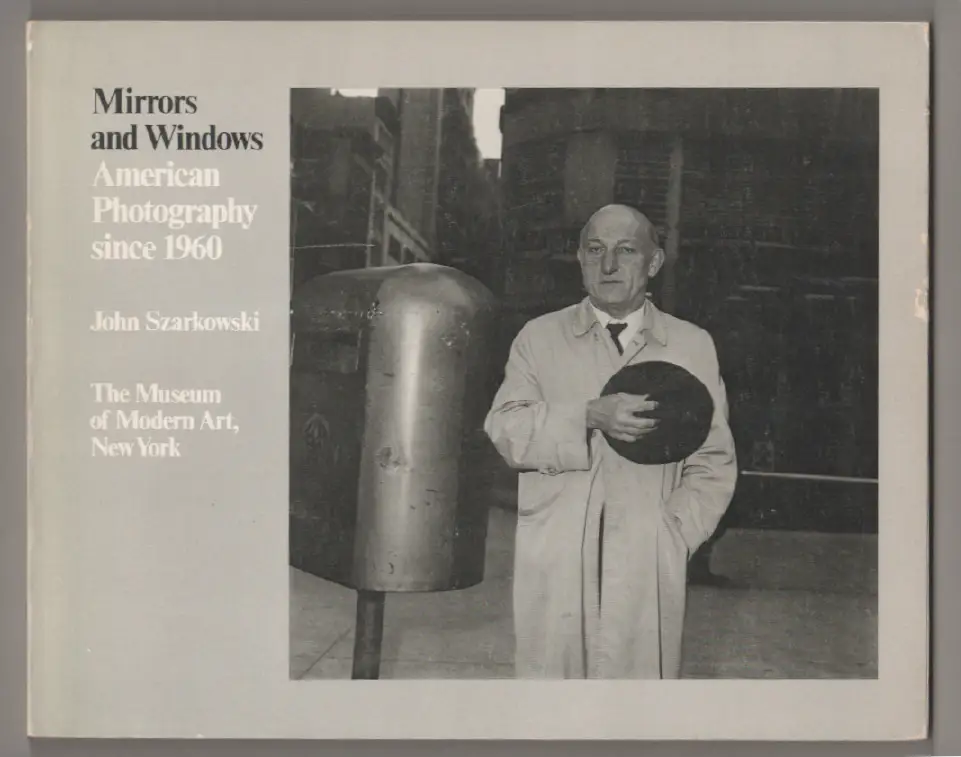
A daguerreotype would be seen as a window image as they document reality through the photographs and portraits of real people. A calotype would been seen as a mirror image as they can be manipulated as they weren’t typically used for documenting portraits of people and can be taken of anything as they were easier and cheaper. Using one of Szarkowski’s quotes ‘is it a mirror, reflecting a portrait of the artist who made it, or a window, through which one might better know the world?”
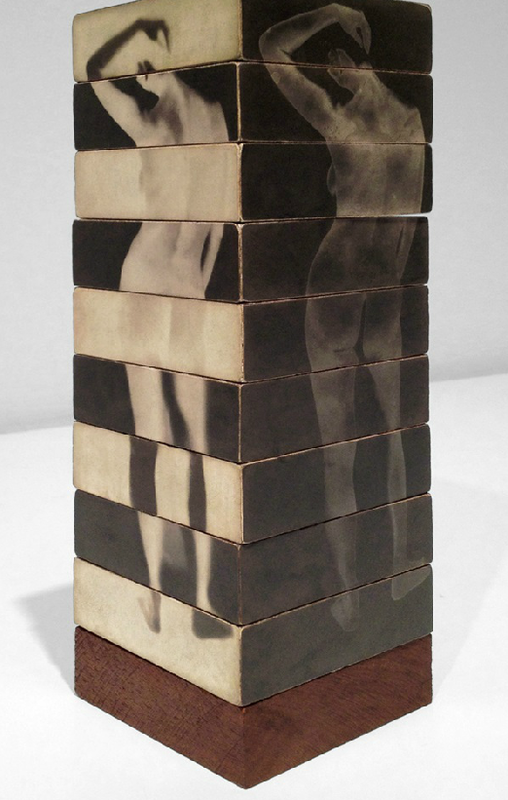
Mirror Image
Robert Heinecken – Figure Sections/(Multiple Solution Puzzle), 1966
This image is a mirror image as it has been highly edited and manipulated. I have chosen to analyse this image as I think there is a lot to talk about where every part of the image has been edited in some sort of way, for example the woman has been edited onto a stack of wooden blocks and reflected the same image on both sides. The body has been put on two sides of the blocks and one side has got a combination of black and white blocks where the body is shown more in the black parts and in the white parts the body is much lighter and almost transparent. On the other side where all the blocks are black and the body is also a more transparent figure yet is more visible and more obviously a body than the side that has a combination of black and white. The artist could have seen this image as a way to express the same body but differently, The two different colours on each side of the blocks could reflect on how the artist is feeling like feeling seen in different situations and referred to on the blocks. “The distance between them is to be measured not in terms of the relative force or originality of their work” I agree with this quote about photographs because it tells you that a photograph isn’t just about the originality of the picture its about how they do it and what the story behind the photo is whether its reality or made up and romanticized.
Window Image
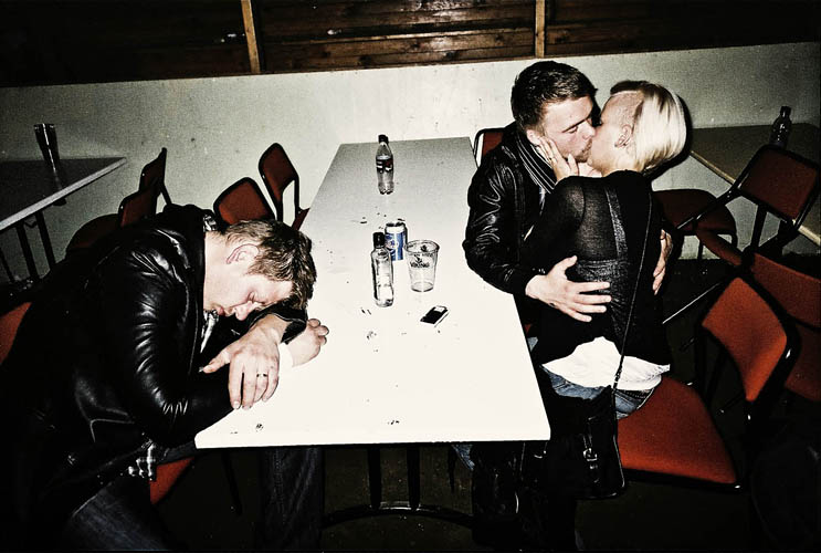
Rafal Milach, ICELAND, Saudakrokur, 2010, Annual horse gathering country ball.
I think this image is a window image as it has been taken of three people clearly under the influence. This Image to me is objective, shows realism and presents the effects of alcohol is young adults. This would be a window image as it is not staged and is taken authentically of three adults, one asleep or resting on the table and two kissing. This could also be seen as a more subjective image and therefore a mirror image but I think the realism of this proves otherwise. The actions that these adults are presenting can clearly show the influence of alcohol. a quote that I think goes well with this image from John Szarkowski’s thesis would be “The distance between them is to be measured not in terms of the relative force or originality of their work, but in terms of their conceptions of what a photograph is: is it a mirror, reflecting a portrait of the artist who made it, or a window, through which one might better know the world?” I agree with the quote because photographs can be objective where the subjects in the photo are real and representing what is in the image clearly with realism and truth or subjective where you get to make up a story and choose what the story is behind the image. “generous and inclusive acceptance of fact, objective structure,” and that the selection among these facts is the romantic, personal opposite built into any photograph of merit.” This quote from Jed Pearls review argues with John Szarkowski’s thesis that an image is either a window or mirror is argued from Jed Pearl that photographs all have romanticism included and that each photography has their own subjective story as it is personal to the photographer and each person that looks at it.
I think that John Szarkowski’s theory and Jed Pearls review has made sense of the idea of window and mirror images and has been put together well where John Szarkowski had put his idea out and Pearl has reviewed it and made it make sense. The difference between mirror and window images are that the mirror image has been manipulated and edited highly whereas the window hasn’t and is authentic. The subjectivity behind the mirror image is in the imagination of the people who sees it and has a selective story behind it. Whereas the window image has got truth behind it and is objective as there is what is in the image and that is it. “an evolution from public to private concerns and at the same time a potential toward either self-expression or exploration in the unique sensibility of each photographer” Is a quote Jed pearl used in his review of Szarkowski’s thesis and I think it has value towards what the thesis is getting across with mirror and window images as both include the photographers vision where a mirror is a reflection of the photographer and a window is what the photographer sees as objective and real where he wants to document the message they try to get across.
Is it a mirror, reflecting a portrait of the artist who made it, or a window, through which one might better know the world? – John Szarkowski
What are the differences between photographs that are Mirrors and Windows?
The difference between mirror and window photography is a mirror is a romantic expression of the photographer’s sensibility as it projects itself on the things and sights of this world. A mirror image is staged and subjective, they reflect the photographer and therefore called a mirror image. A window photograph is a photograph that shows realism and are objective. They are called window images because they show what is real in the image, like looking out of a window.
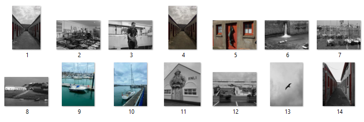
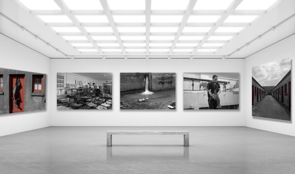
I have created a gallery for my favourite images because I can’t fit them all into one gallery so I put the images that best fit and look best together into one gallery.
I chose to put these images together in my gallery because they are the ones that I have put together in my zine and because they all are in black and white so in my opinion they look good together in the gallery.
Overall, I think my zine creates a good idea about the harbour and maritime history in jersey because of my different selection of images of and around the harbour throughout my zine. What could have improved my zine is if there were images of the maritime museum which could have added more diversity in my zine but they were my least favourite and didn’t have the best quality out of all the pictures that I took.