


Final layout

On Photoshop:


Final layout
On Photoshop:

I firstly, started off by creating a book with all my images and putting them in the order that I wanted them to be in. I used the type of colours and tones in each photo to match the photos together and some double page spreads for the bigger landscape images and then filler images on one page.
I changed the whole book colours and background colour to black as it looked better than the original white colour with my images that are darker and taken at night time, and it also fit with the title of my book ‘After Hours’ better.

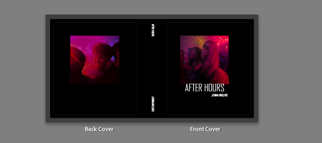
I put the title under the picture on the front colours and then put the title and my name down the spine of the book. I didn’t want my name on the front cover because I like the minimal look of the front cover with just the picture and the title.
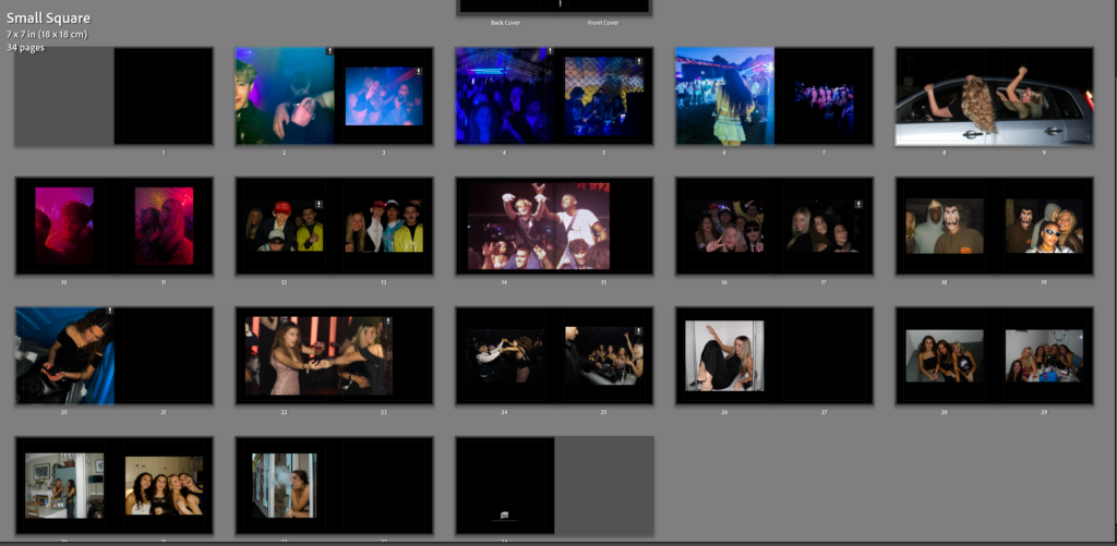
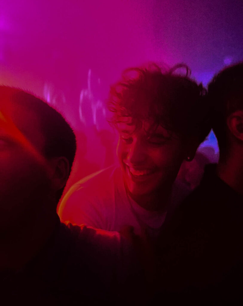
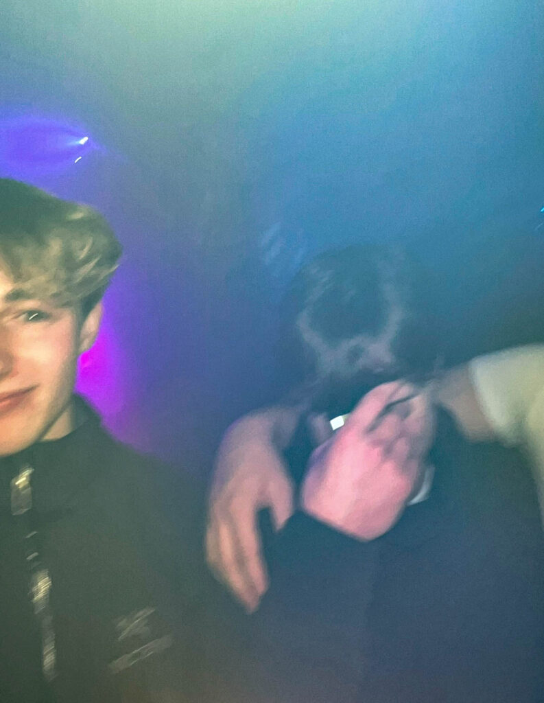
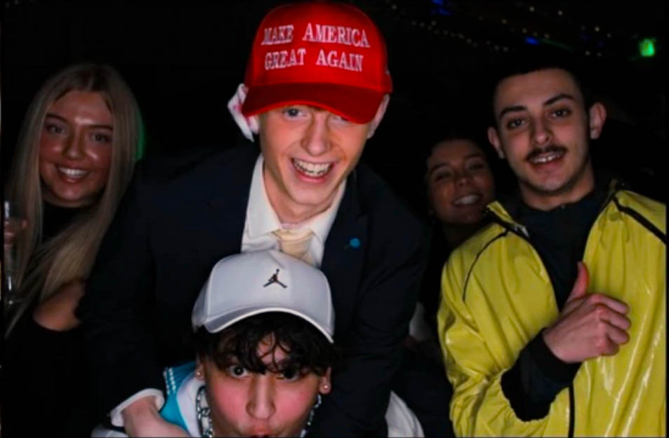
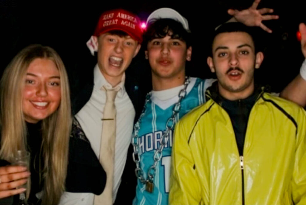
These two images were taken on the same night with similar lighting and contrast. I also put these two together because there is a blonde and brunette boy in one image and then in the other a blonde and brunette girl and I liked the contrast of it and it also matching the front cover images with the juxtaposition of the images with boy and girl linking to my theme of identity.

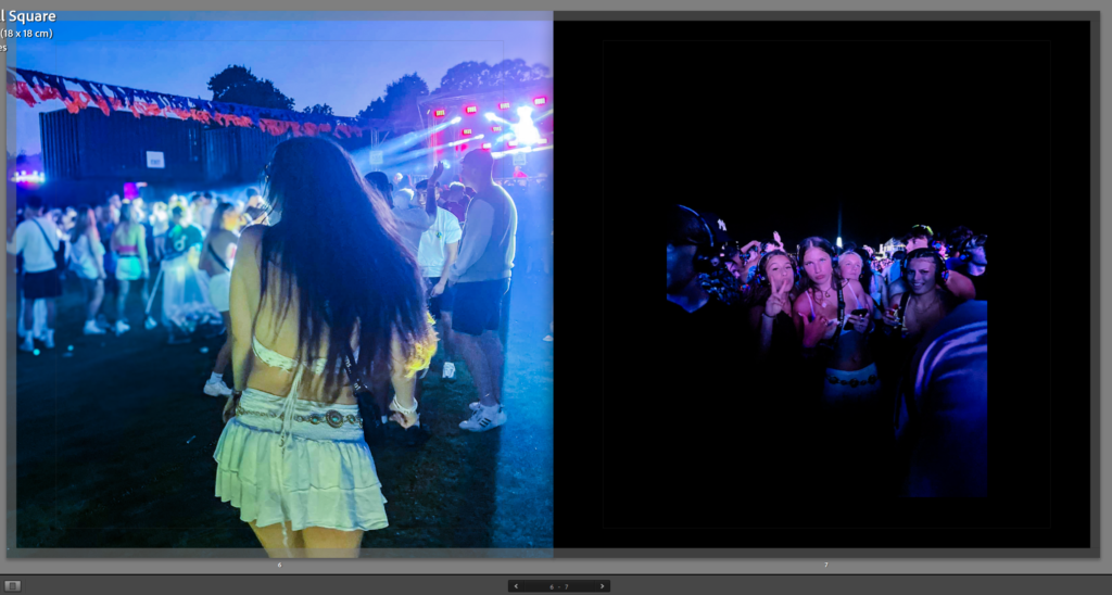
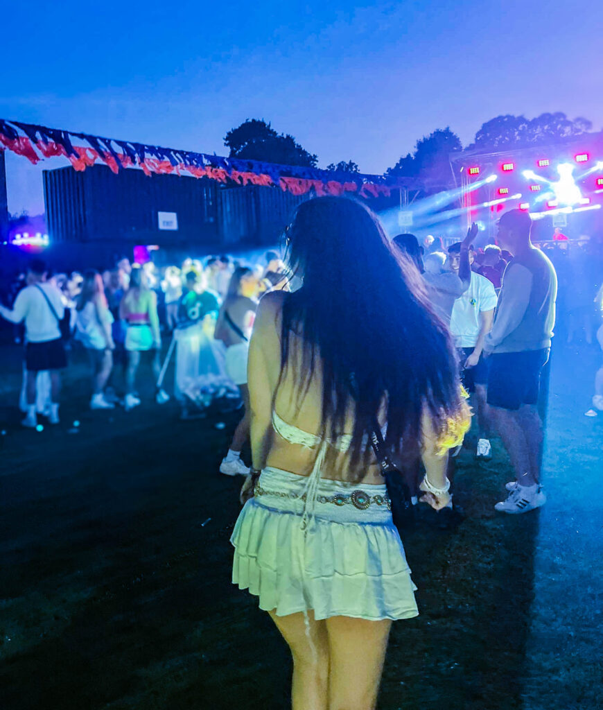
These two images I put together of a girl at a festival and then in the second image its that same girl with a group of her friends. I made sure both of the lighting in the images were blue and the previous images before it had that theme of blue.
For this picture I used as a filler image to separate the night from the next one. This picture is a double page spread where it is spread across two pages. This is because it is a larger landscape image and I liked it spread across two pages.
These two images I put on the front cover as well as in the book so that you could look at them together properly. I liked these two together because of the juxtaposition with boy and girl doing the same movement and the same type of photo. I also put these two together because of the colouring with them, the pink and purple tones of both images I think contrasts well with the black background.
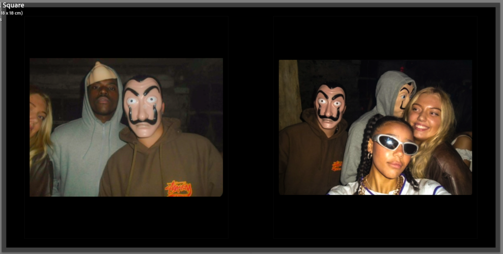
For this image I put two pictures together of the same night because I liked the way they it looked like they were taken at a Photo Booth so that’s why I put them together.
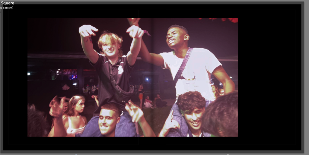
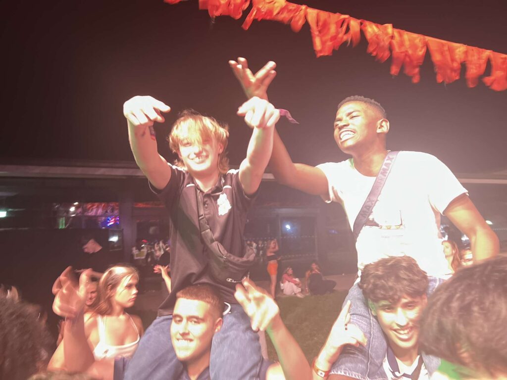
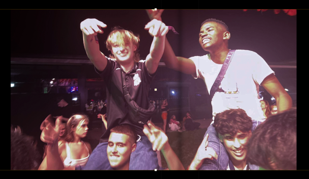
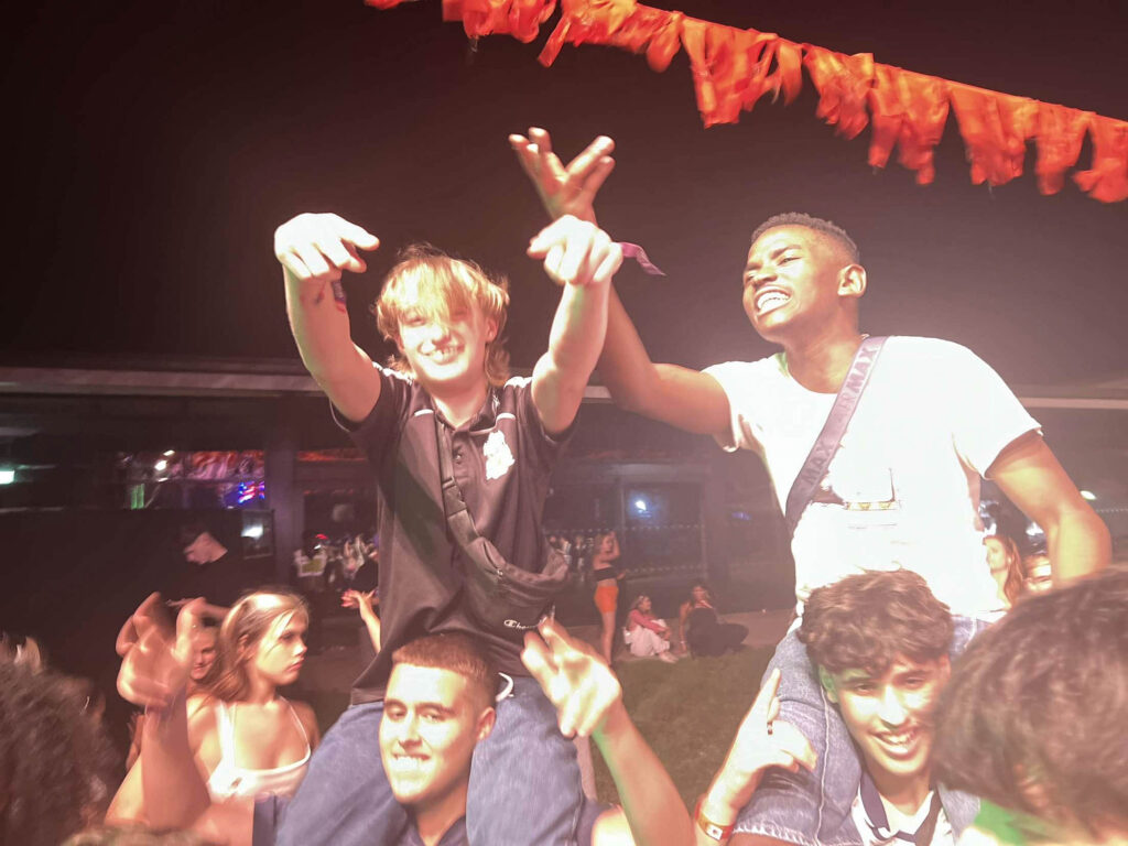
This image is a double page spread of my friends at a festival on each other’s shoulder singing. I like the way this image isn’t central of the two pages and is more on one page than the other.
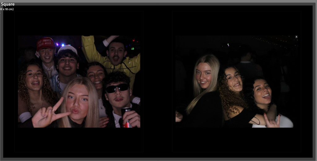
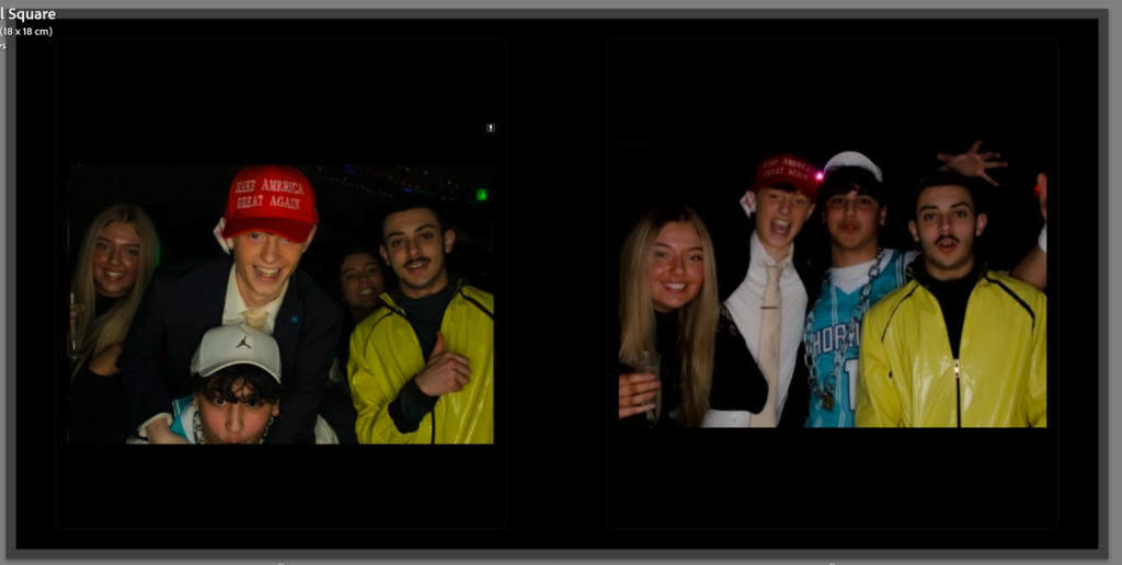
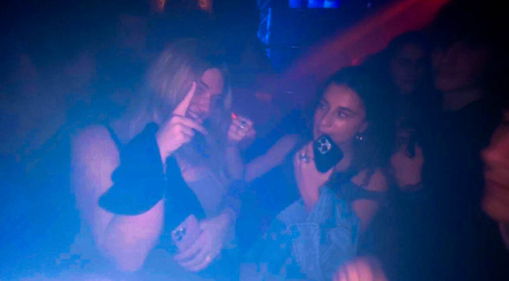
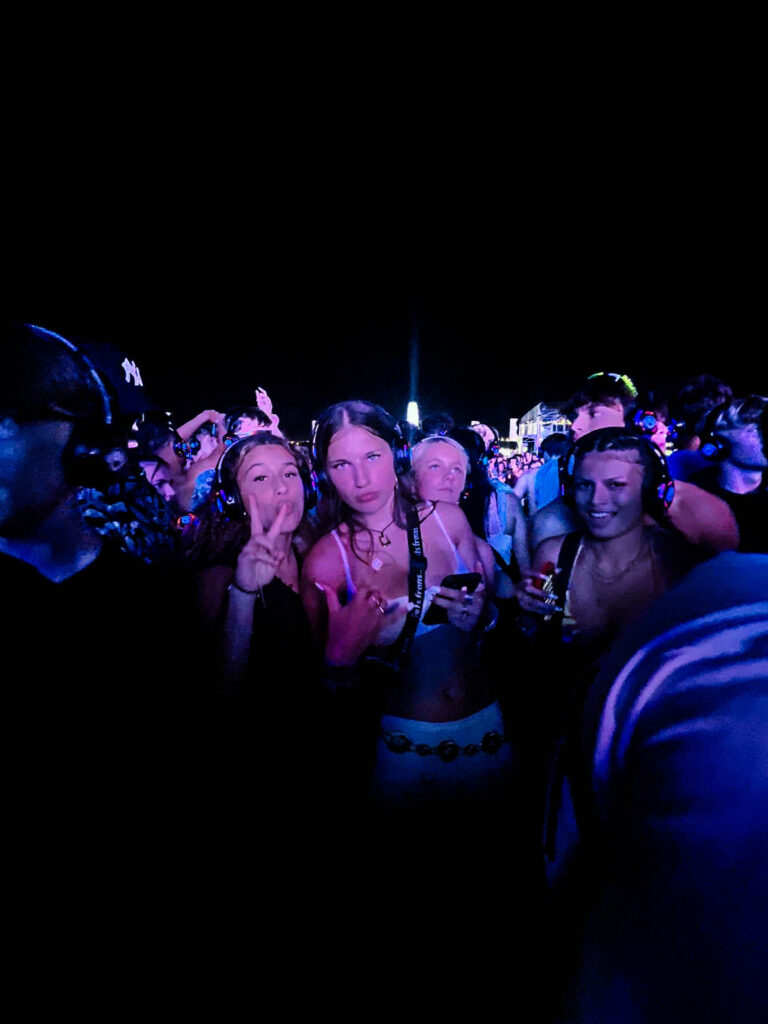
These two images also taken at the same event is put together because I like the contrast of the boys and girls in one picture together and the girls separate from the boys in the other. I also like the Photo Booth look in these images swell
These two pictures were taken on a digital camera and the pictures were already how I wanted them to look in my photo book. I chose these two to put next to each other because they were taken at the same event.
This image is a filler image for my photo book to separate the end of a night from another one. I chose this one because it is rough and it doesn’t romanticise going out like how the party pictures do.

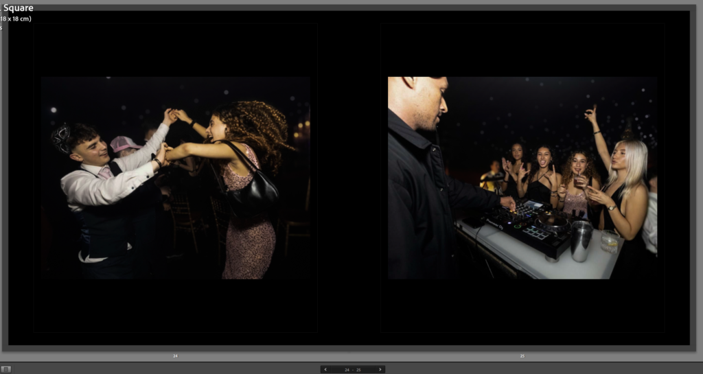
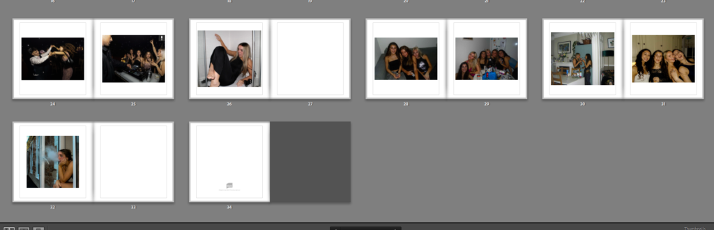
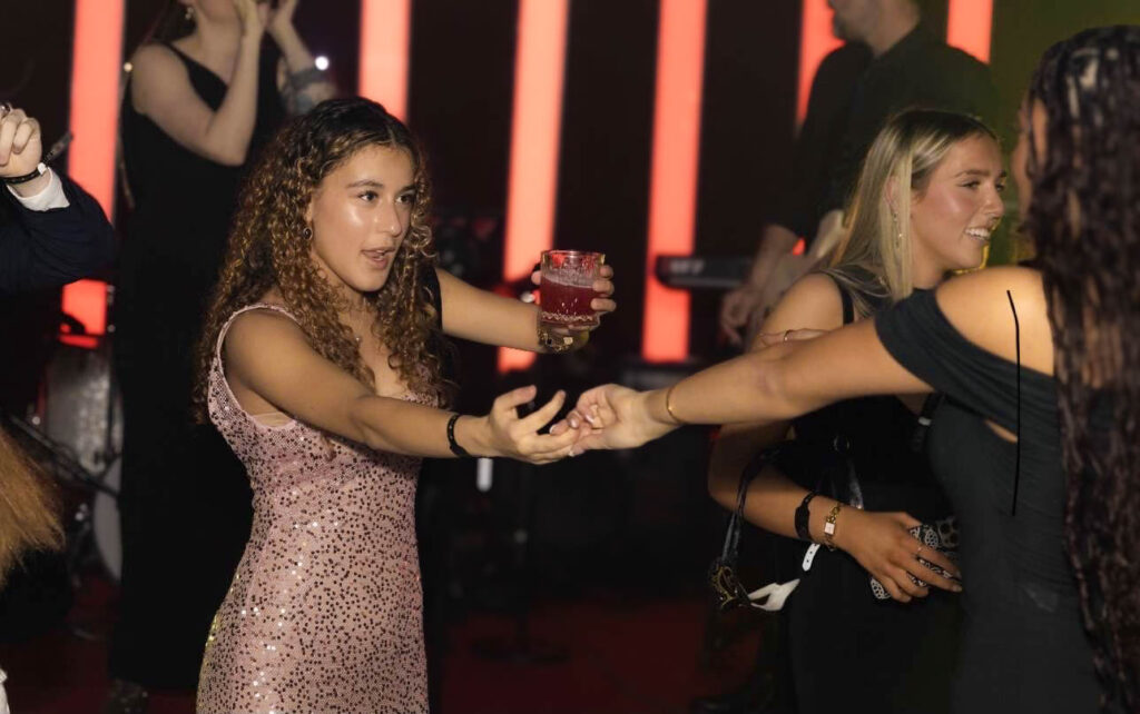
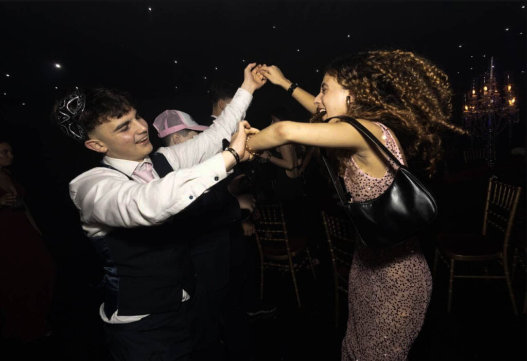
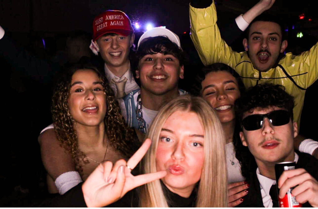
These three pictures, one a double page spread then the other two on the two pages are all taken at the same event. I put these pictures together because they all focus on the same girl throughout the three images. The double page spread of her dancing with another girl and a live band in the background, then the other two images of her dancing with a boy laughing then a group picture with the girls at a DJ stand.
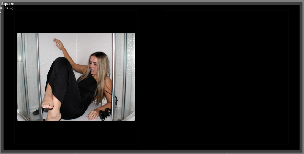
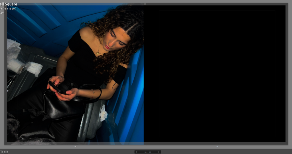
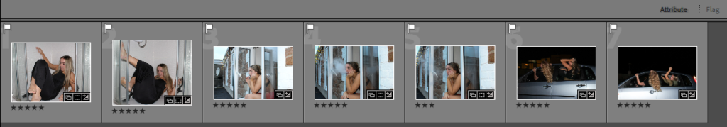
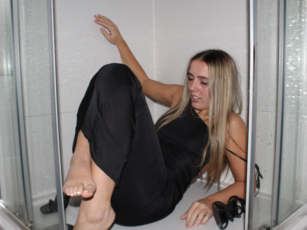
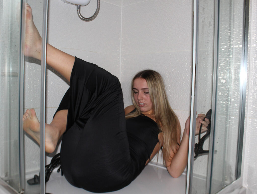
This filler image of a girl drunk in a shower. I put this on one page with a border around because I liked the way it looked how it is smaller and makes you look at the image followed with a blank black page next to it shows that its the end of the night and a filler image.
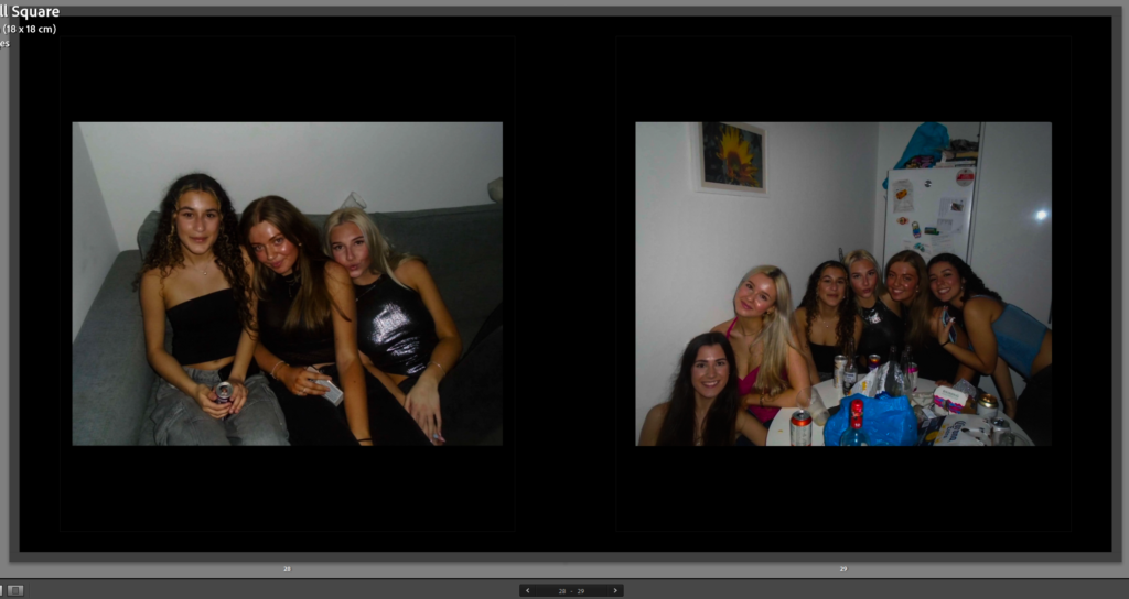
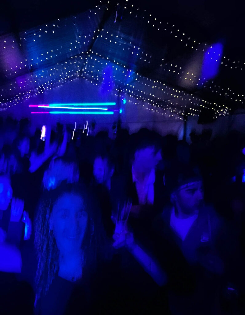
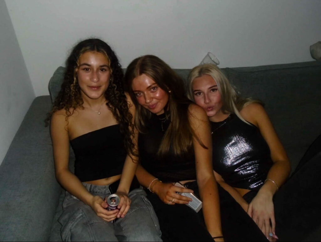
These two images taken in the same are of a group of girls at a party, one taken on the couch and then the other around a table.
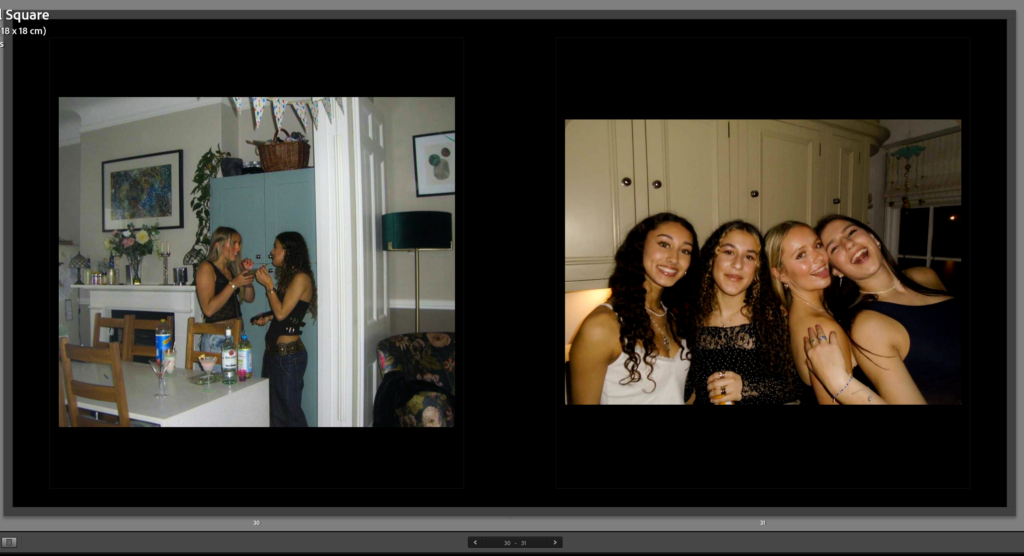
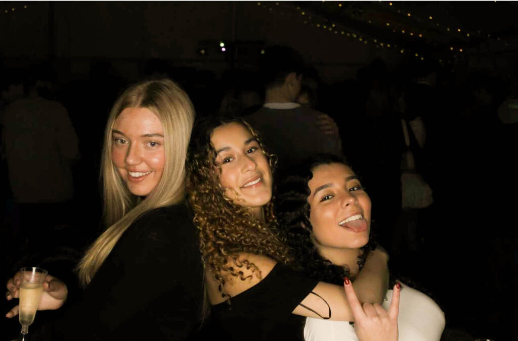
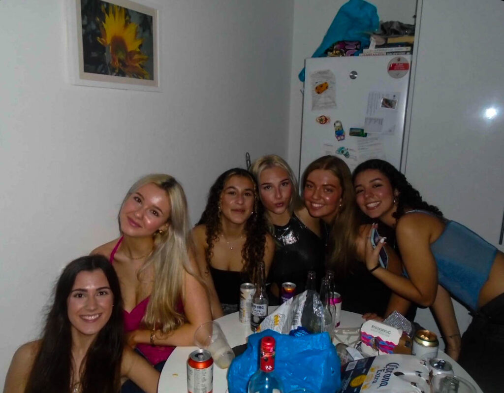
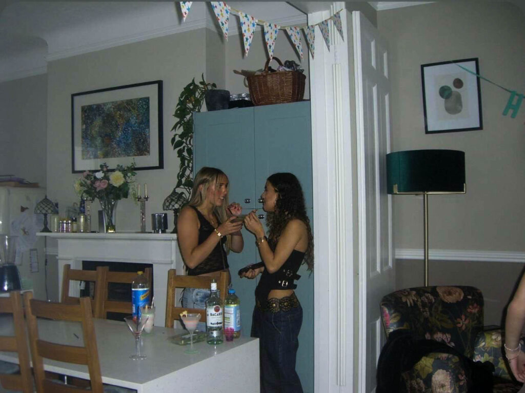
These two images are taken at a girls night. The first image of two girls having a debrief and talking in a corner, they could be gossiping. The other image of a group of girls smiling for the camera enjoying themselves.
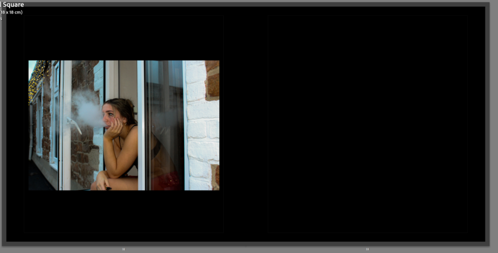
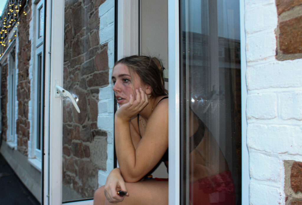
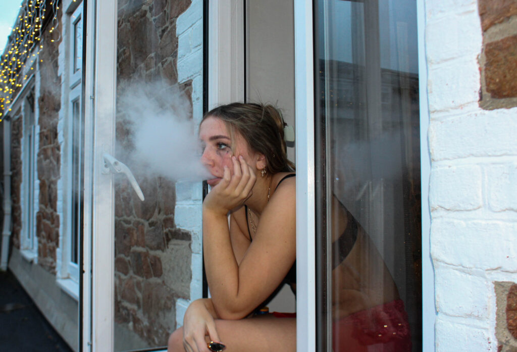
This is the final image in my photo book of my friend sat outside a window vaping. this is the final image because it looks like she is contemplating the night before, regretting her actions and thinking about what happened the night prior.
My photo book its based on youth culture and identity. For this I took pictures at different parties and events that I went to and took snapshot images of my friends enjoying themselves and being authentic at these events. The story of my phonebooks starts off at a party and throughout these parties are separated with a filler image of one of my friends being hungover and drunks after the party by themselves. The first filler image however starts off with me and my friend having fun in a car symbolising that these parties and events are fun at first but continuing throughout the book the filler images are darker and makes you stop romanticising these parties. My books final images is a girl using a vape outside her window, this image is last in the book because it shows the aftermath of all the parties and that is isn’t fun when you wake up in the morning and it looks like she is thinking and regretting the night before.
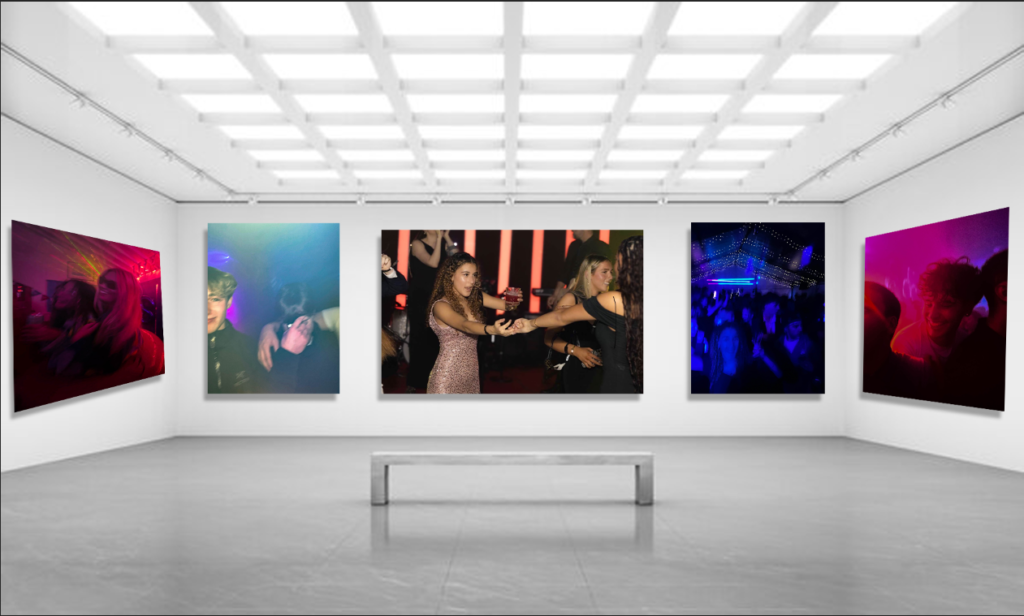
My virtual gallery includes my favourite images of my nightlife photos. Overall, I think my favourite images are the far left and right ones. These two images I think go well together and I like the way they are presented in my photo book, as I used them twice, on the front cover and then in the book. The middle image is in the middle because its the biggest image of them all and also is the image with the most going on, you can see a live band in the background and also the girl holding hands dancing with another, It shows what my book represents.
For my personal study I have chosen my theme to be youth culture and identity expressed through nightlife. I have chosen this theme as I think it is a fun thing to be taking pictures of and a good way to take fun photos and experiment with them. Firstly I did a photoshoot with my friends of us at one of our houses and got my friend to act drunk in the shower

For this image I got my friend to act drunk in the shower, I had her put makeup and a nice dress on because this matched with one of the parties that I took pictures at so I thought it would be a good filler image to use. I edited this with high contrast and increased highlights and whites to make it look brighter. I wanted this effect because It’s very in your face and in contrast to the images of one of the parties that I went to it has the opposite lighting effect which looks cool.
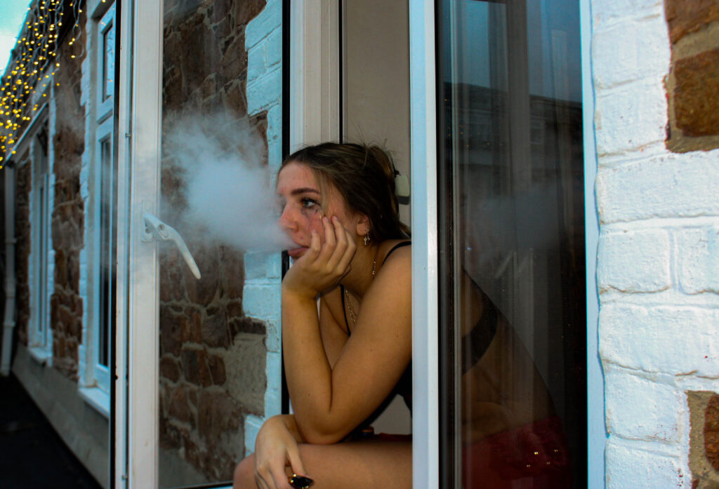
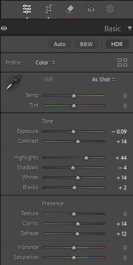
This image is also set up where I had my friend smoke out of a window to represent someone who is hungover after a night out. I turned the exposure down to replicate the early hours of the morning. I increased the contrast to make the image seem a bit more rough and turned up the saturation for this yellow tone which matches with the final images in my photobook.

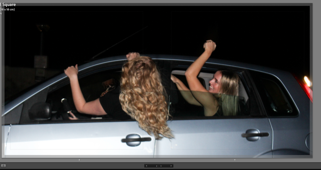
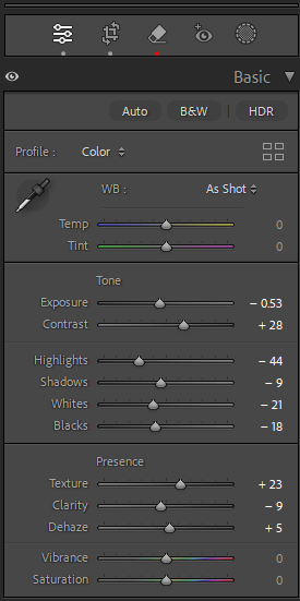
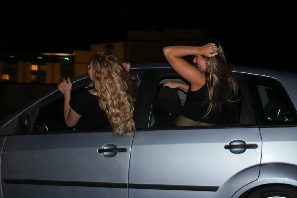
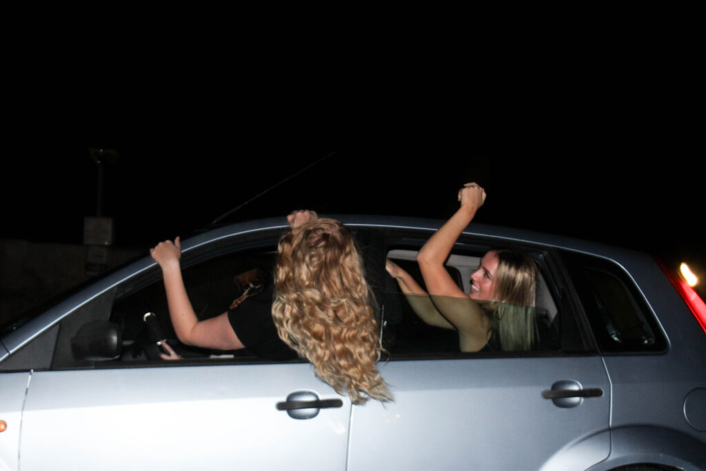
This image of two girls hanging out of a car is a filler image for my photobook, as it will be used to separate one night from another. I decided to use this photo because it still fits my theme of youth culture and identity in nightlife as its night time and its two girls having fun but without going to a party which is a break from all my other images of partying. I increased the exposure the overall image brighter but also for the car to look brighter because it contrasts better with the hair coming out of the car window.
AI
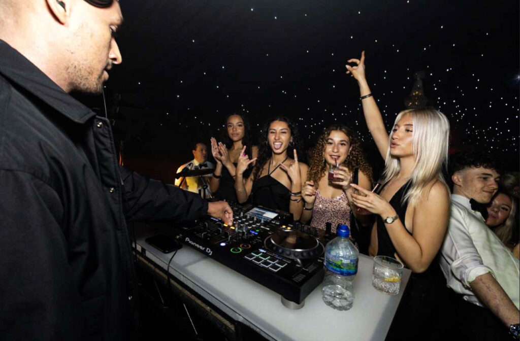
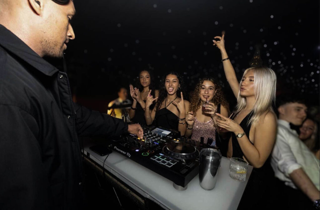
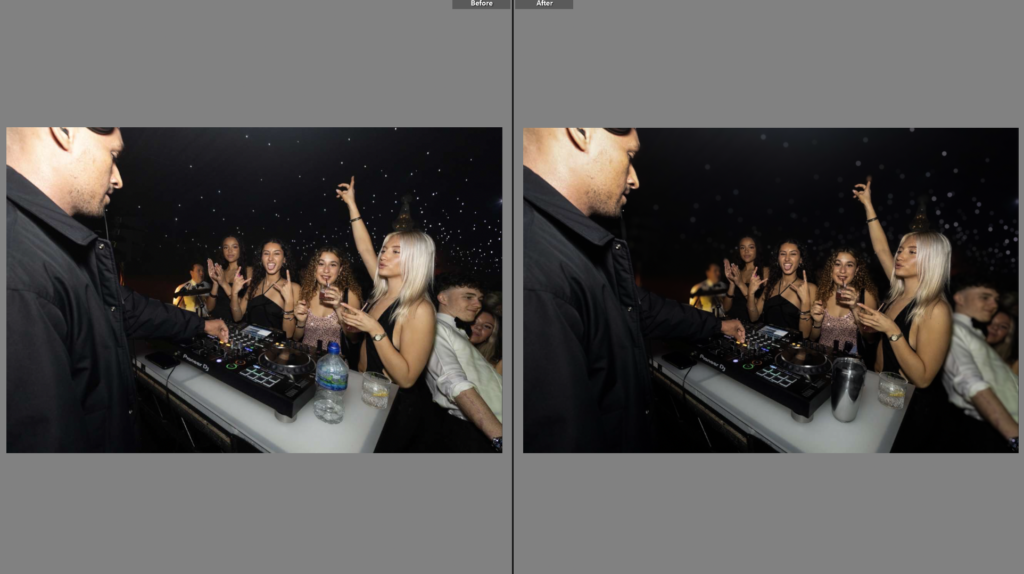
For this image I used AI to remove a water bottle and replace it with a metal cup because the water bottle looked out of place and to me ruined the picture, I couldn’t remove it fully without it looking weird, so I replaced it with the cup, which looked better overall and matched with the other things on the desk better. I also used a blurring filter for this photo so you could focus fully at the DJ and the 4 girls at the front. It also looked nice with the blurred background with the little star lights in the background.
Colours

For this the picture it originally had green lighting but I changed it to pink to match another image that I was using in my book with the same posing and movement, which is originally a pink/purple colour but I made it brighter and the colour stand out more.
How its used in the photobook:
How I edited this image:
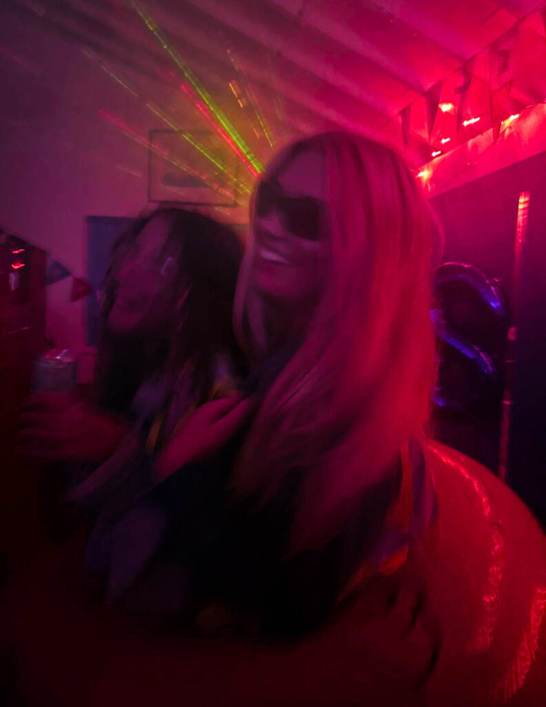
The first image already had bright lighting but I turned up the dehaze and clarity to make the lighting pop out more while also turning down the exposure and contrast to make it darker in general with the bright colourful lighting in the background. For the second image I turned up contrast so it wasn’t too blurry and then turned up vibrance and saturation to make the colours stand out more. I made the overall tone much darker than the original because the picture looked well lit with blue tones but looked too bright compared with the other.
For this image it originally was more orangey and bright but but I turned down exposure so that you could see things more clearly without it being so bright and then turning down vibrance and increasing the pink tint for a neutral tone because it is placed in my photobook next to images with brown and neutral tones.
The photobook I have decided to research is A Mini Story. This book is about the photographers life with grandad who died when he was 7 but the story is about the life his grandad lived and the influence he had in his life, like his interest in cars and how his grandad was in a mini club. The genre of this book would be about family, grief and inspiration. This is because of the images of his grandparents, then losing his grandad to cancer, and then finally taking inspiration from him and also getting a mini like his grandads and restoring it. The approach to image making is taking pictures of different areas in his life, like his grandparents house and garage, then older pictures of when he was younger with his grandad and then pictures of his dad, his mini and garage, then finally a picture of his grandads mini and his mini that he bought.
The photographer was a former student called M De Gruchy. He made it to show the life that his grandad lived and how it inspired him to have the same passion of Minis. He dedicated the book to his nan.
The book is hard cover made of cardboard, it uses the same paper throughout and all the pictures are in colour apart from three, his grandparents wedding picture, and two of his grandads old mini. This can symbolise the age of the images, where his grandparents got married in 1969 which was 56 years ago and then also showing the age of the old mini. The images are different sizes, some are single page, some are double page spread and there are multiple small images on one page. There is also text throughout the book linked to the images that give a description of the image and clarifies what the images are or what is happening in the image. it is a portrait book but the images vary between portrait and landscape on the double page spreads. The editing looks natural, some images have been edited to look old and vintage but the images look like they have not been edited much. The binding is saddle stitch the cover is cardboard and a printed image. The title is literal and relevant within the book. The story is about his grandad and his passion for Minis. It is told like a story of his grandad and growing up with him, then later losing him and following after his passion for minis. The structure is told as a consecutive story happening in order of what happened with his grandad and then after he died.
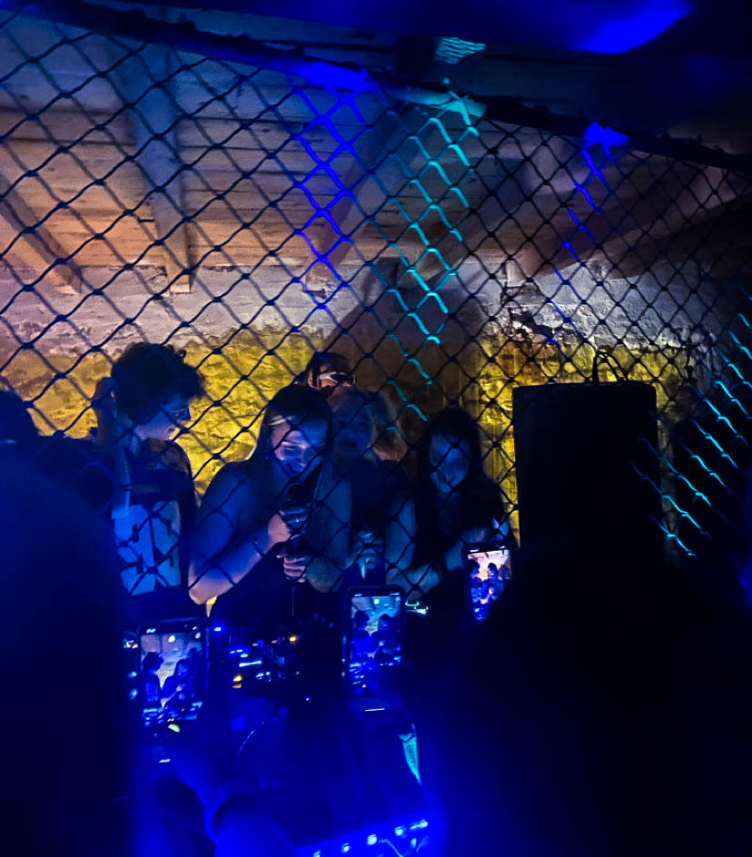
For these photos I took pictures of different parties that I went to previously and selected some that I could use in my final photobook. All of these images are snapshots and were taken quickly with me not thinking about taking the photo and what the final result would be. I have edited these images in a way where the colour is bright and vibrant with lots of contrast.
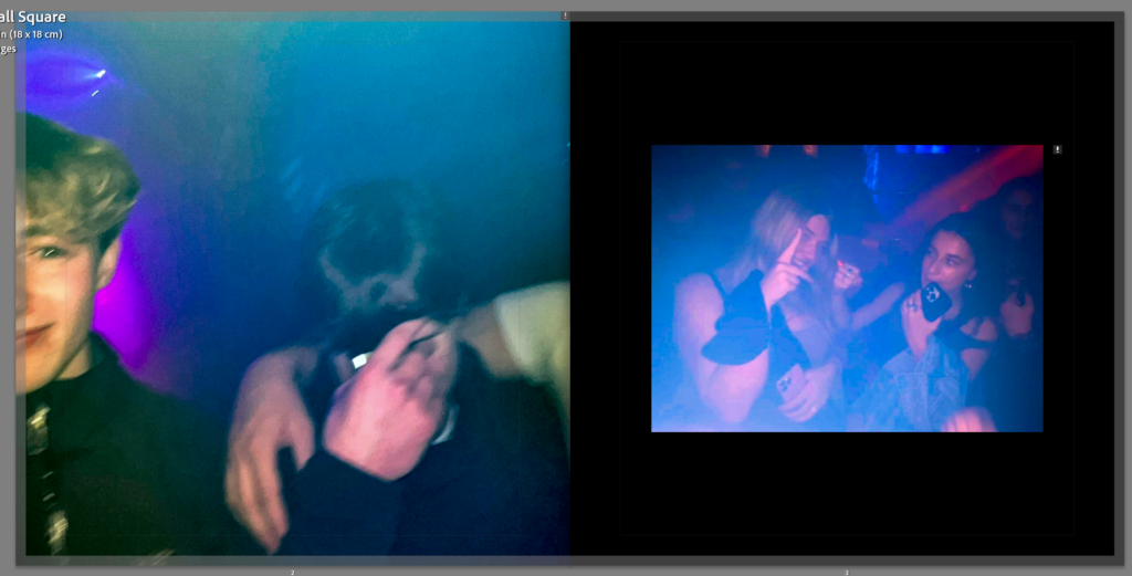
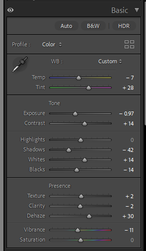
This photo I am planning to use as the front page of my photobook. This is because it is a subtle picture without any strong character or thing catching your eye, everything in the image is blue so there is nothing standing out and catching your eye so it is a subtle way to start off the book.
These images I have paired together because they were taken at the same party and the lighting is originally very similar as they both have a yellowish tint and red and green disco lights in the background. I edited these so that there was a darker tint and increased contrast with the people and the background
These images were also taken in the same night. I have chosen to put these two together because the lighting is dark with strong colours in both images. I have increased both the vibrance, saturation and clarity of both these images so that they are really stand out a lot and show a lot of exposure within the image.
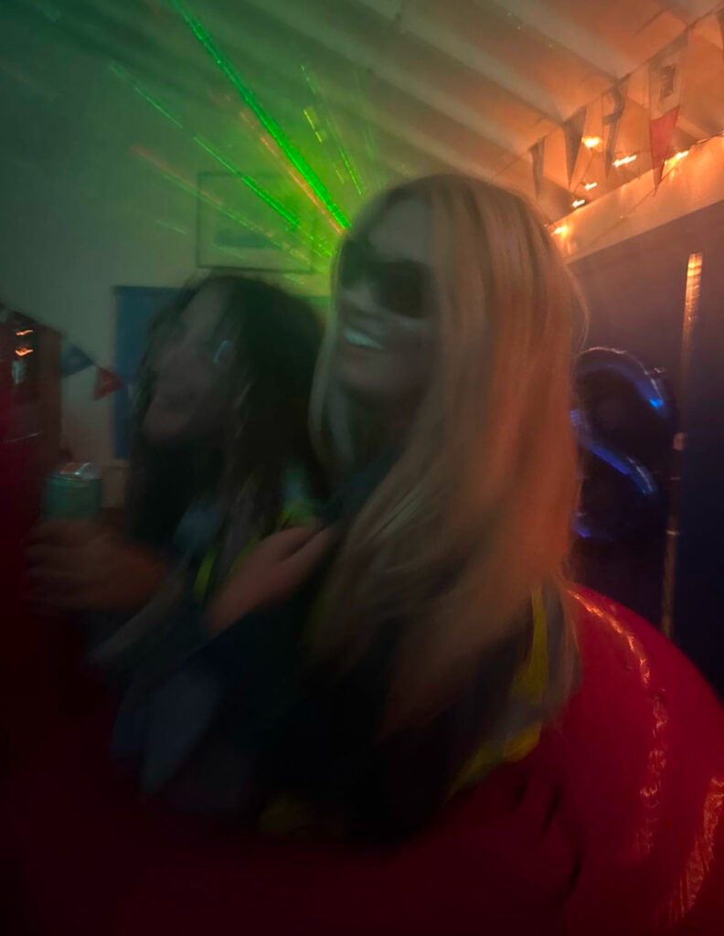
These images are taken of my friends at a party. The main focus in these images is my friend in the pink dress. She is in all three photos and they all show the different people she has been talking and dancing with, showing the very social aspect of a party. I haven’t edited these images much apart from the blurring with the strong blur effect on Lightroom and I made the images look darker but with more contrast and a warmer tone with the tint and also a filter on the first photo. For one of these images I used AI on Lightroom to remove a water bottle and replaced it with a metal cup which looks much better than the water bottle which I feel ruined the photo.

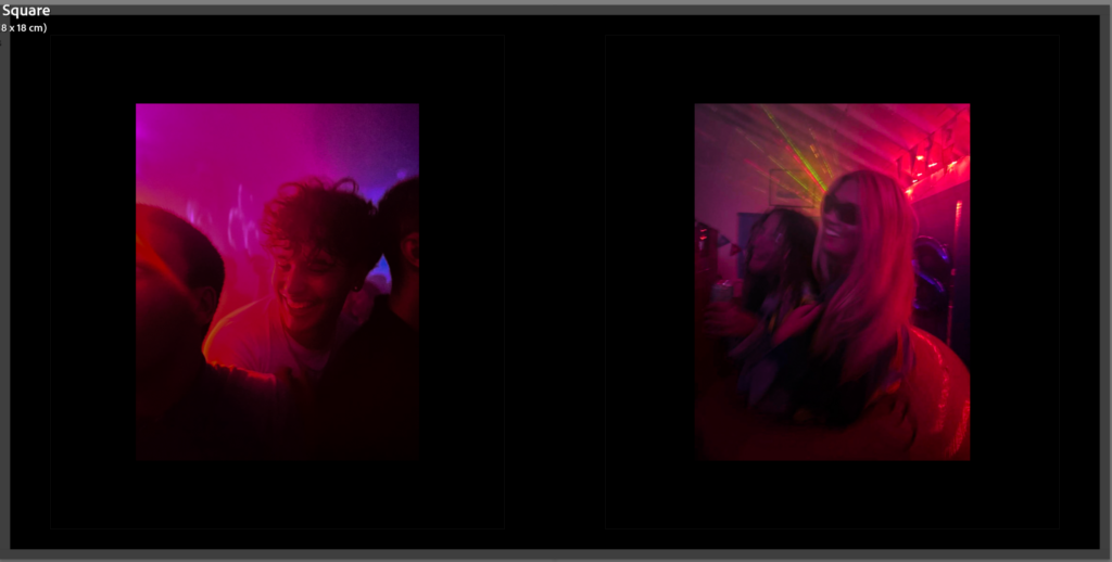
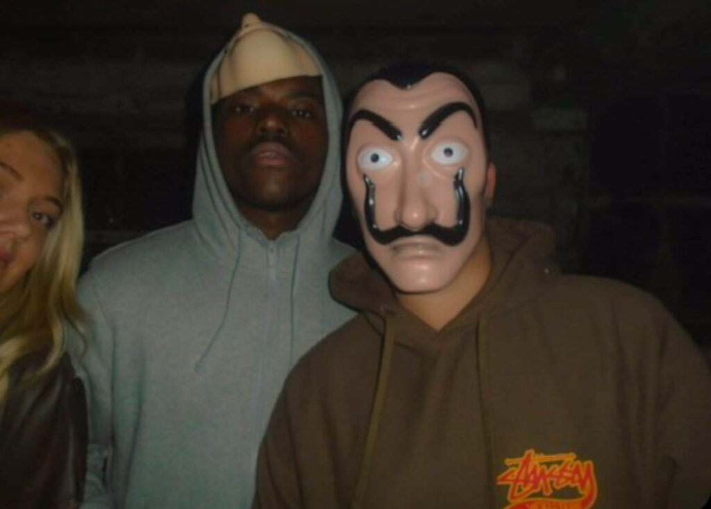
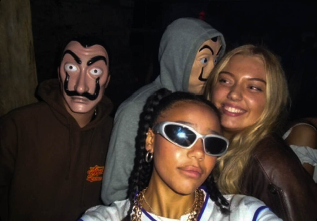
These images are at two different parties but I think they go well together because of the similarities of both images, like the fact they are both laughing and the type of photo is just very similar in general. Originally the image on the right was green but I edited it to pink as the green was not a nice tone and I prefer the pink, because it’s as if the photos were taken at the same time and place. They also look better as a pair this way.
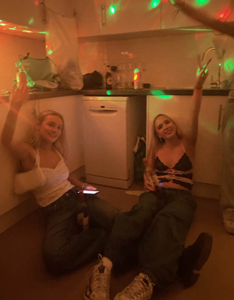
These images of me and my friends were taken on two different types of cameras. The top two photos were at a Halloween party where we were all dressed up, these were taken on a small digital camera. I like the way these came out because I like the exposure on them and the neutral colours. The other 4 images were taken on a photobooth camera at another party I went to with my friends. These images are colourful in themselves so I didn’t add any fake lighting colours to them. I turned the exposure up for all of them to make it brighter and look clearer so all the colours stood out without adding any unnatural ones.
For my first photoshoot I took about 200 images in total where they are all set up. My first photoshoot I went out with my friends and took some images at different places and in different outfits. For the first photoshoot I had my friend dress up in a nice outfit and look drunk in the shower. My second photoshoot was her with a vape, using it looking hungover out the window, I will use these images at the end of the photobook. Lastly we took images of us hanging out of the window of a car. This is because I want my final project to have a break from the party images and have a moment where its just teen girls having fun in a car, which I will use as a filler image. I edited these images all in a similar way with high exposure and strong white and dark colours so they have lots of contrast and look vibrant and powerful instead of boring and soft
PHOTOBOOK: Narrative: What is your story?
Describe in:
Design:
I want my whole book to be black and have a hardback cover. The paper within will be black and the writing for the title and name will be white. some of my images within the book will be full bleed and others will be smaller with an image on each page. The title is ‘After Hours’ to symbolise that my images where taken in nightclubs and parties at nighttime. For the editing process I focussed on colours and contrast for all images, making sure that each picture paired together are matching.
What do you want to explore?
I want to explore the club and youth culture in Jersey. I want to explore this because as a part of the youth in Jersey I want to be able to express what young 18 year olds experience when they go out into town or to parties during the weekend. I also want to explore this topic because I like to go out and I want to be able to capture the moments of going out whether these images are raw or set up.
Why does it matter to you?
This topic matters to me because I am an 18 year old living in Jersey and being isolated on an island night life is so different here compared to places like England and around Europe. But living in Jersey gives us very different opportunities and lifestyles compared to how living in England would be, for example we get to go to the beach everyday during summer and then be able to go into town or to a party afterwards, whereas, that wouldn’t be a common thing to do in England.
Which form I would like to present my study
I would like to present my photos in a photobook. I want to do this because it will look best presented in a photobook where its like a story and each page has either a new day or event on it, each event separated by a filler image where we are no longer at a party but just drunk or hungover.
When and where I intend to begin my study
I intend to begin my study with a few photoshoots around town and at different parties that I will go to, I want to take window images where they are not set up of the people that I go to the parties with, but I will have 1 set up photoshoot where the images are set up and my friends are acting out about being hungover and drunk, as filler images.