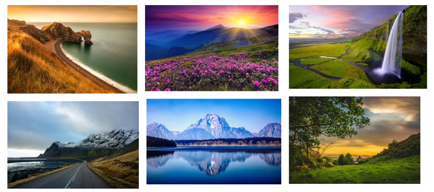
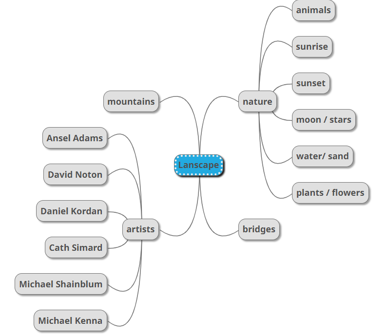


Romanticism was born as a reaction against the Age of Enlightenment and the Industrial Revolution. Romanticism is identified by a focus on emotion, imagination, and individualism, as well as a rejection of the rationalism and restraint of the Enlightenment. It also placed a strong importance on creative freedom and individual expression, as well as a celebration of nature and the wonders of the natural world. Romantic artists explored the sublime through paintings of the imagination, which could often turn into nightmares, and natural landscapes, which were mighty and beautiful but always dangerous. Romanticism first showed itself in landscape painting, where from as early as the 1760s British artists began to turn to wilder landscapes and storms, and gothic architecture, even if they had to make do with Wales as a setting. Caspar David Friederich and J.M.W. Turner were born less than a year apart in 1774 and 1775 respectively and were to take German and English landscape painting to their extremes of Romanticism.
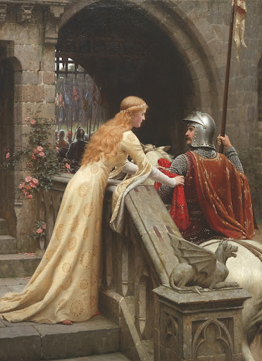
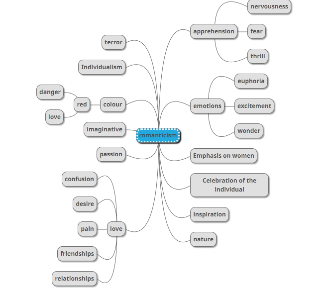
Characteristics of romanticism:
The Sublime is a western aesthetic concept of ‘the exalted’ of ‘beauty that is grand and dangerous’. The Sublime refers to the wild, unbounded grandeur of nature. Theory began with Edmund Burke in the mid eighteenth century, where he defined sublime art as art that refers to a greatness beyond all possibility of calculation, measurement or imitation.
Mood board:
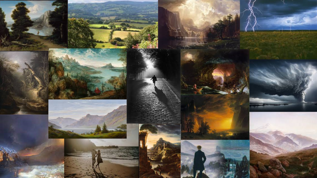
What is Romanticism technique?
One technique employed by many Romantic painters was the use of small, close strokes of complementary colours to create brilliance and vivid visual effect. This approach become later followed with the aid of using the Impressionists, who introduced their very own interpretation of the method.
Mind map:

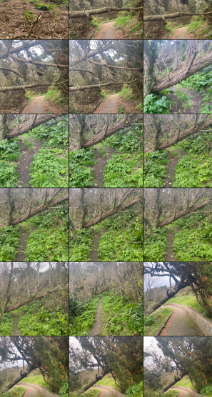

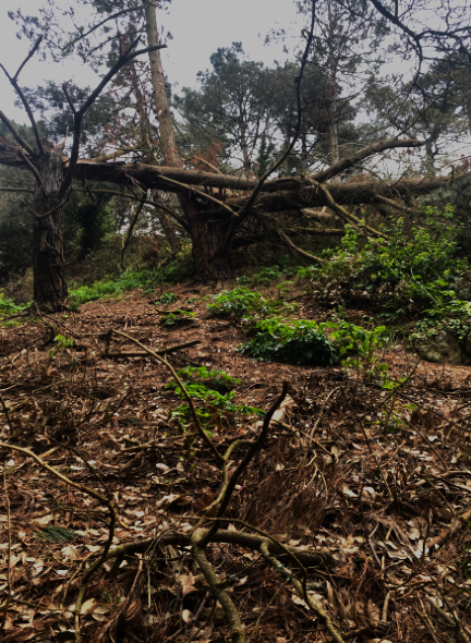
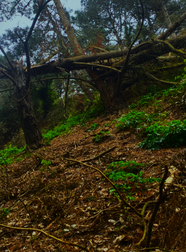

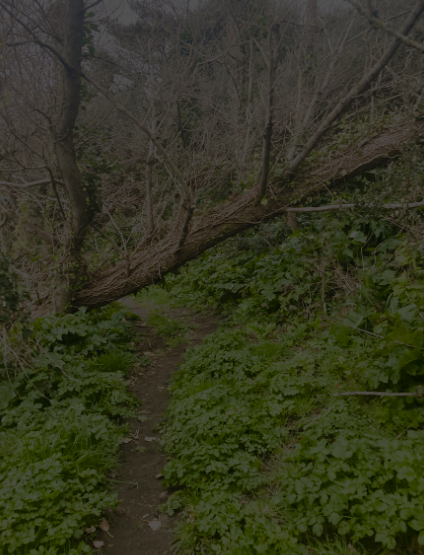
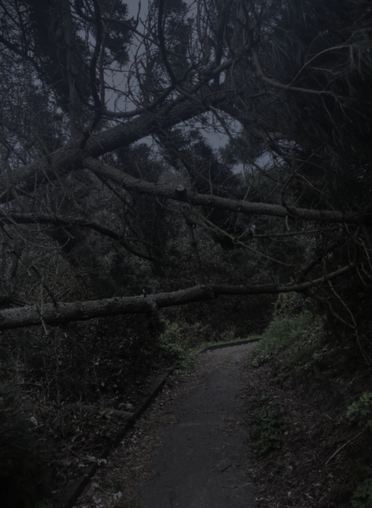

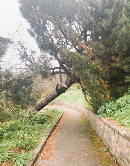
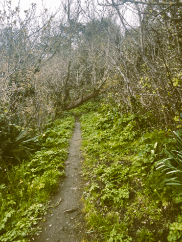
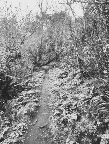
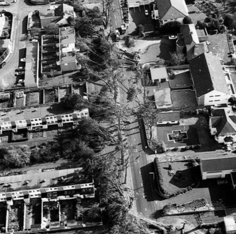
The photos above are the pictures I took of the damages from the storm Ciaran near peoples park.
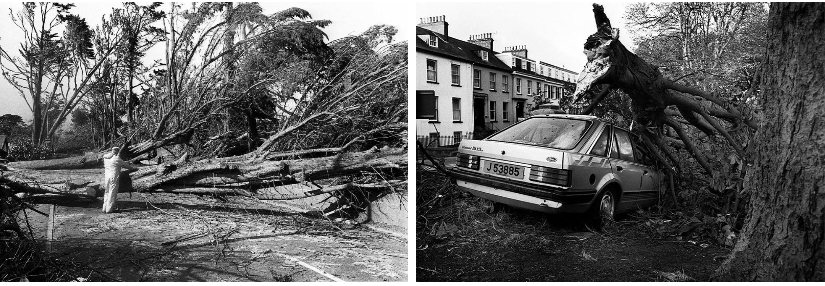
best image:

I choose the image above as the best picture because it shows a lot more damages and how bad the storm was and also the black and white setting suits best than all the other images.
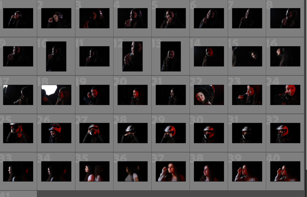
For my first photoshoot I chose this image because it reminds me of Cindy Sherman photos of her getting ready and that’s exactly what my mate is doing in this image as well.
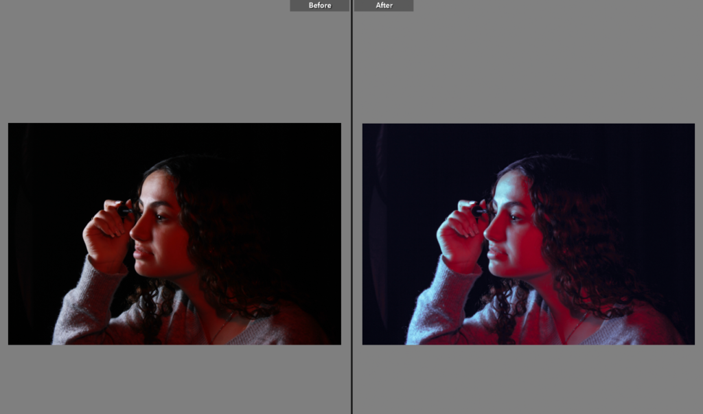
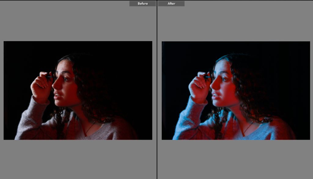
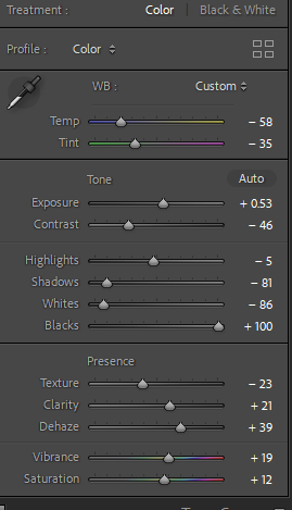
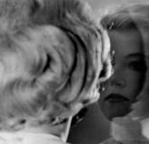
For my second photoshoot I decided to cpoy a bit the first photoshoot but this time she is more concetrated on doing her make up and i used different lighting.
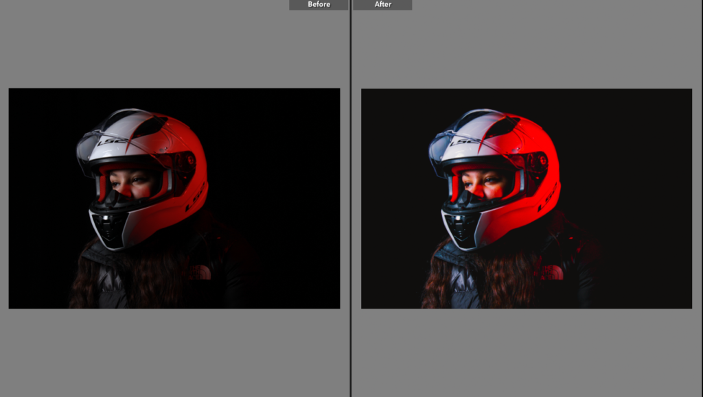
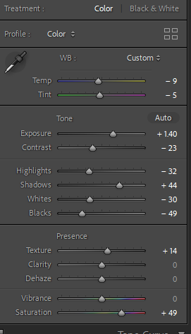
For my second photoshoot I decided to pick this image because most people would say that motorbikes are very masculine and not feminine at all but this photo is trying to prove that even girls can have a motorbike not just boys.
1st photoshoot:
For my first photoshoot I am going to take pictures of my friend putting make up on since it is similar to one of Cindy Sherman photoshoots getting ready. Below is the inspiration photoshoot from Cindy Sherman.
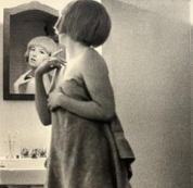
My photoshoot isn’t going be the exactly same thing at Cindy Sherman’s photoshoot above but it will be the same back story which is her getting ready.
2rd photoshoot:
For my second photoshoot I have decided to take a photoshoot a bit similar to Cindy Sherman’s picture below. My mate is going to either pose looking at the mirror, look at the mirror and put perfume or staring at jewellery.
3nd photoshoot:
For my third photoshoot, its not related to cindy cherman but it is something that has to do with masculinity and femininity. I am going to take photoshoots of girls with things that people thing are more masculine such as a helmet or driving a motorbike.
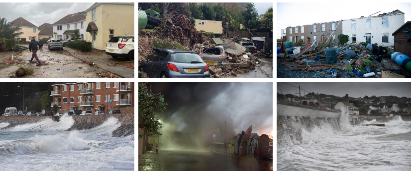

Storm Ciarán was a European windstorm that severely affected parts of Europe from late October to early November 2023. Part of the 2023-24 European windstorm season, Ciarán impacted north-western Europe and killed 21 people, eleven of whom were in Italy and four in France. It also caused mass disruption to transport. Widespread damage from 100 miles per hour (160 km/h) winds were reported in the Channel Islands, while 1.2 million French households were left without electricity. In Jersey it hit 167km/h (104mph). Storm Ciarán changed into named with the aid of using the United Kingdom`s Met Office on 29 October, even as the Free University of Berlin in Germany named the gadget Emir on 30 October. It changed into anticipated to convey winds of ninety to one hundred twenty km/h (60 to 70 mph) broadly with >a hundred thirty km/h (>eighty mph) on a few coasts. More heavy rainfall changed into anticipated to fall which might exacerbate the flooding from Storm Babet per week prior. The Met Office’s long-variety forecast said that Storm Ciarán might flow away on three November, with many locations nevertheless with blistering winds and rain spells. The Channel Islands have been because of be hit with gusts round ninety five mph (153 km/h) with colleges closed and a crimson climate caution in place. On 1 November, this changed into up to date to a Force eleven violent typhoon, with the Met Office pointing out that Storm Ciarán changed into present process explosive cyclogenesis. The typhoon might effect the Netherlands on 2 November. The typhoon particularly affected the Isle of Jersey, in which a robust thunderstorm fashioned a twister along the golfing ball sized hail with windspeeds of the typhoon accomplishing over a hundred mph (one hundred sixty km/h).

The damages caused by the Storm Ciarán in Jersey was similar to that seen with the severe ‘Great Storm’ in 1987. The great storm of 1987 was a violent extratropical cyclone that occurred on the night of 15–16 October, with hurricane-force winds causing casualties in the United Kingdom, France, and the Channel islands as a severe depression in the Bay of Biscay moved northeast. Forests, parks, roads, and railways have been strewn with fallen bushes and faculties have been closed. The British National Grid suffered heavy damage, leaving heaps with out power. At least 22 human beings have been killed in England and France. The maximum measured gust of a hundred thirty five miles in line with hour; 217 kilometres in line with hour (117 km) became recorded at Pointe Du Roc, Granville, France and the very best gust within side the UK of one hundred twenty mph; one hundred ninety km/h (one hundred km) became recorded at Shoreham, West Sussex. The hurricane has been termed a climate bomb because of its speedy development.
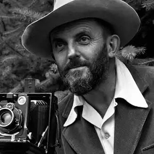
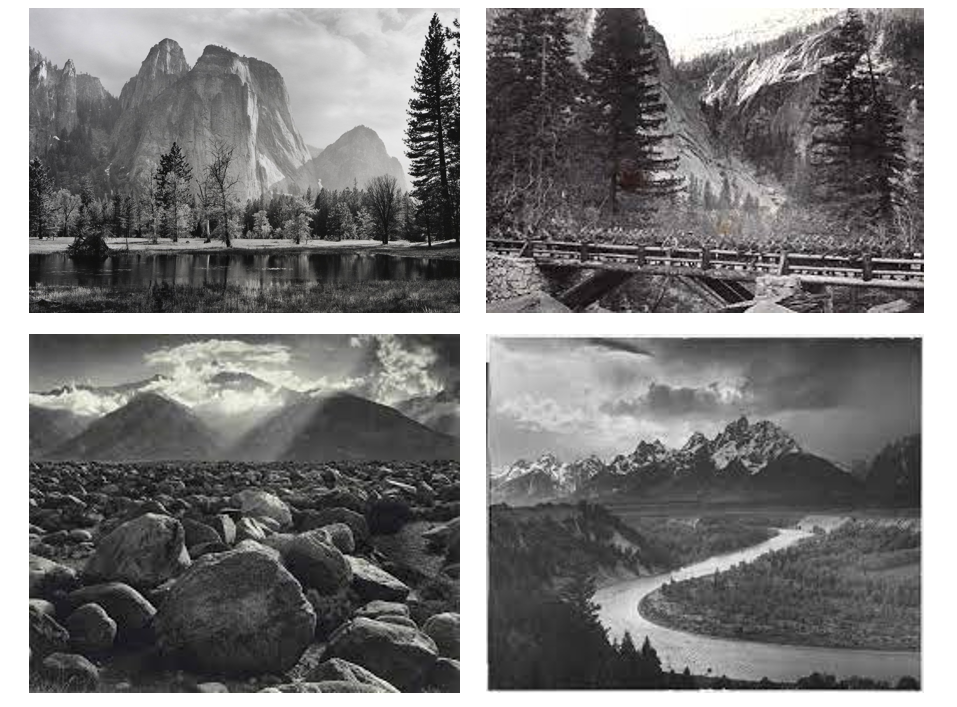
“In wisdom gathered over time I have found that every experience if a form of exploration” – Ansel Adams
Adams was born in the Fillmore District of San Francisco, the only child of Charles Hitchcock Adams and Olive Bray and died April 22, 1984 (age 82 years), California, Untied States. He turned into named after his uncle, Ansel Easton. His mother`s own circle of relatives got here from Baltimore, in which his maternal grandfather had a a hit freight-hauling business however misplaced his wealth making an investment in failed mining and actual property ventures in Nevada. Adams`s first photographs have been published in 1921, and Best’s Studio started out selling his Yosemite prints the next year. His early photos already confirmed careful composition and sensitivity to tonal balance. In letters and playing cards to family, he wrote of getting dared to climb to the best viewpoints and to brave the worst elements.
Ansel Adams, America’s most beloved wilderness photographers, shunned romanticism to reveal the raw beauty of the outdoors. Ansel Easton Adams, arguably the most famous pioneering modern nature and landscape photographer.
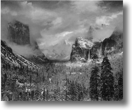
Clearing Winter Storm, Yosemite National Park, California is a black and white photograph taken by Ansel Adams, c. 1937. It is part of a series of natural landscapes photographs that Adams took from Inspiration Point, at Yosemite Valley, since the 1930s. This picture of a clearing and spent winter storm was taken on a day in early December. The storm, first of heavy rain and then turning to snow, began to clear around midday so Adams drove to New Inspiration Point, a place where he had taken many pictures and which gave this breath taking view of the Yosemite Valley. I love the way the image is set and how everything is so detailed and has so many different shades of grey and black. During the years in Yosemite there was an almost continuous opportunity to monitor the changes light and weather moods, hilly and mountainous regions regularly experience spectacular weather conditions. Such conditions however are often very fleeting and there is rarely the time to arrive at a suitable location for a photograph and set up the bulky and labor intensive 4 x 5 in or 8 x 10 in view cameras.
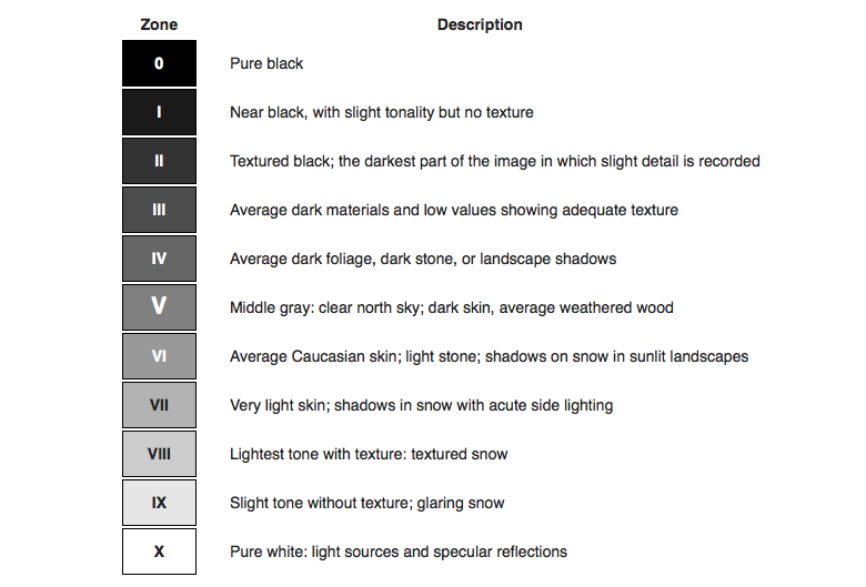
The 11 zones in Ansel Adams’ system were defined to represent the gradation of all the different tonal values you would see in a black and white print, with zone 5 being middle grey, zone 0 being pure black, and zone 10 being pure white.
Even though the Zone System is over 80 years old, it is still relevant today whether shooting modern films or digital capture. This article is for photographers wanting to learn more about the Zone System for their particular workflow.
On November 15, 1932, at the M. H. de Young Memorial Museum in San Francisco, eleven photographers announced themselves as Group f/64: Ansel Adams, Imogen Cunningham, John Paul Edwards, Preston Holder, Consuelo Kanaga, Alma Lavenson, Sonya Noskowiak, Henry Swift, Willard Van Dyke, Brett Weston, and Edward Weston. The name of this Group is derived from a diaphragm number of the photographic lens. It signifies to a large extent the qualities of clearness and definition of the photographic image which is an important element in the work of members of this Group.
Ansel Adams inspiration and influence is curated with the aid of using Drew Johnson, curator of images withinside the artwork branch and current winner of a California Book Award provided with the aid of using The Commonwealth Club for his book Capturing Light: Masterpieces of California Photography, 1850 to the Present (Norton, 2001). This exhibition is important, Johnson says, because “It locations Adams withinside the context of the records of images, specially West Coast images. Adams changed into strangely informed approximately the paintings of different photographers, each his contemporaries and that of 19th-century pioneers. This inspiration and have an effect on turns into obvious while his photos are studied next to the paintings of others.”
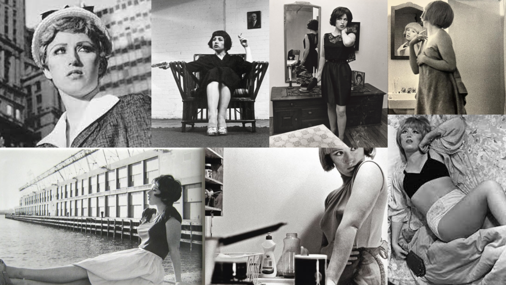
Cynthia Morris Sherman (born 1954) is an American artist whose work consists primarily of photographic self-portraits in which she depicts herself in various situations and in various imaginary ways. Her ground breaking work is a series of 70 black-and-white photographs of her performance that evokes typical female roles in media (particularly art house films and popular B-movies). It is believed to be a collection called “Untitled Film Stills”. In the 1980s, she used colour film and large prints, focusing on costume, lighting, and facial expression. Sherman was born in Glen Ridge, New Jersey in 1954, the youngest of five children of Dorothy and Charles Sherman. Shortly after she was born, her family moved to Huntington Township, Long Island. Her father worked as an engineer for Grumman Aircraft. Her mother taught reading to children with learning disabilities. Sherman said that her mother was very well behaved and that her father was strict and cruel. She was raised in an episcopal manner.
She challenges her audience to think about the fluidity and malleability of identity by subverting traditional gender roles. Her photographs invite us to consider how society shapes and imposes gender norms on individuals. Cindy Sherman’s work questions images and the authenticity of the self. To create her images, she assumes the multiple roles of photographer, model, makeup artist, hairdresser, and stylist. Whether portraying a career girl, a blond bombshell, a fashion victim, a clown, or a society lady of a certain age, for over thirty-five years this relentlessly adventurous artist has created an eloquent and provocative body of work that resonates deeply in our visual culture.
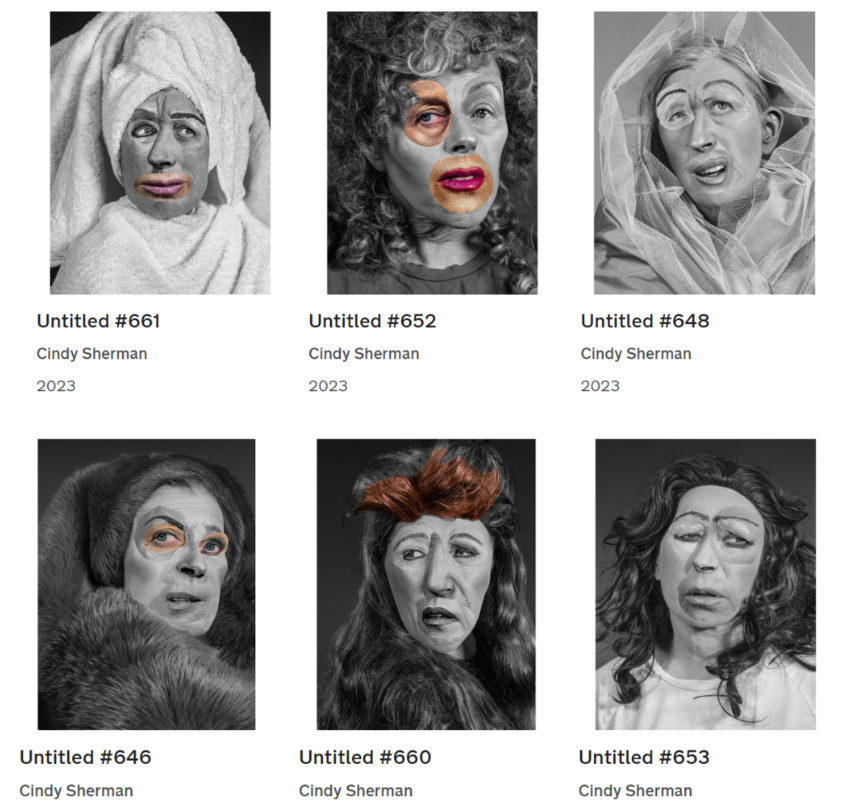
Sherman works in collection, and every of her our bodies of labour is self-contained and internally coherent; but there are issues which have recurred during her career. The exhibition showcases the artist`s person collection and additionally provides works grouped thematically round such not un usual place threads as cinema and performance; horror and the grotesque; myth, carnival, and fairy tales; and gender and sophistication identity.
Sherman`s ground-breaking pictures have interrogated issues round illustration and identification in current media for over 4 decades. Since the early 2000s, Sherman has built personae with virtual manipulation, shooting the fractured experience of self in current society—a problem the artist has uniquely encapsulated from the outset of her career. As critic and curator Gabriele Schor writes on her method, `Sherman`s complicated evaluation of her face and her diffused employment of expression shows that the running technique of creating up and costuming the self allows processes: an intuitive and fluid method stimulated with the aid of using curiosity, and an meant method whose stimulus is conceptual and which has a ‘problem matter’.
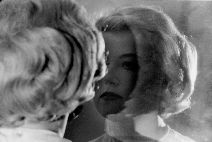
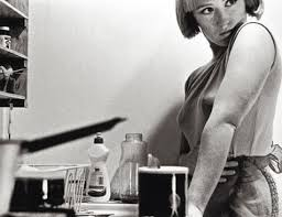
Cindy Sherman’s photographs is a perfect example of femininity because it shows how girls are and what they normally do. For example the image above shows Cindy Sherman is looking at herself in the mirror and getting ready which is what girls love to do. And the last image shows that she is cooking which is also connected to femininity because back in the days women’s would always be the ones cooking and sometimes till this day its still same.
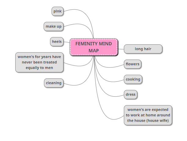
FEMININITY MIND MAP
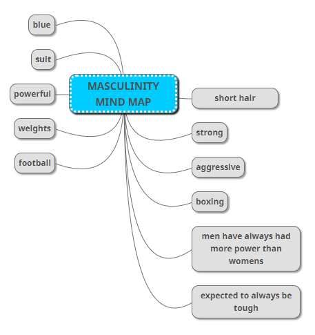
MASCULINITY MIND MAP
