All posts by Jess Jones

Filters

Author:
Category:

The New Topographics Research 

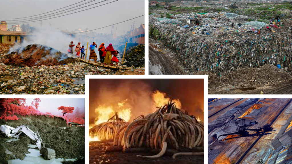
Mood board

New Topographics: Photographs of a Man-altered Landscape

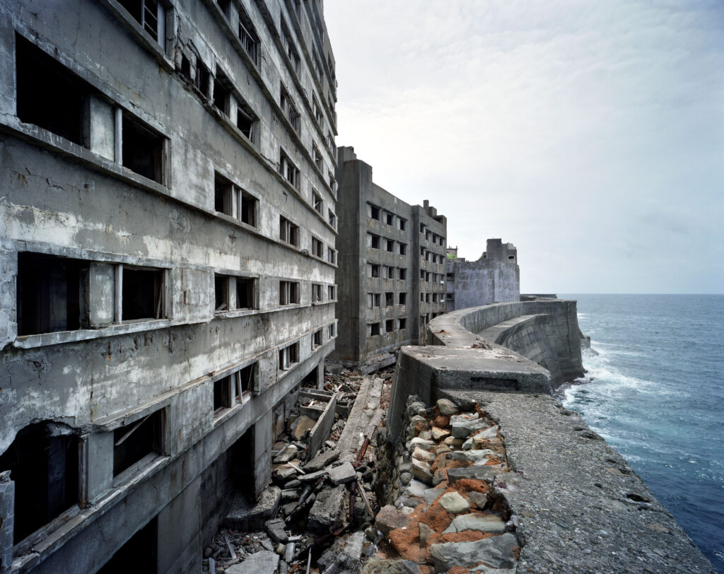
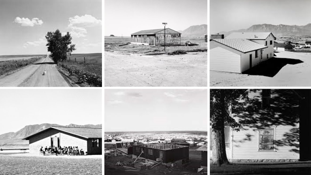
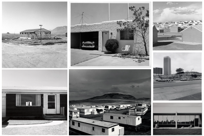
The New Topographics photographers were Robert Adams, Bernd and Hilla Becher, Lewis Baltz, Joe Deal, Frank Gohlke, Nicholas Nixon, John Schott, Stephen Shore, and Henry Wessel Jr. They decided to not focus on the pristine features of sceneries like national parks, instead, they focusses on suburban places such as freeways, gas stations, industrial parks, and tract homes.

What was it a reaction to?

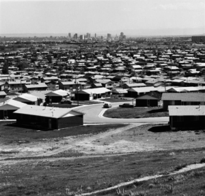
The New Topographics was a reaction to both a reflection of the increasingly suburbanised world around them, and a reaction to the tyranny of idealised landscape photography that elevated the natural and the elemental. Overall, it was the opposite of what Ansel Adams and Edward Weston had created which was landscape photography focussed solely on nature where no people/man-made structures were present. It emphasized the relationship between man and nature by brining them together to show manmade landscape with the addition of nature. Many of these photos are in black and white and are of urban areas. One characteristic of many photos is to be empty. using black and white really works with this idea since the simplicity of the shades are simple and there isn’t an over contrast of colours involved making the image feel hollow. this will then be accompanied by nature in some way

The New Topographics was inspired and taken by the expedition called “New Topographics: Photographs of a Man-Altered Landscape,” which was mounted in 1975 by William Jenkins. It then became popular and signalled a radical shift away from the traditional depictions of landscape.

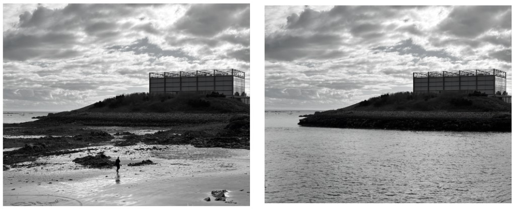
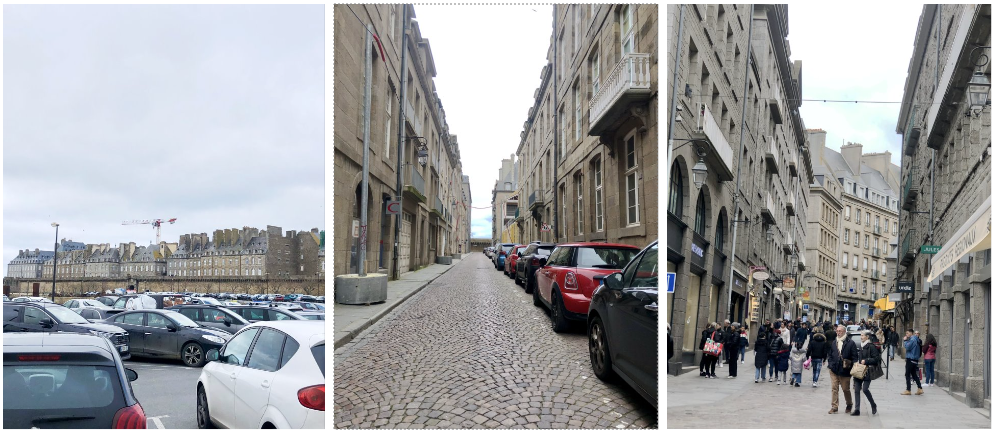
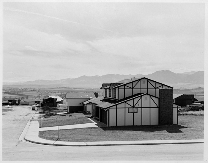
In this photo, you can see its a good example of an empty feeling photo. The clouds are very faint making the sky blank with one shade of lighter grey. i think this works well as taking a shoot when the weather is looking more like a storm would further fill up the image taking away the emptiness and adding more aspects into the image. the image is an example of a desolate street without the presence of human life, this allows the viewer to simply focus on the manmade houses which in this case would be the large house which takes up a large portion of the image.

The naturalistic part of the image would include the grass, fields and trees in the background and finally the large mountain in the background.

Typologies Research and Artist reference

Typologies

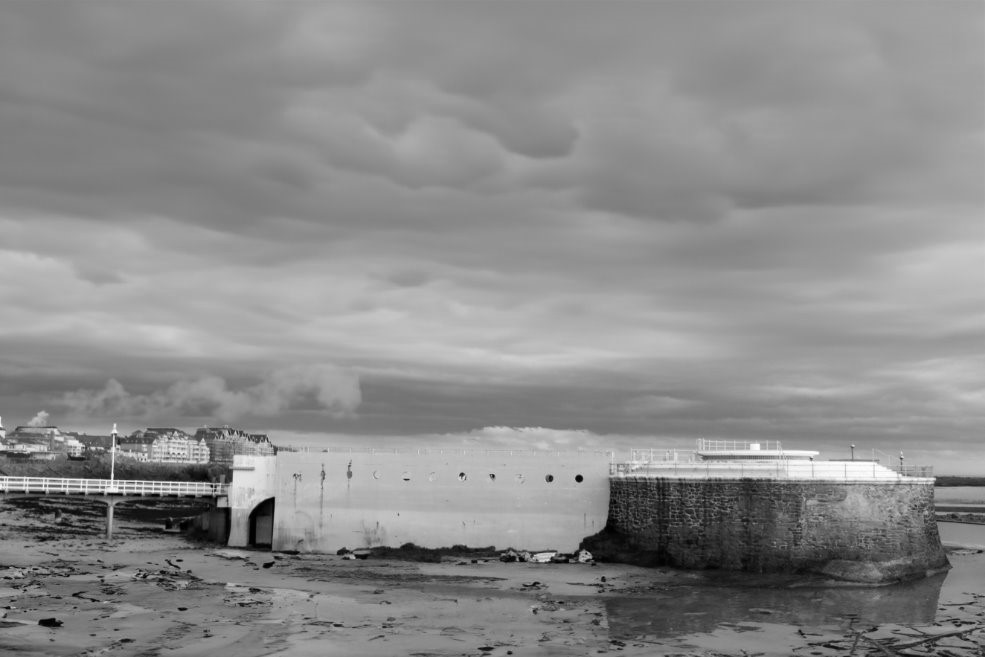
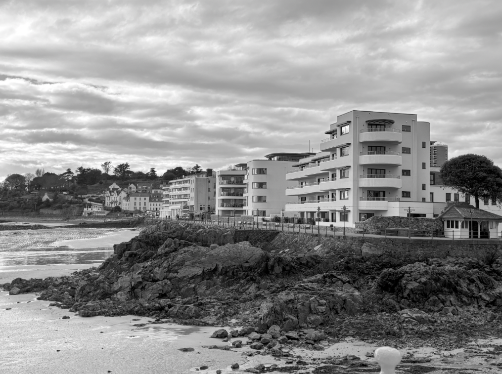
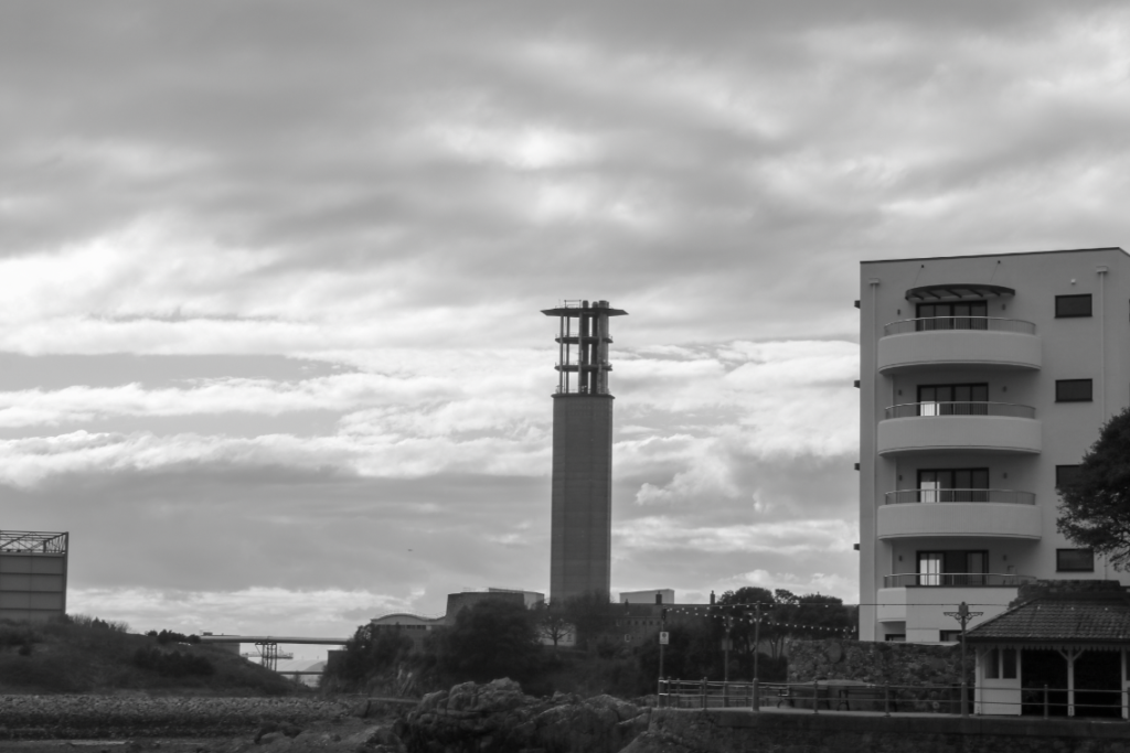
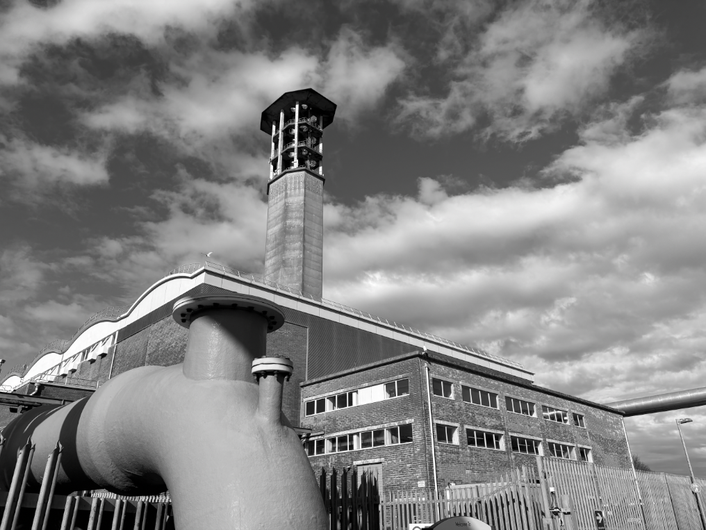
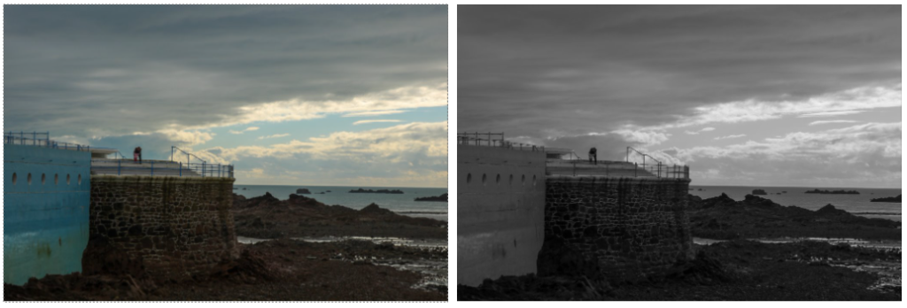
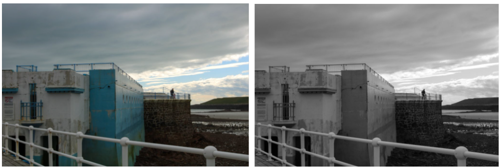
A typology is a single image that generally involves one aspect of any size which fills the whole image. The image above focussed on taking an industrial approach which works well with some of my own photos such as the jersey incinerator below. These images are typically in black and white and the time and weather in the day is also a factor typology photographers have to large take into account. as the industrial building itself is a darker colour, that makes the shade dark once its in black and white. this means that you cannot produced these images with the same affect if the sky is blue and clear as this will make it a darker shade. therefore, making sure this is taken on a cloudy day will create contrast with the building that is being photographed and make it further stand out so it does not blend into the dark shade of the sky and get lost.

Bernd and Hilla Becher

“The question ‘is this a work of art or not?’ is not very interesting for us.”

– quote by Bernd and Hilla Becher

Bernd and Hilla Becher are a photography duo who are husband and wife who started photographing together in1959. For close to fifty years, they documented architectural forms they collectively referred to as “anonymous sculpture.” They produced photos that only included singular buildings which were usually in the centre of the image to make it the main focus. the buildings they photographed included water towers, blast furnaces, coal mine tipples, framework houses of mine workers, and other vernacular industrial architecture.

they would generally take these photos using black and white instead of colour. They would then group these images together in a grid, they produced what they called “typologies,” which grouped buildings by function creating a simple but unique idea of photography

In this photo, it is displaying the same structure but in many different forms and locations. each photo has been taken front facing and made sure to get the structure exactly in the middle. this works well because if the photos were not directly in the centre then it would look off when put onto a grid with other similar photos. This photo documents industrial structures which all look fairly old and well used and so I like how they haven’t used colour for their images.

I think the black and white works as it further brings across the industrial feel to the image whereas colour would probably make it too bright and each image one the grid wouldn’t be able to match each other. the distance of zoom on the camera also works well with each image to make sure they all take up the same amount of space on the image and match sizes. I also like how each image does well to not involve background. almost each image is basically empty which works well to make the main structure the dominant focus within the image.

Typology Practical response

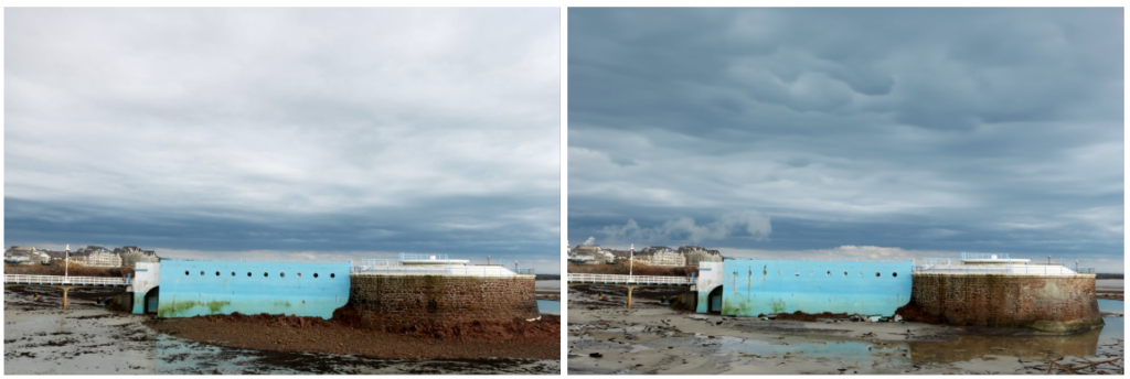
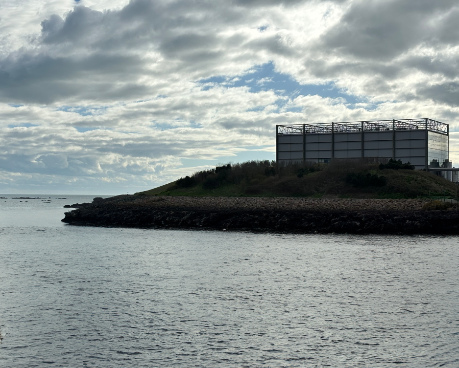
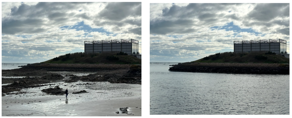
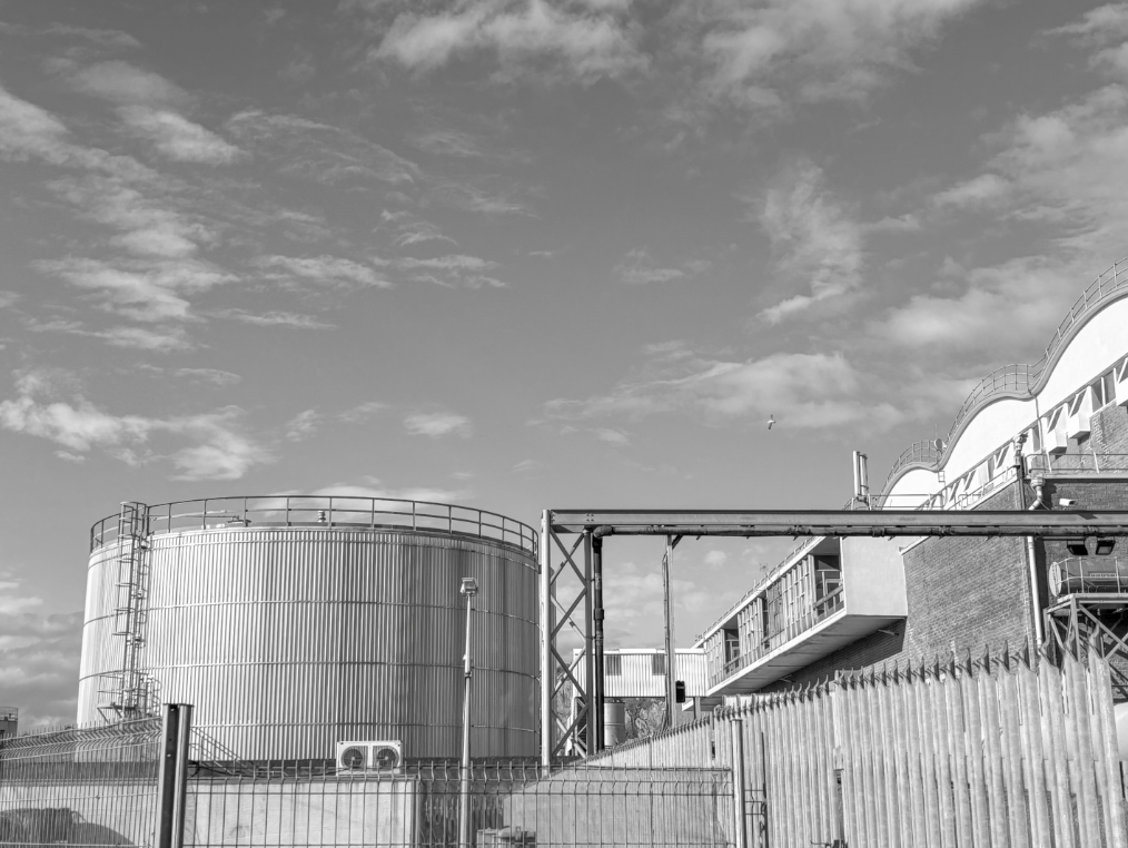
One disadvantage of this shoot was that the sky was generally more blue, however the many clouds in the sky still managed to create that contrast with the building but just not as much as I would have liked.

I think this image works well as typology as the building is centred in the middle and is clearly the main focus of the image.

Ansel Adams – Artist Research

Ansel Adams, born February 20, 1902 to April 22, 1984, was the most important American landscape photographer and environmentalist who created famous black and white photographs mostly based in the American West. He was the grandson of a wealthy timber baron and grew up in a house set amid the sand dunes of the Golden Gate. At age 4, there was an aftershock of the earthquake and fire of 1906 which threw Adams onto the ground where he sustained a bad nose break. This distinctly marked him for life. His high level of intelligence, shyness and permanently injured nose caused Adams to struggle with fitting in at school. it became clear to him later on in his life that he may have been hyperactive. As well as this, it was highly likely that he also suffered with dyslexia. he was taken out of school and tutored by his father and his aunt. His childhood of a limited amount of friends or socialising lead him to be immersed in nature where he’d been commonly found taking walks and hikes in the still-wild reaches of the Golden Gate. At about age 12, Adams became a gifted and ambitious pianist. After he received his first camera in 1916, Adams also proved to be a talented photographer. He devoted his dedication to being inspired by the forgotten and unspoiled wilderness of America’s national parks and other protected conservation areas in the West.

He was the one to found the group of photographers called Group f/64. This group consisted of people who shared the same interest in photography characterized by sharply focused and carefully framed images seen through a particularly American Western viewpoint. Group f/64 were Ansel Adams, Imogen Cunningham, Edward Weston, Willard Van Dyke, Henry Swift, John Paul Edwards, Brett Weston, Consuelo Kanaga, Alma Levenson, Sonya Noskowiak, and Preston Holder.

The Zone System

He and a man called Freud Archer developed a system of image-making called the Zone System. The Zone system assigns numbers from 0 through 10 to different brightness values, with 0 representing black, 5 middle grey, and 10 pure white. Thought they were a group, each person had their own interests/specialities that all came together to show a range of photograph from different places or things. For example, Adams’s images of Yosemite National Park, Edward Weston’s close-up, high-detail photographs of fruits and vegetables and of sand dunes, and Cunningham’s studies of calla lilies.

Ansel Adams and Romanticism

apart from the contrast of colour uses, these photos are very similar to each other. One main characteristic of romanticism is emotion, and in both photos, I can receive the emotion of calmness. the use of the two rivers represent piece and tranquillity. both images focus on one natural landscape of a mountain/hill. this can also be linked with romanticism since it tends to focus on natural things rather than manmade. in the romanticism photo, another thing that relates to this point about natural is the use of the animals. Another emotion, which contrasts with calmness, could also be a sense of fear and negativity and this could be represented with the sky. Ansel’s image looks much more dramatic in terms of an approaching storm as you can see that, in terms of his Zone System, the clouds start to approach a 3 or 4. Though the romanticism isn’t as dramatic, the weather is still a similarity. As stated before, there is an obvious contrast of colours since Ansel’s photos are all in black and white and focus mostly on the darkness/lightness of the shades whereas the romanticism photo is filled with warming tones.

Influence on others

Ansel Adams main influence has been to awaken people to the beauty of nature. Each of his photos focus on natural landscapes where it captures different aspects of the world (in this case, American west) and the beauty of them within a photograph. Ansel Adams biggest development was the Zone System, a technique for determining optimal film exposure and development, which has clearly had a huge impact of the photography world. His invention has helped many photographers with the control of image values, ensuring that light and dark values are rendered as desired and just improving their images over all.

Image Analysis

This was one of Ansel’s photos called ‘Fern Springs, Dusk’

It is clear that Ansel has only used natural daylight with no artificial as it is a natural scene where he wouldn’t have the equipment properly set up in a place like this for artificial light. The use of him using natural light clearly shows the patients he has to be able to wait for the correct moment of light to pass through the water as well as his exposure time on his box camera. Though the image is black and white, I think it stills gives off a cool tone due to the overuse of bright white. as well as this, the brightness of the water drips also closely resemble ice crystals. Adams has managed to use space well, he has zoomed close up to the natural landscape so that is leaves no empty spaces and its all filled with the natural aspects. I think Adams choice of photographing a waterfall is very effective with the theme of naturalistic landscapes as water is a very obvious natural element.

My Response -> Ansel Adams

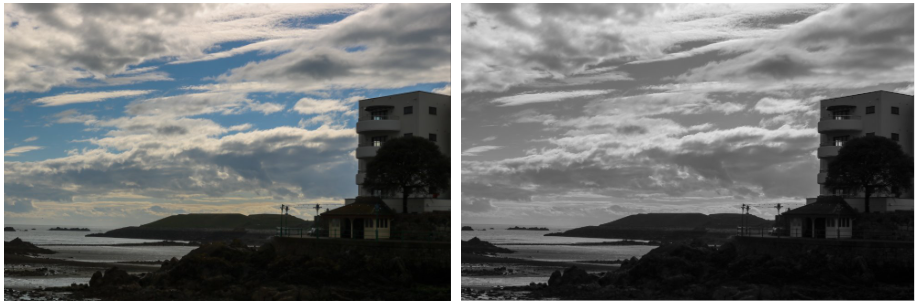
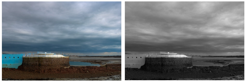
This is one of the landscape photos that I had taken while I was in France. I liked this image because of how it matched Ansel Adams photo of the mountain and snow. I took this image in colour where the sun was hitting the top of the mountain. I edited this image on photoshop by going to adjustments and then black & white. from there, I was able to adjust the different colours with the scale. this meant that I could make some parts of the photo look darker and some look lighter

Photoshoots

Ansel Adams inspired

photo my images are inspired by:

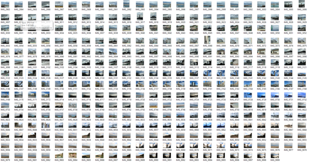
A small portion of my photos were taken in France and I think they are linked with Ansel Adams quite because of the use of his mountain photos.

Colour to Black & White:

I edited these images on photoshop by going to adjustments and then black & white. from there, I was able to adjust the different colours with the scale. this meant that I could make some parts of the photo look darker and some look lighter. i like the ones where the snow is very clear and visible because it means i could have a very bright white which would be considered a rating of 10 on Ansel Adam’s Zone System.

Final Images

Storm Damage:

For this photoshoot, the focus was on the storm that hit the island in November 2023. the impact of strong winds resulting in a tornado reached speeds up to 186mph and resulted in major damage to jerseys homes and nature. thousands of trees were downed or damaged, a lot of attractions were closed due to the impacts and most importantly people lost homes.

My photoshoot was focussed in St Clements where the storm hit badly and my focus was on the trees that were damaged but I also took some of various buildings. I focussed on forest areas such as La Blinerie which is a lane that is along side the golf course. I also photographed some of the golf damage as well.

I think I could’ve done better by going further around the island for damaged as I only focussed on where I live so I didn’t get all the damage. I think also it would’ve benefitted me if I had taken the photos earlier on as by the time I began taking photos, the damage had already began being cleared.

Romanticism / Sublime

Romanticism

What is Romanticism?

Romanticism was a particular movement or era in art that occurred towards the end of the 18th century during the first half of the 19th century. Romanticism often aimed to put much emphasis on emotion and individualism. The early period of the Romantic era was a time of war, with the French Revolution (1789–1799) followed by the Napoleonic Wars until 1815. There was the fall of the monarchy and a change in society. It was also the time of the industrial revolution where more things were making there way into more factories. enlightenment was another movement known as the age of reason which was a more reasonable and sensible movement in contrast to the movement of Romanticism.

There are many characteristics of Romanticism, painters and photographers took a very large amount of their inspiration from natural aspects of the world and not usually human-made. Many paintings/ photographs have a deepened appreciation of the beauties of nature.  Overall, the characteristics include a focus on individualism, an emphasis on nature, emotion over reason, freedom of form, an exploration of the Gothic and unknown, a return to the past, the awe and wonder, the idealization of women, the purity of childhood, and the search for subjective truth.

Many photos focus on tranquillity like a photo of a sunset or calm seas. As well as this, photos that focus on dramatic and dangerous conditions such as a stormy sky or rough seas are also very popular when it comes to romanticism.

What is the sublime?

The sublime can overall be described as a quality of greatness or grandeur that inspires awe and wonder. The sublime is a meeting of the emotional and the natural world. Nowadays, the word is used as an ordinary term like a ‘sublime’ evening but when you focus on the historical facts and meanings, you find a deeper use of the word pointing to the heights of something truly extraordinary. The sublime has been described as many things, but in a sum up of the meanings, people have mostly described it as a judgement, a feeling, a state of mind and a kind of response to art or nature. when the word Sublime is split into two, ‘sub’ is commonly described as below or up to and ‘limen’ meaning limit, boundary or threshold. ‘limen’ can also be seen as another word for the word ‘lintel’ which means he heavy wooden or stone beam that holds the weight of a wall up above a doorway or a window. the impression of pushing upwards against a strong force is an important connotation for the word sublime and commonly used in descriptions in things such as essays.

It was especially important in eighteenth-century Britain, mainly because of the increasing importance of landscape as a subject category for artists. Edmund Burke was not the first to speak of the sublime but he is well known for his descriptions and understanding. he split the idea of the sublime into 7 parts:

Darkness – which constrains the sense of sight (primary among the five senses)
Obscurity – which confuses judgement
Privation (or deprivation) – since pain is more powerful than pleasure
Vastness – which is beyond comprehension
Magnificence – in the face of which we are in awe
Loudness – which overwhelms us
Suddenness – which shocks our sensibilities to the point of disablement

[The sublime, declared Burke, was “the strongest passion,” and he belittled the importance of the beautiful, claiming that it was merely an instance of prettiness.]

Origins of Landscapes

  1. What does Landscape mean?

A landscape is a part of the earth that is captured in a singular photo. It consists of the geographic features that mark, or are characteristic of, a particular area. Landscape photography commonly involves daylight photography of natural features of land, sky and waters, at a distance. The word Landscape originated from the Dutch word landschap which was a name given to photos of a countryside. The word and technique was borrowed from artists, famous Dutch landscape painters include Jacob van Ruisdael and Vincent van Gogh. It is highly typical for landscape photos to involve naturalistic aspects such as natural mountains, rivers, fields etc. However, photographing human-made features can also be accepted as landscape photos. Landscape photos are very commonly taken in a non-human activity environment and therefore the photographer can devote their full focus so the scenery and not the people that could be involved. As well as art, the definition of a landscape photograph is broad and may include rural or urban settings, industrial areas or nature photography.

2. When did landscape emerge as a genre in western culture?

landscapes emerged as a genre in western culture during The Renaissance. Renaissance is a French word meaning “rebirth.” This event marked the time where people began to move away from medieval ways to more modern times. it was a period of time where people began to appreciate art, modern science and literature more. This is where landscapes emerged in the 16th century. Renaissance art had much more detail than medieval art. for example, Portraits of the Renaissance era depicted bright colours, shading, and realistic features of the subject being painted. The background was often plain because Renaissance artists wanted their subjects to be the focus. During the 1300s, artists began to appreciate the natural aspects of a painting and the surroundings of whoever their subject was.

3. when did classical landscapes emerge as a genre

In the 17th century, Landscapes gained popularity and attention of many people and artists. The classical landscape was ideally seen in scenes in the mythic and idyllic Arcadia of ancient Greece. The leading practitioners of the genre classical landscapes were the French-born-Italy- based artists called Nicolas Poussin and Claude Lorrain. both artists spent their time in Rome drawing landscapes of the Roman countryside and Italy was the most common place for things like these because of the beauty of the country and unique sights. Into the 18th century, Italy kept its popularity for classical landscapes but the new centre focus was brought onto France and England
4. What prompted the rise of landscape art during the late 18th/19th century?

Landscape artists of the 19th century embraced the thought of romantic movements within art and aimed to infuse their work with drama and passion. The 19th century was a time where landscape art had gained much more attention and was beginning to be seen as a go to piece of art technique. In England two of the foremost landscape painters were John Constable and J.M.W Turner. Landscape painting gained prominence in the late 18th century with the rise of Romanticism. Romanticism was a particular movement or era in art that occurred towards the end of the 18th century during the first half of the 19th century. Romanticism often aimed to put much emphasis on emotion and individualism. Characteristics include a focus on individualism, an emphasis on nature, emotion over reason, freedom of form, an exploration of the Gothic and unknown, a return to the past, the awe and wonder, the idealization of women, the purity of childhood, and the search for subjective truth.

5. When did landscape photography originate?

The earliest evidence of a landscape photograph was taken between the years of 1826 and 1827. It was an urban landscape photo taken by a French inventor by the name of Nicephorus Niepce. This photograph took him 8 hours so it was sensible that he didn’t take a moving photograph. Due to landscapes already being a very famous and popular artistic technique, it was no surprise that landscapes also made its way into photograph once the uses of photographs were invented and gained their own popularity. Early photographers seemed to decide that landscapes made the perfect subject because they were static and so the danger of the subject moving was minimal.
Artist Comparison with my Inspired photos

Cindy Sherman face distortion

I think I did well to recreate Cindy Sherman’s work using the effect of face distortion. However, there are a few differences between her work and my own. Cindy Sherman creates these pieces with the camera zoomed/ close up to the individuals face which captures the details really well. However, mine is more further away which means a lot of empty space is included. I think my photo could have been improved by copying her close up technique. Another difference is that a lot of Cindy’s work shows her main focus was creating these photos using the older generation whereas mine is an individual from the younger generation. A last difference is that Cindy has used a different person for the cut outs but kept them at a natural size. I decided to use a different person but change the size of the facial features so that they were unproportionable to the face underneath.
A similarity between the two is the different shades. though in this photo she used black and white and I did not, the cut outs are still very clear as there is a difference in skin tone.

Cindy Sherman Female Stereotypes

For this inspiration, I did two sperate photoshoots so I’ve added both. The first one on the left is a copy of Cindy’s photo in my own setting with my own props whereas the second shoot is more of a general inspiration for female stereotypes and not a direct copy of any of her work.

I think the first photo turned out fairly well as it can be quite clear that I have taken inspiration from this particular photo. A similarity of this photo compared to Cindy’s is the use of props. I have taken her idea of adding a pan in the frame to further show the fact that the setting is located in a kitchen. as well as this, she has props that surround her which also bring across this idea and this is also evident in my photo with the use of the apron in the background and the kitchen towel. A difference is the chosen poses. I decided to busy myself with doing something to show the setting more whereas Cindy is looking over her shoulder.

I think the other photoshoot turned out well and is by far my strongest. It matches Cindy’s ideas of showing the general things a woman would stereotypically do. As dance is generally thought as a female sport I decided to also show a stereotype within my photos as well. The particular phot I have chosen shows the individual looking into the mirror fixing her lashes which is also seen as a female thing to do. In both photos, Both woman are not looking to the camera which creates a more natural looking photograph There are a few differences as it is not a direct inspiration. I have not used black and white anywhere in this photo as I think the use of the red lights reflecting off the navy costume is very effective so using black and white would cancel that out.

Duane Michals Reflections

I think this inspiration turned out quite well as its fairly similar to Michals’ idea but also has its differences. We have both used the black and white effect on our images which I think turned out well. As well as this, both takes have a source of light included but one is artificial and one is natural. I think the natural light looks a lot better so I would change that if I were to do it again. We have both used circular mirrors to show the reflections but mine is a lot smaller which lead me to focus on individual separate facial features whereas Michals shows a large part of the face in the mirror. I have not added a person into my photo as the mirror was small and it was tricky to add myself into the photo as well as getting the right angle on the mirror. This differs from Michals as you can see the individual is included in the photo.

Photoshoot Edits and Final Pieces + Evaluations

Cindy Sherman Femininity double exposure edit

For this edit, I decided to use the technique double exposure. I used 3 different photos where the individual was holding different poses. These 2 photos were edited on Lightroom to increase the quality of them and then transferred to photoshop where I was able to change the opacity of one of the images so that they became transparent. I did this by getting my base photo and then dragging the other tab onto the base photo. from there, I selected the image one at a time and move it into place, adjusted the sizing and finally changed the opacity to about 50% Each of these images were taken with the addition of the red lighting so I decided to keep that common with the 2 photos so that they all had the red effect.

Evaluation of piece

This final piece links to Cindy Sherman’s theme of femininity. Sherman likes to step into different woman identities and show the femininity side of them. I think my edit links to femininity and Cindy Sherman well as the main theme of my photoshoot was Dance. Though it is more gender neutral now, dance has very commonly been viewed as a female sport. I decided to use this stereotype to my advantage and capture pictures of a dancer showing the beauty of dance and femininity. I think the 2 photos that I took worked well as they are both showing the individual from different angles. For example, the one of them shows the individuals hair in a typical feminine style and also the open back of the dance outfit. In the other photo, you can more clearly see the individuals face where she can be seen showing more emotion as she is smiling. Lastly, the photo that shows her in the position of an arabesque represents the individuals hands and arms, she can be seen posing in a typical dance way where the arms float in a beautiful and feminine way. I also like how I’ve decreased the blacks and made the individual herself more of a dominant feature in the image and got rid of the black curtain slightly showing.

I think I could’ve improved the way I photographed some of the images too. The one of the arabesque captures a lot of her body but I think it would’ve made a better image if her hand was in frame and my foot was in frame to show the ballet shoes.

 Other photos that I liked

Evaluation of piece

Overall, I like both of these images as they use the technique of reflection. In the first image I have managed to include the whole body in the shoot as the reflection of the ballet shoes are in the mirror. I think this is a good effect and further shows the theme of femininity that I explained in the last edit. I think showing the ballet shoes is important to bring across the theme of dance and to show a tricky skill ballet dancers are able to achieve. I also like the affect if red lighting that reflects off the back of the individuals head almost like she’s blocking it. Thought I really like this image, I blacked out the background but wasn’t able for the white flooring. I think, if it had been possible, the photo would have looked much better if the flooring was also black so bolden her ballet shoes a bit more.

The second photo I one of my favourites and also aims to use reflection however the view of the reflection is not visible. This photo also shows femininity as its stereotypical for females to be linked to make up and beauty. In the image the individual can be seen attempting to touch up make up which shows a basic trait of a typical female. I also like this image as it was not planned and it was a natural photograph to take as the model wasn’t aware and was simply just going a natural thing. The angle of this image also shows other similar factors of femininity such as jewellery as the earring is very clear as it is directed right at the camera.

This edit was also inspired by Cindy Sherman’s theme of femininity. There is a handful of photos that Cindy Sherman created where it pictured a female in the kitchen. I decided to take this idea into my own hands and create my own take on it. As I used the same technique as the edit above, the editing process was similar. by getting my base photo and then dragging the other two tabs onto the base photo. I changed all of my photos from full colour into black and white as that was what Cindy Sherman did wit her photo. this also creates the effect of an older photo like hers was from there. I selected the image one at a time and move it into place, adjusted the sizing and finally changed the opacity to about 50%.

Evaluation of piece

Overall, I like this edit however I think the photos would be more effective if they were used as 3 separate ones mounted together and not in a double exposure edit. But I also like the use of double exposure as it shows3 natural film stills merged together to form some sort of story. I used photos at different angles however, each photo doesn’t show the individual looking into there camera which can create a more natural looking photo. The pose for the largest photo was inspired by one of Shermans most famous photo where she is looking over her shoulder. This could create a sense of fear or unknowing for the viewer as they cant see what the person is looking at as it is out of the frame. I think the use of black and white worked well as with colour, the double exposure could have made it look a bit confusing a busy.

This photo shoot links to femininity as years ago is was stereotypical for females to be more commonly pictured in a kitchen working at home and not in a work place as that would be for the men. I have the pan showing in the photo which will further bring across the fact that the setting is a kitchen. as well as the apron hanging on the door and the kitchen towel acting as a prop. I think I have done well to recreate Cindy’s ideas as well as adding my own twist on it.

Cindy Sherman Face Distortion

This final piece was also inspired by Cindy Shermans more recent work. I did these two edits by getting two portraits and choosing which one I was going to cut out and white one I was going to cover. I chose the photo and then used the lasso tool to cut out part of the eye and part of the mouth like Cindy Sherman also did. On the top photo I used the effect of a drop shadow to make the cut outs stand out more and on the second photo I kept it normal.

Evaluation of piece

I like this final piece as it is showing female facial features from not just one person. I think it was also an easy process for a good outcome. I think I did well to explore different techniques likes drop shadow. I like the use of the drop shadow in my images as it boldens the cut outs to further show that its out of place and makes it very apparent to the viewer. Though I used drop shadow on one, I do prefer the photo without it. I also like this photo more because I’ve enlarged the features to make them look more out of place and it also has more of a difference in skin tone than the top one so it pops out more.

In some of Sherman’s photos she also used the technique of black and white contrasting onto coloured portraits. I decided not to do that as I think the difference in skin tones also have a good effect. This photoshoot highlights parts of a female face by also making it look unusual and unique. This type of edit could be a representation of being insecure about yourself and Sherman takes that to another level by putting together an abstract piece and still managing to make it interesting and unique.

Duane Michaels film stills

Photo inspiration:

This edit was inspired by Duane Michals who is well known for creating photo sequences. I took this idea and recreated it myself. To edit this, I simply needed to work with the base photo (which was the individual laying down) and then layer the other photos above it and adjust the opacity. I also decided to make this shoot black and white as that was what Michals does in the photo I am most inspired by.

Evaluation of piece

I did a similar sequence of photos to what Michals did in his and I think mine also turned out well however if I did it again I think I would’ve preferred a landscape sequence of photos like Michals did. I like this final piece because it was a simple process however it is definitely not my strongest. I think the use of black and white worked well as it brings across the fact that the sequence of images isn’t very happy and it is more showing emotions of sadness, guilt, worry and anxiety. This photo was taken as a self portrait and I did not have access to a camera so my own resource was my phone. This is a negative as it means I wasn’t able to achieve the highest quality for my images. Another negative is the angle I chose, I think it would’ve looked much better if I had done it landscape and maybe included the whole bed in the frame

Duane Michaels Mirror Reflection

For this final edit, I simply needed to put all of the 6 photos side by side to create the film still effect that Michaels does. I decided to change the full colour to black and white as that is what he did in the photo I am inspired by.


Evaluation of piece


I think this photo shoot turned out well as it is very similar to Michals piece which shows that I have used an artist reference in one of my pieces. As well as this, I think this edit links to Femininity as I have zoomed in on aspects of a female face using a mirror. I also added an extra photo that focuses on the necklace. Though this isn’t part of the female face, it still shows a stereotypical female thing as they are more commonly the ones to be wearing jewellery.

I like this piece and how the mirror is only small so therefore only focusses on small aspects of the face. I don’t like how the two images on the end have the arm at different heights and I think I could’ve done better to make sure I stayed in the same position. I also think this piece would ha looked better if I had a plain background as sometimes a background with aspects induced may take the attention away from the main part.

Opposites

This photo wasn’t inspired by an artist but I wanted to represent opposites in one of my photos. For the top photo, I edited it by changing the lighting temperature to a cooler tone and then creating more of a shadow around the individual. With the bottom photo, I made it have a more warm tone.


Evaluation of piece


I think this final piece turned out well as it shows the contrast by the use of colours and poses. The first photo can be seen to picture a female holding more of a masculine pose with the hood up and hands on head whereas the bottom photo shows her with her full face visible and head resting on her hand. I also like the use of colour as the warmer toned bottom photo gives off a more soft a calming feeling which could represent more of a female character whereas the top photo is more darker, bold and blue which is stereotypically a male colour. I think this shoot was good as it was taken in the studio and with a camera which makes sure there is good quality and a plain background that won’t clash with the main aspects.

Femininity and Masculinity Gallery

Environmental portrait Gallery

Studio Portrait Gallery

Photoshoots

Stereotypes- Cindy Sherman

This photoshoot was taken in the studio. I used the use of the red lighting to contrast with the navy blue dance outfit and I think that worked well. I also used the use of an extra object which was the mirror.

to edit these images, I adjusted the exposure, highlights and shadows. In my opinion, I think that the images being quite dark worked well. I took some photos with the subject posing and some photos where she was not aware she was being photographed and I think this worked well as it shows a more natural side to the photoshoot.

Cindy Sherman- Face distortion

For this photoshoot, I simply needed to take normal portrait photos as the inspiration is only seen once the photos are edited in photoshop. I used some of the photos from the studio lighting photoshoot as well as some new ones. I am planning to make a few attempts of this photoshoot as I will make one person the main subject with the addition of face parts from the other people and then do this a few times and alternate the main subject.

I think these photos will work well as the individuals are posing for the photo and it’s not natural, this means that it will be easier to edit as the main focus is the face and not anything else.

Duane Michaels- Mirror Reflections and body parts

This photoshoot was taken in a natural setting which was my bedroom. This would be seen as a negative as the photos don’t have the addition of the studio lighting and quality.
this is inspired by Duane Michaels as he did a similar shoot with a woman holding a mirror and twisting it to show different parts of her face. In my photoshoot, my mirror is significantly smaller so I decided to make the focus on individual aspects of the face. I took a few of these photos as Duane Michaels can be known for his photography being many photos put next to each other to create film stills.

Duane Michaels- Film Stills (for double exposure)

These photos were also taken away from the studio. They were also inspired by a few photos that Duane Michaels did with a few different people. I am planning to use these photos to edit them on photoshop by using double exposure and layering the photos on top of each other.

Photoshoot Planning

  1. Inspired by Cindy Sherman Female Stereotypes

Her other photoshoots that focus on female stereotypes were taken in a time where its a little different now so I will focus on keeping the theme in the years hers were taken and attempt a recreation. As well as this, I could also show the photos in a different perspective and contrast what it was like then to now. These photos can be taken at home or can be taken in the studio and I can bring in props/costumes. For some photos, they will just focus on the basic stereotypes, For example, football and basketball are commonly seen as embodying masculinity, while dance and gymnastics are feminized. I am planning on getting a friend to show the stereotypical girl sport of dance by using the studio and having her wear her dance outfit.

2. Inspired by Cindy Sherman Face Distortion

Cindy Sherman has many photoshoots that focus on the female stereotypes. She also has more recent photos that focus on the face. In these photographs, she replaces parts if the face with someone else’s to create a more abstract image. I am going to try and create my own photoshoots with both of these ideas.

For creating the photoshoot such as the one above, I am going to aim to take portraits of people in the studio. I am going to involve a minimum of two people. However, I could also focus on the same person but experiment with the colour by adding black and white aspects rather than completely switch part of a face with someone else’s. This photoshoot would be straightforward as it would just mean taking simple portraits which would then be edited on photoshop.

3. Opposites

Another idea I had was to picture women in the usual roles of men. this could be by profession or activities that would be a typical masculine job. For example, if you think of an important business person who’s very high up and important the majority of people would picture a man. So in my photos I want to reverse the general stereotypes. These photos can be taken at home or can be taken in the studio and I can bring in props/costumes.

4. Duane Michals inspired: Reflections with multiple photos:

I am going to focus this photoshoot on the femininity theme and also make most of them self portraits. I am going to aim to take photos using a mirror doing usual girl stuff, eg applying mascara. I will have to take these photos in different stages because in the example above, the subject is moving her head in different directions to make sure each photo if different to the rest. So I will have to think of ways each of my own photos can be different.

5. Duane Michals inspired Double Exposure


I also want to do a shoot like this which is also inspired by Michals. I am going to do one of myself and then possibly another one of the opposite gender.

This photoshoot wont be taken in the studio and will be taken at home as it’ll need to be in a natural setting.

Photoshop attempts of what I want to do (Photoshoot 2)