
All posts by Jonny
Filters
Personal Study: Evaluation of project
Initial Idea Reflection
The main focus of my project was to show how the “normal becomes abnormal”, referring to how recognizable areas or locations change under different lighting and weather, specifically at night. When I commenced the project, I was going to explore both day and night photography but as the project went along, I found myself more interested to the low light / night photography as it brought the mystery, emotion and thought-provoking feel. Me being more interested by the nighttime photography, led me to have more photoshoots during the night and better outcomes at night whilst still getting multiple daytime shoots in.
Photoshoots Reflection
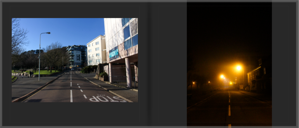
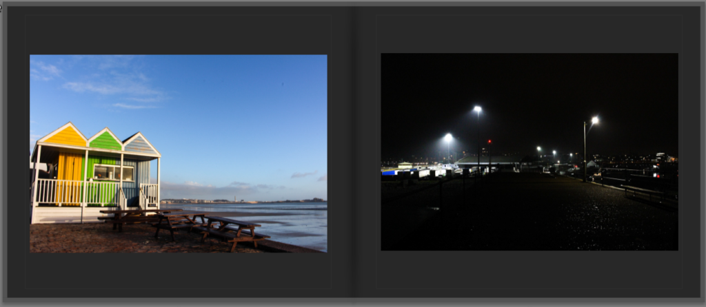
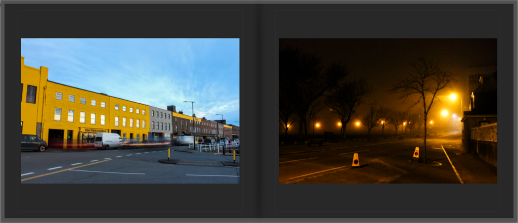
The biggest realization I had throughout my project was that the images taken during the night turned out a lot more effectively in comparison to the daytime ones. The night time photographs had more of an emotional effect to them, evoking senses of mystery, isolation, solitude and interest which fit in perfectly with the theme I was intending on. The nighttime photographs, inspired by Todd Hido and Pierre Putman had a surreal, cinematic look to them which was created through the blend of lighting and the mist, the shadows and the contrast of highlights. Alternatively, the photos taken during the day, although they were strong in terms of composition and framing, I thought that they were quite basic in comparison. They were missing the same feel and intensity which the nighttime images had, meaning that they look more simplistic. Even though they may have been quite ordinary, they still played a huge role in the sequencing of my final photobook, they allowed to show the dramatic changes between the day and night effectively.
Essay process
Another key aspect of my project was the essay, writing the essay was challenging but there were many positives in completing the essay to a high standard. To construct this essay, I had to do lots of detailed research into the photographers, Todd Hido and William Eggleston. I also researched the progression and history of colour photography. Although it was difficult, it helped me understand different photography techniques, lighting techniques and etc. In conclusion the essay improved my confidence in analyzing the meaning behind work which helps me analyze the meaning behind my own work, benefiting me in future projects.
Final Book Reflection
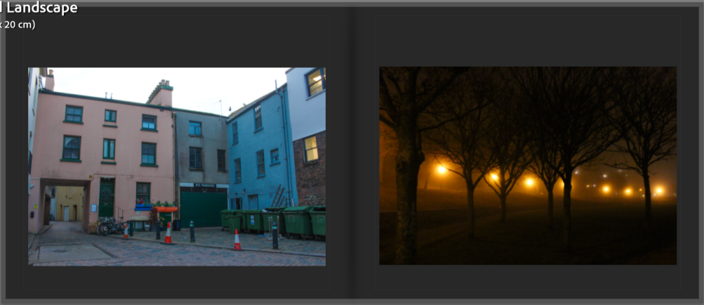
The final photobook successfully shows the theme I had intended on exploring. The minimalistic cover attracts people to look at the inner pages of the photobook as it is mysterious and is an extremely thought-provoking scenery, the yellow title was a perfect addition to the cover as it gave a contrast without being too bold. If I could change or improve anything about this project, I would make the amount of images of day and night more equal and get them to similar quality. I would try out different ways to make the daytime photographs more interesting, engaging by maybe focusing on different angles, lighting conditions, lenses or different camera techniques.
As a whole, this project has made me think precisely about sequencing, planning and presentation. It has also helped me have a stronger understanding on how images can have deeper meanings behind the framing of it. In the future, I will be taking skills I have improved and learnt with me as well as any improvements or mistakes as a lesson which I can avoid in future work.
Final Prints – Virtual Gallery + Evaluation
final Prints:
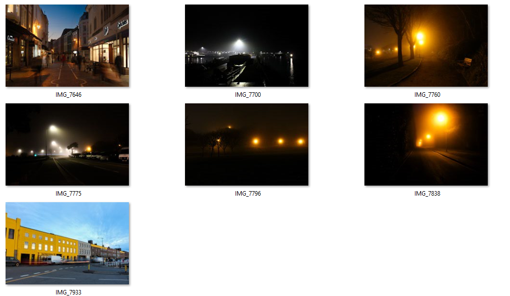
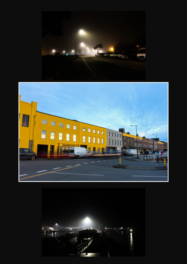
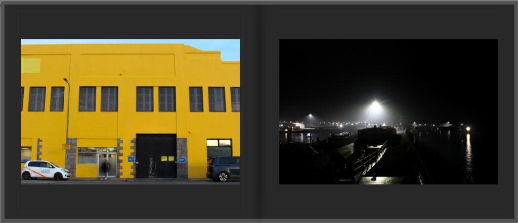
Above are the seven photos that I precisely chose to be my final prints. When selecting the images for final prints, I chose only one that was taken during the day because my nighttime photographs are more powerful in conveying the mood and atmosphere that my project aims to express. The artificial lights mixed with darkness create mystery and depth that is suited to the main theme of my personal study. In the future, I will frame these prints to evolve the presentation and impact that these photos can have on the viewer.
Virtual Galleries:

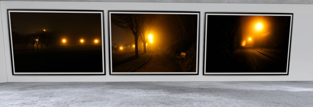
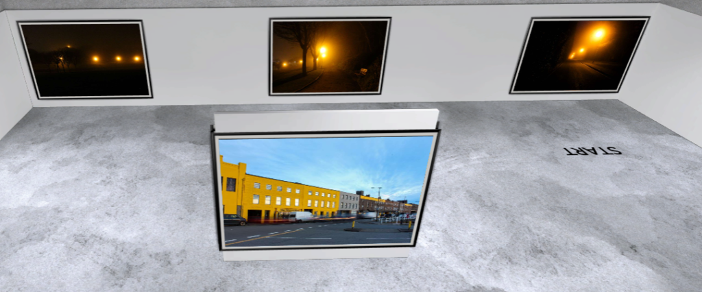
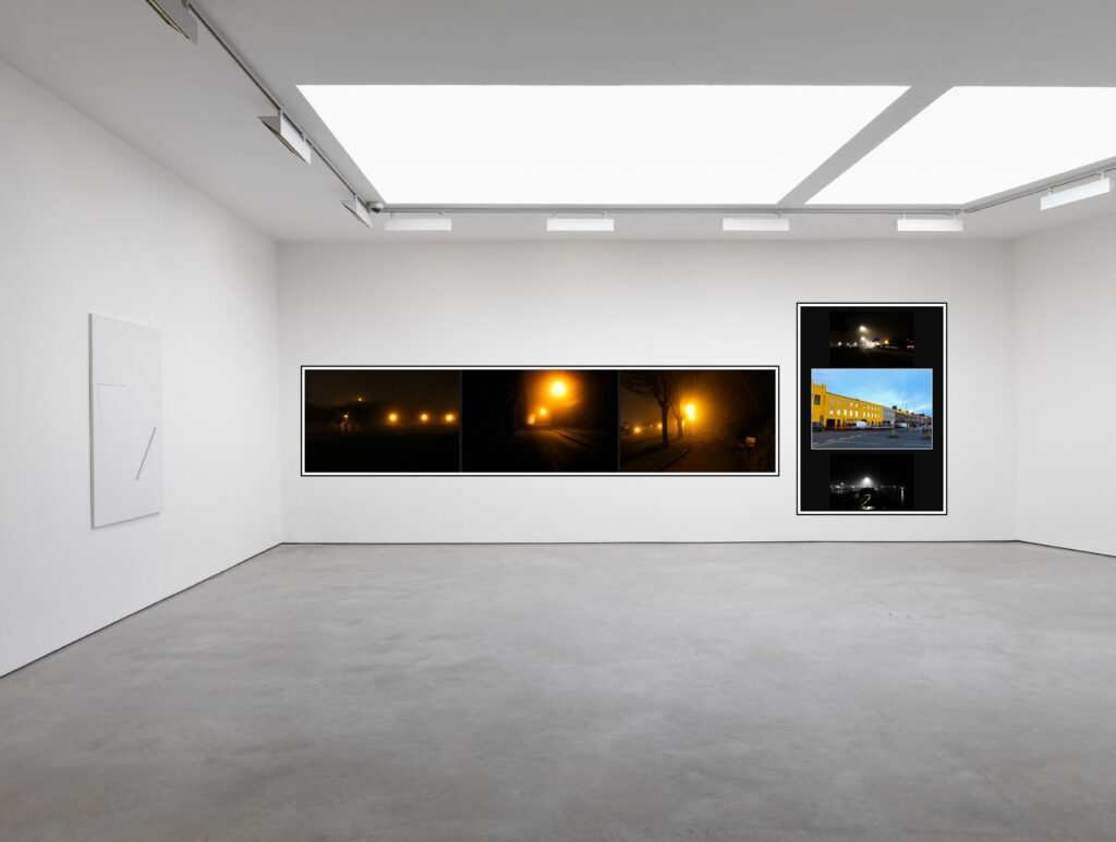
To see how my end prints would be shown in an art gallery space, I created a virtual gallery using a website called: ArtSteps. Artsteps allowed me to investigate how to put the photos together and which layout looked best in the gallery space. The layout was done carefully to put night photos next to other night images, making a more organized and clearer layout. I included the one day-time photograph on its own in the middle of the exhibition in order to make it a statement piece and make it stand out even more. Seeing the photos in this gallery setting allowed me to be more specific with my selection of my final prints and it also showed how the photos would be successful together in a professional gallery space, giving me inspiration on how to lay my final prints out when framing them.
Real Final Mounting Outcome
Evaluation Of Final Prints
For the recent images I shot, I think they perfectly capture the mood and ideas I was going for with this project. The seven images summarise the entire book by displaying the contrast between the light and the dark as well as how everyday places change based on the lighting and time of day. However, the contrast between the two would be apparent and easier to compare if I had chosen an equal number of daytime and nighttime photographs for my final prints. The choice of mainly nighttime photos was intentional, the nighttime scenes produce a stronger mood, mystery, and emotion, where the one photo taken during the day provides a glimpse of clarity to lead the viewer into the darker scenes. Each photo was chosen specifically based on composition, light, and the effect that it provides to the series. Seeing these images in the virtual gallery made me more comfortable and confident that these 7 images were the most appropriate to use. Soon, the photos will be framed and mounted to be presented professionally and in person.
Personal Study: Photobook Construction
Selection of images
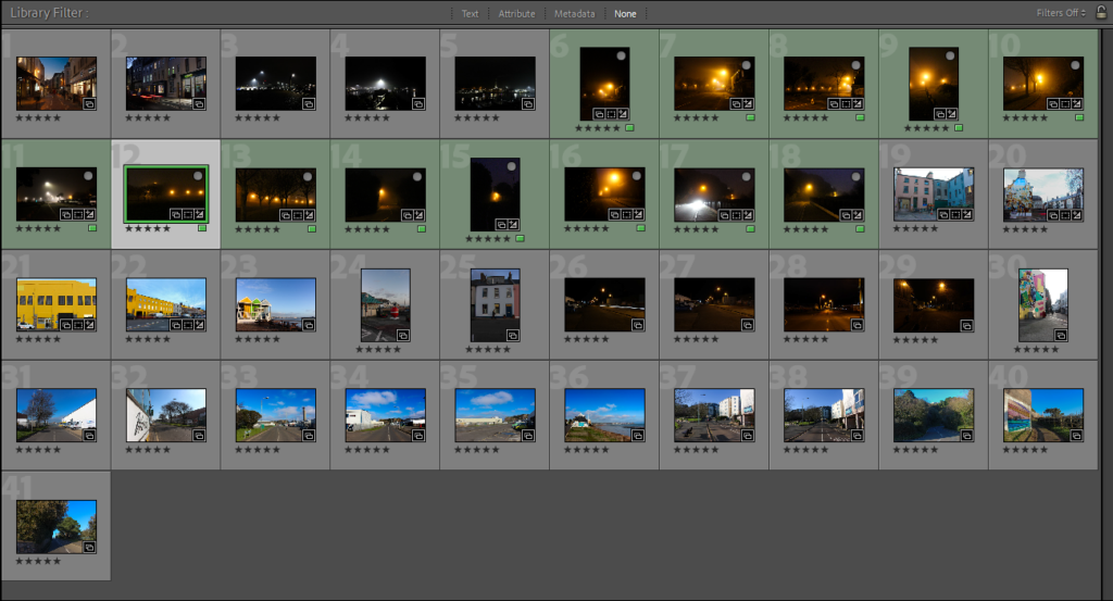
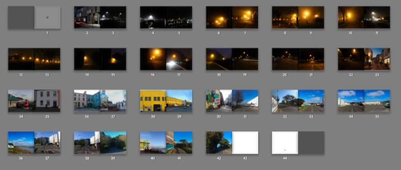
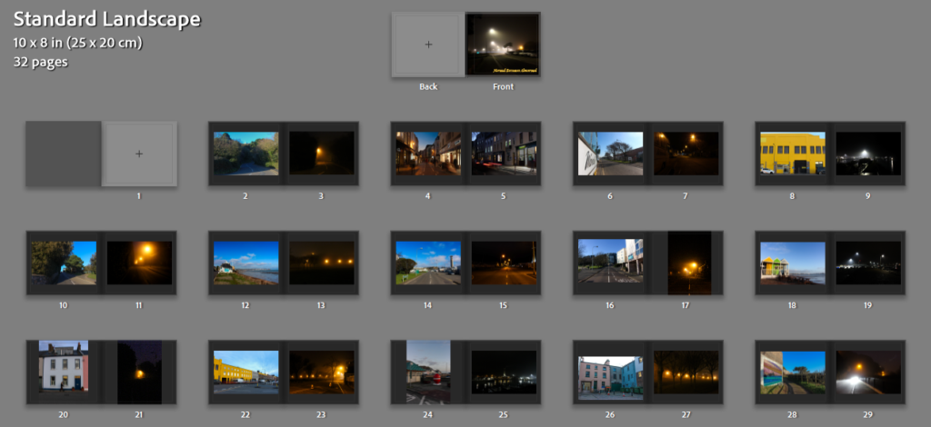
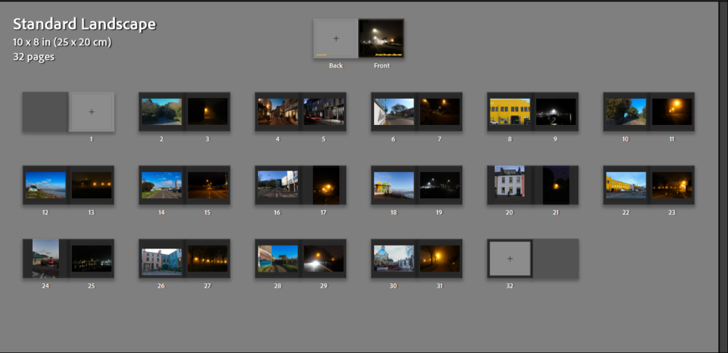
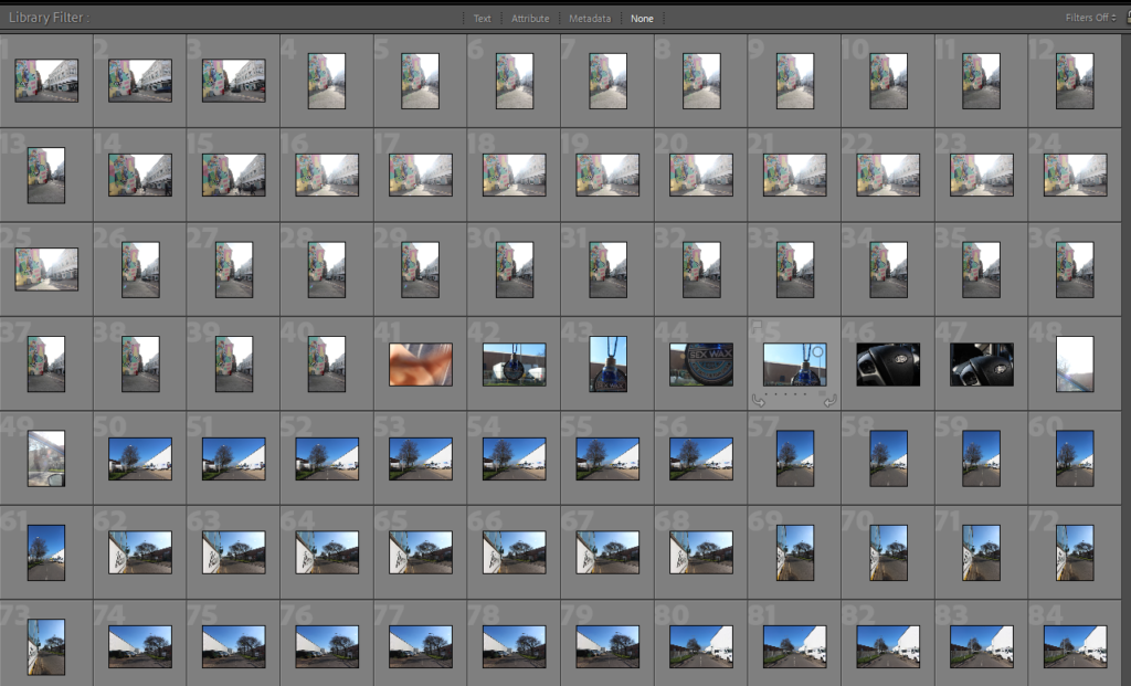
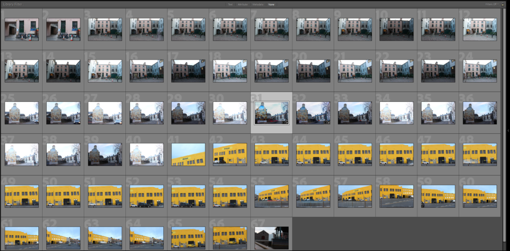
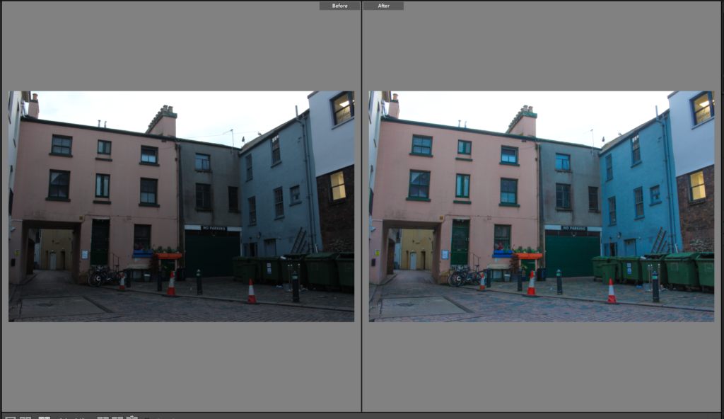
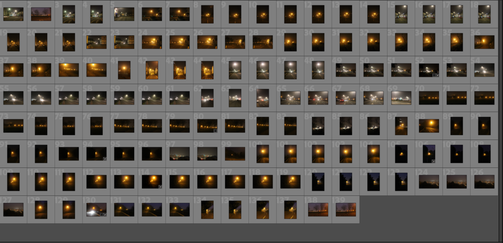
Firstly, before I even began opening the book I selected the 41 final images which could possibly be used in my book and put them into a collection of its own. This collection consists of images from Both night and day, ready to be put into my photobook to show the contrast between the day and the night. Before even opening up the book tab I had another quick review of the images and most of them will be incorporated in the book however some might not. The collection of the 41 photos are displayed below.
Book Specification
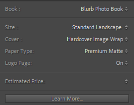
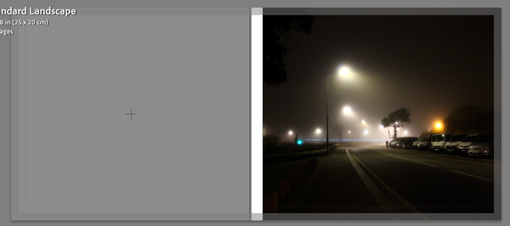
These are the settings I have originally chose for my Photobook, I have gone for a Standard Landscape Book with a Hardcover Image Wrap and on the inside I have chosen to have Premium Matte paper. I chose the standard landscape sized book because most of my final selected images are landscape orientated and in my personal opinion I prefer the landscape over the portrait book. Premium Matte paper was chosen because matte paper works better with darker photographs, it allows the ink to sink in efficiently.
Initial Book Construction
Front Cover:
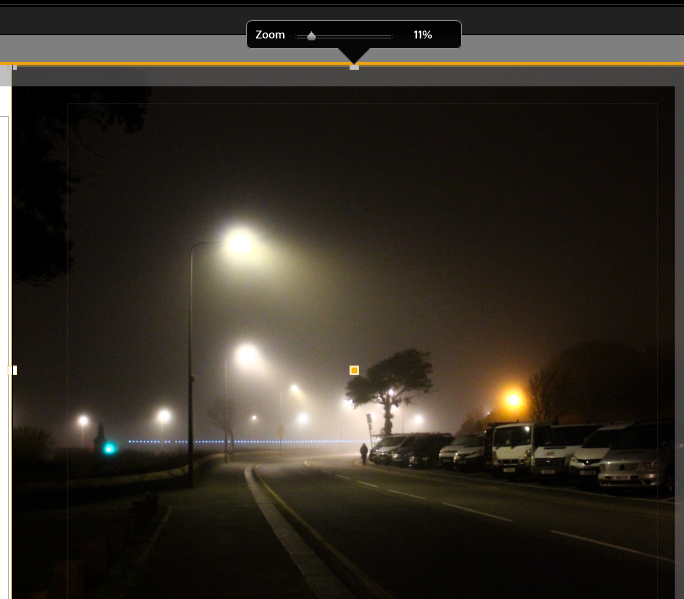
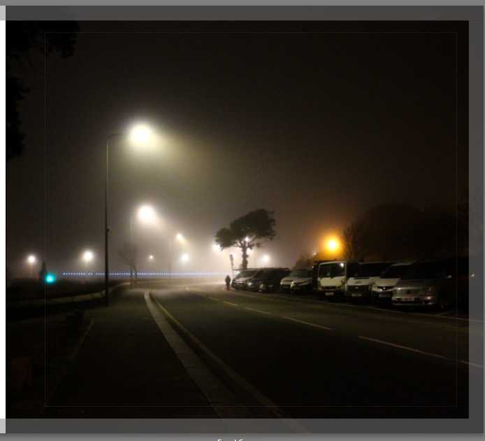
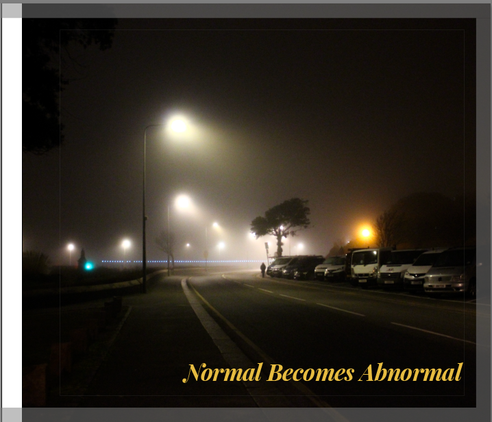
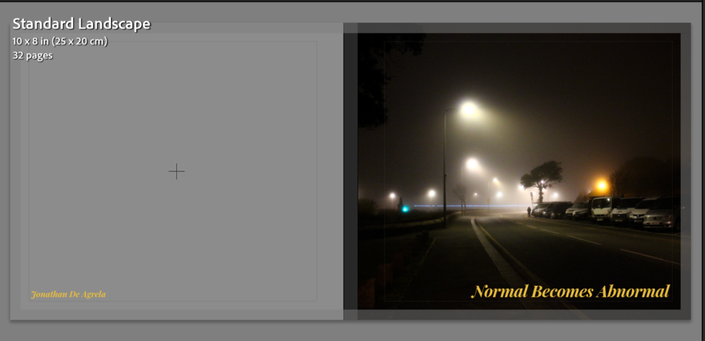
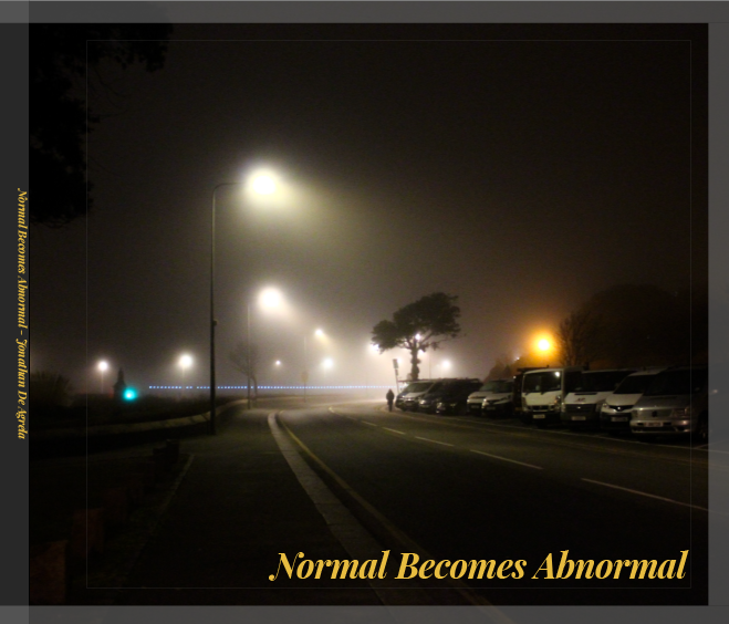
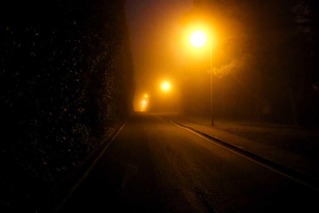
Firstly, this is the image I have decided to put as the cover I chose this image to be the cover of my book because this photograph is extremely thought provoking and displays a part of my projects theme clearly. To make this landscape image the front cover I had to zoom the image in 11%, meaning that I lost some parts of the image. Even though some areas of the image are not shown in the front cover, I do not think this is a big deal as I framed the image perfectly where the Interesting part of the image was shown, and the parts cut were little details which do not add too much to the image. The combination of the fog and the bright glow coming from the lampposts creates brings out the feeling of mystery. The emptiness shown in the photograph links back to the solitude which the night brings. This cover fits perfectly with the purpose of my photobook of how a normal setting can become abnormal, the focus of my project. This image stands out and therefore invites the viewer to pick up and look through my book.
Title Of Photobook:
My Title for my project has always been “Normal Becomes Abnormal”. I chose this title at the very beginning of the project, this title was chosen due to the way it blends with the intention behind the images and the images themselves. My projects theme is to show the contrast between the day and night showing the elements presented during the day, under the sunlight and showing the contrary elements which are presented in the night, under low light.
This above is the chosen front cover of my photobook and the next step to finalize, or proceed with the photobook is to add the title of my project: “Normal Becomes Abnormal”. I already had an idea in mind on what font I was going to use for this title, The font is called Playfair Display. This font stood out to me out of any other font because it has both thick and thin strokes which creates a dramatic look and matches the look of the book.
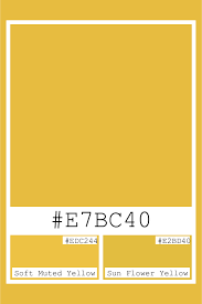
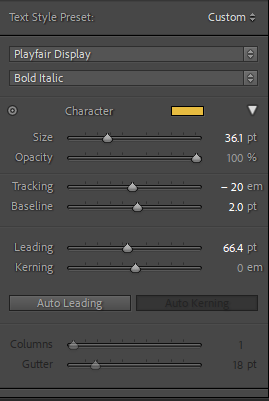
Once I decided what font I was going to use for the title of my front cover, the next step was to choose a colour for the title. I started off with experimenting with most colours seeing which ones I thought worked with the book and which ones did not, I narrowed my choices down to two colours Muted Yellow and Cool Grey. I first experimented with the muted yellow, finding the perfect shade of yellow on google then using the muted yellow hex to apply it to my title. I found that muted yellow worked well with the front cover because my cover displays a dark misty night setting and the muted yellow gives me enough contrast to make the title stand out. I chose muted yellow over any other yellow because this Muted yellow stood out in front of the dark tones of my image without being too bright or clashing with my cover. Below is What my title looks with the Playfair Display font and the muted yellow colour.

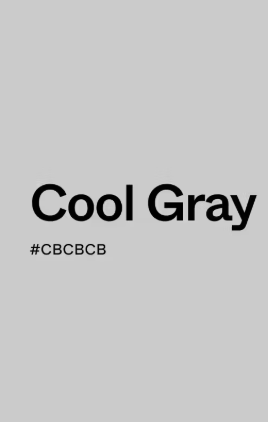
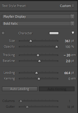
Once I had experimented with using the muted yellow colour on my title, I then tested out a cool grey on the title, however this colour did not work well on my front cover. The grey did not stand out when placed on top of my cover, because the photo on the cover is mainly dark toned and the grey on the cover just blended in with the rest of the image, making the title not stand out. Below shows what my title looks like in cool grey, in the screenshot it looks good however when put together with the whole image, it just does not work.

Title Placement Experimentation:
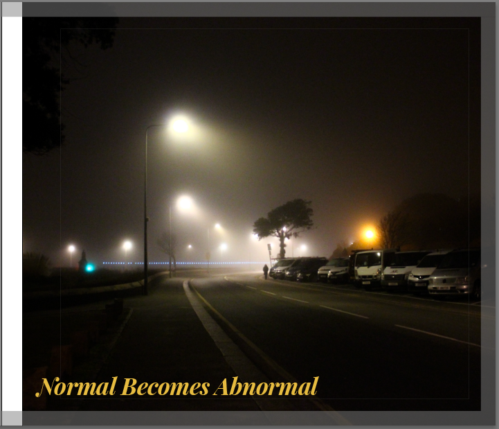
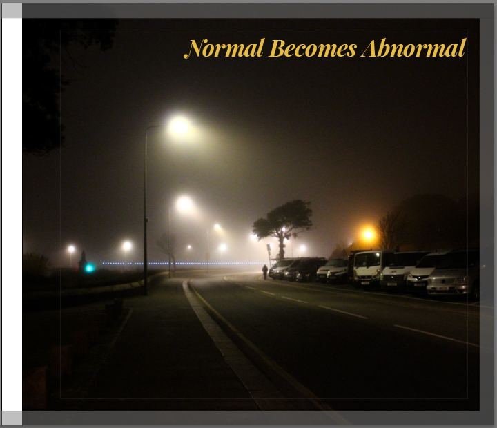
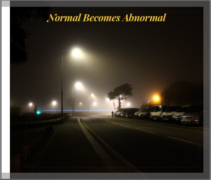
As you can see in the screenshots above, I experimented with the placement of the title. I tried placing the title of my book on various different areas of the cover. After having tried every area I could, I found that when the title is located in the corners of the cover, where there is some empty space, it looks more minimalistic and professional. Above show the four title locations I narrowed it down to, My favourite two out of these four are the two displayed below.
I find that these two covers work the best out of the four, the title being placed on the right side of the cover works nicely as the bottom and top corners of the right hand side are quite empty and do not show any detail, making these the perfect places for my title to be so I lose as little important content as possible. These two are also very minimalistic which I like and was one of my targets for this photobook.
Final Front Cover Chosen:
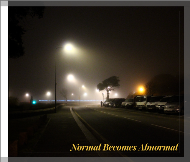
This above is my final front cover I have chosen for my photobook. I have decided to include the muted yellow title “Normal Becomes Abnormal” placed in the bottom right corner of the cover image and the font used is Playfair Display. I chose this design as my final one as it looks professional, tells a story, minimalistic and is eye catching, making it a strong front cover for my book. The muted yellow colour on the font works perfectly with the cover image, duplicating the same tones as the streetlights and it gives a slight contrast making the title stand out, drawing attention to my photobook.
Inner Pages Of Photobook
Sequence Experimentation 1:
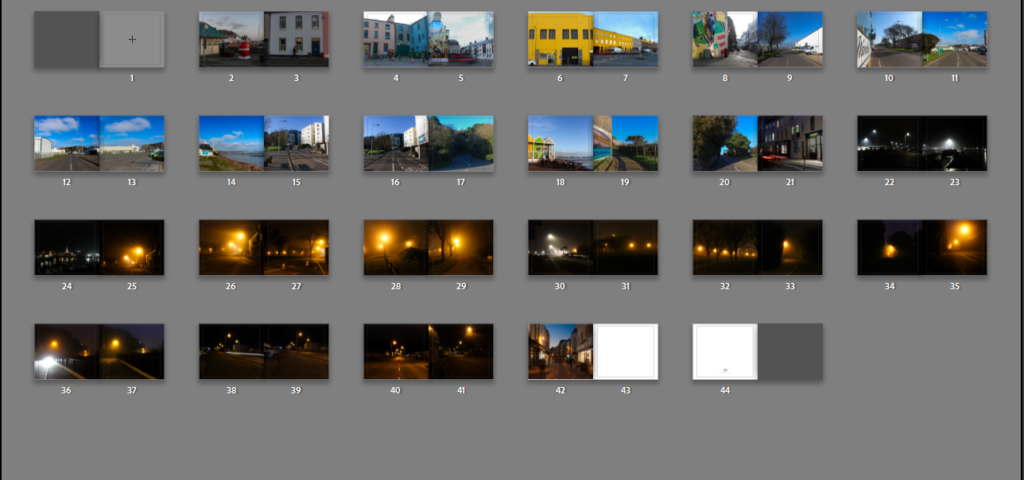
To start off the internal pages of my book, I started off with a quick draft putting the night time images at the front of my book and the daytime photos towards the end of the book, contrasting the sequence of the ordinary day. I do not think that this sequence is good enough to be my final sequence as it just does not make sense and is quite confusing. Below is a screenshot of my first experimentation with structuring and sequencing the inner pages.
Sequence Experimentation 2:
Below is my second experimentation with sequencing, differently to my first sequence I started off the book with photos during the day and then the end of the book consisting of the night time / low light images. I think this sequence works better than the first one, following the cycle or the day, this structure allows the viewer to experience the shift from day to night, going from familiarity and clarity to mystery and isolation.
Sequence Experimentation 3:
Below is my third experimentation with the sequencing, this is my favourite format of sequencing out of the three drafts. This structure shows a photo taken during the day, then a photo taken during the night showcasing each one side by side, making the difference between the day and night easier to understand and view. This sequencing also works very well because I have a handful of images which are taken in the same location at different times, by placing two photos taken in the same location next to each other, I can really display how the day and night contrast with each other. This will be the sequencing I use for my final photobook.
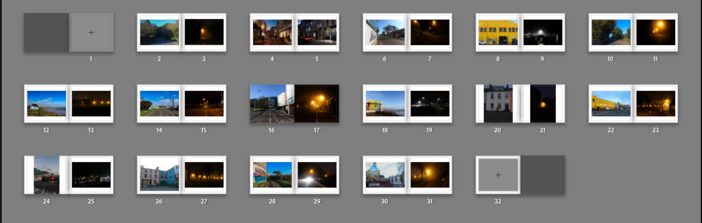
Image Framing:
As you can see in the screenshot above, I have decided to make each of the photos have a border around them, I did this on every page to create a sense of balance and keep my photobook consistent.
Page Colour:
I did not like the white background on all the inner pages because I think that the white pages do not work well with the overall mood of the images, therefore I changed it to a darker tone, a dark grey. This slight change in the book makes a big difference, making the book more appealing to look at and the paper blends with the night time / low light photographs. This small change helps put the whole book together, making the presentation of my book more detailed and efficient.
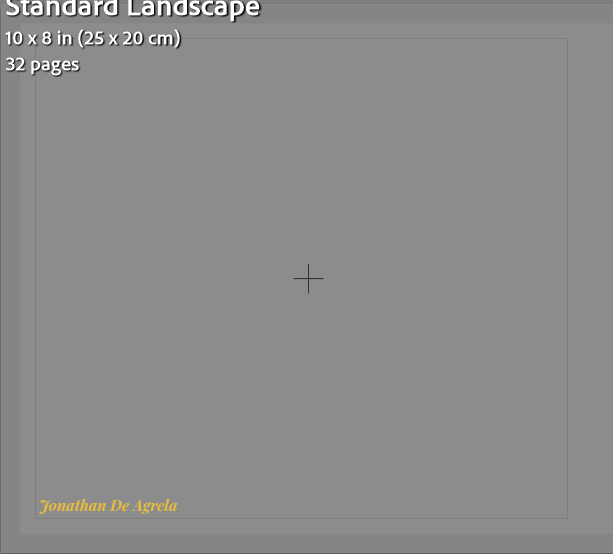
Back Cover:
For the back cover I have decided to keep it simple and leave it blank, apart from my name. I have done this to keep the minimalistic approach I have kept throughout my entire photobook. By not adding a photo on the back cover, it allows the viewer to only focus on the front cover and the photography itself. The minimalist approach also adds to the sense of mystery which I portray through my photographs taken during the night, reinsuring the aspect of mysteriousness, making my book look more professional and neat.
Final Evaluation Of My Photobook
My photobook, “Normal Becomes Abnormal”, focuses on different areas and settings change between day and night, highlighting how the time of day and atmosphere can create a difference in emotions. My main aim was to capture how normal environments that we live and see every day become mysterious under different times of day and light. The book was mainly inspired by William Eggleston and Todd Hido however i also took inspiration from a belgian photographer who goes by the name of Pierre Putman. Overall I am happy with how the photobook turned out in the end. I think the book successfully showcases the beauty of locations changing depending on their atmosphere and the emotional impact that it can create. This whole process has been great to do and helps me see what it is like to develop and create a photobook, this experience can be reflected on and any mistakes or errors done in this book can be used to improve any future project I do. Personally, I believe that this photobook could possibly be seen as quite random and confusing. The book could be viewed like this because of the use of the same locations next to each other and others being two completely different locations placed next to each other.
Final Photobook:


Personal Study: Final Essay
“Explore the dichotomies of the characteristics between the day and the night.”
‘Photographs are perhaps the most mysterious of all the objects that make up, and thicken, the environment we recognize as modern. ‘(Sontag 1977:4)
Introduction
During the day, the natural sunlight brings energy, clearness of the landscapes around and life to the world around us, however, at night the same landscapes/spaces give a sense of mysteriousness, loneliness and emptiness. These changes not only alter the location/setting itself but the emotional impact it has on those who experience it. The contrast between the day and night has a strong effect, with the light and shadow influencing our emotional reactions to the surroundings as well as the way we experience them.
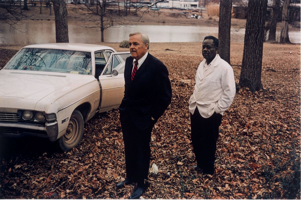
My personal study`s main target is to explore the differences between day and night, particularly targeting how the change of time from day to night creates different moods and portrays different emotions. To explore this theme, the two photographers I have decided to do an in depth study of is: William Eggleston and Todd Hido, these two photographers capture photographs taking into account the use of light, colour and the setting in unique ways. Eggleston`s photography captures the ordinary in extraordinary ways, differently Hido`s style of photography spotlighting isolation and mystery.
In addition, I will include Pierre Putman, whose work compliments both artists by offering a different perspective on the play between light and shadow. Putman’s cinematic photographs focus on solitary dark urban settings, where artificial lighting and glowing lampposts create a dreamlike, interesting scenery, turning empty streets into powerful, emotional stories.
I will respond to their work by featuring both daytime and night-time images, influenced by the work of these three artists, in my final photobook.
Historical /Theoretical context within art
Photography, starting off with being mainly monochromatic images, changed incredibly after The World War II (1939-1945). Initially, colour photography was only seen and linked with advertising, fashion photography and in photojournalism through publications like: Life, The Sunday Times Magazine and National Geographic. These publications made colour photography popular, by showing it to a wider audience; making colour photography more casual to view in the media. Although this type of photography was becoming popular, the world of fine art and documentary photography was slower to accept colour photography, sometimes being viewed as “vulgar” and “brash”. Black and white was always the ordinary, many artists said and believed that the importance and high detail of the monochrome photographs could not be replicated with colour photography, once again spotlighting the initial refusal to accept colour photography.
Although, colour photography at the beginning of its origin was resisted, the 1970s was a crucial period for it. In the 1970s photographers started to utilise and experiment with colour, rather than using colour photography as a tool strictly for representation, they instead focused on how it can create emotional, psychological and visceral depth in their work.
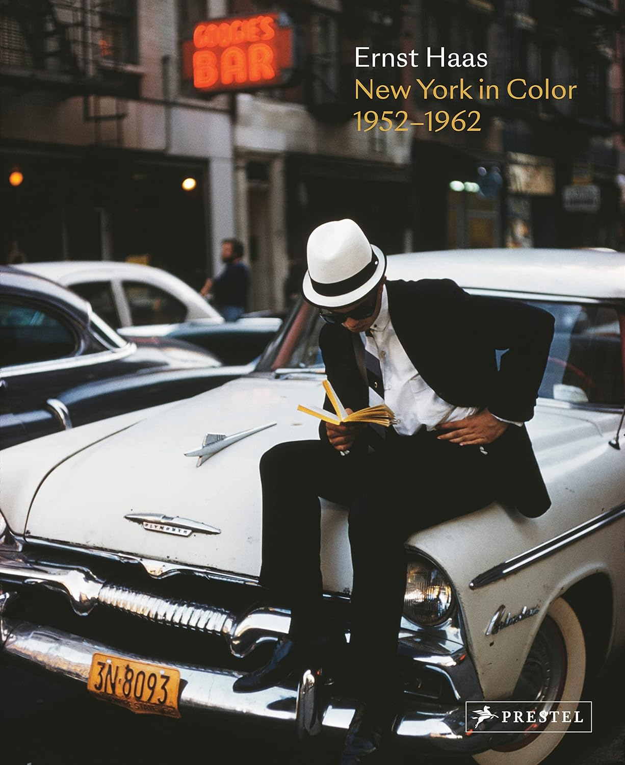
The director of photography at the Museum of Modern Art (MOMA) in New York City, John Szarkowski had a core feature in changing how people perceived colour photography in the art world. Szarkowski helped put together the first solo exhibition which was dedicated to colour, showing off Ernst Haas`s unique work in 1962, this had a huge influence on the acceptance of colour photography in fine art. Another huge influence on the acceptance of colour photography, was Szarkowski’s work with William Eggleston, the 1976 exhibition and the book William Eggleston’s Guide. Eggleston`s work consisted of the dye-transfer printing process which allowed him to one up the “snapshot aesthetic” and made colour photography a tool for reflection of society and an expression of creativity.
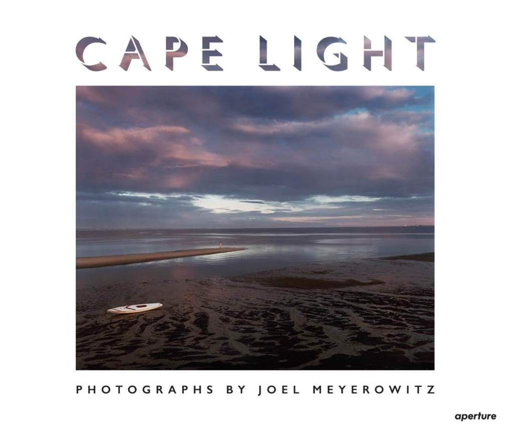
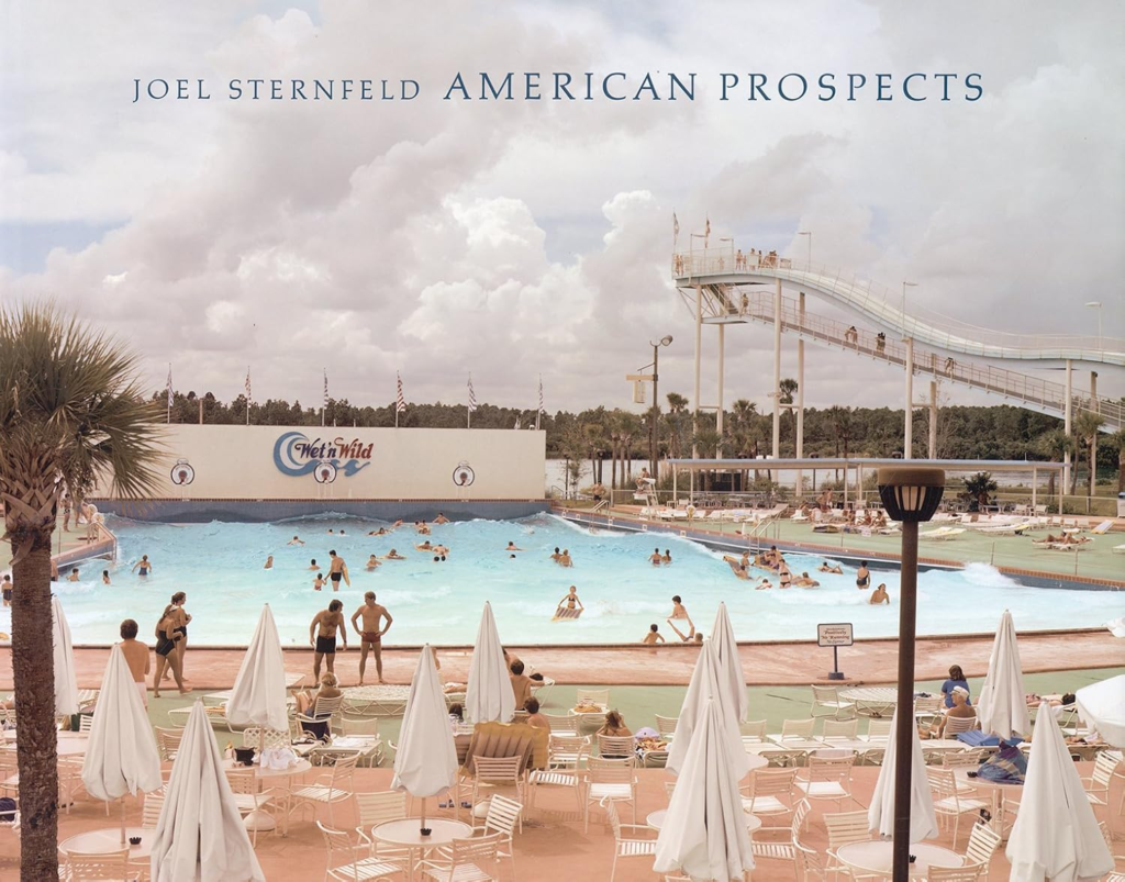
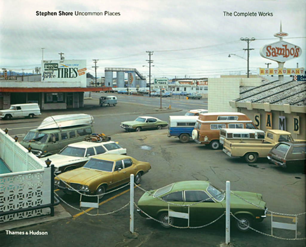
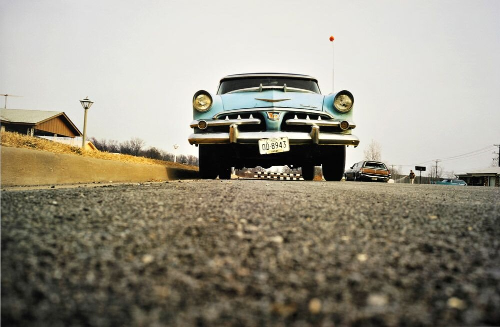
Joel Meyerowitz, Stephen Shore, and Joel Sternfeld were other American photographers who started to use colour to capture the small, little details of the American Landscape. Joel Meyerowitz published “cape light” in 1979, Stephen Shore published “uncommon places” in 1982 and Joel Sternfeld publishing “American prospects” in 1987, these three books show how the traditional camera, traditionally used with black and white film was also used to capture colour, these books became strongly influential for the development of colour photography.
In conclusion, the late 1970s and early 1980s had a fundamental change in colour photography, this was mainly because of the hard-working photographers like Eggleston, Shore, Meyerowitz and Sternfeld. The work of these photographers is perfect in showing off how colour can be used to create emotional depth and can create an interesting story, setting up future artists to use colour photography as a powerful form of art.
William Eggleston

William Eggleston, also known as the “father of color photography”, he has earned this title due to his inspirational work that raised colour from a basic advertisement tool to a serious form of fine art / art. Eggleston challenged the usual standard for art, black and white photography, he challenged this by making the most of dye transfer printing. Dye transfer printing is an expensive process which intensifies the saturation and colour balance of an image, although his images are quite normal and ordinary, they are turned into an incredible piece of work due to his use of colour and the dye transfer printing process aids him to get this lively feel, this is clearly shown in Eggleston`s work.
Set Of Images done with dye transfer process:
The primary moment where Eggleston started to become more known was in 1976 when he had his initial solo exhibition at the Museum of Modern Art in New York where he showcased his first book, William Eggleston’s Guide. John Swarovski, the director of photography at the Museum Of Modern Art, was a key role in making Eggleston`s Guide acquire public attention. Swarovski helped Eggleston not only by choosing his excellent solo exhibition in 1976 but also helped by writing an introductory essay to the photobook. In this essay, Swarovski states that Eggleston`s work is “perfect”, and he also says that Eggleston`s work is “related in iconography and technique to the contemporary standard of vernacular camera work,” homing in on Eggleston`s focus on ordinary subjects. Many viewers initially criticized Eggleston, saying that his images lacked depth, however over time many recognized the perfect composition`s and his idea behind these photographs, opening a door for artists and photographers to use colour to express their ideas artistically.
William Eggleston`s work was normally captured instinctually rather than conceptually, meaning he would never plan his photoshoots and would go with the flow. In an interview, Eggleston states “I never know beforehand Until I see it, it just happens all at once”. This quote shows the connection he has with his surroundings, having an impulsive and observational style of photography which still is executed successfully. Eggleston would waste no time with his photoshoots, taking one photograph per subject / focal point.
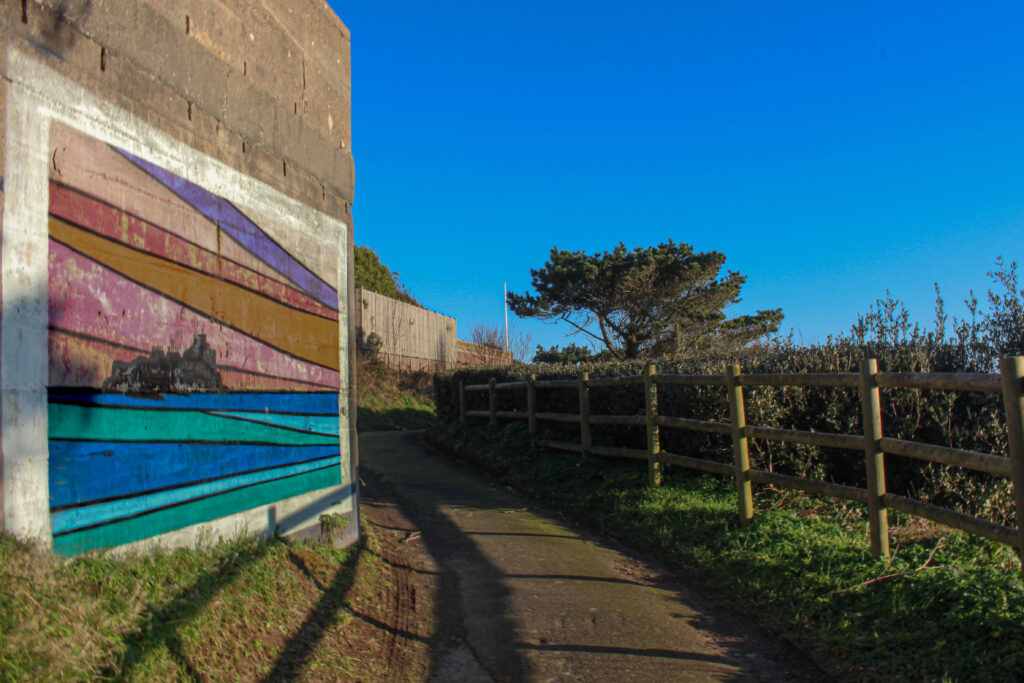
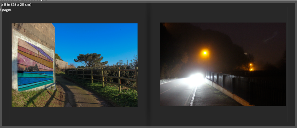
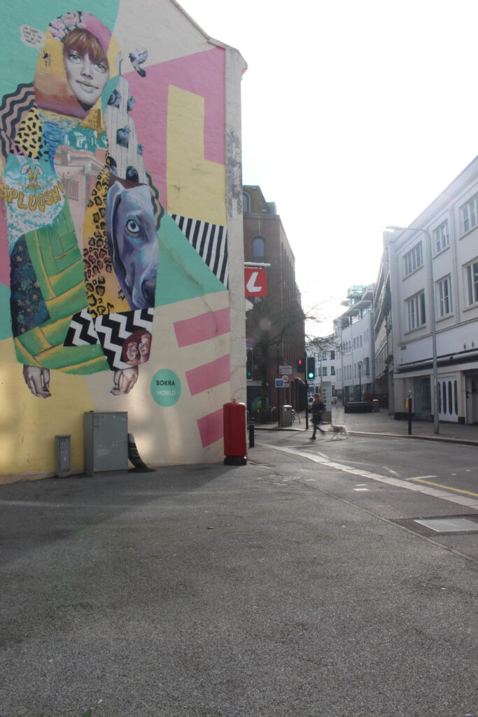
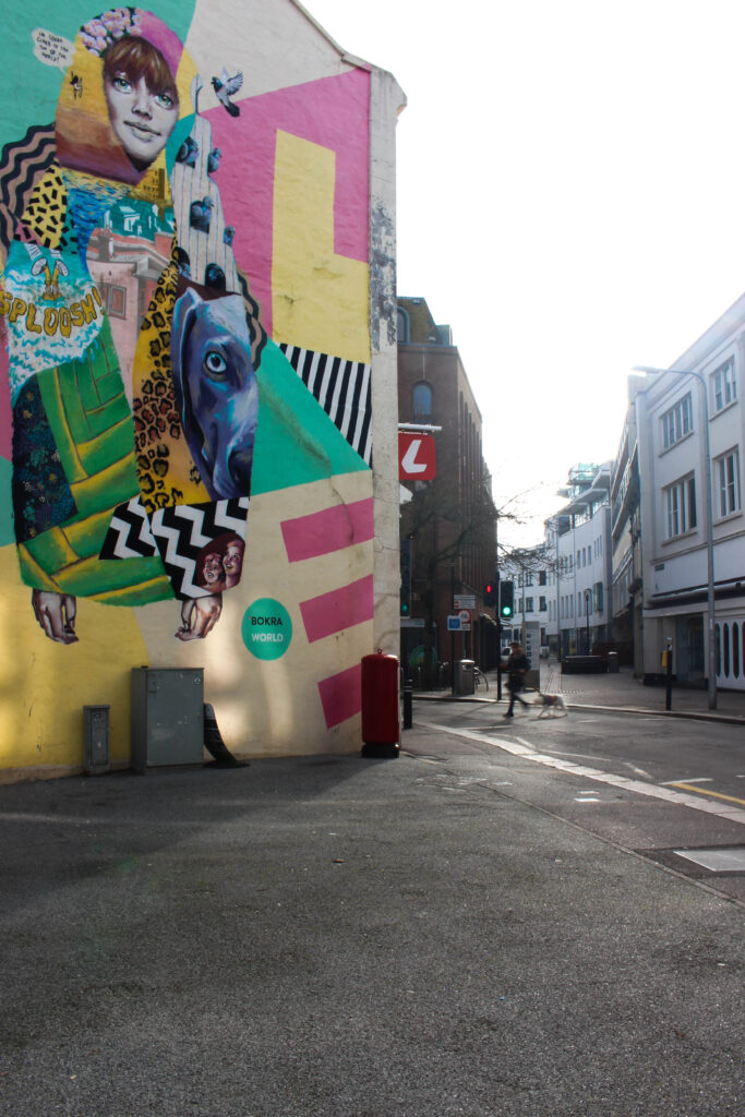
Similarly, when taking my photographs I took the same approach as Eggleston, finding the beauty in things we see every day. Like Eggleston, I did not plan the photograph above; by contrast I came across this setting whilst on a walk and created this response spontaneously. Eggleston`s work has a huge focus on the contrast of colour in everyday life, therefore I also did the same; the vibrant, colourful mural on the plain wall and the bright blue sky showcase the contrast in colours, I was able to capture in this image.
Even though my photo is digital, and Eggleston often used the dye transfer printing technique to achieve the excellent use of colour and the strongly saturated tones shown in his work. My photo shows off the strong vibrant blue sky, the earthly colours of the landscape and the bold mural, almost looking like I have used the same technique as William Eggleston to capture this shot. This ties with Eggleston`s ideology that the colour on its own can form the overall mood and story of an image.
Todd Hido
Todd Hido is a widely famous photographer. He thrives in photography by the way he uses light, colour and the overall location to create a sense of mystery and a mix of emotions. Hido`s work, especially the photographs of urban areas at night, has made him one of the biggest names in modern day photography. Similarly to William Eggleston, Hido also takes photographs of the everyday scenery, however Eggleston mainly focuses on the beauty of the everyday life and Todd Hido does the opposite, capturing the feeling of loneliness, isolation and possible nostalgia.
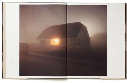
Todd Hido`s best known work is House Hunting, published in 2001. The book consists of long exposure shots taken at night of residential houses, with one single lit up window which is beaming out onto an isolated, dark road / street. The images are very mysterious and do not have a definite clear story behind them, grabbing the viewers’ attention as the viewer will pay more attention to every detail to see what is happening behind the window. Most of the photographs are taken from far away and often through car windshields, to add a blurry, dreamlike effect to his images. Unlike William Eggleston, Todd Hido does not take his photos with precise clarity but does use distortion and softness to strengthen the mood of his work.
Inner Pages From House Hunting (2001) – Todd Hido
The process which Todd Hido goes through during his photoshoots is very much instinctual, he drives around aimlessly looking for locations and areas which he can relate to emotionally. As discussed before this process is also done by William Eggleston where he takes a more spontaneous approach without planning his photographs and collections. Hido`s work is a lot more cinematic in comparison to Eggleston`s, Hido is inspired by filmmakers like David Lynch and Alfred Hitchcock, this inspiration from filmmakers leads to an eerie, dreamlike feature which has a narrative unfolding just behind the frame of the images.
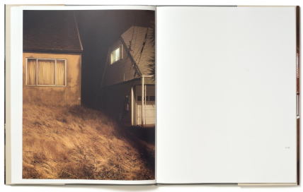
Similarly to my project and what I investigated, Hido`s work explores the themes of solitude, emptiness and mystery. Some of his photographs are connected with his own personal memories of his own childhood and living the American suburban life.
– Todd Hido
The most obvious similarities between my images and his is the use of light in a space. In this image above by Todd Hido, light is diffused from the sun by the mist, which gives off this dreamlike, misty appearance. The approach makes it difficult to understand background from background, resulting in a sense of depth in a picture. Similarly, in my image shown above, the lights on the road turn into a yellow glowing beam because of the thick fog surrounding it, giving the same dreamlike theme / style which Hido has. The light is directly next to the darkness that is surrounding it, making solitude, loneliness and abandonment more apparent within my image.
Compositionally, both mine and his photograph guide the viewers eyes, this is done using the obvious leading lines. In this image specifically Hido captures the sky as well as trees, however in my work I am using continuous lines created by the lamp posts and roads to add depth in my image. In both the photos, the lack of people and human presence adds to the sense of isolation, allowing the viewer to add their own emotions relating with my picture.
Conclusion
Throughout my project, I have understood how both Todd Hidos and William Egglestons photography has affected me as a photographer in terms of composition, mood and setting. At first, my assumption was that Hidos cinematic approach to light and Egglestons open approach to colour were two extremes of how to approach photography. However, once I had commenced my project, I realized that both photographers make the mood, narrative and the setting a key aspect of their work, which has really influenced my work despite their differences.
In this project, I’ve been inspired to take photos instinctively by Eggleston’s ability to find beauty within the ordinary. I also learn from his work and from his guide (William Eggleston’s Guide) that form can portray feelings and emotion just as powerfully as colour can. In contrast, Hido’s eerie, dreamlike images, like those in Bright Black World, influenced me in regards of light and loneliness, inspiring me to experiment with mood and story in my nighttime photography. Thanks to these photographers, I now have a greater understanding of how light, composition and instinct work together to create effective imagery.
As my perspective developed, I began to realise that the way I work is in between Eggleston`s spontaneous approach and Hido`s careful storytelling style. I originally believed that in order to be excellent in photography, photoshoots had to be carefully planned and conceptualized but after diving deeper into Todd Hido`s and William Eggleston`s work, I now have a better appreciation of instinctual reaction to capture photos.
In future projects or work, I will continue to take inspiration from Eggleston and Hido whenever possible whilst also taking inspiration from other photographers / artists, to create a more advanced style which suits me uniquely.
Bibliography
Websites:
Sontag, S. (1977). In Plato’s Cave. [online] Available at: https://openlab.citytech.cuny.edu/chengphotoarth1100f2019/files/2018/02/Susan-Sontag-In-Platos-Cave.pdf. [Accessed 24 Jan. 2025]
Burroughs, A. (2016). William Eggleston, the Pioneer of Color Photography. The New York Times. [online] 17 Oct. Available at: https://www.nytimes.com/2016/10/17/t-magazine/william-eggleston-photographer-interview-augusten-burroughs.html.[Accessed 26 Jan. 2025]
REBEKAH JACOB GALLERY. (n.d.). William Eggleston. [online] Available at: https://www.rebekahjacobgallery.com/william-eggleston. [Accessed 26 Jan. 2025]
Film Still Photography. (2025). William Eggleston’s Guide. [online] Available at: https://www.filmstillphotography.com/william-egglestons-guide.html [Accessed 26 Jan. 2025]
Atlas Gallery | Fine Art Photography. (n.d.). ERNST HAAS: NEW YORK IN COLOUR, 1952-1962. [online] Available at: https://www.atlasgallery.com/exhibition/ernst-haas-new-york-in-colour-1952-1962. [Accessed 26 Jan. 2025]
Farache, E. (2013). It Was Too Strong: An Interview with Todd Hido. [online] The Paris Review. Available at: https://www.theparisreview.org/blog/2013/11/19/it-was-too-strong-an-interview-with-todd-hido/. [Accessed 28 Jan. 2025]
Hido, T. (2017). Todd Hido On ‘Homes at Night’ and Illustrating Memories in Photography – Interview by Coralie Kraft | LensCulture. [online] LensCulture. Available at: https://www.lensculture.com/articles/todd-hido-todd-hido-on-homes-at-night-and-illustrating-memories-in-photography. [Accessed 28 Jan. 2025]
Grieve, M. (n.d.). Todd Hido’s Bright Black World – 1854 Photography. [online] www.1854.photography. Available at: https://www.1854.photography/2019/01/todd-hido-black/. [Accessed 29 Jan. 2025]
Hido, T. (n.d.). House Hunting. [online] www.toddhido.com. Available at: http://www.toddhido.com/househunting. [Accessed 29 Jan. 2025]
Books:
Jaeger, A.-C. (2008). Image makers, image takers : the essential guide to photography by those in the know. London Thames & Hudson.
Lowe, P. (2019). A chronology of photography : a cultural timeline from camera obscura to Instagram. New York: Thames & Hudson.
Personal Study: Deconstruct Photobook
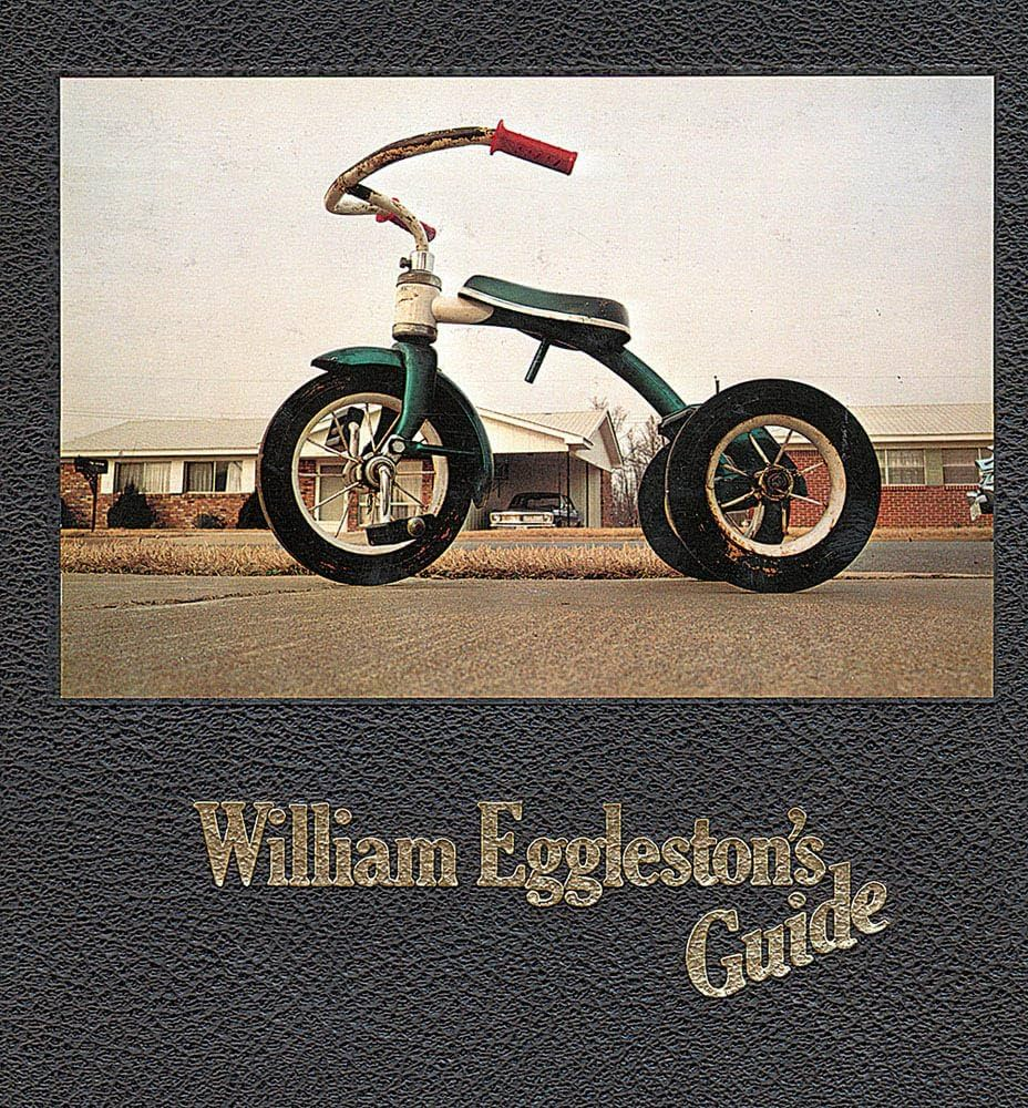
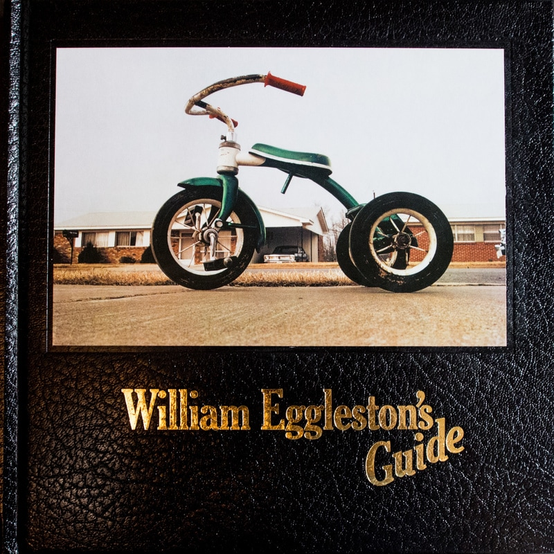
William Eggleston`s Guide, at the time of when this book was published (1976) colour photography was mainly linked with advertisements or just random images instead of professional, serious artwork. William Eggleston`s work was heavily important in showing how colour could highlight or improve storytelling in documentary style photography. This photobook was produced apace with his solo exhibition at the Museum Of Modern Art (MOMA) in New York. John Swarovski, the director of photography at the Museum Of Modern Art, was a key role in making William Eggleston`s Guide catch the public`s eyes. Swarovski helped Eggleston not only by choosing his excellent solo exhibition in 1976 but also helped by writing an introductory essay to the photobook. In this essay, Swarovski states that Eggleston`s work is “perfect” and he also says that Eggleston`s work is “related in iconography and technique to the contemporary standard of vernacular camera work,” highlighting Eggleston`s focus on ordinary subjects.
The photographer is William Eggleston and he created this timeless photobook to capture the ordinary suburban lifestyle of North America at the time period. Nowadays this would be seen as unique and foreign to us due to the contrasting aspects of the decades. He made this collection of photos to present and he stated they were repeatedly inspired by Henri Cartier-Bresson’s pioneering candid, street photography. His intention behind this photo book was to convey his images to the public for the first time. The William Eggleston`s Guide was displayed at the Museum Of Modern Art in 1976.
Holding William Eggleston`s Guide brings out a sense of importance and curiosity. The cover of the photobook is elegant, well made and still lightweight, making the book easy and comfortable to handle and it makes the viewer interested to view its contents. However the image on the front cover does not portray what is on the inside of the photobook, I think that that the image is quite boring and basic, I also do not like the angle that he has taken the image in, however this might be a statement from Eggleston showing that he is proud of every capture of his. The paper on the interior is smooth with a slightly textured surface adding a physical quality which compliments Eggleston`s images. On the cover of the book, the title is written in gold adding to the rich aesthetic the book has inside and out. The book first interior pages consist of the essay written by John Swarovski which is placed on 8 pieces of green thick paper, with the rest of the pages being glossy white. The images on the white pages are vibrant and the ink used is highly saturated highlighting his incredible use of colour, the colour in his images come to life in the photobook as the printing is done with clarity and detail. The whole photobook is in colour and there is no images in monochrome, this was a key part of the book as colour photography had not been widely known or accepted in the creative space. Eggleton’s photobook is in portrait and is quite big in size, allowing the images to be larger and overall making the photobook more intriguing, the book being relatively large allows readers / viewers to look at the images with a lot of attention to detail as the images are bigger too. This book is quite small in comparison to other photobooks, William Eggleston`s Guide has 112 pages to be exact. The smaller amount of photos entices the viewer to engage more with each image and actually take in each image one by one, revealing Eggleston`s thought behind his image selection. Eggleston made this a hardcover book and had the cover image printed straight onto the hardcover instead of putting a dust jacket on the book and the binding of the book is regular and traditional keeping the focus on the images themselves rather than the book itself. The title of the book: William Eggleston`s Guide is extremely literal, instantly identifying the photographer and classifying the book as a “guide” to his unique way of seeing the world. The title of the photobook fits in with the overall minimal design seen throughout the whole book. The book as a whole captures the everyday life in the south side of America including Mississippi, Alabama, Florida, Georgia and Kentucky. Aside from the introductory essay, the photobook only has small, sly captions which is found at the bottom of each page, this feature of having small captions at the bottom of the page is very minimal, and is done on purpose to keep the attention and focus on the images rather than taking the viewers attention off of the images and onto the writing. The images selected are rather random however they are all showing the same story of the ordinary daily life in south side of America, focusing on the overlooked, dull subjects.
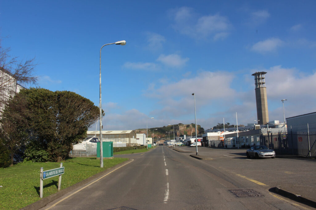
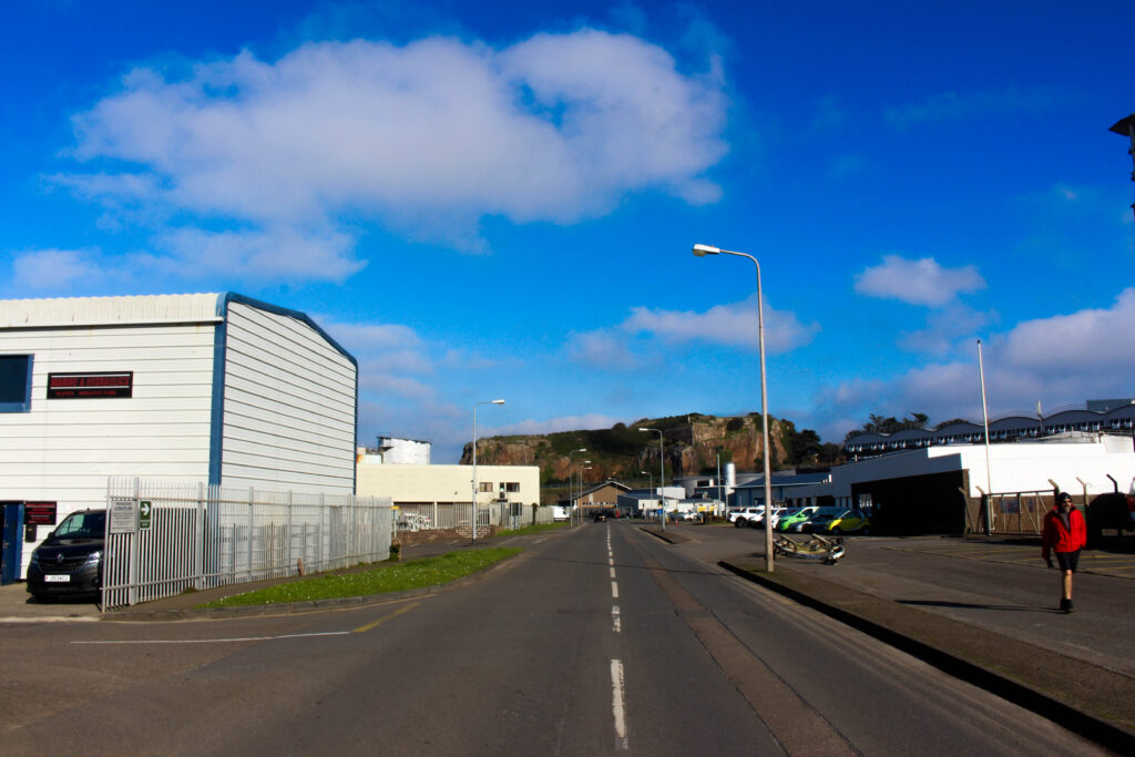
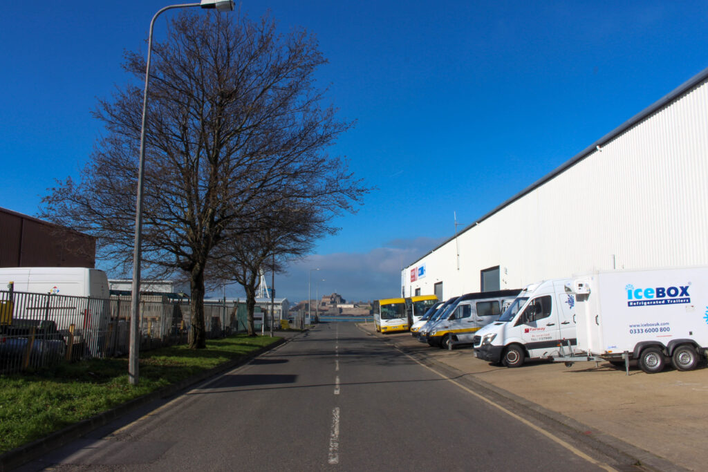
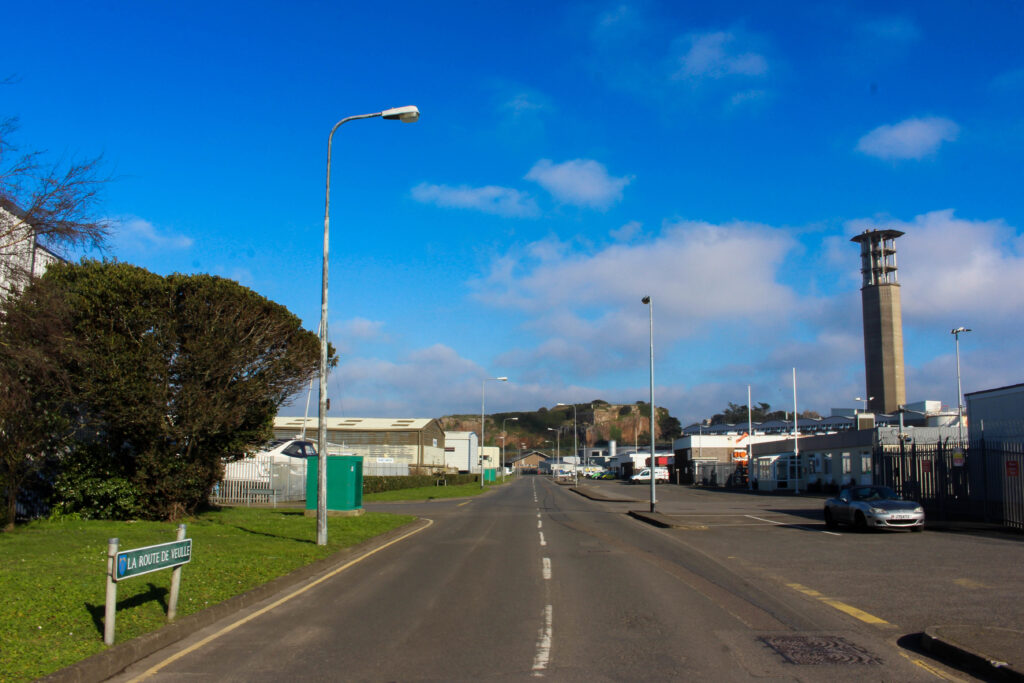
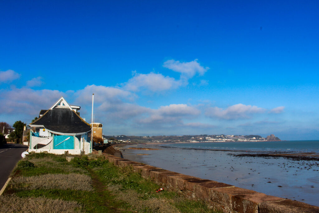
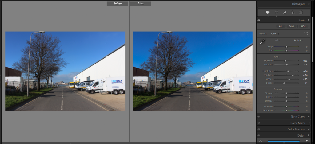
Personal Study: Photoshoot #6 – Day
Initial Contact Sheet
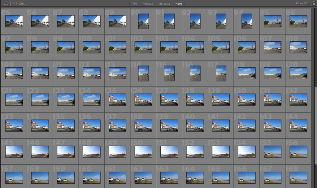
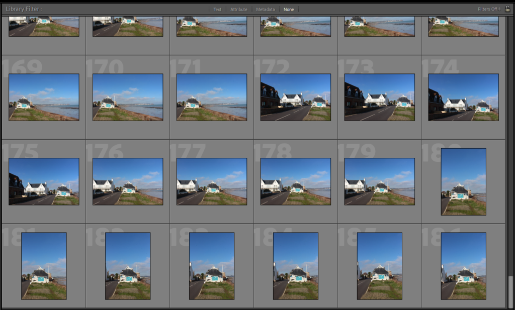
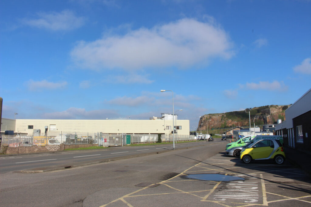
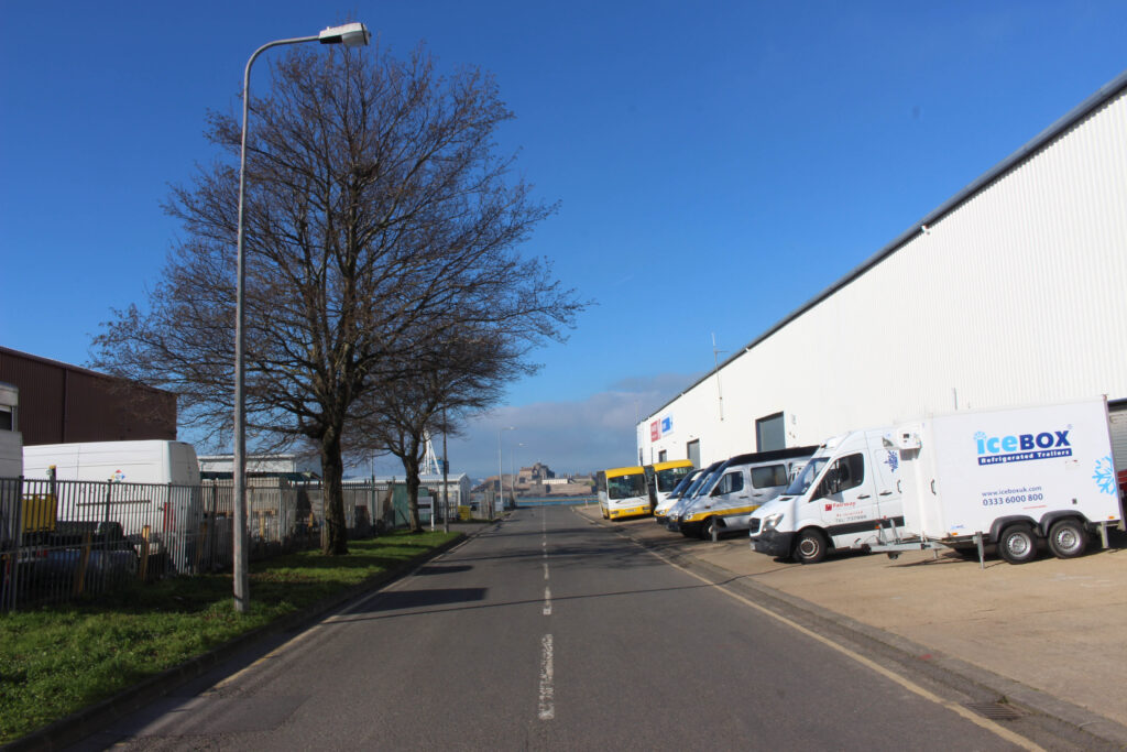
This is the initial contact sheet, displaying every image which was taken during this photoshoot. In total for this photoshoot, I took 186 photographs, these 186 images show off three different locations: St Helier, La Collette and St Clements. For this photoshoot my aim was to capture as much colour as possible, reinforcing the inspiration from William Eggleston and capturing the urban and everyday life during the day with natural light, so I drove around with these three specific locations in mind to find colour and beautiful scenery under the natural sunlight. I went to La Collette as I had taken photographs in that location during the low light, night time settings so I could show the contrast of the same location under two different atmospheres.
Final Selection of Images

From the initial 186 images, I only chose 7 as my final ones. These 7 in particular were chosen due to the way they portrayed these locations during the day, showing the energy given from the sun and giving a complete different mood / feel in comparison to most photographs taken during the night.
Final Selection – Before Editing

Final Selection – After Editing

Before & Afters
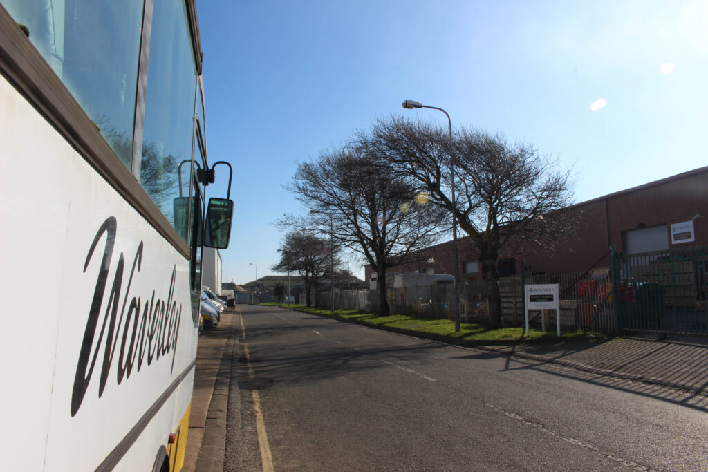
Favourite Image From this photoshoot

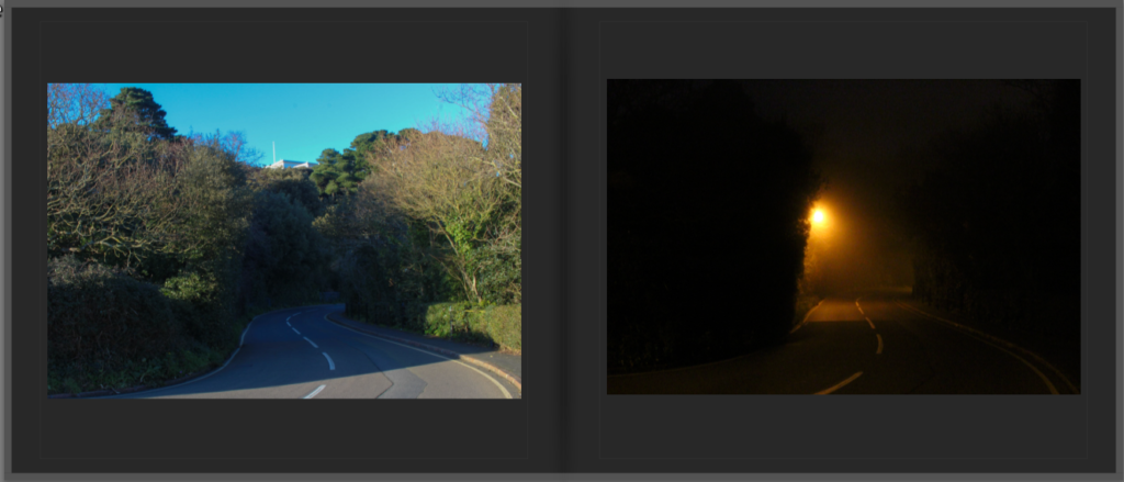
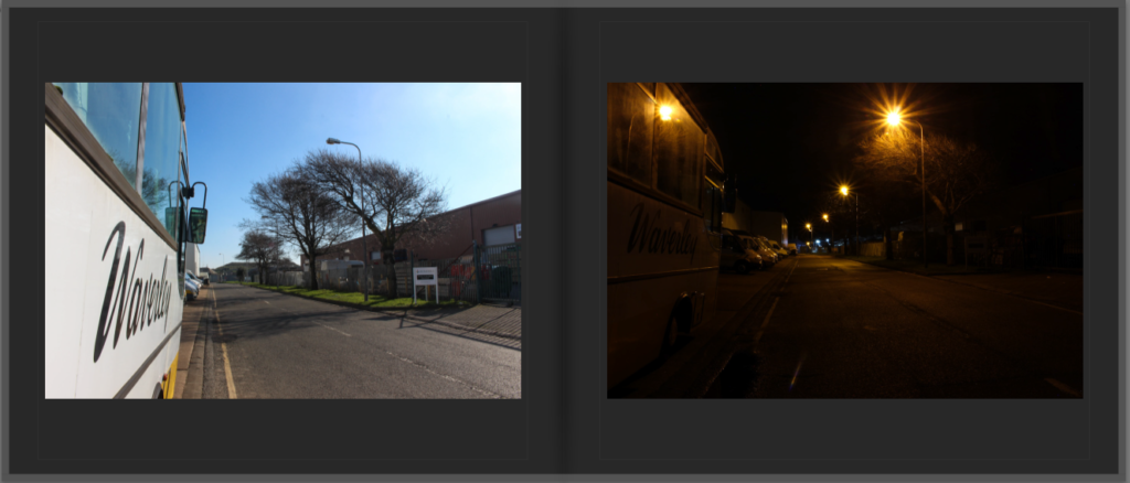
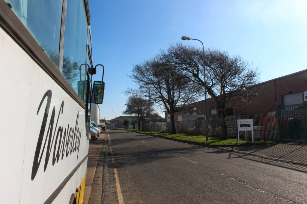
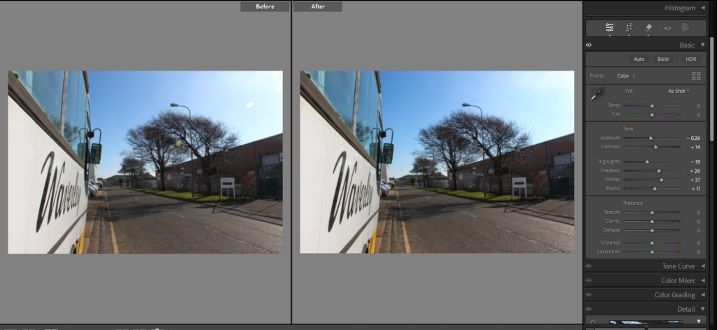
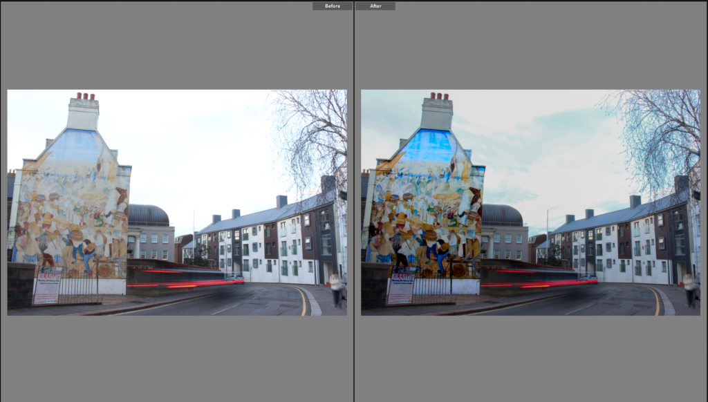
Above is my favourite photograph from this photoshoot taken during the hours of the day, this image is my favourite out of all of them because it is strongly framed and how it perfectly links with the overall theme of my book. I also took a photo in a previous shoot which is almost identical to this one however it was taken during the night, making this image more meaningful in contrast. This photo shows the details of the bus, trees and just the overall industrial setting. The reflection which comes from the bus window could be seen as another layer to the image, possibly showing that there is life outside of the frame. This photo will work great inside my photobook, especially when placed on the same double page spread as the almost identical image at night, reinforcing the theme of the normal becoming abnormal.
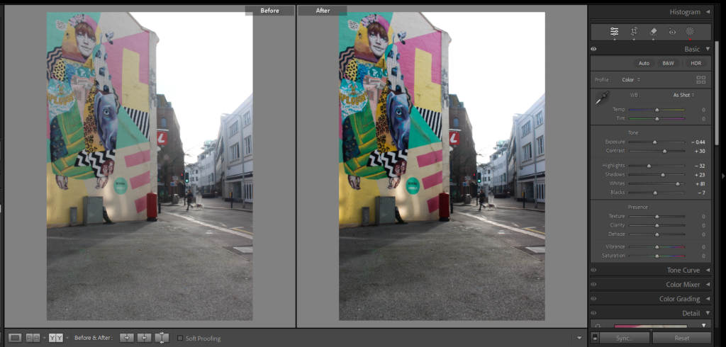
Personal Study: Photoshoot #5 – Daytime, Colour Photography
Initial Contact Sheet
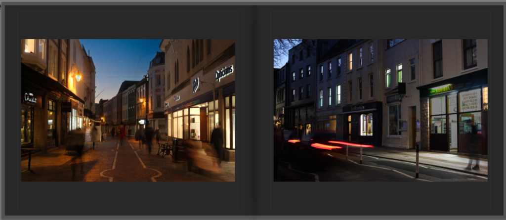
For this Photoshoot, I walked around St Helier looking for vibrant colours, this was heavily inspired by the work of William Eggleston. Eggleston`s use of colour and how he captures the ordinary life inspired how I went about this shoot. My target with this photoshoot was to capture the bold colours within the streets, urban setting which goes unnoticed, bringing attention to these aspects. However, my time was limited because once I had started capturing photographs, the sun had already started setting meaning I had a short period of time with the optimal lighting. During this photoshoot i used a tripod and a shutter release and I decided to use different exposures taking 3 images at a time to then when editing, use photo merge / HDR to make them stand out more. I took advantage of the lighting whilst it was there and, in the end, captured 67 images, each focusing on colour within the urban settings.
Final Selection Of Images
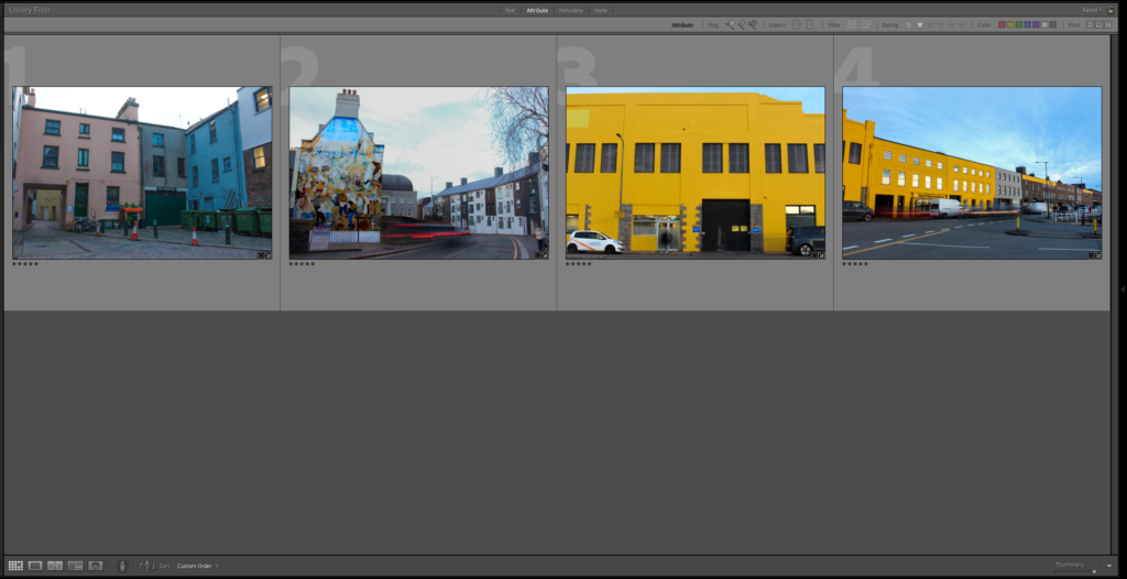
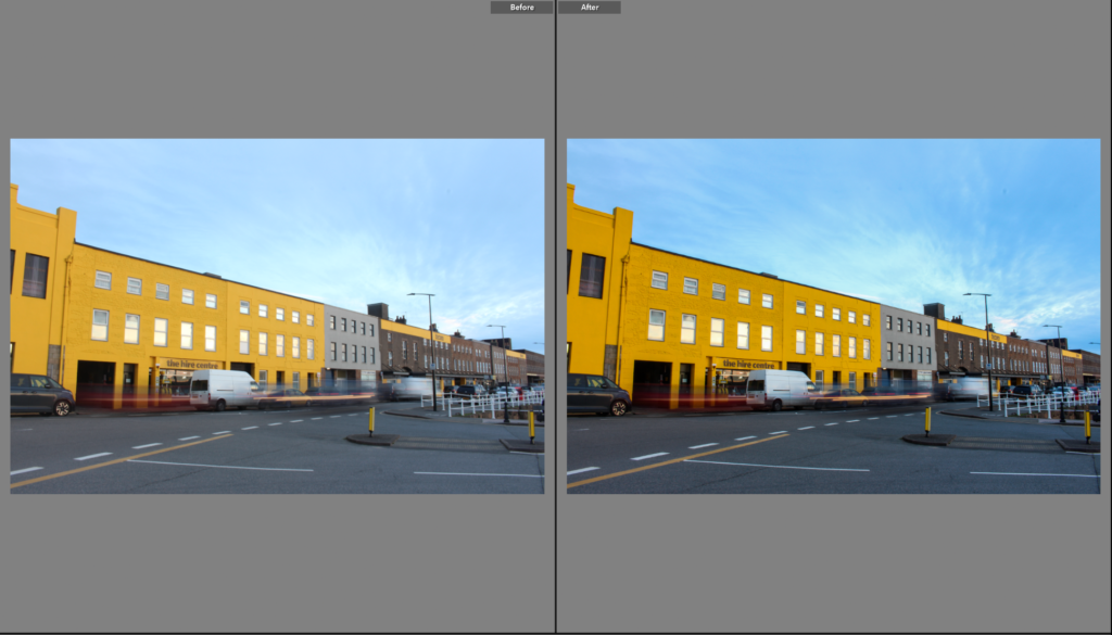
After looking through all 67 photographs, I only selected 4 images. I chose these four photographs as I think they are the best representation of what my vision was for this photoshoot. Separately, these images stand out for their unique display of colour, composition and generally how it captures the urban environment during the sunlight or daytime. Three of these four images also have motion within them, this is an aspect I really like and fits perfectly with the theme I am exploring as it shows how during the day there is movement and life which strongly contrasts my other photoshoots taken during the night.
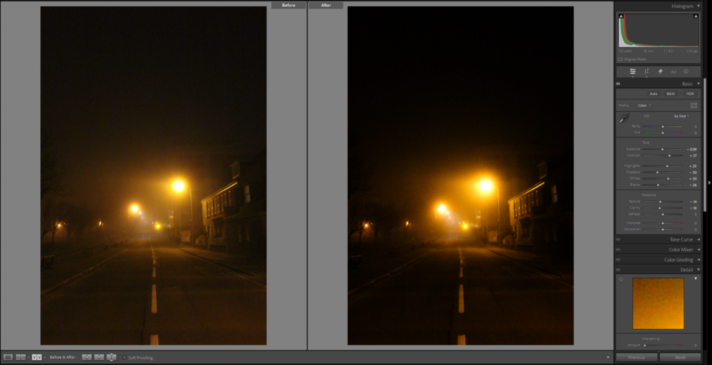
Development Of Final Images – Before Editng & After Editing
Above is a series of screenshots showing off my final selected images before and after editing, showing how little adjustments can impact the whole image and mood. In all of these photographs the most noticeable edits is the increase in colour saturation this links to Eggleston, he is known for his strong use of colour and he is known for capturing the ordinary in extraordinary ways. To get the same effect that he does I intensified the colour hues and the highlights to make the sky and the colourful buildings more dynamic and interesting. In some of the original photos the lighting is not quite right and looks odd and in order to fix that I adjusted the highlights and exposure.
Image 1
Image 2
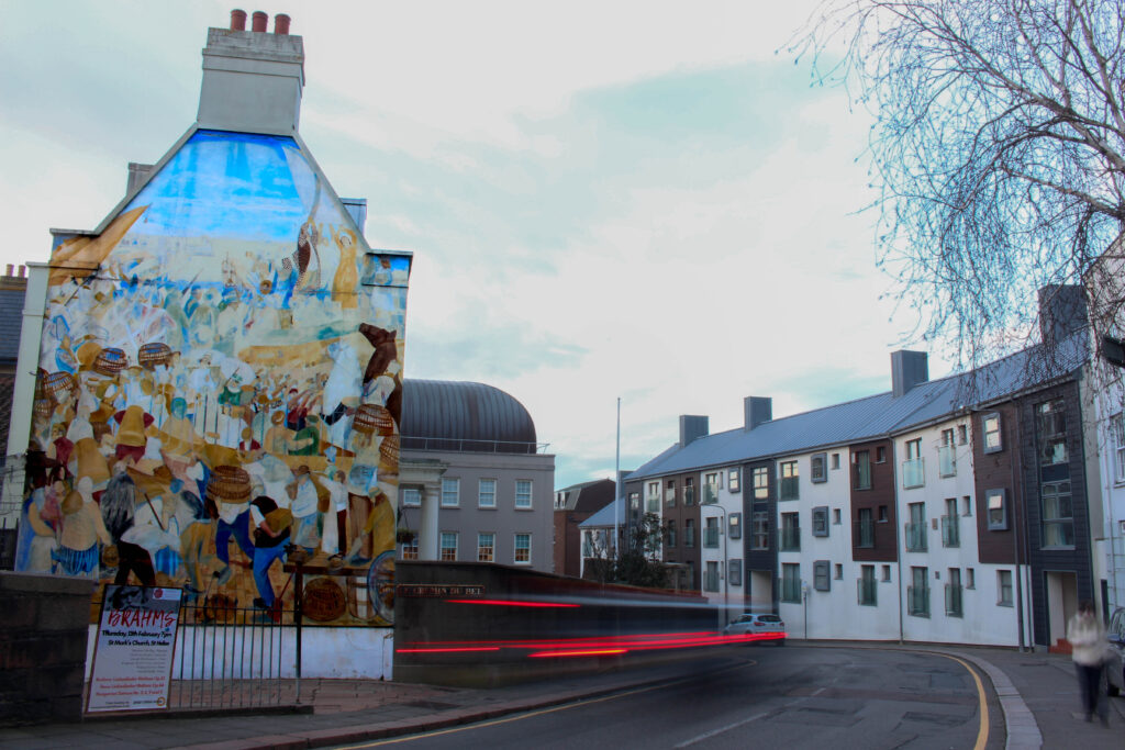
Image 3
Image 4
As a whole, I am happy with how the final photos came out. The photos really emphasize the difference between the day and night, the bold, vibrant colours seen throughout all 4 images is what reinforces the contrast between the day and night. Inspired by William Eggleston, this photoshoot was focused on capturing the everyday life, using strong colours and compositions. During this photoshoot I also captured a great amount of motion blur, reinforcing the idea that the day brings life, energy and movement, I think this aspect makes the images tie in perfectly with the theme of my personal study. I think that once the final edits were made, I successfully created compositions which reflect the quality of the daytime, making a strong contrast to the night time focused photoshoots taken for my project.
Favourite Image From Photoshoot

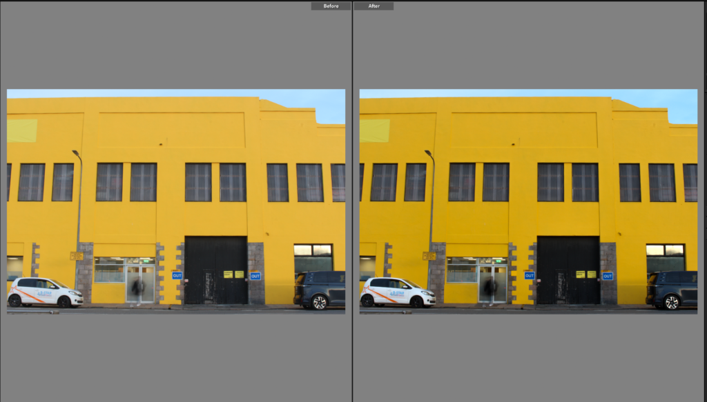
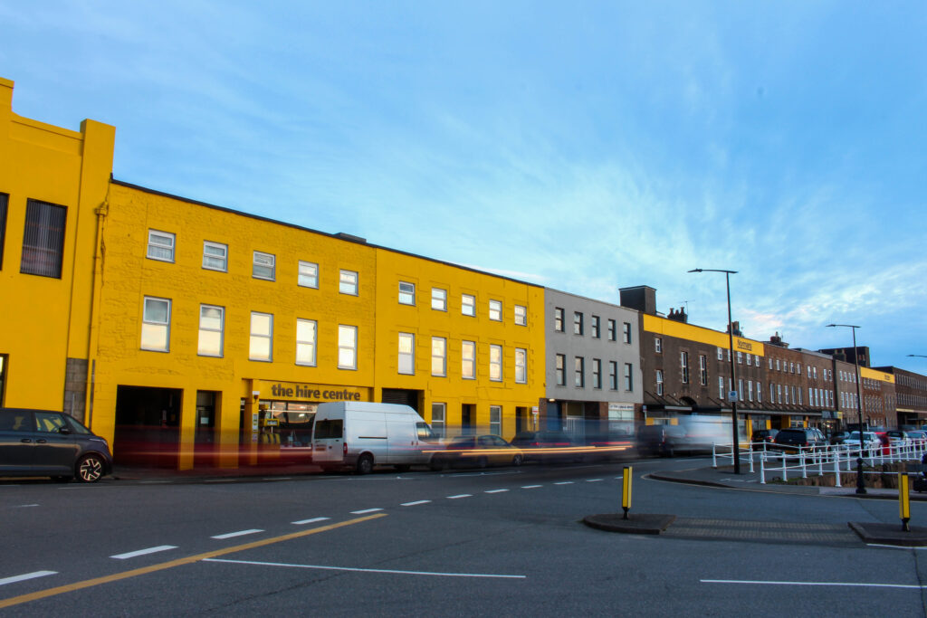
From the four final edited photos, this one is my favourite. What makes this photo stand out to me is the composition, within one frame I captured the urban buildings, the mural and motion blur from the moving car. The mural strongly contrasts with the softer tones of the sky and buildings creating different layers to this image. The image has 3 layers which is the mural, the mural is bold and filled with colour making it a the main focal point of the image, the sky and the buildings in the background create a contrast, making the mural stand out even more and the motion blur made by the moving car adds another layer making the image feel more immersive instead of 2d. The motion blur captured in this photograph adds the element of life, and energy, emphasising the aspects of the day. Overall, I believe that this photograph perfectly links to my day theme, capturing a moment in a colourful urban setting.
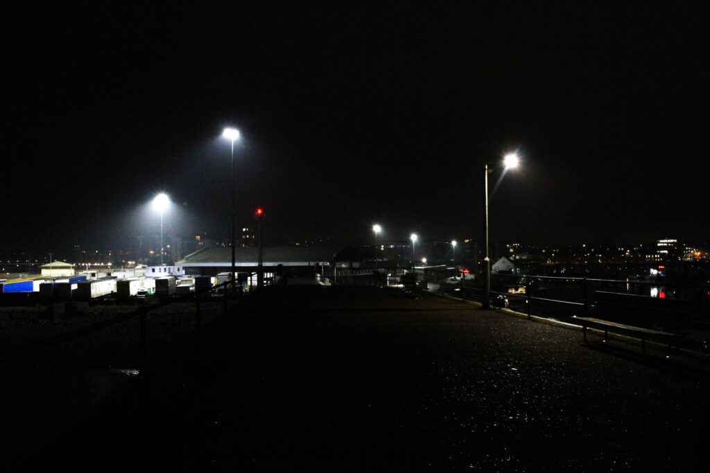
Personal Study: Photoshoot #4 – Elizabeth Marina – Night
Initial Contact Sheet
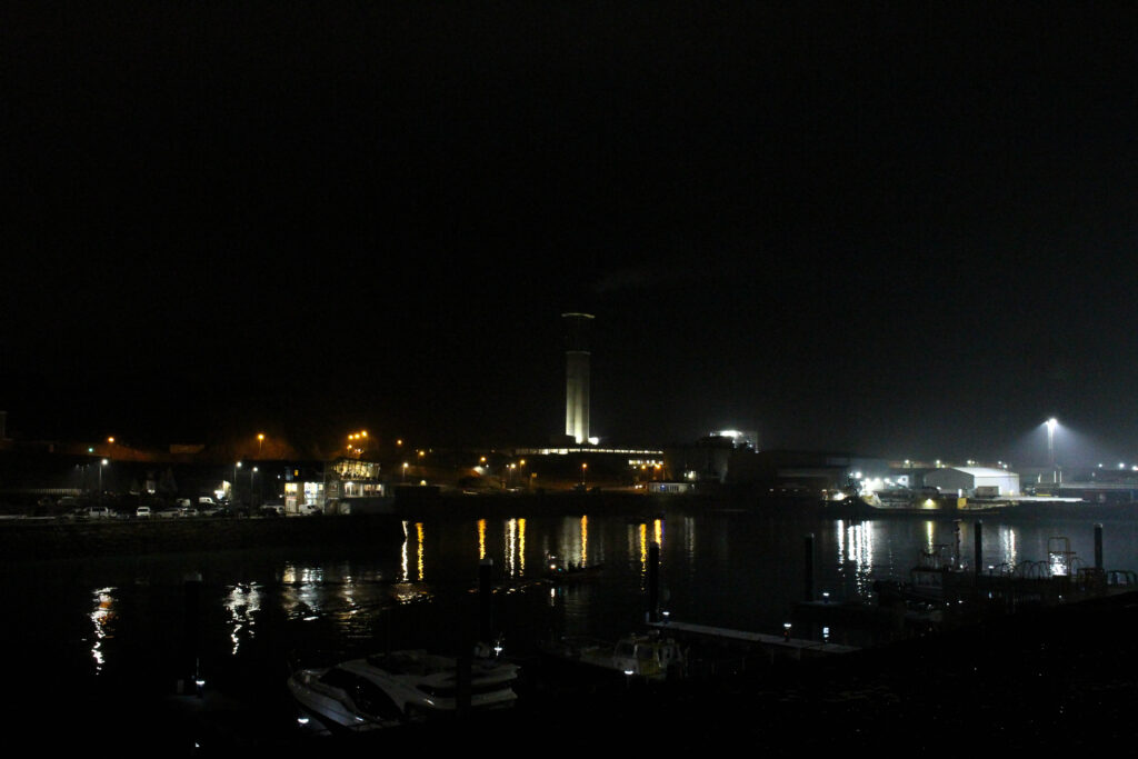
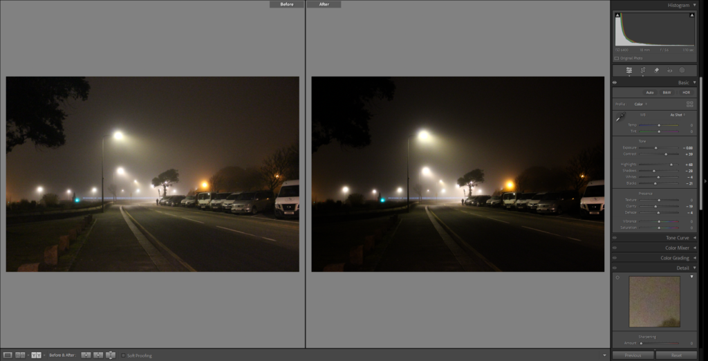
Above is a image showcasing the initial photographs that I took for this photoshoot, this photoshoot was pretty short, only capturing 36 images in total. I chose this particular location for this photoshoot because of the artificial lighting and the overall mood, the lights at Elizabeth Marina are flood lights meaning that the light scatters across a certain distance, this worked well with the slight amount of mist that was present during this photoshoot. This photoshoot almost replicates my third photoshoot, emphasizing the interplay of the fog and artificial lighting, creating a surreal and dreamlike scenery. For this photoshoot I used my DSLR camera along side a tripod and shutter release to ensure the frame is as stable as possible, similarly to my third photoshoot I used a relatively high ISO of 6400, this was a mistake of mine and the ISO should have been set to a smaller number like ISO 100 to capture as much detail as possible. Even though I used a high ISO, I still like the overall photoshoot and I think the outcomes are great, grain is seen in all of the images in this photoshoot due to the use of the high ISO but I believe that the grain improves and highlights the overall mood I am aiming for. The main target with this photoshoot, just like the rest of the photoshoots taken at night and at low light was to capture the sense of solitude, mystery and isolation.
Final Selection Of Images
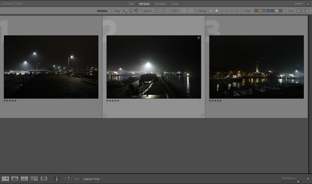
Once I had put my 36 photographs, the next step was to look over each photo cautiously, to then choose the final best images. From the 36 photos I selected 3 final images which I believe best fits the mood I was aiming for with the project as a whole. The reason as to why there is a little final selection of 3 photos, is because the majority of the 36 photographs are almost identical angles and placement, I took various photos from one point as every photo from that point would capture some differences. These final images blend in beautifully with the rest of my photobook, contrasting with images taken throughout the day and tying in with other photos taken at night.
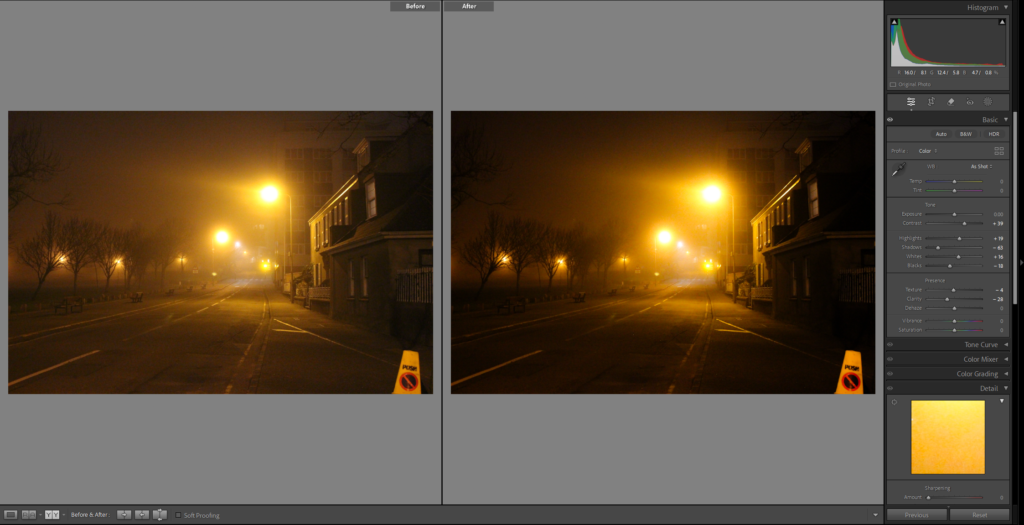
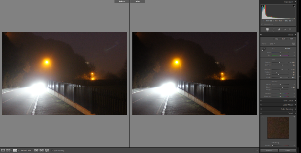
Before And After Editing

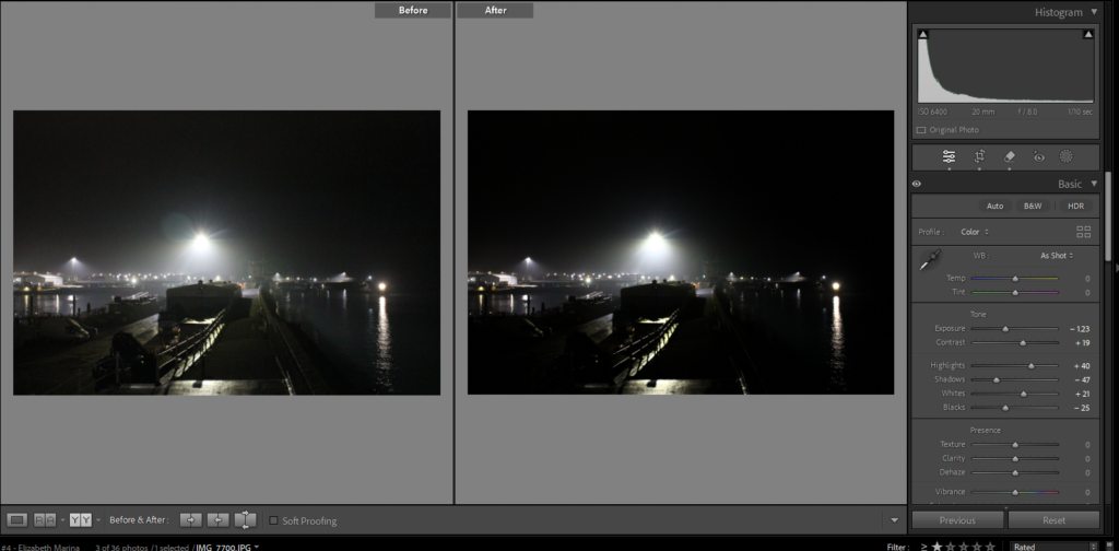
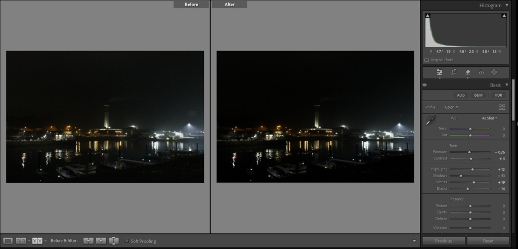
Similarly to other photoshoots, when editing these images I only made slight, subtle changes to them. I did not want to completely alter the unedited images as they are great images as a whole, capturing the isolation and the interplay between the artificial light and the low light. As you can see in the screenshots above for each image I reduced the shadows, increased the whites and decreased the blacks, this was done to reduce as much grain from the image as possible and to also emphasize the time of day. Reducing the shadows and decreasing the blacks meant that my image became darker overall this was done to really show the difference between the day and the night, where the daytime photographs are lit up, detailed and filled with life and the low light photographs are dark, mysterious and lack detail. Another process which I went through was using the Spot Removal tool to get rid of any glare from the lights which hit the lens away from the image, removing this glare.
Final Images
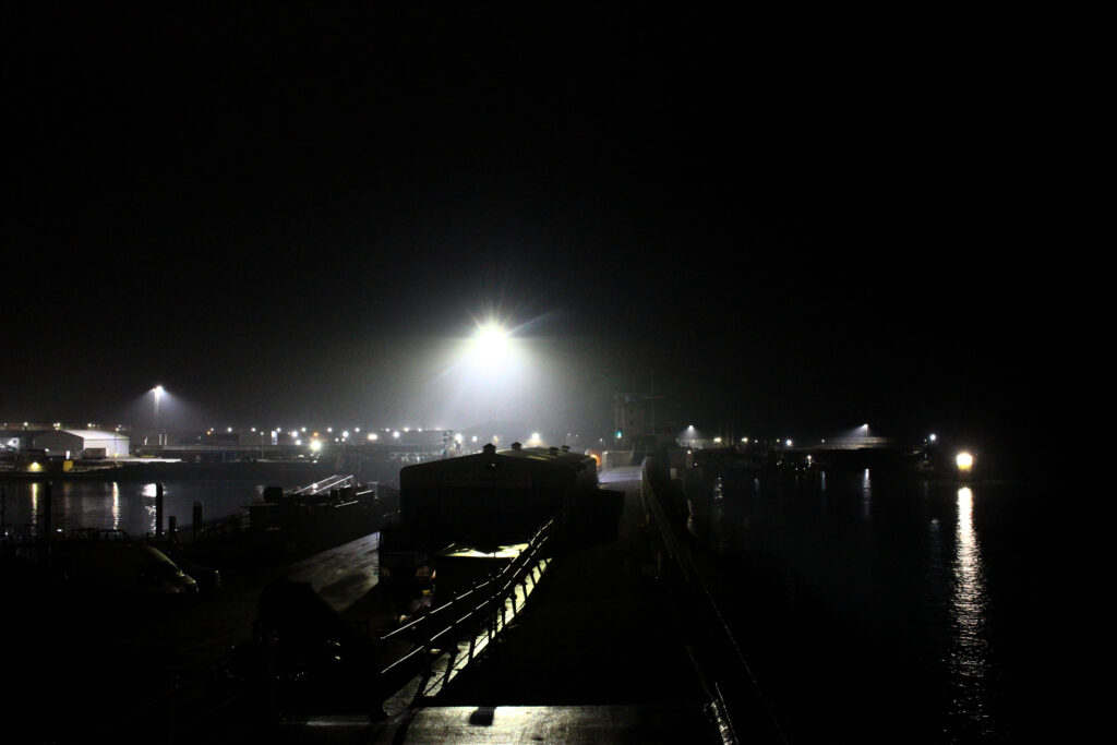
Overall after editing these final images, I believe that this photoshoot was a great success. These 3 final photos will play a part in my final photobook to efficiently show the contrast between the atmosphere during the day and the night. These 3 images clearly resemble what the night, low light does to a setting, these photos I think convey a strong feeling of abandonment.
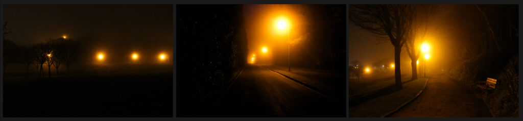
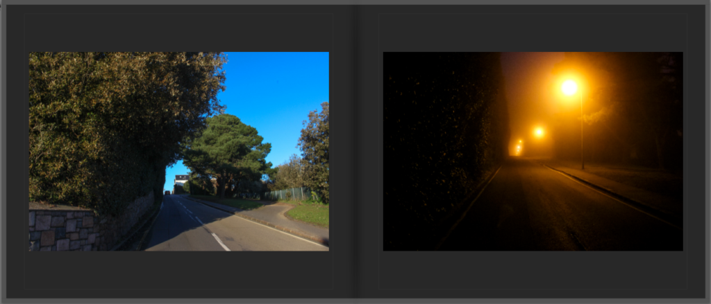
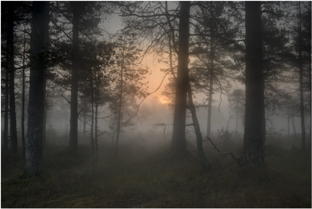
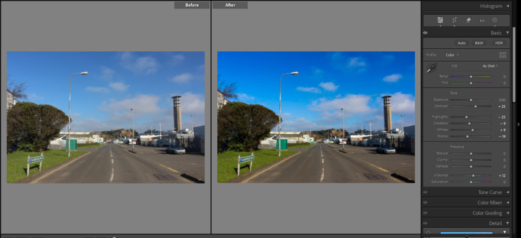
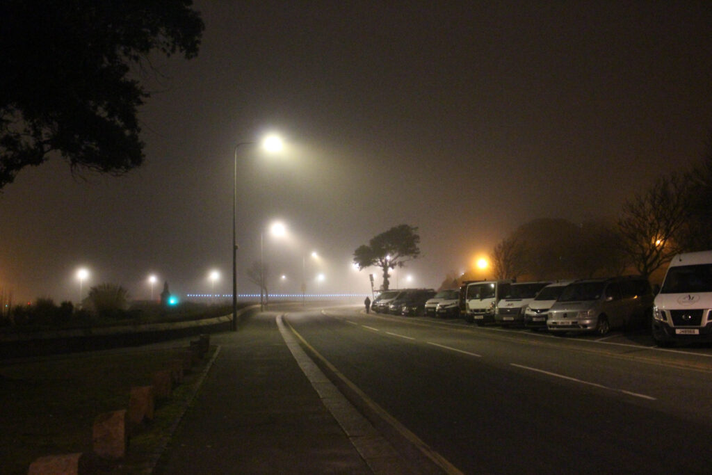
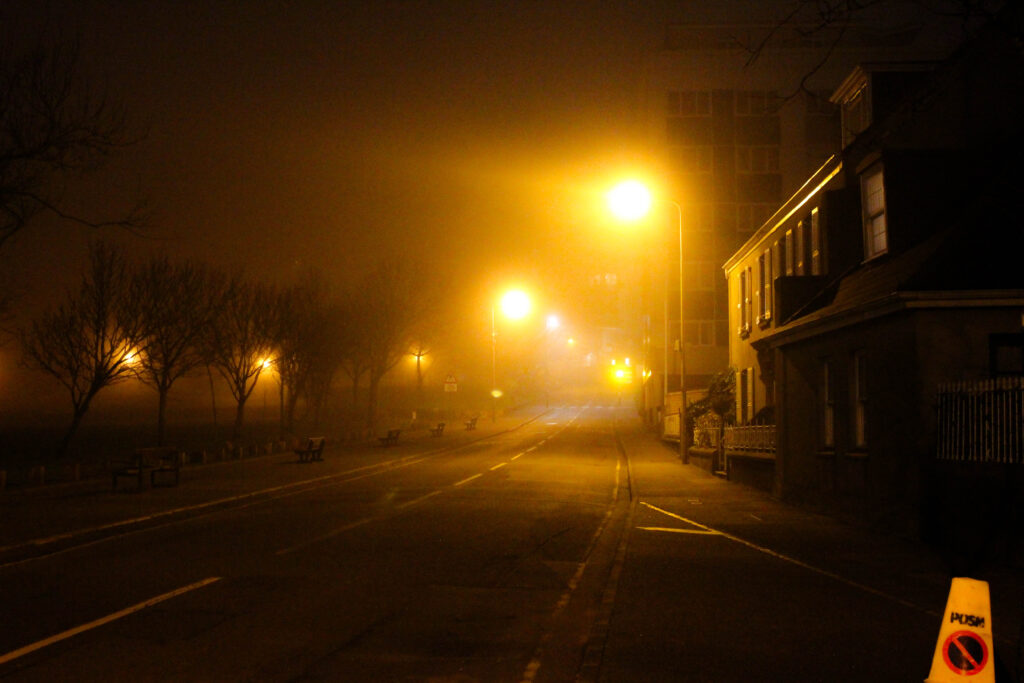
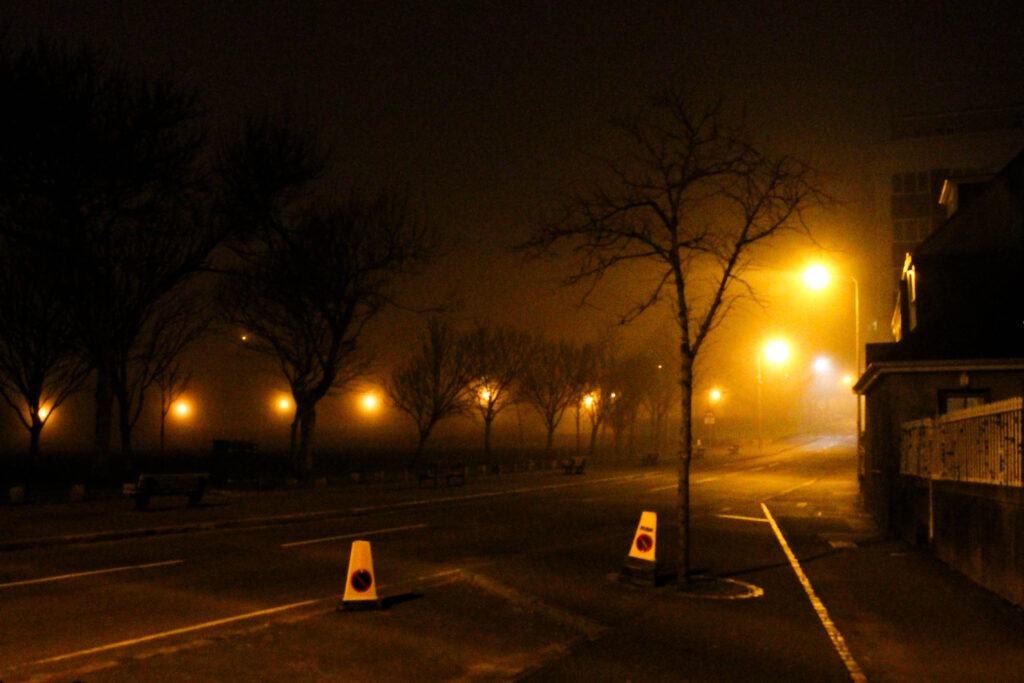
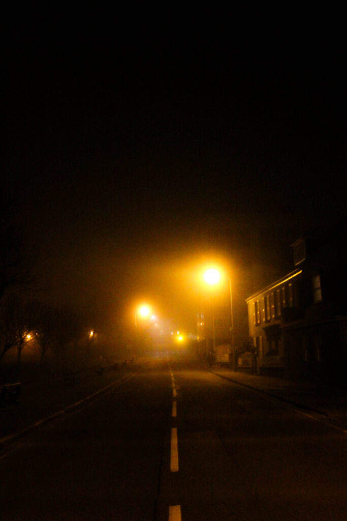
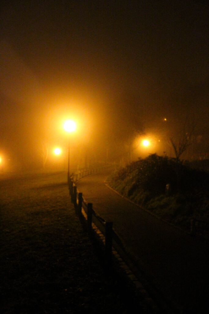
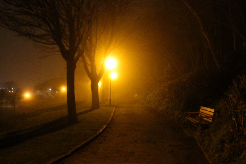
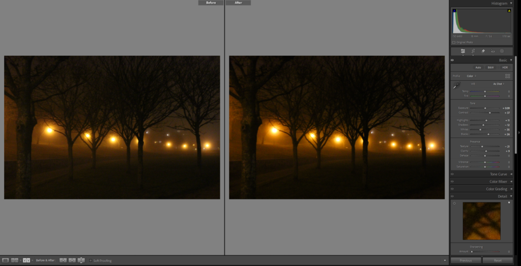
Personal Study: Photoshoot #3 – Loneliness Through The Morning Fog
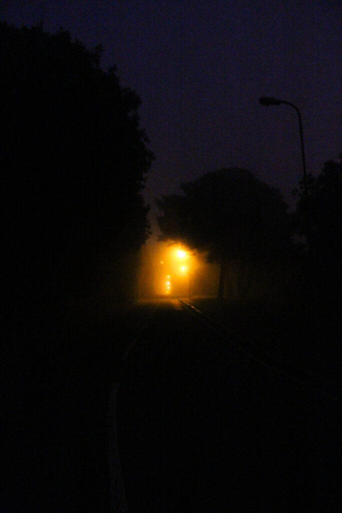
This was the initial contact sheet of every photo, for this photoshoot I went out in the early morning to capture the morning fog, as I want to explore how the mist/fog creates a dreamlike, unreal setting which alters the general landscape. When I went to capture this photoshoot, I had arrived at the originally planned location just as it was starting to become light outside, capturing the indistinct changes in how the location looked under the elegant smog. The morning fog not only dispersed the light, but also created this interesting beam effect around the lampposts within frame, making this the focal point in the majority of the images captured during this photoshoot. The beam of light poking through the fog added an unearthly quality to the setting, highlighting the sense of mystery and the transformation. The sense of loneliness is also found in this photoshoot, as I purposefully chose a time when few people would be out. the photographs show the empty, quiet landscapes with no signs of life which added to the feeling of abandonment and solitude, both being the emotional impacts I intended to showcase in my project. This photoshoot was shot handheld, using a high ISO to keep a faster shutter speed in the low light, I did this as a long shutter speed would often capture a moving car or people, taking away from the sense of solitude I was trying to convey. Even though using a high ISO meant that grain would be seen in my images, I find that the grain improves and highlights the overall mood I was intending for. The slight grain found within the images compliments the foggy, dreamlike sense of the morning as well as the contrast between the warm light and the cool fog. Overall I took 139 photographs during this photoshoot.
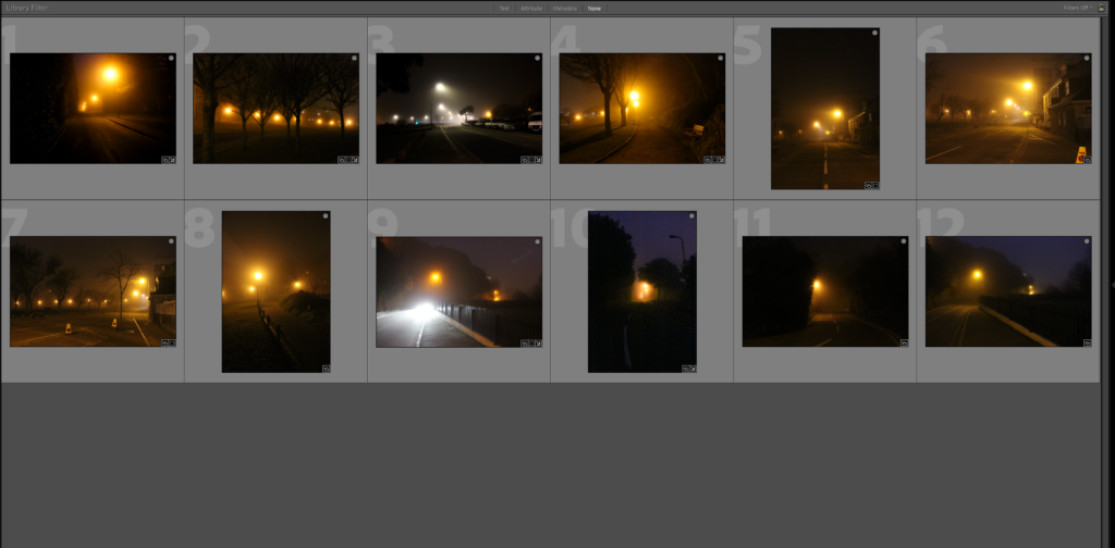
From the 139 photographs I captured during this early morning photoshoot, I selected 13 final images which I find best fits and showcases the themes and mood I am aiming for with this project. The process I went through to select these images, required me to review each image and focus on the ones that caught the interplay of light, setting and the feeling of loneliness I am aiming to acquire. I chose the photographs which highlighted the misty, unreal quality of the fog, the beam coming from the lampposts and the quietness which reflect the sense of isolation. These final images I have chosen show the emotional value and mood I hope to send throughout my photobook.
Final Image Selection – Unedited


These images showcased above are the 13 final photos in their raw, unedited state. These raw photographs show the contrasts, textures and the overall mood created by the darkness and the cloudy mist. Even though the photos already show off the emptiness, loneliness and the surreal, dreamlike effect that I intended on, the next task i will do is subtle editing to these images, improving the tones, changing the exposure and just perfect the overall mood of the collection of photographs. Editing these images will ensure that they fit in with the overall theme/story of my photobook.
Final Image Selection – Edited
Once the 13 images were carefully chosen, I started editing them in order to enhance the overall mood and theme I am aiming for. My main target when editing was to highlight and show off the dreamlike qualities of the foggy morning whilst also improving the theme/mood of isolation. By altering the contrasts and highlights, I managed to find the perfect balance between the warm lamppost lights and the soft tones of the fog. Whilst editing I also brought out some miniscule details which might have gone unnoticed. These photographs below are the final, fully edited images for this photoshoot.


Final Image Selection – Before & After
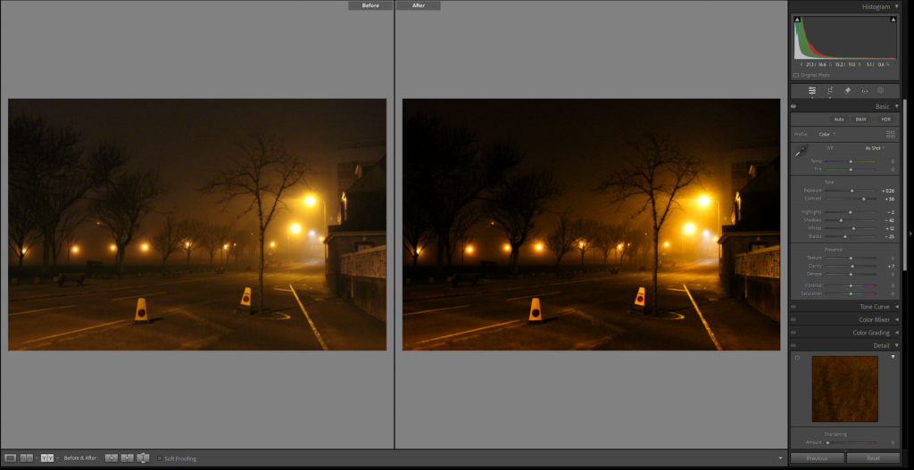
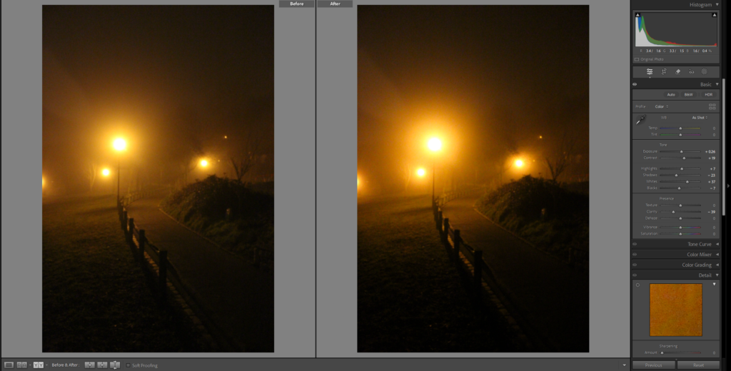
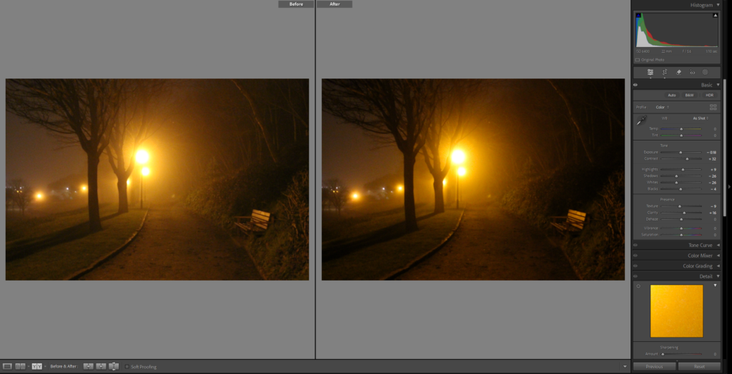

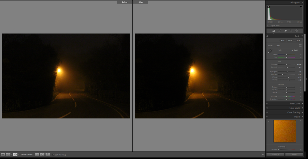
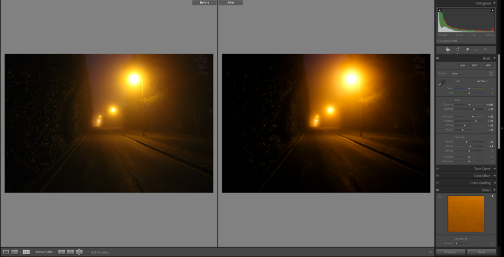
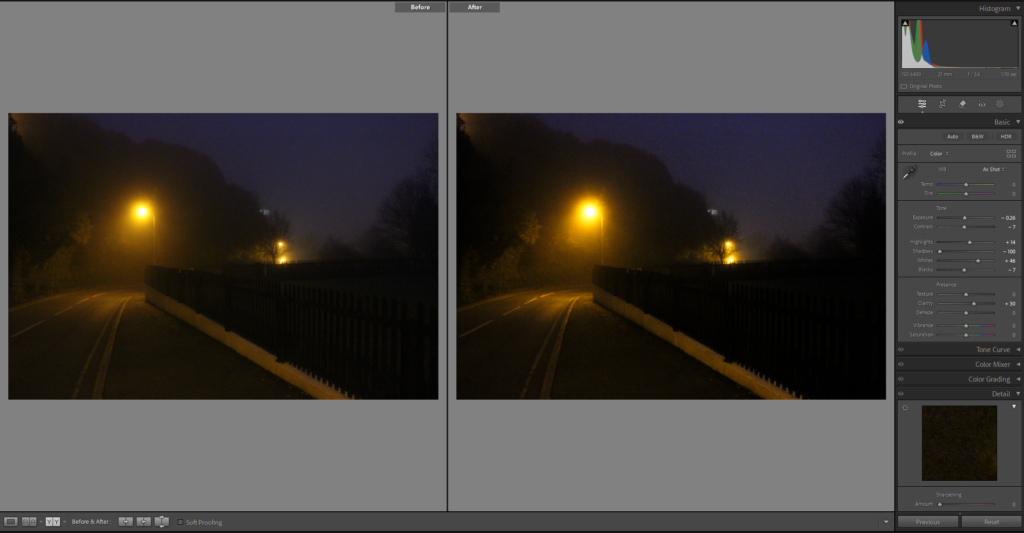
As You can see for these images, I only did subtle adjustments to them. My goal when editing was not to dramatically change the raw photos, but to slightly improve them and to refine the overall mood of the images. Every edit had a high focus on perfecting the contrast, highlights and tweaking the shadows and whites, with most of the photographs, I increased the contrast to emphasize the quality of the fog. The purpose of altering the whites, blacks and shadows to bring out smaller details which were hidden behind darker areas. Overall, my choices when editing were done to keep the natural sense of the foggy night whilst also intensifying the feeling of solitude that the images show.
Favourite photographs from this photoshoot

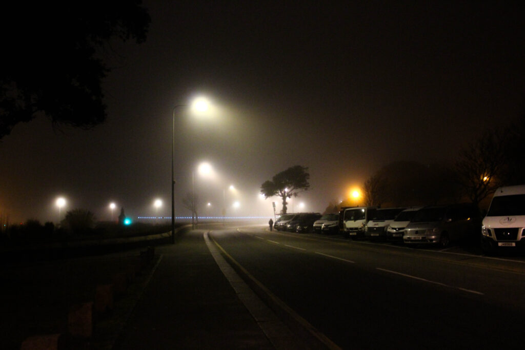
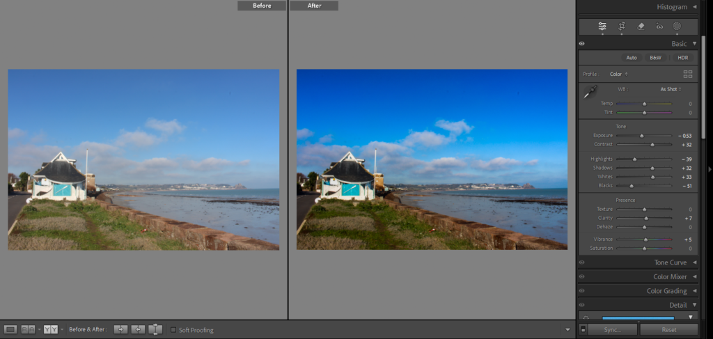
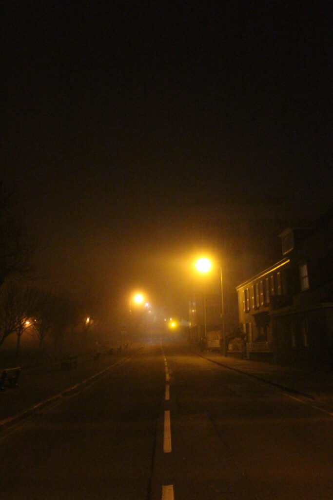
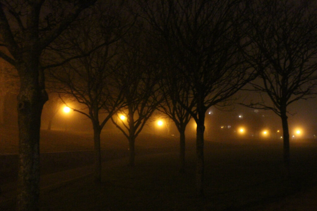
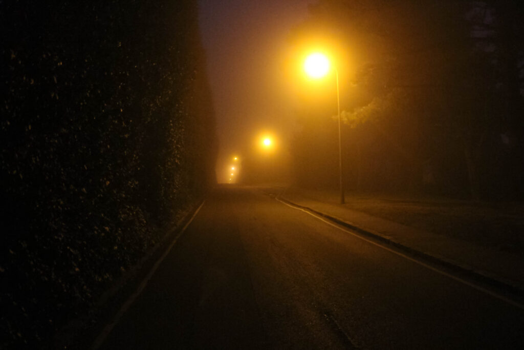
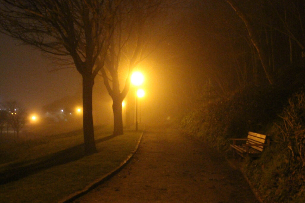
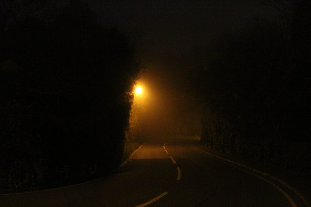
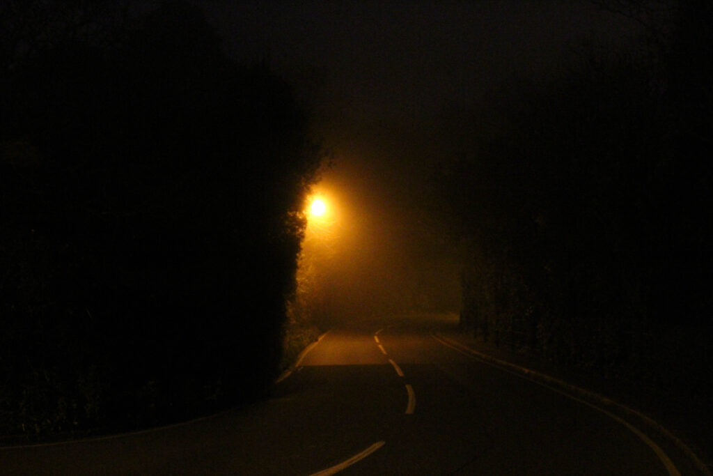
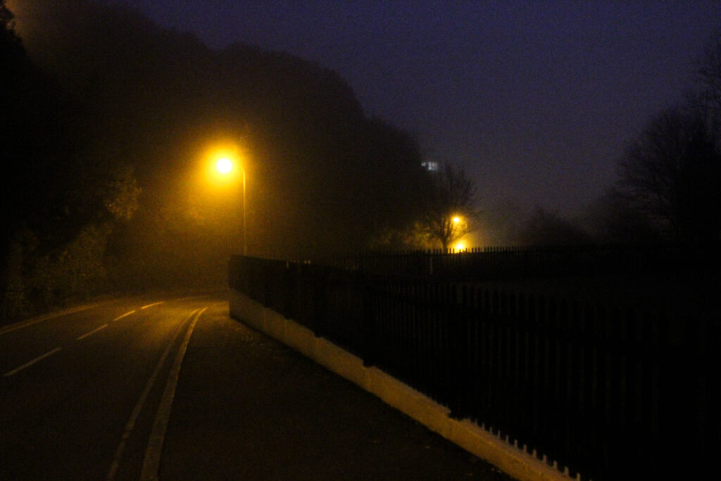
This image shows a long, desolate road being lit up by a warm glow from a row lampposts. The contrast between the left of the image being dark and the right side of the image having an intense amount of light, draws the viewers attention towards and through the road and pavement, almost like leading them into the unknown. My favourite aspect of this image is how it captures the sense of solitude, the empty road in this frame could suggest abandonment, however the working lamposts give an idea of life, fitting perfectly with my theme. This photo will be a main piece inside my photobook, as it clearly portrays the mysterious, lonely mood outlining the dichotomy between the day and the night.

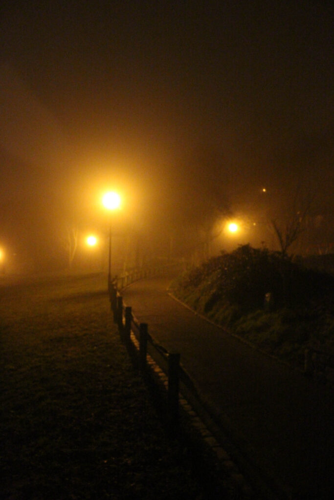
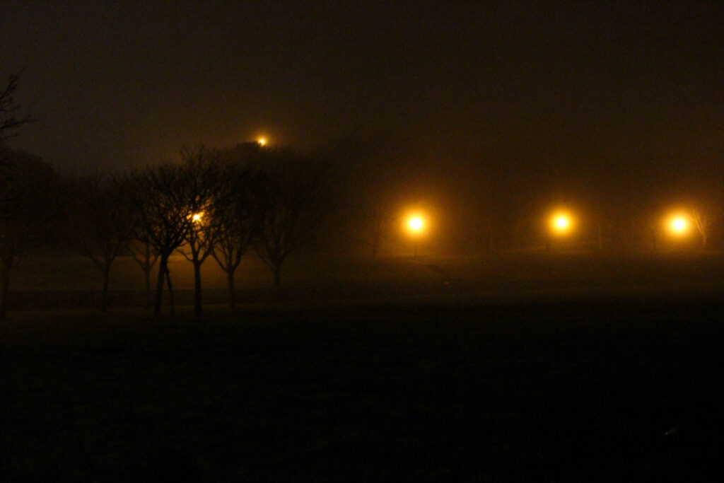
This photograph displays an urban landscape filled with mist, allowing the lampposts to scatter freely. The soft light turns into a warm glow which is complimented by the mist surrounding the lampposts, the leading lines on the road and the lights slowly fading into the distance, it entices the viewer to follow the path into the unknown, similarly to my other favourite image. In my opinion this image is the definition of the normal becoming abnormal, the emptiness of the urban setting mixed with the glow of the artificial lighting, creates a quiet narrative of walking through a place which feels both safe and uncomfortable at the same time. This photograph will also play a key role in my photobook as it reflects my theme clearly, showing how landscapes during the night become abnormal.