That is Anthropocene?
The word Anthropocene, derived from Greek, means “the recent age of man”.
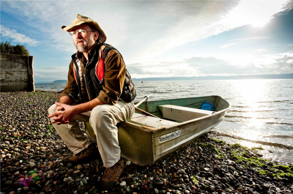
Anthropocene is the largest epidemic to happen in the natural world. The effects of our human advances taking a destructive tole on the nature that has be admired and studied by many. With our plastic being eaten by birds and fish and our roads crushing hedgehogs and toads. The photographers who create work to fight for more fitting environments for our co-inhabitants, producing pieces that shock many to the heart. The planet is not our to destroy and many would be shocked to discover how much their new t-shirt would have contributed to this destruction. These artists are exploring the way in which Anthropocene has affected this world and are creating ways of warning others that their actions have consequences.
Causes of Anthropocene
There are four main causes of Anthropocene. these are: Agriculture, urbanisation, deforestation and pollution.
Agriculture:
The agricultural industry has left its mark on the planet though it may not be apparent at first. The machines that harvest the wheat for your bread release off fumes and the over farm salmon from the shop containing that much fat that it is worse for you than a big mac. Animals are over feed and pumped full of chemicals to make them more appealing to eat.
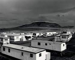
Urbanisation:
With every growing populations comes the need for more housing, clothing and food. Fields are being built on that were full of life and cramp streets and roads are making it hard for wild life to rehome themselves when they are eventually removed from their home.
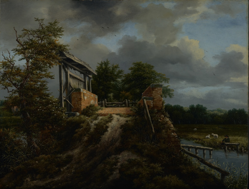
Deforestation:
Wood being a vital part of our life from pencils to tables and supports in structures, including your real Christmas tree, It is every where however this wood has to come from somewhere. unfortunately that means cutting down a entire forest just to supply enough for everyone.
Pollution:
With human advancement comes the never faulting threat of pollution. Whether that be CO2 or chemicals released in to rivers and oceans and the light produced by the street light and busy road full of glowing cars blocking our gorgeous stars.
Consequences of Anthropocene
Anthropocene ultimately has major draw back and unwanted effects on us. The pollution in the air making hard to breath, filling our lungs with chemical and slowly rotting them from the inside out. The animals we eat containing antibiotics and things that were not meant for human consumption. The places we live becoming run down and abandoned or removed to build something modern and disrupting the landscape.