All posts by Hannah Bridle

Filters

Author:
Category:

feminity vs masculinity- photoshoot plan

Photoshoot 1

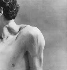
For my first photoshoot, I am planning on taking inspiration from Robert Mapplethorpe’s project body parts where he did close up photos of the male body and then edited them into black and white.


I want to do something similar however I’m going to try and do close ups of both the mascilin body and the feminine body. I want to show the natural differences between the more masculine sharp lines and the feminine soft curves.

photoshoot 2

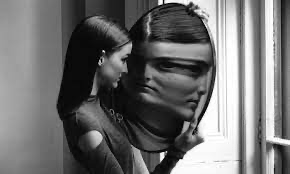
For my second photoshoot I am inspired by Duane Michals and his magic mirror project. For these he used a distorted mirror and had the model move it slightly which created these interesting effects he then later edited them and put them in black and white.

I will be doing my work slightly differently to his though because he didn’t use editing for the that distorted effect however I will be. Then like his work i will be editing it into black and white.

Photoshoot 3

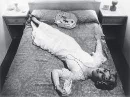
This photoshoot is inspired by Cindy Sherman and specifically her “untitled film stills” where she took photos heavily inspired by sterotypical women and their jobs like housewives and then later worked women.


My photos are going to be very similar to hers the plan is to do take pictures based on what i think your sterotypical house wife would be doing like washing the dishes etc… Then i think during editing i will edit them in black and white like her work because for this project she doesn’t have any of her work in colour.
Photoshoot 4-

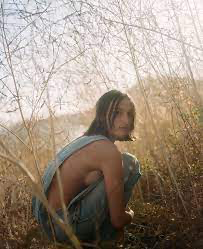
For this last photoshoot the idea behind it is to take photos inspired by Lauren Withrow. She takes these beautiful photos of usually women outside and they have such a calming and feminine feel to them.

For my photos i will be going out to a field to get some images like hers with nature and i will also try and find some plants similar to one the one above because i really like the effect of her being surrounded by the plants.

femininity vs masculinity- photoshoot 3

For this photoshoot I too a lot of inspiration from Cindy Sherman and how she would show more of the stereotypical jobs for women or the way society views women.

For the photoshoot I tired to create a similar feel to photos and kind of recreate some of them myself.

I think these photos came out really good they had this very feminine feel to them just like the original artists did.

I do think these photos could have benefitted with some better lighting I think next time I would try and get ring light in order to take these photos.

However I still think they came out really good and I still had some good contrast and clarity in the image.

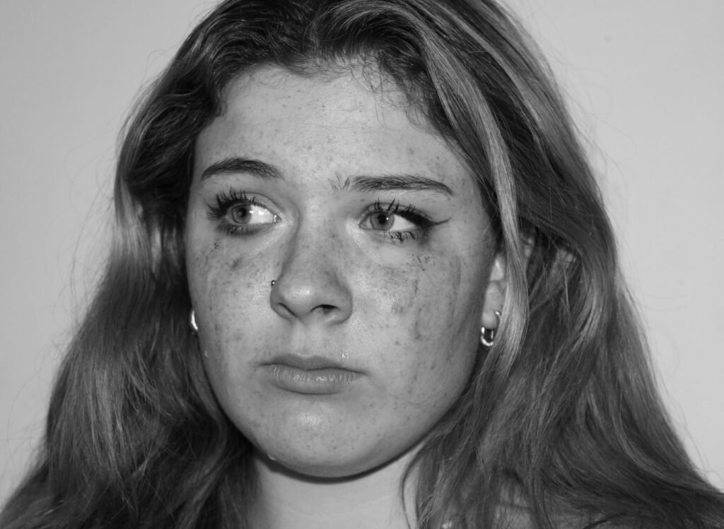
I really like this photo I think the lighting really makes the models face stand out which works well with the eye contact as it makes her appear really confident and serious which society associates as quite a masculine trait to have.


This part of the photoshoot i was trying to recreate and taking inspiration from this photos from Cindy Sherman

This part of the photoshoot definitely had the best lighting as I was able to use a ring light so i was able to capture a lot more detail in the image compared to some of the others. The strong lighting meant you could see a lot more contrast between the models face and the makeup which is streaming down her face.

I actually think the lighting works better in my photos compared to the original because I believe you cant see very clearly which is actually happening in her photo which might have been what she was trying to achieve however I think mine achieve the idea better as it stand out more and illustrates the point better .

femininity and masculinity- photoshoot 1


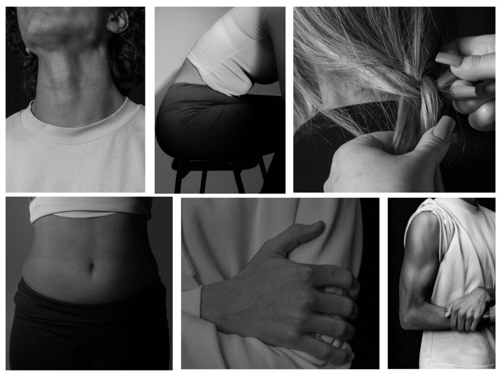
For this photoshoot, the idea was to capture the feminine body and the masculine body by showing off feminine features like curves and for guys more muscular aspects. I’ve done the body parts in black and white just like Robert Mapplethorpe did for his photos.
However i did do some photos which wasn’t inspired by anyone and just how I thought femininity could be portrayed.

I really like this image I think you can clearly see where I got my inspiration from. I think the black background works really well behind as it creates a good contrast and it makes the model stand out and draws your eye to him as he is the only visible thing in the image.

I think these photos were really successful I tried to recreate the hands picture with both and guy and a girl as you can clearly see which is which as the female hand has the softer shapes and she has has her nailed done which is quite a feminine trait. Then you have the males hand which is a lot more angular you can see those more prominent veins and bones in the hand unlike with the feminine hand.

Both these images as well as the one above once again show off the idea between masculinity being more sharp and angular and femininity being rounder and curved. The picture of the models stomach and hip dips show off some of the most feminine part of women. And then the image of the guys back and arms show off more masculine parts of the body.

For this half of photoshoot I strayed away from the artist as I wanted to a more playful side to men and women and show more action shots rather than showing how they are physically different I tired to show it more through personality and emotion.

I think the mirror photo worked really well in my opinion because being focused on your looks and making sure you look good society shows as more of a feminine quality so having the male model play with his hair and look in the mirror was me trying to show how guys also worry about their looks.

I think these images were very successful I think the colours give the images a playful and feminine feel to them as they are also quite stereotypically feminine colours. The photos of the model sitting I tried to have her appear more masculine by sitting up very straight and appearing really confident which is usually associated as more of a masculine trait to have.

I then tried to do the opposite with the photos above by showing the friendship and the connection between the two models as being close and hugging is once again more of a feminine thing to do in society.

femininity and masculinity- photoshoot 2

for these images I was inspired by Duane Michal’s project “Dr. Heisenberg’s Magic Mirror of Uncertainty”. However unlike Duane Michal’s I will be editing to distortion onto the mirror.

I am able to achieve this by selecting the part of the image I would like the distort for these it is the mirror.

Then one I have done that I duplicated that layer and pressed the smart object option.

Then I went into the layers category to go into the distort section which is where at first i was using the wave distortion filter .

Later I started to experiment with the pixelate section where I tried both crystalize which mainly made the mirror look pixelated and the second one was the section called mezzotint.

I think both of these images came out really good although it isn’t the same exact same as the inspiration artist I think the links and inspiration is quite clear which I like. As I still have that clearly distorted image but instead of just stretching the models face I’ve made the picture look all wobbly and unclear which is how he may feel emotionally.

I think overall I’m very happy with this photoshoot because i also feel like the original artist should have had similar ones just with wen as its quite common for people to believe women are the ones who struggle with self image however men also face those issues too so by having the model be male I think i captured how men don’t always have a constant self image too.

femininity and masculinity- photoshoot 4

These images below are heavily inspired by Lauren Withrow’s work. I tried to capture the images so they had the same feel to them as all of her photos have this amazing calming and tranquil feeling to them.

I was able to find a field which I felt worked perfectly for Lauren Withrow’s style of work.

This is definitely one of my favourite photos I took for this photoshoot. I love the way i can tell who I was inspired by and captured her exempts without completely coping the image. I think the picture works really well with the model being in focus and the the plants being blurred it kind of creates this boundary between the two. It also softens the image slightly I find which I think helps show off the femininity within the photo.


For this photo above I took a lot of inspiration from the image on the right. I though the wind moving the models hair looked so interesting and dynamic. I think the hair gives the image so much movement and life as everything appeared so still without it.

I was tempted to edit the image into black and white however I think the colour of the sea and sky made the image look quite cheerful and happy rather than more dull and gloomy and seeing as I was trying to add life the the image it worked better.

Overall I believe the photoshoot came out well I was happy with the photos. They had clear links to the inspiration. I think all the photos ended up looking really feminine with those soft shapes and colours which is what I was trying to achieve.

I think if I was doing the photos again I would try and have more of a side on shot of the hair in the wind like Lauren Withrow has because I think being able to see her face as well as her her was very successful.

photomontage- final outcome

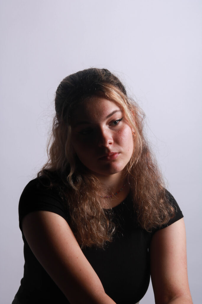
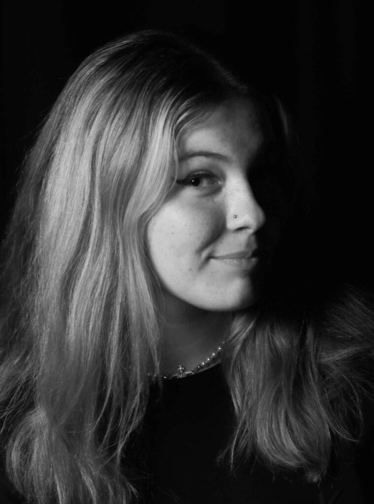
I’m very happy with how this photoshoot came out I think the first one is my favourite because I think it looks good that u can easily tell which part of the face unlike some of the others where it’s not as clear I just don’t think it works very well as it makes the photo look overly busy and chaotic. Whereas although there is a lot going on in the first image it loos quite organised.

I also think the contrast in the first one works really well because the models face is well lit up which contrasts nicely against the dark background which does draw more attention to her face

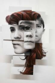
For photomontage I was inspired by David Hockney’s work. For the editing what I had to do was find two images for the first two edits i did I used two pictures of the same model however for the last edit I did I used two different models. Then you need to select small sections of the image and use layer via copy . You can also add whets called as a “stroke” which gives you a slight boarder around the small section which adds more dimension to the image.
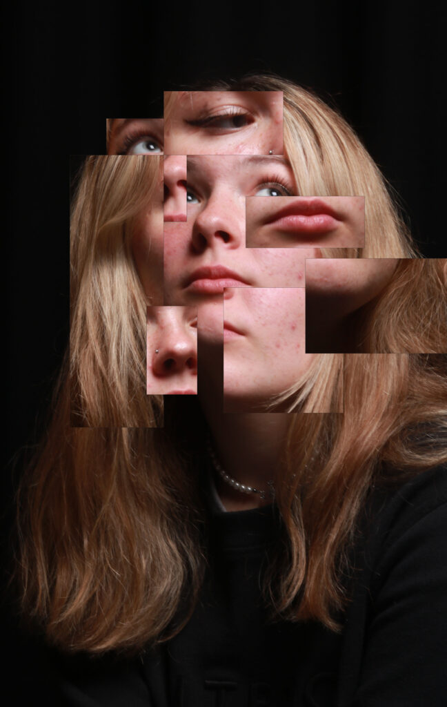
Then all I had to do was drag the parts I selected off the other model onto the image I wanted. Next all that was left to was arrange all of the selected little images so that I basically creator and new face and it helps to layer some of the pictures on top of each other.

Femininity and Masculinity- Artist research

Cindy Sherman-

Cindy Sherman is most known for her amazing work about femininity and taking photos inspired by stereotypical aspects of women. For these photos she does it all by herself usually, she is the model makeup artist director photographer, etc..

These images are from her work called “untitled film stills” which she created and worked on from 1977-80.

For these she plays stereotypically female characters like a housewife, sex object, gardener, etc… however, she also does have some working characters within her work. The idea behind this was to show how society views women to also show who/what women are. Having both working characters and also housewife-type characters shows that women should have the option to choose whichever they want.

I’m a big fan of her work I think she expresses her thinking and her opinions about women and how much women can achieve and how they can do whatever they want if they want it bad enough, very well.

This image feels very calming because this character is doing something quite mundane nothing very out of the ordinary and because the photo is in black and white it has more of this nostalgic feel to the image but there’s almost this sad aspect about it as it can bring back memories or ideas of how (in less recent years) women were often forced to do this kind of job and couldn’t pick what they wanted to do.

The lack of colour in the image I think helps create this emotional aspect to the picture. The way the model is looking away from the camera gives off the impression that she is more scared and timid as when you make eye contact with the camera it has a very confident and almost scary feel to it which this one doesn’t which I think works if you think about how women were at the time.

If you use the rule of thirds she would be in the on column on the right and it kind of gives off the impression as if she is hiding in the image otherwise she would be more central which also helps create this idea of her being more sacred and timid. I think this photo is quite natural by the looks of it the lighting isn’t too harsh and it is kind of even all over so I doubt there was anything like a ring light used for this photo.

I think conceptually her whole idea was to show what life was like for women what jobs they could do and what was the most common for women especially this one as many women were forced into being housewives and didn’t get an option in what they did.

During the 1970s-80s there were many women’s movements and protests following the big push during the 60’s for more equal rights for men and women as there was a clear lack of equality that women faced. Which I think heavily affected and influenced her work/project of untitled film stills.

Duane Michal’s-

Duane Michal’s is a self-taught photographer who gained popularity for his project “Dr. Heisenberg’s Magic Mirror of Uncertainty” which was discovered when he was asked to be in French Vogue in 1999 for a science-based issue. He says he has always been both interested in physics and photography but especially abstract and what he describes as “un-photographable” work.

For these images he achieved these through having this distorted mirror so whenever the model would move the mirror slightly it would have this really interesting and unique water-like effect so the whole of the model’s face would change.


Visually this image has this almost abstract aspect to it from the mirror and yet the rest of the image appears to be this calm and normal setting it’s a good contrast from the abstract and chaotic feel of the mirror.

These photos can kind of appear sad and give off these negative feelings due to them being in black and white and you could interrupt the mirror as if to show him reflecting on his true emotions and how life is feeling for her and the outside is just how she presents herself and she wont show anyone how she is truly feeling.

When looking at this photo in a more technical sense one and as well in most of her other images he always has his model in the very centre of his photos if using the rule of thirds which can show how they are the most important thing as it’s in the very centre so your eye is automatically drawn to it.

I think the concept of this artwork is to show how nothing is certainty when converting life and in general so having the reflection be distorted and not show it is supposed to be kind of shows the uncertainty.

He named this project “Dr. Heisenberg’s Magic Mirror of Uncertainty” because at that time Dr.Heisenberg had recently said how “you cannot predict with any certainty the position or velocity of a particle” which clearly inspired her work as she shows that inconsistency.

Lauren Withrow

Lauren Withrow is more of a recent photographer who has only recently been majorly discovered and she is growing big and more well-known quickly.

She describes her work as her expression of femalehood, feminity, queerness and vulnerability. She has made this amazing feel of femininity through these feminine shapes through clothing and poses everything feels more soft and rounded off which would be considered more feminine and it is clearly portrayed.

Robert Mapplethorpe-

This is Robert Mapplethorpe’s project called “Body Parts” which he would get up close shows of different sections of the human body usually a man’s body as he can photograph visual masculinity. He described his work as  “the perfect way to make a sculpture.”

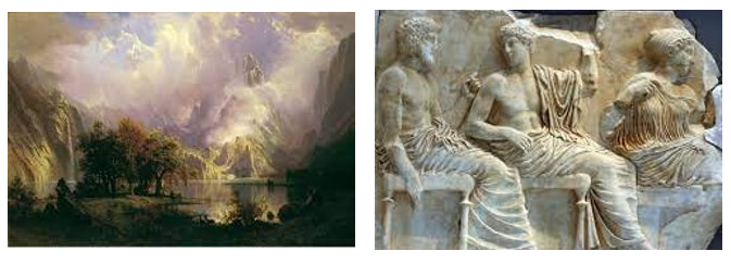
His work was heavily inspired by classic sculptures and paintings where it shows the classic ideal. How men are supposed to look and act. Which I think he executed really well i believe you can see very obvious similarities between his work and some classic sculptures.

femininity vs masculinity- introduction

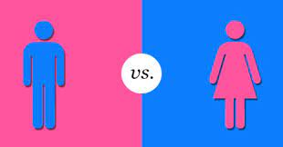
Femininity and masculinity would be considered a small part of binary opposites which is quite a broad topic so you have smaller subjects/topics like femininity vs masculinity, black vs white, peace vs war etc…

Identity can be quite a political topic especially now since more people are starting to speak about inequalities they face due to their identity. You have lots of people who will be in support of equality for everyone no matter who they are. However you will still have some people who wont agree and will discriminate due to race, gender, social class etc…

There have been many movements in the past to fight for more equality such as suffragettes movement, black lives matter protest, civil rights movement, pride parades and many others.

Femininity– “qualities or attributes regarded as characteristic of women or girls.”

Historically society have given women these role such as being a mother (which most may be however that does not define them) and someone who should do all the cooking, cleaning and taking care of the house and family while her husband is out

Society also seems to have quite high expectations of women and how they should be feminine by always looking perfect with their hair done, makeup on, nails done. Often women are looked down on when they aren’t “perfect”.

Now more then other women are trying to defy these stereotypical thoughts and ideas about what it means to be feminine. It was always quite a masculine trait to be brave, powerful and strong but more women are now saying that being strong can be feminine too.

Masculinity– “referring to the roles, behaviours and attributes that are considered appropriate for boys and men”

While women were said to be at home men were quite the opposite they were said to be the ones that had to go out to work everyday to earn money for their home and family. They were said to be taking care of their family financially.

As a society we have kind of told men they have to be tough, they cant be vulnerable and emotional they have to be strong for their family. It was quite common for people to tell men that they cant cry and to get over their problems they were facing.

Recently now as a society we have been trying to stop these damaging stereotypes as they hold no purpose and just isolate people. Its now although not mainstream it is more common to see a man wear makeup. Its now more alright for men to get upset and need support too.

How the war effected gender roles– A big defiance against these gender roles/rules were the war, this is because when the men went off to the war it meant there was no one to do the “man” jobs therefore the women had to start doing those jobs which showed everyone that they are just as capable as men. Not only did they start doing men’s jobs but they also had to carry ion with their original jobs like cooking and looking after the kids so it really proved to everyone how strong and capable women actually are.

photomontage -introduction

Photomontage is where you create this new piece of work by (if you are doing it by hand) cutting and sticking different images onto a photo or (if you are doing it digitally) editing different photos on top of anotherto make a whole new image.

some famous photographers who have used photomontage before would be Hannah Höch who was said to be one of the origninal creators of this style, man ray who is well known for his hand photo with eyes in the center and raoul hausmann who was well known for using writen work underneath his images.

Photomonatge is often used to show and express peoples minds and how they think without words and it doesnt always have to make sense or be logical.It was most used and popular during the 1970’s and 80’s during the postmodernist era.


double exposure- artist research

I think one of my favorite photographers who has done work on double exposure would be Christoffer Relander. He was best known for his series called “We Are Nature”. He layers the original portrait photo and layers a blurred nature image on top which is known as double exposure.

Emotional aspects-

I really like these photos they feel very tranquil and calming because all the colours are quite dull and muted but the way it’s blended makes it work

Visual aspects-

I think this image really works I like the fact it is in colour and you have the rich greens showing through unlike some of his other images.

I also really like how you can still see the model’s face very clearly underneath the nature/trees and the trees are almost being used as her hair i think that looks really successful.

technical aspects-

if you use the rule of thirds you can tell they have all the darker parts of the image where the hair would be in the collum on the right and the middle collum seems to be the most bright and colourful. The side on the left is probably the dullest it doesn’t have much it other than the model’s face.

conceptual aspects-

I get the impression from his work that Relander is trying to show us the beauty the calming effect of nature​
I would love to recreate his work I think it’s so interesting and beautiful and would be a great one to recreate.

contextual aspects-

This style of work is from his “We Are Nature” collection. Christoffer Relander is a Finnish photographer who liked the idea of pairing up each subject/model with different geographical/natural elements.