All posts by Hannah Bridle

Filters

Author:
Category:

Self Study Project: Observe Seek Challenge introduction


Observe Seek Challenge-

The theme of observe seek challenge I have linked it towards the idea of watching. whether that’s watching people or your surroundings. However I like the idea of almost being hyper aware.

I also like the idea of focusing on the male gaze. And how women are constantly being objectified whether that be in media or in life.

So I would like to combine both ideas and show the objectification of women and how it effects them on an emotional level.

I really like the idea of using clay and having this cracked effect as in my research I have seen lots of things like “the soul, mind, spirit, or invisible animating entity which occupies the physical body.” and  “a person might say that trauma has damaged a person’s psyche “so I thought slay would be a perfect way of trying to show someone’s emotion’s and how things can effect them and slowly start to break them.

I like the idea of showing the inside on the outside which is what South African artist Walter Oltmann choose to do. He was more inspired by the human body and he was famous for pieces like the Bleeder.

I think I would like to use makeup in order to try and show this I could potentially use some sort of clay to symbolise someone breaking but show it on the outside.


street photography photoshoot 1

For my first photoshoot, I went to St Malo where I was able to take my street photography. Henri Carter Bresson was my inspiration for this photoshoot so I tried to imitate his style so I focused on getting natural photos of people.

Henri Cartier Bresson inspired

In these photos I’m taking inspiration from Henri Cartier Bresson and how he will wait for the decisive moment. To be able to recreate his photos I waited in the same spot which I thought would create an interesting shot waited there until someone came by and tried to get a natural photo of them.

I found to get a similar feel to his work a lot of it came to the editing which you can tell from these images compared to the ones below In colour. Editing inspired by Henri Cartier Bresson was relatively simple I noticed that all his images as in black and white but they had a lot of contrast within them which he got through lighting. However, I was able to achieve that due to it being cloudy so I had to create that through editing.

People

This image has an empty alt attribute; its file name is edited-1-2-683x1024.jpg

These images are very similar to the ones above however for these I stuck to the idea of waiting for the decisive moment but I didn’t turn them black and white like Henri Carter Bresson. I preferred this because I felt erasing the colour took a lot of the life and the personality out of the image. Because of it only being a snapshot of someone we don’t find out much about the person especially if the photo is in black and white, clothes, for example, can show a lot about someone if they wear eccentric brightly coloured clothes it can show that they maybe have this big personality which I like to see in photos like these.

Overall I’m quite happy with how this photoshoot came out. Although it was more of a difficult photoshoot to do as I had to find a spot that I found would make for an interesting spot and then have to wait for someone to come by but also having to make sure the lighting was right so it was overexposed or underexposed. This was something I had to focus on as different photos required very different settings for example the ones where the person was walking the shutter speed would have to be a lot quicker in order to get a good quality image out of it however for the photos of the people standing still I would then have to change the setting as it wasn’t going to be the same. My favorite image would the the woman in pink I found that setting in the street to be very good for trying to focus on one person but also having there be lots of people around. By using a busy location It meant I was able to get try and get a more interesting background to the image and then the main object within the picture I would have to try and frame so they would stand out the most. Although it wasn’t as busy as I had hoped I found this person worked well as she was wearing a partially bright and monochrome outfit which did make her stand out within a crowd.

Architecture

Although I was focusing on Henri Carter Bresson I also did want to take some photos where I focus on the architecture in St Malo.

I really liked this image above I found this interesting wall down one of the lanes where it had been heavily graffitied but on the side of it was a drain which worked well in my favor. When looking down from this angle the drain acts like a divide almost as if it is two images stuck together.

For this photo tried to use the pillars within the architecture to frame the picture as it was a beautiful building however the greenery within the middle open part really brightened up the image. The building itself is quite monitored with just the natural beiges of the brick which was used however having all the plants in the middle I found it added a lot more dimension to te image and it also made it more unique as it’s not something done very often or not to this degree.

Review And Reflection

Anthropocene-

Anthropocene-

The idea of the current time period and how its very human-influenced

I focused on overpopulation and showing the busy streets of town .Although I do like how this photoshoot came out in the end I didn’t take much enjoyment out of it nor do I think its some of my stronger work.

Landscapes-

Landscapes-

The idea of taking photos of an area of land which is often seen as having an aesthetic appeal

I quite liked this photoshoot I found myself experimenting a lot more with this photoshoot than I do with most. I think I have got some good work within this topic but I don’t think its my best work.

Femininity vs Masculinity-

Lauren Withrow inspired-

I really enjoyed this photoshoot I found that taking photos of a model in more of a nature environment is something I enjoy because I can incorporate parts of the landscape within the photo. I think I could do a lot more with this idea and expand on it.

Robert Mapplethorpe inspired-

I really enjoyed this photoshoot I also think it was very successful. I enjoyed being in the studio with the model and trying out different techniques and doing slightly more abstract photos rather than normal portraits.

Portraits

Lighting-

Similarly I really enjoyed being in the studio and playing around with different lighting techniques. I think some of the photos came out really well whereas some other not as much but i still think it was a successful shoot.

Narrative and Sequence

Process

The process of making the zine-

The first thing was to try and select the images I wanted which was easy i loved the idea of using all close ups of different materials and tools which are so common ion the harbour.

Then after those have been selected and edited I just printed them out so I could start making a physical draft. All that I had to do for that was fold four pieces of paper in half to create the “booklet” and then cut up the images I printed out earlier. Once that was done all I needed to figure out was the order of my pictures, whether I wanted them so its one on each page or have some pages with multiple images and what’s going to go next to what.

The process of making the zine-
The first thing was to try and select the images in which wanted to use, which was easy. I loved the idea of using close-ups of different materials and tools, which are so common in the harbor.
After those have been selected and edited I just printed them out so I could start making a physical draft. All that I had to do for that was fold four pieces of paper in half to create the “booklet” and then cut up the images I printed out earlier. Once that was done all I needed to figure out was the order of my pictures, whether I wanted them one on each page or have some pages with multiple images and what was going to go next to what.

My Images

My Story

3 words– details ,industry, colour

A sentence-Close ups of St Helier’s harbour, the tools and equipment which makes this industry possible.

A paragraph– The concept behind my work and this story is to try and make known what goes on in the harbor as it’s such a key part of Jersey’s history. I want to show tools and objects that are used as they will all have their own job/use and without them, the job probably wouldn’t be possible. Their equipment can be seen as an extension of how we manipulate and change our environment.

Zine: design and layout

For this project the first thing I had to figure out was what I liked and what I didn’t. I realized I didn’t want to have this story based on repetitive photos of boats so I decided I wanted to use some of my more abstract photos and focus of specific items within the harbour and use the close ups of those objects and materials.

These were the final images I had selected to become part of my zine.

The first decision came with the photos and where they were going to be placed on the page as originally I felt that because the photos themselves were so detailed I wanted the background to be plain white to draw more attention to the images. So I started to play around with placing the photos in different spaces around the page.However i did end up deciding to keep in centered in the end as i felt as though they looked alot more cohesive as a story in the same place.

Then I tried to add colour to the background as I felt as if it was looking kind of boring I started off with selecting what I found to be one of the most powerful colours within the photo and using it as the background colour which I has really liked.

I also tried to switch the colours so if the image on the left was quite bright orange and the image on the right was dark brown the image on the left would have a dark brown background. I really liked this for a while as it added lots of contrast between the images.

At one point I was also considering not to use the coloured backgrounds as I felt they felt really flat and it wasn’t working so I tried to use another photo from my photoshoots and lower the opacity to create the background. This I felt didn’t work there was too much going on and made everything look messy. So i decided to forget about that idea and went back to the coloured backgrounds.

That’s when I then tried still using the coloured background but adding a simple image behind them which I felt looked better than the pervious idea but there was still something that looked off about them.

Finally I had decided on using the actually image itself to go behind. I felt like that worked perfectly because it obviously had the same shapes so it matched very well and yet because the opacity was a lot lower it was drawing your attention away and it wasn’t like it was trying to just expand the image. The only thing I had to decide on was weather I was going to have the images in black and white or with the colour. I decided on using the colour for behind the images as I felt that the black made the the originally photo look different and it was kind of taking away my attention from the main image to the page as a whole which is not what I originally wanted.

St Helier Harbour Photoshoot

Original –

Edited –

For these images there was too much that I needed to do editing wise I felt that cropping them helped show off and draw attention to the more interesting parts of the image. I also just then increased the shadows ,contrast and exposure as I wanted the man to stand out more as he seems to blend in slightly in the first image.

I found most inspiration from these last images I liked the idea of focusing on a more specific aspect of the harbour in this case all the equipment, tools, and utensils which are required to have the harbour be successful.
I think these photos were more successful because once I knew what I wanted to capture it meant I could focus on the more technical aspects of the photos. So because I wanted to show the tools used within the industry I wanted to use close-ups so I could try and display and amplify the textures and colours within.

Street Photography Artist research: Henri Cartier Bresson

Henri Cartier Bresson was most known for his photo at Place de l’Europe Behind Gare Saint Lazare which is when his “decisive moments” project really grew popular . He would say that he would like to connect humanity through photos.

he would bring a camera everywhere with him in order to capture every/any millisecond in a moment. He described his camera as an extension of him as if he was hunting so he needs to be patient wait for that perfect shot.

His camera

Henri Carter Bresson was particularly fond of using a Lecia Rangefinder this is because it was considered one of the most inconspicuous of the cameras. That was because they were a lot smaller than most other cameras available at the time it also didn’t have a loud sound when it took the photo. This helped him with his photos as his aim was to get candid photos so the more invisible he could be the better. He was also very fond of using a 50mm lens as he felt that it offered the most realistic point of view as its what’s closest to our eye.

His background

Henri grew up quite wealthy with his family in France which is where he was introduced to art.to begin with he had a big interest in painting however he later found that photography is what he was most passionate about. He found photography to be an extension of the eye.

He felt this was able to interreact the world with his camera which lead him to start travelling he went to Europe, Africa, China, Indonesia, India, Burma, Pakistan and many more… The experiences he got out of his travels influenced him to start his project “decisive moment”
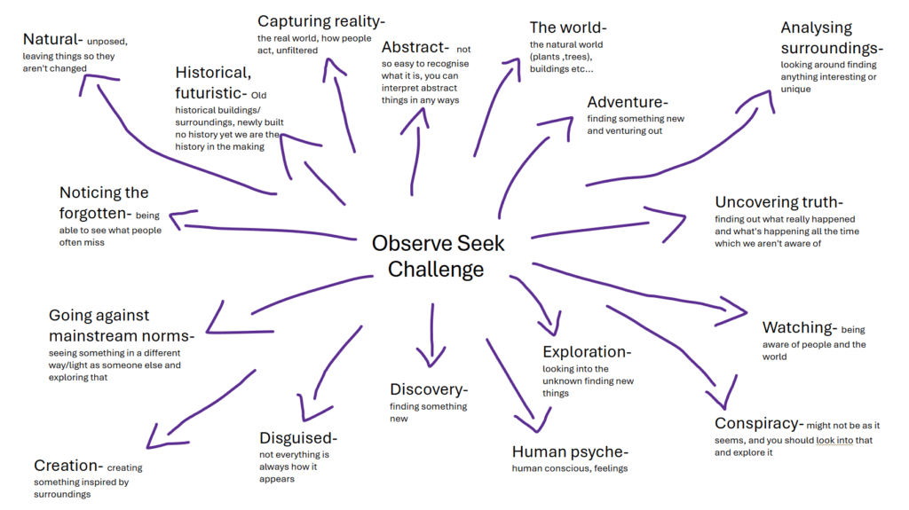
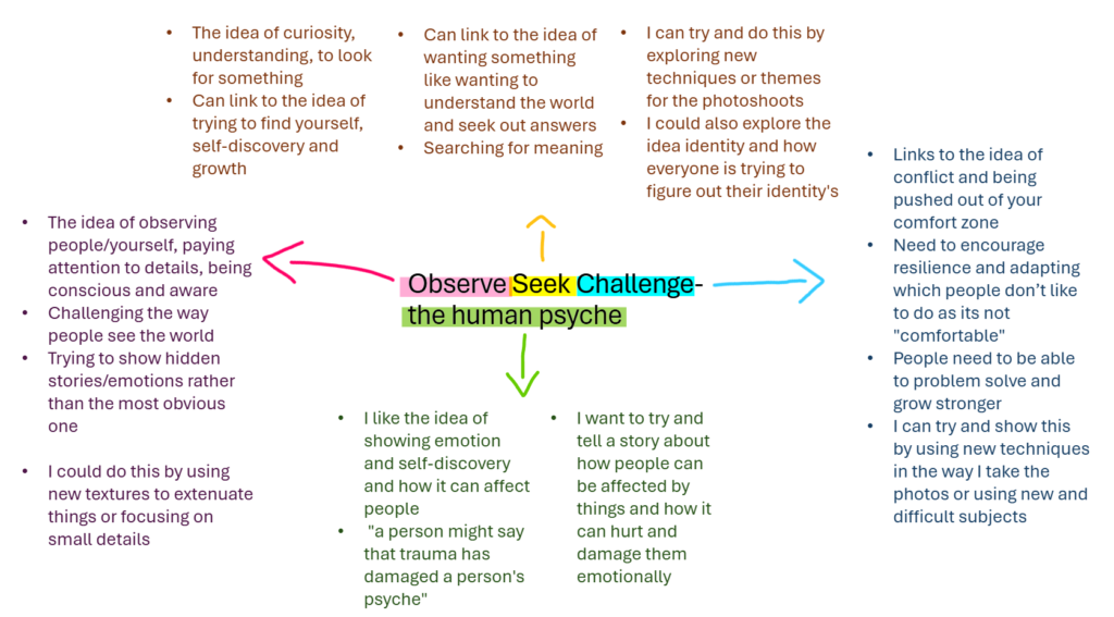
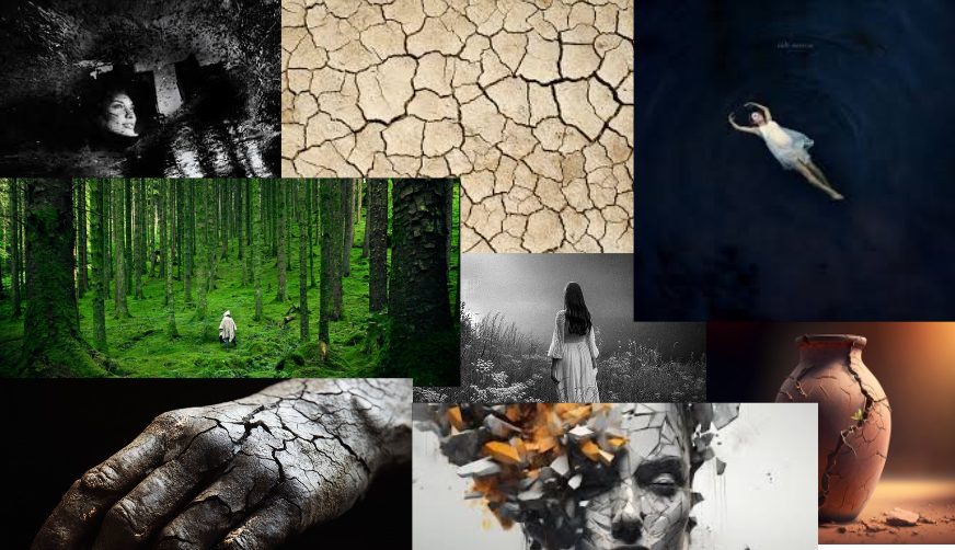
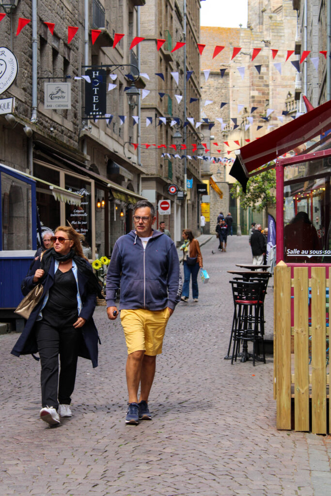
image analysis

leading lines-

In the photo you can see that he’s using leading lines from the railings to draw attention to the man in the image. Although you can argue it doesn’t draw your eyes perfectly because it does kind of draw your attention off the page if you were to follow the railing it does help frame the image and then I find that the ladder of the left of the man helps to draw attention to him.

framing and negative space-

I find in this image it uses negative space really effectively it frames the subject really well drawing a lot of attention to it due to it being really calm and not having much going on. It helps balance out the image as the middle has lots going on and has lots of detail so the calming upper and lower sections helps it feel more organised and less chaotic. I also find the shadow and the clock really help balance out the image as they are both on leading lines but opposite sides of the photo making it look more even and aesthetic pleasing otherwise for example it might look too top heavy.

Colour and texture-

In his photos he has them in black and white this is because at the time technology had not advanced enough to have a camera ion colour. However I think the having it in black and white really works the viewer tends to see more detail within the actual I’m age this way as they are not being distracted by colours.

I think due to there being no colour in the image i think it helps with texture as it draws more attention to it and makes it stand out. you can see all the texture on the walls and the ground very clearly

Camera techniques-

In this image you can tell that he has used a small aperture as there lots of depth in in his image. This meant that everything in the image was in focus including the foreground and the background.

You can also tell he uses a fast shutter speed because for the time the image was taken its considered very sharp so he would have had to use that fast shutter speed to be able to capture the quick movement.

Lighting-

You can tell that this image is really relying on natural lighting and you can tell that it was most likely mid day when he took this photo based off the man shadow in the water. Some people can struggle with taking photos midday because of how bright the sun can be making it more difficult as it can cast some very harsh shadows however instead of fighting that Henri Carter Bresson leant into that and wanted to capture those shadows.

Symbolism-

Henri Carter Bresson focused on the deceive moment which he achieved very successfully he started the shift from very staged photos to these spontaneous candid images which shows the human experience a lot more as people are unaware they are trying to look a certain way or do a certain thing for the camera is people is their true and raw form.

Landscape topic photo gallery

Editing Process

To create one of my online photo gallery’s all that I have to do is find a picture of a blank gallery room like this. Then I just need to find the images that are the most successful then I will drag them onto the gallery in photoshop. After that i can play around with the perspective as in order for it to look more natural it needs to be able to bend and follow the wall. Finally after doing that I like to add a boarder around my images to make it look like a photo frame so I will add “stoke” in FX and then I also like to add “drop shadow” as it give it more dimension

Anthropocene

Landscapes

Topographics

Storm Damage

Overall opinion

I picked all of these photos the way I did because I wanted each “room” to have a certain look to them so I didn’t really want any coloured photos in the same room as a black and white one so if I were to want just one of two in colour and the rest black and white I would create a whole new “room” for it otherwise it wouldn’t look cohesive and would just look quite messy.

For the photos I picked only some of the very best I wanted to make sure it was only my strongest photos in order to make it look so successful. I feel like even though the image look quite small because of the way they are laid out you can still see lots of the detail within the images I believe having them in black and white helps that because they colours contrast so well making it appear more dramatic and making it stand out.

I think my favourites would be the topographic images as I feel the AI photos tell a story so clearly and successfully them being right next to each other so you can clearly see the similarities and the differences works so well.

Final piece plan

For these final pieces all I will be doing is taking these individual images and splitting them up and sticking them onto a larger piece of card so that they tell a story and look cohesive together.

For the mounting I will be using a large black sheet of card and the a slightly smaller white sheet on top of the to create that small boarder around both the white and black card. Then I will be sticking the images onto that top layer of white card with even spacing in-between.

I have chosen to use these three photos for one of the final pieces based on Anthropocene. I picked these three as I felt they showed off the main idea of anthropecne as you can see how the natural beach has now had lots of additions like the buildings because of us. You can see the structure that’s already been built on the left and then the middle is a close up of a section of that structure then the last image on the right is of construction machine which suggests that there will be more built on top of the beach.

I would also like to have my final piece of landscapes to look like this although it doesn’t tell a story I feel as if by having both of them together it helps it look more cohesive and less random I also think having both the black and white backing card works well with the images as there are in black and white so its monochromatic and also having just white makes the image a lot brighter and the sky from the photo can kind of blend in but by having the black behind it creates this contrast which really helps.

This will be my last final piece which is for Anthropocene for this is similar to the landscape final piece as I don’t feel as if its trying to tell a story however having those two images which are quite different locations and yet they look so similar works. It shows how built up and overcrowded it actually is in jersey.

landscape photoshoot 1

Contact Sheet

This is my contact sheet from my first landscape photoshoot where I went to one of the forest near Noirmont point around the coast where they had lots of damages due to storm Ciaran. I took some inspiration from Ansel Adams with the editing style.

editing process

For this photoshoot I took my originally photos and in Photoshop I went into the black and white section and then I was able to change the specific colours in them. So I could adjust the different colours in my photos and make some appear quite dark and then could make others in my image appear very bright and white.

while editing I tried to focus on the zone system that Ansel Adams would use for his images. The zone system is basically different shades of black 0 being the darkest, with that shade you don’t end up seeing any texture and it kind of ends up as negative space. Then you have 10 being the lightest its often the light source or sometimes the reflection in the image. What made most of his images so great was that he would every “zone” in his photos. It creates these dramatic and intense contrasts which work really well.

Final Edits

I think these photos turned out really good I added lots of the dramatic editing which Ansel Adams liked to use in his photos. I believe it worked really well with the photos because they were all of these really dramatic damage which works well with the theme of the sublime. It kind of appears very overwhelming and almost scary due to the sheer size .However if you think about the actual act of for these trees falling over and destruction it has caused on the environment around it can be kind of daunting.

I think my favourite photo would be the one underneath of the root of a fallen tree. Due to the editing style I used you can see so much detail like the strands from the roots where its just been harshly ripped out of the ground.