These are some of my final images presented as a virtual gallery.
Project Evaluation-
Overall I’m pleased with how my project came out. My aim for this project was to try and show the effects of the paitrachy and subjects like the male gaze but focus on the mental and psychological effects. From my perspective I have successfully portrayed that. In each photoshoot I included small and subtle aspects as well as using the makeup as a way of portraying my theme. For example in my second photoshoot I wanted to try and display how the media and society tries to erased women’s faces and how so much more emphasis is on women’s bodies. To portray this in addition to using this “mask” I also choose to not have the models face in focus.
For this project I took lots of inspiration from many different artists some that I had very little prior knowledge of and some that I already had an interest in. For example Lean Shamash and Michael Rubin these were new artists for me and although visually there might to be this clear link between my work and their, conceptually they helped form and shape my project.
Throughout my project there are many picture which I deem to be well executed.However, I consider these images to be some of my strongest within this project…
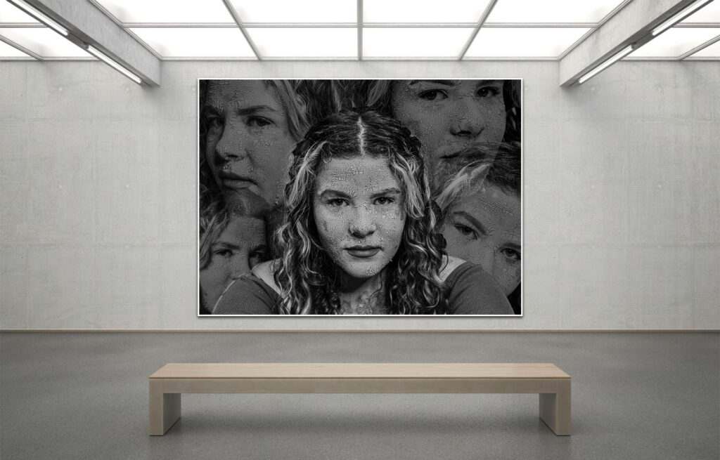
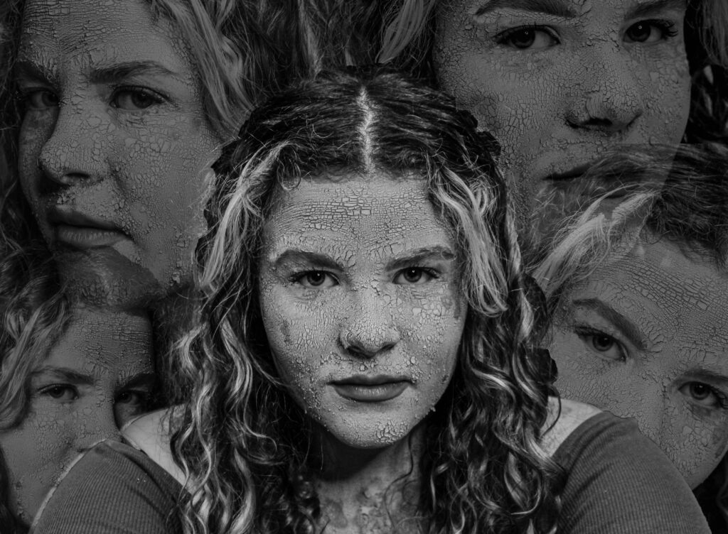
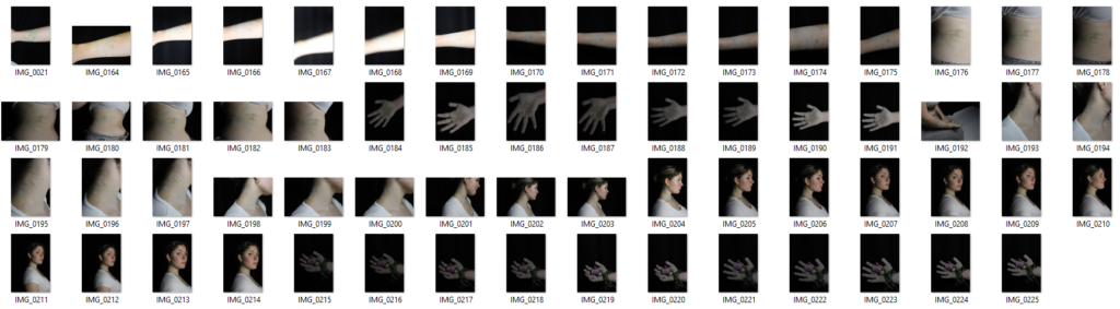
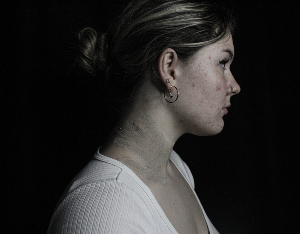
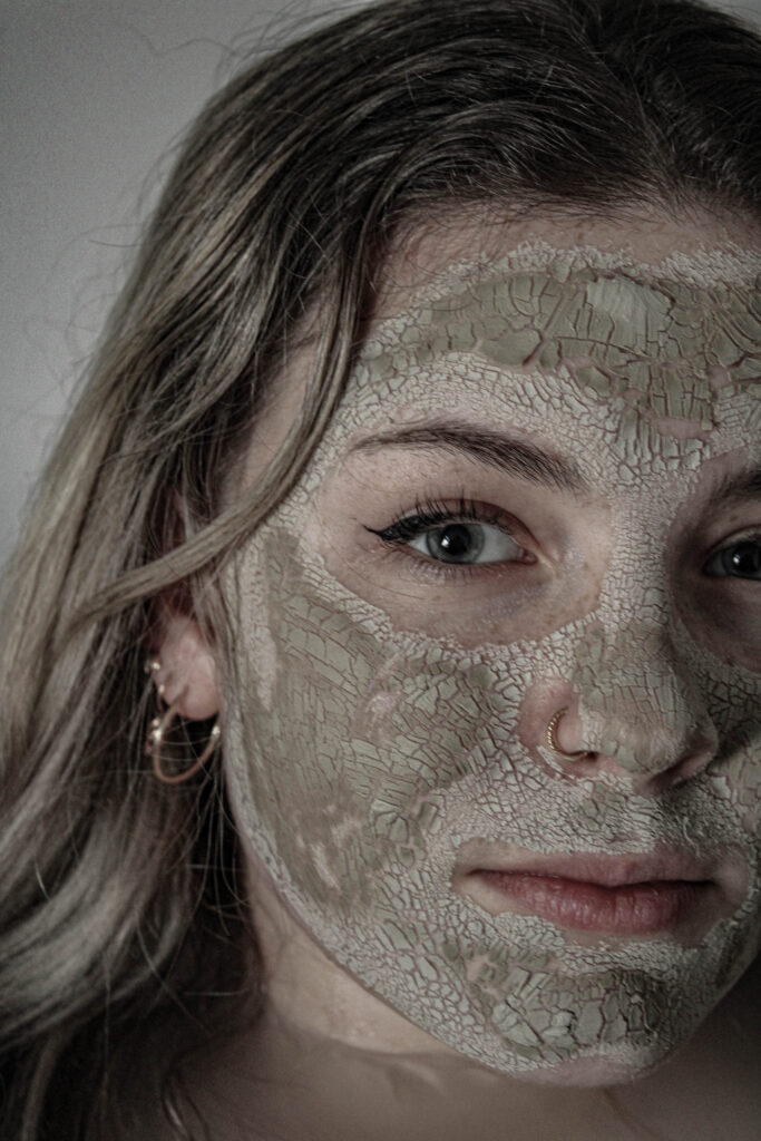
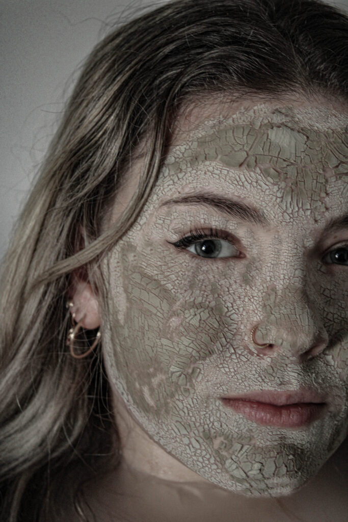
Im very pleased with the final outcome for both of these images. the image on the left is from my first photoshoot where I took a few of the portraits and editing them to be surrounding the model. One of the things that I believe makes it such an impactful image is due to the amount of detail on the models face. With the makeup that I used I realised it looked the best under studio harsh lighting it extenuated the cracks on her face and helped portray this decaying and weathered look which I was seeking. Additionally the image right is from my fifth photoshoot where I was inspired by a movement on social media from 2020 for “denim day” for sexual assault victims. This image stands out to me for multiple reasons one being that photoshoot as a whole was quite different compared to my other photoshoots. I believe this image to be so impactful due to the fact I am showing more of a physical representation of trauma.
A sentence– I’m focusing on the male gaze and showing how the male gaze is destroying women.
A paragraph– I’m centring my project around the male gaze which is the idea of men objectifying women for their visual pleasure. However I want to show how it actually effects women as in society we often get told the the male gaze is wrong but no one talks enough about why it still happens; how it effects women emotionally.
Design
For my photobook, I will be taking lots of inspiration from Anna Gaskell’s photobook which she was inspired by, and used references to Lewis Carroll’s Alice in Wonderland and 1970s horror films All About Eve and Carrie. However, I will make it my own, and decisions surrounding small details will be influenced by what I believe looks and feels best for my project.
I want to consider the following…
Paper and ink- I am planning on using premium lustre for paper type as I believe it will help extenuate the textures within my photos due to it being glossy. For me, what works best as the key aspects of my project are centred around texture. Additionally, this book will be using both colour and black and white, which the glossy premium lustre paper will compliment. Formatting and size- I am planning on displaying my book as “small square” (18 x 18cm). I have done this because I’ve used a mixture of portrait and landscape images within my project but my more powerful and impactful images tend to be landscape. Therefore, by using square, I believe it will make it easier and more effective when I create double-page spreads, but it will still accommodate and compliment my images, which are portraits. Something important for me is not going too much over 30 pages this is because I feel the longer my book ends up, the more repetitive and boring it will start to appear due to the photoshoot being very similar in style.
Title- In regards to the title of my book, I would like to choose something poetic that still has that clear link and clue to what my book is about, as my project as a whole is more abstract.
Narrative- For me, the way I present (in terms of the order, etc) my images is important. A key part of my book is having the book get darker and darker the further in you get to try and represent life being drained out of someone due to objectification and the psychological effects it brings.
Design- when designing my book, I would like to use a variety of different layout designs, including a double-page spread. For the last picture presented in my book, I am planning on using a double-page spread. In an attempt to heighten the photo’s visual presence and create a more impactful impression.
To what extent have cindy sherman and Claude Cahun explored the male (photographic) gaze in their work?
“In their traditional exhibitionist role women are simultaneously looked at and displayed with their appearance coded for strong visual and erotic impact so that they can be said to connote to-be-looked-at-ness”
-Laura Mulvey
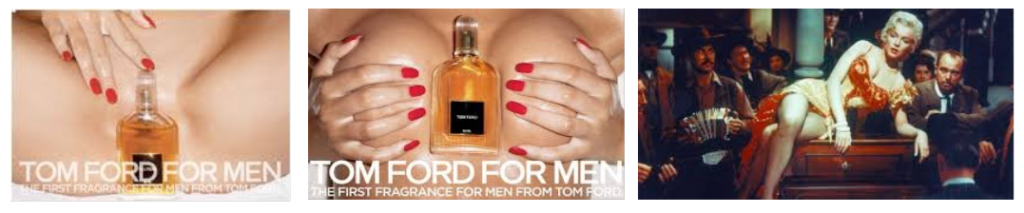
The male gaze. The term the male gaze is referring to Laura Mulvey’s feminist theory where she discussed how women are seen as objects for men’s visual pleasure. This is present within society however it is magnified through the media. A prominent example of it would have to be Marilyn Monroe specifically in River Of No Return from 1954 where the first few shots of her in the saloon focus purely on her body and then her seductively resting on the piano. Similarly, Tom Ford’s advertisement for their first male fragrance in 2007 featured a woman’s bare chest with a perfume bottle in between her cleavage and another with a perfume bottle placed in front of her groin. Its clear that the male gaze has been evident and used for many years and has not appeared to stop.
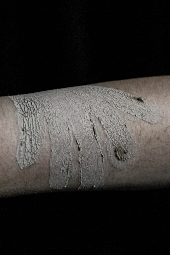
However, artists like Claude Cahun and Cindy Sherman challenge these harmful stereotypes and portray a different perspective of the female experience. Cindy Sherman focused on identity, gender roles, and stereotypes. Similarly, Claude Cahun questioned identity and gender but they used aspects of surrealism in their work. I believe that their work and their message are still important, relevant, and still needed. I am exploring similar themes within my own work as I believe it is important to highlight the issue of the male gaze. I’m planning on showing this by creating cracked effect for the models faces. I want to use some of the usual conventions similar to what Cindy Sherman created however by creating this cracked makeup on my models face I’m hoping it can show her she is breaking from within and the objectification she’s facing is ultimately breaking her.
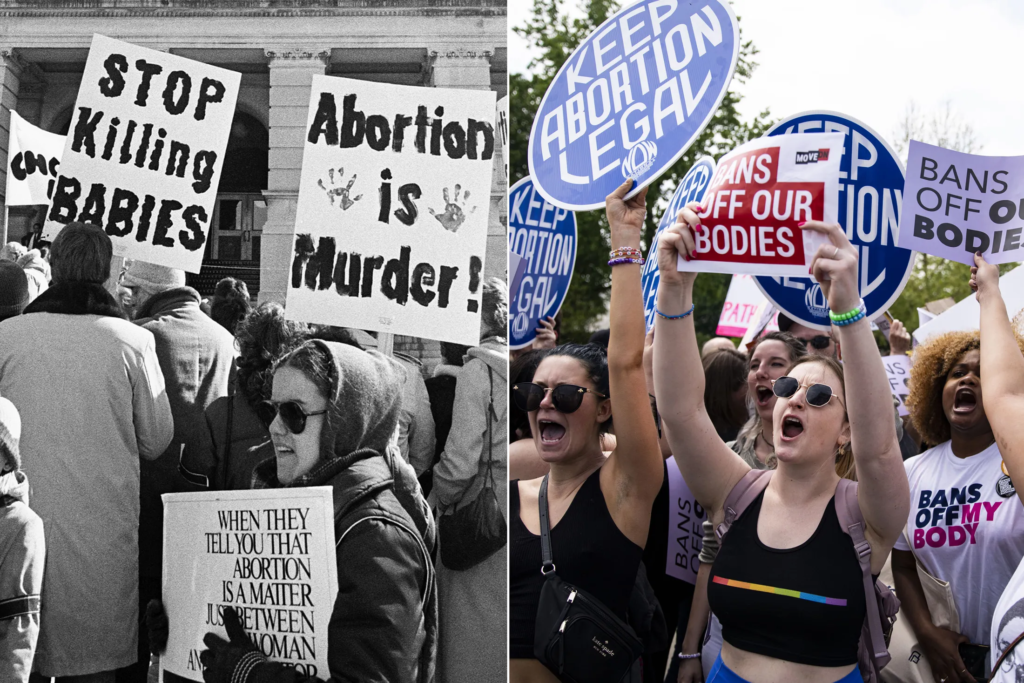
I believe feminism is such an important topic as the patriarchy affects everyone in society. Feminism tends to have a bad stigma around it which could be due to the lack of education around real feminism. Society has tainted the message of feminism many people think it centred around wanting women to be superior to men which is not the case. The first feminist movement (which can be considered the first wave of feminism) took place during the 19th and early 20th centuries. It was centred around women’s suffrage and giving more opportunities to women as during that time women were seen as inferior to men, they weren’t able to have their bank accounts, they weren’t allowed to vote even after that law was lifted the only women who were married could vote as well as women of colour were still unable to vote whether they were married or not. There have now been around seven waves of feminism each one carrying on the previous message but improving it through new ways. For example, the main difference between third and fourth-wave feminism is fourth wave wants to focus more on technology and social media so spreading your knowledge and fighting through social media. However, very recently it appears that as a society we seem to be back peddling as of January 20th, 2025 Donald Trump is president of America once again and has been vocal about his opinion surrounding abortion rights. Women finally got the right to have control over what happens to their bodily autonomy in 1973. However, since President Trump has been elected people are scared that once again we will have these rights stripped away from us.
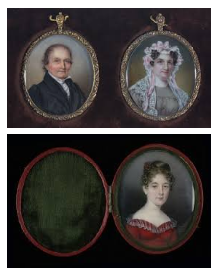
Due to this, we may see a resurgence in feminist art. It is said that feminist art started in the late 1960’s to the 70’s it was created to highlight and display the inequalities and the challenges that women were having to face at the time. Art was originally a male-dominated area as historically women were supposed to be caregivers, mothers, etc… Women didn’t often get the chance to attend art schools as men did. They also were not allowed to partake in more taboo styles of art like nude portraits as it was deemed inappropriate for women. In order for women to be able to create art they often had to be wealthy and get taught by other male family members. A great example of this would be Anna Claypoole both Anna and her sister were the first women elected academicians of the Pennsylvania Academy of the Fine Arts.
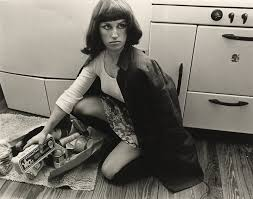
A photographer who was renowned for their work centred around feminism and the male gaze would be Cindy Sherman. She rose to fame during the mid to late 1970’s with her “Untitled Film Stills” where she produced 70 black and white stills centred around her portraying these different characters. She produced a depiction of a working woman, a housewife, etc… This can be linked to Judith Butler’s ideas of Gender performativity where she discusses how gender is based on repetition and rituals within society. The idea that gender is not fixed but is unstable and the notion of gender that gets pushed on people during infancy is in fact a myth. Similarly, Cindy Sherman discusses how she took inspiration for her work from the phrase “male gaze” as she felt that the media only portrayed women from a heterosexual viewpoint and it tended to reduce women to being objects. You can see how this impacted her work as she tried to challenge these gender-driven stereotypes by not romanticizing or glorifying them and instead exposing them. She does this very successfully, her images tend to be quite simple and she is always the model which I believe makes it more effective as she always has the same quite flat and unreadable expression on her face in all the photographs making them appear a lot more superficial as you can not tell how the model/women within the image is feeling. I also think by Cindy Sherman being both the model and the photographer for her pictures I believe makes them more impactful as she has all the power in the situation, she isn’t affected by the male gaze which will often occur subconsciously or not because it is so heavily ingrained into society but because she can control every aspect she tried to prevent that.
For example, in image no. 10, Cindy is playing the ‘role’ of a traditional 20th century housewife. She is depicted crouching on the kitchen floor alongside a broken, spilled shopping bag. What Sherman achieves through this comment on female stereotypes is nothing less than protesting the traditional roles of women in that time period. Women in this era were restricted and categorized to act and be a certain way; cooking and cleaning for the kids and husband, and overall being the invisible ‘caretaker’ to what would’ve been an ungrateful family. This concept is solidified in her lack of direct address, her melancholic, distant gaze leaves the audience questioning her real personality; who she is behind the ‘role’ of a housewife. Visually you can tell she was inspired by the 20th century from her outfit to her hair and makeup which is effective for creating the atmosphere of the role she is meant to play as being a housewife was one of the only roles for women during the 20th century until a little later when the suffragette movement started to grow and women started to get into more occupation fields but it was only around 20% of all women at the time who were working.
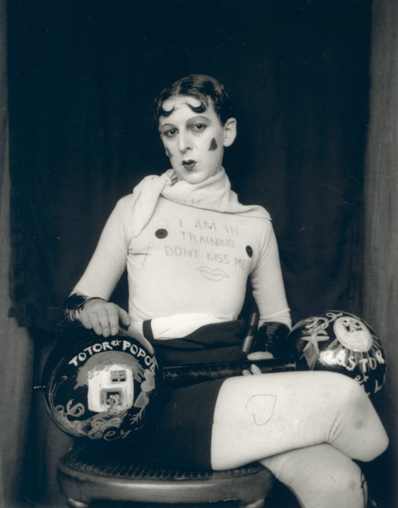
Similarly, Claude Cahun is a great example of an artist who challenges harmful stereotypes and creates thought-provoking feminist photography. Even before creating they started to explore art and photography Cahun started to push the boundaries with feminism and gender during their childhood Claude Cahun delved into the idea of being non-binary and going by they/them pronouns which clearly influences their work today through their differing characters some presenting more masculine some more feminine. They tended to focus on gender and more specifically the fluidity of gender. Claude Chaun’s work is contradictory to Cindy Sherman’s work focuses on the stereotypes to challenge them instead Claude Cahun uses elaborate props and fashion to convey new a different ideas about gender. It is evident within their work that they stray far away from the male gaze all of their work appears to be quite androgynous and doesn’t fit the beauty standard. However, like Cindy Sherman all of Claude’s work are self-portraits so they’re taking away the power from the audience by being in control.
For instance, the image ‘I am in training don’t kiss me’ holds the title as one of Cahun’s most famous pieces of work. In the picture they have short hair, evident in how Claude makes a point of distancing herself from the male gaze and alongside it, the stereotype that women must have thick, long hair in order to be deemed attractive by society. Similarly Cahun appears to be holding a pantomime barbell which continues to challenge stereotypes as its often said that women should be dainty and delicate and not strong, powerful and capable to do the same things as men. Additionally, Claude’s facial expression holds power and significance. Specifically, in the direct address to the audience, Cahun comes across as very intimidating and, as a result, holds power over the viewer, positioning herself at a higher status. In addition, they wrote the title of the picture on their shirt which emphasises their message of “don’t kiss me” demonstrating that they don’t want to be sexualized through her photo.
Ultimately, both Claude Cahun and Cindy Sherman have created incredible work which pushed against boundaries, challenged stereotypes, and helped advocate for change. Claude Cahun has effectively helped push the boundaries of gender and gender performativity, and Cindy Sherman challenged the harmful stereotypes which often suppress women. An aspect of both of their work that I am interested in exploring is their use of facial expressions in their photos. Both Cindy Sherman and Claude Cahun use quite deadpan facial expressions however, unlike Cindy Sherman, Claude Cahun uses direct address, which I find comes off as very powerful and demanding, so I would like to experiment with that within my work.
I’ve decided to do more of an experimental edit. I want to try and create a chaotic feeling.
to create this I have used a image of the model where she is looking directly at the camera and in the middle of the shot. Then I’ve taken some of the other photos where she is looking in different directions and cut them out of their photo and added them to this one. I also realised that I would need to do the same to the original photo otherwise it would be covered by all the others surrounding it.
I found that the image looked a lot better with the surrounding photos with lowered capacity as I wanted the main/middle version of the model to be the one that stands out. Then all I needed to do was add the resat of the images and arrange around the image.
Photoshoot 2- experimenting
Binary opposites its referring to the idea of having two things that are vastly different and contrasting for example light and dark. So for my work I liked having the beauty from the model but also the natural aspects from the rocks which contrasted the man made structures behind.
I experimented with these photos by using AI. I tried to edit the background and replacing it with something new and more stereotypically pretty the first image I used one of my own photos and placed in behind the rocks whereas for the second two images I used AI.
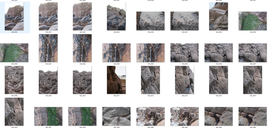
For this photoshoot I went into the studio, as I felt like my photobook would need some other images to add contrast; this is because most of my photos are portraits so by adding these additional filler images it will make my book appear less repetitive and more engaging.
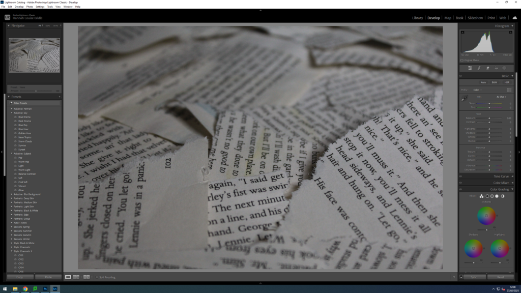
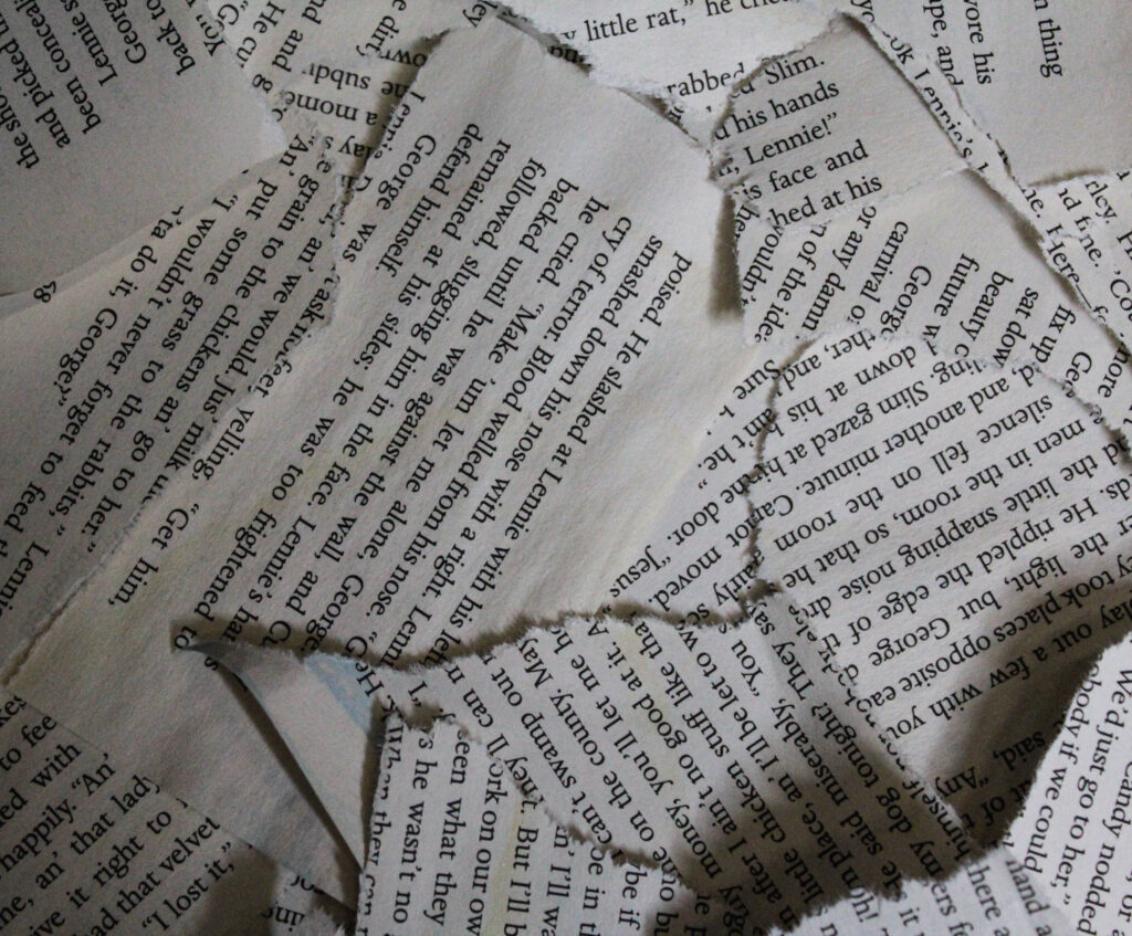
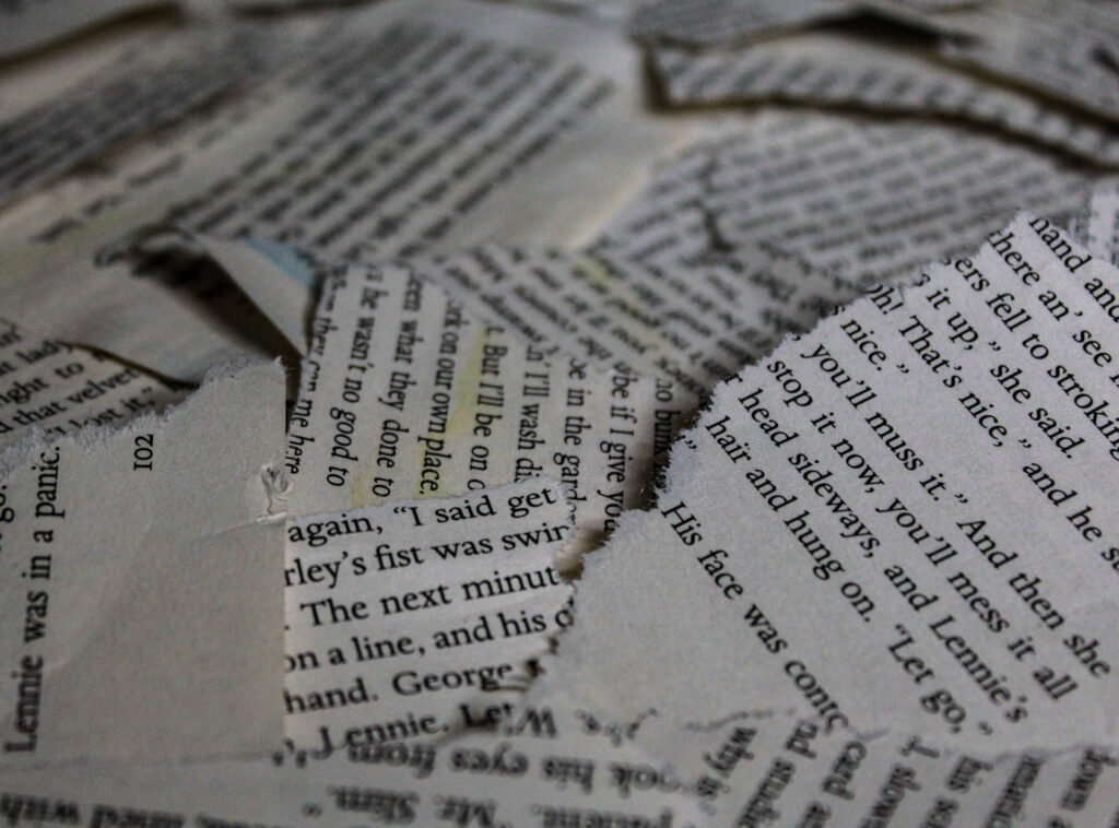
I chose to use some ripped-up book pages and a piece of card with the face mask to create a cracked look on the model’s face. I did this to try and symbolise destruction and loss, just like I did with the models; to amplify and carry on with the ‘narrative’ that I am trying to tell whilst also using an alternative and more abstract way of showing destress, vulnerability etc…
Contact Sheet 1
Contact Sheet 2
Editing
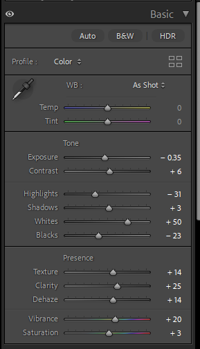
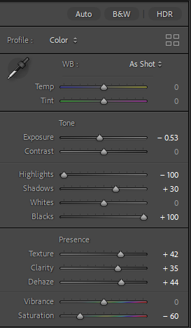
The editing for these photoshoots was rather simple and fairly similar. The main aspects that I wanted to enhance and change was the highlights ,shadows, blacks and whites. I found this works best as it makes the image look sharper, the edges of the paper are a lot more emphasised this way. However, I did decrease the saturation slightly as a key aspect of my book I wanted was the further into the book you got the more desaturated it gets.
Similarly with the other set of photos I adjusted the whites, blacks etc… However, with some of the picture of the rocks you could see the sky and more of the background compared to the other photoshoot. This meant that I had to adjust the brightness for the background using the masking tool.
Final Images
Final Images
Evaluation
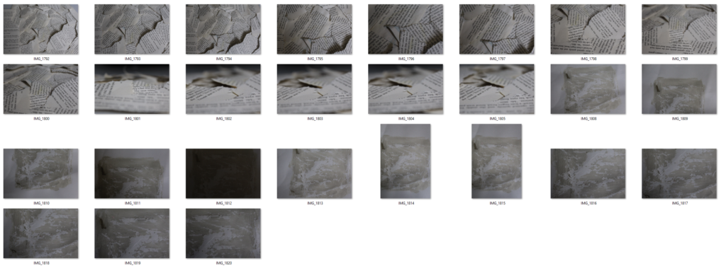
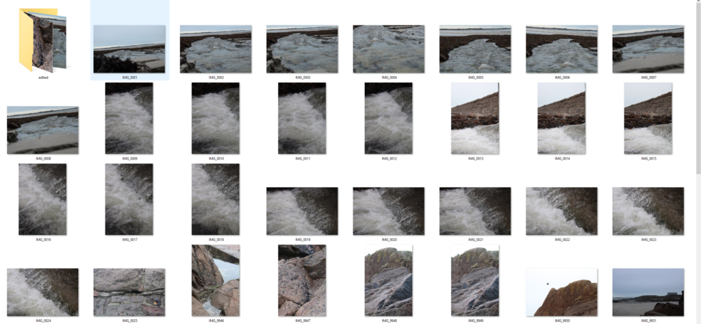
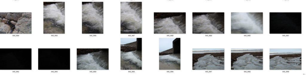
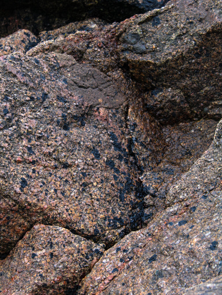
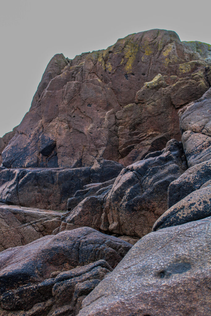
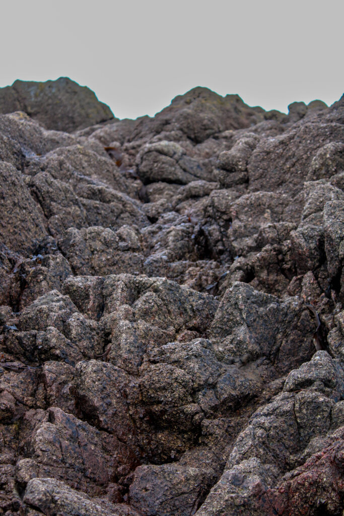
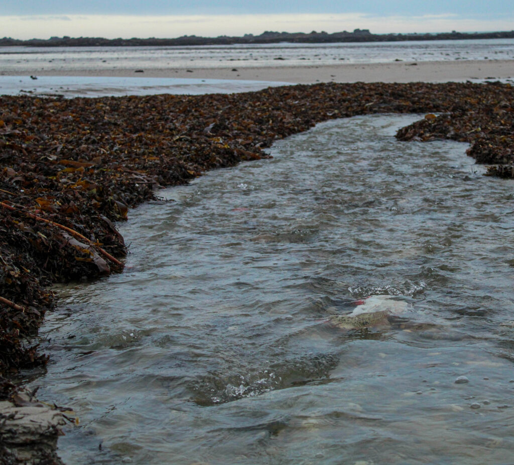
Overall, I’m quite happy with the pictures of the rocks because some of them were close-ups, meaning you can see many details in the different colours and textures. This is going to be very useful in my photobook as it’s adding a lot more variety. I also find that they link and can be related to the cracked ‘skin’ that I used on the models. However, for the picture of the water I wish I had used a faster shutter speed in order to get a clearer image of the water running as the ones I got came out slightly blurry due to the speed of the water and the lower shutter speed which I used.Similarly, I’m happy with how the book pages and the piece of card turned out. I tried to get multiple different angles when photographing the book pages, experimenting to see if I could create more depth within the photos. Which I think I successfully achieved by taking some of the photos from a lower angle additionally by using the lower angle it reveals more layers and textures which you couldn’t see from the higher, birds eye view which I also used.
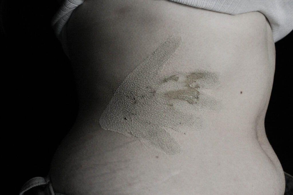
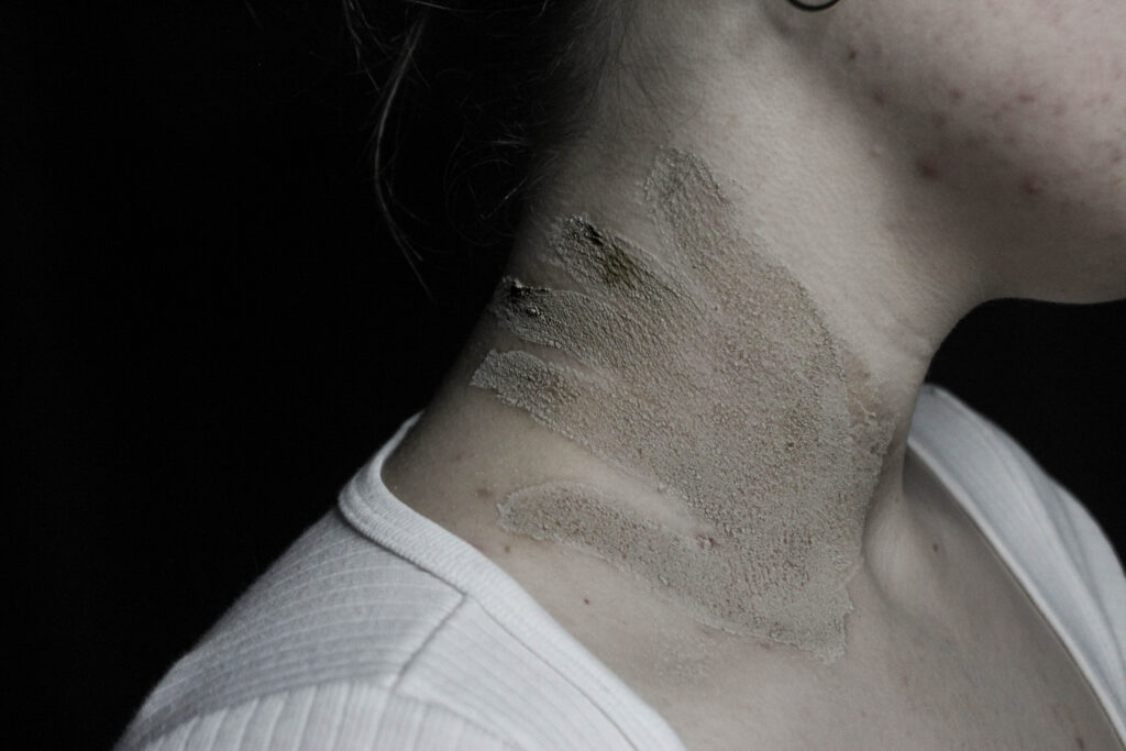
For this photoshoot I wanted to focus specifically on sexual assault and harassment. I did this through creating handprints on the model. This was actually inspired by a movement originating in 2020 where sexual assault victims would paint a red handprint on their body where they were touched without consent and share their story/experience as a part of the hashtag ‘DenimDay’.
Contact Sheet
Editing
When editing something I wanted to focus on and emphasise was the darkness of the photos. I knew I wanted to place these images towards to back of my book which is where the more dramatically lit and intense photos would be found. This meant that I had to increase contrast, blacks and shadows in the photo however by just doing that it lost a lot of the details so I then increased the high and highlands to help make sharper lines.
Final Images
Evaluation
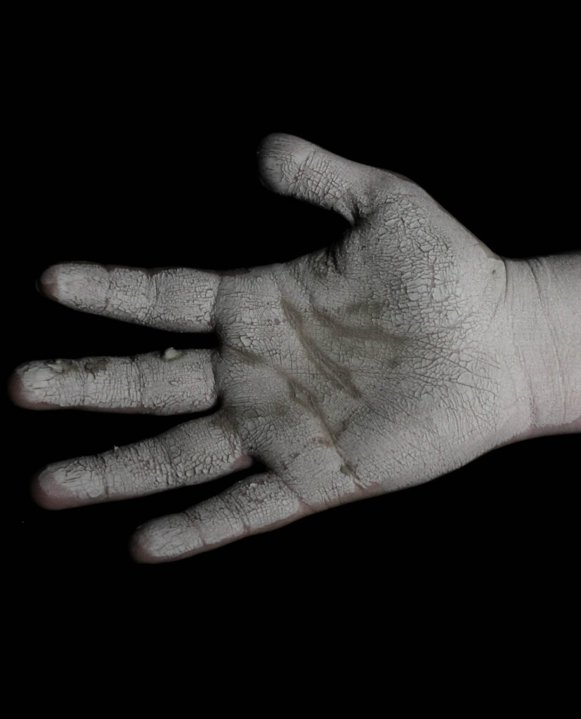
I’m extremely pleased with how this photoshoot came out. From a technical point of view potentially they could have been better by increasing the exposure in order to brighten up the picture. However, by doing that I felt it lost part of the intensity of the photo. The picture of the hand with the aged rose I think is my favorite from this shoot I used the rose to try and symbolise how objectification doesn’t only affect you internally but can start to manifest and affect other aspects of your life in the way you see things or interact with things.
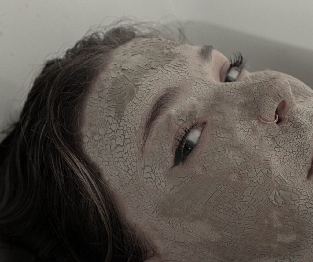
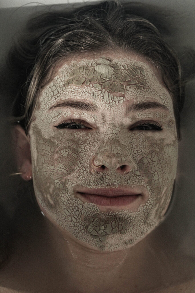
For this photoshoot, I took inspiration from milk baths. I wanted to do this because they often represent purity and tranquillity. I try to create a similar effect in all my photoshoots by having this contrasting meaning of the broken and dispirited. I will use makeup to give texture to the model’s face, and then either the clothes I put the model in or, in this case, the background suggests concepts such as purity. I like adding these calming and dreamy aspects the pictures to emphasise the damage being done.
Contact Sheet
Editing
For these images when editing the one thing I do like to pay attention to and focus on would be the texture. For the concept of the story I’m trying to tell the cracking of the model’s face is a key component. Therefore, I like to make sure it’s as effective as possible. To emphaise this the key things I like to do is increase the contrast, shadows, highlights, and texture. I’ve found that increasing the shadows and highlights significantly amplifies both depth and details which is what I want.
Final Images
Evaluation
Overall, I’m not too happy with how the photo shoot came out I think I would have worked better using a bigger bathtub to have more space but I had to work with what I had access to. However, I do like the photo from the side angle where it focuses closer up to the model’s face I think it’s a little bit different compared to my other photos where they were all full face shots. I think what I could have done during the photo shoot to improve would have been to give my model more direction in terms of facial expressions and posing as I do like the photo where the model appears to be slowly submerging into the water facing straight towards to camera however I believe it would have worked much better if she had more of a deadpan facial expression.
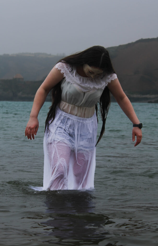
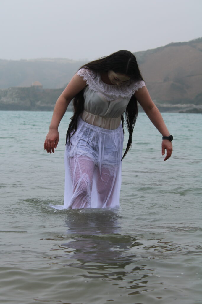
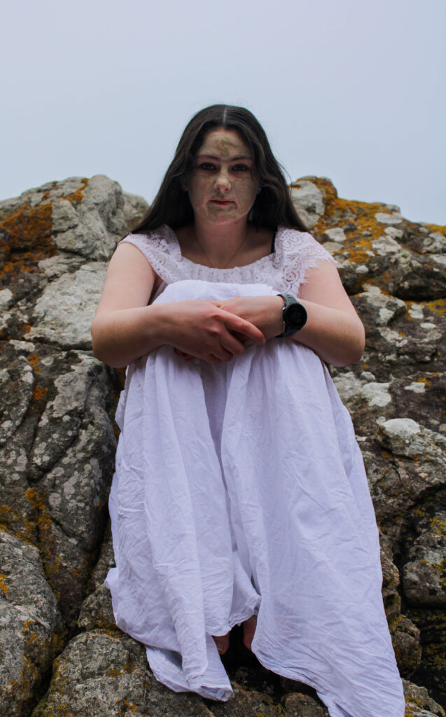
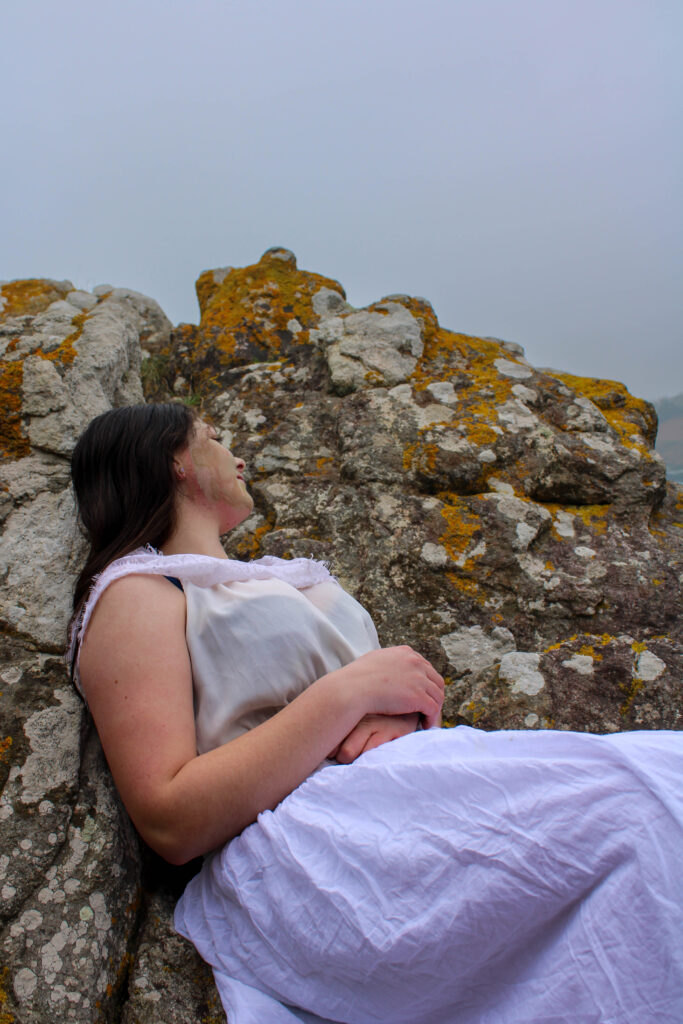
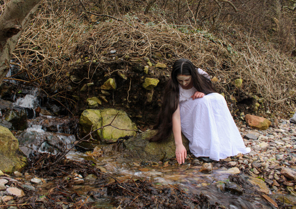
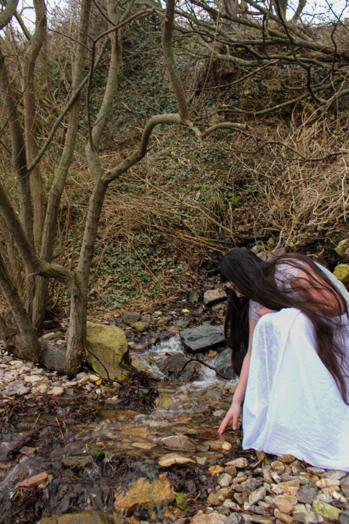
For this photoshoot I went to Bon Qui this is because this location contains many different sections within it. This means I am able to go to the woodland area, rocky area and then the sea and have everything look more cohesive as variables like lighting will be the same due to the fact the photos will be taken within a short time frame. Similarly to my other photoshoots i will be using the Aztec face mask to create the cracking effect on my models face.
Contact sheet
Editing process
For this photoshoot I wanted to make the picture appear darker and have higher contrast levels. However when trying to achieve that it make the model appear too dark. Therefore, I used the mask tool in order to separate the model and the background so that I could darken the background without effecting her. By doing this i was able to create this eerie effect to the image.
Final images
Evaluation
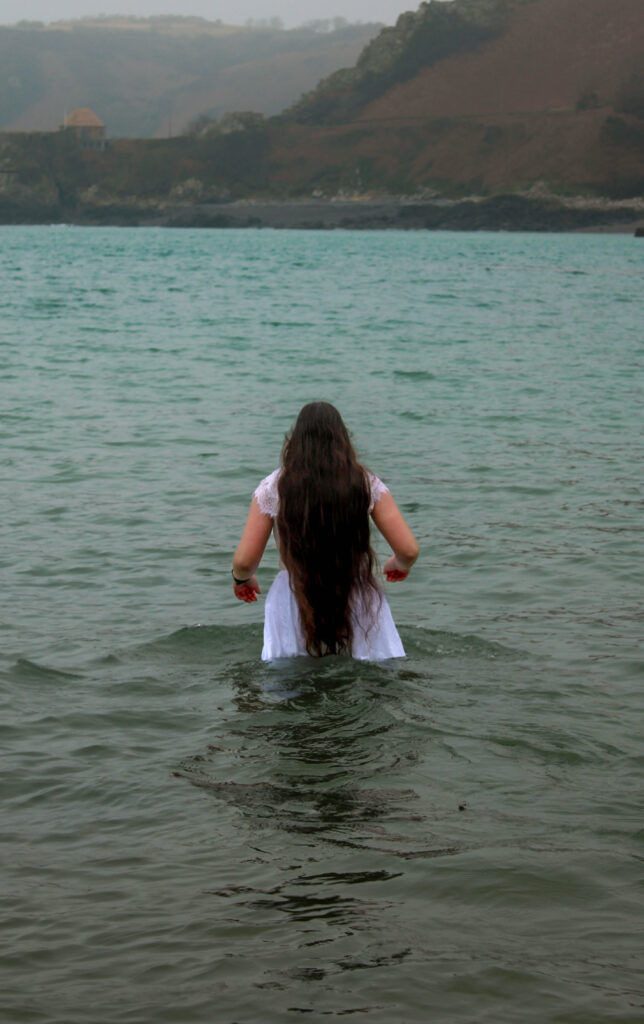
Overall I’m pleased with how this photoshoot came out. I wish that I had spent a little bit more time in order to properly frame each shot in order to try and achieve more symmetry through the shoot. I think the images of the model on the rocks came out very successful what helped was the models facial expression, she appeared to have quite a serious and sombre look on her face. Similarly, the clothes that I put the model in were appropriate and did an excellent job of helping portray the message of the model representing purity and perfection. I really like the photos of the model emerging out of the water I think efficiently demonstrate the concept of someone being washed away spiritually. Additionally, the image of her walking into the water I wanted to represent her losing her self.
For my project, I am focussing on the male gaze. However I’m not just going to show what that looks like, I want to show the effects it can have on women. I’m doing this because everyone’s heard about how objectification and the “male gaze” is wrong but that doesn’t seem to be enough. So hopefully by showing how being mistreated in that way can destroy someone from the inside the message will be more successful and impactful.
In order to show this, I’m planning on using makeup to show cracking on the model to try and symbolise her breaking down, I’ve kind of taken inspiration from percaline dolls and how they are an object and have cracked skin. so I’m trying to recreate that through the more woman are objectified the more the models starts to crack/break.
I’ve chosen this theme for the project because I feel these kinds of social issues are very relevant. One of the reasons for this is due to the recent US election where Donald Trump is now president once again and with this, he plans on banning abortions in the states. That action alone is starting to strip women of their rights. Although women now have a lot more rights compared to in the 1800’s it almost feels like we are taking a step back. Women are sexualized more than ever in the media.
I’m planning to present my work in a photo With that I find that presenting work in books tends to accentuate any flaws within the work. Therefore, I need to make sure I focus and take time considering my layout (rule of thirds, Fibonacci spiral). It will also be important to try and focus on lighting and weather this is because I wanted to do lots of photoshoots outside. Therefore different weather conditions will create very different vibes for the image.
I have a very specific way I would like to present/start the picture book. My first and last picture in the book will be from the same photoshoot to achieve a cyclical narrative style. I think this will be very effective for the storytelling of the projects and the contrast as you will be able to look back at the first page and see how much the model and changed and been destroyed as it may be subtle between each page but hopefully the change the first page compared to the last will be drastic.