All posts by George Blake

Filters

Author:
Category:

Studio lighting/Edits and Evaluation – George Blake

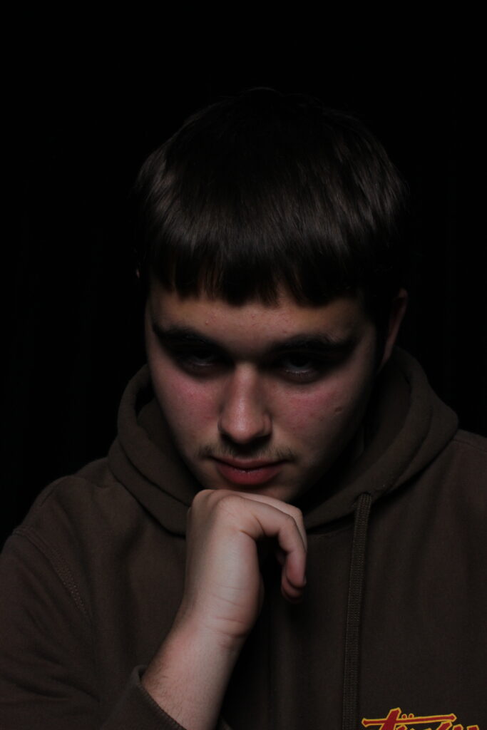
Rembrandt

For my Rembrandt shoot, I believe my photos could improve by more experimentation with the positioning of the light.

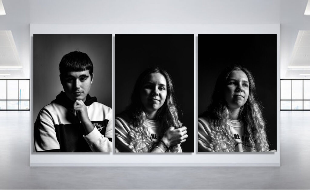
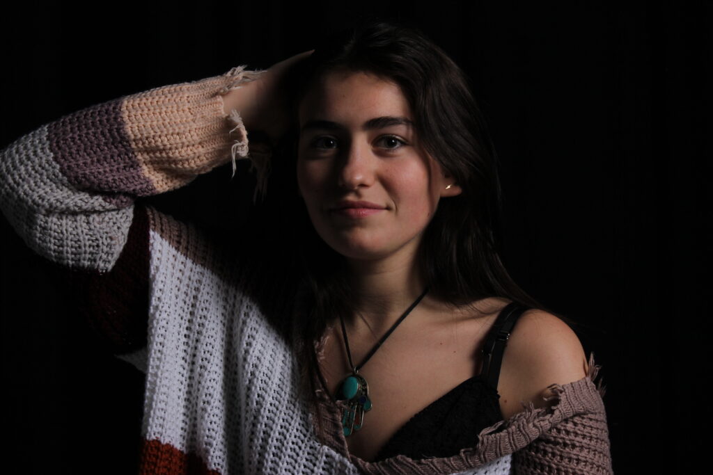
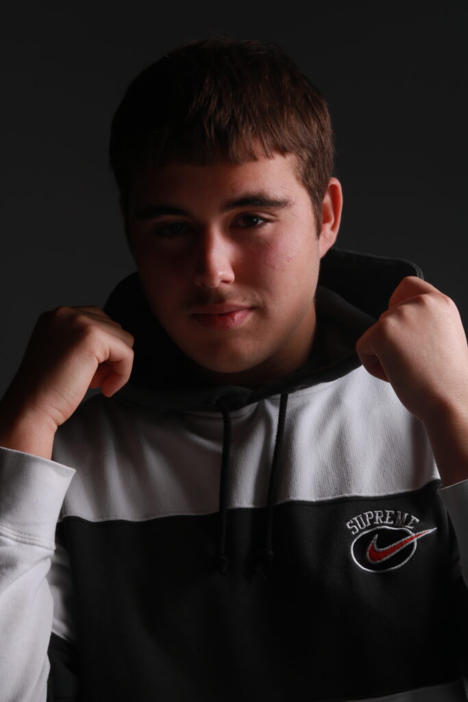
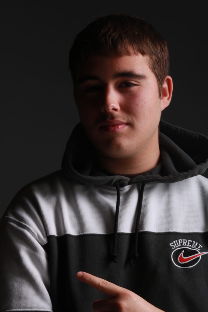
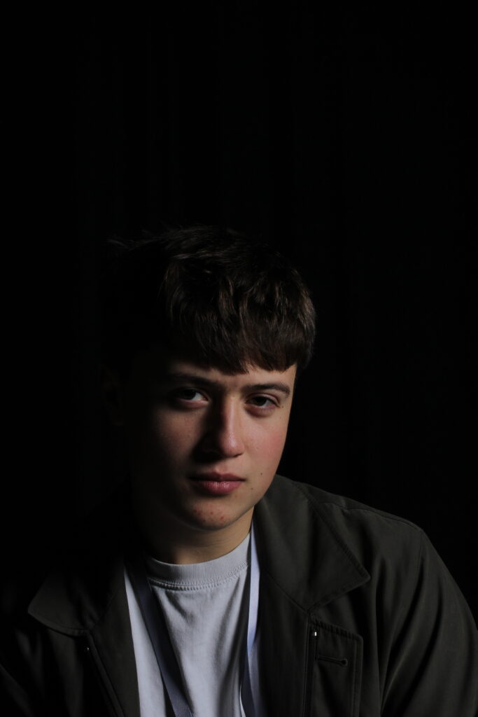
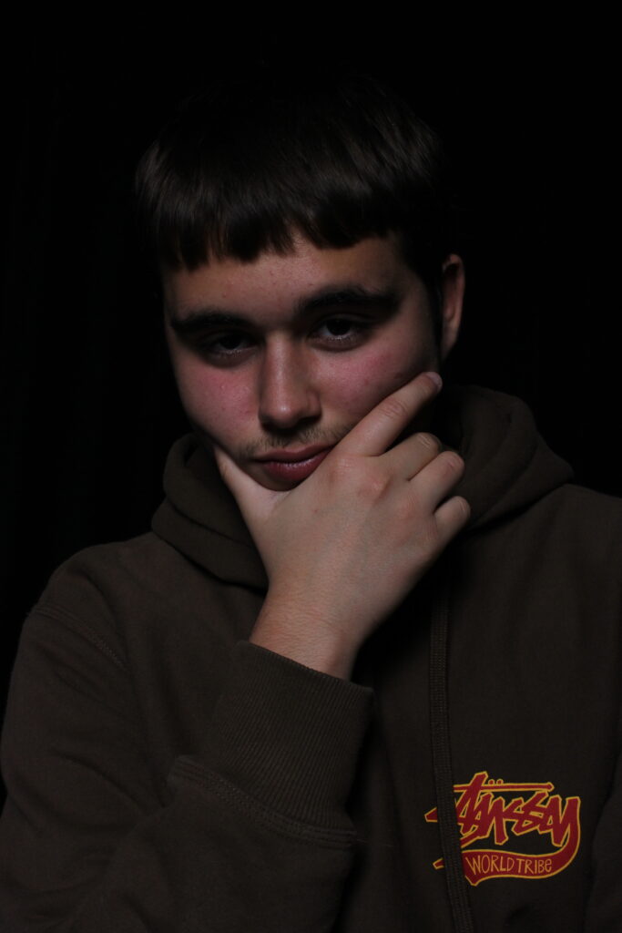
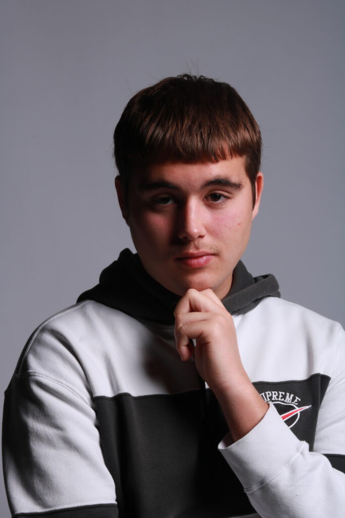
Out of the shoot, these where my best, with the recognisable light triangle on the cheek of the subject being the aim to be captured.

3 Best photos:

Edits:

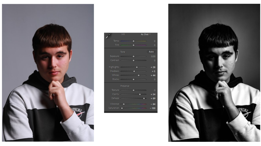
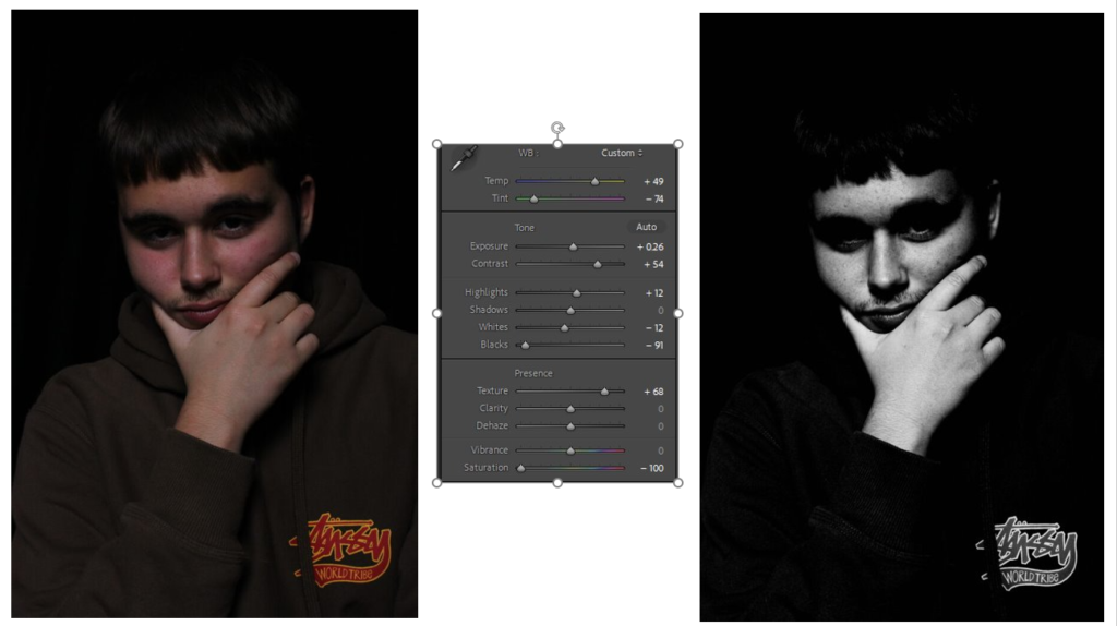
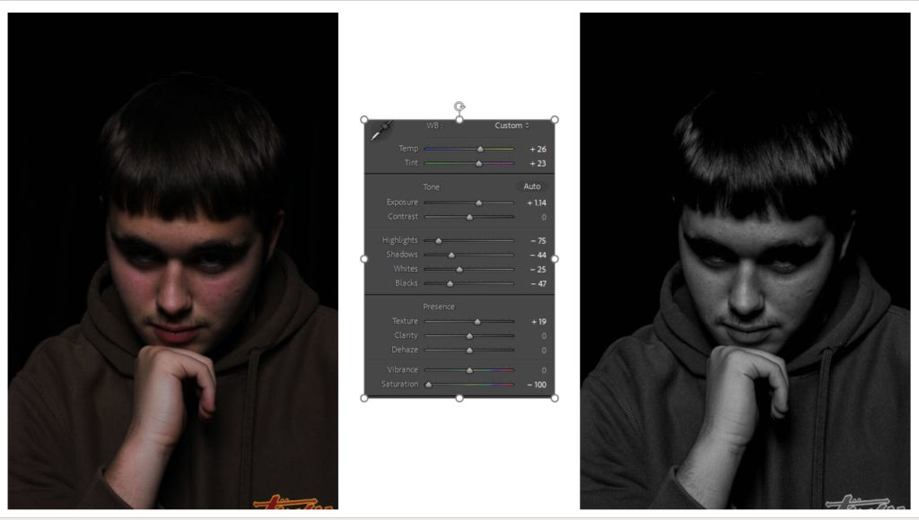
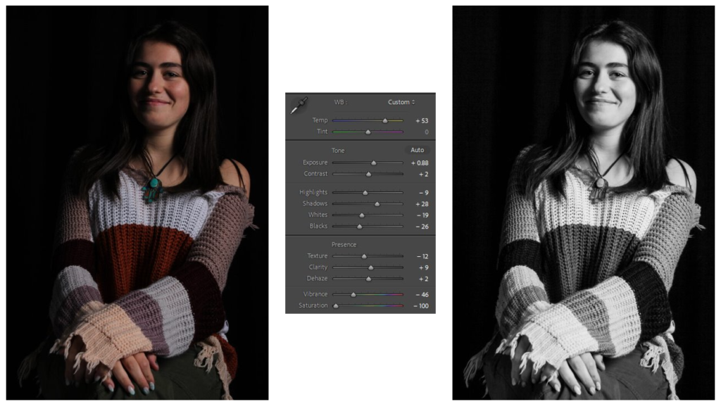
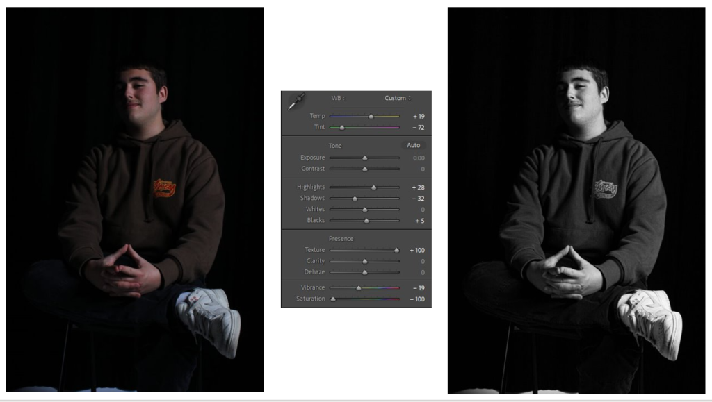
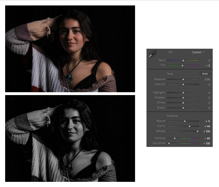
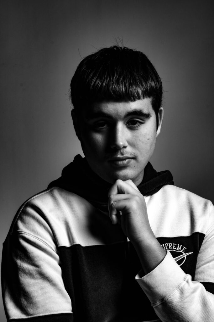
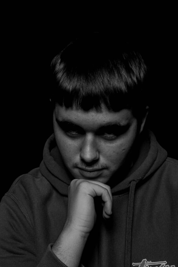
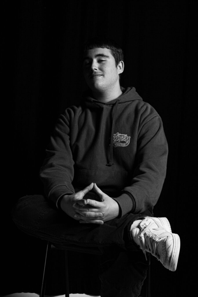
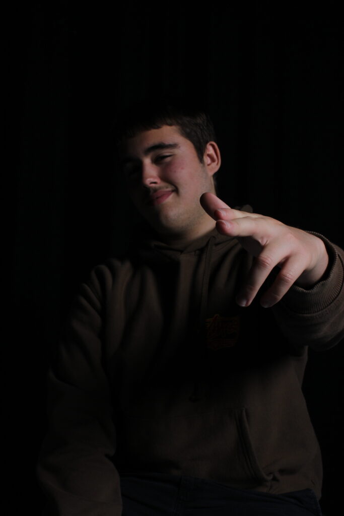
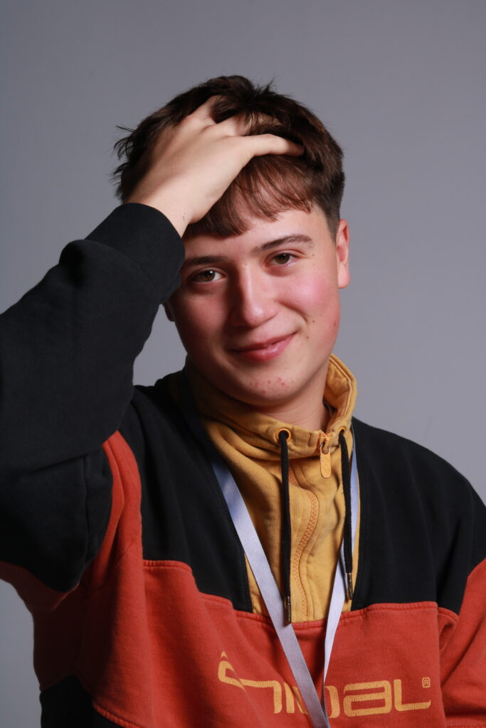
Creating a black and white effect it added more tone and contrast to the image. I liked these edits as by converting into a black and white image, its makes the subjects form look separate from the background, making this interesting 3D effect.

(Such as this one, the grey background separates with the contrast of his white and black hoodie. I Made this effect by altering with the saturation and adjusting different areas with the use of contrast, highlights and temperature).

(With this photo, I tried to lessen the highlights to make the light triangle more predominant, this, alongside with the use of some contrast it adds more depth and form to the image. By making the white higher it creates that strong lighting effect, ruminant of Rembrandts early use with portraits in Hollywood).

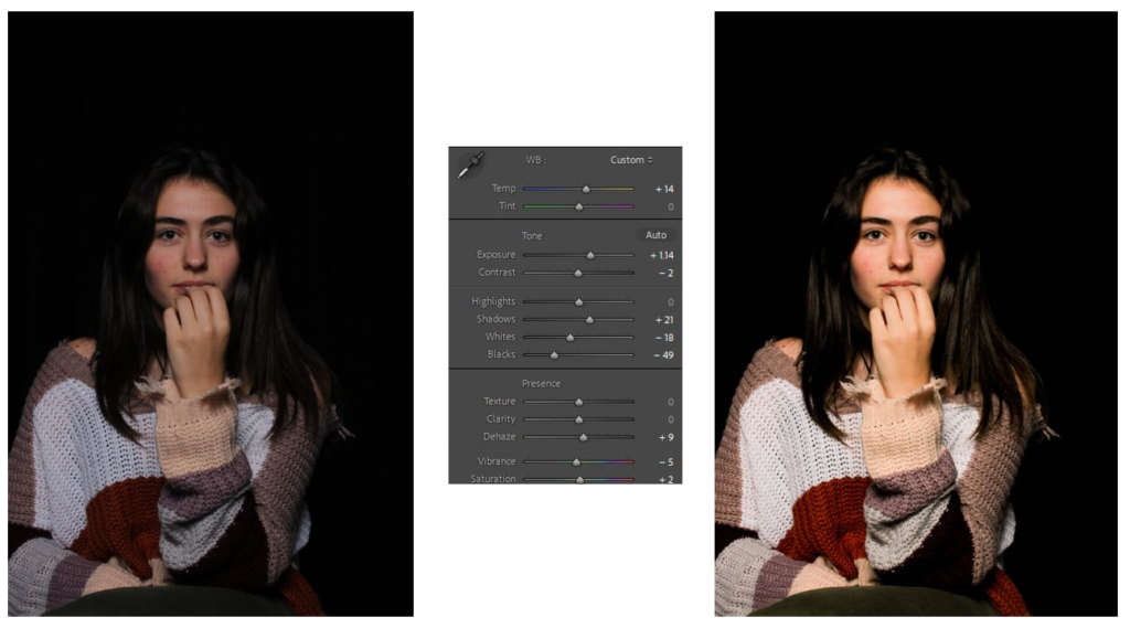
(Although the light triangle is more circular with its lines, I used texture, clarity and de hazing to create a dark toned portrait. Additionally by lowering the highlights and black aspects of the image, it allowed the bright parts of the image to create a tone shift of a different merge of shades).

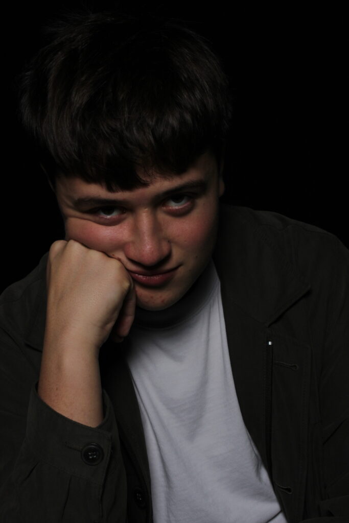
Butterfly –

3 best photos:

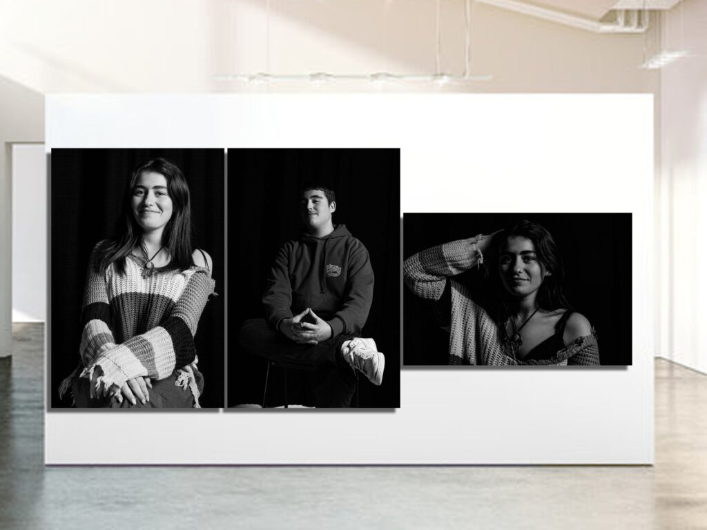
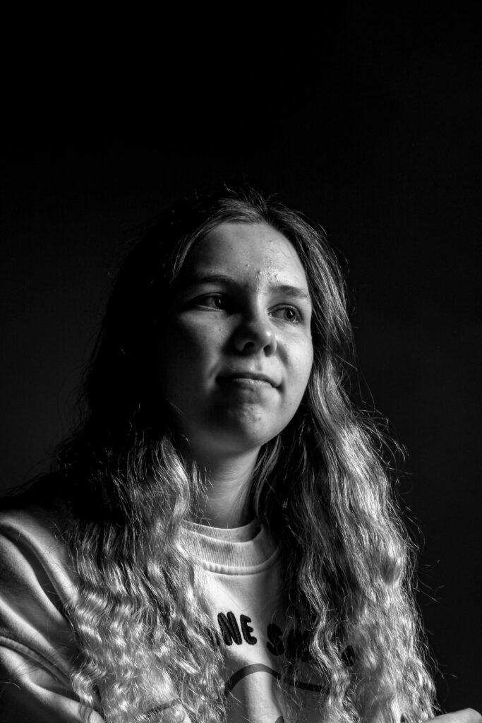
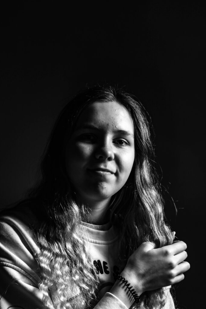
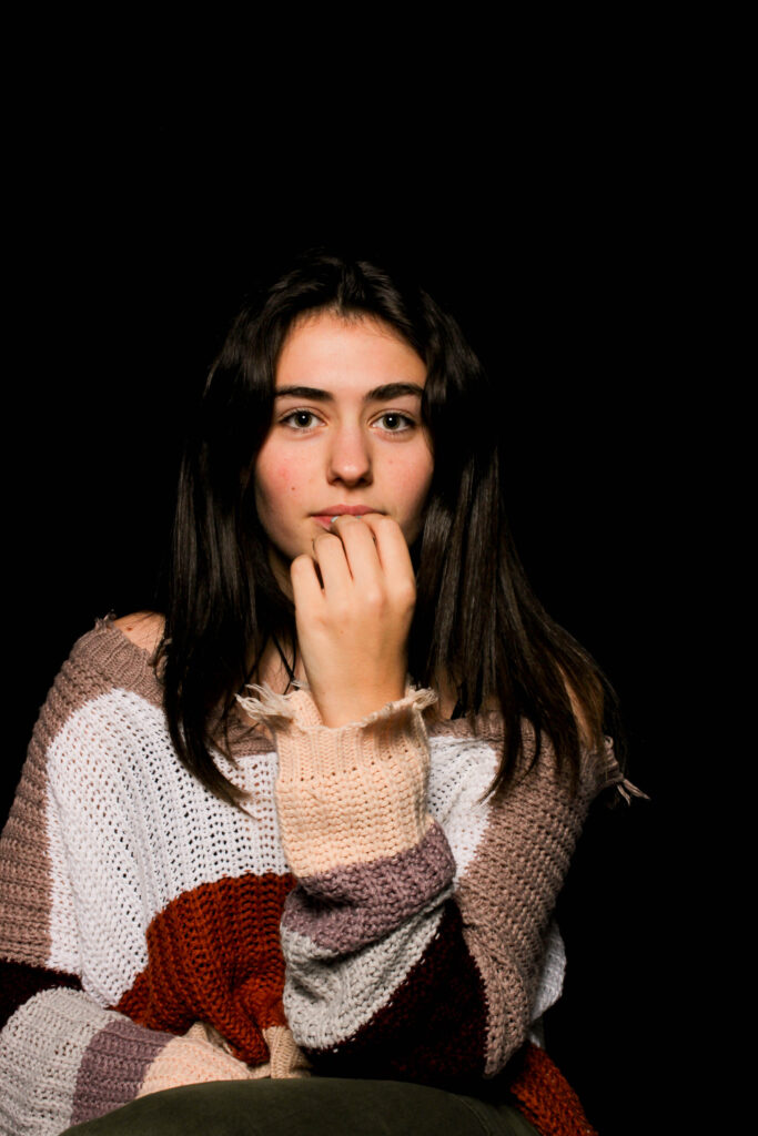
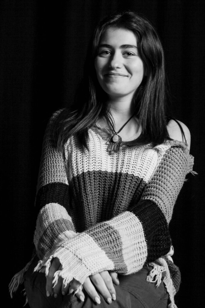
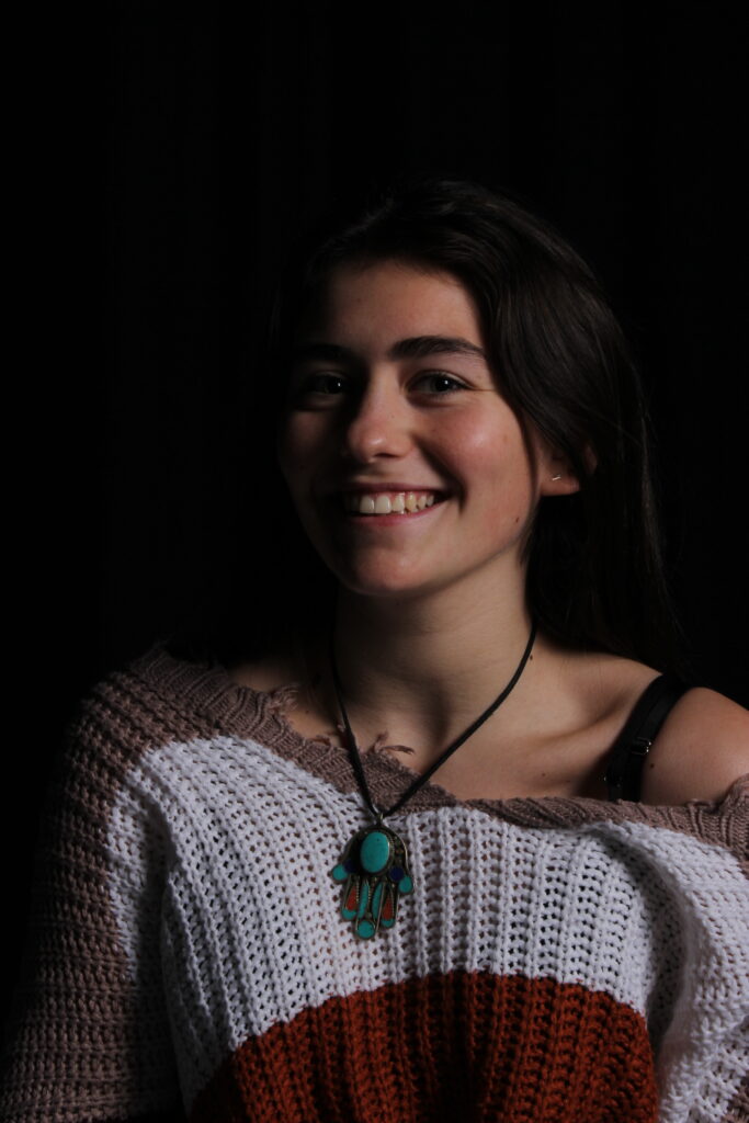
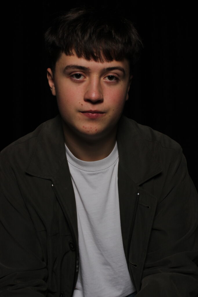
I like how these images created the recognisable ‘butterfly’ below the subjects noses, this alongside the use of shadows surrounding them, it creates an nice composition.

For next time, I will try and create more photos with this effect as I find it, Interesting to play around with.

Edits:

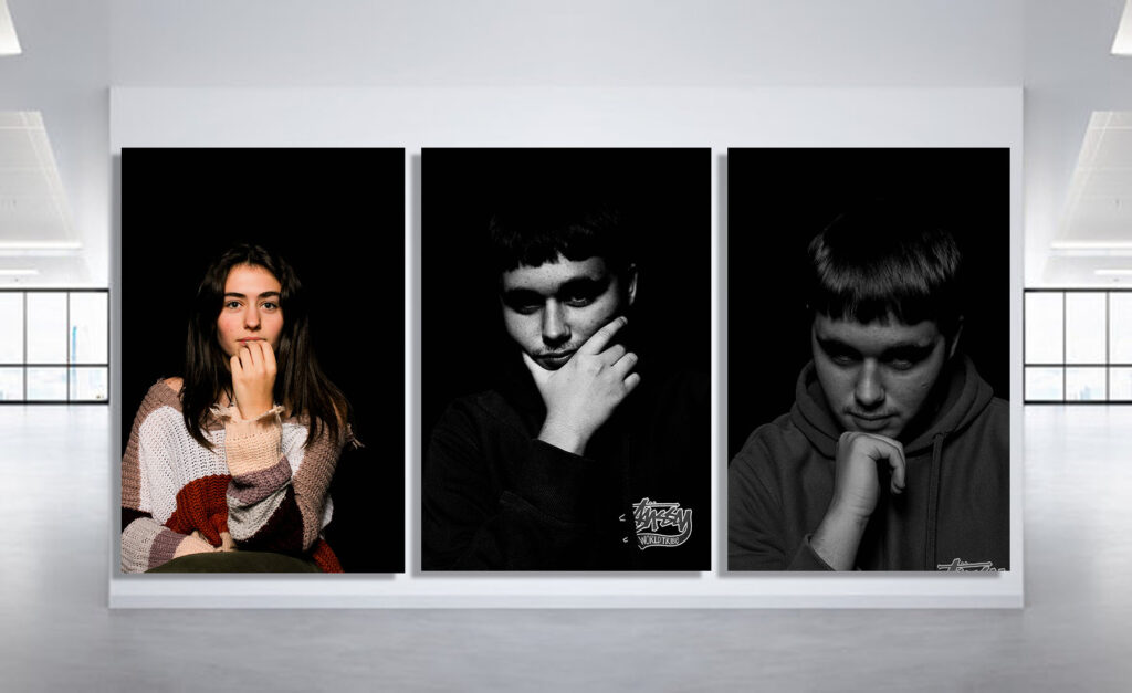
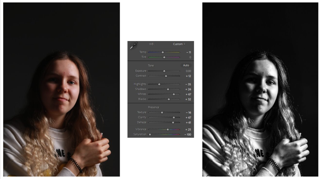
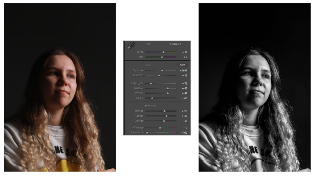
For my Butterfly edits, I altered with texture, shadows and highlights to create a very stark trio of photos.

(For this image, by lowering the saturation, altering the images temperature as-well as the texture it creates a gritty but cool effect on the subject. With a sort of 2D effect, it looks as if they where painted onto a black canvas).

(With some good shadows already present, I edited further by lowering them as-well as some other elements such as highlights and the whites and blacks to generate a more matte effect on the image).

(Going for a different style, away from greyscale, I tried to make the shadows more faded by decreasing the black, and increasing the exposure, this creates a more higher toned lighting effect).

Chiaroscuro –

3 best photos:

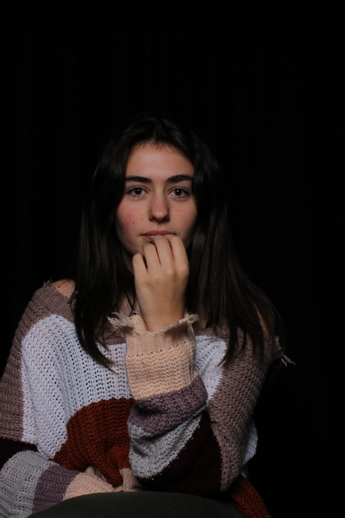
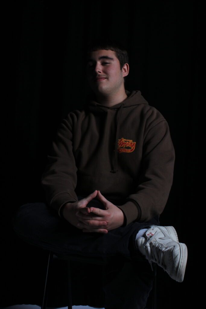
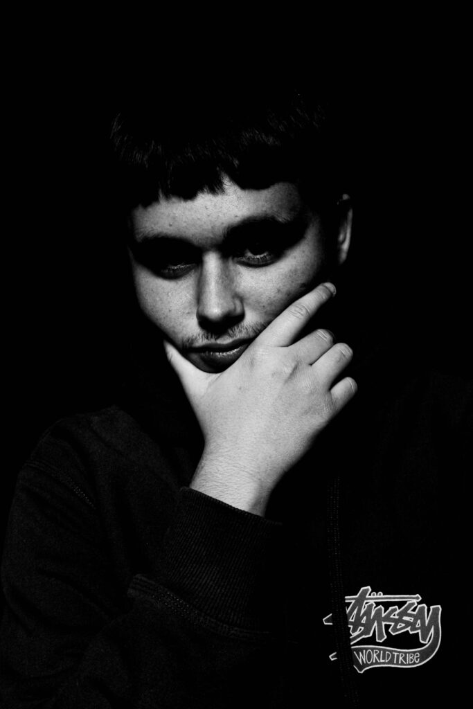
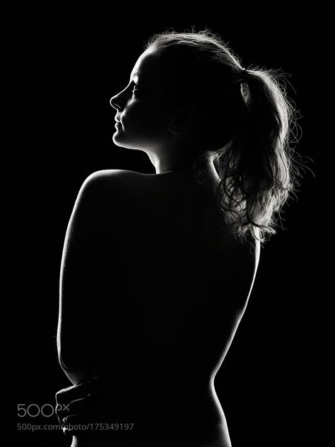
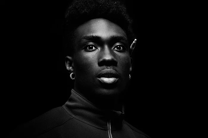
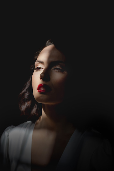
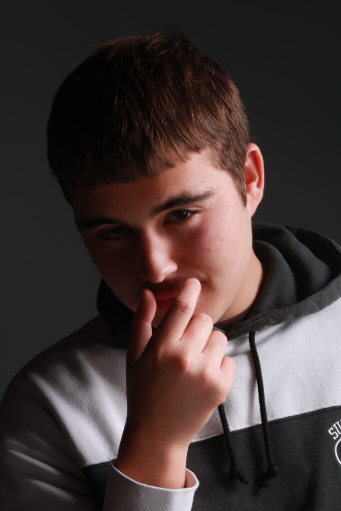
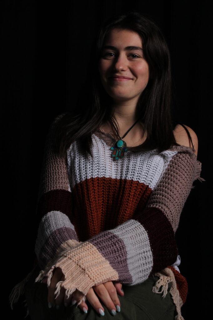
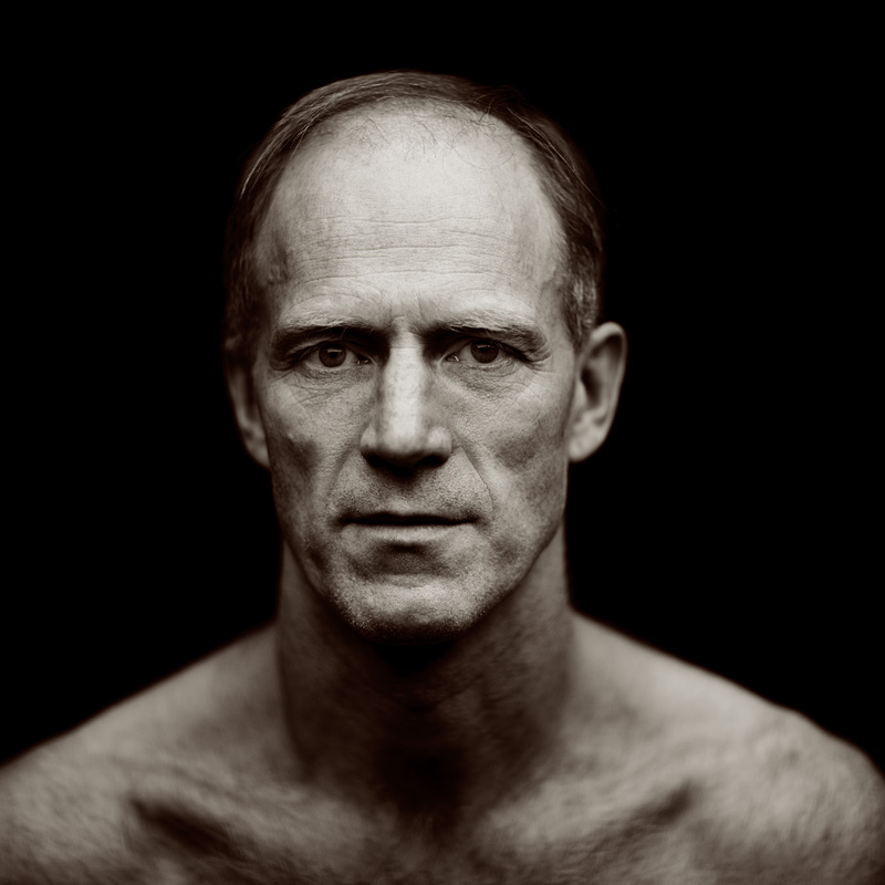
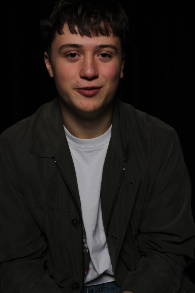
I believe these are my best Chiaroscuro photos, I like how the light creates an interesting 3D effect, with shadows being created through creases in clothes.
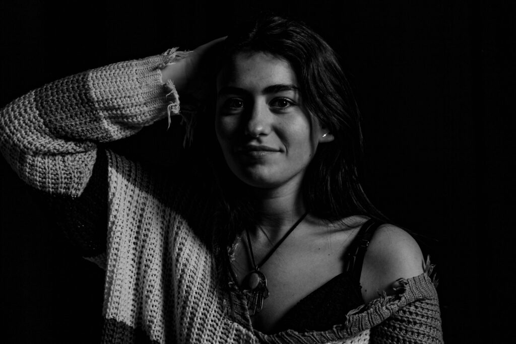
For improvement, I will try to improve the brightness of the light.

Edits:

(By increasing the image temperature I was able to increase the lights brightness with this image. To create a more standout effect with the shadows).

(With the original image I found that it wasn’t bright enough, so by using a low saturation alongside a darker shadow effect the contrast of the white tones to the black makes a distinct composition).

(With the outcome of this it already fitting the aesthetic, I added only little by altering the texture, clarity and dehazing, sticking to the genre of my mainly greyscale images, I lowered the saturation).

Full photos:

Rembrandt

Butterfly

Chiaroscuro

In conclusion, I like these images and believe they are a good first attempt at trying Studio lighting techniques.
Studio Lighting/contact sheet – George Blake

These images are from studio lighting portraits:

My Intention with these shoots was to play around and experiment with the Rembrandt, Butterfly and Chiaroscuro lighting techniques.
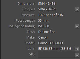
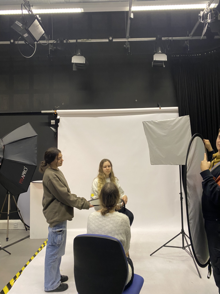
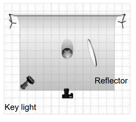
Recreating these, in the studio we used a DSLR camera, with a flash adapter, additionally with a reflector to try out with.

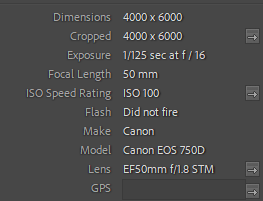
camera settings:

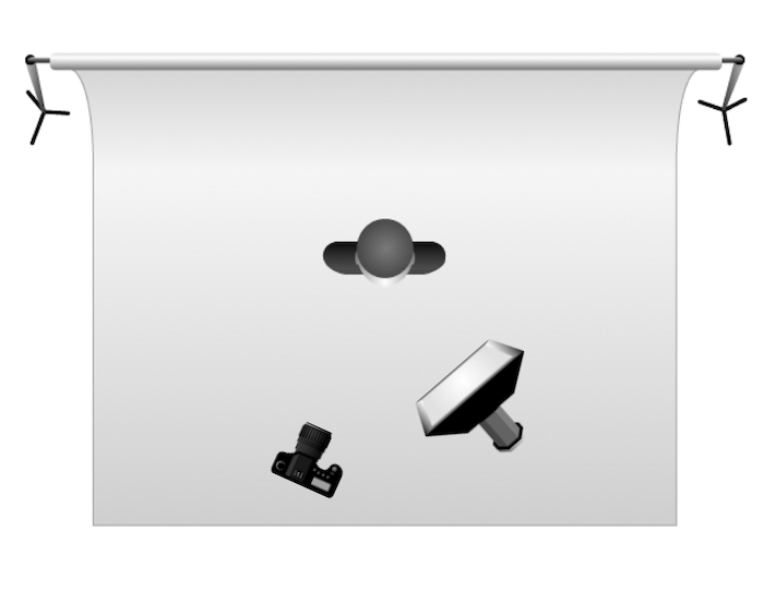
Studio set up:

Rembrandt –

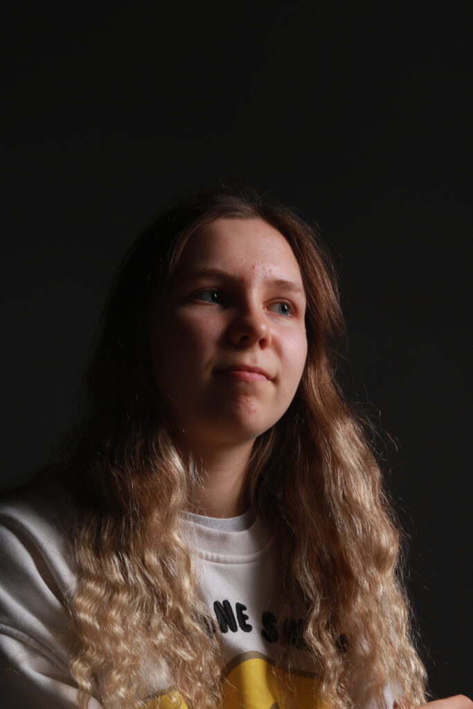
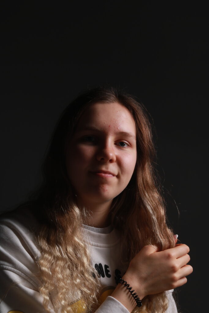
5 – 4 star rated photos:

(These are also white flagged – meaning they consist of photos that are taken clearly and match the Rembrandt light triangle).

These photos, capture the visual elements of Rembrandt, with the light positioned at a 45 degree angle and Rembrandt light triangle present on the cheek.

3 – 2 star rated photos:

(These are also white flagged – meaning they consist of mostly clearly taken photos or just didn’t fit the look I was going for, such as not containing a clear indicator of the light triangle or too poorly exposed).

These could improve, by altering the exposure on the camera or by repositioning the light to create a starker contrast of the triangle.

2 – 1 star rated photos:

(These are black flagged meaning they do not appeal to what I was aiming for during this photoshoot).

These, to me didn’t fit the look I was going for, therefore this is why I have given them a low rating.

Butterfly –

5 – 4 star rated photos:

(These are also white flagged – meaning they consist of photos that are taken clearly and match the Butterfly lighting effect).

These images, best represented the effect of butterfly lighting as shown with the shadow casting on the top lip.

3-2 star rated photos:

(These are also white flagged – meaning they consist of mostly clearly taken photos or just didn’t fit the look I was going for).

These images were clearly taken but did not fit what I had In mind.

Chiaroscuro –

5 – 4 star rated photos:

(These are also white flagged – meaning they consist of photos that are taken clearly and match the tonal contrast of Chiaroscuro lighting).

These are my best of the shoot, the contrast with tones, and balance of colour most represent examples I’ve looked at.

3 – 2 star rated photos:

(These are also white flagged – meaning they consist of mostly clearly taken photos or just didn’t fit the look I was going for).

The poses to me created to much brightness, which isn’t what chiaroscuro is.

2 – 1 star rated photos:

(These are black flagged meaning they do not appeal to what I was aiming for during this photoshoot).

The exposure for this image was too low.

Conclusion –

In conclusion, I think these shoots turned out well, in terms of the visual composition they are inspired from and recreated to fit the techniques to a decent standard. I would improve by experimenting more with the light and try to get better at Rembrandt. as that proved the most difficult to create.

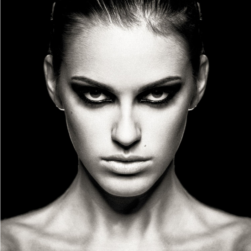
Studio lighting: Chiaroscuro lighting – George Blake

What is Chiaroscuro lighting?

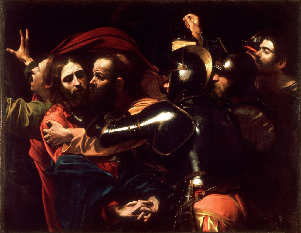
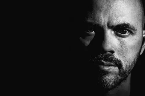
A visual element originating from art, Chiaroscuro comes from the Italian word for light dark. In art however, it is defined as the bold contrast between light and dark.

First appearing in portrait paintings from the 15th and 16th centuries, Their birthplaces can be found in Italy and Flanders (Holland). In these paintings the subjects, in a dark environment, would be casted in a singular beam of light, that was emitted from an unseen source.

(These paintings were also attempted by a previously mentioned artist, Rembrandt, Who’s own lighting in art was stylised In photography also).

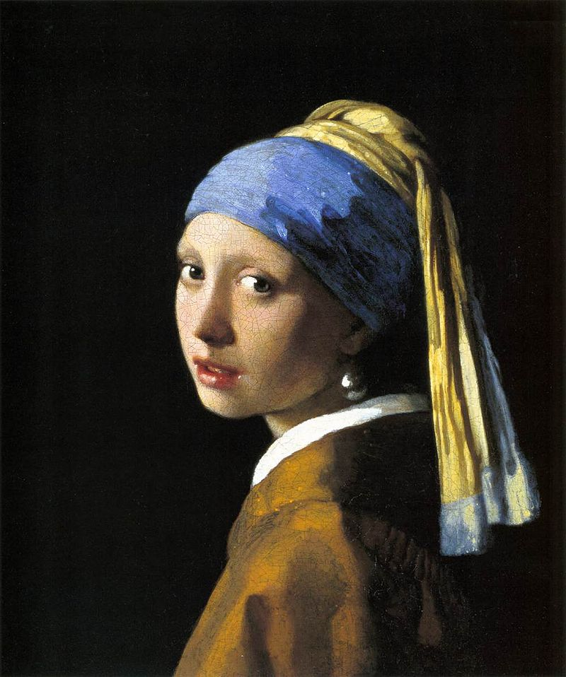
(Most likely the most famous example of Chiaroscuro, Johannes Vermeer’s ‘Girl with the pearl earring’ 1665).

Origins in film –

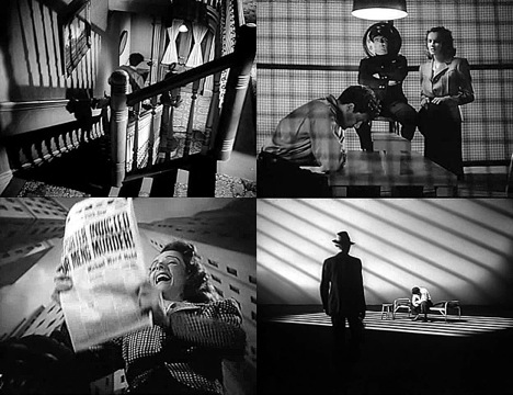
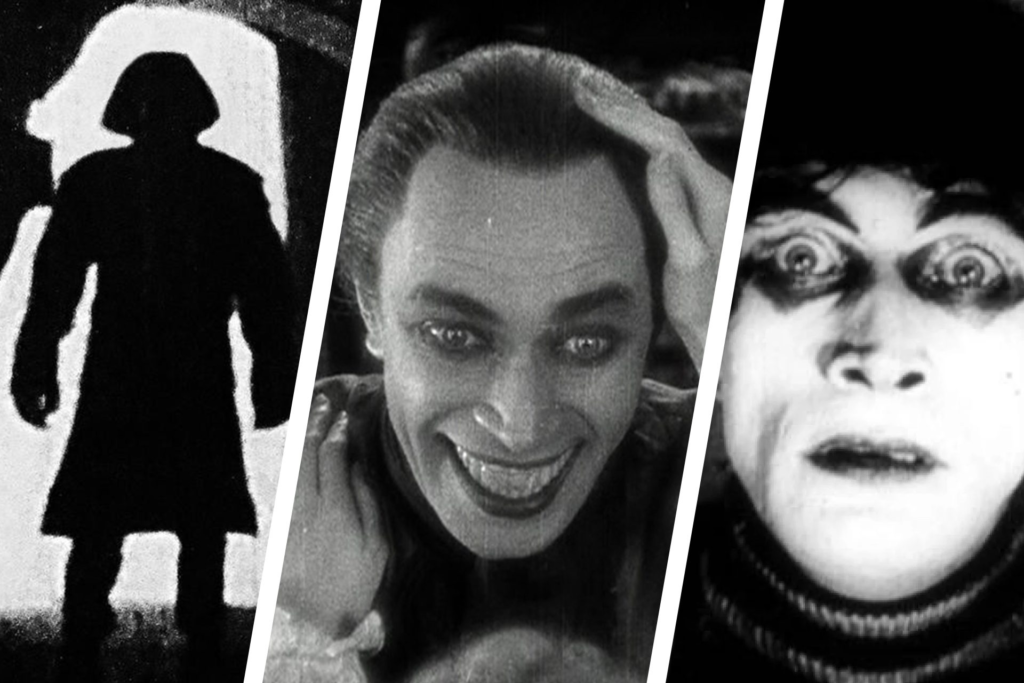
Used by Hollywood, Chiaroscuro can be seen in elements of film noir, where it is used to emphasise Moral ambiguity, enigmatic presence and sexual motivation. Seen in old detective films from the 40’s and 50’s, its use can connote the idea of interrogation lamps casting a singular beam or street lamps illuminating one part of the sidewalk. It additionally has its roots in German expressionist cinematography.

(Noir detective films using Chiaroscuro).

Origins in Photography:

In Photography, Chiaroscuro lighting is used artistically to create dark and dramatic portraits of a subjects face.

It has been played around with since the invention of the camera, further exploring the same techniques of light seen in painting.

How to create Chiaroscuro lighting:

Light –

To take Chiaroscuro, either a constant or flash of key light must be on the subject.

Additional edits:

A black back drop is the best for this as it creates more of a stark contrast on the viewers facial features.

Additionally the option of a reflector to soften the light on the facial features is also available if the photographer is not opting to go for an extremely dark image.

Lens – Using 35mm or 55mm is the best Lens size for Chiaroscuro as close-ups are the main aim for lighting technique.

Examples of own work:

Studio Lighting: Butterfly Lighting – George Blake

What is Butterfly lighting?

Butterfly lighting is a form of lighting technique used mainly in a studio where artificial light can be used to create the effect. The lighting technique got its name from the butterfly-shaped shadow that appears under the nose when the light comes from above the camera.

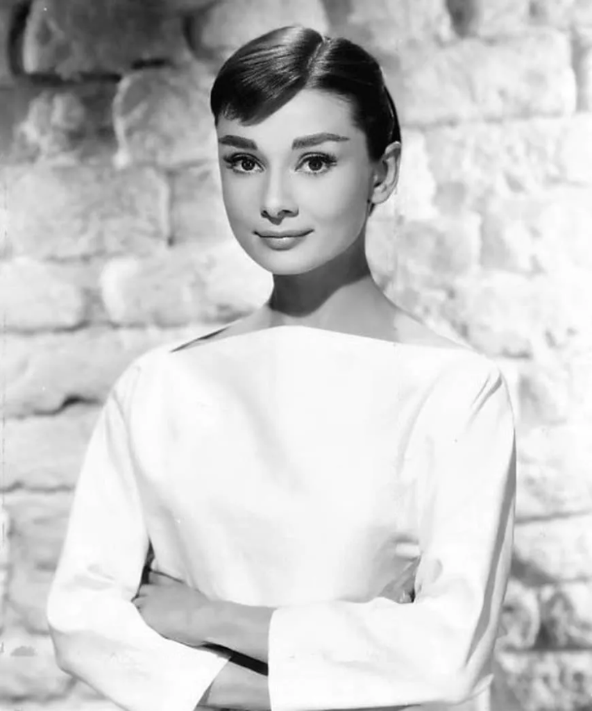
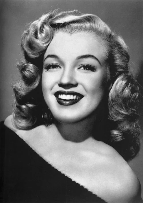
Like Rembrandt, Butterfly lighting found its origins mainly in Hollywood. Additionally referred to as ‘Paramount lighting’ or ‘glamour lighting’, its earlier and still current use was on model stars, its purpose was to highlight the models beauty in detail. such as Audrey Hepburn modelling here, under this lighting technique:

Why use Butterfly lighting?

By having the light positioned above the camera onto the subject, this highlights the cheekbones which then creates shadows underneath the nose and neck, this makes the subject look thinner. Overall it good for taking flattering portraits and create a beautiful symmetry.

(The shadows on this model creates an eye-catching symmetry)

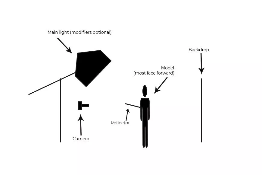
How to create Butterfly lighting:

Light

To create the Butterfly lighting effect, either natural or artificial light can be used, as well as either hard or soft light. If soft light is being used, modifiers such as a beauty dish is useful to help distribute the light evenly on the skin. In order to create an effective butterfly lighting effect, the subject must be facing the light.

(Examples of Soft light VS Hard light)

Lens

A 55mm is a good lens for a close up of the subjects facial features, For this lighting technique, its purpose is for a subjects face so this lens is best applied to this.

optional add-ons:

Additional experimentations can be made with the use of reflectors to soften shadows either on the chin or the face.

Examples of own work:

Studio Lighting: Rembrandt Lighting – George Blake

What is Rembrandt lighting?

Developing from a Dutch portrait painter, Rembrandt Harmenszoon Van Rijn, it refers to the way of lighting the face in which an upside-down triangle is formed under the eyes with shadows of the subject.

With the invention of spotlights in Hollywood in the early 20th century, Rembrandt lighting in photograph emerged from this as people were able to experience with light artificially instead of relying on it naturally.

Becoming widely used with film stars for promotional material it soon became a well known lighting technique.

Why use Rembrandt?

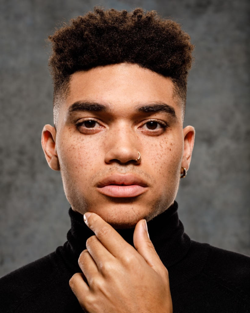
By using Rembrandt lighting, it creates a interesting shadow and contrast, with the triangle of light being casted on the subjects face.

Drawing in the eye with an interesting lighting technique, the portraits subject is made the main focal point with a shallow depth of field as an additional method helping to achieve this.

Rembrandt can be used with either hard or soft light creating a choice in how the photographer wants to create an individual look on the viewer.

(As seen here).

Hard light

Soft light

(As seen in both images the reoccurring triangle of light below the eye signifies this lighting technique as Rembrandt).

How to create Rembrandt:

Light – By using one singular light source, at an angle of 40 – 45 degrees, placed higher than the subject, this creates the Rembrandt technique.

Lens – A 35mm or 55mm is the best lens types for Rembrandt lighting. 50mm is best for a good depth of field and shallow aperture. 35mm is best for a wider point of view and is able to capture the subject entirely.

Examples of own work:

Studio Lighting: Basics – George Blake

When using lighting you must think of the following when creating a desired outcome:

  • Intensity of the light
  • Direction of the light
  • Temperature of the Light (Warm or cold + white balance)
  • use of ” the golden hour”
  • Using reflectors (silver/gold)

Light can differentiate in many ways depending on how it is used for example…

And

White balance (WB) and colour temperature

Comparison and Evaluation/ Environmental Portraits – George Blake

Inspiration

For my Environmental Portraits my main inspiration were on the Photographers: August Sander and Alec Soth.

Comparison –

Inspired by Sanders use of full body shots I aimed for that effect in some of my photos.

Sander can also be seen to use a low F-stop on his camera, this creates a blurred back ground effect, highlighting the features of the subject. In the photos of my dad, I aimed to try and mimic that.

Seeing how Alec Soth had his subjects hold props in some photos I tried to replicate that when me and my friends played airsoft.

With the one of the key features of this project being to capture a story within a photo, I looked at some of Karen Knorr’s photographs where she had taken photos of someone in a military uniform.

Seeing how I am apart of the Air Cadets and my dad had a career In the army I had my own attempt at her genre.

Evaluation

To improve my photos I will play around with the settings some more to create other desired outcomes in my photos. I believe I could improve on how I manage the exposure as some of my photos came out either to dark or too bright, which wasn’t what I wanted.

Overall, I think I created some good final outcomes that can be seen to fit the Genre of Environmental Portraits.

Environmental Portraits/ Contact Sheet – George Blake

These images are from my Environmental Portraits, for my Nostalgia Project.

5 – 4 star rated photos:

(These are also white flagged – meaning they consist of clearly taken photos and matched my desired outcome).

These Photos, too me, capture a similar, composition and fixed focal point of a person in an environment like how Environmental Portrait photographers: August Sander and Alec Soth took their photos.

3 – 2 star rated photos:

(These are also white flagged – meaning they consist of mostly clearly taken photos or just didn’t fit the look I was going for).

I would improve upon these images by timing up the shot better and perhaps taking them with a tripod to stabilise the long shutter-speed. These images do display some good qualities however, such as lighting and and use of aperture to create a more focused effect on the person.

2 – 1 star rated photos:

(These are black flagged meaning they do not appeal to what I was aiming for during this photoshoot).

Camera Settings:

Best Images:

I will edit these Images as my first Edits in the style of my studied Environmental Portraits.

Environmental Portraits Photo-shoot action plan – George Blake

For my Environmental Portraits, I will photograph indoor and outdoor locations of people at:

  • Work (Elizabeth castle).
  • Home.
  • Bunkers (Noirmont).
  • Horse stables.

I will be photographing my:

  • Friends.
  • Family.
  • Work colleagues.

I will take my photos:

  • Over the weekend.
  • During a walk.
  • Whilst on a break at work.
  • Hanging out with friends.

How I will take my photos will be:

  • With a Camera.
  • In a place I am familiar with.

why I will take them is because:

  • It captures my family in a natural environment.
  • Depicts the day-to-day running’s of My Job.
  • Shows the type of environment me and my friends hang out in and what we do.