



Intro –
For my plan to create a photo essay of documentative photography my Photoshoot plan is as such:
Where?
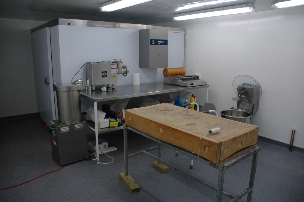
I Will photograph my series in the following locations:
Who?
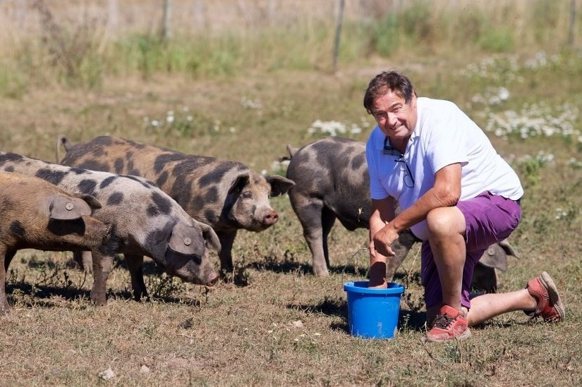
Members of my family, employee’s and farm animals around the farm portraying their regular or challenging masculine and feminine roles:
When?
Since I am staying at my Nans whilst my house is under going renovations, Over the span of the weeks I am staying there I will gather images in shoots.
What will I use?
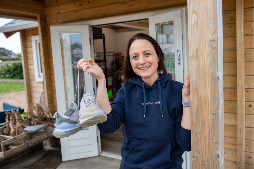
Using props my family members will holding these include:
Ideas of how to present:
Moodboard + Mind Map –
(Documentative style)
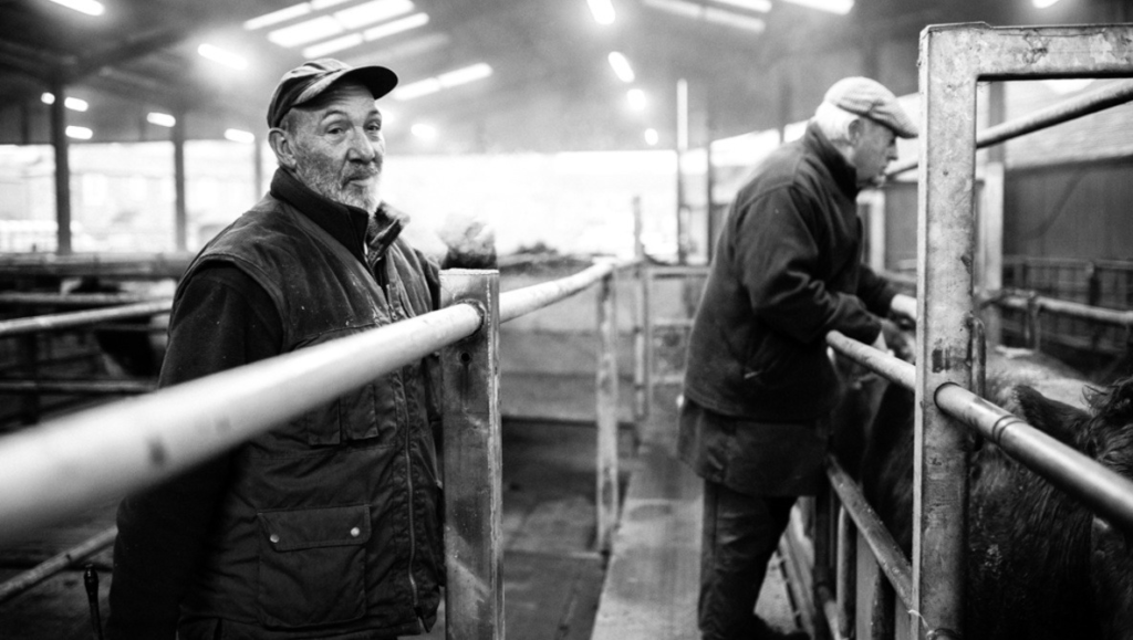
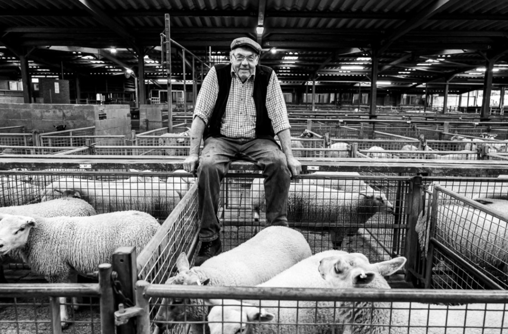
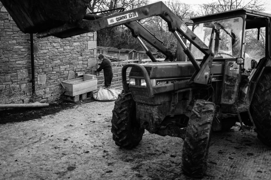
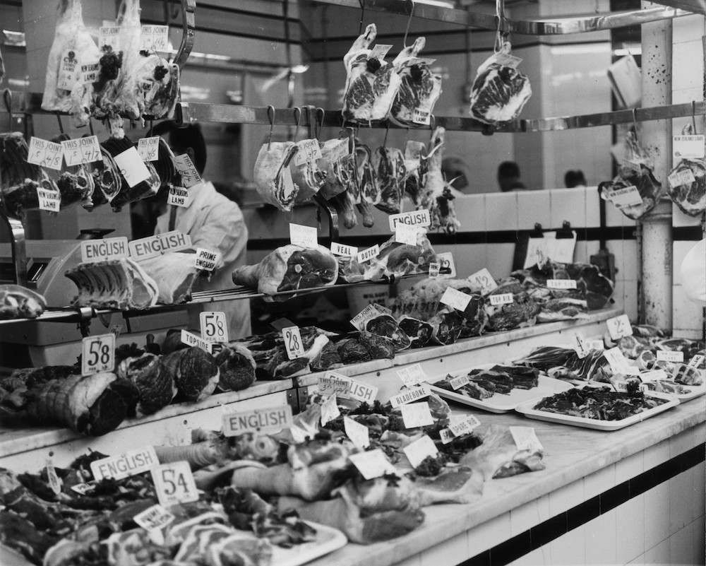
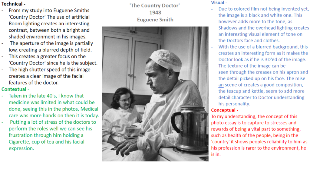
(Picture Essay – ‘Country Doctor’ by Eugene Smith, 1948)
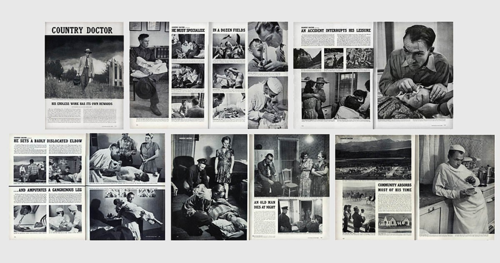
My inspiration for this came from the Photographer Eugene Smith, who photographed a Picture essay called ‘Country Doctor’ in which he captured a story of a day in the life of a physician living in Rural America. This Inspired me for my idea of creating my own idea of a picture essay but having it consist of the identities of the Men and Women working within my relatives business.
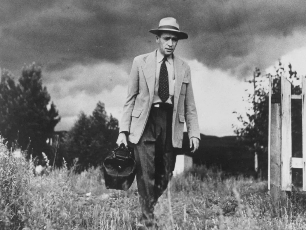
(The ‘Country Doctor’)
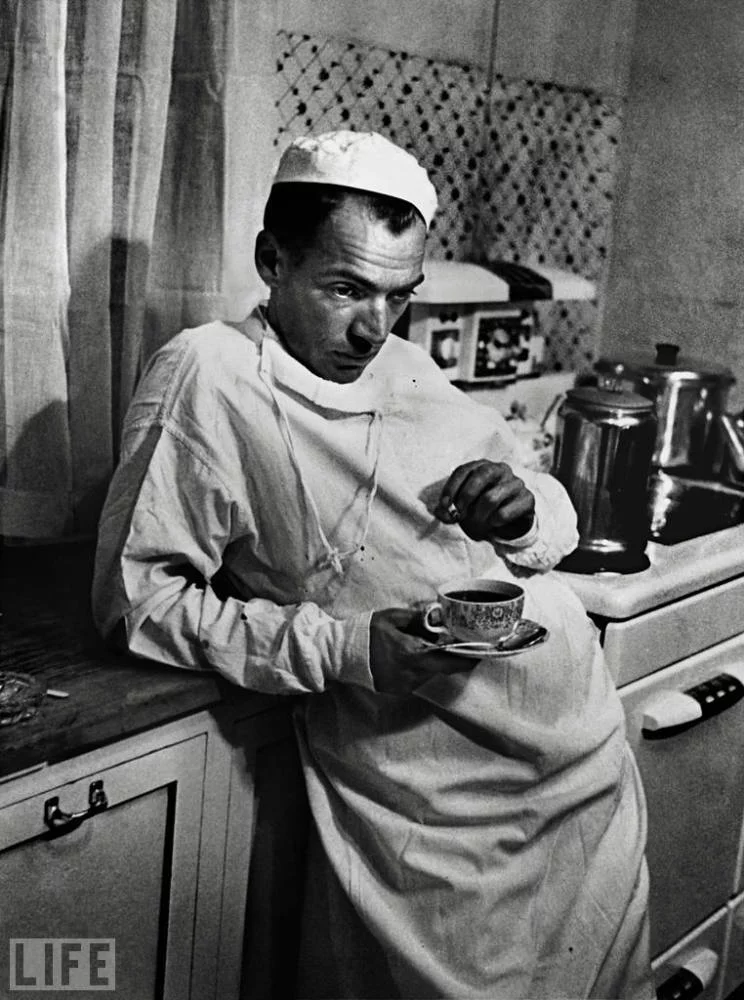
Image Analysis:
Mood Board –
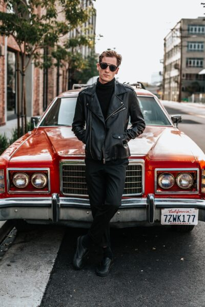
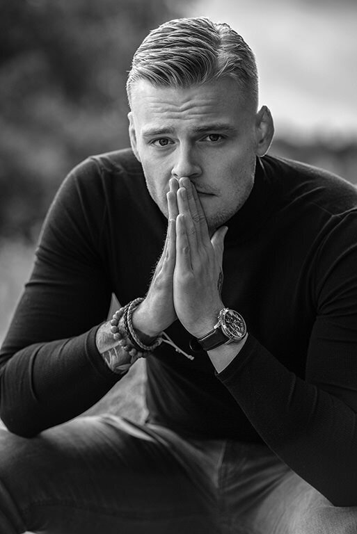
With these 2 Ideas in mind I will explore masculinity, femininity and Identity through one of them for my Photo assignment.
What is the definition of Femininity?
Femininity is generally defined as the attributes, behaviours and characteristics of women or girls. The most prominent example can be seen with the stereotypical traditional association of the colour pink, being highly regarded as a ‘feminine colour’.
(Barbie, 2023 – Ryan Gosling and Margot Robbie – actors)

What is the definition of Masculinity?
Like Femininity, Masculinity is generally defined as the attributes, behaviours and characteristics of Men and boys. Using the same example, The colour blue is stereotypically associated to be a ‘masculine colour’.
(Donald Glover – Actor & Musician)


What is the definition of Identity?
Defined as being who or what a person or thing is. Identity can vary with culture, environment, gender, politics, and social aspects. Identities alter in different nations and regions having their own appearances and characteristic’s in their population.
An example cultural identity of this can be seen with Māori people from New Zealand. Being an Indigenous Polynesian population, in mainland New Zealand their identities can shown through their appearances, the most well-known one being their cultural tattoos, called Tā moko.
(With Men, It is more common to see the entire face, tattoo’ed as of tradition)

(With Women, The tattoo is usually on the lips and chin)

These further show examples of environmental identity, taking influence from culture and history with these tribal face tattoos dating back pre-European involvement with New Zealand. Additionally their Customs and traditions are associated with cultural identity. The Haka, a ceremonial dance that consists of vigorous movements of rhythmical foot stamping as well as expressive facial expressions, It is performed for various social functions associated with Māori culture.


Social identity, which is when people self-concept are shown through membership in groups, can be found with influential movements of fashion or behaviour. A notable social group associated to the UK are Roadmen. Dressed in all black, and known for being anti-sociable, they’re social appearance is recognisable for those reasons and can be found in urban areas such as London where large groups socially affiliate with each other territory.

With fashion, social identity can be shown through trends and styles. Styles can define someone’s identity with their appearance acting as a insight to their personality.
Styles such as Normcore, explore the deliberate choice of being unremarkable or unfashionable in casual looking clothes, yet creating a noticeable appearance through style.

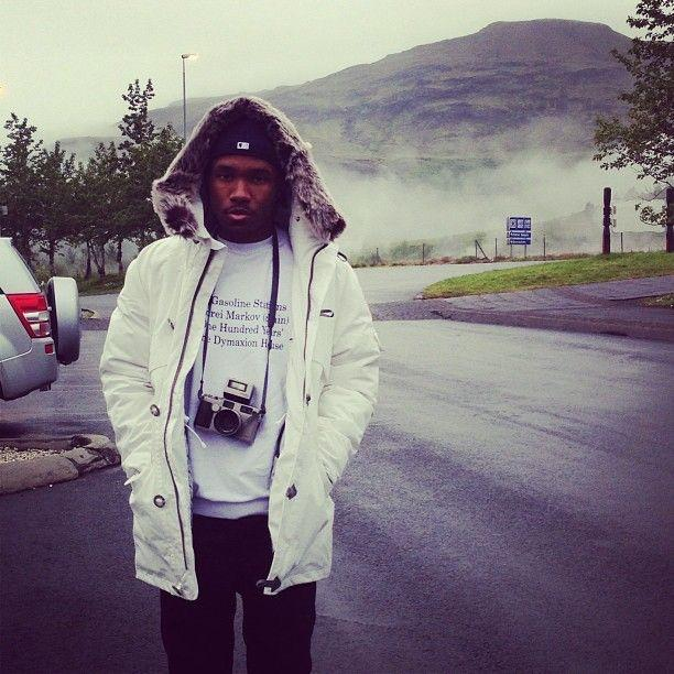
Gorpcore, which focuses on wearing functional outdoors wear, is usually associated to clothes such as fleeces, Gore-Tex jackets and hiking trousers. Made popular through social media with Celebs such as Frank Ocean spotted or appearing at events wearing gorpcore brands, like Arc’teryx. This helped it become more popular in High fashion with brands such as Balenciaga getting involved with the style. Therefore leaving a large influence on the fashion influencers who build their identity on how they are dressed.
(Frank Ocean – Musician)

(A$AP Rocky – Musician)
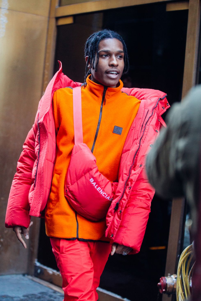
Geographical Identity, which is a groups sense of attachment to their country/region can be shown locally with an example being the Island games. Showing Island recognition for a sporting event, and loyalty to its island through its players, this shows geographical Identity as the island is represented through its population showing their pride.
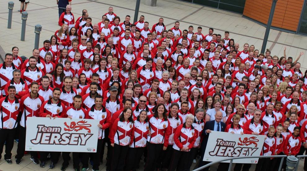
Identity can also be formed with upbringing, with parents, siblings and relatives playing factors of building personalities. When surrounded by people who you live with, you grow to adapt in your character from aspects of theirs, if you have a parent that shows confident or introverted characteristics, you are more likely to develop those traits. This can also be seen genetically with children being identical to their kids.

What are Culture Wars?
Culture wars are conflict’s between social groups, that have different cultural ideas, beliefs and philosophies. Commonly found where there is an overall disagreement on societal values, it is usually occurring in western countries where their democratic systems can generate issues and discussions with topics such as Abortion, multiculturalism, Sexuality or even values such as morality or lifestyle.
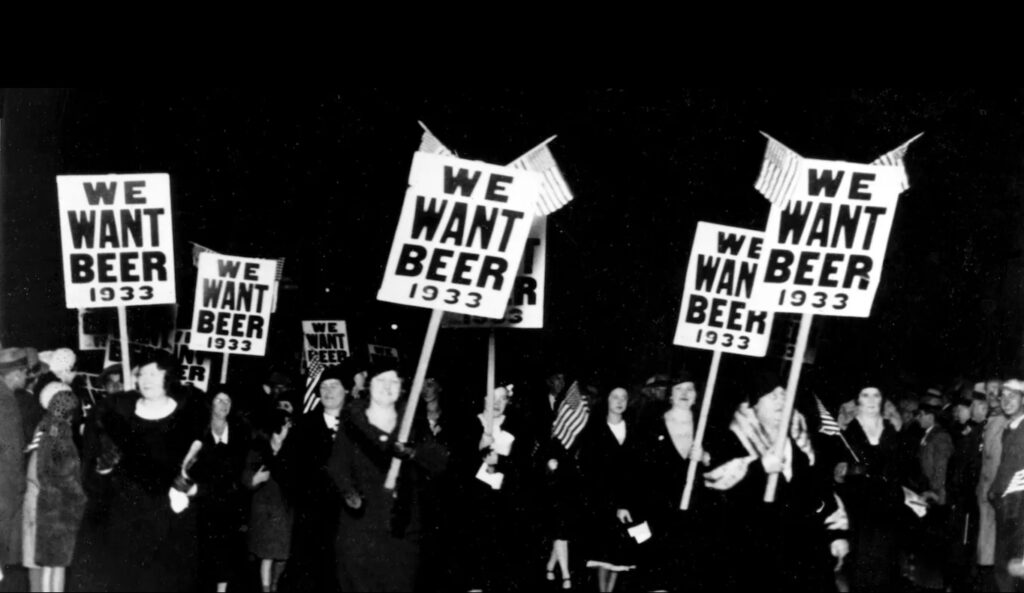
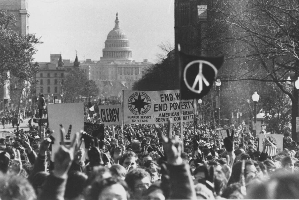
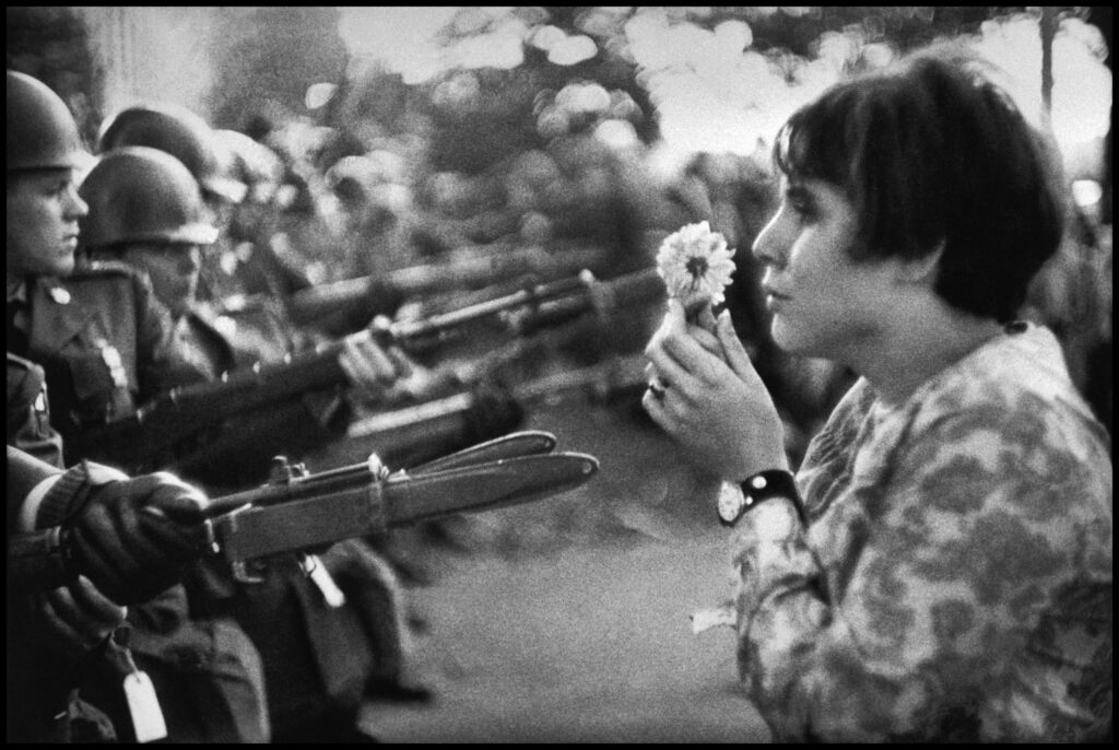
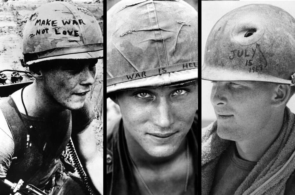
With the US having a vast geographical size, historical background and variation of demographics of different religions, cultures, morals etc it isn’t uncommon to see how it is the breeding grounds for culture wars to emerge from. The USA has seen numerous examples of them such as the prohibition era from 1920 to 1933, where many people campaigned and had the selling and consumption of alcohol banned. As a result however many states protested against it and eventually had the law revoked allowing alcohol to be unbanned. Another can be seen with the protests against the Vietnam war from 1955 – 1975 where many people saw it as an unnecessary war against communism to prove democratic supremacy and political power, which eventually ended after the loss of life was to high and political unrest back home in the US made it unpopular.
(Anti-booze campaigns held by pro-prohibition activists and campaigners)
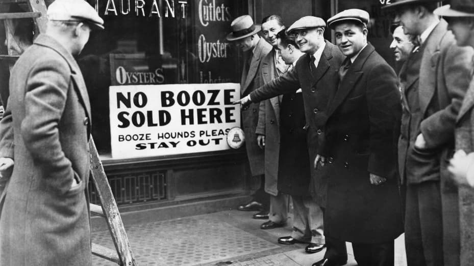
(Anti-prohibitionists rallying to demand the laws removal)
(Anti-war protests in Washington DC, demonstrators displaying the iconic piece symbol and flag)
(Peaceful protestors placed flowers in the barrels of the rifles of national Guard soldiers outside the Pentagon)
(Soldiers in the conflict displayed their own acts of protest with slogans and art on their helmet covers)
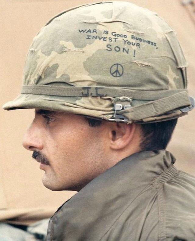
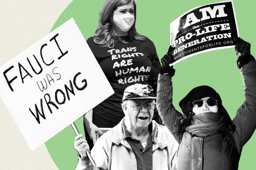
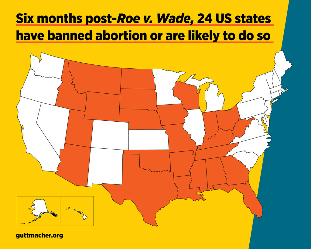
Culture wars pose a real discussion about ethics and morality in society today, with the most recent example being over the choice to have an abortion in The US. At the start of the year, The US congress made the decision for abortion to be illegal in states that desired it. As a result since then, 24 states have made the decision to ban abortion. With pro-life events prior, many religious and anti-abortionist groups declared it was murder and held protests outside of abortion clinics. This however sparked outrage among other groups who opposed the idea of being forced into keeping the child as it meant in some cases rape victims or accidental pregnancies couldn’t have a right over their own body in deciding if they wanted to commit to having a baby.
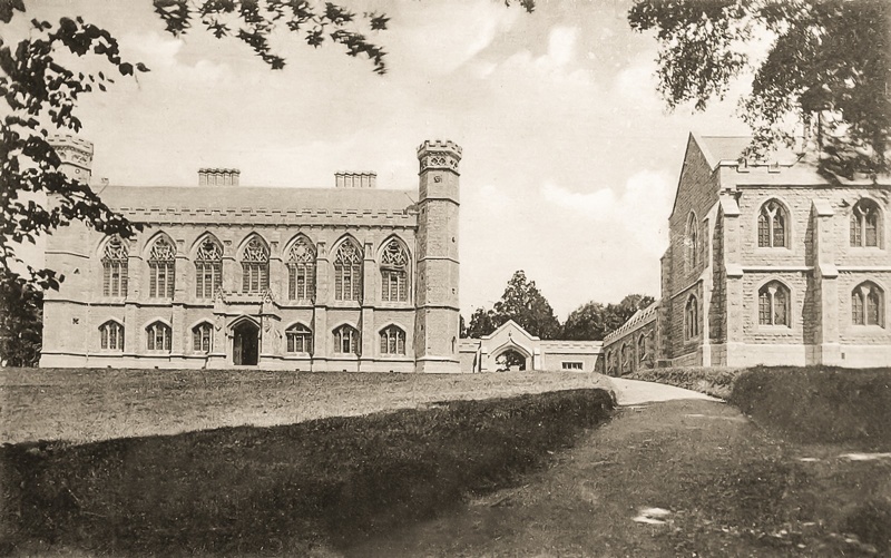
An example of a culture war in Jersey can seen with the modern usage of the English language. Prior to Jersey becoming a crown dependency, the population spoke the language of Jèrriais, a Norman-French dialect that had evolved into its own dialect. Since the Victorian era, more and more British traveler’s settled in Jersey, establishing schools such as Victoria college, however with them came the english language which soon became increasingly the more common language. In schools, Students who spoke Jèrriais were punished for it, only speaking it at home to their parents and other relatives. Additionally many locations names were changed to make them more understandable for people who spoke english. With such examples being the parishes. St Jean’s became St John’s, St Pierre became St Peter and mainly the town centre St Hélyi became St Helier.
(Victoria College)
However with the modern day, more recognition of Jersey’s history and langauge is being fought for and represented by organisations such as Jersey heritage and the Jèrriais Organisation who educate through museums or in schools.
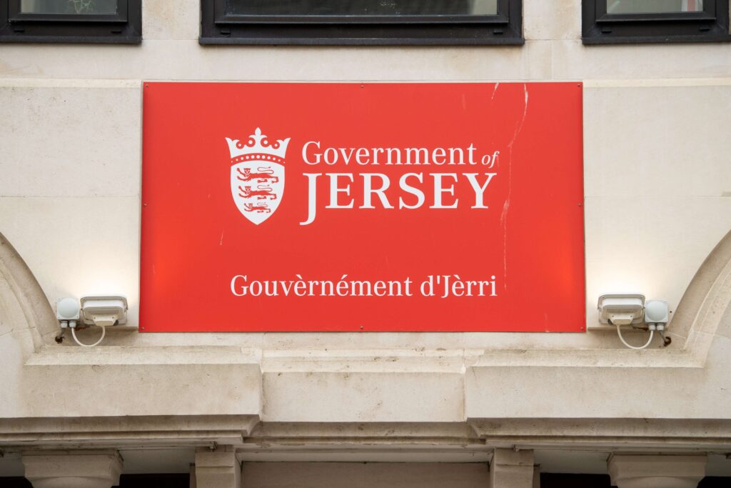
Recent examples of this fight can been with the states of Jersey installing their Jèrriais name and translations to their building and website, as well as Liberty Bus including the Jèrriais parish names on the side of its Buses.
(The governments name translated)
(Below the windows of the upper deck, the Jèrriais Parish names can be seen in a multi coloured line)
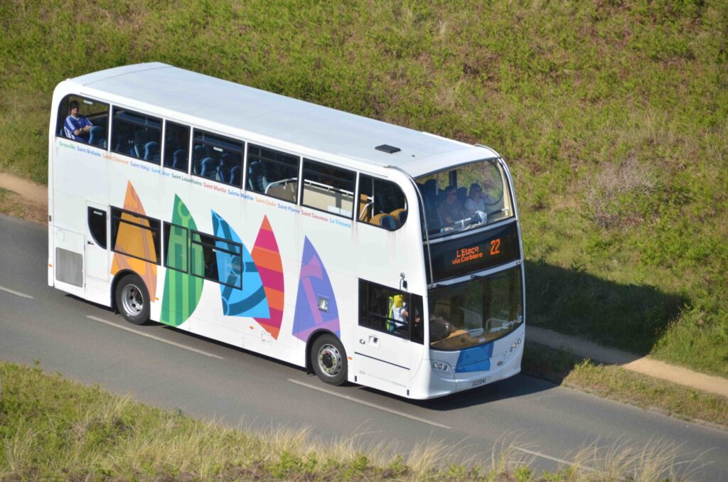
Culture wars, pose both positive and negative outcomes depending upon the cause. This is evident with campaigns to remove something negative upon society like laws against the rights of other groups of people, like slavery for example. When it can become negative however is when the decision is being forced upon the government to make decision for example with the case of abortion, it can result in unpopularity on both sides as one cultural group may not agree on it whilst the other one might.
What is Identity politics?
Identity politics, put simply is the tendency for people from certain religions, ethnic groups, social backgrounds and other groups to create exclusive political alliances, rather than choosing on the brood-based party politics. With the term made in 1977 by the Combahee River collective, its usage went on to become more popular in the 80’s, where events based on identity became more prevalent. Such as with the social activisms of People from The Feminist, LGBT and Civil rights groups. The most recent case of this term can be seen with the Black Lives Matter movement.
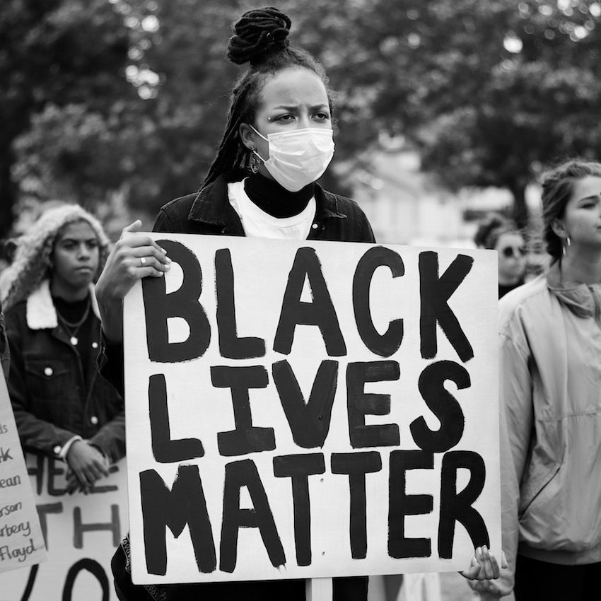
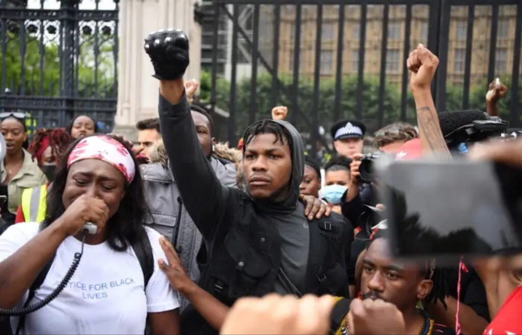
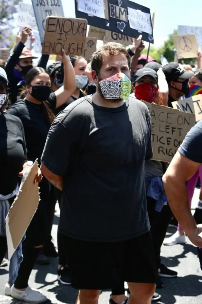
The Black Lives Matter movement is a decentralised political and social movement that strides towards showing the highlighted issues around racism. Being an international movement, it can be throughout many countries where black people have experienced racism and oppression. Due to the numerous reported cases of African Americans being killed by white police officers such as Breanna Taylor, the situation grew larger and larger with riots being held in protest. The most significant riot was held when A man called George Floyd was killed after a police officer knelt on his neck. After this, city’s in the US developed into chaos as members of their black community’s and people who supported them, rioted against the police about the unfairness law enforcement had treated them, with the issue becoming so widespread celebrities became involved in the marches held In major cities across the world.
(Such as: John Boyega in London and Jonah Hill in Los Angeles).
(Police and protesters: Clashed amongst the rioting, with fires, tear gas and batons).
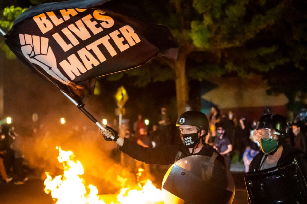
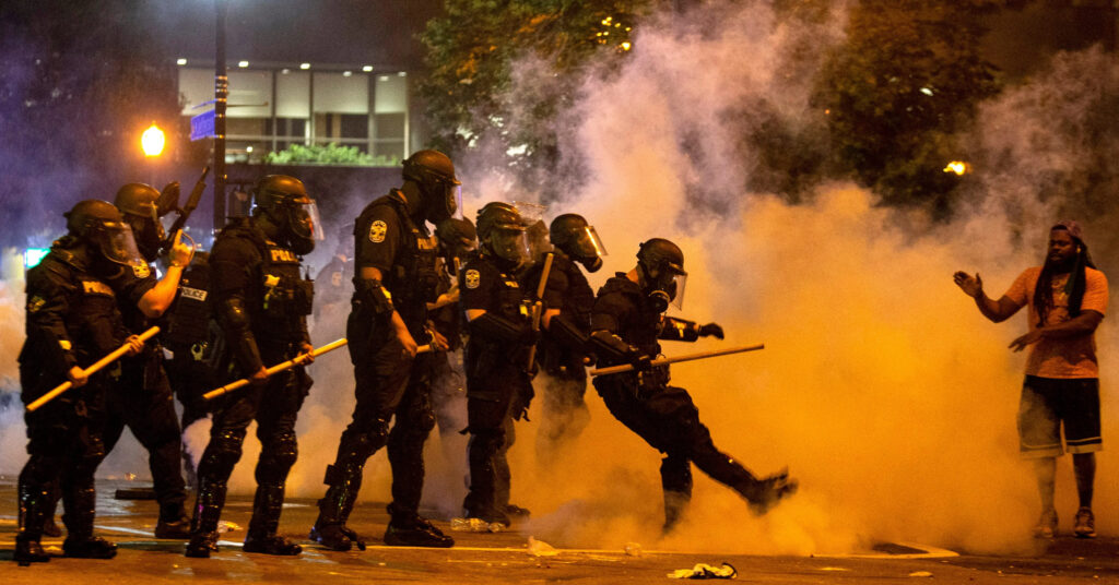
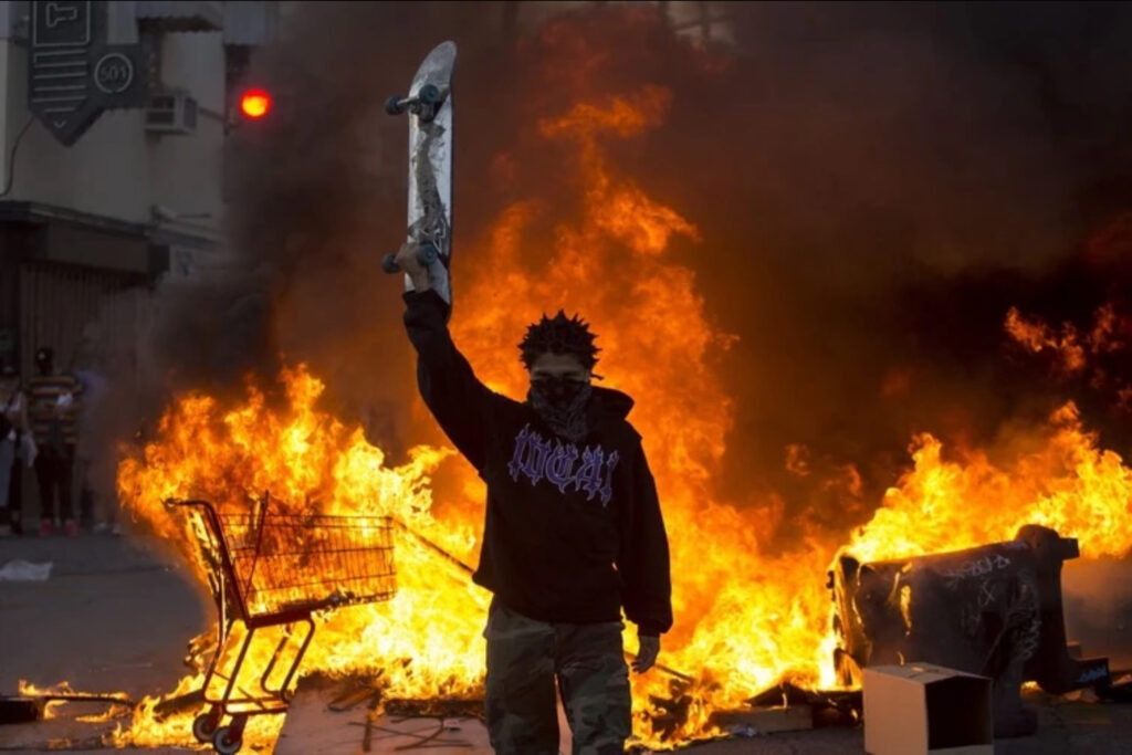
With the cases of rioting however, unnecessary violence and property damage, causes harm to both people in and outside the cause. In some cases black business owners found their stores looted and destroyed during the BLM riots despite being supporters of the cause. This raised a question to at what point did it stop becoming about the actual objective of the movement and instead became an excuse for greediness and senseless violence.
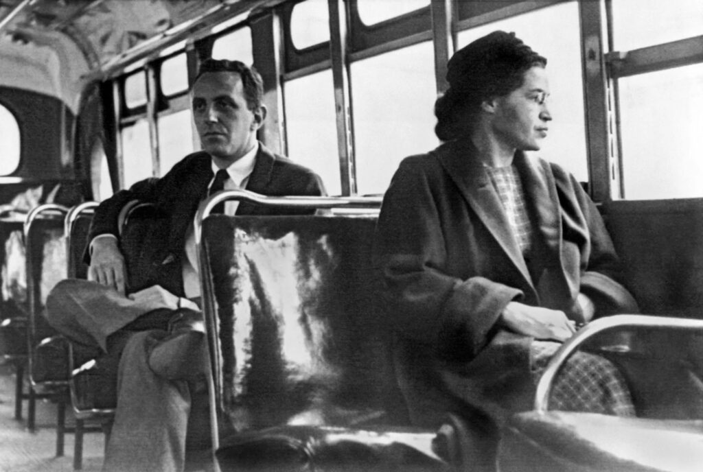
Due to foundation of many areas being built on the backs of slavery, the movement found itself originating in America, with one of the major events in history for the cause being the civil rights movement. Spanning from 1954 to 1968, black people held a campaign to abolish Racism, discrimination and segregation in the US. Key figures arose from this such as Rosa parks’ and her bus boycotts as-well as Martin Luther King Jr, speaking out on behalf on creating a world where Black people could be treated equality to other people.
“I have a dream that one day this nation will rise up and live out the true meaning of its creed.”
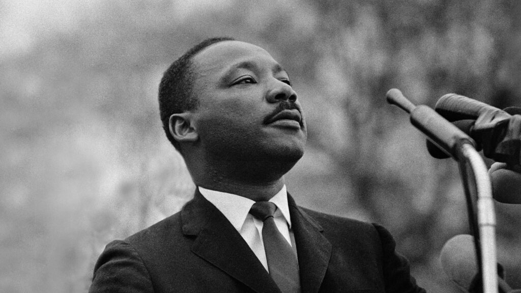
“You must never be fearful about what you are doing when it is right.”
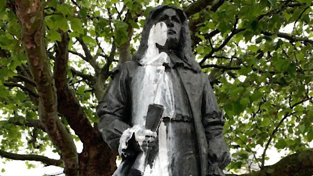
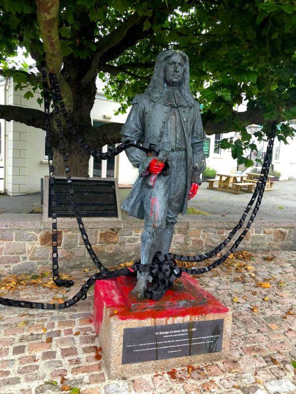
On a local level, The Black Lives Matter movement can be found amongst the Channel Islands. One example being the push by protestors to remove the George De Carteret statue in June of 2020 due to his strong links to slavery after the death of George Floyd Sparked a worldwide debate on who should be immortalised in the form of statues.
Since 2020, 168 statues of historical figures who had links to the slave trade have been removed. One of these statues who sparked controversy was the one of George de Carteret outside the George de Carteret Pub we’re it was vandalised for his links to the slave trade.
(White paint was seen to thrown of him in the early stages of the protest, with later protests having ‘blood’ on his hands and bound in chains).
Identity politics can be seen to spark conversation about the issues faced by certain members of our societies. However with the rise of demonstrations amongst different groups it seems that people are at a culture war to make themselves standout amongst each other. However with actions of hardship publicly shown and protested about by these groups, it goes to show how much it is relevant in the world and how it needs to change to make it a better place for everyone to live in.
Using my Mullins photos, I experimented more with the types of Headshots I could create.
By overlaying images, cutting them out from their individual layers and lowering their opacity I was able to create some edits I liked the outcome of:
(Example of what the cuts look like)
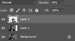
(Layer 3 – 40% opacity, layer 1 – 50% opacity = helps create overlapped effect)
By adjusting the Hue and saturation, this is how I got the multi-coloured image with each layer having a sperate colour.
(For example, this is how I adjusted my images to get the colour I wanted)
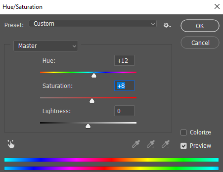
Edits:
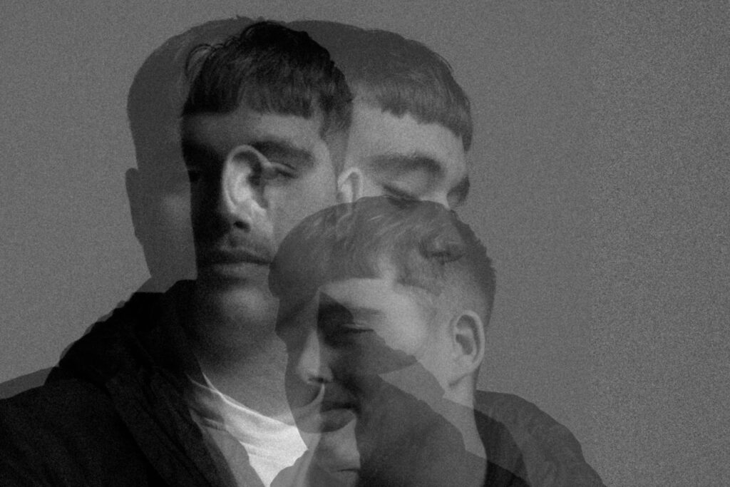
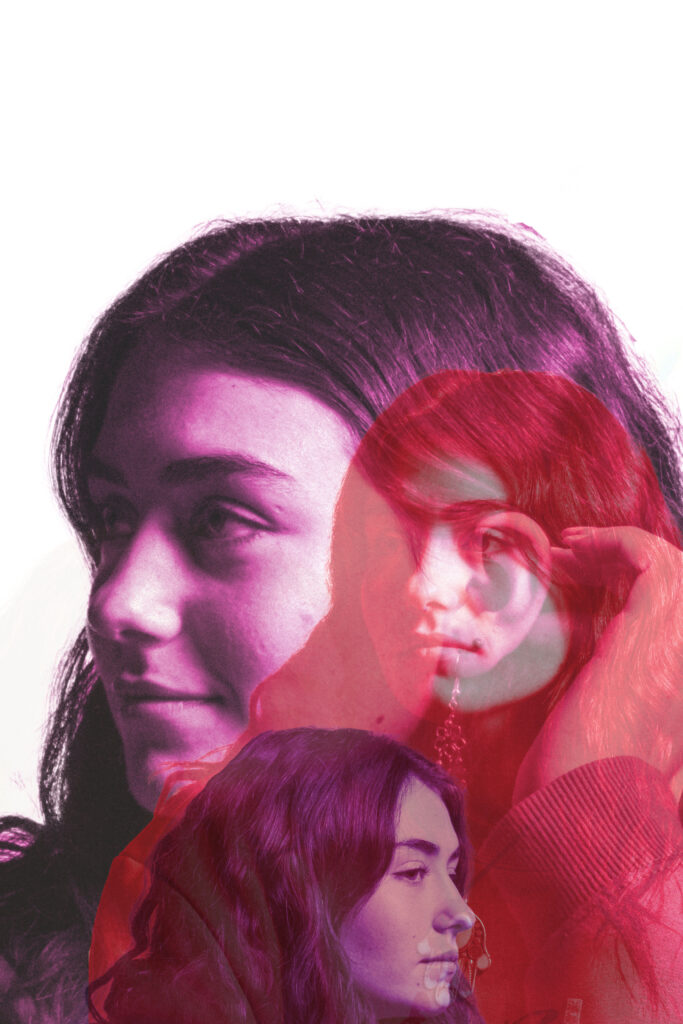
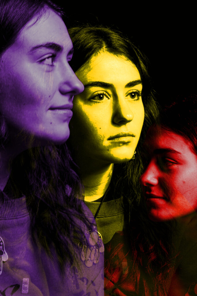
I like how these images came out, In future, more photos would be better as I would be able to further experiment with my images.
With Juxtaposition, A comparison can be made of my attempt images to same type of headshot Style, Henry Mullins took in his photos.
Using the same angles I was able to recreate some of his photos.
Comparisons:

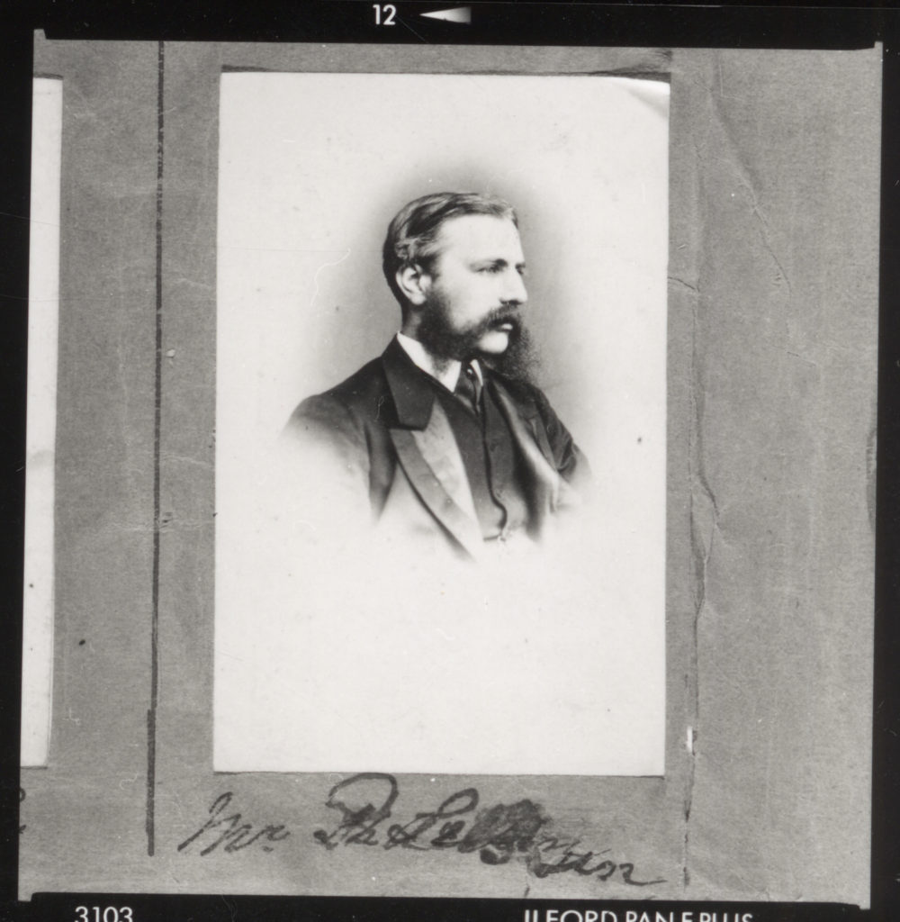

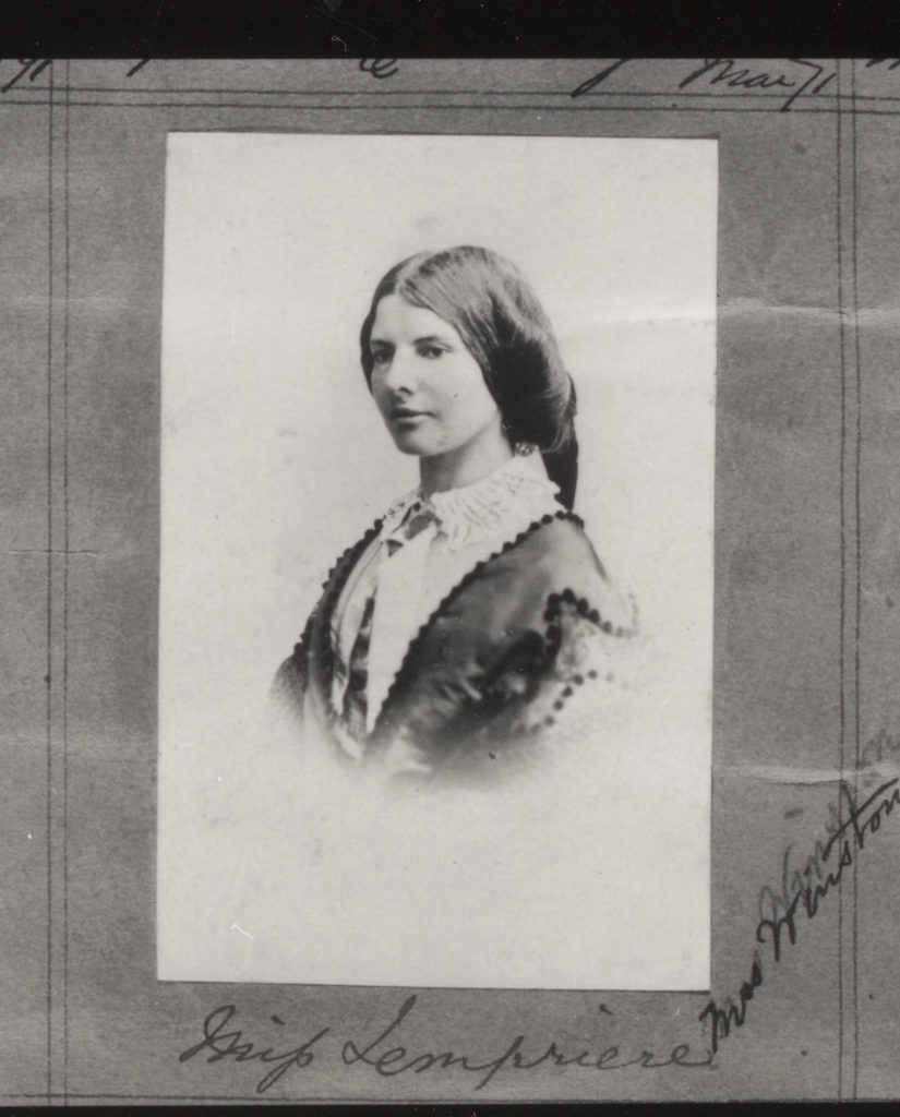
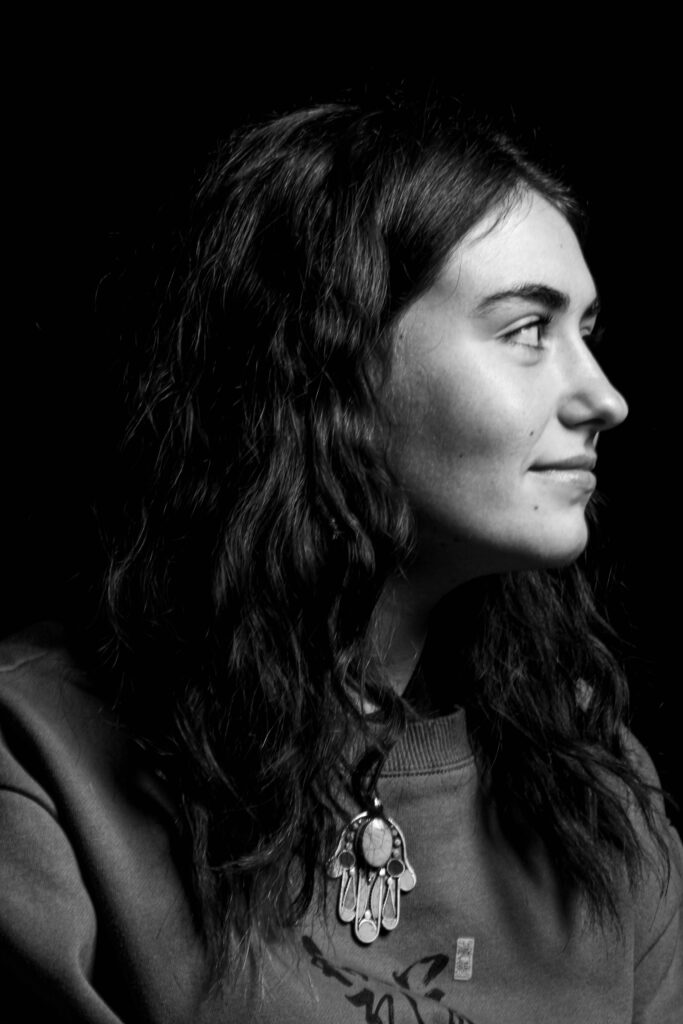
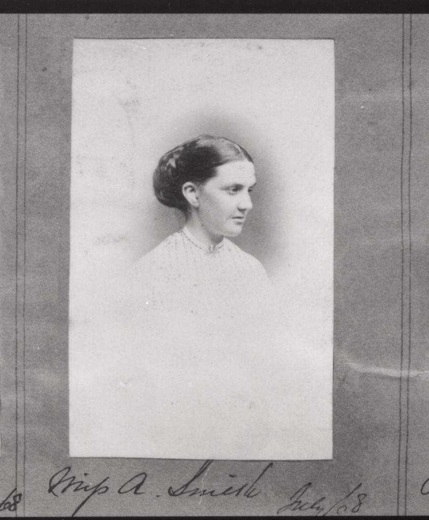

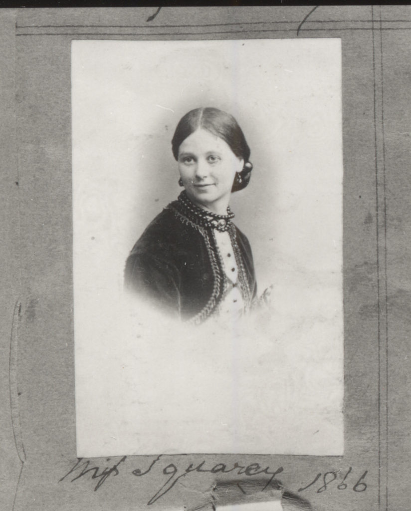
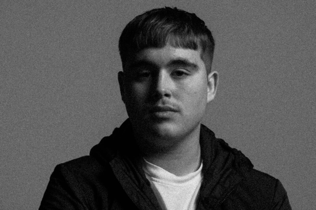
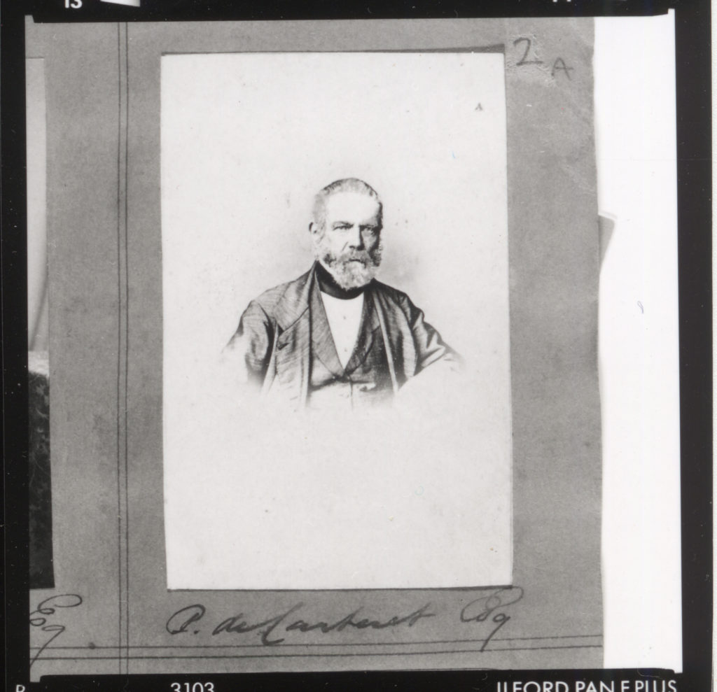
Using the lighting techniques I learnt prior I was able to add more detail to these headshots. In conclusion I like how these images compare to the originals and believe I have replicated these images well.
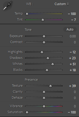
For my edits I wanted to recreate the diamond Cameos Mullins did during his later work. Playing around with the saturation and tone of the image I was going for the Old-timey looks his images had on his Carte-de-visite’s.
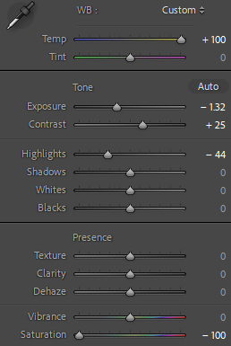
Edit settings:
Going for a grainy effect, I tried to replicate the vintage aesthetic of Mullins photographs with the following settings:
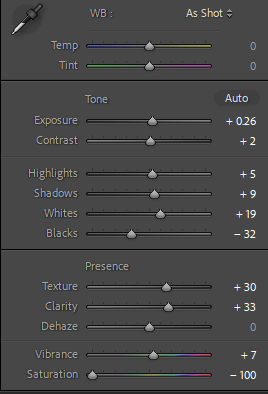
Using from what I have learnt from my studies into studio lighting, I enhanced the shadow on my Chiaroscuro lighting with these edited images.
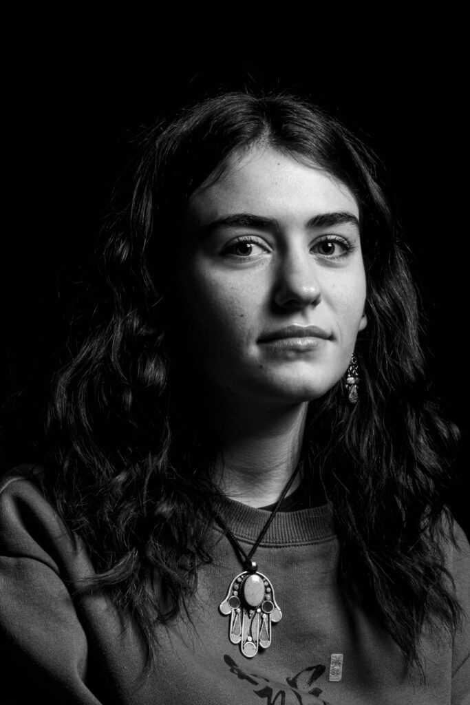

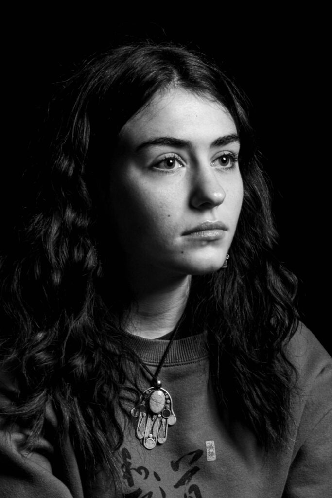
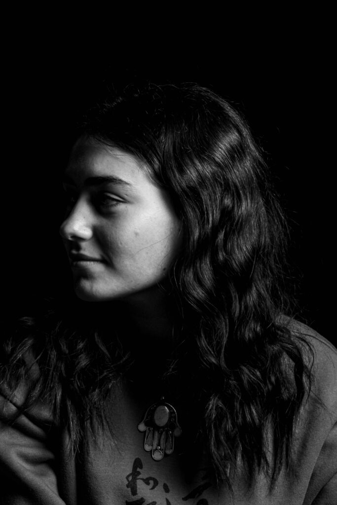
Since Mullins photographs were taken pre-colour film, I decided with my edits to have a low saturation to have that same visual composition of his images.

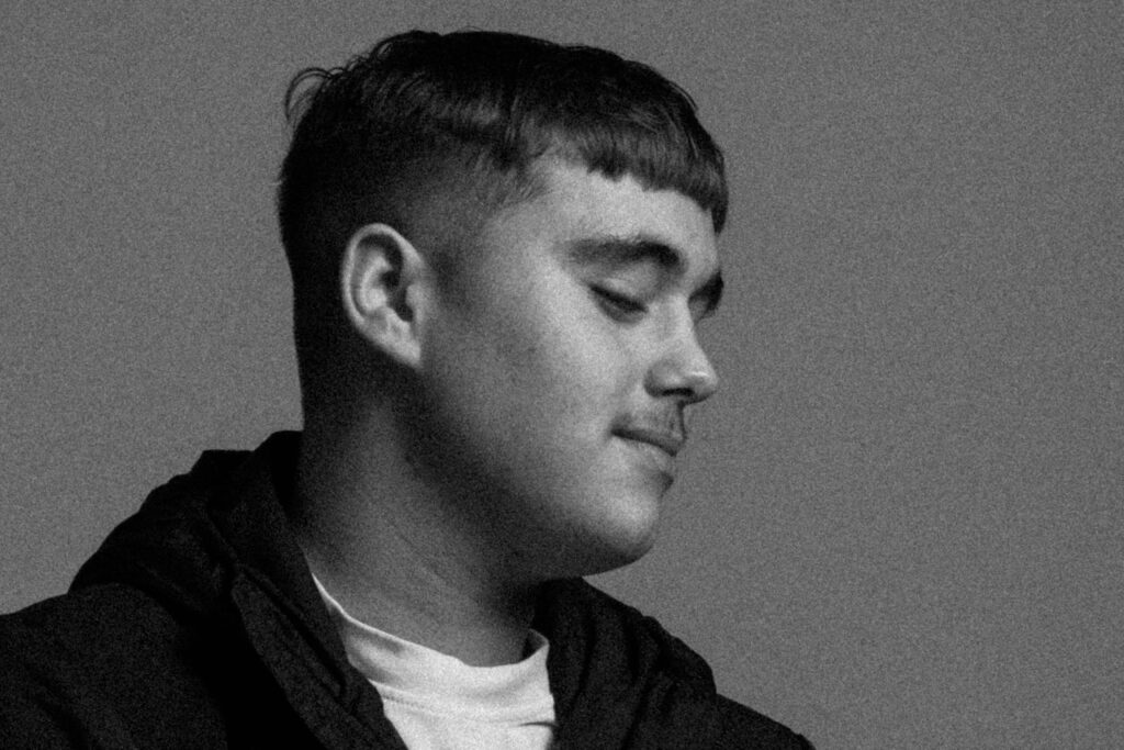
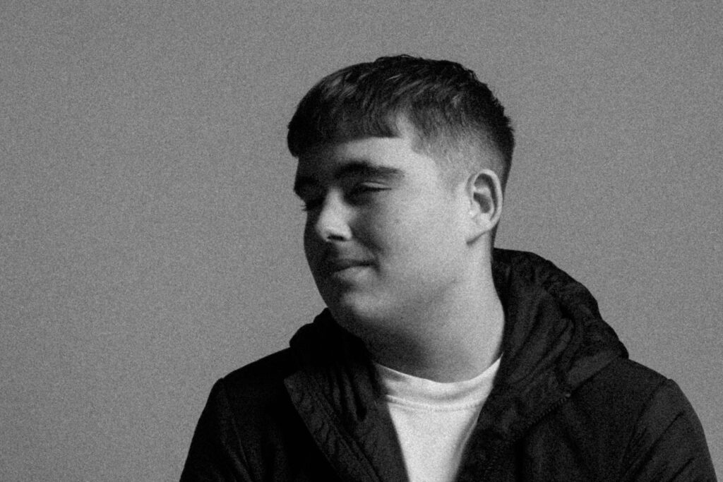
(Further use of studio lighting, here I used Rembrandt and made it more prominent with white settings)
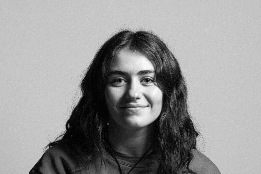
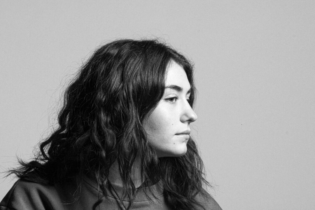
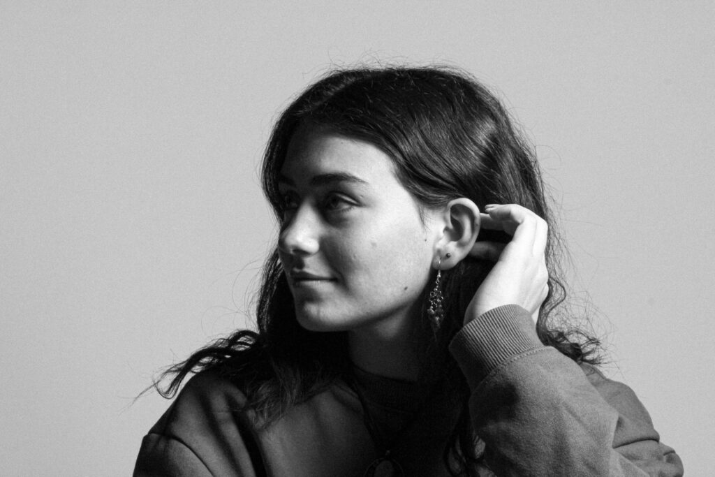
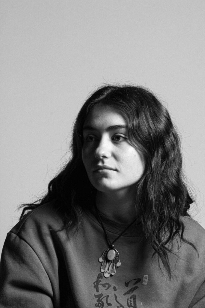
Going for a very old looking photo, I attempted this by Increasing the size and roughness of the grain. Additionally by adjusting the exposure and contrast, it made a more brighter image and tonal difference amongst the light and dark parts of the Image.

(Using Rembrandt lighting again, I used grain to give it a more prominent appearance).


Diamond Cameo edits:
Using the eclipse tool, feathering and a use of alternative backgrounds, I edited my images further with photoshop.
Sticking to the idea of Diamond Cameo, I experimented further by alternatively adding a background of an old photo of Jerseys king street.
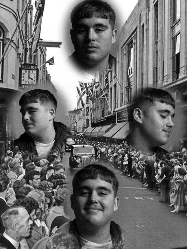
With This Diamond Cameo, I matched the background image of my photos to an old image of a newspaper I found. To me this creates an interesting composition as the headshots almost merge into to the newspaper.
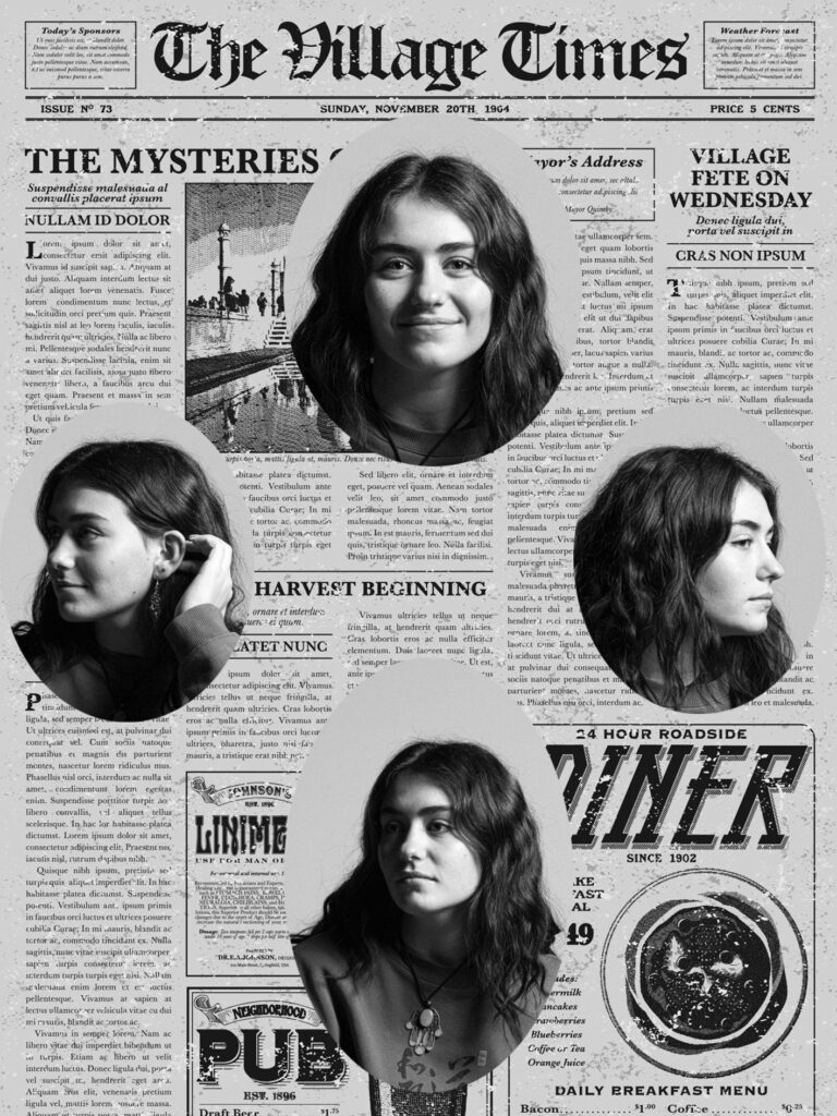
Going for that old card effect, I used photoshop textures to make this image more interesting with its visual composition.
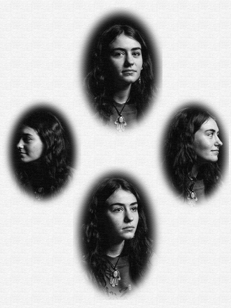
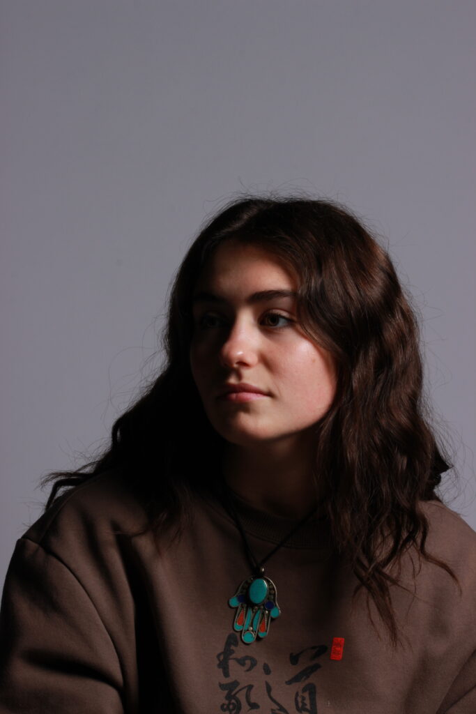
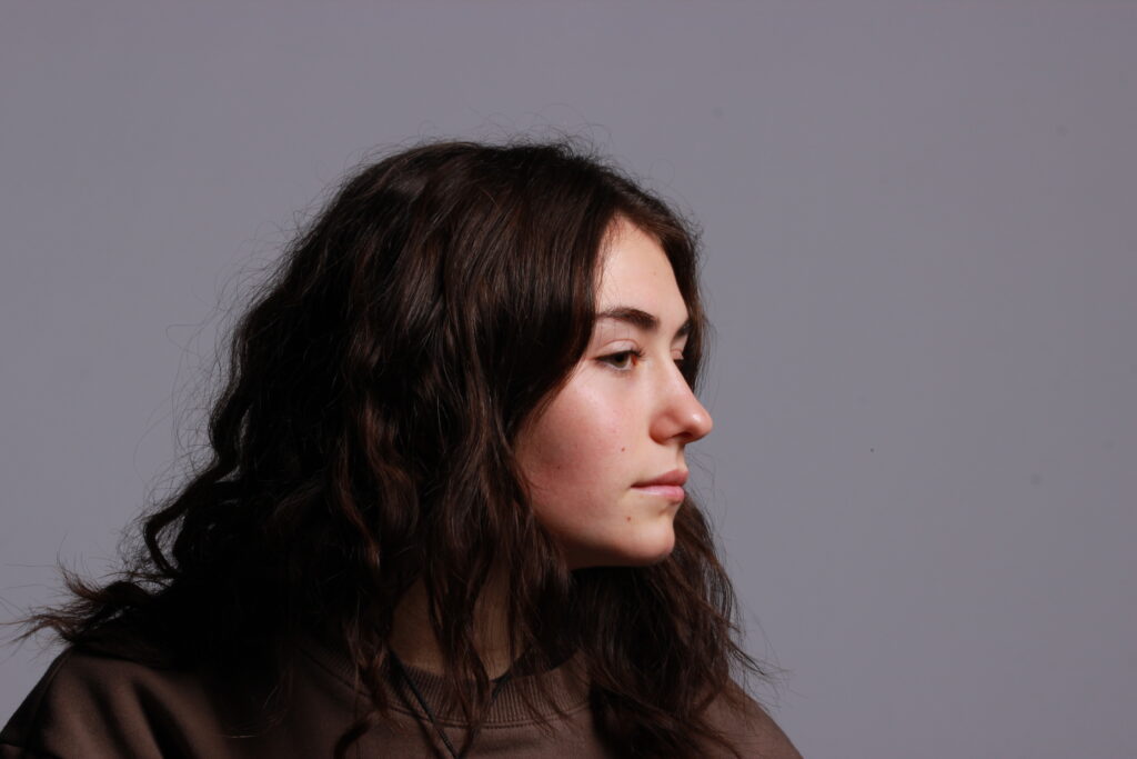
These images are from my Henry Mullins Photoshoot.
My Intention with this shoot was to recreate the headshots Mullins used to create his Carte-de-visite’s and Diamond Cameos. With editing I will make my images look like his.
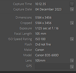
Camera Settings:
Green coloured:
These photos are rated 4 – 5 on the star rating, and are flagged meaning I believe they had a decent outcome.
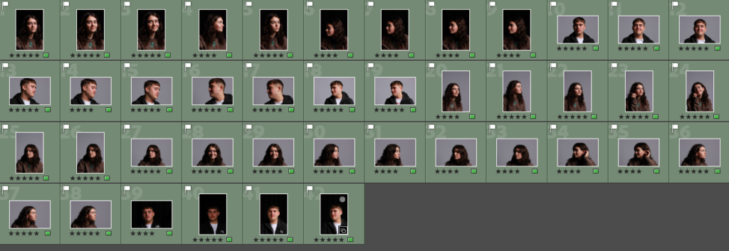
These matched the angles I would like to use for my Diamond Cameos. Additionally the composition of these image came out well, as the contrast of shadows makes a good tonal effect for that vintage look I am going for.
Red coloured:
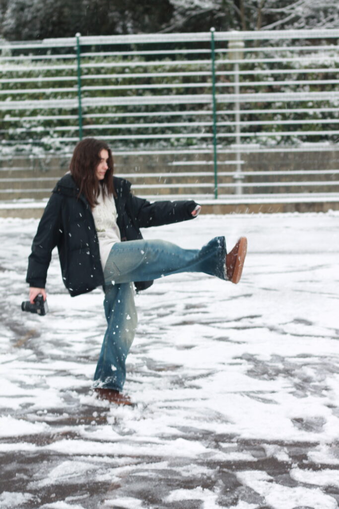
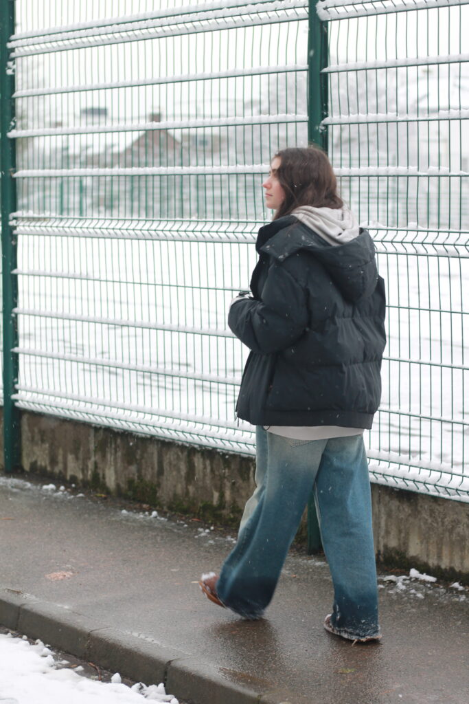
These photos aren’t rated as they did not conform to the idea I was going for. Some weren’t taken properly, as they were over exposed or too dimly lit.

These were unable to be used, due to not matching what I was going for. This was because I did not think they had the same angle types I was looking for with my work.
Best Photos:
