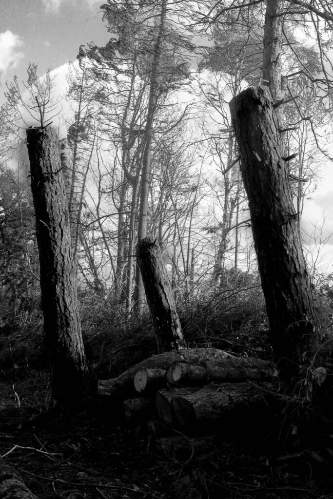
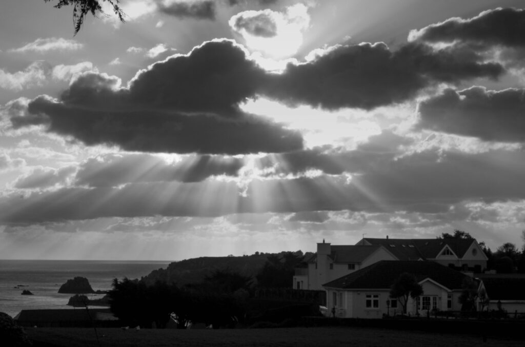
All posts by George Blake

Filters

Author:
Category:

Ansel Adams Case study – George Blake

Who is Ansel Adams?

Born in San Fransisco, 1902, Ansel Adams was a famous American photographer in the 20th century, most known for his landscape photography capturing Americas natural beauty. His photoshoots specifically were devoted to capturing the remaining fragments of untouched American landscapes and preserved wilderness. Mainly taken in national parks and areas of remaining beauty in the American West, Ansel Adams first captured his signature style of landscape in Yosemite National park. After summating a mountain peak carrying a heavy camera, tripod and additional gear, he reached a place called the Half Dome this is where he would first use ‘visualisation’, this started of his career in photography leading on to him creating numerous famous photographs such as:

The Tetons and Snake River, Grand Teton National Park, Wyoming, 1942

‘Denali and Wonder Lake, Denali National Park and Preserve, 1948’

Clearing Winter Storm, Yosemite National Park, c 1937

His love for the American West came from his love for nature, quoted by Adams the national parks he visited such as Yosemite and Sierra Nevada were “Coloured and modulated by the great earth gesture”. His first trip to Yosemite, in 1916, started his love for the place and his passion for photography. It was there his father gifted him his first camera, an Eastman Kodak No.1 Box Brownie.

What is Visualisation?

Quoted by Ansel Adam’s Visualisation is “to see (an image) clearly in the mind prior to exposure, a continuous projection from composing the image through the final print”. Put simply it is the concept of being able to see the scene prior to shooting and using your mind to make the that scene as a final product. In addition to using visualisation, Ansel Adam’s alongside his fellow photographers in their group F/64 developed the ‘Zone System’.

What is the Zone system?

Using a chart ranked from numbers 0 to 10, this could be used to determine which areas of the photograph would fit into these zones of tone. Combined with visualisation this is helpful in deterring what the image would turn out to look once printed from film.

Using a Kodak Brownie Box Camera, Adams carried two filters: One red, one yellow, these where used to pick more detail in tone on certain parts of the picture. For example, the Yellow made the brown hillsides and tree bark for visual, standing out better, the red was to darken the sky and create that dramatized appearance.

Group F/64

Being an environmentalist and conservationist, he helped found the group F/64. This group consisted of photographers advocating “pure” photography, this consisted favouring a sharp focus and the use of full tonal range within an image. This group saw the invention of the zonal system and produced some other often overlooked photographers who’s work slowly grew into the spotlight like Ansel Adams. Some of these include Edward Weston, Dorothea Lange and Imogen Cunningham. The name of the group stemmed from a suggestion by Adams as a nod to the F-stop there photos often used.

Edward Weston, like Adams has now become far more recognisable for their work, this can been with his still life pieces of vegetables in dramatic detail of visuals.

(‘Cabbage Leaf’, 1931)

I can’t tell you how swell it was to return to the freshness, the simplicity and natural strength of your photography … I am convinced that the only real security lies with a certain communion with the things of the natural world

— A letter from Edward to Ansel in 1936

Adams links to Romanticism –

Composing some of the 20th century’s greatest pieces of landscape photography, Ansel Adams can be said to have modernised transcendentalism, the idea that society and its institutions spoil the purity of the individual, with this in mind it can also be stated his work brought about the American revision of European Romanticism from the 18th and 19th century through the use of photography albeit in a visual composition similar to the paintings from the past.

In comparison to the paintings from the Romanticism Period, it is more clear to see where Ansel Adams possibly took inspiration from with his photoshoots.

Ansel Adams (Cathedral Peak and Lake, 1938)

Wilhelm Bendz’s Berglandschap (mountain landscape, 1831)

Inspired by Alfred Stieglitz, who he met in 1933, and held a one-man exhibit for in 1936, the influence of his work is visible when shown in comparison to each other.

(Stieglitz)

(Adams)

Image analysis –

In response to looking at Ansel Adams work, I will use his technical skills to help improve upon my landscape photoshoots and try to create an interesting set of photos based similarly to his visual style.

Romanticism – George Blake

What is Romanticism?

“Romanticism is beauty without bounds-the beautiful infinite.” – Jean Paul

Romanticism is an artistic and intellectual movement which stemmed from the rich and wealthy within Europe, around the late 18th to early 19th century. It consisted of attitudes, Ideals and art pieces that expressed a large emphasis on the romanticized rather than realistic celebrations of nature. Creating a falsified utopia out of the unsophisticated countryside. Romanticism generated from the individualism of the wealthy people in the 18th and 19th century’s conceptions of nature.

The Romanticism movement in art is highly associated to the ‘Age of Enlightenment’. This was an intellectual movement from the 17th and 18th century that consisted of ideas concerning God, Humanity, Nature but most importantly Reason due to its primary source of authority and legitimacy. The reason for its connection came from their similarities in their philosophies.

Coming from the Era of Enlightenment, The art form grew out of the disillusionment of values regarding reason and order after the French Revolution in 1789, where the French people revolted against their oppressive wealthier population and monarch. Brining an entire change to the nation neighbouring countries such as Britain, Italy and Spain adapted to these new ideals through theory and art.

What is the difference between Bucolic and pastoral?

Bucolic often refers to the pleasant aspects of country life and its nature. Pastoral is similarly defined, positively as the working elements of country.

The Art of the sublime

The art of the sublime, which took place at same time of the enlightenment, is understood to mean a quality of greatness and grandeur, that inspires wonder and awe. This is specifically with regards to landscape. This can seen with this image for example.

Romanticism artist –

“I never saw an ugly thing in my life: for let the form of an object be what it may, – light, shade, and perspective will always make it beautiful.”

John Constable, a Romanticist painter from the 1800s, painted his conceptions of the countryside like many others of the bucolic art pieces made by other artists at the time. Although still representing the exaggerated elements of nature, John constable drew directly from nature within most of his art pieces. This was due spending his childhood, in a small Suffolk village where he lived and witnessed the rural economy in its workings, this would later go on to inspire his artistical career and illustrate this through his romanticist paintings.

Landscapes Photoshoot Plan – George Blake

What?

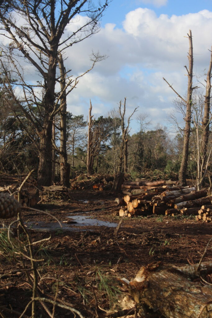
For my photoshoots I will photograph the damaged landscapes of Jersey due to Storm Ciaran. Throughout the night of Wednesday November 1st 2023, Jersey and the other channel islands, Guernsey and Sark, experienced a tornado ravage across their landscapes. With Jersey hit the worst, every parish had received some extent of destruction. Examples of such include trees falling onto homes and entire buildings have roofs and walls ripped off. Waking up to the damage, islands found out that many roads were impossible to traverse through and walking paths were blocked. The railway walk in St brelade, had become entirely covered in fallen trees and branches making it hardly able to recognise.

The neighbourhood in the area of FB fields had received the brunt of the storm, with many windows, roofs, gardens, car severely damaged to a point of unrecognition of what it previously looked like. Photos of street looked like an image of a war zone.
In comparison to the previous storm in 1987, that Jersey islanders nicknamed the ‘Great Storm’, the damage to the island was caused by much more violent and strong winds. Islanders alive who have experienced both reminisced to the time and have said the severity of damage it caused was similar to as it was now.

(The ‘Great Storm, 1987)

Who?

  • I will capture images around island of damage caused by storm Ciaran as well as some of Jerseys urbanised areas.

Where?

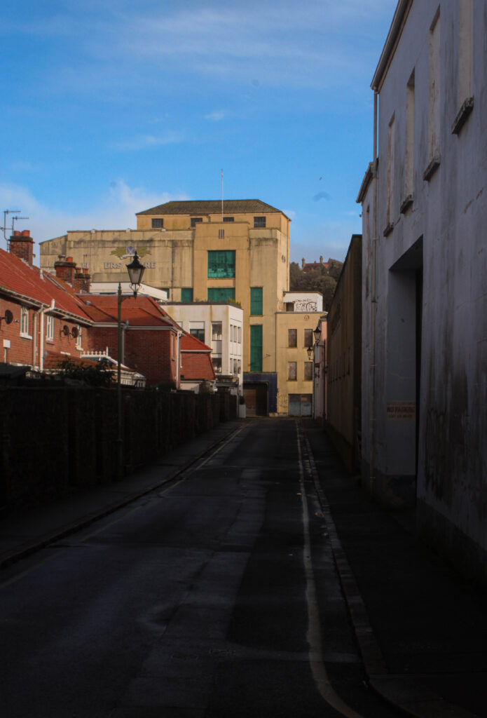
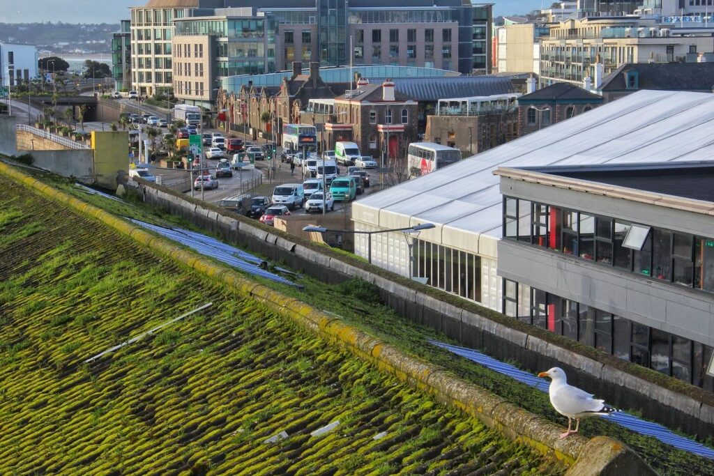
  • Town – old areas in St Helier’s urban area such as the brewery, abandoned buildings, alley ways are a good example plus show storm damage. Houses around town are also being worked on with roof patching etc.
The top of car parks, provide a good height over towns urbanised topography. This is how I will create similar images such as to these. Places like fort regent will be useful as well.

  • Noirmont – fallen trees are still populating the area and is a good way to show the impact on the woodland area and farm surrounding it.
  • The railway walk – Numerous trees are still collapsed in that area and will provide a good example of regularly used pathways damaged.

When?

Over the half-term I will attempt to photograph a variety of different areas affected by the storm. By having photoshoots of different areas effected it will help create a good contextual basis on what happened like how Frank Gohlke did with the tornado damage to his home town, Wichita Falls in Texas.

Mind Map –

For my photoshoots I plan on creating at least 3, capturing different areas of damage caused by storm Ciaran. The idea I had in mind was to have them capture: Urban damage ( Town area), Environmental damage (walk paths, fallen trees in woods etc) and property damage (specific cases of peoples homes and what types of damage has been done, such as cars, gardens, roofs, walls, etc).

(Idea of general location – Town)

(Idea of general location – Noirmont, railway track, St Catherine’s woods)

(Idea of general location – houses in states effected heavily by the storm)

With these general locations in mind, this will be a starting point for my conceptual basis with my photoshoots.

The ‘New Topographics’/Landscapes Artist Reference – George Blake

Mood board:

Artist studies:

Robert Adams –

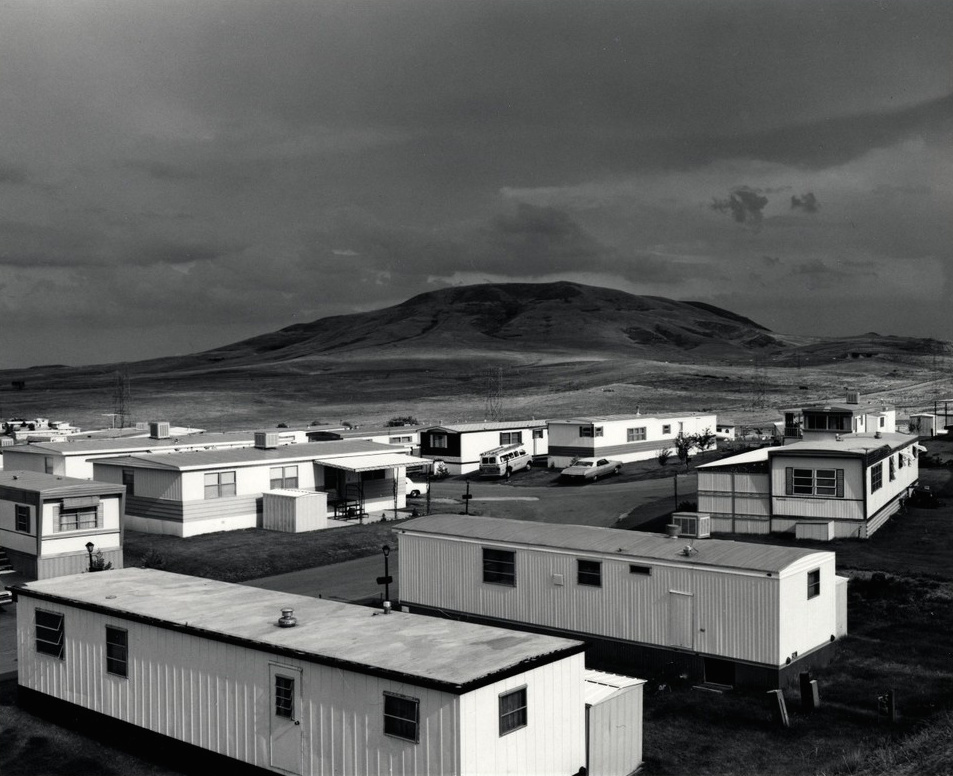
Born, May 8th 1937, Robert Adams is an American Photographer apart of the ‘New Topographics’ , were him and other photographers captured the aesthetic of rapidly urbanised landscapes such as parking lots, warehouses, and suburban houses. His work is said to explore and reveal the effects of human impact on wildness and open space, furthermore it is spoken that his work also shows the hollowed out idea of ‘Manifest Destiny’ when expanded in the 19th century and that this once rapid expansion has led to after effects of consumption of the landscapes. With these images, i feel as if this is best shown as a once, large peaceful expansion of calm has been converted into a populated area of both busyness and desolation of urban sprawl.

Lewis Baltz –

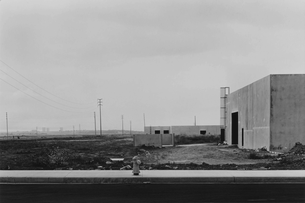
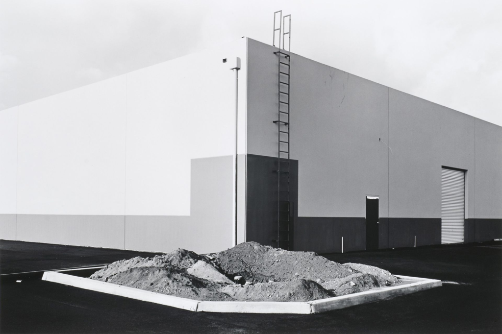
Born, September 12th 1945, Lewis Baltz can be seen as one of the young prodigy’s of the baby boom generation to capture the aesthetics of the ‘New Topographics’. Like Adams, his work exposes the vast Urban sprawl, now left desolate and unused post second world war. With the grand scale of industrial output during the second world, large structures as seen in this image sit unused and worn out from a past, once busier function. Now, numerous areas like this, are captured by Baltz.

Frank Gohlke –

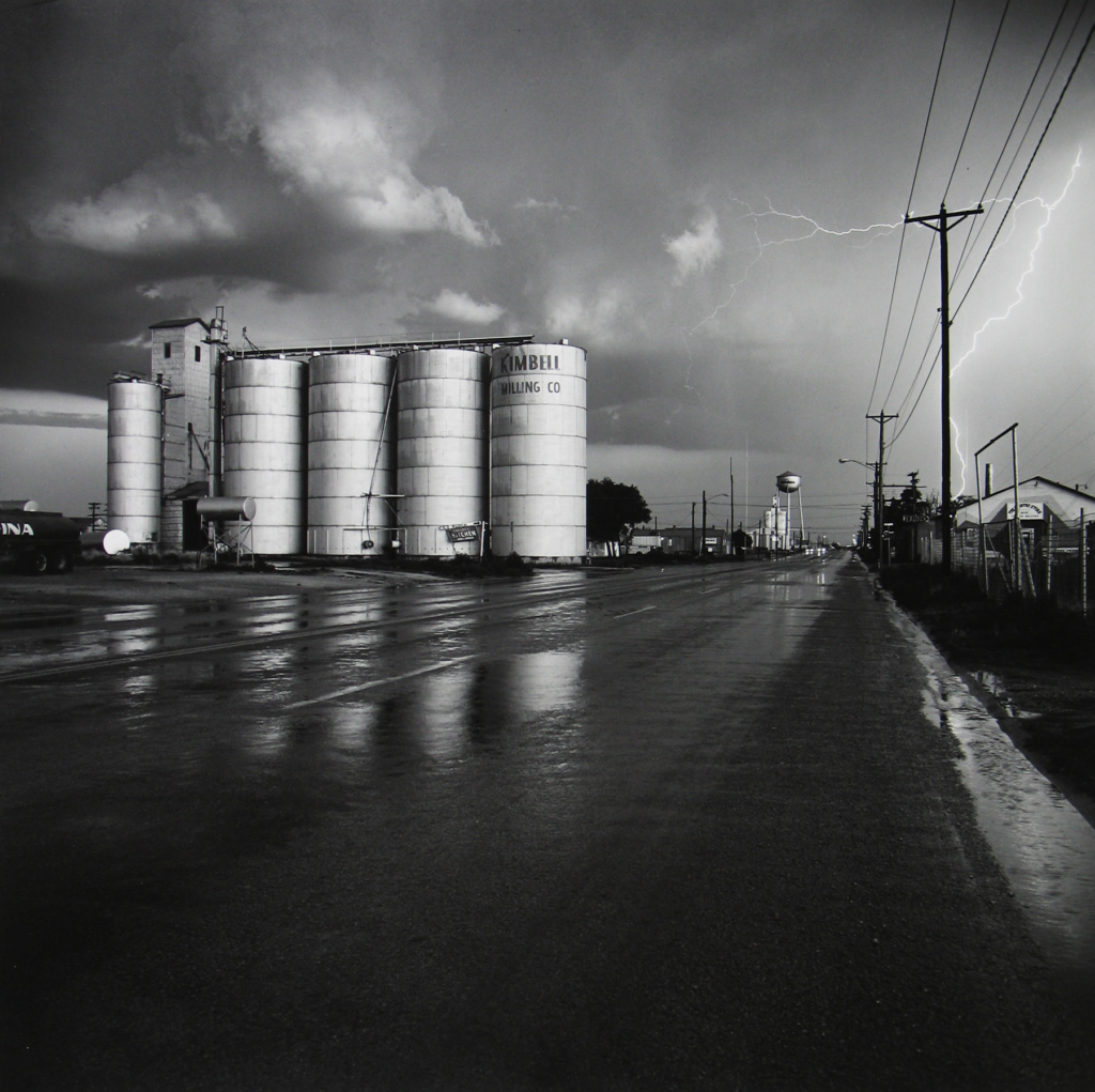
Born, April 3rd 1942, Frank Gohlke was another photographer apart of this aesthetic. Photographing urban areas such suburb neighbourhoods and old factories within towns, Gohlke, differed slightly from the rest as his photos also consisted of cases of destruction in urban areas. Such as the aftermath of a tornado hitting his home town Wichita Falls Texas, in 1979, as well as the destruction of property surrounding mount St Helens following its eruption in 1980.

( Tornado aftermath, Wichita Falls, Texas, 1979)

Frank Gohlkes’s work is significant to me as his photographs are highly similar in comparison to our project for this topic. Our project is to compose photoshoots of the damage caused to our islands landscapes following storm Ciaran in November of 2023.

All of these Photographers have had their work featured in numerous Art galleries, such as the Solomon R. Guggenheim Museum in New York. Most importantly, all 3 were apart of a group of 10 photographers who were selected to be a part of the “New Topographics: Photographs of a Man-Altered Landscape” and featured in the 1975 exhibition at the International Museum of Photography at George Eastman House.

Quotes:

No place is boring, if you’ve had a good night’s sleep and have a pocket full of unexposed film.

– Robert Adams

If you read what, say, Weston was writing in the 1920s he talked about an industrial medium, reflective surfaces, contemporary subject matter—it’s a straighter line to [Ed] Ruscha’s 26 Gas Stations than it would ever be to Ansel Adam’s pictures of Yosemite and their kitschy calendar sensibility.

– Lewis Baltz

The best landscape images, whatever their medium and whatever other emotions they may evoke… propose the possibility of an intimate connection with a world to which we have access only through our eyes, a promise containing its own denial.

– Frank Gohlke

Image analysis

For this image analysis, I have chosen to look at Frank Gohlke’s work as I believe it will be the best point of reference for my photoshoots.

Rural Landscapes – George Blake

What are Rural Landscapes?

“ Any landscape is a condition of the spirit” – Henri Frederic Amiel

Rural Landscapes are the vast geographical features of anything that consist of large expanses of nature. This includes Croplands (Farms), Forests, deserts, swamps, grasslands, pastures, rivers and lakes. In photography, Rural Landscapes genre focuses on the countryside, its people and the unaltered beauty of the world.

Unlike Urban landscape photography which focuses on the activity, volume and tumultuous visuals, Rural landscape photography captures mainly the secluded and soothing peace of nature.

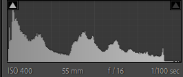
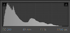
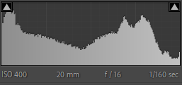
With an F-stop around F11 to F16, And and a shutter speed around 1/100 to 1/200 these setting are best suitable combined with an a correct ISO depending on lighting,

Rural Landscapes can establish a sense of nostalgia, with familiar landscapes becoming a lasting place of home. Either for good or bad reasons rural landscape photography captures a indissoluble image of a place in time.

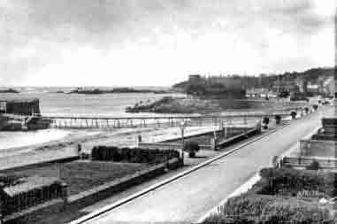
(St Peters Village 1912 – Now)

Rural Landscape photographers with their work try to target spaces within the world, where both tranquillity and chaos co-insight, grandeur or pocketed locations lie and prepossessing sights unfold .

Mood Board:

‘The New Topographics’ / Landscape – George Blake

What is The New Topographics?

Being a term coined by William Jenkins in 1975 to describe a group of American photographers, such as Robert Adams, Lewis Baltz and Frank Gohlke. The New Topographics consisted of mainly black and white prints of urban altered landscapes, taken together, their photographs, formed a shared aesthetic of banal appearance.

(Robert Adams – “The place we live”)

(Lewis Baltz – “New Topographics: Photographs of a man altered landscape”)

(Frank Gohlke – “Grain Elevator and Lightning Flash, Lamesa Texas, 1975”)

What was the ‘New Topographics’ a reaction to?

Being a reaction to the rapid cases of urban sprawl across America, it showed the oddly fascinating topography of areas usually perceived as mundane locations. This consisted of large urbanised towns, industrial sites and more. Not only capturing the reflection of an increasingly urbanising country, it also served as a reaction to the more common and idealised landscape photography of natural and elemental landscapes, like such as artists as Ansel Adams.

(Ansel Adams, Cathedral Peak and Lake, Yosemite National Park, California)

birthed in the 1970s, the ‘New Topographics’ sprouted from a struggling post-war America. After the second world war, Soldiers had returned home to their wives and got busy creating the Baby-boom generation. In this time period of America the countries birth rate increased massively from 1955 to 1964 nearly 42 million had been born.

After this in the 1970s, many of these baby boomer now had grown into young adults. More homes were needed to accommodate these adults and their new families and as a result, America saw a rapid increase in homes and suburbia. Another problem post-war was the challenges with the economy, inflation and labour unrest. If there was a sudden collapse in price and wage control, many feared it would lead to inflation of prices.

Final Portraits: outcomes, comparisons and evaluations – George Blake

Masculinity, Femininity and Identity –

For my photoshoot I based some of my photos from Eugene smiths documentative series ‘Country Doctor’, Creating my own version, I explored in my photoshoot the way Masculinity, Femininity and Identity are explored throughout my Relatives locally owned business, A pig farm.

‘A day in the life’ – George Blake

In comparison to my inspiration, I think I created a good visual and textual inspired photoshoot for my edited photographs. With a similar concept in mind I went my own way with documenting through a photo essay of the ‘day in the life’ of my relatives pig farm.

Comparison

I find that these images create a comparison, due to both images capturing the subject in a working environment. Despite different Jobs entirely, they’re similar in the fact both subjects in the image are doing a task related to their practice.

To me, these images can be shown to comparison from each other as Both images subject does not provide a direct eye contact to the camera. This for me creates that documentative element in these photographs as it further associates the subject into the image as the viewer is captured to their appearance within their environment.

In comparison to Smiths work, I believe my editing to create a picture essay, envisioned as a newspaper matches closely to his work. Going into detail about the contents within the image, I believe I have made a good replica of his concept.

Overall, I believe I have captured the same conceptual basis, the photographer, Eugene Smith had when creating these images. I think with the technical aspects, such as lighting and aperture, I was able to make a close match. Since Smith’s photos were made in 1948, I tried to replicate a newspaper effect from the time period. I based my idea of positioning my photographs to create that same effect as if being read out of a newspaper or magazine.

I was also inspired from a vintage WW2 Jersey Newspaper I own, where photographs were presented in small circles popping out on a page. Using my knowledge of photoshop I had gained from making diamond cameos, I recreated that effect with some of my smaller side images.

Studio Portraits –

For my photoshoot, I was inspired by a large mixture of photographers such as Henry Mullins, a local photographer who merged his studio portraits of people of Jersey into a Diamond Cameo and Andrés Gallardo Albajar, who got headshot photographs of people with and without hands covering their face, to then merge them as Multi-exposures.

In comparison to Mullins, I believe I was easily able to create a similar approach to his style, basing my concept of his, I used by photographs from my studio shots.

Comparisons –

Overall, I like how these came out a lot as I think I managed to create a similar style to both photographers. Using photos from when we played around with studio lighting, they are a mixture of Rembrandt, Chiaroscuro and butterfly lighting.

I would improve however with further with more photoshoots to be able to have a wider experimentation to Image manipulation. This is because I feel like I could create some additional diamond cameos and multi-exposures without over-using images from the shoot.

Environmental Portrait –

Inspired by the German photographer, August Sander, I wanted to recreate his style of some of his high contrast, environmental portraits. Using a similar aperture I tried to capture my portraits of people in their natural environments. I was also inspired by Alec Soth, who would photograph people doing their hobbies.

Overall, I like how these came out, I think the angles of the shots and composition produce an nice image, I would improve however with getting better lighting. As some of my photos appear to have less definition on shadows as during my photoshoot it wasn’t particularly a sunny day.

Comparison –

Overall, I like how these turned out. In comparison to, Soth’s and Sanders work, I think my images loosely take influence through capturing the visual concepts of people in their natural environments. How I would improve is for further exploration into environmental Portraits, capturing more realistic locations like a work place or home, I think combined with a more accurate attempt at shot distances, I could produce a similar style of image.

Masculinity, Femininity and Identity First edits – George Blake

Photo shoot Info:

Taking inspiration from Eugene Smith’s ‘Country Doctor’, My photoshoot consists of a documentative series of images. I wanted to edit my images to look in the same way, to achieve the same composition.

First edits:

Overall, I like how this image came out. How I framed the shot is good, as it provides a clear shot of the subject and allows the viewer to create assumptions on the type of role my nan plays in the farm. In addition to this, the arrangement of items on the work desk in front of her creates an interesting Mise-en-scene which leads the eye around the images content. What I would improve however is trying to get a clearer quality of image, by having a higher aperture next time, it wont create as much of a motion blur on parts of her face and hands.

Like the previous image. I am fond on the outcome for this photograph. Using a mid-body shot, I think I created an interesting Mise-en-scene of my subject performing his task in a documentative style. With the arrangement of him handling the packaged meat and dressed in his work apron I think these combined to make the Mise-en-scene standout more. How I would improve is by having a lower exposure as the brightness behind him supresses more of the environment of the butchers kitchen.

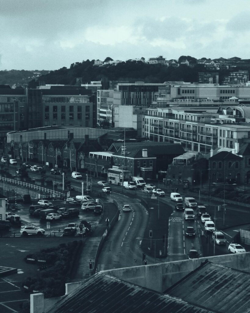
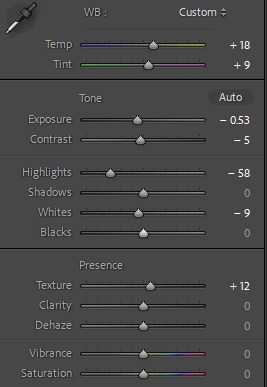
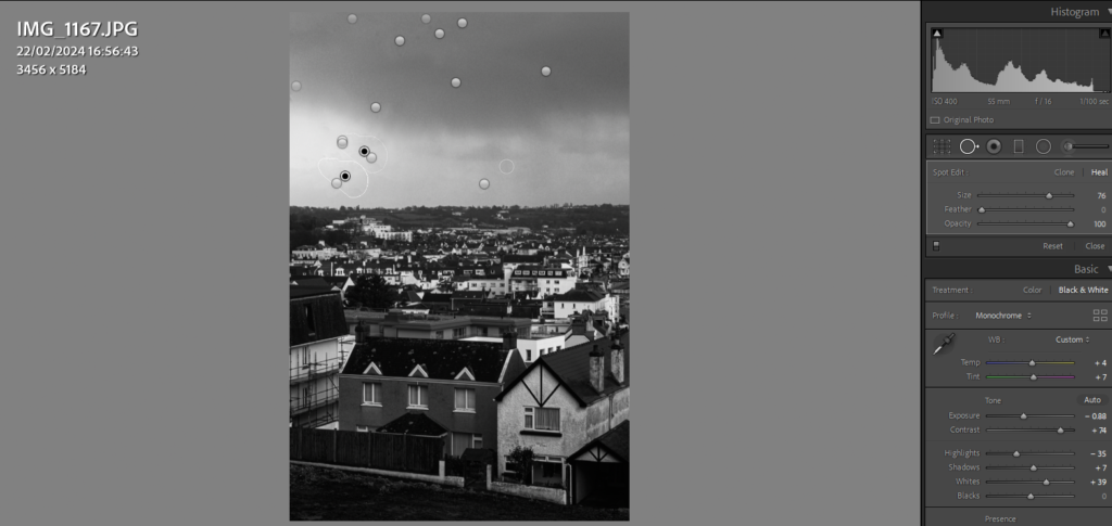
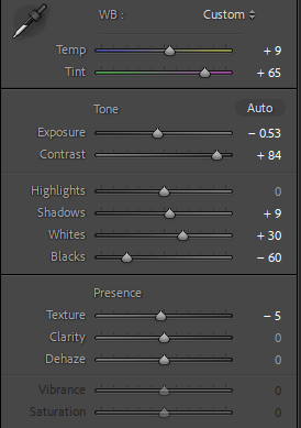
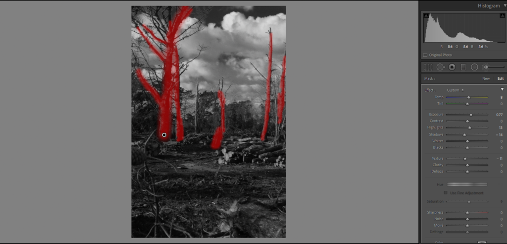
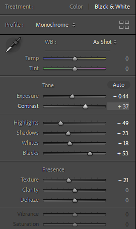
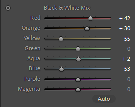
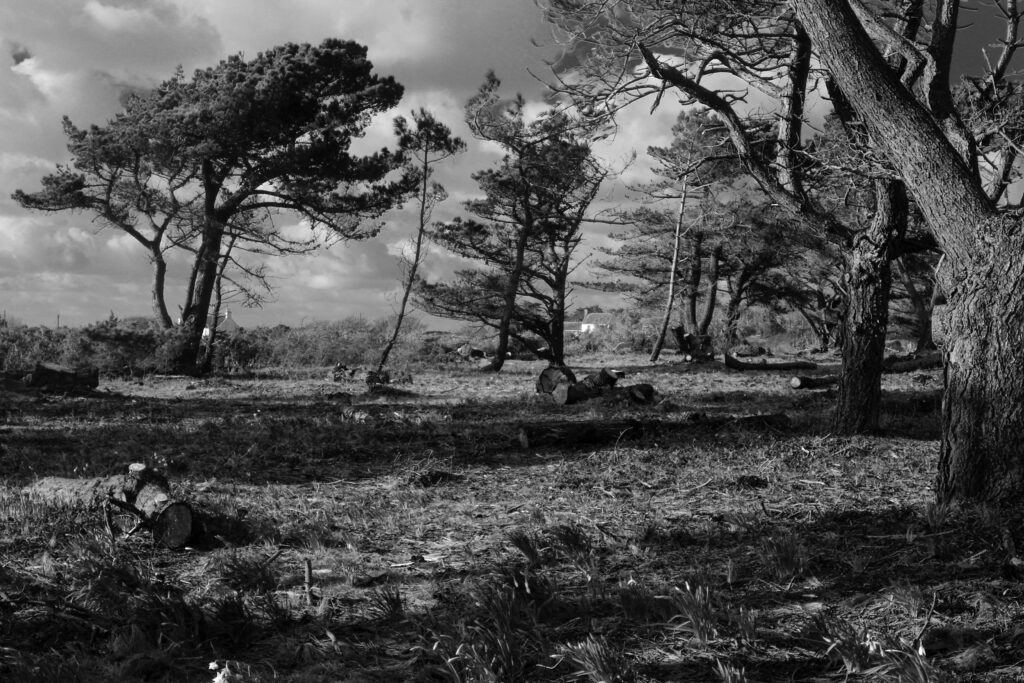
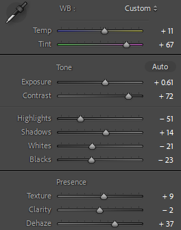
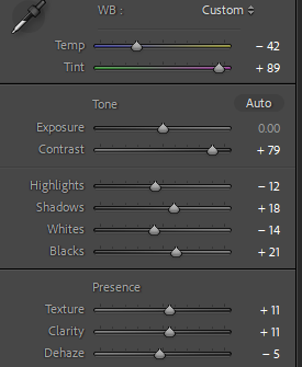
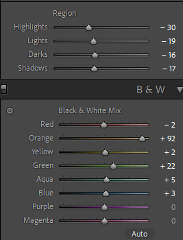
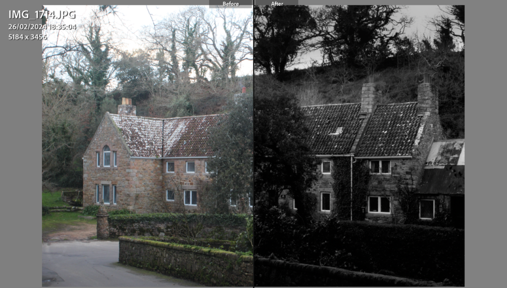
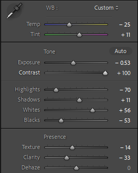
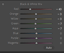
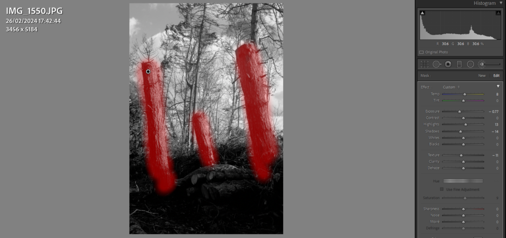
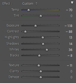
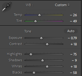
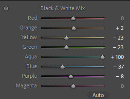
By altering the temperature as well as some other elements like texture and dehazing, I think I was able to improve on this image, making it seem more contrasted then it did before. Like the other images, I have lowered the saturation to create the old uncoloured-film effect photographers had before its invention. To improve, I will use a larger aperture like F11 or F16 to reduce the motion blur. To me, this image provides a good example of identity for my aunt, as through her facial expressions, a viewer can connote she finds joy in her work.

I like how this image came out as, to me, it captures what I was hoping for in comparison to the ‘Country Doctor’ by Eugene Smith. by editing it, I made it more brighter as it was a low exposure. With the use of the components of the environment: such as the hose, pig and the trees in the background. These all combine to create an interesting composition of a day in the life on the farm. Additionally this goes to show my cousins portrait of one of her roles on the farm, furthermore it can be said to challenge the traditional roles given to men and women on a farm as usually the dirty work of feeding the pigs and etc is a ‘Mans job’.

For this image, I believe it already had a nice amount of light. Working of that I played around with the texture and clarity as well as shadows and white to black balance to make it stand out a lot more once I had lowered the saturation. I find that this image connotes a lot of Identity about the farm as the butcher statues weathered appearance shows how long they’ve spent as a local business.

Taken together, these pictures go to show another part of the process of working on a butchers farm, captured in a documentative style. With a large view into the environment we can see the type of activities the business gets up. With the arrangement of utensils on the table as well as the meat it helps to provide that aesthetic needed to produce an interesting composition. This can also go onto provide information on how masculinity is shown. Being very hands on with the job, it represents a traditional sense of a masculine role. When combined, with other images of my aunt and cousin, for example it creates a diverse image of a workplace not overly male-dominated, which is stereotypically expected when one thinks of a butchers farm.

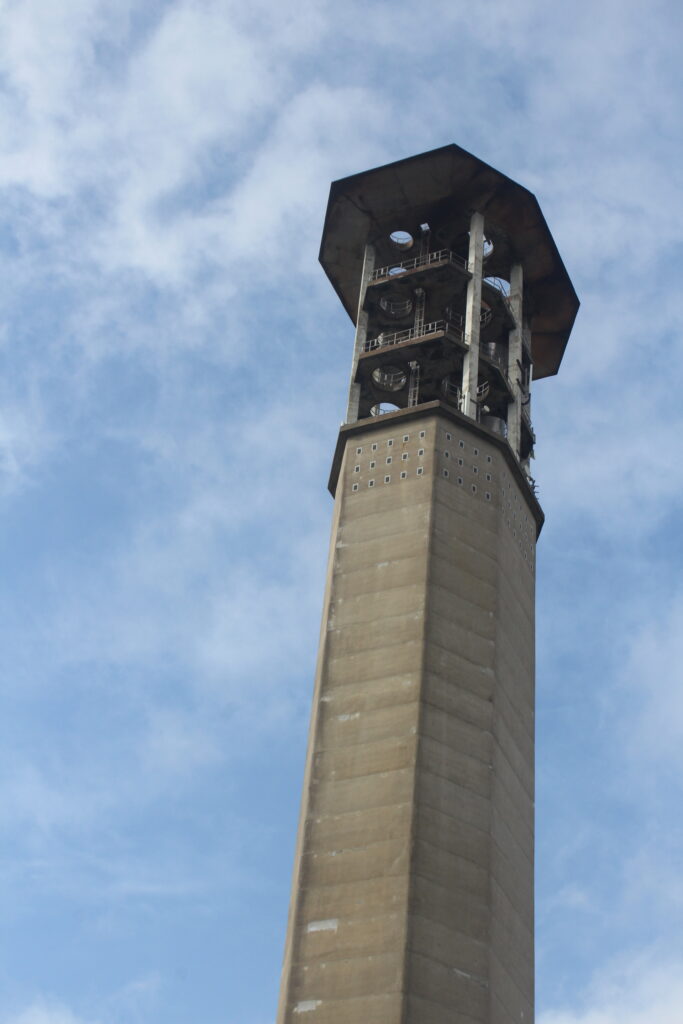
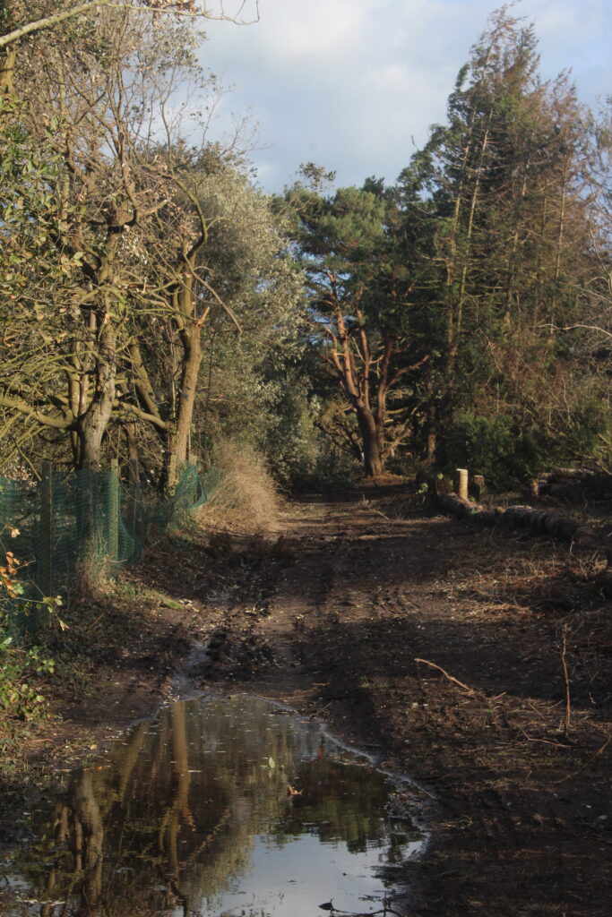
This image has an empty alt attribute; its file name is IMG_0784-683x1024.jpg

Conclusion:

In conclusion I like the outcomes of these images and will make further edits to them soon in my practice exam. Taken together, and some other a companying photos, I find that these images can be seen to take inspiration from my artist reference, Eugene smith and his gallery of images in ‘Country Doctor’.

Masculinity, Femininity and Identity contact sheet – George Blake

Content:

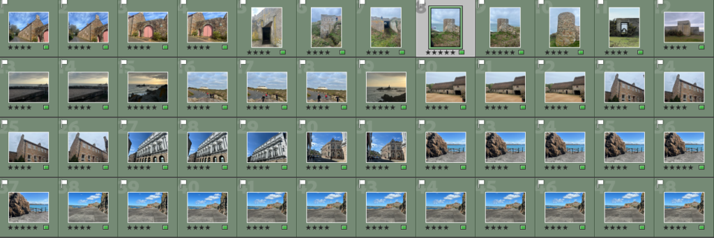
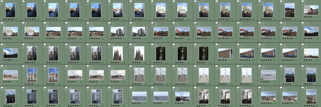
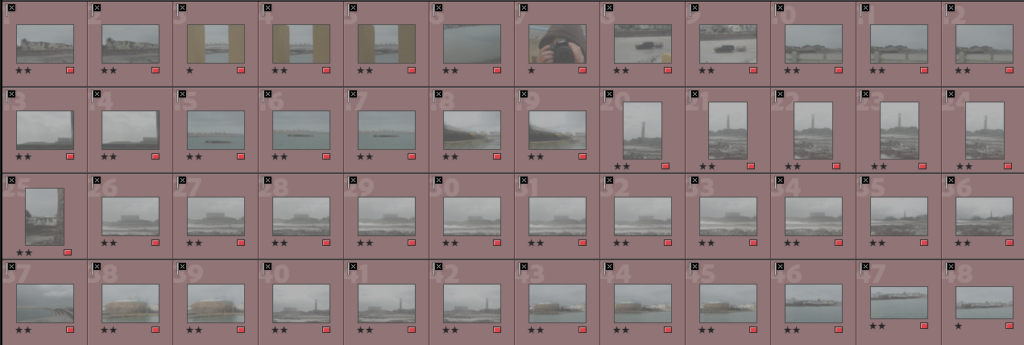
For this photoshoot I used my first Idea from my mood board of photographing members of my family, their colleagues, as well as the animals around the farm. I have composed a documentative series of images of the working parts of the farm with examples being the kitchen, animals and machinery, furtherly I have represented the identities of business through photographing them in their usual places.

Best Images:

Image Ratings:

Green coloured:

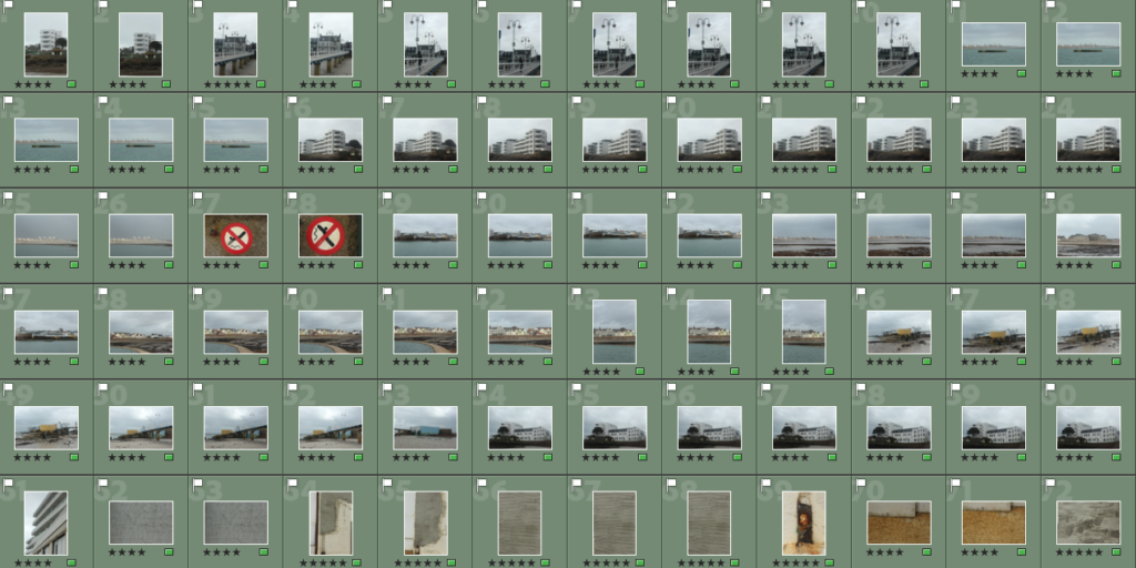
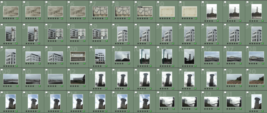
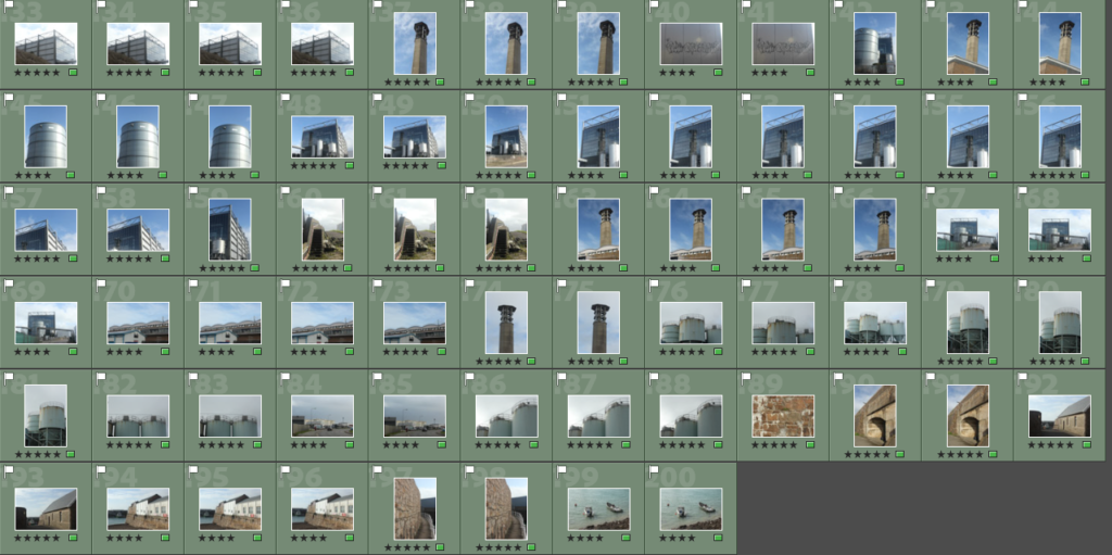
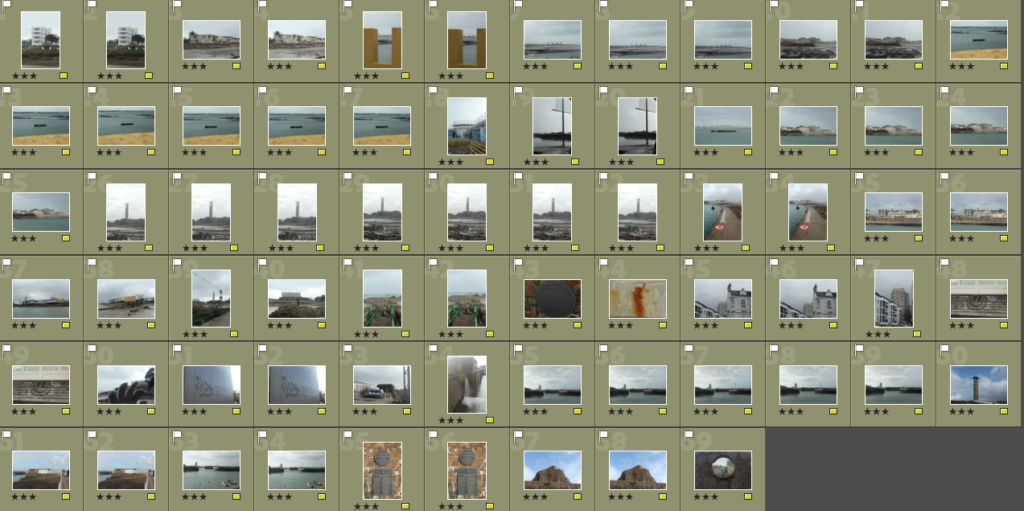
These photos are rated 4 – 5 on the star rating, and are flagged meaning I believe they fit the right aesthetic I am looking for with my plan of creating a documentative series of images for my project on Masculinity, Femininity and Identity. These pictures consist a merge of portrait pictures as well as some environmental portraits.

Yellow coloured:

These Images are a mix-match of images of either images I may possibly use or scrap depending on if I want them.

Red coloured:

These images did not fit the aesthetic because they where either blurry, poorly taken or not what I had in mind when I saw the results.

Conclusion

In the next blog post I will make edits to these images for my project with Masculinity, Femininity and Identity.

Claude Cahun + Cindy Sherman – Additional Artist References – George Blake

Who is Claude Cahun?

(Claude Cahun photographed her conceptions of what Masculinity and Femininity looked like).

Born as Lucy Schwob, Claude Cahun was a French photographer, writer and sculptor. Known for her exploration into questioning her Identity, she holds a strong title in being one of the early explorers of Gender Fluidity, decades before its modern prominence today. Changing her name to become more androgynous, she wanted to explore her identity of being non-gender specific.

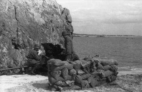
Born on October 25th 1894 in Nantes France, she would later evacuate to Jersey in 1937, when the looming threat of Nazi Germany would soon erupt 2 years later in 1939 when they began their invasion European nations. When the war eventually met Jersey with the occupation of the channel Islands, Claude Cahun and many others had to endure hardship and struggle due to their heritage. Coming from Jewish decent, she was forced to hide her religion with her ability to speak German.

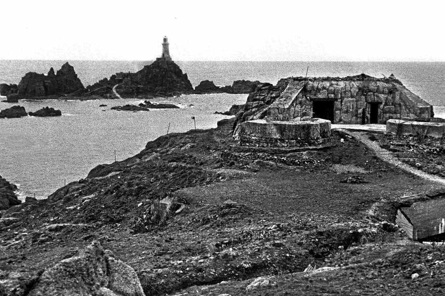
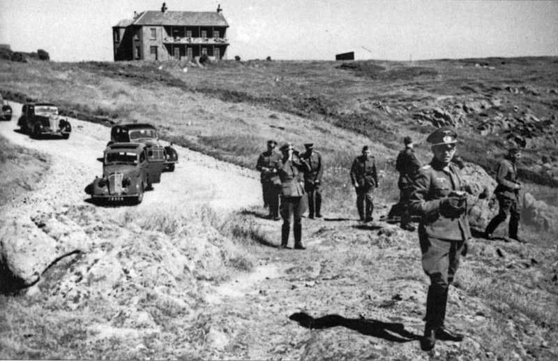
(German soldier overlooking Corbiere’s lighthouse).

Her creative choice with surrealism is also highly prominent to people as due to the suppression of abstract art under the Nazis, her photographs exploring gender and identity can be seen as a rare act of creative resistance to the Nazis ideology of a conformed race where everyone looks the same.

Cahun photographed herself in self portraits in numerous outfits to explore her variety of Identities. This was because she enjoyed capturing the surrealist nature of how Femininity, Masculinity and identity can be explored, altered and challenged. This can be seen with the example image below where Cahun, for a first time viewer is hard to distinguish from male to female.

“Under this mask, another mask; I will never finish removing all these faces.”

Who Is Cindy Sherman?

(Cindy Sherman photographed her ideas on female stereotypes , through a variety of characters similar to Cahun).

Born in 1954, in the United States, Cindy Sherman is a Photographer known for her feminine characters and their identities she created to examine the how identity is constructed. Playing every role in the photoshoot – photographer, model, make-up artist, hairdresser and stylist.

Spanning over 4 decades, she took multiple photoshoots of her exploration into how the feminine identity is represented. Her most famous one was her untitled film stills, taken in 1977-80 she created photographs of her exploring herself in various settings resembling that of mid 20th Century B movies. Some of these include the jaded seductress, the unhappy housewife, the jilted lover and others.

“I wish I could treat every day as Halloween, and get dressed up and go out into the world as some eccentric character”.