All posts by George Blake

Filters

Author:
Category:

Anthropocene Photoshoots Contact sheet – George Blake

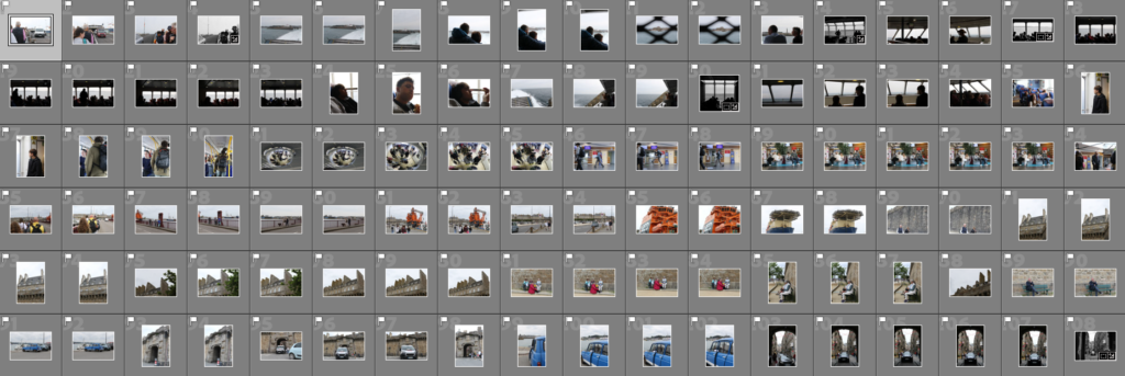
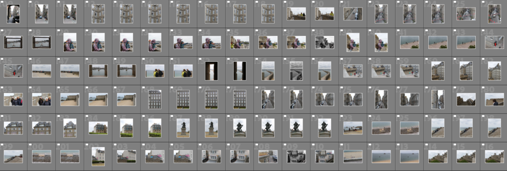
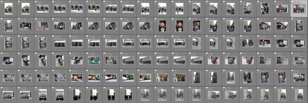
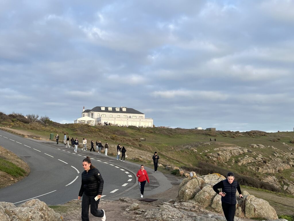
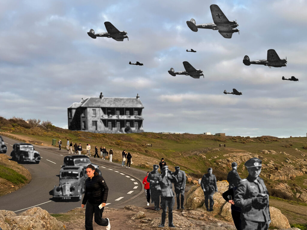
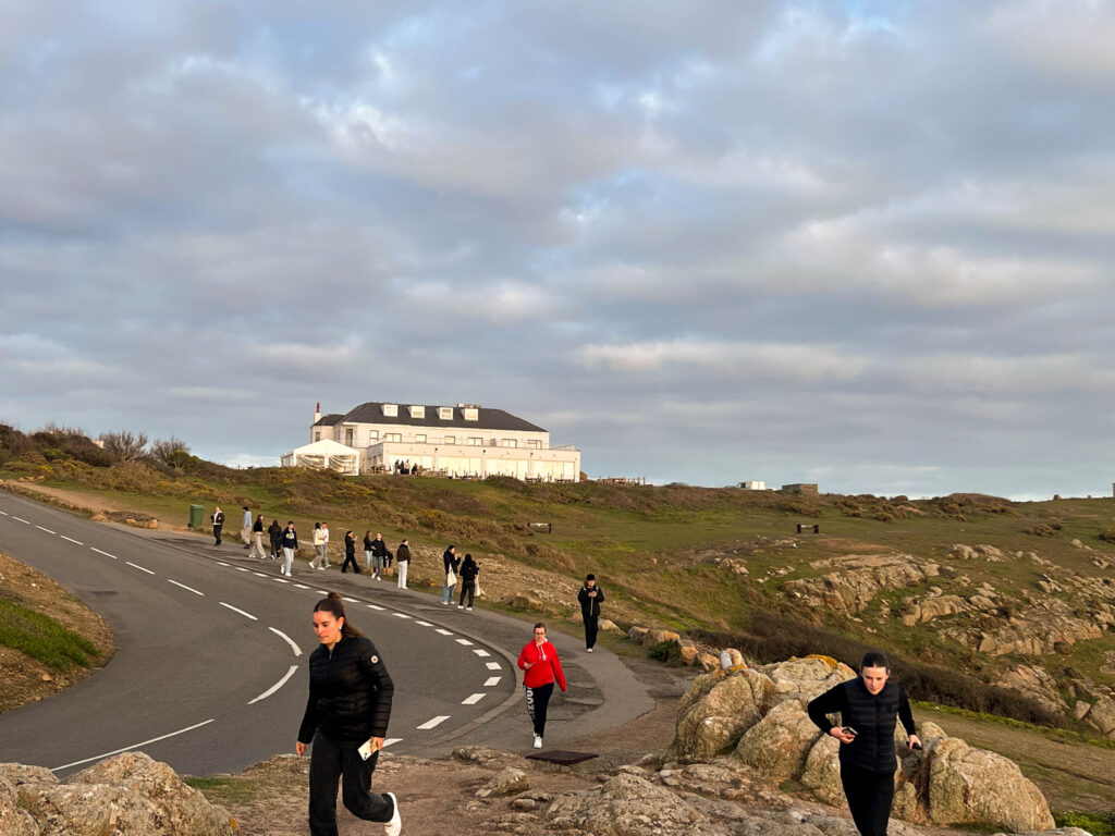
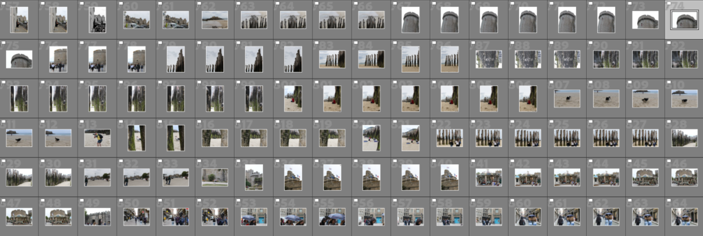
(For this image, I went on a historical walk around the area of plemont and how much it has changed since the second world war).

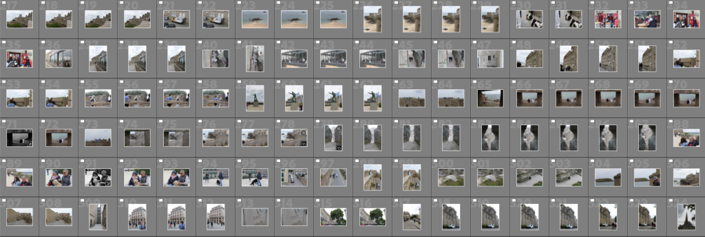
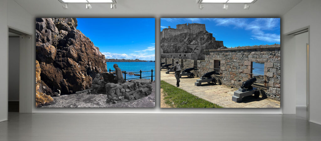
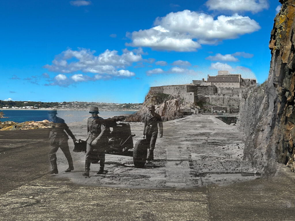
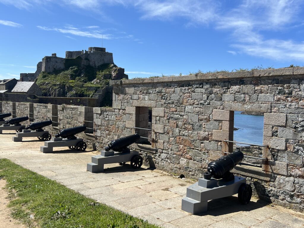
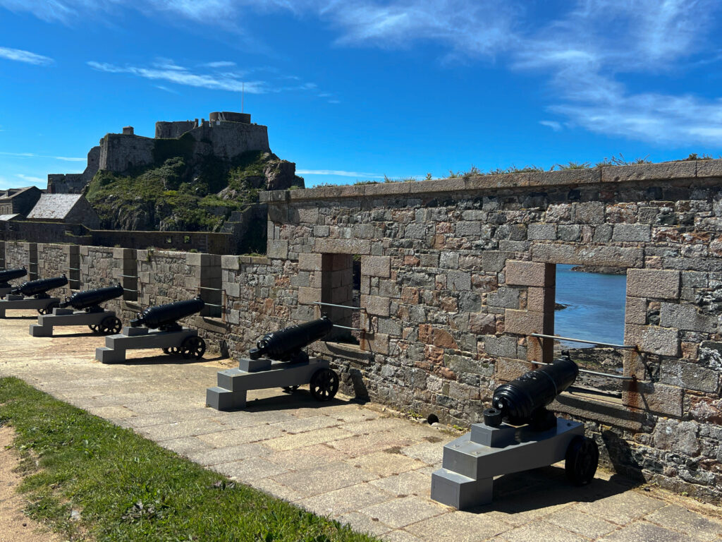
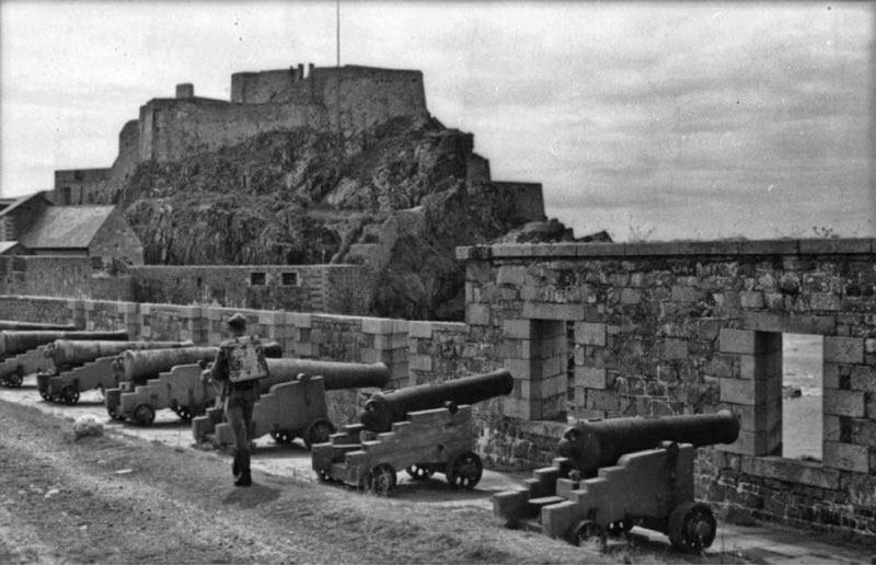
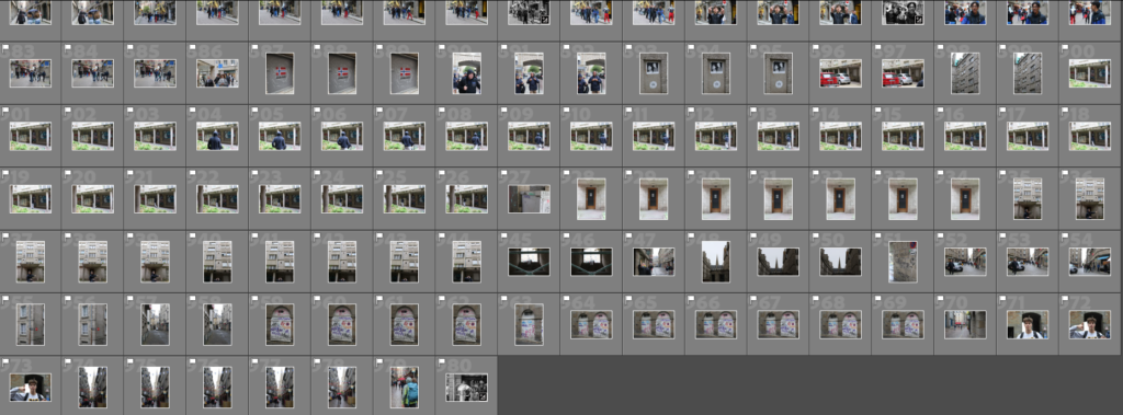
These are my photoshoots combined into a contact sheet, for my first contact I toke images of the historical site at plemont, with its mix of architecture from 2 different time periods with how they compare today, i thought it would be an interesting location. For my second photoshoot i focused on areas with direct influence of German bunker architecture such as cornier and Elizabeth which i had gathered historical photos to make comparison images from then and now with. Some mini-photoshoots are included like old buildings in town and in the agricultural museum, Hamptonne.

These photos are rated 4 – 5 on the star rating, and are flagged: This means that they fit the aesthetic of Anthropocene, and incorporate elements associated to it and my photoshoot plans.

These images are taken well but lack the correct amount of exposure, need to be cropped, re-adjusted with their angles or contain unwanted obstacles.

These images did not fit the aesthetic because they where either blurry, poorly taken or did not fit the concept I was basing my photoshoot off.

Examples:

Anthropocene – Photoshoot plan

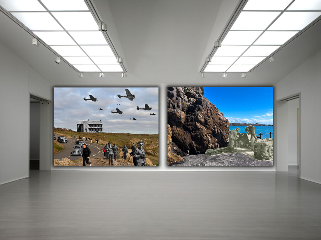
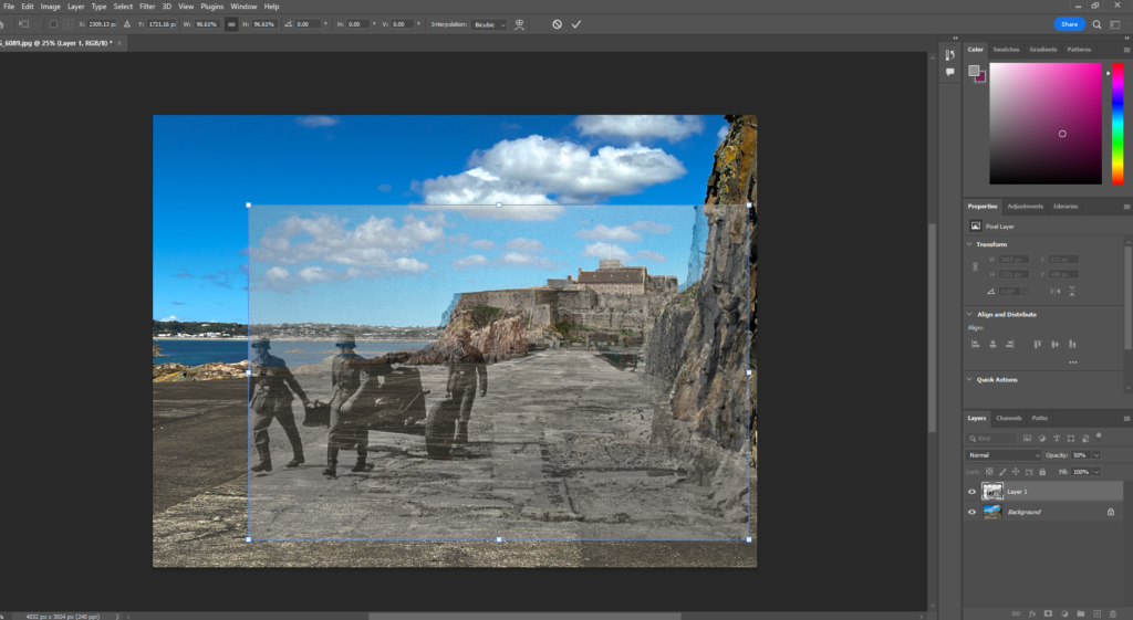
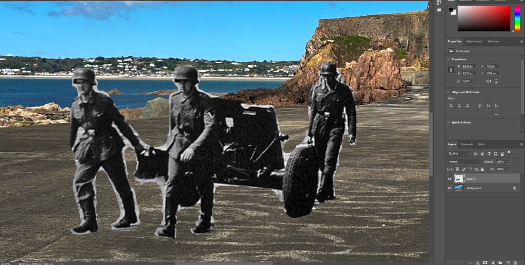
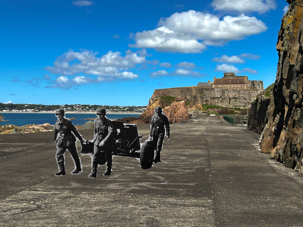
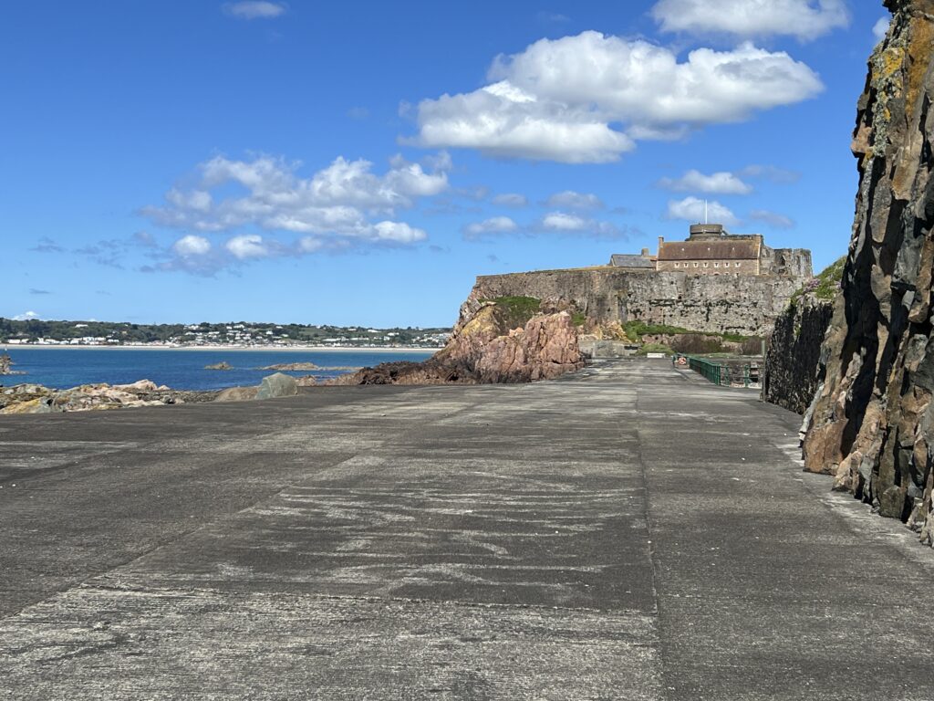
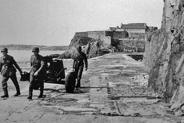
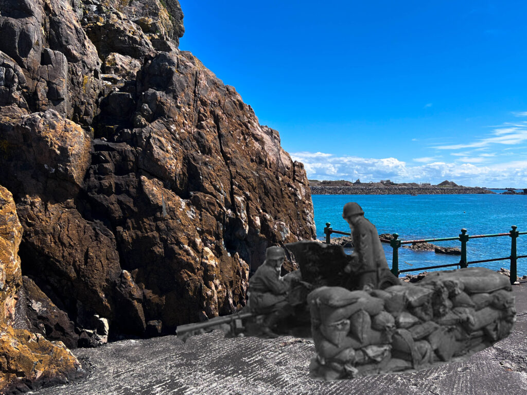
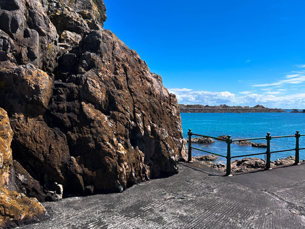
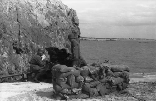
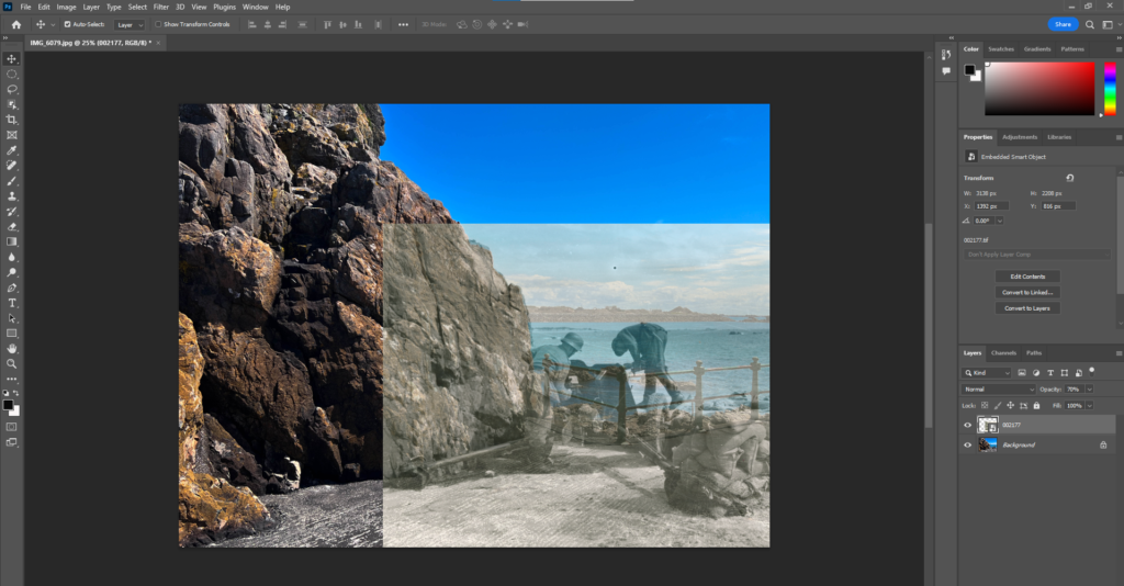
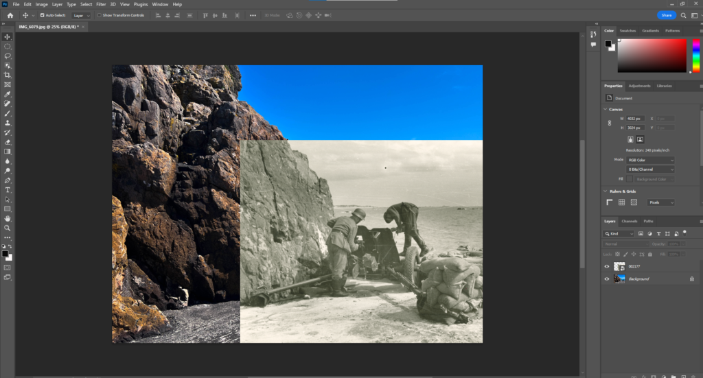
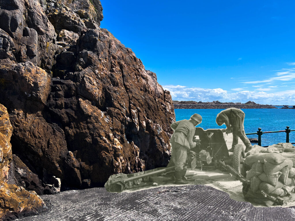
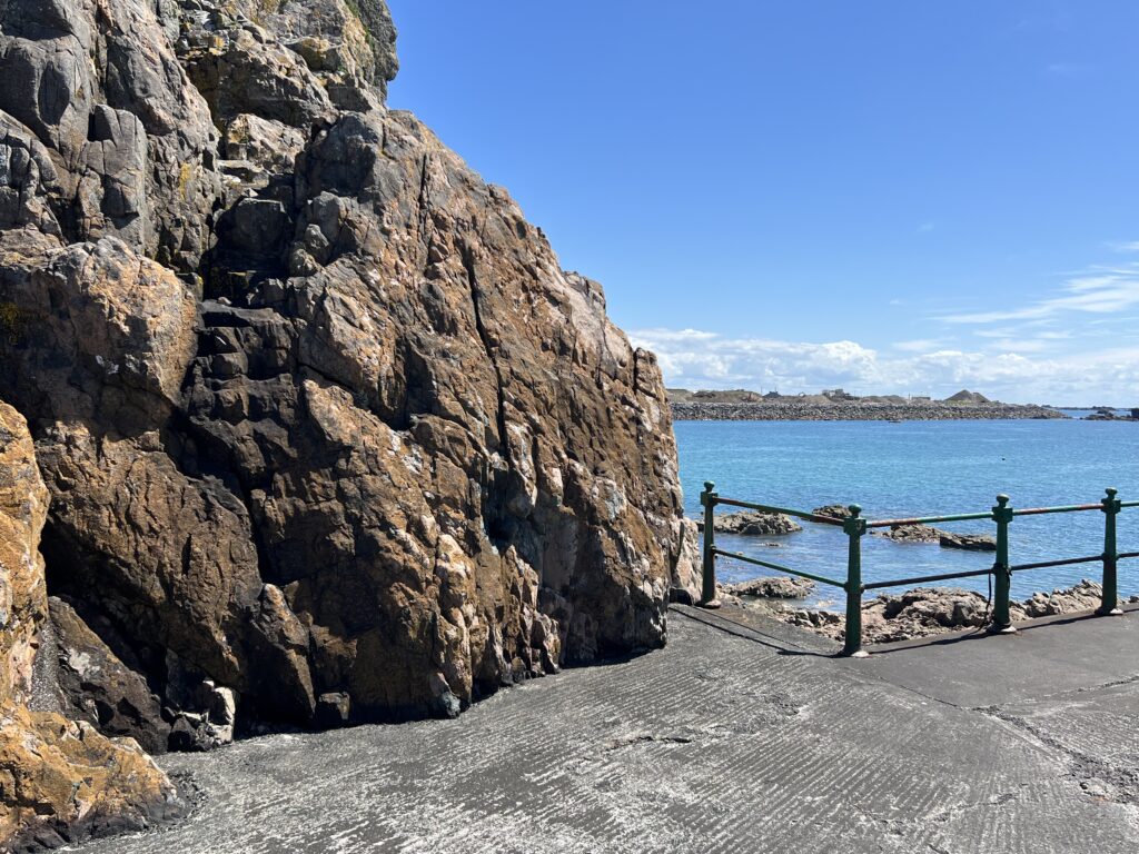
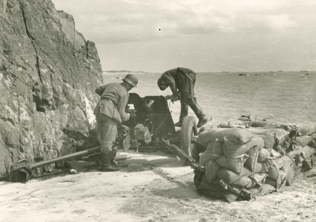
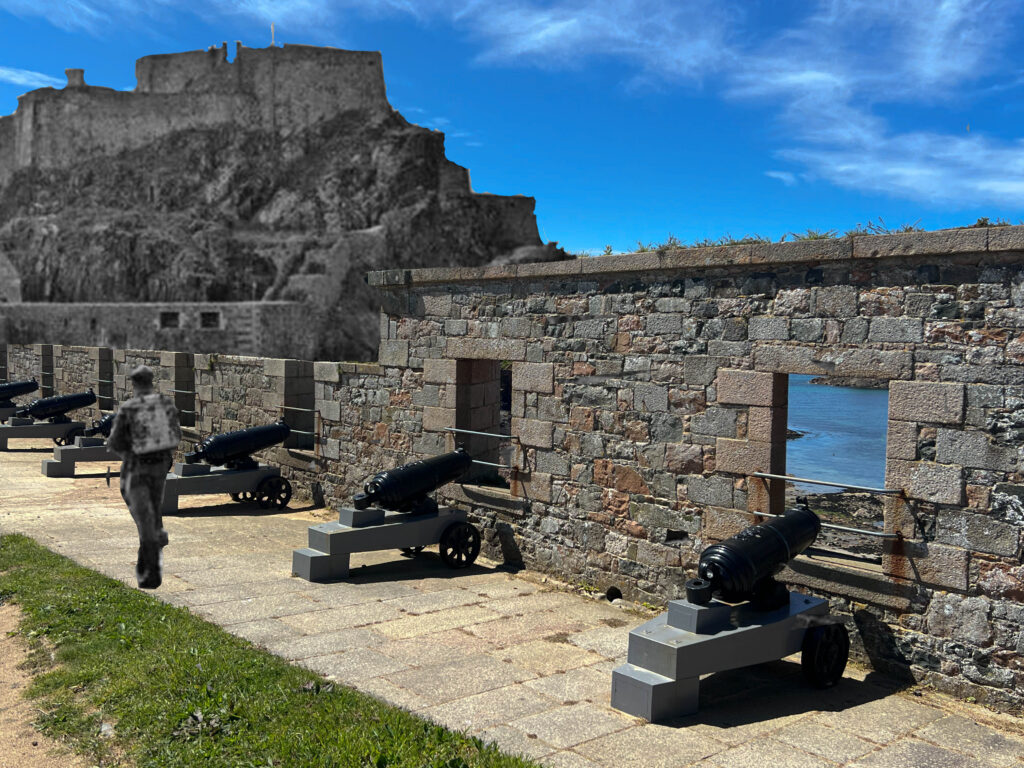
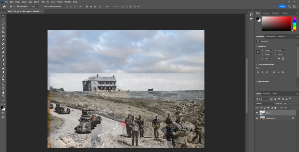
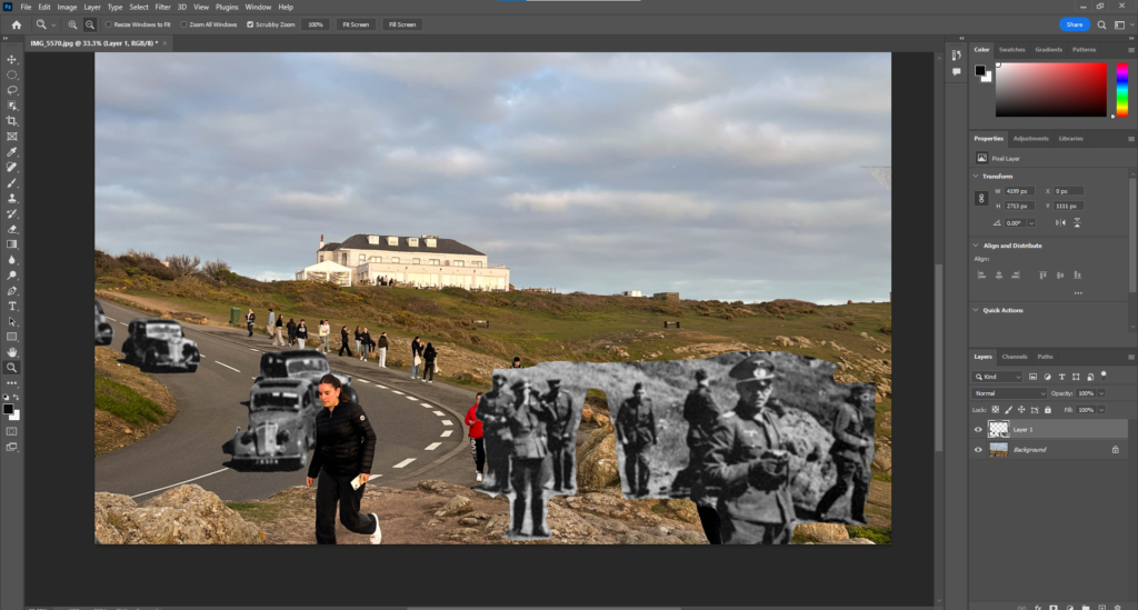
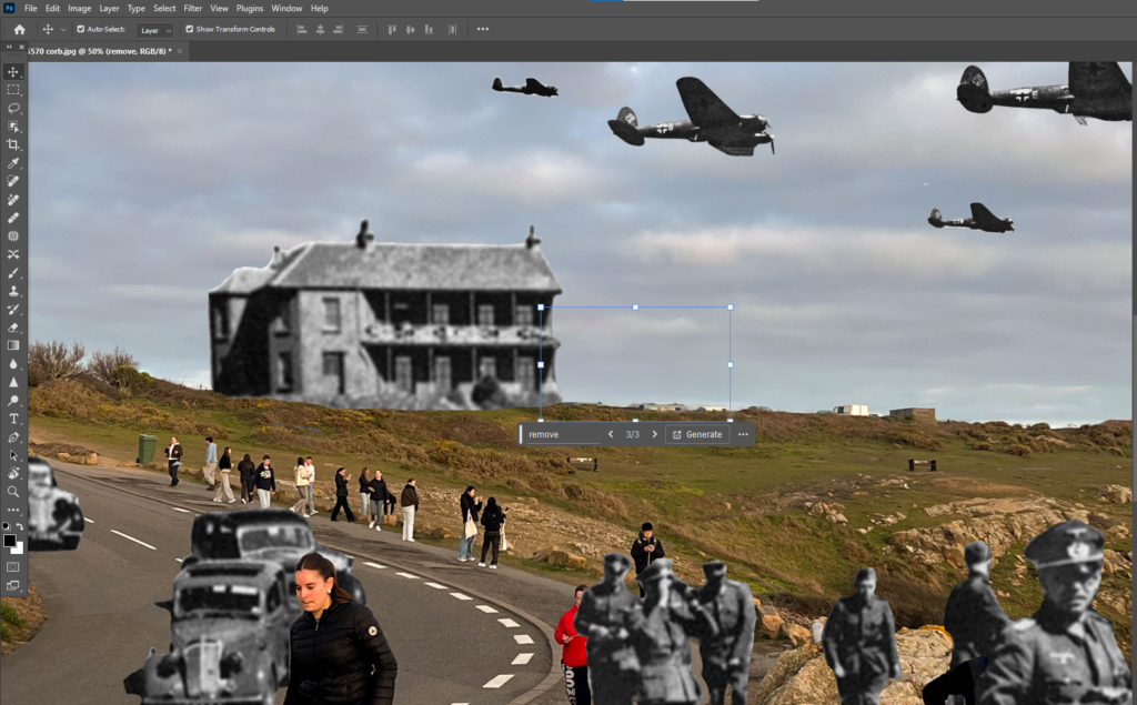
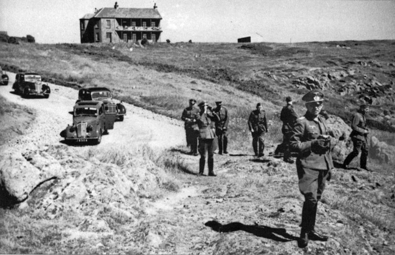
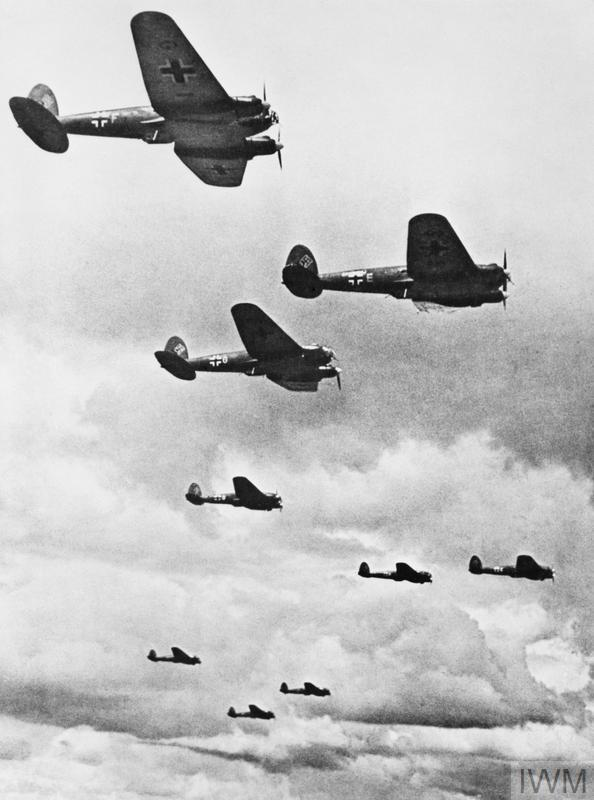
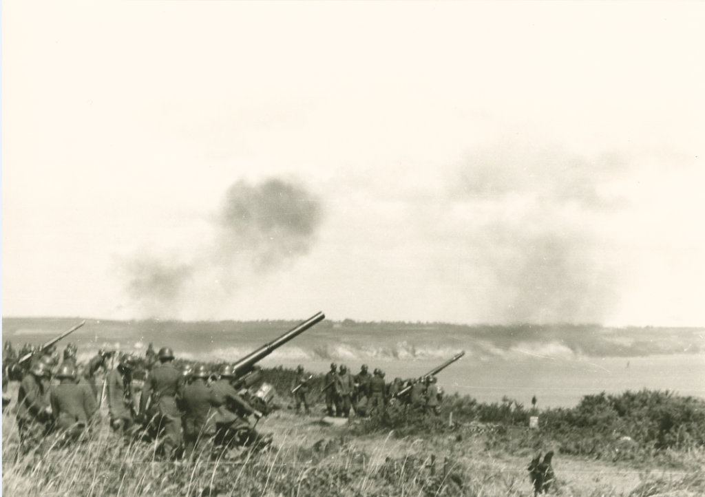
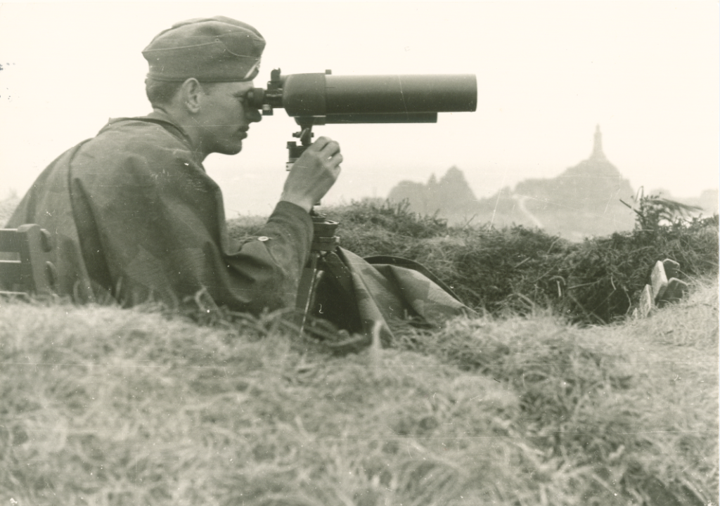
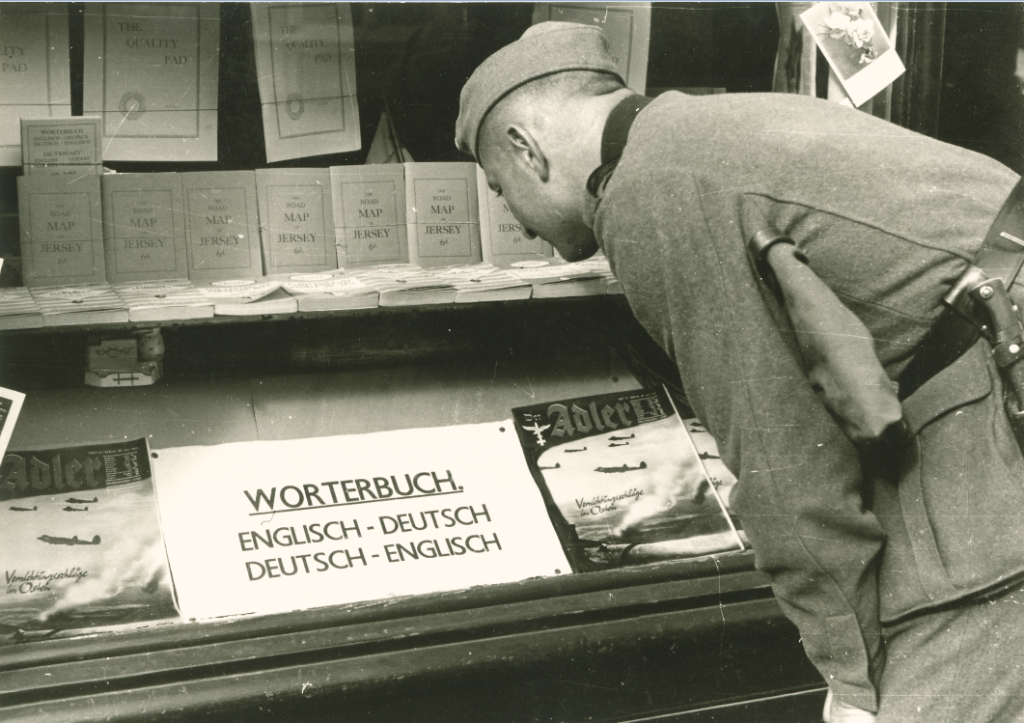
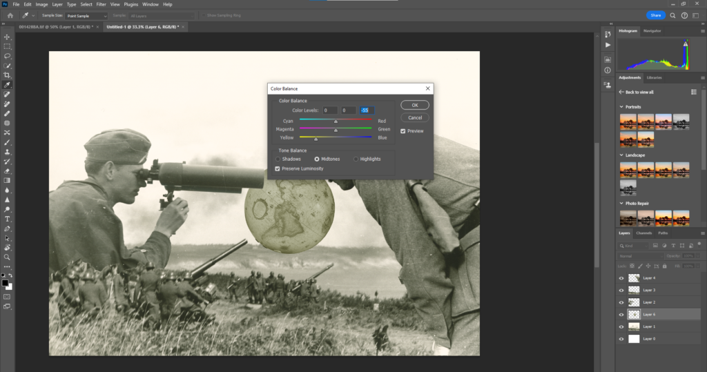
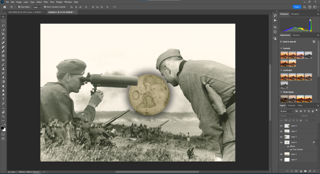
Idea 1 – My idea for a photoshoot is to recreate the positioning of these second world war photographs in modern time, by positioning the camera in the same place this show the anthropogenic change brought to Jerseys locations from a different time, our relatives may have lived through. Throughout the shoot I will recreate these following images and their locations due to their historical significance to Jersey.

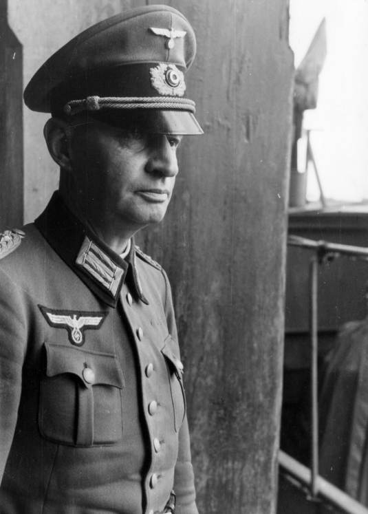
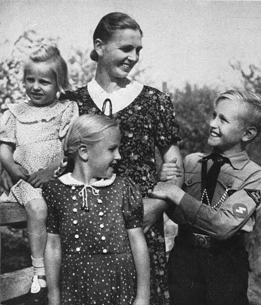
Using images taken by German officials, soldiers with cameras, locals and etc I will show how much the areas have changed since the occupation.
Image

Idea 2 – Another idea for a photoshoot is a timeline of images on how homes have changed throughout century’s. Based on their architecture, you can see the styles and influences of the time and how they compare to now and how they mix.
Places good for this would be areas like Jersey heritage sights such as the castles or Hamptonne who other different housing variants throughout history, other places like town can show a good range of housing throughout the century’s.

Anthropocene/Artist Studies – George Blake

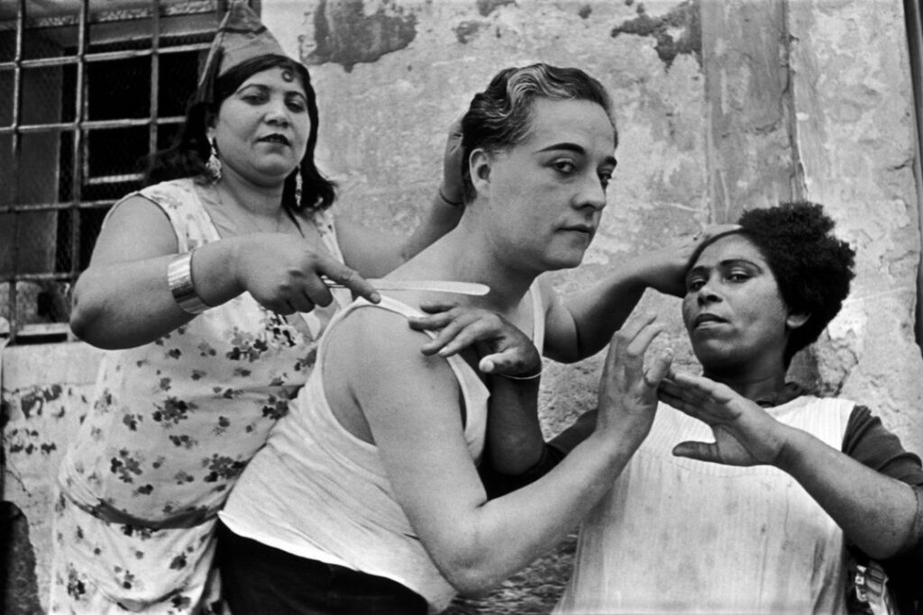
Photographing areas of Jersey, such as Town, Havre de Pas, and other coastal areas, Albert Smiths work is known for his portrait and landscape work of Jersey in the past. Capturing much of Jerseys iconic landscapes I will take inspiration from his photos with my work. Although not doing it intentionally. through his casual photography, Albert Smith captured much of Jerseys past historical topography.

With a vast collection of images of Jersey Landscapes, this provides a well documented topography that we can use to compare to those same locations in the modern day. Such as in the images above, we can see how much the coastal areas have changed, With Havre Des Pas for example, we can see that since his time period the development of La Collette behind it hadn’t occurred. With the images of recognisable areas such as the harbour and Gorey, Smiths photography shows what would local landmarks would have appeared in his time, and for future viewers of his work, how much they have altered to what we recognise them as today. His work can really show the human impact we have had to this Island with its numerous mass developments and changes to recognisable scenery through urbanisation and societal influences such as architecture.

The reason why I chose Albert Smiths work was I thought it was a very interesting documentation of Jersey through a historical lens. Taken almost purposely to conceptually make a stamp of the areas old appearance, we as an audience to his collections from many years after his lifetime in the 19th-20th century can see how the effects of Anthropocene are thought about when viewing his photography. Comparison pictures of now to the locations are unneeded due to their recognisability but the uncanny nature of how much the environment within the pictures have changed, for me, really help make his work stand out as apart of the Anthropocene genre.

For my photoshoots, I have created plans that will feature in the next blog post that will incorporate Alberts Smiths style of documentative purpose, with also his style of photographing the shifts in topography of Jersey’s well known locations.

Pioneering Photographer – Thomas Sutton

Thomas Sutton, known locally for his importance to bringing photography to Jersey but also his wider significance to the history of photography. Owning a photography studio from 1848 to 1854 in St Brelades he also worked at a printing establishment in Jersey for the famous photography Frenchman L.D. Blanquart-Evrard in the 1850s which was advertised as being patronised by, H R H Prince Albert who was keen to photography and had a collection himself.

Suttons work has recognition for his early experiments with the patenting of a panoramic lens as well as being the photographer for James Clerk Maxwell’s pioneering 1891 demonstration of colour photography.

Suttons local recognitions can be seen with him being the first to produce a photographic publication of the Island named – “Souvenir de Jersey” in 1854.

As seen in the images above, Suttons photography was primarily landscapes. like Smith his work focused heavily on capturing well-known areas such as Gorey pier, however this is not the only connection to Anthropocene that can be made when looking at his work. With many Images of the coastal and rock formations of Jerseys surrounding coastline, it can be said to capture the effects of geology under the theme of Anthropocene. With rocks in the past for example being mined for silver in the parish of Grouville and granite rocks being mined in areas to create the Martello towers for example we can see how areas over time become altered through human input to them such as with these coastal areas. With his invention of a panoramic lens, this could be said that this came out of wanting to explore further with landscape photography, capturing more within a frame and therefore the documentation of landscapes that could be used in a later time to show the effects of Anthropocene.

Due to his notability within the History of Photography, and in recognition of his work done locally within the barriers of what can be applied to the theme of Anthropocene, I chose Sutton, as my overall idea for this project is to recreate positioned photographs of past historical photography of our Island to show how much has changed over time between century’s.

With his conceptual basis in mind, I will capture areas that will most likely face or already have been subjected to a change over time from how they originally appeared in photographs of the past.

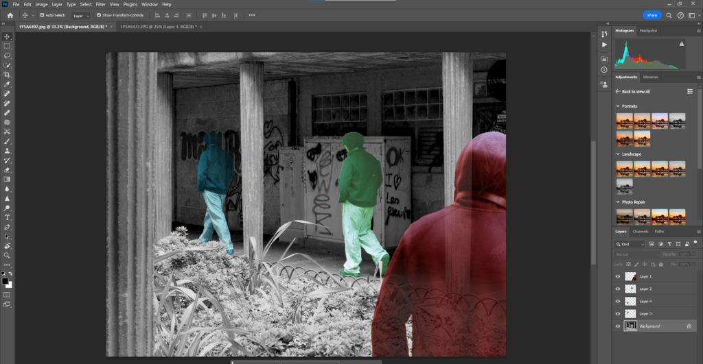
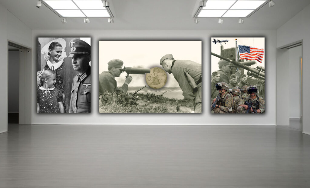
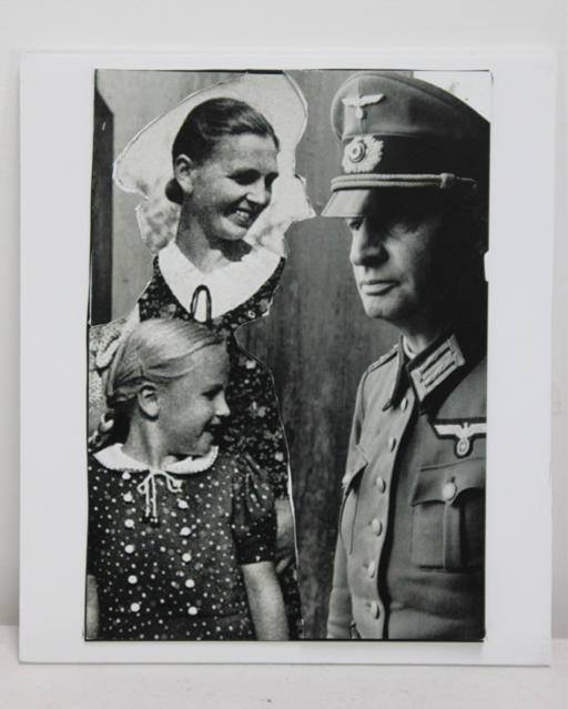
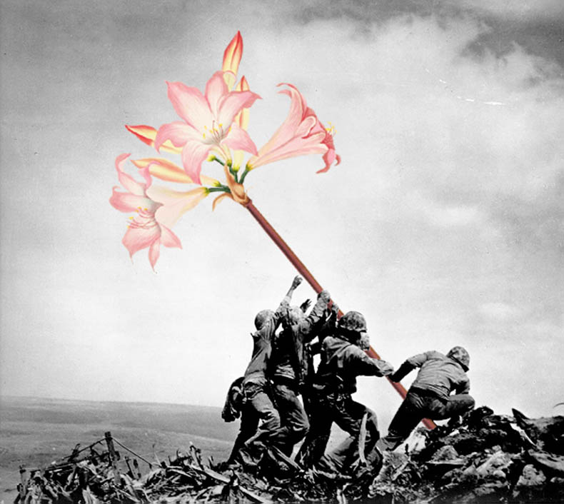
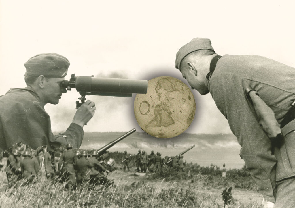
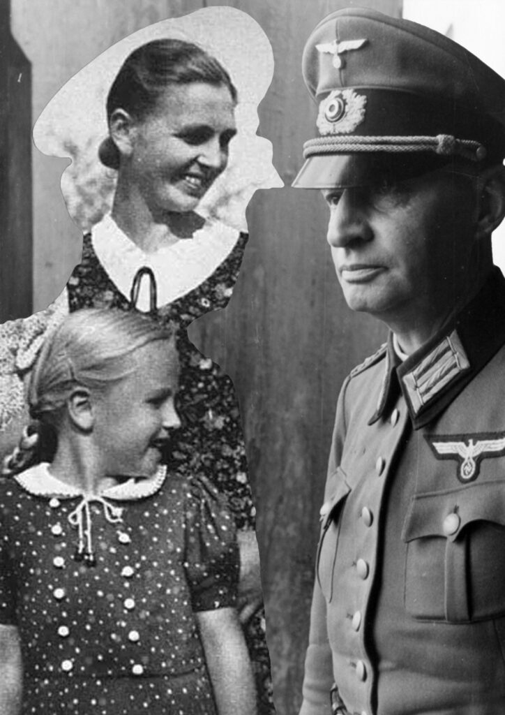
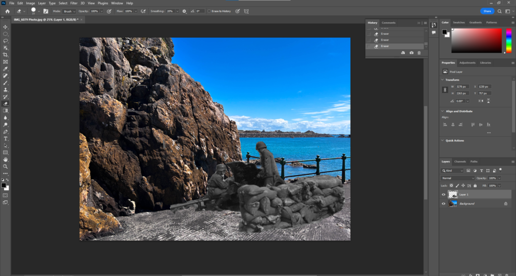
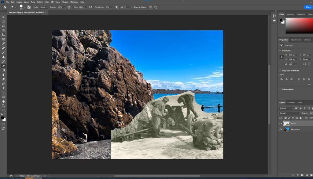
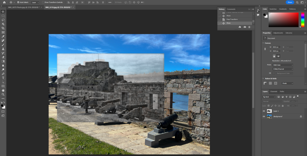
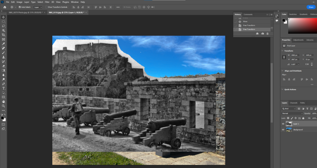
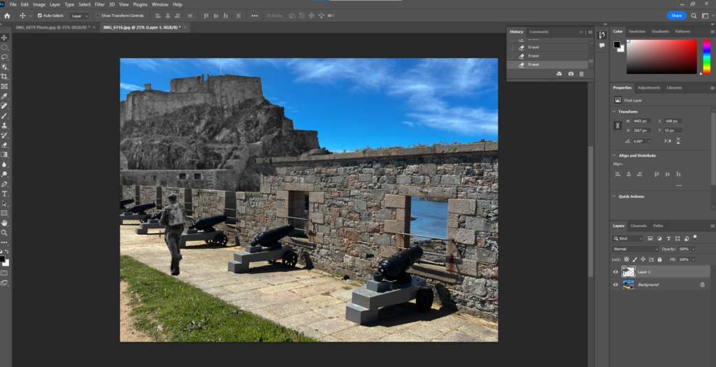
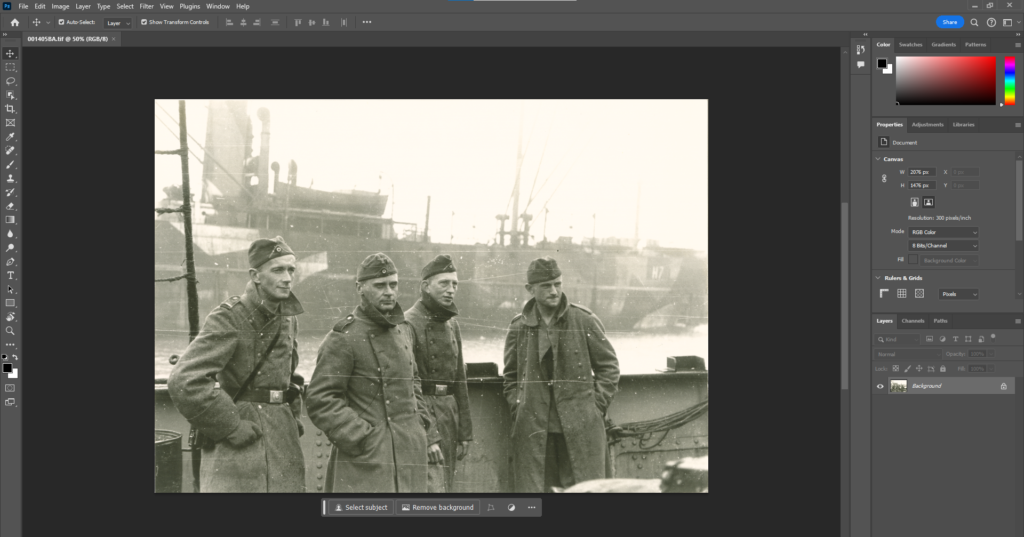
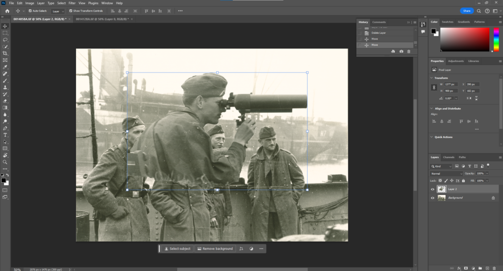
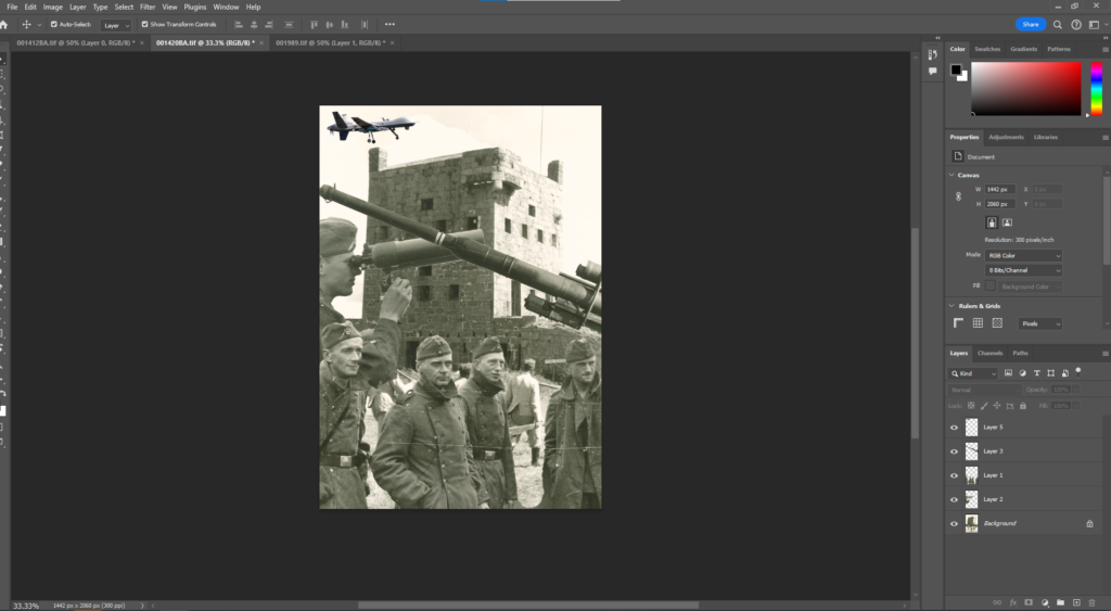
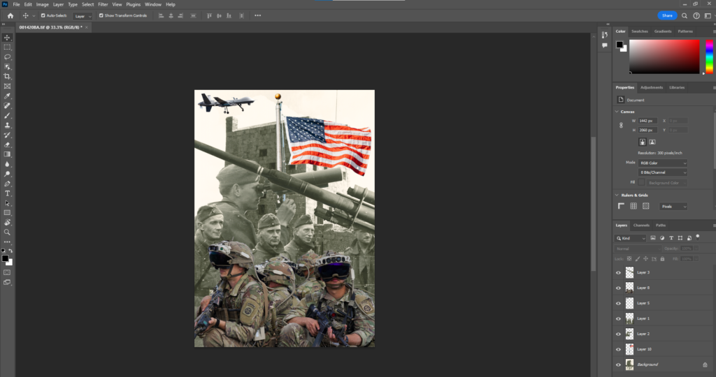
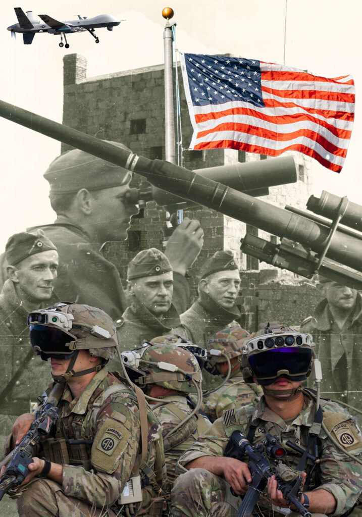
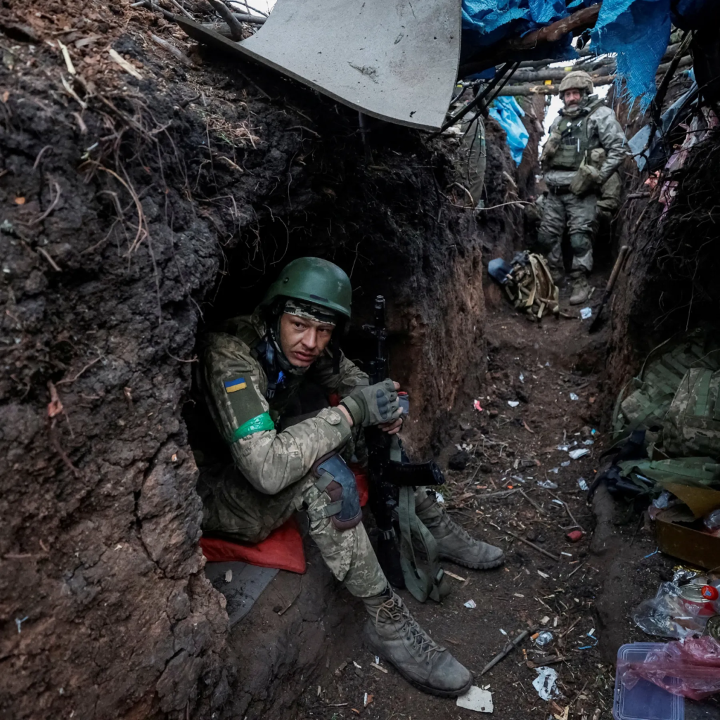
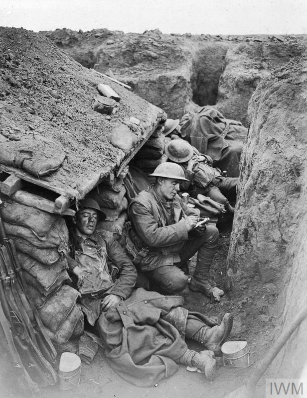
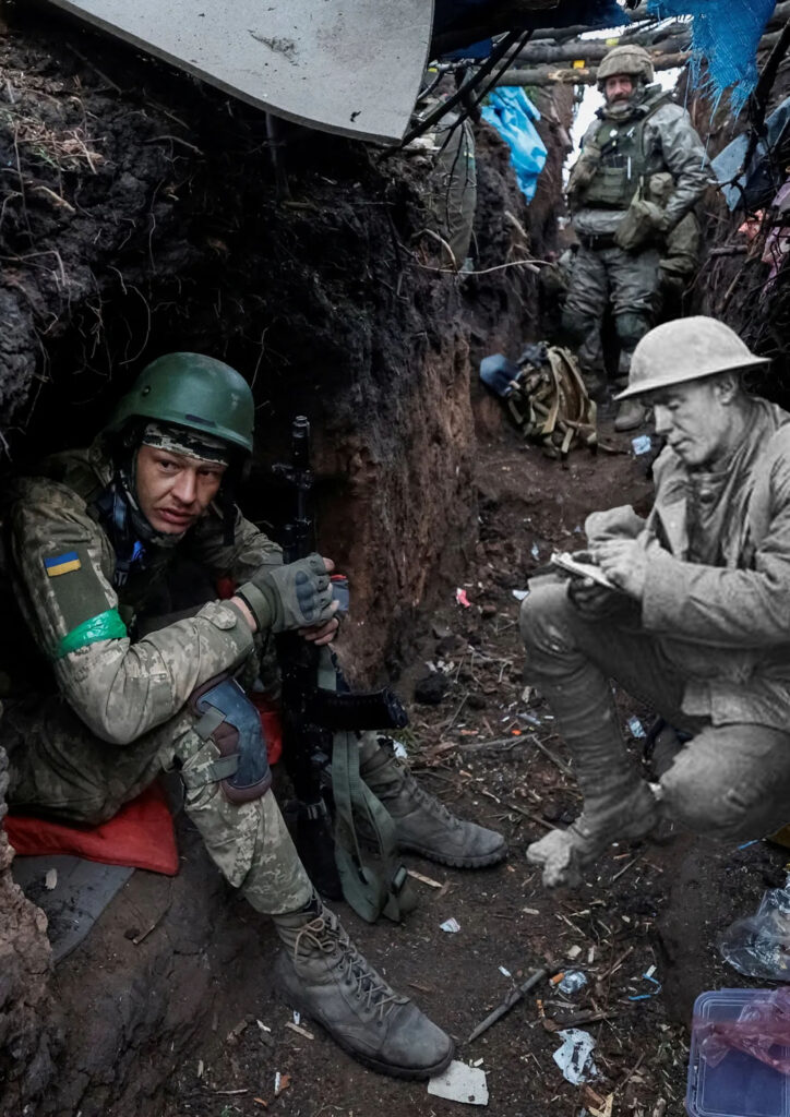
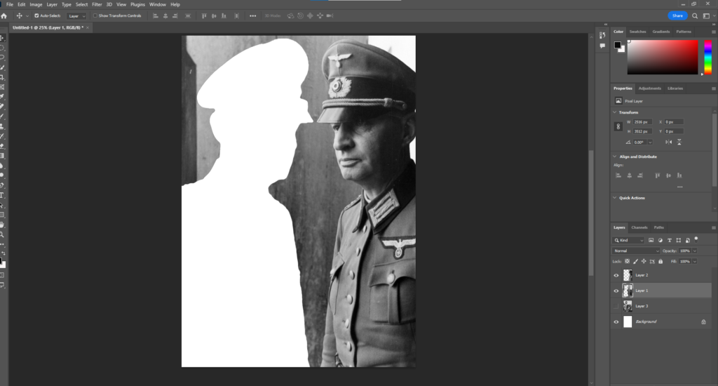
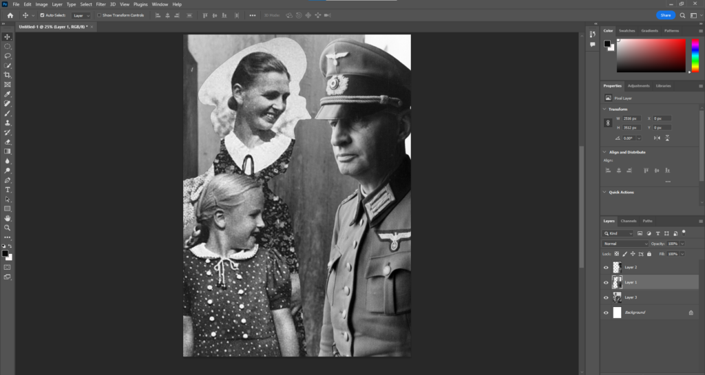
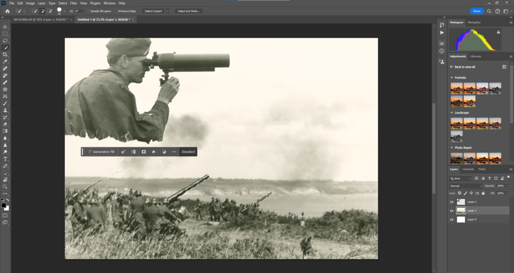
For editing the historical images onto their modern counterparts, I can take inspiration from Avant-Grande, specifically the soviet aesthetic choice that originated from propaganda posters. With their rustic, cut-out design I will edit in this way.

Used to entice the soviet people with their flashy and modern look, the moved away from classical forms of art to emerge to a new wave of art, very much on theme with the origins and values of the USSR who moved away from an old classical form of ruling a country (Monarchy) and modernised into becoming something far from its origins, One-party state that didn’t rely on parliament but controlled everything within the country.

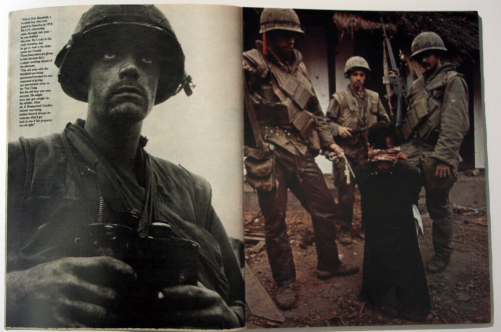
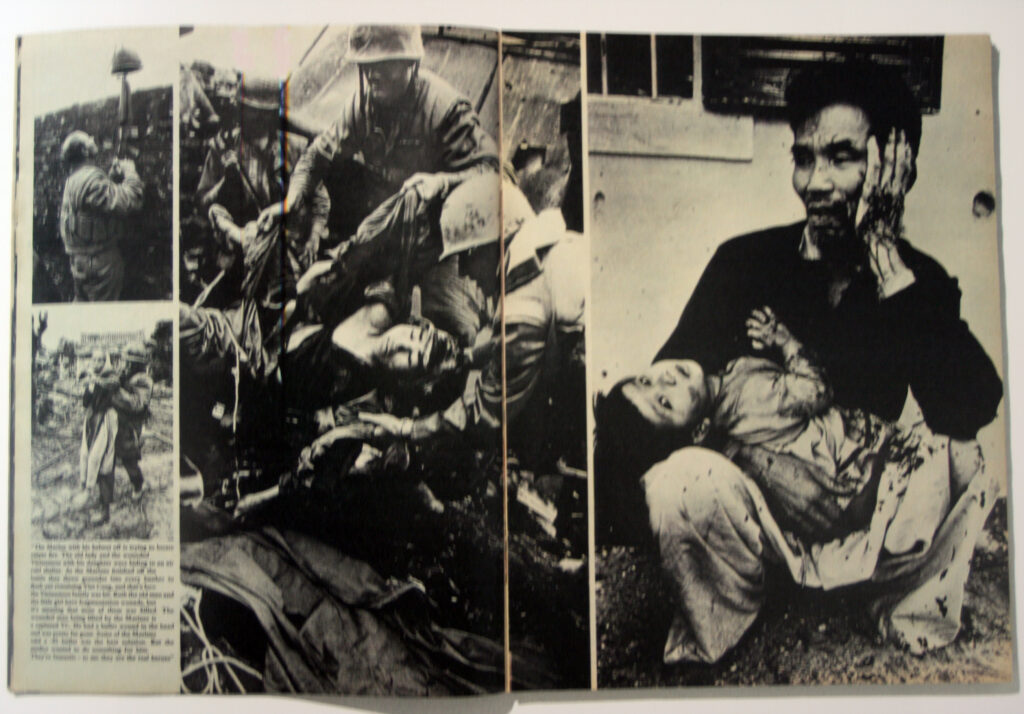
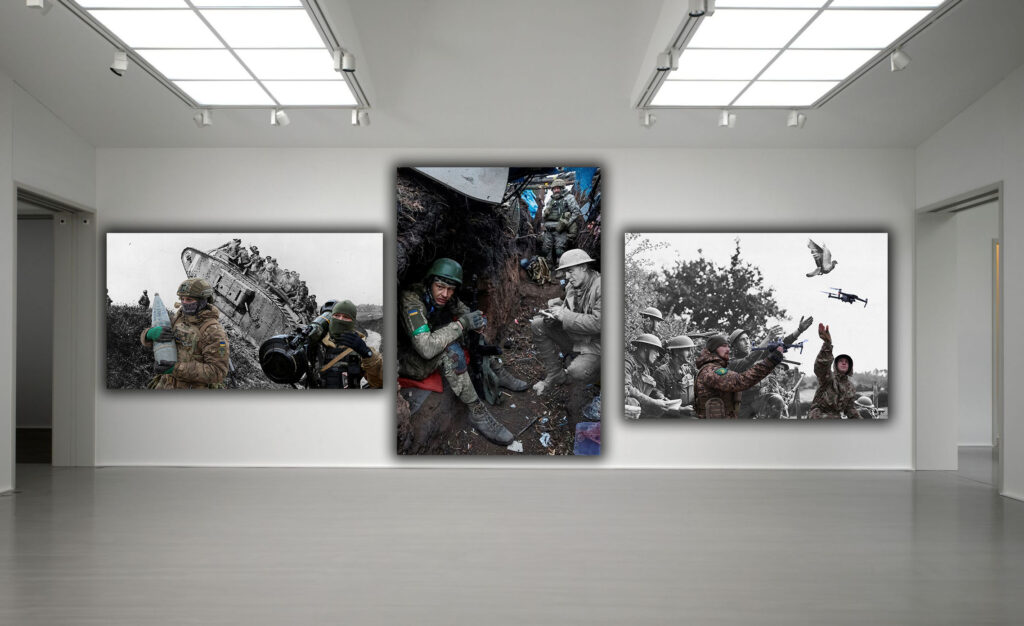
Used, abstractly, to show the cruelties of war, colleges can show a collect summary to the opposition of war and its effects on not just the soldiers who fight in them but who gets caught in the crossfire, the damage to environment, the neglectful responsibility of those in charge and much more.

It can be said that these images, put together are a good way of showing the ridiculousness of war in its purposes to create ‘peace’.

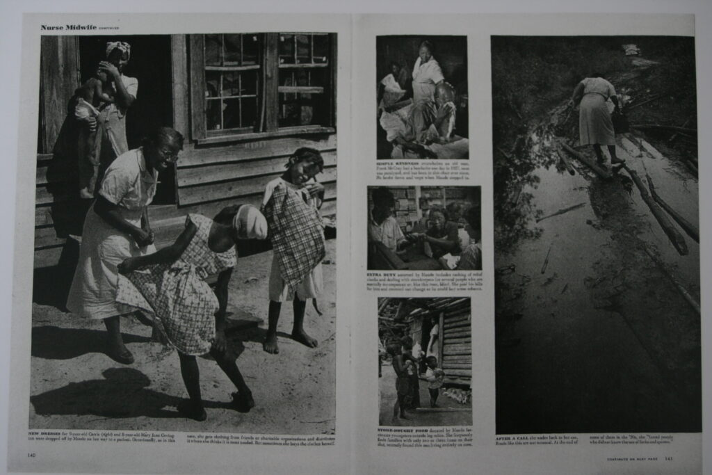
Artists such as Martha Rosler show the effects of war on the home life of people effected in a different way. With the ‘Truth lying behind a curtain’ the effects of war at home can be shown as a visual metaphor for what actually goes behind the ideas of war that is often left out when teaching about conflicts.

With this in mind, I can use this both visually and conceptually to show the effects of war on the channel islands and specifically the areas occupied in the past to show the overall effect it has had on the islands Anthropocene.

Landscapes – Intro to Anthropocene – George Blake

Anthropocene is the Human effect onto Earths topography, in photography, it covers a variety of images containing human impact to the earths geology, landscape, limnology, ecosystems and climate. With the use of photography, we as a society can observe how the implications of our lives into Earth can change it over time. With photography being around since the early 19th century, observations can be made on how over time, places change in shape, size and appearance.

Evident in Jersey, with the developments of new housing, financial buildings and overall re-urbanisation in places like St Helier we can see from Jerseys past to now, the changes put in place and how the effects of alienisation and disassociation can generate from what things where like and how they appeared compared to modern day.

Corbiere

‘New Topographics’ final outcomes – George Blake

These images, are my final outcomes of my ‘New Topographics’. Inspired by Photographers of the topic, Robert Adams, Lewis Baltz and Frank Gohlke. Inspired by their modern approach to Landscape photography, their Photoshoots can be shown to leave heavy influence on my work and that of many other photographers who choose to capture the aesthetic of urban landscapes.

produced using a camera, but edited on a mobile device with the app Snapseed, their use of filters and variety of adjustment tools, produced to what I believe are some good images, influenced by Adams, Baltz and Gohlke.

‘New Topographics’/First Edits – George Blake

Photoshoot 1:

Before:

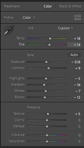
Edit Settings:

For this photograph, I used highlights, temp ands hue to make the colours pop out more, with a vibrant mixture of colour, Blue, Orange these help bring the viewers attention from the darkened alleyway.

Final Result:

Before:

First Edits:

Due to the lack of colour in the buildings stretching across the landscape, I decided to make it into black and white to create a visual contrast between their tones.

Final Result:

These Edits have been made on the App, Snapseed, Using their features of filters, and adjustment settings, similar to Lightroom I altered with the exposure, White & Black balance and other settings to improve them further.

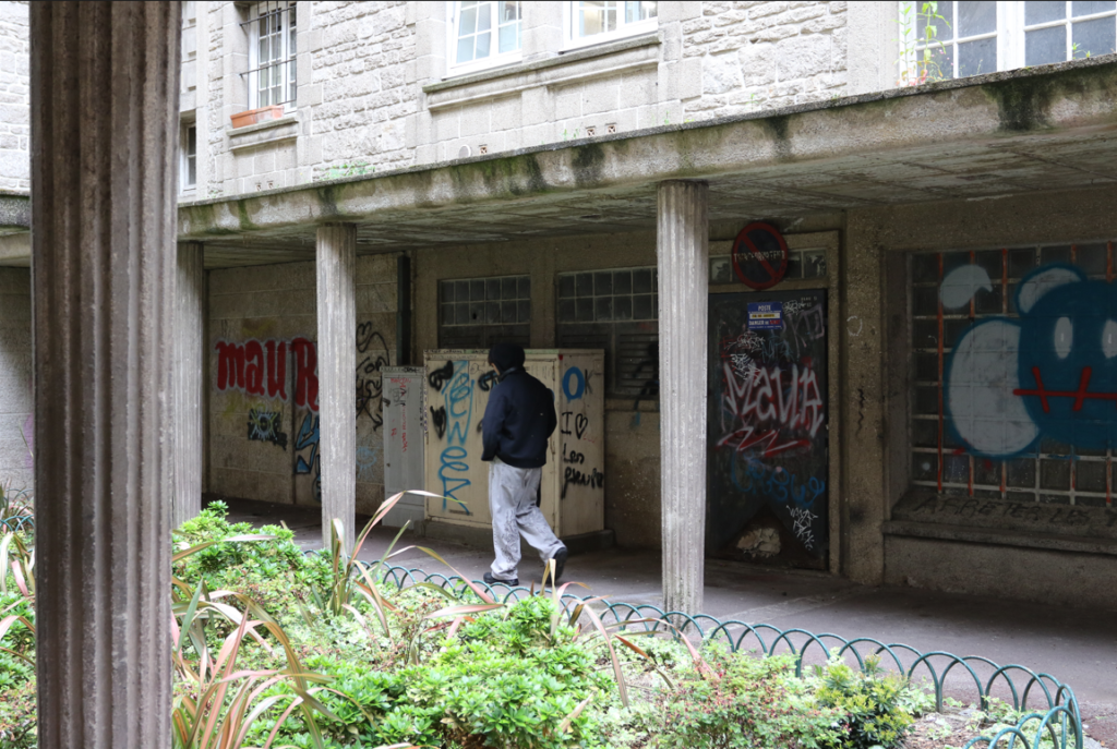
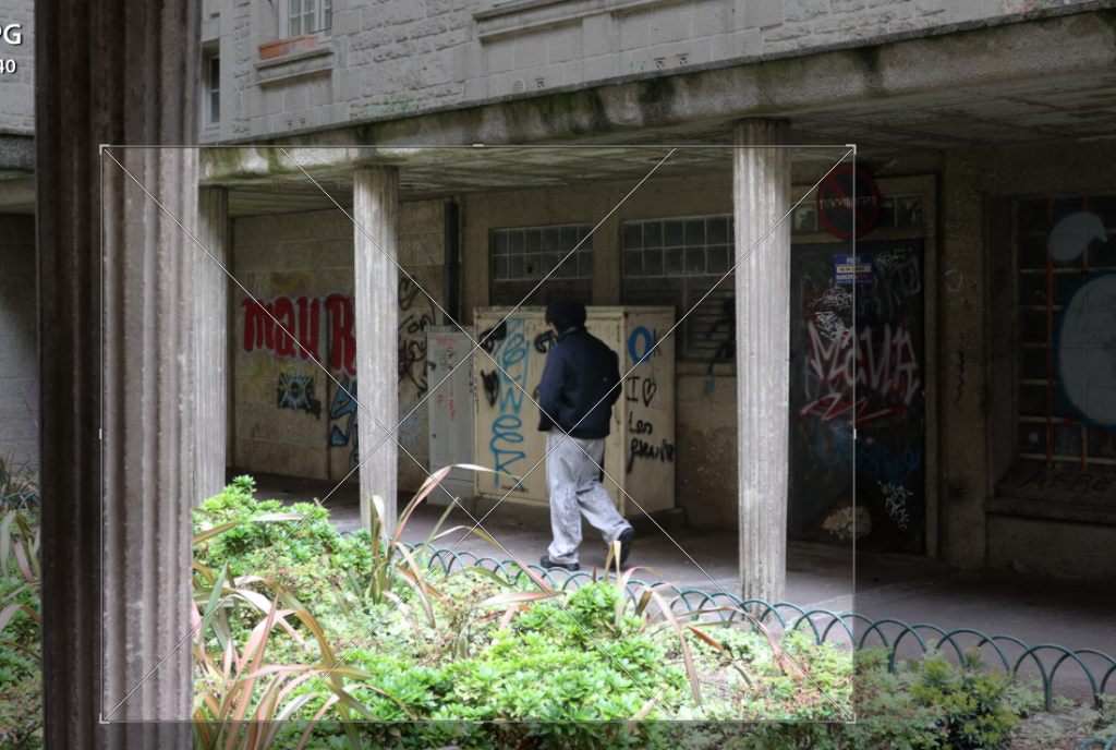
For this image, I was Inspired from the works of Lewis Baltz, With his dead-pan shots of purpose built environments I believe I have captured that in this image, by adjusting the exposure, contrast and the WB balance I was able to create, what I think is a similar image to his work.

Like the previous image, I took inspiration from Lewis Baltz as well as Robert Adams. With Lewis Baltz’s restricted shot angle and as a conceptual basis of housing being photographed due to an increasing population which I believe fits the topic of New Topographics. Using the WB balance, contrast and highlights this is what created that dramatic tonal difference from black windows to the flat white walls.

Having the same conceptual basis of Lewis Baltz, the empty, dystopian sense of his images of industrial areas on a grandeur scale. Using tone setting such as highlights, shadow and whites and blacks I was able to create a shiny effect on the sun surfaced part of the building and big tanker.

Inspired by the works of a New Topographics photographer, Kieran Gosney, who I didn’t mention in my art reference, he photographs large industrial structures similarly to this one.

By altering the dramatic tones of the whites and blacks in the image, this is how I created the dramatic sky behind the brutalist tower. Like the previous image, I used contrast to have that shiny effect on the metal structure of the towers support beams.

(Kieran Gosney’s work)

By turning down the saturation entirely and highlighting the tone of the black and white parts of the buildings this adds much more volume to their architectural features as prior to being edited their colours are quite faded and muted.

Specifically inspired by this image of the New Industrial parks by Lewis Baltz, the use of space within the photograph shows the dystopian emptiness of industrial areas. In my image I feel I replicated that conceptual idea through capturing a large empty are where no people are in sight (despite the car).

Using effects such as contrast and tonal features like shadows I was able to create a deeper feeling to the image of the sites vast size, to further express this I also increased the clarity.

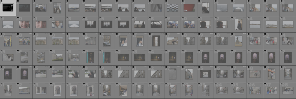
‘New Topographics’/Contact sheet – George Blake

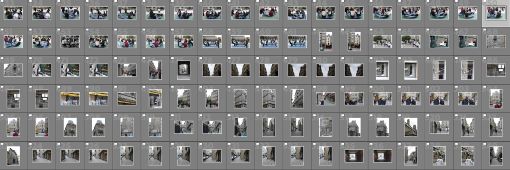
First Photoshoot – Towns landscape: New and Old buildings

Green coloured:

These photos are rated 4 – 5 on the star rating, and are flagged: This means that they fit the aesthetic of ‘New Topographic’ photographers like Robert Adams, Lewis Baltz and Frank Gohlke.

Yellow coloured:

These images are taken well but lack the correct amount of exposure, need to be cropped or re-adjusted with their angles.

Red coloured:

These images did not fit the aesthetic because they where either blurry, poorly taken or did not fit the concept I was basing my photoshoot off.

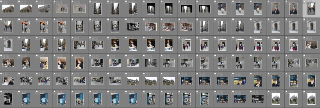
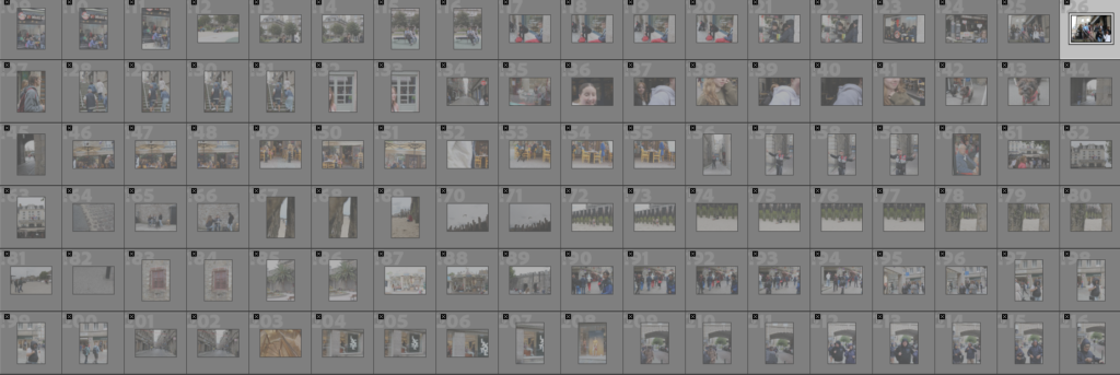
Second Photoshoot – Walk Out across seaside and industrial area.

Green coloured:

These photos are rated 4 – 5 on the star rating, and are flagged: This means that they fight the aesthetic of ‘New Topographic’ photographers like Robert Adams, Lewis Baltz and Frank Gohlke.

Yellow coloured:

These images are taken well but lack the correct amount of exposure, need to be cropped or re-adjusted with their angles.

Red coloured:

These images did not fit the aesthetic because they where either blurry, poorly taken or did not fit the concept I was basing my photoshoot off.

Rural Landscapes/Final Outcome – George Blake

Intro –

For this Photoshoot I took inspiration from Landscape Photographer Ansel Adams and based my images of his work. Mainly taking landscapes of storm damage, rather than expanses of areas with untouched natural beauty, I aim to show the natural effect of destruction caused nature.

Noirmont – Storm Damage.

I like how this image turned out as the depth of field covers largely into the details of damage, with a path of destruction stretching from foreground all the way to the background, The suns casting of light across the fallen trees creates a stark contrast in tone. What can be improved is the focus as Some parts of the image had blurs or out focus patches.

Although not technically a landscape, the detail of this image is what enticed me to adjust and edit this image. With a good use of golden natural light, the shadows hugging around the back facing part of the tree creates a engaging point of interest within the image when converted into black and white.

Having the same conceptual use of visualisation, like Adams I had an idea on how I wanted to create this image. With a good composition of trees, fallen debris on the ground, shrubbery and moody clouds in the background the mise-en-scene of this image was further improved with more definition being put on the lights contrast to shadow and reflection of sun on the blades of grass.

This image, to me, turned out well. With a good composition the bushes to the left and trees to the right frame the larger trees in a suitable position to catch the viewers eye. With the trunks silhouettes against the white wall of clouds the top canopy emerges above them on a shade of grey. Coincidentally, this creates a interesting effect to the image. Furthermore with the cleared out area in the foreground, Tire tracks act as leading lines into the area, with the trees reflected in the puddle, it acts almost as a metaphor of what used to be there in that cleared out area.

Needing more space, I would still count this as a landscape due to the depth the picture has into the woods. With the camera centred into the pathway, I waited for the clouds to clear to allow more natural lighting into the frame. Like previous images the natural contrast of tones in light is what I find captivating in these images.

Although close the nature, I feel as if I have captured the concept of storm damage well in this image with the 3 tree trunks and pile of logs showing the extent of damage caused to Jerseys local environment. Shown to stick out like a fork the 3 tree trunks define themselves within the image against the greyer toned trees in the background. To me this exemplifies their importance as by dragging the attention with their altered shape, compared to the undamaged trees in the rear, their changed appearance conveys a deeper effect both visually and metaphorically.

St Brelade – Damage and landscapes

With the beams of pure light emerging in the crevices of the grey clouds, the landscape contrasts with darker tones and the seas lighter horizon line. With houses to the right and view of the rock face and sea to the left, this creates a balanced composition within the image. Lines in this image can be seen from the field below the houses, to their roofs, in the clouds and across the sea, acting like stairs, the viewers eyes can travel from these lines up the image.

With the lighter toned building, its presence is well contrasted through edits to stand out from the darker tones nature that surrounds it. Although more fitting for the next subject (‘The New Topographics’), I saw it as a fitting image to the concept of Romanticism, which Adams was inspired by for his shoots.

Sandwiched in the middle, the lighter tones of fallen branches is surrounded by the much larger, fallen and still standing trees from the bottom to the top. In this image, I find that the darker toned trees acts as representation to the fallen trees in the past, acting as a shadow to their former stature. The fallen trees and branches however, much more brighter in appearance show their present manner.

Rural Landscapes/First Edits – George Blake

First Edit Plan:

For my Photoshoot I will edit my pictures in the style of Ansel Adams landscape photos. To replicate his aesthetic of dramatic tonal range I will use settings in Lightroom to do this, since Ansel Adams didn’t have the advantage of technology and having to use yellow and red glass panels I will use the Black and white mix to make these colours within in the image stand out more when converted in to Greyscale.

First Edits:

Before:

Edit settings:

Using an exposure brush I was able to high light some of the trees that I thought weren’t bright enough inside the picture. With the sky before being a nice bright blue, Once converted to grey scale I used the Black and White mix to make the sky seem darker like how Ansel Adams did in his Photos,

Final result:

Before:

Edit Settings:

Using a HDR merge, I was able to create a more artificially exposed image, although not natural looking to nature, it provided a vibrant tonal once converted to grey scale. Like in the previous image instead of darkening the sky, I thought it would contrast to much with the shadows in the foreground, instead I played around with the yellow and green to make them stand out more.

Final Result:

Before:

Edit settings:

In this image I tried to make a sharp contrast from the sky and the surroundings in the foreground. By Using large variations in exposure, contrast and highlights I was able to add more detail to the composition of the image that can said to go fairly unnoticed when not in black and white.

Final Result:

Before:

Edit settings:

Using tint settings as well as the contrast, I was able to create a more diverse difference in the shadows of the image. Using visualisation I saw the how the long path way could create an interesting depth to the image. Using Adam’s Zonal system, I was able to create a large range of tone. With darker tones being in the lower half of the image and gradually getting lighter towards the top.

Final Result:

Before:

Edit settings:

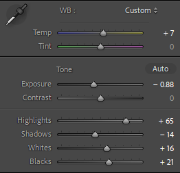
Due to the image being over exposed, I lowered it down and added some more depth by adjusting the tone with less highlights and more whites to make features on the old stone farm house pop out some more.

Final Result:

Before:

First Edits:

In this image, I edited this image to have stages on tone from top to bottom. With darker tones in the trees above I used a graduated filter to create that transitional effect of dark tones into the lighter tones of the thin branches.

Final Result:

Before:

First Edits:

With this image, I used a highlighting brush to increase the tone of the 3 trees, making a contrast from the trees in the background I completed this by altering a lot of the exposure, white and black balance and highlights.

Final Edits:

Rural landscapes Contact sheet – George Blake

Green coloured:

These photos are rated 4 – 5 on the star rating, and are flagged meaning I believe they fit the right aesthetic for my attempts of creating a similar photoshoot of landscapes like Ansel Adams, however by using photos of storm Ciaran damage.

With good texture and tone within the images, these best contain what I feel could be used to create a similar set of images that Ansel Adams created in American national parks.

Yellow coloured:

These images are taken well but lack the correct amount of exposure or may be salvageable.

These images, although containing some good and bad photos, can partially relate to Ansel Adams work. Not taken in the similar style I believe they still show some elements of romanticism.

Red coloured:

These images did not fit the aesthetic because they where either blurry, poorly taken or not what I had in mind when I saw the results.

These images outcomes were not what I wanted in terms of exposure, aperture and shutter speed and were either taken poorly.

Best Images –

I like This image as like Adams’ work, it includes a large variety of detail in its composition, with different areas of nature through its fore, mid and background. With a nice tonal contrast with shadows and sunrays it creates an interesting mise en scene for the image.

Using the building and equipment as a frame, I believe I made an interesting composition and space, with a variety of texture on the stone brick wall and the wooden trees and patchy grass, it contains, to me, a rural aesthetic, similar to what Adams strived for with his work.

Although not massively similar to Ansel Adams landscapes, I still like this image as it contains an interesting angle on the landscape at Noirmont.

This picture in my opinion covers the landscape well including large elements of nature such as: Hills, Sea, Cliff faces and fields. With a good texture in the clouds and beams of light spreading across the horizon it creates an interesting composition.

Conclusion –

In conclusion, I find that there is a fair majority between the photos have been rated and that there is some both good and bad outcomes with my images.