All posts by George Blake

Filters

Author:
Category:

Page Spread: design + layout – George Blake

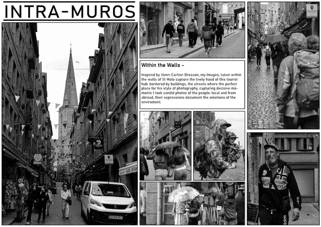
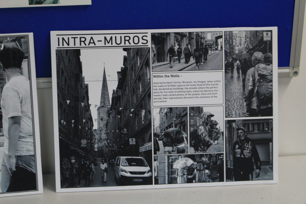
Here I will show the design process of how I made my page spreads of my images from St Malo.

1st design –

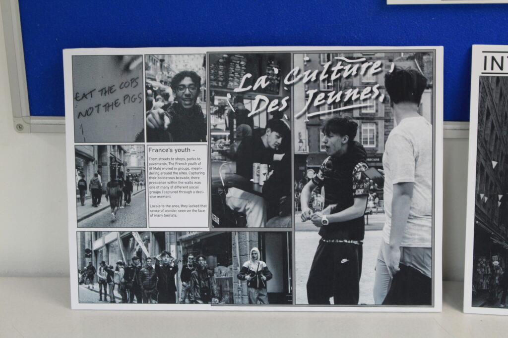
After arranging out a design I liked, as well as adding the images I believed best suited with it, I left a gap for text to be included.

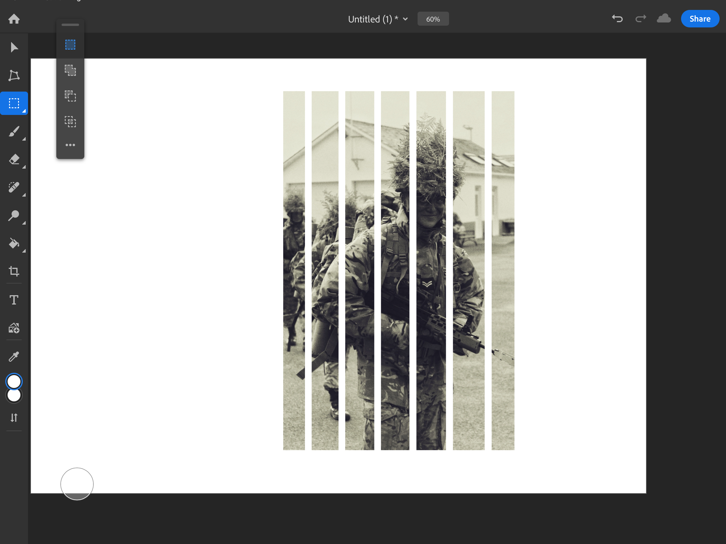
By adjusting the Images again I made some room for my page spread title, by also moving my text box higher up this made it closer to the top of the page and more easier for the eyes to be guided when looking at the work. Inside Its text, I wrote about my inspiration, Henri-Cartier Bresson.

Adding stroke borders, This help defines the image more on the page and matches to the text box, which also contains a bordered.

2nd design –

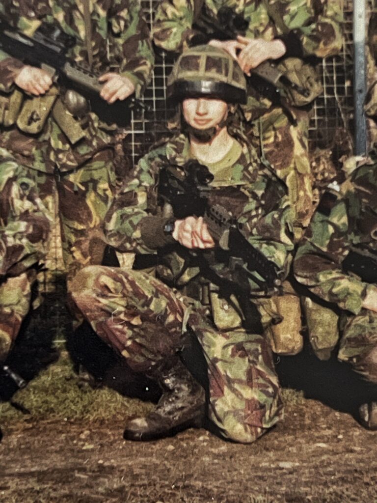
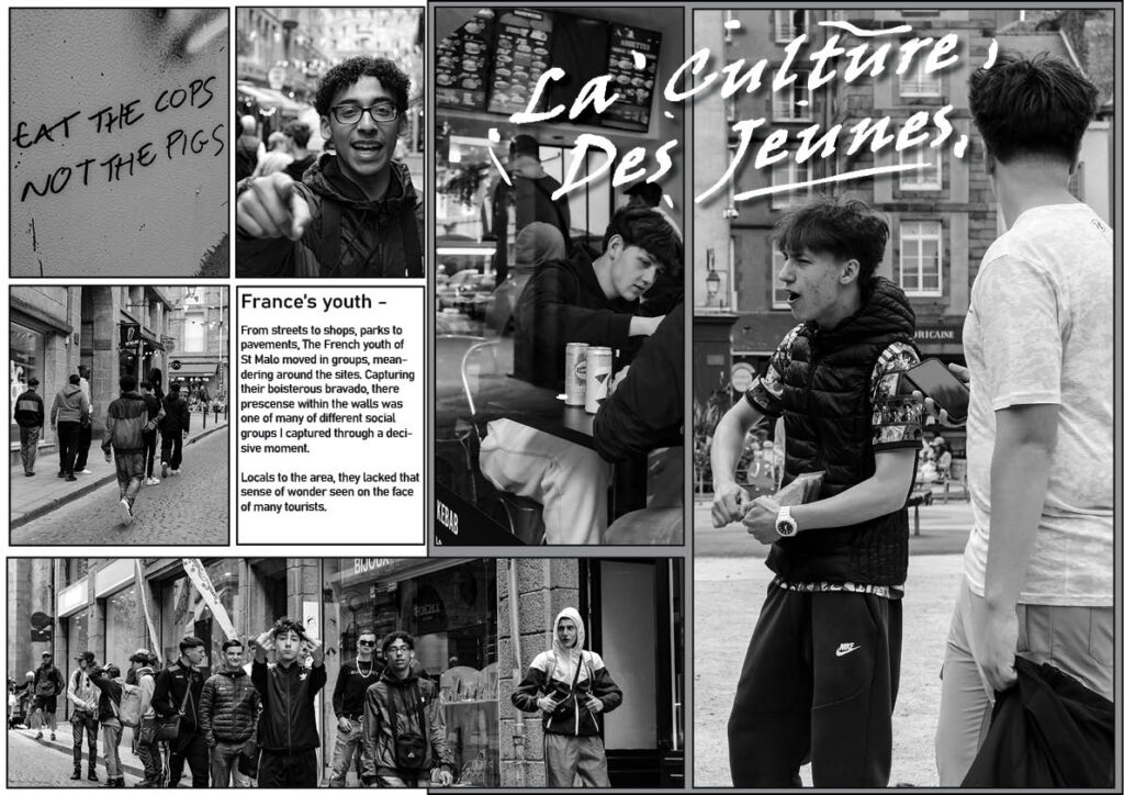
Designing the layout of the second design, I focused on the examples of male youth culture/hooliganism I saw within St Malo. Through selecting my edited images I have composed a similar aesthetic between these images inside this picture story page spread.

Whilst in St Malo I noticed that graffiti was quite common in the area, with masculine connotations being a quite common idea behind the idea of graffiti, I decided to include this in my work. Using a font that to me looked like it was created with a spray can, I used the pencil tool to add a rough level of detail of paint marks to further generate my impression of my title.

With the final text added, This came out quite well in my opinion and creates an interesting composition around the aesthetic I chose to present.

Picture Stories: Research and analysis – George Blake

This page layout where a subject covers an entire page is something I’d like to try and incorporate into my work, I chose this as it simplifies viewing the work and can provide more impact to contents within that image.

These Layouts with a combination of very large and small images attracted my attention due to its interesting composition. Something like this could work for images that are taken within the same area, like how in these references they all take place within a combat zone or a village .

this picture story’s use of a full image for the front cover, with limited text is a good example of how to present my work. By having one area sum up the contents this could apply for my St Malo images.

This picture story is a good reference for its, easy to follow narrative through inter-connected photos and text description. By added context this creates and interesting story to follow.

Without text, multiple images on a double page spread is another unique way of presenting images. As mentioned previously, this would apply well to my images taken within the same context.

Having a singular image spread over an entire page, with or without text, is another method of picture story design I might incorporate into my work, depending on the picture and its contents this could make it stand out a lot more to viewer.

Text overlaid images is another interesting way to incorporate information about the contents of your image. Darker areas of images are best for this as it acts as a back drop within the image for your text.

St Malo/ Street photography edits – George Blake

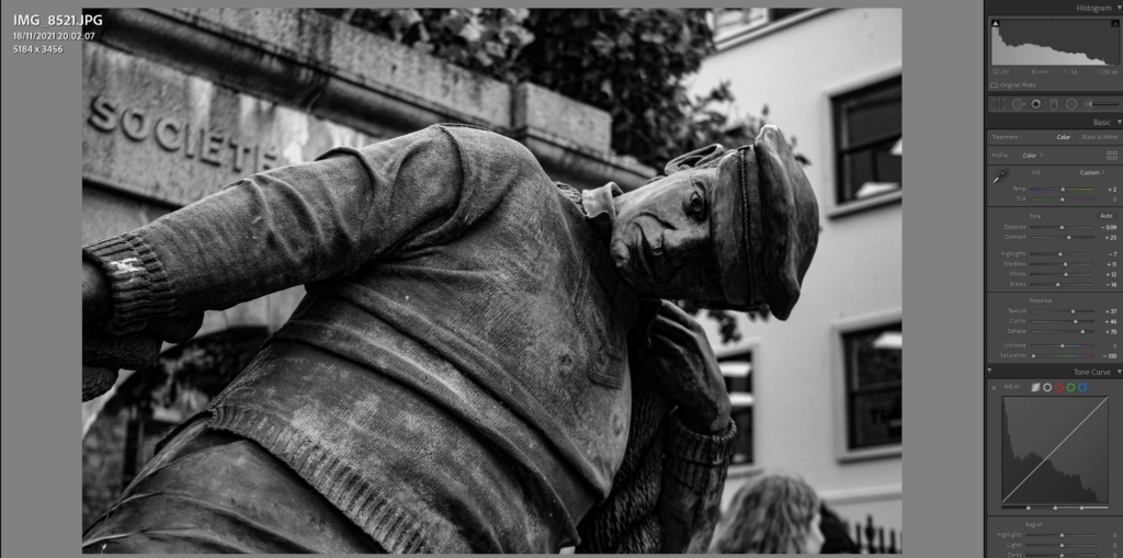
For my edits, I have focused on mainly on altering on Saturation, Clarity and Texture. Through examples I will show their slight variations, depending on the subjects within the frame, such as movement, lighting and distance.

Due to numerous edits containing similar settings, I will break down some of the main types of edits I’ve made to the majority of my images.

Since in the original image, limited light was within the foreground of the images contents, I aimed to highlight this through editing by creating more depth to it through editing.

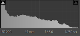
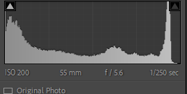
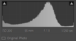
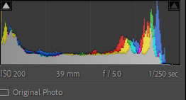
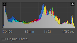
Camera Settings:

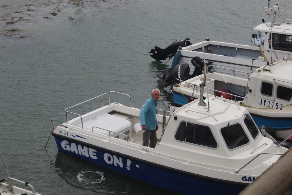
Before:

Editing process:

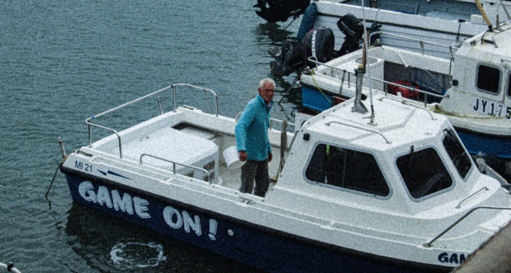
Through cropping my image to centralise the composition of windows and subjects, I converted my image into greyscale through removing the saturation. By altering other features such as clarity and texture, and settings within its tone, I edited this image with the focus on making the light standout from its outside source, and highlighting the woman in pinks appearance due to her singular action of looking out the window.

Final image:

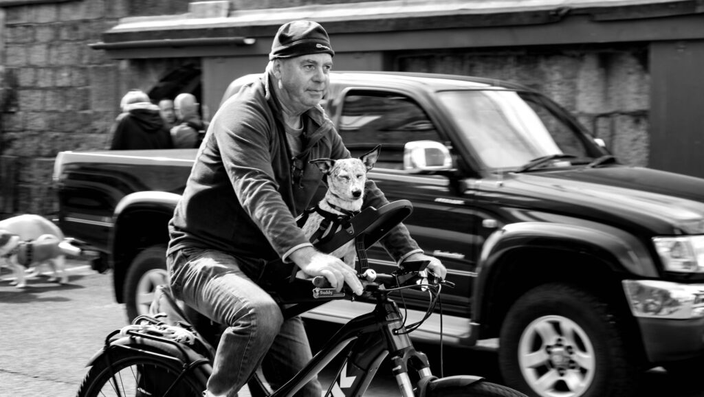
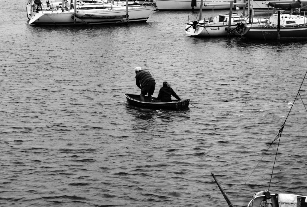
Inspired by Cartier-Bresson’s image of a cyclist I decided to try and create something similar within St Malo using motion.

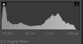
Camera Settings:

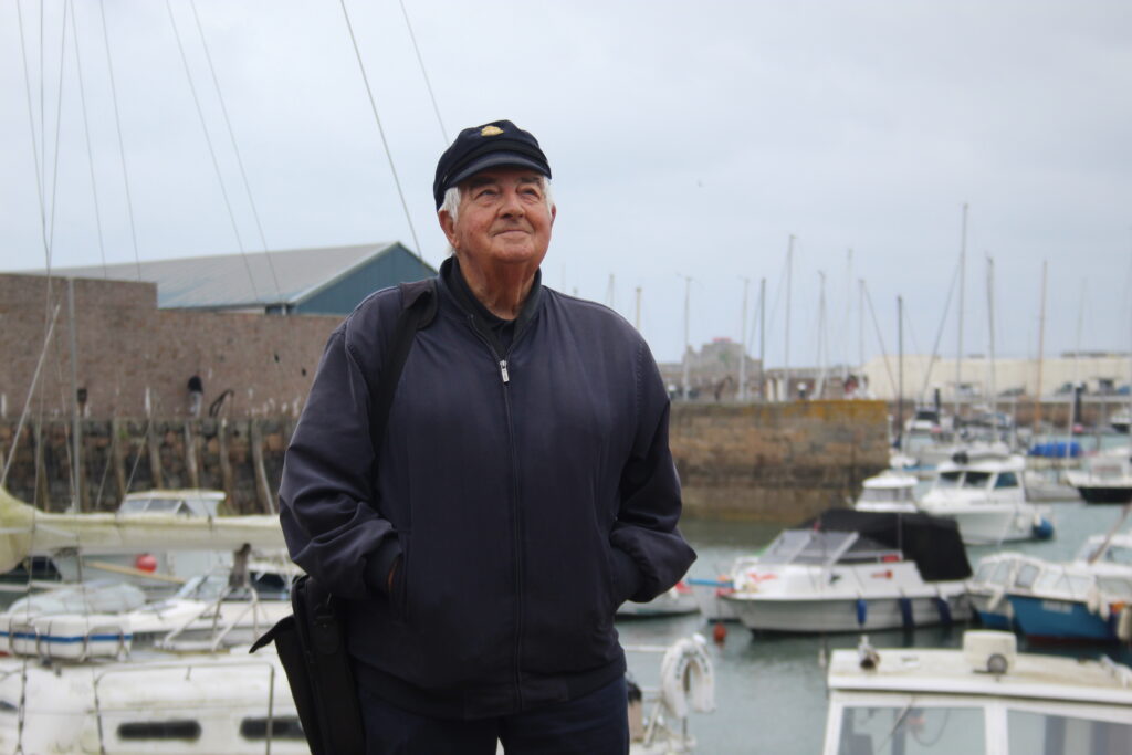
Before:

Editing process:

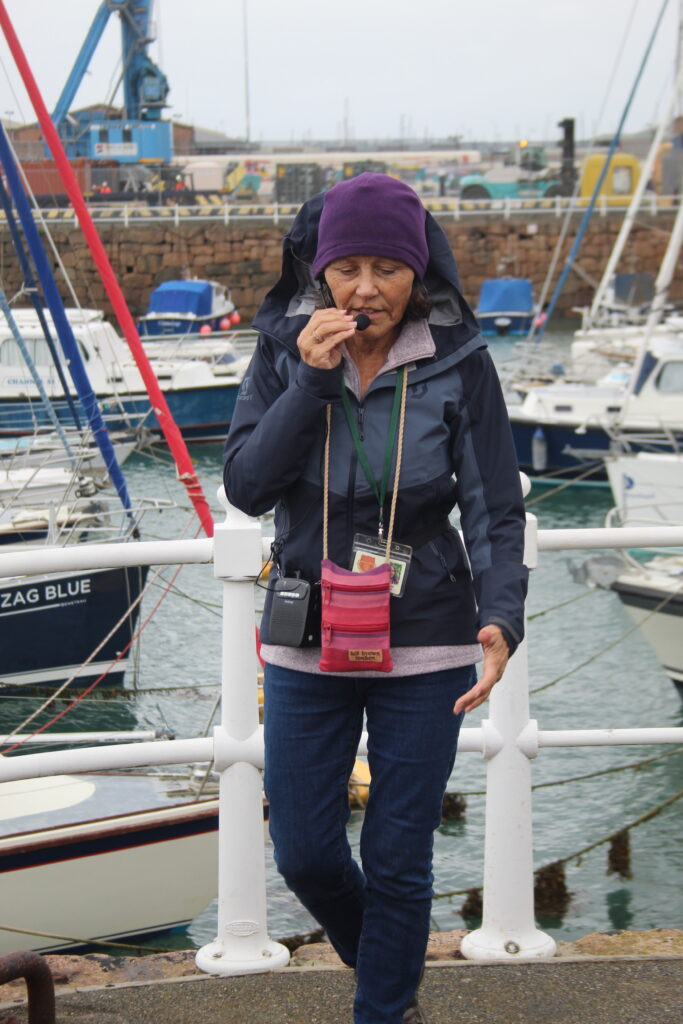
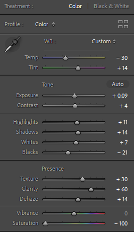
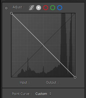
By adjusting the texture, clarity and haze, I tried to create a sharp but also an intentionally blurred image.

Final Image:

Edit 1 –

With Cartier-Bresson’s images of large infrastructure, dwarfing their surrounding subjects, I took inspiration from this in my own work and tried to recreate it.

Camera Settings:

Before:

Editing Process:

After turning into black and white, to add more pop and character to the image I attempted to make a tonal shift between shades. With lots of distance into the image it can be seen that it contains lots of different tones that can pop out once edited.

Final Image:

Edit 2 –

In the next image I did something similar with a more busy street.

Camera Settings:

Before:

Editing process:

To edit this image, and incorporate those variants in tone from colour when converted to greyscale, I prioritised making the small details in the lower half of the image stand out more with dehazing and white and black balance.

Final image:

By shortening down the original image, Cropping can help create a more effectively deeper meaning to its contents.

Camera Settings:

Before:

Editing process:

adding additional shots, I wanted to further detail this image by overlying multiple images. By adding different angles, changing their colours and opacity, I think this adds more detail and exclusiveness to the image.

Final Image:

Edit 1 –

Capturing a few photos where Reflections where caught in them, I liked how they came out a lot and can be said to capture 2 moments in one image without the use of artificial alterations.

Camera Settings:

Before:

Editing process:

To make sure both reflection and subject within the image where able to be recognisable I mainly used highlights and contrast to make them both stand out.

Final image:

Edit 2 –

Camera Settings:

Before:

Editing process:

Due to the unedited version being slightly out of focus but a lot of the tonal settings being alright, I mainly used the dehazing and clarity to make the image look nicer in greyscale.

Final image:

Edit 3 –

Camera settings:

Before:

Editing process:

Editing this image, like before I focussed more so on clarity and dehaze, this was to differentiate the subjected reflections within the original image.

Final image:

Henri Cartier-Bresson & The decisive moment – George Blake

Henri Cartier-Bressons work, as he puts it, is a ‘physical pleasure’. By carrying a camera he says it is an ‘extension of the eye’. This can be seen in his collection of photographs that capture a preserved time capsule of day to day life.

Born 22nd August 1908, in the outskirts of Paris in Chanteloup, Seine-et-Marne, Henri Cartier-Bresson grew up with an interest for art. Initially showing a fascination in surrealism painting, in 1932, during a year-long stay in the ivory coast, he discovered his passion for photography with a Leica, his camera of choice.

First exhibiting his artwork only a year later, It featured at the Julien Levy Gallery in New York. During the Second World War, Cartier-Bresson joined the French army, where he was promoted to a corporal in their Film and Photo unit. In 1940 during the invasion of France he was captured by German soldiers, up until 1943 he was a prisoner of war in which he managed to escape from on his third attempt. Joining an underground resistance network, he helped others escape from nazi captivity.

Rue Mouffetard, Paris, 1954

During the liberation of Paris in 1945, he photographed the allied victory with a group of professional journalists and then went on to film the documentary Le Retour (The Return).

Post war, he met up with other famous war photographers who served like him during the conflict, the most notable being Robert Capa, As well as some others like George Rodger, David “Chim” Seymour and William Vandivert, here they collectively founded Magnum Photos. An organisation that till this day, represents photographers, and exhibits and licenses their work.
Spending 3 years travelling in the East, Cartier-Bresson retuned back to Europe in 1952, once returned, He published his first book, à la Sauvette, in english meaning ‘The Decisive Moment’.

In This book, Cartier-Bresson defines his approach to Photography…

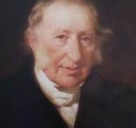
A young Cartier-Bresson, holding his signature Leica.

Later on in life Cartier Bresson, made a return to painting in 1968. In 2003, his wife and daughter created the Foundation Henri Cartier-Bresson in Paris to preserve his legacy and his work. Throughout his lifetime, He had received numerous awards, prizes and honorary doctorates. A year later he passed away in his home, located in Provence on August 3rd, 2004.

Henri Cartier-Bresson, in his book ‘The Decisive Moment’, created a series of images, pioneering in their unique story telling and have since been widely considered as one of the most important photo books of the 20th century. Described by Robert Capa as ‘a Bible for photographers’ his book is an interesting dive into the world through a camera.

The concept of the decisive moment comes from the idea that everything that occurs happens in a flow of events, In Cartier-Bresson’s eyes, there are moments within these events that contain a perfect arrangement within a frame. These moments are always spontaneous and often never repeat themselves, therefore making the photographer vigilant to be ready to capture that decisive moment.

Cartier-Bresson believed that the process doesn’t come randomly through attempts to capture that moment, it is up to the photographer to observe, anticipate and patiently wait for your focus to choose something you notice and let that be your decisive moment. To get the perfect image, timing and composition make up 2 strong factors in creating a impactful image such as Cartier Bresson’s. Another big part is the meaningful element, this can something that conveys an emotion or statement, for example a couple, someone doing a job, people enjoying something etc.

Anthropocene/Evaluation – George Blake

For the Anthropocene Topic, I believe my outcomes are a unique take on what usually isn’t massively associated to Anthropocene but still proves to be through its deeper meanings and historical context.

By covering the topic of conflict, my images show how the affect of Anthropocene is omni-present in every aspect of life. More specifically , my images go to show how through generations of human impact and change, the element of war leaves scars and resonates within the world and society till this day.

By using foam board I was able to create a 3D effect for this edit I made.

By incorporating some text, I believe this improved the outcome of this edit. Using text allows to create a deeper meaning to the image as what it means can be broken down into ambiguous definitions.

As mentioned before, text helps to add meaning to the work, in this case, It works as an education tool to inform the viewer of what went on within the subjects contents.

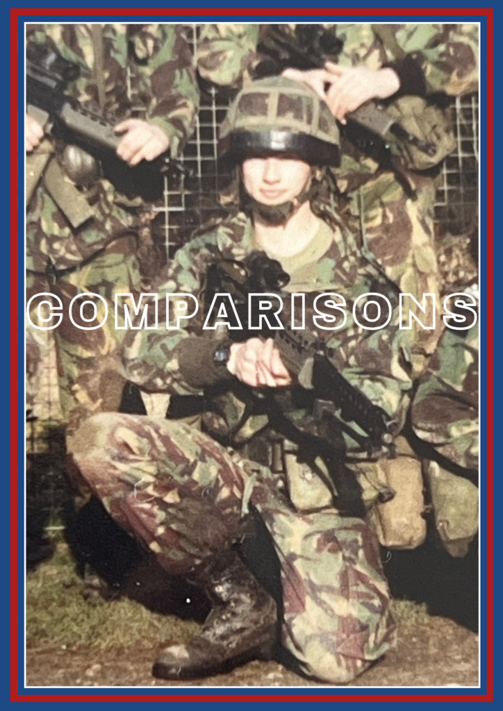
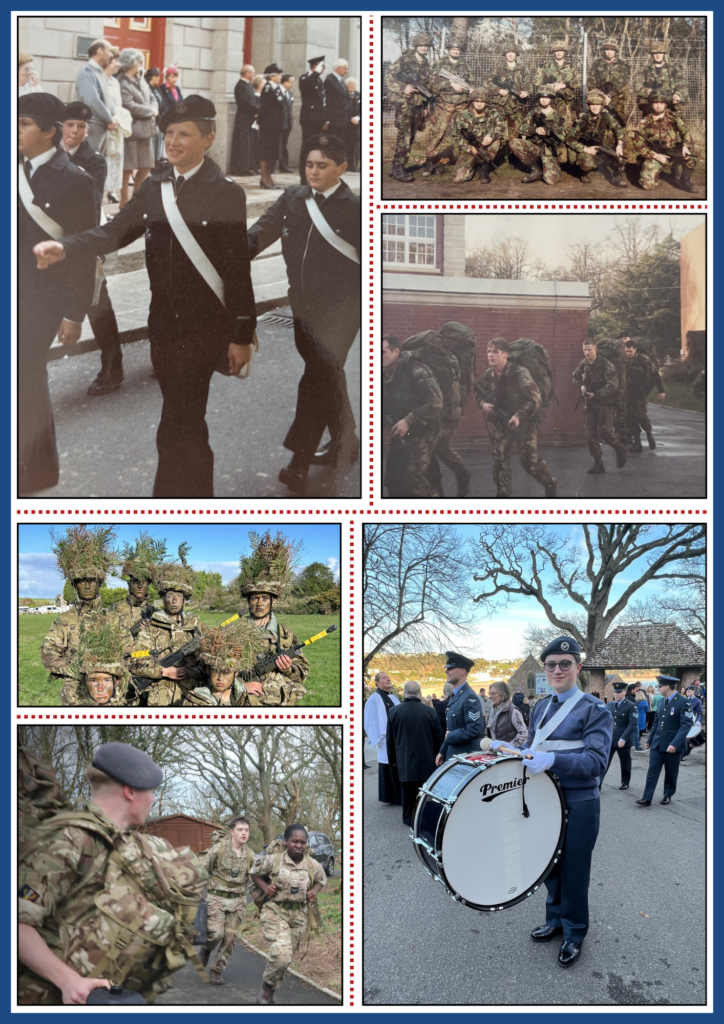
Comparison:

My work

Martha Rosler’s work

Taking inspiration from War collages, with their particular artists such as Martha Rosler, as well as different art movements like the soviet Avant Grande, these all helped me visually and conceptually base what I wanted my outcomes for these images to look like.

Anthropocene/Final images – George Blake

For my Final presentation of images from Anthropocene, I covered a variety of examples of how time affects environments of war.

In my images I covered the difference of technology over time, how areas of heavily fortified positions are now tourist attractions and how much they’re environment surrounding them has change.

These edited photos here, aim to show the effects of Anthropocene of war, how despite Technology advances, Battlefields change, the image of war remains the same. In the case of these images that message stands strong as despite the original images being taken over 100 years ago, in comparison to the modern images in only recent years, the actions, jobs and methods still are the same.

These Images aim to show the ideological aspect of Anthropocene. Although time passes from these past periods of conflict, their marks on history remain today with use of these images from their time.

These images show the local effects of Anthropocene, from Jerseys wartime occupation, where these locations where of military value and heavily defended, to now, an industry that thrives of its history through tourism. Areas featured like Elizabeth castle, or Corbiere where chosen by me as I thought, how they both massively changed in environmental purpose and were a clear sign of human impact on the world, so locally to me.

Anthropocene/ First Edits – George Blake

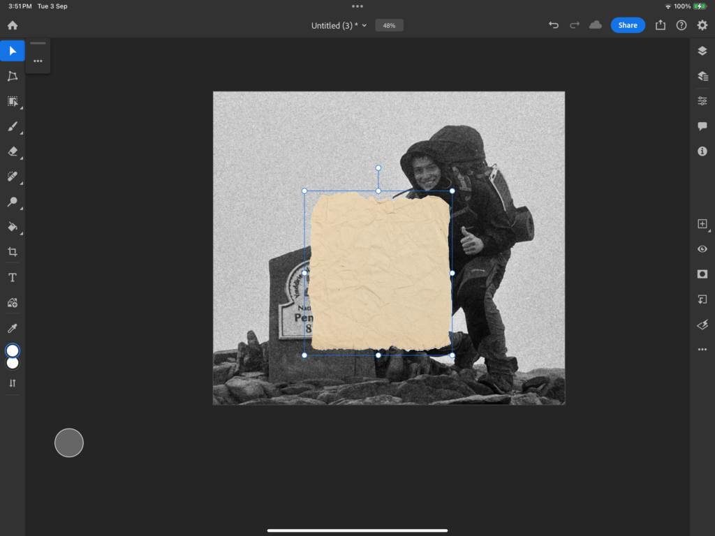
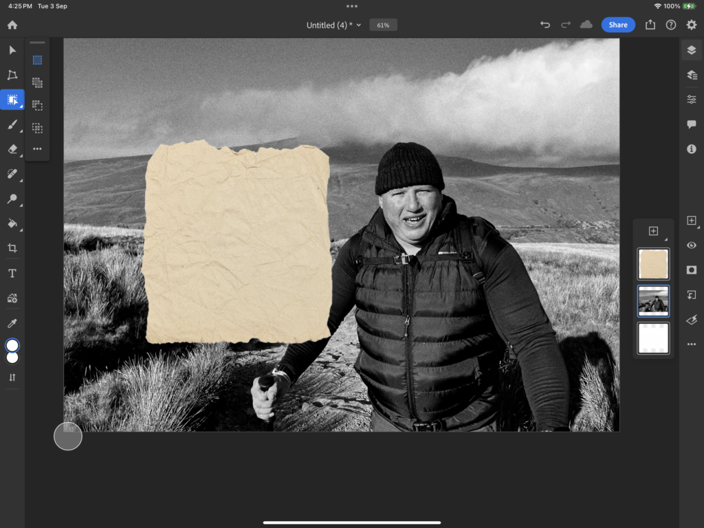
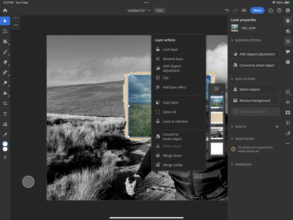
Using photoshop I further edited my work:

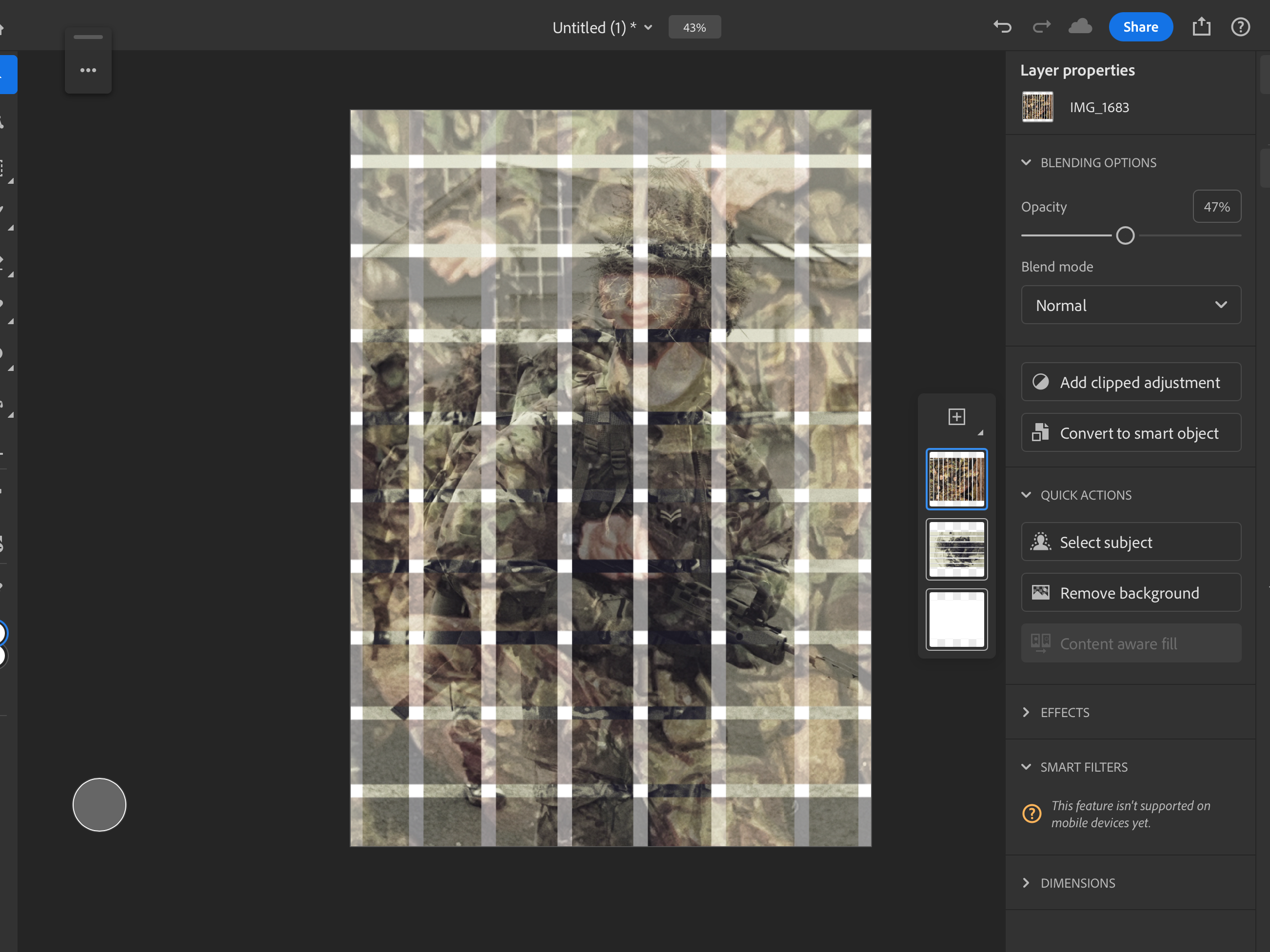
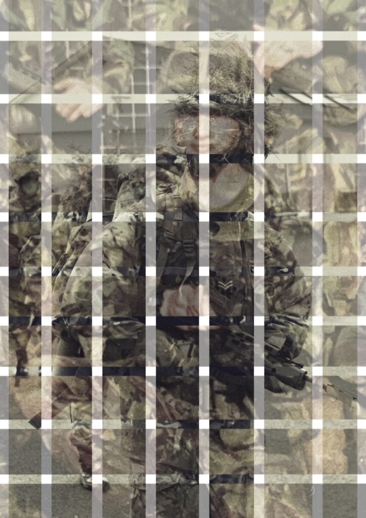
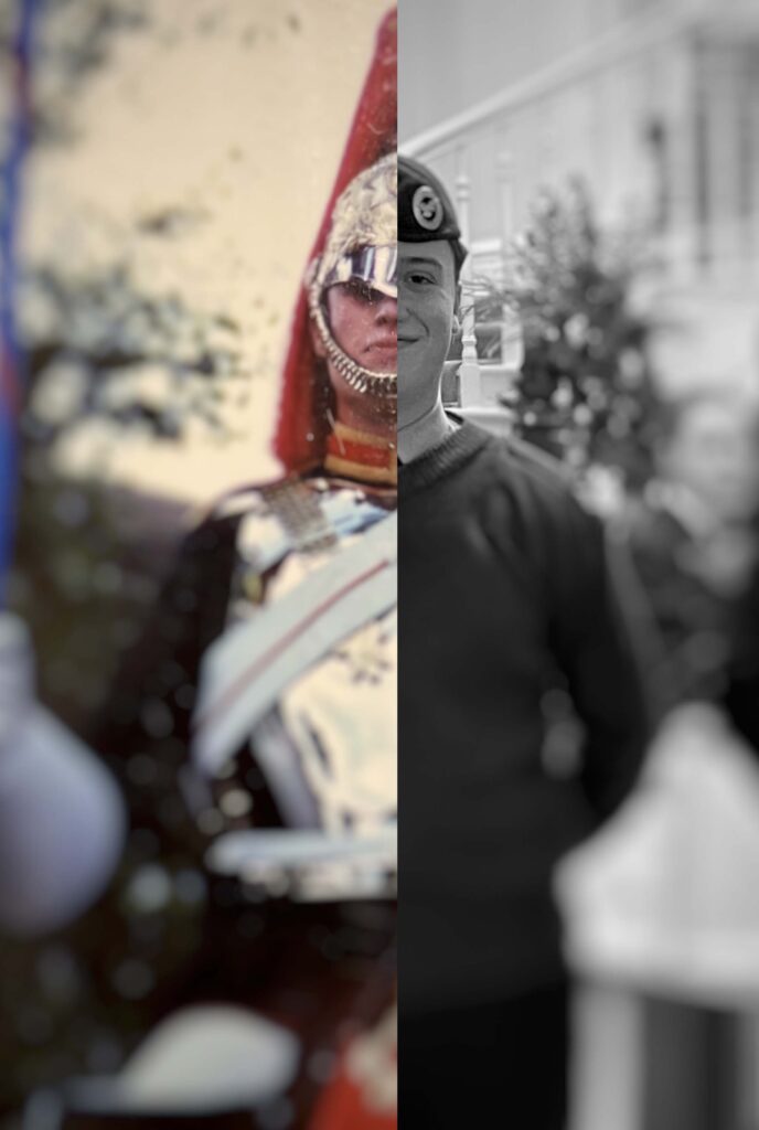
Using opacity I was able to perfectly line up my images to how they would have been taken back then in the 1940s.

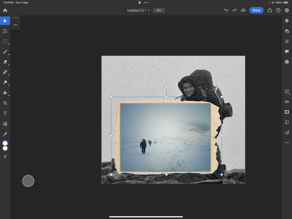
After lining the image up, I re-added its full opacity, I began cutting out my image in a sort of ‘scrapbook cut-out’ aesthetic.

Using a brush to merge out the opacity the image came out as this…

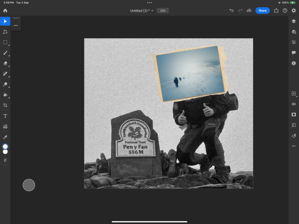
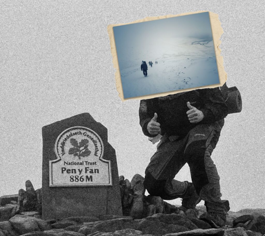
By merging these images, I have created a view into the past through an opacity fade. This shows how much Anthropocene has altered the landscape around us from its appearance in the past.

Using photoshop I further edited my work:

Being much trickier to line up since the rock face has changed so much overtime, I repeated my method of using the occupation images opacity to overly it onto my modern picture. Despite proving to be a challenge this can also be said to show the effects of Anthropocene as the power of that field gun could be said to shape the side of the rock with its powerful kickback.

In comparison between these 2 images the effects of Anthropocene are clear to see with the breakdown of the rock face and the extension to la Collete.

Using the same Settings for the image, I did this as the image I wanted to photoshop is just a slight variation to the one before.

Using photoshop I further edited my work:

Overlying the Image I repeated my methods off adding the historical image to where I believed it would be positioned back then.

By lining the image, I can get a frame of reference to see how I want it to be positioned, and have it Ready so I am able to cut it out to scale.

When the opacity is removed you can really get a good look at how the images line up. By cutting the image out, I am able to create my desired aesthetic for the image of it appearing almost as a ghostly cut-out from the past.

Using photoshop I further edited my work:

Due to angles being hard to recreate I use objects within both images that are appropriately sized for me to use to reference the positioning of my historical photo overlay.

By resizing the image, I am able to capture more of the original image in a larger size, making the contents more clear.

Using photoshop I further edited my work:

With the environment being hard to map, My photoshopping off the historical image would prove difficult. This however can be said to show the effect of Anthropocene and how far it has changed from then till now. With the contrast of visual content from Germans in the 1940s to French tourists in the present it creates a interesting visual example of Anthropocene.

Wanting to remove the excess space from the top of the image I added some German airplanes, to add more character to its context.

Using photoshop, I was able to remove unwanted details such as a wall of the current Corbiere Phare.

Although the amounts of planes is exaggerated to what would actually fly over Jersey, I think it makes for a good filler for the blank space within the sky of this image.

Montage –

Edit 1 –

Using images from The German Bundeswehr Photo archive of the channel islands I further experimented with my work, with inspiration from war collages.

Importing images of modern machines of war into war it creates an interesting look into the effects of Anthropocene in warfare.

By adding photos, of Current US Soldiers compared to the Germans from the 1940s, this image is a collage to show the huge advancements made in technologies from powerhouses from their time.

Final result:

Edit 2 –

For my second edit I thought id explore the effects of Anthropocene in the war in Ukraine to show similarities and differences they conflict has with the First world war, with my images of trenches.

Using the objection selection tool on Photoshop, I cut out a soldier from the first world war to show much these images comparison despite their changes over time in uniforms, country and technology, the element of War remains the same.

Edit 3 –

Through the comparison of technology we can see the difference from then till now.

I really like how this edit came out, and I think it really shows the comparison of technology from the past to present and how it is incorporated to warfare. Within the modern day, we can see how technology replaces many jobs from the past. It quite an interesting look into the binary-opposite of Nature vs machines.

Edit 4 –

In this edit, I aimed to show the difference explosive technology between conflicts in History.

Shown through the comparison of firepower, the change in size of how they function varies largely, whilst their purpose remains the same.

Edit 5 –

Through this image, the idea is to show the personal inflections of war, such as separation.

Overall I like how this came out, and think it creates lot to talk about within the contents of the image. In relation to Anthropocene it contains a call-back to Jerseys past through the inclusion of the German officer, stationed here on the island back into the 1940s.

Edit 6 –

Wit these images, I wanted to show how the Germans, apart of the Nazi’s Third Reich, wanted to dominate the world. With their violent weaponry shown through these local images, I will add them together to create an interesting collage.

Editing in an Image of a globe, its colours did not match the surrounding images, to correct this I altered them by removing the saturation, adding grain and making it a yellowish hue.

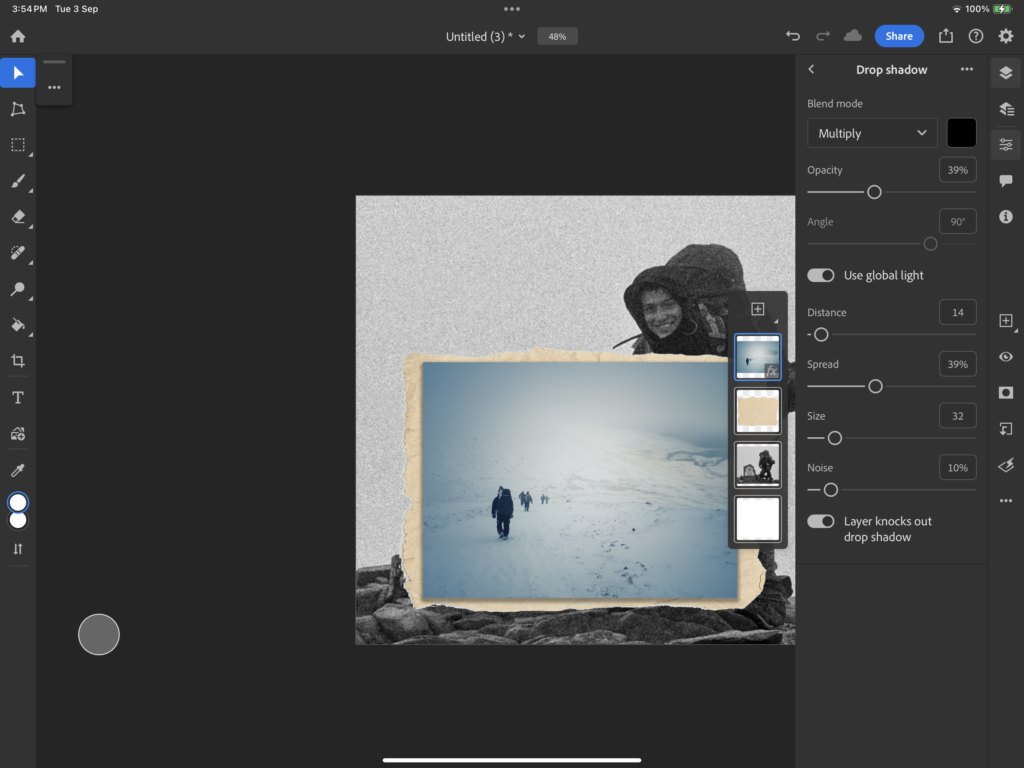
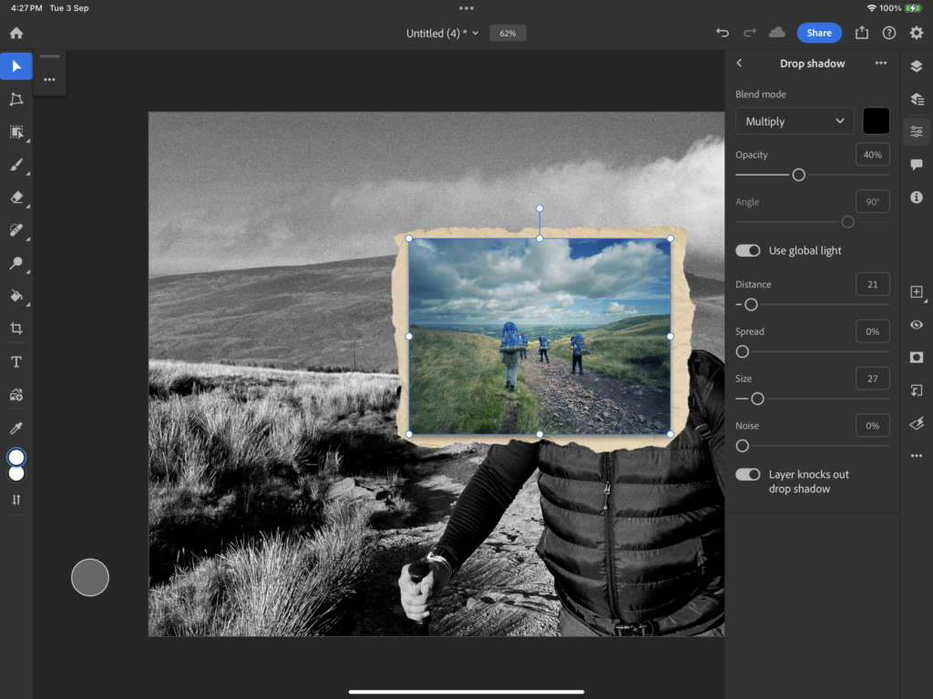
By adding a drop shadow it makes the globe pop out a lot more, and blends in well with the smoke effects from the Guns firing.

I like how this came out with the positioning of the Germans looking towards the centre, I believe it creates an interesting conversation point on what it could be interpreted to mean.