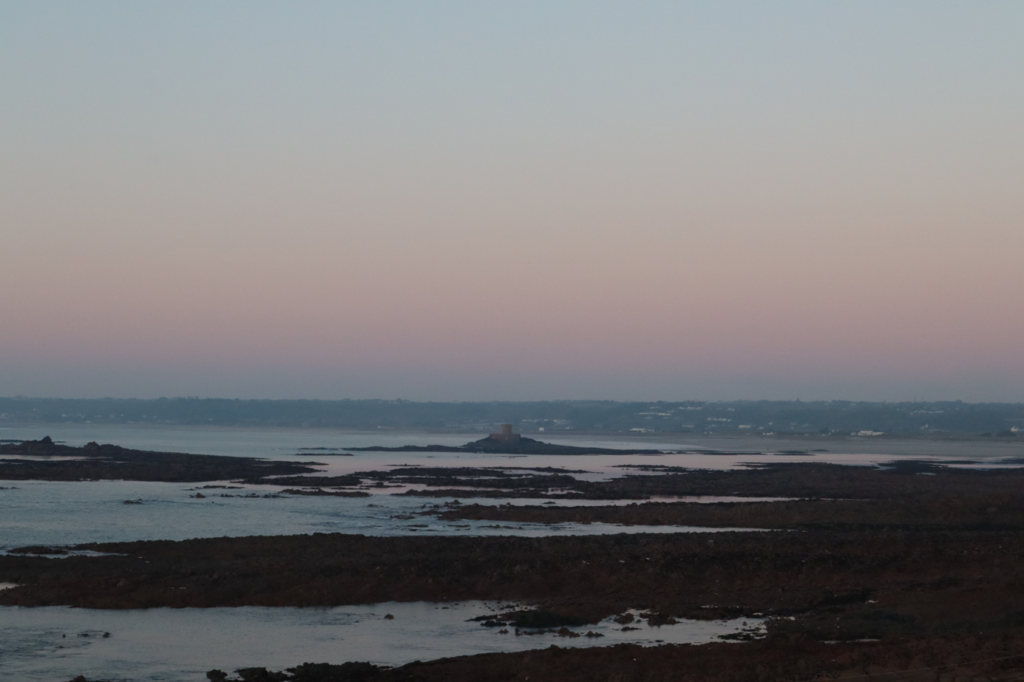
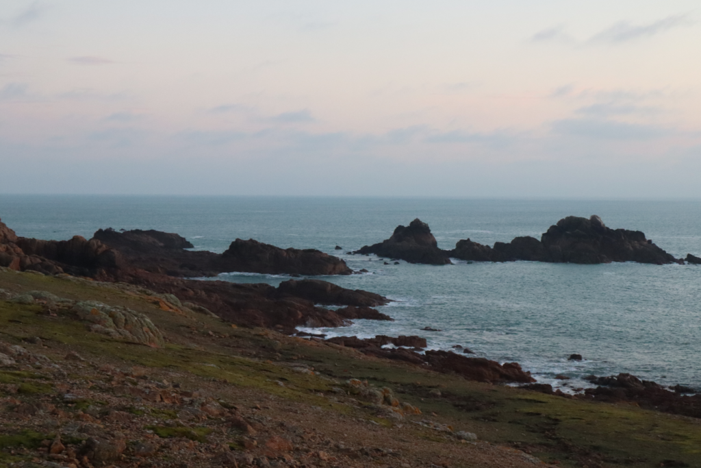
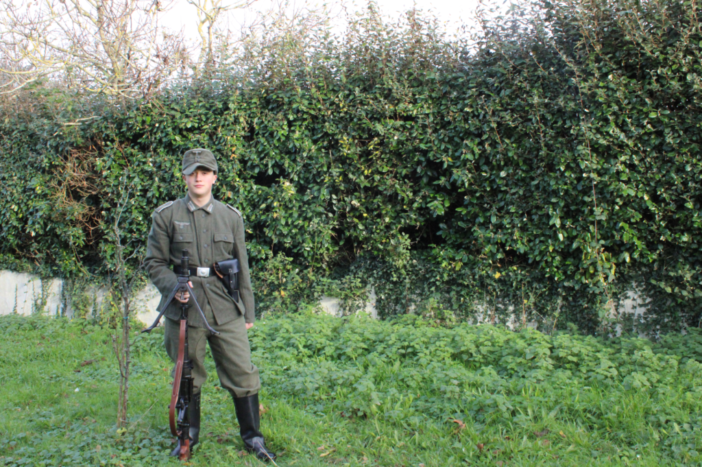
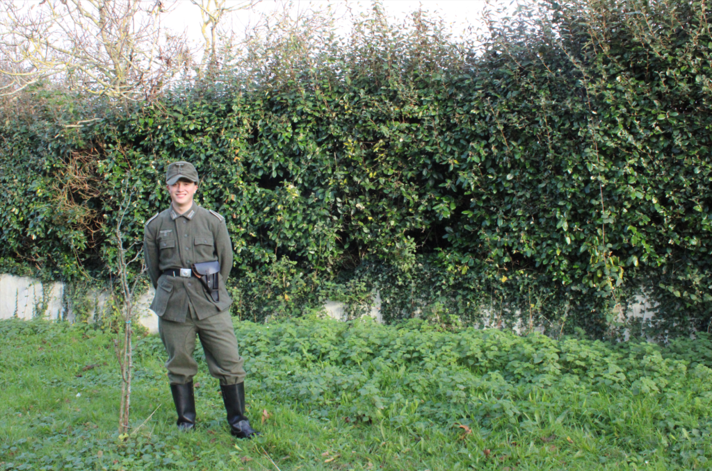
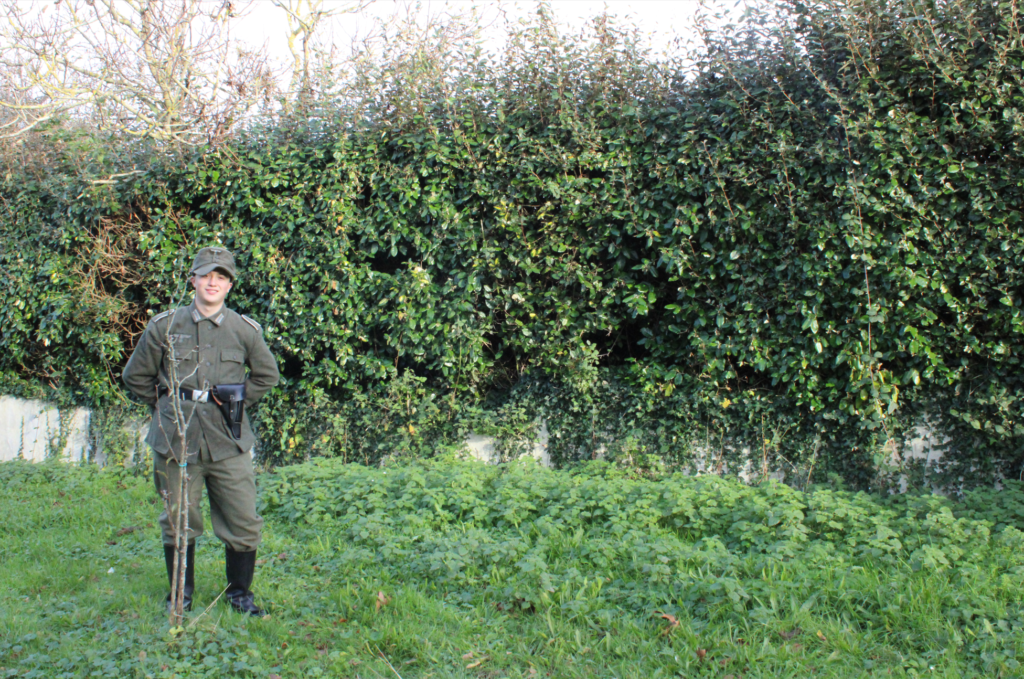
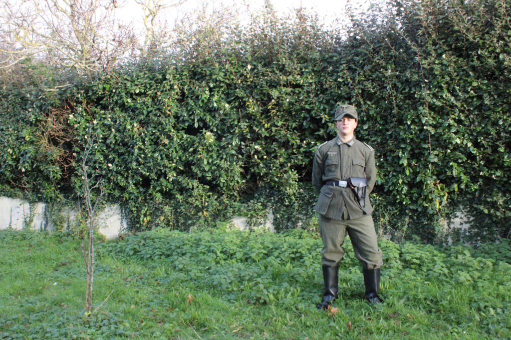
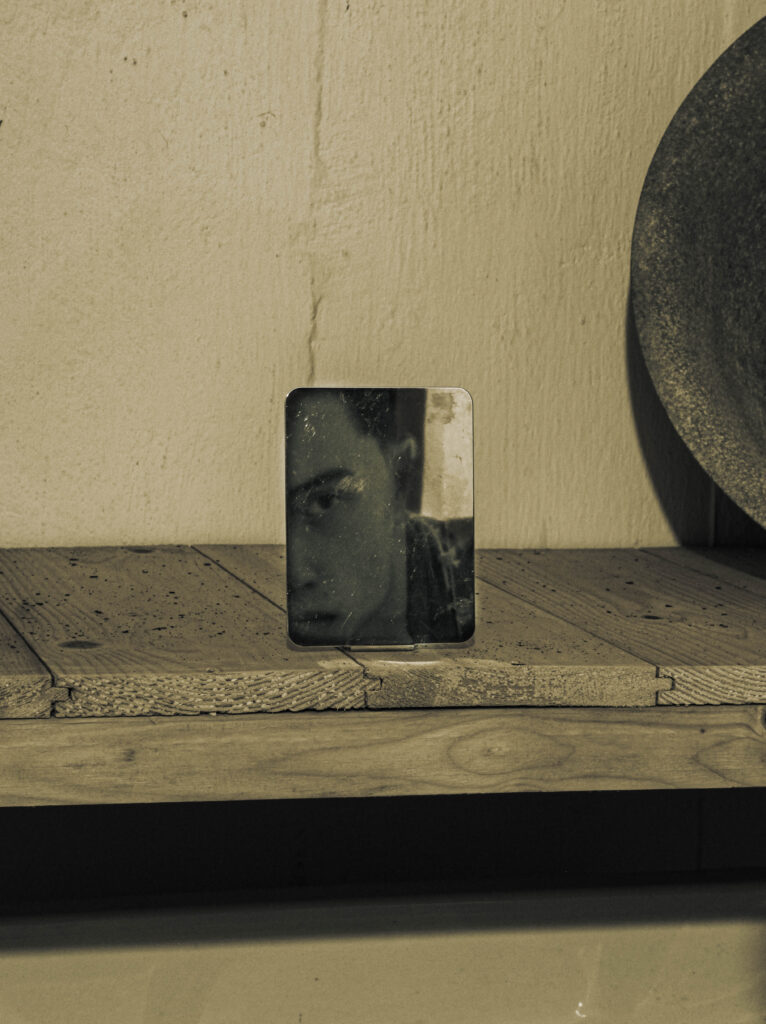
These are my final images presented in a virtual gallery.

These are my final images presented in a virtual gallery.
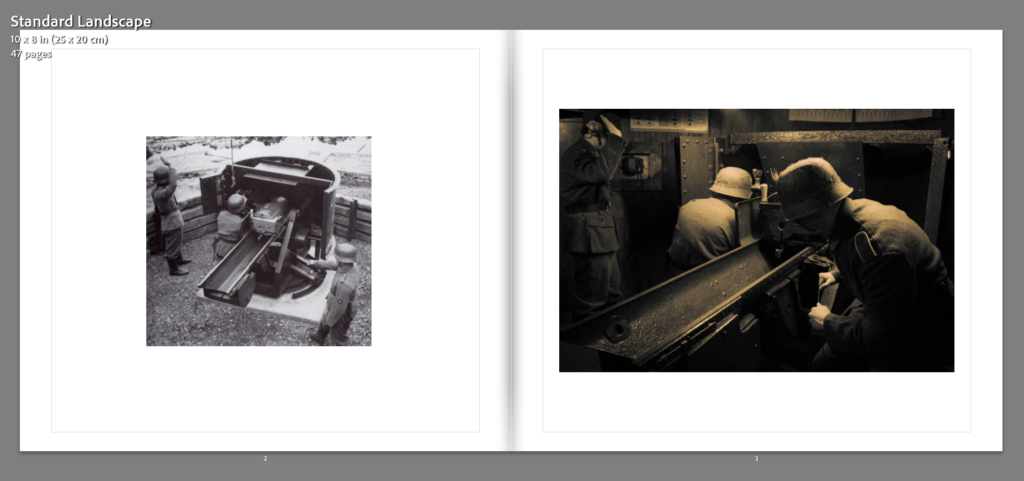
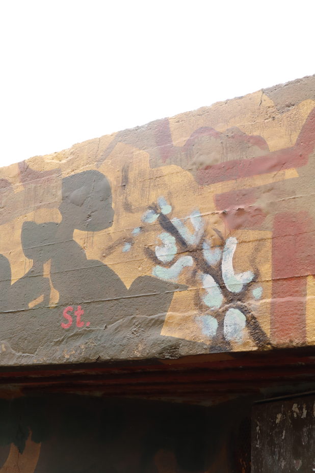
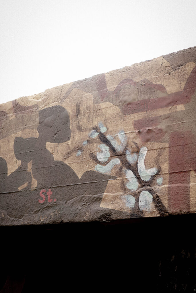
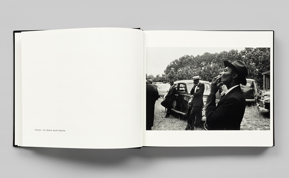
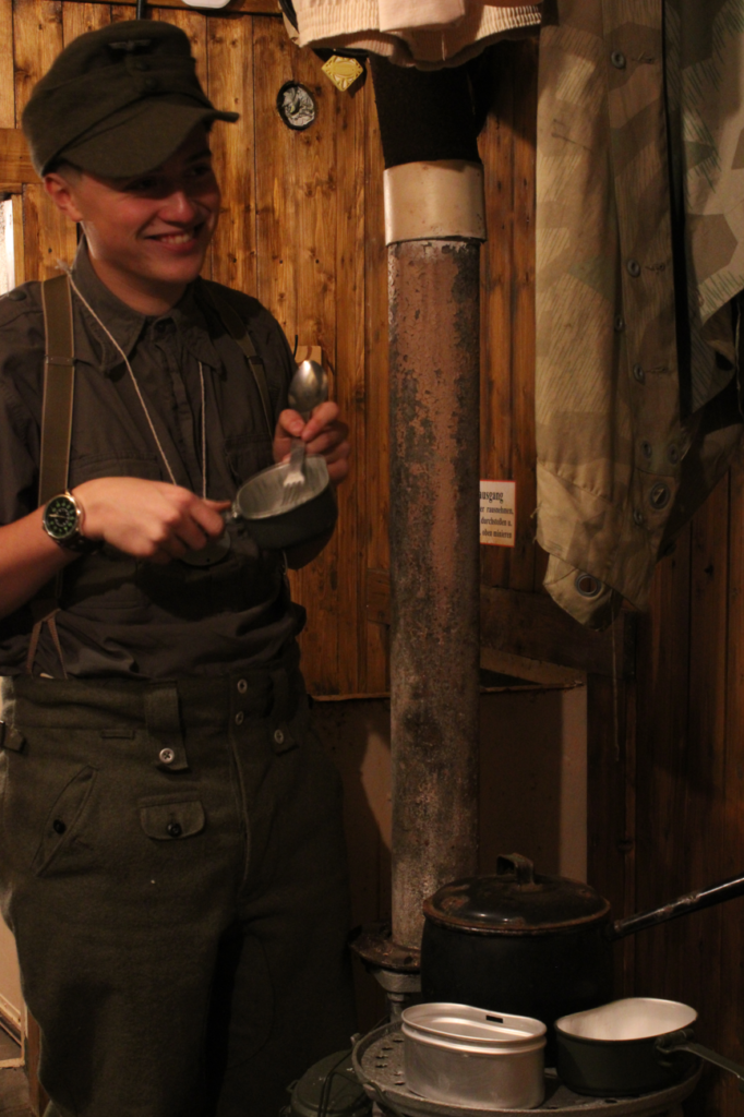
Photobook – Kanelsoldaten:
Evaluative analysis
Overall I think my personal study was successful in creating my plan to portray the truths of reality and war through photography. By being able to show links to my influence from both my artists I find my images appeal to both aesthetics. Due to the difficult process of image taking such as with the props, locations, weather and timing in addition to the editing process of detail correction in Lightroom and the positioning and creating the images through photoshop I found it was hard to create all the images I wanted in the time that I had. Another issue was the lack of equipment to portray the soldiers as accurately as I wanted.
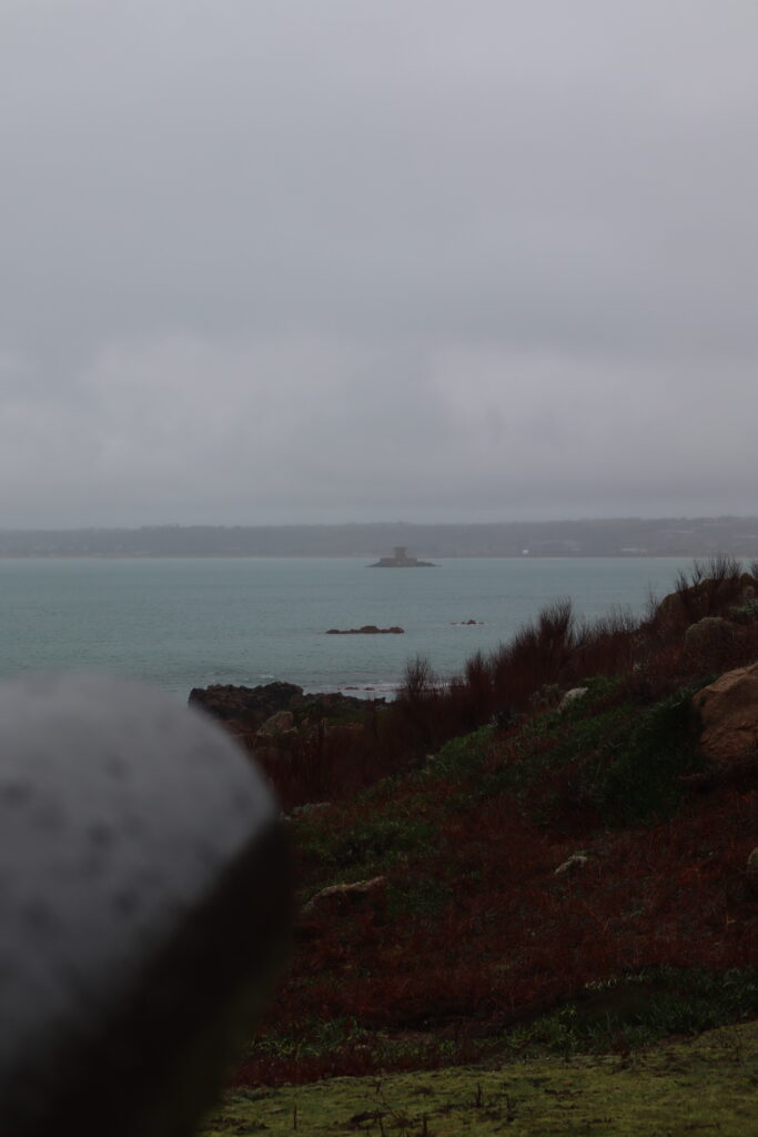
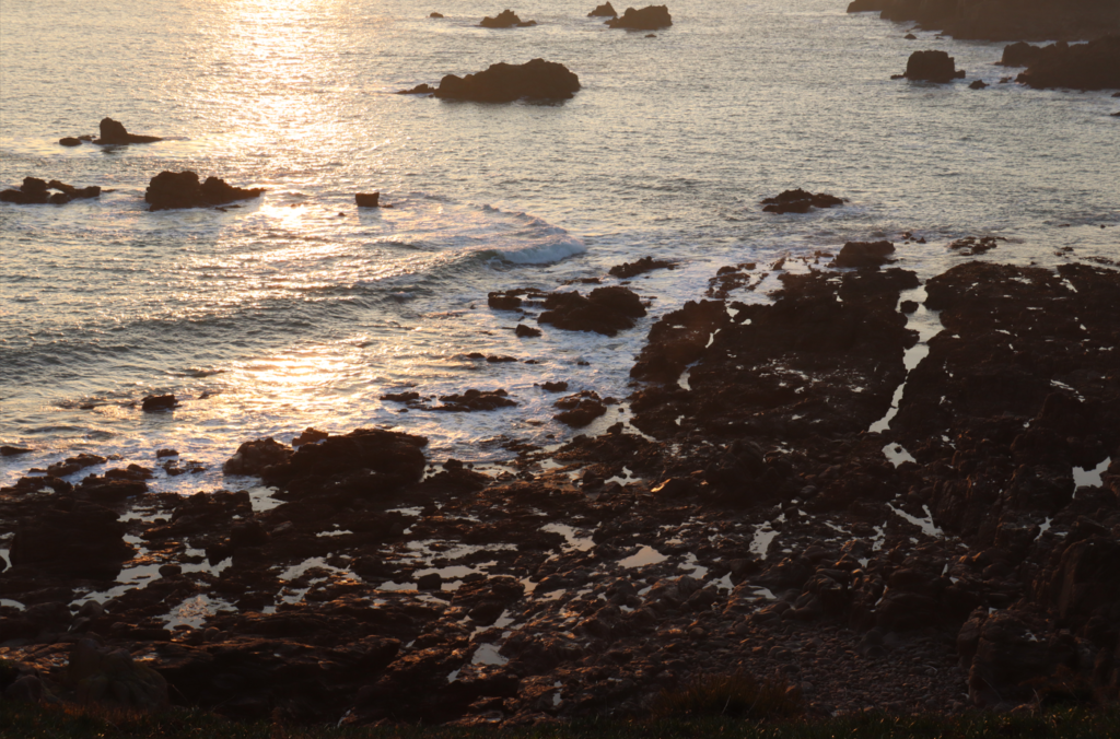
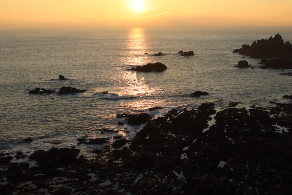
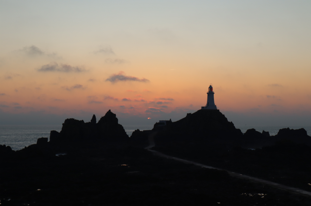
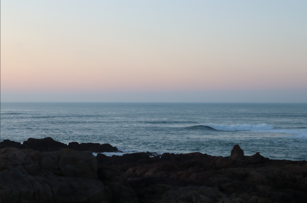
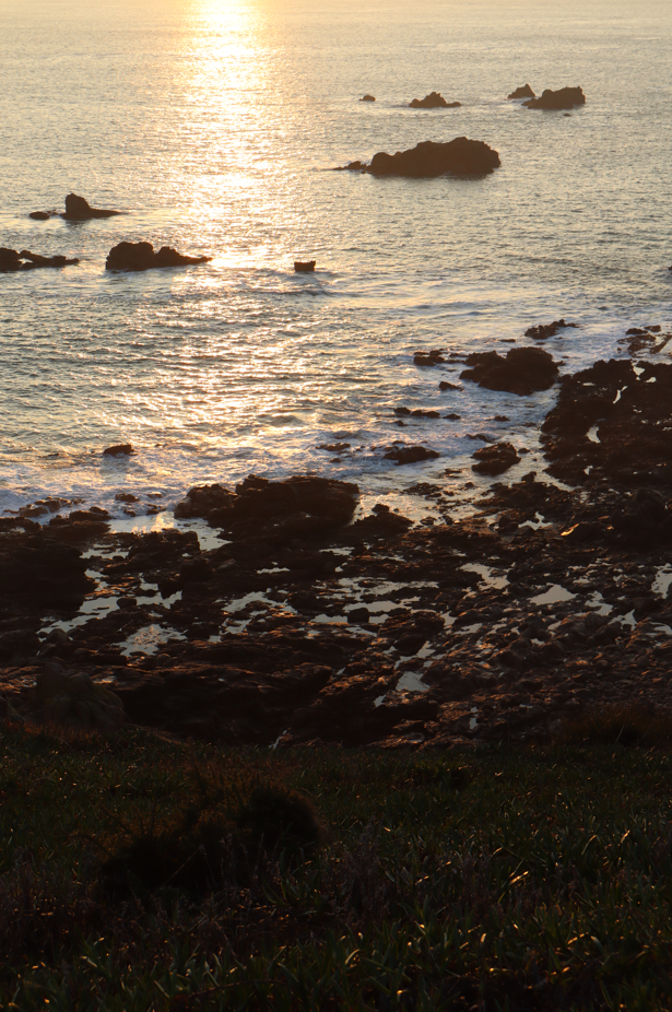
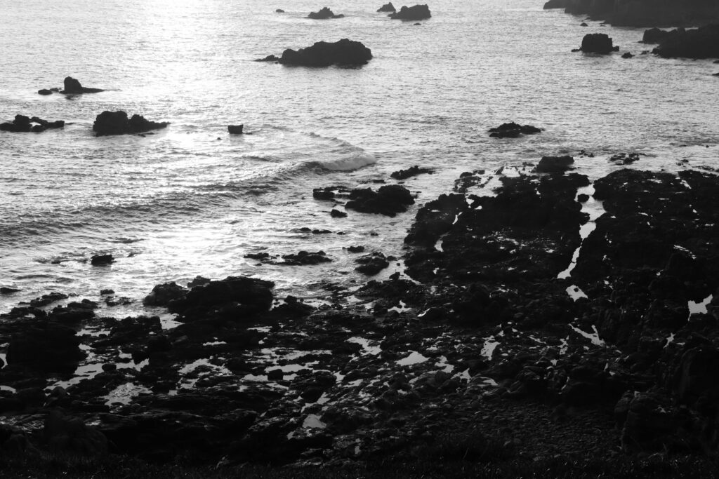
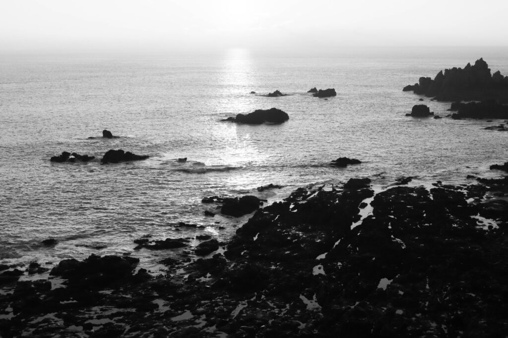
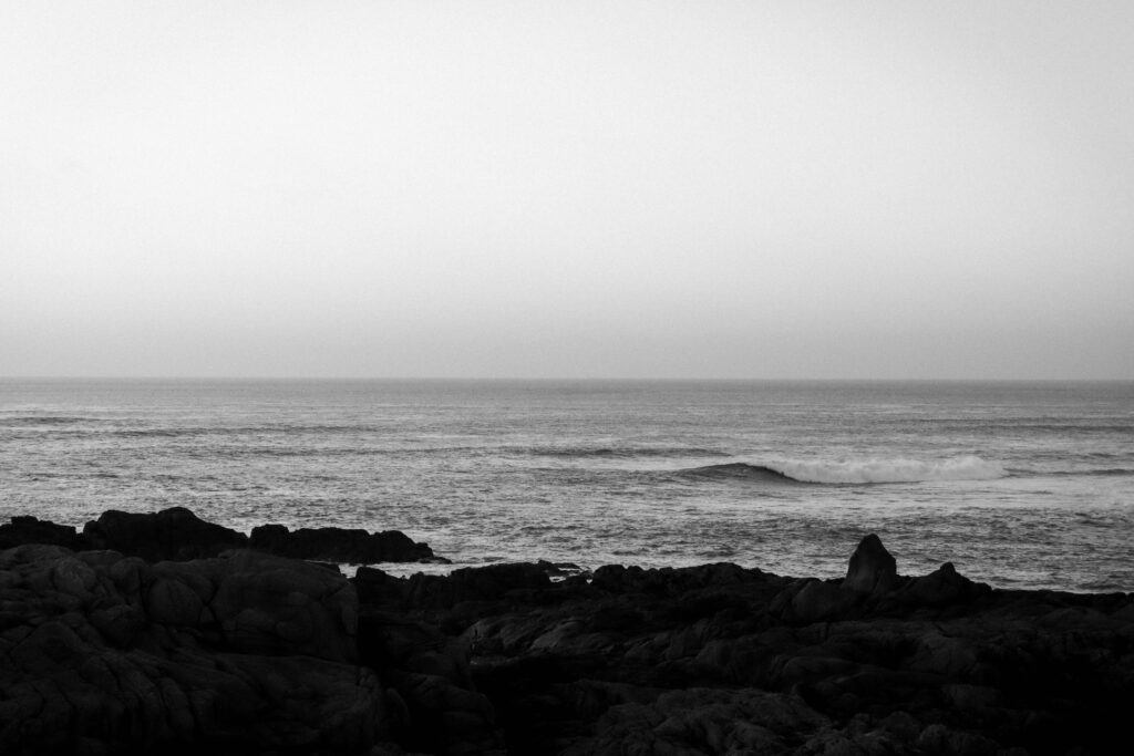
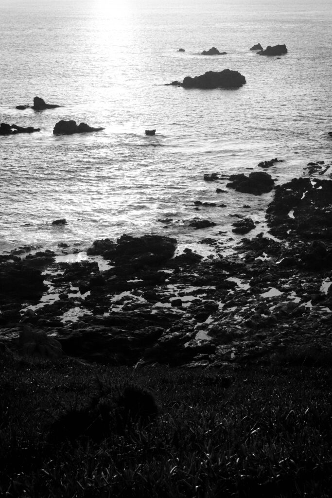
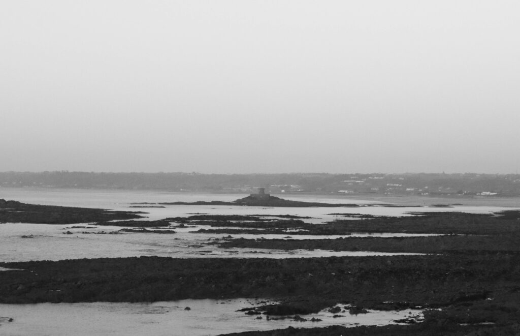
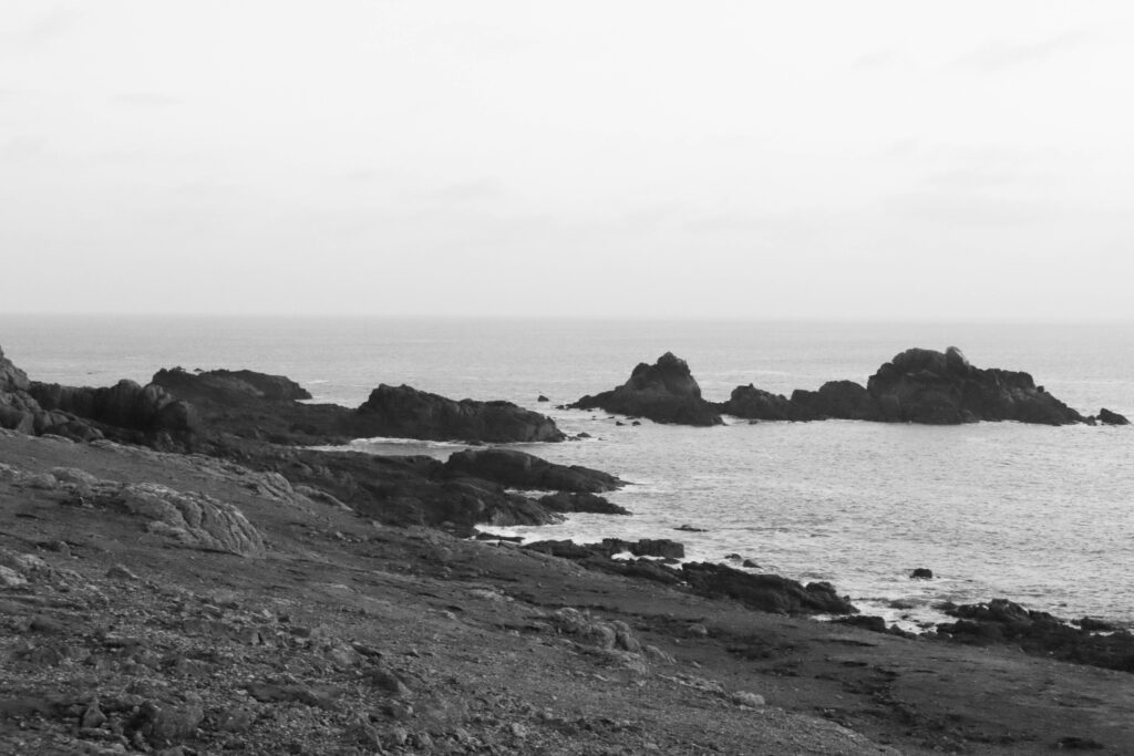
Despite these set backs however I believe I was able to create a diverse array of images and locational settings that fitted around my target location of La Corbiere. With accuracy as my focus I aimed to include cross-comparing elements such as referencing through my images to the text I included. With the text being a poem, written by a German Soldier stationed at La Corbiere, it mentions the seas surrounding Corbiere, through some of my images I aimed to include photographs of the sea to make reference to this.
Photobook: Story & narrative
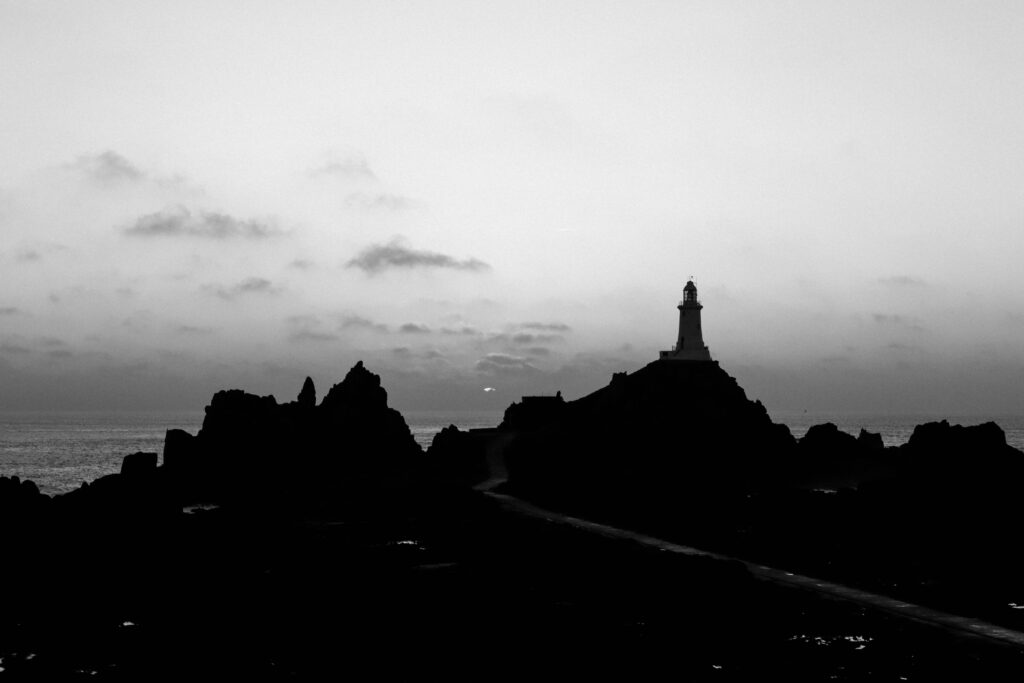
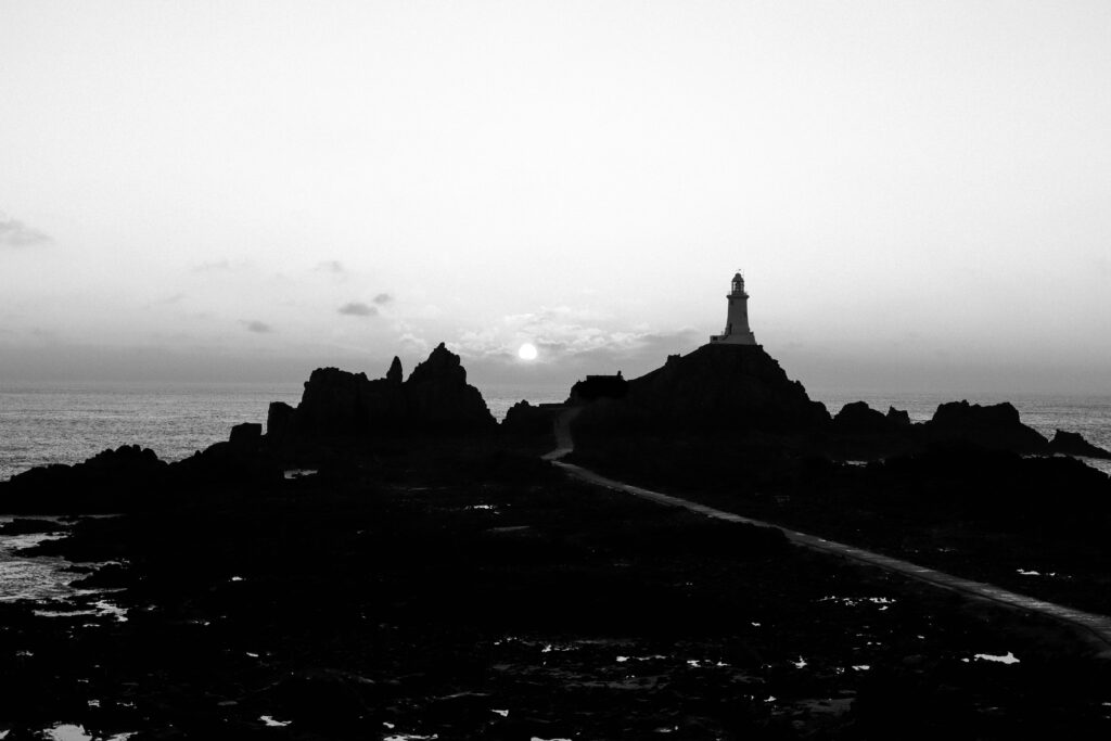
With the Images I produced including archival photographs, I positioned these together with my recreations/interpretations to create the narrative of their relation. With Landscape shots as separator’s, this was to tie in the location of the narrative and bring emphasise to the images local setting. With the photographs including cloned versions of myself, in interoperated scenarios, the aim of these images by themselves was to create the immersion into their own stories

Photobook: Layout and Design
Using a variety of designs within my photobook layout, the aim was to create a well balanced composition where images used together would work well together or contrast in an aesthetically pleasing way.

With archive images being an important tool to show my influence in the recreated photographs, it was important to me to position them together.
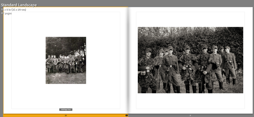
With the design, I also positioned the images to merge in colour or create contrasts through various appearances, this can be seen where images lower in saturation or are placed on separate pages of black and white to then coloured photographs.
(Lowering of saturation)
(Colour contrasts)
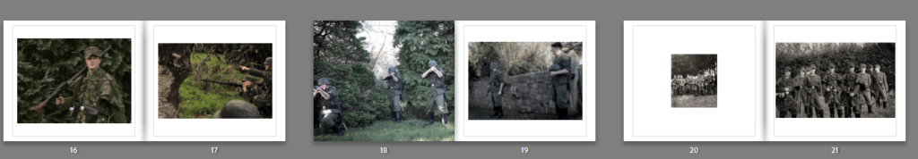
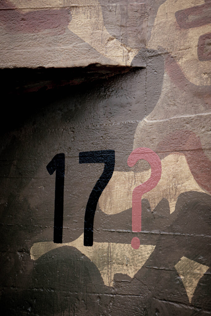
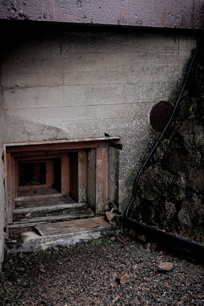
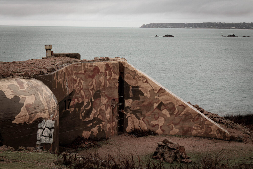
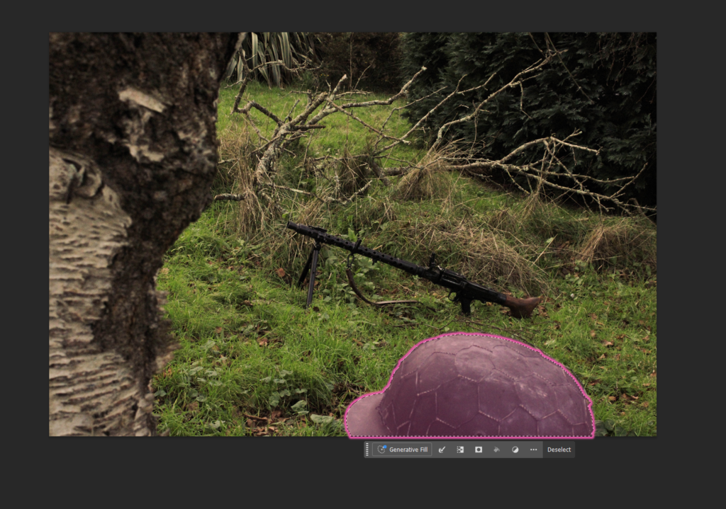
These are the edits of my third and fourth photoshoot:
Snapseed edits –
Using the app Snapseed on my phone, I was able to use their filters to create both a realistic depiction and more time-period based aesthetic of some of my images of the bunkers and some more duplicated soldier photographs.
3rd shoot –


4th shoot:


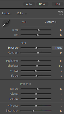
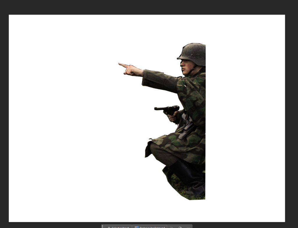
Lightroom & photoshop edits:
Applying the same edit methods as before I created some more images for my shoot. These include photographs from my 3rd, 4th and an additional 5th shoot. These consist of both subject based photographs as well as landscapes.
3rd shoot:
Before and After:
Editing:
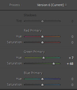
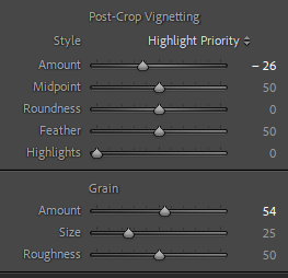
applying the same settings across all these images, this was to create a similar aesthetic across all my images. this would help keep a repetitive theme of images within my work.
Outcome:


Before and After:
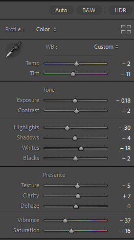
Editing:
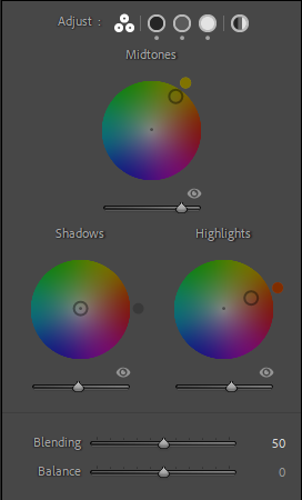
Using these settings this was to create that low-saturation, and dark type of aesthetic that Michiel Peeters creates in his work. With shadows being prevalent within the images, I darkened them through the shadows.


Outcome:
4th shoot:
Before and After:


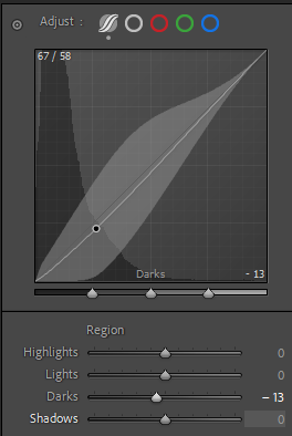
Editing:
Editing these in Lightroom, I aimed to mirror the shadowy and low saturated aesthetic of Michiel Peeters. Syncing all the images to have the same appearance I then made the cloning process using photoshop. Here I was then able to merge my images into one.


Outcome:

Before and After:


Editing:
Doing the same as before I lowered the brightness and colour to make the image appear more dramatic and darker in Lightroom, due to me standing in too close of a similar spot I used shadows of another image to move myself other to the other side which I find looks better.


Outcome:

Before and After:


Editing:
Using Lightroom I was able to use the settings to add more darker parts to the image by adding some contrast, shadows and black. Then by using photoshop I was the able to merge them together.
Outcome:

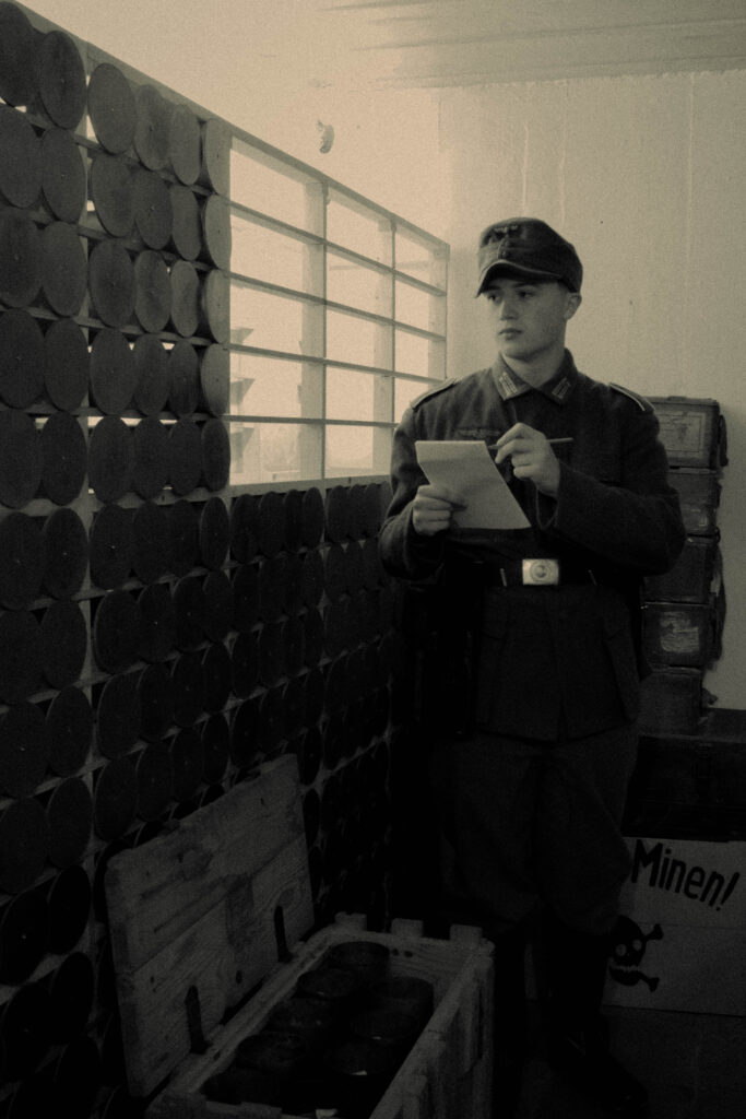
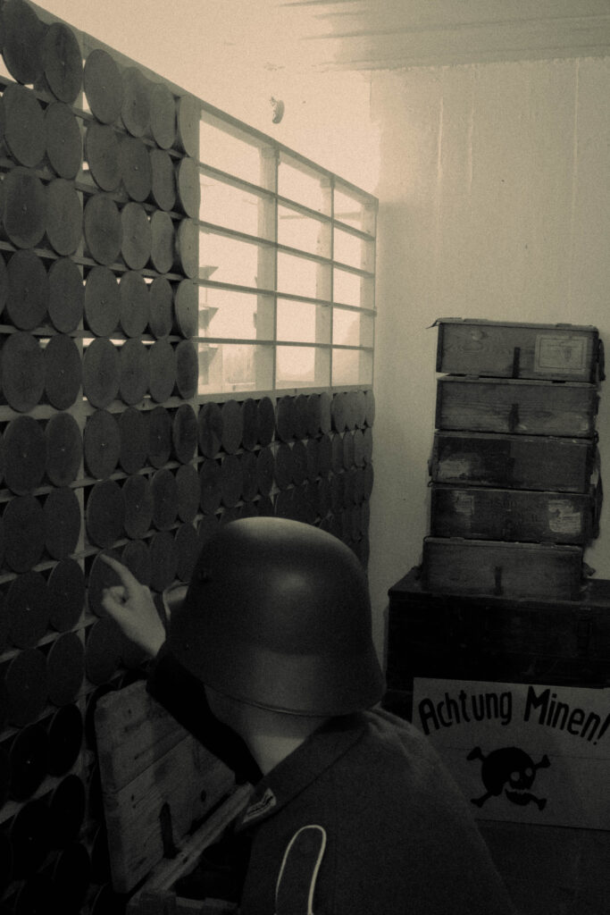
Before and After:


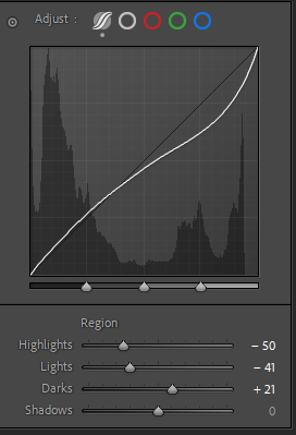
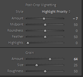
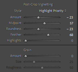
Editing:
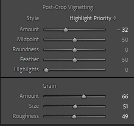
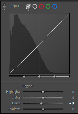
Editing all these pieces together with the same settings, I used the highlight region to darken aspects of the work, lowering the saturation, texture and clarity I followed in the theme of making the image darker. cropping the image, I made it smaller as there was to much open space.


Outcome:

Before and After:

Editing:
Using the following settings this was to create a merged effect of a vintage image but also using modern image clarity to act as a divide between some of my images.


Outcome:

Before and After:

Editing:
Like the image before, I aimed to create a gritty vintage image but also make it appear modern in its appearance. By using the lighting regions to adjust the images depth I added to this with other settings such as with highlights, saturation and clarity.


Outcome:

Before and After:
Editing:
Using Photoshop, I applied the settings of my binocular image to match the aesthetic so these images could work together when applied.
Outcome:


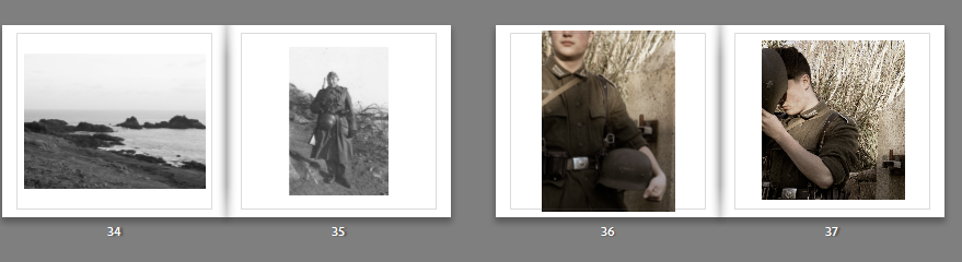
5th shoot:
Before and After:
Editing:
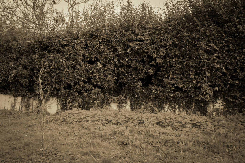
Applying these settings across these images, the aim was to include some observational documentation of the La Corbiere coast for my images, converting them into black and white this was to create an aesthetic of the old photography visual style.
Outcome:
Before and after:
Editing:
Using some minor adjustments to these images, the aim was to replicate the grainy film aesthetic of photographic images from the 1940s.
Outcome:
1. Research a photo-book and describe the story it is communicating with reference to subject-matter, genre and approach to image-making.
‘The Americans’ – Robert Frank, Published 1958.
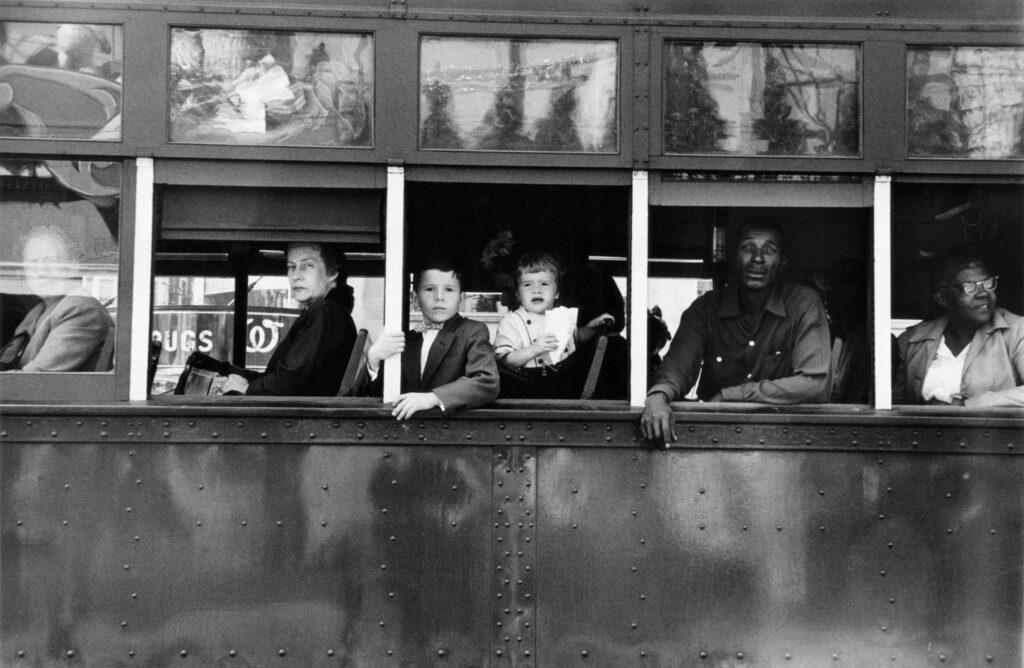
‘The Americans’ by Robert Frank captures his Journey across 48 states of America, photographing the natural sights around the country. Through the candid approach it communicates the “everything-ness and American-ness of these pictures” ( To quote the book). Reminiscent to Henri Cartier-Breton’s ‘Europeans’, it captures street photography of the everyday lives and experiences of those of at the time. Making use of a variety of shot types, the core 3 that are present consist of close-up, mid-shots and long-shots. Like its subjects, Franks’ images consist of many types of light. Natural and unnatural, are used heavily to bring out detail and character to his images, such as with dark shadows of the day forming a stark contrast, or the warm glow of lights bringing attention to his surroundings and subjects of the photograph.
2. Who is the photographer? Why did he/she make it? (intentions/ reasons) Who is it for? (audience) How was it received? (any press, reviews, awards, legacy etc.)
Robert Frank, 1924 – 2019.
“I was very free with the camera. I didn’t think of what would be the correct thing to do; I did what I felt good doing.” – Robert Frank
Robert Franks ‘The Americans’ explores the faces of many personalities across the United States. Travelling from state to state, the written intro from Jack Kerouac narrates his journey, bringing to life the images we later see. With many takes on the reasoning behind his journey of faces, the most popular intention behind Franks work was that he wished to photograph the America, far away from the idealised view of the American dream and instead capture the quiet America, those not given a voice or those that didn’t live in line with the vision of the ‘American way of Life’. In the theory of Frederik Trovatten, Frank within his work wanted to: Embrace imperfection, prioritise emotion over aesthetics, see a story in every frame, develop his own vision and be an observer to the world, not a performer.
In the words of the Museum of Modern Art “In a country that was not his own, Frank assumed the unique position of an outsider and voyeur who unobtrusively captured the tensions of the geographic, economic, racial, and religious diversity of the US.” “Frank captured the nation as a messy corpus, never privileging city or country, black or white, Jew or Christian, rich or poor.”.
Franks achievement through his work earned him a notable reputation in the world of photography, such as within John Szarkowski’s theory of ‘Mirrors’ and ‘Windows’. To quote Szarkowski, Robert Frank’s work “characterises opposite modes of the new photography, with its divergence between those who believe that art is a mirror, reflecting a portrait of the artist who made it, and those who see it as a window, through which one may better know the world.”.
Frank also notably gained awards such as the Guggenheim fellowship in 1955, the 1996 Hassebald foundation international award in photography, the 2002 Edward MacDowell medal and a doctorate in fine arts in 2015 from Nova Scotia college of Art and design University.
Sources:
https://trovatten.com/robert-frank
https://www.moma.org/artists/1973
3. Deconstruct the narrative, concept and design of the book and apply theory above when considering:
UNDERSTANDING PHOTOBOOKS:
NARRATIVE, EDITING, SEQUENCING, DESIGN, FORM, FUNCTION.
How can photography represent the realities or truth of war?
“Photography cannot change the world, but it can show the world, especially when it changes.”
– Marc Riboud
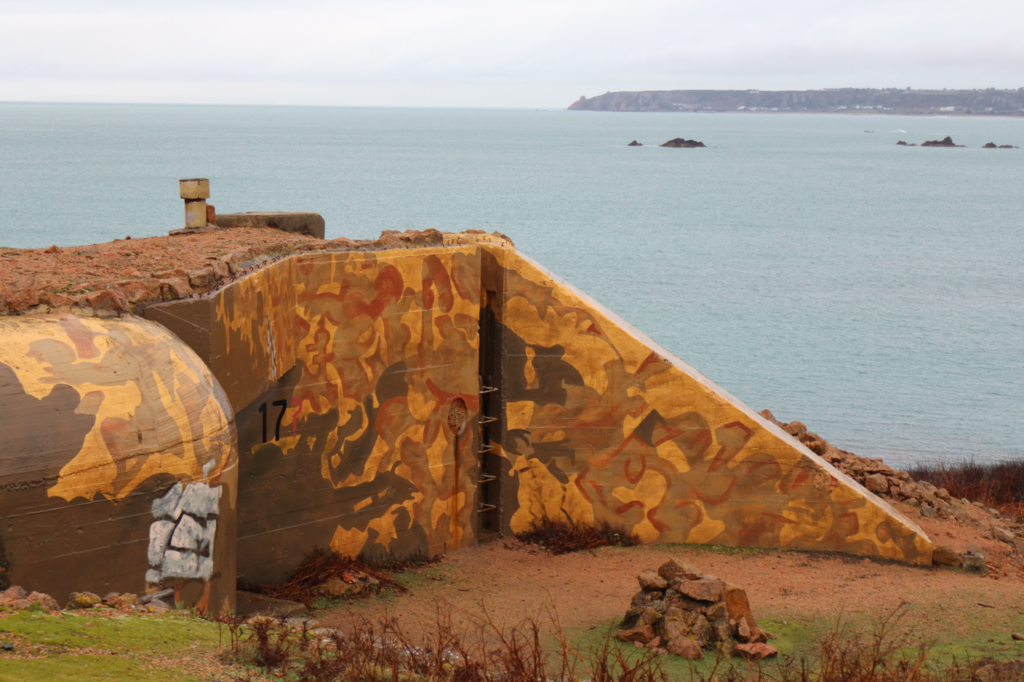
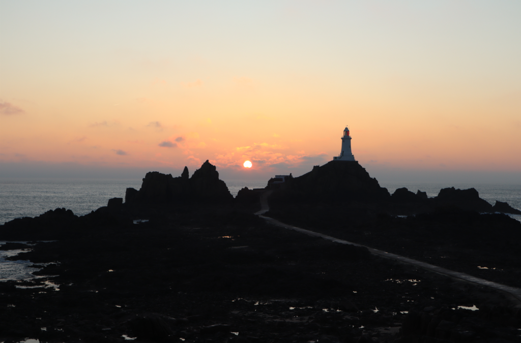
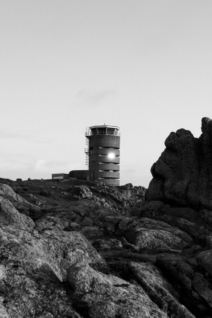
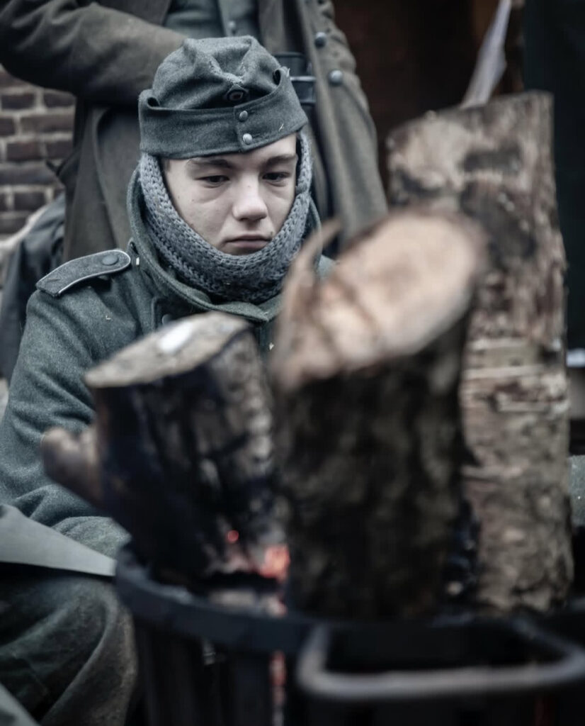
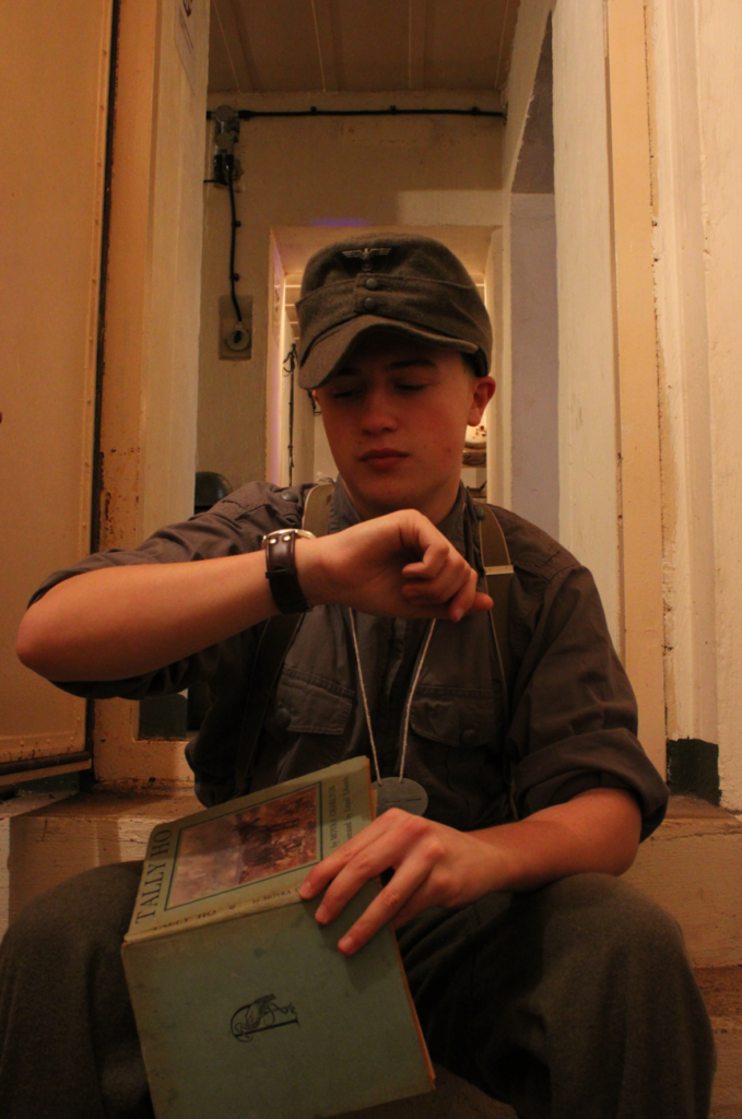
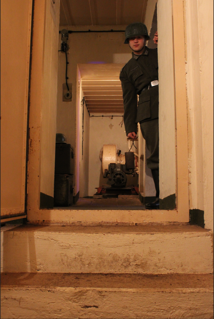
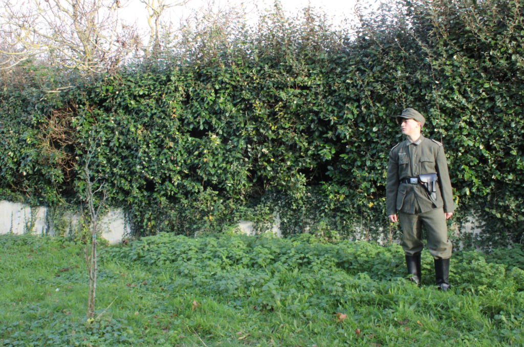
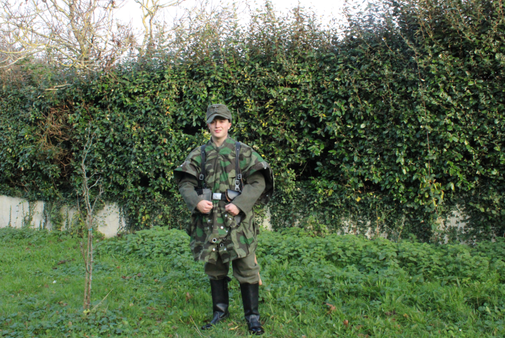
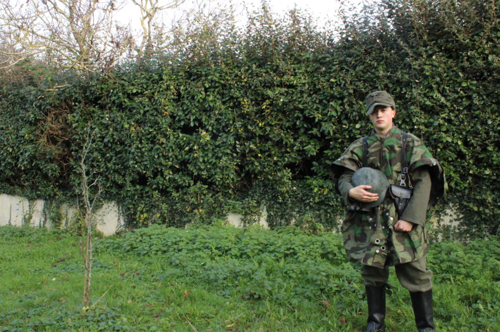
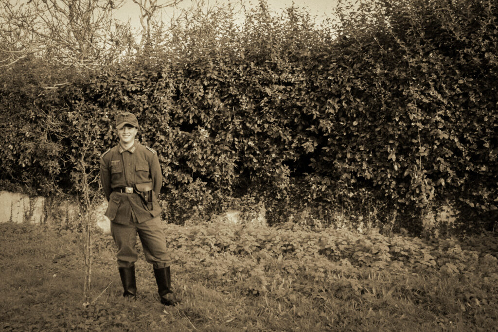
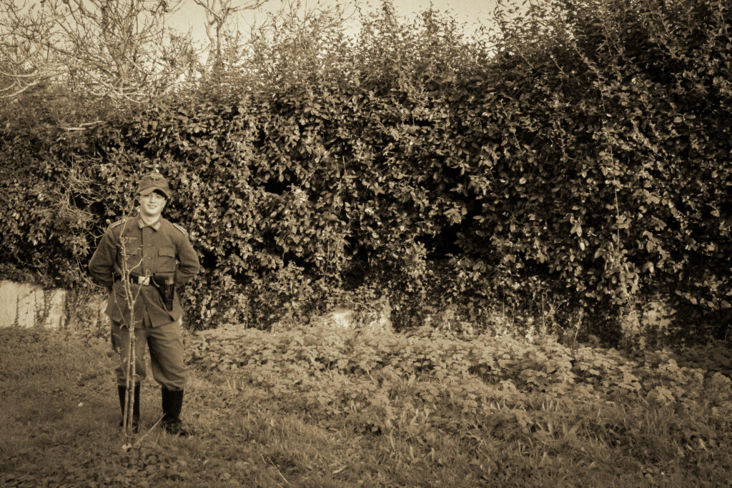
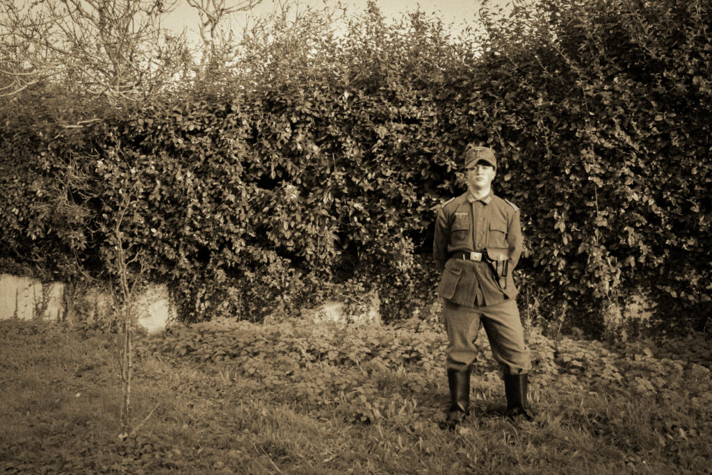
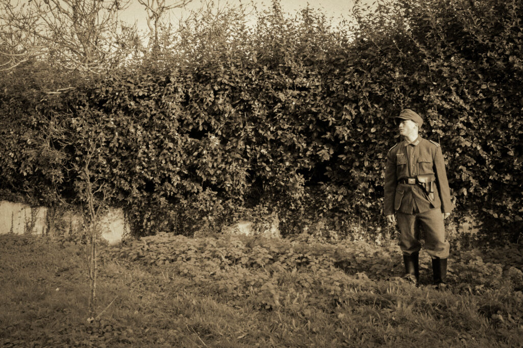
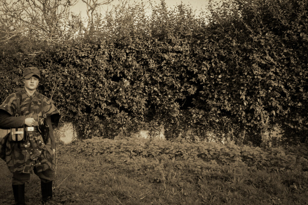
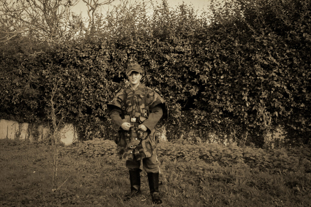
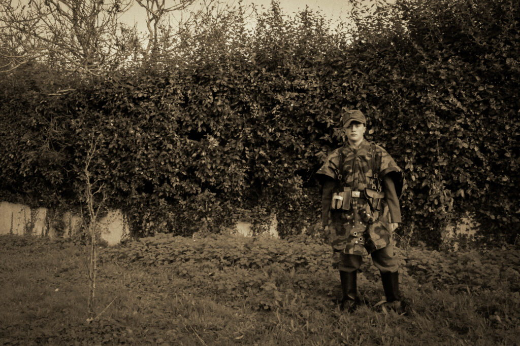
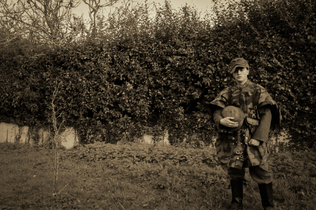
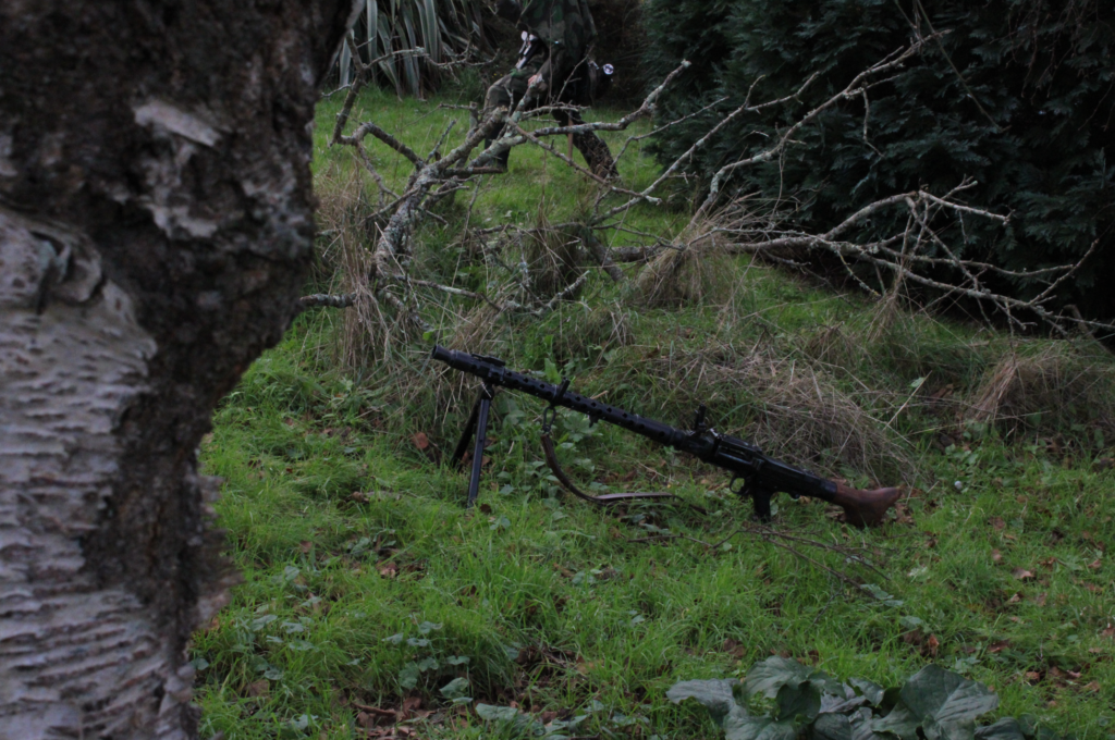
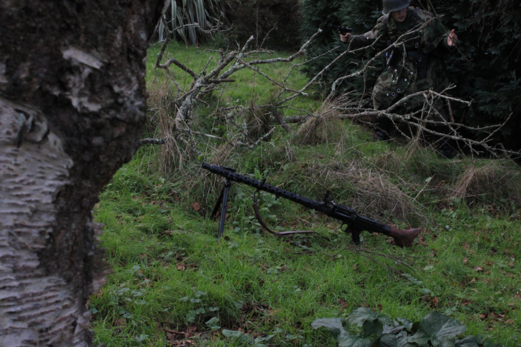
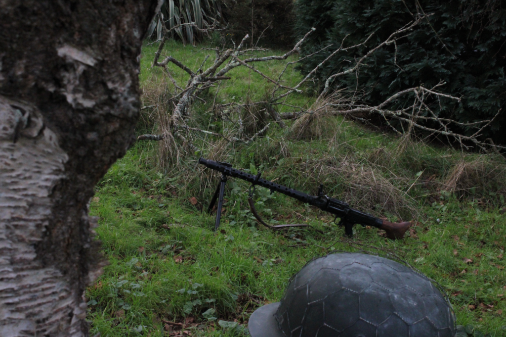
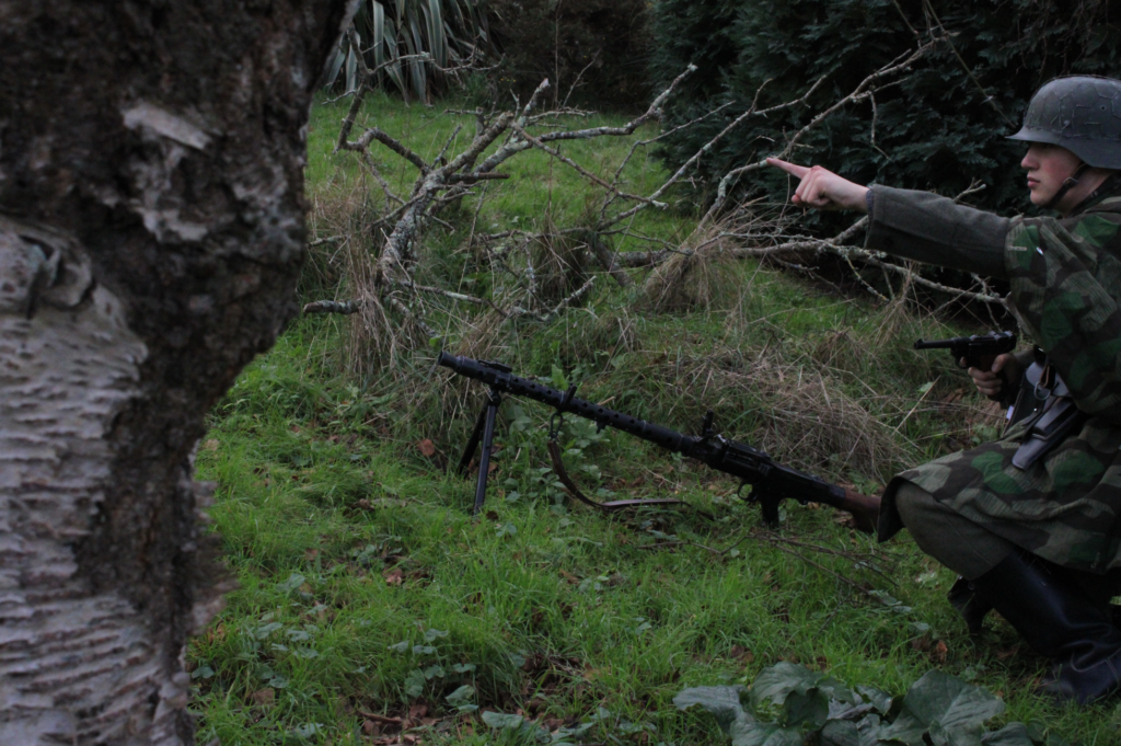
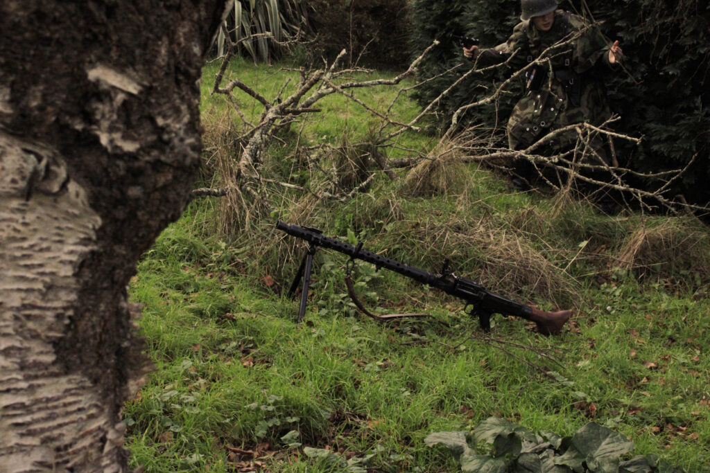
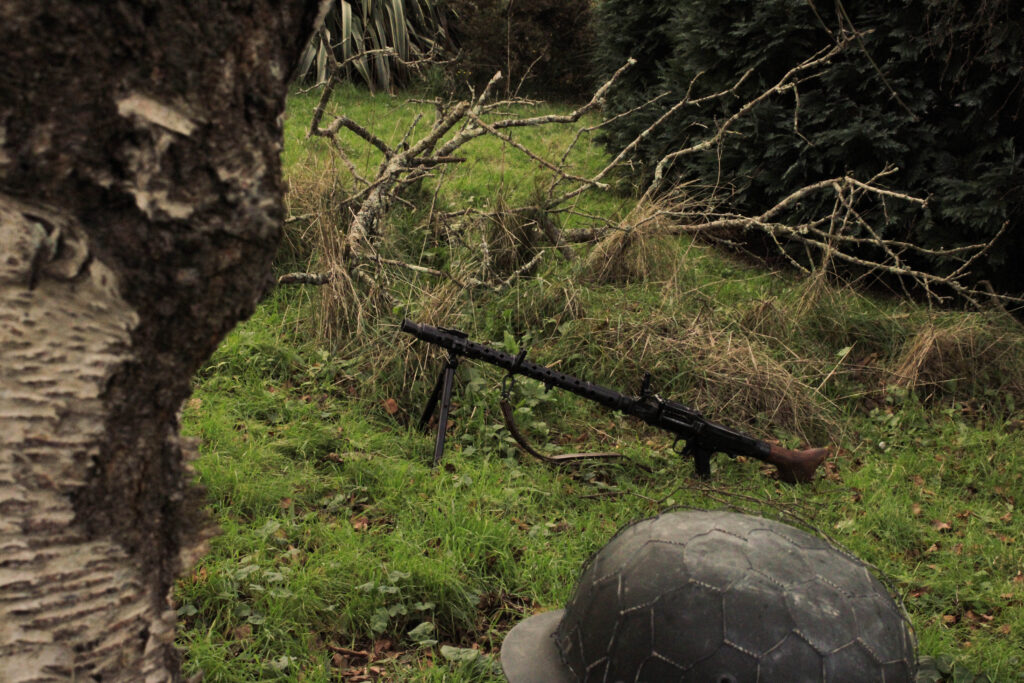
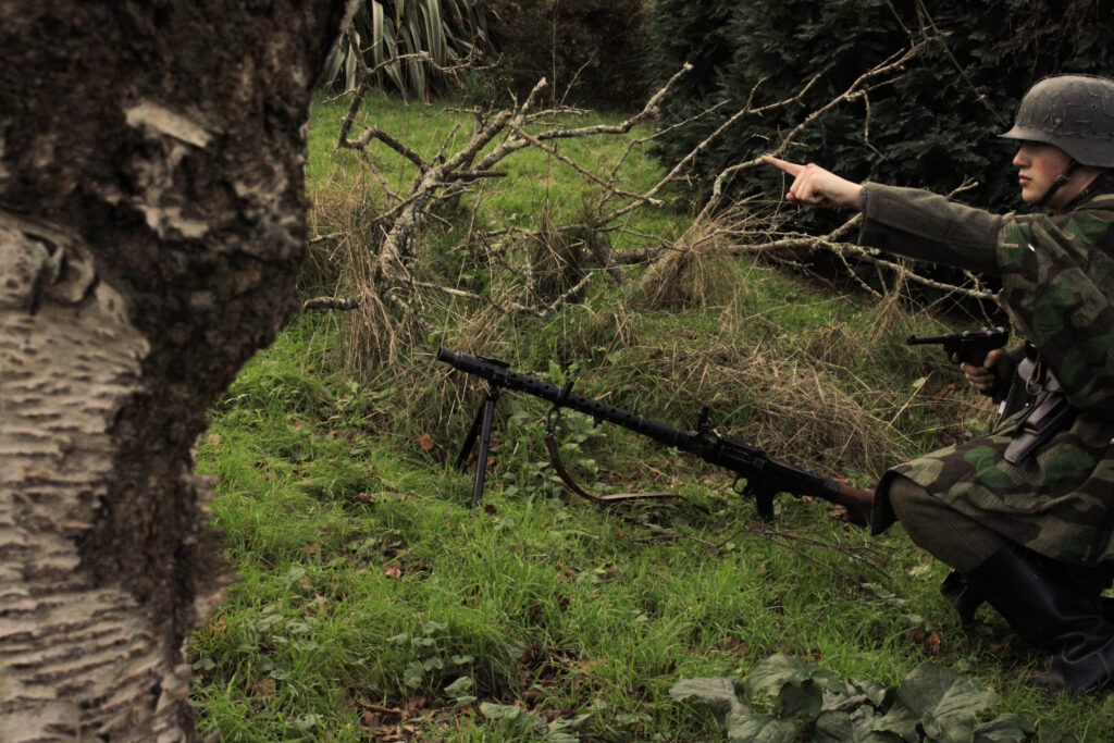
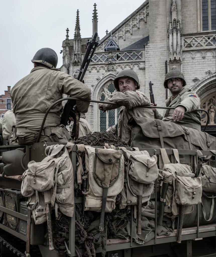
Within my study I will explore the lives of German soldiers stationed at La Corbiere. Using a combination of both tableaux and documentary approaches to photography, I will depict their lives as they lived them in their fortifications. For my inspiration, the artists I have chosen are Paul M. Smith, a UK artist behind the series ‘Artist Rifles’ (1995) and Michiel Peeters, a Belgian photographer who, through re-enacting archive images, creatively visualises and re-tells the lives of soldiers of the Second World War. Both artists share the theme of war, however through their depictions, varies greatly in the meanings and purpose behind them. As stated by Sontag in ‘Plato’s cave’ ‘Photographed images do not seem to be statements about the world so much as pieces of it, miniatures of reality that anyone can make or acquire.’,1 I find this applicable to both of my artists within their respective genres and interpretations of the theme of ‘war’. In my eyes, Smith’s work falls into the artisanal category, using himself as the subject behind photoshopped scenarios, which can be analysed to reflect his own experiences involving the military. Peeters’ work on the other hand, focuses more-so on the observational aspects of documentary photography, creating a tableaux to re-tell events surrounding areas of historical significance in Belgium and France.
Through both interpretations of war, I find it interesting to see how both explore the subject, in either a personal or educational manner. For my project I would like to recreate some original images of the Germans soldiers’ stories I’m visualising. To do this, I will edit them to appear in a similar manner to the quality and feel of the vintage film aesthetic. In addition to this, I would also like to create that de-saturated grittiness of Peeters photographs, as I feel it creates a sense of realistic immersion. From correspondence with Peeters himself, he told me, ‘my inspiration comes more from movies and TV than other photographers, such as with Band of Brothers, Saving Private Ryan, the Longest Day, and some others.’2. To merge these two aesthetics – photography and cinema – I will include filler images that fade like a gradient between them. For some of these filler images I will include some landscape shots of Corbiere, this will show elements of formalism as unlike the images of myself they do no not intend to show any emotion or context, but rather just inform the setting in which the photos take place.
With the subject of war, being associated to the thoughts of death and violence, I find these artists in their respective ways, present the side of humanity which can be found in those who were involved; their stories and experiences. Applying similar photographic methods and techniques, I wish to combine the two, to present a personal interpretation and to educate people on the lives of some of those stationed within Jersey during the Second World War. With scars of the war still residing through concrete emplacements along our Islands coast, this also creates the personal factor of heritage and history, which I wish to remind and educate viewers about a pinnacle point in our local history. Through these artists, I find that they will inspire me to create an informative and unique take on documenting history that reflects both on their creative qualities of editing. Using photoshop skills I have picked up during my studies, I feel I have a good basis on how I can go about creating my project.
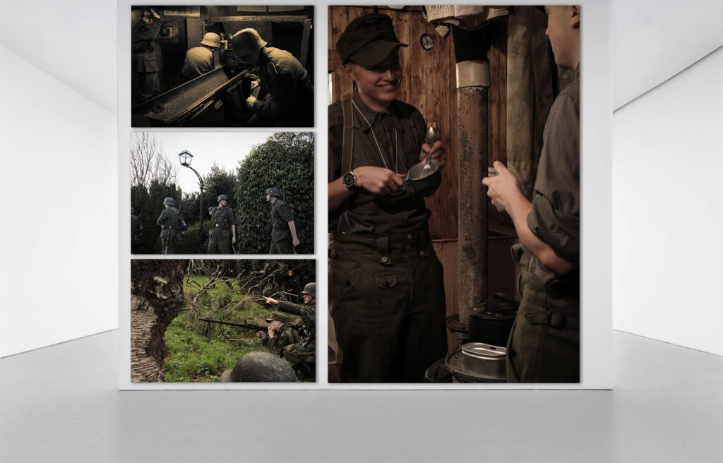
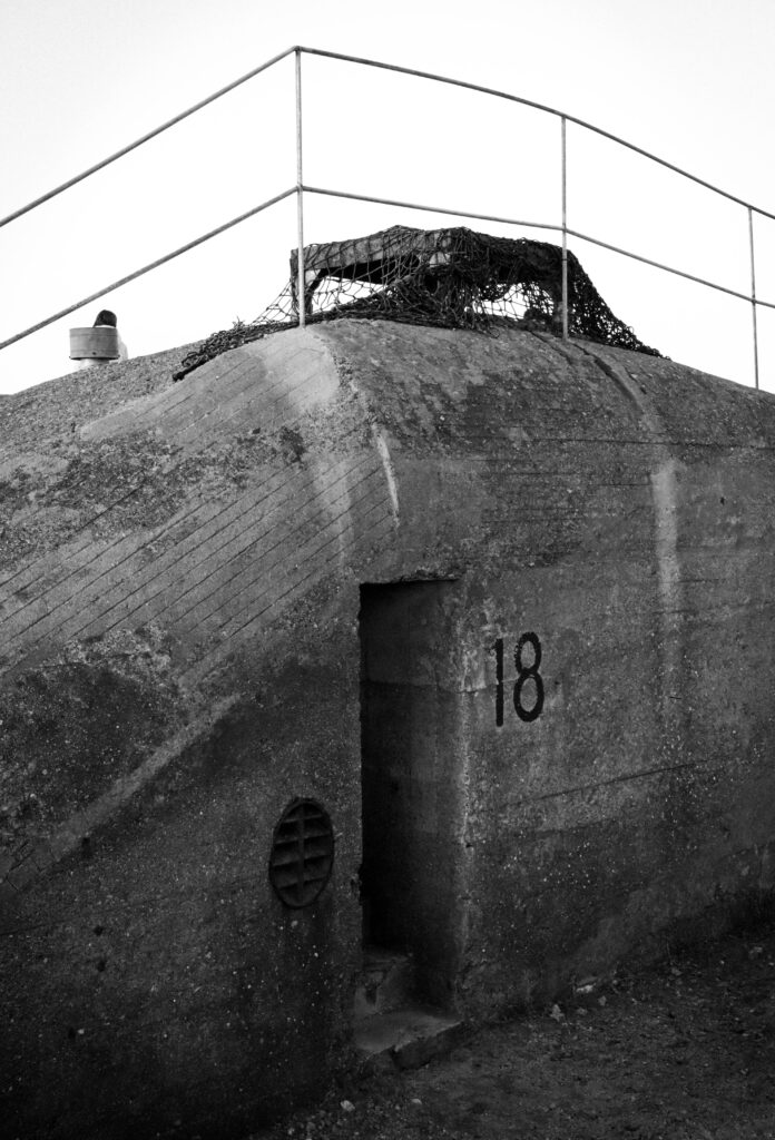
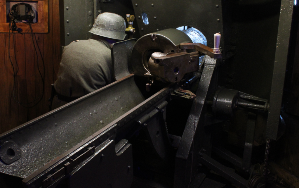
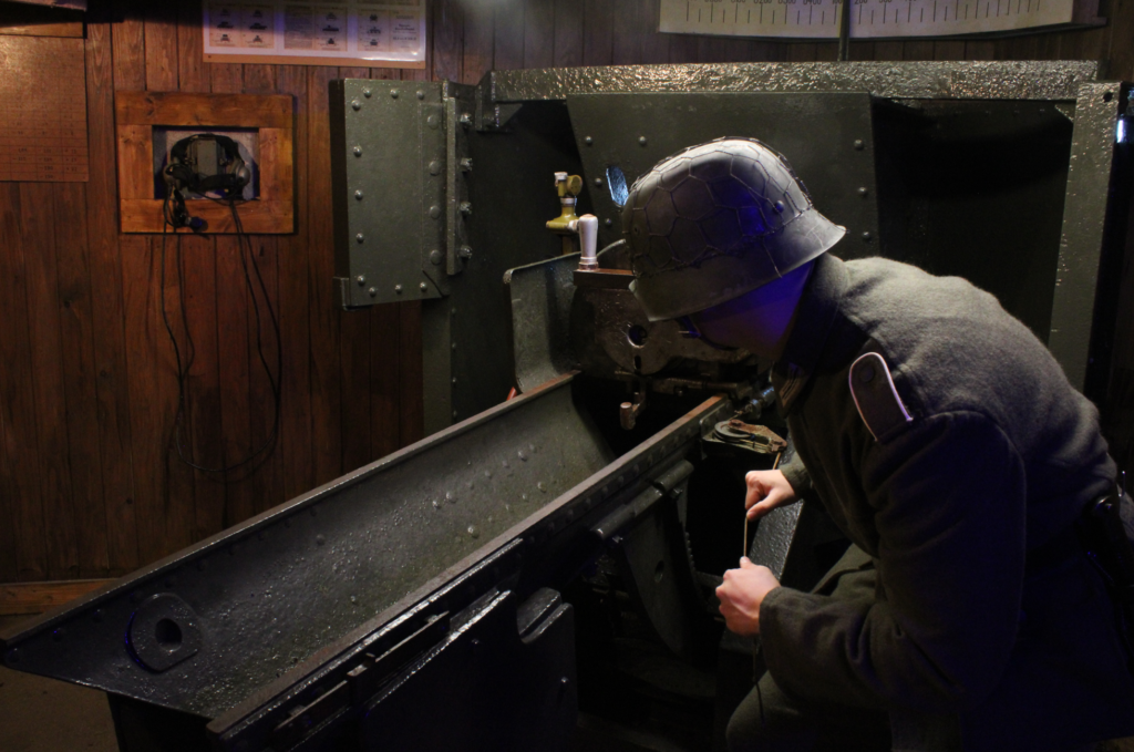
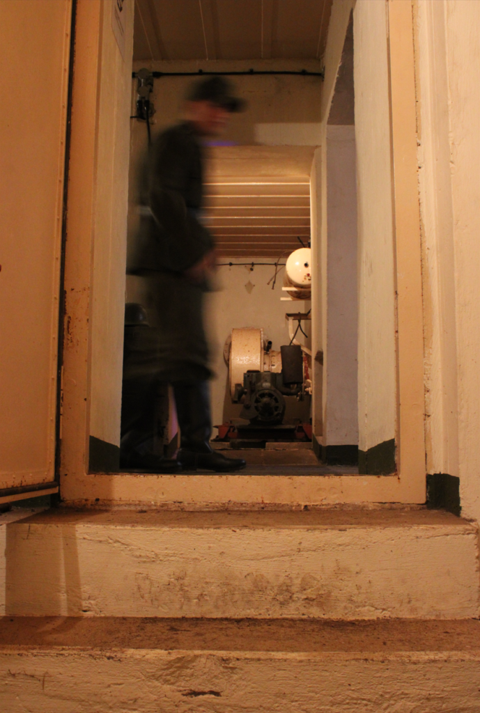
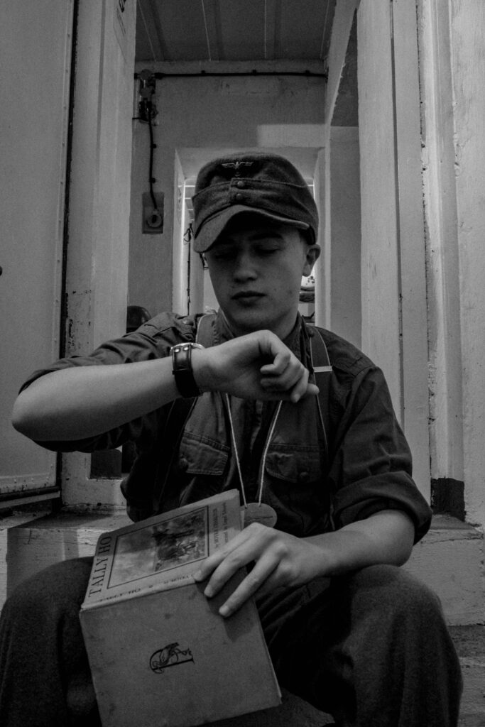
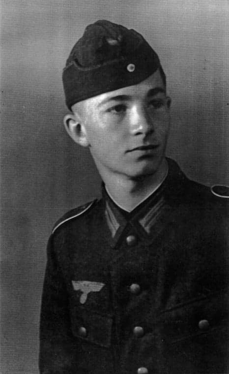
During the period of the occupation, many soldiers on the island were found cut off from mainland Europe, with limited ways to communicate to their families. Soldiers like Engelbert Hoppe found it a hard time to be away for so long. Like the islanders, many soldiers also felt imprisoned. For this reason, I wish to capture these stories within my photographs. Through my study into photographic art movements and approaches to image-making, I find that tableaux is the most applicable to my work. The origin of tableaux in photography as an aesthetic style is rooted in pictorialism, which emerged in the late 19th century and was the first attempt to consider photography and artistic expression. Performed in plays, Tableaux vivant was an early form of its place within art. Performed in theatres, actors would form visualisations of the past such as live recreations of historic paintings through costumes. In its simplest form, Tableaux can be used to convey a pictorial narrative through staged images.
With my approach to interpreting the German soldiers stories (through a personal expression of my passion for history), I find that through tableaux, I wish to create a representation of the lives of the often-generalised enemy. With the German people forced to serve by their fascist government, the unlucky young population that did not conform was what made up some of the men from 2nd Company of MG Battalion 16.
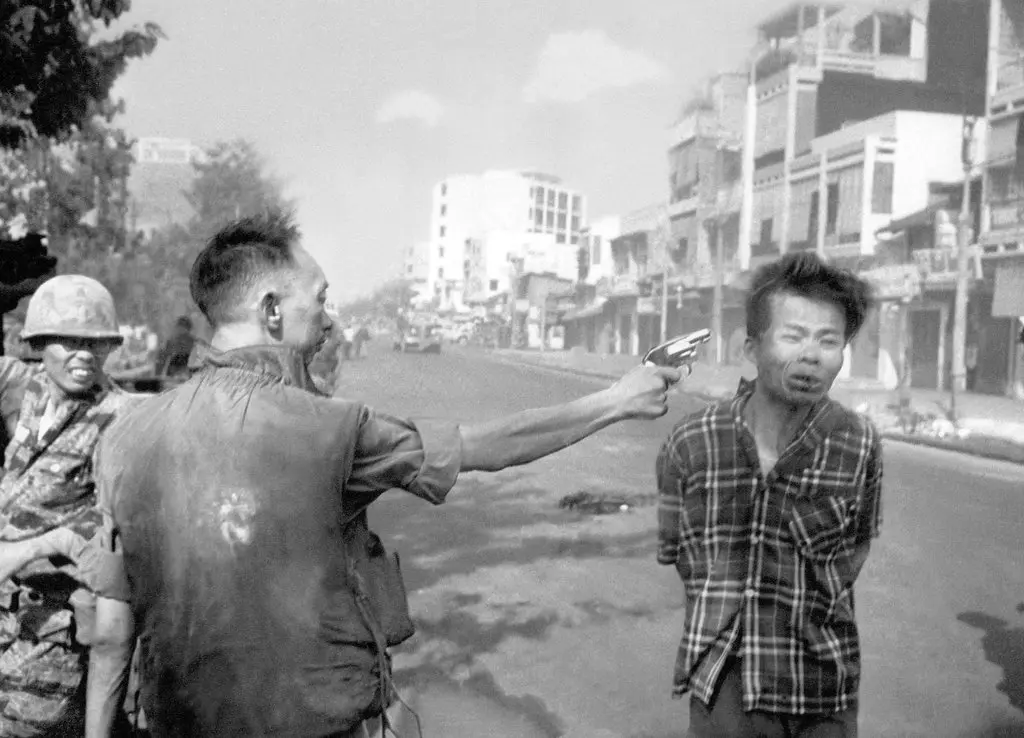
In Susan Sontag’s ‘Plato’s Cave’ she speaks of the use of photography in war, with its initial use to document progression of battles and victories it eventually became a source of capturing the visual horrors and atrocities of war. Sontag examples this through the controversial Vietnam War. Unlike prior conflicts, such as the Second World War when the United States were fighting for a “just cause of the free world”, the conflict in Vietnam was a proxy-war of political ideologies, ‘No one brought back photographs of daily life in Pyongyang, to show that the enemy had a human face’.3 Artists that did so include the likes of Nick Ut with famous image ‘The Napalm Girl’ and Eddie Adams who captured the horror committed by man with his image ‘Death captured on camera’.
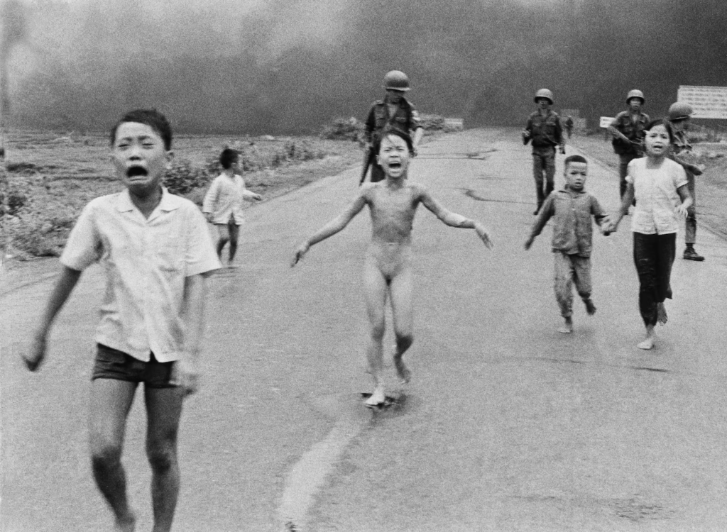
‘The Napalm Girl’, Nick Ut, 1972.

‘Death captured on camera’, Eddie Adams, 1968.
These images are compelling for the time as they showed the public the reality of ‘the enemy’; innocent people who were caught up in a war of politics and were facing the brunt of it. With all this in mind I find that despite the fixed mindset of ‘good vs evil’ people associate to a war, there is a deeper personal factor which often goes unrecognised within these conflicts, that is the people caught between it all, forced into these situations against their will. This is why I feel as tableaux approach is applicable, focusing on the subject matter of the personal lives, I wish to construct a narrative that people can follow to visually understand that these soldiers had their own lives too, not just the face of a hateful and oppressive regime. To quote Susan Sontag, ‘to photograph is to participate in another person’s mortality, vulnerability, mutability. Precisely by slicing out this moment and freezing, all photographs testify to times relentless melt.’4.
Paul M. Smith –
To depict the lives of the German Soldiers in a way that I found represented the realities or truth of war, I found that Paul M Smith’s work, aided me through his images. After serving as a regimental photographer in the royal engineers he displayed his own personal interpretation of his military experiences by creating images of himself cloned and dressed as soldiers being placed in scenarios, remnant of work such as Eddie Adams. Here I found inspiration into how he utilised photography to visualise the personal effects but also ubiquitous effects of wars reality.

‘Artist Rifles’, Paul M Smith, 1997. + ‘Death captured on camera’, Eddie Adams, 1968.
In these depictions, Smith attempts the question, how can photography represent the realities or truth of war? Presenting his own military experiences in an interpretative tableaux, Smith’s work aims to ‘debate about the truthfulness of many battlefield photographs (such as) from the First and Second World War; some, which we now know were taken during training’5. Looking into this image in particular my work takes influence from the methods applied by Smith in his work.
Paul M. smiths influence:

‘Artist Rifles’, 1997, Paul M Smith.
My example – ‘Combat Exercise’.
Within ‘Artist Rifles’, Smith refers ‘to the nature of war photography and its sometimes-dubious status in another battlefield, the Media’.6 With many famous images surrounding World War Two such as ‘Raising the Flag on Iwo Jima’ being misinterpreted or used as propaganda to display the victory of a battle, the reality of photographs circumstances can differ largely. With this picture for example, the flags raising was only within the first week of a thirty-six-day struggle to control the Island. With Nazi-Germany being a significant user of such intended misinterpretations, many of their images were staged to convey victory, this was the case with Jersey which they saw as the stepping stone to England. From this, Smith’s work challenges the concept of how photography depicts the reality and truth of wars through a modern tableaux with a genuine but also interpreted lens. Smith brings to light the issue of media and its ability to change the past through their own interpretations of photographs and how realities of wars can only be true for those who have experienced it or have been closely associated to it such as himself. This therefore explains why he focuses on himself as the subject to create this visual metaphor for his audience to understand.
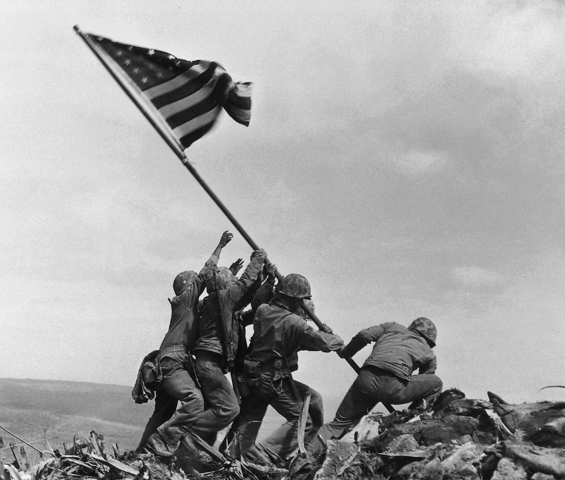
‘Raising the flag on Iwo Jima’, 1945, Joe Rosenthal.
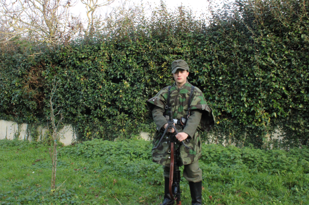
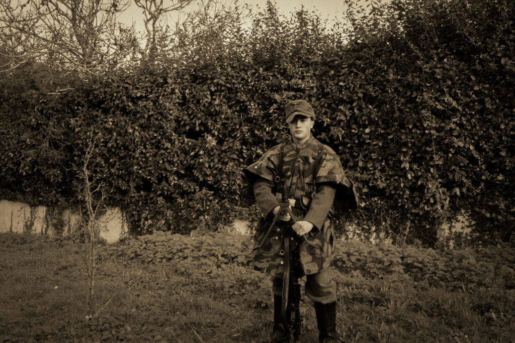
With Smith’s work displaying a fabricated aesthetic of war, he created it through the method of using props such as weapons and various poses between his clones, to form the immersive environment you expect to see in images of conflict. In addition to this, the use of double staging adds to the immersion as his images themselves are of staged military training to simulate real-life warfare tactics. Smith pays homage to the type of imagery associated to warfare provided from many eras of war photography such as the ‘Robert Capa photography taken during the Spanish civil war’ ‘alluded to in Artist Rifles’7. From these historical references I used my research into the Germans of Corbiere, who themselves held training drills like this, to link to his methods of image constructing to make an indexical reference in my own work and construct the same aesthetic that his images have in conveying photography’s more fictitious side to war.

Reference Image – Germans of MG Battalion 16, 2nd Company on training.
Michiel Peeters –
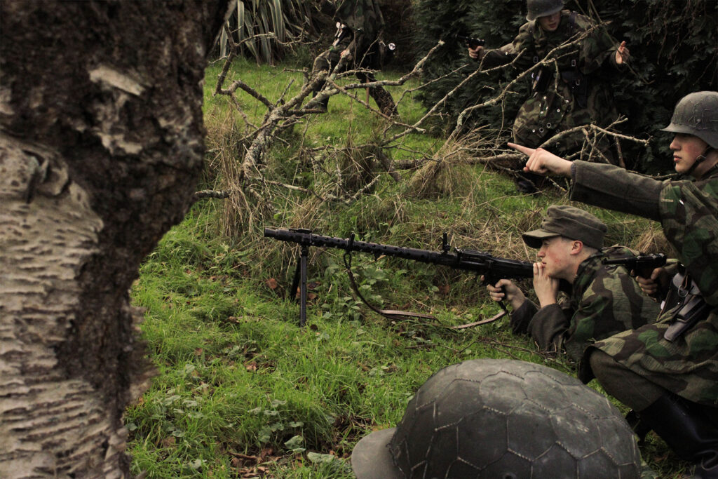
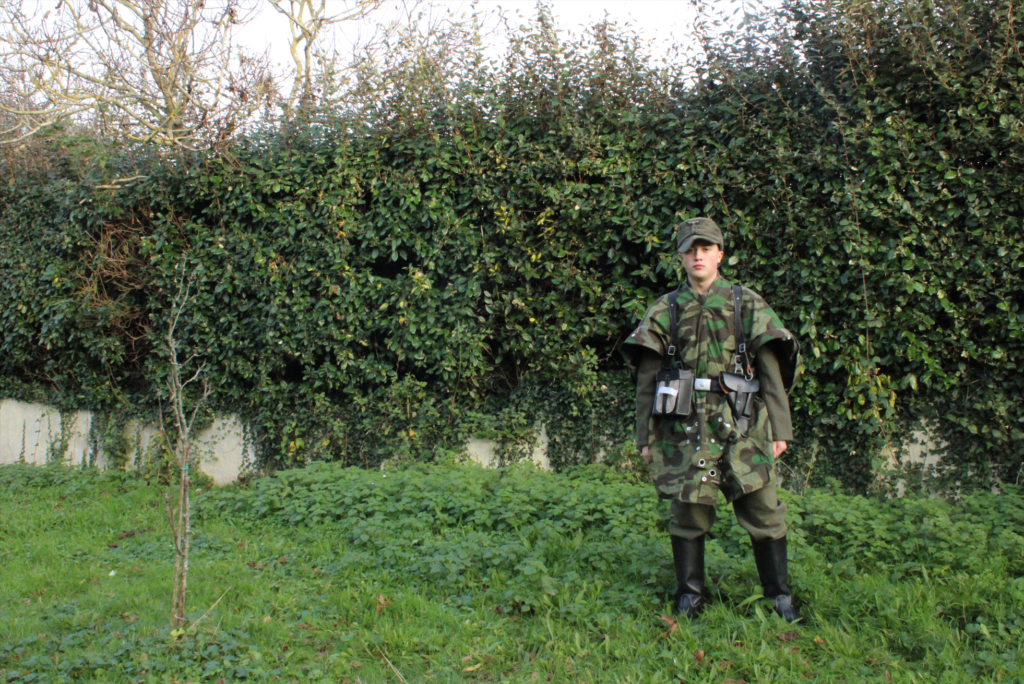
In Michiel Peeters work, he makes use of genuine locations of historical significance for his visualisations of the Second World War. Using re-enactors dressed in accurate uniforms, portraying the actual groups which fought there, I found that this was applicable to my project to demonstrate our Islands local history, but also to provide an answer to the question, ‘How can photography represent the realities or truth of war?’. Focused on telling the stories of the individuals that were present in these places, Peeters makes extensive efforts for accuracy in things such as uniform details, vehicles and weather. From all of this, Peeters brings out an immersive aesthetic, reminiscent of the observational documentation present in photographs from that time, yet with an advantage of modern technology such as with camera quality and access to editing software.
Speaking to Peeters online, he told me that ‘the only correct way to capture the re-enactors is when you are next to them in the mud, snow, foxhole, tank, etc.’ ‘The only photographer I relate to from WW2 is Robert Capa with his famous quote ‘if your pictures are not good enough, you are not close enough!’.8 With Documentative photography having its roots in the illustrated photo magazines, popular from around the 1920s to 1940s, notable names included LIFE magazine which Robert Capa worked for during the war. Pictures featured in the magazines came from these correspondents being attached to the army as they fought through the war, their observational style reflective of the way Peeters conveys his images.
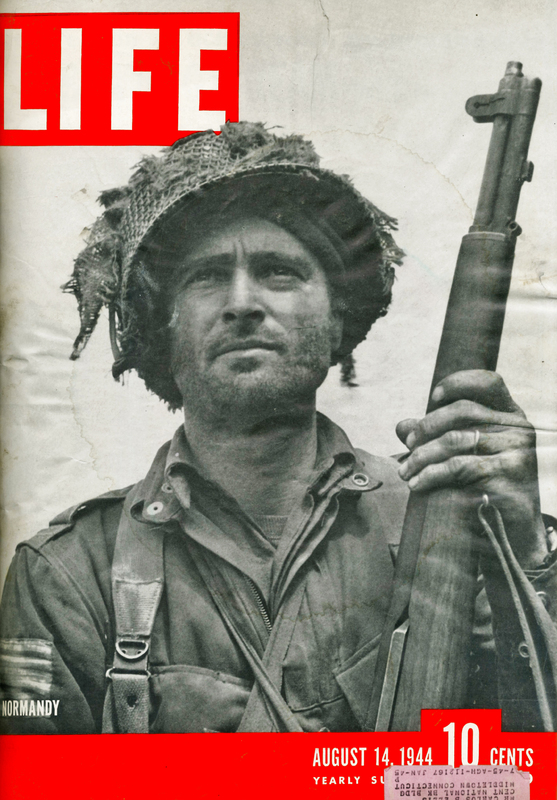
‘Faces of War!’, 2024, Michiel Peeters. + ‘LIFE, In Normandy.’, 1944, Bob Landry.
Although differing in terms of motivations and mise-en-scene to my other artist, Paul M Smith, Peeters also makes use of tableaux photography. Used in a documentative sense, his photography is used to represent the reality of war through recreating the people present as accurately as possible. Taking from historical resources such as archive photographs, this aids his image making progress to ensure as much detail is included. This echoes from tableaux’s initial use such as in theatres where it was used to create a ‘living picture’. 9 In the same way Peeters does the same to educate and entertain through his photography. For this reason, I find that Peeters presents photography as a tool to inform and educate the realities and truths of war, through a tableaux, dedicated to historical accuracy to provide immersion into this real event. With the choice to present them in a modern context, this adds to the immersion of portraying wars reality as it creates something we can see. As Sontag states, ‘photography makes us feel that world is more available than it really is’. 10
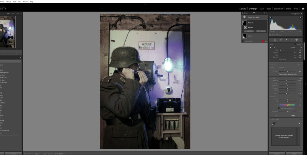
‘Windhund, 116th Panzer division’, 2024, Michiel Peeters.
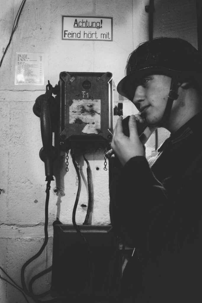
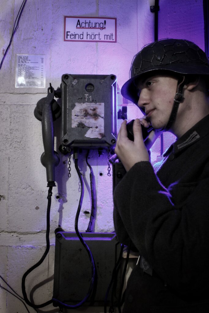
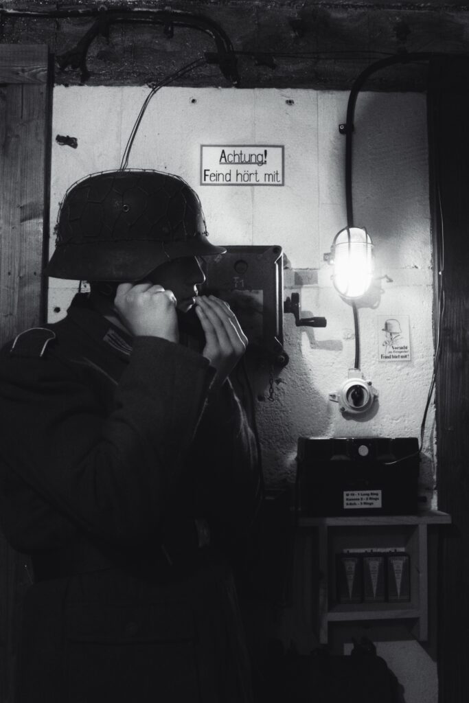
My example – ‘Achtung’.
For my project, I wish to combine the advantage of modern editing software to produce my images in the same way as Peeters with its lower saturation, tone and other adjustments to create that gritty realism his images represents. Replicating his image making process of being imbedded into the lives of the people he visualises; I copied this through close-up shots of me to make my uniform and appearance the focus. For my project I want to also create images with the same vintage aesthetic of originally taken images. Taking from Paul M. Smith’s inspired images, I can then apply the aesthetic of Peeters style of editing them to create a merger of the two.

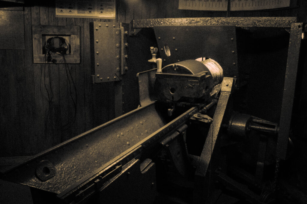
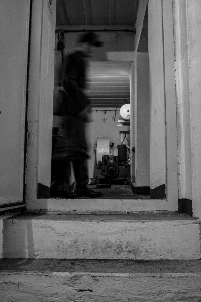
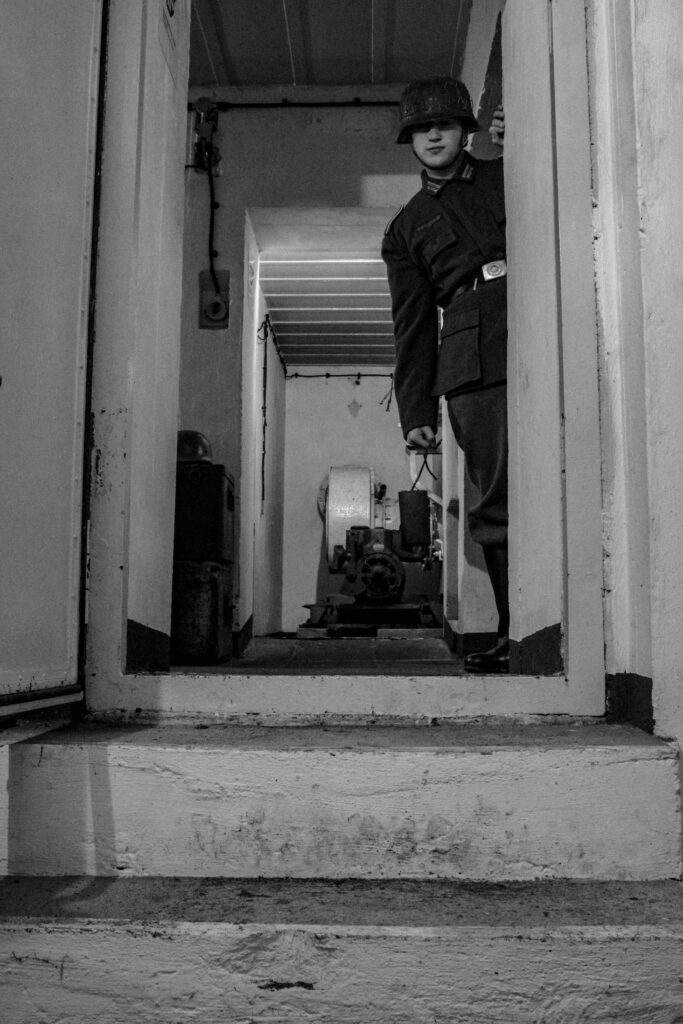
Reference Image – Early war photo of MG Battalion 16, 2nd Company, gun crew. + My Example, ‘Gun crew’.
In my study, I took the key points of my artist studies to influences and create an understanding of how photography can be used to represent the realities or truth of war. Despite wars various depictions, my artists; Paul M. Smith and Michiel Peeters, have taught me that the concept of war can be captured through photography in various ways, yet still portray the same meaning and sentiments. Where these artists can be seen to differ however is through their own interpretation of the subject. Paul M. Smith uses photography to retell his own perspective on war and through himself being the subject. He makes the point that the true reality of war is only experienced by those present within it and how media’s representation can often shift this fact through its own interpretations of it. In contrast to this, Michiel Peeters uses photography to educate on the history of war, and particularly those who had to go fight them.
Despite their different approaches, both contain the key point of bringing the reality of war to light, whether it be artistically like Smith or directly, in a documentary fashion such as Peeters. Furthermore, both artists make use of staged images within their photography to depict war and retell experiences of it. With photography being the largest source to provide visuals of war, it is understandable that the only way to recreate that is through tableaux’s depiction. As Susan Sontag states ‘photography has become one of the principal devices for experiencing something, for giving an appearance of participation’. 11
From what I have learnt from studying my artists, I have taken influence from Smith’s cloned use of himself as the subject to depict the personal lives of the many German soldiers of Jerseys occupation. My inspiration from Peeters came from the focus on historical accuracy in the right clothing, props and through details such as location where I photographed within the actual bunkers that the men of MG battalion 16, 2nd Company, served in. Furthermore, the focus on the Second World War was also a large influence from Peeters also. Taking from Smith’s use of photoshop, and Peeters edit style I combined these technical elements to create my final outcomes. With my focus documenting the lives of these soldiers, I used archive images to base my emotive language mainly in my face across some of the photographs, from these images I also tried to recreate them to the best of my ability. Through my work, I feel I have replicated the similar sentiments behind each of my artists work, and through a personal factor of my island’s history, I committed to informing about the lives of those stationed here and the often-ignored truth of wars reality for them.
Word count (without including quotations): 2444
Bibliography:
These are the edits of my first and second photoshoot:
Snapseed edits –
Using the app Snapseed on my phone, I was able to use their filters to create both a realistic depiction and more time-period based aesthetic of some of my images.

Lightroom & Photoshop –
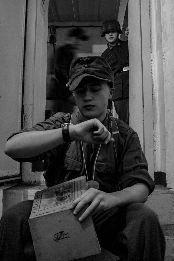
Gun Crew:
Before:
Using the Image without me as a base Image the aim was to recreate the original photograph by layering the different positions of myself to replicate the look of the gun crew. By syncing the images to the same editing settings I aimed to create the old Yellowish texture and hue photographs from the past contain.

With this image as my reference, I tried to recreate it to the best I could.
Editing:
Using the following settings I was able to create the desired aesthetic that makes use of its low tones to contrast brightly against the limited but bright light.
Outcome:
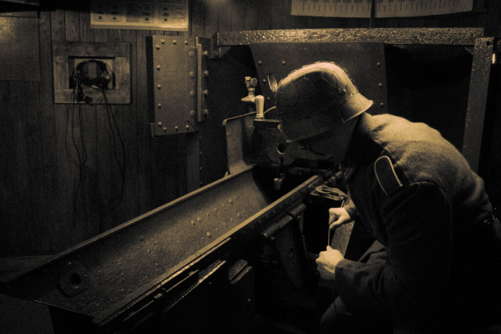
Now edited I was able to merge these images to replicate the original image using photoshops object selection tool to layer the images of myself into one.
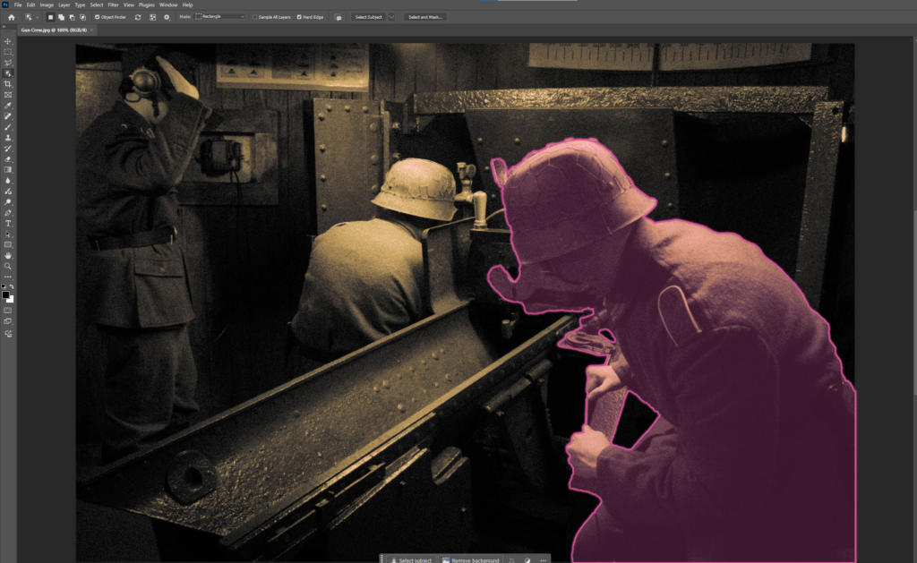
After:
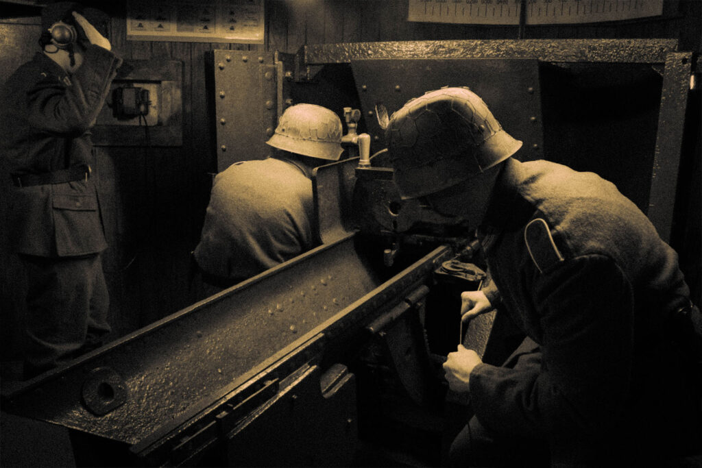
Overall I am happy with the outcome of this Image. With the overall composition creating an interesting story, I find my inspiration from both the the original reference Image and the artist inspiration from Paul M Smith are faithfully recreated in my own piece of work.
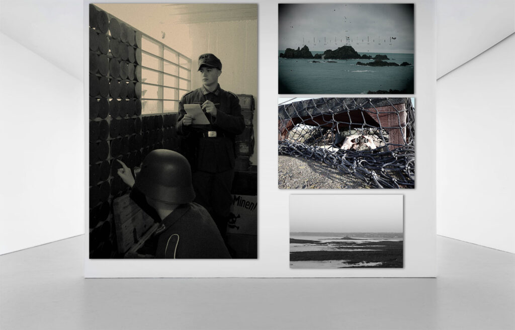
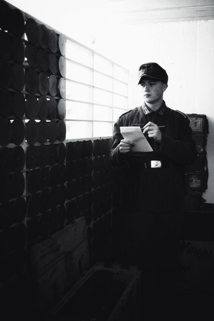
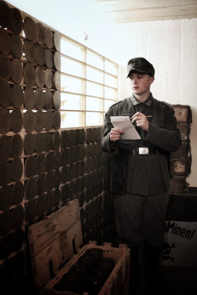
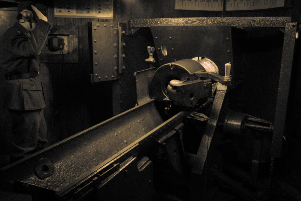
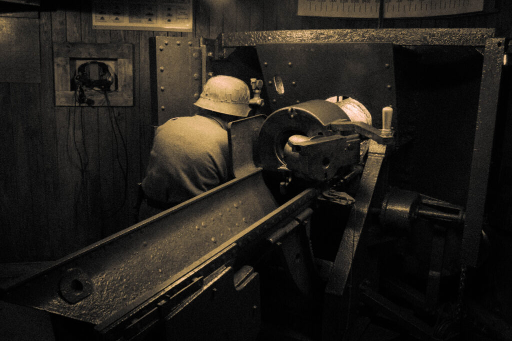
Ammo Inspection:
Before:
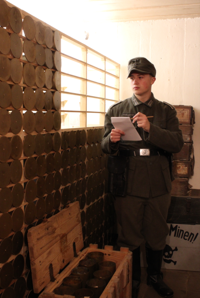
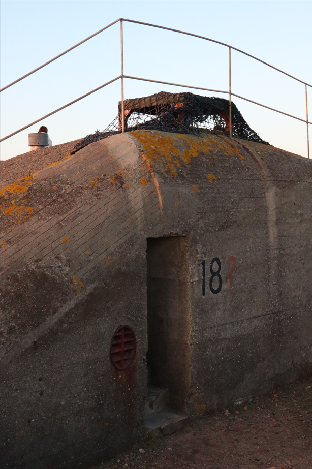
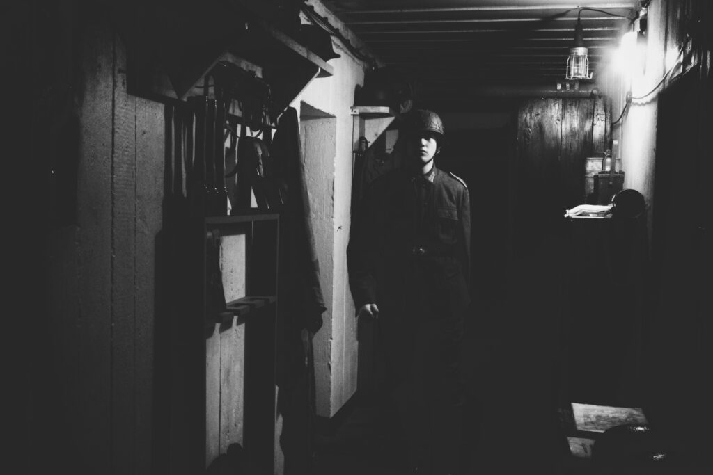
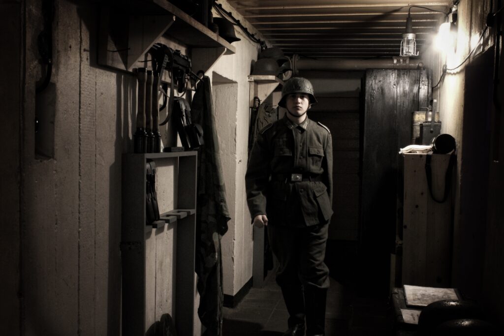
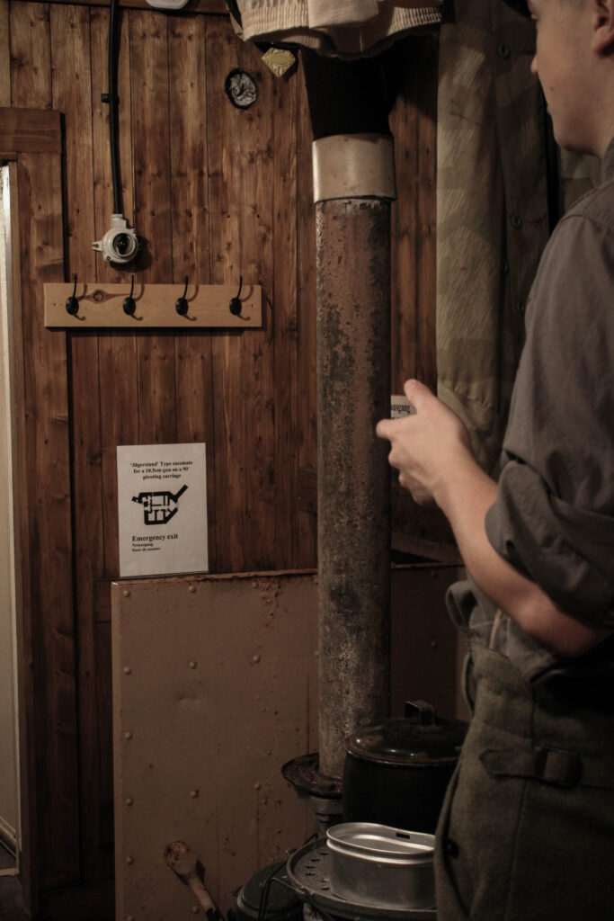
Like the previous Image, the aim for this image was to create a scenario that would occur within the life of the fortress. With the Bunker being remade to look how it did 80 years ago, this helped create the immersive aesthetic which I believe added to to its overall mise-en-scene through the additional use of props and costumes.
Editing:
Using the following settings I was able to create an contrasted tone of stone grey’s and almost a sand-like white, to me this was creative in its own appearance, whilst still paying homage to the older appearance of photographs of that time.

Outcome:
From this I was then able to repeat the process of using photoshops object selection tool to create ‘clonified’ versions of myself.
After:
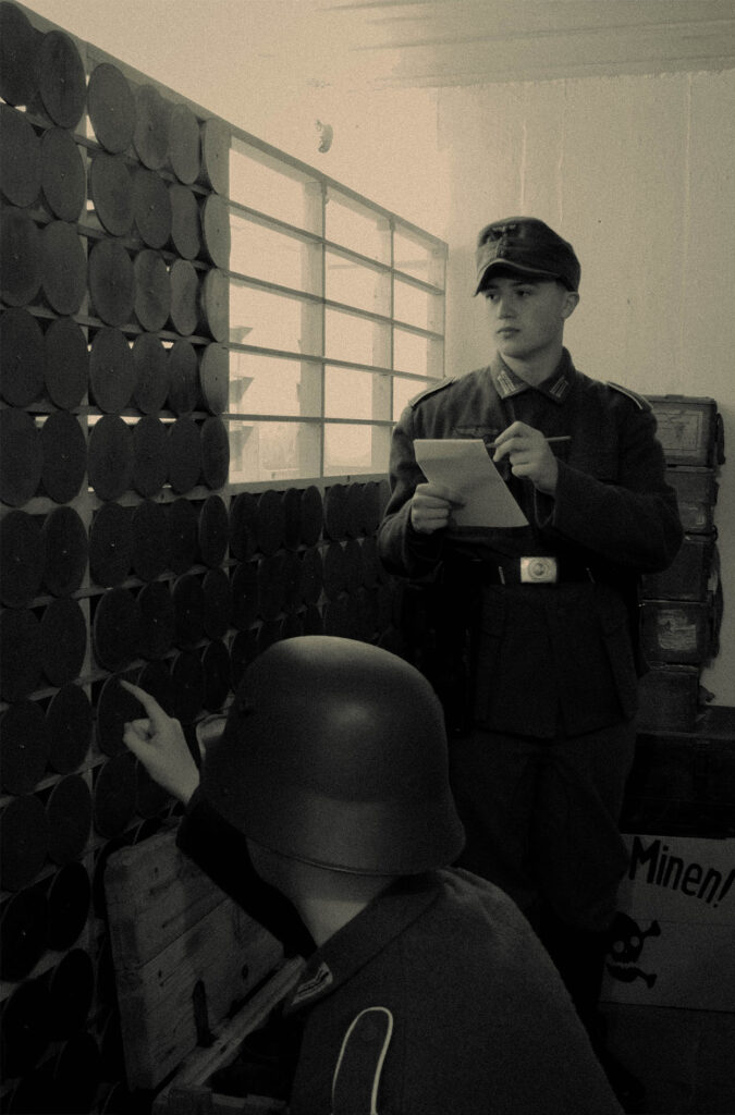
I Like this outcome as it recreates a plausible scenario which would occur within the bunker, with difference In headwear and accessories I feel that this image helps to separate the 2 ‘Me’s’ and creates an detailed level of immersion.
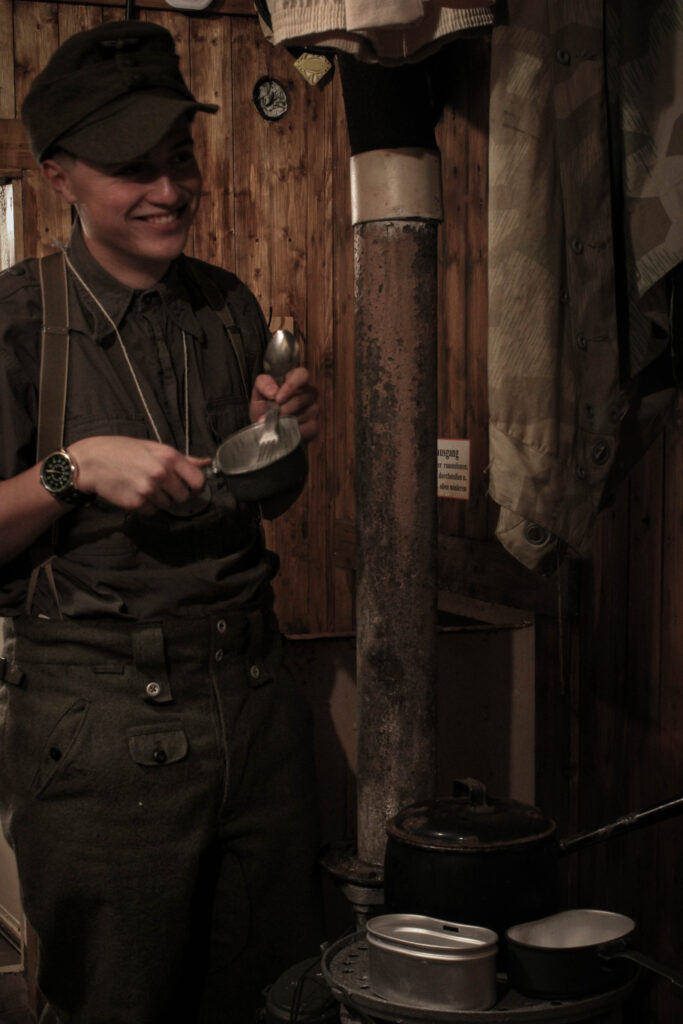
Crew Room:
Before:
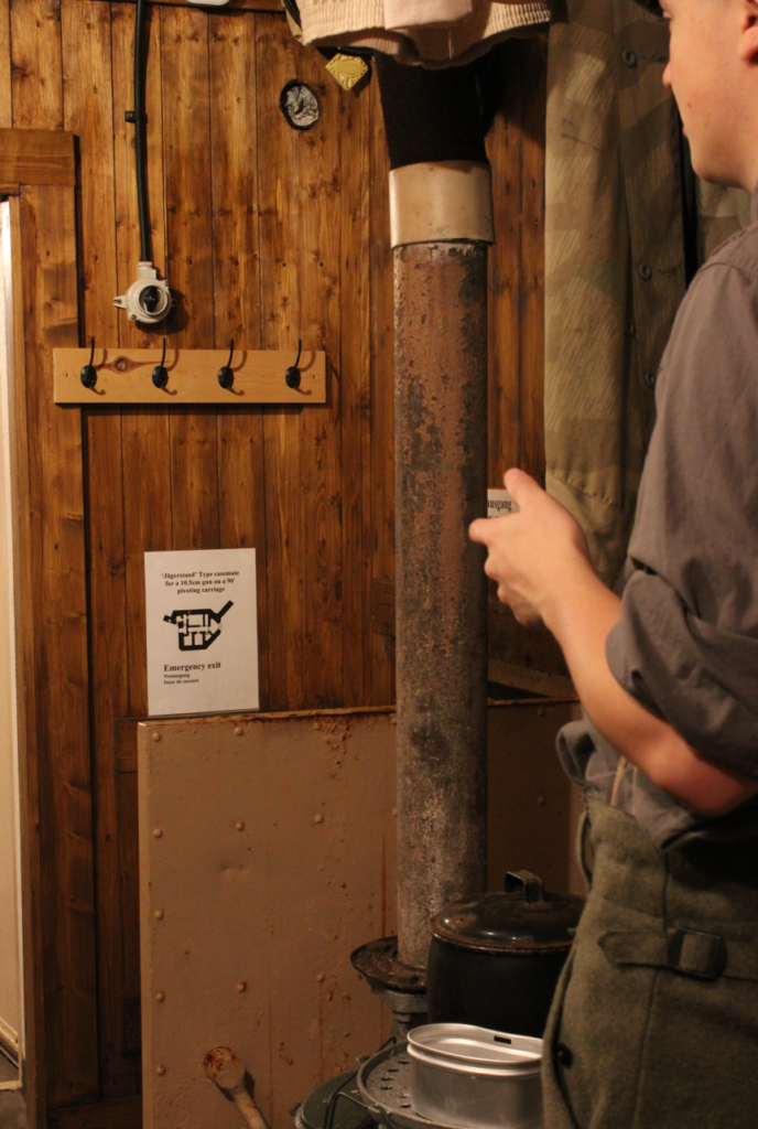
With the more serious areas of the bunker being covered I thought I’d try to cover the more relaxed types of images you’d see in a bunker such as communal living and sharing the limited utilities offered.
Editing:
Using these settings I tried to create an Image with some colour, with the warmth of the photographs already with its brown and orange wood panelling as a backdrop, this acted as a stepping stone to achieve this, through the following edit settings

Outcome:
After:
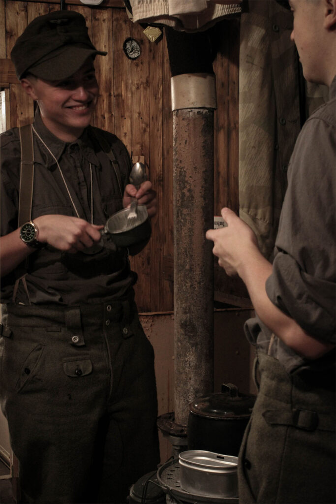
With this intended candid style, I feel it creates an interesting atmosphere and aesthetic to the image, with the me on the right having a partially obscured face, like some of the other images I have made, to me, it creates a level of realism to the peculiar concept of Paul M. Smiths work I have chosen to base my images off.
Spent cases room:
Before:
With these Images here I wanted to try and continue this intended candid style, with some minor influence from Henri Cartier Bretton with use of motion blur. With the centre image, this was inspired by this photograph in particular.
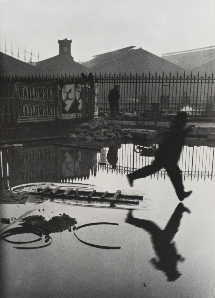
‘Behind the St. Lazare’, 1932 – Henri Cartier-Bresson
Editing:
Using the settings shown I created the basis of tone, shadow, high lights and etc. This was to create that ‘Stoney’ colour like within Cartier-Bressons photograph.
Outcome:
Now edited I could now merge them into an image to create another ‘scenario’ photo.
After:
With the use of different props, poses and uniform diversity I feel as if this shows a creative mise-en-scene into the idea of my project and how I aim to show the lives of Jerseys occupiers in World War 2.
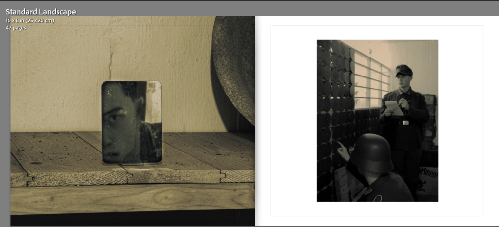
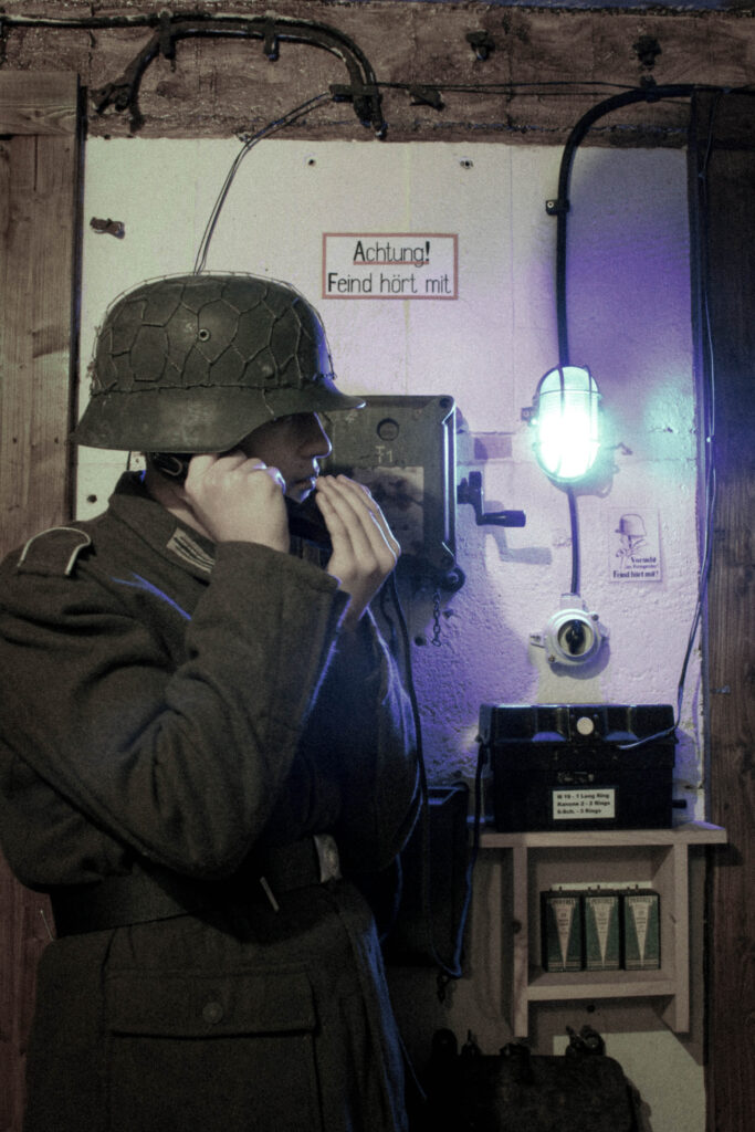
Command Phone:
Before:
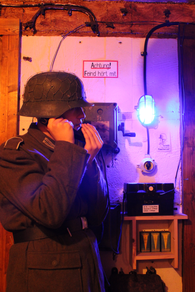
Straying away from some of the multi-crew photographs I’d thought I would try some individual shots as sort of filler photographs between the main edits.
Editing:
Using both a gradient filter an exposure brush, I touched up on some details I thought were lacking towards the left side of the photograph.
After:

With a section of my influence based on the work of Michiel Peters, I aimed to recreate his images that feature a low-saturation to create a sense of drama and grittiness.
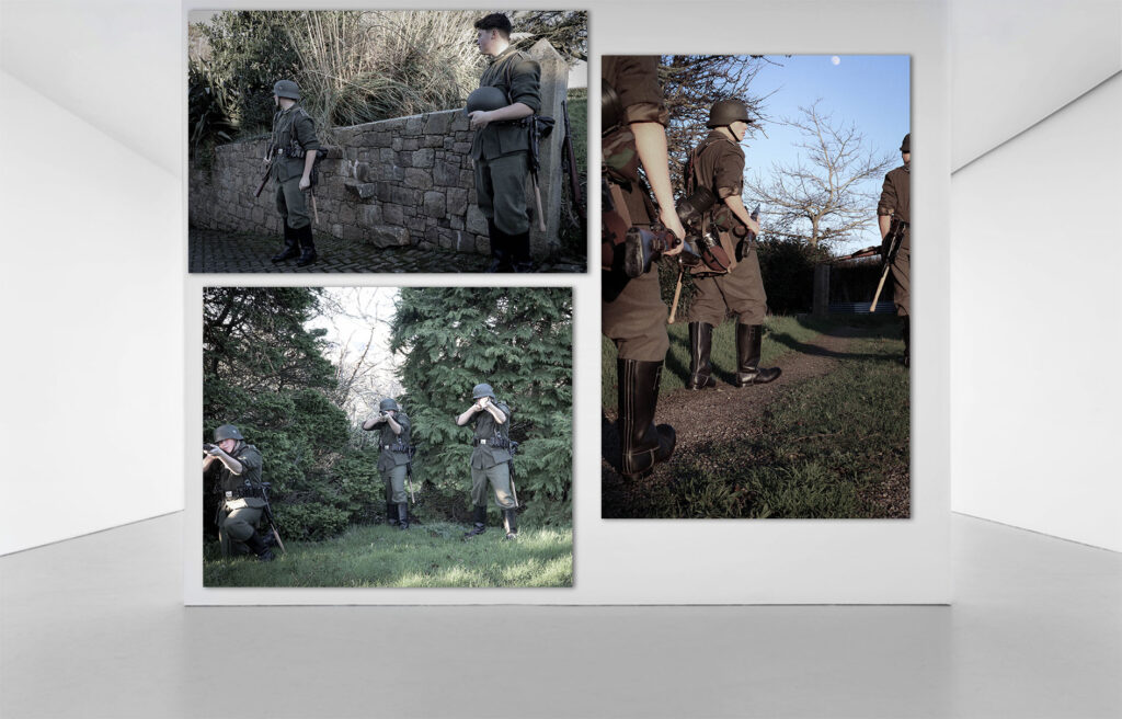
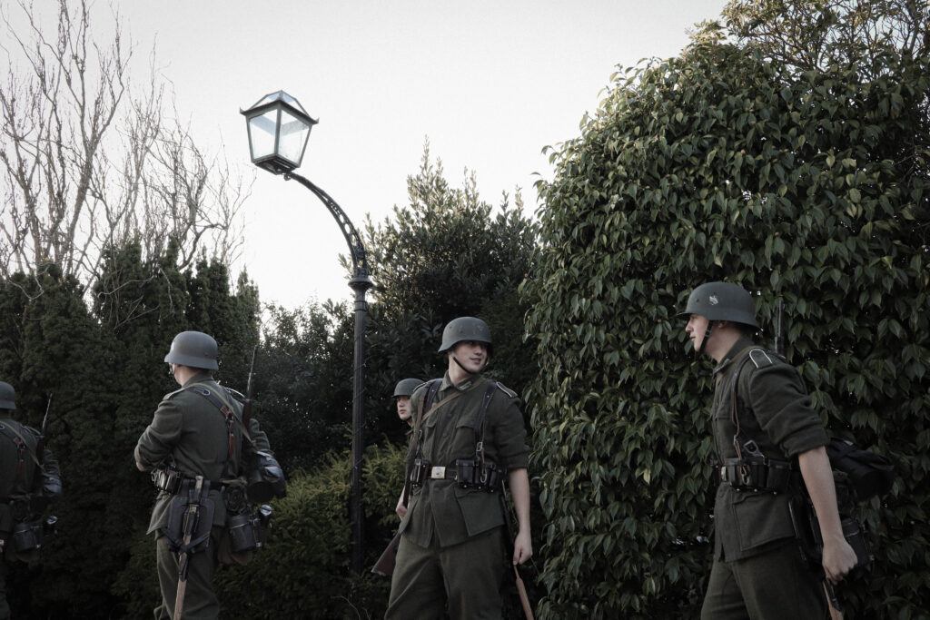
Field training:
Before:

With this image being a large one to recreate, I tried my best to copy out the poses and appearances of the individuals of each man within the original photograph of the training exercise.
Editing:
Using a blank image of my location as a basis, I edited it to my liking and then applied these settings to the set of images I wanted to implement into into it.

From this, I then used photoshop to merge them into one by cutting out myself into layers and piecing them together.
Adjusting them slightly to fill the gaps I then flattened the image to make it whole.
After:
As a result, this is what turned out:
Overall, I am very happy with this image, as editing the multiple ‘Me’s’ proved to be quite difficult. There is still some minor faults such as repetitiveness with the headdress and of course myself however this came at the expense of uniform accessories such as other hats or caps they would have worn. Cropping of the feet to was also hard, as wind direction and changes made from moving about made the lower parts seem less in quality compared to the upper, however if decide to crop by the calves this can be avoided.
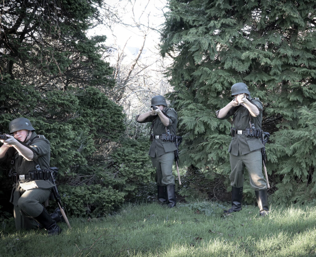
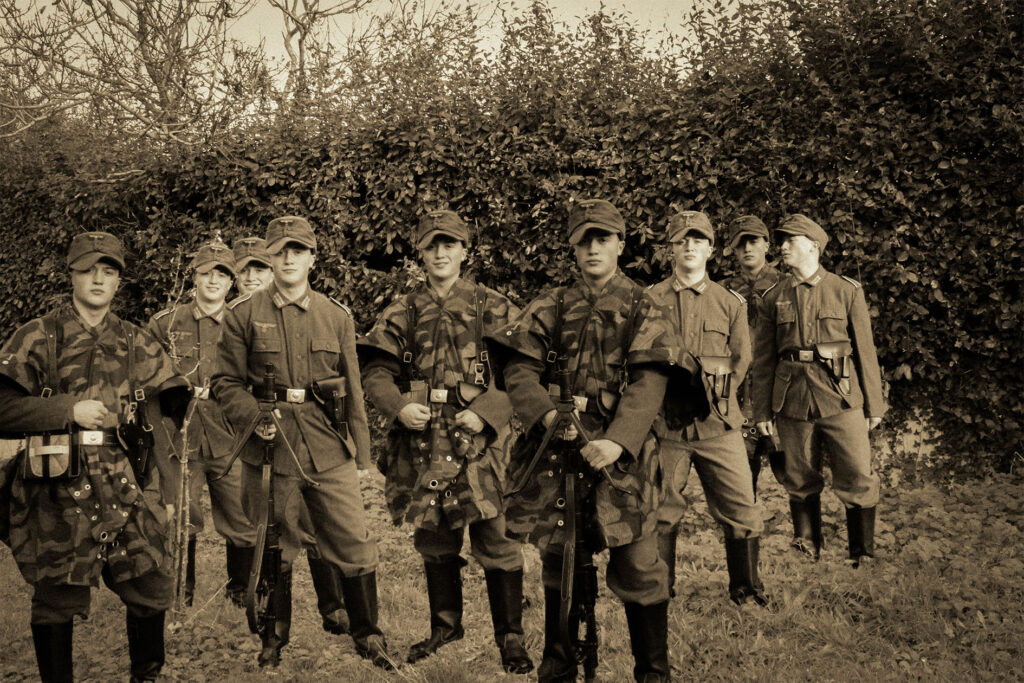
Combat Exercise:
Before:
With these Images, I aimed to show my inspiration from Paul M. Smith and his series ‘Artist Rifles’. With his photograph of multiple clones of himself making an assault charge, I found that replicating this would be perfect within the types of battle trainings the Germans had on the island.
Editing:
Editing these images, like the ones previously, I applied them to my selected photographs.
Outcome:
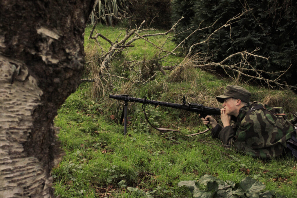

From this, I then was able to edit this further in photoshop by merging them together to give the impression of a combat exercise.
After:

Placing the various me’s, I find it has resembled the photographs of Paul M Smith and his similar creative choices regarding his series ‘Artist Rifles’ very well.

‘Artist Rifles’, 1997 – Paul M. Smith.
Interlude Photographs:
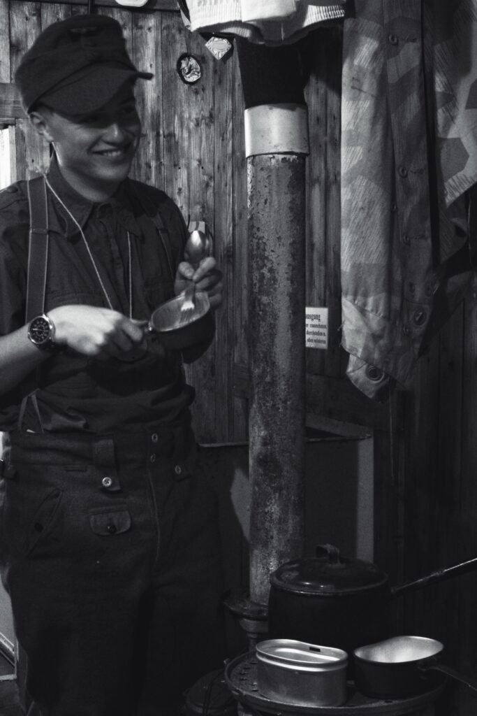
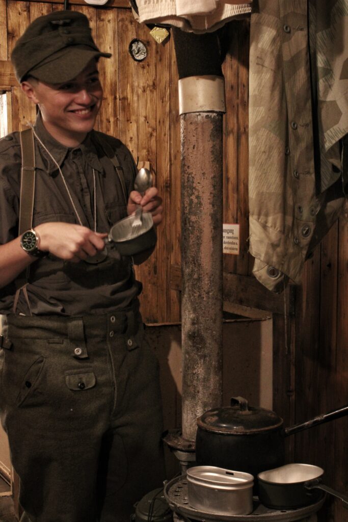
With the edits making up a lot of the book, I will add some filler ‘interlude photographs between the scenario images I made. These images don’t include to much of the clone process.
Before:
Editing:
Using these settings, I tried to replicate the colour and tone of the ammunition room photograph.
After:
Overall I am happy with the outcome of this photograph as I find that it acts a good example of the more ‘regular’ experiences they got up to which, now we can still relate to such as shaving.
Photoshoot 1 –
Green –
(Purple stands for edited photographs).
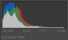
These photos I found where clearly taken and where applicable to be able to edited for my project. These images rate around 4 or 5 out of 5.
Yellow –
These photos are good but not what I want or did fully come out as expected. These Images score for about a 3/5.
Red –
These Images were either accidental, poorly taken, test shots or other. They score around a 1 or 2 out of 5.
Other Photoshoots:
Due to the large amount of photographs I took throughout the course of the project, It would take up to much time assessing and valuing each image, for this reason the remainder of my shoots are ungraded, excluding the images I rated and edited.
Photoshoot 2 –
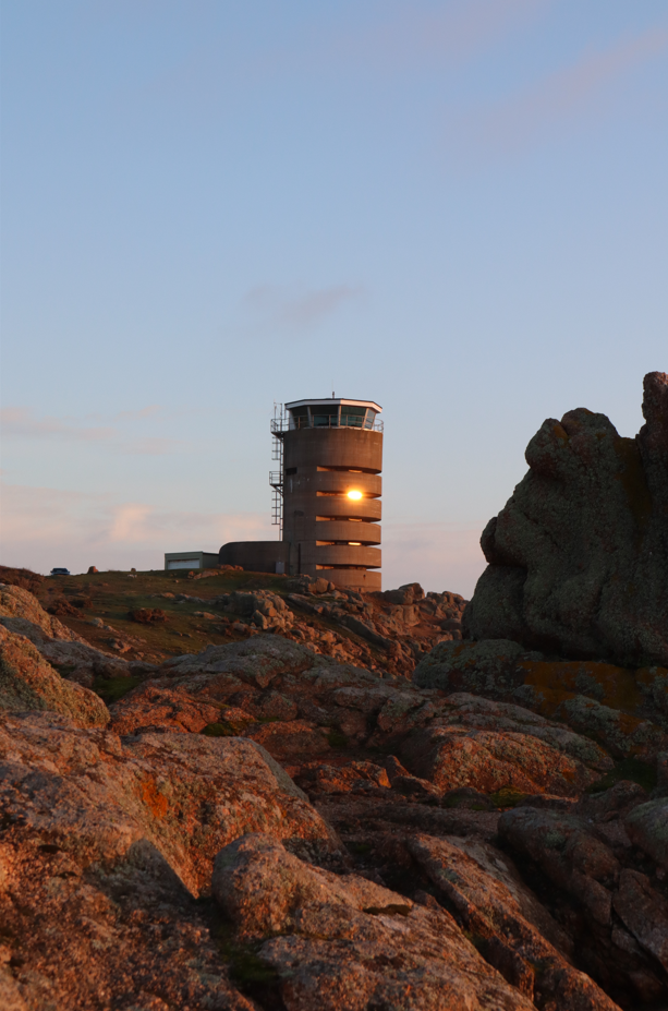
Corbiere Landscape shots:
Photoshoot 3 –
Outdoor German photos:


Photoshoot 4 –
Corbiere landscape shots:
Photoshoot 5 –
Outdoor German shots:

Brief –
For my Images, I plan on photographing at the K2 bunker at Corbiere. Here I will create my images inspired by the lives of the German soldiers in the conflict and retell them in the style of photographers, August Sander and Paul M. Smith. Basing my work on Michiel Peters’ World War 2 visualisations, my inspiration is to retell a story within my images, similar to how peters’ does in his work.
‘2nd Armoured in Belgium’ – 2024, Michiel Peters.
Where my inspiration from Paul M. Smith comes in, will be through the use of myself as a subject within multiple characters in a scene, such as Smith does in his series, ‘Artist Rifles’. With the bunker I’m photographing in being manned by multiple crew members, finding enough actors and uniforms proves to be a struggle, by photographing myself this will make the shoot more achievable to the look I want.
‘Artist Rifles’ – 1997, Paul M. Smith
Images to recreate –
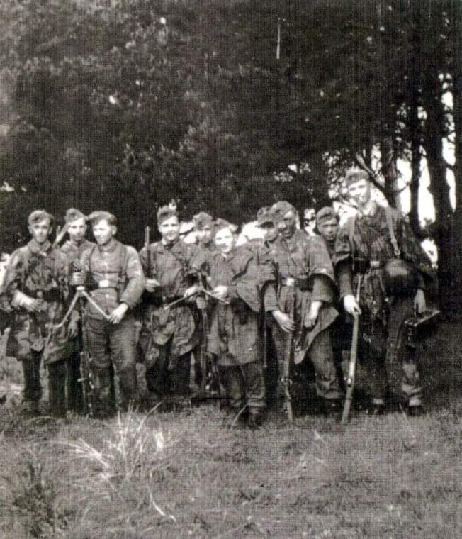
MG Battalion 16, 2nd Company – Training in the vicinity of La Moye.
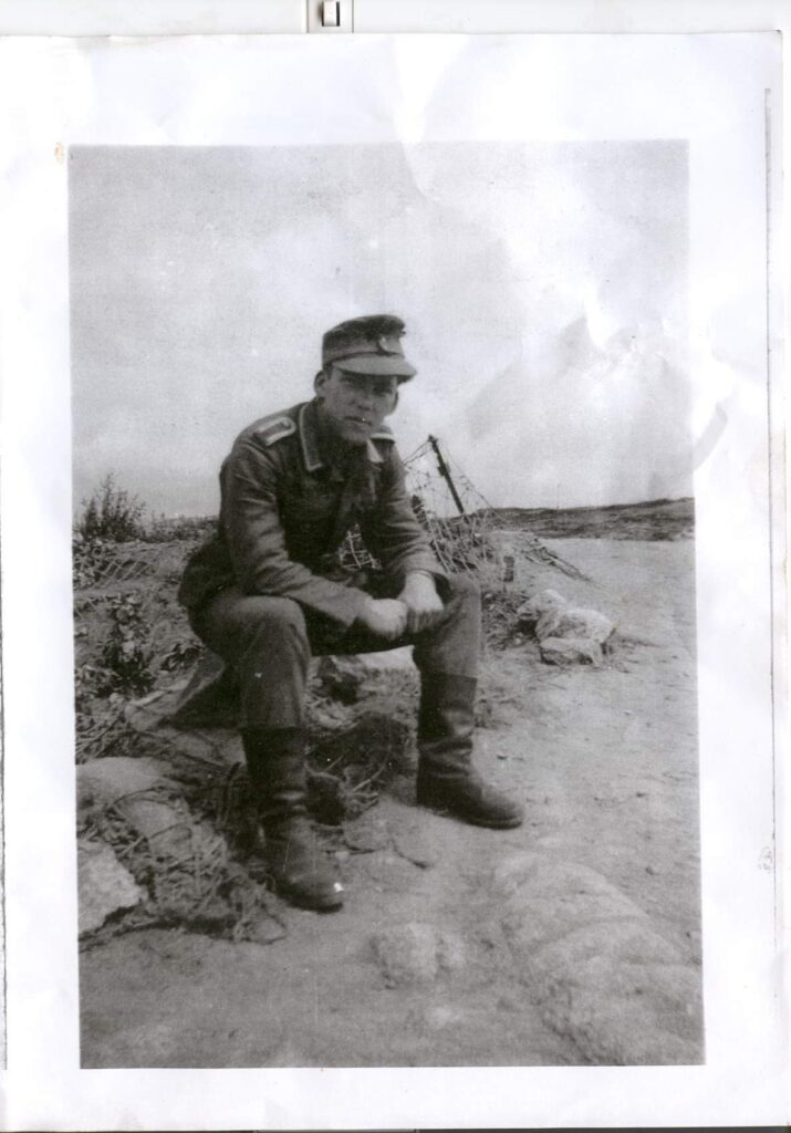
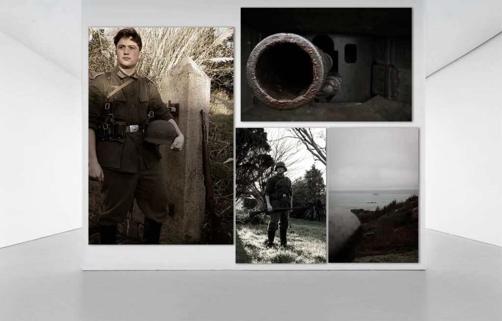
Engelbert Hoppe – The 19-year old Commander of the M19 Corbiere complex.
Horst Herrmann – The young Berliner, who was stationed in the K2 bunker.

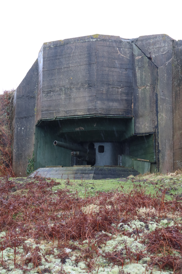
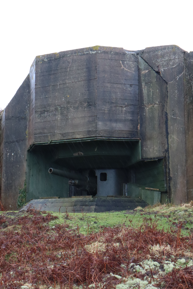
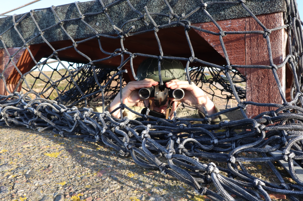
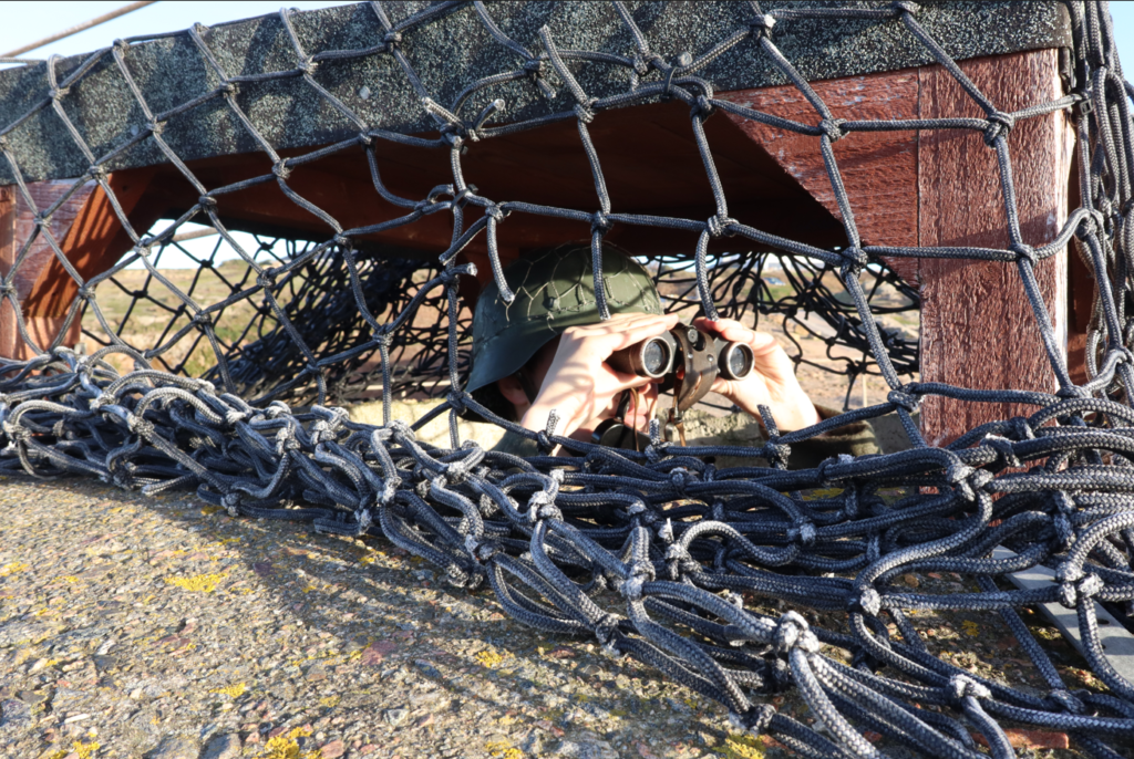
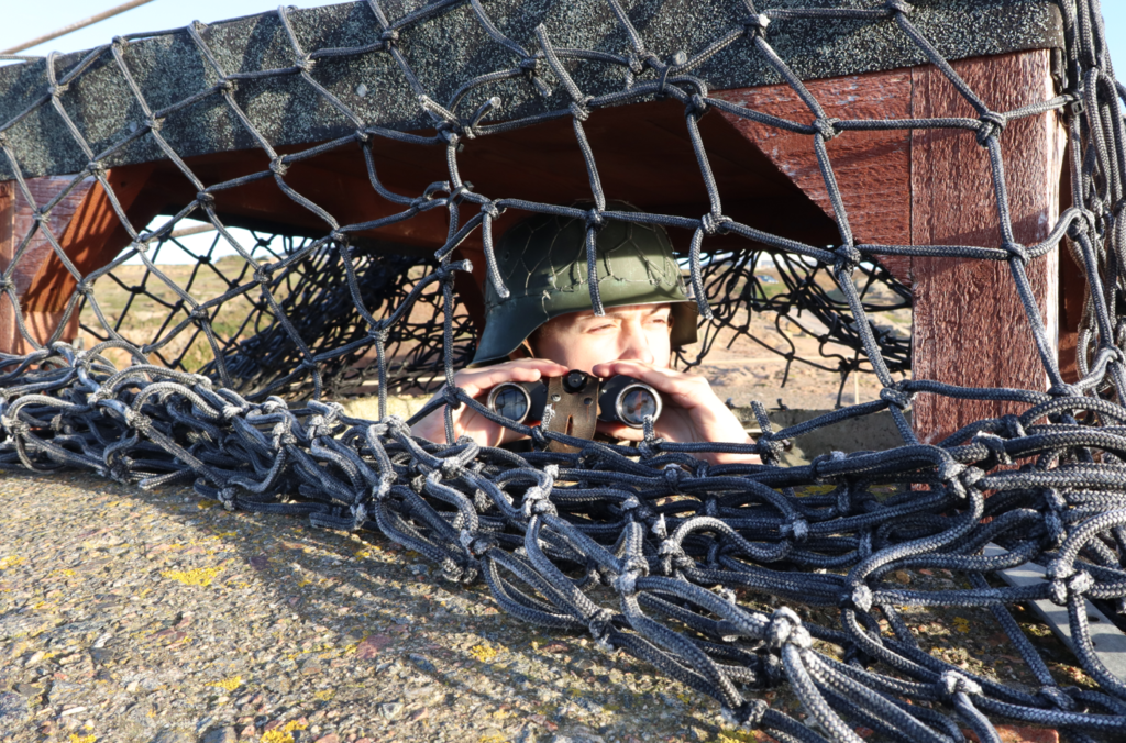
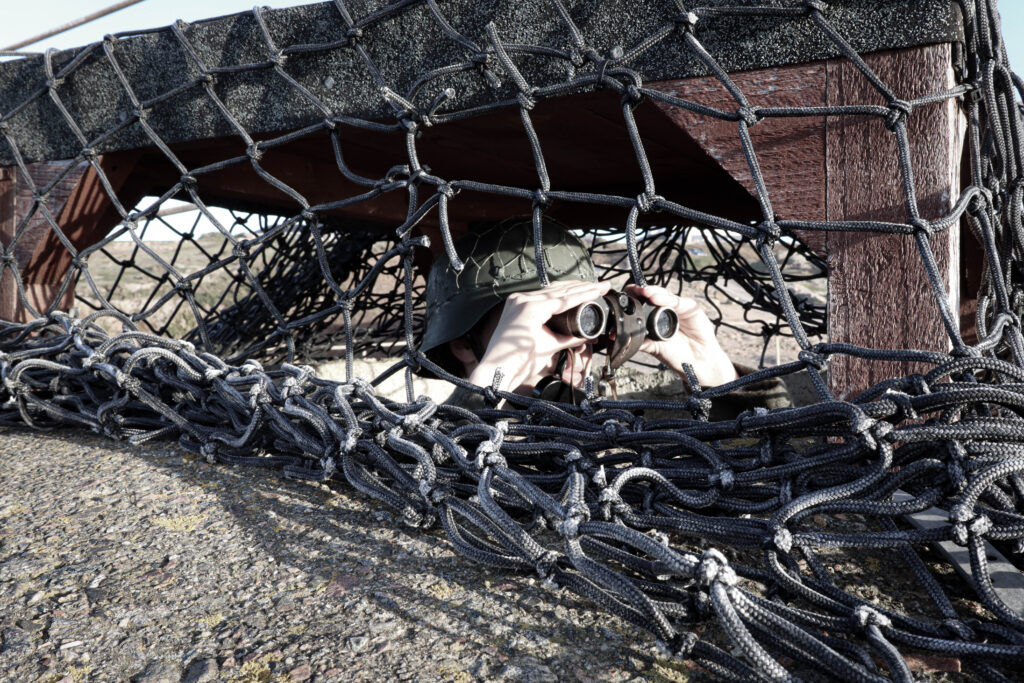
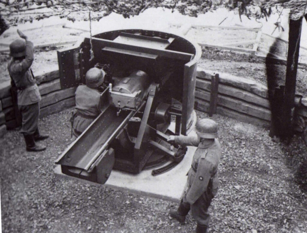
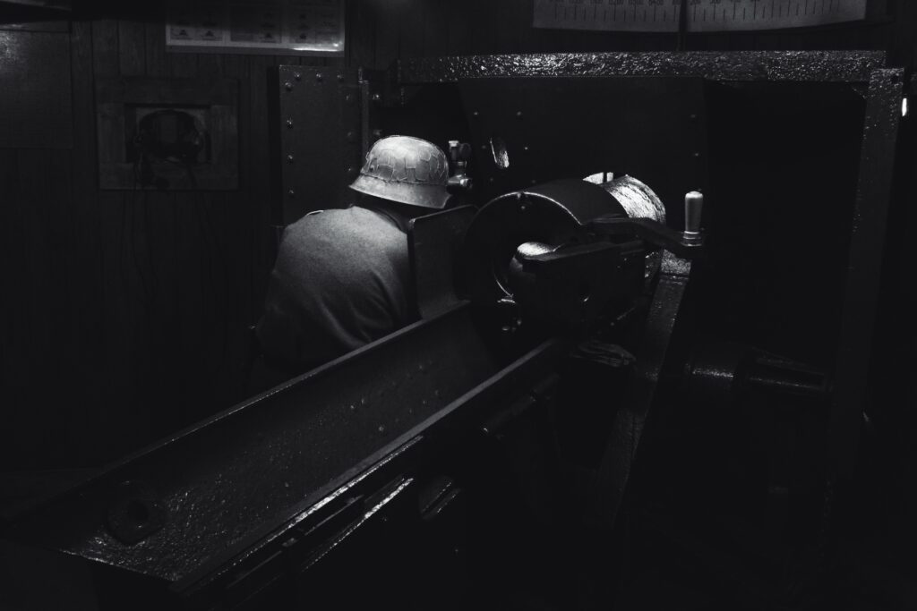
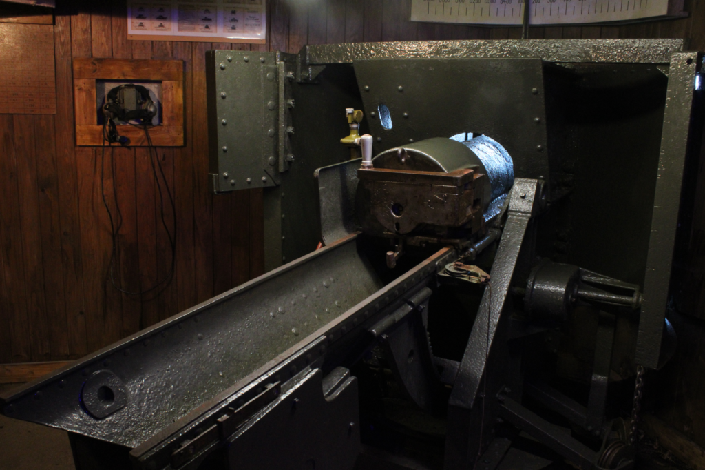
10.5cm Canon – Prior to its construction, the 10.5 was outdoors under a camouflaged netting.
Using existing photos of the men stationed in the Bunker, my photographs will aim to recreate them closely with similar uniforms and positioning. With photos of particular locations that I can access, I am able to recreate these well, for some outdoor and others that are similar to other locations, I can replicate these with ease too.
Photoshoot 1 –
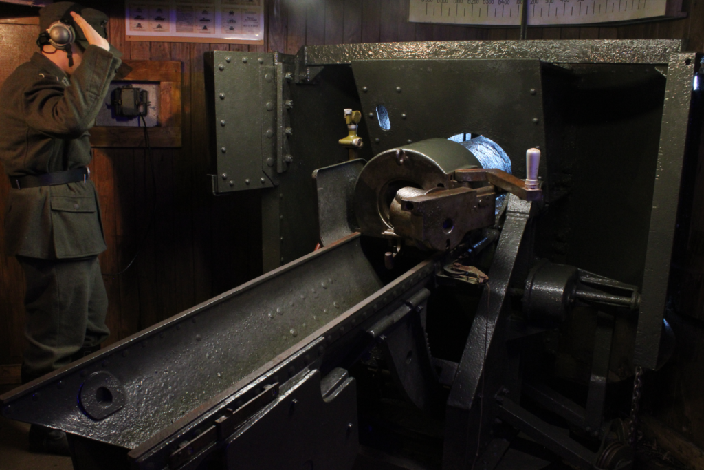
In this first shoot I will aim to create the interior depictions of life under concrete. I will also try to mimic the photograph of the 10.5cm canon in the style of Paul M. Smith where I portray each operating role of the canon crew.
Types of scenarios will include:
Photoshoot 2 –
In the second shoot, I will aim to create the exterior depictions of their outdoor life’s. Here I will try to mimic Michiel Peters photographs in the open environment works, of realistic settings to where the Germans would’ve gone and what they would do outside of their fortresses. One photo I want to recreate is the photo of them on field training in the area of La Moye.
Types of scenarios will include:
Statement of intent –
Personal:
Within my work, I aim to explore history through my photography. Due to my interest In the subject I feel as if I can create personal and expressive representations of the past or follow in the documentative medium to capture how our surrounding environment has changed to now. History through photography, to me, Observes an insight into a greater knowledge of the past, and the different ways to explore it, by visually getting a picture I feel as it lasts more in a persons mind to visualise what has come before us, unlike historical texts do. From my own personal experiences, I find that to further development my historical interests I aim to seek a visual understanding of the past, whether it be a historical site or what remains from that period. To have that opportunity to express that through a creative photographic process, I want to educate through my work their historical impact and bring awareness to their significance.
I wish to develop my project through exploring visualisations of the past, such as like documentative photography. In my work however, I will stage these images to replicate this effect, to create an immersive atmosphere within my photographs to make the past lives of people more relatable to the modern day. By photographing at historical sites, I feel this better replicates their relatability to our lives today. Using LED lighting and a tripod, I will aim to photograph myself recreating these photos to further demonstrate my interests in the historical subject. Looking into local History, I aim to begin my study by looking at key historical events within the island such as the occupation. With the occupation being a large part about the Islands history I will aim to try and replicate the lives of Jerseys occupiers at their concrete constructions littered around the coast.
With the topic, documentative photography, as my main point of inspiration, I want to create a visually informative project in the form of 1-3 mini books in a box set, or one entire book. The issue I’ll explore is the unexplored sides of war such as the life’s of the individuals forced to fight and serve, In the case of the occupation, many of these types of individuals where present.
Project:
Due to my strong interest into the Second World War, I feel as if my knowledge on the subject will make an interesting documentative personal study. Creating a recreated depiction of the men stationed at Corbiere, I will base my images through the personal accounts some of these soldiers gave from CIOS annual reviews. Having personal access to the Bunkers they where physically in, written accounts from the men themselves and uniforms they would have worn, I feel this is a good stepping stone into how this project can be creatively and effectively made. I would like to do this to explore our islands history and share it with others who either aren’t aware or want to know more about our islands history. By covering the Occupiers side, I aim to tell an often untold story about their emotions and lives amongst the trapped islanders.
Visiting Art centres around St Helier, we got a good insight into some artists and their creative pieces.
Jersey Arts Centre –
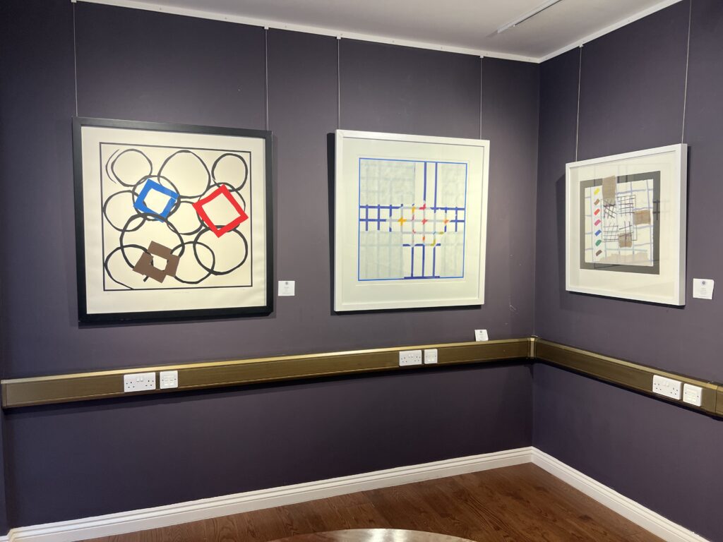
Marc Medland’s ‘10 projects’ exhibition:
‘The invented parallel worlds are set in extreme situations and are represented using short film, animation, collage, architectural drawing and physical models.’ – Jersey Arts. Visiting this exhibition, the work on display was creatively eccentric in its appearance, with a retro yet modern aesthetic, the use of graphic design, story telling through ai generated imagery and unique individual production in all the projects, I Enjoyed his work and found it quite impressive.
CCA Galleries –
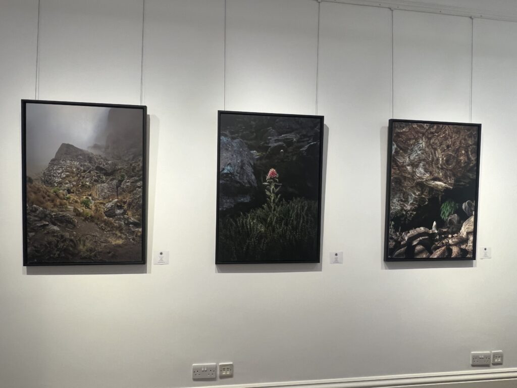
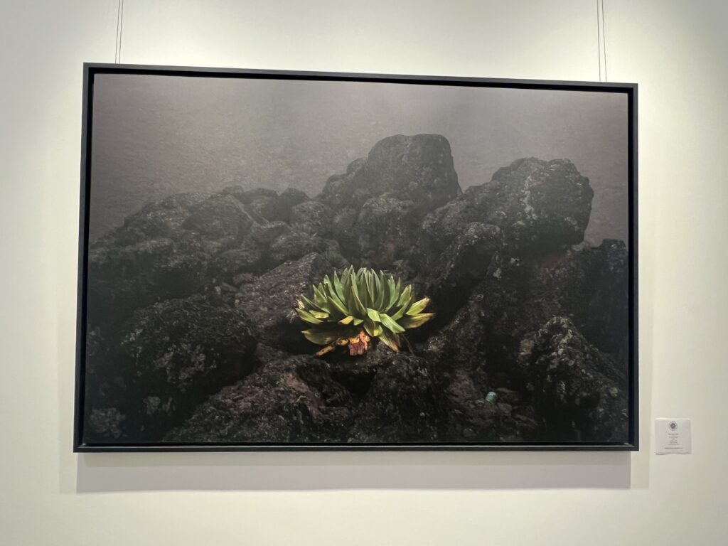
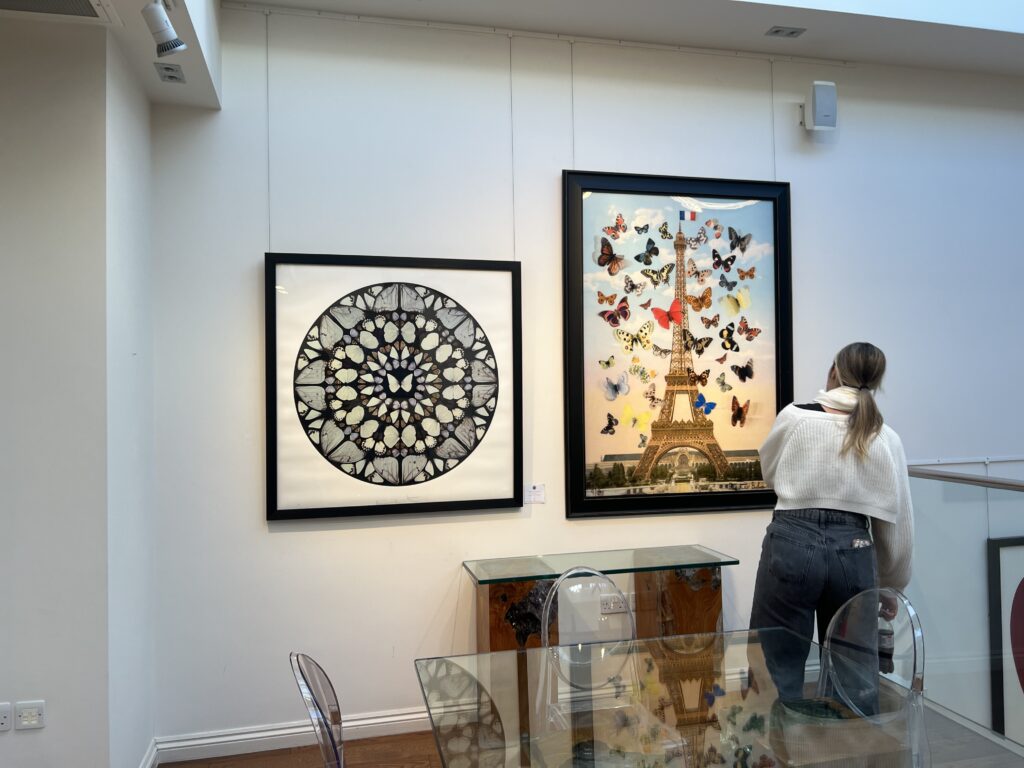
Visiting the CCA Galleries next, we looked around the current exhibition created by photographer, Glen Perotte, who captured his 15 day summit up mount Kenya’s botanical beauty. As the Gallery states “this new series of photographs Perotte explores the flora of Mount Kenya, Africa’s second highest mountain after Kilimanjaro and a uniquely special place. Mount Kenya is god’s mountain, a locus for the spiritual life of many of the ethnic tribes in the area who believe god came down from the sky to live on its peak amongst the clouds. The focus for Perotte is the astonishing plant life that manages to take root in this volcanic and harsh landscape of thin air and rocky terrain, sometimes by banding together and at other times finding a small niche to settle in alone. Strange, yet wonderfully captivating, these botanical wonders exhibit adaptations honed over millennia to survive the harsh mountain environment.
Glen Perotte is an international photographer who has worked in New York, London and is now based in Jersey. Perotte has shown at the Barbican London, The Association of Photographers Gallery and the Royal Photographic Society, Bristol. Glen returns to CCA Galleries International for his third solo exhibition with an exciting body of new work.”
Amongst the other parts of the gallery, we looked at some international work from other featured artists on display.
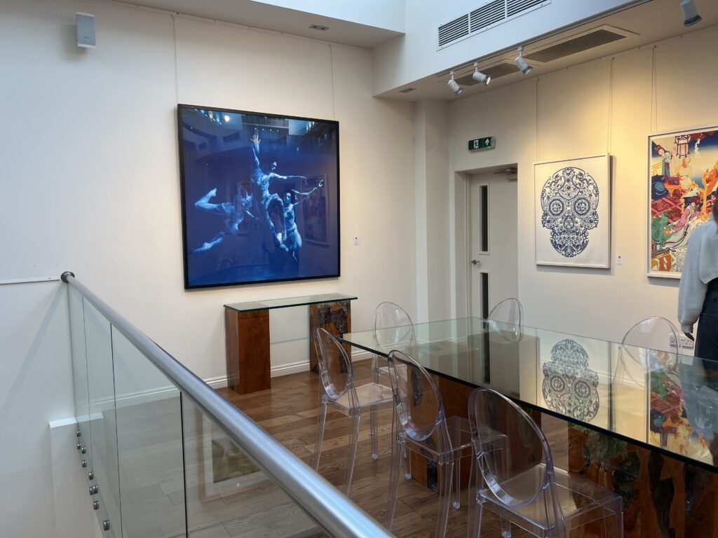
ArtHouse Jersey at Court House –
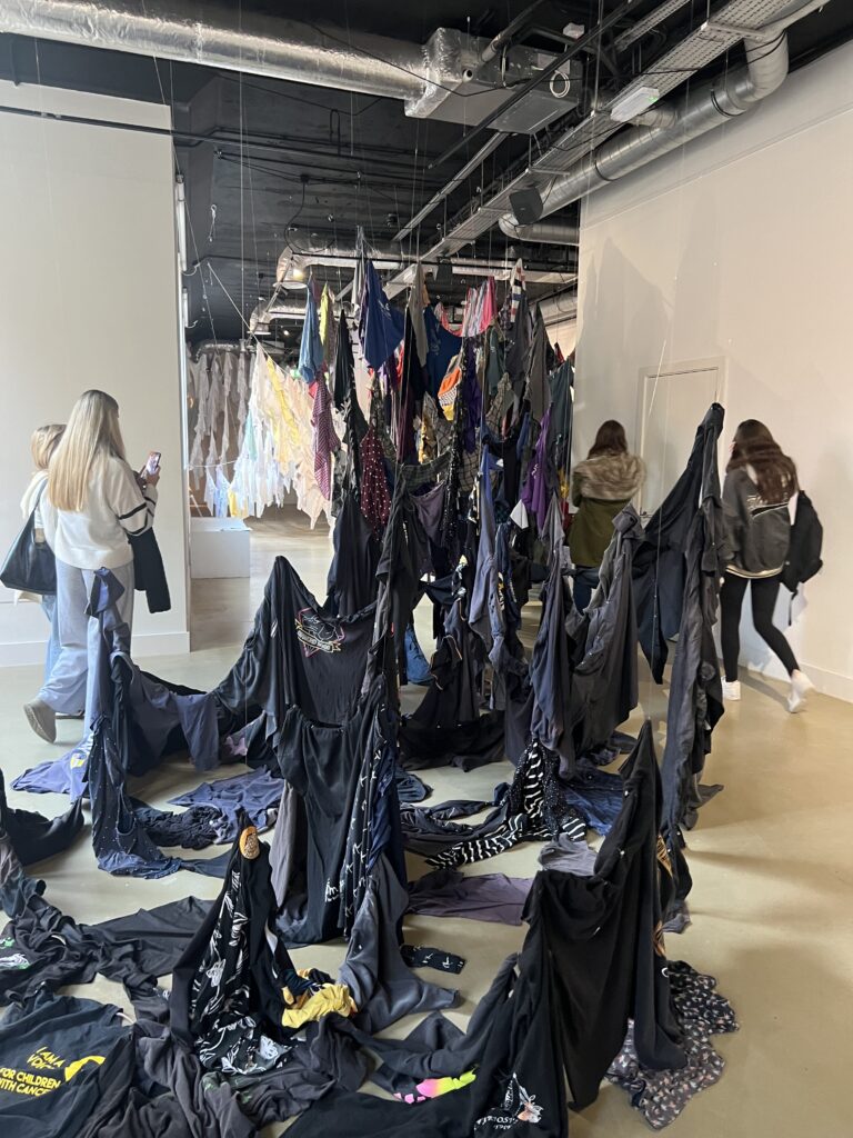
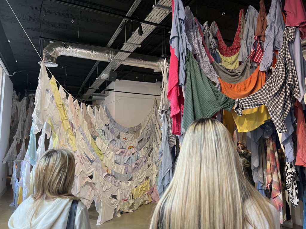
Dancing Together: A ballad – by Kaarina Kaikkonen is the current exhibition at court house. Featuring a vast collection of donated clothes, it tells a moving story of the story’s behind the pieces of clothing, donated by our islands local people.
As ArtHouse Jersey states:
”Dancing Together: A Ballad is an indoor reimagining of Kaarina Kaikkonen’s large-scale public sculpture, Dancing Together, which was created in the outside in the public realm in St Helier in the summer of 2024. It incorporated over 700 shirts donated by people in Jersey during the summer and many of those who donated a short also shared a meaningful memory or story connected to the shirt.
For this overall project Kaarina Kaikkonen has created two distinct works that bring together the different stories of people and their shirts – ordinary, sad, courageous, joyful, humorous – that reflect the people of Jersey. In the more intimate space of ArtHouse Jersey at Capital House, visitors are invited to get up close to these very personal sentiments, each garment holding a world of its own memory, offering Islanders the chance to truly connect with the many moving human stories that held the original Charing Cross public artwork together. Dancing Together and Dancing Together: A Ballad, both created especially for Jersey, are the latest works in a series of shirt installations that Kaarina Kaikkonen has created inside galleries, museums and outdoor settings across the world over the past thirty years, from Shanghai to Madrid, Santiago, Chile to Rome and across Finland and Scandinavia. Each work responds to the particular architectures, histories and natural elements of its location, recycling materials to create an artwork that speaks to a sense of a collective ‘body’, of time suspended and a poetic reflection of memory, loss and our shared experience as humans and the different environments in which we live. Discussing her work, artist Kaarina Kaikkonen has said, ‘I want to use materials that have had a previous life. Then I change it and give it a new life, a new form of art. To make beauty from the ordinary.’ This reinvention of Dancing Together into a new life, also featuring a specially created score by acclaimed Finnish composer Päivi Takala, opens the question of what is possible through reimagining, reusing – and how from otherwise forgotten or discarded materials, can come an extraordinary, moving, gallery experience.”
“The sound of Colour” Town church –
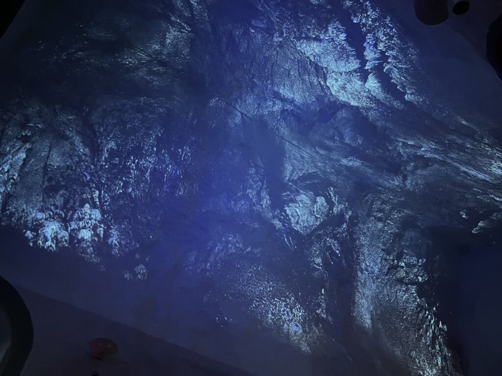
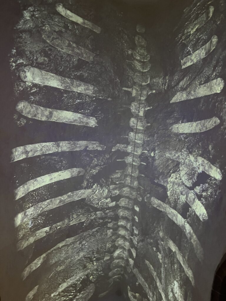
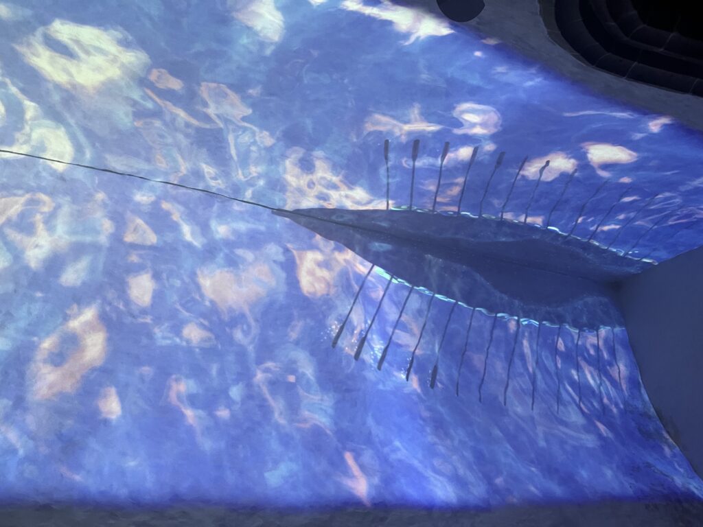
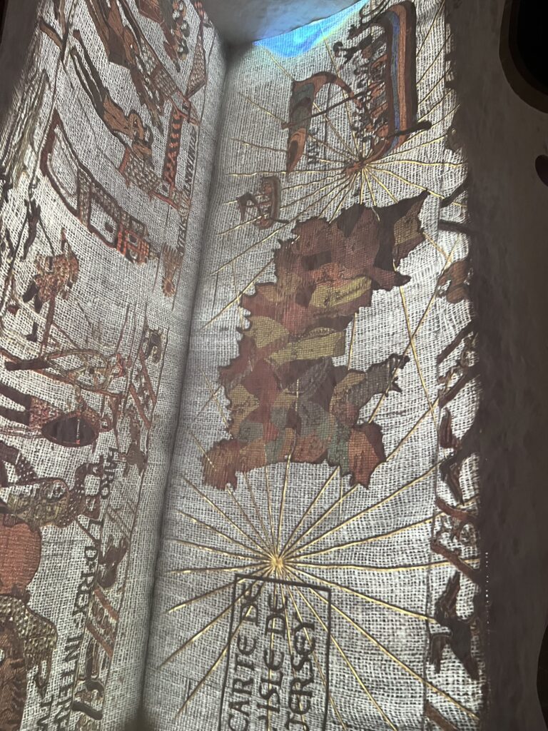
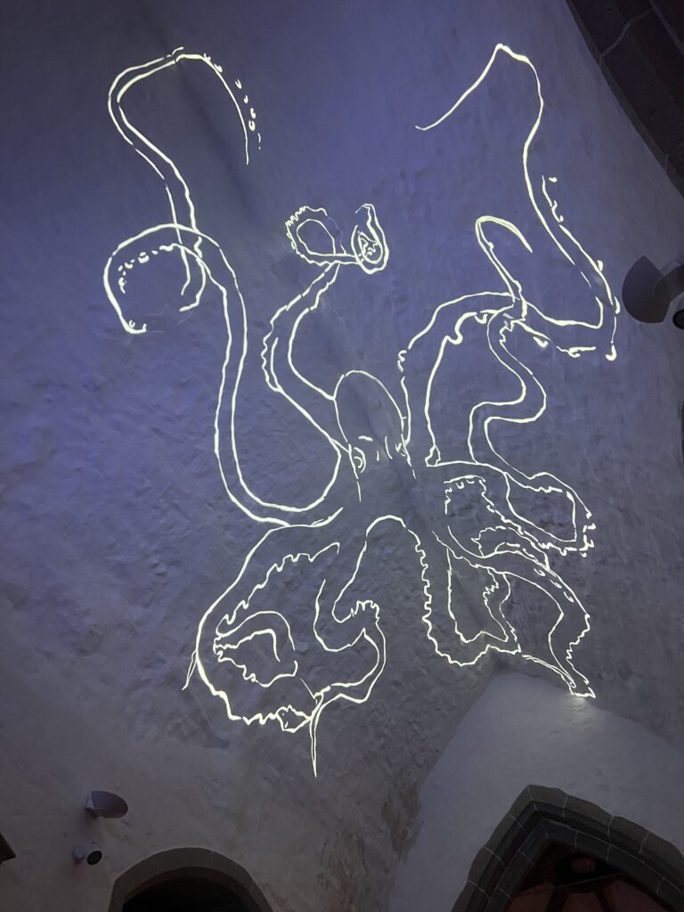
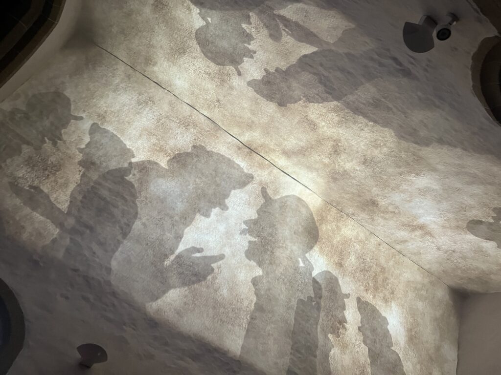
On our final art piece visit, we went across the road to Town Church to see ArtHouse Jerseys second exhibition, ‘The sound of Colour – arrivals’. Visually retelling the history of Jersey through Sound and beautiful visuals, this was a very immersive art piece I found very well made and inspirational. From ArtHouse Jersey “ArtHouse Jersey’s The Sound of Colour: Arrivals, is a new projection mapping project to be presented at St Helier Town Church from Friday 8 to Saturday 23 November. Featuring visuals by international artist Akhila Krishnan and a soundscape by the Jersey electroacoustic composer Sarah Keirle-Dos Santos the piece is co-authored and produced by Natasha Dettman for ArtHouse Jersey. It follows the success of the first edition of The Sound of Colour: Origins (2021) which also completely transformed the iconic venue of St Helier Town Church with projection and soundscapes.
Arrivals explores the emergence of language in Jersey; from the distant whisperings of the Magdalenian people of the late Stone Age, the Iron Age Celts of Gaul, the Romans, the Franks, the Normans, to the appearance of our native language Jèrriais. Bringing light into the darkening month of November, Arrivals considers how our language and culture has been woven into existence and shaped over thousands of years of settlement of this Island by different peoples and cultures. We finally land in present day Jersey, where the sounds of modern English, French, Portuguese, Polish, Romanian, Swahili, Filipino and many more languages can be heard. The immersive soundscape created by Sarah Keirle-Dos Santos features the voices of many Islanders speaking some of the languages which would at various times have been spoken widely and some which may have made a brief appearance in Jersey.”