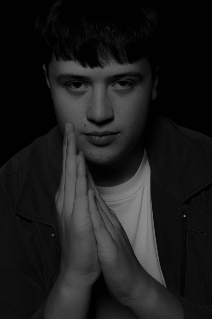
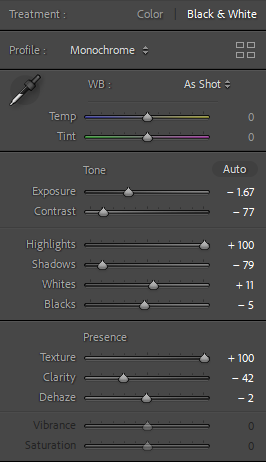
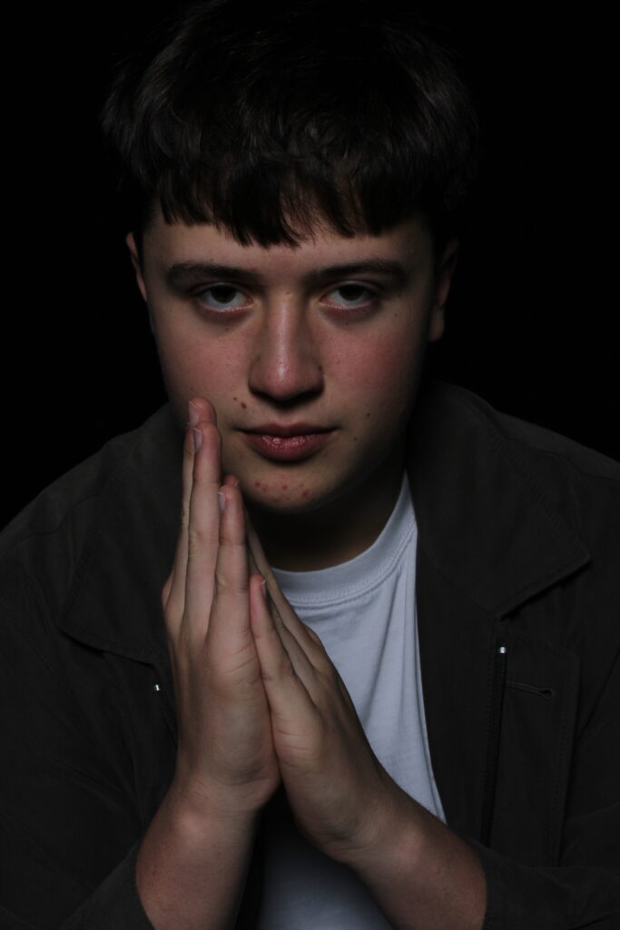
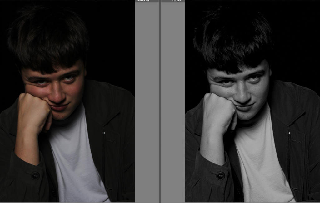
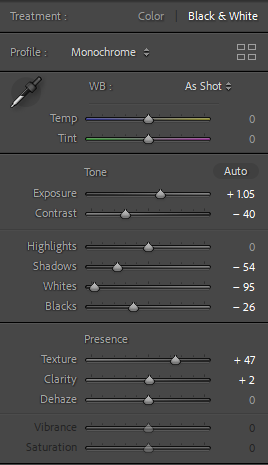
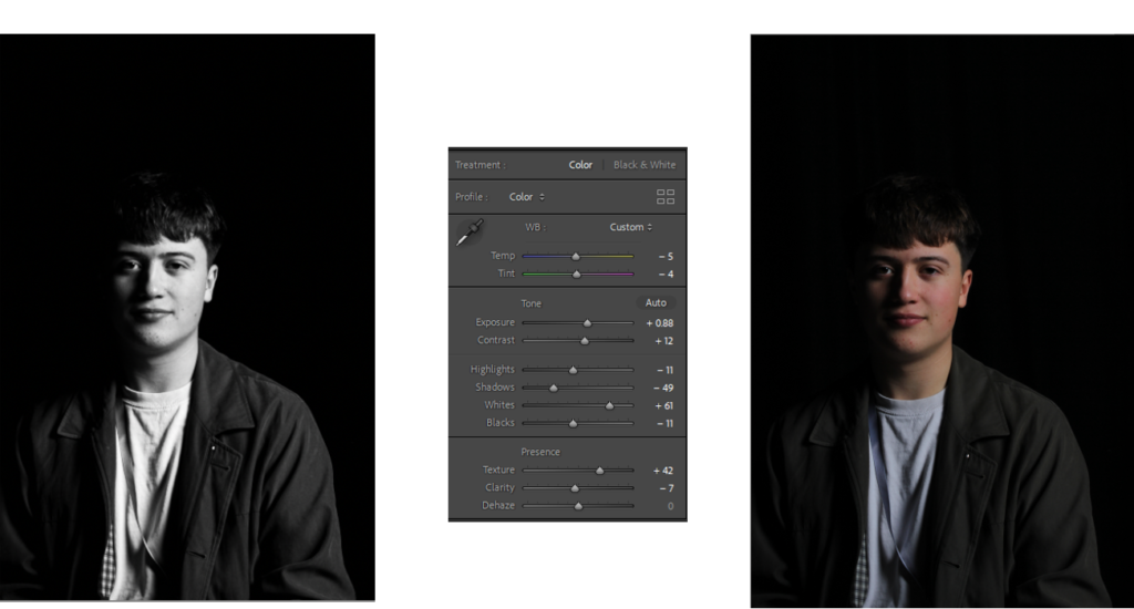
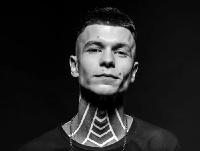
most photos that I’ve seen with the butterfly effect have been in black and white with your odd exceptions in colour, therefore this persuaded me to make the image black and white. and I liked the way the image came out.
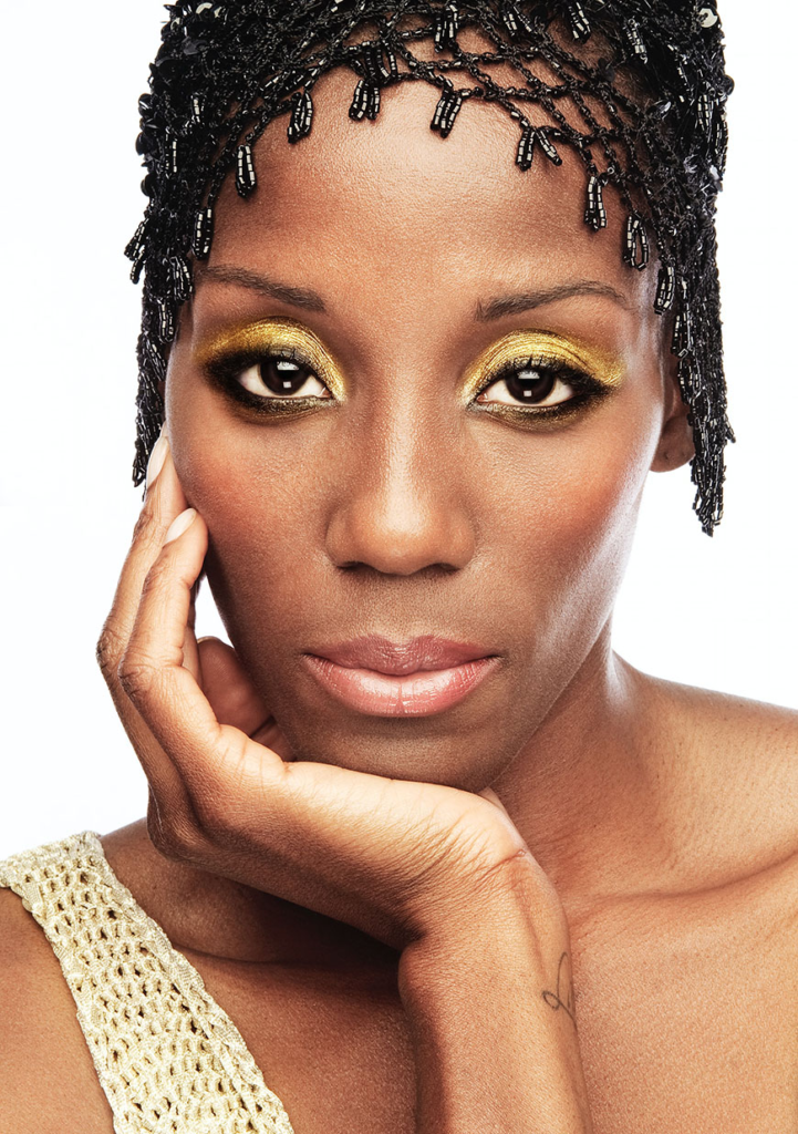
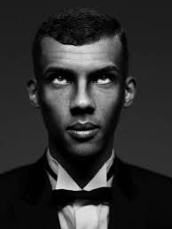
this is also another image that I like because it does what a portrait is supposed to do show off the details of the subject and it also shows off the butterfly effect really well.
Rembrandt lighting:
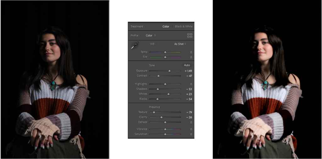
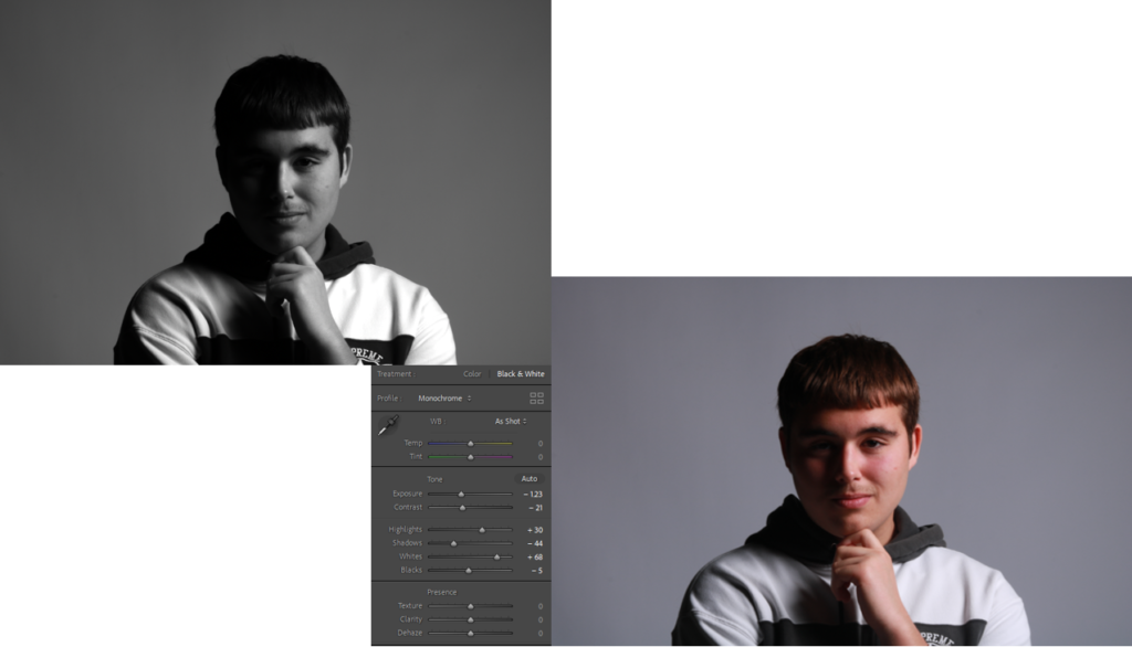
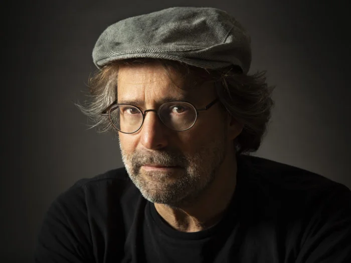
to make the Rembrandt effect look even better I decided to make the subject in the photo more brighter however still have the textures and shades on the face as I personally think it made the triangle and the shadow on the subject pop even more.
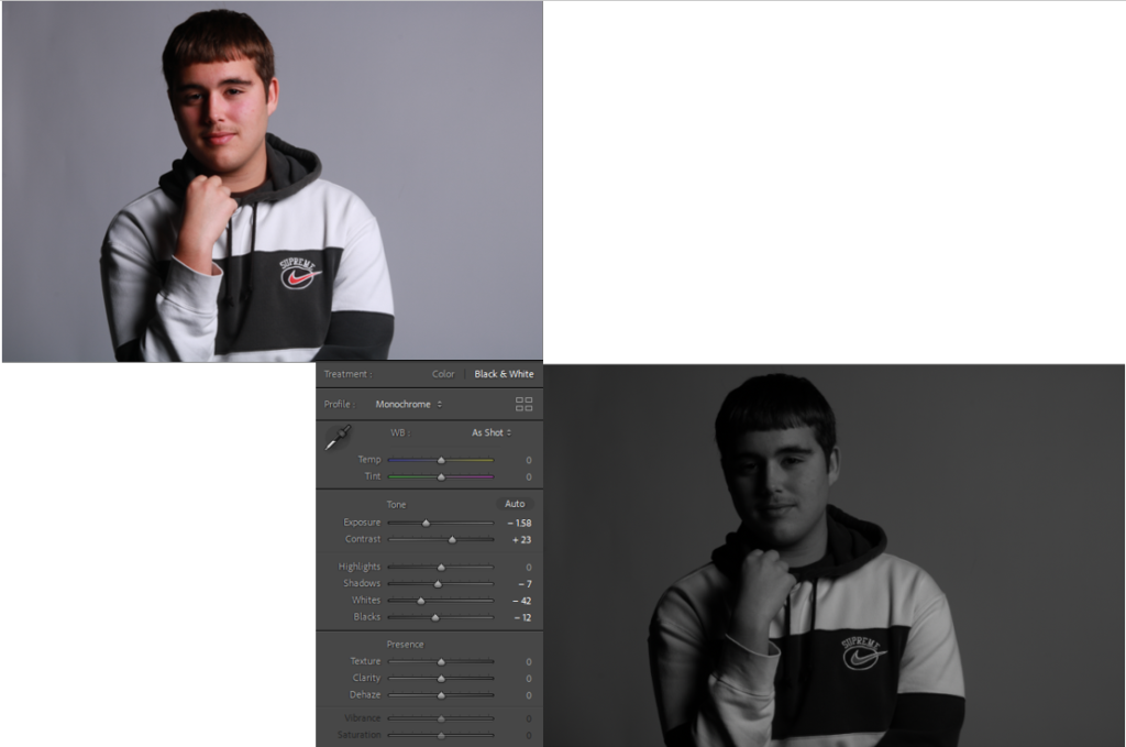
this other photo I decided to make with Rembrandt effect was in black and white as I wanted to experiment doing different things instead of having the photos in just colour for my Rembrandt images.
Chiaroscuro lighting:
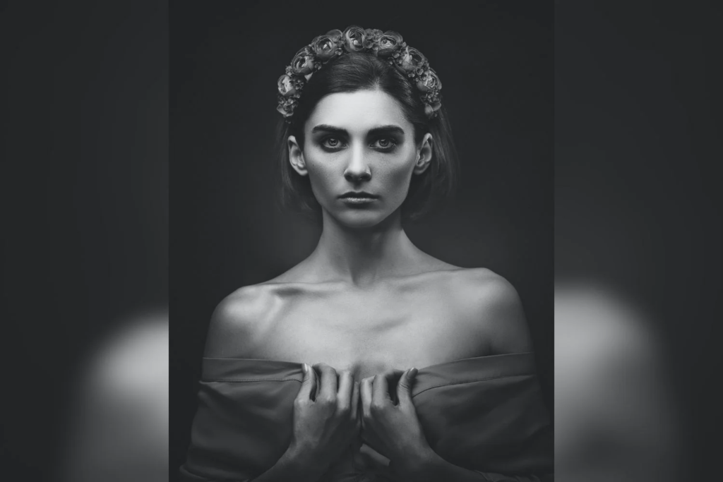
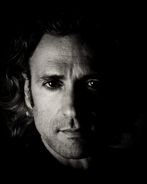
to achieve the Chiaroscuro effect I had to show the contrast between black and white by making it seem like there is an unknown source of light beaming on the subject
I made another photo which I think fits the description of the Chiaroscuro lighting effect personally I think it came out really well
an environmental portrait is when the object of the photo is placed in an area that you would associate it with (footballer at a football pitch etc).
mood board:
mind map:
photo must have a distinct subject that matches its background
props can be useful to help paint the picture
location of photo (inside or outside etc).
more than one person can help create more emotion in a photo
Artist study-August Sanders:
“It is not my intention either to criticize or to describe these people, but to create a piece of history with my pictures.” – August Sander
Introduction:
where was he born? August Sanders was born in Herdof Germany. he grew up having an interest in photography after his uncle bought him camera and he met some photographer who helped spark his interest in photography.
august sanders took photos of people all over Germany, even though they didn’t consist much emotion if not none from the subject but could still paint a story of what the person does or is. he did this from the early 1900s all the way up until 1964 where he would pass away he created a portfolio called “people of the 20th century” his photos helped document the change and growth in society and the differences in social classes.
august sanders helped to document changes in one of the most dominant army’s in history (the uniform and the environment of the soldiers and commanders etc).
individual photo analysis–
this photo in my opinion helps us show what August Sanders really wanted to capture in all his photos in this genre
this photo shows that he liked to use quite an old fashioned large format camera that consisted of long exposure times, as in this photo it allows him to capture all the details not only in the person but everything around the person as well such as the little details in most of the bricks the floor where he is standing. this photo tells what environment this person worked as it seems to be quite messy but so precise as his surroundings are quite dirty (floor, stain on the wall etc) and the the preciseness of how the bricks must be laid out. so to conclude this photo really portrays what this persons work life is like in multiple different ways.
all of this really helps us show what life was like in the 20th century as he is essentially creating a piece of history.
other examples
obviously after having such an influence in photography multiple people have tried to replicate his work with a modern twist it and these are some examples:
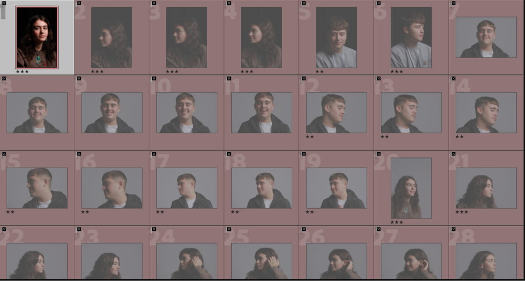
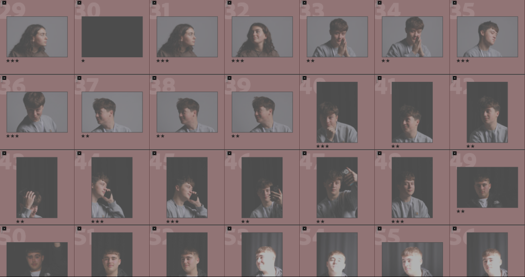
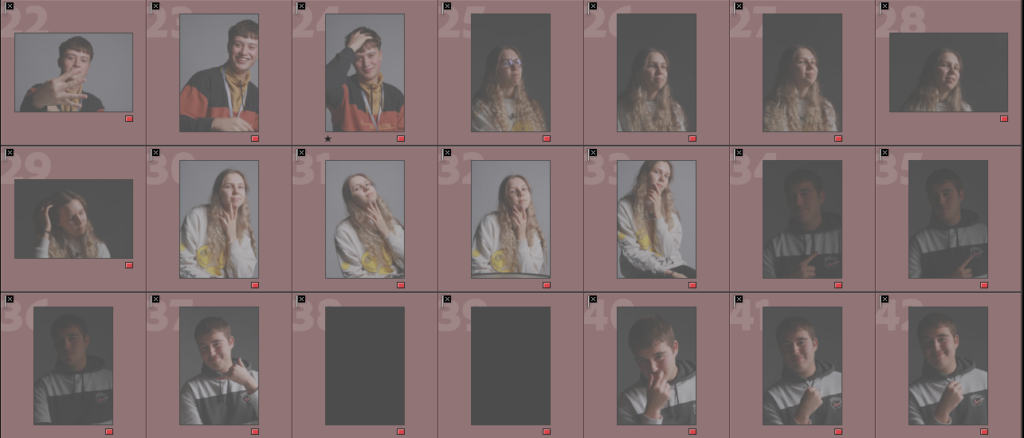
for this shoot I wanted to create Rembrandt lighting in the best possible way in my ability, I did this by making sure I had the lighting on point and making the shadows I needed to make around the face. And these are the photos I came up with.
4-5 star photos (best photos I came up with)-
3-4 star photos (decent photos I came up with)–
1-2 star (worst photos)-
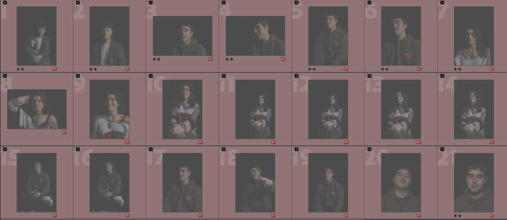
Butterfly lighting– I judged these based of the lighting on the face and how well the butterfly effect was created on the subject.
4-5 star photos (best photos I came up with)-
3-4 star photos (decent photos I came up with)–
1-2 star (worst photos)-
conclusion-
in conclusion I think that there is a lot of room for improvement when it comes to taking my photos as there is only a handful that I think show off the lighting technique to its best. I think if I was to do this photoshoot again I would take a lot more photos and keep adjusting the lighting until its perfect.
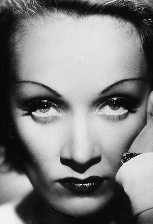
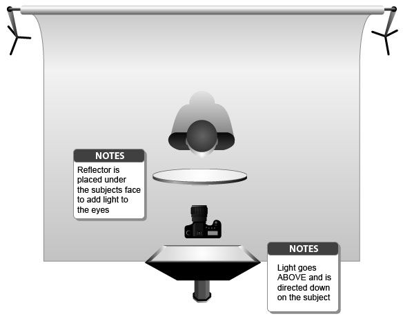
butterfly lighting is a lighting technique that consists of where the key light is placed above the object in the photo. this helps create the shadow under the nose that looks like a butterfly hence where is gets it name from.
butterfly light lighting originates from Hollywood 1930s as it helped create some of the earliest glamour shot. German silent film actress Marlene Dietrich helped give this technique its name after how she was presented in one of the films she stared in.
why use this form of lighting?
by using butterfly its helps the facial feature stand out more (cheekbones etc) and become one of the photos main attraction, however the main focus of the photo is the shadow under the nose (butterfly) and neck as this is what makes everything pop in the photo. overall this technique is perfect for making glamour shots as it makes the person look more symmetrical and it also makes the person look more thinner.
as you can see the lighting makes the model look more eye catching as all her facial feature are popping.
how do you create butterfly lighting?
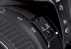
lens-
the best lens to use is 55m as it gets you a close and focused photo with heavy detail of the person.
Light-
to create butterfly lighting artificial or natural light can be used, also hard and soft lighting is also applicable for this technique
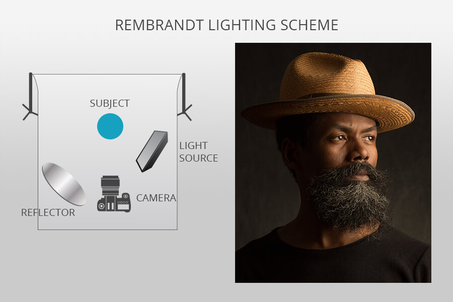
Rembrandt lighting came about in the 20th century and was created by film director Cecil B. DeMille, he did this to created much more realistic effects instead of just having your average studio lighting that was pretty generic. this type of lighting became much more common in films and promotional photographs to make them more interesting and eye catching. In conclusion, this sort of lighting is supposed to make a triangle under the eyes with shadows on the subject in the photo.
why use Rembrandt lighting?
when using Rembrandt lighting you can create an eye catching photo as it can create an image that looks natural but could also look dramatic.
Rembrandt can be used with either hard or soft lighting depending on how the photographer wants to portray the subject in the photo.
hard light
soft light
as shown in these two photos there is always a triangle of shadow being created when using the Rembrandt technique.
how to create Rembrandt lighting:
light- for the lighting you are going to need one source about 45 degrees away from them (about five feet) that’s also higher than them to create the technique.
lens- A 35mm to 55mm is the best range when taking a Rembrandt photo as these provide a nice wider point of view capturing more of the subject or it can be more zoomed capturing more detail of the subject (good depth).
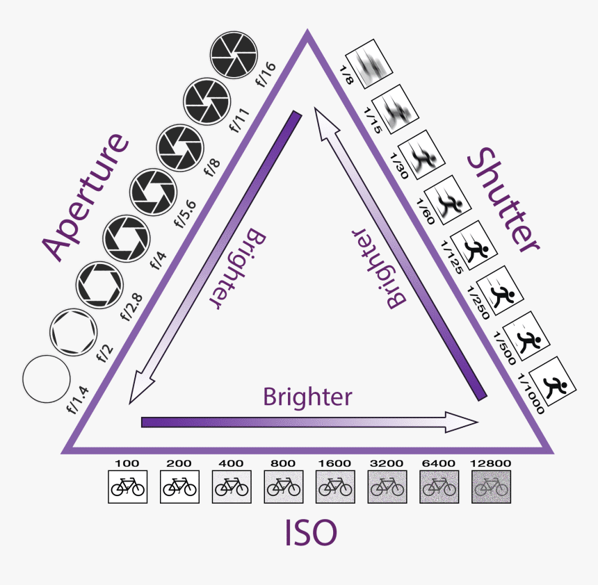
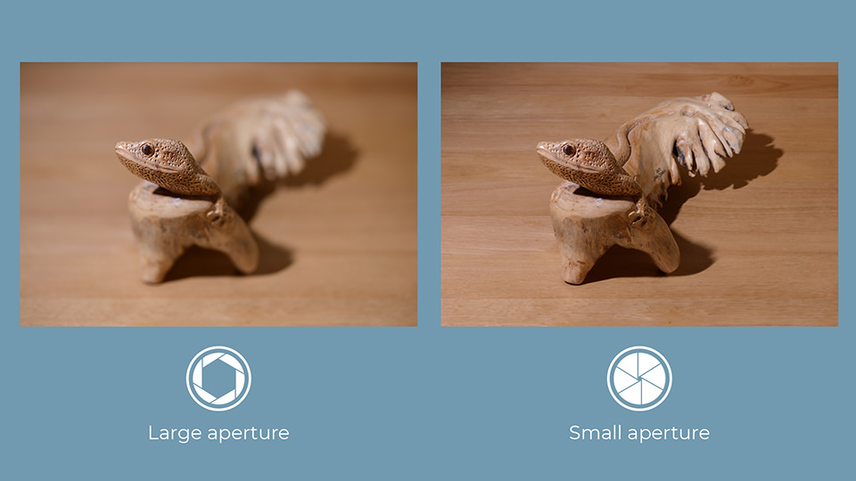
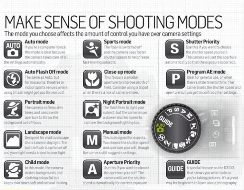
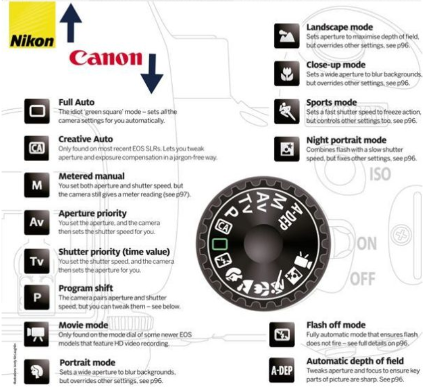
the aperture decides how much light is let into the photo you take. how it work? well as you make the lens smaller the less light it let in and vice versa. it can also blur the foreground and background to focus on that bracket the object your taking a photo of.
shutter
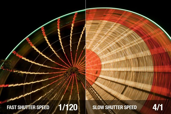
the shutter speed is what it sounds like it is, it dictates how long the shutter takes to close when you takes a photo (it shows the movement of an object)
Iso
Iso controls how much light is let in to the camera, it dictates how light or dark your photo is going to be.
exposure
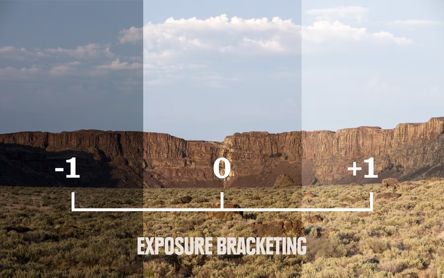
exposure is when the amount of light that reaches your camera creating visual data.
exposure metre
exposure meter, also called light meter, photographic auxiliary device that measures the intensity of light and indicates proper exposure
white balance
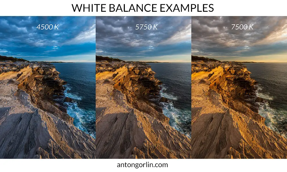
white balance helps make the colours on a photo more realistic (more intense)
auto focus
auto focus is exactually what it sounds like it automatically focus’s on the subject of the photo.
manual focus
adjusting the focus by yourself with out an aid from the camera
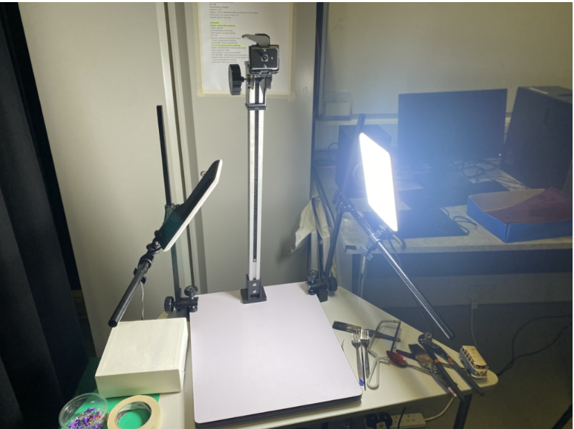
this is the set up i used for one of my objects photo shoots. this set up matches the settings above i have presented.
Walker was an American photographer who was widely known for his farm security administration work. most of his work was done with 8 x 10 inch view camera (a large format). Evans said this about his images of tools
“Among low-priced, factory-produced goos, none is so appealing to the senses as the ordinary hand tool. Hence, a hardware store is a kind of offbeat museum show for the man who responds to good, clear ‘undersigned’ forms.” Walker Evans
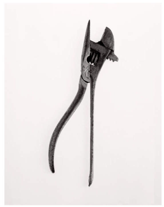
Walker Evans – Beauties of the common tool – 1955
Walker evens began photography in the 1920s and was very well known his black and white photos he liked to show of the shadows in his photos by using the low light technique.
to make his photos Evens decides to make an infinity background effect and uses an overhead light to make an sort of shadows that were supposed to be there disappear to focus purely just on the tools and nothing else hence why the shoot is named “the beauties of the common tool”. this allows all the texture and the details of the tools to come to light.
Daren Harvey-Regan
Beauties of the Common Tool, Rephrased II, 2013 Fibre-based handprint, mounted, wooden frame with museum glass
Harvey-Regan recreates Evens by taking tools and making them main interest of the photo but puts his own twist to it by taking apart tools and putting them backing together with a different piece. and as he was a more modern photographer he was able to have better lighting by using studio lights making the photo having no dark patches where as Evens did. this meant that Harvey-Regan was able to bring out more texture and clarity in his photos.
Comparison
the main difference between the two respected photos is the fact that the modern equipment is able to out perform the old equipment meaning its able to bring out more out of the tools giving its more texture and visual quality.
however they both have the same ideas
my person attempt
for this photo I decided to take inspiration from Harvey-Regan as i wanted to have no shadow to make the tool stand out more to show off its ruff texture.