All posts by Edgar Perestrelo

Filters

Author:
Category:

final outcomes and idea behind them Anthropocene and virtual gallery.

for this project I wanted to use AI on images that I had taken to try and show how we are damaging the planet in many different ways. so I want to use my images to make people think what can we do to stop it?

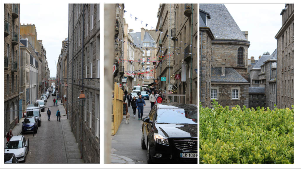
the idea behind this three piece image was inspired by Michael Marten’s sea change however I made my piece different to his and interpreted it in my own way by getting a picture in town and using AI to make a past and present image of what this image could have possibly looked like in the past and future. I thought this fit the theme of Anthropocene as it shows much we have changed the planet from the past to the present and possibly what the planet could like in the future.

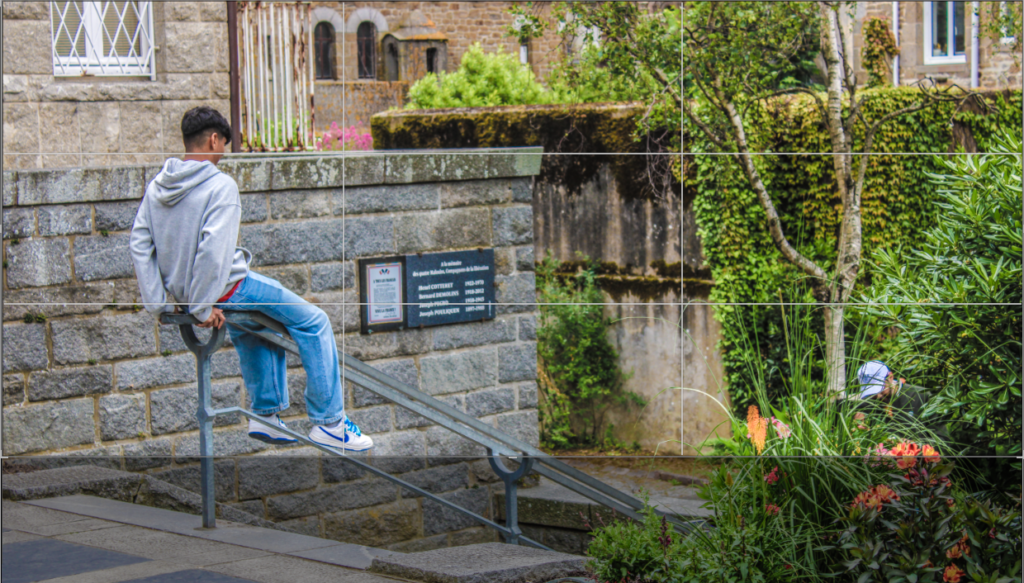
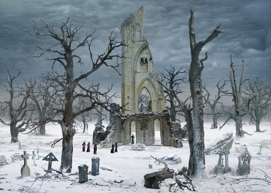
this image that I edited aims to show Anthropocene through pollution that we have caused in the sea and on the surface of are planet I done this by using AI to add things to the image such litter and a construction site to the image. I think this image helps shows what we need to change in order to stop these problems we have that have been happening for a long period of time. I liked how this came out because the shadow is creeping up slowly on the other side of the image to represent the fact that the damage humans have done has almost taken over everywhere. I also like how the image looks similar to a painting which gives it more of a dramatic effect to the image.

in my opinion I think this image was a bit over the top with everything that was happening in it but I also think it still achieves what I wanted to produce and I think it does a great job at that. this is because, it demonstrates everything that is a problem in the modern day planet such as planes that are polluting the air all-over the globe along with the abundance of litter that’s been left in this location even the fact that there is a bin in plain sight

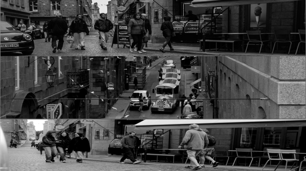
i think these three images perfectly showed off over population as you had all these buildings pilled up on top of each other with narrow streets filled up to the brim with cars everywhere which would get in your way when trying to navigate the small town. also another issue these three photos may represent is mass tourism which could be the reason why these small towns maybe over populated in holidays such as the summer and winter.

inconclusion I believe that I was successful with portraying Anthropocene in many different ways by showing various different ways we pollute the planet (overpopulation, air pollution, littering, construction and polluting are seas).

for my virtual gallery I decided to use the images I decided was the best images out of all of my final outcomes. I decided to put them in a gallery of there own so they stand out and speak for themselves which suits the topic of Anthropocene. I also included some of my typography images as well to go along with them in a separate gallery as I didn’t want them to get jumbled up with my Anthropocene images. for next time I think I should take more photos so I can come out with more final outcomes and more photos to edit for next time.

Anthropocene

what is Anthropocene?

Anthropocene is essentially the effects/impacts that humans have on the earths topography. it covers everything that impacts the planet such as landscapes, ecosystems, and limnology. this was driven mainly driven by industrialisation such as deforestation and urbanisation. The term Anthropocene originated from the Greek words “Anthropos” and “kainos” (which mean human and new)

Why and how are people exploring Anthropocene?

photographers have started to gain a big interest in this topic as its all of the things its linked to (damage to the earth) is being spoken about on all social media which is why i believe the topic has gained to much interest over the years this is how

documenting environmental degradation: photographers are capturing images degradation of the environment, such as climate change, overpopulation, and deforestation. the point of these images is to show the evidence of the damage that we have made to the planet.

the human-nature relationship and how its portrayed: photographers are exploring the relationship between nature and humans. these photographers are taking photos to essentially document how we are treating the planet, as well as how we are damaging it

raising awareness and advocacy: through photographers work they are helping raise awareness of all the problems that we are creating. they use tools by to help engage peoples emotions and to get people thinking about how we can change what we are doing to the planet basically getting people to take action and make change.

showing how nature is fighting back: some groups of photographers and single photographers are capturing what nature is doing to fight back. they do this by capturing ecosystems and species that are able to adapt to the damage that we have created to help survive.

Overall photographers are very important when it comes to documenting Anthropocene not just for the present by also for the future so we can look back to see if we have made difference in the future if that’s going to be positive changes or negative changes who’s knows. inconclusion these photos can inspire people and also encourage people to be different.

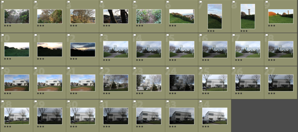
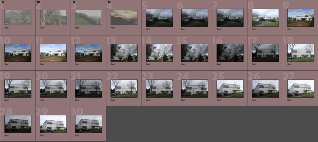
Rural landscapes contact sheet

green coloured:

these are photos that I consider that perfectly match the criteria I was given or just one or two things I could have done better and it would be perfect. (rural landscapes, Ansel Adams similarity’s and also some storm damage). these photos are rated 4-5 stars

yellow coloured:

these photos are rated 3 stars and I consider them decent which were a bit off from what I had pictured in my head when I wanted to make these photos.

red coloured:

these images didn’t fit what I wanted at all and can not be salvaged with editing to fit what I wanted for this project at all and is why they are rated 2 stars or just 1.

best outcomes from my photoshoot

even though this photo isn’t much of an Ansel Adams I liked how the image turned out as it has some nice textures and you can see some colours coming through the branches.

this photo captured a nice sunset shows off other things such as hills fields and sea. which is why I picked it.

this photo captured lots of different textures and has some different colours to it throughout which I why I believe its one of the best I took.

Ansel Adams case study

who is Ansel Adams?

Ansel Adams was born in 1902 in San Francisco and was a famous photographer in 20th century, as he was well known for his landscape photography as he would capture mesmerizing photos of American’s natural beauty that had been untouched and had been preserved. His most common spots to take pictures would usually be at national parks as it was one of the few places that had kept its natural beauty to capture in west America. Ansel Adams signature style of taking photos for landscapes was captured in Yosemite park. as he captured a picture of a mountain peak using a heavy camera, a tripod and his own additional gear. he visited a place called half dome where he would use visualisation. this would really launch his photography career as would go on to create some memorable photos such as:

North Dome, Basket Dome, Mount Hoffman, Yosemite, 1935

Yosemite Valley, Yosemite National Park, 1934

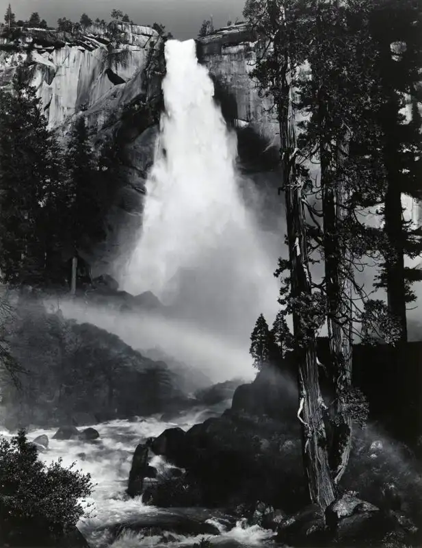
Nevada Fall, Rainbow, 1947

Ansel Adam’s love for the American west came from the fact that he just loved nature. Quoted by Ansel Adams he visited such national parks like Yosemite and Sierra Nevada as they were “coloured and modulated by the great earth gesture”. his first trip to Yosemite was in 1916 were he would start his journey in photography as his father gifted his first camera , an eastern Kodak No.1

what is visualisation?

Ansel Adam’s always said visualisation was when you could see an image in the mind prior to using exposure. as its a continuous project up until the final print. Ansel Adams with some of his friends also created a thing called the “zone system”.

what is the zone system?

the zone system is a chart that ranks numbers from 0 to 10, this could be used to determine. this can be helpful as it could you visualise a photo before you go for your final print to really determine what you want.

Ansel Adam’s camera (kodak brownie) only consisted of two filters: one red and one yellow. for example the yellows would help browns stick out and look better. And the red filter would create an unrealistic look to the image.

Group F/64

Group F/64 was a group that was founded by Ansel Adams that consisted of 7 photographers from the 20th century, their aim was to create “pure photography”. Which could be considered as hypocritical as their work was enhanced before the final image was printed. however this group still created the zonal system which lead to producing some photographers who started to slowly grow into the spot light like Ansel Adams.

Edward Weston, had become far more recognizable for their work, this was shown when he took pictures of vegetables with this one being the most recognizable.

Ansel Adams links to romanticism

Ansel Adams was known for creating some of the most memorable pieces of the 20 century. some would say he even modernised transcendentalism, which is essentially the idea that society is spoiled by the very things they created like massive city’s that are so “brilliant” when they already have brilliant things such as nature with these beautiful landscapes that Ansel Adams is showing off in all his photos. this obviously links to romanticism as some could say this is a similar event to the 18th and 19th century Europe with paintings that artists created.

when looking at the pictures Ansel Adams took you could easily say that his images take inspiration from romanticism as they have many similarity’s.

Romanticism intro

what is romanticism?

Romanticism was a cultural movement that started in the 1800s but peaked in round about 1800 to 1850. it was essentially artists and poets criticizing the “lavish life” living in big city’s and also science as they thought it was glorified and wanted people to be glorifying nature and how happy people were living in the countryside’s in the middle of nowhere. this is because people that lived in these remote areas even though they weren’t very fortunate they were seen as a lot happier than these people that lived in wealthy places. inconclusion, there is 5 elements to romanticism which is individualism, emphasis on nature, emotion over reason, freedom of form, and exploration of the unknown.

Casper David Friedrich 1832

context to why the Romanticism movement started

the reason why romanticism started was because writers and artists rejected the age of enlightenment as it was all about undermining religion and other beliefs.it was all about pushing intellectual and philosophical ideas hence why it was also had the nick name of the age of reason.

coming from an era of enlightenment the art formed grew out of the disillusionment regarding reason and order after the French revolution in 1789, this when the French decided to revolt against their monarchs and wealthier population. Bringing a change to other countries in Europe such as Britain, Italy and Spain which adapted to these ideas.

what is the difference between bucolic and pastoral?

bucolic often refers to the nice and relaxed county life and its nature. And pastoral is quite similar as it focuses on the positivity of the working elements of country.

the art of the sublime

the art of the sublime has been understood to mean the quality of greatness or grandeur that inspires in awe and wonder. this specifically relates to to landscapes.

Romanticism artist-

John Constable, was a well known Romanticism artist in the 1800s, he liked to paint his personal concept of what the countryside was like similarly done by other artists. however he was able to still exaggerate the elements of nature. this was due to john constable growing up in a small village (Suffolk) where he had first hand experience what the country side was like first hand . this experience he had when he was younger would go on to inspire his paintings in the future.

final outcomes for portrait. project, evaluation and artist reference

for my masculinity and femininity project I based my project based off of Claude Cahun and Cindy Sherman my creating or recreating some of the photos they have made by using techniques they have used in the past through out my work.

comparison

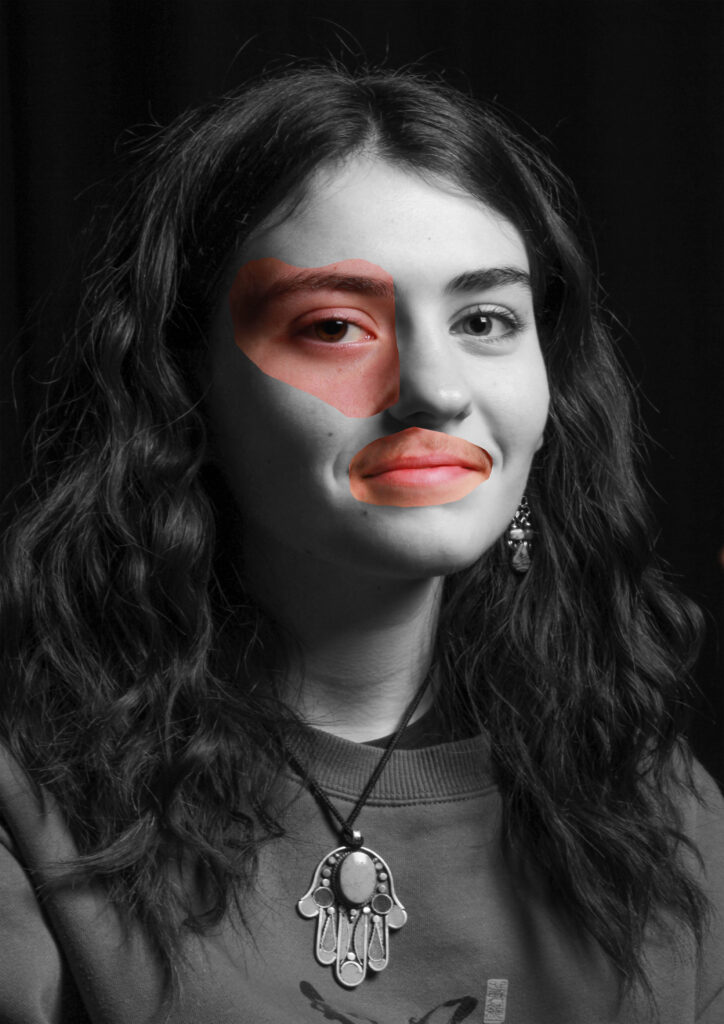
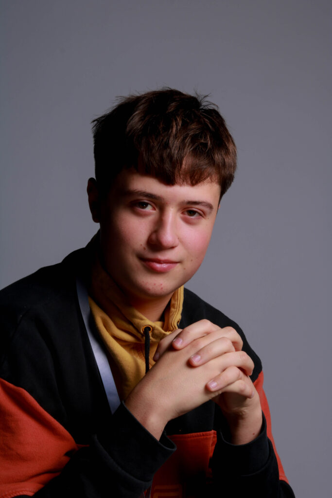
in my opinion, I believe that I have captured the basis of what I wanted to achieve by when I created the images. however I wanted to put a little twist on one of the photos for the first Cindy Sherman image bellow I had it as a coloured image with a light pink lighting to still give it a girly feel even though I had a male model. And then for the rest of the images I wanted to recreate the artist images to the best of my capability. I was mostly inspired by the vintage photos of Cindy Sherman and Claude Cahun and therefore wanted to make my photos look vintage by using photoshop and adobe light.

studio portraits

for the studio portraits we had to come up with outcomes that used the different lighting techniques such as Rembrandt, butterfly and chiaroscuro. and also have images inspired by artists such as Henry Mullins.

inconclusion I think I came up with photos that fit the criteria that was given as I was able to have a chiaroscuro, Rembrandt and butterfly lighting effects while also trying to fit the style of the artists Henry Mullins.

however, if I had to go back and do it again I think I would try have more photos than I took to experiment with than what I had to help create additional images and diamond cameos as I didn’t get to create as much as I would have liked. and to also experiment with different multi-exposures.

artist reference- Claude Cahun and Cindy Sherman

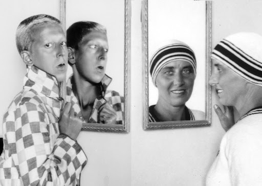
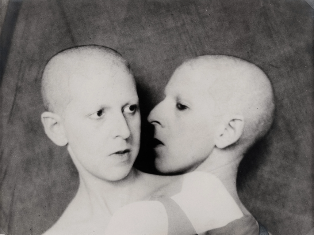
Claude Cahun (Lucy Schwob) was a French photographer and writer. she has a very good reputation for being one of the first people to explore gender fluidity through photography, making her working advanced for her time even through it would have been seen as quite controversial as gender fluidity would have been looked down upon by the majority of the public in the 1940s .

Claude Cahun was born on October 25th 1894 in Nantes France, who would later move to jersey in 1937 a few years before one of the most historical things would ever happen in jersey (the Nazi invasion). she would eventually have to hide her religion and her identity to pretend to be German. making her work even more of a risk during the occupation as the Nazis were against any sort of gender fluid idea as they wanted to create the “perfect race”.

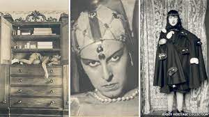
Cahun photographed herself in many different outfits and settings in self portraits to explore many different identities. her reasoning behind this was because she liked the idea that femininity and masculinity could be altered and challenged in multiple different ways as shown in the photos above and bellow

this photo is titled “under this mask, there’s another mask”

Cindy Sherman

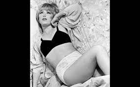
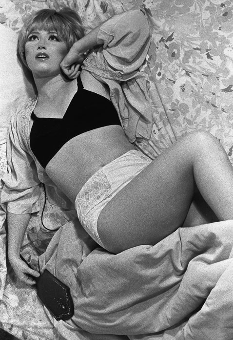
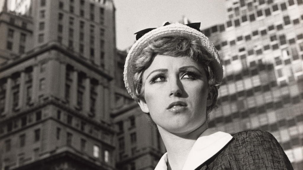
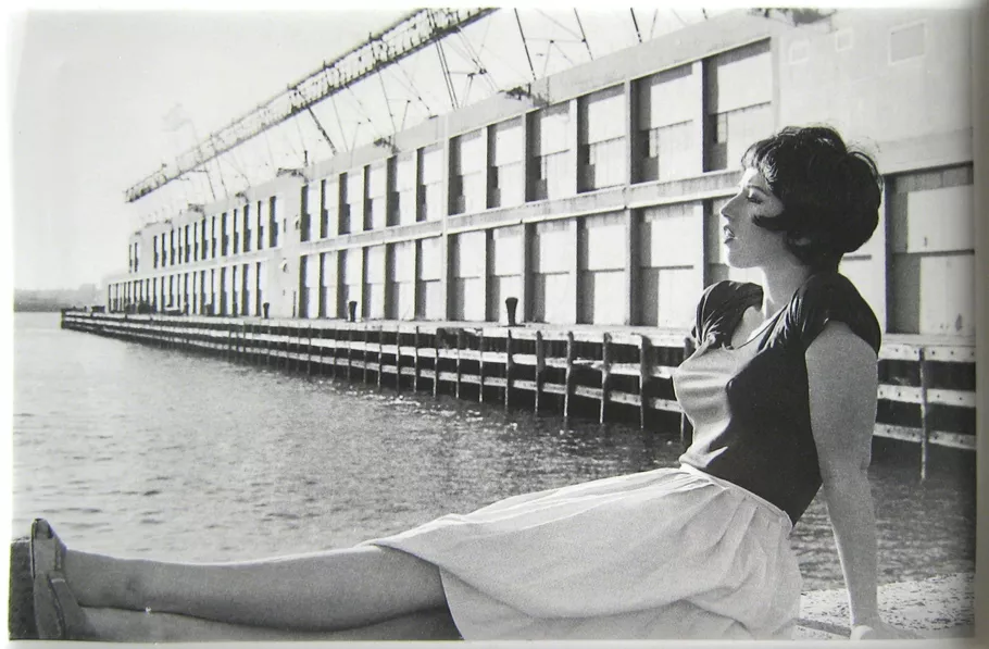
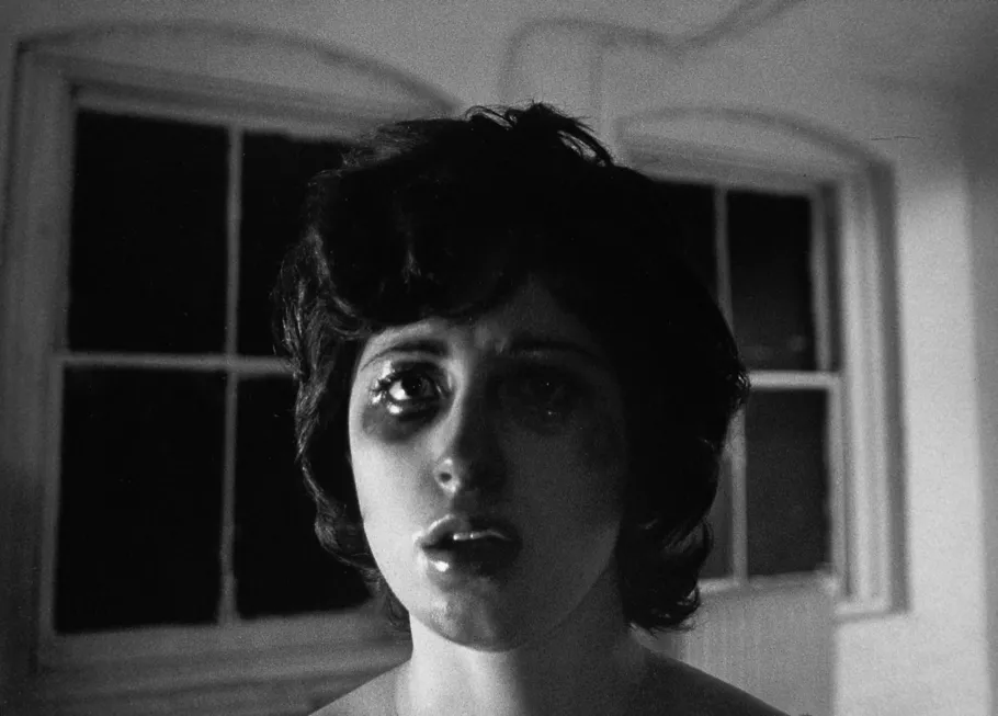
born in united states, in 1954 Cindy Sherman is a photographer who was known for her feminine characters and the identities she would create, it was as if she was playing a character in each photoshoot. she was the idea behind it all as she was the model, photographer, stylist and the make up artist.

over a period of 4 decades she took a numerous amounts of photoshoots exploring the idea on how to create and represent femininity. Cindy Sherman’s most famous pieces came from the “untitled film still #21” which was essentially Cindy Sherman in black and white photos where she would have multiple different outfits and personas.

contact sheet masculinity and femininity + plan

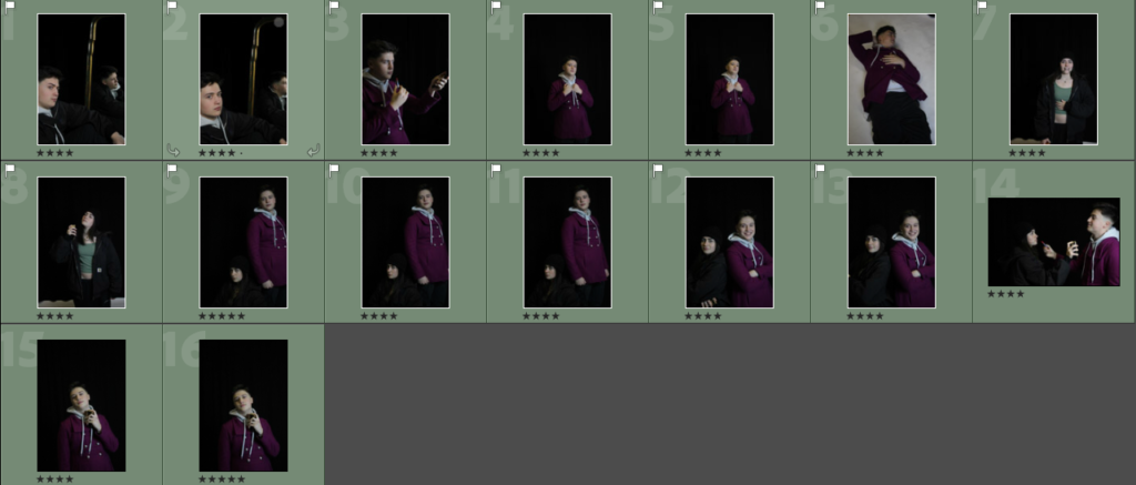
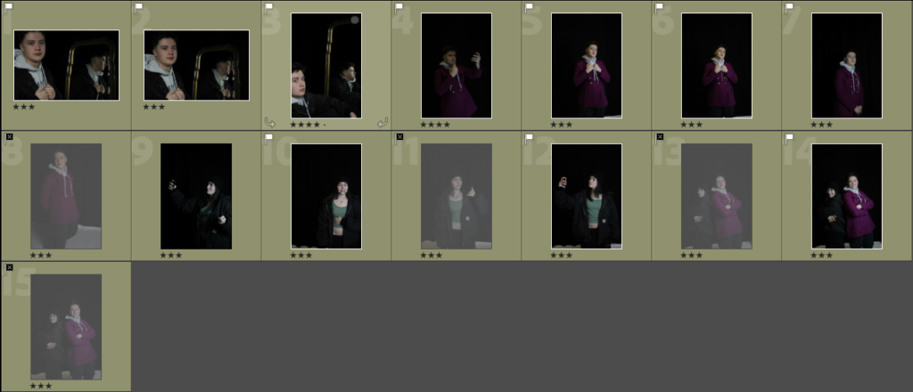
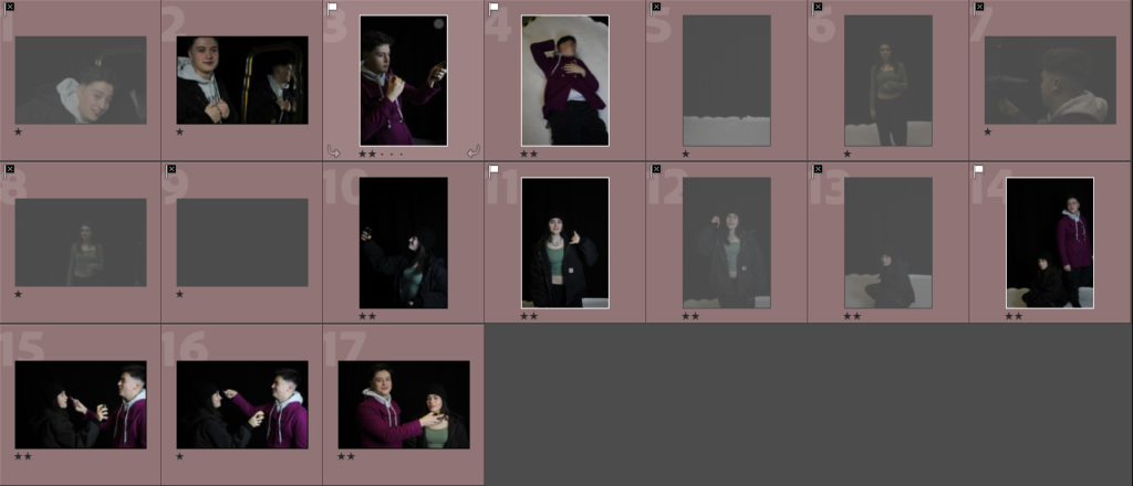
for this photoshoot I wanted to show masculinity and femininity by bringing in props to make the models look more like the opposite gender while trying to make some photos that have links to Cindy Sherman and Claude Cahun. I accomplished this by bringing in props such as a women’s jacket and lipstick for the male model and I also brought in a chain, a men’s fragrance and beanie to make the female model look more feminine. however if I was to do the photoshoot again I think I would to try to take more photos and try and get different types of photos focusing on certain things.

4-5 stars (green coloured)

3 star photos (yellow coloured)

1-2 stars (red photos)

in conclusion I think I came out with a lot of photos that I think are appropriate for the project that I think fit the description of what I wanted.