All posts by Eden Mulliner

Filters

Author:
Category:

Anthropocene photoshoot plan

What aspect of Anthropocene am I taking photos of ?

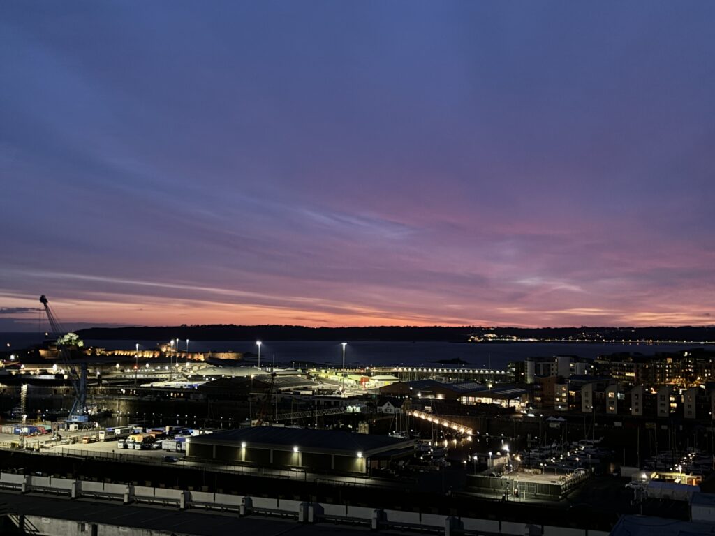
I’m going to take photos inspired by light pollution and the amount of light that is emitted from buildings and large areas that overlook town, I’m also going to get photos of sunsets over buildings and over St Helier.

Where am I going to go ?

I’m going to go to high advantage points that overlook large area of land. For example I’m going to go to Fort Regent and walk all the way around the Fort to get views from all different angles so that I get photos overlooking Havre de pas but also overlooking town as well and then around by the car park on pier road at a high advantage point so that I can get photos looking down on to the car park and I’m going to use artificial light to brighten areas up on the photo and to highlight certain areas. I’m also going to go to the other side of town by Peoples Park and walk up the hill by the park so that I can get a better view of the bay and also that overlooks the other end of town. My final place that I will go to take photos is over dale hospital as there is a big drop right behind it that overlooks St Aubin’s bay and the other side of the island. I will do two areas per photo shoot.

What time of the day will I take my photos at ?

I’m going to take my photos at night time and then use exposure bracketing if I want to make my photos darker or lighter or make it look like there is more light pollution. I’m going to take photos from all different times of the day ranging from the morning to mid day and then at night to get different perspectives of light pollution throughout the day.

Anthropocene Artist Study

Anthropocene ~ Artist Study ~ Liu Bolin

Liu Bolin is a Chinese photographer and performance artist known for using chameleon style methods to immerse himself in the environment. The meaning behind Liu Bolin’s photography is that he blends in with the environment and this links to the way that the Chinese society is ruled as the people don’t have a voice and just blend in and don’t stand out.

What inspired Liu Bolin Photography?

Liu Bolin ~ At the end of 2005, I was living in Beijing and working as an artists assistant. Beijing’s art world at this time was thriving. All 140 artists in Suo Jia Cun were exclusively making art, and this is what I knew I wanted to do.

Image Analysis

The colour that is painted on Liu makes him very camouflaged with the rest of the image so he blends in with his surroundings. The texture in this image is very rough and uneven which suggests that he wants to fit in. The meaning behind his photos is that he is stuck in a controlling society and that in his country the people don’t have a voice and don’t have access to speak what’s on their mind. Liu Bolin says in a Ted Talk that he is sometimes called “the invisible man” because the Chinese government treats the population as a whole rather than giving people their individual voice. The invisible man also suggests that he is seen as just someone in the background and he doesn’t stand out just like nobody else stands out in the population. The surroundings of the photo add no value to him as a person as the image is in a public place that has no meaning which again has connotations that the people in China are treated like they are worthless and have no meaning or value.

Mandy Barker ~ Biography

Mandy Barker is an international award winning photographer who is British. She is mostly known for her work with marine plastics from the ocean, and has worked alongside scientists to try and bring awareness to the amount of plastic that is being used.

What inspired Mandy Barkers Photography?

The ever growing problem of plastic on the UK coastline and just how much of an issue its causing for the environment. She was inspired to use the plastic from the oceans in her photography to create a montage of images from the plastic that she collected.

How does Mandy Barkers photography relate to the theme of Anthropocene?

Mandy Barkers photography relates to the theme of Anthropocene as she collects washed up bits of plastic from the oceans and creates something spectacular and beautiful out of something that is very negative and is ruining our planet. With these amazing montages that she makes she makes awareness of the plastic pollution problem. Mandy Barkers photography consists of using plastic objects from the beach and arranging them on a black background or a piece of black fabric and then she uses those edits to build up the objects into a montage and adds more colourful images that she has photographed of a particular object to make the montage more interesting and appealing to the eye. This relates to the theme of Anthropocene because it shows that when more of the edits that she photographed are added to the montage the more plastic objects and rubbish from the oceans is in her photography which is trying to show just how much plastic is in our oceans.

Mandy Barker Image Analysis

The texture of this image is very rusty and bumpy that shows the wearing of the plastic objects. This also suggests that plastic takes years and years to break down and decompose. The meaning of this photo is to show how much plastic there is in our oceans and also to show that something that is so ugly and disgusting can be turned into something so beautiful and eye catching. The colour in this photo makes the image a lot more appealing to look at and directs your eye to more of the phot as the colour is drawing your eye in. The idea of this photo is to also try and use up some of the plastic that’s in the ocean and to show the sheer amount that is in our oceans. The size of the objects in this image makes the photo seem like its deep in the ocean and that there are thousands of plastic objects in the sea and on the shore. By changing the size and the opacity of the objects it makes it look a lot more crowded and full and shows that the ocean is heavily populated with plastic.

Anthropocene

Mood board

What is Anthropocene ?

Anthropocene is the impact humans have had on the world these are things such as pollution and overpopulation and using up the worlds resources until there is very little left for everyone else. People have been so emerged in social media.

What inspired Anthropocene ?

Anthropocene was believed to have started in the 18th century at the start of Britain’s industrial Revolution which created the first fossil fuel economy. Burning the organic carbon in fossil fuels enabled large scale production and drove the growth of mines, factories and mills.

What’s the importance of Anthropocene ?

Humans have become the most influential species on the planet, causing significant global warming and other changes to land the environment and water, and overall effecting the atmosphere .

Image Analysis

This lines in this image from where the truck has dug paths in the soil act as leading lines to point your eye in the direction of the focal point being the truck in the middle of the image. The lighting in this image has a lot of shadow from the sunlight from the end of the tunnel which creates contrast between the areas in the tunnel that have no sunlight reflecting on them and the areas in the tunnel that do have sunlight reflecting on them. The lighting on the truck also makes the focal point stand out more and directs your eye more clearer to the truck. This image shows the damage being done to the world and how humans are draining the world of its recourses and if the world runs out of its recourses then there will be no more in the future when the worlds population will have increased more leading to bigger and more complicated problems. The composition of this image is balanced between the shadows and the lighting coming from the entrance of the tunnel. The background in this image is large scale which almost shows just how big of an impact humans have had on the world and just how large the problems that we have caused have become and how much larger they will get if something is not done about the pollution of the world.

What I’m going to do for my Anthropocene Photoshoot ?

I’m going to do my Anthropocene Photoshoot on light pollution and how the amount of light that is admitted has an effect on the atmosphere. My Photoshoot is going to be on the light from buildings and from streetlights and I’m also going to use artificial lights like torches to help give more light to my photo. I’m going to use a tripod to get clear pictures and so that I can get the angles for the photos right for example if I’m photographing a multi layered car park and the lighting from it is only reflecting in one area the camera will need to be still to try and get that photo right. I’m also going to get images of buildings with lights reflecting from them and the different lights that they admit into the atmosphere. I’m going to go all around town and around the waterfront to get these images as the most amount of light pollution will be around town and amongst the buildings and the businesses that are around town. Another idea I had was to take pictures of cars when they are driving to photograph the headlights and the brake lights to show how much light they admit at night and the amount of gas emissions that come out of the exhaust.

The New Topographic Photoshoot

Artist Reference ~ Stephen Shore

Stephen Shore is a Contemporary American Photographer, best known for his colour images of street corners and plates of food, suburban baseball fields and parking lots. Stephen Shore said “I discovered that this camera was the technical means in photography of communicating what the world looks like in a state of heightened awareness,” which made him take his photography seriously as his photos show a different side of the world.

Image Analysis

His images are recollections of experiences but they are taken in a careful and considerate way. His images are taken with a large format camera which makes his images a lot more precise and increases the quality of his images both in colour and in the form. The layout of this photo is very chaotic and there is a lot of things going on in the image which makes it quite confusing to look at. There is a petrol station and cars parked in a parking lot both in one photo which creates a more interesting concept. The rainbow in the sky creates a contrast between the dark colours of the cars and of the background of the image as its all very dramatic dark colours whereas the sky is a pale blue and white colour. The lines in this image from the car and from the reflection in the puddle act as leading lines to the focal point of the image.

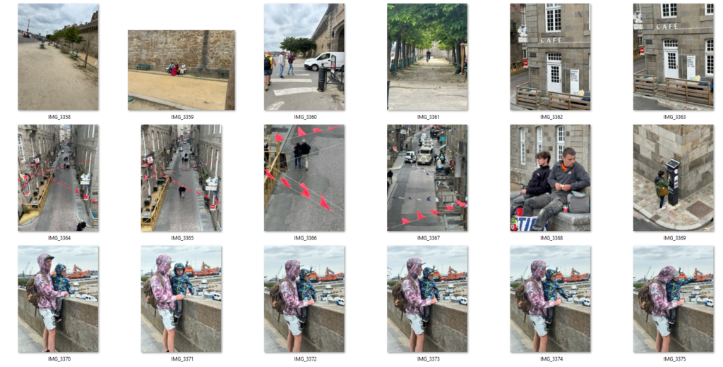
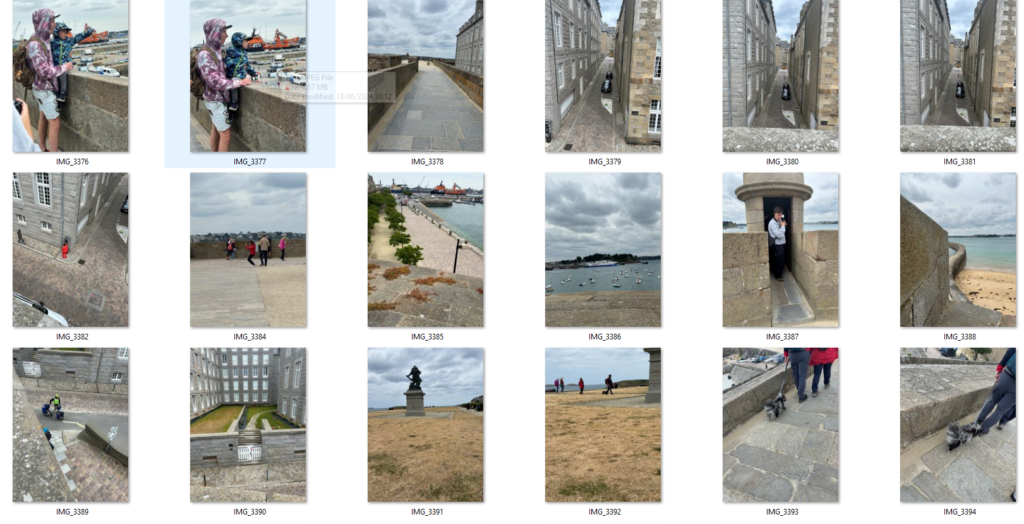
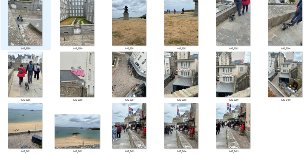
Contact Sheet

The New Topographics

What was The New Typo graphics

The new Topographics was a term coined by William Jenkins in 1975 to describe a group of American photographers such as Robert Adams and Lewis Baltz who had a similar Banal Aesthetic, in that they were formal, mostly black and white prints of the urban landscape. The photos often captured the tension between natural scenery and the mundane structures of post war America.

What Inspired the New Topographics

Many of the photographers associated with new typographics including Robert Adams, Lewis Baltz, Nicholas Nixon and Bernd and Hiller Becher, were inspired by the man-made, selecting subject matter that was matter-of-fact.

Image Analysis

This photo separates the natural beauty of the mountain and then the trailer park below it juxtaposing the negative and the positive of the post was in America as many Americans lost their homes from the destruction of the was and couldn’t afford to stay in their houses any longer as they might of lost their families or their partners to the war. The colour in this image is in Black and white which makes the image look more dramatic and more powerful, which gives the image a dark and sombre look to it.

Industrialised building photoshoot

Edited Images

Best Images

These are two of my best images as they capture industrialisation the best. The lines and shapes in these two images make the photos look so much more interesting and different. The line of the poles in the first image is a really good focal point and the lines in the sand direct your eyes to the focal point. The colour of the sky also makes the poles stand out more as the contrast between the dark sky makes the white look more vibrant.

In the second image the building in the background has been there for many years and is quite old but in the foreground the building has only just been built and is very modern . Which contrasts between old and new. The tree in the background suggests that this place was once overflowing with nature until industrialisation took over and buildings needed to be built to accommodate for the growing population.

Edited best photos

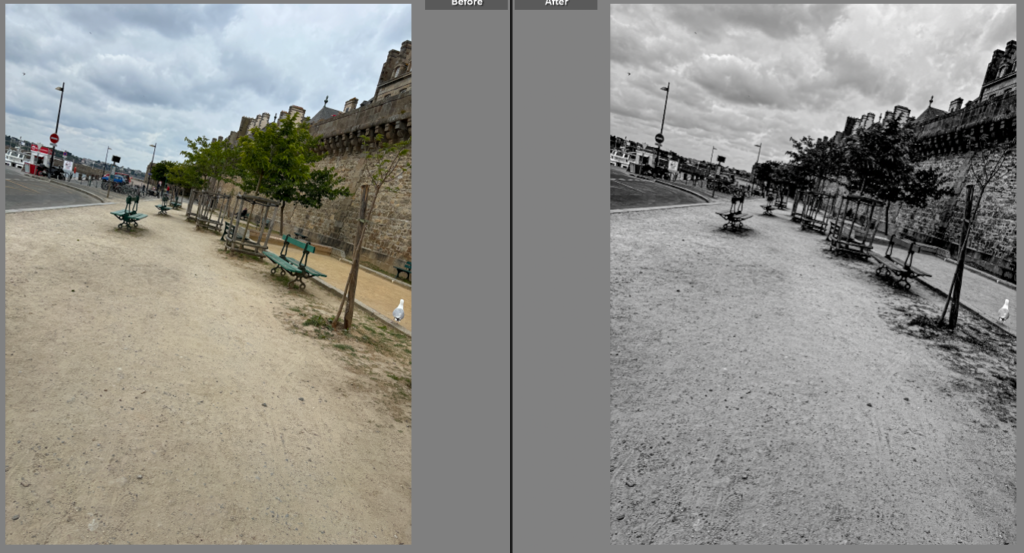
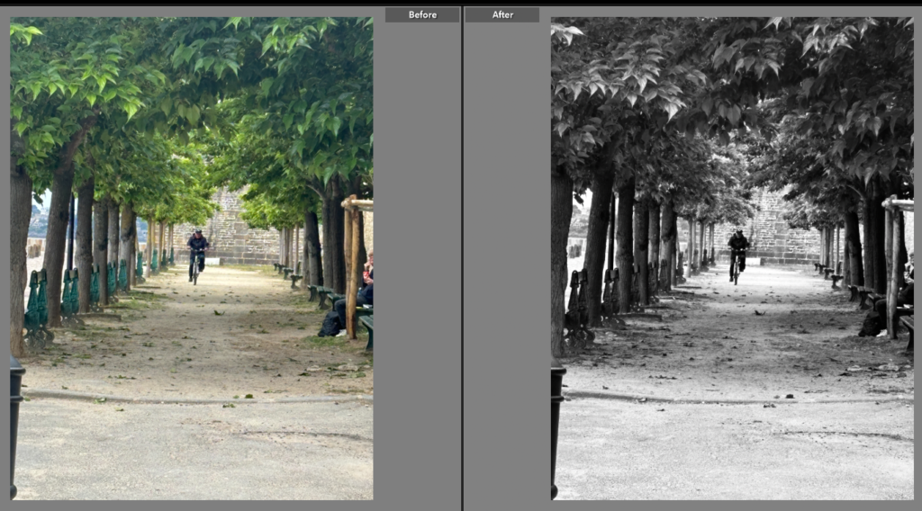
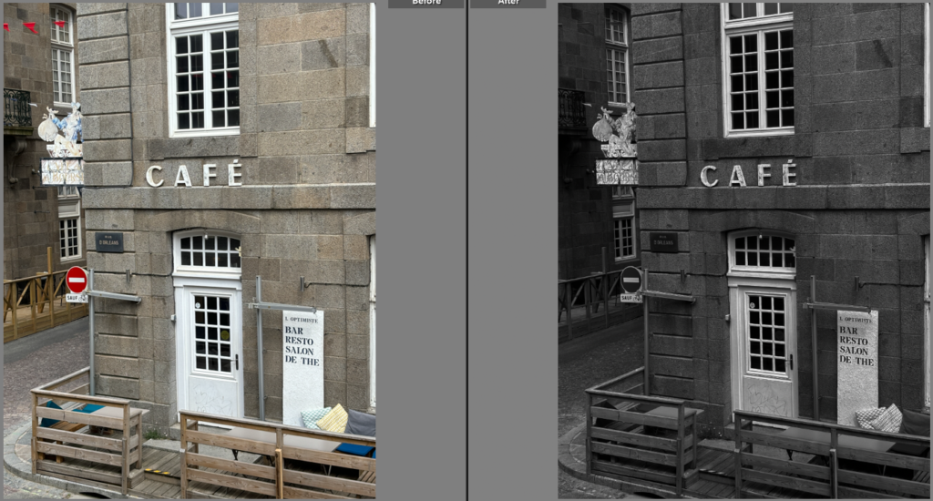
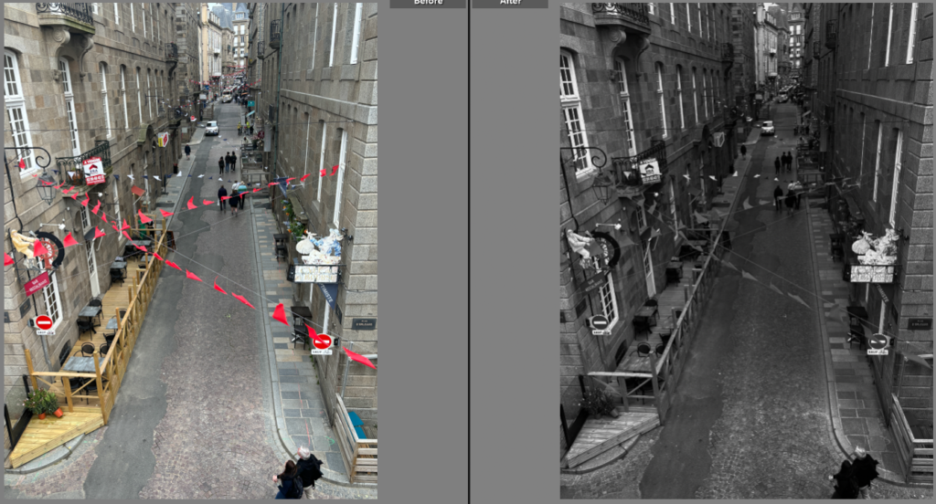
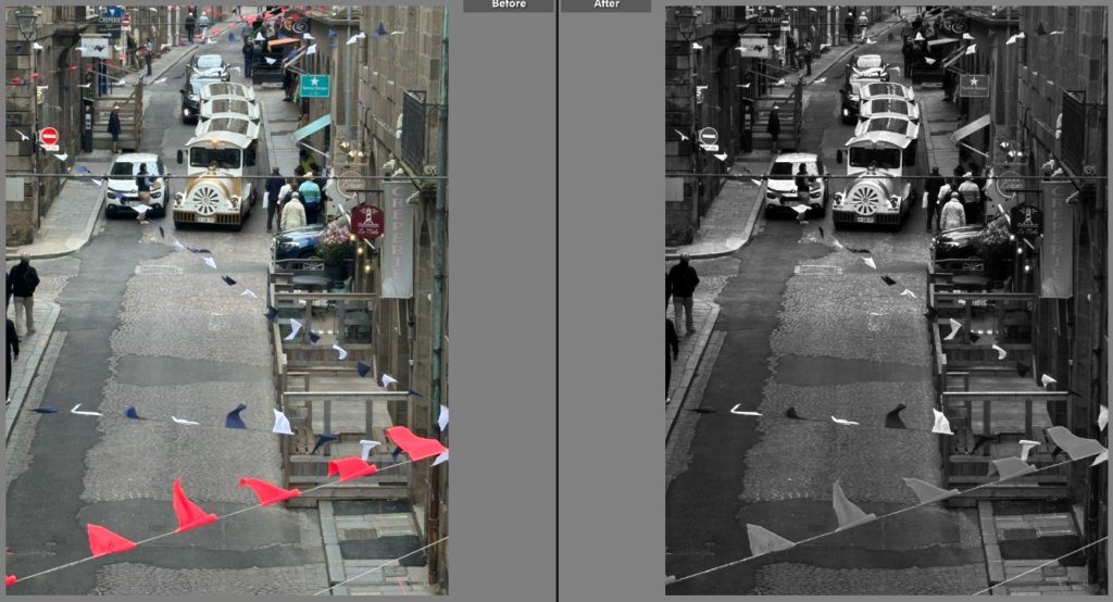
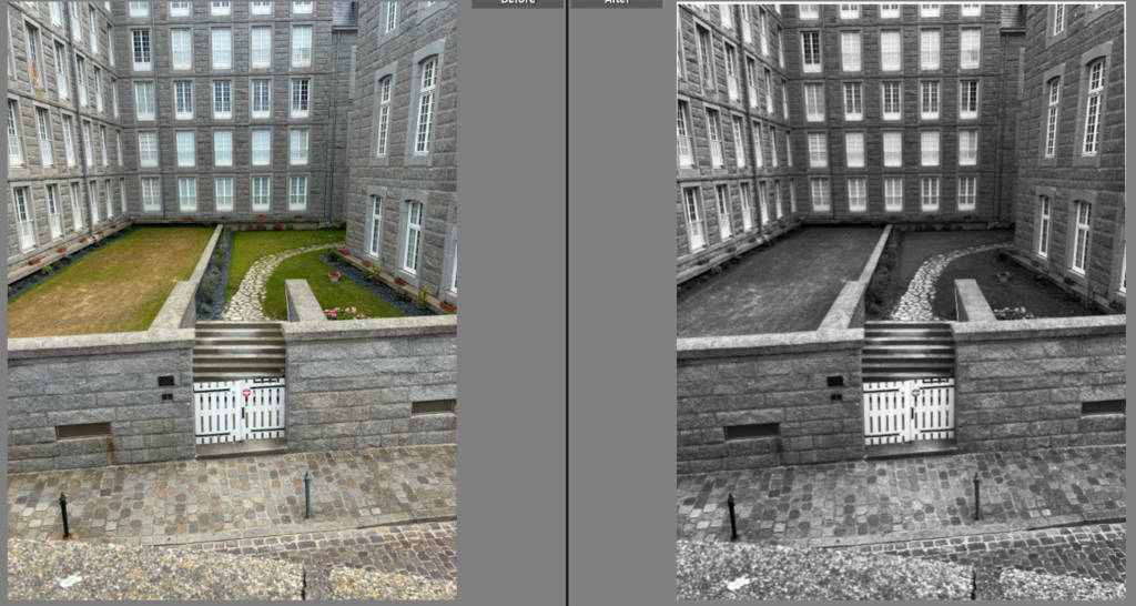
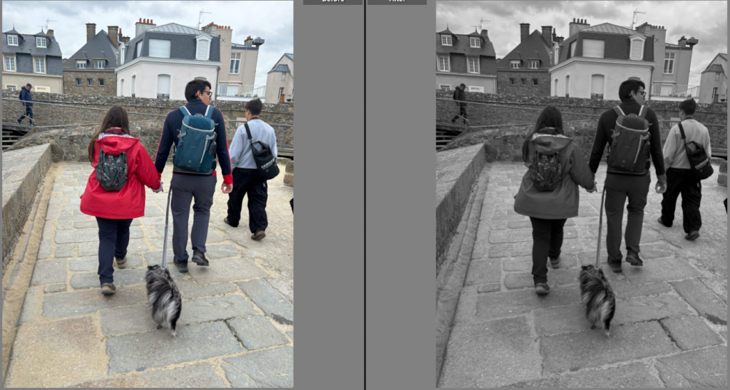
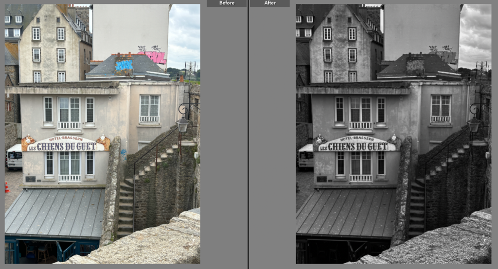
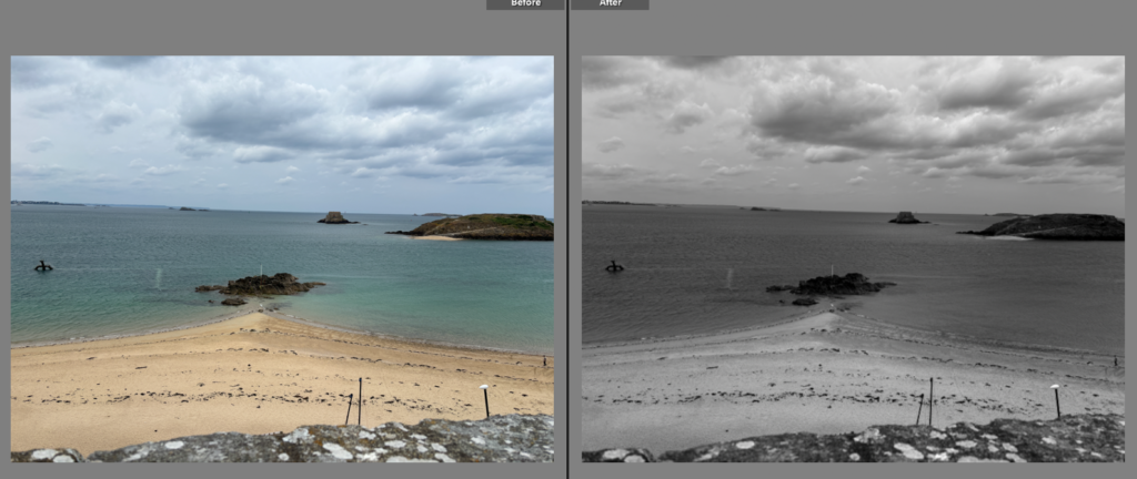
I changed the colour into black and white and then changed the darkness of the sky to give a more dramatic and darkened contrast between the sky and the rest of the image.

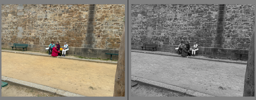
I further experimented with my photos and made this image of the stairs a darker shade of blue and altered the angle of the stairs making the stair rail straighter and look more in line with the stairs.

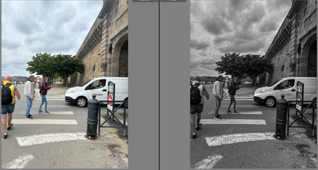
For this image I made the image on the right a lot darker by increasing the shadows and decreasing the amount of whites on the image.

John Constable Case Study

Biography

John Constable was born on June 11th 1776 East Bergholt Suffolk and died March 31st 1837. He was a major figure in English Landscape paintings in the early 19th century. He is best known for his paintings of the English countryside.

Who was John Constable influenced by ?

John Constable was influenced by Dutch artists such as Jacob van Ruisdael and Jacob van Ruisdael. Constables work was highly original because of the realism and vitality of his paintings.

John Constables Paintings

Image Analysis

The colour in this painting is very dark and dramatic and looks like the painting is representing a storm and how small the person in the painting actually is compared to the storm and the severity of the storm. The size of the person in the painting shows just how destructive and terrifying storms can be. The lines in this painting suggests how dramatic John Constable tried to make the painting as the dark black lines have been painted in all directions which make the painting look very chaotic. There is no pattern in this painting which doesn’t make it very aesthetic to look at and makes you not know where to look at the painting because the directions of the lines are all over the place and not in any specific pattern. The layout of this painting is focused more in the middle of the painting and a bit towards the outside but is mainly in the middle where the storm is painted.

The idea behind this painting ?

The idea behind this painting is linked to the sublime as the storm can be so beautiful and mesmerising but also terrifying and can turn and destroy anything so quickly. The thought behind the painting to make the man so small also suggests how big the storm can get and how much more powerful the storm is compared to the man in the painting.

Romanticised rural landscape photoshoot plan

Plan

My plan for the romanticised rural landscape photos are to go to Plemont beach because of the rocky beach to get photos similar to Ansel Adams photo of the rocks. Then I’m also going to go to the cliffs to get more dramatic photos of the sea and the rough waves.

Depth

The depth of this photo is very wide as there is a lot of the photo in view and it extends out quite far. The leading lines are from the stones and the beams of light that lead your eye to the focal point being the mountains in the background.

Colour and light

The colour in this image is very dark colours and uses the Zone System to understand all the colours that are in the image. The use of light in this image is very dramatic light but the sun beams that are in front of the mountains give contrast against the dark light on the stones.

Shadow

The shadow in this image is on the mountains and on the stones on the beach which increases the dramatic effect of the light on the image.