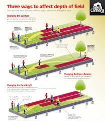
Print Screen 1:
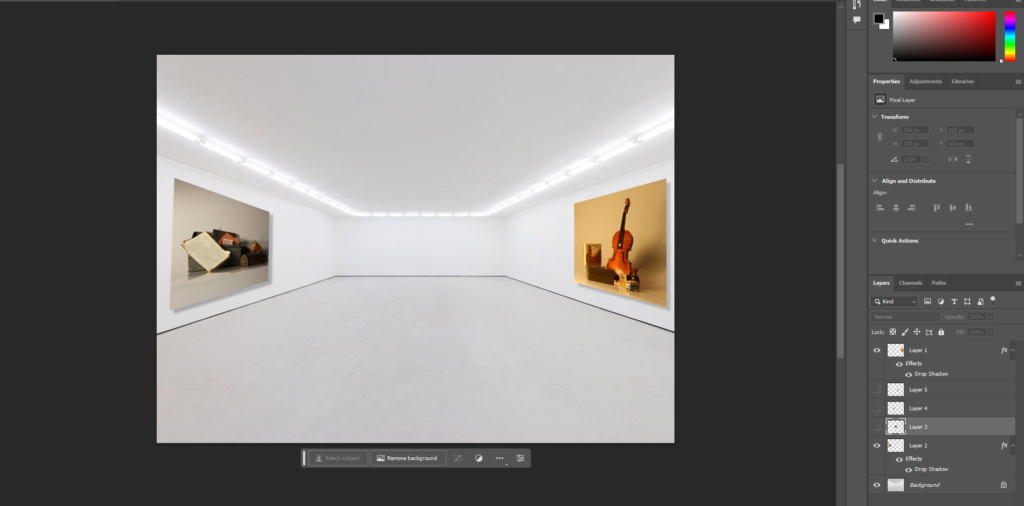
To start with, I opened up a plain gallery photo I found on the internet, I chose this one because there is lots of space where I can add my own images in. I began with these two images because they are definitely two of my most successful images that I have taken and edited so far. I thought that by adding these to the sides without any other images near them, it prevents distractions when looking at them, and means the viewer can focus on them more. By using photoshop I was also able to add shadow effects, and slant the images on the sides to add a sense of realism, it already began to look professional.
Print Screen 2:
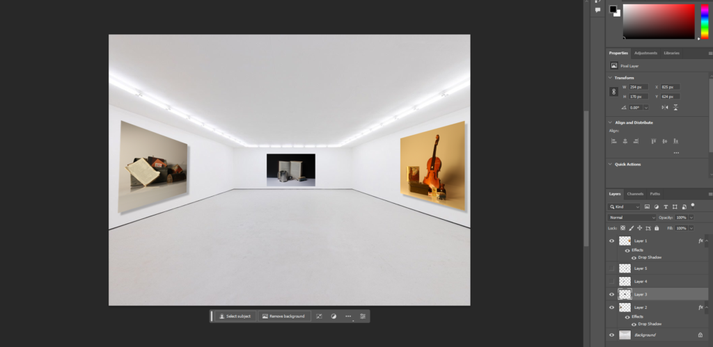
I then moved on to the back section of the gallery, where I added another still life image I had taken in the middle. I did this because it looks efficient if my still life photos are equally separated. I did not need to add any shadows to this image because it was a neutral shot, meaning I can not see any of the sides.
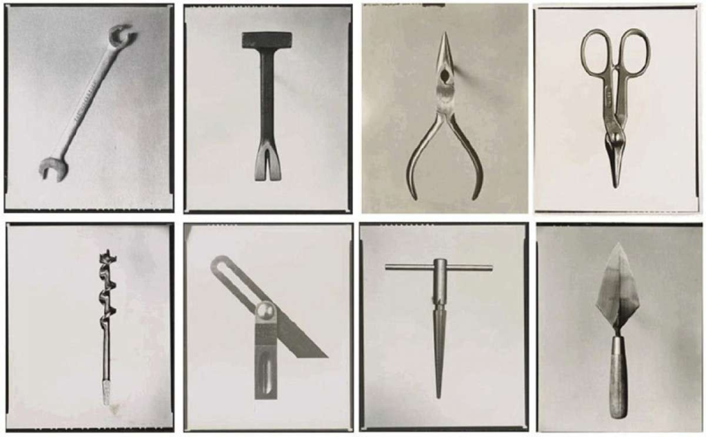
Final Virtual Gallery:
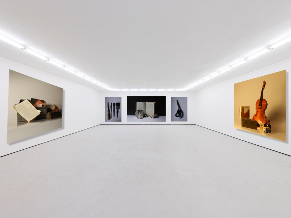
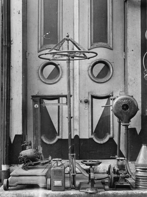
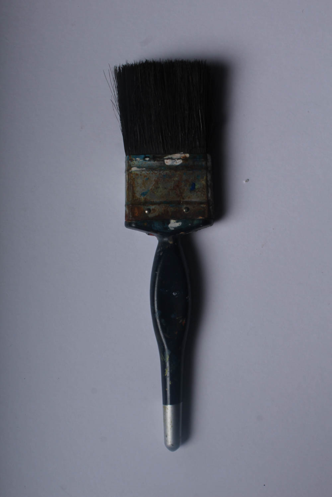
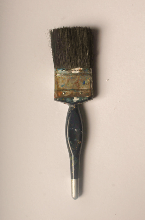
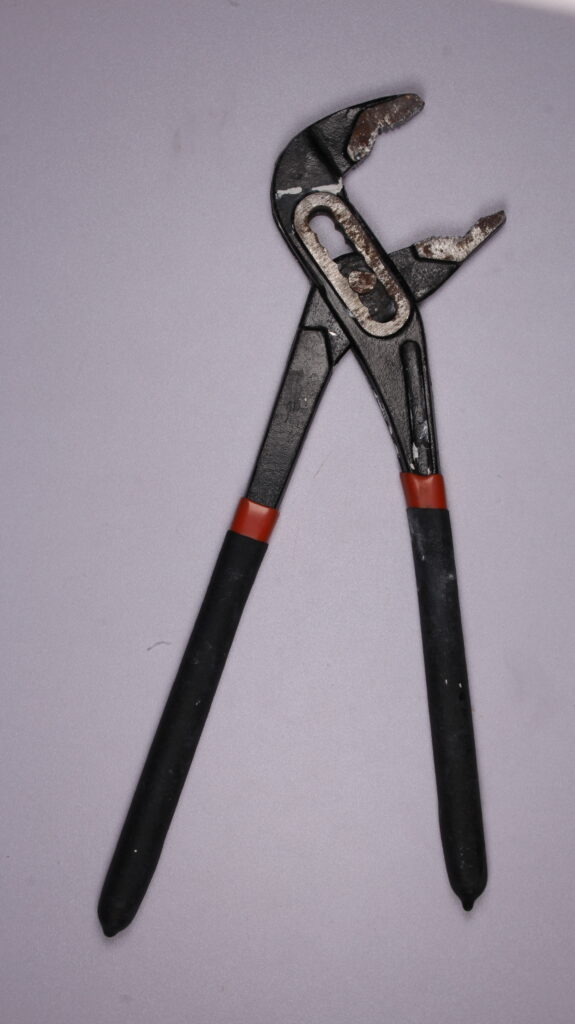
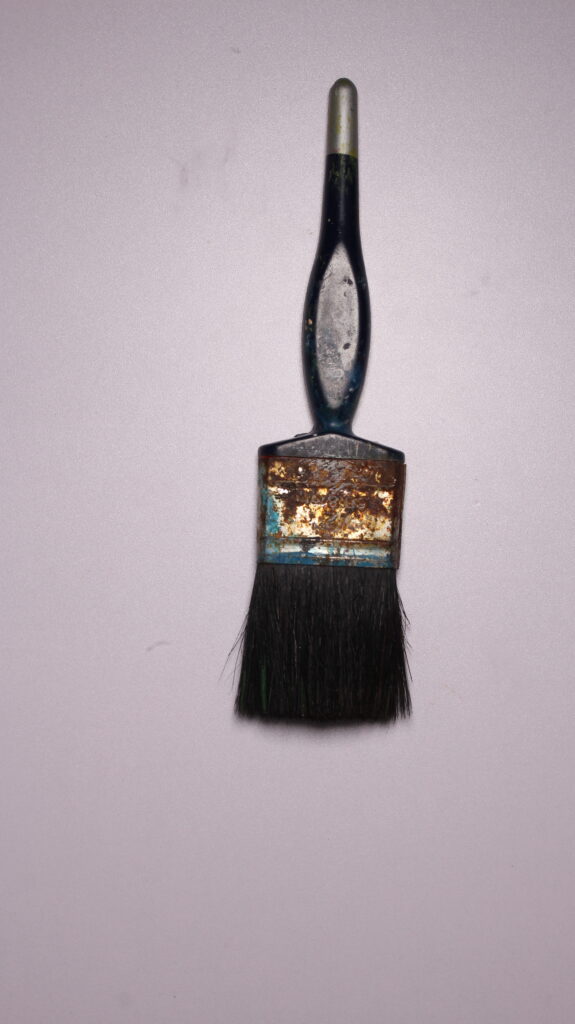
This was the final result of my virtual gallery, after I added in my final images. For the final two, I decided to incorporate photos of tools, which was inspired by Walker Evans and Darren Harvey-Regan. I did this because it created a realistic contrast of photos you could find in a real art gallery. I like the effect of the two tool images separating the still life because it creates disparity, and therefore makes each detail in each image more noticeable and eye-catching.