All posts by Evie Burrows

Filters

Author:
Category:

Evaluation and Critique

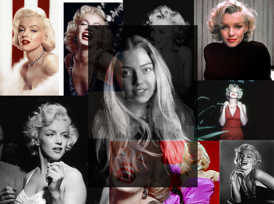
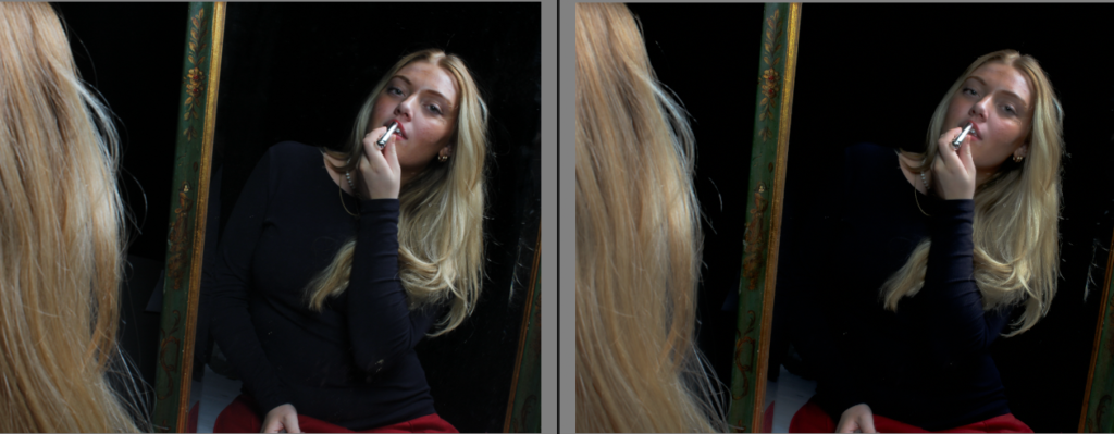
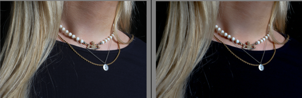
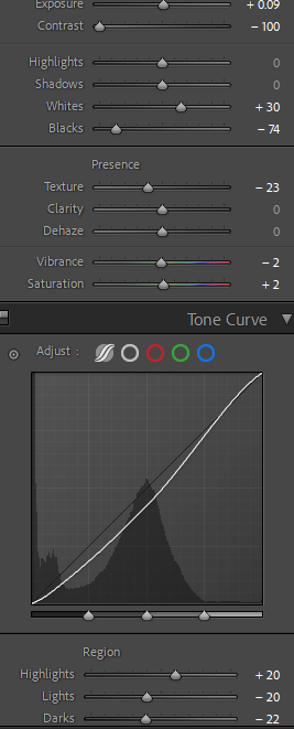
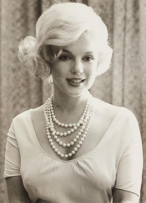
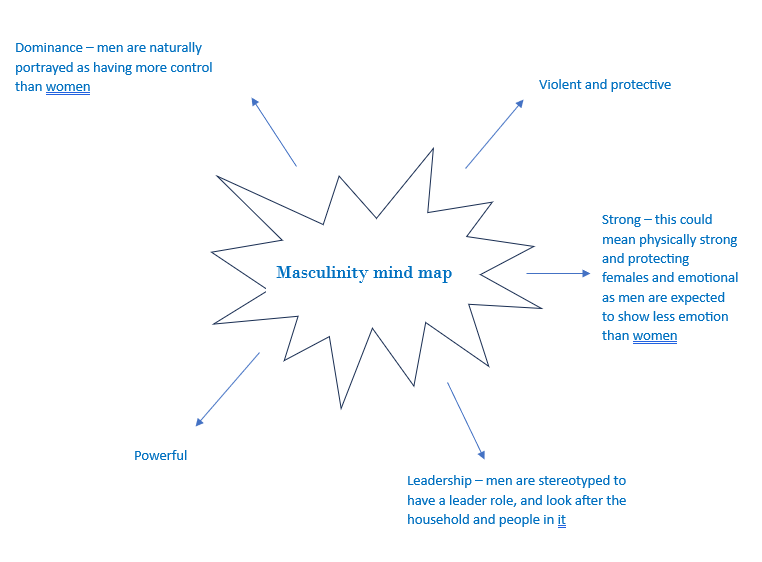
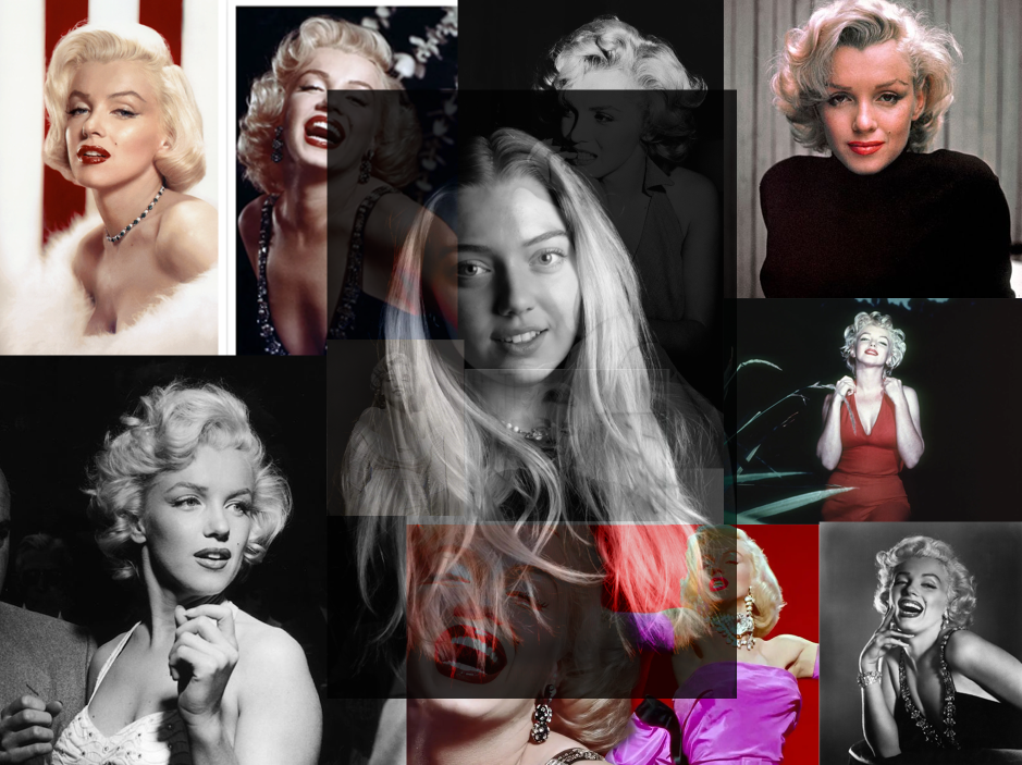
Overall, this final outcome is my favourite because I included prominent hints of my inspiration for my own image, which shows the viewer where I got some ideas from. I like how the background is all different photos of Monroe, yet I added my own image on top, to ensure it is the subject of the overall outcome. I chose to do the collage of different phots of Marilyn Monroe because I think it adds a unique effect and gives the overall outcome some life. I also like how I added coloured photos of Monroe in the background, not just black and white. This added a more appealing look. To achieve this, I adjusted the opacity of my own layer on top, which allowed the entire outcome to blend more, and have a seamless look. I like how I managed to combine my own image with my inspirations to show the similarities and differences between them, but they blend well and compliment each other due to the similar approach we did.

However, I do think I could have changed some things within this outcome. One of the main problems I faced was time management, in which I had to rush my editing process. I don’t like how prominent my image is on top of the background ones. I think it would look more successful if I had blended out the edges of my image into the background, so it creates more of a fade. I also think it could’ve looked better if I kept my own photo in colour, rather than in black and white. I think this approach would’ve made my outcome look more unique.

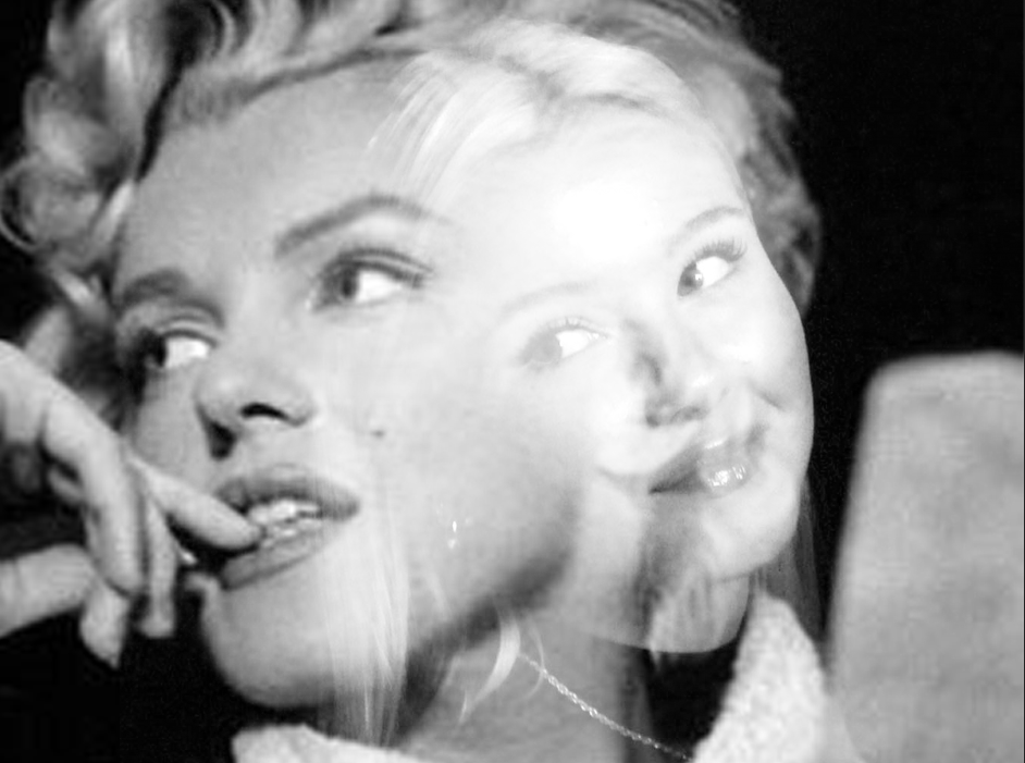
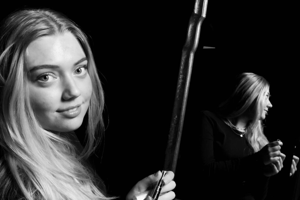
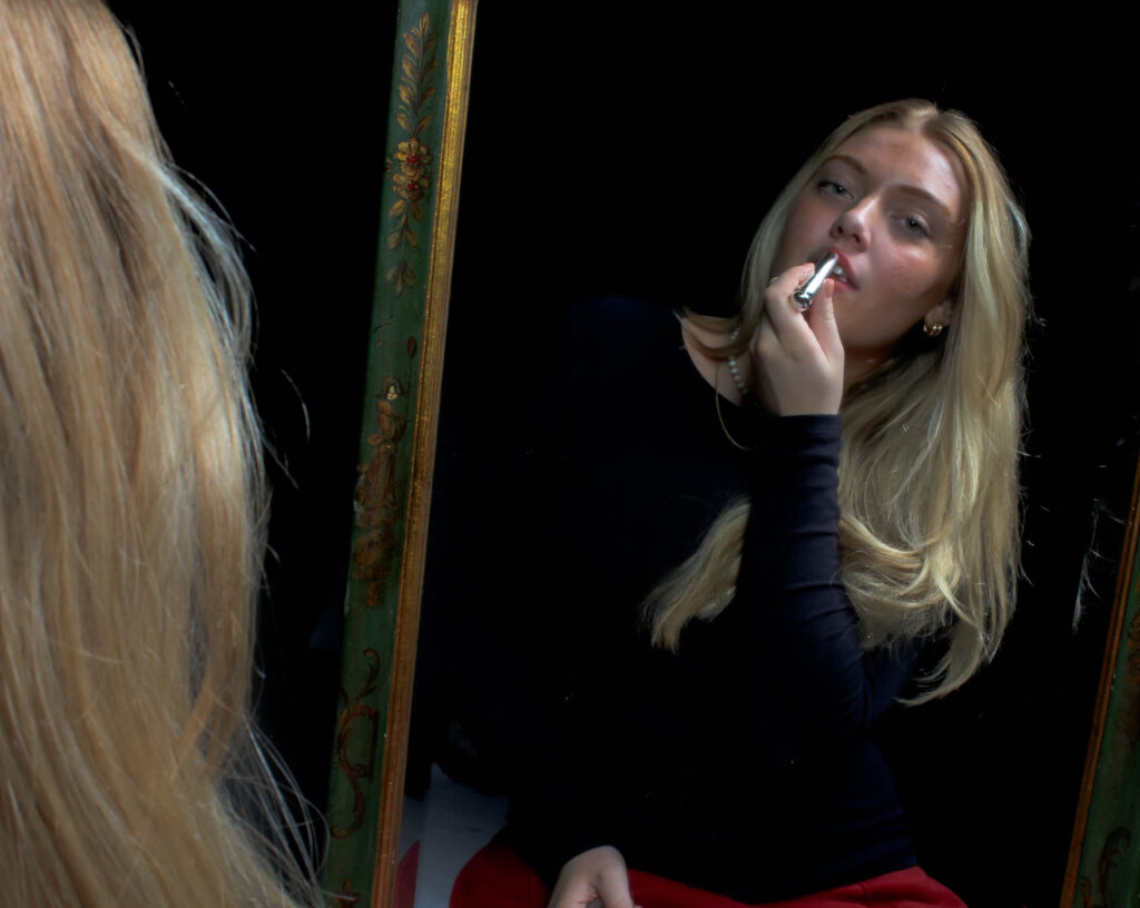
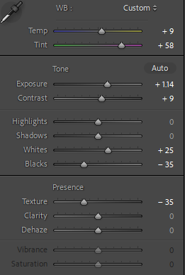
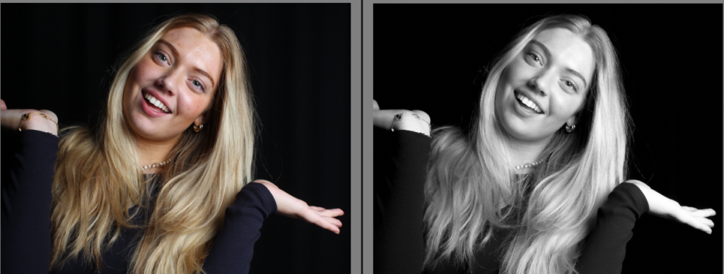
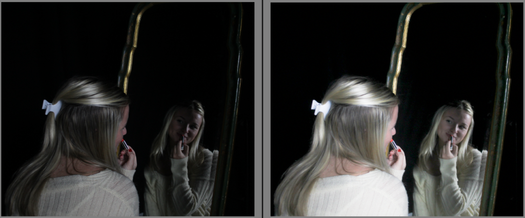
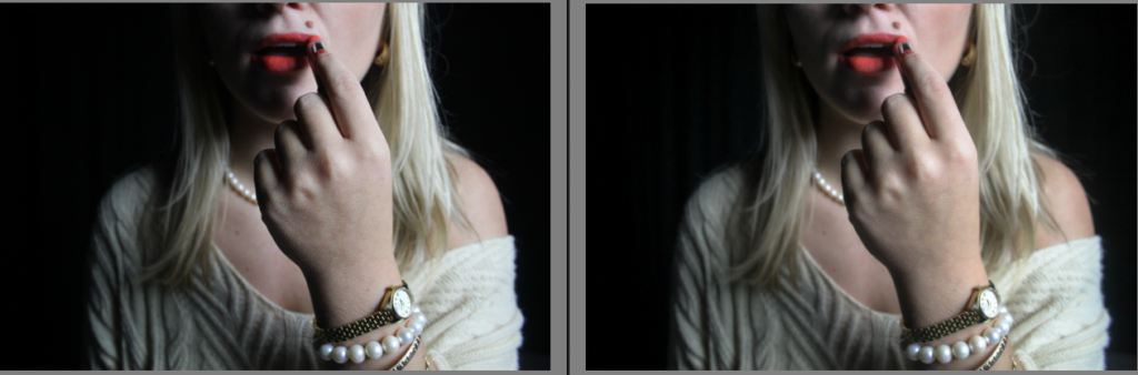
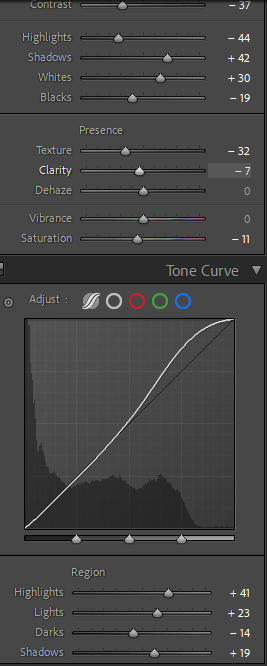
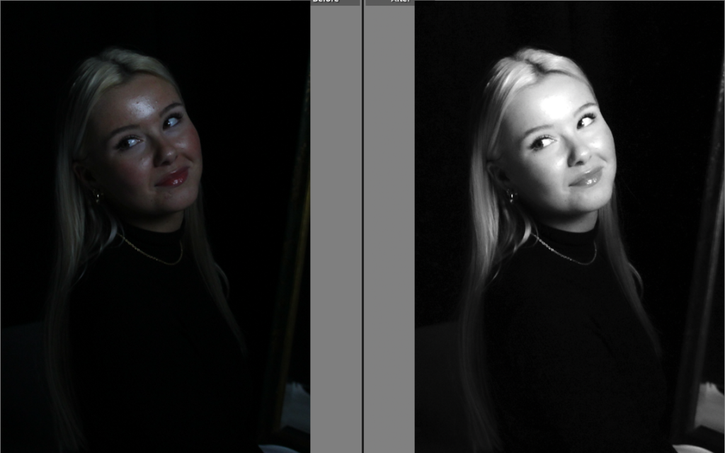
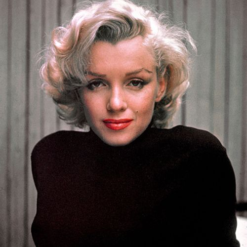
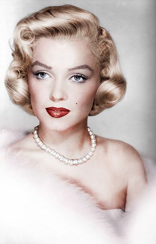
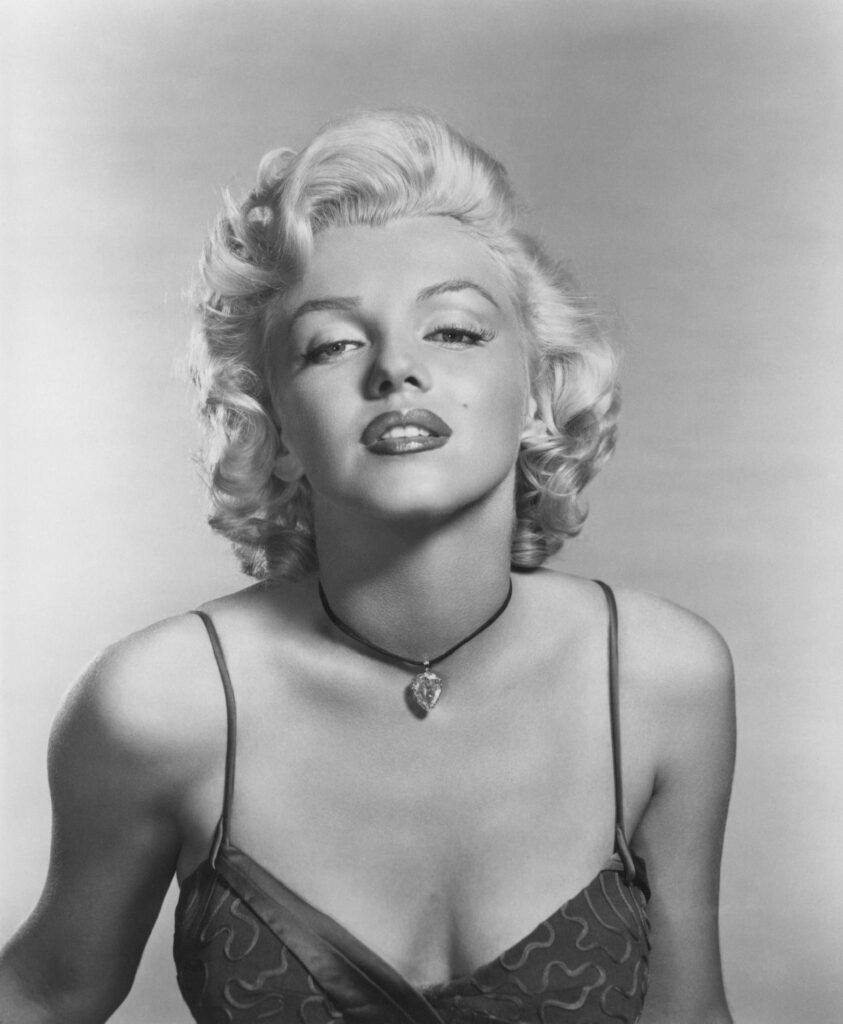
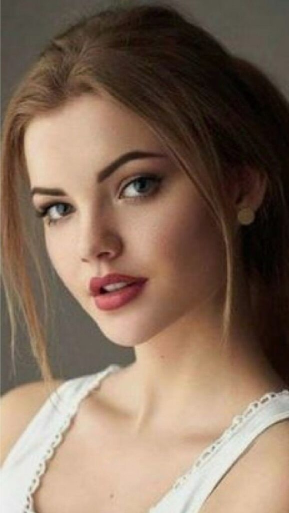
Within this outcome, I personally believe the editing on Lightroom went smoothly. The use of overlapping the two similar images of me and Marilyn Monroe portrays my aims and objectives to achieve. I like the lighting of my image as it is bright and luminous, which ultimately gives the4 image a happy mood. I chose to execute this technique as it shows how Marilyn was illustrated to the world as “perfect” with no flaws, which is a big part of femininity. However this contrasts with the cold tones in the image, as I made it black and white, which is similar to Claude Cahun’s photos. I overlapped these two photos smoothly so the outcome didn’t look too harsh. I did this because I think it looks more gentle, which is essentially what women are stereotyped to be. I like how the viewer can still see my entire image and also Marilyn. In addition to this, I used this photo of Marilyn because I knew it would compliment my image because of the gaze we are both doing, this is a common thing that girls do because we are stereotyped as “self conscious”.

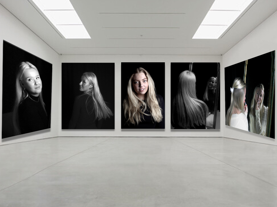
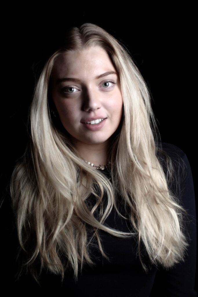
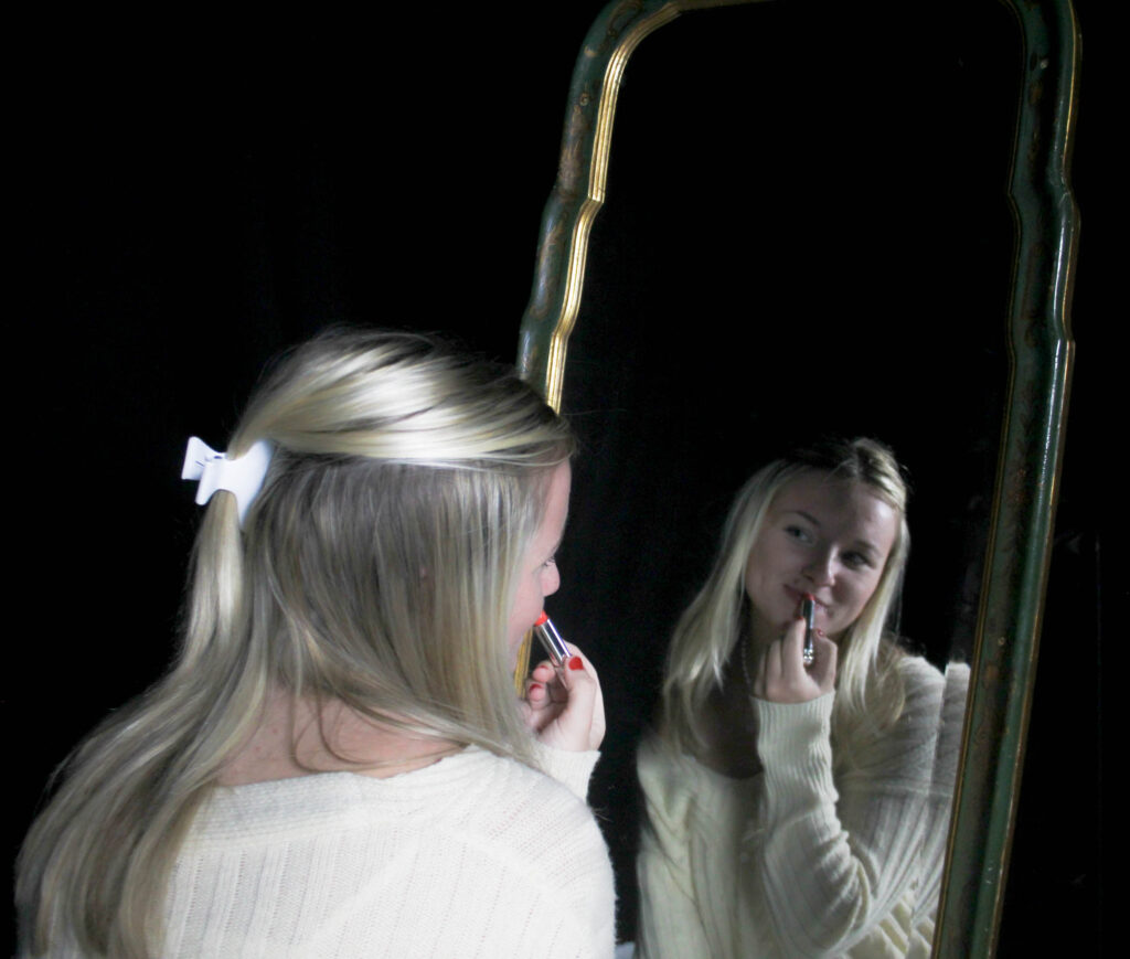
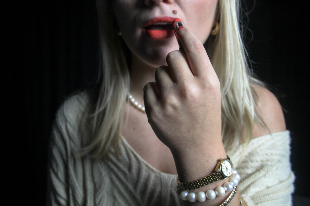
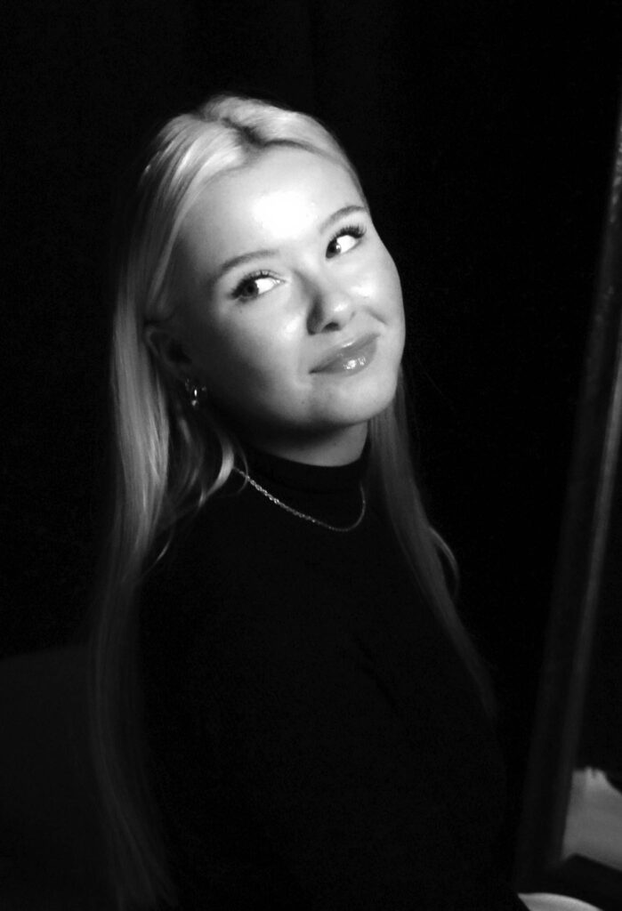
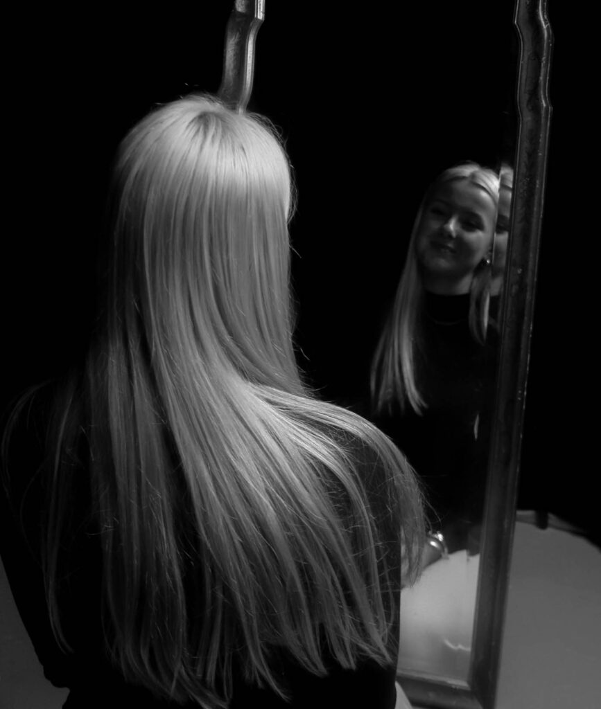
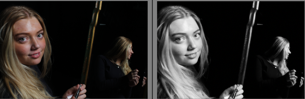
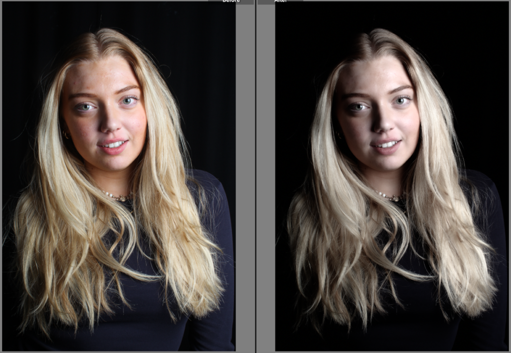
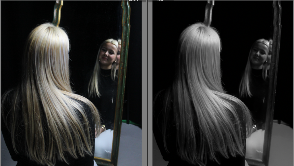
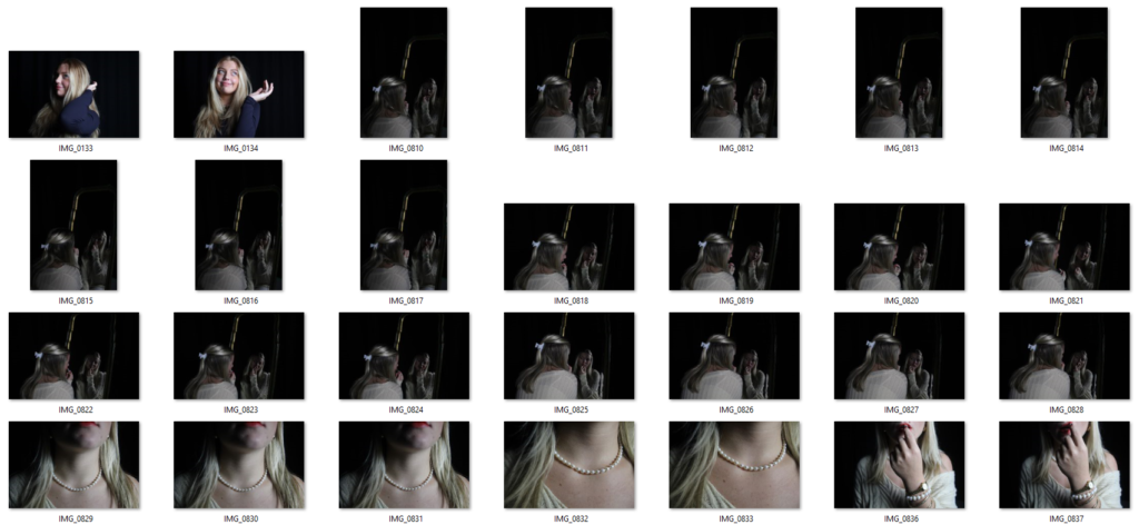
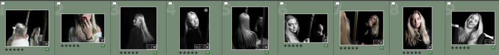
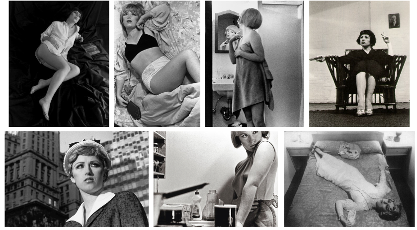
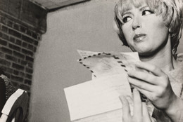
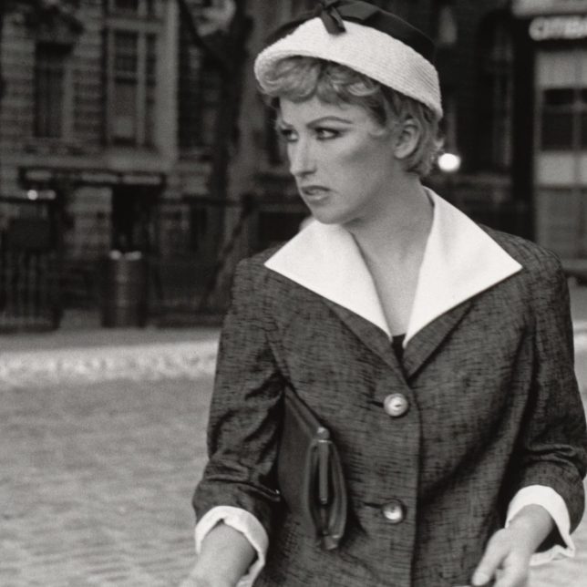
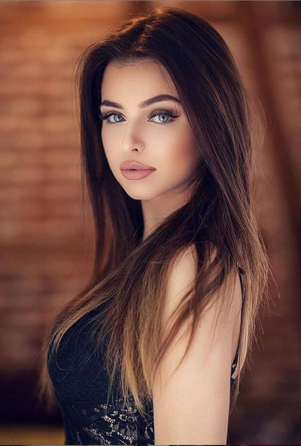
I chose to do a virtual gallery as a final outcome, because it portrays all my best images into one. I put my most successful image in the middle, so it draws the viewers attention straight away. I think this adds to the outcome because there are many resemblances to Monroe and our inspiration photos of her. It looks good because my model is doing the “female gaze”, which is very fitting for the topic of masculinity and femininity, and is also something Monroe does in a lot of her photos. Also, I like the middle image because it has different tones to the others; the other images are completely black and white, whereas the middle one has hints of colour which is intriguing and creates a contrast. I ensured the background was black in all my images so it gives a classy effect, while also allowing the black and white to stand out more and add a mysterious effect. I like how all of my images have a clear main subject, which is mainly the hair, as again it ties in with the femininity aspect perfectly.

Comparing my work to Cindy Sherman

Artist Reference image:

My image:

I see similarities between mine and Sherman’s work as we both explored the idea of traditional photos. This is seen in the black and white filter over both images. I like this because it gives the photo itself an ancient look, even in modern day photography taken with more technical cameras. Another similarity between both images is both models are dressed in dark clothing, which helps keep the viewer focused on the subject and their facial expressions. Finally the last similarity between the images is the use of not looking at the camera whilst the photo is being shot. I think this is a favourable touch as compared to posed photos, candid’s make observers feel more connected to the poster, feel more interested in getting to know them and like them more. This was driven by candid’s making people seem more genuine, which made others react more favourably.

However there are many noticeable differences between mine and Sherman’s final images. One of the main ones being the background; Sherman explored having a slight hint of colour to add some interest into the photo, whereas I wanted to keep my background plain as an object or model against a plain background will naturally stand out better and produce a stronger image. Another big difference between the two images is Sherman has added a grainy filter into hers, which ultimately makes it look slightly more ancient. I like this idea because grain makes the image look sharper as there is added texture. I did not add a grainy look because I wanted my image to appear softer, as I feel it symbolises femininity whilst also portraying a similar look to Marilyn Monroe. The last perceptible difference between the two photos is the hairstyle of the model. In the artist’s image she has shorter and “messier” hair with a fringe. A fringe on women was extremely trendy in the 1920s, which Sherman’s image compliments well. Whereas in my image I wanted a more sleek look, like Marilyn Monroe’s photos.

Image Editing and Experimentations

For my first edit, I knew I wanted it in black and white because I think it portrays a similar resemblance to many photos of Marilyn Monroe. I increased the exposure because I think it adds an advantage to the lighting, making the model’s face look brighter against the dark background.

For my second image I went into further depth with the editing, to achieve more unique outcomes; I decreased the lights and darks to create more of a contrast between them, and also adding shadows to give the outcome more definition.

For this image I wanted to create more of an ancient effect, in order to do that I had to decrease the saturation. I also decreased the texture so the model looked flawless like Marilyn. To prevent any distractions from the subject, I decreased the blacks so the background is easier to ignore. I also increased the highlights so the image didn’t look dull.

In this photo I made it black and white again, while decreasing the contrast so the image did not look too extreme. Although I increased the vibrancy because I didn’t want the image to look uninteresting, as well as increasing the highlights.

This image I also experimented further with as it started off as one of my most characterless photos, due to the lighting. I increased the highlights and vibrancy to substitute for the poor lighting. I decreased most of the other options such as shadows, whites, blacks, saturation and dehaze in order to emphasise the lights.

This photo I made it black and white by decreasing the saturation to -100, and also decreasing the vibrancy slightly. However I increased the highlights to emphasise the blonde in my hair, as this closely resembles Monroe.

Within this image, I decreased the texture as I knew it would benefit how classy it looked altogether. By increasing the whites and decreasing the blacks I was able to create a visible contrast, which I think brought out the jewellery in the photo, which is the main subject. Also, by increasing the whites it helped to emphasise the blonde tones in the hair.

In this image, the main subject has many lighter tones such as the jewellery, hair and skin complexion. I knew that in order to draw attention to these features, I had to decrease the blacks, while also bringing out the shadows to give the image definition.

This image was originally extremely dull, with poor lighting. Therefore I decreased both the temperature and tint of the image, while bringing focus to my hair. I wanted to keep the image quite dull, to add a sense of mystery, so I also decreased the lights and darks. However, I adjusted the highlights to 100 so my hair was still eye-catching, whilst being black and white.

I edited all of these images in Lightroom hoping I could achieve similar outcomes to Marilyn Monroe. Most of my photos are in black and white, which I also believe is useful as Cindy Sherman and Claude Cahun both embody black and white images in their work too. This way I am able to incorporate artists we have looked at, as well as embracing my own creativity and ideas. The use of black and white is successful because it gives the photos an ancient theme to them, which adds a sense of realism throughout my work. I believe this is important because Monroe became popular in the 50’s, in which all photos were black and white. I also cropped all of my photos so there would not be any unnecessary background distracting the viewer from the subject of the image. A common theme throughout my edited photos is increasing the exposure, which I did because I think it perfectly separated the light and dark tones in each of them, helping to highlight the different shades. Furthermore, I increased all the blacks and all the whites in each photo too, which made it easier to identify the main subject. This means that there was hardly any background in any of them, allowing the viewer to stay focused. Additionally, I decreased the texture in all of my images because I wanted to achieve as similar to Marilyn Monroe as possible, in which she always looked flawless in every photo.

Femininity Photoshoots / Contact Sheets

This photoshoot is inspired by Marilyn Monroe, as she was an American actress, model and singer. Known for playing comic “blonde bombshell” characters, she became one of the most popular sex symbols of the 1950s and early 1960s. We decided to explore the idea of Marilyn Monroe because she represents femininity and the idea of women being objectified. We incorporated little aspects such as making our blonde hair the main subject in some of the photos, and in some we emphasised pearls as they were an iconic symbol of feminism.

For our second photoshoot we portrayed similar ideas representing femininity. We took advantage of props such as the mirror in the studio, and we also brought our own props which we thought would portray a feminine mood; pearls, red lipstick and lots of other jewellery.

In this photoshoot, we knew we could resemble Marilyn Monroe by highlighting our hair throughout the photoshoot. We made this the focus in most of the images as it exhibits the feminine look, as well as incorporating the idea of Monroe being the “dumb blonde”.

Finally, for our last photoshoot, we made the mirror the subject of our images as this way the viewer will have something different to focus on. The use of red lipstick also symbolises Monroe as it is associated with confidence. “Red lips are universally appealing possibly due to the perceived association with sexual arousal”. We thought it was important to highlight this as it also tells a story on Marilyn Monroe being objectified throughout her life.

Here are all of my selected final images in Lightroom, before exporting them into a new folder in my documents. This way I will be able to edit them all separately

Inspired – Photoshoot Plan

Marilyn Monroe Inspired

Marilyn Monroe was born June 1st 1926 in Los Angeles, California and died August 5th 1962. She was an American actress who became a major sex symbol, starring in a number of commercially successful films during the 1950s, and who is considered a pop culture icon. Monroe portrayed an early image as a “dumb and seductive blonde“, later implied that she was a sensitive and insecure woman unable to escape the pressures of the Hollywood society: a society where women were objectified and treated poorly compared to men. Her vulnerability combined with her needless death raised her to the status of being an American culture icon.

Monroe gained the most recognition from the movie “Gentlemen prefer blondes” in which she played a dumb blonde character that essentially men were attracted to, sadly she was never seen as anything more than a pretty woman.

Monroe was widely known throughout the 1940s and 1950s. She received several thousand fan letters a week, and was declared “Miss Cheesecake of 1951” by the army newspaper Stars and Stripes. She was mainly recognised for her blonde hair, wearing excessive amounts of pearls and red lipstick, and modelling.

My Plan:

My plan for my photoshoots is to produce a large selection of photos in the studio, enhancing Monroe’s iconic and eminent touches to her look. I plan to embody mine and the other model’s blonde hair in a variety of different ways, whilst also including pearls and making them the subject in some images. This way, we are able to tell a part of Monroe’s emotional story to people, signifying the importance of women’s rights and femininity.

Cindy Sherman – Artist Reference

Cynthia Morris Sherman (better known as Cindy Sherman) is an American artist born on January 19th 1954, whose work consists primarily of photographic self-portraits, depicting herself in many different contexts and as various imagined characters. For 40 years, Sherman has probed the construction of identity, playing with the visual and cultural aspects of art, celebrity, gender and photography. She is among the most significant artists of the Pictures Generation. Sherman has continued to transform herself, displaying the diversity of human types and stereotypes in her images. She often works in series, improvising on themes such as centrefolds (1981) and society portraits (2008). Her history portraits (1981), portray her use of theatrical effects to embody different roles and her lack of attempt to disguise her efforts: often her wigs are slipping off, her prosthetics are peeling away, and her makeup is poorly blended. She highlights the artificiality of these fabrications, a metaphor for the artificiality of all identity construction.

For four decades, Cindy Sherman has probed the construction of identity, playing with the visual and cultural codes of art, celebrity, gender, and photography. Sherman was always interested in experimenting with different identities. As she has explained, “I wish I could treat every day as Halloween, and get dressed up and go out into the world as some eccentric character.” Sherman has continued to transform herself, displaying the diversity of human types and stereotypes in her images.

Image analysis:

All of Sherman’s images incorporate a lack of femininity throughout them, as shown. One of the main aspects I noticed first was the deep contrast between the dull and dark colours surrounding the subject in the image. The background is black, allowing the face to stand out, along with the clothing she is wearing. These are effective because they do not allow the viewers eye to wonder throughout the image, rather we stay focused on the subject. Sherman regularly alters her appearance to the extreme, which makes her almost unrecognisable. For example, in this photo she has exaggerated her lips to the maximum, which I find interesting because I believe it symbolises femininity. She has also altered her eyes and eyebrows, making them very thin to the point they look fake. The use of this portrays a confused expression on her face. This is important because it gives the idea that perhaps Sherman is confused within her own identity, which leaves the viewer also questioning.

More of Sherman’s work:

Some of Sherman’s most famous artwork:

Claude Cahun – Artist Reference

“One of the most curious spirits of our time”

Claude Cahun was a French surrealist photographer, sculptor and writer, born on October 25th 1894. After studying at the University of Paris, Cahun settled in Montparnasse in the early 1920s and began her artistic career. It was in Paris that Cahun adopted the name Claude in 1914, as she was originally born as Lucy Renee Mathilde Schwob but began to explore the idea of being gender neutral. They chose this new name because in French is both a male and female name. While Cahun was alive, it is argued that the pronouns used were either she/her or they/them because that is what was used when they were alive and used themselves; they/them because of their often-discussed detachment from being a woman or a man. Cahun is best known as a writer and self-portraitist, who assumed a variety of performative persona.  Moving to Jersey in 1937 with her stepsister and lover, Marcel Moore, she resisted the occupation taking place on our island. During their lives together in Jersey, the women decided to mount an underground resistance campaign following the Nazi’s occupation of the Island in June 1940. The two campaigned against them, provoking them in a risky manner for four years until 1944 when the Gestapo investigated them. Narrowly avoiding a death sentence, the two were freed from prison on the 9th of May 1945 following Jersey’s Liberation. Remaining on the island until 1953, Cahun suffered from ill health which unfortunately resulted her passing in hospital on the 8th of December. After this, Moore continued to live on in Jersey for many more years until sadly ending her own life.

Her life was a representation of resistance, defying the conventional ideas of beauty and femininity with her shaved head and male attire, challenging them. This was almost revolutionary in the 1930’s, being in a same-sex relationship and exploring her identity in a difficult time period of traditional values. Whilst Cahun was alive, they produced many pieces of work which The Jersey Heritage Trust collection represents. Their work challenged the politics of gender and identity, alongside the work of many male Surrealists who depicted women as objects of male desire. They used domestic settings such as a cupboard at home and introduced something interesting and new to this environment, exploring gender fluidity.

Image analysis:

For example, in this image Claude Cahun is representing the masculine stereotype, which I can see from their shaved head and dressed in a suit, giving the image a monotone look. This contrasts well from some of their other photographs because they have also been seen wearing makeup, portraying a more feminine side. I believe Cahun’s work is important in todays society because it breaks down the idea that females must be feminine or males should be masculine. Being a vision of gender fluidity and breaking down the gender roles that were traditionally assigned.

Mood Board: