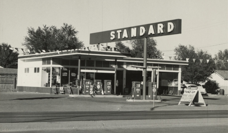
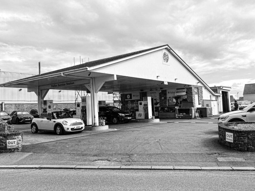
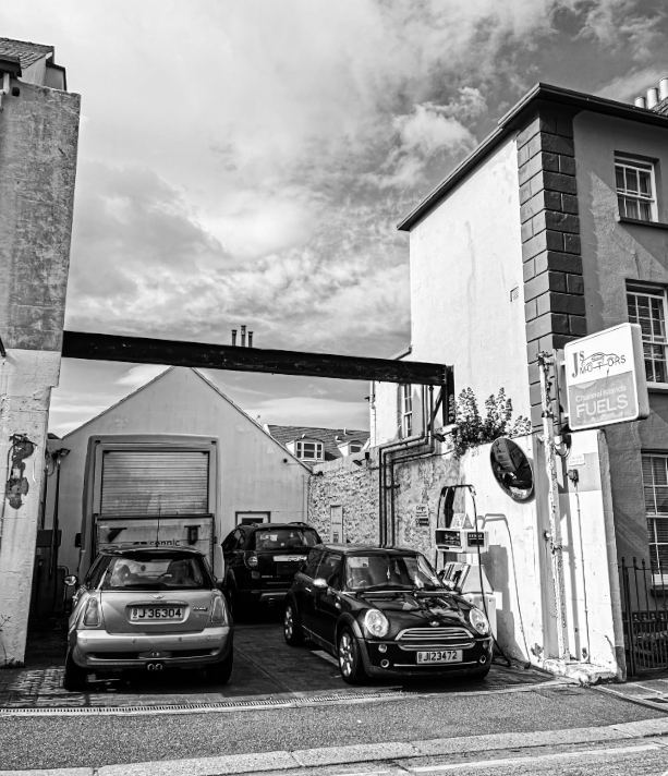
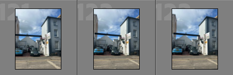
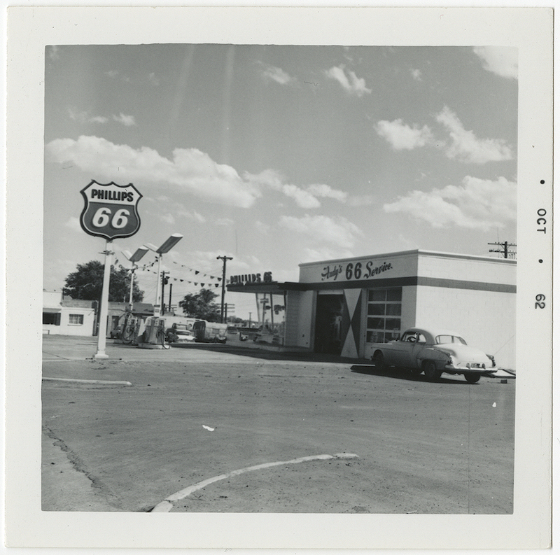
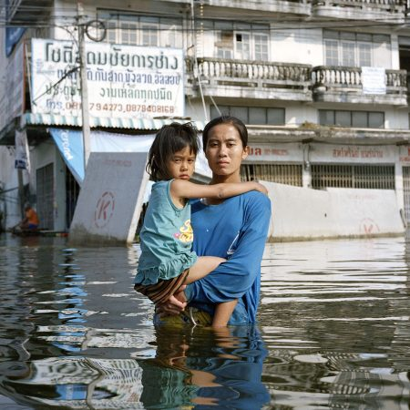
Ruscha’s work in photography includes a large photoshoot of old petrol stations, with lots of empty space surrounding it. This is due to him mainly photographing Los Angeles and Oklahoma City. My photographs contrast to this because many of the petrol stations in Jersey are significantly smaller than ones in America, leaving less empty space surrounding them. A similarity between mine and Ruscha’s outcomes is the angle in which the image is taken. Both of us take our photos from a deadpan angle, which allows the whole setting to be shown in the image, I also like this angle because gives the image an overall sense of simplicity, without over complicating which elements to include in the shot. It seems as though Ruscha takes his photographs on a main road to get everything in the shot, I also tried this approach because I wanted to be able to do the same.
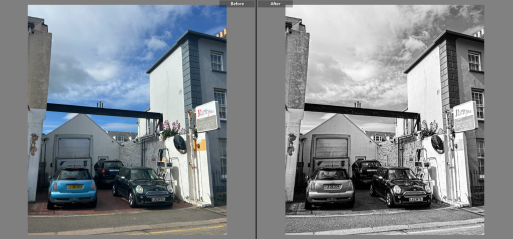
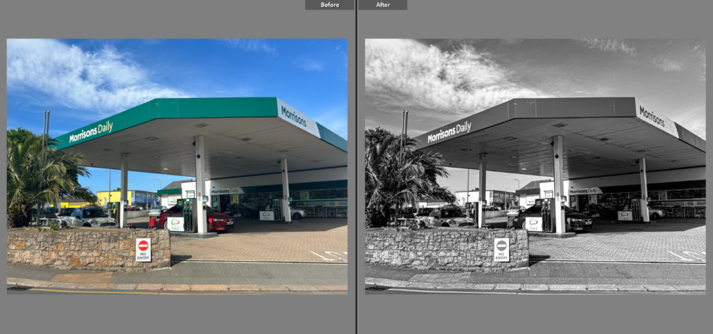
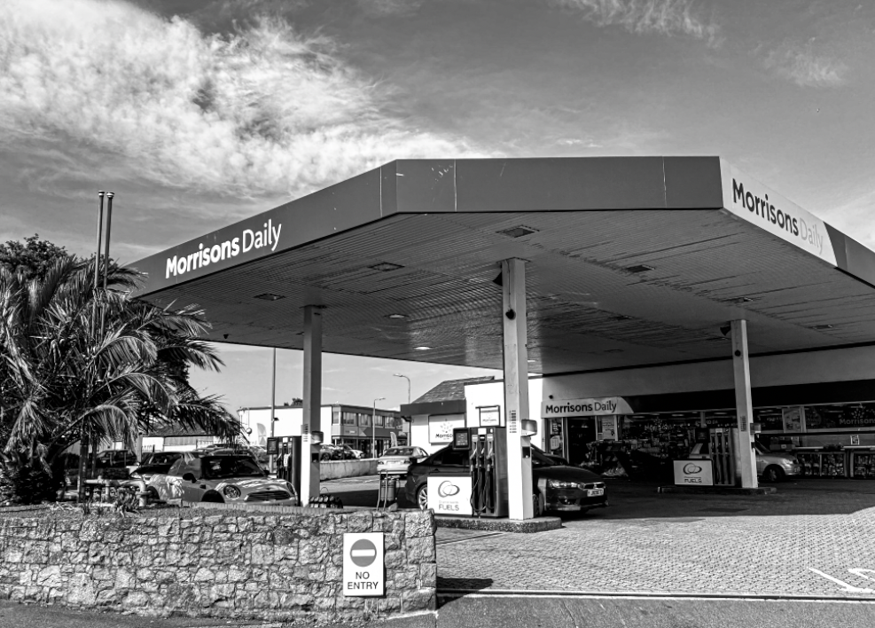
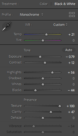
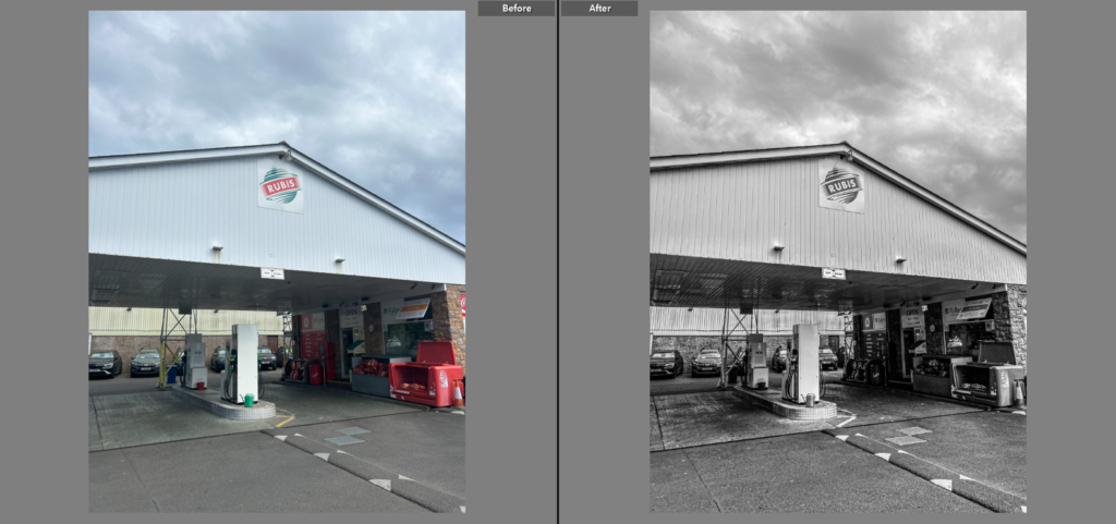
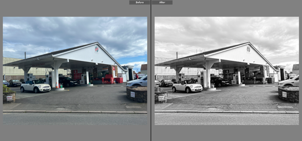
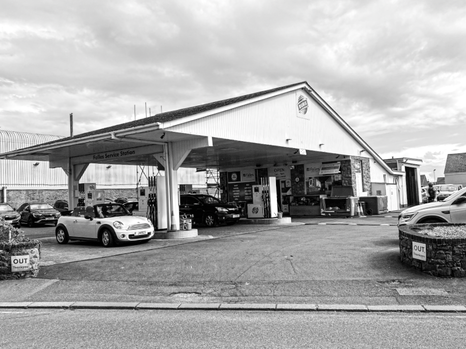
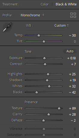
For my first image, I adjusted the temperature to exaggerate the different shades within it. I knew this would be useful as all of my images are going to be in black and white, so by doing this I am preventing my outcomes from looking bland and lifeless. I also increased the exposure to add more brightness into the photo, and the contrast to extenuate the lights and the darks. I also increased the texture in all of my images as it adds a grainy affect, which is significant for me because it helps my images take on a more historic effect.
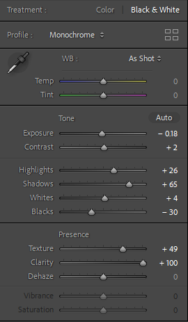
For my second image I decided to decrease the exposure rather than increase. I did this because the lighting when I took the original photo was very bright, which took away from the features in it. By decreasing the exposure I was able to bring out the main subject rather than the background. However, I increased the highlights as it was able to bring some life back into the photo, while also helping create a bigger contrast. Again, I increased the dehaze to bring out all of the different textures in the image. Finally, I decreased the blacks as this also helps exaggerate a contrast between the different tones, which linked back to my artist inspiration.
For this image, I decreased the temperature rather than increasing, this is because it helped exaggerate the black and white rather than decrease the overall mood. By doing this, my photo was able to fit in perfectly with the rest of them as originally it naturally had a brighter aesthetic. I decreased the whites because it made the image look over-exposed, and increased the texture and clarity to match my other outcomes too.
Similarly to my last image, this photo was originally over-exposed. Therefore, I decreased the exposure to neutralize the different shades. By increasing the highlights, shadows and whites I could create a natural looking contrast, which helped my main subject easily become more eye-catching to the viewer. In this image I kept the temperature and tint neutral because I did not want to change the colours in the image too much.
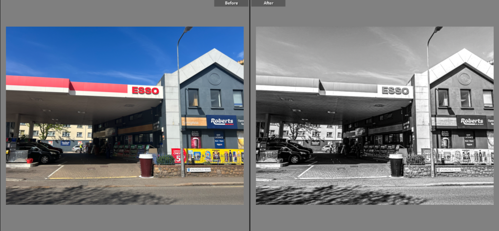
In my fifth image, I decreased the temperature because this image had a wider variety of different colours compared to my other image. This way, I was able to bring down those colours to help this image fit in with the others. I slightly increased the exposure but not too much because there was a lot more sky incorporated in this photo than the others. Although, I increased the highlights because it created a successful contrast between the white building in the background and the dark roof of the petrol station.
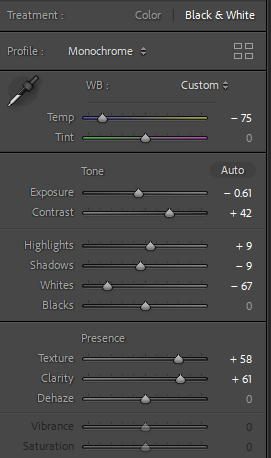
This is the last image I edited, and I increased the temperature by a significant amount because originally this image had minimal colour and appeared more dull than the others. There was very little contrast throughout the image before editing, therefore I increased the highlights, shadows and texture to bring some life into the outcome. Also by increasing the dehaze, it helped add a more ancient feel to the outcome, as well as showing resemblance between my outcome and my artist inspiration’s.
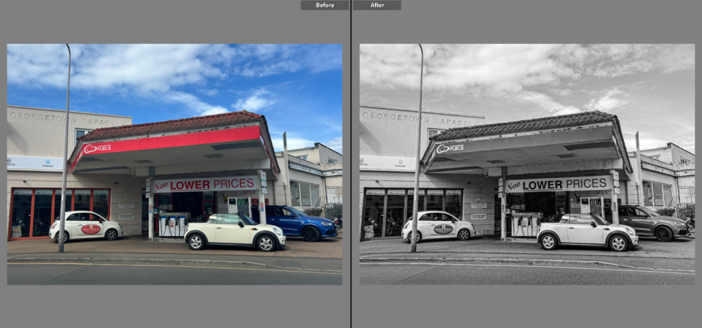
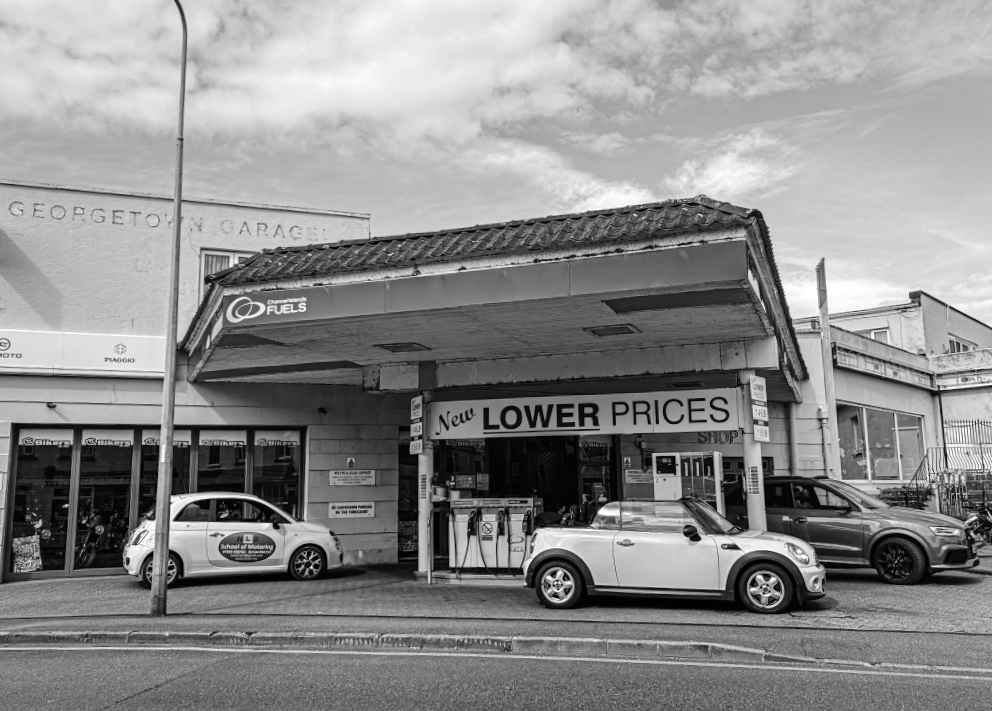
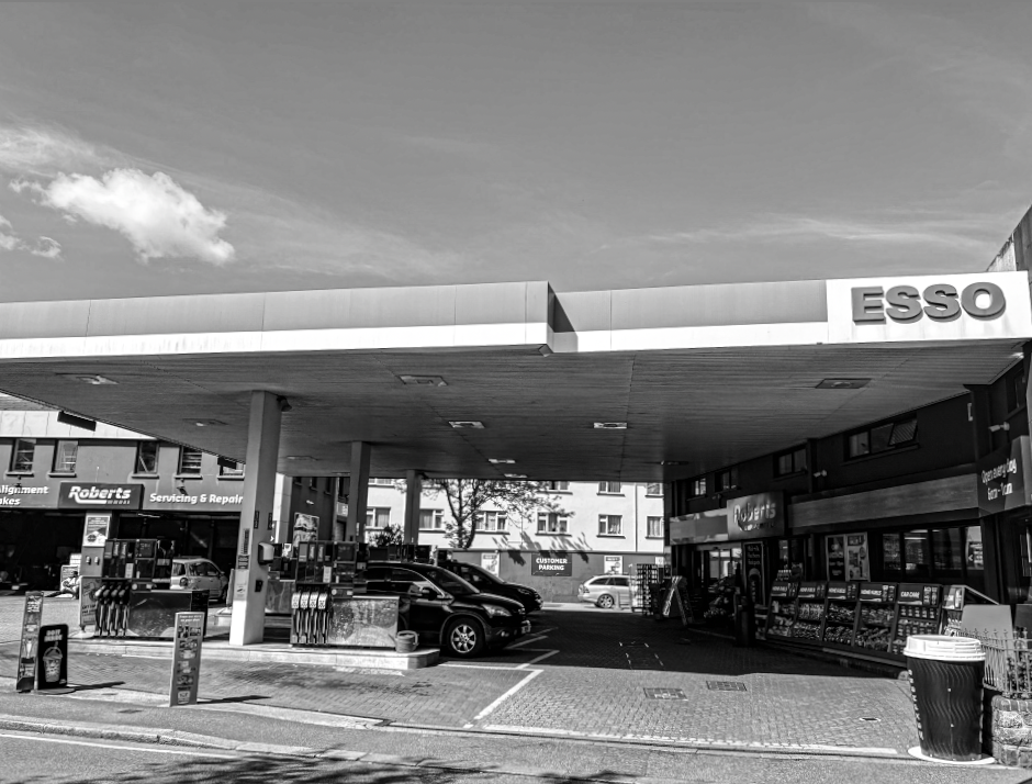
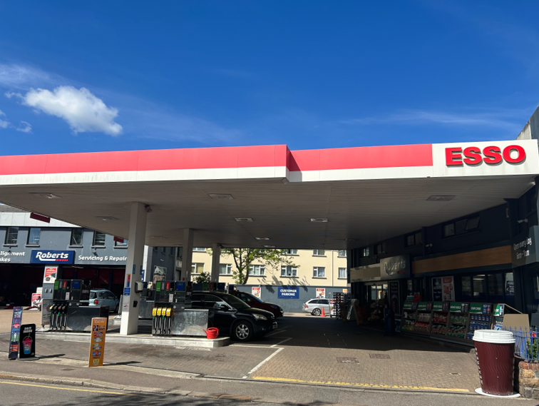
These are the 6 different petrol stations I visited. I chose to photograph 6 different petrol stations around the island because my plan is to put them into a typology. I feel that this will be successful as typologies display a range of different images that link to the same topic. I selected my best photo of each station so I can compare the similarities and differences, as well as being able to make my final pieces in the project interesting for the viewer, as they display a strong contrast.
For my second photoshoot, I went to as many petrol stations as possible in attempt to improve and recreate my previous photoshoot. This is because in my first shoot I mainly focused on one petrol station, which does not emphasise the problem of air pollution, so I believe it will look more successful by including multiple different stations compared to just one. In addition to this, this technique is similar to Ruscha’s “26 gasoline station” project, which will hopefully make it cleae to the viewer what my aim and intention is.
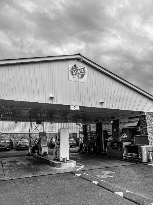
To improve, I changed the angle of my photos so it resembles Ed Ruscha’s whereas in my previous shoot I kept the angle and position of the camera very close up to my subject. I prefer the angle of my new photoshoot because there is a lot more features included in the frame, which ultimately I find important because it allows the viewer to see how many people use the petrol stations. By doing this I am able to portray my view of the issue, by showing the viewer how normalised it is. Overall I am much more pleased with my second photoshoot because it has better similarities to my inspired artist, as well as included more of the area around it which I believe looks more more interesting.
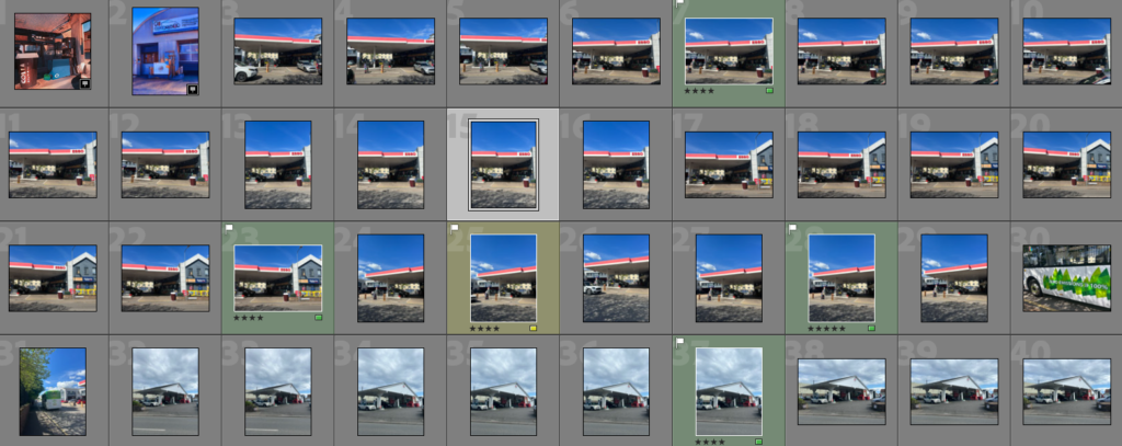
Contact Sheets:
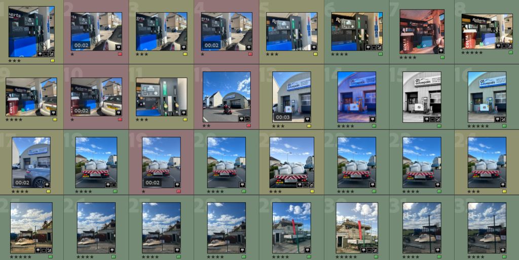
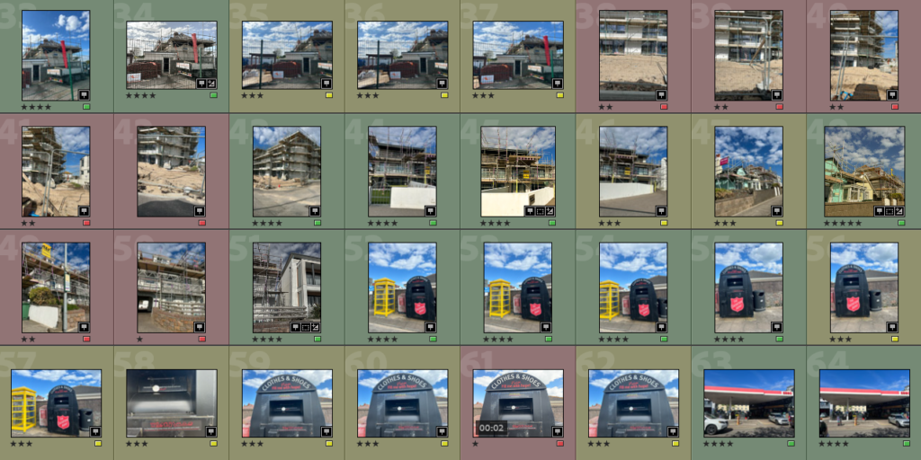
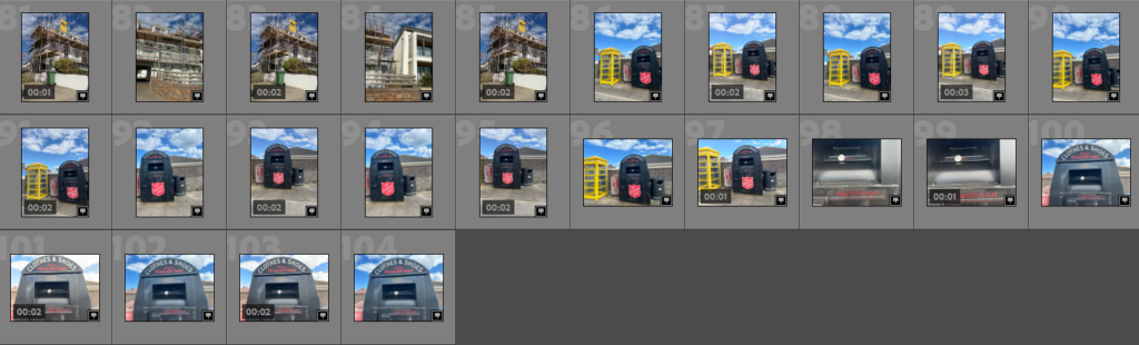
After I imported my photoshoot into Lightroom, I flagged my best image from each shoot. This will help me in my project to choose my best images to use, while also speeding up the process.
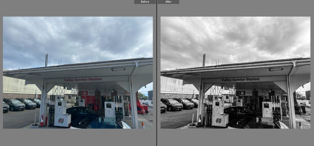
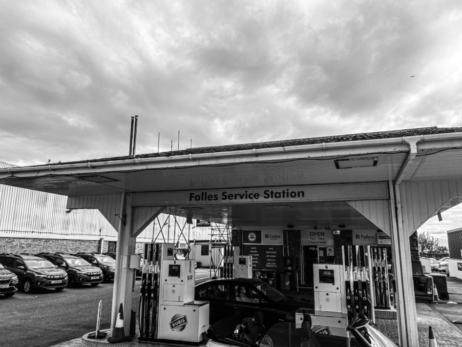
For my first photoshoot I made it my aim to focus on capturing one of the main causes of air pollution rather than the outcomes and results of it. This was an important focus for me as petrol has been extremely normalized since more cars have been invented and adapted, therefore the damage through the use of it has increased significantly. Air pollution has long term issues such as damage to the human brain, kidneys and liver etc, and can even lead to a person’s death. Therefore I went to local petrol stations and photographed the petrol pumps as it has significance to the issues. This photoshoot relates to Ed Rusha and the Anthropocene as the petrol and gas humans use massively effect the air pollution. Therefore, my idea was to take images of petrol stations in the modern aesthetic and attempt to edit it to make them look nostalgic. This is effective as petrol stations are a useful feature for humans in everyday life, meaning as many people are using them they are overlooking the issues and damage they are causing the environment.
During this photoshoot I also incorporated photos of scaffolding and build-work as they contribute to environmental impact through energy and resources consumption. The construction site requires energy for lighting, heating, and cooling, which all contribute to carbon emissions. Additionally, the mining, drilling, and transportation of the materials used contribute to greenhouse gas emissions, pollution, and deforestation. These factors have also heavily increased in the last 20 years, which has ultimately had negative affects on the environment.
Through this project I aim to catch the viewers eye by exploring the cause rather than the harm that has been done, which should inspire the viewer to recognise the deconstruction of the environment and how it has increased heavily. This should also help spread a message of how humans should stop using so much petrol and ignoring the harm.
How I could improve:
The first issue I faced within this shoot was the angles in which I took the photos. In many of my photos I have had to crop irrelevant artefacts from the edges of the photo, which I could have saved time by making sure they were not in the frame before I took the photos. The second main problem with this photoshoot was I only photographed two different petrol stations, rather than photographing lots of them around the island. This prevented me from capturing a variety of different stations, meaning I am unable to compare them in size and see which ones are more harmful. The third main factor which limited my success was the majority of my images being live photos. This was because I used my phone for this shoot, and accidentally put the settings on “live” rather than regular. This caused issues during my editing process because sources like photoshop and Lightroom are unable to edit live photos/videos.
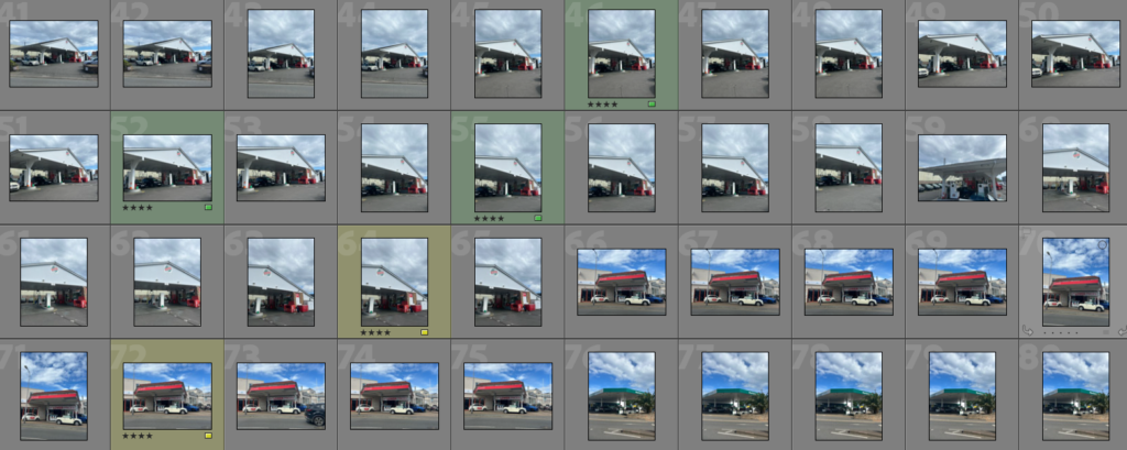
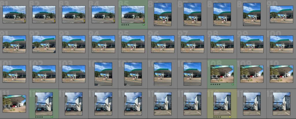
On Lightroom, I put all my images in a folder and rated them individually from 1-5 stars and colour coded them showing my favourite and least successful images in the photoshoot. This allows me to identify which photos I can edit and use for my final pieces in the future. Also, by looking at the amount of images I colour coded red, I can then conclude how to improve my photoshoots overall so I can prevent this happening in future photoshoots. I can do this by looking at the angle of the image, the exposure and the shutter speed, as all of these factors influence the success of the final outcome.
Then, I went through all my images and deleted some of the worst ones, so it narrowed down my photoshoot to my best photos. This is likely to increase my chances of producing better final pieces as I am only able to choose between photos that need some improvement, and photos that were taken well.
My plan is to link an artist that I have studied previously (Ed Ruscha) to the theme of Anthropocene. This is because Ruscha chose to photograph the trivial objects like gas stations to express his interest in the things we usually ignore. Through elevating these humble structures to the status of art, Ruscha asks the viewers to review the notion of beauty and value. From my research I can gather that Ruscha mainly photographed petrol stations in Santa Monica Boulevard and Pacific Coast Highway and Melrose Avenue between 1974 and 1975. He has managed to complete over 40 shoots since 2007. I also chose to focus on Mitchell because he captures ancient and vintage buildings, in which I assume he does this to create nostalgia. I can recreate this by going to St Helier as I believe that is a place that carries many historical buildings rather than newer.
How does the artist link to my aim?
I can successfully link Ruscha’s work to my own because petrol stations are one of the main causes of air pollution, in which I am trying to send a message to the viewer on the dangers of air pollution, and also how it has been normalized through recent decades due to new, advanced technology. Therefore the main focus of my photoshoots will be local petrol stations and I will approach this by using similar methods to Ruscha e.g colours, editing and angles. I like the angle of how Ruscha captures his photos, as he incorporates a large setting within the image which helps the viewer gather more of a realistic idea. I also find it interesting that the photos are not taken from an accurate deadpan angle, but they are slightly off centre. This could be seen as unusual for photographers to do as it can sometimes make the image look rushed. However I do not believe this within Ruscha’s images because it is still in focus and includes the features that need to be included.
Another interesting factor within Ed Ruscha’s work is the border around the edge of the image that also includes the date. I find this very intriguing because it adds an old aesthetic, and makes the viewer link this image to images taken on a polaroid camera. The use of the image being in black and white also adds to this theme because we know that colour in photographs was only enabled in the early 2000s.
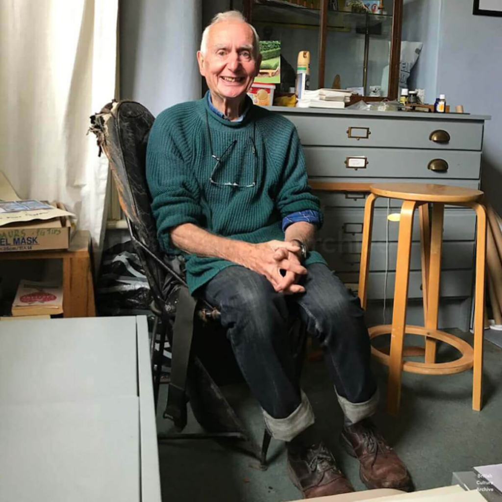
Peter Mitchell is a British documentary photographer born in 1943, and is known for documenting Leeds and the surrounding area for more than 40 years. Born in Hope Hospital, Salford, Peter lived briefly in the North West before relocating with his family to London during the 1950s. He grew up in Catford and attended Hornsey College of Art. Following a brief period working as a trainee travel agent for Thomas Cook, he worked for a number of years in the Civil Service as a draftsman. Later, he found steady employment as a graphic designer. Peter moved to Leeds in 1972, into the house in Chapeltown where he still lives and works today. Whilst having a stint working as a delivery driver around the city, he started to photograph the shops, houses, and factories that didn’t have long before they were to be demolished – or “goners,” as Peter referred to them.
Mitchell’s photographs have been published in three monographs of his own, as well as his work being exhibited at Impressions Gallery in 1979, and nearly thirty years later was included in major survey exhibitions throughout the UK including at Tate Britain and Media Space in London, and the National Science and Media Museum in Bradford. Mitchell’s work is held in the permanent collections of the Royal Photographic Society and Leeds Art Gallery. Peter’s striking images were an essential part of the colour documentary scene in the seventies and eighties and often featured shopkeepers and factory workers outside their places of work.
Not much is known of Mitchell’s practice through the 1990s and early 2000s. He did continue to photograph, filling his home with negatives, prints and artwork. Mitchell’s work came back to public attention in 2007 with its inclusion in How We Are: Photographing Britain, exhibited at Tate Britain. By this time, Mitchell’s one-time co-exhibitor Martin Parr had become significantly influential not only with his own work, but in his championing of British Documentary photography as a whole. Parr identified Mitchell’s significance to the development of British photography and with some cajoling, and the help of American publisher Nazraeli, Peter’s first Monograph, Strangely Familiar, was published in 2013.
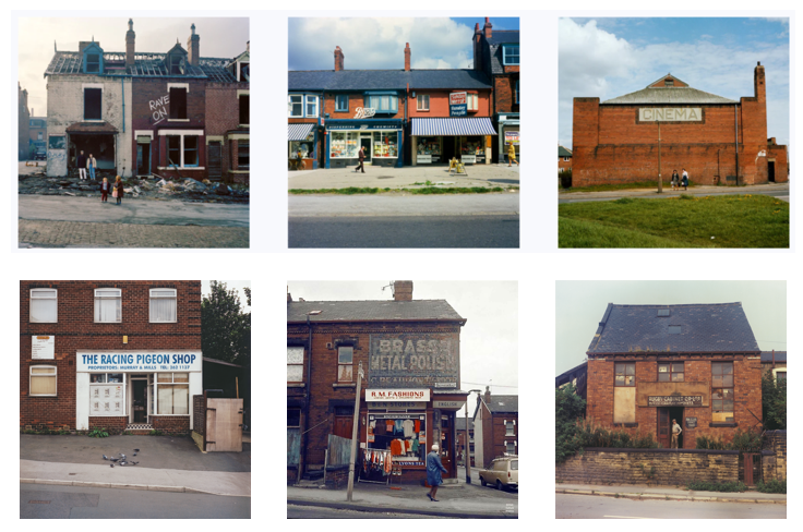
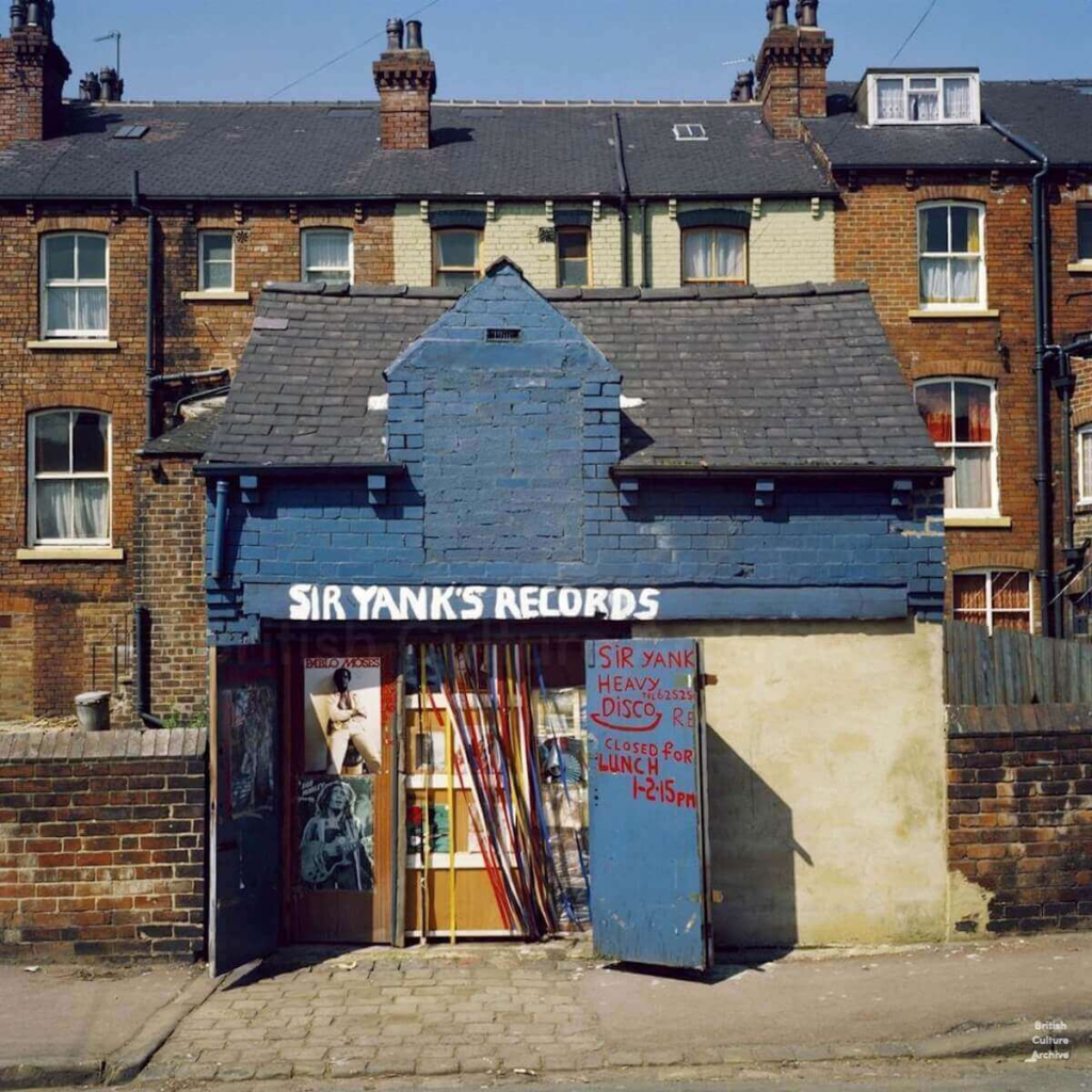
Sir Yank’s Records (& Heavy Disco). Leeds, 1976.
“I’m a Buddy Holly fan, that’s why I took it. The single Rave On was released in 1958, it’s one of my favourite Buddy Holly tracks!”.
Mitchell focuses on capturing old, casual buildings such as red brick houses without a pleasing aesthetic or any modern features. This can be seen as unusual from a viewers perspective as typically photographers focus on photographing large or beautiful buildings. Mitchell differs from these artists, making him stand out against them as he has a much bigger sense of realism throughout his work, without using many editing apps either. He tends to keep his work very natural looking, and always taken from a deadpan angle, allowing maximum capacity for the surroundings of the subject too. Overall these factors give a significant, vintage and antique aesthetic. From this, we can gather that Mitchell is a practical photographer, who manages to make simple buildings seen from different views, which opens up our outlook on Anthropocene photography. This ultimately influences other photographers, who also capture the impact of humans on the environment, to perhaps also take on a more realistic approach. Overall, the commonsensical approach that Peter Mitchell takes forces the viewer to realise the changes that have happened in the world due to humans and how we have adapted to a more modern world.
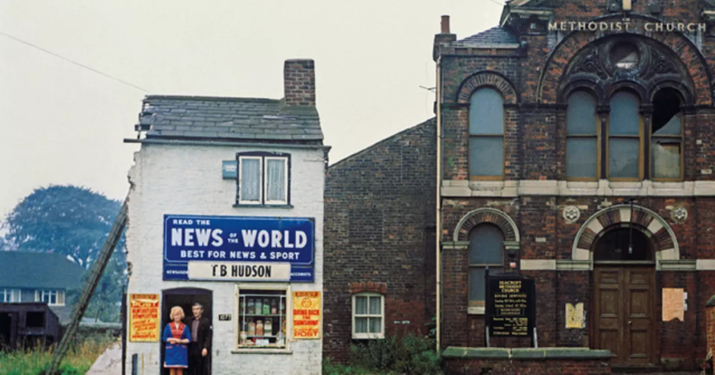
“I’ve been a fan of Peter Mitchell since I first saw his photograph of Mr. & Mrs. Hudson outside their newsagents in Seacroft, Leeds, in 1974. It is a brilliant image that is part of Peter’s body of work documenting Leeds from the 1970s onwards.”
Image analysis:
Mitchell has also produced images like this where slightly more modern buildings are featured next to the industrial buildings, ultimately creating a contrast between the new and the old. Although, I can infer that the shop on the left is still not a modern building, but the use of painting it white reflects today’s world as we now see the colour frequently. This effect enhances the similarities and differences between them which adds a sentimental mood into the image, showing how humans have adapted to modernity. The use of including a church, which is connected to the shop, could also be significant as it may highlight that the couple in the image are religious and they may own the church as well as the shop. From this, as a viewer I could also assume perhaps the artist is religious too, and he may be photographing his passion to communicate a message with the viewer. Additionally, Peter Mitchell has involved the sky and some background into his photo, adding a more casual aesthetic, which can take the viewers eye away from the main subject in the image. As I can see the sky is a dull, white shade this can be seen as reflecting the emotions hidden behind the image. Perhaps Mitchell is implying he might be sad by the new changes and portraying them through the emotionless tones throughout.
In contrast to this, we can also see that half of the shop on the left has been knocked down, with what we assume as the shop owners still standing at the entrance. From this we can presume that they have owned the shop for many years and are about to get it knocked down. This links to the Anthropocene as humans and their updated, advanced technology has caused many buildings etc to be knocked down and replaced by more modern versions. This again adds to the sentimental affect throughout the photo, and perhaps Peter Mitchell can relate to this feeling and is sending a message through his photography to people, so we can see the damage and change.
Overall, this image is effective because it explores the contrast between the new and old, while also incorporating a sense of realism. The artist also manages to create an overall mood throughout one image, as he includes many features that tell a story without speaking. I find this very inspiring as Mitchell has a unique perspective and aesthetic in his photos despite capturing every day, simple buildings.
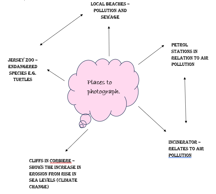
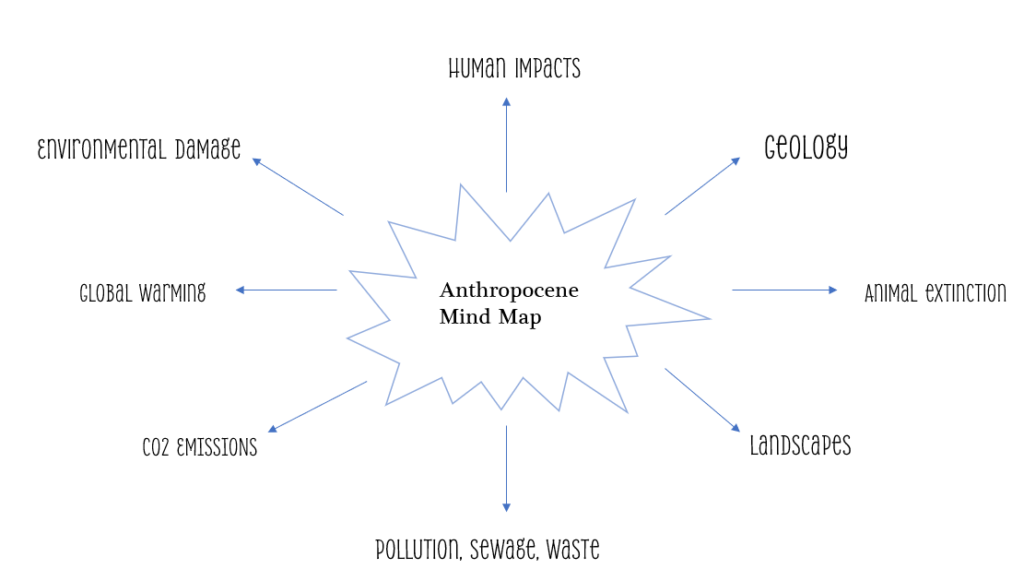
I created this mind map on PowerPoint to help guide me through the Anthropocene project, identifying key factors that play a role in how the Earth has evolved since humans began to damage the environment. By highlighting these areas, I am now able to set a focus for my photoshoots which will allow me to portray my own thoughts and ideas into my work, with a sense of creativity and originality.
The Anthropocene is a proposed geological epoch dating from the commencement of significant human impact on Earth until now. It affects Earth’s geology, landscape, limnology, ecosystems and climate. The Anthropocene Epoch is an unofficial unit of geologic time, used to describe the most recent period in Earth’s history when human activity started to have a significant impact on the planet’s climate and ecosystems.
In simple terms, it is how human activity impacts the earth.
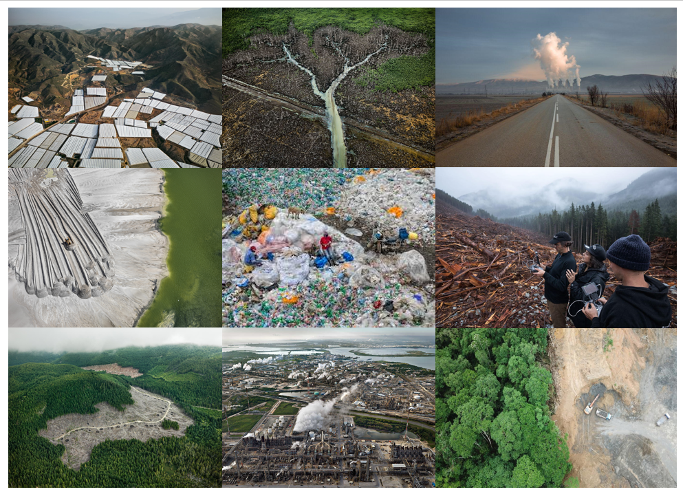
Mood Board:
The word Anthropocene comes from the Greek terms for human (‘anthropo’) and new (‘cene’), but its definition is controversial. It was coined in the 1980s, then popularised in 2000 by atmospheric chemist Paul J Crutzen and diatom researcher Eugene F Stoermer. The Earth is approximately 4.5 billion years old while humans have been here for a much smaller scale, yet irreversible influence has taken place on biodiversity and nature, fundamentally altering the Earth’s physical, chemical and biological code. In the last 60 years, the Great Acceleration has began. This is a term used for the increasing rate at which human impacts are unfolding at an unprecedented scale and speed, causing the globe to deteriorate and become more modified, spiralling downwards. Being the most influential species of the planet, human behaviour has created a snowball effect of significant impacts not only for other ecosystems or species but ourselves too. Just a few of these are:
Extinction
Habitat destruction
An increase in extremeness and frequency of severe weather conditions e.g earthquakes, tornados and storms
Carbon dioxide emissions
Global warming
Ocean acidification
To accelerated and irreversible global warming, the Anthropocene may coincide with the rise of the modern environmental movement, as a new geological age that has displaced the Holocene of the last 10,000 to 12,000 years. Human beings have become an emerging geological force that affects the future of the Earth. The dramatic changes in the correspondence of humans and the environment. Beginning with the Industrial Revolution, the late 1940s and early 1950s, the strong impact of Contemporary Society, the rise of capitalism, the colonization of the world, and the era of fossil fuels. The geologist, Thomas Jenkyn spoke of anthropozoic rocks, the geologist Pavlov used it to refer to a new geological period in which humanity was the main cause of planetary geological change, later Paul Crutzen (Nobel Prize in Chemistry) gave popularity to the term Anthropocene.
Just over twenty years ago, scientists introduced a term to denote a new geological epoch in which human activity has had a marked impact on the global climate: the Anthropocene. Since that time, the concept of the Anthropocene has been exposed to a wider public audience through expanding environmental studies and scholarship, increasing coverage in the popular press, widespread and fervent activism, and a variety of artistic responses. Second Nature: Photography in the Age of the Anthropocene is the first major exhibition to examine the Anthropocene through the lens of contemporary photography. Comprised of 45 photo-based artists working in a variety of artistic methods from studios and sites across the globe, Second Nature explores the complexities of this proposed new age.
Since it’s emergence, the term Anthropocene been adopted by disciplines outside of the sciences including philosophy, economics, sociology, geography, and anthropology, effectively linking the Anthropocene to nearly every aspect of post-industrial life. Organized around four thematic sections, “Reconfiguring Nature,” “Toxic Sublime,” “Inhumane Geographies,” and “Envisioning Tomorrow,” the exhibition proposes that the Anthropocene is not one singular narrative, but rather a diverse and complex web of relationships between and among humanity, industry, and ecology.
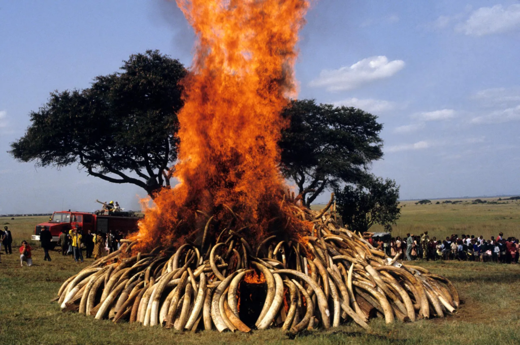
Ultimately, the theme of Anthropocene also links to the project of Poaches hunting down elephants and killing them as easy access to their tusks. Elephant’s tusks are burnt for the pure purpose of Ivory, which comes from the tusks and is considered very valuable. Because of the high price of ivory, poachers illegally sell their tusks. Tens of thousands of elephants are killed each year for their tusks, and as a result, elephant populations have declined rapidly.