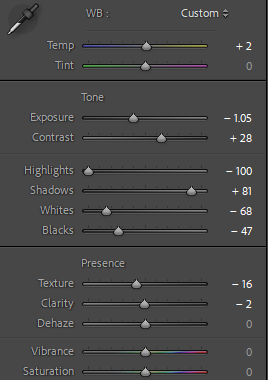
Overall, I am pleased with the outcome of my photo book and my careful selection of final images used. The front and back cover of the photo book set the tone for what’s inside as they reflect my different artist inspirations Justine Kurland and Ramona Wang, but also correlate with each other. I think there is a clear theme and message which can be seen immediately, and I think I have successfully displayed some of my personal ideas and opinions in my images throughout the book, yet it also leaves room for interpretation from the viewer, as only some pages are cohesive.
There isn’t really a consistent flow throughout the book, which may be a drawback as it could be argued that the message is not clear due to the random order of the images. However, I think each page is engaging as there are clear connections between images and they are well composed and thoughtfully framed. The lighting and colour varies through the book, as I took my photoshoots in different locations and at different times of the day.
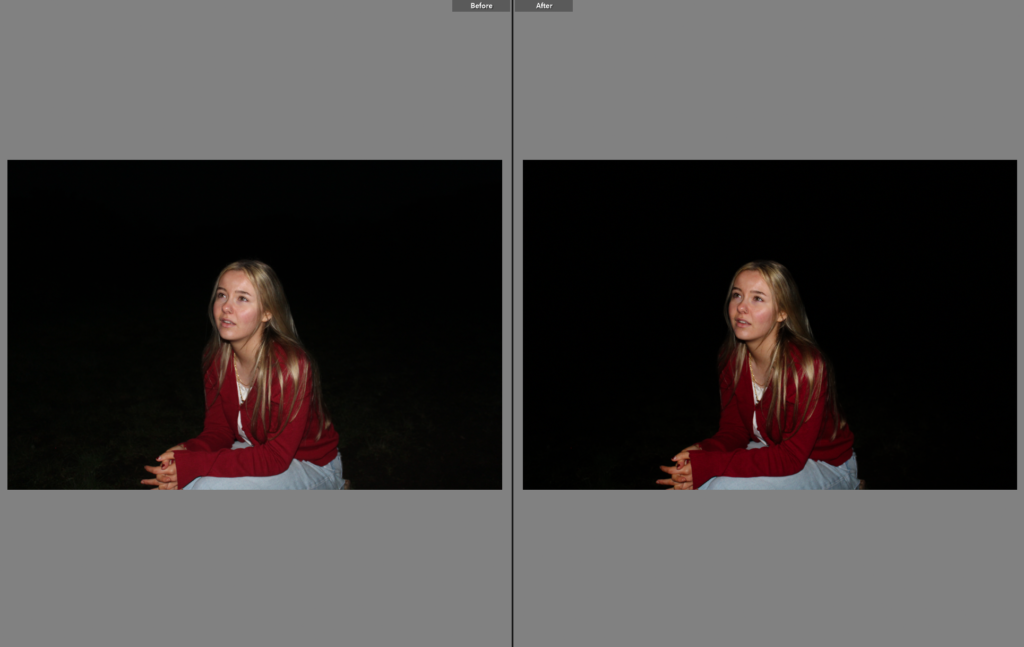
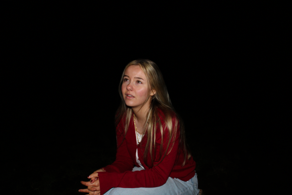
I successfully linked my personal imagery to Kurland, as the images inspired by her often have bright, natural lighting which enhances the mood and helps the viewer engage as they can see the adventure in the outdoors. This contrasts with other images from different shoots, particularly my second photoshoot where me and my subjects were outdoors in the dark. These images have lower exposure, less vibrancy and overall a more tense effect to them, which reflects the theme of youth through being rebellious, as well as reflecting bonds and community. I think all of my images have an emotional and intellectual impact on the viewer as they display my personal experiences with being a youthful female, which can help with engagement.
I am also happy with the overall design of the book as there is a variety of different placements and spacing to create a rhythm, even though the arrangement of the images is random. Another drawback of my book is that I did not consider adding in any text to any of the pages, which may take away some value due to the fact it may be harder for the viewer to interpret my message. I thoughtfully met my intentions as my personal study photo book reflects historical contexts of the Male Gaze, as well as traditional stereotypes of females and the behaviour we are expected to carry out. My images execute my ideas and beliefs on these contexts, and I have thoughtfully framed each image on every page to display my themes of femininity and youth through my own personal experiences.
Technical, visual, contextual & conceptual elements within my final photobook:
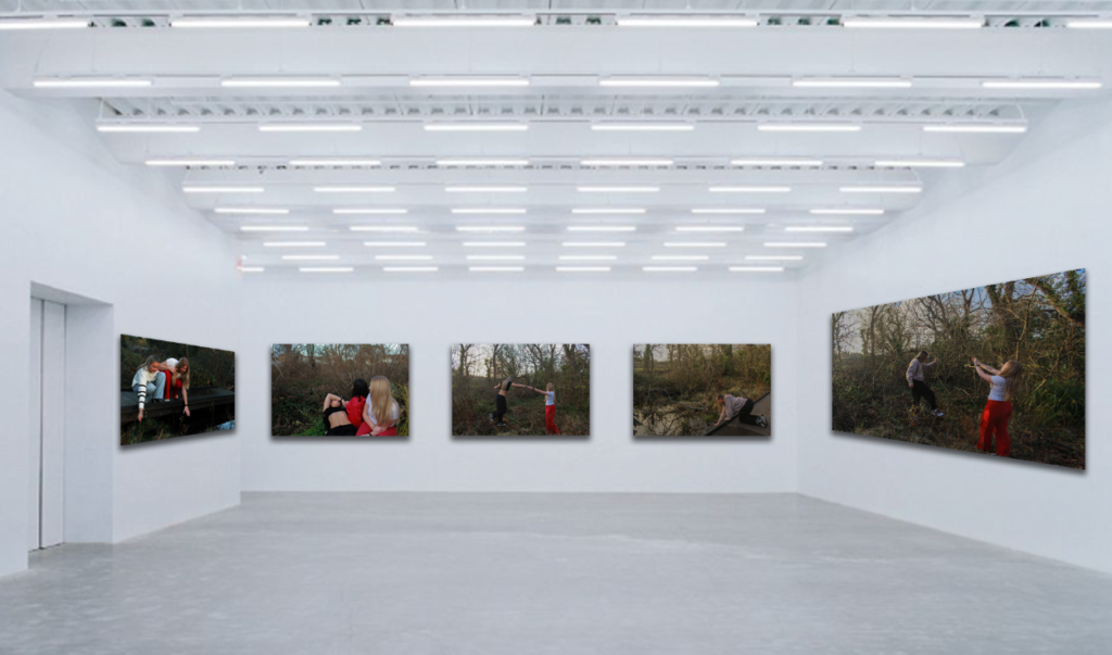
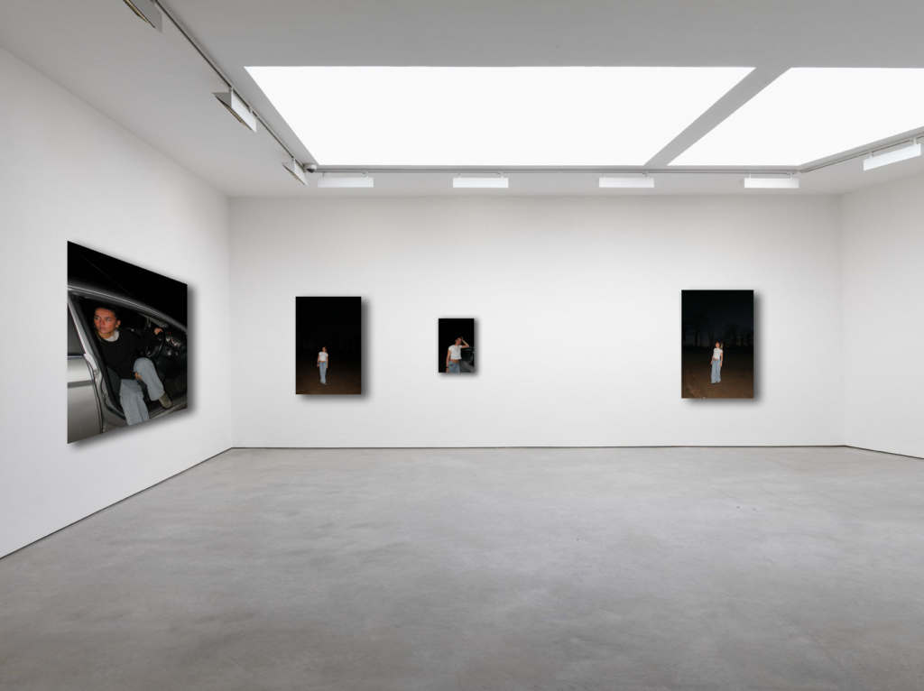
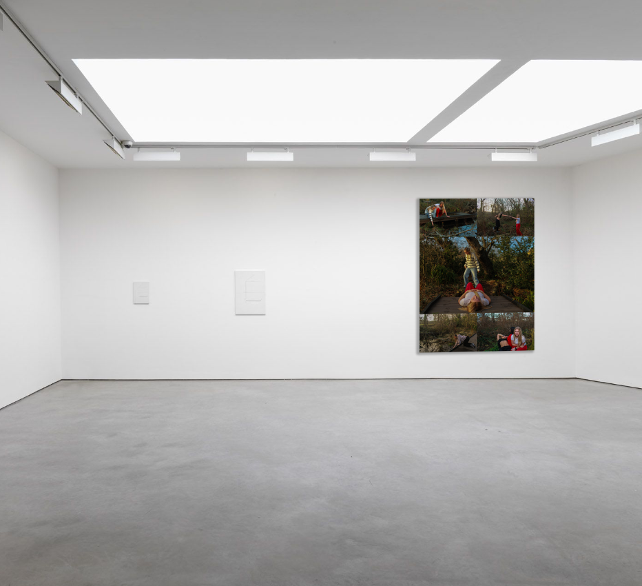
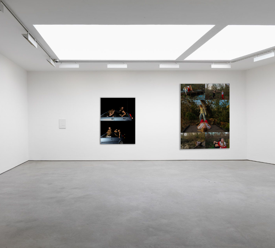
I chose to make virtual gallery’s to end this personal study because I think it is an effective way of displaying all of my best final outcomes, and the way each of them are placed next to each other makes it easier for the viewer to interpret them individually, yet also make comparisons between them and be able to make connections.
First, I chose my most successful shoots out of the 5 I exhibited, and picked out my final outcomes. I then opened up an empty gallery from the mock ups folder, and placed it into Photoshop as a document. I individually opened up each image that had been exported from Lightroom as a jpeg, and placed them into each space on the gallery. The two images on the left and the right are on a slight angle, which makes my images look more fitting into the gallery. To do this, I clicked ‘edit’ in the top left corner of my screen and scrolled down to the ‘transform’ option, where I could then press ‘perspective’. I dragged the bottom corners of the image so it could move to the correct place, making it look more realistic. Finally, I selected each image one at a time and added a drop shadow to them all so it looks sincere and adds a sense of professionalism.
Experimentation virtual gallery’s:
Final virtual gallery – mock ups:
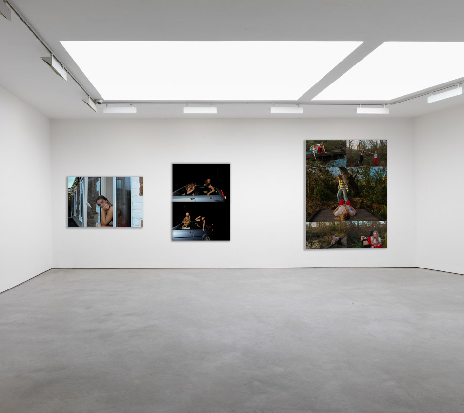
The image above is my final virtual gallery for my personal study, successfully displaying a minimal variety of outcomes from different shoots I carried out.
I chose to display them this way as it meets exactly how I presented them in my mock exam, using mountboard and card. However, to make this virtual gallery specifically, I had to use different methods and layouts in Photoshop to create outcomes that resemble my real ones.
The first outcome on the left was placed using the same steps I described briefly above, there were no changes to the way I presented this one, as it is an individual image and has no layout. The image in the middle and the one on the right were presented using multiple layers and creating a grid to present them in. I added in each image accordingly to my physical outcomes, then cropped the excess space around it to create a singular compact image. I then flattened my layer so all the images become one layer rather than separate.
Similar to the previous, I individually placed my two outcomes onto a plain black backdrop, as in my mock exam I placed them onto a piece of black card to give the effect of a border. I also cropped the excess space to allow my images to take up the entire area.
For my final photo book, I am using Lightroom Classic to design it.
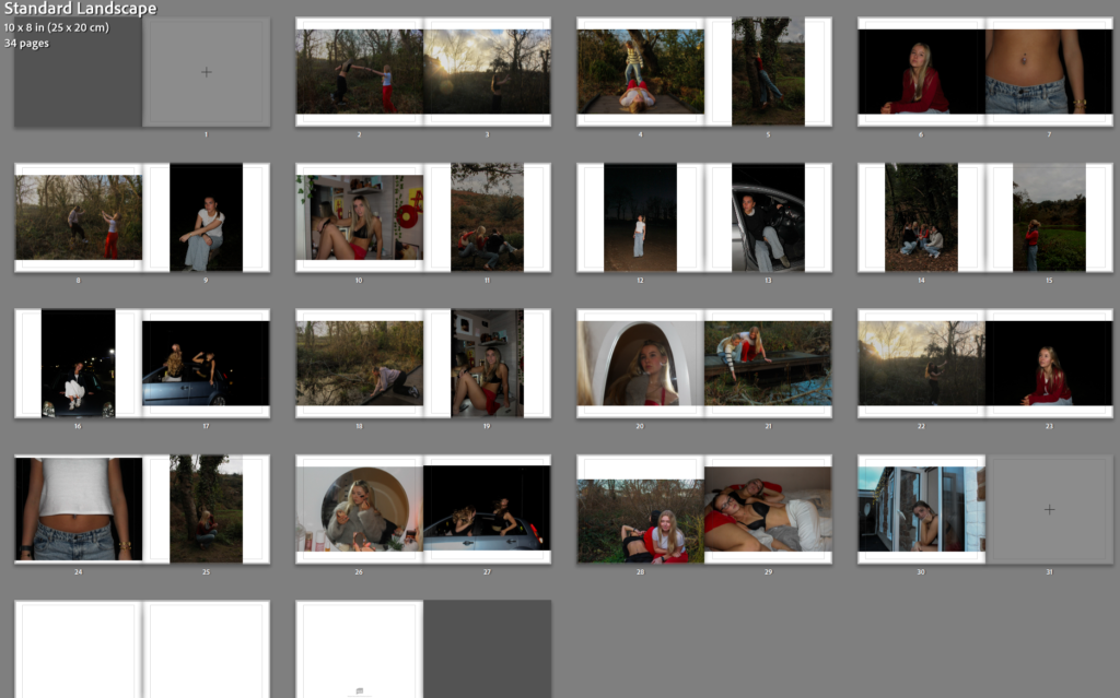
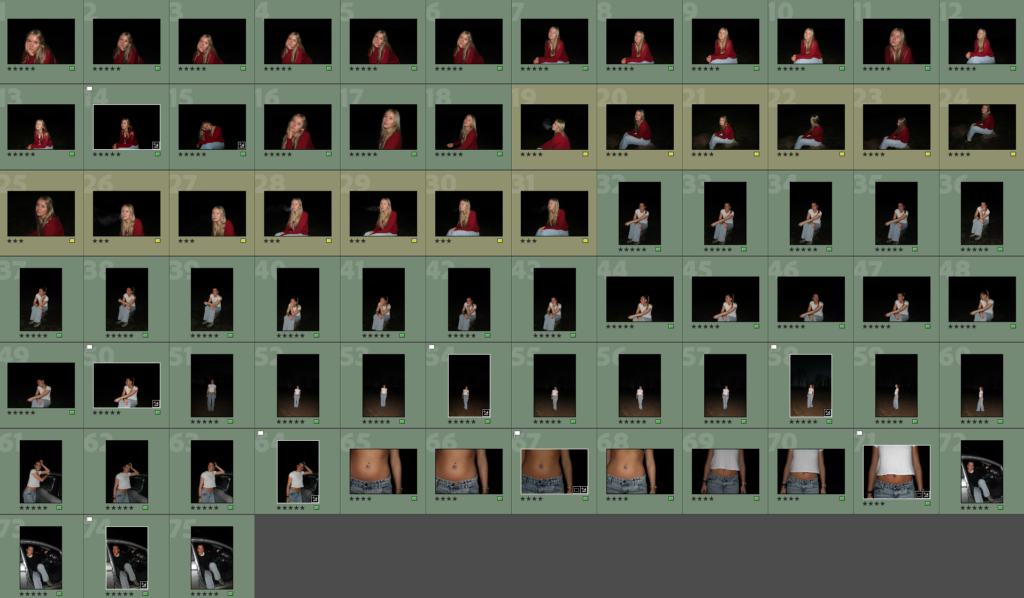
This was my first original layout, where I had initially placed around 50 images into it to start off my photo book. Although, I quickly realised that 50 images was too many as they were taking up 100 pages of a book. I wanted my book to only be around 30-40 pages long, so it stays consistent throughout but with a variety of interesting images from each shoot. Therefore I removed many of my images that were perhaps too similar to another one or just didn’t stand out to me as much, and I was left with 35 pages. This was a rough plan for which images I wanted to include, however I soon decided that I wanted to make my layout more unique, and have specific images standing out from the rest of the book.
I also switched my book layout from standard landscape to standard portrait, as I felt that it fits my images better due to them mostly being portraits. This way, my big landscape images would also be emphasised too.
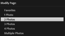
When choosing displays, my main choice was the one with two photos, I chose this because if I included any more then the images may clash with each other, and it would be too distracting from the other pages. I wanted each and every image to stand out individually to be able to tell my story, and I did not want any images discarding another one.
I then began experimenting with different layouts for each double page of my book, choosing a range of displays and also choosing which images work best on a page together. During this experimentation, I also chose my best landscape images to include on a double page spread individually. This way, my photo book will look more appealing and have unique elements within it to draw the viewers attention to specific images without subtracting from another.
My front and back cover:
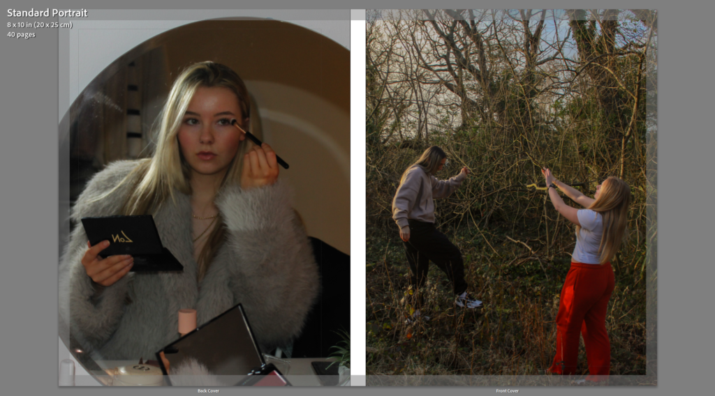
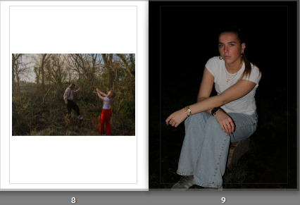
I chose these two images for my front and back cover because I feel they represent my subject matter best. The front cover image on the left clearly takes inspiration from Justine Kurland, and as she was my main artist focus, I wanted to incorporate her ideas and apply my own approaches. By looking at the front cover, the viewer immediately gathers a sense of freedom and escape, which is what I wanted to achieve as this links to the femininity and youth themes of my project. The back cover image was inspired by Ramona Wang, another artist I looked at in depth and wanted to focus on for this project. The image displays traditional expectations of women, and this will work effectively with the title of my book as I am wanting to challenge the ideology of women objectification.
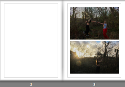
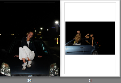
I put these two images together on the first page for the viewer to immediately see as they reflect Kurland’s series of exploring escaping the expectations on female behaviour. I like how the scenery is similar in both images, so I decided to include them both on the same page so the similarities and differences can be seen clearly.
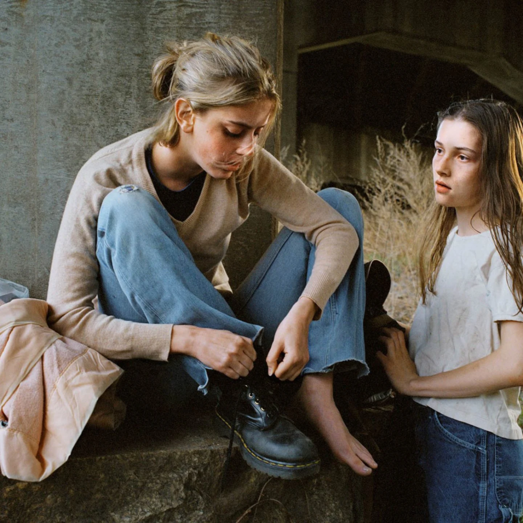
For my second page I chose a similar approach to the first page, reinforcing my ideas on females in natural landscapes. These images were from different shoots, but they compliment each other well due to the factor of nature and the vibrant clothing on the subjects. I made the image on the right full bleed because it is a portrait, and therefore the image on the left can have its own border around it, allowing the tones to stand out.
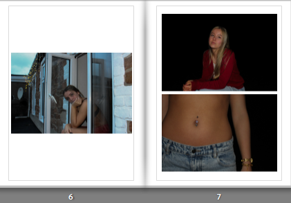
The two images on the right are on a two photo display, as neither of them include elements of nature yet they still link to my themes. Both images include darker tones and a higher contrast, so I put them together to create a more dramatic effect and slowly tie in a more realistic side to my project. The image on the left is by itself due to the cooler tones and the building in the frame.
These two images are also from different shoots, I like how they differ from each other completely as it allows for the viewer to interpret them however they like. I placed the portrait on the right as full bleed due to the immense amount of black in the image and I like how it adds tension. I placed my front cover image on the left page with a border as I didn’t want to attract too much attention to it due to it already being used.
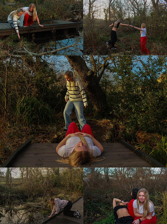
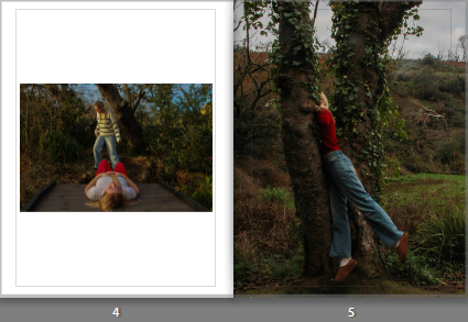
This image is on a double page spread, due to the excessive amount of nature, which I believe works well because the previous few pages do not include much greenery. I like the editing in this image and therefore wanted it to be on its own so the viewer can take in the different colours and shades within it.
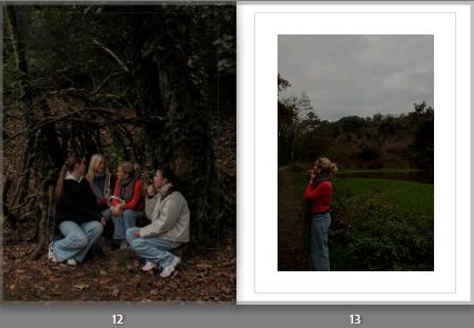
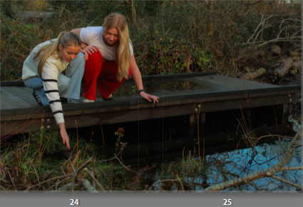
These two images compliment each other as they were taken in the same shoot, they share similar colours within them as well as both having quite low exposure. I placed them together to reflect the importance of community within young females. The image on the right reflects loneliness, so I gave it a border to emphasise this. Whereas, the image on the right shows bonds and friendships, so I made it full bleed to emphasise the significance of it to my project.
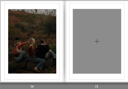
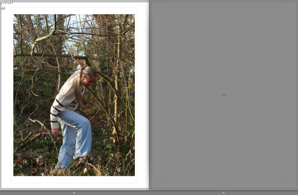
This image is on its own double page due to the fact it has many elements in it and is already quite a busy image. I did not want to repeat a similar approach to the previous page, so I placed a border around it and left the right page blank. This allows the viewer to focus on the activities the subjects are exhibiting, which is what Kurland photographed so I wanted to recreate that effect.
These two images portray more of a darker mood, due to the pitch black sky and limited background because of this, so I think they compliment each other effectively. I placed them next to each other to bring out the theme of loneliness again. However, the white clothing on the subject in the left image helps brighten the overall mood due to the heavy contrast of colours, also allowing her to stand out. As she is also further away from the camera in the left image, I made it full bleed so the viewers eye wouldn’t move straight to the image on the right.
I liked the setting in which this photo was taken, it has a lot more colour in it than the previous images. Therefore I brought this image in by itself to bring back some life to my photo book as I do not want it to appear dull or repetitive. The image shows me executing Kurland’s ideas of bravery and also brings in rural landscapes. I added a white border surrounding it to contrast with the dark greenery and trees taking up the majority of the frame.
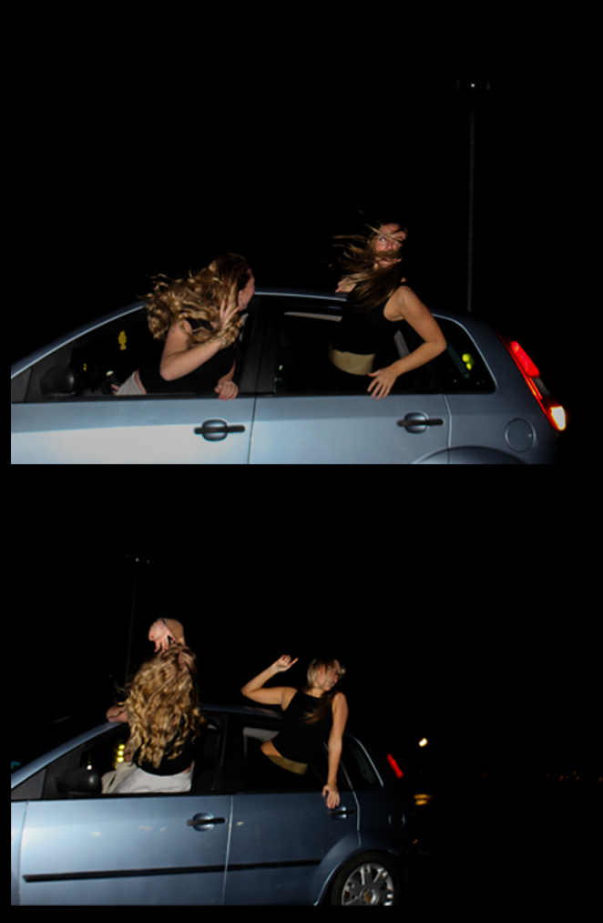
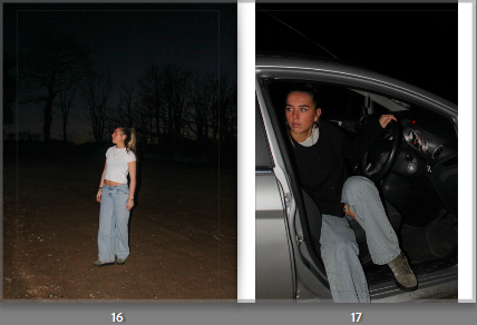
These two images portray the theme of escape, as they show subjects outdoors in the dark which hints to the viewer that they are runaways. I placed them together because they have similar colour schemes and reflect the same idea, which helps give my book a sense of organisation as the rest of my images are mixed together. The image on the right has a border because I think if I put them both big they would look too similar.
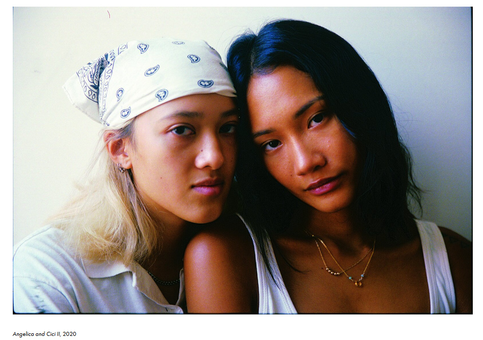
These two images directly link to Ramona Wang through the subject composition. This is because they are both self portraits reflecting typical expectations of women, such as putting in effort to look feminine. I placed them together on this page as they have dark tones with hints of red clothing, also linking to femininity. However, the image on the right is significantly smaller than the one on the left as it is as landscape image, so I added a border to add some definition.
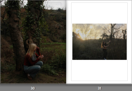
This image is one of my favourites from all five of my shoots, so I wanted to give it its own double page because I feel that it is unique to every other photo I took and I wanted to emphasise it in my photo book. I like the natural lighting as it links directly links to Justine Kurland and her use of natural lighting in all of her images. I also like the angle of it as it is typically lower than any of my others, as well as including moving subjects, making it appear less staged.
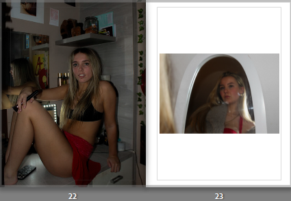
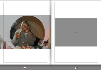
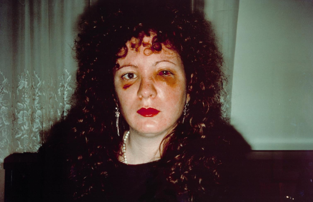
I wanted this image to be presented on its own as it is a busy image with lots of different colours within it. It also has quite a high exposure due to the flash being used for extra lighting, so I chose not to contrast this with another image on the other page as I feel it may defeat the intriguing elements in it tat I want the viewer to focus on, such as the makeup and clothing. This image is inspired by Ramona Wang and exploring the exploitations of women in art and photography, and I wanted this statement to be quite clear, so placing it by itself I am allowing it to be emphasised.
This was another layout where I decided to include three images on a double page, due to the fact they all have a black background and a high contrast. I placed the two on the left together as they were both inspired by Ramona Wang, challenging traditional female stereotypes as we are not professionally posed, giving the two photos a candid effect. They compliment the image on the right page because they all look underexposed, which creates a sense of nostalgia and makes them feel like they were captured in the same story.
These two images were taken in different shoots, and the differences between them is what made me put them next to each other. The image on the left has a darker feel to it, contrasting the right image which shows the sunset beaming through the trees. However, the colour palette in both of them is similar because of the nature, and it portrays adventure and freedom which parallels to Kurland’s Girl Pictures. The left image is a portrait so I made it full bleed, and the image on the right has lighter shades throughout because of the lighting, so adding a white border will effectively compliment it.
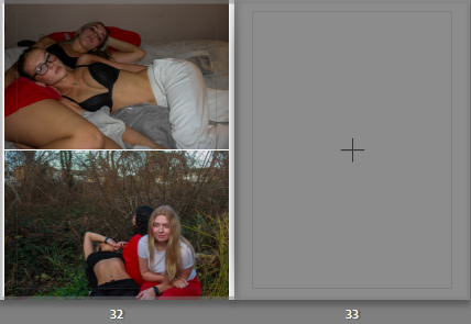
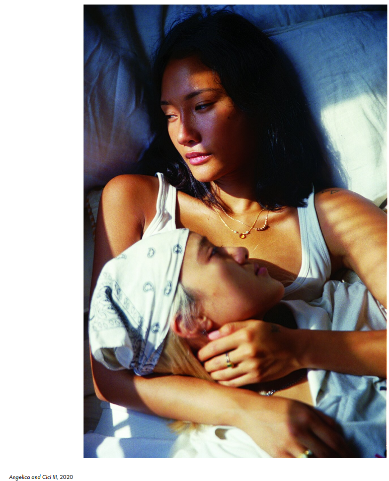
I wanted my last page to correlate with both my artist inspirations but in a way they could work together and share similar ideas. They both highlight youth, femininity and community which is significant to end my photo book with to ensure my aim has been portrayed successfully. Despite the similarities they share, there is a clear divide between them creating a juxtaposition. The top image has a dream-like aesthetic because the setting is in bed, giving the image a warm, friendly sense to it. Whereas the image on the bottom delves into reality, as it shows exploration and being in the wild. A contextual reference to this could be that Kurland focuses on a more idealised world, whereas Wang takes a more realistic and raw approach, and these two force the viewer to question if we, as a society, should accept the world as it is, or perhaps suggest change to the expectations of beauty and ideas surrounding feminism.
How do feminist artists use art and photography to display messages to society?
“I wanted to foreground girls’ lives, centring them by creating an all-female society.” – Justine Kurland – 25th January 2023
The works of Justine Kurland express the heritage of youth, girlhood and a search for identity, capturing the lives of young teenage runaways specifically through her book, Girl Pictures. Girl Pictures is a photo book, presenting an enduring symbol of romance, rebellion, escape, and freedom through the representation of teenage runaways, which ultimately challenges traditional narratives of femininity. Created between 1997 and 2002, Kurland focused on the roads in the American wilderness, and her subjects are presented as companies to one another, promoting a strong sense of intimacy throughout her series. My personal study will take inspiration from her photo book, as I feel it resonates deeply with my ideas and what I want to portray. Her work evokes a strong sense of nostalgia and longing for freedom, and her images blend the innocence of girlhood with the strength and independence young women find during adolescence. The contrast of the two allow Kurland to construct a powerful narrative about the importance of connection and community during this time, which encourages girls like myself to delve into our own experiences including vulnerability and strength. Kurland’s work stands out to me because her subjects experiment with intimacy and protection, along with the experimentation of nostalgia to evoke a sense of freedom, rebellion and escape. These ideas successfully link to my project as I am aiming to reflect these themes through my own personal experiences as growing up as a girl in the island of Jersey. Family Album by Ramona Jingru Wang carefully investigates themes of identity and relationships, similar to Kurland. Wang shed light on the exploitations of models, and her work is a quiet refusal of specific representations of them. Wang’s images in this series depict her family, where she delves into the themes of identity and the connections between humans and the space around us, through capturing simple everyday moments that highlight femininity and nurture. I took inspiration from Wang due to her ability to shift certain stereotypes and present young women in a way that feels empowering to viewers like myself. I admire her unique approaches to photographing young girls, and this allows me to consider how I can use these ideas to portray my own experiences as growing up as a girl. Both Kurland and Wang stand out to me through their ability to challenge traditional female stereotypes and capture femininity and youth from a female perspective, making it easier for me to feel inspired by their work, understand their values and successfully incorporate them into my personal project.
I am basing my personal study project on the themes of youth and femininity as I feel passionately towards both topics. Femininity is significant to me as I am a young female who feels the need to carry out certain feminine qualities in order to display my place in social circles, as well as society as a whole. The male gaze is a term formulated by feminist theorist Laura Mullvey in 19th and 20th century. She introduced the concept in 1975, where she argued that the mainstream media constructs women into objects of male desire. The link below shows the psychoanalytic and feminist theory by Jacques Lacan and Luce Irigaray, in Mullvey’s Visual Pleasure and Narrative Cinema essay. I have read through the pages and deepened my understanding of the voyeuristic values that society have shaped around women and how long these values have been around, as well as where they have stemmed from.
After reading through the pages of Lacan’s and Irigaray’s views, I found myself most drawn to page 21, specifically the quote:
“Ultimately, the meaning of women is sexual difference, the visually ascertainable absence of the penis, the material evidence on which is based the castration complex essential for the organisation of entrance to the symbolic order and the law of the father”.
This quote tells me that power is determined by gender, ie. males with a penis holds more power, whereas castrated women are immediately frowned upon as it is assumed that they lack intelligence. It also exhibits the idea that females are judged by what they lack rather than the qualities they do have, which follows the traditional stereotypes. Therefore, this plays a key part in the development of gender identity and is perhaps the reason many women struggle with becoming at ease with their identity. Most art and photography projects that include women also follow the idea that women exist primarily to be looked at, and are only framed in a way that emphasizes their beauty or vulnerability, reinforcing male control. I believe that my artist Ramona Wang has included aspects of the male gaze into her work and perhaps taken inspiration from it to challenge stereotypes of women. For example, Wang uses the ‘camera’s gaze’ approach in a lot of her images, in which her subjects are looking seductively at the camera or posed in submissive ways. I believe that this approach to her photographs is to challenge traditional stereotypes of depicting women for male pleasure, as she has used her subjects to mimic the poses from photography and film, therefore exposing how women are forced to perform femininity. Contrastingly, Justine Kurland does not use the male gaze in her photography. Rather, her work rejects the idea, particularly in her Girl Pictures series that I am focusing on. Her work challenges traditional depictions of females in photography, as she has her subjects appear more free and powerful instead of weak and vulnerable, which is how women are often portrayed in art, photography and media. Femininity is a mixture of qualities and characteristics that exhibit narratives that only women can do, which therefore ultimately separates us from men. Despite this, feminism in general is seen as a movement to end sexism, which I also think plays a vital role in my project as women have faced many battles with sexism, and fought for values to be modernised in a way that allows an equal balance between genders. The girls in Girl Pictures are often presented as dirty, tough and portraying a tomboyish look, which goes against the idea that youth and femininity must be delicate. I aim to touch on these conventions in my project due to the natural ingrained stereotypes of females, and therefore shine light on the inequalities. These values of mine have guided me to focus my project on femininity, as I feel it allows people to find their personal identity and can help us explore how femininity is expressed through different generations and cultures. Youth is equally as important to me as I aim to successfully highlight the impact youth has on an individual, through being able to develop their skills and also finding their own personality that they feel they can express to the world. I think my two themes link effectively to one another because they are both mainly shaped by societal factors. In my opinion, society idolises youth and associates it with beauty which then creates pressure for young females to adopt these elements into their identity.
I will be responding to these two artists by taking in all of my inspiration from them and capturing several photoshoots that portray similar ideas to them both. For example, my first photoshoot will take place outdoors in a natural and rural landscape, similar to Justine Kurland. This is because she focused on photographing a fantasy and utopian world that teenage girls ran away from home to live in. I will recreate this idea using my friends as subjects, and the location of my shoot will be St Catherine’s woods where my subjects can explore the nature surrounding them. My second photoshoot will primarily take inspiration from Ramona Wang, located indoors. This is due to the fact Wang mainly captured her subjects indoors with minimal clothing and expressing a traditional exploitation of females, specifically her loved ones. My photoshoot will include aspects of the male gaze, as this is another significant factor that contributes to my project and the themes of youth and femininity. My third photoshoot will be another inspired by Kurland, where I will take my subjects into more scenes of nature where they can display the ‘runaway’ narrative and build relationships with one another in the wild. My fourth photoshoot will be one with no particular artist inspiration, an opportunity for me to incorporate my own ideas and imagination tied into youth and femininity. It will be shot outdoors similar to my first photoshoot to stay related to my main artist Justine Kurland, yet I aim to include exploitations of females to stick to my themes. My last photoshoot will be mainly inspired by Wang again, where I will be the main subject presenting female stereotypes. This is because I feel strongly about the topic, and by including myself I am able to present my values and beliefs in my project to add a more realistic effect. I will include images of me doing things that typical young women do, for example putting on makeup and dressing up to go out.
Justine Kurland
Justine Kurland uses her photography to challenge the traditional stereotypes shaped around women. She uses her platform to reinforce the idea that women do not have to perform in certain ways and exhibit specific behaviours in order to be feminine. In Girl Pictures, Kurland reimagines her models as independent, free and brave, which are characteristics that women are not usually seen to have. Due to mainstream media, male-dominated traditions have formed gender inequalities, leading to an uneven balance between men and women. I feel drawn to the idea that Kurland has focused her work mainly around young women, and has placed them in the centre rather than outside objects of desire for men to view. I believe that she has successfully criticised the expectations imposed on young women in most mainstream narratives, and suggested an alternative vision of female dominance which is very important for young girls to see. My overall aim is to break down these norms in my own work, following Kurland’s message to society in order for many young viewers to disengage with traditional stereotypes and expectations. Kurland stated: ‘There’s something political about creating a world that you want to exist.’ (Reference source using Harvard system…) This quote confidently reflects Kurland’s attempt to create a world where women exist outside following a patriarchal society, where we can live freely and not need to exhibit personas that men believe are important. The political side to it is displayed through Kurland’s work, as she is actively challenging the dominant ideologies and attempts to propose a new world which would be ideal for women.
In an interview with Aperture magazine, Kurland also stated: ‘The usually male protagonist doesn’t belong to the world as he has inherited it. He fights alienation by striking out to find a world of his own.’ (Kurland 14 July 2020) I was drawn to this quote by Kurland in the interview as it is suggesting that in mainstream media, it is common for men to be born into a world where they feel they don’t belong, and that most of them have the confidence to run away from it and begin a new life due to being unsatisfied. However, Kurland challenges this by adapting these ideas into her work about females where they escape the domesticity.
Comparison of my images to Justine Kurland:
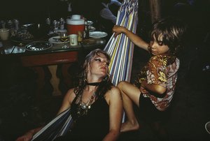
Within my response to Justine Kurland, I attempted to include similar aspects within this specific image inspired by her; such as the slight hint of red clothing, the background of nature and the physical close bond between the subjects, resembling strong relationships and intimacy.
Evaluation of my images compared to Justine Kurland:
The setting of nature is used in both mine and Kurland’s images, as they both take place in a natural, overgrown outdoor environment. I carried this out effectively as it allows my outcome to link to Kurland’s style of depicting her subjects in an untamed space. I also think I exhibited the composition of the image well, due to the subjects performing in an intimate manor which shows a clear connection between them. The main factor that differs my image from Kurland’s would be the overall tones within it. My image has been edited so that it has cooler tones being emphasised rather than warmer tones. This makes my image appear colder than Kurland’s, which I think overall changes the mood of the image and gives a slightly more melancholy effect. This is a drawback for me because I wanted this outcome to appear vibrant and reflect a happier mood, as the aim of this image is to allow the viewer to focus on the clear friendship between the subjects.
Ramona Wang
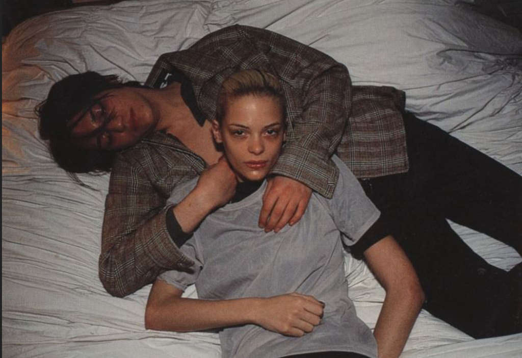
Ramona Jingru Wang uses her position in photography to reflect the themes of identity and community through her family and loved ones. Wang’s ethnicity plays a crucial role in her photographs, to create a strong narrative around the exploitations of Asian women in photography. Her heritage is a significant factor of the story behind her photographs, making her main aim through her work to delve into the connections between humans and the space around us, and also the impact that images can have on our perception of reality. She proposes her ideas into her work by photographing her loved ones building relationships with one another, and investigating how we as humans care for each other. Wang believes in discarding flat narratives of Asian models, as she is a model in art and photography herself. Therefore, her Family Album series was proposed in a way that implies blurring boundaries between private family life and public photography, where she captures intimate scenes at home focusing on the relationships of the people around her. I believe Ramona Wang’s approach to her work is important because it is a quiet refusal of the typical narratives shaped around women of her ethnicity. This ideology links to Kurland as the aim of both of their work is to challenge traditional stereotypes and ideologies surrounding categories of people, which relates to my work because I aiming to disregard typical expectations of young females and link it to my personal experiences with being a girl.
‘I’ve always wondered why naked female bodies are always presented and seen in a sexual way, so I decided to see if I could create photos of my body that are honest and not for pleasing anyone.’
This statement by Wang reflects feminist opinions on the male gaze and the rights of women. It challenges the conventional portrayal of the female body in art and photography, as she questions why it is only looked at in a way of sexualisation to be consumed by men, and not in a way where it can be understood that female bodies can be photographed within personal expression through a camera. From the quote ‘honest and not for pleasing anyone’, I can gather that she is attempting to gain reclaim control over the male gaze, and wanting to shift perspectives on women as she emphasises honesty, which overall implies that she wants to be free from the idea of objectification.
Comparison of my images to Ramona Wang:
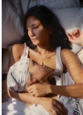
For my image comparison, I believe these two images share similarities within the subject matter, but differences within the overall tone and lighting. One thing that I think I executed well is the connection between my two subjects, as this links to what Wang produced and they both suggest a strong sense of togetherness, which is the aim I am trying to reflect. In both images, the subjects are also lying down, which implies a sense of realism as it gives the outcome a more casual effect, which allows it to look less staged. The frame and angle of my image is also very similar to the artists, as I have reinforced the focus on the facial expressions through the angle of the camera which is only focused on the subject expression. However, there are some clear differences between the two. My image was taken in the evening, meaning I had to use artificial lighting, whereas Wang’s image has been taken near a window in clear daylight as there is sunshine rays beaming on the subjects face. Another difference is the clothing on both of our subjects, Wang’s subjects are wearing softer clothing which gives her image a more relaxed and realistic effect, whereas my models are wearing minimal and harsh clothing, making it appear more dramatic.
Evaluation of my images compared to Ramona Wang:
To evaluate, I believe I executed similar outcomes to my artist inspiration by closely analysing the connection between models which I interpreted well as this was a main focus of mine to reflect on, as it links to my themes. I recreated this successfully in my image by using the same posing approach, where both my subjects are laying down with one lying on the other, and getting my subjects to perform in a way that presents a close relationship between them. However, I think Wang’s image evokes a deeper connection between her two subjects due to the model in the foreground looking up at the model behind her, which shows that Wang has carefully explored the theme of love and care, which I didn’t. Another drawback would be the difference in lighting as mine is artificial, which I think slightly shifts the perception of intimacy as it emphasises that the image is staged, whereas Wang’s image feels more natural.
Conclusion:
In conclusion, there are multiple parallels between both of my artist inspirations – Justine Kurland and Ramona Wang. They both explore themes of female representation and intimacy, linking to my themes on femininity and youth. Through carefully interpreting both of their photographic styles, in this project I was able to gain a strong sense of the conventional narratives on femininity and the way females are expressed through art and photography, through both landscapes and self-perceptions. The significant difference between my two artists is Kurland focuses on groups of young females in a wild and natural environment in which they explore a sense of freedom and escape, whereas Wang explores self representation with a more personal approach, challenging the traditional sexualisation of the female body. One of Wang’s main ideologies included throughout her work is the male gaze, as she questions how women are presented as well as perceived by men. Kurland does not explore the male gaze in her photographs, she explores a more crafted and opposing aesthetic through using nature and soft lighting to create a utopian world for young females. These two contrast heavily to one another, as Kurland’s approaches and compositions create a balance between innocence and real life documentary, yet Wang uses a more raw approach through self-representation which create a more unfiltered effect. Kurland executes her images in a way that highlights an idealised version of the world, through trying to challenge traditional domestic roles of women by depicting them as brave and free. On the other hand, Ramona Wang emphasises the reality of the female form, showing that she prioritises honesty.
I aimed to execute both of these ideologies throughout my five photoshoots for this project, tieing in both traditional stereotypes of young females as well as intimacy and resembling the close bonds that we share with one another. My overall objective is to create a seamless blend within my photo book, between the importance of personal identity through youth and the strong community between females. Drawing from Kurland’s depictions of her subjects, my photoshoots obtain a clear portrayal of freedom and female bonds as I focused on natural settings that evoke escape from traditional expectations. As Wang challenges the male gaze, I also incorporated aspects of this in my second and fourth photoshoot. I did this by using a more intimate approach within my subjects, to reinforce the idea of female objectification. By merging these two artists and their themes together, my project reflects a narrative where young females exist both collectively and personally, which overall challenges the way femininity is portrayed in art and photography.
Bibliography
Bengal, R. (2020) ‘The Jeremys’ in Girl Pictures. New York: Aperture.
Kurland, J. (2020) ‘Cherry Bomb’ in Girl Pictures. New York: Aperture.
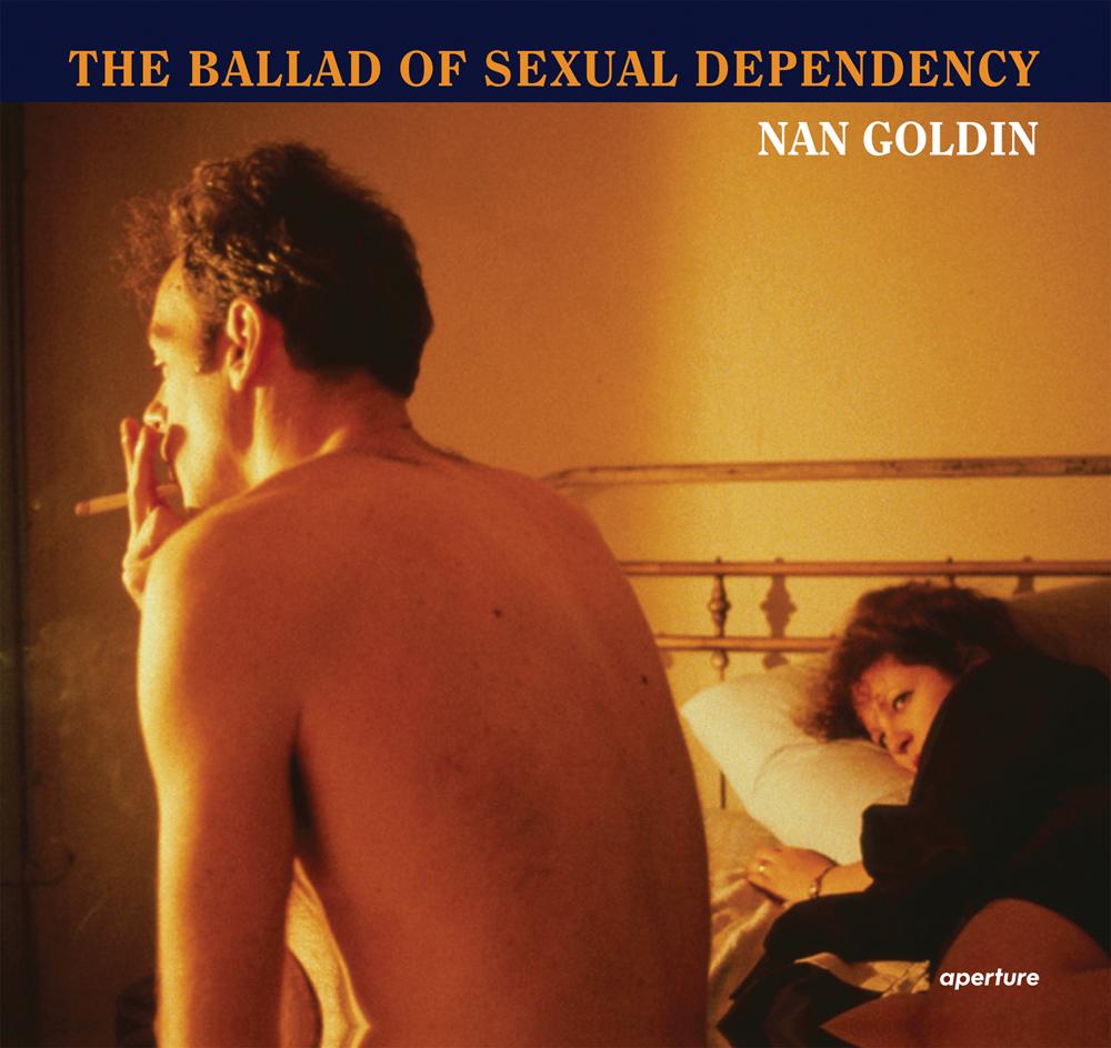
The photo book I chose to observe, research and take inspiration from primarily is The Ballad of Sexual Dependancy, by Nan Goldin.
Exhibition. Jun 11, 2016-Apr 16, 2017.
Details
Format: Hardback Number of pages: 144 Publication date: 2012-10-31 Measurements: 10.28 x 9.37 x 0.73 inches ISBN: 9781597112086
The Ballad of Sexual Dependancy by Nan Goldin was first produced in 1986, and is a photo book that holds over 700 images of the artist herself along with loved ones. Within the book, Goldin uses it as a diary to document the difficulties of intimacy, love and identity.
Nan Goldin was born in 1953 in Washington D.C. and was deeply affected by the suicide of her older sister, Barbara, at a young age. This early trauma shaped her artistic vision, as she later used photography to document moments of intimacy and connections between people. Goldin studied at the School of the Museum of Fine Arts in Boston, where she was introduced to photography and began capturing the lives of her friends, many of whom were part of the LGBTQ+ community, sex workers and drug abusers.
Goldin’s aesthetic is characterized by rich, warm colours, often enhanced by artificial lighting with a snapshot-like quality that gives her work an immediate unfiltered feel. The use of the flash in her photos creates a sense of realism, as it suggests that the photographer is interfering in a private moment. Overall, Nan Goldin’s work challenges societal norm by focusing on people and experiences often excluded from mainstream narratives.
The images in the photo book surround the theme of relationships, self-destruction and sub-cultural life. These themes influenced my focus on youth and femininity as Goldin shone light on similar narratives to what I am aiming to show, through capturing moments of vulnerability and reality without romanticisation. This immediately inspired me as the aim of my personal project is to show the reality of growing up as a young female, who has to follow specific expectations in order to be seen. I want to take a similar approach to Goldin by portraying an unfiltered and raw view on my key themes and apply them to my experiences.
Many of Goldin’s images address the domestic violence she has faced, showing and sharing her experience with millions of other women who have faced the same thing, especially since her images were taken between 1979 and 1986. This was a time where women were devalued and dehumanised, due to the firm gender inequalities in society at the time. Therefore, her photo book tells a story which portrays conflict and increases awareness of the issues happening at the time.
“In part a love poem to the bohemian life style of young people in New York City, it is also a melancholy meditation on the joys and terrors of romantic relationships, both straight and gay.” –The New York Times
This quote from The New York Times tells me that Goldin’s work is very inclusive when portraying love, through the end of the quote: “both straight and gay“. In the 1980s, LGBTQ relationships were not common and often removed from the mainstream culture, meaning that people of this culture would often keep quiet about their sexuality to conform to the societal norms. However, Goldin provided a realistic view on queer relationships. This is significant to me because through my photo book I am including aspects of female friendships and the importance of intimacy in them to develop healthy and comfortable bonds. “Joys and terrors” is a juxtaposing element in this quote that tells me Goldin incorporates both beauty and brutality in her work, showing she does not romanticise relationships as she focuses on the theme of love, yet also violence.
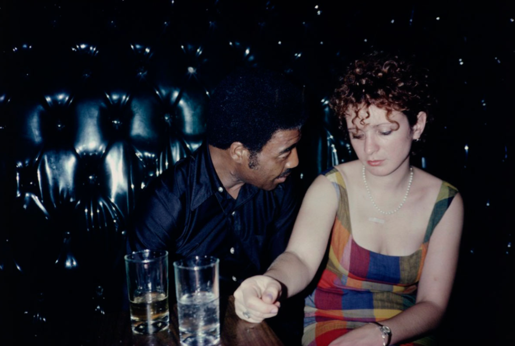
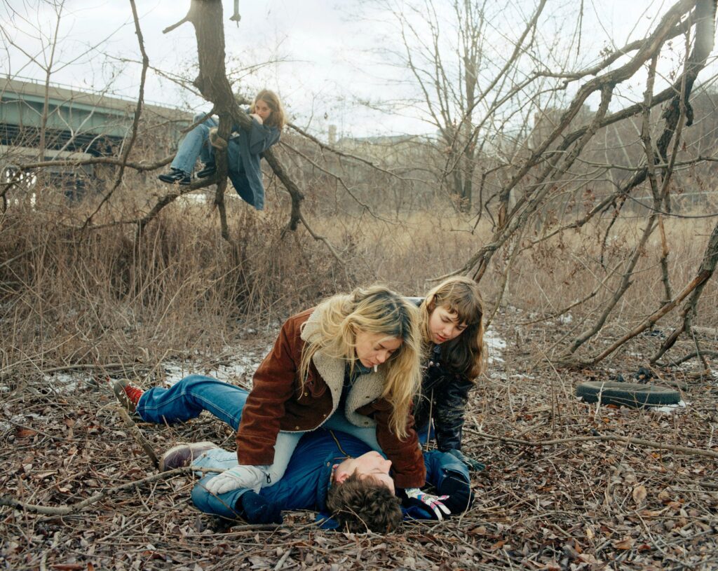
Image comparison between Justine Kurland and Nan Goldin:
Justine Kurland and Nan Goldin both explore themes of identity and challenge traditional stereotypes of females. The aesthetic of Goldin’s image in particular has a more spontaneous effect due to the chaotic scene and a less staged approach. This contrasts to Kurland’s image because we can clearly tell its staged due to the subject in the background observing the 3 subjects in the foreground. Another main difference between the two images is the lighting and colour. Kurland uses natural daylight, and reimagines her photographs in a mythical way as they are carefully composed and cinematic, whereas Nan Goldin’s image is capturing a moment as it is happening.
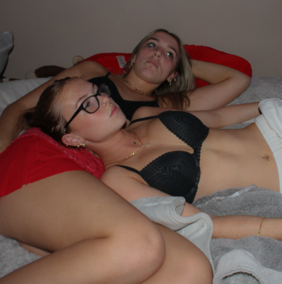
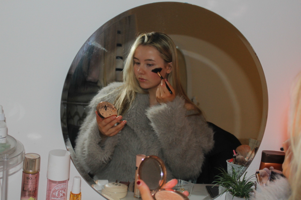
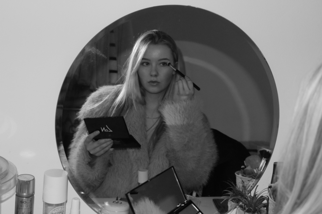
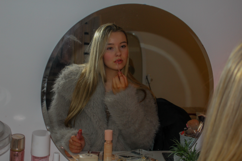
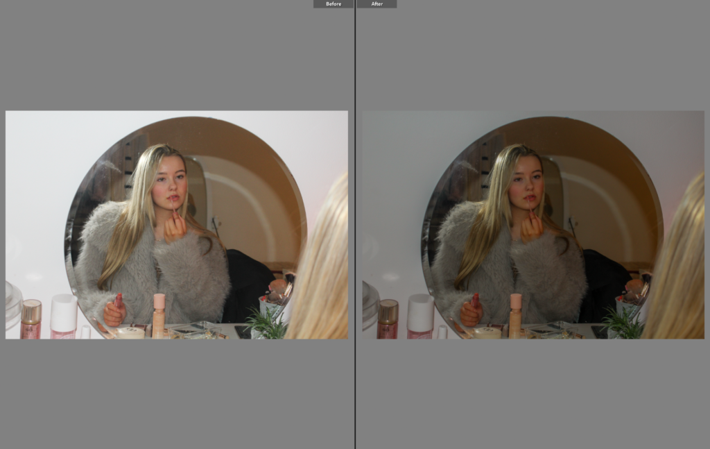
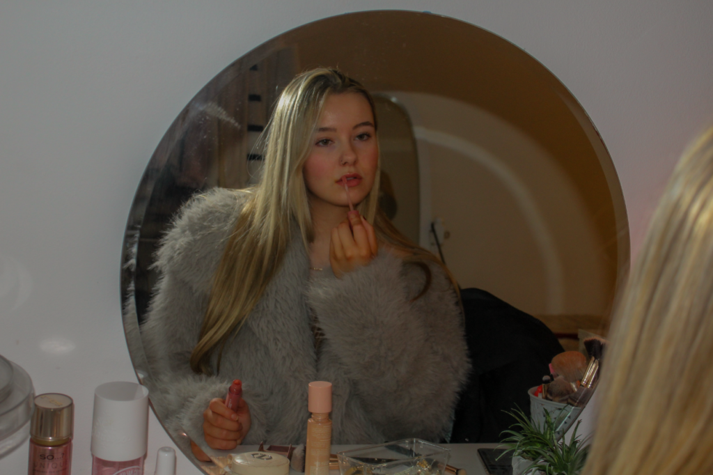
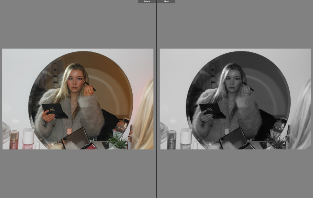
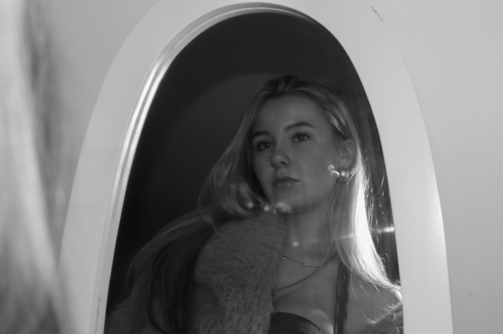
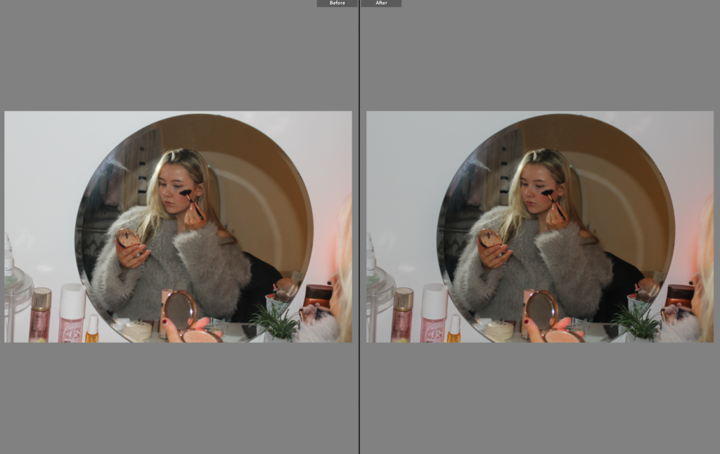
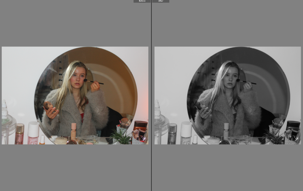
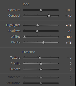
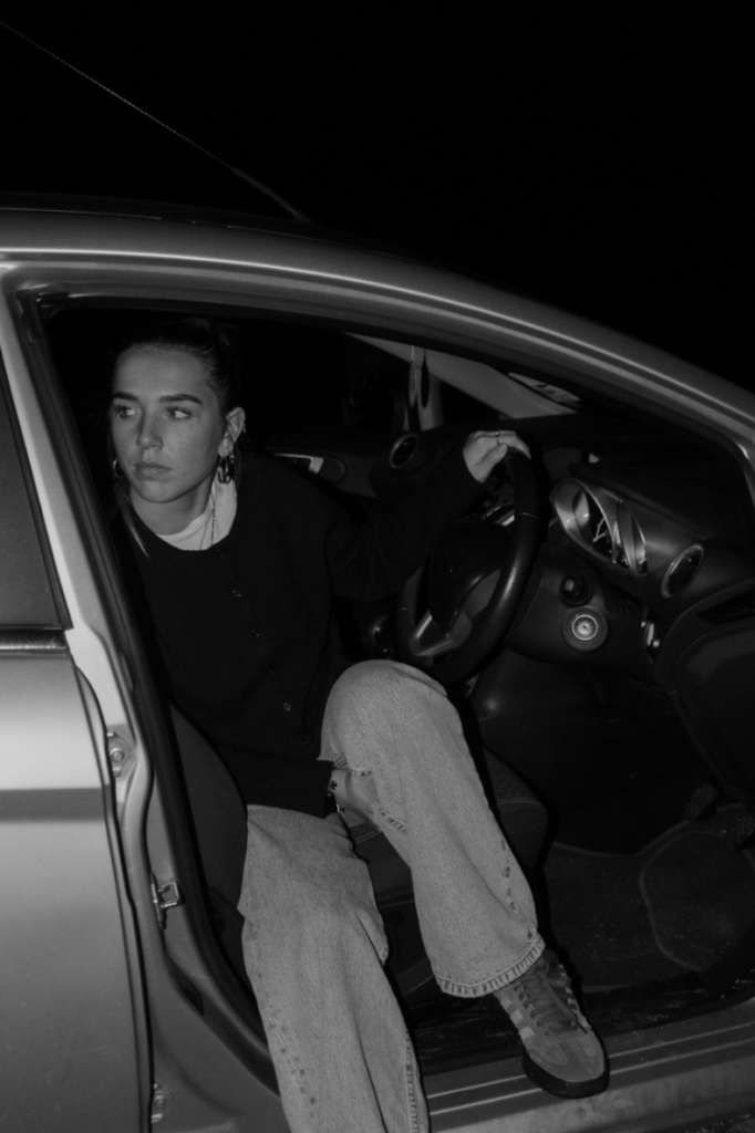
To conclude, I think this photoshoot is my favourite from the five photoshoots I have executed for my personal study project. This is because I took a unique approach compared to my other shoots, as it has a different location and I am portraying a different aesthetic to the others. This photoshoot took inspiration from Ramona Wang, as I have exploited my subject the same way she has, through the use of doing typical female activities to represent the stereotypes. I am wearing a vintage fur jacket over a red dress, which highlights the significance of women existing only to look pretty. On the other hand, a disadvantage of this shoot is that all of my best outcomes look the same or very similar, so I decided to put some in black and white i order to allow them to stand out, and also so that the viewer can pick up the minor differences between each image.
What I think went well:
Subject expression – the facial expressions of the subject are successful as they represent the photographic gaze
The props – the clothing helps add to the dramatic effect and symbolise women being objectified
Portraying typical female activities – links to my themes of femininity and youth due to me getting ready for a night out, and these themes are associated with young women
What I think I could improve:
Range of camera positions – my camera position is the same in most of the images, limiting the uniqueness in each one.
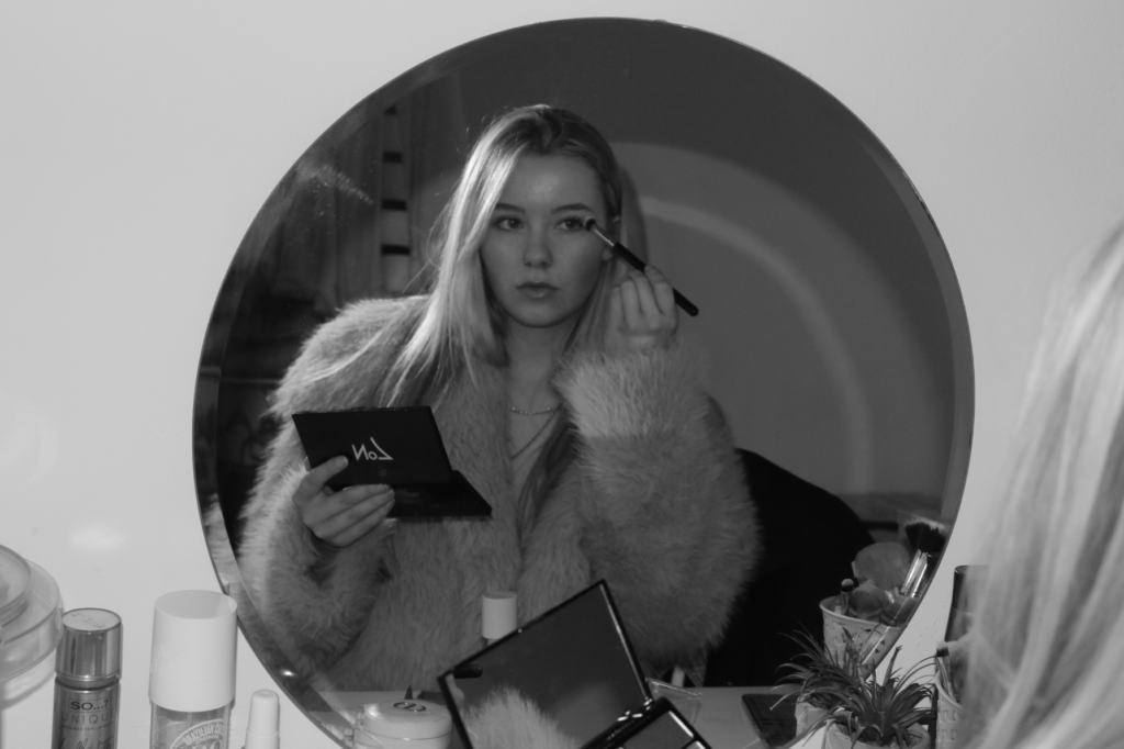
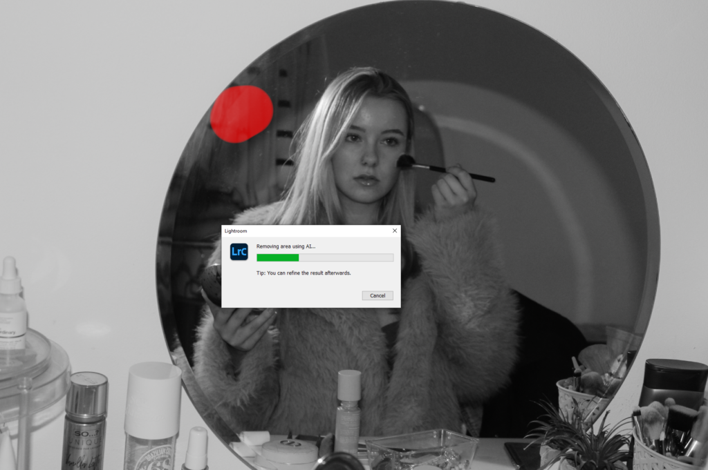
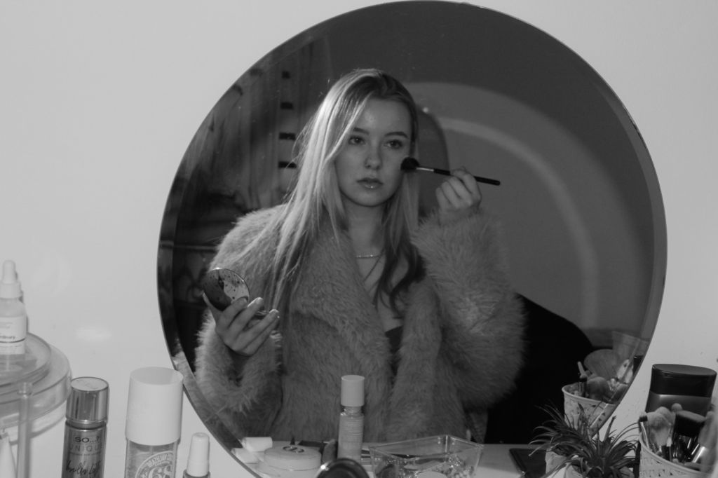
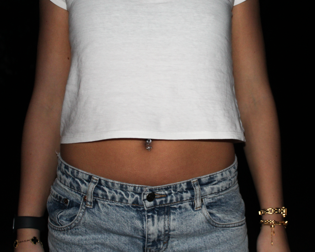
This was my final photoshoot for my personal study, mainly inspired by Ramona Wang. I was the only subject in this shoot, allowing me to explore the themes of femininity and youth through personal experiences fully. In this shoot I focused on capturing traditional stereotypes of young females, and specifically the exploitations of them in photography. For that reason, the location of my shoot was in my bedroom, to create staged images of myself getting ready for a night out. This links to my themes because women are typically associated with looking aesthetically pleasing, and that being our only purpose. I wanted to conform to these ideas by presenting myself in a manor that is seen as feminine, while challenging the ideas around it. As this shoot can be viewed as different to my other shoots, I do not believe that the level of success comes from how feminine my models are portrayed. Rather, I want all of my shoots to be presented in different ways but explaining the same message: looking feminine has nothing to do with being feminine. In my photos throughout this shoot, I performed submissive facial expressions to link to the idea of the male gaze. Moreover, I believe that the way a female would interpret these images is entirely different to how a man would. I believe the female gaze would occur, and women who viewed these images could still potentially see me as a human with intelligence and emotions. Whereas, perhaps males would only view me as an object, and focus on the aesthetic of the image.
Similar to all my other photoshoots, I imported all my images into Lightroom and created a new folder, under the name “Personal study photoshoot 5”, to allow easy access to this shoot for future references. Again, as this shoot is a lot smaller than the rest of mine, it was easier for me to colour code my images and star them. Very quickly I was able to narrow down this shoot to the most successful outcomes that I would want to use in my photobook. I then edited the flagged images so when I create my photo book I can choose the best edited images.
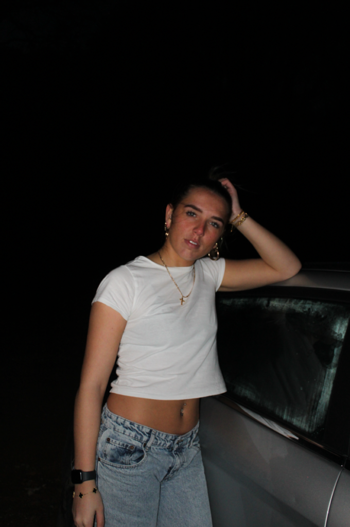
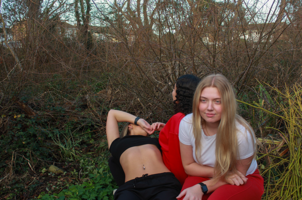
Overall, I think my fourth photoshoot was very successful, despite the limitations of only having 2 main subjects and I don’t want the shoot to appear boring or unappealing. A disadvantage of this shoot would be that there is no specific artist inspiration, which may leave the viewer confused on what my main focus is. However, despite this disadvantage I believe this photoshoot was executed well due to the use of the photographic gaze that me and my other model carried out. This links to Ramona Wang as she photographs females portraying the female gaze to conform to traditional stereotypes of women being objectified for male desire, and I have resembled similar facial expressions to show this.
What I think went well:
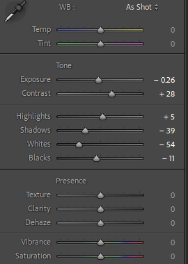
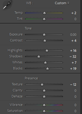
The tones within the images – creates a successful contrast between shadows
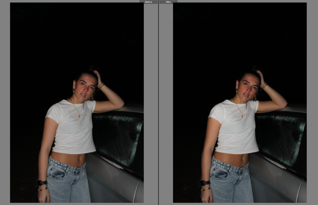
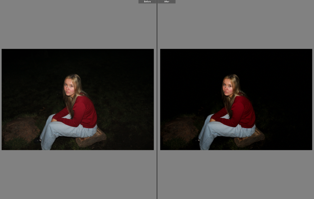
The lighting – differs from my previous photoshoots as it was shot in the dark – creates drastic
What I think I could improve:
Limited range of different images – most look the same due to only having one other model
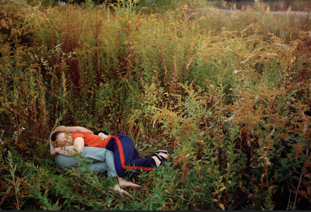
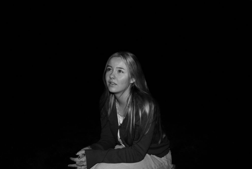
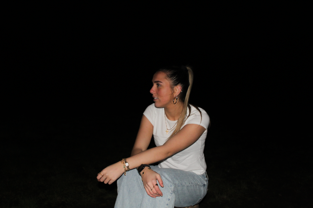
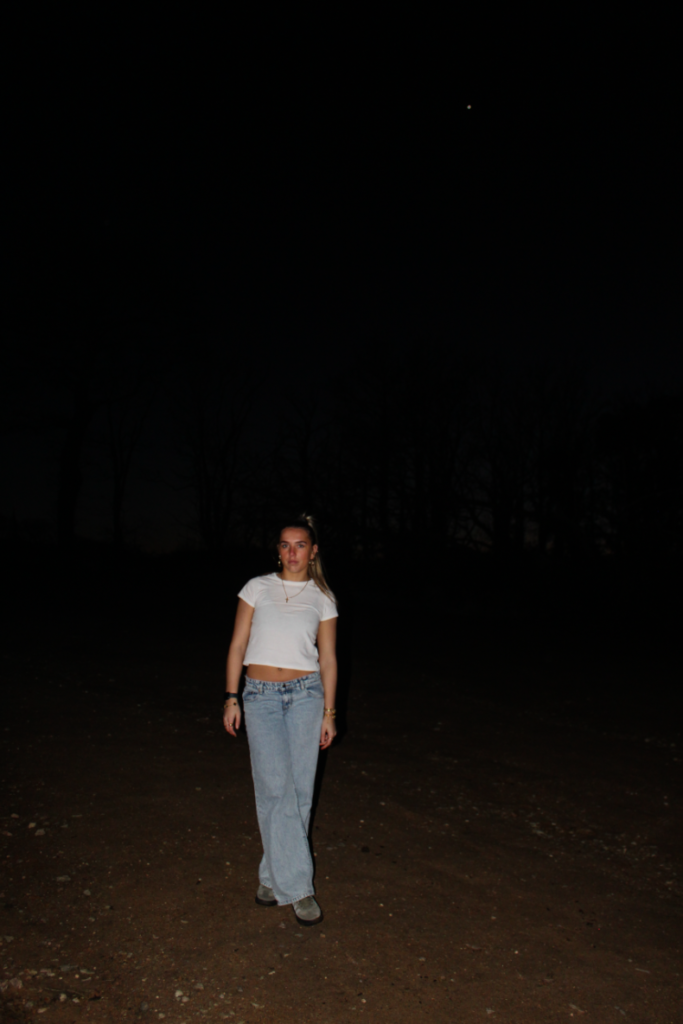
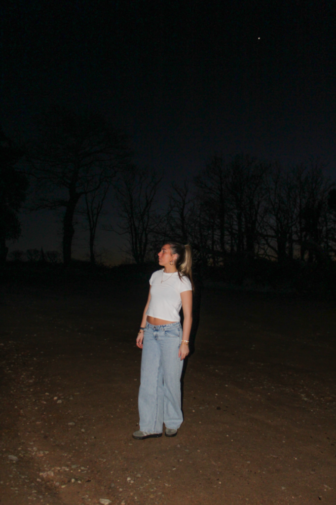
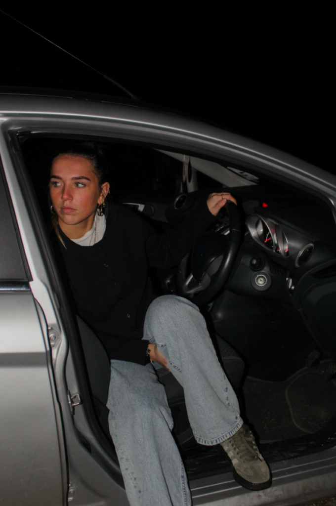
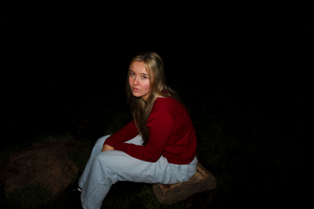
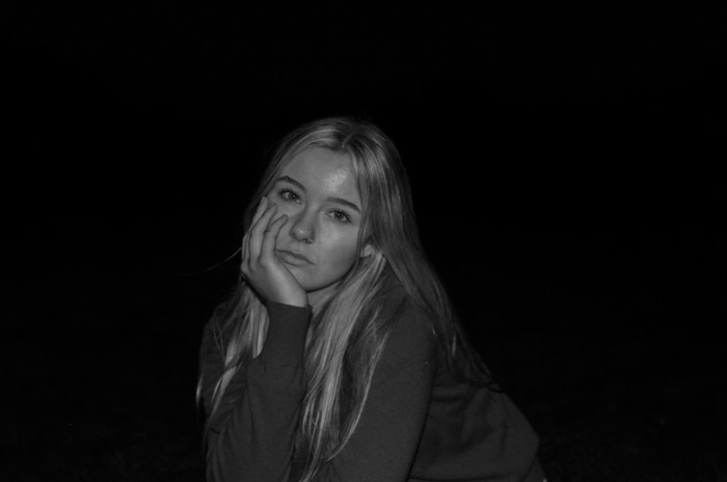
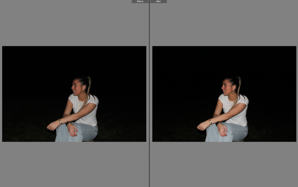
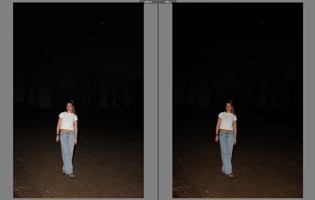
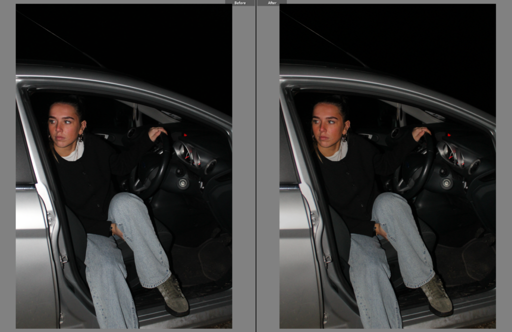
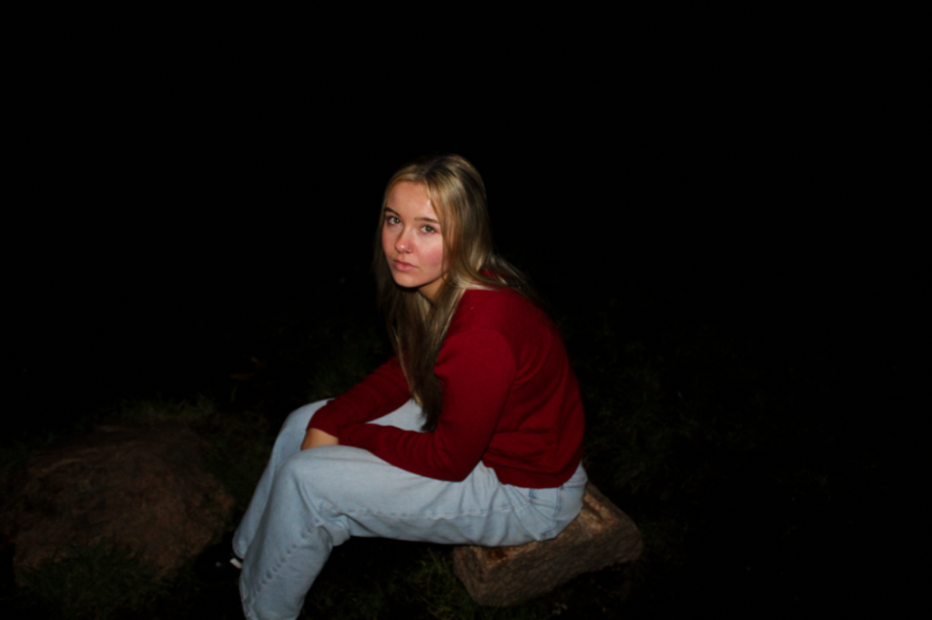
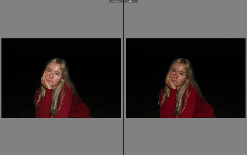
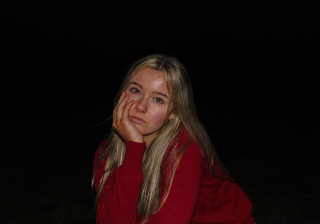
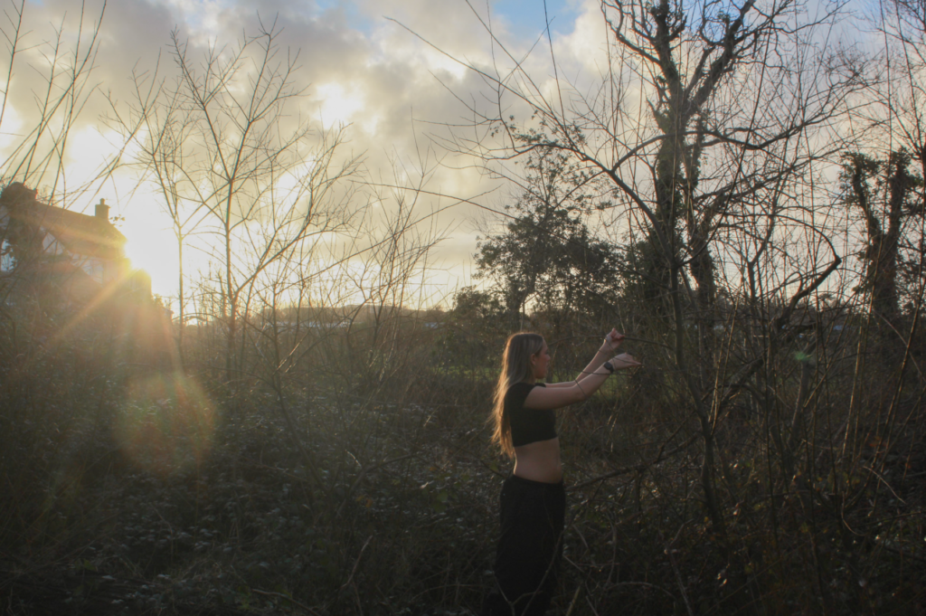
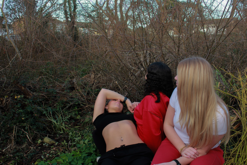
For my fourth photoshoot on my personal study, I focused on myself and one other subject to photograph. This shoot was not inspired by any artist specifically, so it was a chance for me to evoke a more personal theme through my images, where I can include my own ideas, lighting, settings etc. For this shoot, me and my subject went to a field behind St Martin’s school during the evening to create a more dramatic effect, which successfully contrasts my other shoots as they have opposing elements within them. I wanted this shoot to tie in with my themes of youth and femininity through the element of loneliness, which I think relates well to my themes as it is something many young people suffer with. The dominant dark lighting in all of the images help create a sense of drama, and they emphasise how we are sat by ourselves in the dark. This works well because we are wearing vibrant colours such as white and red, which contrast greatly with the colour black. Due to the time of day we took the shoot, it therefore allowed me to experiment with using the flash when photographing,
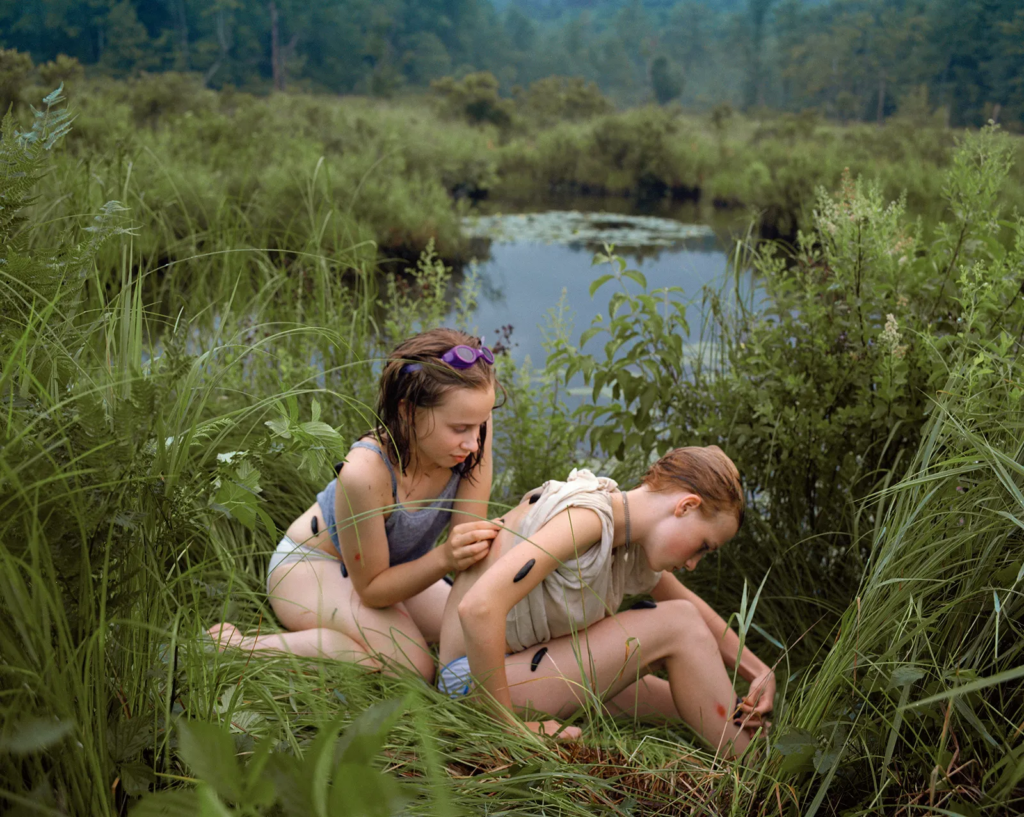
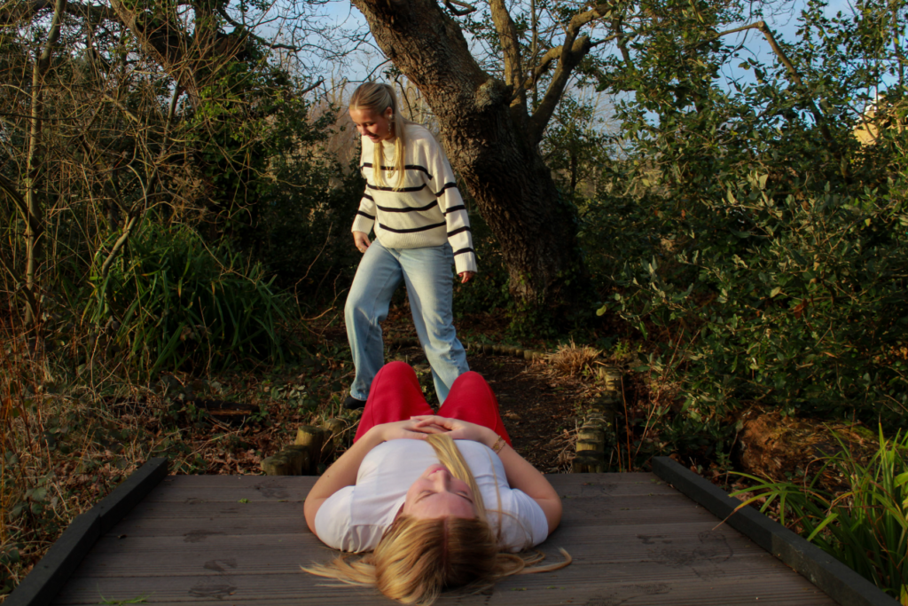
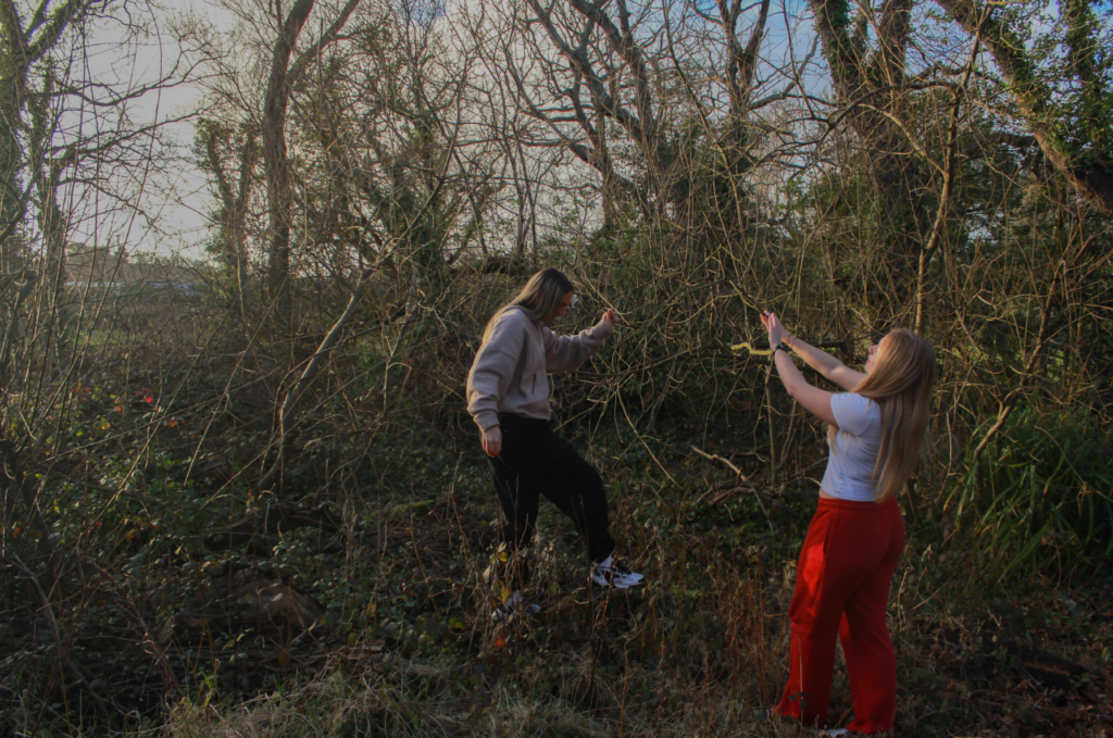
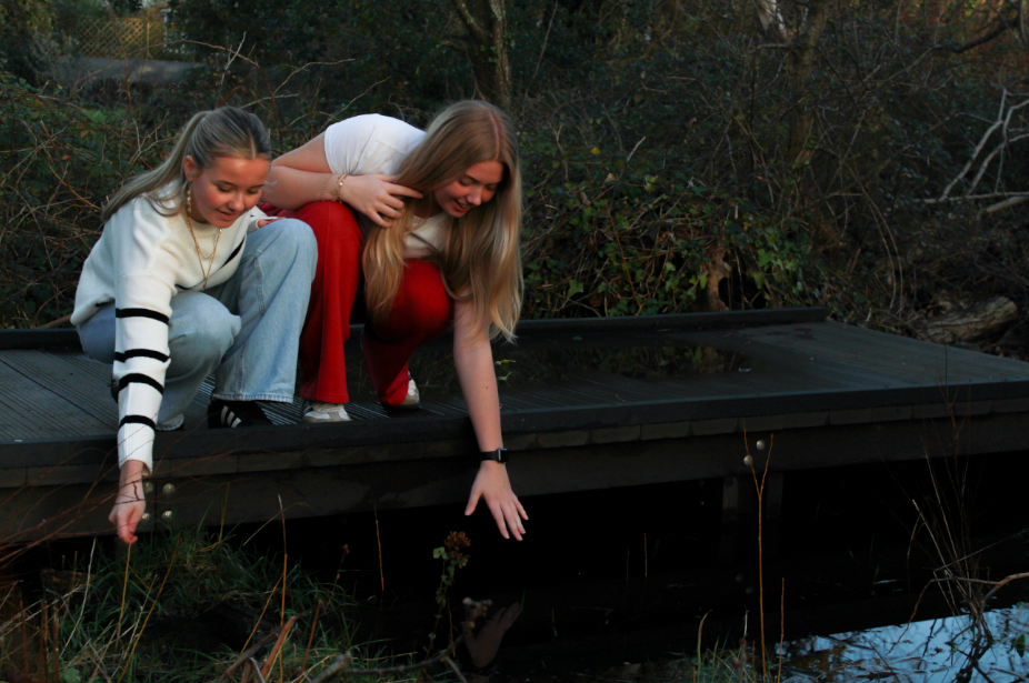
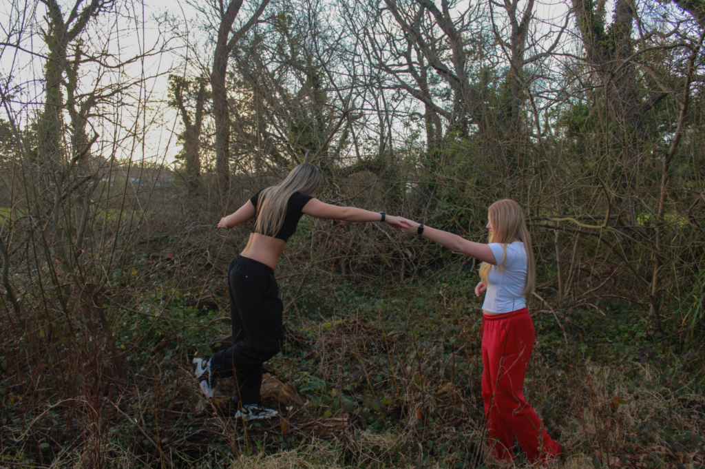
In conclusion, my third photoshoot for my personal study went successfully. I believe I carried out a similar approach to Kurland very well, and I think it will be easy for the viewer to interpret who my artist inspiration was. Each of my final outcomes were carefully chosen when I was editing, for the purpose of expressing different emotions and connections between the girls. I chose the ones that I think resembled Kurland’s series best, and highlight the overall themes of my project.
What I think went well:
Location of my photoshoot was good – different from the first shoot I executed inspired by Kurland
Lighting of my shoot – due to the time of day I took my photos, the overall lighting in all the images is perfect for my editing process.
Subjects – they presented their roles and the relationships between them very well, similar to Kurland. For example, contact with each other and helping each other
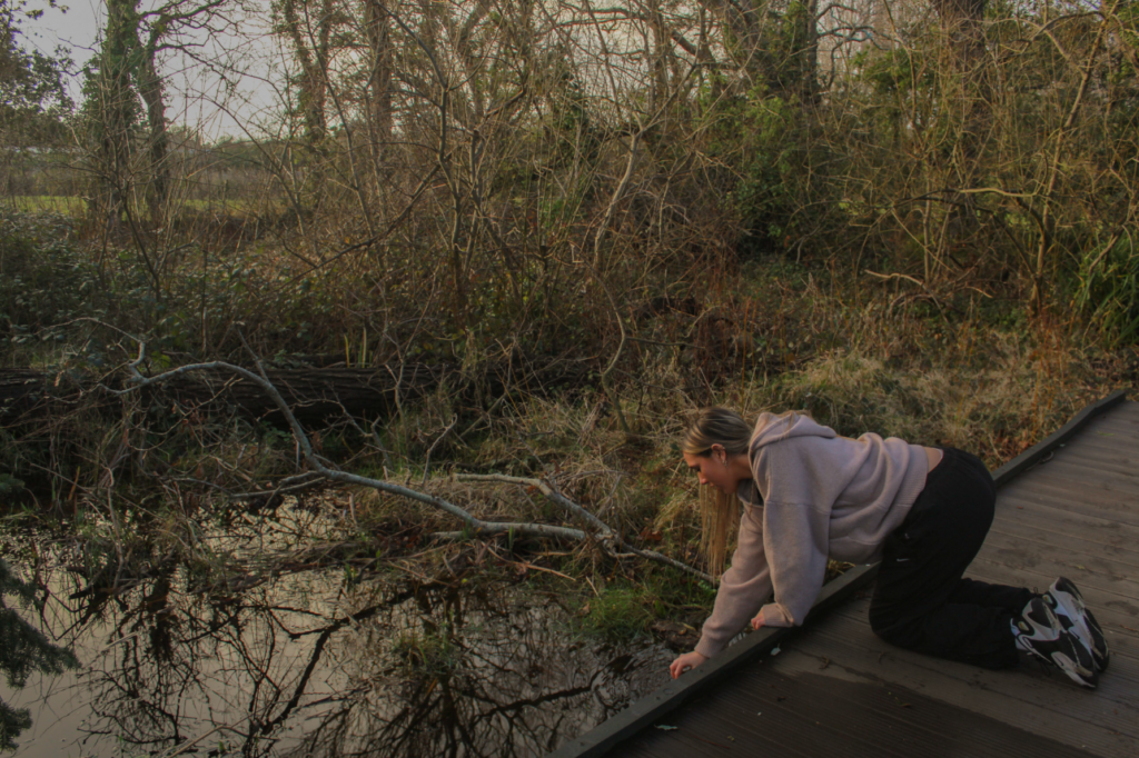
What I think I could improve on:
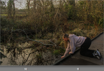
Although the setting of this shoot was effective, I should have experimented with different scenery. For example, big empty roads to show that the girls are exploring alone
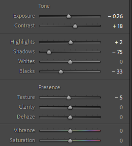
Camera settings – I did not adjust the shutter speed of the camera effectively, meaning some of my outcomes were not in full focus due to a moving subject