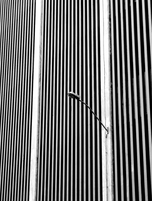
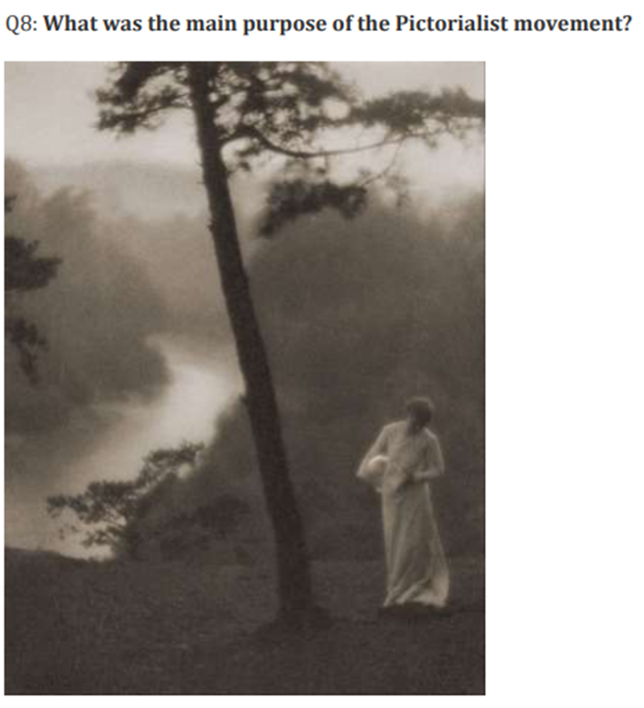
For this photoshoot, I want to explore the binary opposites of masculinity and femininity, inspired by the works of Martin Parr.
‘Bored Couples’ – Martin Parr
In this photo, both subjects are positioned either side of the frame, implicating a difference between the two. This will be the general theme of the photoshoot, that both subjects will stand on both sides of the picture. To further experiment with the difference between masculinity and femininity, I will make changes to either subject to further emphasise their masculinity/femininity.
Rimini, Italy – 1999 – Martin Parr
This photo is a perfect example of the type of contrast I will be attempting in this photoshoot. In the photo, the woman is dressed flamboyantly, to impress, but the man is only wearing speedos and a hat, as that is all that he needs.
Like in this example, I want to try and create a contrast between the masculinity and the femininity by demonstrating the difference between the two with a hidden message. This could be, in the context of clothing, that the man is wearing the essentials and the woman prefers to accentuate her taste in fashion.
Photoshoot 2
For this photoshoot, I want to explore the theme of identity, inspired by the works of Claude Cahun.
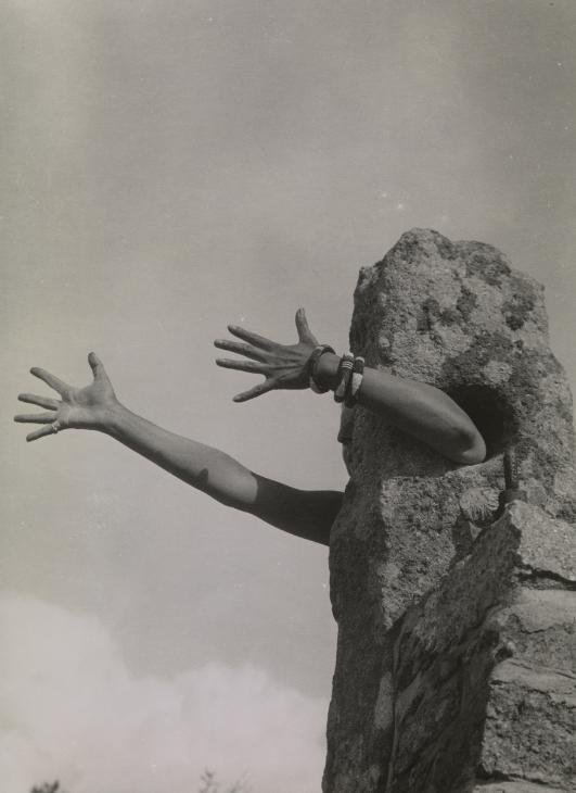
‘I extend my arms’ – Claude Cahun
In this photo, everything but the hands and arms of the subject are visible. This introduces a sense of ambiguity to the identity of the subject. This is the type of ambiguity I want to experiment with in this photoshoot.
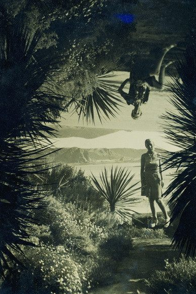
Autoportrait – 1939 – Claude Cahun
This is an example of what I can do to the photos in photoshop. I could attempt to recreate this effect with multiple different photos.
The following photos consist of three different studio lighting techniques, Chiaroscuro, Butterfly and Rembrandt.
Edits
For this rembrandt photo I chose to bring up the exposure and add some warmth to it too. This made the photo look a lot more clearer. I also changed the vibrance and saturation a small bit just to emphasise that warmth and to bring in brighter colours to the photo instead of the dark greys that are present in the original photo.
In this butterfly lighting photo, I chose to make the temperature colder. This changed the background from grey to light blue, which overall changes the atmosphere of the photo and makes it look a lot more interesting by adding slightly more vibrant colours.
For this chiaroscuro photo, I decided to bring up the contrast so that the difference between both sides of the subjects face is more defined. Also, I rose the clarity so that there is more texture in the photo. Overall, this makes the photo a lot deeper and slightly more dark, while the added clarity highlights the subjects face a lot better than before.
Jimmy Nelson is an environmental photographer who has travelled the world photographing a variety of different personalities, from places such as Afghanistan, El Salvador and Nigeria.
This is a photo taken by Jimmy Nelson in Mongolia, displaying the Kazakh people and the beautiful environment that they inhabit.
The photo is taken at about sunset, and Jimmy Nelson has positioned himself facing away from the sun, which creates a shaded effect on the vast mountains in the background of the shot. He has also used a wide aperture to capture the mountains. The photo looks like it was originally under exposed, meaning the shutter speed was too fast, but this could have been done on purpose so that, when editing the photo, Jimmy Nelson could turn the exposure up. The ISO could also have been in a higher range as well to compensate for the low lighting level.
This photo also has a distinct grey colour scheme, which gives the photo both a light and a dark tone, as the foreground is more dark and the background is more light. In the foreground, there is a rocky surface below the horse, which adds to the texture of the photo, and gives context as to how difficult the terrain is to traverse. The two men behind the main man who is the focus point of the shot, give the photo a nice pattern too. Generally, the composition of the shot is very well done.
In the photo, you can see there are three men on horses, each with a bird resting on their arms. These men are Kazakhs, living in the mountains in Mongolia, a place infamous for how difficult it is to traverse. Even in this photo you can see how rough and mountainous the landscape is. Clearly, these men have travelled far up to the top of the mountain that they stand on, which gives the photo power and mystery, it is almost like a demonstration of strength. Although, this is what day to day life is like for these men, and this photo is a very good example of environmental portraiture because it is a demonstration of how different their lives are to ours.
The work that Jimmy Nelson has created would have been a very difficult task. He would’ve had to hike up the mountain with the group of men who most likely don’t speak the same language as him. It is incredulous that Jimmy Nelson had willingly put himself through such an arduous trek just to capture the day to day life of the Kazakhs. It also might have been that this photo was not an idea, but more of a photo that is in the moment, a photo that was not planned but taken on the spot as Jimmy Nelson saw it.
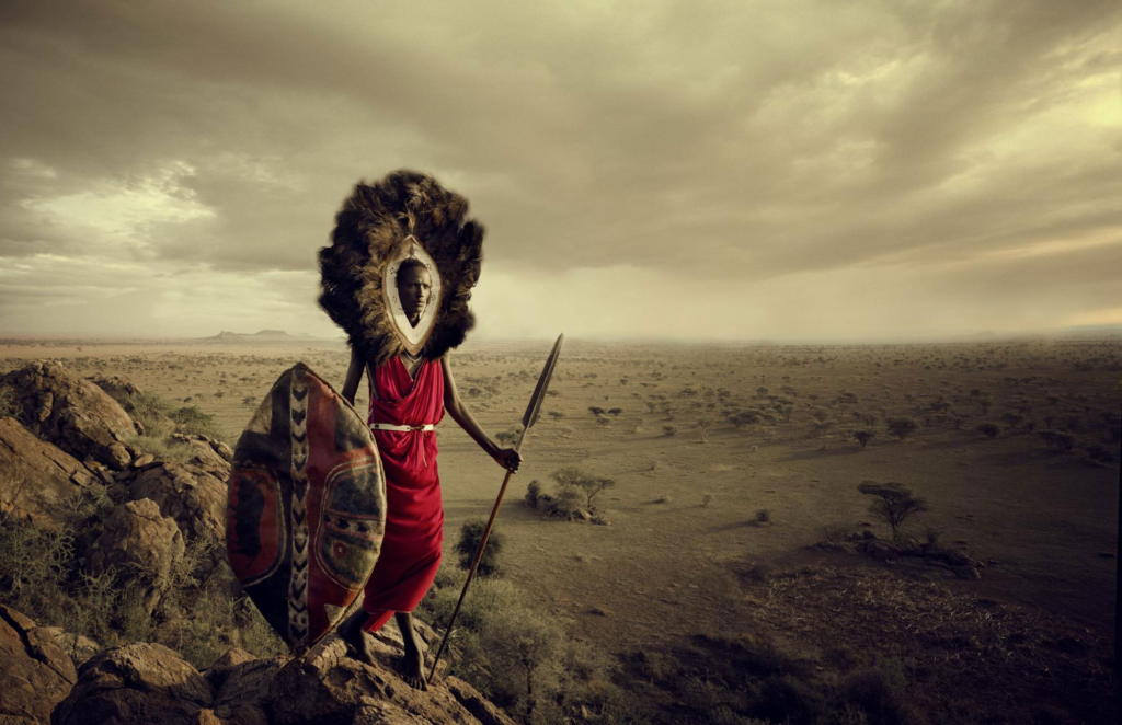
This is a photo of a Maasai warrior in Tanzania, a country in the south east of Africa.
Once again, Jimmy Nelson is facing away from the sun and towards the shadows of the hills, except this time it is to capture the vast emptiness of the landscape behind the warrior. It is not clear what time of day this photo was taken, presumably around sunset. The image looks a little bit under exposed, which again could have been done so that Jimmy Nelson could manipulate the photo in photoshop. Also, Jimmy Nelson uses a wide aperture so that the baron landscape behind the man could be captured. The shutter speed would have been fast so that he could capture the warrior while he is walking, which could have been why the image looks slightly underexposed. The ISO on this photo would have been regular because the frame isn’t that dark and is quite bright in colour. The photo is both warm and cold, the warmth comes from the yellow colours coming from the clouds or the desert, but the coldness comes from the dullness and lack of vibrance in the shot.
The texture of the shot is mostly sandy and rocky, which is another representation of the difficulty of traversing these landscapes that Jimmy Nelson captures. The photo is very 3 dimensional as the wide depth of field displayed the vastness of the desert in the background and how far is goes. There is a very clear line between the sky and the land, which also demonstrates how far the land goes as well.
The photo was taken in 2010, although it is generally a timeless photo as tribes like the Maasai have been around for thousands of years and continue the same traditions as they did all those years ago. Even the weapons, such as the spear that the warrior wields, and the shield as well, most likely have been around for centuries. The man is wearing very traditional Maasai clothes and are very unusual and unlike the clothes generally worn in western culture. He is also wearing what appears to be a lions mane around his head, which is a very powerful statement and could be a sign of strength among the Maasai people.
Once again, this most likely was an in the moment shot, which is emphasised by the warriors lack of gaze at the camera and that he is in motion as the photo is being taken. This perfectly encapsulates the essence of environmental photography, to portray a persons life in one shot, and having the warrior unaware of the shot gives the photo a natural feel.
Overall, Jimmy Nelson is an incredible environmental photographer who goes through thick and thin to capture the beauty of the different cultures he finds himself in and the vast landscapes that they inhabit.
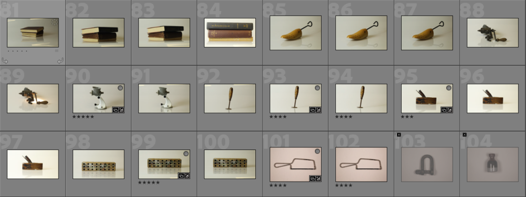
This is all of the photos that I have taken so far in my study of still life. I have utilised the techniques that Still Life photographers and painters used, such as using objects like books to symbolise knowledge and wealth. The majority of the photos are singular objects where I have experimented with lighting and the positioning of the object in the frame. I used a variety of lighting to give different tones and tints to the photo and to add warmth or coldness to the picture. I also used a variety of backgrounds, such as an infinity curve and a flat background. Throughout all of the photoshoots, I kept the depth of field wide on all of the photos as I found through my study of Still Life that having every object in focus is a key element to Still Life photography. Some of these photos are a bit experimental, adding different and contrasting objects that usually would not be seen together, such as the wooden block and the painted cutlery.
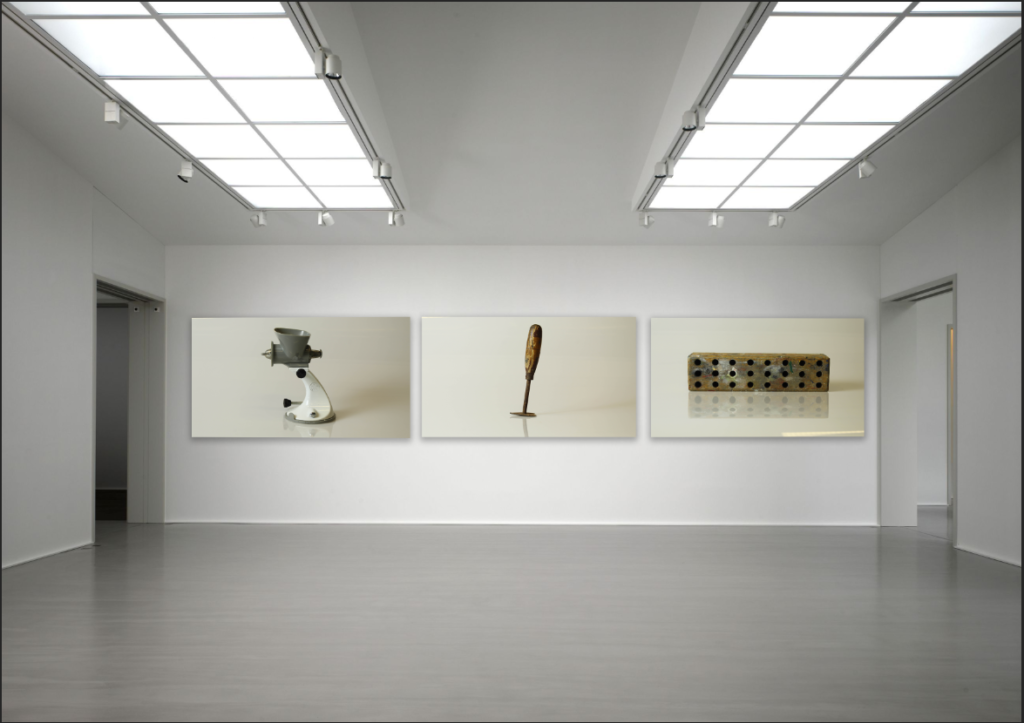
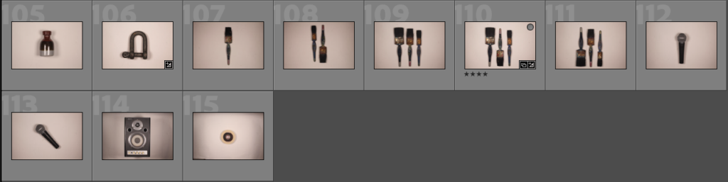
Here are what I believe to be the best photos. Most of these are singular objects, with some experimental photos in there as well. There are a couple Walker Evans inspired photos in the bottom right. I have used lots of different backgrounds such as an infinity curve or just a flat white background. Not much editing was done to these photos, only slight changes to bring up the exposure of the image. I did this because the lack of colour in a photo generally gives it a very solid, still feeling.
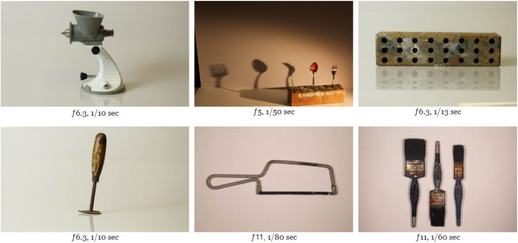
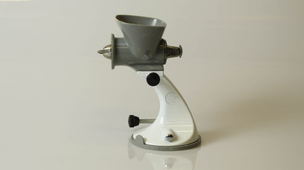
This photo depicts what appears to be some kind of kitchen appliance like a meat grinder. It was taken using an infinity curve, which works well in this case as it looks as if there is no background at all. The photo lacks colour, which emphasises the aspects of still life as colour generally tends to bring a sense of movement, like something is going on in the photo, whereas here it is a still object. This photo was taken with a slow shutter as well, which further implies the stillness of the photo as a slow shutter means that the object cannot move. Older still life paintings used to depict flowers, books or skulls as metaphors for happiness, knowledge or death, but nothing significant derives from the kitchen appliance in this photo, which coupled with the drab colour scheme, puts further emphases on the stillness of the object.
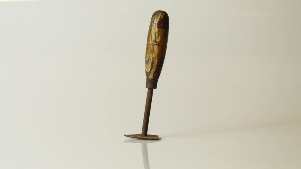
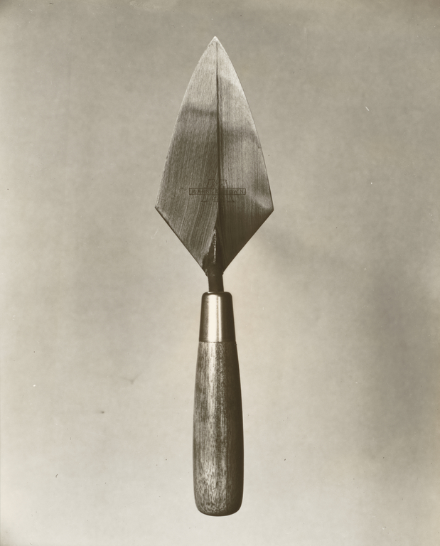
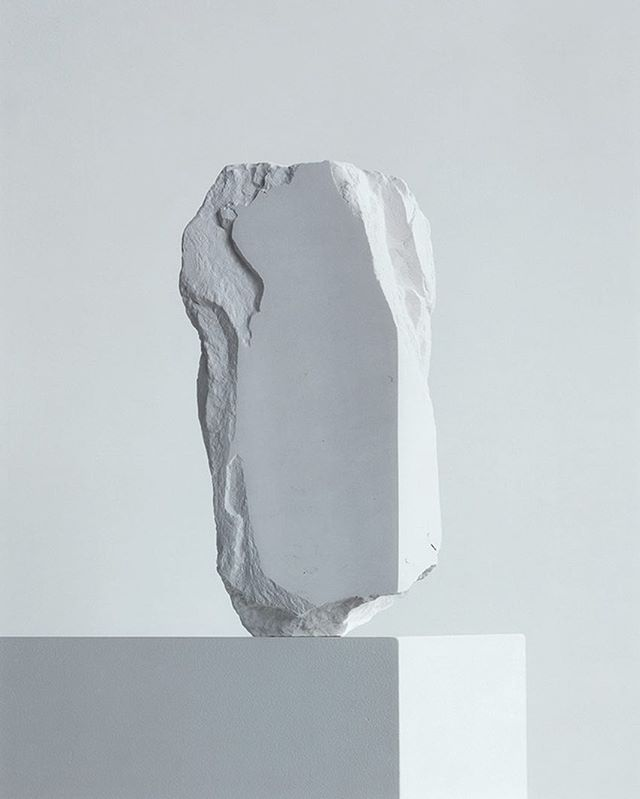
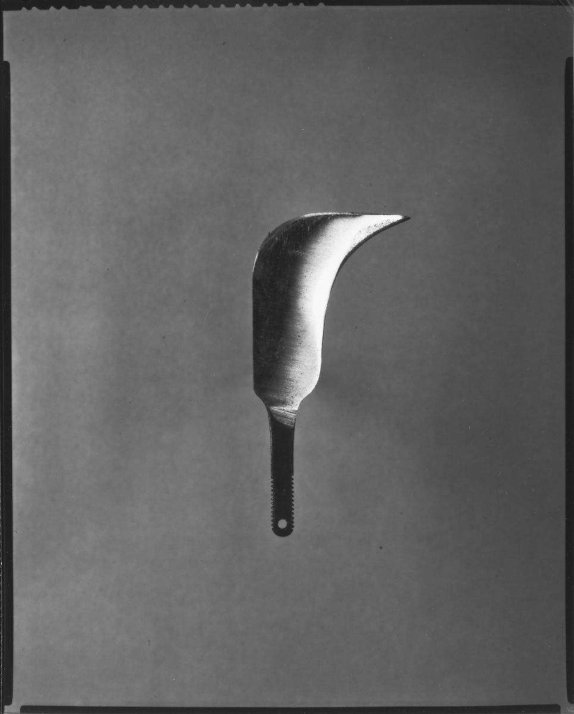
In this photo, there is an object that appears to be some kind of flat tool which was used a very long time ago. This adds mystery to the photo immediately as it gives uncertainty to what the object actually is, where it has come from, what it does. This lack of context is prevalent in most still life photographs as still life is not about the context of the photo, but the content. Also, the object has a slight tilt, which adds another layer of uncertainty because it looks as if it will fall, but it doesn’t and remains still. The shutter on this photo was also slow, which applies further emphasis on the stillness of the object. The tool is rusted everywhere there is metal, which adds texture to the photo and also aids the photo in keeping a brown colour scheme. Although there is more colour in this photo compared to the previous one, the colours are still dull, which again depletes the photo of movement.
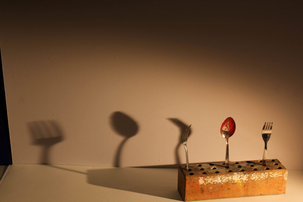
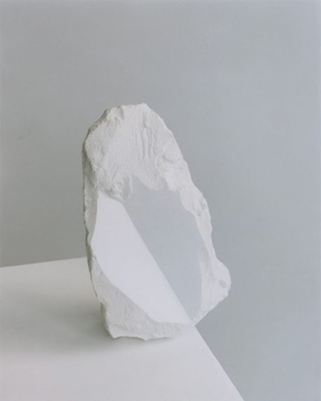
This photo was one of the more experimental ones out of all of the photoshoots, and it is the odd one out of all the selected photos because it features warm lighting, a few colours and has a shadow. I also wanted to include this photo because I felt that I needed to show how shadows can be used in still life. In this example, the shadow is used to stretch the object across the photo so that the frame doesn’t appear empty. The texture that appears on the wooden block also adds to the photo as it adds roughness to the otherwise smooth background. The painted cutlery also adds an interesting element as it removes the smoothness that would be on the spoon and replaces it with a gritty, unclean texture that, again, adds roughness to the smooth background.
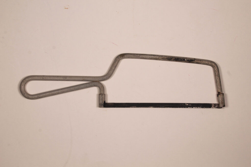
This photo is one of the two out of the selection that is inspired by Walker Evans. It depicts a saw on a flat background. Nothing is happening in the photo, which makes it a perfect example of still life. There is no colour, the saw is only grey and black and the background is just flat white. The texture that appears on the saw gives the photo a rough feeling, but it also shows that this tool has been used a lot. This allows the viewer to question the context, despite there not being any context at all, it is just a saw on a flat background.
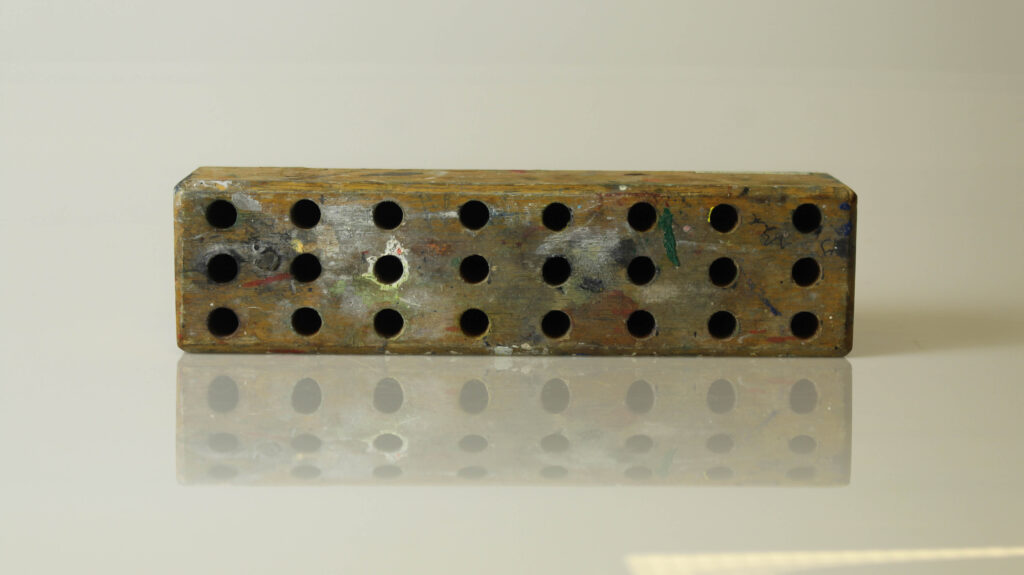
This photo depicts a wooden block used to hold scissors. This type of object usually appears in a classroom, which adds an element of nostalgia to the photo. Also, the texture of the wooden block, with the random splodges of paint and wear to the wood adds a worn element to the photo. Unlike the other photos taken with an infinity curve, this photo actually has a lot of colour. Despite this, the object continues to appear very still and solid. Also, the lighting is almost warm, which emphasises the brown colour of the wood and gives the photo a bit of vibrancy compared to the other ones.
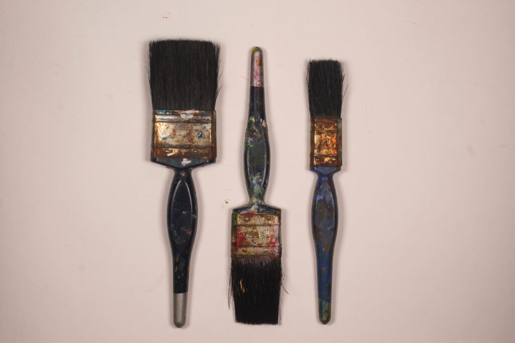
This photo is the other example of a Walker Evans inspired photo. It features three paint brushes on a flat white background. In this case, the shape of the paintbrushes and the pattern that they are arranged give the photo an interesting quality. As well as this, the paintbrushes have clearly been used a lot as there is lots of remnants of dried paint on them. This also adds texture to the photo, as without it the paintbrushes would look new, which is counterintuitive to the still life photos that were taken by Walker Evans, as they tend to feature used tools with obvious marks or dents that clearly show signs of wear.
The works of both Walker Evans and Darren Harvey-Regan are both important pieces of art in the field of Still Life, and both artists bring interesting qualities to still life that were not done before. However, both photographers use similar techniques in their work.
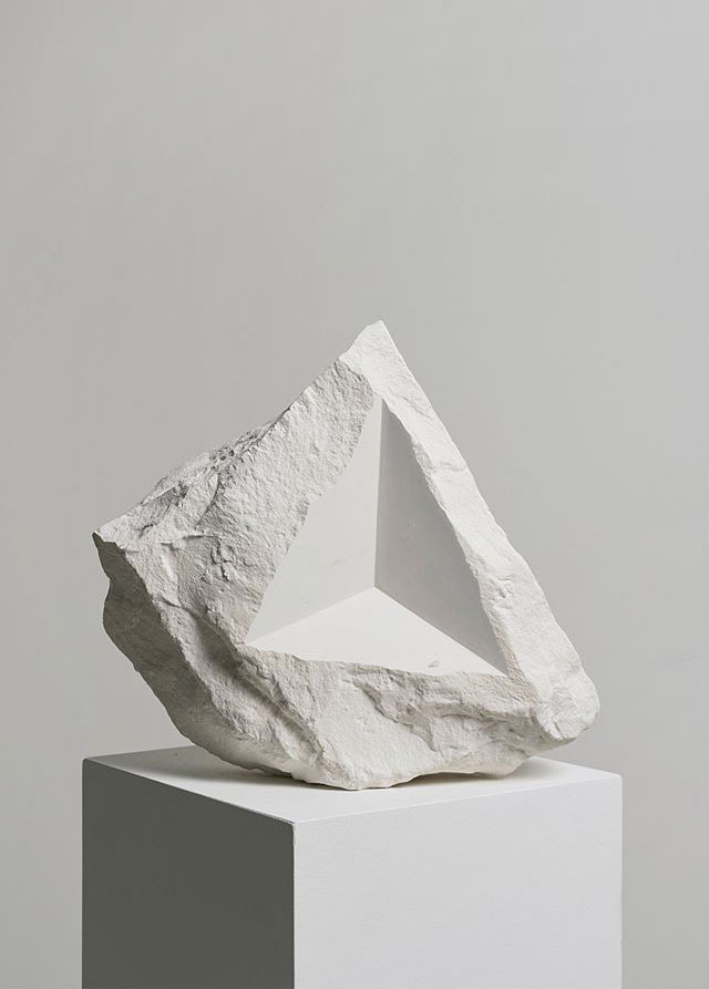
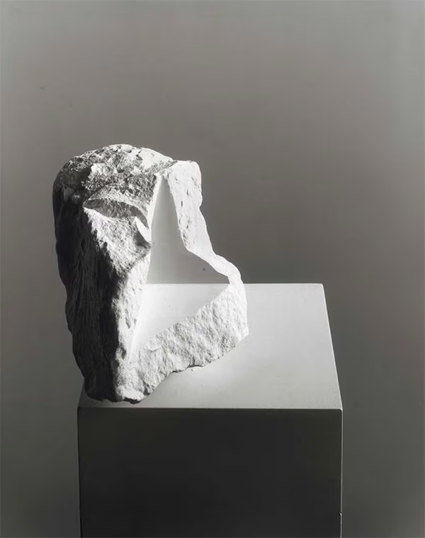
Photo by Walker EvansPhoto by Darren Harvey-Regan
As you can see, both of these photos feature similar qualities. Both photos are in black and white, which adds a quality of stillness to the photos. Both feature a flat white background that isolates the subjects in both photos. Also, in both of these photos a triangle is featured. Geometric shapes like triangles and squares are something that is commonly found in both Darren Harvey-Regan’s and Walker Evans’s work.
To delve further into my study, I have aligned these 3 photos from Darren Harvey-Regan to analyse what is common in each of these photos. Immediately what strikes the viewer is the use of the geometric shapes carved out of the rocks that align with the edges of the box. This adds a very unique aspect to the photos and makes them very visually appealing. As well as this, the shapes create a very large contrast between the rocky surfaces and the sharp edges of the shapes. Also, the objects in the photos seem to have been carefully balanced. A good example of this is the photo in the middle, which looks like something that you would find in nature, maybe on a beach as a broken away piece of cliff. The sharp surface on the object also works perfectly with the edge on the box below it, which emphasises how each of these photos have to be to perfectly aligned so that the shapes align with the edges on the box. Overall, Darren Harvey-Regan utilises this idea very well throughout his still life photography.
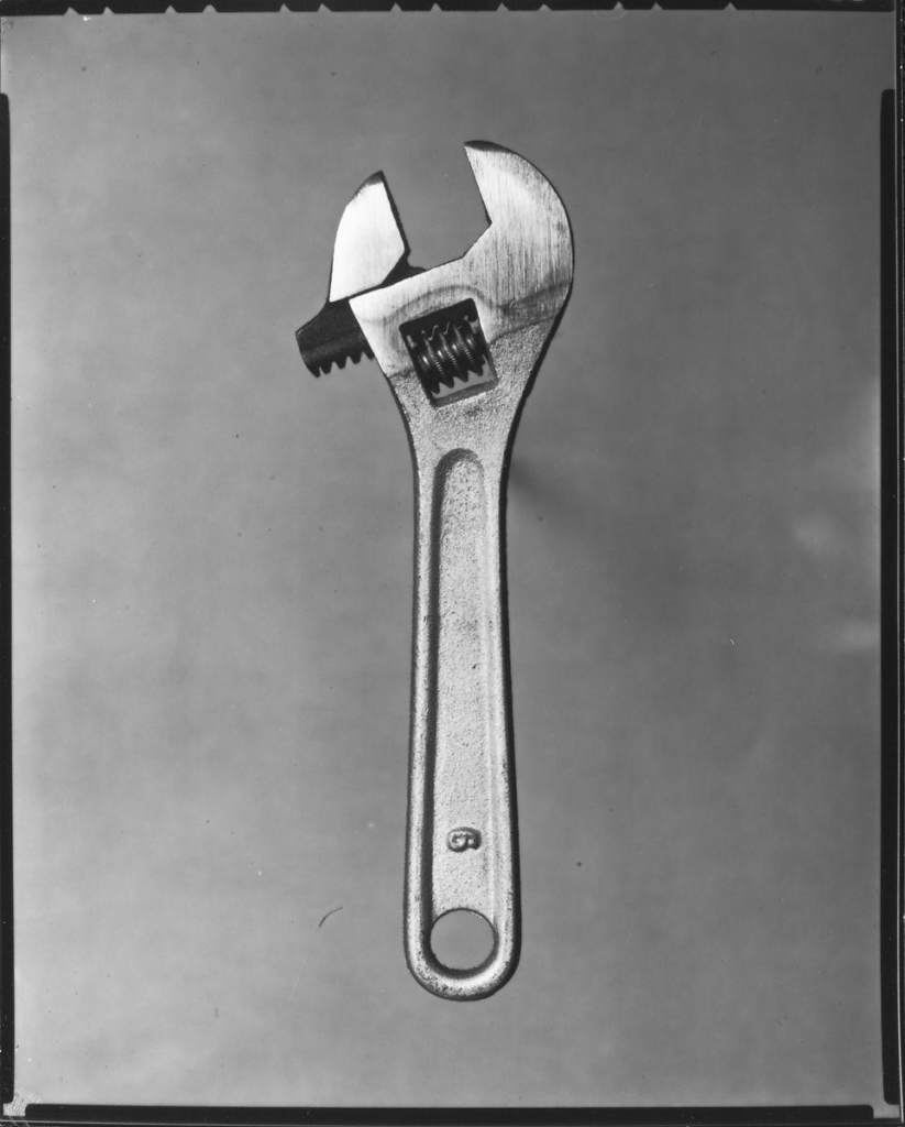
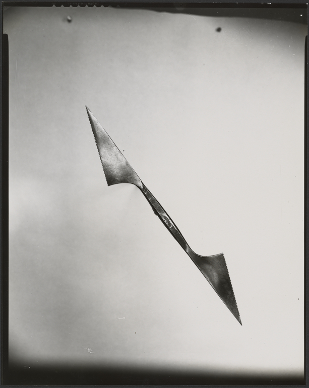
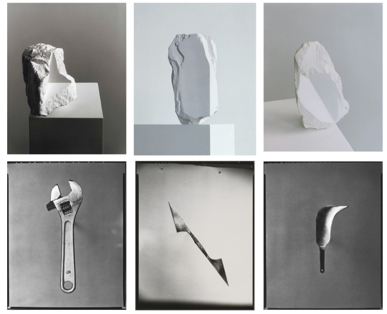
These are 3 still life photos from Walker Evans. Each depict a tool, an adjustable wrench on the top, a kind of double sided blade in the middle and some sort of warped blade knife at the bottom. Clearly, Walker Evans likes to use tools as the subjects in his still life photography, and he utilises them in very interesting ways. Firstly, all of the tools are elevated from the background, hung from a string. This is an interesting idea because it detaches the object from the background. This allows Walker Evans to use aperture to blur the background and completely separate the subject from it. Secondly, all of the tools are metallic, which provides an interesting texture to each of the photos that is different in each. The wrench seems quite solid, thick and put together. The double sided blade looks quite messy and thin, and the knife on the bottom appears quite shiny and sharp. With the addition of the objects being elevated, this allows Walker Evans to use lighting in different ways to make the objects appear in different textures. It also helps that there is no shadow created from the object.
Putting all of the images that I have analysed together demonstrates that both photographers give unique ideas, perspectives and inspirations to Still Life and overall they both provide perfect examples of Still Life photography that outline exactly what a Still Life image is, a still object with little to no context, just something that looks visually appealing.
Formalism is the visual aspects of a photo, that considers everything, such as light, designs, textures, and the general composition of the photo. A formalist photo will usually be more about the content rather than the context. They usually include still objects, arranged in either a chaotic or simple pattern, and utilise the shadows that the objects cast. This can be done in black and white, as when the colour is removed from the photo, the objects appear more still.
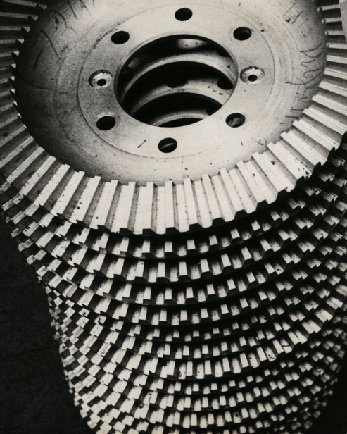
This is a photo by Alexander Rodchenko, an early 1900s photographer from Russia. The photo, which is in black and white, depicts a stack of mechanical objects. This gives the photo a very rigid, still feel, because the objects are metal and have a hard and solid texture. Also, the teeth on the gears form a pattern of lines that is visually appealing, and is the highlight of the shot. The use of lighting to cast deep shadows and to create contrast between the grooves also emphasises the pattern and adds a unique and mesmerising quality to the photo. Also, because of the height of the objects and the downwards angle that the camera is facing, it is easy for the viewers eyes to get lost in the pattern. This is a common trait that appears in other formalist photos too.
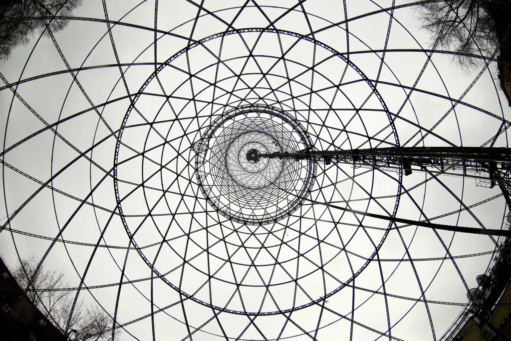
This is a photo of the Shuckov Radio Tower, also in Russia. Immediately what strikes the viewer is the pattern that the tower forms. This is also very easy to get lost in and is quite mesmerising too. The photo is also in black and white, which may not have been a choice considering when this photo was taken, but still the lack of colours makes the photo easier to look at and makes it easier to focus on the subject of the photo. The use of the shadows that follow the perimeter of the shot also make it feel like the photo has been taken from a void, a place covered in darkness.
This is another photo from Alexander Rodchenko. It depicts the intricate pattern of lines that appears on a building somewhere in Russia. Once again, this pattern is visually appealing. The picture also feels big, because the building stretches out of frame. However, in this photo, a lamp post is depicted as the subject of the photo. The lamp post juts out in the photo because it is dissimilar to the main line pattern that appears on the building. This brings an interesting quality to the photo, and could be linked to ‘wabi-sabi’, finding beauty in imperfection.
Overview
There are many similar features that are utilised in the photos shown here. All feature a complex, easy to look at, mesmerising pattern that takes up the majority of the shot. All are taken in black and white and even though it is not by choice, it makes the photos feel empty and still, devoid of emotion. There is more focus on what the content of the photo is and how it looks, rather than the context of the photo, where it was taken, what emotions the viewer feels. Each photo gives a high level of stillness, there is no movement. Nothing really is out of place, even when there is an object that doesn’t fit the criteria of the pattern around it. In general, formalism is the expression of still, a moment in time, not the time before or after, but in the moment.
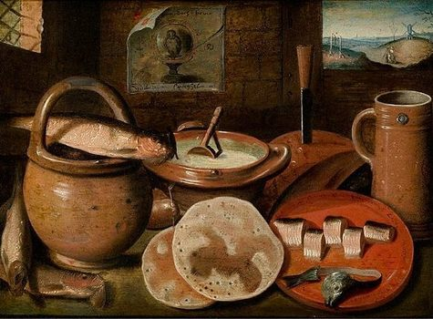
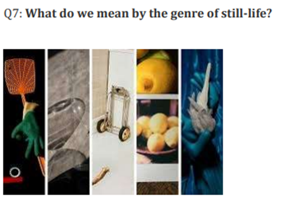
Still life is a genre of art that depicts inanimate objects in a still frame. This usually comes with deeper context or meaning behind the objects that have been placed there. For example, skulls are used to symbolise death, exotic foods like fruit are used to demonstrate wealth, and books are used for knowledge.
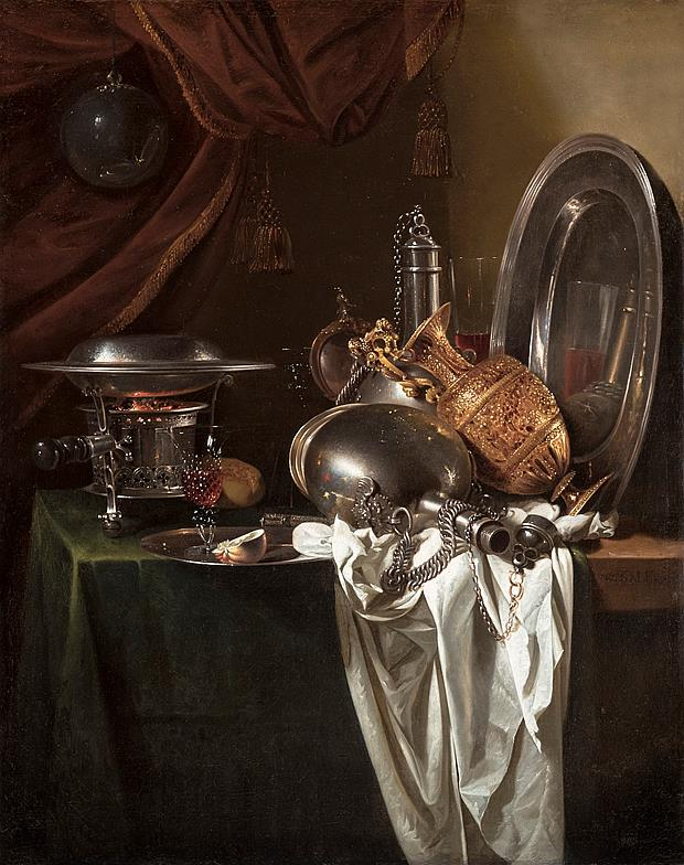
Still Life started in the 16th century, with Dutch painters like Pieter Aertsen, who pictured objects like expensive cheese, exotic fruit and various luxury items. This was done to show off the wealth of the painter and of his country.
Still Life Timeline
16th century painting by Pieter Aertsen from the Netherlands
17th century painting by Willem Kalf from the Netherlands
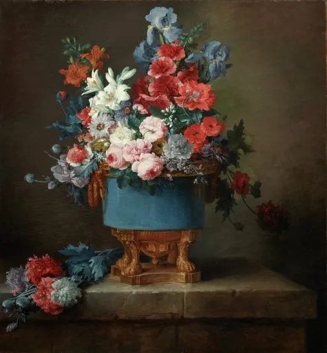
18th century painting by Anne Vallayer-Coster from France
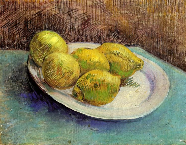
19th century painting by Vincent Van Gogh from the Netherlands
20th century painting by Salvadore Dali from Spain
Still life photographers
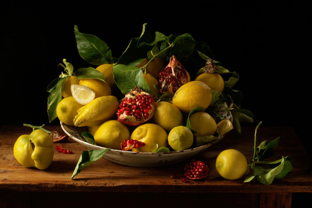
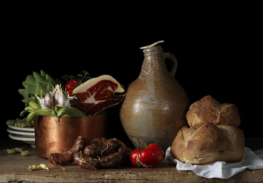
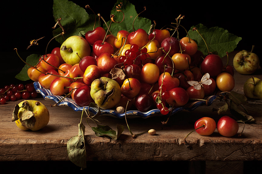
The photos in this post all come from a 21st century photographer who is called Paulette Tavormina. She is a modern American artist that mainly focuses on replicating the essence of Still Life images. She uses similar techniques to the originators of the genre, in this photo using meats, bronze pots and other items that were considered “luxury” for the time. This also links to colonialism at the time as well, as exotic items usually came from far away countries that were colonised by countries like the Netherlands, France or England. Also in this photo, there is a sense of emptiness. There is no background. This is an example of Vanitas, the essence of emptiness. She uses this frequently in her Still Life photos.
The objects depicted in still life photos are used either to depict metaphors or because they visually have a nice shape and reflect well with light. For example, the apples and cherries in the photo above have a nice reflection that compliment their round shape and smooth texture.
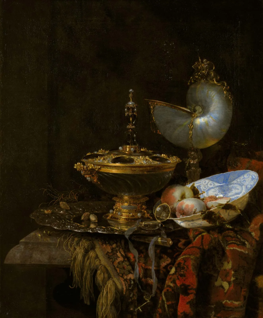
This is another example of Still Life, from a Dutch painter named Willem Kalf. In the photo, there are gold items, exotic fruits and various other items that could be seen as wealth, such as the rug that sits scrunched up and almost neglected underneath all of the items. This could be to show that the owner of these items, either the painter or a wealthy person of the time, has enough money to neglect these luxurious objects.
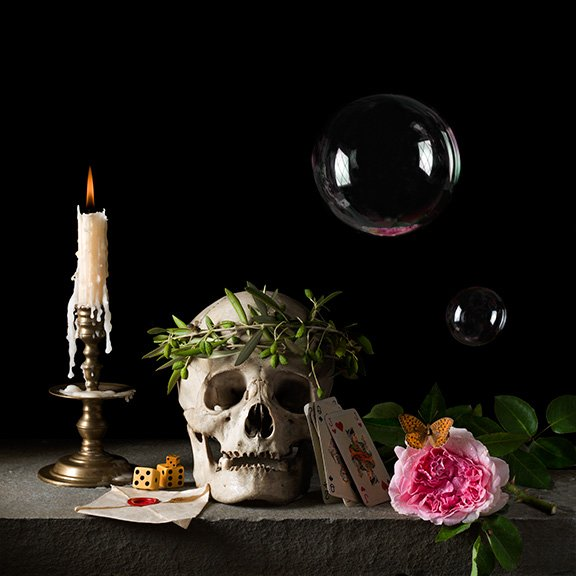
Still Life metaphors:
Skulls/bones – used to depict death, the marching of time. This is usually made with the use of memento mori, the reminder of death
Flowers – romantic values, beauty
Food – fruits are used to depict wealth, meat is used to depict strength or integrity
Books – used to depict knowledge and high intelligence
Valuables – items like golden necklaces or rings, any item that looks expensive, is used to demonstrate power and wealth
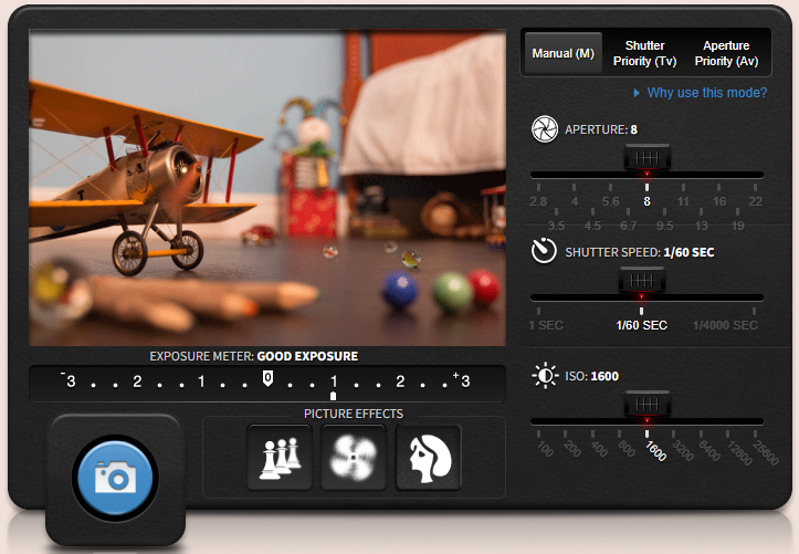
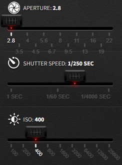
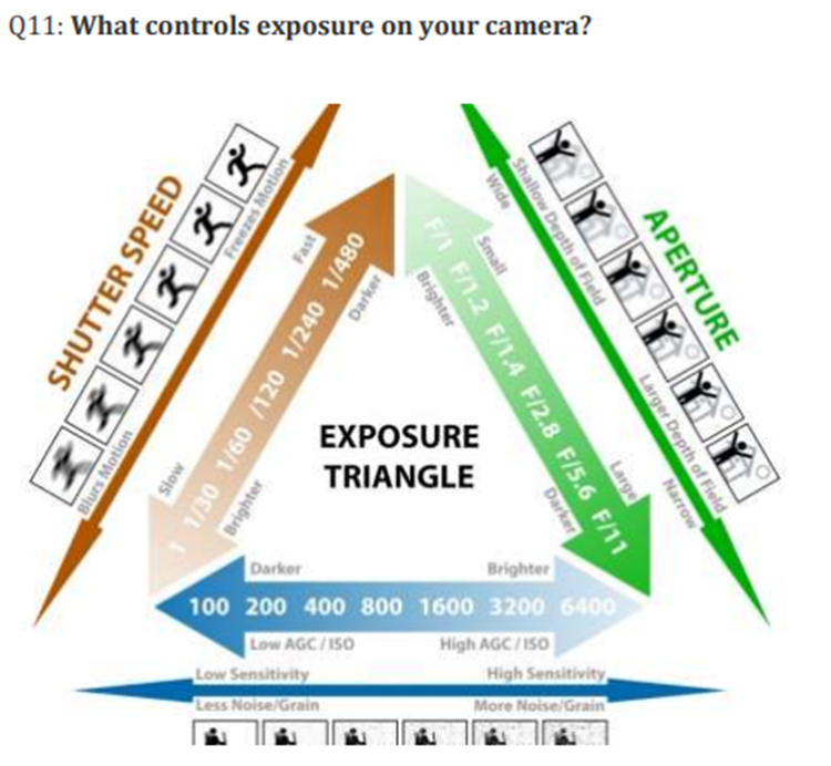
This is the Canon camera simulator. It is a useful tool to teach photographers what the different features on a camera do and how they affect the image.
To get a good image, the exposure meter must be on or close to 0 so that the image is not too dark or too bright. Every setting that you change (shutter speed, aperture, ISO) will raise or lower the exposure meter
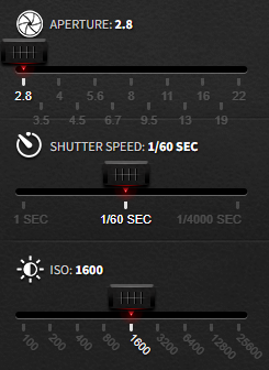
Here is an example of an overexposed photo. The photo in this case is overexposed because the aperture is too big at 2.8. If I change the aperture to 11, the photo will be balanced and the exposure meter will be at 0
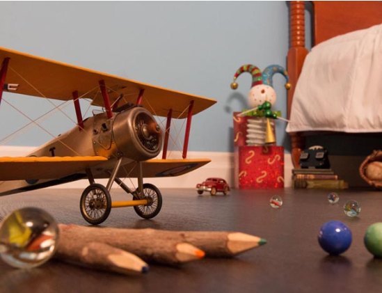
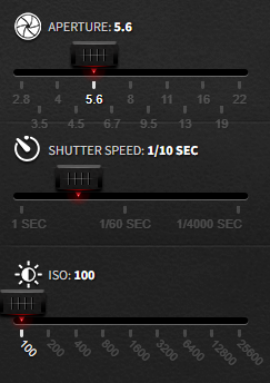
Now, with the aperture at 11, the objects in the photo are lit well and are a lot more visible than they were previously. When you change the aperture, you change the amount of light that the lens lets in. If the aperture is too big there will be too much light let into the camera and the photo will be overexposed
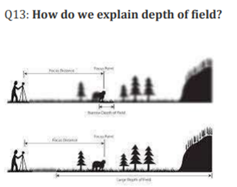
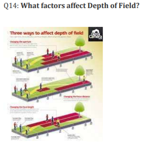
Also, aperture controls the depth of field of the photo and how blurry the rest of the photo is compared to the part that is focused. As you can see, the aperture in this photo has been put to the largest value, which means that the photo has a shallow depth of field. If it was the inverse, everything in the photo would be in focus.
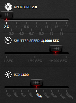
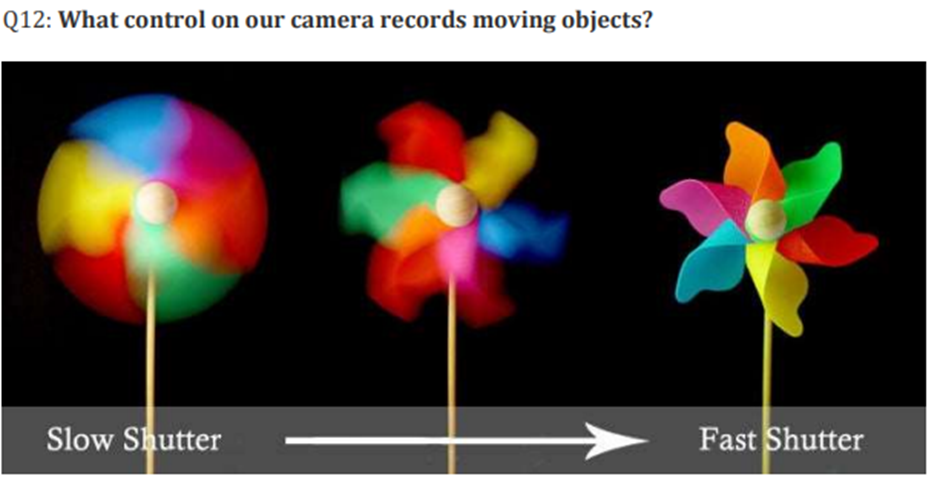
The shutter on a camera is basically like a curtain that opens and closes to let a certain amount of light in. The number represented on the simulator is 1/1000 sec, which means that the shutter opens for 1/1000 of a second. If this number was larger, such as if it was at 1/60 sec, too much light would be let in and the photo will be too bright. If the inverse happens then the photo will be too dark. Aperture and shutter both work together to mediate the amount of light let into the camera.
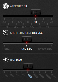
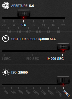
The ISO is the control for the sensitivity of the sensor. Changing the sensitivity of the sensor changes how bright or dark the photo is. A low ISO means a low sensitivity and a darker photo, so to compensate the shutter and aperture are made bigger. A high ISO means a high sensitivity, but with a high ISO, the photo will come out grainy.
Here you can see that the photo is very grainy and the photo just doesn’t come out well. A high ISO is useful for dark pictures where the sensor sensitivity needs to be higher. As you can see, because the ISO is high, the shutter speed has been made smaller to compensate.
Overall, the Canon Camera Simulator is a very useful tool to help photographers understand how the modern camera works and what features like the aperture, shutter and ISO change how the image comes out.