All posts by Coco Moore

Filters

Author:
Category:

Edited Single Object Photoshoot

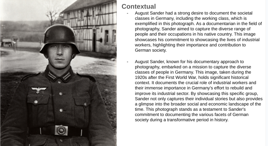
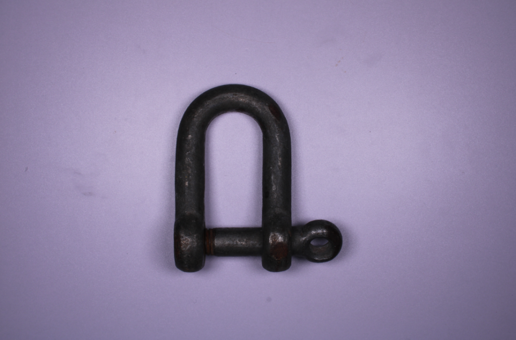
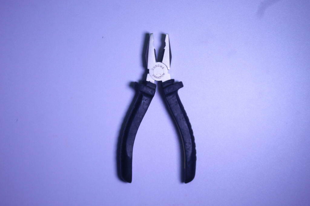
This is one photo I took of a single tool using different lighting, This is the image before I started editing.

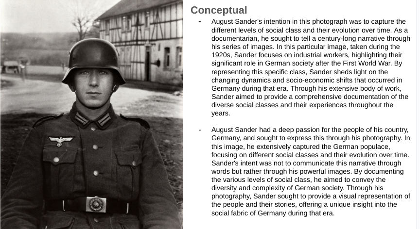
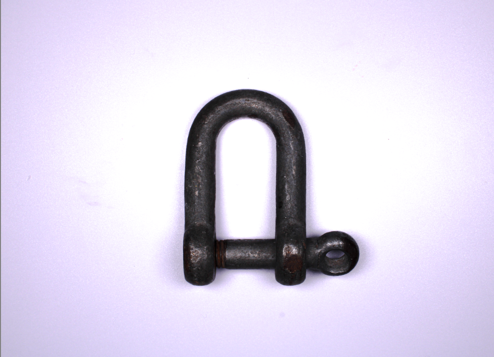
this was the image once it was edited.

The reason I edited it like this was because I was being inspired by Walker Evans. What I like about Walker Evans is the grey and white dark effect, giving the emotion and thought of loneliness with the single object and lighting, so I tried this effect with this image.

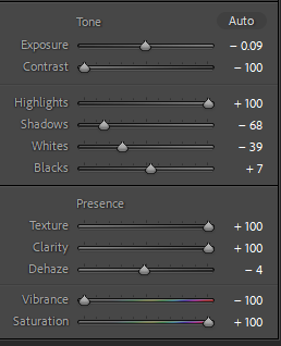
I lowered the temp of the photo very slightly as I thought that when I lowered it more it turned to cold and too blue which wasn’t what I was going for and if I bright it up it would be too yellow or orange which would also be wrong.

With the exposure I put it up, again not by much as if i did it too much it would be very bright and just white or too dark and then practically black, so I had to get it right so it was dark enough it gave the gloomy effect I wanted but not too dark you couldn’t even see the image.

when it came to the highlights, shadows, whites and blacks all corporate together so I had to bare with and focus as i got them all correct. I had the whites high enough you could see the shaping and lighter parts of the tool and the background so that the tool and shadow stood out but not enough it took away the theme and emotion i was going for. but too dark would have blended in the shadow and tool too much to not distinguish the contrast of the colours and object’s.

when I first edited I tried the texture and thought I wanted it to be +100 but when I did it I didn’t like it because although I wanted the tool to be textured to give more character and effect, but once I did it, it gave the background a blurry and fuzzy textured look which is not what I wanted. As I lowered the texture I really like the non textured look on the tool. it also fixed the background problem. But the smooth tool just looked really good in my mind and actually worked with the emotion and look I wanted better then I thought it would have.

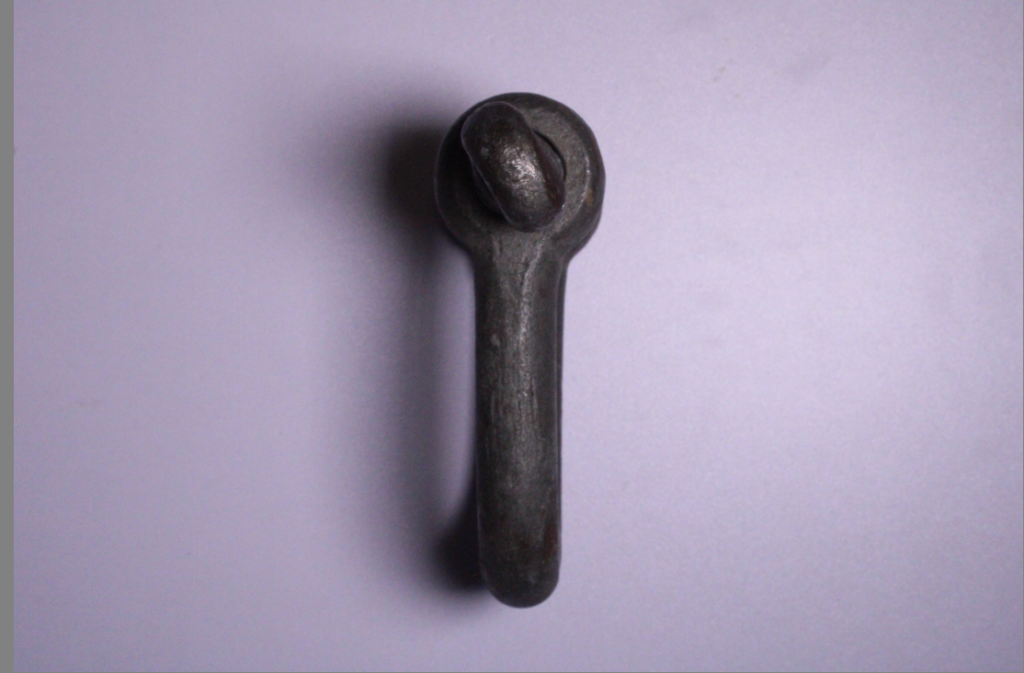
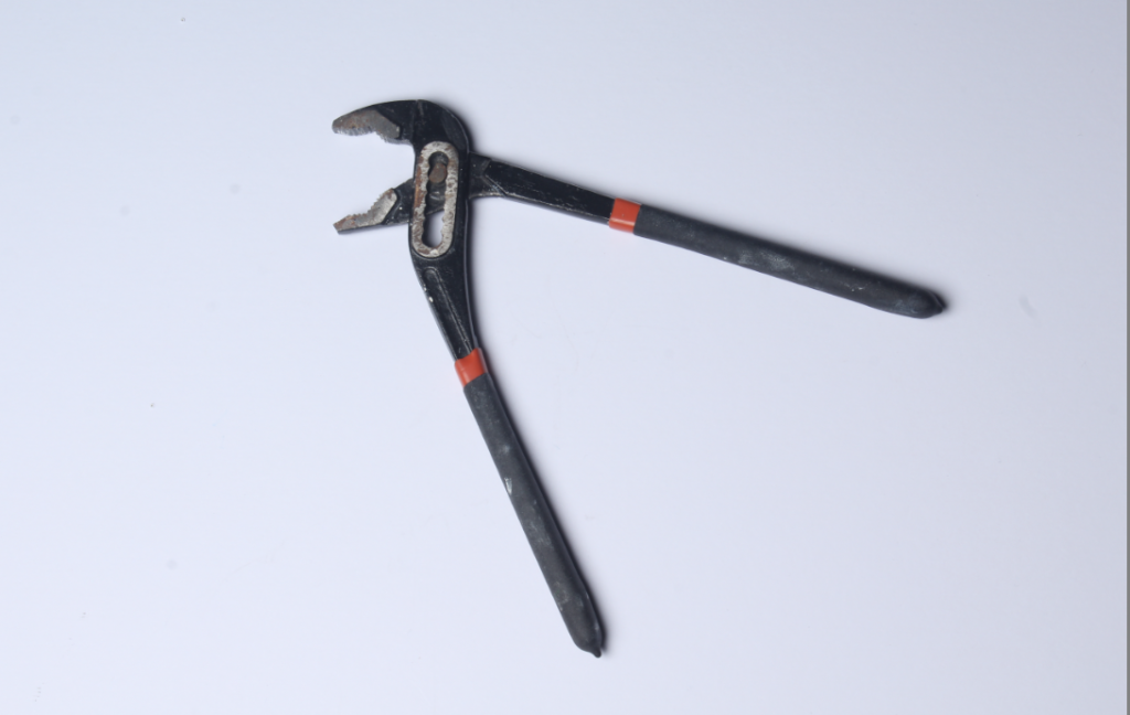
This was another image I took of the same tool but from a different angle of it, I liked it but wanted to edit and change it differently but still along the same Walker Evans idea.

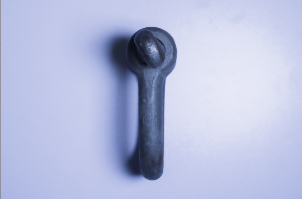
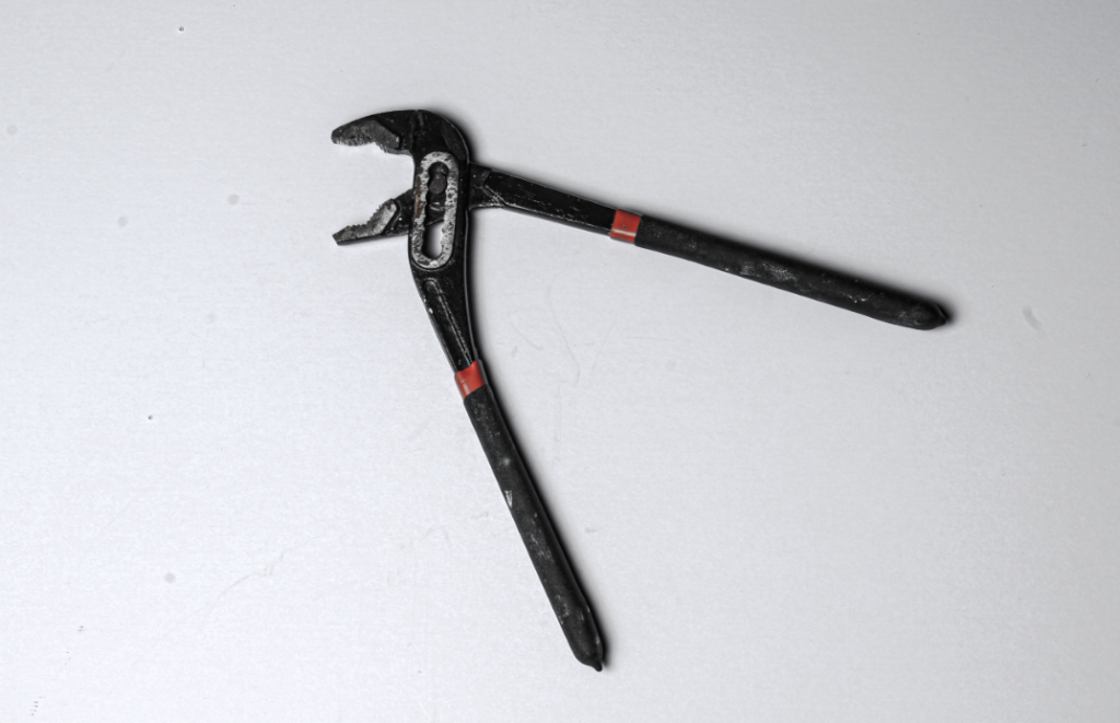
this was it once it was edited because I went for a different but same affect.

firstly I cropped it so the actual object was more centre, because I wanted the tool to take centre spotlight, and be the main thing that people notice, obviously there isn’t much else in the image but with the object being off centre I think it just looked wrong and gave too much attention to the background.

After that I changed he exposure and contrast they are quite opposite of each other and this is because when i did this i realised that it made the darkness of the tool pop out of the whiteness of the background even more because they are both opposite colours I could really make it pop out without being too dark, you couldn’t even see the detail of the the tool.

With the whites, blacks, shadows and highlights i had them all practically opposite each other so the dark of the tool stood out and the whites of the background contrasted.

lastly I changed the texture as I actually wanted to see the texture of the tools but not the whole way so I couldn’t see the texture of the background and the tool stood out more.

These are some more images next to there edited one and what I did to them.

Single Object Gallery And Evaluation

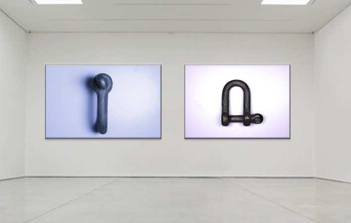
I selected these two photos for my final presentation, I presented them in a gallery form using adobe photo shot. I picked these two because out of all of them I liked them the most, I thought they went well in the topic and was most lie my inspiration of Walker Evans.

This wasn’t my favorite topic as I didn’t find it as exciting taking photos of just single objects and dint show the best of my ability, I also thought while i’m still getting used to the camera and editing on adobe light room it is not the best I can do.

Even when looking at these final images now i see improvements that can be made, with the image on the left although i wanted that cooler temperature it was still too bluey and i think it was because there was something not right with my lighting and when i first took the photo there was a purple background. The image on the right is actually better i think because i increased the contrast so the darker colour really stands out more on the white background. You cant see very well in these photos but there are slight smudges in the background that i also dont like and when improving and learning more about photo shot i can edit those out.

Overall, i do like these images and of course they can improve but this was not my favorite topic.

Single Object Photoshoot

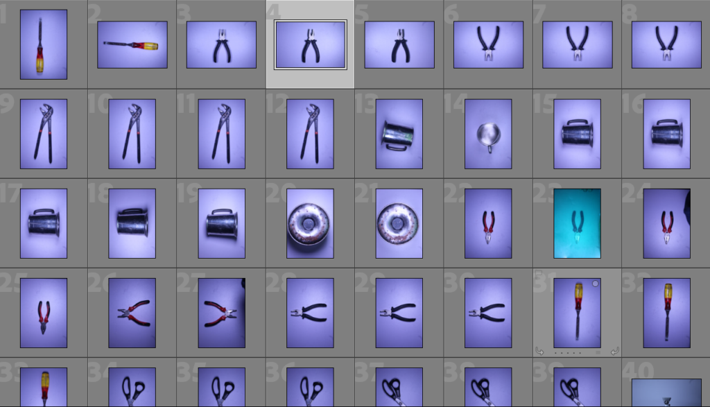
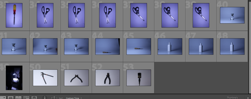
These are photos I took of every day single objects that have been inspired by Walker Evans.

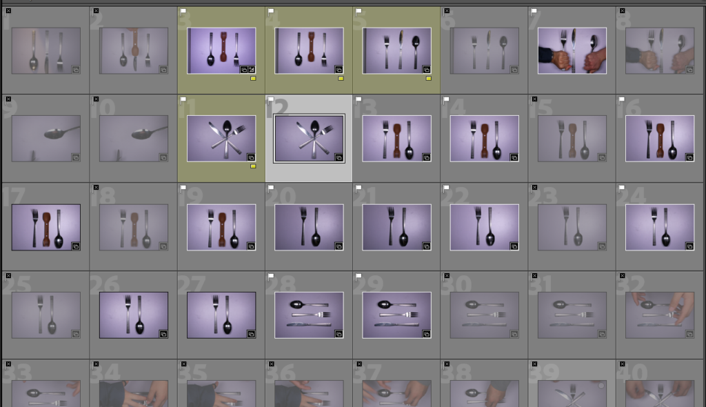
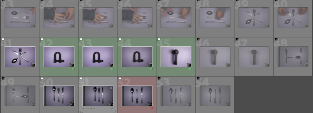
after taking these photos I flagged the ones I liked an decided which ones to edit, etc. Here are some of my favourites from the ones I took before edited.

I liked this one because I think it really resembled Walker Evans, I liked the shadowing on the left side and detail of the tool. I took this photo by having the camera on a with a birds eye view, then turned the light on the left side off to show clearer shadowing. In this photo I don’t like the purple tint, not sure how that happened and will hopefully be able to fic it in editing.

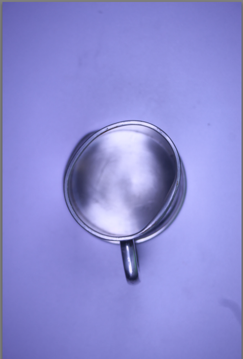
I also like this photo because the fact that its not a perfect circle gives character and tells a story, unfortunately there is the purple tint once again.

I also liked this photo, instead of taking it from the birds eye view I took it facing forward, I like having the reflection and the shadow show different stories.

This was how I completed the bird eye view and had the lighting facing down, I was able to create different shadow affects and changed the angles.

Walker Evans and Daren Harvey-Regan

Walker Evans

About him

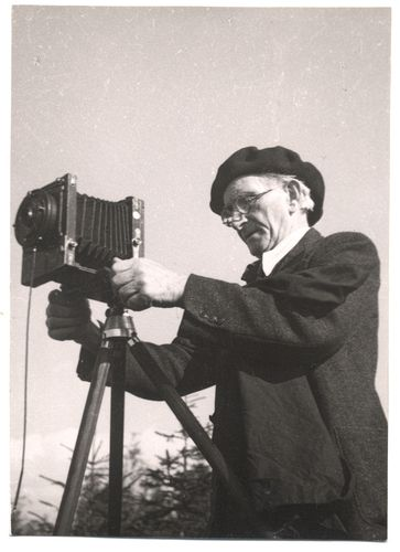
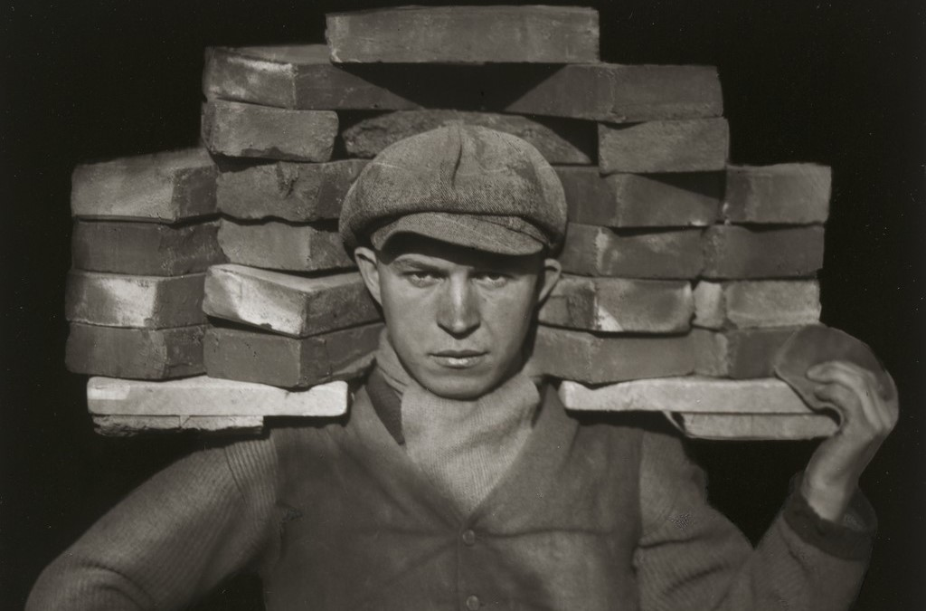
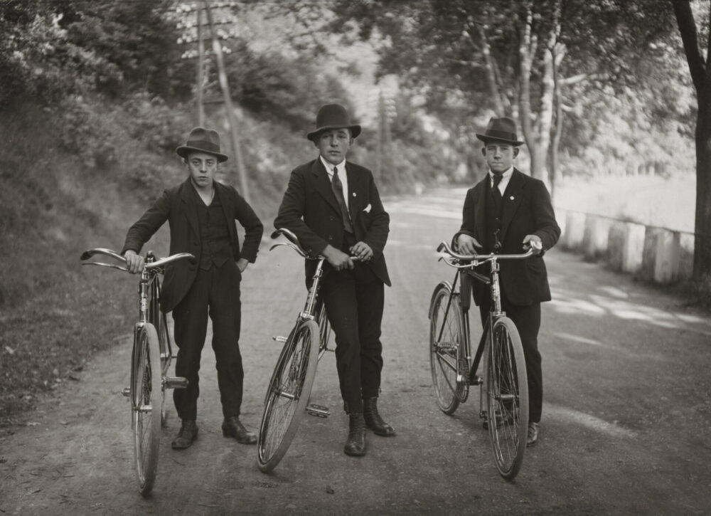
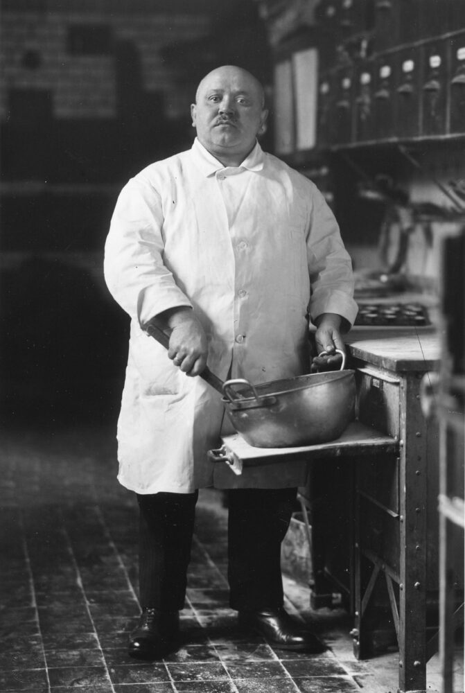
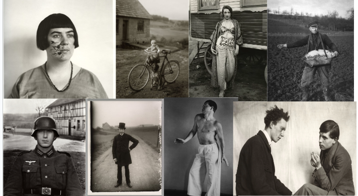
Walker Evans was an American photographer and photojournalist born in 1903 in St. Louis, Missouri. He had a happy childhood and developed an interest in the works of American writer, Mark Twain, and artists who shared a passion for exploring the unknown. He studied French literature and Paris before discovering the works of French photographer, Eugene Atget and became interested in photography. Evans worked for various magazines and was hired by the Farm Security Administration to document the effects of the Great Depression on rural America. He taught photography at Yale University and died in 1975 at the age of 72. Today, he is considered one of America’s most influential photographers.

His most famous piece

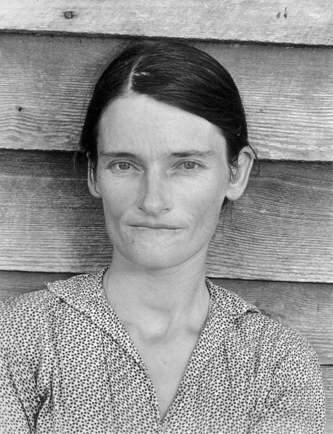
His iconic portrait of Allie Mae Burroughs – a farmer’s wife, and mother of four – whose unforgettable eyes seem to stare right through us 

Walker Evans

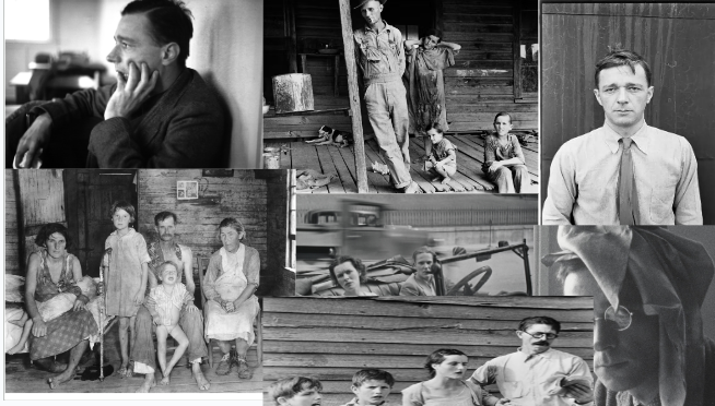
Other pieces of his

Why did he take photos like this?

Walker Evans took the photos he did because he was interested in documenting American society and culture, particularly during the Great Depression. He felt that the camera allowed him to capture and represent the essence of a people and place. His photographs often focused on the everyday lives of ordinary people, particularly those who were struggling with poverty and hardship. Through his work, Evans sought to shed light on the social and economic inequality that existed in America and to give a voice to those who were often overlooked and marginalized.

Daren Harvey-Regan

About him

Daren Harvey-Regan is a British photographer who was born in 1972. He is known for his work in fashion and beauty photography, as well as fine art and portraiture. Harvey-Regan began his career in the arts as a graphic designer before transitioning to photography. Harvey-Regan’s work has been featured in magazines such as Vogue, Vanity Fair, and Harper’s Bazaar, and he has worked with clients including Givenchy, YSL, and Dior. He has also exhibited his fine art photography in galleries across the globe, including New York, Paris, and London. In his work, Harvey-Regan often plays with the boundaries between reality and fantasy, creating surreal and dreamlike images. He describes his photography as a way to explore emotions and the human experience.

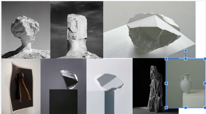
His work

Why did he take photos like this?

Daren Harvey-Regan’s photographic style is influenced by his fascination with emotions and the human form. He strives to capture unique and dreamlike images that explore the human experience. His photographs often blur the boundary between reality and fantasy, incorporating surreal elements and exaggerating the natural form to create a sense of other worldliness. Harvey-Regan has a background in graphic design, so his photographic style also draws inspiration from graphic design and art. He often plays with the composition of his images and uses color and lighting to create a specific mood or effect.

How do Darren Harvey-Regan and Walker Evans compare?

Daren Harvey-Regan and Walker Evans are both renowned photographers, but they have very different styles and approaches to their craft. Walker Evans was a documentary photographer known for his vivid depictions of American life during the Great Depression. His approach was to capture ordinary people and places, often in black and white, with a focus on realism and social commentary. On the other hand, Daren Harvey-Regan is a contemporary fine art photographer who specializes in portrait and fashion photography. His images have an otherworldly quality, often characterized by dramatic use of color, distortion, and surreal elements. Rather than capturing reality, Harvey-Regan’s work is more about exploring the human experience and emotions. While their styles and subject matter differ significantly, both Harvey-Regan and Evans share a deep passion for photography and a desire to capture the world around them in their own unique way.

How do Darren Harvey-Regan and Walker Evans Contrast?

Daren Harvey-Regan and Walker Evans contrast in various ways:

1. Time period: Walker Evans was a photographer in the mid-20th century during the Great Depression, while Darren Harvey-Regan is a contemporary photographer who produces work primarily in the 21st century.

2. Subject matter: Walker Evans primarily focused on documentary photography and captured images of American life and culture during the Great Depression and the post-World War II era. In contrast, Harvey-Regan’s work is more focused on fashion and portrait photography and aims to evoke emotions and a sense of otherworldliness.

3. Style: Walker Evans’ style is characterized by his focus on realism, using black and white photography to capture everyday people and places while highlighting social commentary. In contrast, Harvey-Regan’s style is more dramatic with the use of color, lighting, and a degree of surrealism to create ethereal, dreamlike images.

4. Techniques: The techniques used by Evans and Harvey-Regan also differ significantly. While Evans used traditional photographic methods of his time such as black and white film, Harvey-Regan uses digital manipulation and lighting techniques to bring out ethereal qualities in his subjects.

Overall, while Harvey-Regan and Evans are both renowned photographers, their styles, subject matter, and techniques differ markedly, highlighting their unique approaches to the art form.

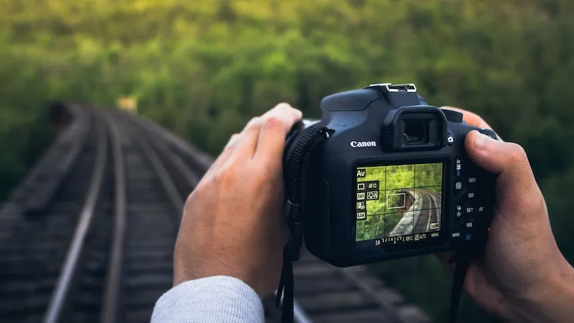
Camera handling skills and camera simulator

Exposure- refers to the amount of light that reaches the cameras image and sensor. Exposure is determined off ISO and Shutter speed.

Aperture- is the opening in the lens that controls the amount of light entering the camera, it is represented by an f-number.

Shutter speed– refers to the length of the time that the cameras shutter remains open when capturing a photo.it controls the amount of light that reaches the cameras image sensor.

ISO- refers to the sensitivity of the cameras image sensor to light. A higher ISO setting makes the sensor mire sensitive to light, allowing to capture photos in light condition.
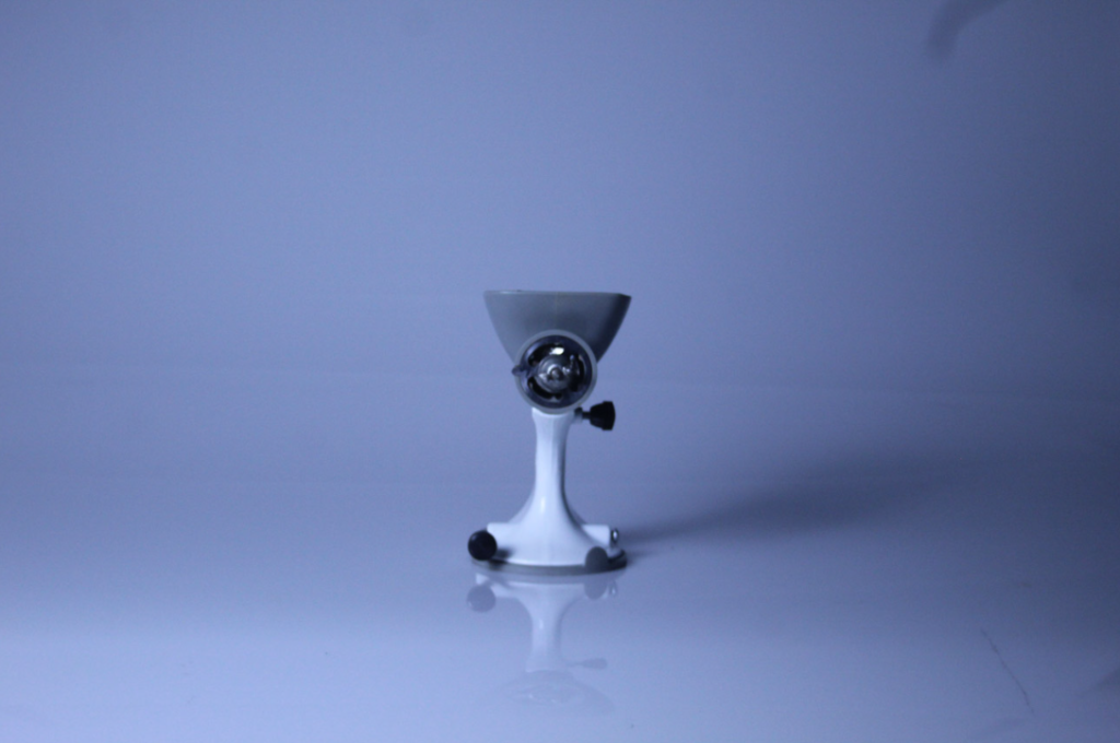
Exposure meter- is a tool that helps you determine the correct exposure settings for your photos, it measures the amount of light in the scene and provides feedback on whether the image will be overexposed.

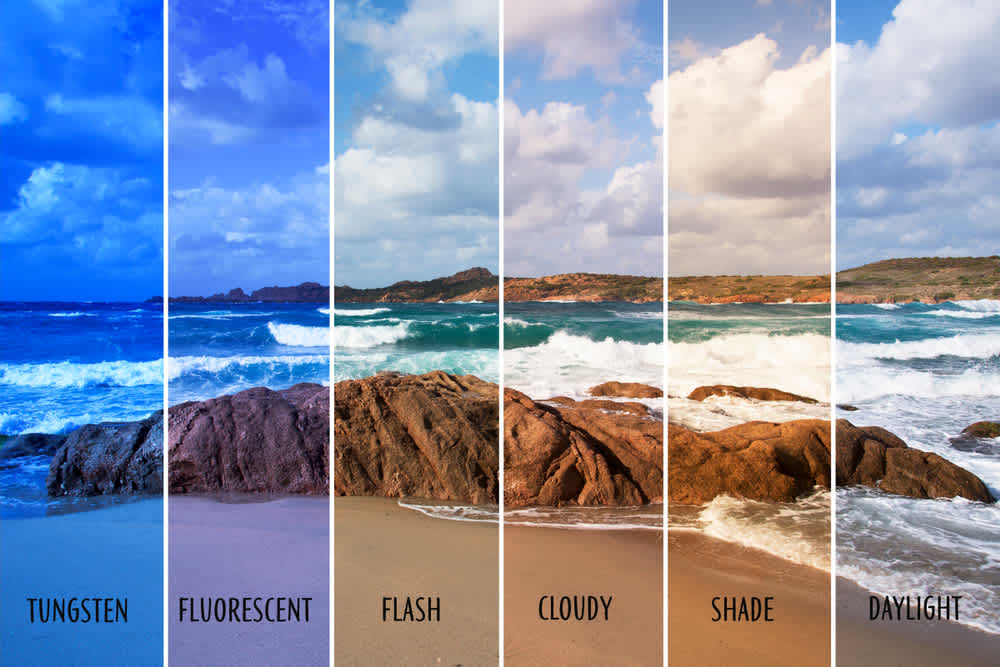
White balance- is a setting that helps you adjust the colour temperature of your photos

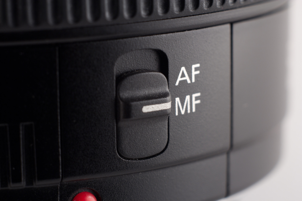
Auto focus- is a feature that automatically adjusts the focus of the lens to ensure that the subject in your photo appears sharp and clear.

Manuel focus- is a feature that allows you to manually adjust the focus of the lens. it gives you more control over the focus point.

Formalism

What is formalism?

formalism is an approach to art that focuses on the formal elements, like colour, shape, and composition. It emphasises the aesthetic qualities of artwork.
The seven basic elements to Photography

Line

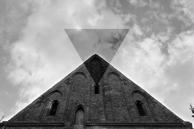
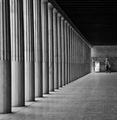
In photography, the basic element of a line refers to the visible lines or edges within an image. lines can be straight or curved, horizontal or vertical, and they can create a sense of movement or lead the viewers eye through the photo.

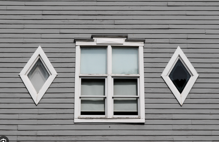
lines in photography can have many affects on the viewer’s emotion. In this photo the mix of diagonal lines creating two triangles is giving a dangerous, dynamism and tension.
On the other hand in this photo there are vertical lines can evoke a sense of strength or height. and in this photo it clearly shows both.
Shape

in photography shape refers to the visual form or outline of objects within an image. It can be geometric, organic, or abstract.

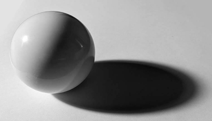
because this photo has more geometric shapes, it creates a sense of stability and order. they are also a little more abstract geometric shapes which can evoke a sense of mystery and curiosity to the viewer.

Form

The basic element of forms refers to the three-dimensional appearance of object captured in a photo. It adds depth, volume, and texture to the image, making it more lifelike and tangible. Form can be conveyed through light and shadow, perspective, and the arrangement of objects in the frame. It helps create a sense of realism and presence.

form can have a profound impact on people, it adds depth and dimension, making the image more engaging and immersive. This image creates a tactical experience as peoples may feel drawn to the textures and shadows detail captured.

Texture

Texture refers to the visual and tactile quality of surfaces captured in an image. it adds depth and dimension, allowing viewers to perceive the texture of different objects or subjects, texture can range from smooth and soft to rough and gritty, and it can greatly enhance the overall visual impact of a photograph. By highlighting the texture, photographers can create a more immersive and engaging experience for the viewer.

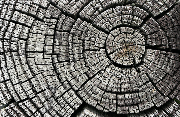
Texture really can effect viewers emotions, as in this picture there is rough and bumpy texture from all the lines in the wood that one would almost be able to feel, a rough texture like this photo can create a sense of ruggedness or intensity.

Colour

Colours are a vital role in photography. They can covey different moods and emotions.

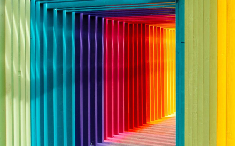
The warm bright colours in this photo like the red and yellow can evoke feelings of energy and happiness, and even though there are cooler colours they are bright and give a feeling of calmness but peaceful and happy.

Size

Size refers to the relative proportions and scale of objects within a composition. size in photography is relative and can be an illusion.

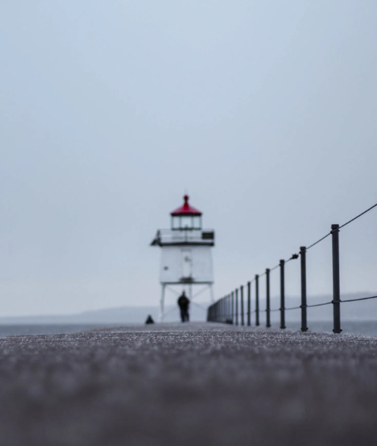
it creates a sense of depth, and can convey a certain mood. for example in this photo there is man angled to look small compared to the massive lighthouse behind him as well as the railings. it gives an effect of intimacy or vulnerability while the large objects evoke commanding attention.

Depth

Depth refers to the perception of distance and three-dimensional in an image. It adds a sense of space and can a photo feel more immersive. Techniques like using a wide aperture to create shallow depth of field or including foreground, middle ground, and background elements can enhance the sense of depth in a photograph.

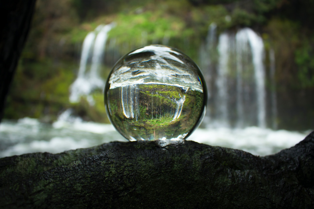
depth in photography can make viewers feel like they are part of a scene, creating a sense of immersion and realism. it can also add visual interest and make the image more dynamic, drawing the viewers eye into the different layers of the composition. By creating a sense of depth, photography can evoke emotions such as wonder, curiosity, and a feeling of being transported to another pace, which i think this photo fits well.

Still life Gallery And Evaluation

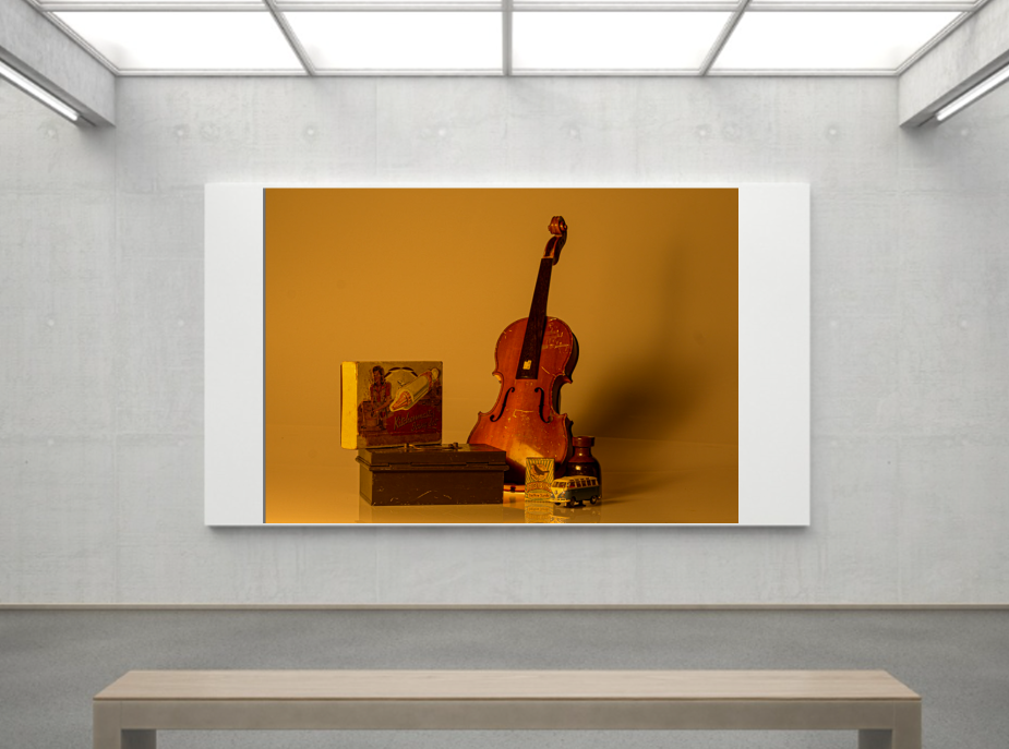
This is my still life final photo that I picked because i liked it the most, my task was to show nostalgia and different symbolises from objects I had in the classroom, I took this same photo a few times and tried editing it differently with cooler colours but after that I decided that for these objects the warmer colours and more texture gave the right effect that I was going for.

Overall this topic was not my favorite as i dont find taking photos of objects that exciting but as my first photoshoot i did quite like the photos i took and edited.

Edited Still Life Images

This image I took for still life, this is completely unedited on adobe light room. The only way it looks like how it does is from lighting I controlled in the studio

This was the finished product I do still believe there is work and more editing to make it perfect.

How I edited .

I firstly cropped the sides of the photo because you could see some of the side from the infinity light and I didn’t want  that.

Then I warmed the temperature of the picture to +35 to give it the warmer yellow and orange colouring to go with the aesthetic.

After that I added a tint of +30 to darken it but still have it that warm tone but make sure everything was tinted with that.

I lowered the exposure to -140 as I thought  making it darker would look better because I got inspiration off over still life photos and when it was darker it not only matched the aesthetic but just matched the emotion drawn out of it and the story.
 
When it came to change shadows, highlights, blacks and whites, I mainly got rid of the whites and highlights not completely because I didn’t just want a black photo but just so the shadows and darker nit really stood out to deepen the story.

For texture I put it on +100 I love being able to see all the detail in every scratch and bump on all the objects I think it shows an antique, worn look.

I took more of these photos with the same objects because I still think there is room for improvement with my last edited one I thought with this one I might try and do thing differently to see if I prefer.

when editing this one I went for the opposite and did cooler tones to see a different story I could tell with the same objects.

firstly I changed the temp -67 as it gives a cooler blue colour and makes it look colder which already starts the affect i am going for.

I didn’t change the tint because it would add to much of a bright unnatural colour when I wanted a natural cold look to tell a story of death and continue an empty lonely vibe when a bright green would not do that.

i lowered the exposure so it is less bright and continues that darker lighting, because it continues the affect

As you can see I put the highlights up to 100 as i really wanted you to be able to see where the light in shining from adding the effect of the shadows behind the objects but making the shadows bigger and darker by putting the shadows to 46 as it makes them look larger then the object and adds to the emotion and depth of the image that I was going for. It also links me back into nostalgia in a way if you are looking at it like the shadows is an older version looking down on the childhood that made them who they are yet they left it behind.

The whites and blacks are similar because I didn’t want the photo to genuinely be too light or dark and be overtaken by a completely different look.

Still life Photoshoot

In this photoshoot it was a collection of home objects brought in or from school with different lightings and experiments to tell a story

These photos told a story of a war time on Juno beach.

These photos were taken from objects at school with a different colouring and symbolism.

i took these photos by placing them in the middle of the infinity light, then turned all the main lights off but kept the still standing light on and made it a warmer colouring to go with the aesthetic of the antique objects.

For the camera I put the around f/16 which is high because I don’t need to blur the background as it is plain already. A low shutter speed because the objects are still, it doesn’t need a high shutter speed.

these are my selected photos as I thought they were the best out of the ones I took and were ready to be edited.