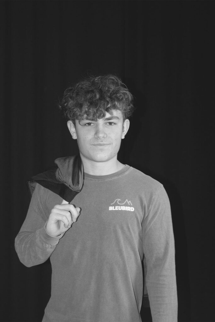
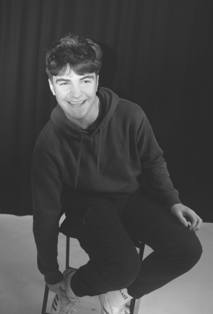
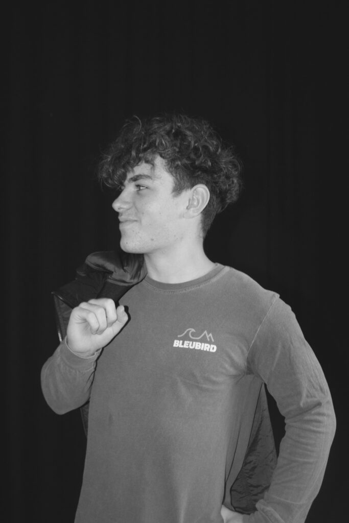
All posts by Chanelle

Filters

Author:
Category:

THEORY/ CONTEXT: 

used the link below to find these ideas:

https://en.wikipedia.org/wiki/Cultural_conflict

(Ideas):Crime and deviance

-A more narrow definition of a cultural conflict dates to Daniel Bell‘s 1962 essay, “Crime as an American Way of Life”, and focuses on criminal-enabling consequences of a clash in cultural values.

William Kornblum defines it as a conflict that occurs when conflicting norms create “opportunities for deviance and criminal gain in deviant subcultures.”

-Kornblum notes that, whenever laws impose cultural values on a group that does not share those views (often, this is the case of the majority imposing their laws on a minority), illegal markets supplied by criminals are created to circumvent those laws.

-Kornblum also classifies the cultural conflict as one of the major types of conflict theory.

(Ideas):Conflicting values

Jonathan H. Turner defines cultural conflict as a conflict caused by “differences in cultural values and beliefs that place people at odds with one another.”

-On a micro level, Alexander Grewe discusses a cultural conflict between guests of different culture and nationality as seen in a British 1970 sitcom, Fawlty Towers.

-Cultural conflicts are difficult to resolve as parties to the conflict have different beliefs.

– Cultural conflicts intensify when those differences become reflected in politics, particularly on a macro level. An example of cultural conflict is the debate over abortion.

Personally, I believe that there are a lot of things causing cultural wars such as inequality, racism and other things such as religion and sex plus people trying to find their identity. I think that people should just accept certain people for who they are but there are also people who abuse the system by claiming information and wanting to make it real. It’s the fact that everyone is different and everyone has an opinion, certain feel as though they have the right for everyone to hear their thoughts where as others disagree, it’s hard to get everyone to agree with the same things that’s why we have conflicts and wars, we have the different genders fighting for different things such as women wanting equality, and certain men believing they should have the power, through all these ideas and conflicts to make everything easier the genders should be neutralised, this would be a huge problem for certain but why should men be above women just like why should certain races be above others. We have had constant arguments about Black Lives Matter and why they should be equal to the rest, these fights are all very unmatured to my opinion as everyone is human and deserve to have the same rights as everyone else, no one is left out, no one is judged and no one should have to sacrifice more things to have the same thing in return. This society has changed a lot which impacts the way people think and act. There are many things that have changed people’s perspective on life and some opinions are more valid than others, however it doesn’t change the fact that everyone has an opinion and has the right to express it. We have conflicts on things on abortion, some people believe that it is murder while others believe that abortion should be allowed, each opinion is valid, but I do believe that it should be the women’s decision if she wants to keep the baby or not. Many people would go against my opinion which I think is wrong as everyone has freedom of speech, there are conflicts about religion and how people may have different beliefs that someone else and therefore creates this exclusion. Some religions are more restrictive and make people wear religious symbols, headscarf’s whereas other religions are kept more on the down low. People believe that showing of your religion can impact how people think for example, children might feel forced to have a religion based on what they see around them. All together they will always be conflicts in society as everyone is so different and we don’t all agree which is a good and bad thing.

experimenting different edits on photoshop

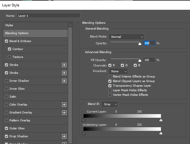
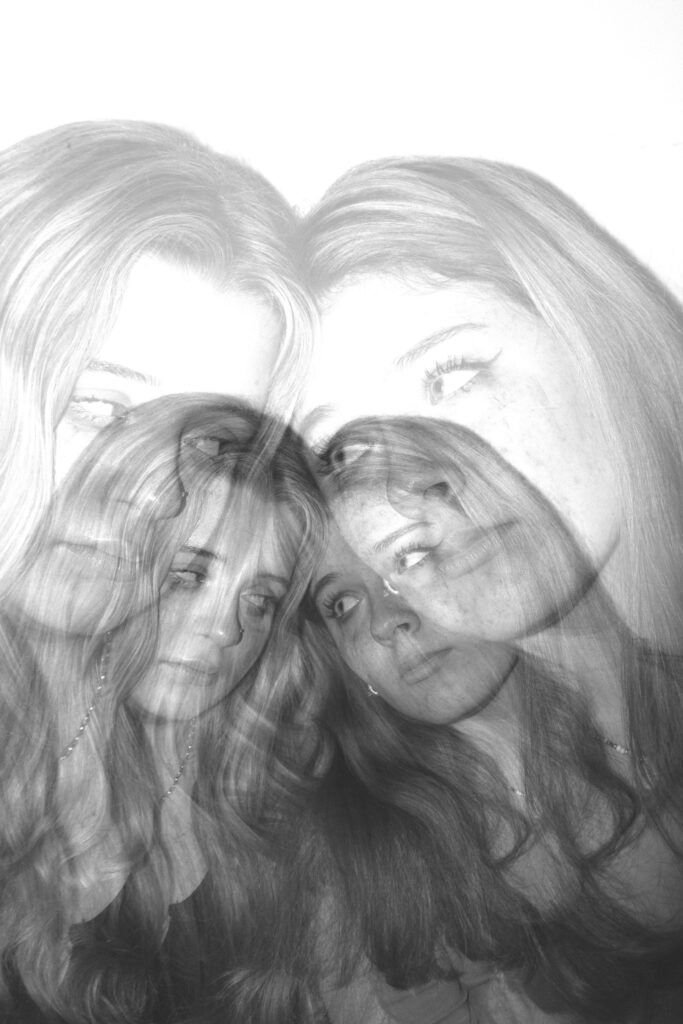
Here I used Photoshop to edit some of my photos together. I had to press a specific mode to choose what type of overlay I wanted to have on each photo. One of the photos I made, I started by putting a background onto photoshop and then applied different photos that I thought would work best. I then used the Elliptical marquee tool to cut out circles of the models face, this then aloud me to get the diamond cameo effect. I turned the photo black and white to make it blend in to the background a little bit better.

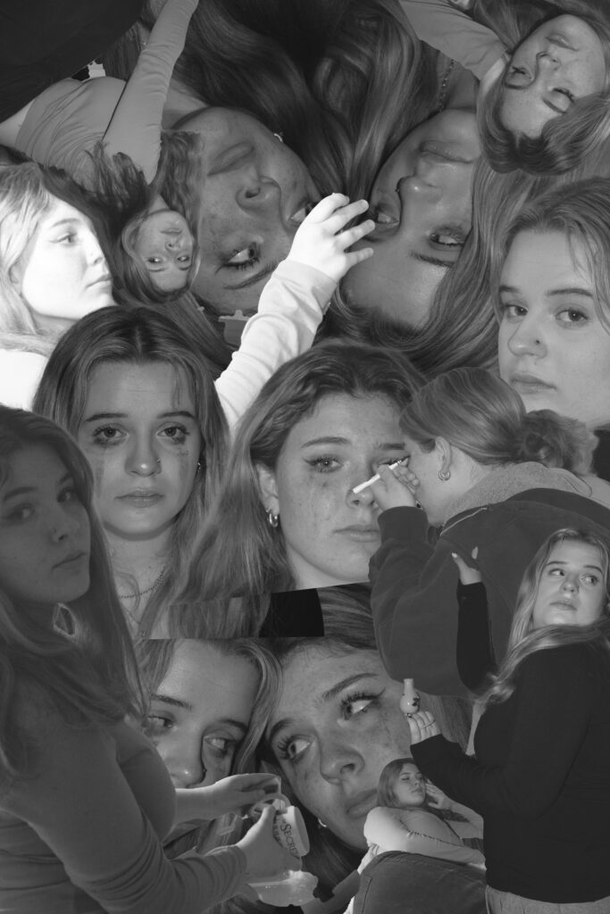
For the bottom ones I had experimented on photoshop to see if I could mix up the photos a little bit, I started by importing more than one photo on top of another and then selecting a blending mode or even placing on each end of the page so I could see both faces, whether it was the same face or a different one.

I personally really like how the top left one and the bottom right one turned out as you can see the facial details quite well. It also helps me to identify what hard and soft lighting is. These two photos are quite different as one is light an the other one is rather dark and another is light.

overall I’m really happy how things turned out and how well my ideas came together, although a lot of my final outcomes looks quite similar I made sure to use different photos so that each outcome could have something unique and different. I personally really like how the bottom two ideas worked out as they are very different to my first attempt to edit, although I didn’t use the same photos, I used different affects. However for these bottom two photos I had to copy each layer of the green photo and place it next to each other to create a whole collage of photos, this really impacted the final result.

For these photos I only used on specific tool to edit them, This impacted how much each overlay of the photo could be seen whether I put it on vivid light or soft light. I chose a range of them depending on the lights and shadows of each photograph.

Head shots photoshoot.

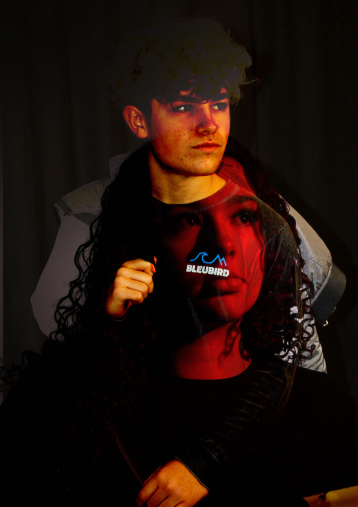
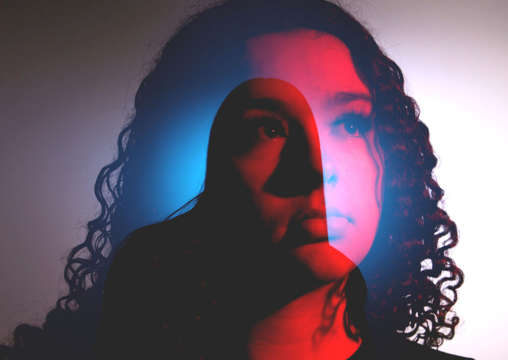
Here we went into the studio and started taking pictures of each model with different coloured lights to try and get a different perspective of each photo taken, I believe that these colours really change the mood of the photo whether the photo has a light or dark shadowing or none, or if it has a red colour to represent anger or even love, there are so many possibilities to these photos which makes the viewer look and think about all the scenarios. I believe that each photo has a meaning even if its just a random photo taken at any random time there is still some meaning to the phot as to why it was taken at that time and place .

we got each model to do different poses so that after I could edit the photos together to create a dimensional look on the photo, I really like how the red ones turned out as I asked the model to look to the side and therefore I can make the photo look quite different and unusual. The two side photos have very different lighting although they are both red there shadowing is light and dark, for example on the left the shadowing in the side of the models face is a cooler colour which makes the face look more mature and sophisticated and the on eon the right has a much more warmer tone which blended in more with the red colouring this made the features stand out less than the cooler tones did.

overall this photoshoot was a success and I really like how the final outcomes of the photos turned out, personally I really like how the middle blue photo looks in the end as its a very different photo compared to the rest as the lighting is a lot darker, the background of the photo is also a lot lighter and pink which changes the black around to give each person different shadowing.

Technical Headshots

Lighting: soft, hard

Soft-A portrait lit with soft light is generally lit with a large light source, like a big soft box or even a large window light. This large light source wraps the subject in light and provides a very flattering and beautiful light as a result of it filling in any unsightly lines and creases on the subjects face.

Hard-This characteristic is perfect for showcasing edgy features like a sharp jawline or muscular definition. More often than not, hard light is more commonly associated with male talent, but hard light can also be used with female talent to express feelings of mystery or intense facial features.

Some my own examples of soft and dark lighting.

Dark tones-

Here we added gel colours on the lens to create that darker tone onto the image, we had a back light with another colour to reflect as highlight on the face this helped us to see the models features but still keep the darker tones. The background is black to help maintain the dark shade onto the face otherwise the model would stand out a lot more again a lighter and soft background.

Light Tones-

Here we didn’t use any gels but simply added some different coloured backgrounds behind the model which added a bright colour onto the models face. As you can tell the middle photo with the black background looks quite dark whereas the brighter backgrounds add that soft features. The models face is quite lit up and all facial features are shown clearly.

Henry Mullins

Henry Mullins started working at 230 Regent Street in London in the 1840s and moved to Jersey in July 1848, setting up a studio known as the Royal Saloon, at 7 Royal Square. Initially he was in partnership with a Mr Millward, about whom very little is known.

An advertisement in the Jersey Times of 5 June 1849 states that “Portraits are taken in groups of two or three, or the single figure, or bust, and of various sizes, even small enough for a ring, the charge for which is reduced to one half of that in London, viz: 10s 6d for the portrait complete. Instruction given in the Calotype, Energiatype, or photographic processes, and proficiency guaranteed for a fee of five guineas”.

After his death his collection of over 20,000 negatives was acquired in 1883 by  Clarence philip Ouless and formed part of his collection which was given to La Société in 2006.

henry Mullins was a photographer who took portraits of people he would then print these photos on  a carte de visite as a small albumen print, (the first commercial photographic print produced using egg whites to bind the photographic chemicals to the paper) which was a thin paper photograph mounted on a thicker paper card. Henry Mullins was the first professional photographer to come to Jersey and establish a portraiture business in the very early days of photography.His speciality was cartes de visite and the photographic archive of La Société contains a massive collection of these. His online archive contains 9600 images, but the majority of these are sets of up to 16 photographs taken at a single sitting. In those times even 10s 6d was a substantial sum to pay to have one’s photograph taken, and included among his subjects are many of the island’s affluent and influential people.

Some headshots by Mullins of both Jersey men and women produced as vignette portrait which was a common technique used in mid to late 19th century.

His photographs are taken very differently as some people were sitting from an angle and others are sat looking straight at the camera, these different photos change the tone of each photo as you could get one to look more professional and others look more like memorable portraits to keep, it also depends on their facial expression and whether they are looking at the camera or to the side. The top right image almost looks like it a family portrait and there is more than one people in the photo as we can very clearly see someone’s hands on the girls shoulder which shows u that Henry Mullins took all types of photos whether they were single portraits or group portraits. Personally I really like the one in the middle on the bottom row as you can see a dark shadow behind the girl an the it begins t be light again which really adds effect to the photo. You can also see some of the peoples clothes so its not just a face that is visible, this makes the photo look more interesting to look at. I also like how Henry has written the persons name under each of their photos so that they could be remembered.

Here we have an article explaining how Henry has opened his new studio in 1848, this gives us so much information, this helps us understand when he started to open his studio and take photos. The small bit of article helps me see that he was a good photographer and that people wanted him to take portraits of them, they views him quite well.

my Portraits

Portrait photography, also referred to as portraiture, is a type of photography in which the subject is one or more people and the aim is to convey something about the subject’s identity, personality, or story.

Basic Lighting

Rembrandt Lighting

Rembrandt Lighting is a technique for portrait photography named after Rembrandt Harmenszoon van Rijn, the great Dutch painter. It refers to a way of lighting a face so that an upside-down light triangle appears under the eyes of the subject.

Butterfly Lighting

Butterfly lighting is a type of portrait lighting technique used primarily in a studio setting. Its name comes from the butterfly-shaped shadow that forms under the nose because the light comes from above the camera. You may also hear it called ‘paramount lighting’ or ‘glamour lighting’.
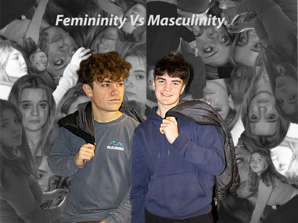
MY FAVOURITE PHOTO:

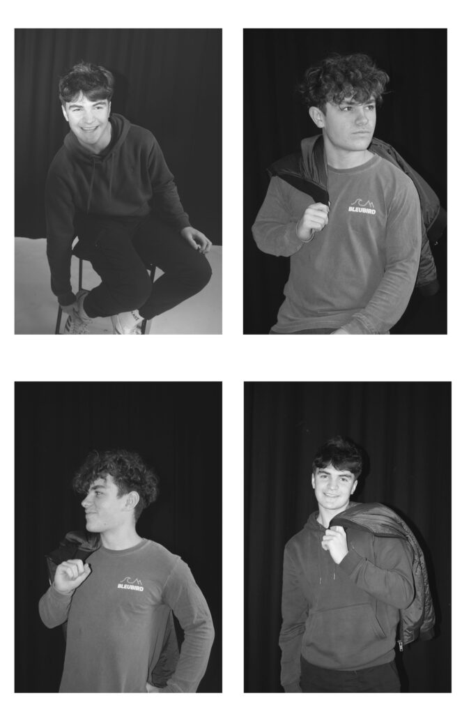
Personally I really like this photo as its not too simple but not too much, I made the model use a prop and had an idea of using something to make their smile wider, This added colour and perception to the photo, I made the photo black and white but made sure that some colour was still shown as I didn’t like how bright the original colour was, this photo makes me feel very happy as the model is very smiley and the photo isn’t black and white, colour makes the photo look more powerful. I really like how they turned out however if I could I would have liked to not get the chair into the photo to make it more mysterious. I do really like how we used a prop as it adds effect to the photo and its isn’t seen as basic and boring like some of my other photos although sometimes simple is better and too much details can ruin it.

Portraits

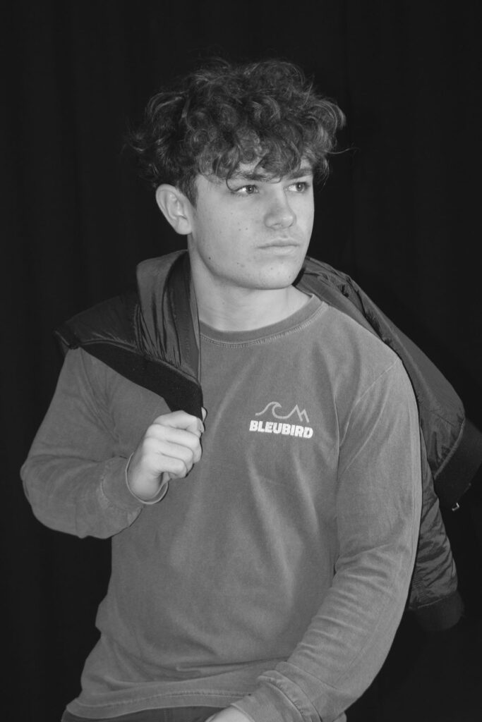
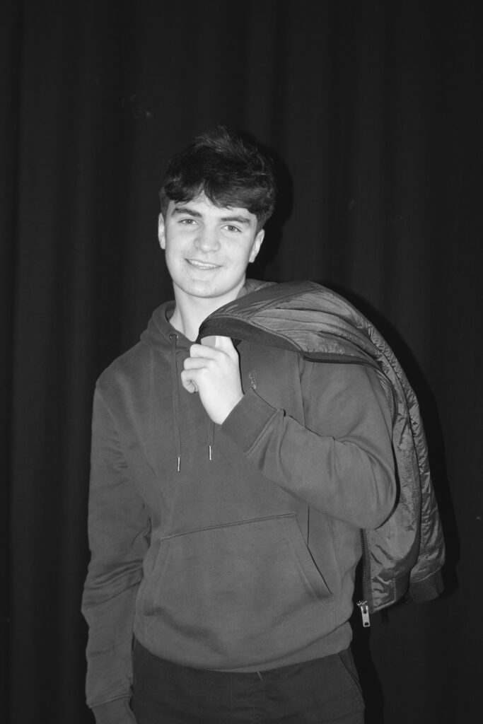
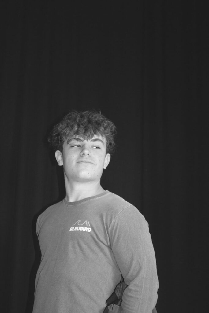
Here are some photos I had taken in the studio and they were all mixed lighting so that we could see what one we could get on each model, we tried to make different background colours to see what looked best and experimented were to place each light and what effect it would have on the model and the photograph. I’ve managed to get a photograph of the butterfly and Rembrandt however I wasn’t able to get any Chiaroscuro photos where there is split lighting and half of the models face has a shadow on it and helps us see the facial features a little bit better.

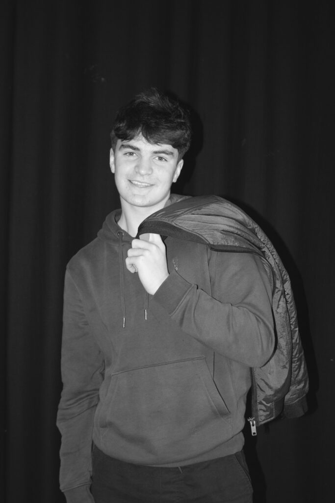
If I were to do this again I would have likes to have take more photo o see if someone of them turned out better, I would have tried to keep some of the photos in colour to see if the lighting would have changed in any way or if it would make the different lighting stand out, I do like that they are in black and white as if adds a totally different effect to the photo and almost makes the photo look more modern in a slight way depending on how you view it, as it could also look quite old aa back in the that cameras didn’t capture any colour. I feel as though putting my photos into black and white helps elevate the light shades grow as you can see on the bottom right photo you can see a bright shadow and the model cheeks bones and their nose, this then shows me how much of effect each lighting position can change the lighting and whether the photo is in black and white.

here I to tried add some of Oliver Doran’s ideas into my photo by making the photo black and white, I also tried to get some of his style of photography into my work, although Oliver takes portraits of people you tend to see their whole bodies in the shot where as only the shoulders and head is visible, if I were to redo this I would try and add some of the models whole bodies into the shot as this really changes the photos perspective.

This image has an empty alt attribute; its file name is image-2012.png

He’s a portrait & advertising photographer working between Jersey, London, Paris and Dubai. He loves cinematic and theatrical imagery mainly of humans but also, as any professional photographer, he delve into other areas of the photographic world including; product, food, interiors and architecture.

He’s photographer who views light as the primary narrator of his stories. His photographic journey has been transformative and enriched by ongoing learning and heartfelt connections with people. He developed his skills over a decade in the Middle East, collaborating with renowned brands like Cartier and Dior, and contributing to high-profile magazines such as Esquire, GQ, and Cosmopolitan. He had the privilege to photograph celebrities like Robert De Niro, Roger Federer, and Sir Ben Kingsley.

Returning to his roots in Jersey, Channel Islands, he immersed himself in portrait photography. him and his team strive to capture the essence of their subjects, a process that begins well before his camera clicks. Building relationships with their subjects, from calls and interviews to casual chats, helps them truly understand their personalities.

As technology evolved, they found a new passion in blending Digital Art & AI with his unique lighting style, leading to innovative photographic art. This exploration birthed the ‘Fantastic Beasts Society’, a vibrant series where animals wear haute couture, captivating viewers of all ages.

His photos are always taken in black and white which makes the photo look a lot more minimalistic and modern, what i don’t like about his work is that he has his own makeup artist and stylist which could be good for certain things however i feel like portrait’s should be taken of someone’s natural state and they should dress how they would normally to show who you truly are and not a fake version of yourself. This could be taken to the completely different context and maybe the stylist is there to help you wear something you wold like but don’t possibly own, same with the makeup maybe someone doesn’t know how to do professional make up and want to experience having it and especially having it when you are getting your portrait taken. Personally I really like how his photos have turned out as he gets the model to stand or sit a certain way and he gets props involved which can give a better back story of the photo, as each photo has a story behind it whether its basic portrait it still holds meaning, like why was it taken?, and why is the model look at the camera/side a certain way, its a mystery and the props in the photo hold evidence of some of the meaning.

Rembrandt Lighting

Rembrandt lighting adds an element of drama and psychological depth to the character of your sitter.

Rembrandt lighting takes its name after Rembrandt Harmenszoon van Rijn, a 17th-century Dutch painter who was known for using earthy tones and golden highlights to frame the faces of his portraiture subjects. What made his painting style distinct was focusing lighting on the subject’s face and adding detail around it, tapping into an innate human attraction to the face.

His approach results in one half of the subject’s face is fully illuminated, while the other half is in partial shadow. One tell-tale sign of Rembrandt lighting is the presence of a small inverted triangle of light below the subject’s eye, usually along the cheek, which is a result of the lighting setup. For perfect execution of this type of lighting, the triangle of light shadow must be no wider than the length of the eye, and no longer than the subject’s nose.

The Rembrandt lighting technique results in a moody and dramatic effect. This type of lighting technique often features a dark or black background behind the subject, putting the subject front and center.

Rembrandt lighting is a technique utilizing one light and one reflector or two separate lights. It’s a popular technique because it creates images that look both dramatic yet natural. It’s predominantly characterized by a lit-up triangle underneath the subject’s eye on the less illuminated area of the face (fill side).

Camera settings (flash lighting)
Tripod: optional, better so you dont have a shake in the photo.
Use transmitter on hotshoe
White balance: daylight (5000K)
ISO: 100
Exposure: Manual 1/125 shutter-speed > f/16 aperture
– check settings before shooting
Focal lenght: 105mm portrait lens

My OWN PHOTOSHOOT:

Personally I really like how this photo has turned out as it looks exactly like a Rembrandt photo, however I would have preferred to have made the triangle around the eye more clear and visible to see, the background is quite dark which clashes with the shadowing on the models face. If I were to redo this again I would have tried to get a white background so that the shadows on the face were more vibrant and stood out of the picture, however I do really like how it turned out as everything is in the right place. If i were to make the triangle smaller it would have been less noticeable and if the triangle was my bigger it would have changed the shape and ruined the point of the photo. If I were to change something about the model I would have changed the clothes and made them more vibrant so that some colour was in the photo however the clothes she had on were simple and didn’t catch my eye too much which is a good as my focus is only on the type of lighting used on the model. I would have also taken of the models lanyard as it sort of clashed with the models clothes and gets in the way. Lastly I would have changed the models posture and i would have made her pose as if she wan more comfortable as she seems to be posing more professionally. I would have possibly made the model hold a prop or even just position her in a more unique style.

CHIARUSCURO

the treatment of light and shade in drawing and painting.

Chiaroscuro is a high-contrast lighting technique that utilises a low-key lighting setup to achieve contrast between the subject and a dark background. Read on to find out more, and discover how you could learn this technique (and more) for free at our upcoming TFC workshops.

A visual element in art, chiaroscuro (Italian for lightdark) is defined as a bold contrast between light and dark). A certain amount of chiaroscuro is the effect of light modelling in painting where 3-dimensional volume is suggested by highlights and shadows. It first appeared in 15th century painting in Italy and Flanders (Holland), but true chiaroscuro
developed during the 16th century, in Mannerism and in Baroque art.

Dark subjects were dramatically lighted by a shaft of light from a single constricted and often unseen source was a compositional device seen in the paintings of old masters such as Caravaggio and Rembrandt.

The set up:

Chiaroscuro is when you have split lighting and one half of your face is more visible than the other and there is shadowing on one side of the face. Its meant to darken the background and highlight the subject in the foreground, drawing the viewer’s focus and attention, Chiaroscuro balances high-contrast light and shade to give the appearance of depth, creating an enhanced or more dramatic effect. Chiaroscuro creates three-dimensionality on a two-dimensional plane, darkening the background and highlighting the subject in the foreground, drawing the viewer’s focus and attention.

MY OWN PHOTOSHOOT:

Here we used more than one light to shine onto the model to create this half lighting on the face, and had someone hold a reflector to the side so that the light would hit certain place of the face, this made the photo look very dark lighted especially with the back background however I do feel that the dark background makes the photo look better then if it had a bright background as the shadows on the face wouldn’t sit right,

I really like how this turned out as you can clearly see the half shadow on the left side of the face, the models facial expression makes the photo look even better as she was always smiling and sometimes having a natural face can change the whole plot of the photo. I feel as though the shadow is exactly in the middle which makes the photo look a lot better than if the shadow was more to the left/right. To get this effect I had to have some help to hold reflectors on the side of the models face so that the light would bounce off of the reflector onto the models face to create that shadow effect. If I were to do this again I would have liked to crop the photo more centred to get a more symmetrical look. I have put the photo in black and white as there wasn’t much colour in the photo anyways, the black and white tone makes the photo look more modern, however chiaroscuro is more of an old type of photography used, therefore making it black and makes it more original to me. I really like how this turned out as you can clearly identify what type of photograph it is and i feel that the black and white effect makes the features of the photograph look a lot more brighter and clearer. However if i were to do this again i would have liked to make the model stand more in the centre of the camera so that it looks more professional.

Chiaroscuro is a very old type of art where dark subjects were dramatically lighted by a shaft of light, certain places of the model and the surrounding has lighted up places.

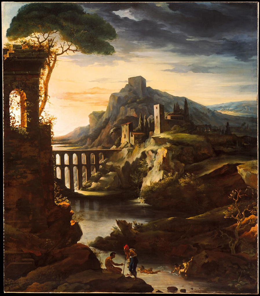
For example, here on this painting there are certain features that are quite dark and very difficult to see and there are brighter places of the model which represents the key features of each painting/photograph. As you can see is that each models/ persons face is very clear and things like their trousers are less viewable as they are less important and not that nice to look at, however their faces hold many key features, also one of the models bodies are quite brightly lit which could help us understand the situation that’s going on.