All posts by Chanelle

Filters

Author:
Category:

Photoshoot 2

Here I took some photos of buildings, the sea and anything else that was around me as I tried to take pictures as to how I see the view to show my own point of view, I put these photos in black and white mainly to be inspired by Ansel Adams. The whole point of taking pictures of the beach and buildings is to show the different places in the world how  each person may see it differently , why taking a picture of it how its seen and not adjusted will help to capture the true moment and not fake photography as many things that are shown today have been photoshopped due to technology and photos have become created by AI which makes everything a lot more dangerous and scarier. If we have Ai creating pictures then what’s the point in going out and taking them, well it helps to keep photography real and alive, it helps to show the true perspective of the world and not how some people may edit it and make ‘fake news’. I feel as though making my photo black and white helps to keep the nostalgia feeling alive as in a few years this area could be covered in new houses or different buildings, it could also be destroyed due to some complications, the answered are always unsolved. The black and white helps also to make the photo look more modern in my opinion as you don’t have colours clashing with each other creates a contrast, contrast is one the basic elements of design, as the eye is drawn directly to it. 

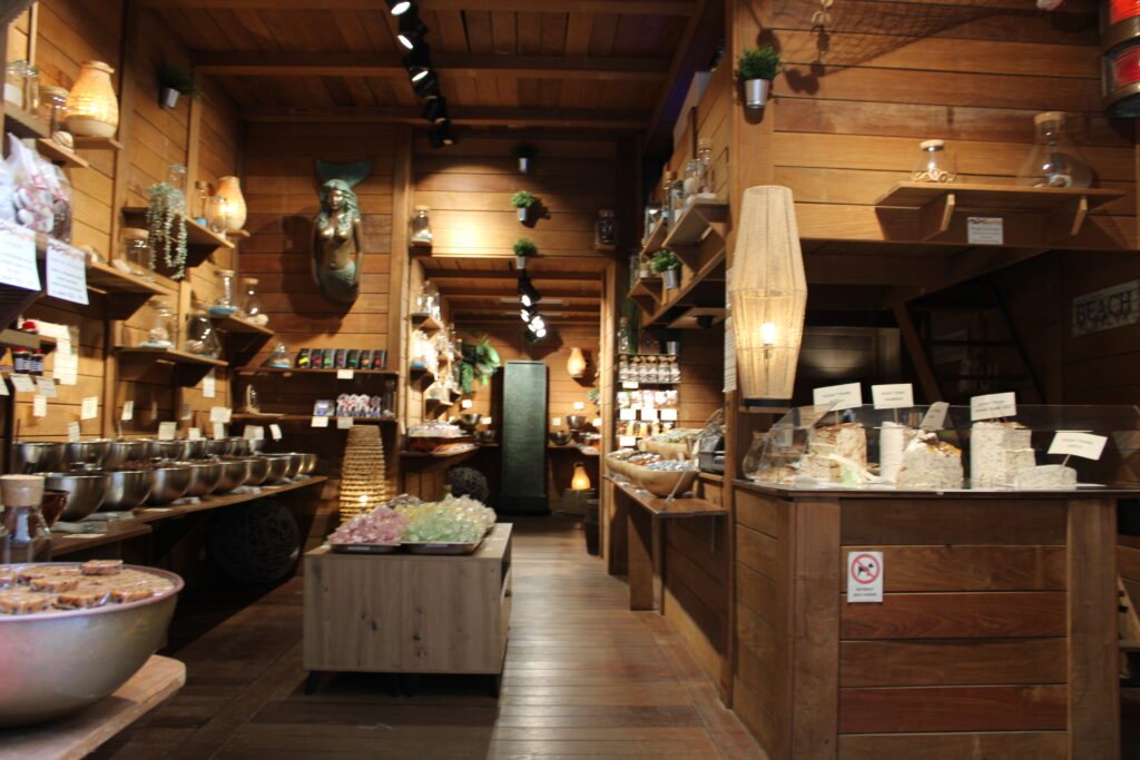
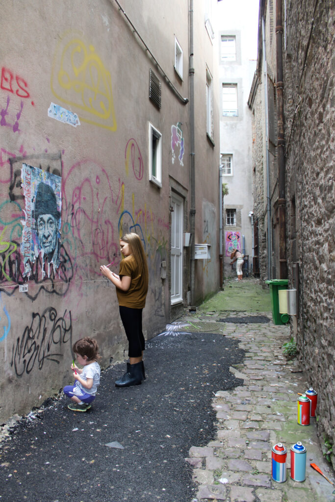
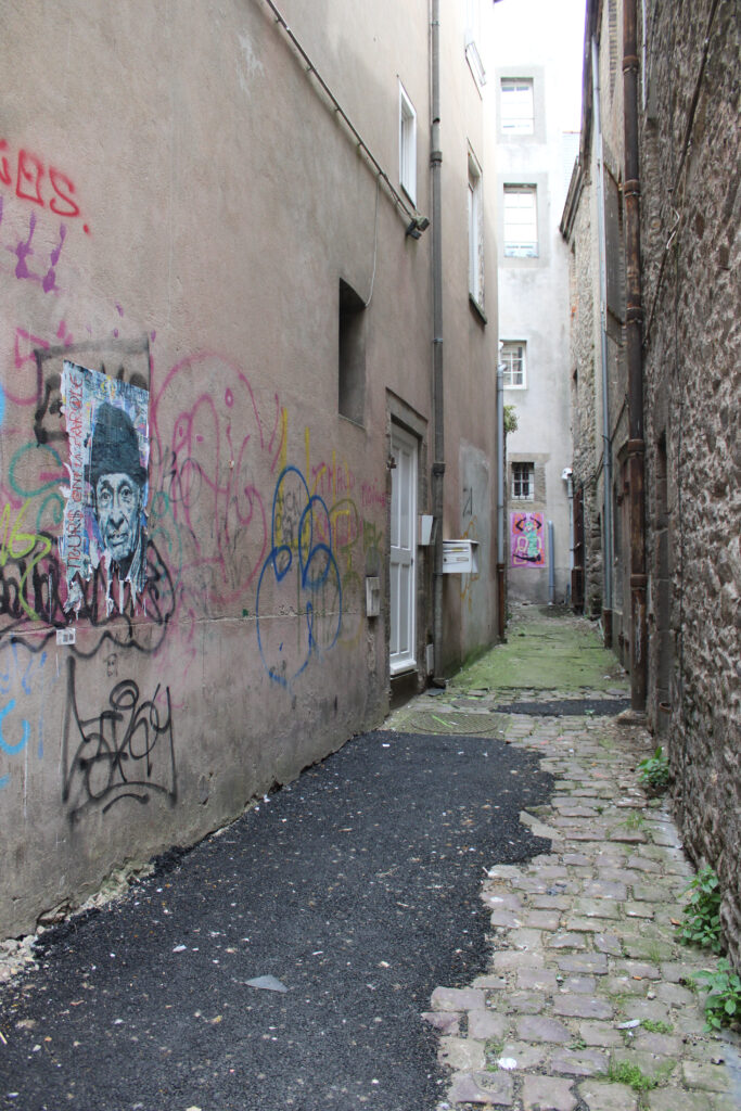
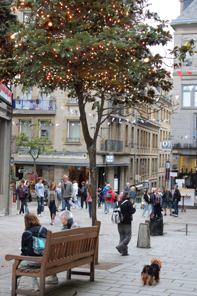
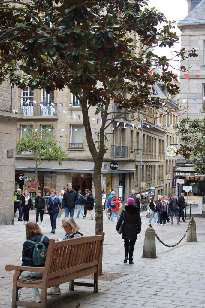
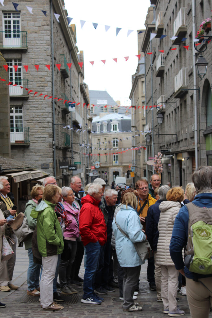
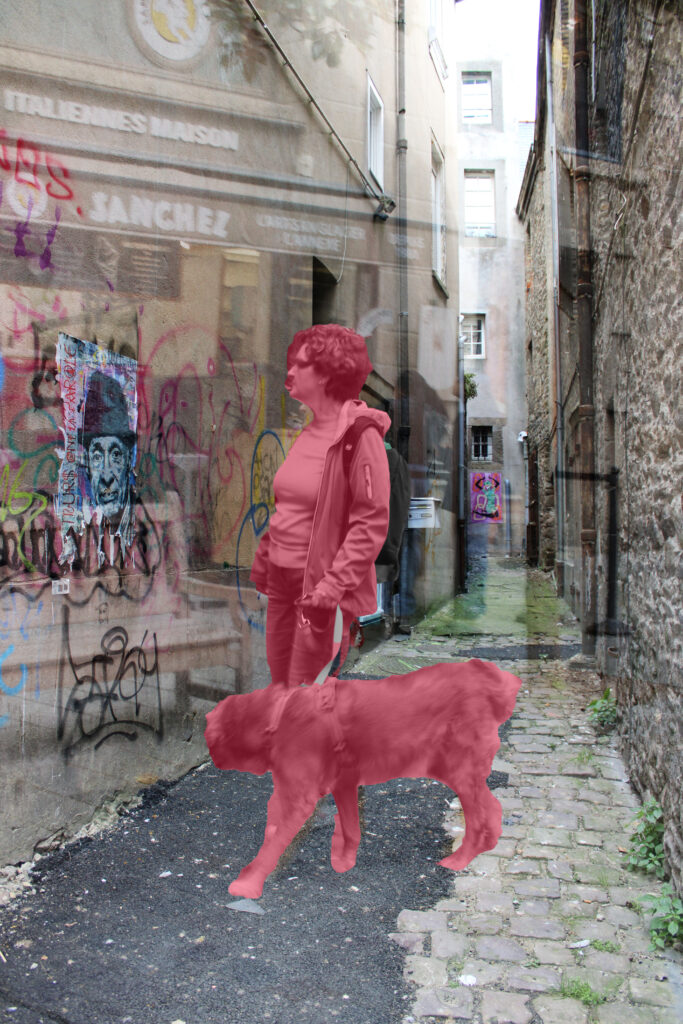
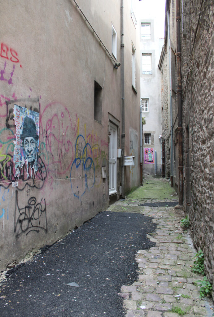
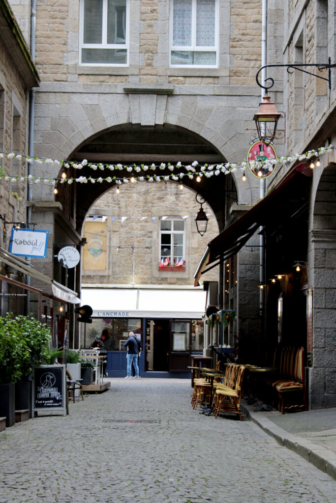
Here are some photos of France, these are landscape photos, however instead of having a photo filled with nature, plants, flowers and no man-made items, instead I have used landscape photos of buildings, with other things surrounding them such as cars and people. I made these photos black and white to yet again represent Ansel Adams photos, although his photos don’t tend to have buildings in them, I wanted to show how society has changed and how beautiful empty lands are getting taken over by humans building houses and other things. This is destroying nature and taking over. Even if these building are seen as beautiful and helpful, they have taken over the empty lands and these photos look very different from each other. Most of these photos still have plants in them which shows that we still have elements of nature around us, and we aren’t destroying everything. To edit these photos, I used photoshop and used the adjustment tool to level how dark each colour on the photo would look as black and white. This help to make each photo have certain things highlighted . these photos here tend to have an industrial look t them as they are filled with buildings and don’t have many natural landscapes and these places would have changed over time as they didn’t always have buildings which shows that man-made products are slowly destroying the earth, for one reason is because many houses, buildings are being built onto of these beautiful places and soon we will have no free land left to do all of our farming, we also have technology taking over where many people are losing their jobs as technology is able to replace them with robots which is a bad thing, but we do have plus sides to technology for example cameras have excelled our photos so much and being able to edit our photos is a big help, to mature the photo, make it look more presentable.

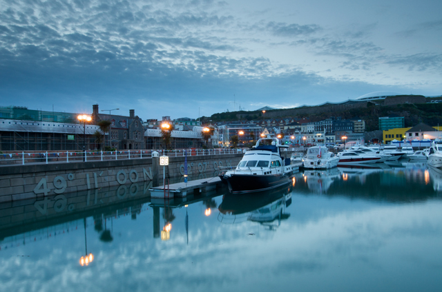
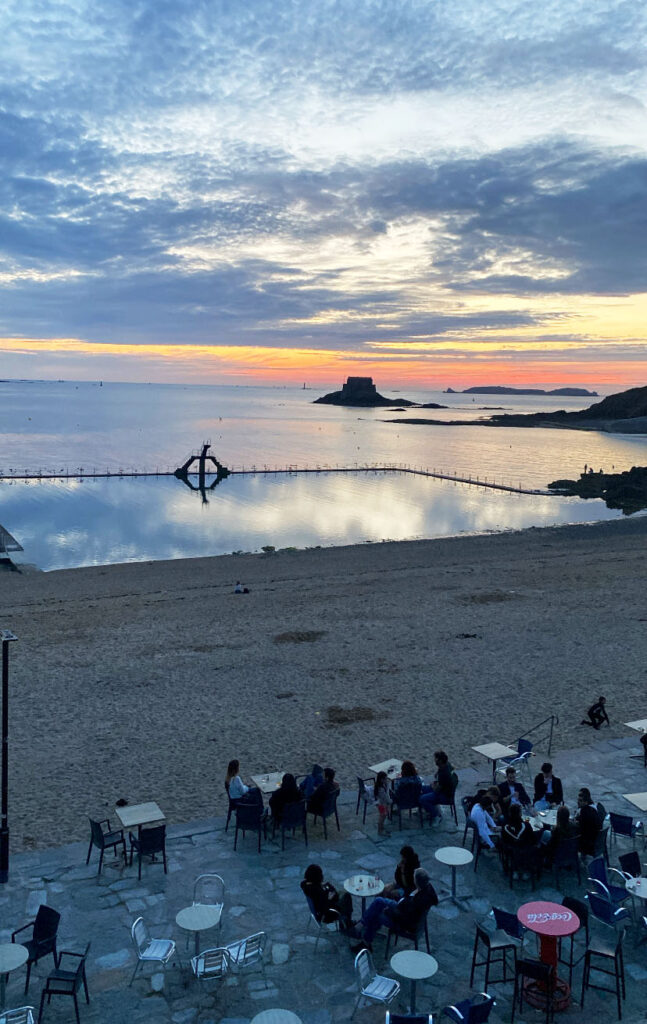
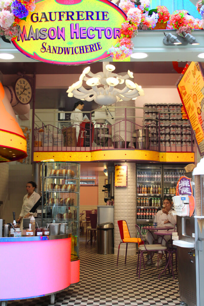
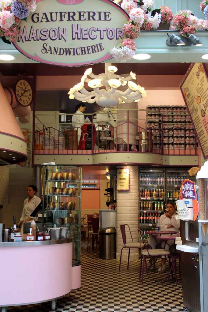
Here I have some photos in colour to show the difference between black and white photos and coloured photos and how they can make the whole mood of the photo look different. For example black and white photos tend to have a nostalgic look to sadness and yearning, they tend to make the photos look quite gloomy, the black and white have a tendency of showing that the photograph is quite old and ancient as they didn’t have colour back then, therefore gives us a nostalgic sensation as the photos are very old and the building/ area could have changed so much between that time. I decided to keeps these photos in colour as it helps to look at the different shades in the sky and how the sky can change very quickly within minutes, that’s why its important to take a picture of the moment and not miss anything.

Photoshoot

Here i selected some of my best photos and presented them in black and white to represent Ansel Adams work, I also like how the black and white effect makes the photo look a lot more mysterious and a sense of the unknown.

Here I went to St Catherine’s to take some landscape photos, and here are some of the results above. I turned the photos black and white to match Ansel Adams work as I was inspired by him to go out and take some photos, I really like how these photos turned out as they show such a natural side of the world where there isn’t any people, the world looks really peaceful and still. However I have taken a few portrait photos, so I could really show the view in different sizes and shapes.

Here I tried to take a picture with a reflection of the view by using water on the ground and positioning the camera in a certain way. If I were to do this again I would try to get the water right to the end of the pier to get a better reflection and not have a rocky surface at the end, which sort of ruins the photograph. would also like to get different locations to different viewpoints and see what it would give me. I really like the idea of having a reflection at he bottom of the photo as it makes it more unique and different, I also really like how it was a sunny day when I took these photos and there were clouds all over the photo, this makes the photo look more detailed and full. To edit these photo I simply when onto photoshop and pressed “image” then “adjustments”, lastly I clicked “black and white” and this gave me options to control the whole photo and what part is darker or lighter in certain sections of the photo.

New Topographics

Photographs of a Man-Altered Landscape” by William Jenkins. 

New Topographic was a term coined by William Jenkins in 1975 to describe a group of American photographers, it is also known as landscapes changing over time and how it used to be viewed by as nature and now its viewed as urban, where the photos are based around buildings. Most of the time the aesthetic of landscape photography that shows nature is mostly based around Ansel Adams work. Throughout the years landscape photography has grown to a much wider detailed subject. Many photographers study new topographic such as Robert Adams, Lewis Baltz, Bernd And Hilla Becher, frank Gohlke, Nicholas Nixon and Stephen Shore. These photographers all studied an approach on landscapes in America often capturing the tension between natural scenery and the mundane structures of post-war America: parking lots, suburban homes, crumbling coal mines. There photographs  are often devoid of human presence. William Jenkins made the new topographic: Photographs of a Man-Altered Landscape”, this was known as an exhibition of contemporary landscape photography. Jenkins Invited these photographers to become familiar with the concept of landscapes changing over time and They first exhibited them in series, as “typologies”, often shown in grids, under the title of “Anonymous Sculptures.” They were soon adopted by the conceptual art movement. Topographic was a reaction to stark, beautifully printed images, topographic was presented as  a reflection of the increasingly suburbanised world around them, and a reaction to the tyranny of idealised landscape photography that elevated the natural and the elemental.

Topography is the study of the features and forms of land surfaces, the origin of the word topography comes from the words “graphia” and “topo”. “Graphia” means writing and “topo” means place. However there is a similar word,  Topographical which means that Topographical maps are special types of maps that show the different land features. New topography represents the physical appearance of the natural features of an area  of land, especially the shape of its surface. For example the photos shown under this, they are similar buildings all in the same perspective, the artist didn’t get any different angles which makes the photos look very similar even if they are different building, it shows the concept that photos look similar if you position then in the same place, each of these photos have a bright white background and have a similar structure therefore it gives the impression that its the same building. That is a representation of what typography is, how things are structured in your photo.

William Jenkins

Williams Jenkins work created the new rules for landscape photography. He created an exhibition “New Topographics: Photographs of a Man-Altered Landscape” was a ground-breaking exhibition of contemporary landscape photography held at the George Eastman House’s International Museum of Photography (Rochester, New York) from October 1975 to February 1976.’The New Topographics photos are about “A man-made wilderness”, the American myths of the West, suburban expansion, and the exploitation and destruction of natural resources. Landscapes have traditionally been produced in order to evoke contemplation on beauty, they were intended to be morally instructive or edifying.’

The Turin Papyrus Map

The Turin Papyrus Map is an ancient Egyptian map, generally considered the oldest surviving map of topographical interest from the ancient world. ‘Besides being a topographic map of surprisingly modern aspect, the Turin Papyrus is also a geological map (the earliest known) because it accurately shows the local distribution of different rock types (with black and pink hills), the lithologically diverse wadi gravels (with brown, green and white dots)’

Ansel Adams photo Analysis

TECHNICAL:

This photo shows an element of natural lighting and how daylight can affect your photo. each different type of lighting can have a different effect to your photo, for example natural lighting fits this photo the best as it shows that everything is natural whereas when taking a portrait of someone natural lighting could be stronger on one side of the face than the other which changes the whole photos purpose. I would say this photo has a hard level of control and it is impossible to move anything but the camera therefore you could get different angles of this scene but not necessarily move any one part of the photo. The control of this photo shows how badly we are affecting this world as we cannot move it, but we can destroy it with global warming, burning fuels and enormous amounts of greenhouse gases in the air. Ansel Adams has given this photo quite a cold tone as the black and white lighting adds a colder tone, if the photo were to have a slightly warmer tone I feel the photo would make me feel almost as if the photo is burning as the cold tone makes the photo look normal and just right, the area looks like a cold place and having a warm tone over it wouldn’t look right and make it look almost like it’s in an odd place. The aperture looks focused as if nothing in the photo is blurry, and you can spot things well. Even though it looks like there is fog in the distance the camera does not really pick it up and almost cancels it out. The iOS 100 has a clean image with no noise around it and has quite high sensitivity.

CONTEXTUAL:

The image was taken at The Tetons and The Snake River, The Tetons and the Snake River is a black and white photograph taken by Ansel Adams in 1942, at the Grand Teton National Park, in Wyoming. It is one of his best known and most critically acclaimed photographs. That river is famous and well known because of the inspiration given to photographers, professionals as well as amateurs. Ansel Adams had taken this photo in 1942, Ansel Adams was the first to get an award for his photography in 1946. He had taken photos of every national park. Ansel Adams had visited 27 out of the 28 national parks missing Everglades National Park in Florida. Ansel Adams liked the idea that proving that landscape plays an important part of the American conservation movement. He wants to make a constant reminder that landscape needs to be protected due to all the earth’s diseases, such as global warming. As a youth, Ansel Adams spent much time outdoors developing a love of nature and taking photographs of these special places. 

CONCEPTUAL:

The idea of this photo shows how pure this photo is and how nature needs to be protected at all costs, Ansel Adams wants to keep nature in photos as in a couple of years those areas will not look like that. The world is slowly dying with forest fires happening and destroying trees and other wildlife, this means that those photos will be the only memories left of the national parks. These areas will change either way because people are cutting down trees, and the weather will look different on different days. The meaning of these photos are purely a reminder of what nature looked like in the 1940s and how different it looks now , how we as humans have destroyed it, it’s almost as if it’s a message saying I told you so, that we are destroying this world and we aren’t doing anything to protect and prevent all these bad things and once they happen we won’t be able to go back. The notion of this photo shows that the world is dying, and humans will not stop producing bad products, this world is known as cruel, Ansel Adams is representing this by taking photos of landscape. I also believe that this photo could suggest how each generation has changed and how little children are always on their phones and never playing outside. They are missing out and will never experience this beauty. As Ansel Adams said himself, he liked being outside as he developed a love for nature and taking pictures of those special places and I believe that as generations get older nature gets less and less appreciated and therefore those photos will hold a lot of meaning in the future. 

VISUAL:

This photo has quite a repetitive pattern with the trees being scattered around the photo on the sides which creates this biodiversity of a forest, where each tree has been cloned and pasted in the same place to create an illusion of theoretical fractals are infinitely. This photo shows the true elements of nature where there are not any manufactured items found in the photo and everything is natural, there are not any people or any animals found, it almost gives a peaceful effect. This photo was turned into black and white purely because Ansel Adams felt that colour could be distracting and could therefore divert an artist’s attention from the achievement of his full potential when taking a photograph. The colours in the photo are known to take people’s attention when they want the photos’ details and texture to attract the naked eye. This photos texture looks quite smooth around the middle bit where the river lays however around the tree the texture of the photo looks quite rough which could show the two different sides of nature and how it is pure and beautiful and how there are wars going, global warming and many other things destroying our planet. The texture of the mountains almost gives off a rough texture, however, the colour white softens that texture to create a more smoothened texture. All together I would say the texture is balanced between a soft and rough pattern all around the photo surrounding the river. The layout of this photo is really well positioned as it shows the real beauty of nature, each element has a feature in the photo without leaving it out, for example the trees have a big part in the photo and show that they give off a rough texture whereas the river is mid centre to represent that everything should be smooth and nothing should go wrong if you think positively about it. 

Ansel Adams

Ansel Adams

He felt colour could be distracting, and could therefore divert an artist’s attention from the achievement of his full potential when taking a photograph.

Ansel Adams was a landscape photographer, best known for his black and white photos of American West, he helped found and associate photographers advocating “pure” photography. His visionary belief in the redemptive beauty of wilderness was expressed in grand images that have popularized art photography among the American public. Adams liked to make his photos black and white as he felt colour could be distracting, and could therefore divert an artist’s attention from the achievement of his full potential when taking a photograph. Adams liked to manipulate his photos with dark room to make them more mysterious. However, he started taking pictures in colour for the same amount of time he took photos in black and white.

things that inspired Ansel Adams were because of his struggles due to his Natural shyness and a certain intensity of genius, coupled with the dramatically “earth quaked” nose, this caused Adams to have problems fitting in at school. In later life he noted that he might have been diagnosed as hyperactive. There is also the distinct possibility that he may have suffered from dyslexia. When he was younger he thought he was different from everyone else when In reality these struggles formed his own views and how he sees certain thing such as how he can make landscape photos looks so elegant and show so much detail and history.

The Zone System

Ansel Adams liked to use the zone system which made the colours black to white, this is a photographic technique for determining optimal film exposure and development, formulated by Ansel Adams and Fred Archer. The Zone System assigns numbers from 0 through 10 to different brightness values, with 0 representing black, 5 middle grey, and 10 pure white; these values are known as zones. To make zones easily distinguishable from other quantities, Adams and Archer used Roman rather than Arabic numerals. Ansel Adams Created the Zone System to have a total control of exposure when out on the field.

Ansel Adams photographs were minimalist, shot in black and white using sharp contrast and deep focus. Ansel’s photography is known for its realist style. Whereas landscape artists used colour and brushstrokes to show the beauty of the places that became part of the National Park System. Adams began to pursue “straight photography,” which meant the clarity of the lens was emphasized, and the final print gave no appearance of being manipulated in the camera or the darkroom. Adams was soon to become straight photography’s mast articulate and insistent champion. He liked the idea of manipulating his photos to make them less common and more unique.

Adams taught himself how to read music and play the piano, and it seemed destined to be his career. But while he dedicated himself to mastering the instrument, from 1916 onwards he also began to visit Yosemite National Park every summer. This lead him to taking a lot of his pictures in Yosemite and the Sierra Nevada which helped to emphasis the natural beauty of land. From my research it made it clear that Adams stopped playing the piano as he didn’t have enough skills to become professional and therefore created a career in photography.

How Ansel Adams images link with Romanticism / Sublime

Here is one of Ansel Adams photograph that links with the word sublime as it’s a really original photo however the sky is very grey and stereotypically isn’t very pretty, the clouds could represent that a storm is coming, or a sense of danger, it could even just be a little bit of rain which in some cases would be good to have, as some places, however most people would disagree and say that the rain makes people miserable and gloomy. This photo looks exactly like the ones I had looked at for sublime as it shows such beauty of the world and shows how pure it is although the rain is about to endanger that thought and make the photo look very dark and seen as a lack of beauty in the world.

What/Who did Ansel Adams inspire?

One of the most important legacies of Ansel Adams was that his work contributed to the American Conservation Movement. Between 1850 and 1920, American conservationists invented the idea of the national park and developed the national park system, establishing an international model for the preservation of natural beauty and wilderness. Personally I believe Ansel Adams would have inspired people who struggled in school and felt like they didn’t fit in, the people who believed that they didn’t have place in earth that didn’t have anyone to talk to. Ansel Adams being brave and strong helped him go for what he wanted, he didn’t let any of his problems stop him, however it is heard that he did stop playing music due to the fact that he fell and had an accident during an earth quake when he as younger, he believed his disfigured face would look nice to have, and having to do shows and be an artists didn’t sound reassuring. Ansel Adams therefore used photography as a way of bringing himself up, he used landscape photo of the world and what he liked the best, he liked taking pictures of Yosemite as it was in his home country and this clearly reflects that he has a strong passion towards his history and where he came from, he isn’t ashamed of what he has become but of what he looks like which can be a big problem to many people and Ansel Adams proving that he got on with his life despite his accident shows how powerful you can be if you put your mind to it.

Sublime Analysis

TECHNICAL: The lighting on this photo is very bright and exposed and shows a lot of the rocks natural colours, the intensity of the lighting makes the photo look really powerful and dominated and shows off the disasters, All the colours are positioned in different places, as all the bright colours are at the top and all the darker colours are at the bottom, it almost shows a blend in the colours. Each type of lighting can effect a photo, for example natural lighting isn’t seen as the best for for this photograph as it would destroy the point of this photo, although this is a painting and not actually a photo it still shows the point of what the the beautiful disaster’s. This photo gives off a cold tone as most of the colours a shade of green or blue which makes it have a cold tone, this makes the photo stand out a lot more than if the colours were warm as the bottom colours are quite dark and need some lighter cold colours to balance out the photos. In this photo there are still a few warm tones scattered around the photograph like in the middle of the photo it looks quite orange or yellow which just adds a sophisticated look to the photo. The photo looks slightly over exposed as it is very bright in the background, however it does draw the viewers eyes towards the photo. The level of control of this photo is quite strong as it shows how steady the photo is, but it would have bee nice to have seen different angles of this photo to see if any of the colours would had changed and which, would it because the sun in is now in the way and everything is a lot brighter and less dull or the opposite the whole photo becomes darker.

VISUAL: The layout of this photo was well positioned as everything seems to work well and look well in place. The texture of the photo looks very rough and dangerous however the photo itself looks really pretty and natural and that’s the conflict between the opposites of this image. The rocks look very detailed and have a very hard and unsmooth surface on them. This makes the whole image looks very dangerous its self, it could put images into our heads to think of the worst, such as someone slipping and hurting themselves because of the rough rocks, therefore this images gives a negative representation although the imagine itself looks really detailed and looks like a positive image, it gives us an overthinking feeling when it comes to explaining how this images makes us feel. The whole image is 3D, which makes all the colours stand out and attracts the eye compared to if the image was flat then nothing wold really stand out and the disaster wouldn’t be captured as well.

CONTEXTUAL: There are many colours around the photo which sort of represents the opposite of romanticism, romanticism is meant to represent the goodness of the world, Romanticism all started with the emphasis on the imagination and emotion. Its mean to be positive and give off a good vibe where as sublime is meant to do the opposite its meant to be a natural disaster that would destroy the world but the photograph taken makes the disaster seem beautiful with all the pretty colours in the photo, its meant to show the positive in all the negative.  It shows a convey of opposites, for example heavy rain pouring down, this can make people upset as they don’t want rain they would prefer it to be sunny hover the rain can be really heling, it can water plants and give water to any animals that have a lack of water. sublime isn’t meant to represent the worst but it can be seen as a very bad situation or idea of something, although there will always be something special that will lighten up the photo/situation. Another example of sublime is just the world in general, the world is full of beauty and allows people o live and survive, for us humans the world is our home and non of us would be alive if it wasn’t for the earth, but things such as global warming, world wars and conflicts, poorer countries, starvation, all of these things turn the world into such a nasty thing. If only life was that simple but there is always bad things happening around us and some of us are oblivious, these are the people who choose not to care and not to help and they help impact the world with their selfishness.

CONCEPTUAL: The idea of this image presents a significant meaning, it helps people to see the good in every bad situation, These types of photos shows the true significance of nature, there are not any manufactured items found in the photo and everything is natural, there are no people or any animals seen , it almost gives a peaceful and quiet effect. Overall this phot makes me feel as though I am not safe, it looks really dangerous and rough to be around and this can lead to overthinking about the image, although the image looks chaotic the point of the image defeats the that whole idea of chaotic. The landscapes taken are the beauty of earth and capture the exact natural surroundings and movements of the photo. As landscape photos are meant to capture the true beauty of the world the fact that sublime does almost the opposite it creates an idea thta the image is capturing beauty and a disaster whereas landscapes tend to just capture beauty.  

romanticism

Romanticism is all about celebrating the spontaneity , imagination and the purity of nature. It creates emotions such as apprehensive, horror, terror and awe. Romanticism is all about characterising the focus on emotion and individualism, also the glorification of the past of nature, preferring the medieval over the classical, as well rationalism of the enlightenment. All together romanticism created freedom, individual expression as well as celebrating nature and its natural world. The romantics believed that putting emotions over a reason was a more valiant choice. The romantic movement/ the romantic era was originated in Europe towards the end of the 18th century, for most of the Western world, it was at its peak from approximately 1800 to 1850. From my research I found out that Both the English poet and artist William Blake and the Spanish painter Francisco Goya have been dubbed “fathers” of Romanticism by various scholars for their works’ emphasis on subjective vision, the power of the imagination, and an often darkly critical political awareness.

Romanticism was founded by August Wilhelm Schlegel and Friedrich Schlegel, they began to speak of romantische Poesie (” romantic Poetry”) in the 1970s, this contrasted with “classic” but in terms of spirit rather than merely dating. Romanticism all started with the emphasis on the imagination and emotion, it emerged as a response to the disillusionment with the enlightenment values of reason and order in the aftermath of the French Revolution in 1789.

Sublime

Sublime is all about the quality of greatness, whether physical, moral, intellectual, metaphysical. aesthetic. spiritual or artistic. The word sublime especially refers to a greatness beyond all possibility of measurements. The word means a high moral or intellectual value; elevated in nature or style. Sublime is meant to show how something can show beauty and terror at the same time. It shows a convey of opposites, for example waves crashing onto a wall could show such beautiful energy as the water splashes ever however it could be really dangerous and seriously injure someone.

Sublime helps to make bad things good, such as storms they can be life threatening but can also be captured as such beauty. The Sublime is known as a western aesthetic concept of ‘the exalted’ of ‘beauty that is grand and dangerous’. The Sublime refers to the wild, unbounded grandeur of nature. Personally I believe that sublime is used to describe the world and how such disasters are happening like wars and global warming however there is some natural things happening like trees growing hat we all take for granted, we have flowers, and the pretty sky with a bright sun which tends to make people happy and we all enjoy having but don’t make the effort to save the world. This suggests that the people are too selfish for this pure and innocent world. Its always about taking and never giving and it should be seen the other way round. Therefore the world is dying with things such as global warming, Things such as  dramatic shifts is human-induced climate change, stemming from the substantial release of carbon dioxide into the atmosphere and as a result of the humans not taking care of this beautiful earth we end up paying the price and consequences of it suffering.

Typically romanticism is seen as a feeling of love, and a strong attraction towards someone or something, however romanticism is seen as much more than that, it holds a much deeper meaning, such as expressing of personal feeling and interest in the natural world. Its all about how nature has shaped us, the way nature has changed through out the years and how things have been damaged, wars that have ruined countries and global warming destroying the planet, romanticism is all about the way in which the world is always going to be our home and if we don’t treat it well we will get consequences. I personally believe romanticism i art and photography is to capture the moment of that time, for example when you go out and you have pretty view in front of you take a picture to have a memory of the world during that time an the world is slowly dying and might not be like that in a few years time.

The Origins Of Landscape

What does landscape mean?

Landscape photography is a broad genre that encompasses many different styles and techniques. Landscape photography typically captures the presence of nature but can also focus on human-made features or disturbances of landscapes. A landscape is part of Earth’s surface that can be viewed at one time from one place. It consists of the geographic features that mark, or are characteristic of, a particular area. The term comes from the Dutch word landschap, the name given to paintings of the countryside.

2) When did landscape emerge as a genre in the western cultures?

End of the 15th century and beginning of 16th century

Landscape emerged in the the Renaissance period, in the 16th century. Early in the 15th century, landscape painting was established as a genre in Europe, as a setting for human activity, often expressed in a religious subject, such as the themes of the Rest on the Flight into Egypt, the Journey of the Magi, or Saint Jerome in the Desert. Though landscape painting was still not a genre in its own right and was considered low in the art academy’s rigid hierarchy of subject matter, background landscapes became increasingly detailed in compositions that emerged in  Venice in the late 15th century.

3) When did classical landscape emerge as a genre?

17th century

Classical Landscape emerged in the 17th century also known as  the ‘Jacobean era’ in England, In a classical landscape the positioning of objects was contrived; every tree, rock, or animal was carefully placed to present a harmonious, balanced, and timeless mood. These landscapes were influenced by classical antiquity and sought to illustrate an ideal landscape recalling Arcadia, a legendary place in ancient Greece known for its quiet pastoral beauty.

4) What promoted the rise of landscape art during the late 18/19 century?

18th to 19th century

The rise of Romanticism, attitude or intellectual orientation that characterized many works of literature, painting, music, architecture, criticism, and historiography in Western civilization over a period from the late 18th to the mid-19th century. Artists started to break away from traditional styles and experimented with new techniques and subjects. They painted everyday life, and even their feelings! This was a big change and it paved the way for modern art.

5) When did landscape photography originate?

19th century

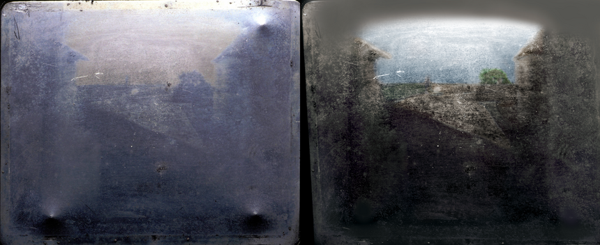
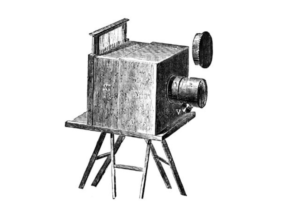
Landscape photography originated between 1826 and 1827 according to the records. The 19th century. It was an urban landscape photo taken by a French inventor by the name of Nicephore Niepce. Landscapes have fascinated humanity since way before photography and the painting tradition is good evidence of that. In earlier times, photography was pretty limited in terms of technology, so landscapes were the perfect subject for the new discipline in the nineteenth century since it was almost static.

Landscapes:

I believe that Landscape art and photography is where you capture all man- made objects and nature, you get an aspect of life and don’t focus on any humans and more your surroundings. Landscape helps to capture the exact moment in front of you and doesn’t tend to have any livings things in the photo, art. Thee are many different types of landscape, for example  Desert, Plain, Taiga, Tundra, Wetland, Mountain, Mountain range, Cliff, Coast. All of these landscape photos are all just land, and more natural then portraits as they can be exaggerated, whereas landscapes are the beauty of earth and capture the exact natural surroundings and movements of the photo.
Virtual Gallery

Here I went on Photoshop to create a virtual gallery, I went online to get a phot of an empty gallery and pasted it onto photoshop, then I added some of my best photos I want to present. When resizing each photo, I had to right click and press ‘skew’ this abled me to make the photo look as if it was stuck to the wall like in the normal galleries. I also had to add some blending options such as strokes to add an outline on the photo almost as if it was in a frame. Also, to make the photos stand out I added a faint outline on the outside of the photo.
Here I edited my photos quite similar to the other ones however I added an effect on the side of the frame of the photo. I added an inner glow this makes it loo like the light are reflecting onto my photos. I tried to make all the photos the same length to make it look realistic. On the sides there aren’t any photos as if I had added them it would have looked crowded and too full. I like how this onw turned out as it looks quite modern as the photos are in black and white and so is the gallery.

Here is a picture of the blending option and what I had added to the photos, although most of them were edited the same, some had stronger strokes, inner shadows or drop shadows. Each option can change the whole photo completely as the stroke controls if the photo is in a frame or not and how big each frame is. When pressing ‘Ctrl T’ you then press skew to control how the photo is adjusted on the gallery wall.

experimenting on photoshop

Here I had the idea of combining the two genders into one photo, I made a collage of all my photos I took inspired by Cindy Sherman, I simply added all the photos to a blank piece of paper and removed the background of each of the photos to combine them as one, after I duplicated the collage and placed it side by side from the other one, I then placed two photos I took of boys and placed on top also removing the background. I left the pictures of the boys in colour as it helps to make both the collage and the singular photos of the boys stand out.

Here I am putting 4 of the best masculinity photos onto a blank A4 sheet, and cropped them so they fit each of the sheet correctly. I kept the photos in black and white as I believe it makes the photo look more detailed and interesting, it also looks a lot better as there aren’t different colours all over the page.

I wanted to keep this idea quite simple so that I don’t have too many photos with so much detail that it becomes too much, I really like how simple this one is and used two models to make it look more detailed. To make it look better I could have added a picture of a boy and a girl to show the difference in how each person stands however I like to show them off separately and not compare them.

In these photos I used a black background which does make the models features stand out a lot better, however I did also use the flash light when talking the pictures which did also influence on how the models features did show, it helped brighten them up and make them look more vibrant.

If i wanted to make it look better i could have also left two of the photos in colour and two of the photos in black and white to show a controversial look.

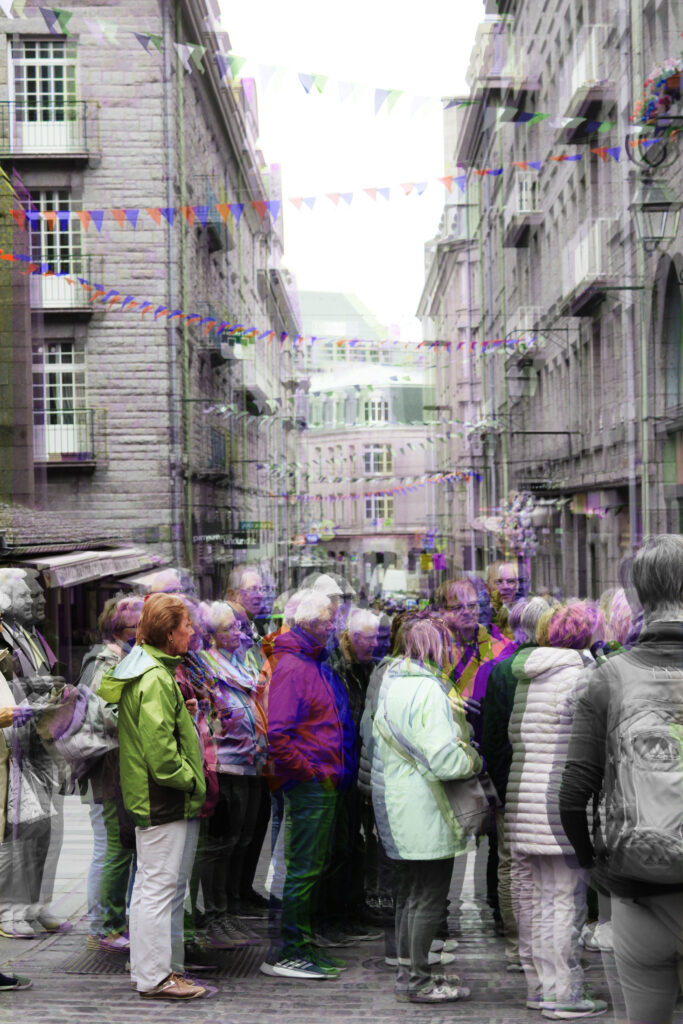
For this photoshop idea, I thought that overlapping the photo would make the photo look very unusual. To do this I had to layer the photos on top of each other, however I did make one of the photos bigger than the other one to make it stand out from the original photo, the reason I made this photo black and white was because the photo was taken in inspiration of Cindy Sherman where she used to take self portraits of herself to show and symbolise women’s lives back in the day.

I do really like how the bigger layer is a lot lighter than the bottom layer, it helps to see the models facial features a lot better, the idea of this photo was to show how women were treated horribly and never had any freedom, they did what they were told and that was it, they weren’t allowed to fight back and say anything as their opinion didn’t matter.

This photoshop idea almost creates an illusion, almost as if the models emotions are coming out, as they are crying, it sort of looks like their minds are slowly leaving, helping release the tears but also helping them put all their pain in the past, all behind them, it could also represent that their inner child is healing them, they are letting go of the pain while their inner child is talking to them reminding them that everything will be alright even if they only have themselves.

For this photo I used a similar concept but changed the different type of overlay. I used a pin light overlay to make it look quit dark and almost adds an orange effect to the photo. I really like how both of these turned out even if its a simple process to do to get this type of edit, it still looks quite interesting how the different colours cross over each other. For one of the photos I used a picture where you couldn’t see their face to make it look more mysterious and strange.

For this photo I kept it quite simple, by making it black and white, this photo was also inspired by Cindy Sherman. I really like this phot as it isn’t too detailed but still has enough to capture the eye. I didn’t want to make all of my final pieces to edited and wanted to keep a few simple pieces to show that I have taken some good photos with good lighting. To get this black and white effect I pressed (ctrl u) and also I positioned the saturation to -100 and the lightness to around +8, this added a slight gradient look.