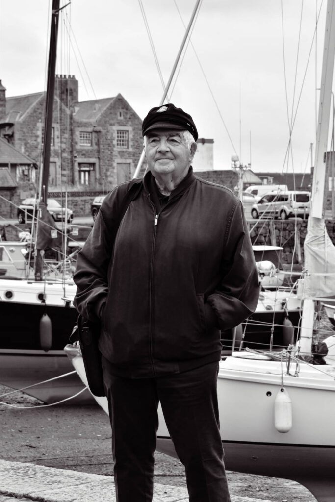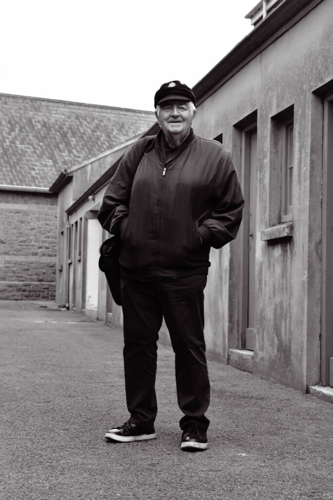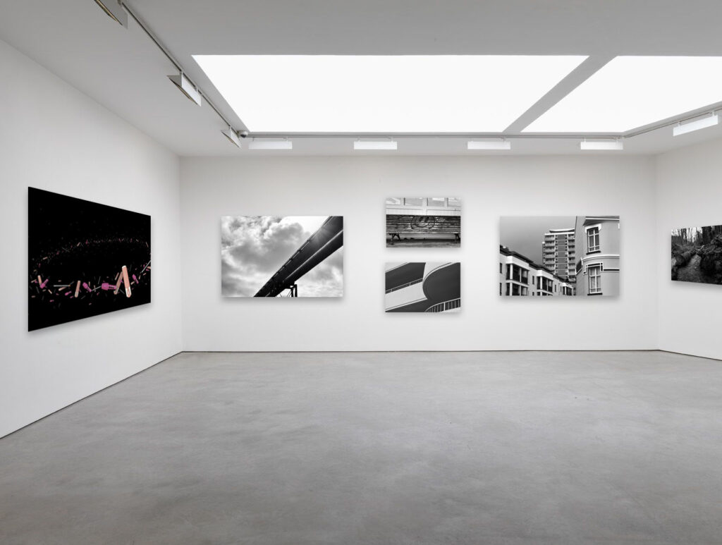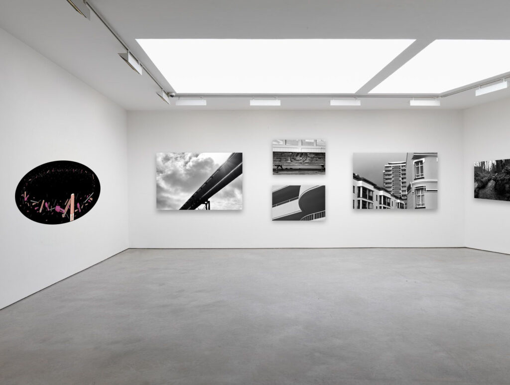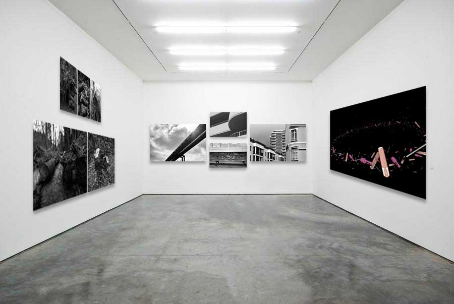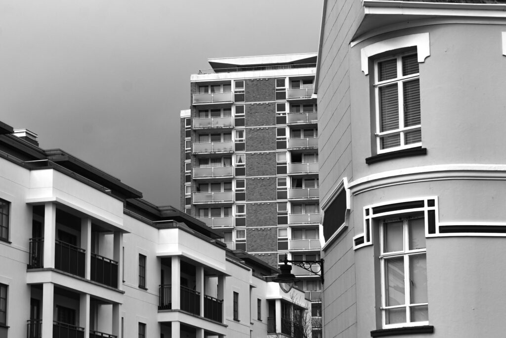
‘Landscapes’ was a form of art where ancient artists drew and painted large spots of land such as gardenscapes which derives from the Dutch word ‘landschap’ The tradition of pure landscapes declined after the fall of the roman empire as landscapes became simply a backdrop for religious scenes. This tradition continued until the 16th century when the renaissance sparked a new interest in the natural world. The Dutch word became associated with the movement as the Netherlands was one of the first places that landscapes became a popular subject to paint. This need for large scenic paintings was born from the rising Protestant middle-class with houses in need of decorating.
Outside of the Netherlands, powerful art academies of Italy and France refused the paintings as they placed historical paintings (including classical, religious and mythological themes) above other styles as portraits, still life and landscapes were seen as inferior. Even as landscapes become more and more accepted, they were still only used as a backdrop for biblical or historical scenes. In the 17th century Landscapes took on a different form known as the ‘classical landscape’. French artists Nicolas Poussin and Claude Lorrain perfected the classical landscape after devoting their careers to roman countrysides. Poussin found that the same emotions conveyed through a person in a painting could be conveyed through a landscape and elevated landscapes to a new, higher status.
The 19th century saw the industrial revolution which altered urban landscapes and the change of old hierarchies. Landscape photography also rose in popularity and influenced the way artists depicted their paintings. Revolutionary artists such as Gustave Courbet began to push the boundaries of a landscape and allowed for future artists to break from the rigid academies. This new generation were the impressionists. Courbet had a distinctive style of layering paint which influenced artists into the 20th century as well as Van Gogh. The 20th century saw photography accepted as an art form and artists embraced landscapes as a way to respond to fears such as ecological disasters and global destruction.
Romanticism
Romanticism was a movement in the 19th century (1800s) which was a direct reaction to the 17th and 18th century enlightenment. The enlightenment was all about embracing science and reason across Europe and America and moving forwards with technological advancements bought along with the industrial revolution. This ‘head first’ society is best shown through the slave trade where minimal costs were spent on labour which lead to large profit margins. On paper this was the perfect way to money making scheme however pulled innocent individuals from other countries away from their homes and families. The romantic era thought about feelings and considered the heart instead. It rejected science as a cold and heartless worldview that run purely by reason which was a dystopian nightmare. This reaction saw the slave trade not as a business reaction but instead as the horrific abuse of people.
Industrial revolution
Romanticism was the rejection of the Enlightenment which had sucked emotion from writing, politics and art. Romanticism cantered art around emotion; personifying them as untamed nature. The industrial resolution connected the Enlightenment and the Romantics, its was a result of the enlightenment and its focus on scientific progress and the root of all romantics problems. The industrial revolution succeeded based on the efficient exploitation of the earths recourses as scientific ideas and and theories were transformed into practical realities. Factories could mass produce products which required more work and provided the owners with more to sell and therefore more money for less effort. They destroyed the environment while offering a large number of jobs. The business owners with factories saw rapid growth in success and profits while putting in less and less work themselves. Despite making more money then they knew to do with, they’d have more time to reflect. Maybe it was guilt for exploiting workers or the environment or maybe it was the fact that their happiness didn’t increase at the same rate as their wallets, but these rich men found themselves idolising the simple farmer life. Since money means power, the romantic period was run by rich, privileged, educated men in large, growing cities who saw life in the countryside as the ideal. This life wouldn’t have smog filled streets or poverty ridden workhouses, instead a sulf-sustaining utopia. They believed that centuries ago humans were happier being closer to nature despite missing the obvious fact that life for the poor in the country side was hard physical labour with poor living conditions and overall shorter lifespans. This sentiment that money doesn’t equal happiness and that a poor family is closer and happier is still common place in the media today.
Despite the flawed outlook on privilege, the romantics appreciated nature which would have effected the art produced. With a growing appreciation of nature, artists such as John Constable created pieces such as the following:
John Constable: The Hay Wain
John Constable was an artist from the romantic period (1821). He documented landscapes for future generations in fear that the progress born from the industrial revolution would ruin them. Factories were filling the air with smog and taking up valuable land. Cities were growing in size and poverty and the land was changing. This piece shows a farmer using traditional equipment such as a horse and waggon walking through a small body of water just in front of a small traditional hut. The trees in the skyline help to create an image of a traditional English countryside witch looks completely different to growing cities showing the commentary on land use, the industrial revolution and changing times. The sky is a mix of blue skies and dark, heavy clouds. The dark heavy clouds are over the house while the bright clouds are over the open landscape using pathetic fallacy to show the farmers concerns or anger over change and the blissful sunshine over the romanticised open, natural field.
The Sublime
The sublime is a quality of grandeur that inspires awe or wonder where emotion is more important than reason. Its inspired by emotions and partially in relation to the natural landscape. The Romantic sublime shares experiences of awe, terror and danger over 1770-1850.The sublime utilises personification (giving an object human like features(in this case showing emotions)), glorifies nature and places an emphasis on aesthetic beauty.
Ansel Adams was a talented pianist before an accident which damaged his confidence. This damaged confidence pushed him away from music and instead towards a different creative outlet: film photography. At 12 his uncle gave him a camera (Kodak Brownie which was the first ready available and reasonably priced at $1 when released(about £30 now) and introduced many amateurs to the subject), he began to take uninspired photographs on his trip to Yosemite National Park. It wasn’t until he finally decided to experiment that he had his first ‘successful’ photograph of the half dome:
He used both a yellow and red filter on his camera(Now a large format camera). The yellow filter (right) has the exact same composition as the red filter(left) only the red filter gave the photograph a greater variety of tone. The sky is much darker and the stone has more contrast creating an image with a stronger identity and looks significantly more dramatic. Using film was expensive and difficult which meant that you could only take a handful at once maximum. This resource management lead him to develop the zone system. The zone system was an 11 part gradient means to visualise how colours would translate into black and white where colours were assigned numbers on a scale with ‘0’ as pure black and ’10’ as pure white. In addition he began to take his photos 2 stops under exposed for exaggerated tonal values and edited them slightly while the glass films were developing. This 11 shade system shows the contrast in his images best when pixelated. The above is this same image with each pixel showing the tonal shades. Every neighbouring pixel is a different value and range massively across the image, this showcases the contrast present in the image. This process is reflectivitve of the quote “You don’t take a photograph, you make it” which was said by Ansel Adams himself. A photograph can be deceiving or awinspiring similar to art and requires much input from the photographer themselves. It was not just shot and taken away instead it was carefully planned and developed, requiring the photographer to make and weave a narrative. His well known grand images popularized art photography among the American public and inspired many to truly appreciate the natural landscape. The zone system also affected how other photographers could control exposure and achieve richer tone in their own images.
Group f/64 was made up of 11 photographers with a common style of photograph with sharp focus and careful framing. It was founded in 1932 by Ansel Adams with the name referring to the aperture on a camera resulting in sharp images. Ansel Adams was an environmental conservationist and his photographs were a way to protest the abuse of land. His photographs were made to showcase the beauty of the land to push for its protection. This was a sentiment that was common among the group of landscape photographers. The group was made up of Ansel Adams, Imogen Cunningham, John Paul Edwards, Preston Holder, Consuelo Kanaga, Alma Lavenson, Sonya Noskowiak, Henry Swift, Willard Van Dyke, Brett Weston, and Edward Weston.
This photograph showcases a landscape of the American west. In this specific photograph value 10 is present in reflective river and the left snowy mountain without any overhead clouds. The river is surrounded by much darker trees which makes the brightness stand out significantly and is also near the centre of the image which helps to draw the eye. The value 0 frames the bottom of the frame which pushes attention upwards of the frame and makes it seem shorter which in tern makes the landscape seem wider and larger and therefore more impressive. The large range of tones makes the image seem like it has genuine depth, similar to how it would look to the natural eye. This makes the image seem much more impressive as it almost looks as though it could creep out of the frame. The whole photograph was lit with natural lighting, diffused by the clouds overhead for a softer outcome. The details are sharp throughout the whole image requiring and was taken 2 stops underexposed. The viewpoint was up on a bank which flows around the left of the frame. This angle allows the river to run below and be visible in its entirety. A grassy plane many meters away is visible clearly which would only be in frame if the viewpoint was higher like it is.
His work is reflective of romanticism. This one in particular encapsulates the sublime with grand, towering mountains. These large mountains and gushing rivers are awe-inspiring but also dangerous. The viewpoint alone could be dangerous with its height however provides a beautiful vantage point. Ansel Adams also valued the environment and large land masses. He created his photographs in an attempt to have the land protected by photographing and capturing the beauty in the landscape and to raise public awareness. He deliberately framed his images to cut out any human activity to show how the land should stay and to appreciate the natural landscape.
Edward Weston
Over the course of 40 years, Edward Weston photographed in monochrome. His work varied between still-life, landscapes and even parodies. He also photographed the American west and was the first photographer to earn a Guggenheim Fellowship. In 1974, for the final 10 years of his life he was diagnosed with Parkinson’s disease and focused on printing over 1000 of his most famous images.
This photograph encapsulates the sublime through the crashing waves. It is taken from a high viewpoint in order to capture a birds eye view and the effect of the waves along the beach as opposed to a normal viewpoint which would focus on the skyline. This photograph is in black and white and in a 4×5 frame. The sand is all one shade without contrast which is broken by the rocks and sea. Pure whites, shade 10, is present in the foaming waves and creates a clear contrast from the rest of the sea. This contrast shows the movement of the water while also showcasing danger which is furthered through the high viewpoint is looking directly down a drop. Pure black is present in the rocks which creates contrast with the fluffy water.
Compare & Contrast
This photograph was taken by Ansel Adams and also shows a beach with moving waves. This photograph however has darker rocks and lighter water. This creates greater contrast across the image as mid-tones are almost non-existent. This one was also taken from height however looks across at the landscape instead of down. By looking across at eye level the photograph is not looking down or belittling the sea. This gives the sea more power and therefore makes it more dangerous. This image also shows the sea during heavier winds with larger waves which are more dramatic. The raging waves juxtapose with the sunny, clear sky above and shows the dual nature of the natural world. Romanticism was the movement that acknowledged and marvelled at nature and I believe that both photographs reflect ideals carried forwards from the movements impact such as the sublime. I believe that both images are representative of the sublime however Ansel Adams shows much more danger and therefore is more intriguing.
Ansel Adams and Edward Weston were two visionaries in photography and both were a part of f/64 with similar styles and ideals. They both took high contrast photographs of nature and travelled together on occasion.
— A letter from Edward to Ansel in 1936
“I cant tell you how swell it was to return to the simplicity and natural strength of your photography … I am convinced that the only real security lies with a certain communion with the things of the natural world.”
Around this time saw the great depression and the world wars which were major events and seen as even bigger ‘failures’ of modern society. The great depression was caused by banks going bust and loosing money which created an unsteady, unreliable and unforgiving environment. This understandably soured people opinions of the government and the ways the county was evolving. Not only were people wishing to go back before the banks crashed, but also back to simpler times without the need for them. In addition more people then ever were working on farms or ranches and pushed them closer to nature which were reliable. People embraced nature and again romanticised a simpler life.
High Dynamic Range
Exposure bracketing is when 2 or more of the same images are taken at different exposures. One under-exposed and one over-exposed taken with the same composition so that they can be layered together, needing a tripod. High Dynamic Range (HDR) combines these images to create a uniquely exposed image as a camera has a limited dynamic range and can typically only capture lights or darks in detail.
Lightroom
This selection of images shows a normal exposure, 1 up/down and 2 up/down. This means there are a minimum of 5 different exposures for a range in detail.
I selected each exposure I was going to use and right clicked to create the drop down. One option: Photo merge, has an option called ‘HDR’ which automatically masks and layers the different exposures.
This opens a pop up which has 4 total options of customisation. I selected the ‘Deghost Overlay’ which shows in red the masking this option used. I then used the graduated filter to change the sky slightly so that it would not be one flat shade. This also meant that it would contrast with the trees. I then set the image in black and white and adjusted with some basic editing. This was to achieve a similar outcome to Ansel Adams where there would be high contrast in greyscale.
Photoshop
In photoshop, file has a drop down with option ‘Automate/Merge to HDR Pro’. This allows you to add in all the exposure brackets after selecting the option and also has more options than Lightroom.
These options include saturation, gamma, exposure, edge glow etc. These options allow for more control over the final outcome than Lightroom provides.
For the final outcome I again set it in black and white and adjusted the hues. Red and yellow made the most differences to the contrast whereas magenta changed very little. In normal images the sky did not have as much detail as the ground however this editing allowed both to have detail. I used the dodge tool to lighten the wooden whites as there was no other light parts in the ground which had little contrast. The sky had lots of light shades however that was the only light in the whole image. Overall I prefer how the photoshop one came out as I had more control to make the image how id planned. It has more contrast and detail. The Lightroom was too light with little dark whereas the photoshop one had more darks which made the split more even.
For this photoshoot I was inspired by how Cindy Sherman showcased stereotypes, gender roles and her overall characters.
I took these photographs at my friends house because she had a traditional sink with two compartments which was important. A traditional metal sink is quickly recognisable for what it is and heavily associated with the gender roles of women through out the ages.
This kitchen only had lights on the ceiling for lightning which were extremely bright and cast heavy shadows over my friends face. I raised myself higher than her to ensure that her face and the sink would be at the same level in the frame which I think turned out rather well as it has the expectations looming behind her constantly. I also stood at her level for some where she would lounge around the counter.
I wanted to create a character who doesn’t want to be in the kitchen. Instead she has dreams of a luxurious life which she would see in films and adverts. I think that the dramatic poses and over the top parts encapsulate this well.
The draping poses show a lack of effort or care while also showing comfortability and knowledge of her environment. Her disinterest in her activities shows that she wants be elsewhere and that she might be above housework alternatively that she’s tired of working or finished and out of things to do.
I edited this same image in two ways to achieve an aged appearance:
Cropped into a square with a retro effect
Black and White inspired by Cindy Sherman in 4×3 aspect ratio
I didn’t like how the brown tinged ‘retro’ image as the colours were extremely muddy. While the muddiness could say the same as colourless I think the lack of colour not only looks older but also carried across each image consistently.
After narrowing down my selection I settled on these nine images:
Some of these are rather similar however at this point I was still trying to narrow down the selection and wasn’t sure which expressions were best. After comparing to Cindy Sherman however, I managed to narrow down the selection even further.
Each one had the aspect ratio changed and set into black and white. I had two arrangements in mind: all of the images together or 3-4 arranged together.
Both image arrangements were inspired by Hans-Peter Feldman. I fitted all 10 images in frames and arranged these frames in different sizes and positions.
These arrangements all contain photographs of a similar theme or focus for example in this image all the framed photographs are of the ocean. These frames come in different sizes, shapes and colours which I would like to try myself. How the frames are so different but don’t look messy is due to the similar colours of the frames and because the photographs inside are all closely related.
This is another layout created by Hans-Peter Feldman which doesn’t use frames instead pins and a board. All the photographs are of shoes, in black and white and the same size. This is another layout I would like to try. The photographs aren’t all perfectly aligned which is something I will try to incorporate into my own arrangements.
To create these arrangements I first had to arrange the images in photoshop to open later onto a virtual gallery wall. I fitted each image into a golden frame (which looking back should have been silver or grey scaled) and arranged them in a basic shape. I then adjusted the sizes of each photograph and frame which resembled a Hans-Peter gallery wall. In order to insert this image onto a virtual gallery wall later I also added some drop shadows and removed the background.
I prefer the pin arrangement with black and white Images because I think the frames are too vibrant in comparison. For my printed images I will be arranging them in a similar way to the pined up idea only with 2 images instead.
I really like how this arrangement turned out and with shaded details it really brings the set together. I began this arrangement by adding white boarders behind each image to make them look printed. Then I arranged them in a 3×2 grid. To make the images look more like paper being pined up I also distorted the shapes using ‘warp’ which made them look like they were flapping. In addition I added pink dots for pins and rotated 3 images slightly. The pin was either going to be plain white which blended in or pink since its heavily associated with femininity. At this point the images just looked slightly strange so I added a drop shadow to all the images and pins as well as changing the background darker to see the boarders. To finish off I added slight shaded parts to corners and bumps as well as additional shadows under raised sections which in my opinion helped the image turn out best.
I arranged both arrangements onto a blank virtual gallery space and adjusted the vibrancy of the frames.
On the gallery wall with greyer frames, I think the frame arrangement shines. The pined arrangement gets lost next to the frames despite on their own being the complete opposite. I think that the board behind the pins is too large so I removed the board instead. I originally didn’t want to remove the board because I liked how Hans-Peter Feldman arrangement turned out. By changing the frames and board both the setups look much better and more cohesive.
I narrowed the selection for final print outs to the following:
These four are probably my best however since I can only print a maximum of two images I decided to print the rubber gloves and hunching over the sink.
Exploration
Using Hans-Peter Feldman again for inspiration, I edited these photographs to remove parts of the face. In this image above each head was sliced out of the physical print of a family photograph. This photo was then raised against a coloured background.
My photographs might not look right without the whole head because the subjects hair is not stylised in a recognisable shape like the photographers. To compensate I tried removing accessories, faces, arms etc and settled on these two:
I prefer the gloves image to the newspaper for a number of reasons. If I was going to try this again I would have planned ahead and photographed a hair style with a distinct shape. Additionally I would have removed the hair accessories in photoshop so that the face wasn’t the only missing part. I think that the hair accessories also being newspaper would have created a more cohesive appearance. I made the gloves pink because it is a colour heavily associated with femininity. I made the shadows more intense in this image also which actually made the image look raised against the pink background.
For this next layout I wanted to create a scrapbook appearance by removing the background in choppy lines.
Comparison
This photoshoot was inspired by Cindy Sherman. The most obvious similarities is the use of the background. Both images show someone in a kitchen which has been closely associated with women.
Unlike Cindy Sherman these were not based on old films and therefore clothing was not intended to look old. I also had my friend looking at the camera instead of away because looking at the camera making her look assertive and confident and utilises the photographic gaze. This combines modern associations such as the clothing and confidence as well as outdated ones such as housework.
My final Images
I like these two images the most even though they aren’t flashy or over the top. I think their simplicity says more about the mundane life of a housewife and boredom that follows.
In this Image my friend is dressed casual while leaning over a sink. Leaning shows a lack of energy or interest in the task of simply doing dishes. Her gloves create a barrier between her hands and the chore which is reflective of her mind creating a barrier between her wants/wishes and her reality of scrubbing plates. She has dreams of something more where her life isn’t some repetitive cycle of cleaning a mess that just stacks up the following morning and instead engaging where she can see progress and an outcome.
Her clothing is casual without any additional aprons or rags to prevent stains or spillages showing the pointlessness of her gloves which only accounts for the present mess and nothing else. No matter how much she tries telling herself otherwise, it is inevitable that this little gesture to herself wont change a thing and that she’s stuck somewhere she doesn’t want to be. In addition she has a neutral/unimpressed expression which again shows no interest in her task, instead she is looking away at the camera which shows this longing for something else.
Her hair is inconvenient for her task of the dishes. With long hair down she’s likely going to get it dirty however she’s accessorised her hair regardless. This demonstrates the want for outwards approval over convenience. She wants to is is expected to still look a certain way even when alone and getting dirty which is reflective of contradictory gender roles. Women are expected to do housework and cleaning but are also expected to do their hair and makeup, not necessarily at the same time but these expectations follow that woman throughout her whole life ending up with inconvenient hair styles for the dishes.
This photograph does not showcase a face but rather focuses on the gloves. These gloves are significant in this image for a number of reasons: Gloves not only act as a barrier but also an outlet for her imagination. This pose is reflective of a lady posing with expensive arm length gloves on her way out to dinner. Instead of a harsh tug to pull up the rubber with outstretched fingers this action is graceful and pointed which juxtaposes the kitchen surroundings and rubber dish gloves. A pair of full length dinner gloves show that she doesn’t need to get her hands dirty since they’re expensive and that would be a waste of flashy gloves. While she is dreaming of being the wealthy woman attending the expensive dinner she’s more likely to be the cook for the wealthy woman which is not a colourful reality.
The fact these images are in black and white is not only because they were inspired by Cindy Sherman but also the bleak nature of this lifestyle.
Cindy Sherman
Similarities
Both photographs showcase the subject looking away from the sink which shows a disinterest in dishes and rather a desire to be elsewhere. Despite this desire, neither has left. By having both at a kitchen this also buckles down on the idea of gender roles however nothing other then themselves is stopping them from leaving. This is because they have taken onboard societal expectations and fear acting out for the reaction of others around them.
Both subjects inconvenience themselves in order to appear a certain way. Cindy Sherman has a full-face of makeup despite being alone at home which is reflective of the films she was inspired by. The women were by no means realistic in representation order to appeal to the ‘male gaze’. This image is supposed to reflect these ideas by her clothing which is not fit to be at the sink, showy apron and face of makeup. Similarly the subject in my images has her long hair down would will get in her face and the dirty dishes. She’s also wearing new clothes which would get damaged and has a full face of makeup.
Both images are set in black and white but for different reasons. Cindy Sherman is in black and white because the 50s films would have been mostly in black and white as 1961 was the last year Hollywood was mostly not coloured. I chose to change the images to black and white to reflect the dull nature of these tasks and to reflect how old and outdated gender roles tend to be.
Differences
In this image she wears an apron which is purely for show. This is because the fabric will do nothing to keep her clean as opposed to rubber gloves which are over the top, rather useless in the grand scheme but have at least some purpose to distance the work from the person. An apron made of mesh fabric wont do any good with its bottom half covering and permeable material however is completely for show linking back to gender roles and expectations.
Cindy Sherman is looking away from the task and camera with her eyes looking out of frame. This makes her appear as though she is unaware of the camera and is a part of her film inspiration as actors aren’t supposed to acknowledge the camera but also factors into her objectification and underestimation since she seems slightly ditsy. By not challenging the photographic gaze she showcases how women in films were viewed. The subject in my portraits is looking at the camera instead and is stood mostly out of frame which acknowledges the camera and therefore has her posing for it knowingly.
Evaluation
I think that I achieved what I was aiming to with this set of images which was a Cindy Sherman inspired photoshoot highlighting gender roles and how much they have changed. Modern women have better chances of finding work then the ever have and with an unstable economy, even women who do not wish to enter the work force are being forced to take up part time jobs on top of housework. Women still find pressure to cook and clean but nowadays they are also expected to work alongside men. I’m not entirely sure I approached this the right way to tackle the double job point and if I did this again I would plan out additional photoshoots where I covered this topic better. If I had more time I would have also liked to explore the rising househusband which is a reversal of old gender roles.
If I had more time I also would have photographed someone different and in a different location since all of these images are of the same person in the same kitchen which means that they all look very similar.
In conclusion I believe that this photoshoot was successful and that I touched on gender roles in a basic but successful way however in future I would like to delve deeper into how they have changed.
This was a photoshoot named ‘untitled film stills’ where Cindy Sherman took up the persona of different characters. Shes both the model and photographer in these photoshoots making them self-portraits.
Her photographs were taken in the 70s where each character has taken inspiration from the ages. She’s challenging expectations, stereotypes and prejudices. Her characters are removed from her own personality, identity and ideals despite the assumptions of Cindy Sherman projecting the want to be a femme fetale, a common reoccurrence across characters.
Her characters were inspired by films from the 50s which she grew up with. These showed women as objects filmed by male directors leading to the character of the femme fetale, a character Cindy Sherman took inspiration from.
The femme fetale is a French phrase meaning dangerous woman. Its come from old cinema where women were objectified and in many films leading to the title of this collection: “Film Stills”. These images are stills from no film in particular and just a recollection of overlapping ideas. This was a character that Cindy Sherman portrayed in her untitled film stills as it is an easy character to identify. The presence of this character led people to claim that Cindy Sherman’s work was a projection of her fantasies as opposed to an unbiased creation of characters because even in the 70s misogyny was prevalent and a woman photographing herself must have been for attention.
This image is a self-portrait of Cindy Sherman where she is posed in a kitchen as a character. She is stood in front of a sink wearing an apron. This is a response to gender roles/stereotypes shown in the media which in this case is the expectation that women should be in the kitchen. However the character is wearing a mesh apron, not a functional apron showing that the action of standing at the sink is purely for show commenting on films treatment of female characters and how everything they do is for show to appeal to the male audience. Her character is looking away with a bored expression to show that she is simply stood where she would be expected to be despite having absolutely no interest in it.
Similarly to stereotypical art focusing on a woman, her body is in frame. Her head is slightly cut off showing its lack of importance. She is not looking at or acknowledging the camera since the camera is watching her without her knowledge and thus objectifying her. This type of framing is common place in media which shows people in parts instead of as a person which act as signifiers. Additionally the camera will capture moments of characters when they think are meant to be alone which is what this photograph shows.
This image uses the artificial kitchen light overhead which is reflecting on the wall. It has been taken in black and white with little pure white or black and is mostly mid-tone greys. One of the few exceptions to this being the white of her eyes. Her eyes being well lit makes them stand out as bright, large and shiny showing a hope for being out of frame or elsewhere which is where her eyes are looking. The dishes are a dull necessity as opposed to something that she cares about. The use of artificial lights shows that this is supposed to seem just like a normal household.
The use of props around her fully submerges her character into the environment. A sense of depth is created with the counter props which have varying distances from the camera. Some are better in focus than others with dirty dishes being out of focus and the cleaning supplies being in focus. By ensuring that the supplies are in focus this creates a tidier appearance as they are used for cleaning as opposed to being in need of cleaning. This signifies the need for beauty even when alone in the comfort of your own home.
There is a large empty space above the sink which draws the eye away and creates an unfinished environment such as a new house or filming set. It feels as though something is missing which could signify the disingenuous nature of actors reading a script in films or the fact that this lifestyle is unrewarding and empty.
Shannon O’Donnell
Cindy Sherman has been an inspiration to many photographers, one being Shannon O’Donnell. Shannon O’Donnell is a photographer who explores themes such as gender identity.
Shannon O’Donnell filmed herself while playing out characters. This requires many skills such as acting on top of the skills required of a photographer. She’s had to act, direct and shoot all at the same time which is really difficult. She achieved these imaged by shooting on film. This is because switching between a still photograph and acting was a time consuming and difficult process. Instead she filmed in typical 24 frames per second and using adobe premier, selected individual frames.
She photographed herself in character. This character was of a woman around the house. This character was dressed up as though she was going out which directly contradicts with her domestic tasks of tidying up, doing dishes and cooking. Her book is presented in a tea towel further showing this domesticity. I believe this character shows the many expectations placed on women.
This was shot in colour but selected, refined and presented. The images were changed into black and white like Cindy Sherman’s but I believe there’s also another meaning behind this change. I believe the effect of black and white shows how outdated gender expectations are compared to the rapid evolution of technology. Technology has advanced massively and the option of colour was there however these gender expectations still remain. Additionally the black and white seems more personal since there are no flashy colours. This shows how it effects everyone on a personal level.
This image shows Shannon O’Donnell in character in the kitchen. The choice to incorporate background ensures that the images aren’t strictly about the character because the character in her environment puts her into context. This kitchen is just as important as her.
She’s dressed up showing expectations of dress and appearance while the background shows expectations of housekeeping. Despite both expectations of women being well known, its an unusual occurrence for some to be cleaning the house in high heels. This was inspired by Cindy Sherman with much thought put into the composition. This is clear in the dress which is a vintage cut (waistline and shoulder pattern).
A lot of her photos are of her legs and shoes, this is reflective of films objectifying women by introducing them by their body first. A camera will start with the shoes which would typically be heels. These heels are associated with the femme fetale archetype. Heels are not a convenient shoe and lengthen legs which have been historically provocative. The camera would then pan up the legs which are an obvious signifier. This camera action has been shown in these images. This image also uses the reflection from the oven to reflect the shoes to direct additional focus.
I will be focusing on one person mostly since in isolation it is easier to create and understand a character. This is also important to create an isolating atmosphere since I want her to seem lonely or trapped in a way.
What
Inspired by Cindy Sherman I will have the subject posing as a stereotypical olden day woman.
When
Inspiration originally came from the 50s which Cindy Sherman commented on and I will be taking ideas from. Despite this old origin I plan on a modernising it further.
Where
I will not be taking these photographs in the studio as I don’t want these images to exclusively be about the characters as the environment builds up a character. I want these characters in context such as household chores.
Why
I want to highlight gender roles and how different people would respond to them.
Photoshoot 2
Who
This photoshoot will focus on a collective group. As opposed to the first which was about an individual this one will be about atmosphere and collaboration.
What
By association, girls in the media are seen meeting up in small group sleepovers and getting dolled up. The group will help each other get ready, play games and just overall create a collaborative atmosphere.
When
This will be based on modern stereotypes and during the late day. Since it will be a sleepover these wont be taken mid day out in the sun and instead under artificial light.
Why
Group identity is a massive part of what brings people together. By placing a group of people with similar interests together this will focus on the group atmosphere as opposed to an individual and their opinions. these are both just as important when covering topics of identity and stereotypes.
Photoshoot 3
Who
This photoshoot will not focus on a person but instead something that is closely associated with them such as shoes or their bag.
What
I will create a collage of different peoples shoes and bags. Since people typically have a set of shoes they wear often or really like they can be closely associated with a person.
Where
The background will not be important in this photoshoot as all the focus should be on the item. A studio photoshoot would be best for this one.
Why
Someone can use a lipstick for example and be heavily associated with red lips by those around them. Stereotypes are often also following these items for example someone with red lips would be seen as confident. These can makeup the person that people see them as without necessarily having anything to do with their actual identity.
How
I will be taking bird eye view photographs of each object to show their wear, colours, silhouette and overall style.
Lucy Renee Mathilde Schwob, later known as Claude Cahun, was a French born surrealist photographer. Claude Cahun was an artistic name specifically chosen for its genderless associations. Reading the name would not instantly be identified as feminine or masculine. She is best known for her self-portraits. She moved to jersey in 1939 to avoid German captivity as a Jew since at the time it was not yet occupied and she’d assumed it would be safe since she’d come to the island previously on holidays when she was younger. She was sentenced to death in 1944 (after she moved to jersey) during the occupation where the Nazis destroyed much of her work. Fortunately the island was liberated the following year. She survived until her natural death in 1954 suspected to be influenced from her time in German captivity.
In life she did not conform to gender stereotypes, shaving her head and wearing male attire and as early as her teenage age years challenged conventional ideals of beauty. She also never exhibited her photographs and saw herself as a writer which rises question as to the purpose of her photographs.
Claude Cahun stripped back her appearance to a genderless face. She shaved her head removing a stereotypical feminine trait. She wore men’s clothes changing a feminine silhouette to an unidentifiable one. She changed her name to a unisex one to leave behind biases. All of these things are associated with a woman and by removing them she was questioning what truly makes a woman and if without dresses, makeup and long hair would people still see her as one.
This image is of two self-portraits layered together. She has a shaved head, no eyebrows and no makeup for an androgynous appearance. This is a common visual across her work linking to bigger themes she liked to tackle such as gender identity. Without long hair she’s not necessarily quickly seen as a woman which builds the question: What makes a woman?
She is positioned in front of a black background so that all focus is focused onto the faces. Her face is lit with bright lights to fully illuminate the whole thing. The shadows cast by her nose shows the light is coming from that direction which is consistent with the second face to create a full image as opposed to two separate portraits stitched together. I would say that he skin looks extremely pale because the images are slightly overexposed which makes her look ill or ghastly which paired with the two faces creates a surreal or supernatural appearing image.
She utilises tone to achieve a unique appearance to her images. The eye is drawn to the brightest things which in this case is her and is a stark difference to the background. There is no mid-tones present in the image which almost makes her look supernatural or like an apparition.
In my opinion, Cahun’s photographs were a way to explore her identity and what made her the way she is while still exploring and experimenting through the art from. She could portray herself however she wanted with the use of personas and ‘masks’. “Behind this mask another mask, there can be no end to these disguises,” is a quote from the writer herself which I believe supports this idea.
This photograph in particular caught my attention because it stitches two different images together. It is in black and white as it was created before digital and has lower resolution then modern images. She would have had to combine the two during production when she was developing. Claude Cahun is centred with two faces. One with darkened eyes whispering into the others ear. This use of lighting successfully creates a sinister appearance which helps to create a story of intrusive thoughts or the devil on her shoulder whispering into her ear. The turned face is used to act like a physical manifestation of her dark thoughts either internally or a representation of exterior influence although by using her own face it seems more like an internal struggle. The act of whispering has connotations of temptation and an act of evil. The use of a dark, smoky background again helps to the darken the image and create a sinister undertone.
I believe the message of this image is that Claude Cahun is her own demon of sorts. She is the one whispering into her own ear and tempting herself, she isn’t blaming anyone/thing else. In terms of identity this shows the two sides of a coin; the front side and the darker side. She cold be maybe repressing a major side of herself or it could be showing how she is two-faced.
The only differences between the faces is the angle, expression, and amount of light reaching her eyes. This could show a number of things:
That she struggles to differentiate the two faces/ halves of herself as they are so similar.
The two sides are more similar that she would necessarily like to admit or it would seem at a first glance.
The two faces are equal parts of what makes her up.
Only half the second face symbolises she doesn’t fully understand it/she doesn’t see it it for what it is and blames herself. Its purpose is foreign/misunderstood.
Binary Opposition has roots in Saussurean structuralist theory in linguistics where two ‘opposites’ are defied by one another and get compared. Examples of binary opposites:
Good vs Evil
Black vs white
Masculinity vs Femininity
‘Masculinity and femininity’ is a common example of binary opposites and a common comparison for backgrounds, discrimination and privilege. It is an easy comparison to make and is one of many that is commonly mentioned in conversations about identity politics and culture wars.
Identity Politics and Culture Wars
Identity Politics are politics based on identity. Many factors influence and makeup someone’s identity such as:
Race,
Nationality,
Religion,
Gender, and
Social background
Identity by definition is a factual makeup of a person, however it is also a personal interpretation of what makes you you. Personal identity can bring people with similar struggles, opinions and backgrounds together, but can similarly split two people apart for little reason creating tension which builds into ‘culture wars’.
A culture war is a cultural conflict between different social groups who struggle to impose their own ideology. They can be small and harmless grown out of innocent competition or aggressive and hate filled.
Identity can bring people together by harnessing their joined identity to create a community. This group could be a positive thing aimed to help and boost one another but could also become a negative environment if each person holds grudges and fuel one another’s hatred. These communities can build within a geographical location or online in recent times.
Recently left wing LGBT communities have taken over the media. Some label this movement ‘woke propaganda’ as though communities haven’t been fighting for genuine respect for decades. This community strays from the traditional Binaries of gender and therefore defy stereotypical gender norms which upsets conservatives.
The LGBT community has culminated a bad reputation online from loud individuals who attack ‘wrong’ or uneducated individuals for disagreeing with their opinions. They are known to ‘doxx’ these individuals which puts them in harms way. Despite the loud commotion on sites like twitter, other sites are relatively quiet since the large group is not as easily connected.
Groups with shared identities are often sectioned into subcultures online. These can help young people connect and socialise with people with similar interests and feel understood. They could also push young people to become closed off and distant from ‘outsiders’. These communities are also infamous for weaponizing joined identity or radicalisation.
Masculinity vs Femininity
This is one of the most prevalent examples of binary opposition which is acknowledged even by children in the playground due to the ‘social norms’ pushed by society from a very young age. This is achieved in many ways including: marketing, characters in tv and personal experiences. This both separates the two and pits them against each other creating competition and unease.
The differences between the two could be as simple as long hair being associated with girls and short hair with boys. Not particularly harmful stereotypes but prevalent ones regardless.
Masculine stereotypes:
Strength, aggression, well educated, breadwinner, provider, emotionally unavailable, anger, blues, reds, gyms, positions of power, power in general, cars, dinosaurs, trains, army, work, trousers
Women are often seen as inferior for being emotional, weaker and dumber due to a past of different education and standards being measuring with men’s strengths in mind.
In addition to the diamond cameo I wanted to try some different presentation techniques.
Double Exposure
I experimented with 2 different uses of double exposure. The first I added false colour and arranged each layer in a different spot to create an arrangement. The second I layered 4 different angles over the top of each other to distort the portrait. I reduced the opacity of these layers so that they wouldn’t be too harsh. I prefer the second one because I think that the distortion looks more interesting than the first arrangement.
Vignette
Using photoshop I added a light vignette to the corners of the portraits. The lighter backgrounds worked best only needing one layer to be visible. The dark one needed many layers which made the clothes looks overly exposed. I don’t really like how these turned out and were one of the weaker experiments this project.
Cut outs
Using these two portraits I used the triangle shape tool to select two areas of the portrait and cut out those sections. The black background is too dark and didn’t give much to choose from in terms of areas to select. With the lighter background it stands out more from the background.
Virtual Gallery
I arranged the four portraits I was using on one wall using the perspective tool. I added one multiple exposure image and the two diamond cameo images. The diamond cameo images look out of place on the wall and I think I should have made them smaller and together on one wall.
Evaluation
I compiled all the best images into my virtual gallery. I think the photoshoots inspired by Henry Mullins were the best since I had a clear plan and vision. I wanted to create some diamond cameo arrangements and at least one vignette portrait so set out to photograph similar angles. Since I wasn’t planning on creating the multiple exposure or cut outs, I hadn’t photographed with those ideas in mind so especially for the cut out images they just looked a bit odd.
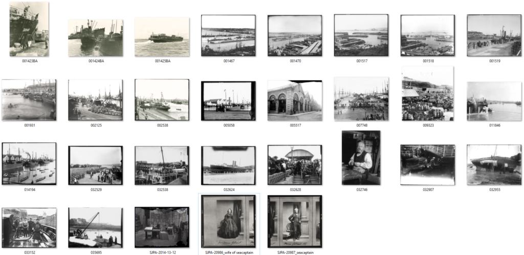
Henry Mullins moved to Jersey from London to take commercial portraits of over 9,000 islanders from 1852 to 1873. He compiled copies of these portraits into 4 large albums currently kept in the Societe Jeriase Photo-Archive.
Henry Mullins opened a studio named the ‘Royal Saloon’ at 7 Royal Square. Here he would photograph middle-class subjects under Queen Victoria’s rein. Commercial photography was still incredibly new and costed £1 per image. This price meant that portraiture was no longer limited to wealthy upper-class individuals. His subjects included the elite: the Bailiff, Lt Governor, Jurats and Deputies but also bankers, doctors and Clergies.
The commercialisation of photography
Carte de Visite was a small photograph originating rom France in 1854. This was not the first permanent photograph or commercial photography process (Daguerrotype came first. It was the process of printing onto a fragile copper plate created in 1839.) but was the first small, portable type. These images were 6x9cm and would be sent like postcards between friends and sparked interest in creating albums. Carte de Visite used Albumen Print where the images were binded using egg whites. This technique used negatives which made allowed for reproductions. This was the technique used by Henry Mullins where he even advertised his studio as being cheaper than London.
Henry Mullins
Henry Mullins adventured with different styles of portrait. He would use diamond cameo, four ovals showing a face at different angles, as a unique presentation. He would cut out the ovals and arrange them into a diamond shape. Additionally he would bleach the edges to whiten the background and fade them into the page. Both of these styles would frame a headshot unlike the usual portraits which were full body in front of a intricately decorated background.
An Inspiration
Henry Mullins has inspired many other photographers including Michelle Sank who travelled to jersey to photograph people in a similar way. There are many similarities between the portraits but also many differences.
Comparing the two
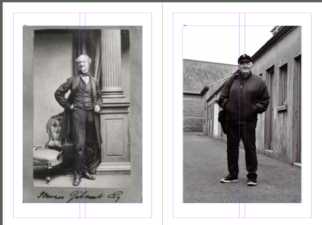
In this Portrait Michelle Sank photographed Ian Gorst, the chief minister. It would have been impossible for Henry Mullins to photograph Jerseys Cheif Minister since the first one was only elected in 2005, however he did photograph many of the islands elite.
Composition
I decided to compare these two images because they both show a man dressed in a suit angled straight on. Both of the subjects are resting their right hand some furniture to create an interesting pose and are stood upsright.
Michelle Sank was able to take her photographs in colour due to the advancements of digital photography. This photograph is also taken to landscape to showcase the background unlike a traditional portrait. The background is a dull 2000s office with the whole thing in focus. This image uses the natural light from the window as the main source of light and frames the subject slightly off centre. These features together separate this image from a traditional portrait and instead file it under the umbrella of ‘modern art’ instead.
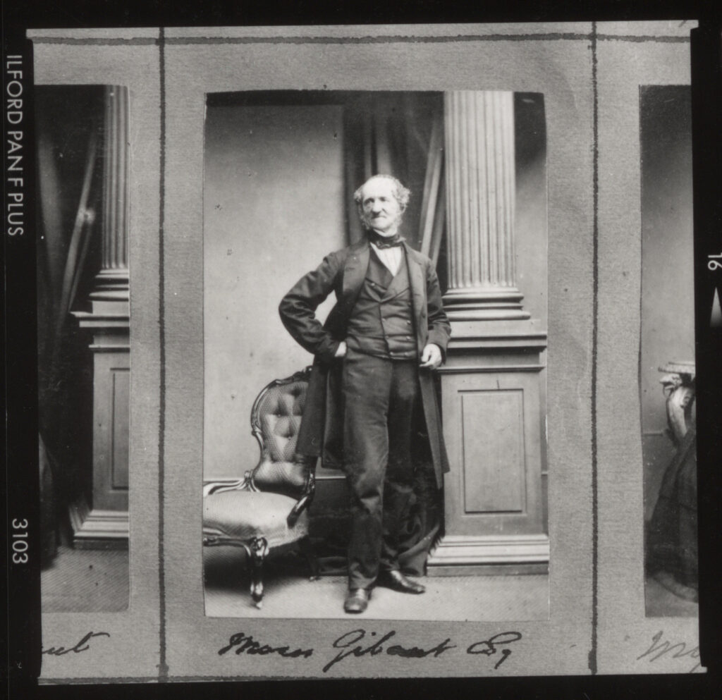
Henry Mullins took his photograph in his studio using slightly harsher light. The image has been taken in portrait to frame the subjects full body. However unlike Michelle Sanks portrait, Henry Mullins bleached out the background and the bottom of the mans body to frame and draw attention to the subject, a technique called vignette. Since this was early in the development of photography, it was used as a means of documentation instead of an art form. Bleaching out the background was a way to highlight the individual in their portrait. Having a full background could make the frame too busy which is why when Henry Mullins does use backgrounds its a way to put a person into an environment or to create unique shapes.
Clothing
This portrait shows a modern man in modern dress. Like Henry Mullins, the subject wearing what he would normally be wearing to work, only this was taken 100+ years later showing a stark difference in silhouette, fabric and colour. Both here and in inspirational photographs show the subjects in typical suits of the period. A modern suit is created with cut corners due to the nature of them being mass produced. The fabrics are thinner and cheaper to produce leading to less flattering draping, shaping overall quality. There is no care put into their production which comes through when buying, wearing and being photographed.
The modern suit can have as few as 2 main layers: Shirt and blazer. A Victorian suit however needed to cover everything and a shirt had only really recently stopped being seen a part of underwear. The suit had began showing signs in Britain while under the rein of Charles II however only became recognisable in the late Stuart era. The Vicorians are well known for their modesty which meant formal attire for men required a minimum of 3 layers but was typically accompanied by a coat also. Typically the sets were created with bold colours and patterns as well as rich embroidery and detailing to showcase wealth (which would be important in a portrait being sent to friends for example).
These sets were made with thicker, organic materials and were still being handmade which meant it was tailored with more flattering seams and unique shapes. Unlike a modern suit with only one back seam at times, the Victorian suits could have 3. This would allow for a form fitting jacket, movement and a unique silhouette which wouldn’t be possible with just one back seam. These differences are evident when comparing photographs. In Henry Mullins’s photographs, the fabrics show depth in folds, texture and shape leading them to photograph much better.
Michelle Sanks portrait above shows a rigid, square and ill fitting suit. I believe this is a good comparison between the portraits because it is (apart from the colour) the first visual sign of a difference in time period I caught onto. This demonstrates how photography creates perfectly preserved time capsules. The modern suit is quickly identifiable due to its familiarity now and in years time fabrics and shapes. A Victorian suit isn’t what we’re used to or would see on a daily basis so it is unfamiliar despite still being a suit. When putting these two images next to each other it shows
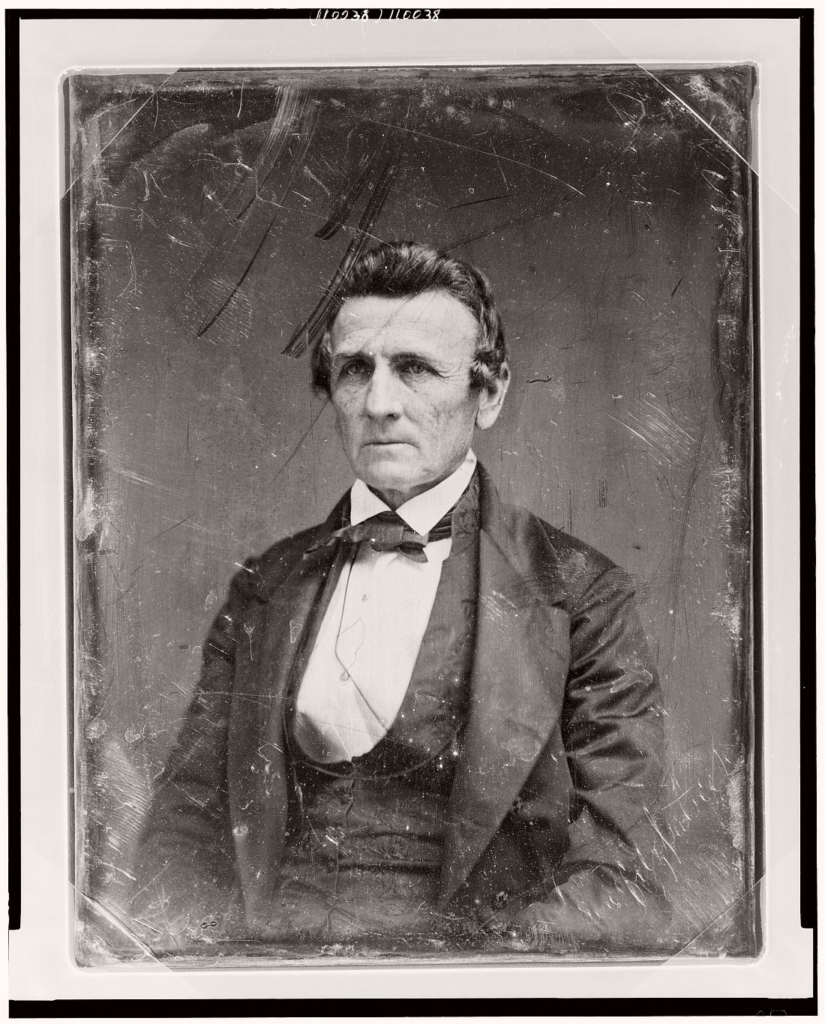
Since the above Image is low resolution here is a good example of the quality difference. This is another portrait taken by Henry Mullins however this time of Victor Hugo, a French writer.
Juxtaposition
Juxtaposition is when two opposites are placed next to each other with contrasting effect.
Placing these two images next to each other showcases not only the advancements in photography and production but also society.
Headshots
This photoshoot is a response to Henry Mullins where I will be experimenting with a new camera lens (105mm) and diamond cameo.
Photoshoot 1
I began choosing sets of 4 images to use for a diamond cameo. To edit the images I set them all in black and white and adjusted the settings until I was happy with the effects. They don’t all have the same background since I was moving around the backlight for different lighting effects. This wont be as much of an issue when I edit the portraits into a diamond cameo however when all the images are being presented as is it ruins the continuity.
Set 1
Set 2
Diamond Cameo
I wanted to try out two different styles when I created the diamond cameo arrangements. I wanted one where I used some old paper as a background and coloured the portraits in beige to create an aged look similar to Henry Mullins. I then wanted to try a second one where I used a different background and didn’t recolour the portraits.
For this first one I added each Image onto the background and created an oval shape. This oval shape needed to be same for each of the four portraits so I copied the shape 4 times and rearranged them into the diamond shape. I then added the portraits over the top of the shapes and created a clipping mask so they’d be the correct shape.
The only difference in this was when I recoloured the portraits. To recolour the black and white portraits I selected the colour overlay and changed it to a brown to match the background. This one was made in portrait as opposed to landscape like the first. This made the circles more round which didn’t look like Henry Mullins examples.
Rembrandt Lighting is characterised by the triangle of light under one eye. It uses one artificial light at a 45 degree angle to create shadows over a persons face.
Origins
Rembrandt Lighting is named after Dutch artist Rembrandt Harmenszoon van Rijn who painted portraits during the golden age. He ranged from self-portraits to animal studies with around three hundred portraits and two thousand drawings and solidified his reputation as one of the greatest etchers during his lifetime (1606-1669).
His interpreted biblical scenes were highly praised as well as representing emotions and attention to detail. He was an influential artist but not without his fair share of personal troubles which is reflected in his collection of self-portraits. He had many teachers who influenced his style of painting, mainly: Jacob van Swanenburg, Pieter Lastman, Jacob Pynas and Joris van Schooten.
Set up
A flashlight is set up at a 45 degree angle to cast shadows over the face. The angle of this light will illuminate one half of the face but not the other which creates the triangle associated with this lighting style. The nose will cast a sharp shadow while the rest of face will have lighter shading which is part of what makes this such a unique and interesting technique. This works best for headshots so the camera needs to be close to the face with a 55mm lens.
Examples
Butterfly Lighting
What Is Butterfly Lighting?
This lighting technique uses an overhead light which casts a butterfly like shape under the nose. Also known as ‘paramount lighting’ and ‘glamour lighting.’
Origins
This lighting technique earned the name ‘Paramount lighting’ from its common appearance in classic Hollywood. Paramount used this technique for every corporate image in the early days of Hollywood earning it the name. It makes the model look slimmer by highlighting cheekbones and creating shadows under the neck and also evens the face and hides wrinkles giving it its other name ‘Glamour lighting’.
Set up
The type of light can vary massively for this lighting technique however the light is always higher than model looking down on them. This ensures the shadows are under the nose, jaw and cheekbones since they are further forwards and will catch block the light.
The camera needs to placed slightly lower than models face and not above. The model needs to be in front of the backdrop so that there isn’t a shadow over the backdrop.
Examples
Chiaruscuro
What Is Chiaruscuro Lighting?
Chiaruscuro is Italian for ‘lightdark’ which is defined by a bold contrast between light and dark. Also known as ‘split lighting’.
Origins
It first appeared in renaissance paintings in Italy and Flanders however didn’t fully develop until it was associated with Baroque art. It began with drawing on coloured paper and gradually working towards whites or building up darker shades in a gradient.
It is used often in art to create a sense of volume or three-dimensional objects and in photography and cinema is typically black and white for additional emphasis.
Set up
The first of these techniques uses the flash to bounce off of white surfaces to create a soft effect. The second two use only one key light and occasionally a reflector to bounce light back onto the model.
Examples
Stylistically these types of images are typically black and white for additional contrast between the white light and the black shadows. Using light this technique can also showcase silhouettes which have interesting shapes and are unique to this type of lighting.
Loop Lighting
What is Loop Lighting?
A style of lighting where a round shadow is formed under the subjects nose, similar to butterfly.
Set up
The key light is set up at 45 degrees from the persons face and raises just above the eye line. This height creates the nose shadow similar to butterfly and the angle is similar to Rembrandt. This means that similar shadows are casted to the side of the face but not as extreme as Rembrandt so there is no defined triangle.
Types of Light
Why do we use Studio Lighting?
Studio Lighting is controlled, artificial light to achieve a specific outcome and/or style. The light will be consistent across the whole photoshoot unless deliberately changed. It also reduces the amount of post-production editing to be done. When the environment is consistent and created in a way to achieve a specific look there shouldn’t be much if any editing after because any issues can be adapted on the spot.
What is fill lighting?
A fill light is used to expose details lost in shadows. This is the secondary light in a 3 point lighting set up. It is typically set up in the opposite direction to the key light to fill in the shadows.
How do the 3 points of light differ?
this involves just one point of light known as the key light. This is the simplest type of light placement. This technique will cast dark, ominous shadows and brings drama to an image.
two points of light are typically set up at 45 degrees from the subject to illuminate the image with the key light and fill in shadows with the fill light. This softens shadows which solves some problems with one point lighting that the shadows are too dark or prominent.
Three points of light are the key light, fill light and backlight. This is used to fully illuminate a subject in a pleasing way with minimal shadows.
Studio Photoshoot
For this photoshoot we tried two set ups. First was standard Rembrandt lighting which makes up the first half of these images. They turned out really well however we didn’t have a second light on the background to make it white so it was a grey instead because the flashlight wasn’t bright enough to reach it. The second set up switched the flashlight away from the people and onto a reflective surface which still illuminated the face but didn’t reach far enough to shine any light onto the background so it was black. This one was more difficult since a lot of the time there wasn’t enough light on the face.
Occasionally we used a smaller reflective surface under the face also to lighten the eyes since they sit back in the sockets and are usually slightly overcast with shadows.
The camera was a 55mm lens at a close distance to the models. They were sat on a stool at a slight angle towards the light with their heads turned towards the camera so they weren’t front on or sat in an awkward positions.
When I was sorting images I was checking that the photographs were in focus first of all. Second I was checking the placement of the model and their pose. I could crop out background to centre the person but when half the face is out of frame there’s nothing I could do. I had to make sure that they weren’t awkward also. In lots of portraits its obvious that they don’t want to be there and aren’t comfortable in front of the camera yet so they wouldn’t hold eye contact or weren’t posing in an interesting or meaningful way.
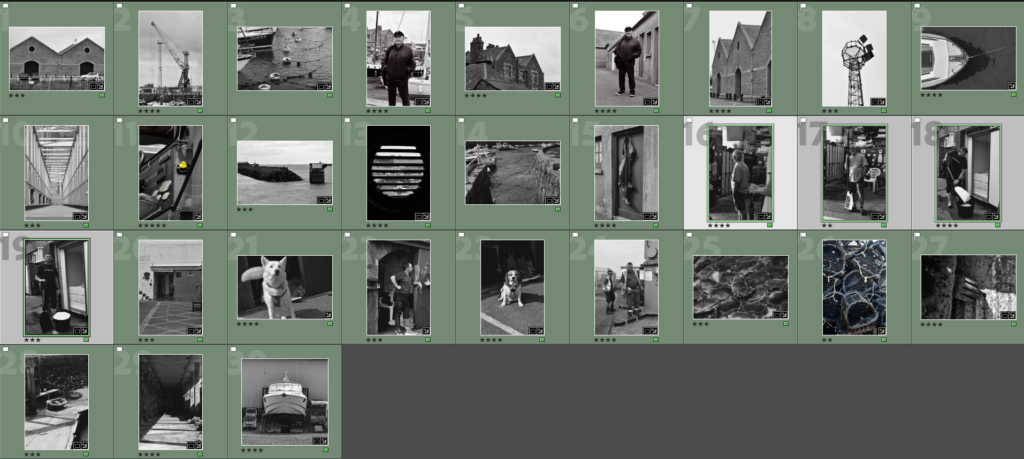
I started by flagging all focused images and marking down all the unusable ones. I then went in and used stars to rate the quality of each one. I mainly only used 4/5 star images to edit. Using green I marked all the images I considered editing and purple for the ones I wasn’t going to use.
Images
Using the same three images I also tried black and white:
Next time I will also experiment with hands and props. I tried to photograph fingers twisting hair etc but I wasn’t directing the models very well so the hands were out of shot, obscuring the face or just looked out of place. I would like to experiment with props especially when we move into full body portraits because it will give the model something to do leading them to pose easier and fell less uncomfortable. Props will also bulk up the frame a bit whereas a single person in fame could look small with some props it will create more interesting shapes and fill out space a bit more.
Studio Photoshoot 2
We used a three point lighting set up for this photoshoot. We had the key light at 45 degrees, a fill light behind and a reflector to bounce from key light.
We used flash light which occasionally didn’t go off leading to a few black shots in the photoshoot but on the whole I think these came out well. I think I’ve gotten better since the first photoshoot as I have more experience and practice. As I take more photos I will get better at directing the subjects and arranging the lighting.
As I was going through these images I was making sure that they were in focus and sharp. I used a 55mm lens at varying distances from the subjects to either get headshots, half body or full body. The subjects were all sat on a stool which was taller than the chair I was sat on so that they were framed easier and looked more important. Mainly we used three point lighting with the key light at an angle, the reflector under the eyes and a fill light on the background to make it white.
Images
This Image used butterfly lighting which created a shaped shadow below her nose and defined her cheekbones. I think this image could have benefited from not using the fill light and defining the nose shadow more. I think making this portrait black and white helped since the shadows became more defined since they’re the opposite of the whites. We drew the blinds behind her face so that the background was pure black and the key light could be directly on her face. The reflector was below her eyes to lighten them.
I used Chiaruscuro lighting for this image where the key light was pointed away from the subject and towards the reflector. This made the background black and created an overall darker Image since there was less light on the subject. In addition we kept the fill light to illuminate the hood from behind to create the outline to the left.
This portrait used just the key light and the reflector. The key light was turned away from the subject and pointed towards the reflector so that the light was too weak to reach the white background making it black. The little light that was bounced back at the subject illuminated half the face in a Chiaruscuro technique.
I framed this portrait in landscape instead of portrait because she was wearing a bulky coat which I wanted to be fully in frame. I used loop lighting with both sides illuminated creating a dark stripe down the subjects face. This stripe obscures her eye and creates a moody look. The fill light is to the left of her face which breaks up the shadow while the key light is reflecting to light up her right.
This image was made with Rembrandt lighting to create a triangle over her cheek. I kept this image in colour because I like the difference from all the previous portraits and I think all the colours worked well together. The portrait was also lit much brighter than the previous few so it didn’t look as moody and so wouldn’t fit black and white because it would need more prominent shadows to avoid looking grey.
Presentation
I plan to group three black and white images into a triptych and keep the other two separate. This is because I think all three are similar and compliment each other well.
Final Images
I tried two arrangements using just the three portraits: one vertical, and one horizontal. The vertical arrangement makes the centre portrait look too big in comparison which is disproportionate especially since the landscape ones have wider framing and make the subject look even smaller in comparison. I do think that the smaller gap between the images looks better though. The horizontal arrangement is better proportion wise however in this one makes the centre portrait look squished.
To combat these issues I created a grid with all four. Initially I wasn’t sure about this arrangement since the hooded image doesn’t have a face and mightn’t of fit with the others. All of them use a different type of lighting however I think these portraits sit well together anyways because they all use the same editing and the same subject. None of the images look squished or too big because there is one landscape and one portrait frame on each level which evens it out.
Virtual Gallery
I downloaded a blank virtual gallery background off of google after setting filters for a large size so that I could edit on it photoshop. I then opened up the images on top of it and changed their perspectives if needed. I added a drop shadow bellow the images to match the backgrounds lighting.
Evaluation
Each time I used the studio I think the quality of my photographs increased. This is why all the final Images are from the second photoshoot as opposed to a mixture with the first since the quality of each portrait was overall better. I tried each type of lighting and there was at least one good example for each although next time I will focus on Rembrandt to get a sharp, large triangle because I only got small soft triangles. By experimenting with the position of the key light I managed to create two completely different styles of portrait; the black and white one where the key light is pointing away, and the coloured one where there is lots of bright and directed lighting.
I need to try and get more light into the eyes by using a reflector because they look quite dark in some of the images. To do this I will use a reflector close under the eyes and pointing at an angle as opposed to being completely flat. This will bounce lots of light up into the sockets which sit slightly back in the face and therefore don’t usually get well illuminated. I would also like to get more creative with my portraits because a lot of these images are rather basic with plain white light and deadpan angles.