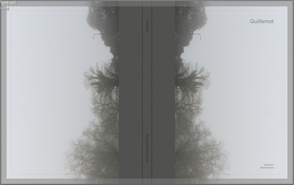
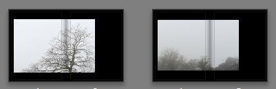
I wanted the cover to make sense from both sides to follow both narratives. I choose this image because it is hazy and soft and somewhat dream like.
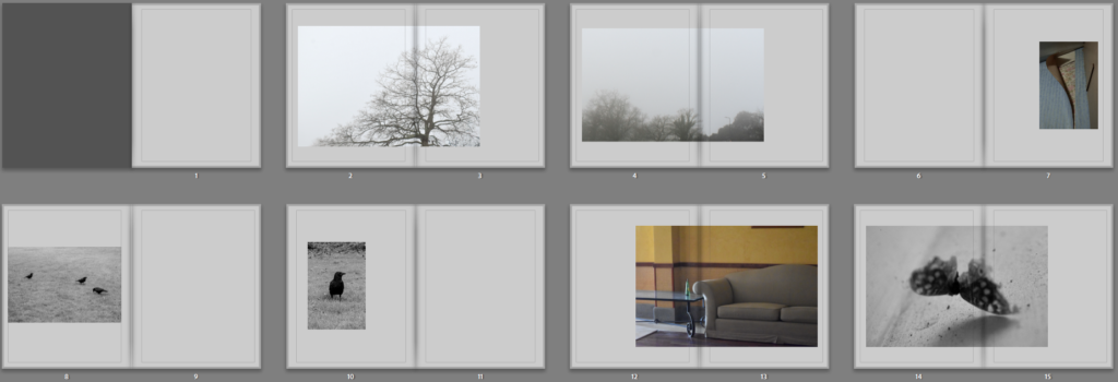
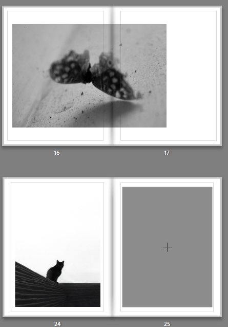
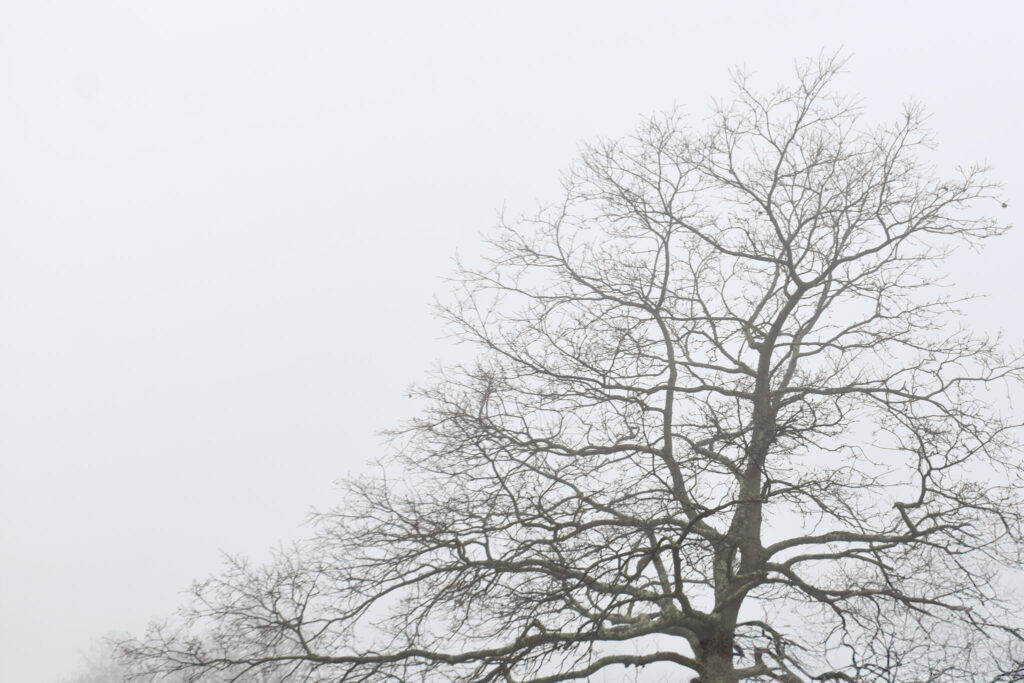
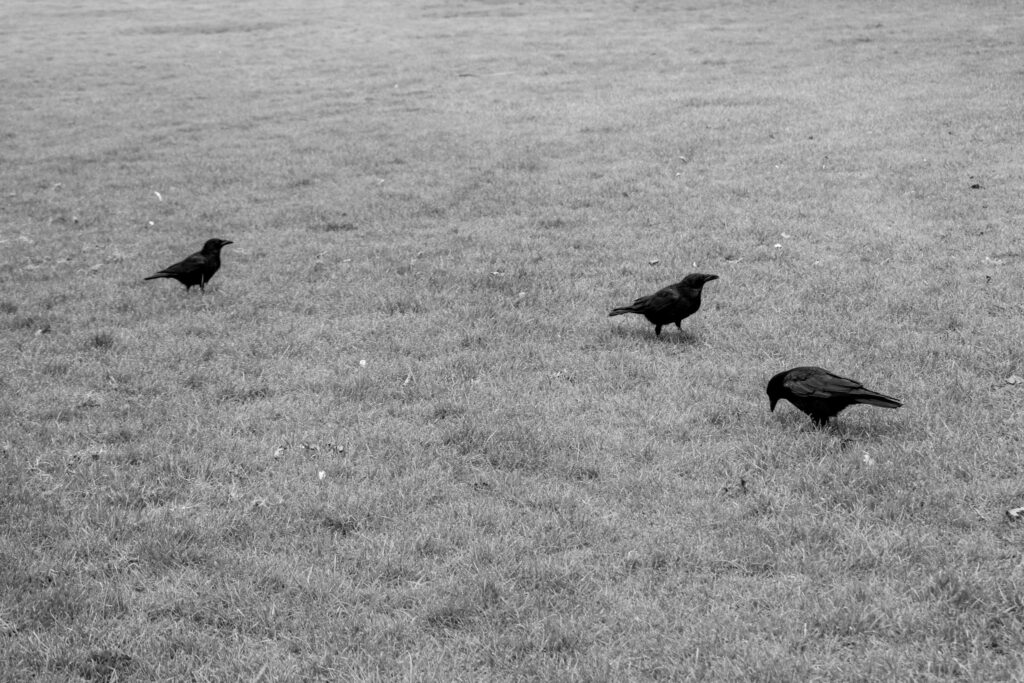
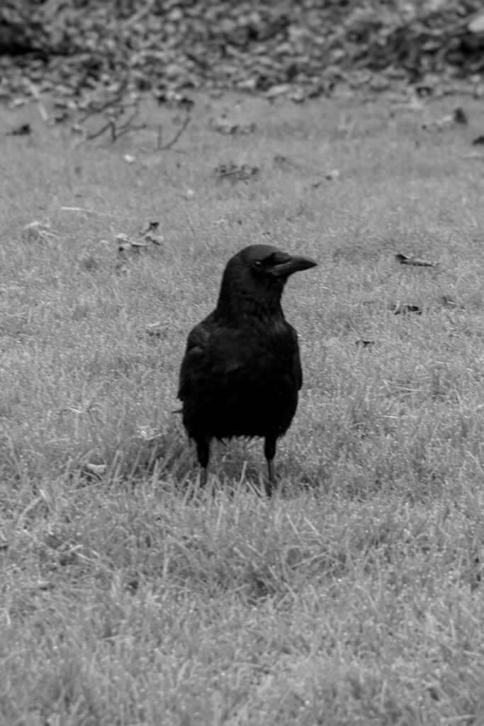
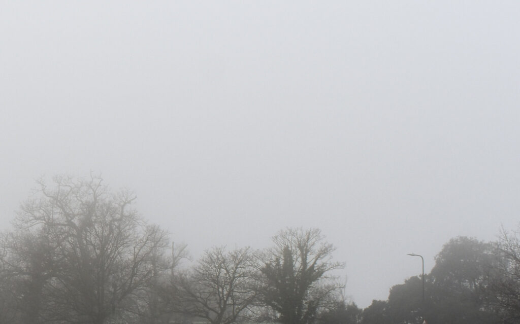
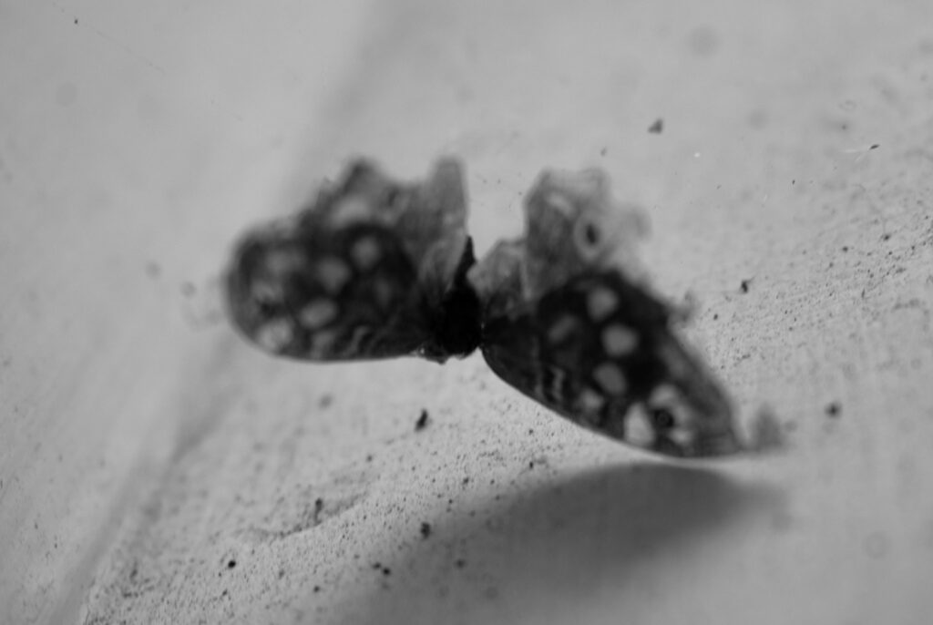
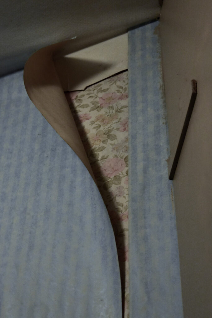
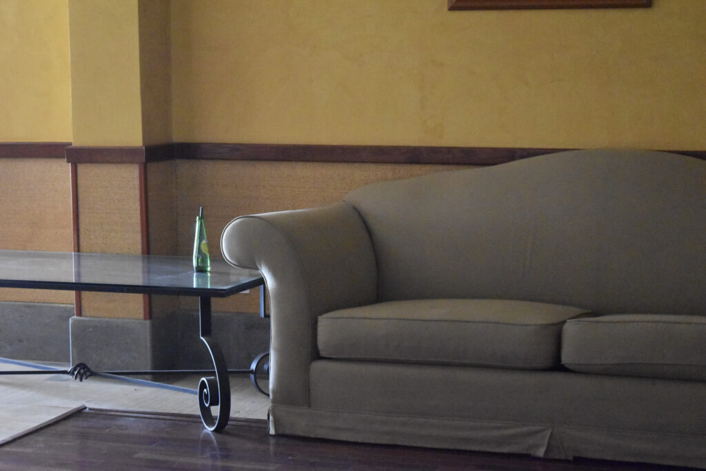
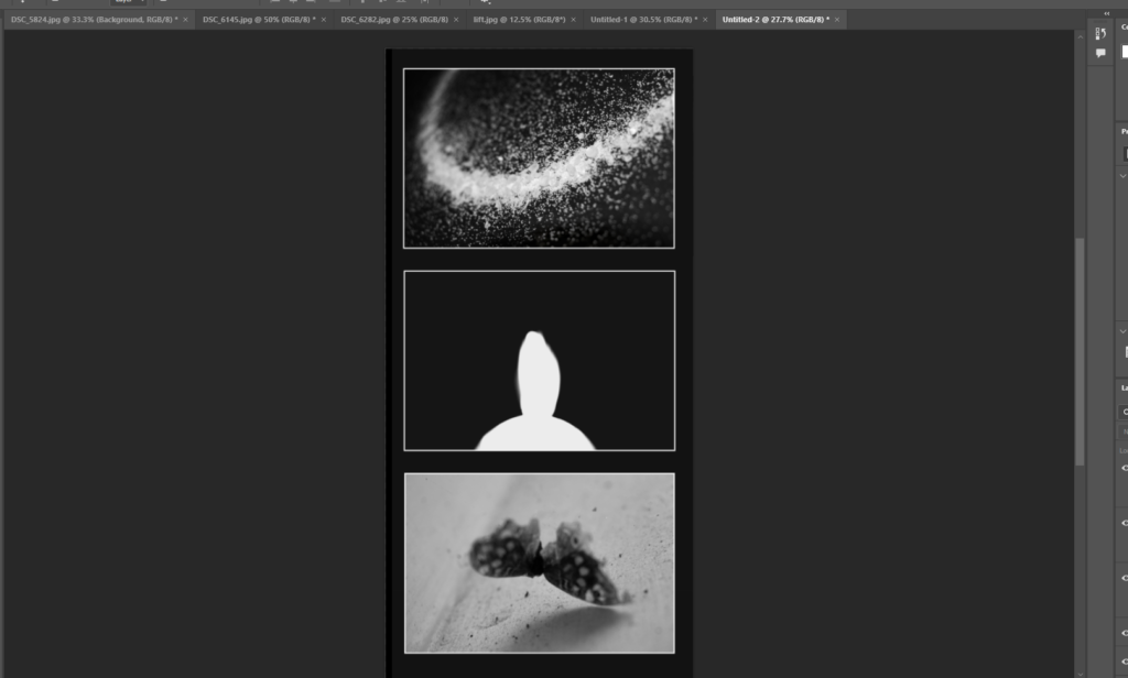
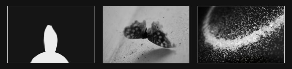
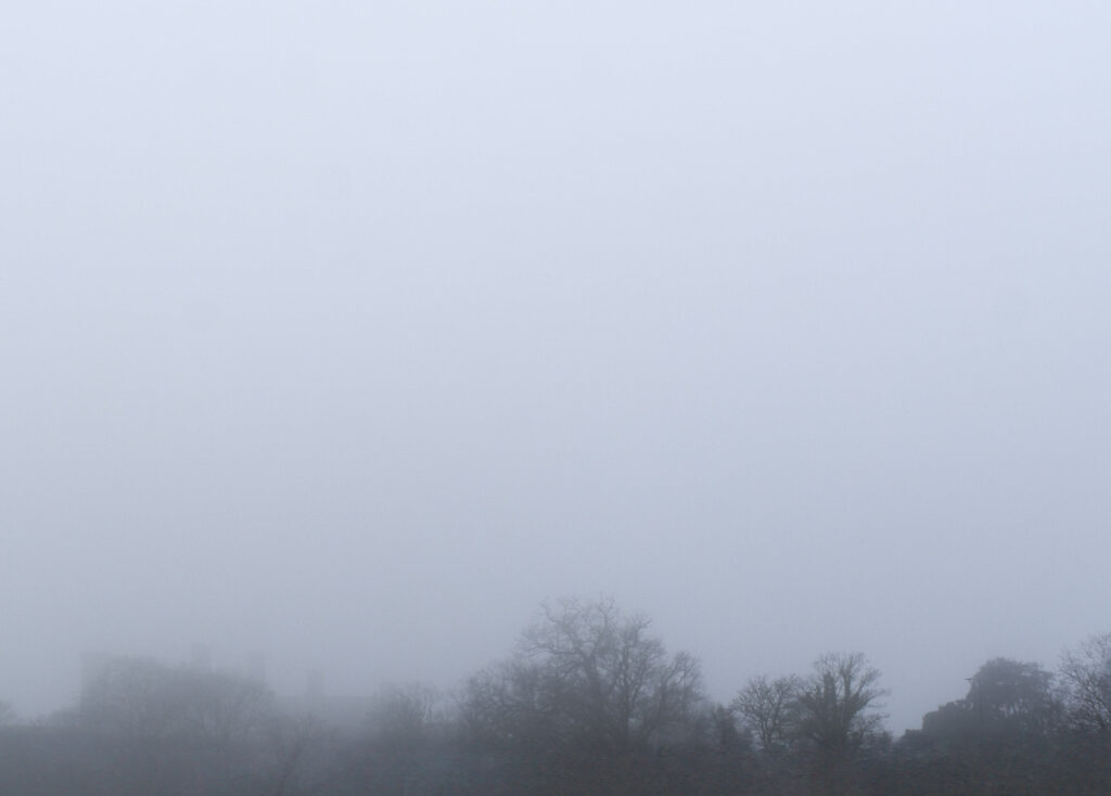
I put both mist images together so that the narrative would start light and outside while still being somewhat mysterious. I then interspaced with peeling wallpaper because its like peeling back a brave face. I put both images of birds together, starting with the further and honing inwards. I interspaced with another coloured one this time the sofa because its still peaceful and quite close. Following birds that can fly I choose the moth to contrast as its flightless.
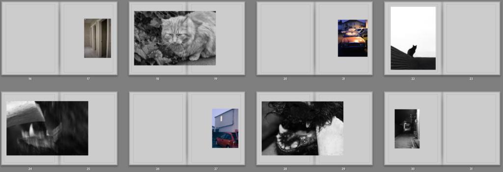
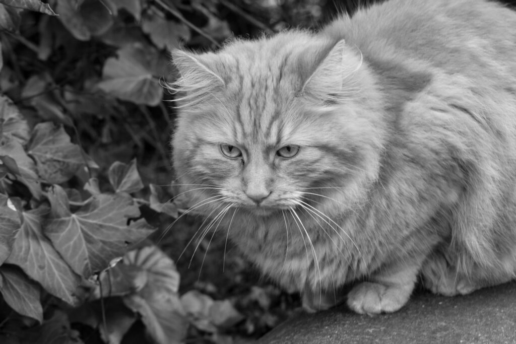
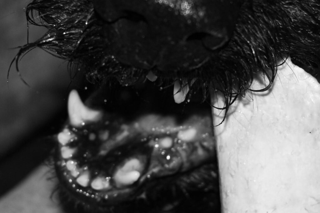
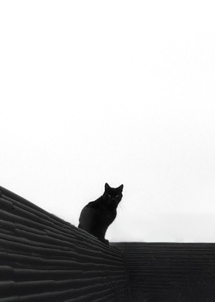
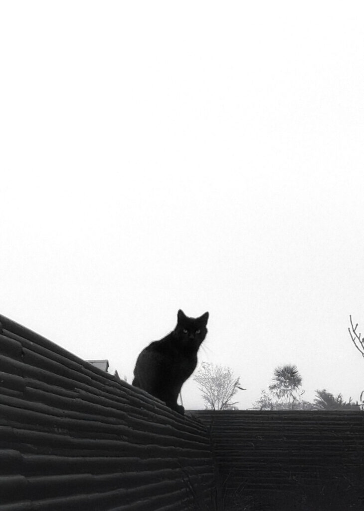
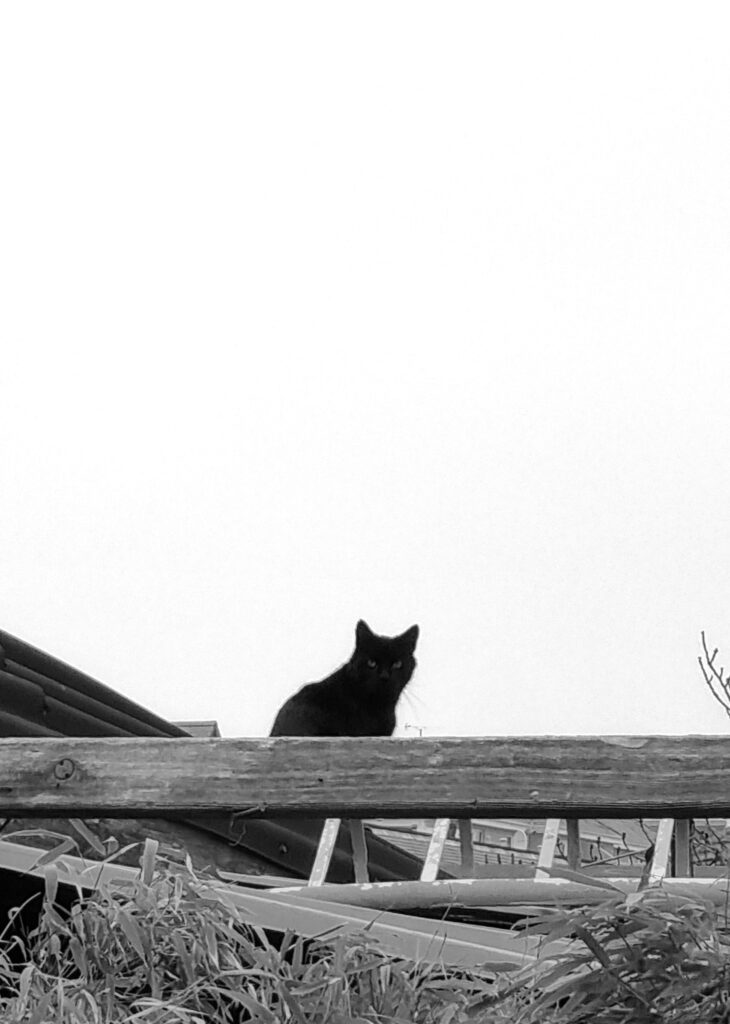
I wanted to interrupt the cats and dog because the images have shifted from peaceful to somewhat aggressive with the dog, broken car and higher contrast. The cats I made sure to start with the more peaceful one and put the second more mysterious one next.
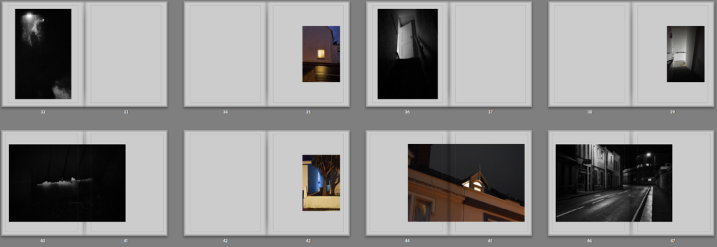
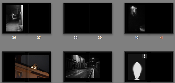
Following the more aggressive images I put together the more eerie images which continued the high contrast sequence.
To round off I choose the most abstract dark ones.
For the final layout I shrunk down all the blurry images so that they would print best and made sure that the black and white images were arranged differently to the coloured ones. I liked how the contrast between the human coloured images and natural black and white images looked when separated within the book. I put the essay at the back of the book instead of the front so that I could start right away with images which I thought was the most effective layout. I also had most of the lighter images at the front, staring off with soft and light images and gradually becoming much darker with harsher lines compared to the effect of mist.
1. Write a book specification and describe in detail what your book will be about in terms of narrative, concept and design with reference to the same elements of bookmaking as above.
Narrative:What is your story? Describe in:
3 words: exploration of fears
A sentence: I want to explore my own fears and how they can be presented in different ways.
A paragraph: Fear isn’t limited to one particular set of imagery. I want to explore the different ways to present the same few fears with both natural and urban backdrops.
Design: Consider the following
How you want your book to look and feel: I want my book to look like an old library book with a plain/basic hardcover.
Paper and ink: I will use plain white paper instead of black for the colour images.
Format, size and orientation: To create a library book I would have wanted an A5 portrait. Portrait would let me create full bleeds with any landscape images while also keeping some smaller images for variety.
Binding and cover: I want a plain cover either with a basic pattern and title or like the slip has been removed without much going on at all.
Title: I decided on ‘Guillemot’ like the bird black guillemot. I choose this because not only do I find large birds freaky but also because birds fly and rise above any difficulties. The black guillemot is a black and white bird which matches my black and white images too.
Design and layout: I will have two different sequences going at once so I will need to differentiate between the two by size or where they’re laid out on the page.
Editing and sequencing: The images will be arranged quite sporadically. I was contemplating arranging each image by photoshoot or if they’re all black and white in a gradient however I didn’t want to make a comforting sequence. I will either arrange each image in a random order or start mostly in some sequence and change it every few pages. Additionally most images are in black and white however I will make sure to place a few coloured ones in between.
Images and text: I don’t plan on having many bodies of text except for the essay at the end which will be arranged in columns with uniform text type and size.
In terms of sequencing I sequenced all my black and white images and coloured ones separately before interspacing them. The black and white ones I tried matching with the one before going from a park outside through a street and into a dark room like walls gradually closing in on the viewer.
The coloured ones I did the opposite. I started closer and worked outwards from wallpaper and being inside to being isolated and left outside.
Then I interspaced the two different sequences.
I tried two different sequences. The first where I used the coloured images to split between images when they changed for instance birds > moth. While this made more sense I didn’t want to create any sense of comfort in predictability and tried one when the images are more sporadically spaced out:
I liked how in particular the dog looks as though its trying to eat the cat since I find it quite funny. The beginning of the first one and the ending of the second one and decided to combine the two.
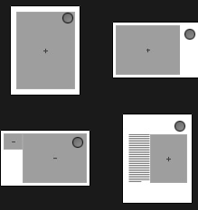
All the coloured images were laid out on the right side as its what’s seen second in either of these templates:
The black and white images were aligned on the left side as its what’s seen first in these 2 templates:
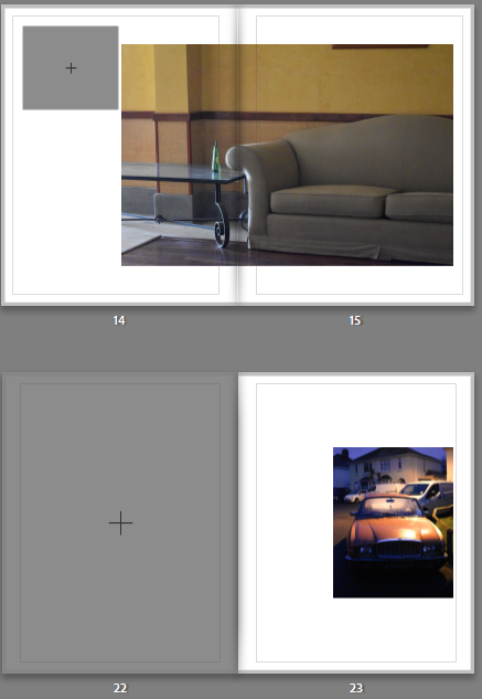
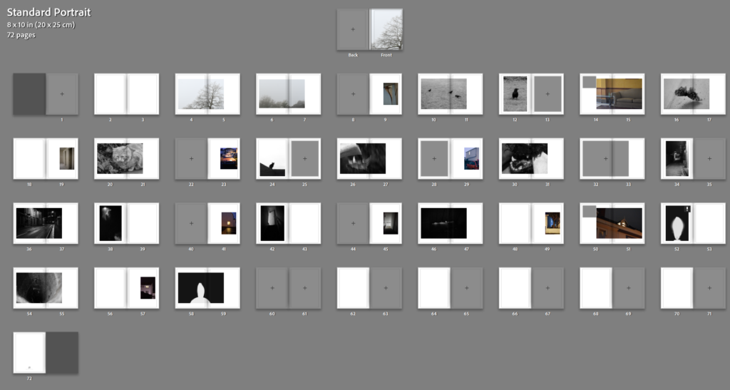
My initial layout looked like the following:
I knew I wanted the essay to fit in separate as a newspaper clipping attached separately to the back so I didn’t need the blank pages at the end. I wanted to add some blank pages throuhg out also which would be a good way to loose all the pages at the end.
In terms of the cover I was unsure wether to put an image on the back or not.
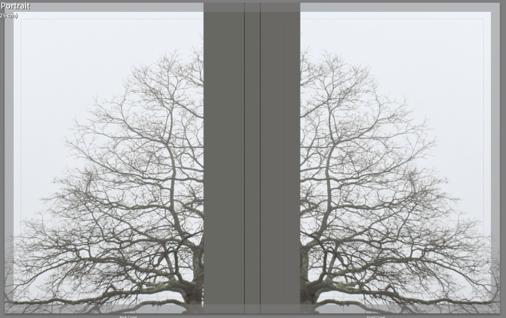
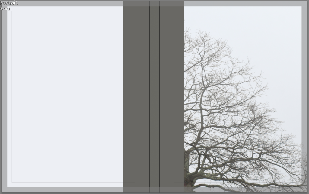
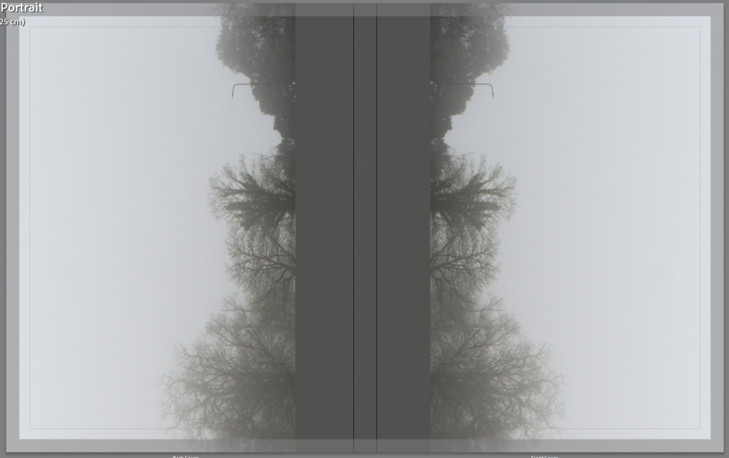
I think that the double looks better so I compared two different images on the cover. Since the book has a sequence going in both directions the same cover inverted like a mirror makes sense.
The single tree works best as portrait while the landscape looks better landscape or open. I decided on the landscape image instead.
I will insert my essay as a newspaper clipping between pages 68/69.
I tried with black pages and grey pages too.
Black pages create a much darker overall appearance. I like how this looks for the darker pictures like these^ however for lighter images like these I’m not so sure on the black pages:
Additionally i tried multiple shades of grey:
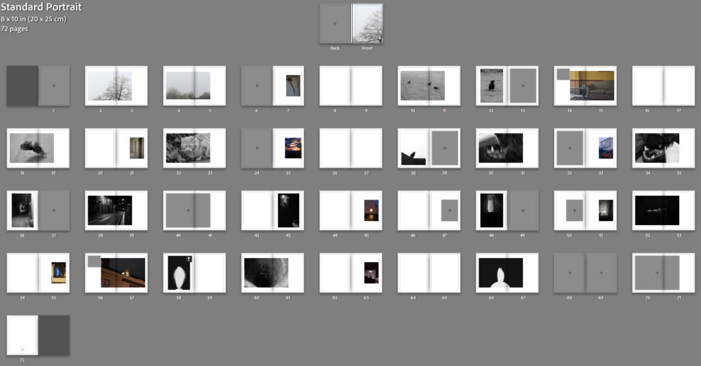
I think that the lighter grey works best because it matches with he cover as well as being darker than bright white for the dark images and light enough for the lighter images. I added the essay at the end in columns and added the title and name to the cover.
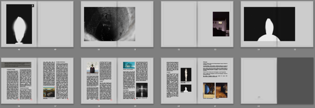
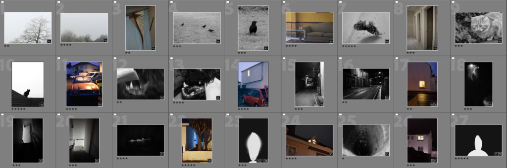
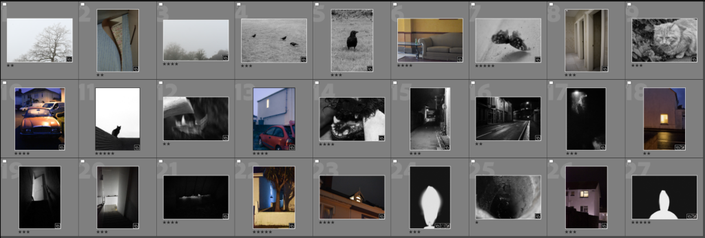
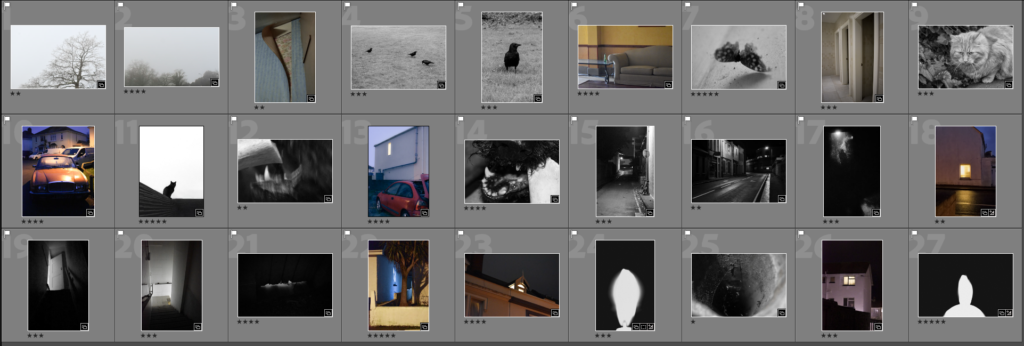
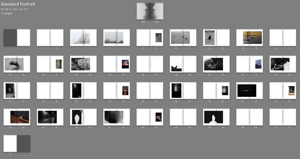
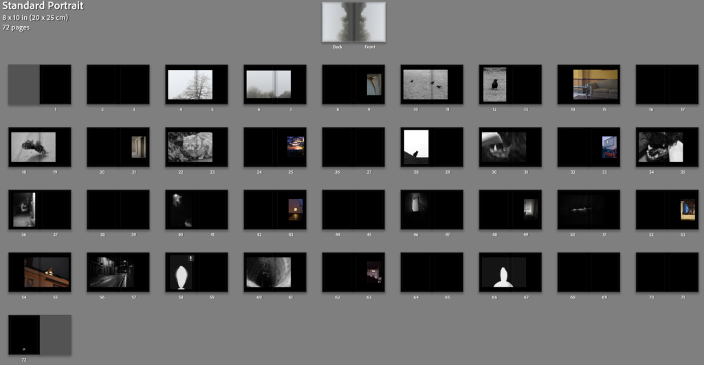
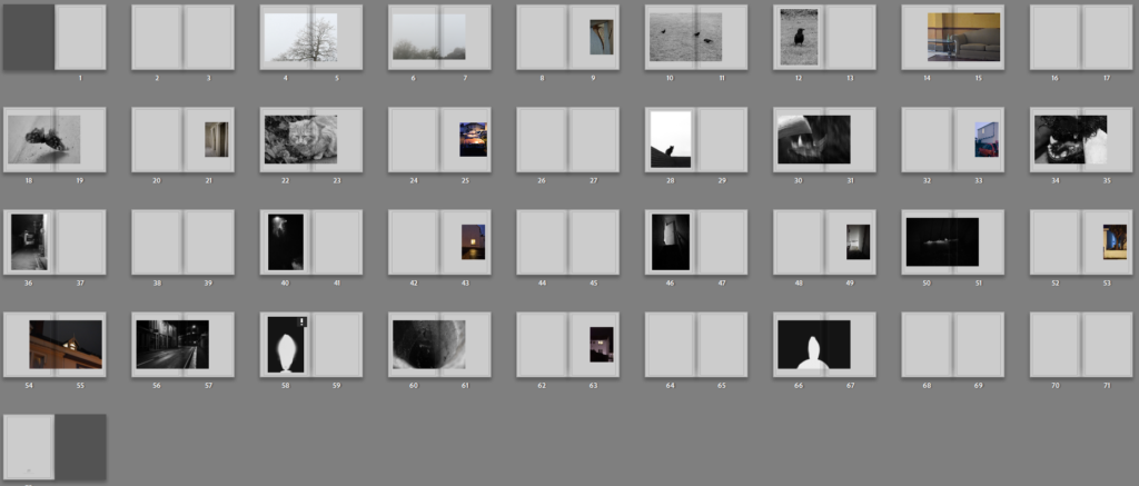
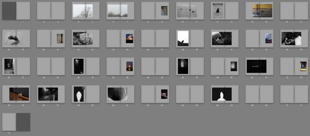
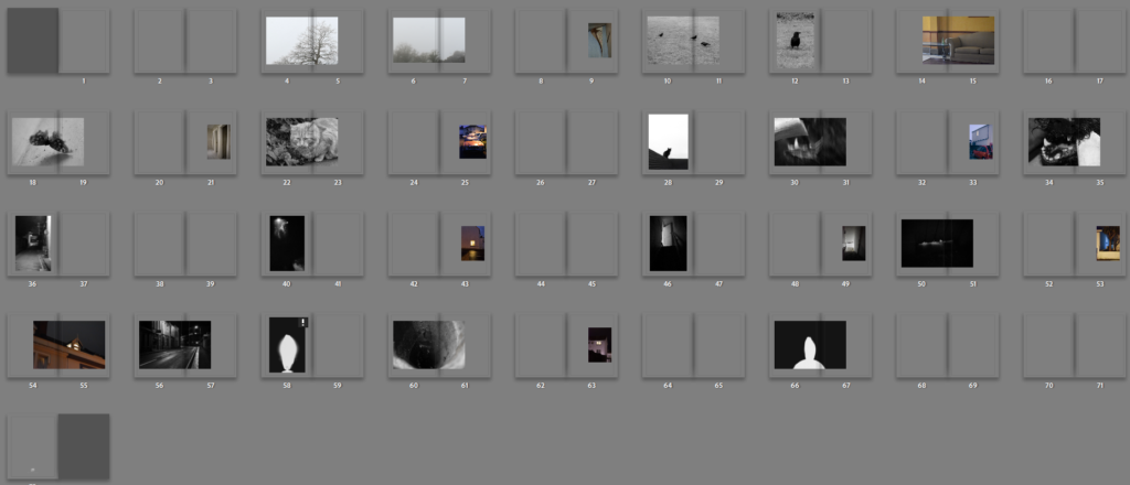
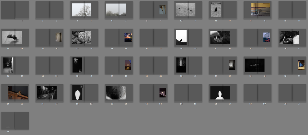
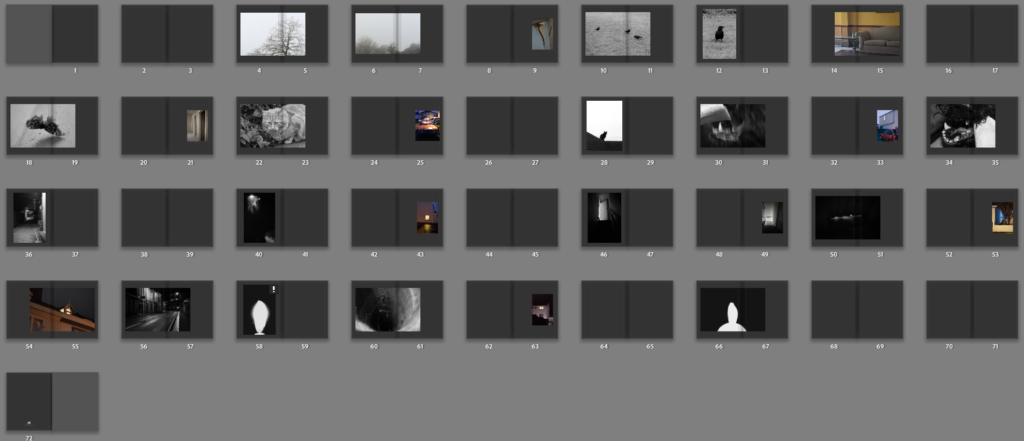
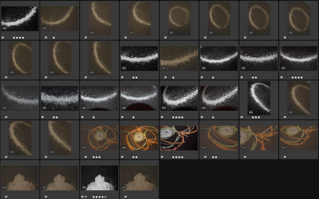
The final 27 images I choose for the photobook were:
Overall I like interspacing black and white with colour and I feel as though my images create a general sense of discomfort. My favourite images were the figure and moth because of their simplicity. I included a total of 10 coloured images with 5 of them houses. I was worried that maybe there were too many coloured but I didn’t want to remove the colour from any of them either. If I arrange about one colour between every 3 black and white images then I feel as though they might be spread enough.
I decided to use one of the following images on my cover But I wasn’t sure which one.
They were all black and white which I liked for the cover and had different effects. The misty trees were more muted and mysterious while the birds and butterfly were more symbolic. I liked the crows because they have certain superstitious qualities but I also like the moth because its wing was broken and it was left essentially paralysed. I felt as though they were both potentially too busy for the cover though and decided to flip and use the tree.
Final Prints
The final images I choose for prints were the following 6:
I want a variety of sizes with 4 A4 and 2 A5. The Lift and the sofa will be A5. The figure, moth, salt and house will be A4.
Virtual Gallery
Overall I think some of these images are much stronger than others. I think I needed more images to buff up the photobook and create a clearer narrative. I think I had enough coloured images but I should have more black and white images in comparison. I think I’ve created a strong set of images covering multiple bases of fears from superstitions to more specific scenarios such as broken lifts and aggressive dogs with additional images between to keep it constantly changing.
Print Mock-ups
I decided to mount up in 2 different ways to split the different outcome sets. The first set is the 3 black and white images which I decided to window mount together in a triptych. The second set were the coloured ones which I decided to double mount individually.
I tried arranging both in the horizontal and vertical but I think that vertical turned out the best as it elongates the landscape images. For the final outcome I switched the order of the images. For the second set I was unsure how big to make the borders so I tried both larger ones and smaller ones
I didn’t like how either size of border looked so decided to mount the images borderless on foam board so they would still be raised. I still decided to keep each image mounted individually because they aren’t all the same size or fit together into a proper set
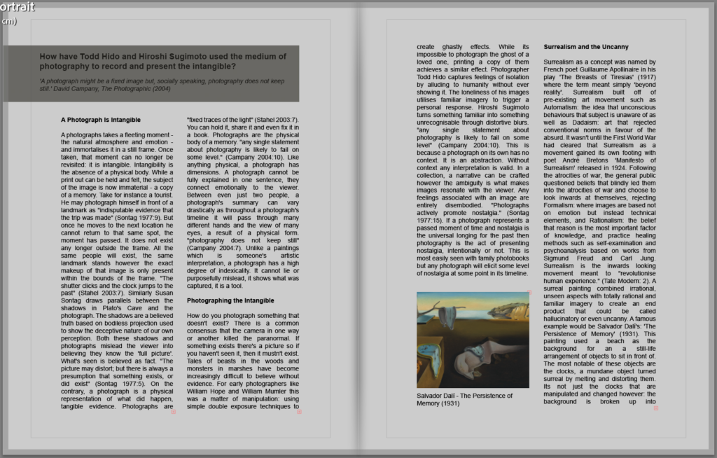
How have Todd Hido and Hiroshi Sugimoto used the medium of photography to record and present the intangible?
‘A photograph might be a fixed image but, socially speaking, photography does not keep still.’ David Campany, The Photographic (2004)
A Photograph Is Intangible
A photographs takes a fleeting moment – the natural atmosphere and emotion – and immortalises it in a still frame. Once taken, that moment can no longer be revisited: it is intangible. Intangibility is the absence of a physical body. While a print out can be held and felt, the subject of the image is now immaterial – a copy of a memory. Take for instance a tourist. He may photograph himself in front of a landmark as “indisputable evidence that the trip was made” (Sontag 1977:9). But once he moves to the next location he cannot return to that same spot, the moment has passed. It does not exist any longer outside the frame. All the same people will exist, the same landmark stands however the exact makeup of that image is only present within the bounds of the frame. “The shutter clicks and the clock jumps to the past” (Stahel 2003:7). Similarly Susan Sontag draws parallels between the shadows in Plato’s Cave and the photograph. The shadows are a believed truth based on bodiless projection used to show the deceptive nature of our own perception. Both these shadows and photographs mislead the viewer into believing they know the ‘full picture’. What’s seen is believed as fact. “The picture may distort; but there is always a presumption that something exists, or did exist” (Sontag 1977:5). On the contrary, a photograph is a physical representation of what did happen, tangible evidence. Photographs are “fixed traces of the light” (Stahel 2003:7). You can hold it, share it and even fix it in a book. Photographs are the physical body of a memory. “any single statement about photography is likely to fail on some level.” (Campany 2004:10). Like anything physical, a photograph has dimensions. A photograph cannot be fully explained in one sentence, they connect emotionally to the viewer. Between even just two people, a photograph’s summary can vary drastically as throughout a photograph’s timeline it will pass through many different hands and the view of many eyes, a result of a physical form. “photography does not keep still” (Campany 2004:7). Unlike a paintings which is someone’s artistic interpretation, a photograph has a high degree of indexicality. It cannot lie or purposefully mislead, it shows what was captured, it is a tool.
Photographing the Intangible
How do you photograph something that doesn’t exist? There is a common consensus that the camera in one way or another killed the paranormal. If something exists there’s a picture so if you haven’t seen it, then it mustn’t exist. Tales of beasts in the woods and monsters in marshes have become increasingly difficult to believe without evidence. For early photographers like William Hope and William Mumler this was a matter of manipulation: using simple double exposure techniques to create ghastly effects. While its impossible to photograph the ghost of a loved one, printing a copy of them achieves a similar effect. Photographer Todd Hido captures feelings of isolation by alluding to humanity without ever showing it. The loneliness of his images utilises familiar imagery to trigger a personal response. Hiroshi Sugimoto turns something familiar into something unrecognisable through distortive blurs. “any single statement about photography is likely to fail on some level” (Campany 2004:10). This is because a photograph on its own has no context. It is an abstraction. Without context any interpretation is valid. In a collection, a narrative can be crafted however the ambiguity is what makes images resonate with the viewer. Any feelings associated with an image are entirely disembodied. “Photographs actively promote nostalgia.” (Sontag 1977:15). If a photograph represents a passed moment of time and nostalgia is the universal longing for the past then photography is the act of presenting nostalgia, intentionally or not. This is most easily seen with family photobooks but any photograph will elicit some level of nostalgia at some point in its timeline.
Surrealism and the Uncanny
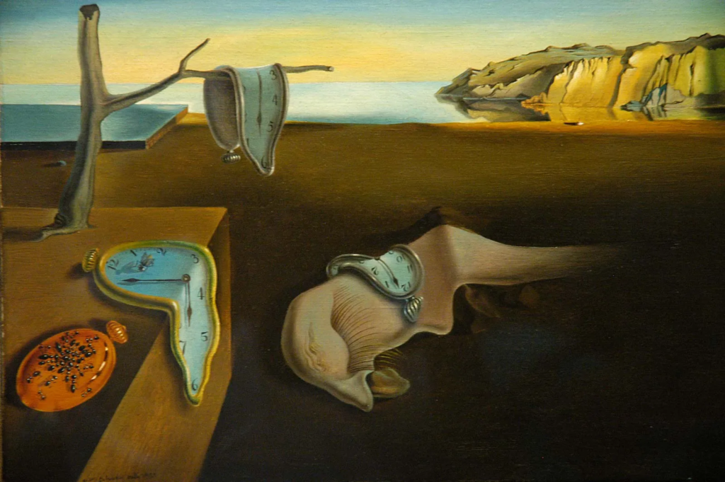
Salvador Dalí – The Persistence of Memory (1931)René Magritte – The Son of Man (1964)
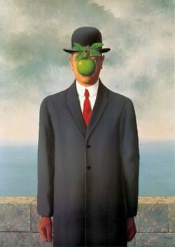
Surrealism as a concept was named by French poet Guillaume Apollinaire in his play ‘The Breasts of Tiresias’ (1917) where the term meant simply ‘beyond reality’. Surrealism built off of pre-existing art movement such as Automatism: the idea that unconscious behaviours that subject is unaware of as well as Dadaism: art that rejected conventional norms in favour of the absurd. It wasn’t until the First World War had cleared that Surrealism as a movement gained its own footing with poet André Bretons ‘Manifesto of Surrealism’ released in 1924. Following the atrocities of war, the general public questioned beliefs that blindly led them into the atrocities of war and choose to look inwards at themselves, rejecting Formalism: where images are based not on emotion but instead technical elements, and Rationalism: the belief that reason is the most important factor of knowledge, and practice healing methods such as self-examination and psychoanalysis based on works from Sigmund Freud and Carl Jung. Surrealism is the inwards looking movement meant to “revolutionise human experience.” (Tate Modern: 2). A surreal painting combined irrational, unseen aspects with totally rational and familiar imagery to create an end product that could be called hallucinatory or even uncanny. A famous example would be Salvador Dalí’s: ‘The Persistence of Memory’ (1931). This painting used a beach as the background for an a still-life arrangement of objects to sit in front of. The most notable of these objects are the clocks, a mundane object turned surreal by melting and distorting them. Its not just the clocks that are manipulated and changed however: the background is broken up into nonsensical boxes and a tree is growing out of a wooden surface. All these inconsistencies create the appearance of something that could only exist somewhere illogical such as the subconscious. René Magritte’s ‘The Son of Man’ (1964) is a seemingly normal portrait, something familiar and unassuming except for the floating green apple obscuring the face. By obscuring and manipulating something familiar such as the face into something new and foreign with an apple creates a sense of wonder and mystery in the viewer.
The uncanny was coined by neurologist and founder of psychoanalysis, Sigmund Freud. Psychoanalysis is the theory that personality is dependant on our past. Similarly the uncanny was the idea that childhood fears still cast immense fear over the adult mind, a reaction dependant on our past. If a grown adult saw a shadowed figure at the end of their bed the dread experienced would be called uncanny had they been fearful of tales such as the sandman as a child, while it is a reaction of fear, it is also a reaction of recognising some repressed familiarity. The word is now used to simply describe something uncomfortably recognisable and wrong at the same time, an unsettling juxtaposition that does not sit easy with viewers. Take a smiley doodle: the brain will associate it via eye and mouth placement as a face. When looking at a car the same might happen: the brain will see two shapes resembling eyes and something that might enough look like a face to decide that the car its watching you. When faced with a portrait, the brain will tell you that it is a person. If you then manipulated each feature enough that the portrait could no longer be of a real person, the brain will see the overall features and recognise it as a face. At a quick glance you may be fooled however something about it wont be quite right. When facing a doppelganger you will recognise the face as yours, however the nose may be too small to be correct, it would be described as uncanny. The uncanny leaves the feeling of unease and discomfort.
Todd Hido
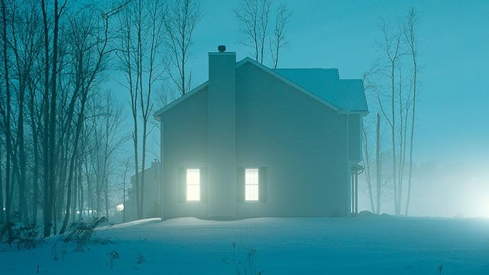
House Hunting, 2001
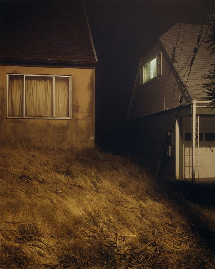
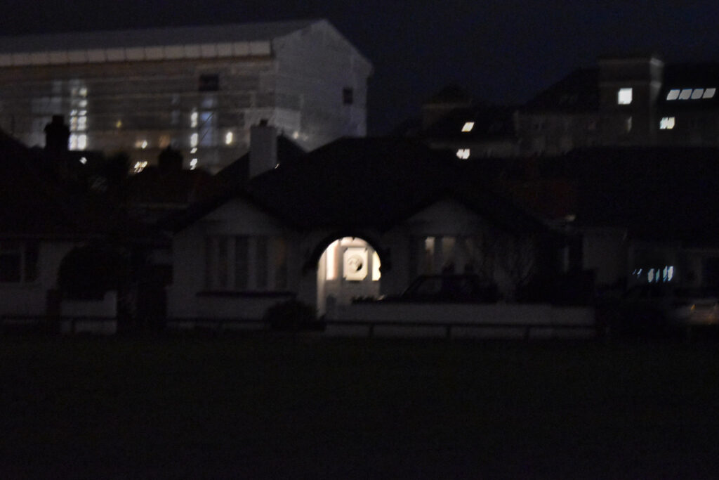
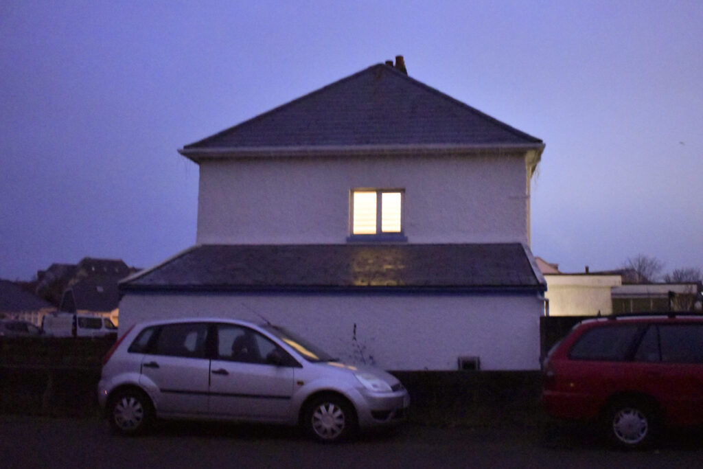
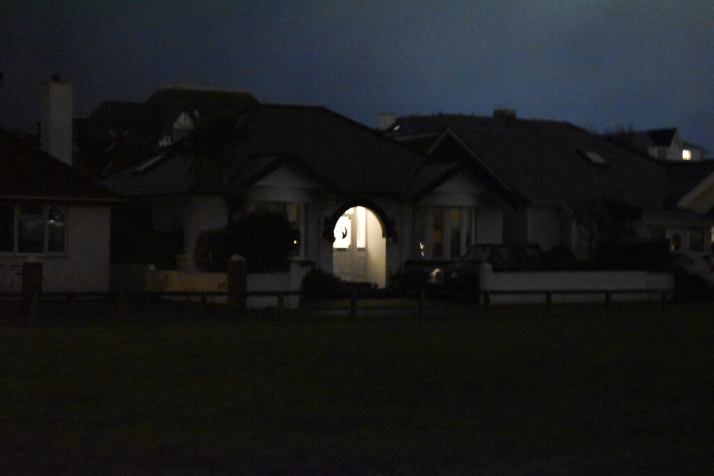
Todd Hido creates photographs that could be described as both traditional and bordering uncanny at the same time. Despite the perceived simplicity of these photographs, they expertly embody feelings of realism and discomfort “as though they have been directly pulled from the recesses of your own memory”. (Kraft, 2021: 2) By taking a shared experience or memory and presenting them back to the viewer, the photograph will have created a personal connection on the basis of familiarity, in turn eliciting a stronger emotional connection. These shared memories however are twisted. He takes ordinary houses and transforms them into haunting dreams through soft lighting and quiet composition. This familiarity is required to create feelings of the uncanny, something only achievable by taking the familiar and changing it into something feared- in this case total isolation. House hunting creates a lonely narrative of being stuck as an observer on the cusp of society. While you can see houses and know someone must be present, you don’t see a single person. They’re hiding, from you. The viewers eye is made out to be that uncomfortable felt-presence, someone uninvited watching from somewhere just out of view. Its an uncomfortable yet strangely peaceful atmosphere that extends throughout this body of this project. Additionally this photograph has a muted colour pallet. The whole image is a cool blue toned with only white light and dark trees breaking this monotone pattern. The bleak colour pallet doesn’t elicit any exiting or extravagant reactions; it showcases the dullness of the mundane, a universally relatable topic that will reach a further audience than an American suburb.
Hiroshi Sugimoto
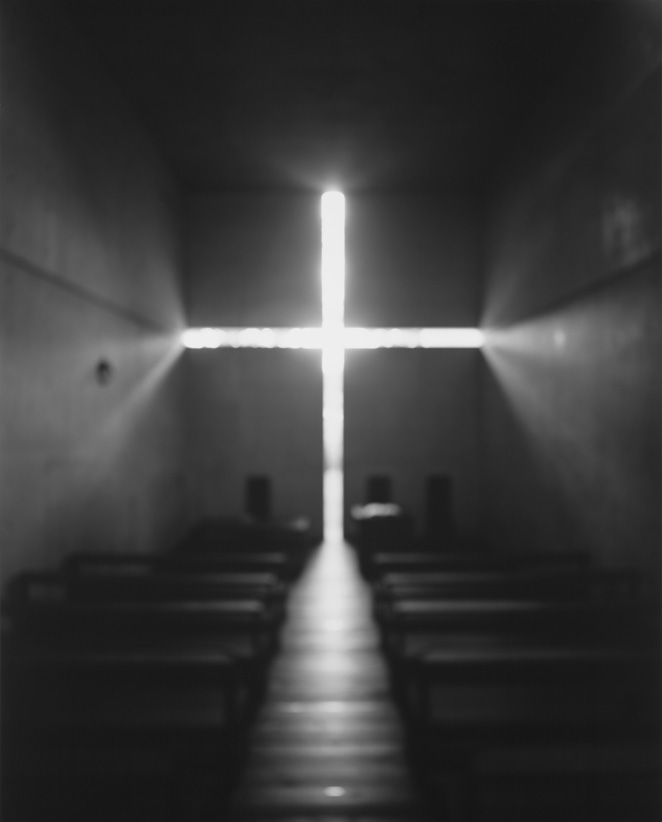
Hiroshi Sugimoto, Architecture (1997 – 2002)
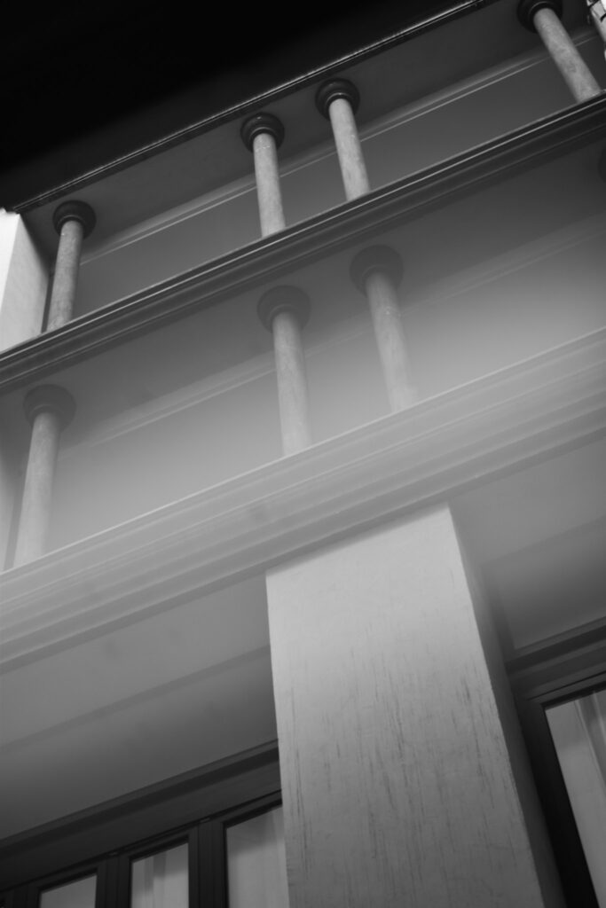
Hiroshi Sugimoto creates photographs that “dissolves the lines between time, memory, and history” (Fraennkel Exhibition: 1) in his photographs. By creating images that seemingly stand outside the passing of time, they hold a strange sense of power over the reader and create an imposing atmosphere, an important feeling when photographing powerful buildings. This makes the presence of the buildings seem as large as they would physically be in person. In this image, Hiroshi Sugimoto has photographed a church. Churches were and still are, though to a lesser extent, powerful so the imposing atmosphere and emphasised cross shows power over the viewer. Although this image of a minimalist church could easily be associated with current aesthetics and movements, it could just as easily be taken from many points of your own memory and therefore history. Minimalism dependent on the present, its been present throughout modern history. The protestant church has been white and void of decoration to separate itself from Catholicism since its foundation in 1517. The lit cross looks angelic with bright glowing white but also inviting, like a welcoming hand which is representative of both the welcoming and openness of community but also the personal connection people build with their religion. At the same time the emptiness of the frame, the bareness of the room as well as the coldness the loneliness that comes with religious teaching and practices creating a cold and out of reach image. even if you wanted to reach out, it looks so large and far away, making the viewer feel unworthy and small. Additionally the image was purposefully made blurred which creates a dazy and unreal appearance. Like something from right out of your memories.
Conclusion
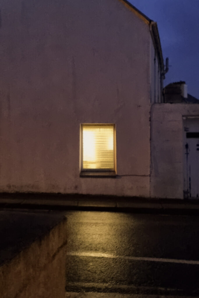
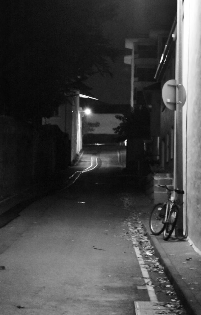
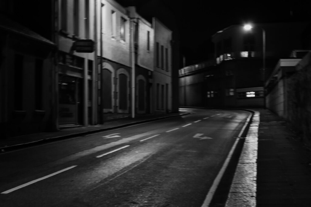
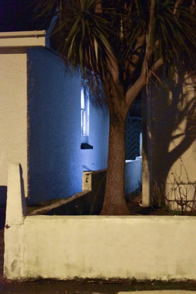
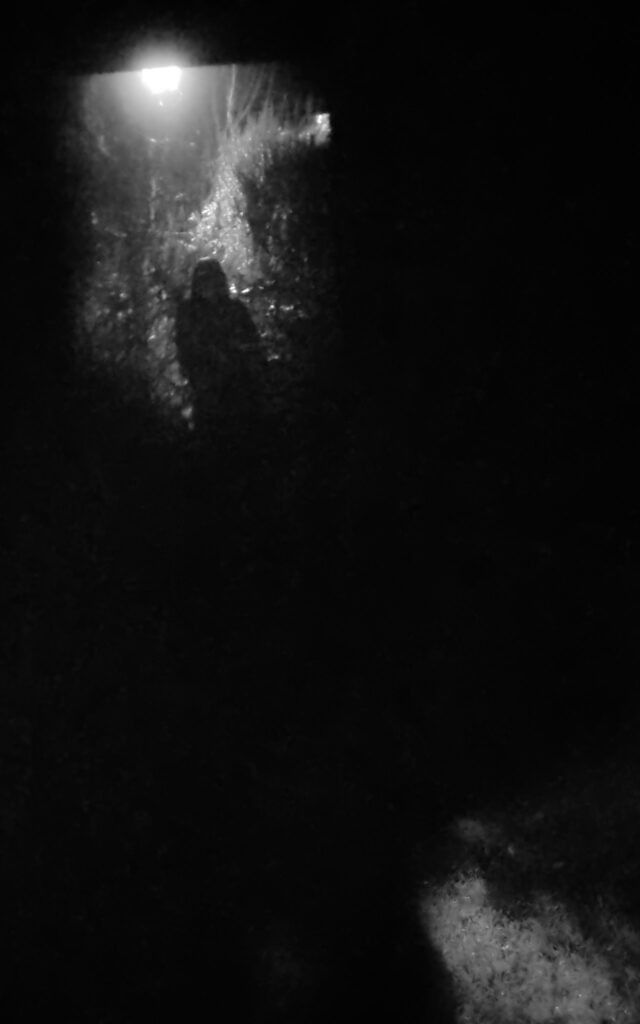
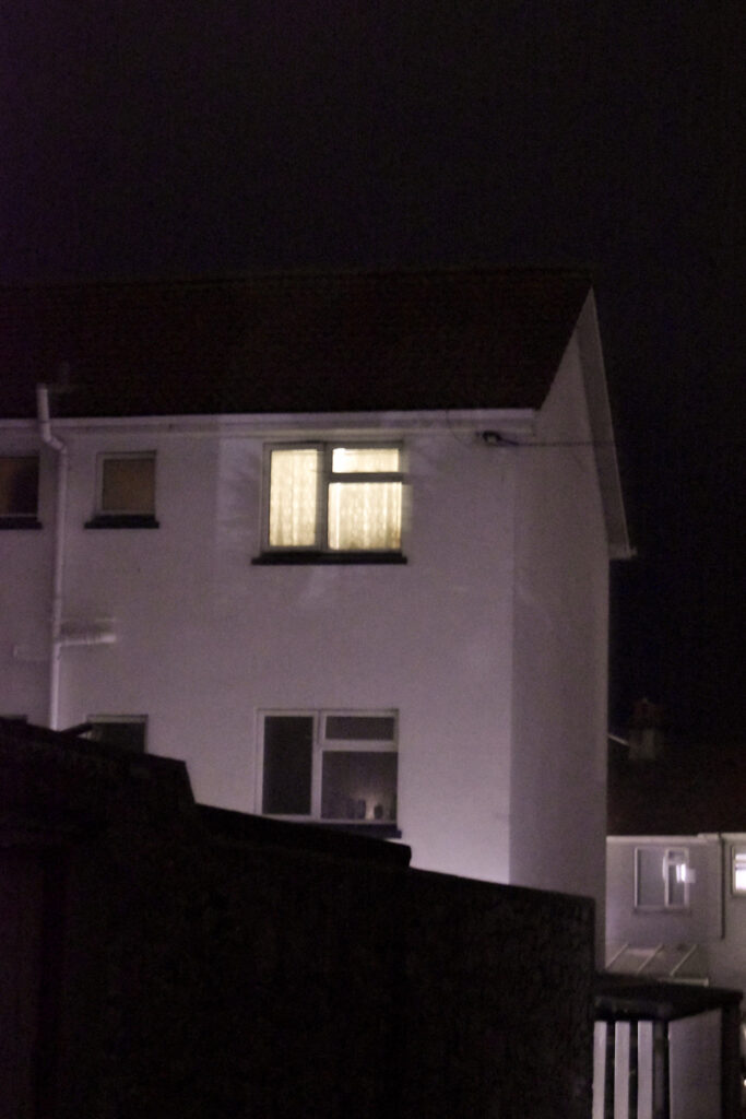
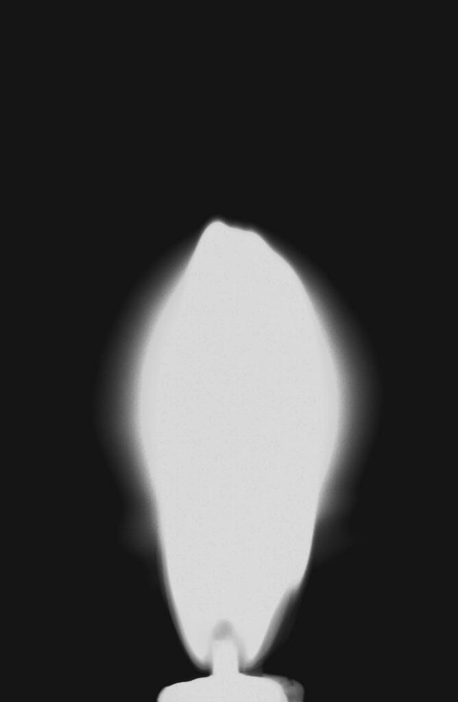
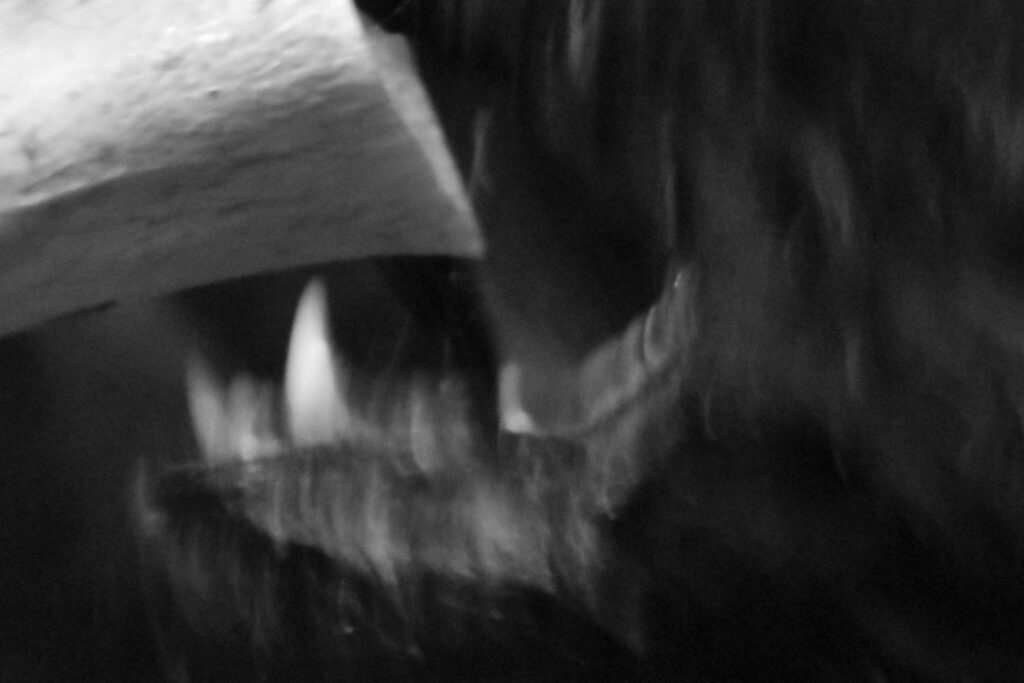
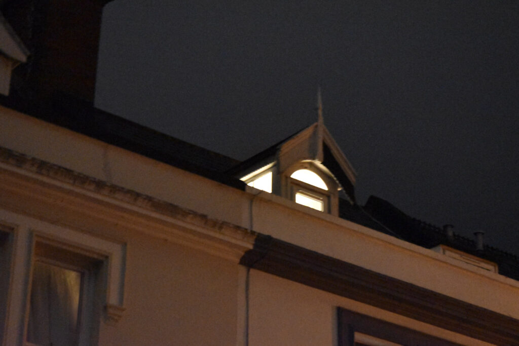
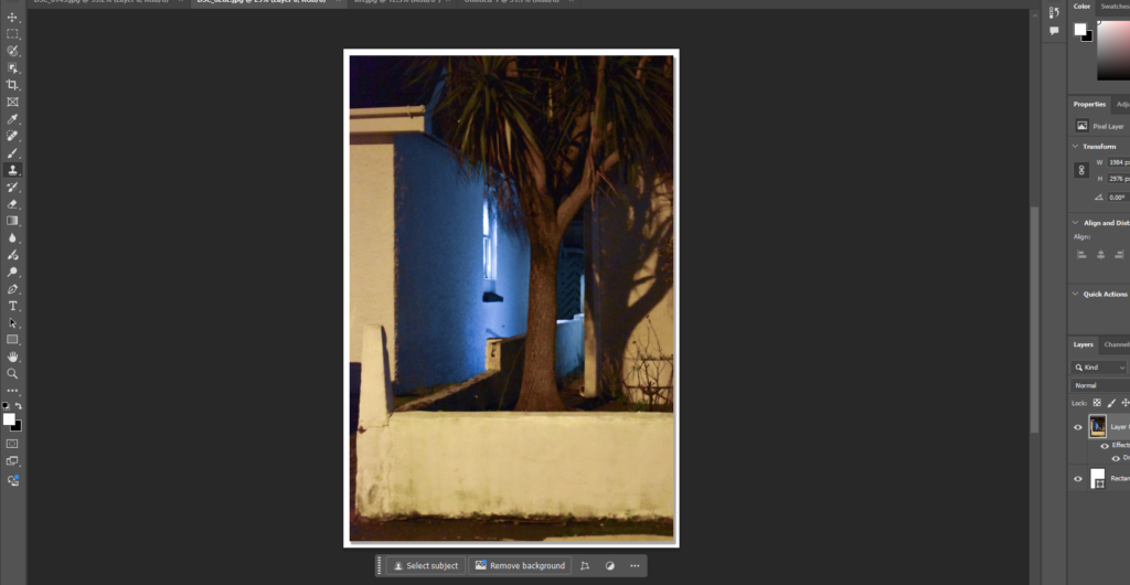
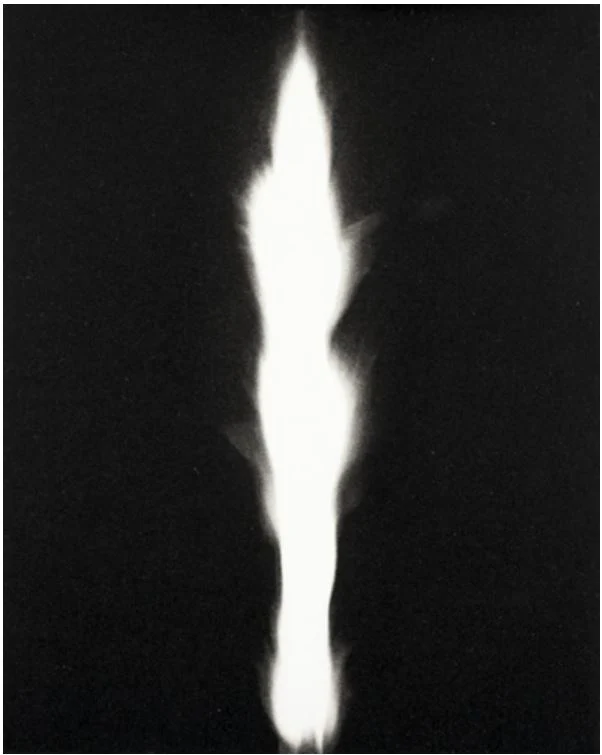
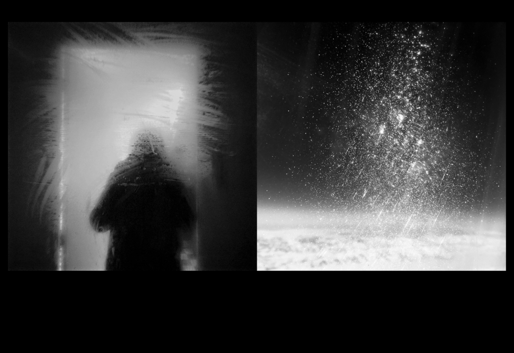
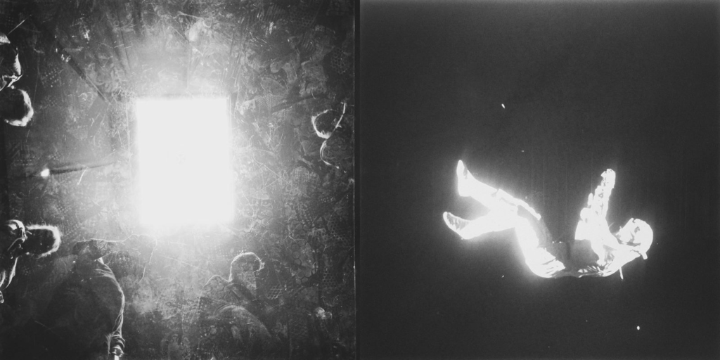
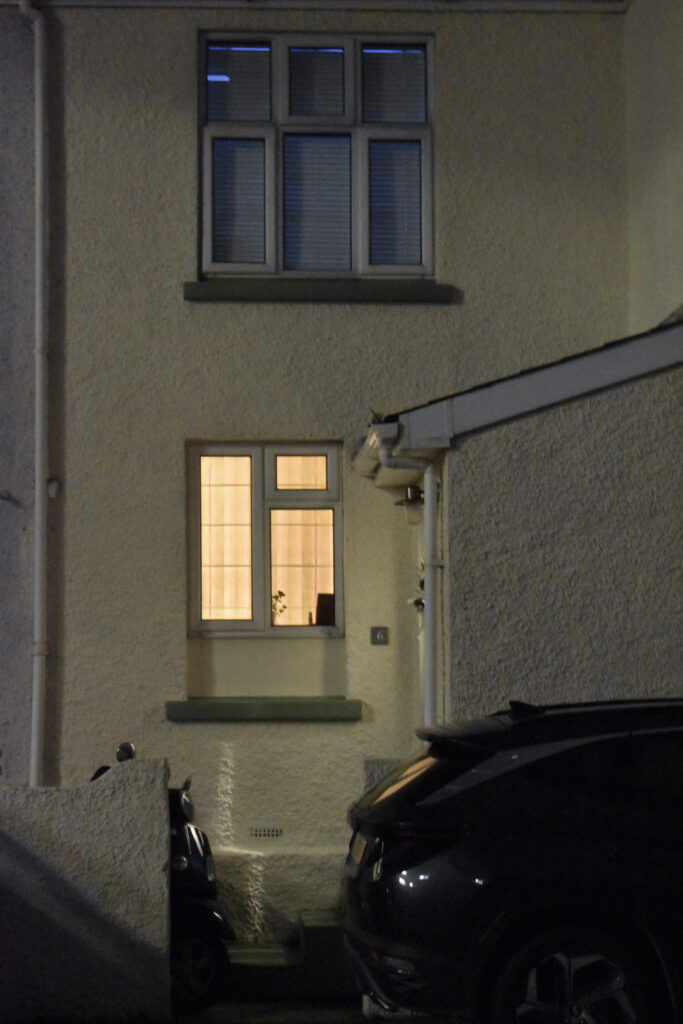
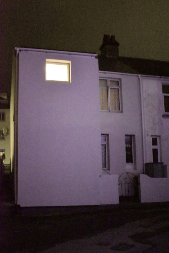
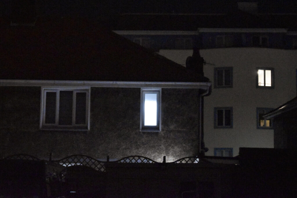
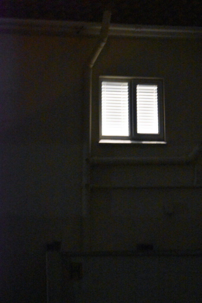
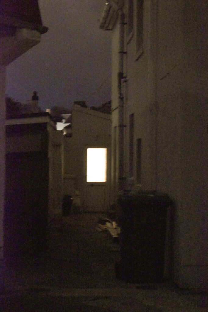
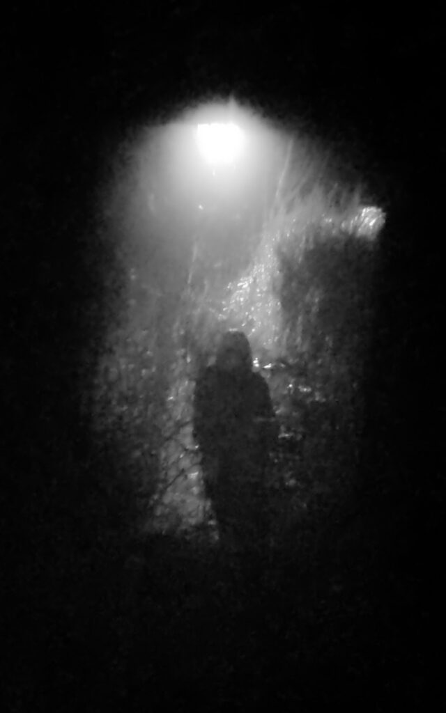
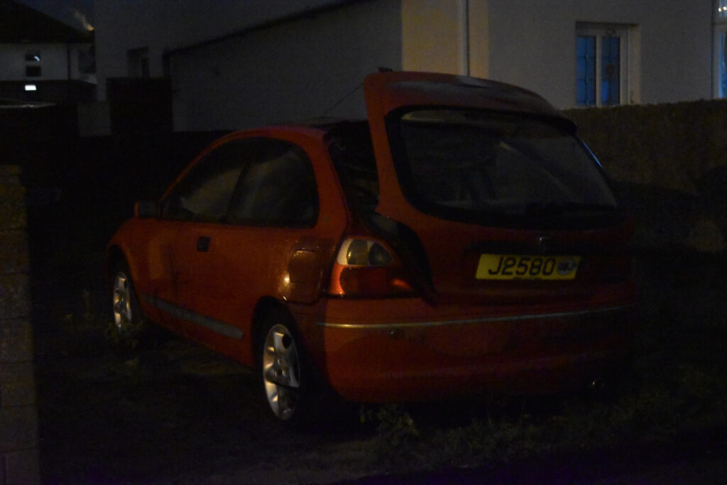
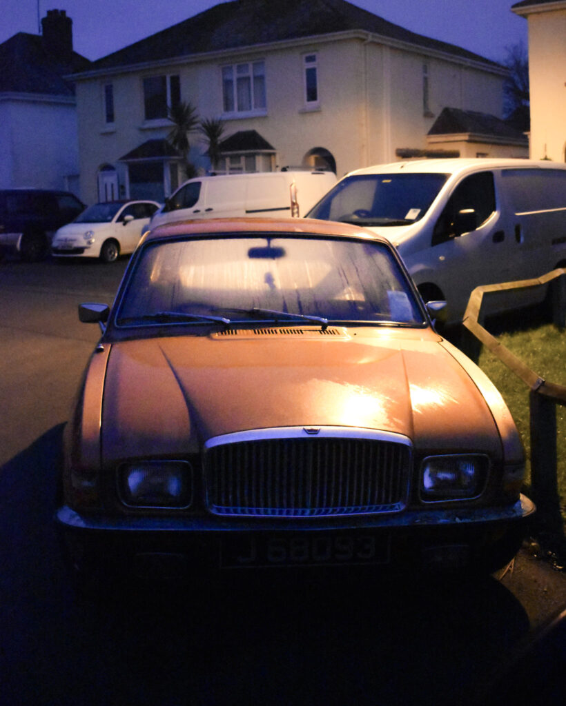
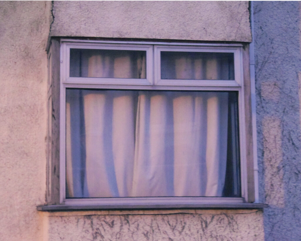
In conclusion, both Todd Hido and Hiroshi Sugimoto have created photographs that capture something seemingly right out of your own memories void of human presence. They have presented the intangible as an intimate emotional response through the use of familiar while also lonely imagery. Todd Hido’s images elicit feelings of nostalgia and loneliness while Hiroshi Sugimoto’s are powerful and intimidating. In response to Hiroshi Sugimoto I produced a number of images inspired by ‘in praise of shadows’ which I believe captures similar feelings of wonder and fear as ‘architecture’. These images create unique and striking shapes from a flame which has associations of danger. While my image didn’t create the same elongated streak, I think the humanoid shape creates an uncanny feeling instead which achieves a similar feeling of unease. As a response to Todd Hido’s ‘House Hunting’ I created a series of images documenting my walk around neighbourhoods at night. I didn’t manage to photograph in heavy fog or mist but I made sure each one showed signs of isolation regardless of the missing mystery of fog.
Hiroshi Sugimoto – In Praise Of Shadows (1998)ResponseTodd Hido – House Hunting (2001)Response
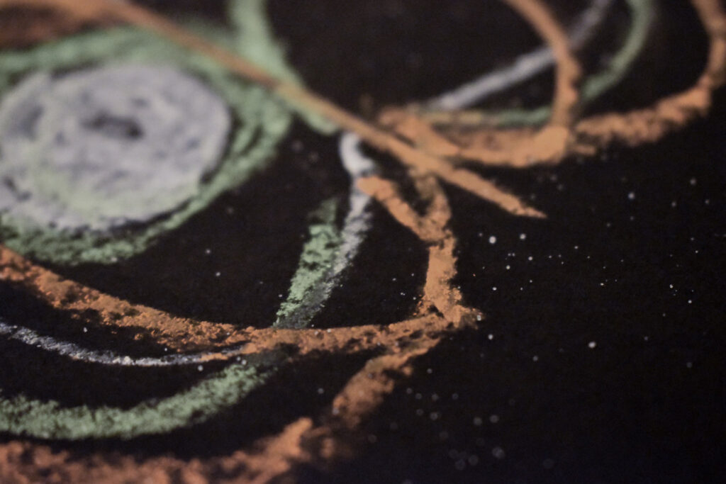
I had an assortment of images that didn’t fit into any other photoshoot:
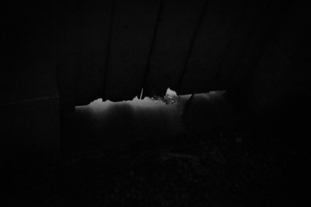
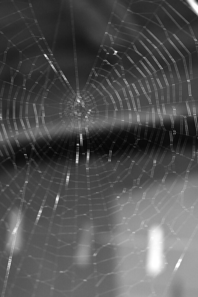
When photographing the animals I choose the black cat for its superstitious associations and the lighter cat for its wise appearance and closer ties to witchcraft. The birds again have superstitious associations and the moth is suspended in a spiders web having lost a wing. I think the moth is quite telling of fear in its place as opposed to creating fear. I photographed my dog eating a bone also as he’s a large dog with sharp teeth which can be dangerous. I like how the fog images are peaceful and relatively mysterious which is the same with the empty roads. I choose a few of my images which were out of focus because they create a hazy/confused appearance or one which looks like you’ve taken a quick glance. Additionally its messiness will be part of the overall unorganised book.
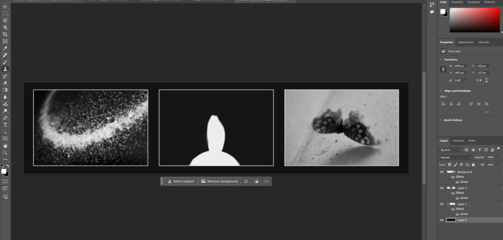
The cat image I edited in photoshop with generative fill. This one had the best angle of the few however I didn’t like how busy the foreground was. I selected the bottom of the image and told it to change the mess to a wall. The best outcome of the 3 was this one although it also added some trees in the background:
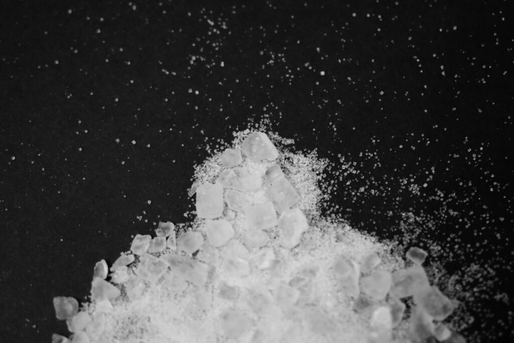
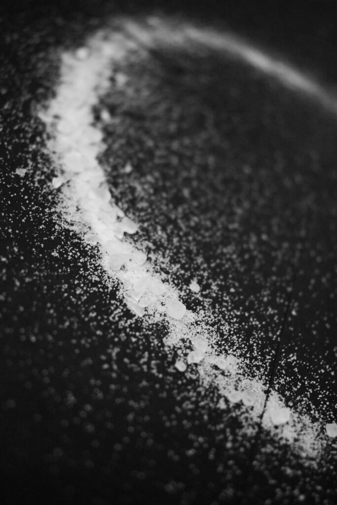
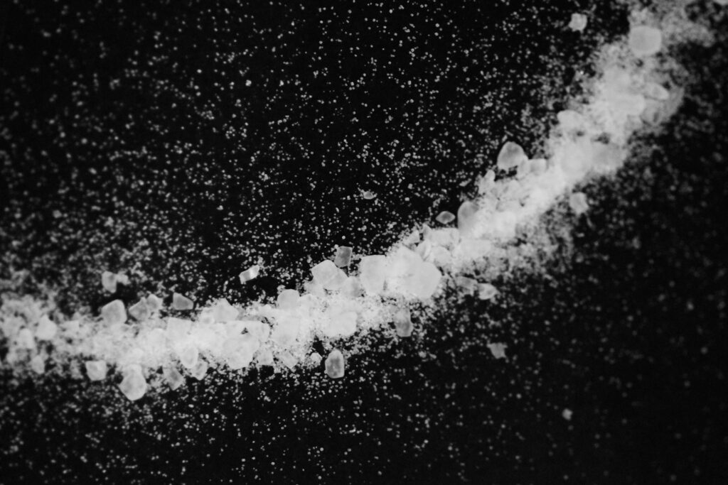
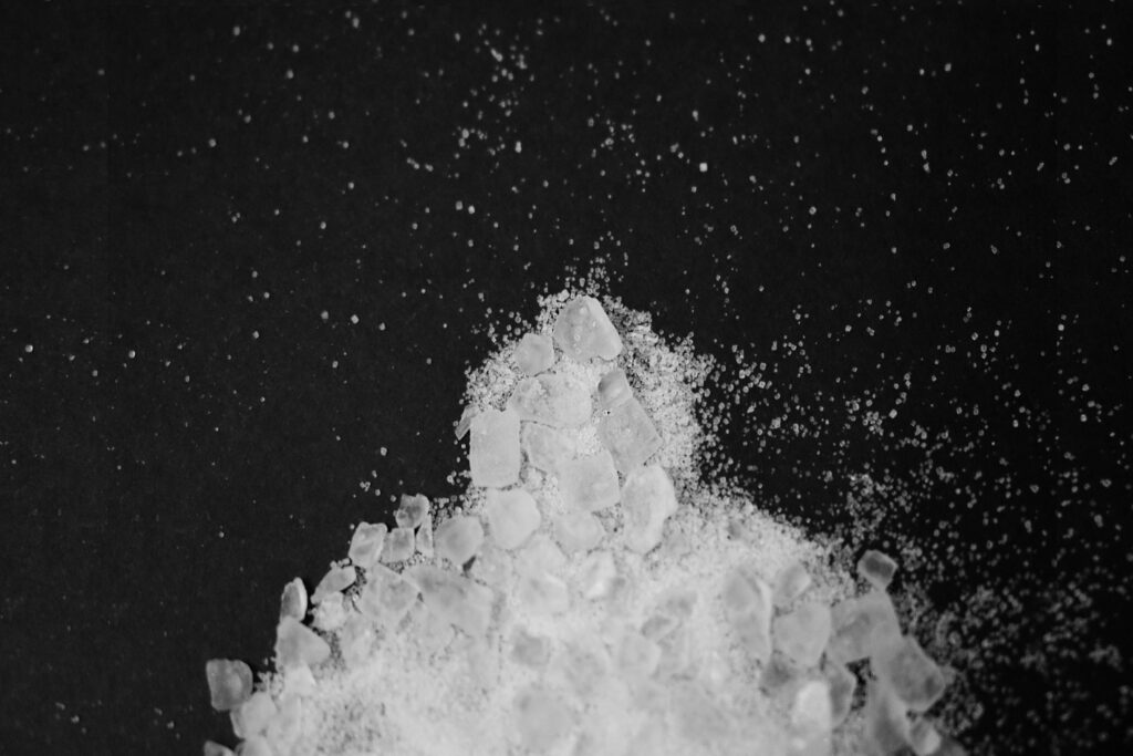
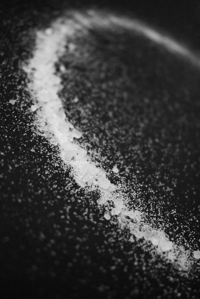
Themes such as fear are often related to religion and superstition. I photographed a salt circle which is a cautionary step to create a safe space from the paranormal. I then made more figure shapes out of the salt and photographed some scribbles too.
Astres Noirs by Sarker Protick and Katrin Koenning.
1. Research a photo-book and describe the story it is communicating with reference to subject-matter, genre and approach to image-making.
This photobook shows a collection of black and white photographs where the photographs have taken the ordinary and blown it up into dramatic images. Every photograph was taken on a phone and matched to its neighbour through overall shape and contrast. Each page is folded with a handful hiding additional images behind. The images were cumulated by an exchange between the two photographers. Like letters the two would send each other images and bounce off one another’s ideas. One photographer is from India and one from Australia. The pockets hide images and the word ‘disappear’. The book and sentence ‘all colours…within black’ makes somewhat sense but with the additional ‘disappear’ and hidden images, it creates a fuller and more well rounded overall narrative. The book is also a reflection of phone photography. The images were all taken from their own social media pages and the shine reflects the bright screens of the devices.
2. Who is the photographer? Why did he/she make it? (intentions/ reasons) Who is it for? (audience) How was it received? (any press, reviews, awards, legacy etc.)
Sarker Protick is an Indian photographer who overexposes and ‘looses’ colour in his black and white images. Katrin Koenning is an Australian photographer with a focus on the emotional connection with the environment.
3. Deconstruct the narrative, concept and design of the book and apply theory above when considering:
Paper and ink: use of different paper/ textures/ colour or B&W or both.
Since every page is folded they feel much thicker then they actually are. The pages are black and make use of a metallic white ink to make it shine under the light.
Format, size and orientation: portraiture/ landscape/ square/ A5, A4, A3 / number of pages.
The cover uses pure black card with the tile indentented.
Title: literal or poetic / relevant or intriguing.
The title is poetic. In English it translated to black stars. Black holes could be seen as more relevant however the use of stars relates to the brightness of the white and the metallic used for printing ink.
Narrative: what is the story/ subject-matter. How is it told?
There isn’t much of a story to the images. The images document an interaction between the two photographers.
Structure and architecture: how design/ repeating motifs/ or specific features develops a concept or construct a narrative.
Every set of unfolded pages have the same layout. The pictures are squares in the top corners of the pages.
Design and layout: image size on pages/ single page, double-spread/ images/ grid, fold- outs/ inserts.
Each image takes up part of one page. The book makes use of folded pages. The pages would have been folded in half and bound through the centre like normal pages. This makes the pages openable from the bottom corners.
Editing and sequencing: selection of images/ juxtaposition of photographs/ editing process.
The images are put together mostly in pairs. each pair are related in some way be it general shape or related themes.
This pair uses the same shape of a triangular shape with the figure and the dirt specs.
This pair have related themes. The astronaut is falling through space and seemingly away from the square on the left which is reminiscent of a star/ship/etc. Had the context of the square been different it wouldn’t seem foreign/alien.
Images and text: are they linked? Introduction/ essay/ statement by artists or others. Use of captions (if any.)
The book doesn’t use many words. In the beginning there is the phrase ‘all colours disappear within black’ which relates to the images being black and white but also the hidden nature of the folded images. There are no captions with the images as these images are abstract and strung together in a narrative that wouldn’t make sense with added context.
For these images I was unsure whether to set them in Black and white to match the other images so far or keep them in colour as how they would be seen.
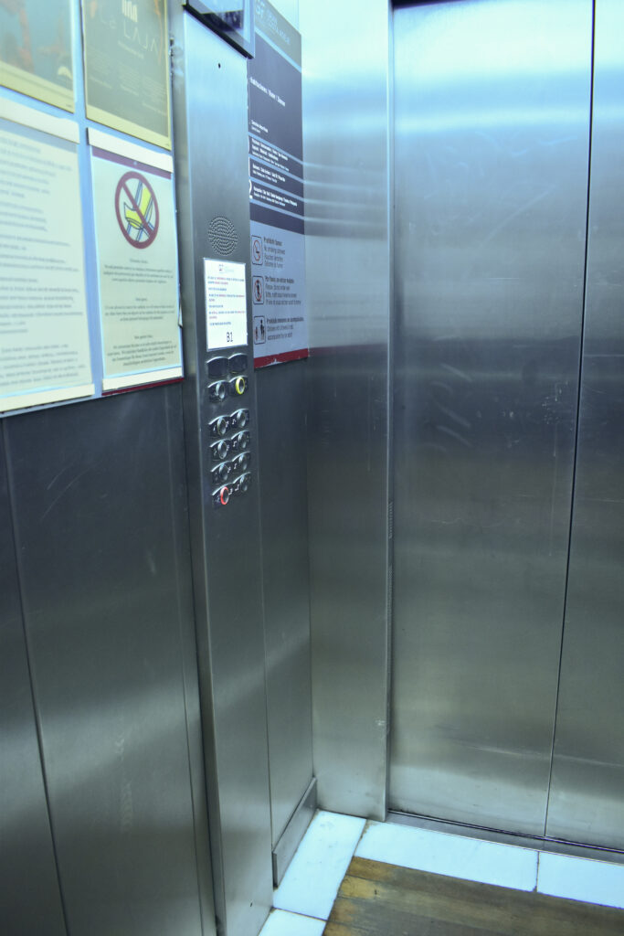
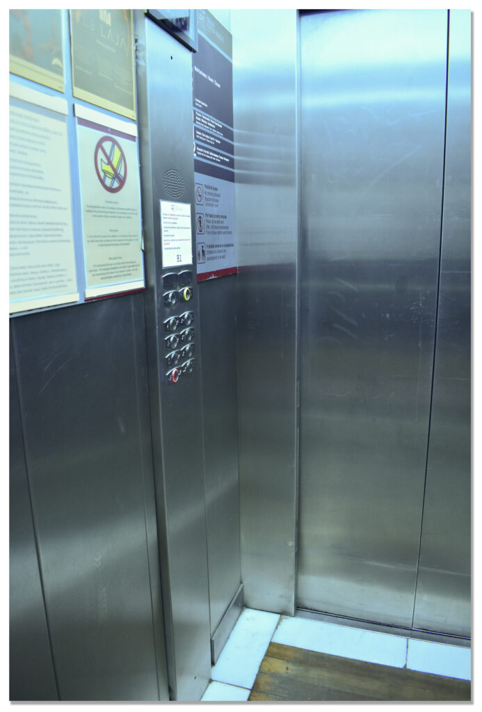
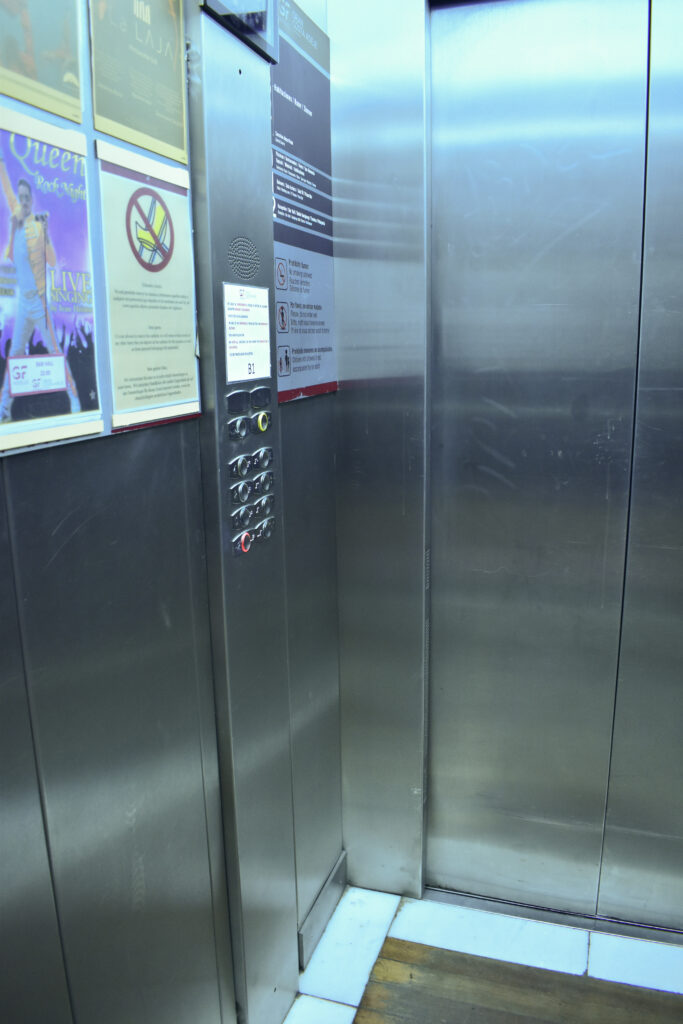
I wanted to remove some of the advertisements from the lift. I used photoshop to generative fill the colourful sheet with some generic writing. The colour looked off however so I masked the sheet and added a tinted layer to create the same yellowing effect.
Overall I think this photoshoot 3 really good images:
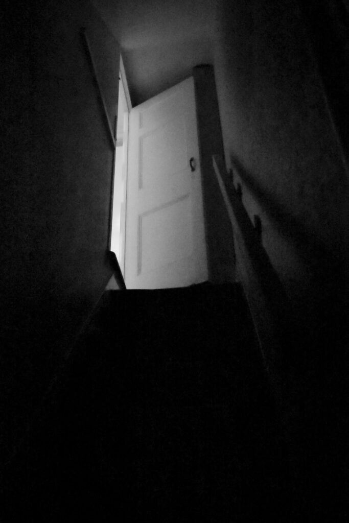
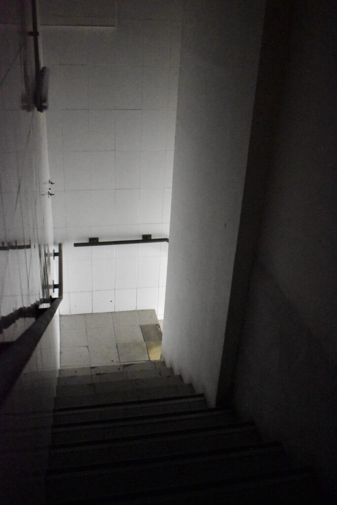
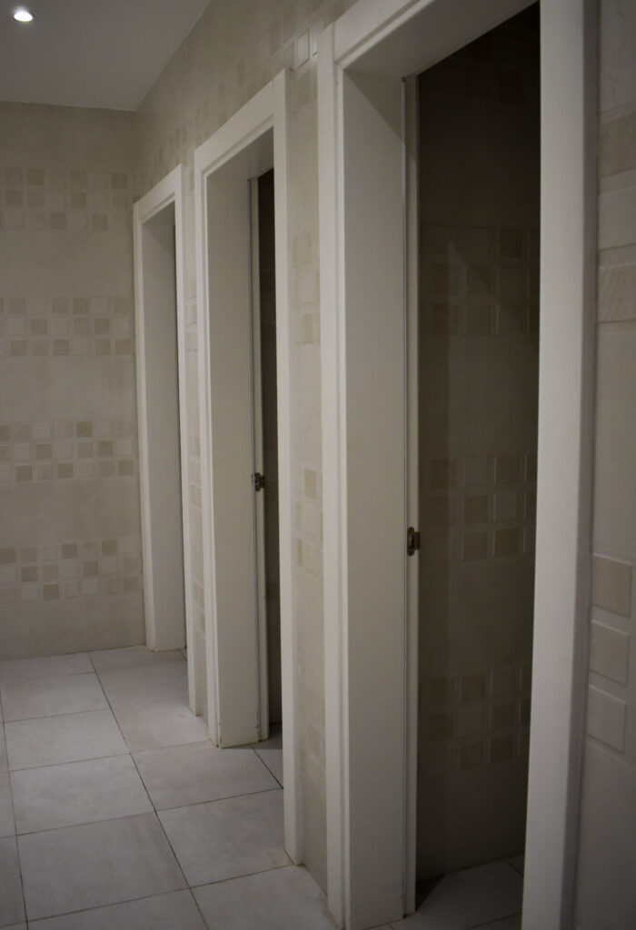
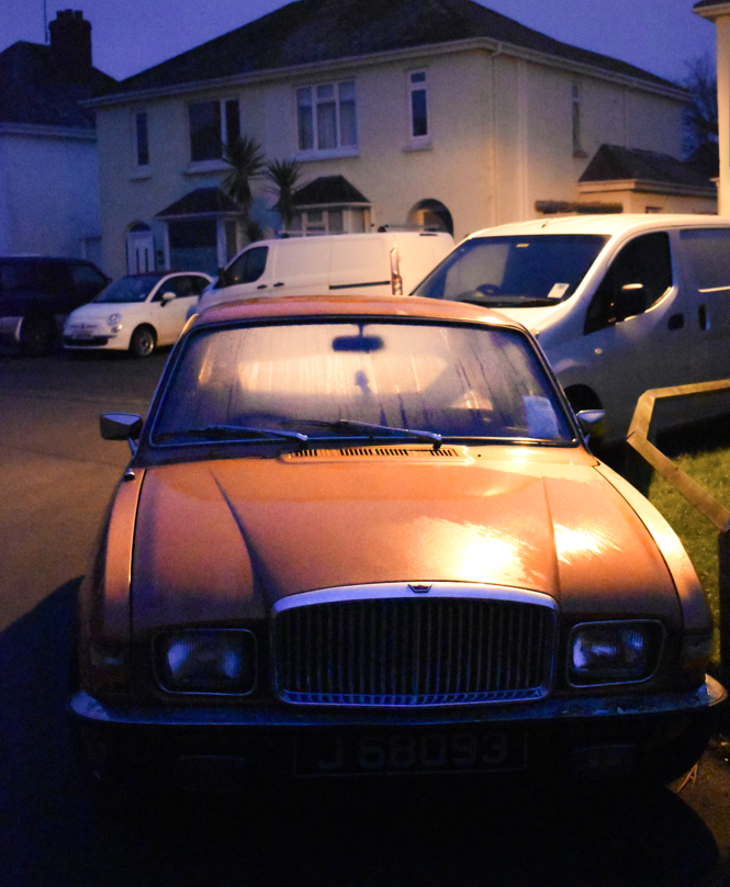
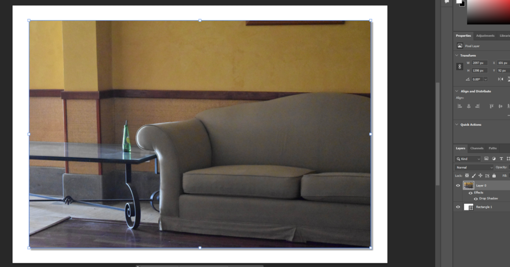
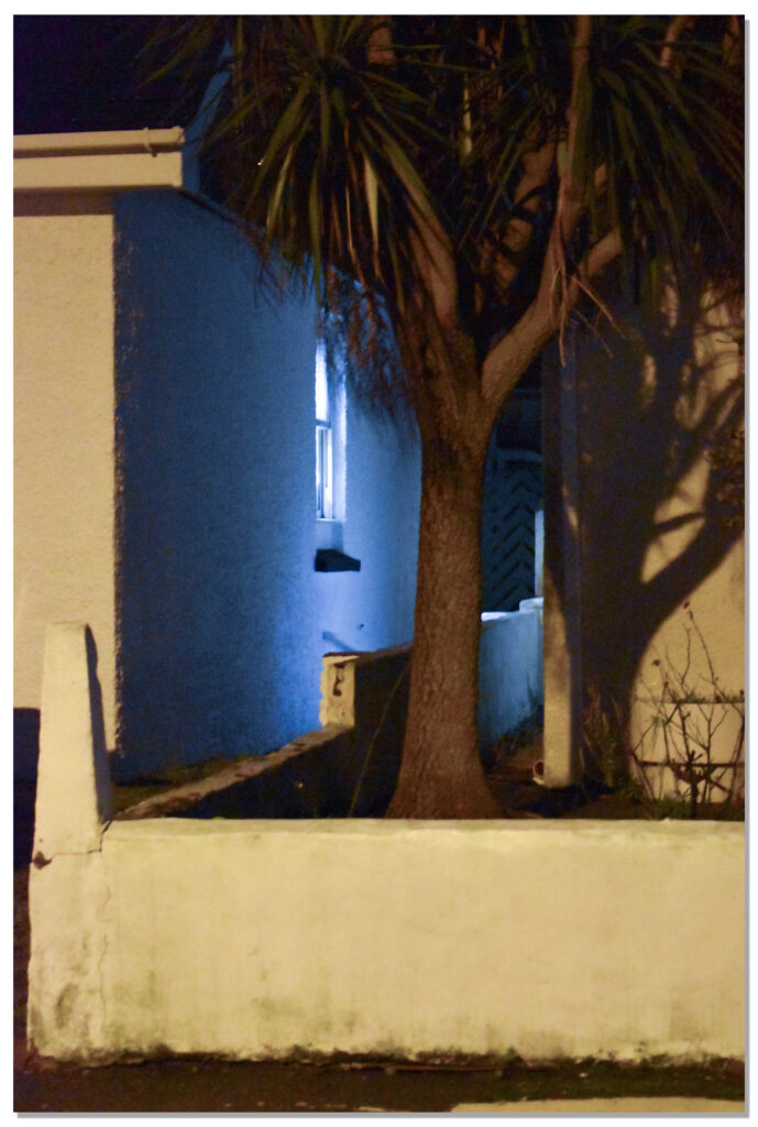
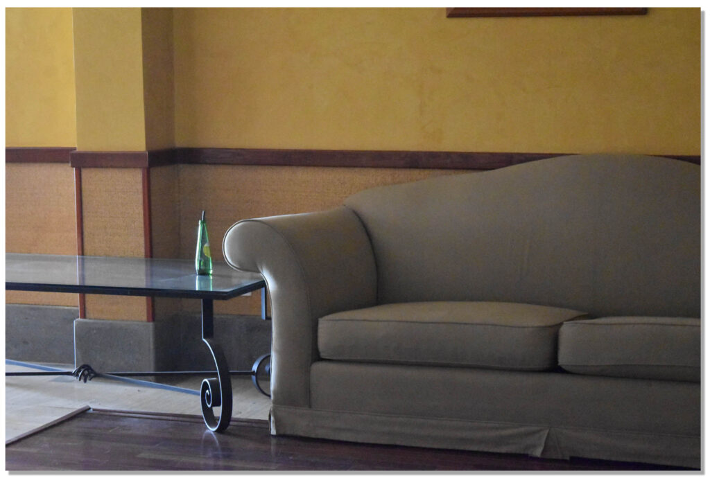
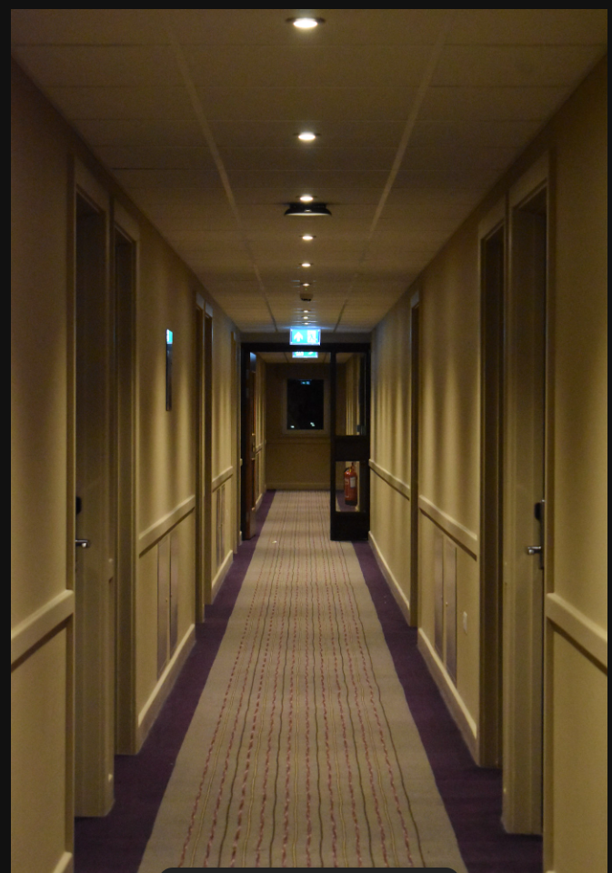
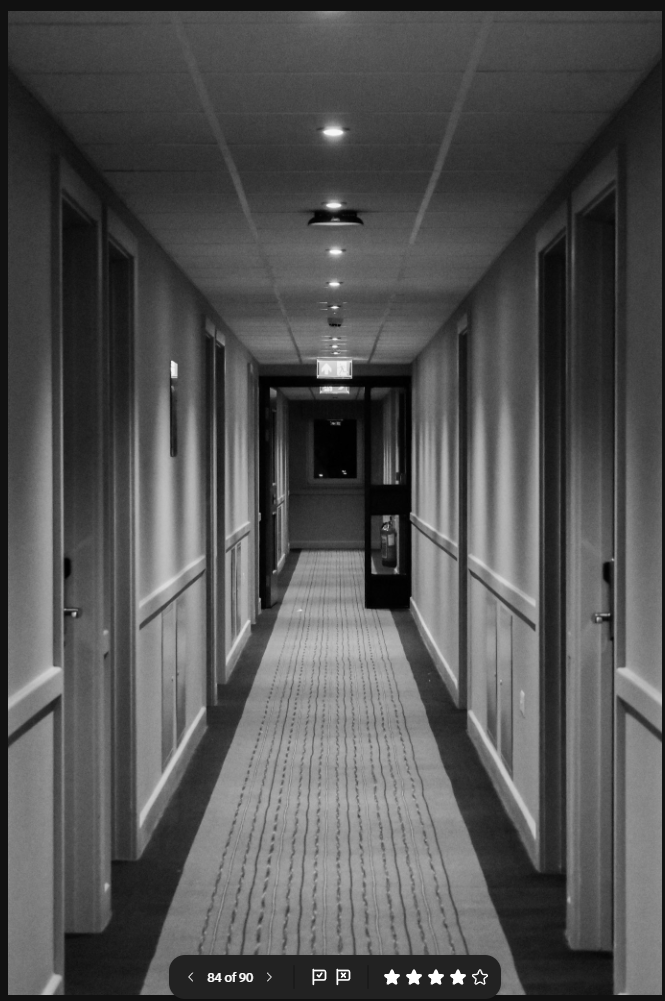
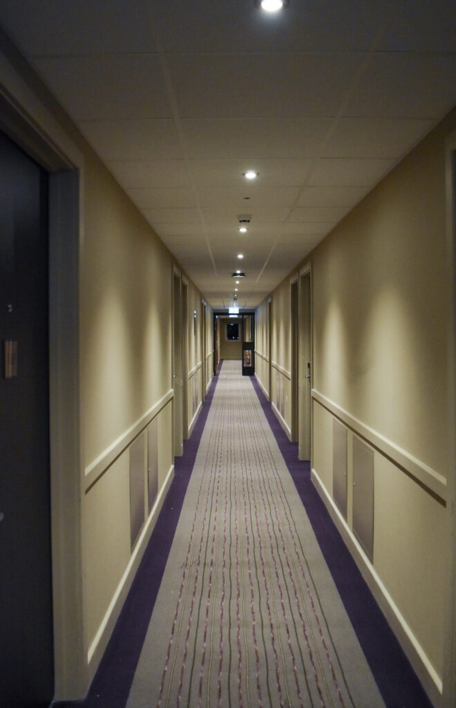
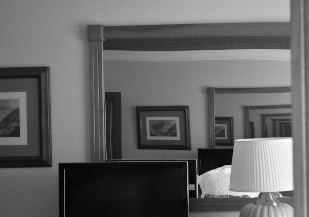
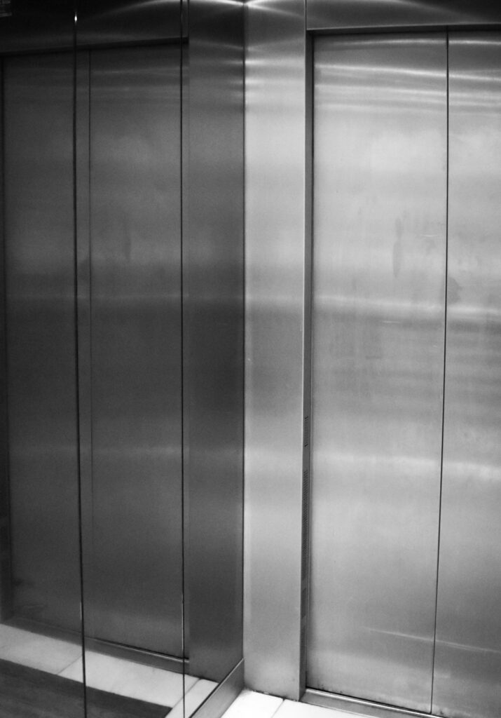
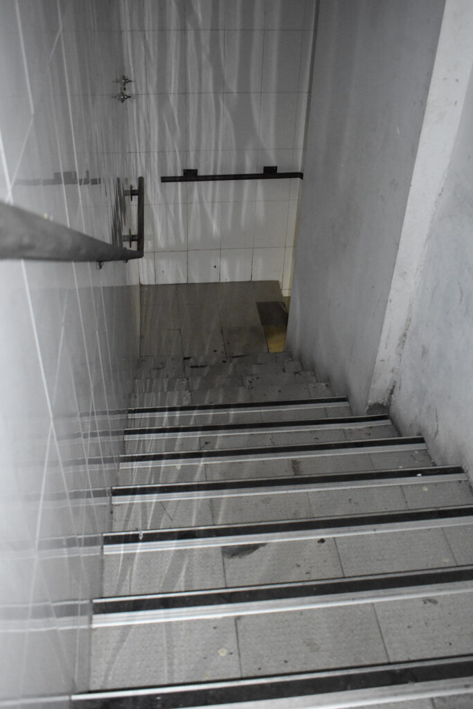
Lifts can be quite frightening for some people for their small space triggering claustrophobia and getting stuck if they break. The lift I photographed broke on me twice with the doors refusing to open and the suspensions jittering which made me really want to photograph it for this photoshoot. The sofa for me showed a liminal space. The yellow walls and past evidence of a person looks odd and fake which I think turned out quite well. I also liked the image with 3 doors pen because it also seems like it could resemble a liminal space. I was torn between this image and another one where the end light was on but the lack of light is more ominous.
Essay Plan Make a plan that lists what you are going to write about in each paragraph – essay structure = 2000-2500 words
Essay question
Opening quote
Introduction (250-500 words): What is your area study? Which artists will you be analysing and why? How will you be responding to their work and essay question?
Pg 1 (500 words): Historical/ theoretical context within art, photography and visual culture relevant to your area of study. Make links to art movements/ isms and some of the methods employed by critics and historian.
Pg 2 (500 words): Analyse first artist/photographer in relation to your essay question. Present and evaluate your own images and responses.
Pg 3 (500 words): Analyse second artist/photographer in relation to your essay question. Present and evaluate your own images and responses.
Conclusion (250-500 words): Draw parallels, explore differences/ similarities between artists/photographers and that of your own work that you have produced
Bibliography: List all relevant sources used
Essayintroduction: convert draft introduction to final version.
Think about an opening that will draw your reader in e.g. you can use an opening quote that sets the scene. Or think more philosophically about the nature of photography and its feeble relationship with reality.
You should include in your introduction an outline of your intention of your study, e.g.
What are you going to investigate?
How does this area/ work interest you?
What are you trying to prove/challenge, argument/ counter-argument?
Whose work (artists/photographers) are you analysing and why?
What historical or theoretical context is the work situated within?
What links are there with your previous studies?
What have you explored or experimented with so far in your photography project?
How will your work develop.
What camera skills, techniques or digital processes have you used, or going to experiment with?
Below is link to a blog post which will provide you with helpful guidelines if you are struggling to structure your essay or writing paragraphs.
How have Todd Hido and Hiroshi Sugimoto used the medium of photography to record and present the intangible?
Introduction:
‘A photograph might be a fixed image but, socially speaking, photography does not keep still.’ David Campany, The Photographic (2004)
A Photograph Is Intangible
A photographs takes a fleeting moment – the natural atmosphere and emotion – and immortalise it in a still frame. Once taken, that moment can no longer be revisited: it is intangible. Intangibility is the absence of a physical body. While a print out can be held and felt, the subject of the image is now immaterial – a copy of a memory. Take for instance a tourist. He may photograph himself in front of a landmark as “indisputable evidence that the trip was made” (Sontag 1977:9). But once he moves to the next location he cannot return to that same spot, the moment has passed. It does not exist any longer outside the frame. All the same people will exist, the same landmark stands however the exact makeup of that image is only present within the bounds of the frame. “The shutter clicks and the clock jumps to the past” (Stakel 2003:7). Similarly Susan Sontag draws parallels between the shadows in Plato’s Cave and the photograph. The shadows are a believed truth based on bodiless projection used to show the deceptive nature of our own perception. Both these shadows and photographs mislead the viewer into believing they know the ‘full picture’. What’s seen is believed as fact. “The picture may distort; but there is always a presumption that something exists, or did exist” (Sontag 1977:5). On the contrary, a photograph is a physical representation of what did happen, tangible evidence. Photographs are “fixed traces of the light” (Stakel 2003:7). You can hold it, share it and even fix it in a book. Photographs are the physical body of a memory. “any single statement about photography is likely to fail on some level.” (Campany 2004:10). Like anything physical, a photograph has dimensions. A photograph cannot be fully explained in one sentence, they connect emotionally to the viewer. Between even just 2 people, a photographs summary can vary drastically as throughout a photographs timeline it will pass through many different hands and the view of many eyes, a result of a physical form. “photography does not keep still” (Campany 2004:7).
Photographing the Intangible
How do you photograph something that doesn’t exist? There is a common consensus that the camera in one way or another killed the paranormal. If something exists there’s a picture so if you haven’t seen it, then it mustn’t exist. Tales of beasts in the woods and monsters in marshes have become increasingly difficult to believe without evidence. For early photographers like William Hope and William Mumler this was a matter of manipulation: using simple double exposure techniques to create ghastly effects. While its impossible to photograph the ghost of a loved one, printing a copy of them achieves a similar effect. Photographer Todd Hido captures feelings of isolation by alluding to humanity without ever showing it. The loneliness of his images utilises familiar imagery to trigger a personal response. Hiroshi Sugimoto turns something familiar into something unrecognisable through distortive blurs. “any single statement about photography is likely to fail on some level” (Campany 2004:10). This is because a photograph on its own has no context. It is an abstraction. Without context any interpretation is valid. In a collection, a narrative can be crafted however the ambiguity is what makes images resonate with the viewer. Any feelings associated with an image are entirely disembodied. “Photographs actively promote nostalgia.” (Sontag 1977:15). If a photograph represents a passed moment of time and nostalgia is the universal longing for the past then photography is the act of presenting nostalgia, intentionally or not. This is most easily seen with family photobooks but any photograph will elicit some level of nostalgia at some point in its timeline.
I tried this photoshoot 3 different times. I tried both at night and early morning with varying results. None are particularly sharp or without grain and most were too blurry to use.