All posts by Anya Blair

Filters

Author:
Category:

Still Life Photoshoot – Contact sheet

I took these photos of my own objects, that had a memory and meaning behind them. I experimented using the camera from different angles, birds eye-view, and straight on. This created interesting formations, with different focal points catching your attention in different parts of the photo. I used different light settings and back drops which emphasised the nostalgia theme as well as my objects.

Final Images

This is my final image, experimented with different edits to create the ‘nostalgic’ theme. I chose different angled objects which added interesting textures, while also creating the unique arrangement like the still life photographers did.

Here I turned the photo in black and white as I think this straight away makes the photo a lot more interesting, as it creates more depth and structure to the photo. As you can see, I have experimented with different features where I could really highlight the objects, creating a lot of depth which made different shadows and tones on certain areas which weren’t shown as clear when in colour.

Editing on Light Room

For this photoshoot, I experimented using different light settings where I achieved warmer and cooler effects on the objects. I experimented with different layouts which created interesting compositions and angles, which enhanced the objects. I was inspired by different angled, unique placed objects from the still life photos, to experiment with different formations of my own objects.

This was one of my final images that I edited on light-room. I thought the more straight-on photos engaged you in a different way compared to the more angled ones, as this created interesting depth. Also, the way I positioned the objects added to the depth because it draws you in closer leading your eye to the more of the formation of the objects. I experimented with exposure and various tones that helped engage the viewer, as well as creating an old but new look that links to the theme ‘nostalgia’.

Walker Evans and Darren Harvey-Regan

Walker Evans was greatly influenced by Darren Harvey-Regan as they both paid close attention to the choice of objects, composition, lighting and exposure levels.

Walker Evans

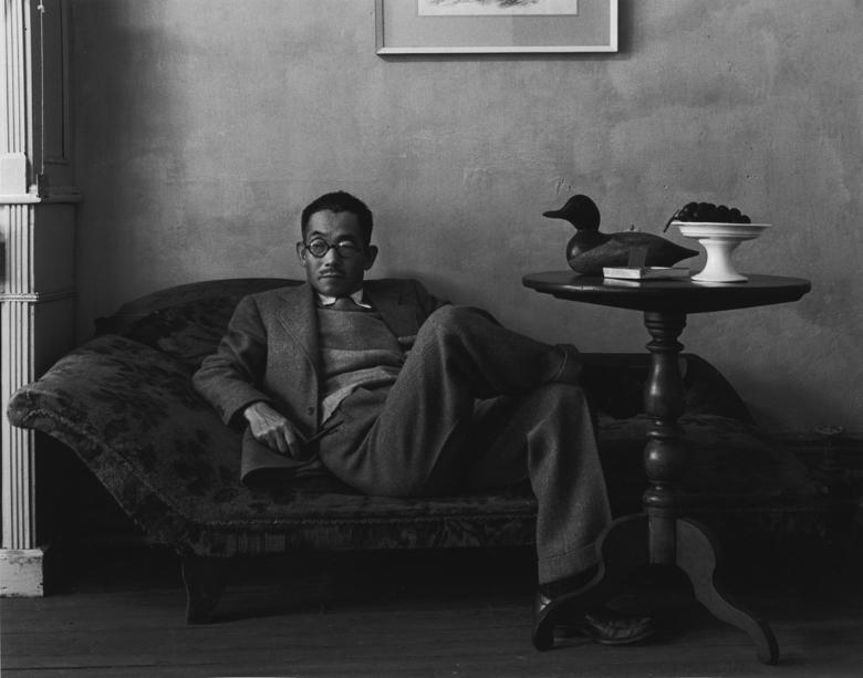
Walker Evans began photography in the late 1920’s, taking his first snapshots while on his trip to Europe. Then on his return to New York he produced his first set of images. He was best know for taking photographs during the Great Depression, as he was mostly recognised for his documentary and social realism style. Evans then went onto produce his first Portfolio in 1955 called, Beauties of the Common Tool where it features day-to-day objects. The simplicity of only one object displayed, creates this engaging and immersing feature for the viewer, as he wants you to see them for yourself in a different way.

Beauties of the Common Tools

Walker Evans shows simplistic everyday objects displayed in black and white, which creates unique forms and interesting exposure as we get more out of the object. This is effective because he turns the objects into something that’s more distinct and eye catching, rather than just photographing basic tools.

Darren Harvey-Regan

Like Walker Evans, Harvey-Regan was interested in the concept that photographs do not exist just to show things, but are physical things that become objects themselves. Harvey- Regan first created montages of Walker Evan’s work, where he would find matching tools, cut them in half and rejoin them to create his final work. The objects he would find were both interesting and unusual as this would engage the viewer and overall make it more distinct.
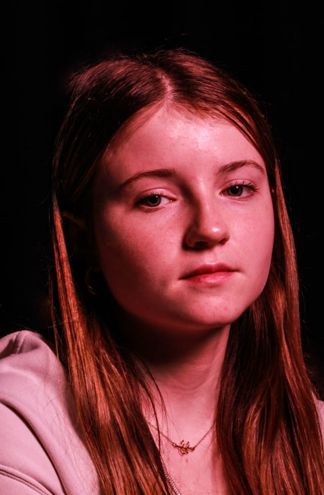
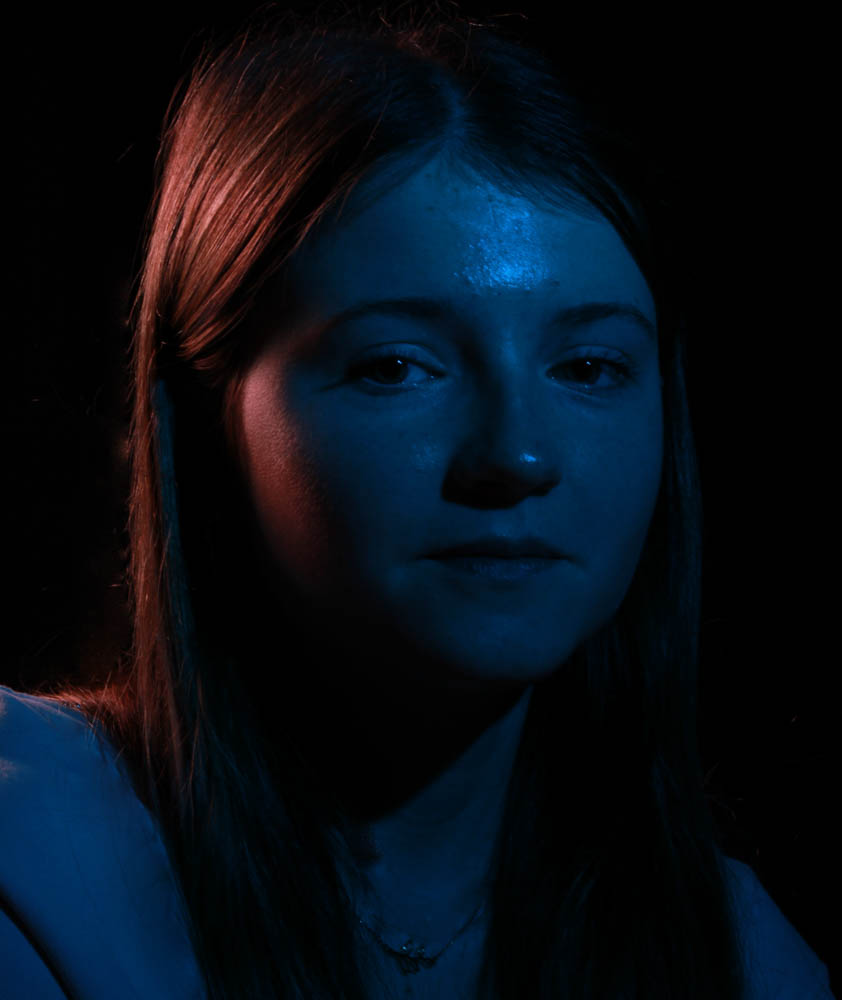
Harvey-Regan finds photography that photographs objects, whilst the overall photo being an object itself, an interesting concept as it creates a deeper meaning making it more interesting to the viewer. I think it overall creates a unique formation as it makes you look closer at the photo creating a deeper meaning. Overall, I think it is a very interesting concept, the simple but effective photographs straight away gets your attention, with the a-symmetrical and unusual objects it creates this deeper meaning making all of your attention focus on the unique formation. I like how it looks like one object but when you look closer you notice two, I think this is a really unique and interesting effect because it creates this different formation.

Still Life

Still life is paintings or a drawing of an arrangement of objects. They are an arrangement of inanimate objects such as fruit, flowers, household items, and textiles. These paintings use different types of symbolic and religious objects to convey deeper meanings or narratives. Still life paintings began in the 16th and 17th centuries, The Golden Ages. Now in the 21st century still life paintings were edited and modernised still capturing the same and different kinds of objects in a more vibrant and modern way.

The Golden Age, 16th and 17th Century

Modern, 21st Century

Vanitas

Vanitas are symbolic artwork, it is a genre of still life that shows the fleetingness of life. Vanitas are closely related to the Memento Mori, which is artwork of objects that reminds the viewer the fragility and shortness of life, for example some of the symbols include skulls and extinguished candles.

Paulette Tavormina

Paulette creates still life imagery of lit objects such as fruit and vegetables that are immersed in dark backgrounds. The dark background enhances the lit objects making each individual objects stand out from one another. This unique feature creates an interesting and unique depth, which leads the eye to each section of the photo while also creating a more deeper and meaningful photo. With fewer negative space, this draws your eyes in closer enhancing the abstract composition, enabling you to have more of a direct focus on the objects. This feature allows you to see and focus on more of the small and intricate objects placed around the photo, creating more texture and unique formations in areas that you wouldn’t notice from a distance.

Formalism

There are seven basic elements of photographic art: line, shape, form, texture, colour, size, and depth. 

Line

Lines are either straight, curved, or both.  Lines can be solid, dashed or interrupted,  implied, or psychological. The type and direction of the lines inside the image convey meaning of the photograph.

Vertical or horizontal lines – convey a sense of stability or a static feel to an image.

Horizontal lines – can indicate distance

Vertical lines – can indicate height, balance, strength.

Diagonal lines – convey a more dynamic scene.

Shape

The Merriam-Webster definition of “line” comprises 15 parts, 46 sections, and 41 subsections. With all of that, the part that we, as photographic artists, are concerned about is this:

8: A straight or curved geometric element that is generated by a moving point and that has extension only along the path of the point

Shapes are 2-dimentional, some shapes intersect and overlap to create a new shapes. Shapes are often visually defined by the intersection or closing of lines. The area containing a shape is often referred to as positive space while the outside area is called negative space, the negative space also creates a shape of its own. Shapes can be geometric or organic such as birds or fluids.

Form

The Merriam-Webster definition of “shape” that we are concerned with as photographic artists is:

1 a : the visible makeup characteristic of a particular item or kind of item

1 b (1) : spatial form or contour

1 b (2) : a standard or universally recognized spatial form

There are two types of forms, organic and geometric. In photographs the positive space is the forms and the negative space is what is left. Three dimensional forms are created into two dimensional forms in the photo, so to create the 3D effect we use shadows. Painters create 3D forms by shading, this reveals depth, highlights and mid-tones. The tonality changes and cast shadows of an object, create direction and intensity. The light relative to that object can change how we perceive the depth of the object in a photograph.

Texture

The Merriam-Webster definition of “form” comprises 12 parts, 27 sections, and 4 subsections. As photographic artists, the part we are concerned with is:

1 a: the shape and structure of something as distinguished from its material

Texture is similar to form, it creates variations of tones that are two dimensional. Smooth and ruff objects creates different types of hightlights, while smooth creates mirror image reflections, ruff objects creates more of an aggressive shadow with out the exact reflections. To be able to see texture, it depends on the subject, lighting, and forms of the image. Shadows is what emphasizes texture, making you able to see texture whether smooth or rough.

Colour

The Merriam-Webster definition of “color” that we, as photographic artists, are concerned with is:

1 a : a phenomenon of light (such as red, brown, pink, or grey) or visual perception that enables one to differentiate otherwise identical objects

b (1) the aspect of the appearance of objects and light sources that may be described in terms of hue, lightness, and saturation for objects and hue, brightness, and saturation for light.

also : a specific combination of hue, saturation, and lightness or brightness

(2) : a colour other than and as contrasted with black, white, or grey

Different colours have different emotional responses for example red represents danger, blue represents calm. We can see different types of colours bold, bright colours, muted tones and harmonic colours. As you recognise the colours in the photograph you will be able to see the subject and it will show the mood of the photo.

Size

The Merriam-Webster definition of “size” that we, as photographic artists, are concerned about is:

1 a : physical magnitude, extent, or bulk : relative or proportionate dimensions

Large, medium, and small are all types of size. The camera can make small sizes larger while making large sizes small. Size can create unique images, while the scale of the object in the photo sets the scene. If you want to emphasize the size of the object in the surroundings you get closer, this is where you change from a three dimensional scene to a two dimensional scene. Overlap also enhances the scene in three dimensions, while also showing the size.

Depth

The Merriam-Webster definition of “depth” that we, as photographic artists, are concerned about is:

2 b: the direct linear measurement from front to back

Depth is shown in all photos, it depends on objects in the frame, and choice of composition. Most images have foreground, middle ground, and background. The more clearer the presentation is between them, the stronger the depth is shown. Also depth is created in photographs when the objects get further from the eye. Texture shows depth, it often smooths out as you get into the distance.

Nostalgia

William Eggleston

Eggleston began his work by taking snapshots of the world changing around him during the 1940s and 50s, where he lived in South America. Eggleston was fascinated by the cultural shift, so he began capturing this on his camera; cars, shopping malls, and new suburbs. During the 70s he wanted to experiment with colour, he wanted an in-depth saturated colour, so to achieve this he began to experiment with dye-transfer. Eggleston captured things that were happening around him such as, drugs, booze, guns and women, he experimented with Polaroids, automatic photo-booth portraits, and video art, but became particularly inspired by Pop art and how it was advertised with bright saturated colouring and how it was displayed. I have chosen Eggleston because I love his simple but effective snapshots he captures, I like how each photograph has its own unique composition and style, each expressing their own story

William Eggleston style is documenting his life, he shoots from unexpected angles or when people are looking away, this shows a more realistic view on his photographs as they portray a more meaningful and engaging message.

Eggleston captured the present day as he wanted to show this in his photography, his iconic work is captured in South America, where he was born. When he began experimenting with colour, Eggleston also combined his new style with Southern Gothic imagery. I think Eggleston’s work is mainly fact, as he captures his current memories. However, his work is a perfect example of Southern Gothic imagery because his work has a vintage theme, with colour that brings it to a more modern print but still is old. ​

Eggleston’s work really inspires me as I love the snapshots he captures in his day-to-day life; I like how each photo has a unique formation and how each one shows a different memory or experience.​

My Ideas:

These images are my favourite because I love how each shows my memory of playing with the toys in different ways. I was inspired by Eggleston to keep the set up simple, which also has an interesting effect as it shows nostalgia. For the first photo, the dramatic warm filter exaggerates the train giving that nostalgic theme of being in the past. It brings back the memory for me but also for the audience, as they get an insight into my memory. 

Final 3 Images:

For the second photo, I used a lightly brighter filter to elevate the natural light and the shades created. This is like Eggleston’s work as he captures his photos from the natural light. I really like this effect as it shows what I saw in that moment.​


For this photo I decided I wanted to create more of a focus point. The cut-out shape explains more of what my memory was because it is showing you the story.  ​

For this photo I didn’t angle the camera. This was because I thought it was an interesting position to capture, as it shows a more focused and direct snapshot. I used the same dramatic warm filter and I think it engages you from a different perspective, having the photo at a different point of view.


I used vivid warm for the filter; I captured this by  crouching and at an angle. This was because it created an interesting composition which showed the building from a different angle. I think this is effective because it has a more in-depth and intricate look as this draws you into the picture catching your full attention.

Final Photo

Here is my final photo, the filter is dramatic warm. I chose this image because by looking at the photo it reminds me of my memory of baking. I was inspired by Eggleston’s work, and the vintage style he uses. As he uses dye-transfer I thought I could create this in my own way by adding the dramatic warm filter, where is gave a similar effect. It gave it the vintage style I was hoping for and had dark areas which really highlights the focus point. I like how is an old rustic style, but still has a lot of colour. The tones created by the filter compromise each other, as together they create a unique photograph. Overall, I am really pleased with the result, because it showcases nostalgia as I am instantly reminded of my childhood. I think this engages the audience as it tells them a story of my memory, like Eggleston’s work does.

Photography Quiz

Q1: What is the etymology (origin & history) of the word photography? 

The etymology of the word photography is writing with light. 

Q2: What year was the first photograph made in camera? 

The year was 1826 (Joseph Nicéphore Niépce)

Q3: When did the first photograph of a human appear? 

The first photograph appeared in1838 (Louis-Jacques-Mandé Daguerre)

Q4: Who made the first ‘selfie’? 

Robert Cornelius (1839) made the first selfie. 

Q5: When did the first colour photograph appear? 

The first colour photograph appeared on 1861 (James Clerk Maxwell) 

Q6: What do we mean by the word genre? 

Genre means a style or category of art. 

Q7: What do we mean by the genre of still-life? 

Genre of still-life means an image that shows inanimate objects from the natural or man-made world. 

Q8: What was the main purpose of the Pictorialist movement? 

The main purpose is to record reality. 

Q9: How do we describe the term documentary photography? 

The term documentary photography means an interpretation of reality as witnessed by the photographer. 

Q10: What is exposure in photography 

Exposure in photography means the amount of light that reaches your camera’s sensor. 

Q11: What controls exposure on your camera? 

Aperture, shutter speed, ISO 

Q12: What control on our camera records moving objects? 

Shutter 

Q13: How do we explain depth of field? 

A view across a field. 

Q14: What factors affect Depth of Field? 

Lens aperture, distance from camera to subject, and lens focal length. 

Q15: What is composition in photography? 

Composition is the arrangement of visual elements within the frame.

Q16: What is your understanding of aesthetics in art? 

Aesthetics in art means concerned with the nature of beauty and taste. 

Q17: What are contextual studies in photography? 

To provide historical, cultural and theoretical understanding of images. 

Q18: How many images are captured on average every day worldwide? 

6.9 billion 

Q19: Which portrait is the most reproduced in the world? 

The Queen (Elizabeth II)