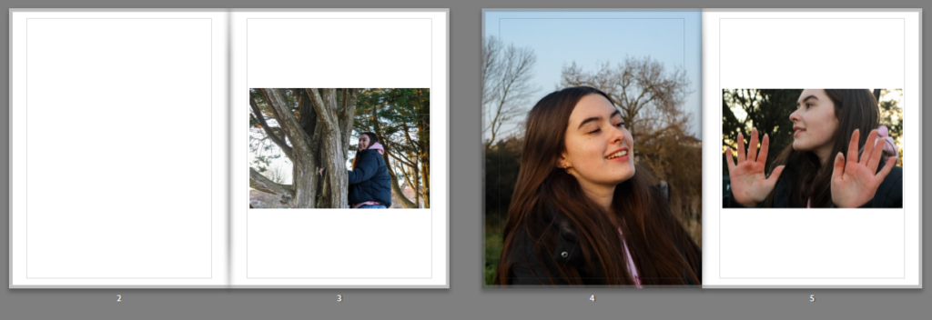
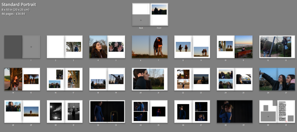
I experimented with my photos between landscape and portrait layouts and found that the portrait layout worked much better for my project. When I had the landscape I also didn’t explore the uses of templates throughout my book which made it look too busy on the pages as there was no black spaces making the book crowded and confusing.
After changing to portrait, I found it easier to use templates like two page spread as it meant my images weren’t stretched out to fill a landscape layout. I managed to create variations of layout on each page such as having two at different positions and sizes, followed by a two page spread. I also did a few pages with 3 images.

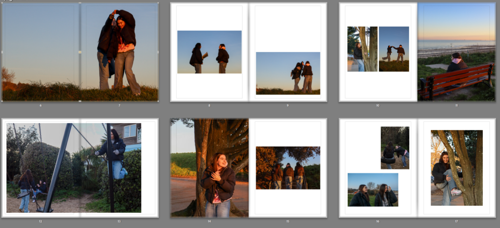
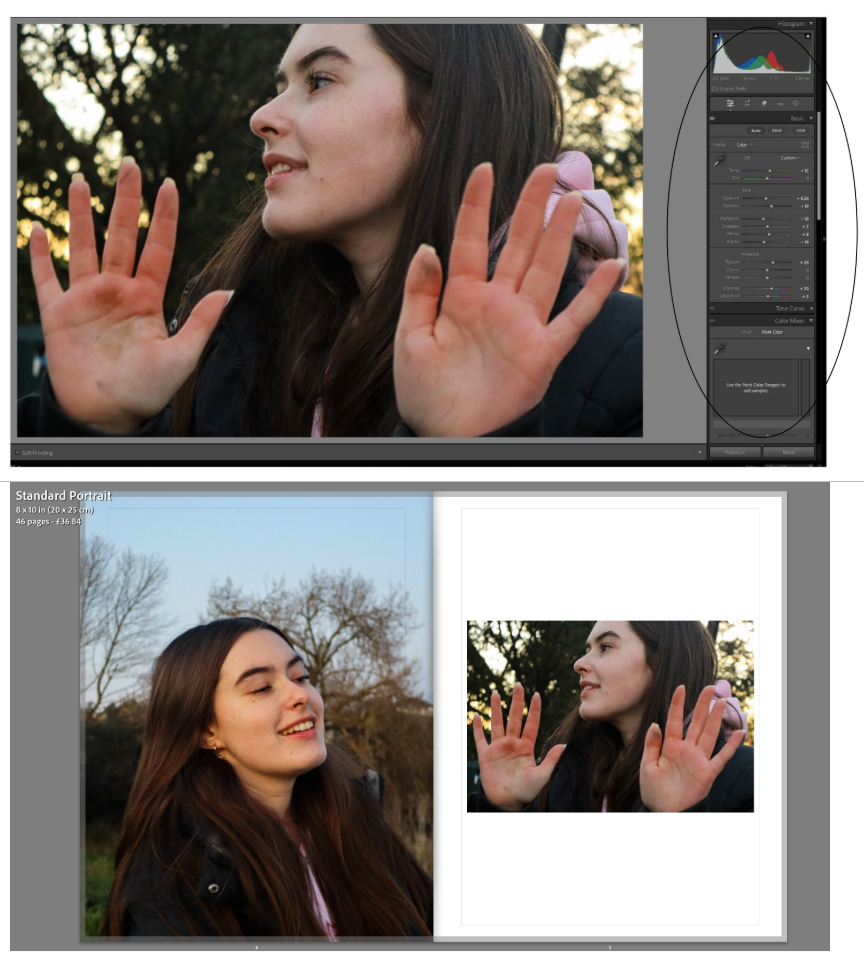
On some images I needed to use the zoom tool which zooms into the photo and fills the page. this cancelled out a lot of empty space in the image and resulted with making sure the main focus was the subjects face. One problem with this page was the composition of colour. The image on the left is a lot warmer than the right due to the left image being directly in front of the light from the sunset creating an orange tint on the skin. In comparison, the right image is a lot cooler as the subject is in a shaded area not being directly hit by the sun.
To fix this, I went back to the develop page where I edited the exposure, contrast and temperature of the image to match it more closely with the tone of the image on the left. This was the result.
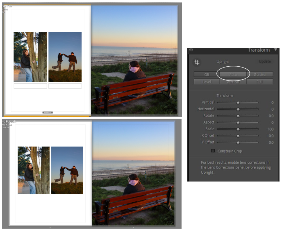
Another change I made was transforming the images that aspects of the image such as the horizon was straight and not at an angle. to do this I selected the image I needed to edit (the right image) and the went back onto the develop page where I scrolled to transform and then clicked auto. This straightened out the image by automatically zooming in slightly and tilting the image so that the horizon went across the image straight and not diagonal. though is was a very minimal and slight change, it made a difference.
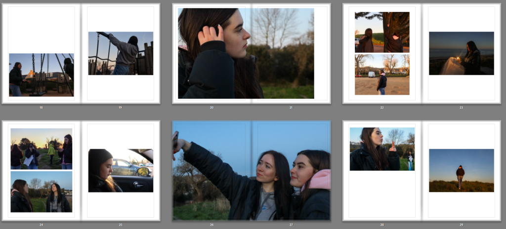
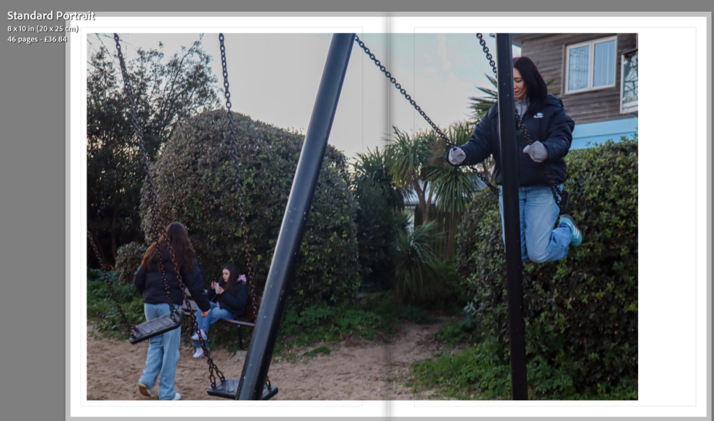
When working on double page spreads such as the one below, I needed to make sure that I wasn’t putting the main subject of the image in the centre as this would be stuck in the fold of the book. With this image, it nicely splits in the middle where the left shows two girls and the right shows another girl. this meant the split in the middle of the book did not interfere with any important features of the image and the main subjects are still very visible which being across two pages.
Final layout after edits: