I have 4 main focuses while designing my photobook;
- Simplicity – 1 photo on each page; the photos I have taken are very good standalone, therefore each photo will be presented on the right page, with a blank page on the left throughout the book, creating a simple sequence that visually appeals to the viewer, while also directly disconnecting each photo from each other.
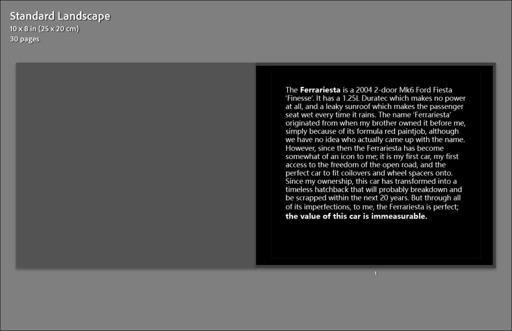
- Create a narrative – my photo taking was very spontaneous, and no photo is the same really, however if I describe to the viewer what the Ferrariesta means to meat the start of the book, the viewer is more inclined to view the photobook as a journal, or a documentation of the Ferrariesta, similar to how 240 Landscapes by Helge Skodvin is presented.
- Start with the best photos – if my best photos are scattered around near the front of the book, the first impressions of my photography will be much better, and since this book only has a loose narrative, I am able to do this.
- Create connections between photos – there are some elements of my photos that are similar, and therefore it is best to put these photos together in the book so that the viewer recognises these similarities also.
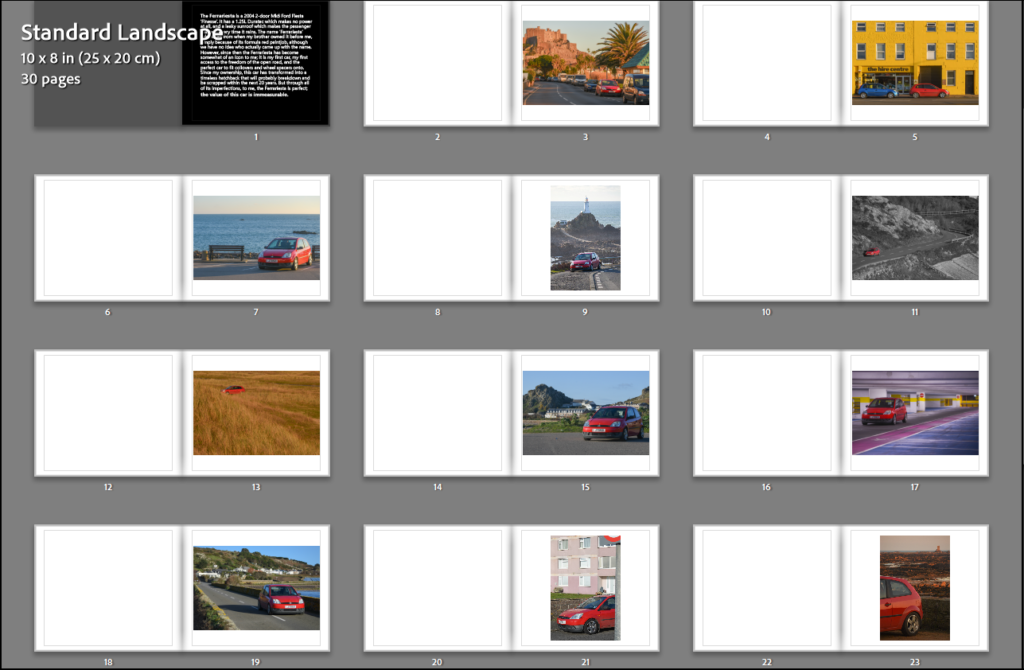
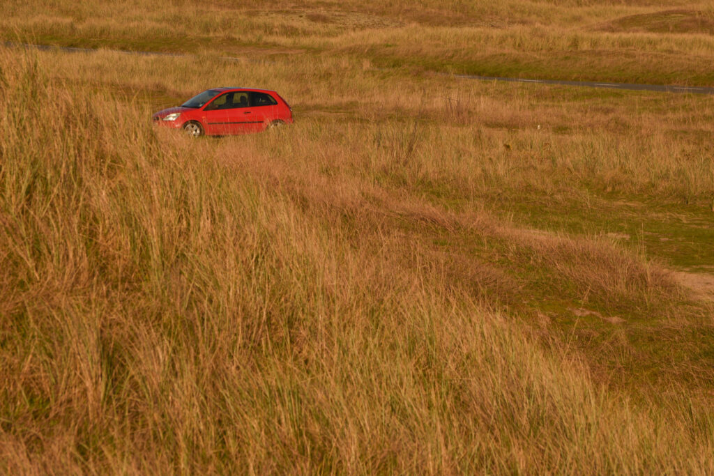
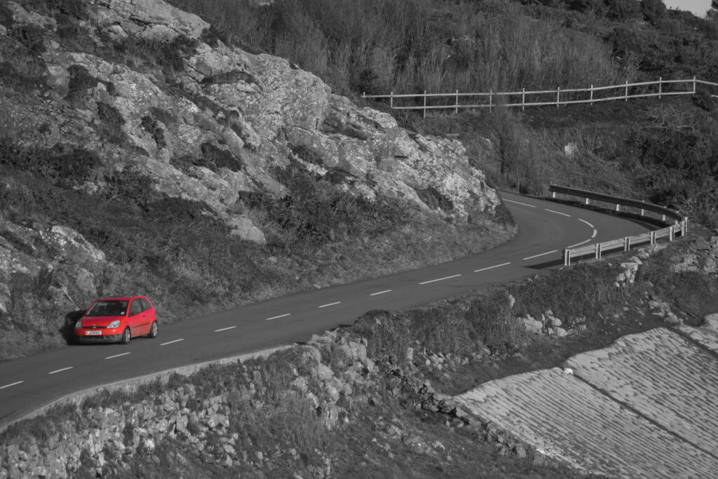
When building my sequence, I knew to start with my best images and move through the book trying to loosely connect each photo with each other. The majority of photos do not link, which made this slightly challenging, however I did find that these two photos would be perfect when put next to each other in the sequence.