Photobook – Kanelsoldaten:
Evaluative analysis
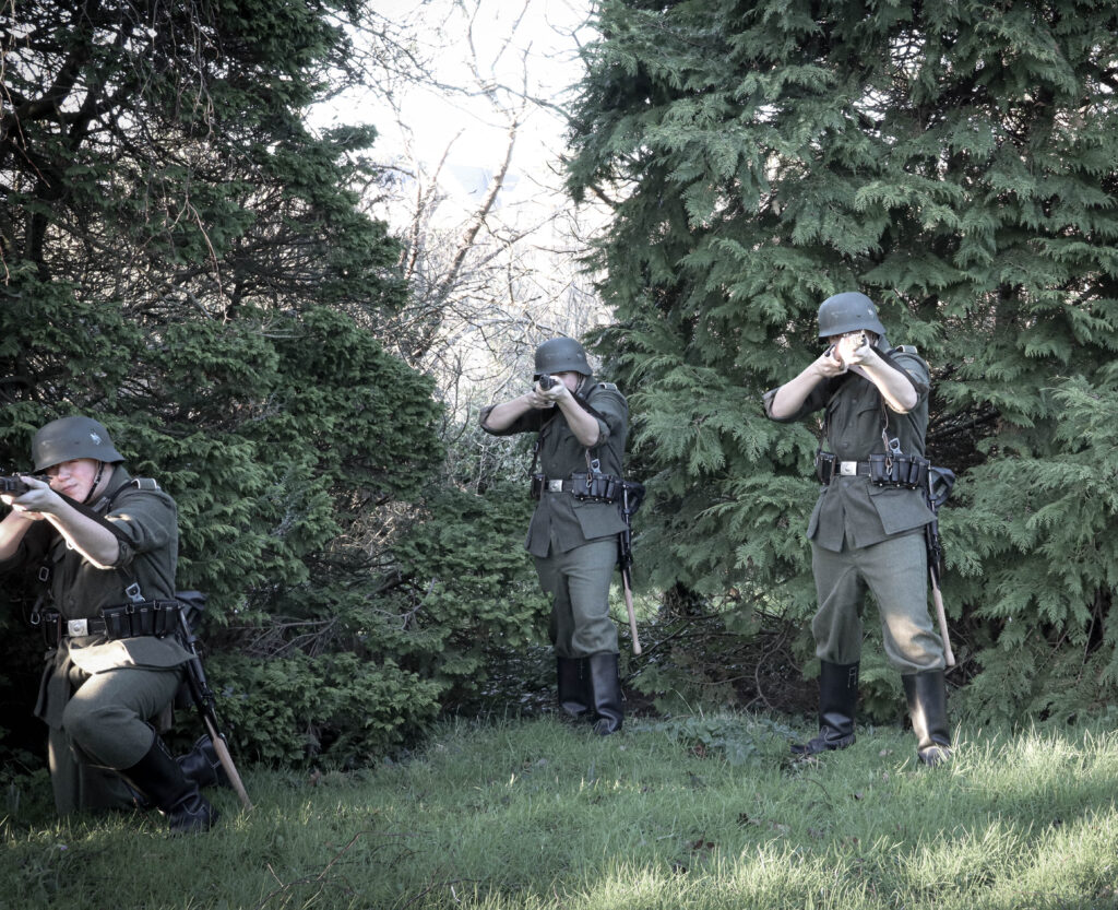
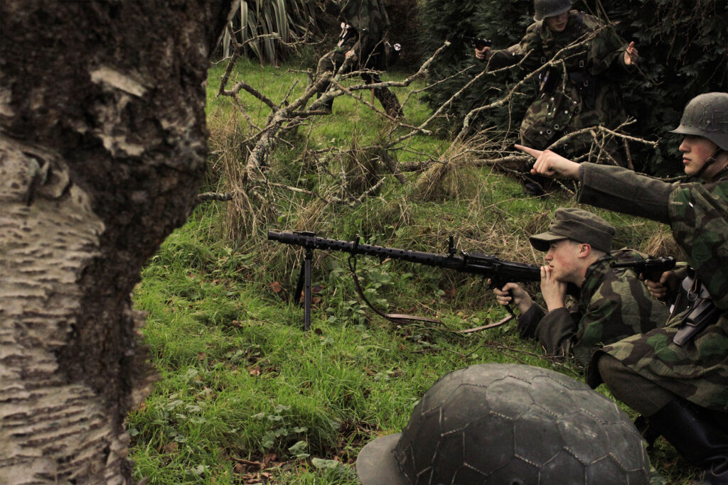
Overall I think my personal study was successful in creating my plan to portray the truths of reality and war through photography. By being able to show links to my influence from both my artists I find my images appeal to both aesthetics. Due to the difficult process of image taking such as with the props, locations, weather and timing in addition to the editing process of detail correction in Lightroom and the positioning and creating the images through photoshop I found it was hard to create all the images I wanted in the time that I had. Another issue was the lack of equipment to portray the soldiers as accurately as I wanted.
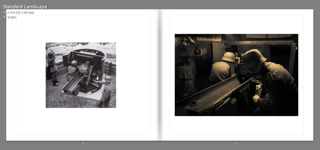
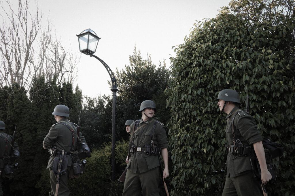
Despite these set backs however I believe I was able to create a diverse array of images and locational settings that fitted around my target location of La Corbiere. With accuracy as my focus I aimed to include cross-comparing elements such as referencing through my images to the text I included. With the text being a poem, written by a German Soldier stationed at La Corbiere, it mentions the seas surrounding Corbiere, through some of my images I aimed to include photographs of the sea to make reference to this.
Photobook: Story & narrative
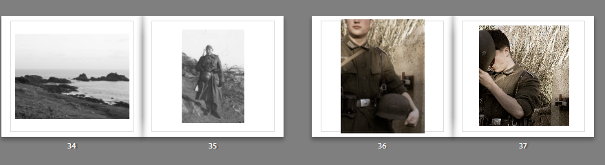
With the Images I produced including archival photographs, I positioned these together with my recreations/interpretations to create the narrative of their relation. With Landscape shots as separator’s, this was to tie in the location of the narrative and bring emphasise to the images local setting. With the photographs including cloned versions of myself, in interoperated scenarios, the aim of these images by themselves was to create the immersion into their own stories
Photobook: Layout and Design
Using a variety of designs within my photobook layout, the aim was to create a well balanced composition where images used together would work well together or contrast in an aesthetically pleasing way.
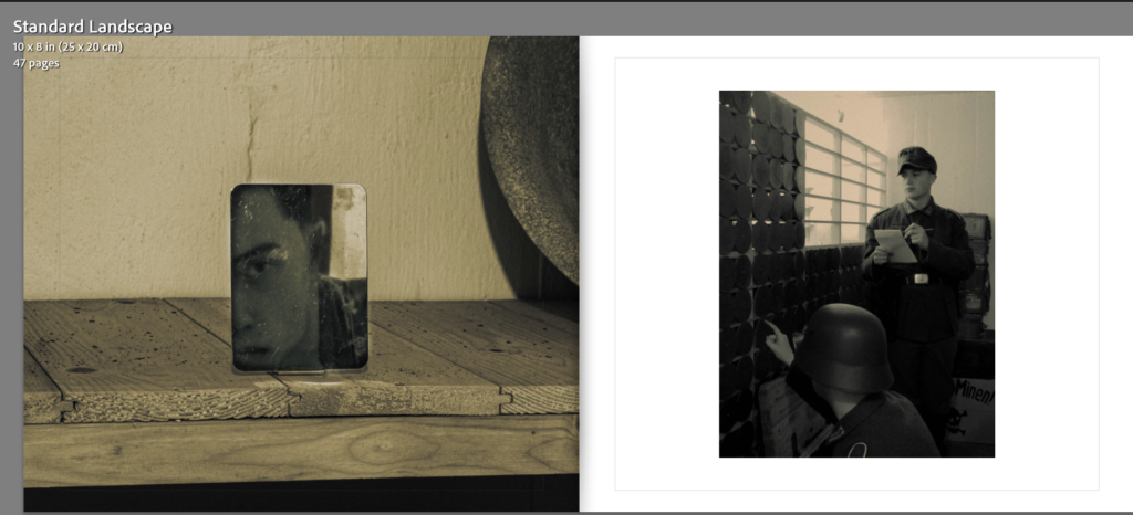

With archive images being an important tool to show my influence in the recreated photographs, it was important to me to position them together.
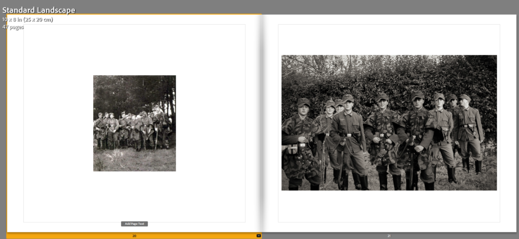
With the design, I also positioned the images to merge in colour or create contrasts through various appearances, this can be seen where images lower in saturation or are placed on separate pages of black and white to then coloured photographs.
(Lowering of saturation)
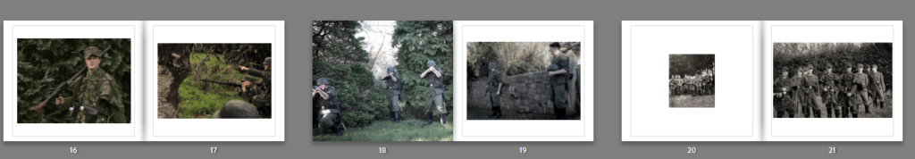
(Colour contrasts)