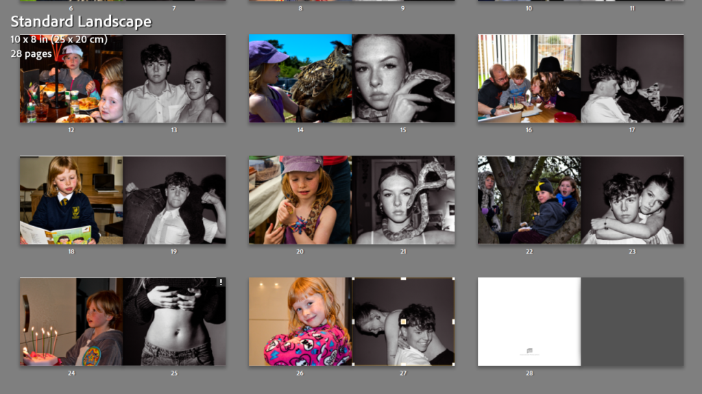
I gathered and placed all photos I may incorporate into my photobook, and made a smart collection of them all. Again, sifting through and ignoring ones that don’t particularly fit with my project.
Carefully placing each photo into their own cell, acknowledging the clash of colours and photo contents, found where they may fit best.
Knowing my sequence of photos is one coloured and one black and white, I left gaps to add my additional photos in when they have been completed.
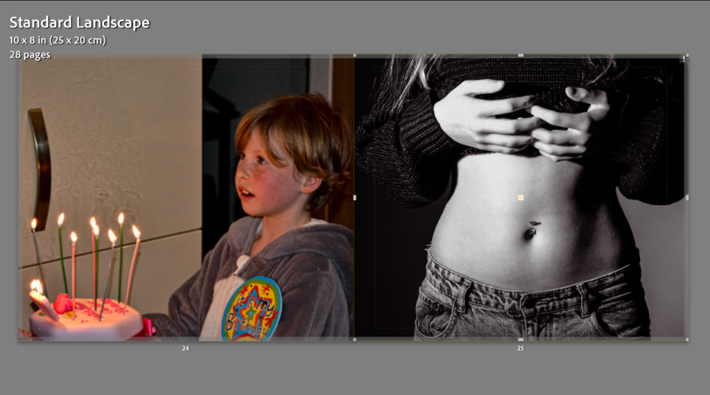
I’ve chosen very specifically which photos would go best together, which photos could tell a story, entice viewers and keep them drawn. The screengrab above, shows this simply, with the childhood photo including food, the teenage/young adult photo depicts stomach. This allows viewers to relate in whatever way they saw fit.
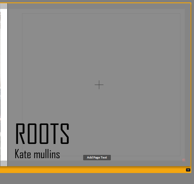
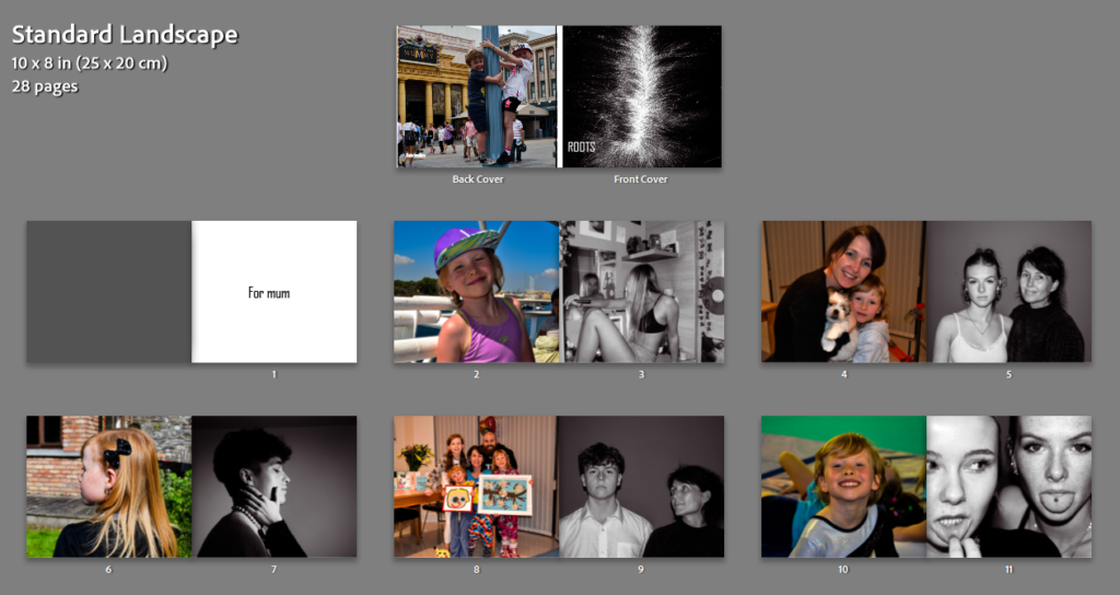
With my title having the name ‘roots’ it gives 2 meanings. The idea of my roots being my family and my childhood but also my root of my hair, as I had copper hair as a child, I dyed over it as I grew up but every couple of weeks, the ginger would come through ever so slightly.
The font I used for this title was ‘Agency FB’. This font really stuck out to me because of it’s harsh block like letters. I feel that this reflects the idea that life is harsh and stubborn too. Un malleable and very ‘it is what it is’.
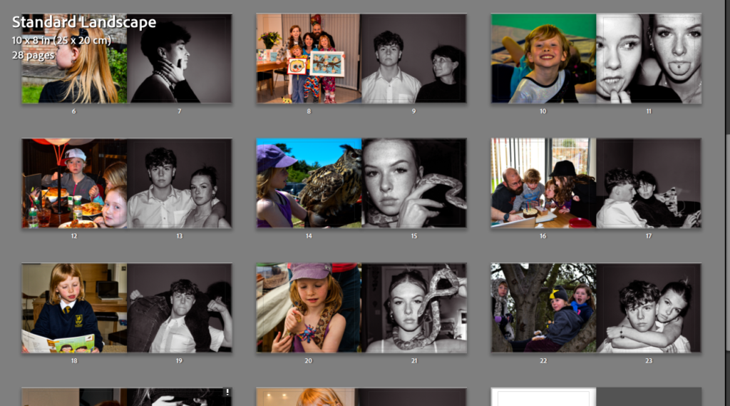
I finished editing and choosing the black and white photos that will fit well with each archived photo, playing around with placement and checking what photo compliments the other the most. Some of the photos matched so well (snake photos), and they look perfect together.
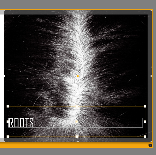
For the cover, the simple but effective idea of using a photo of roots from someone’s hair gives my work a sense of abstractness and almost blindsides the viewer on what the story will be.
Final layout –