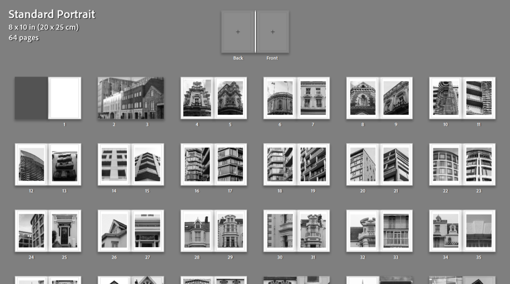
Process
I started off my photobook layout by adding all my best images in so that I could see them all in order to start sorting their positions.
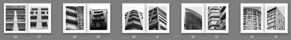
After that, I had started to arrange images where I would like them and what I would like them near. These are the arrangements for my older building images. This arrangement does not include the layout of each individual page.
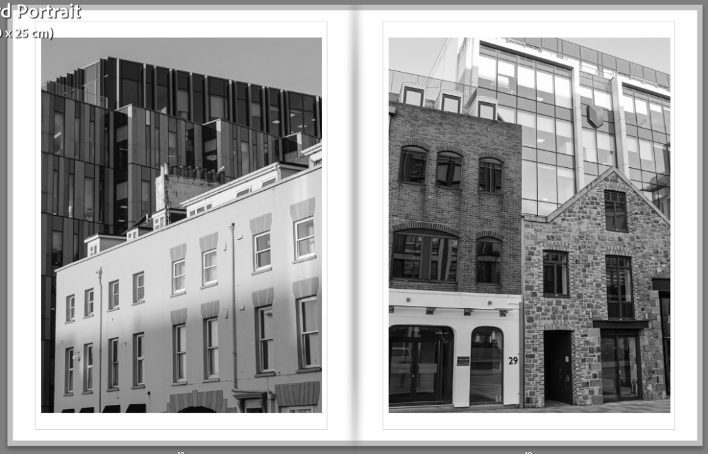
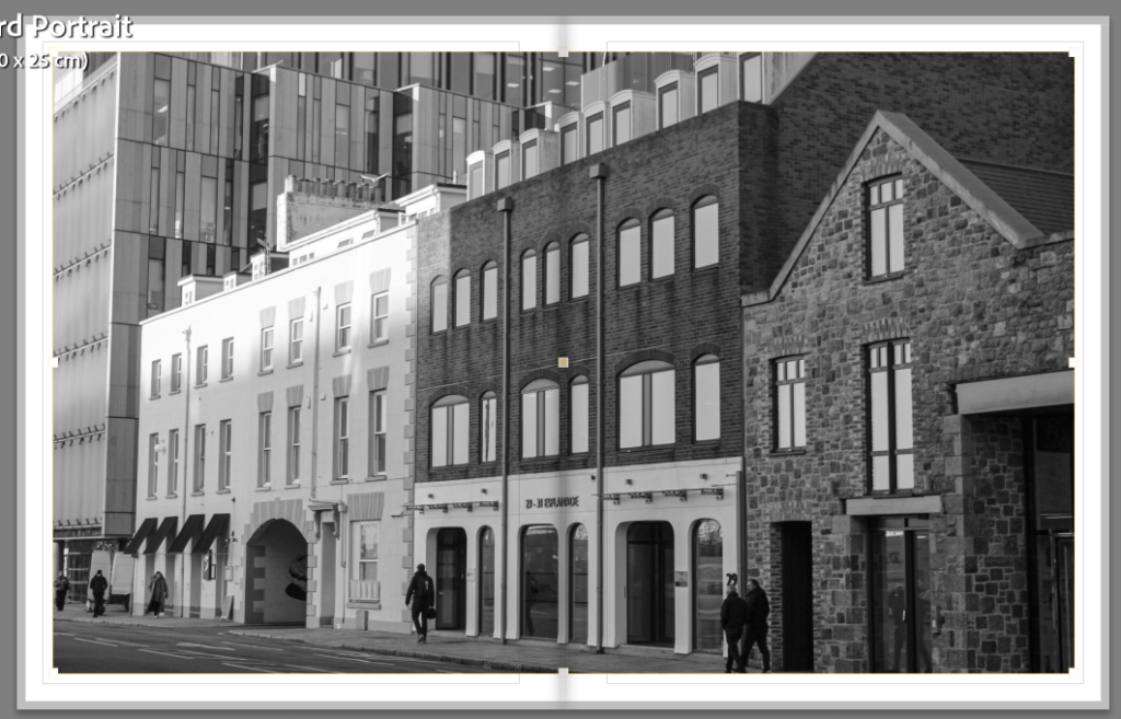
I have then added some images between which present both old and new styles of Architecture to create a link between the two.
I then paired images of modern buildings which I think go well together. During this process, I eliminated a lot of photographs.
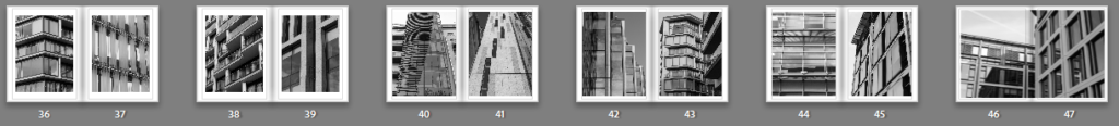
After sorting through the images, I made a start with the layout of each individual page.
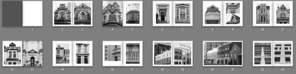
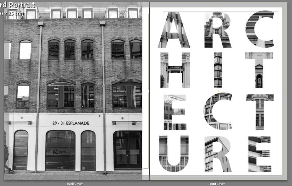
I then added the front and back covers. I showed step by step how I created the front cover on my further experimentation blog post. Furthermore, I chose this specific photo as the back cover as I think it sums up the book quite well due to the combination of new and old architectural styles.
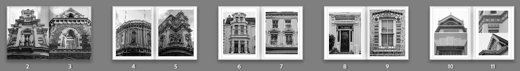
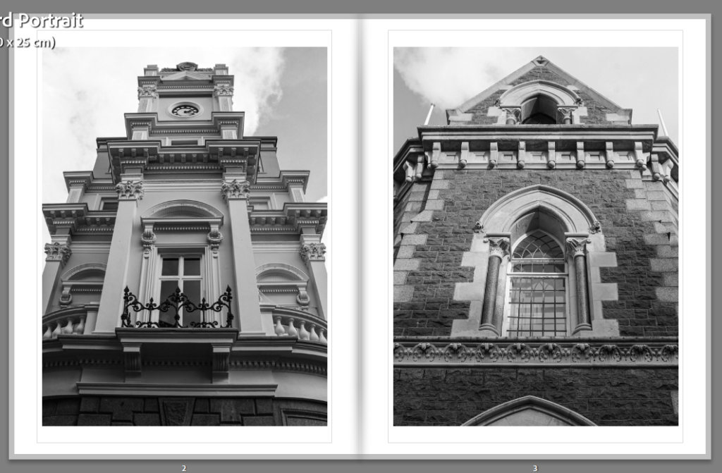
These are the first two pages of images when you open the book. I started with these because I like how they have both been taken at the same angle and they are commercial buildings with a historical architectural style.
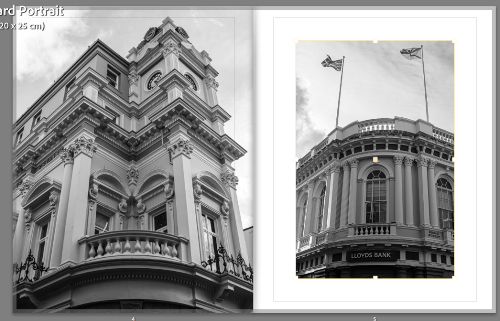
These are my next pages. I wanted to show more commercial buildings in the same are.
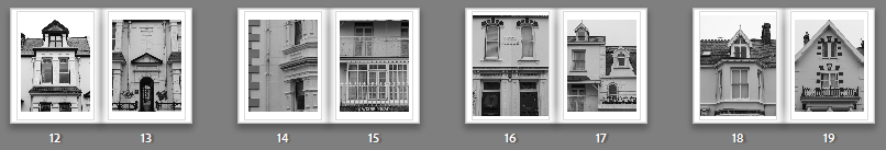
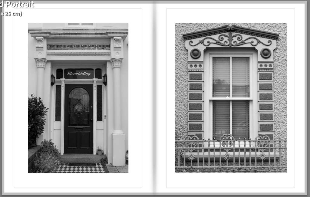
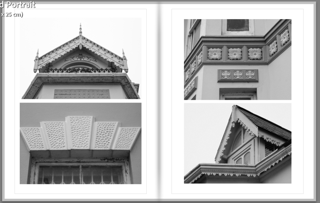
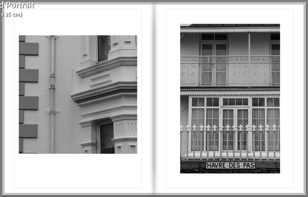
I then moved on to residential buildings, focusing in on the details for the next 4 pages.
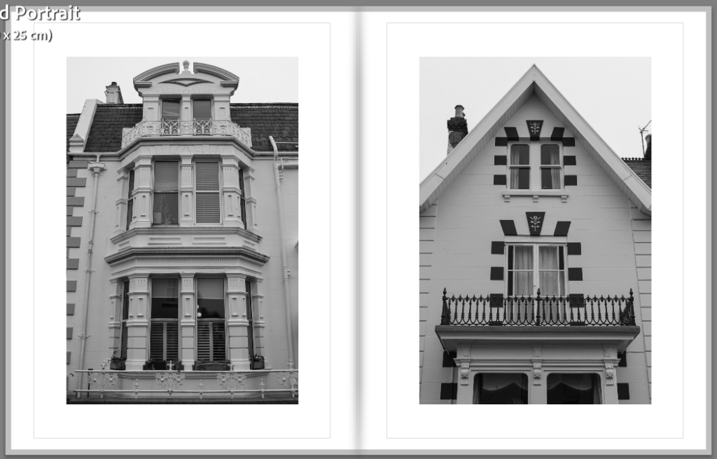
For these two images, I wanted to show two different old architectural styles.
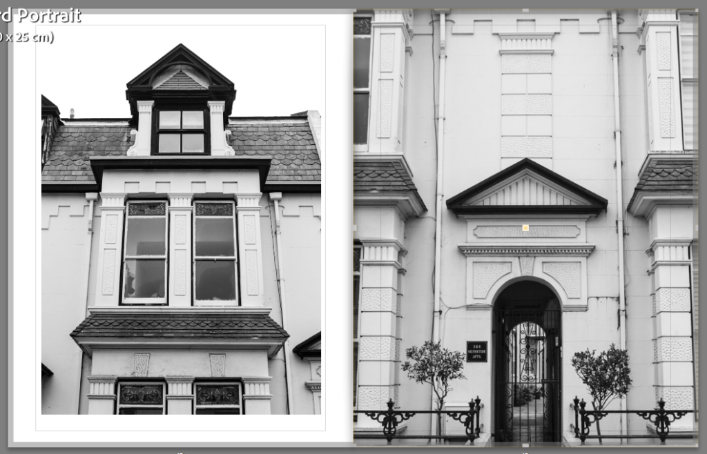
For these two pages, I presented the same building but from different perspectives and different parts of the building.
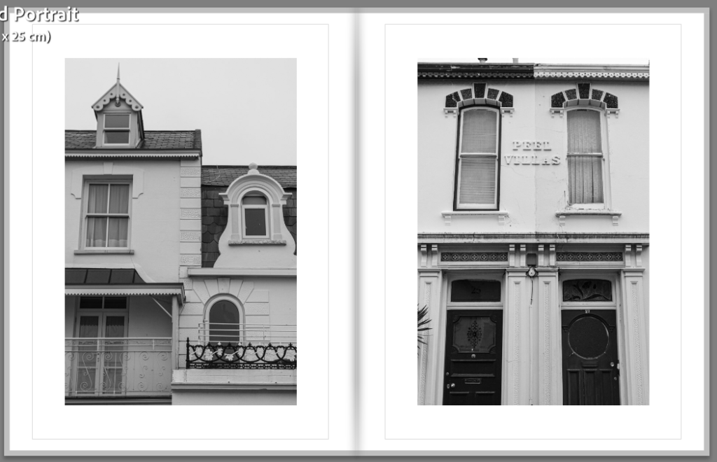
These two images are both of buildings split into two. The first one is two buildings which are connected and the second is two houses which have different shape doors.
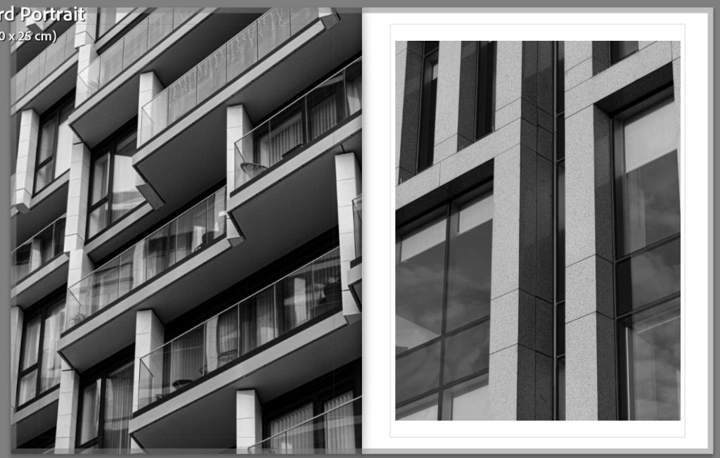
I presented these images together as they are both zooming in on the details.
I wanted to then transition to modern buildings by presenting images of old and new buildings together.
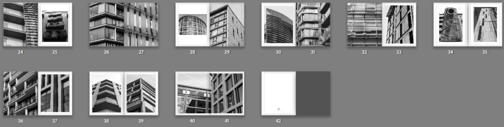
These are my the first images of modern buildings. I showed them together as I think they are quite similar images.
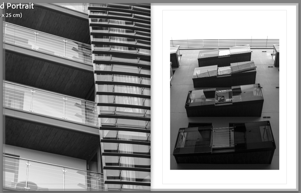
These next images I have put together as they are both of balconies.
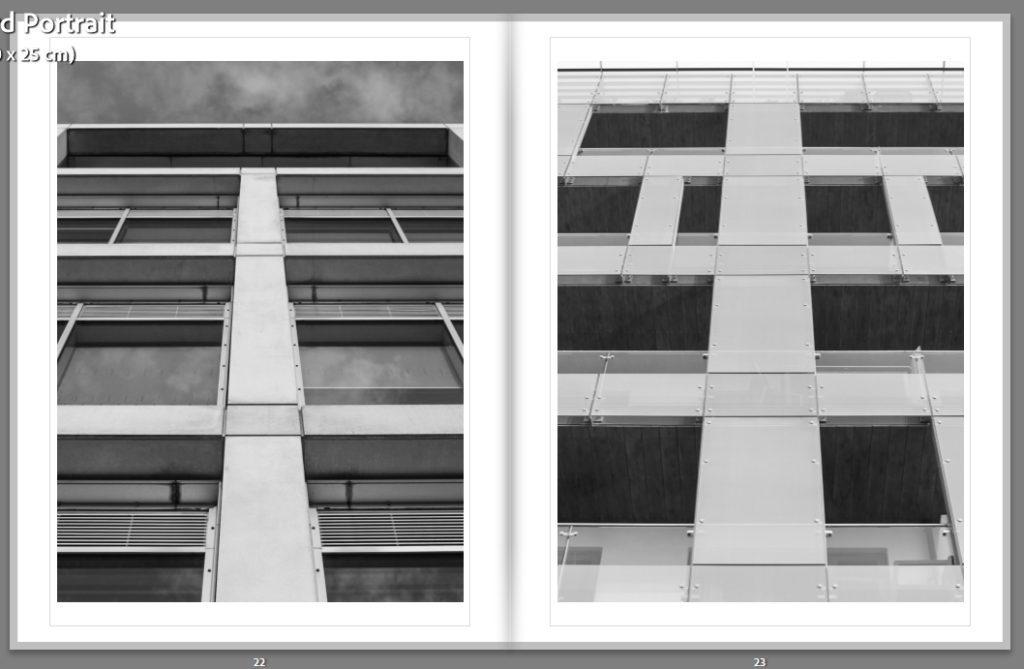
I presented these next two images together as I was able to connect them with the lines of the buildings.
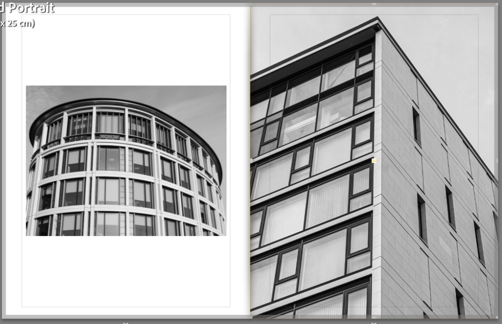
These images are similar because they both are of shapes, the first is circular and the second is triangular.
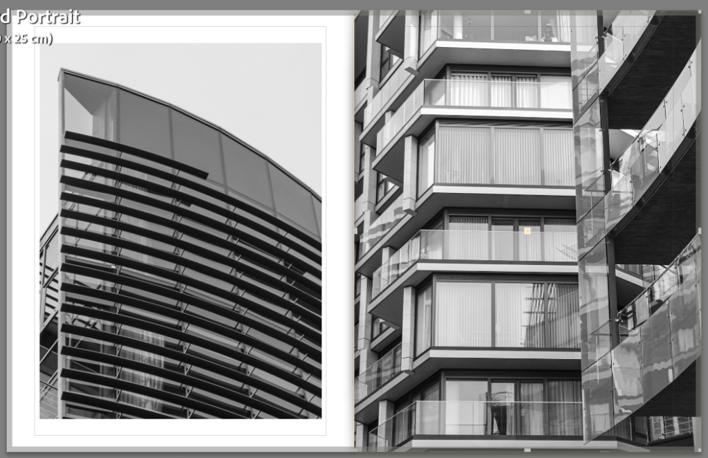
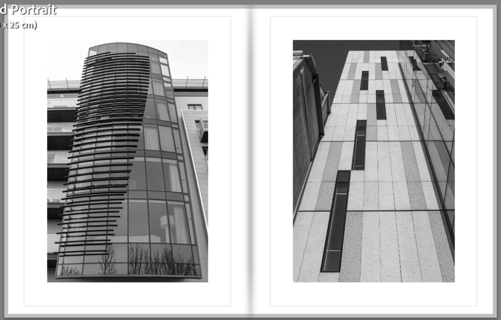
I really like these pages as the images both contain curves.
For these pages, I presented these images together as they both have square windows and are similar to my artist reference.
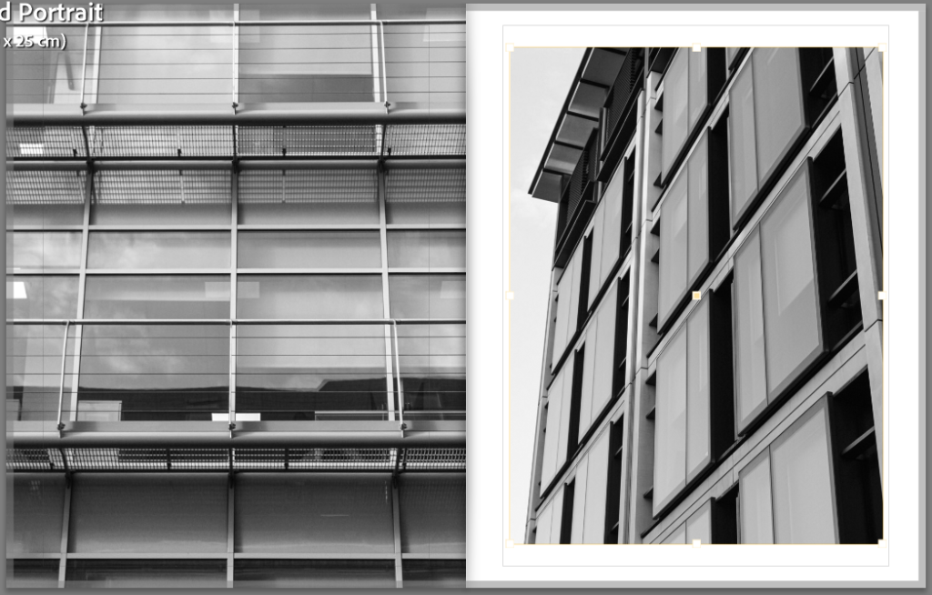
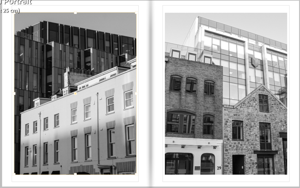
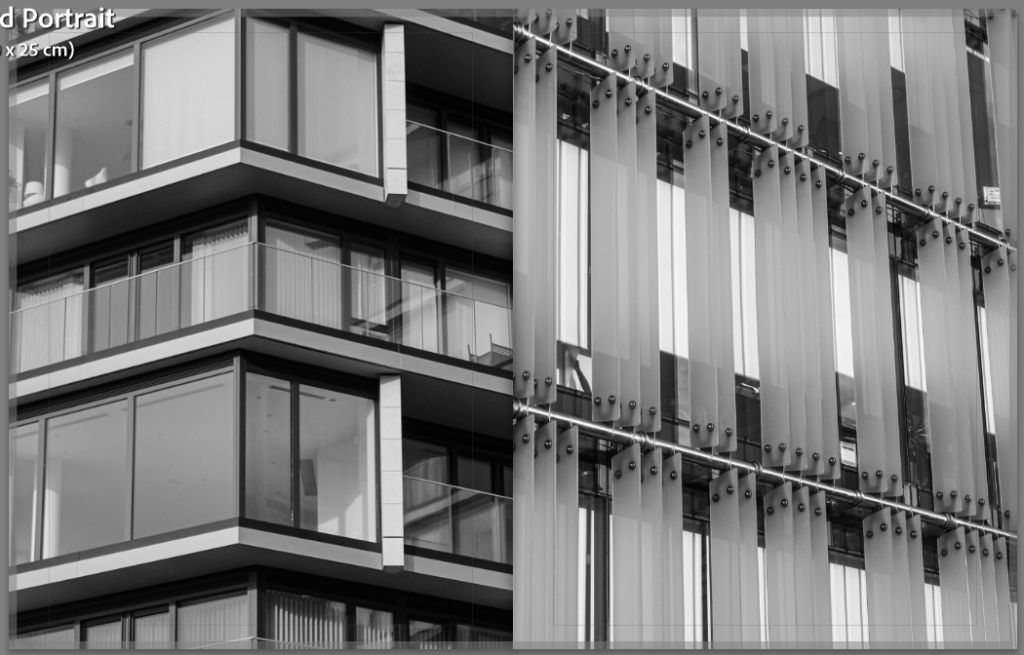
For these images, I presented them together as they both have similar perspective.
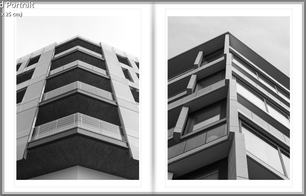
These images I put together as I think they look similar and both were taken at similar angles.
For this next page, I presented these images together as they both have the same triangular points.
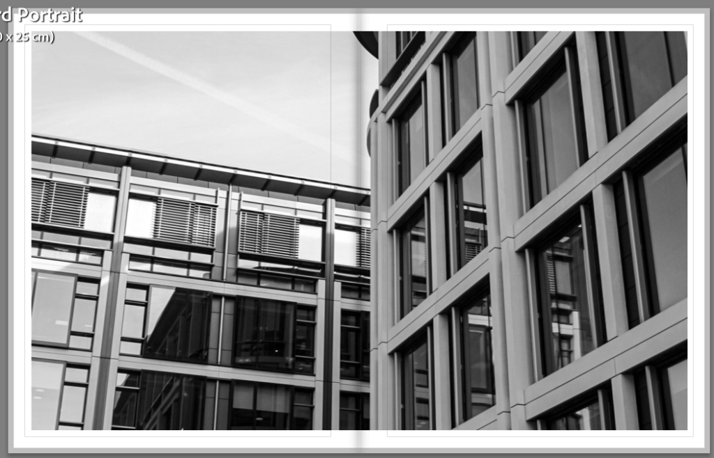
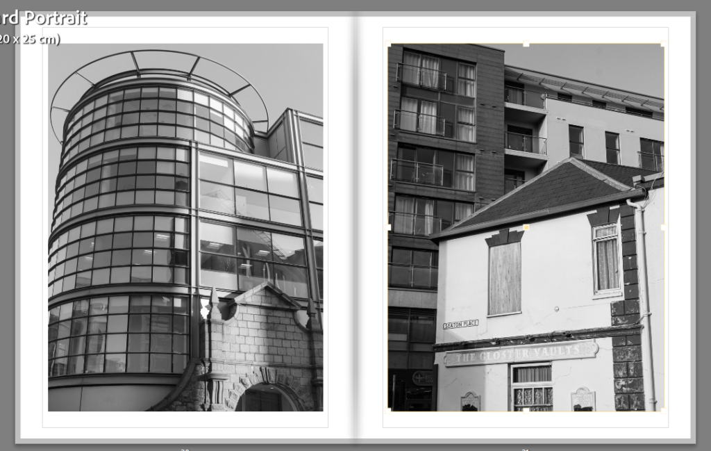
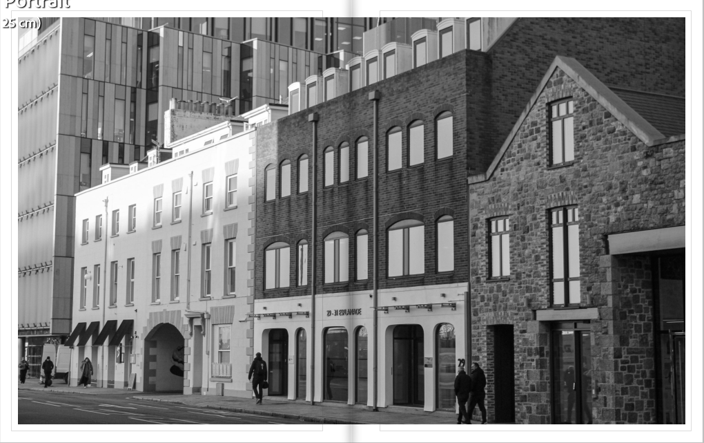
This is my last page. I made it a double page spread of this photo because it is a landscape image and it displays a reflection in the glass of one building of the one adjacent to it. I finished off with this image because I personally really like it and it displays modern buildings which is current, therefore, I went from some of Jersey’s older buildings at the beginning of the photo book to one of the newest/most recently built.