Contact Sheets
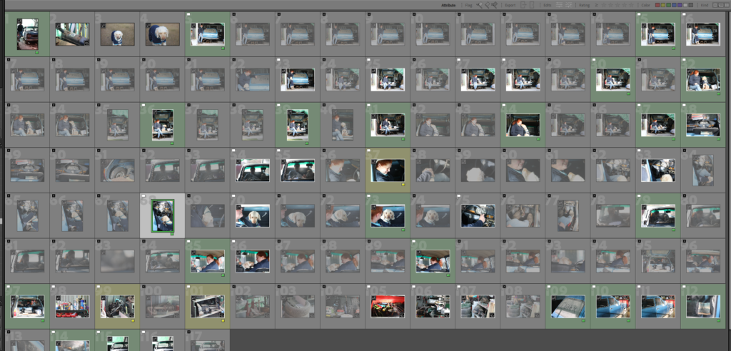

I went through the whole photoshoot, picking the best shots and flagging them, then going through the flagged options and colour coding the photos yellow and green to marking the best shots and ones I might use.
Edit One
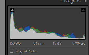
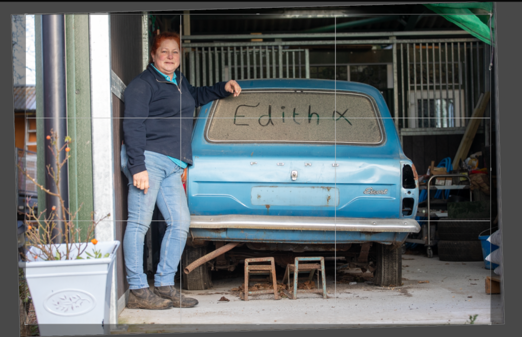
I needed to crop and reangle this photo as it was slightly slated.
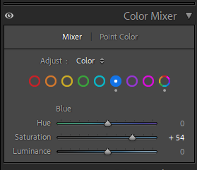
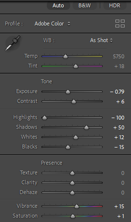
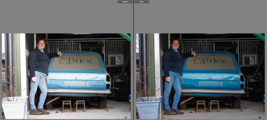
This photo needed, the highlights reduced as there was harsh lighting effecting the cars colour, once reduced I could decease the exposure and adjust the colour mixer panel. Selecting the darker blue, increasing the saturation to bring the cars true colour back to the photo.
Edit Two
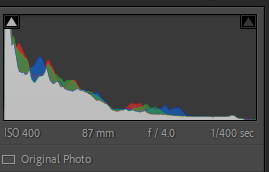
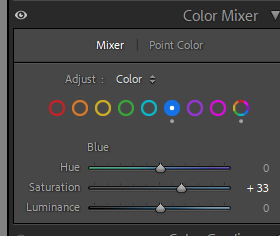
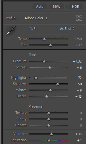
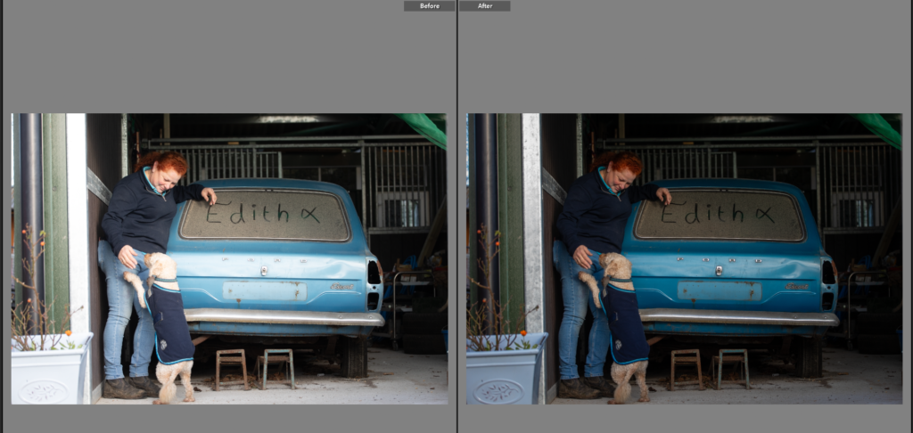
This photo is similar to the last but I liked dog jumping up in this one, adding movement to the photo. I went through a very similar editing process, with adjusting the exposure, shadows, highlights and the colour mixer board. On the colour mixer board I tried to match the cars colour not only to the true colour but the previous edits photo.
Edit Three
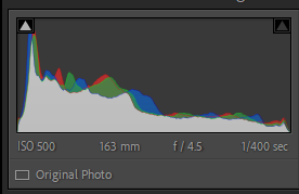
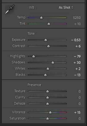
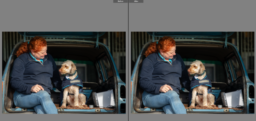
This one I needed to reduce the shine on the dog that appeared due to the harsh lighting. To do this I used, the exposure on a decrease, as well as the highlights. I made other small adjustments to the image solving smaller issues within it. The cropped frame meant the angle re-adjustment wasn’t needed.
Edit Four
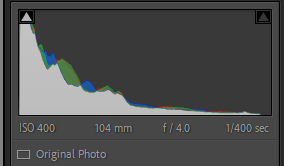
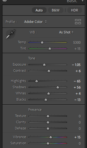

While this photo was similar to the last I haven’t decided which one I might use. The previous one is a better photo at first glance but I like the detail of the cars shown in this one. When editing this one I had to be careful to reduce highlights without making the background too dark as the car shown is why I like this photo.
Edit Five
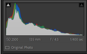
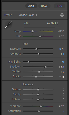

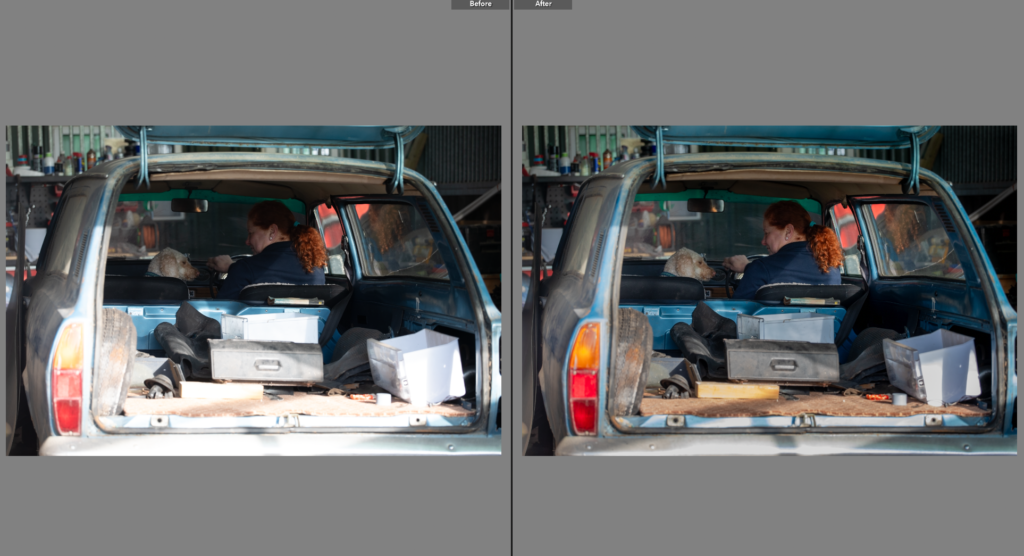
I did try this photo in black and white to tie to previous shoots, however I preferred the colour as the contrast between the dark navy and wooden interior is not something you get in modern cars and creates a lovely contrast within the photo. I decreased the exposure to bring out the colours of the interior.
Edit Six
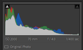
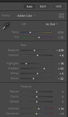
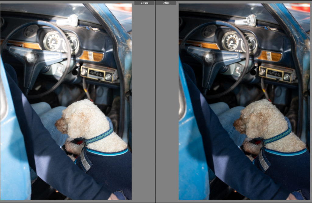
he blues in this photo highlight the unusal colour of the car. The dog adds human feel to the photo.
Edit Six
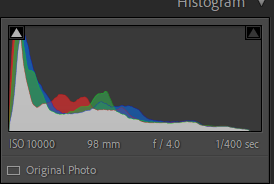
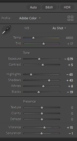

I loved the textures in this photo and the framing, having the person out of focus added to this photo. The dog staring into the camera works well as its a quiet moment of the dog in the car. I decreased the exposure as the photo was slightly over exposed so this added the detail back in, and added the cars details back in as before they were a little flat.
Edit Seven
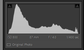
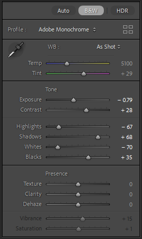
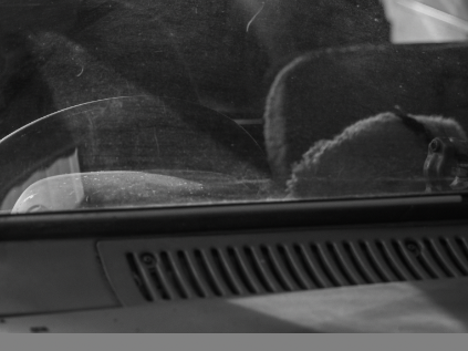
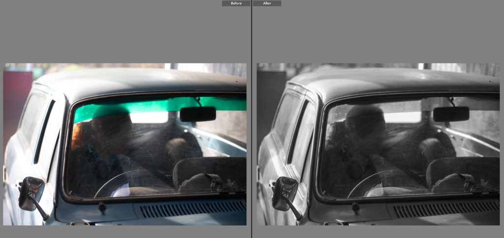
I liked this photo however I knew it would be much stronger in a low contrast black and white, I liked the slightly out of focus look and the black and white enhanced this. It gives this feeling of connection and natural environment rather than a posed photoshoot. I loved the section of light on the windshield and bonnet and the black and white enhanced this showing how I used light and the shadows to create dynamic interesting photos.
Edit Eight
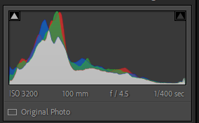
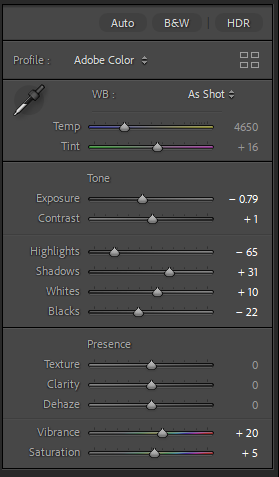
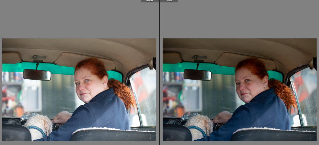
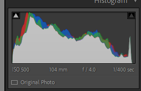
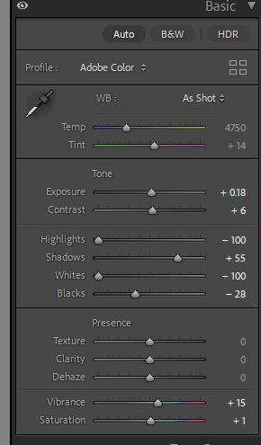
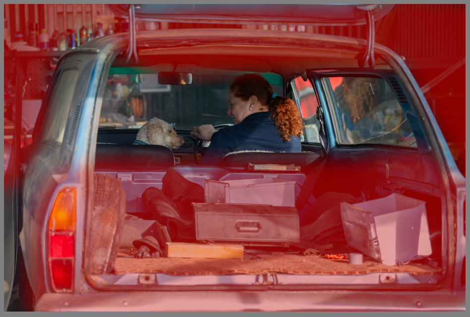
The colours in this photo made an interesting photo, I did try the shot in black and white to highlight the section on light on the persons back however it took away from the image. The models red hair contrasts well with the navy jumper, beige roof lining and dog. I moved the exposure down as the soft lighting washed the model out, adding depth back to the image creates a polished photo. I like the framing of this image as there isn’t too much of the car showing but the model looking over her shoulder creates a feeling of connection.
Edit Nine
Edit Ten
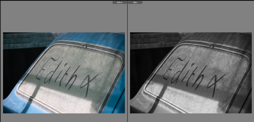
I like this photo, the nickname the car has been given has been written into the dust. The shadows add depth to the photo, almost underlining the word.
Edit Three
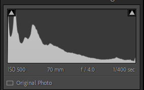
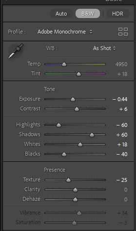
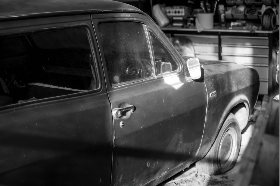
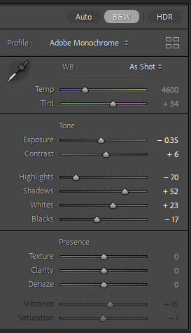
I tried this photo in colour, but it is much stronger in black and white. However when I first made the photo black and white I found the highlights, the bright sections of light are great at highlighting the parts of the car and making an interesting photo.
Edit Eleven
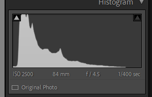
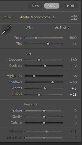
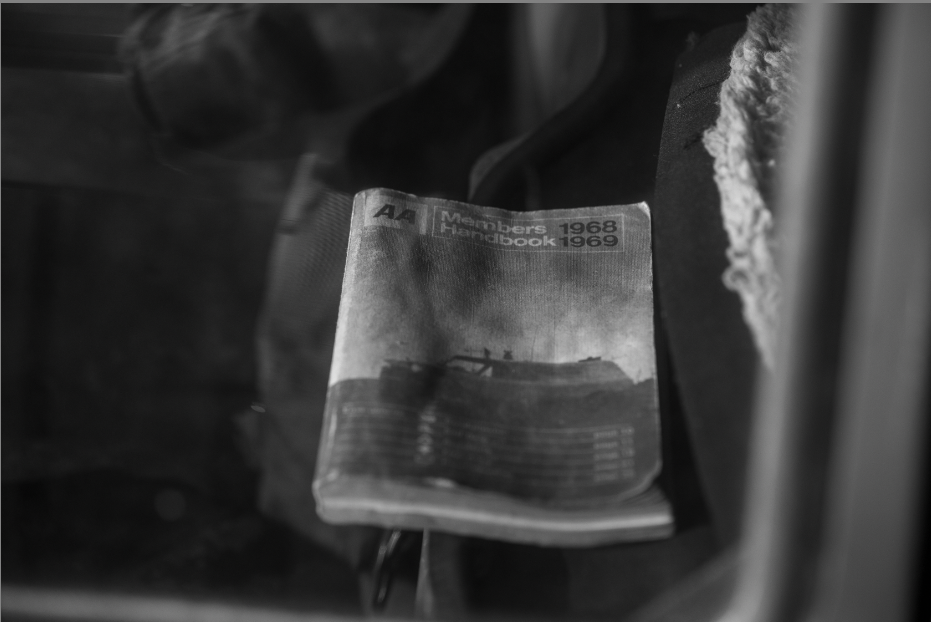
Having taken this photo through a window I was concerned here would be a glare, but instead it made the handbook standout. The left of the photo is mostly dark with different patterns and then the right side of the photo shows a section of the back of the seats. I like that you can see the age on the book, adding to the idea about the cars age. This was helped with the black and white as it removed the distracting colours from the background, leaving the focus on the book alone.
Edit Twelve
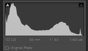
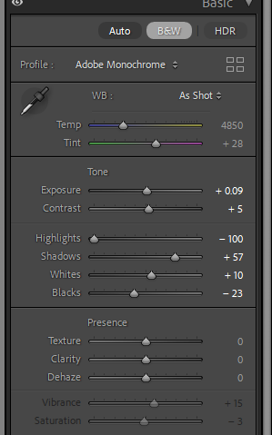
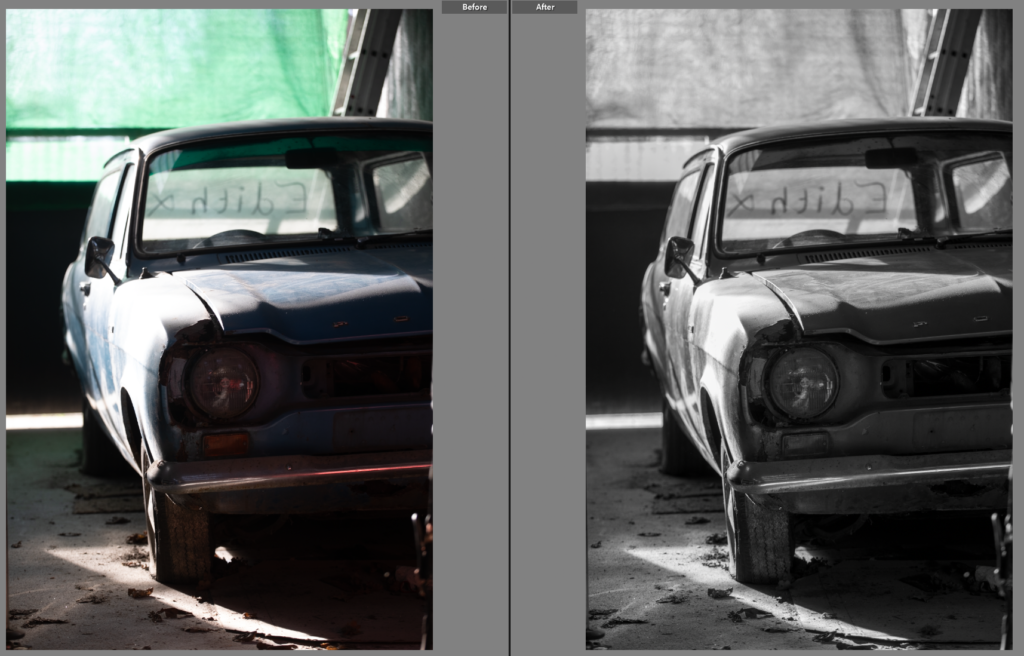
Being able to compare both photos was essential in the development of this shot, Originally I liked the colour version, with the shadows and sections of light highlighting the colour of the car. However I then compared it to the black and white version and found I liked that version better as the green mesh wasn’t as visible in the background, in fact it highlighted the writing on the cars back window. The black and white also brought out the details in the headlight and rust around it.
Final photos
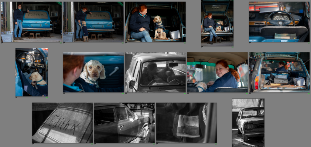
I love the final outcomes of this shoot, I think there is a great mix of colour and black and white shots. Showing details, like the the original car handbook, to the owner and the car, to the dog in the car. All have created a mini narrative within the wider project. Showing the relationship between the car and the owner. I like how apparent the dust is in each shot, showing the age of the car as well as how the passion for the vehicle hasn’t changed over time. This is what I’m aiming to show in the next photoshoot with my father and his old bike that he still loves. Hoping to show how I have been around them most of my life and it has influenced my similar passions. The lighting in this shoot was harsh but created sections of light and darker shadows adding depth and feeling to the photos.
